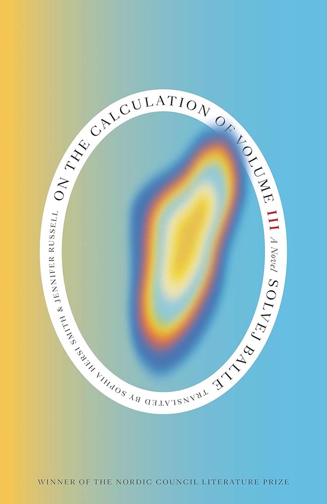
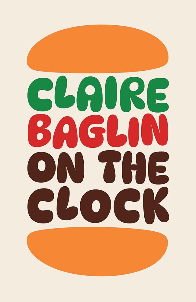
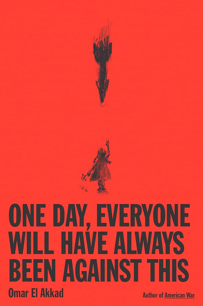
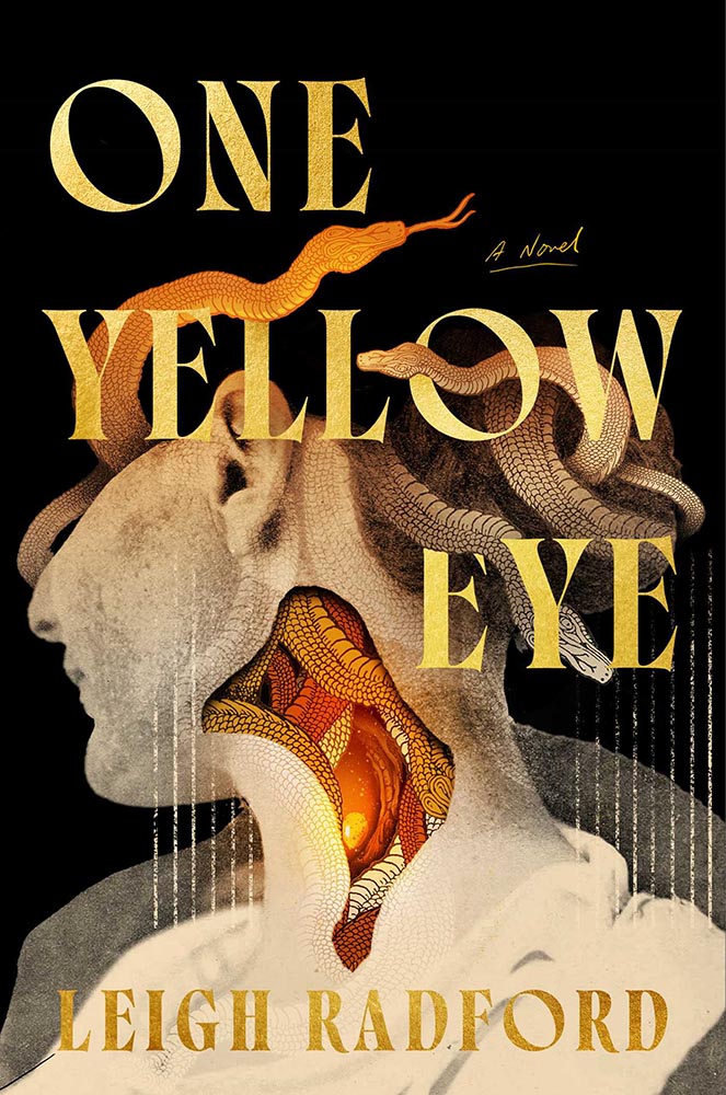
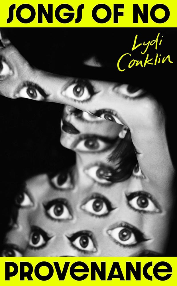
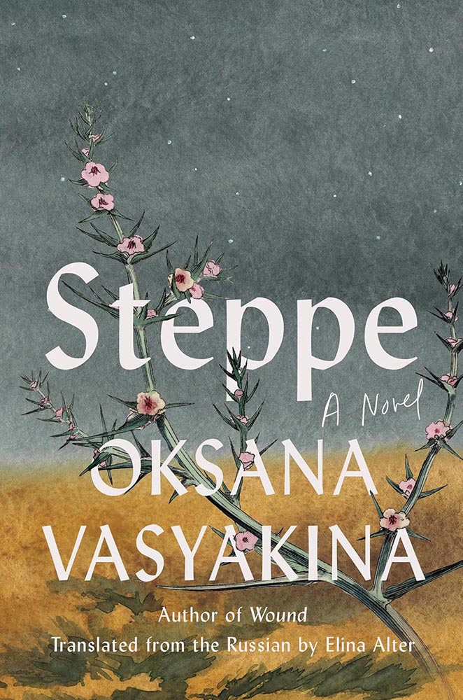
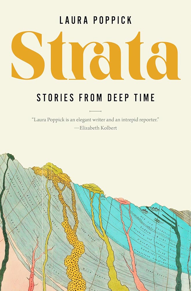
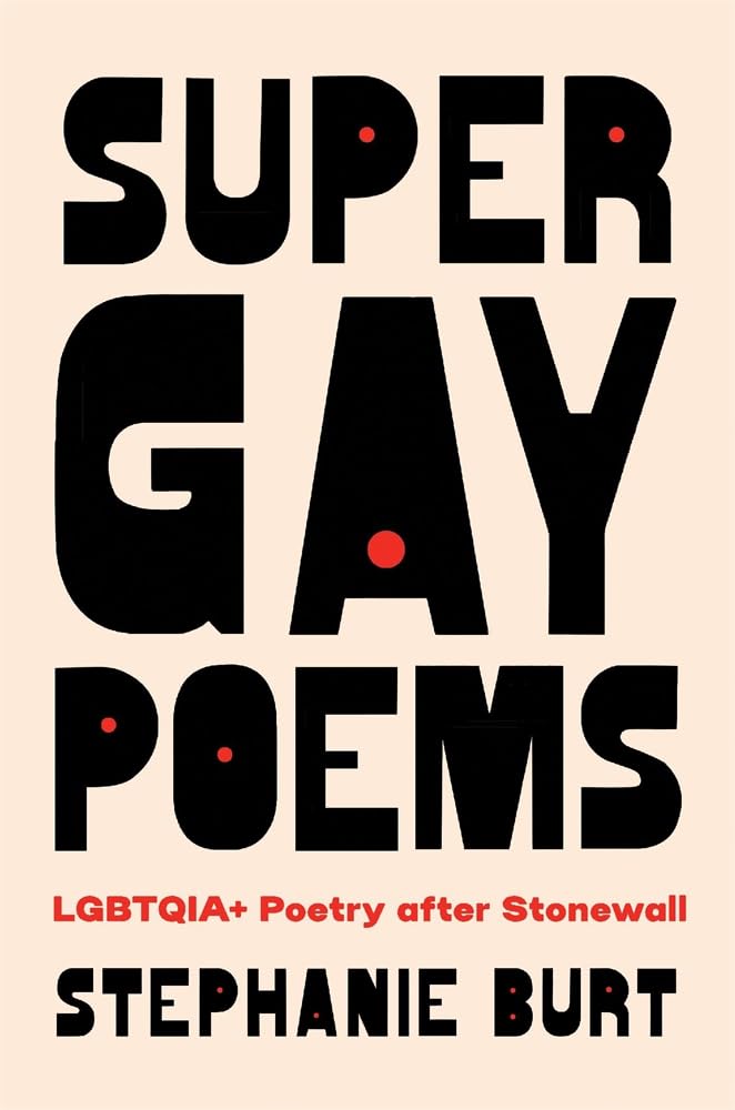
My Favorite Book Covers of 2025

When it comes to describing 2025, “tumultuous” is probably an understatement.

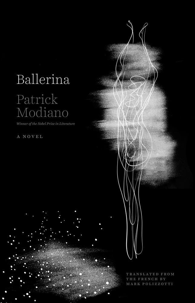
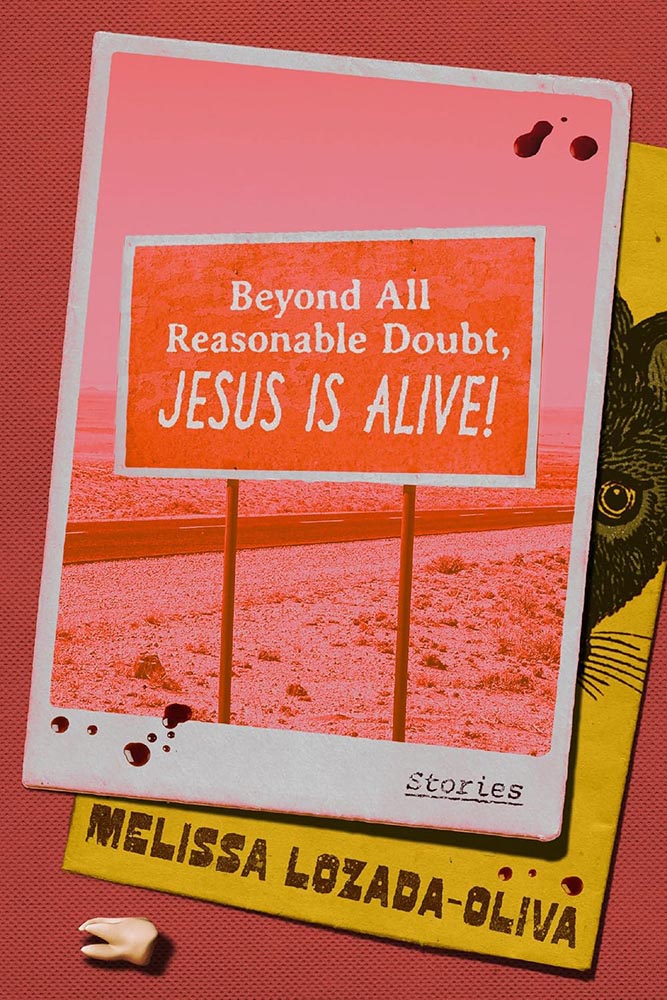
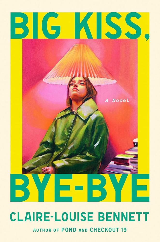
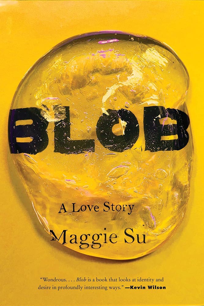
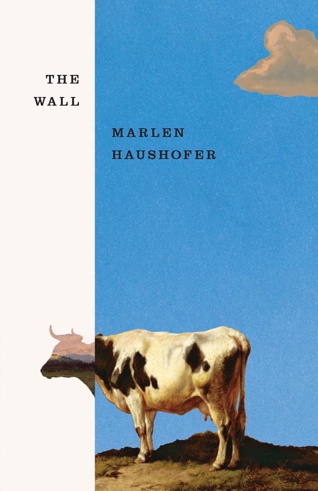
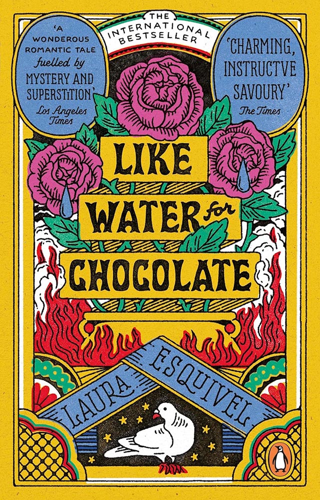
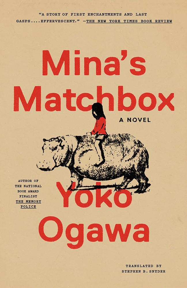
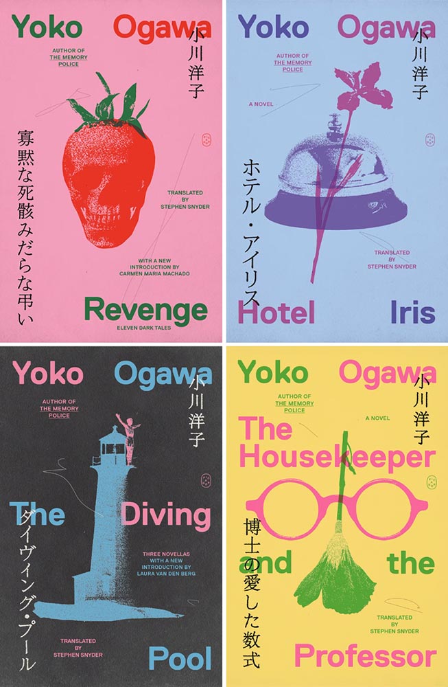
So it’s probably not a surprise that, when looking at the hundred covers that make up this list, there’s a definite direction: favoring quality over quantity. Which is to say, consciously or not, I’ve tended to prefer designs where more is said with less.

Perhaps I’m striving for calm in a world that just … isn’t. Perhaps it’s my choice not to participate in social media and its race for likes, loves, and “latests.”1Publishers need to remember that not all of their readers select what to read based on influencers, what they see on Facebook, or by doomscrolling Instagram. Some of us are lifelong readers, have hundred or thousands of books, and discover by … reading. Real articles, by real people, on websites with those people’s real names on them. (Or even, occasionally, this thing called paper.) Perhaps it’s my advancing age — closing in on 60 now — and thus “old-fashioned” standards.

In fact, it could be said that I value not keeping up: I don’t want to highlight the trendy. I want to celebrate great talent, design that’s standout in its day and still great through time.

However, it’s appropriate to stress that these are my favorites. Others might say “best,” but I’ve been in this business long enough to know that there’s always another title you haven’t seen or read about, and I don’t want to disrespect any of the talented book designers whose work I didn’t see, and consequently didn’t feature. I’ve tried to include design credit where I could — many thanks to the folks who answered requests for that information — and wish to stress that any mistakes in the list below are mine.

Note: By request, titles starting with “The” are alphabetized correctly. Also, if you’re on Foreword’s main page, please click on the post title, above, to read this list. You’ll get larger covers for your viewing pleasure.

• • •
My Favorite Book Cover of 2025
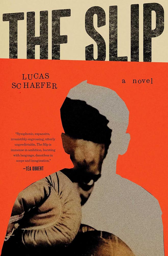
Cover design by Jack Smyth.

There was no question which of these hundred titles would take the title: this heavyweight, brought to us by Dublin-based Jack Smyth. Fellow cover designer Jaya Nicely, in LitHub‘s 2025 list, called it “tactile,” but it’s more than that — it’s downright visceral.

In fact, and indeed in direct contradiction to what I said in the intro, I’m celebrating something trendy: silhouettes are “in” — even overused — but I love this cover because I don’t recall ever seeing one more effectively implemented. Simultaneously hiding around the edge and using it to an advantage, our boxer (presumably the book’s subject, Nathaniel) looks poised to strike.

When combined with type and lines slightly off kilter, use of a fantastic orange, and aging and grain that ice the cake, this cover has it down.

2025’s Runners-Up
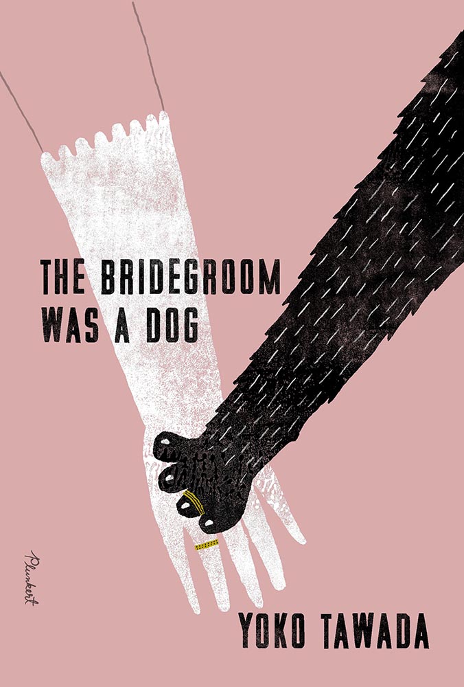
Cover design by Paul Sahre, with illustration by David Plunkert.

A triumph of less-is-more illustration, with color and a title treatment that knows how compliment. The pressed or sprayed, aged-but-not, white and black are magnificent, while the rings stand out as the only use of “gold.” I love that the arm above the glove is just an outline.

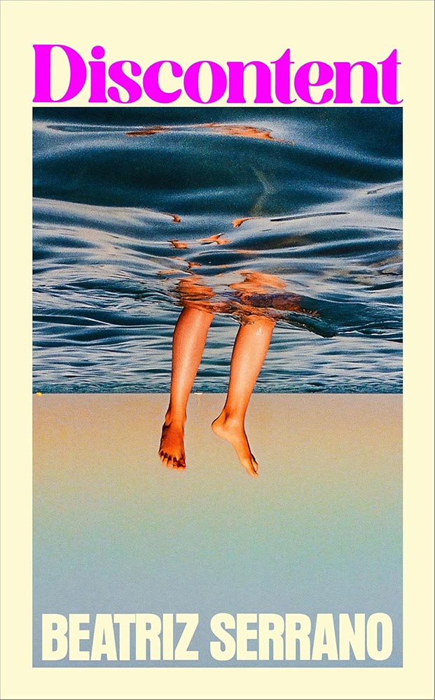
Cover design by Kris Potter; photography by Laurent Tixador.

Photography seems almost passé these days, so its use requires something extra — here served up in spades. On the one hand, I want the boats on the horizon to have been removed, but on the other, it highlights the fraud within in a subtle, realize-after-the-fact way that’s awesome.

I have to say, too: this is about fifteen light years beyond the woman-folded-into-the-chair edition, one of those trends that needs to just stop.

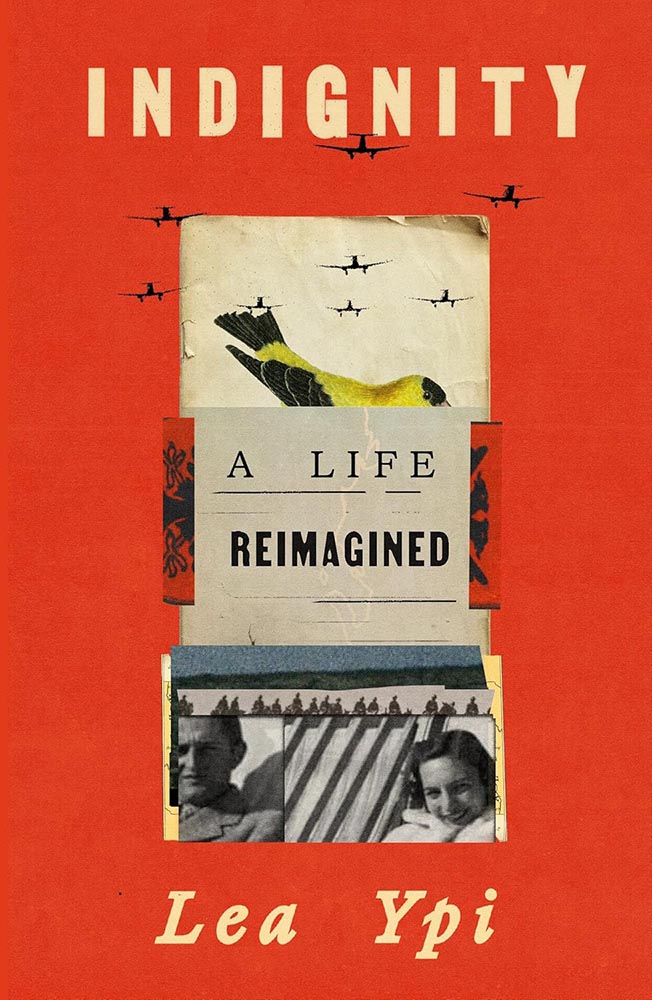
Cover design by Arsh Raziuddin.

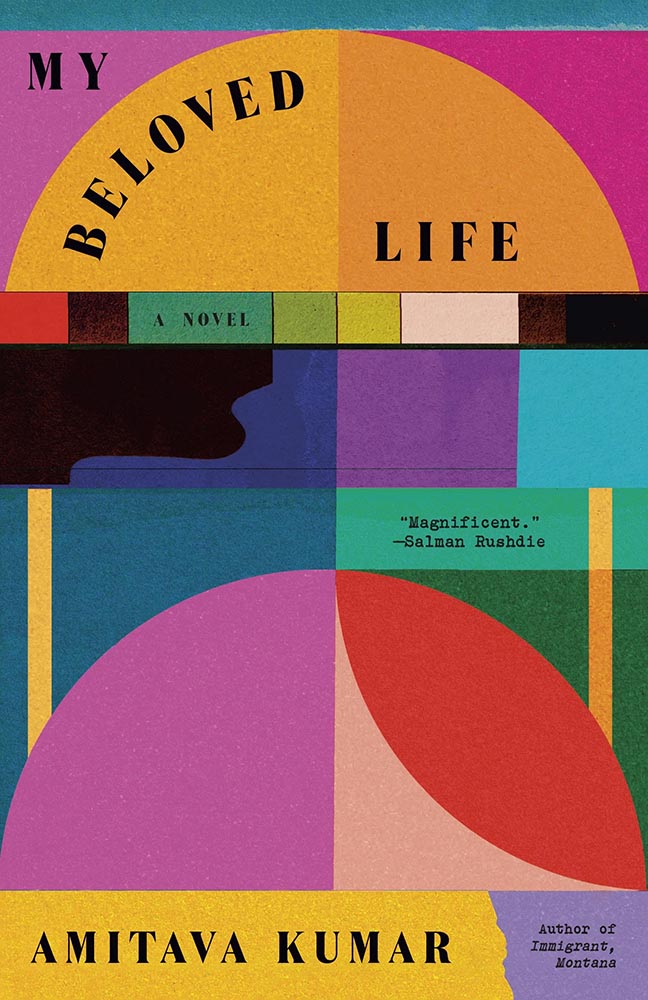
While it compliments Free, from 2022’s list, it’s more: more sophisticated, more of a story, and leaves you with more questions — and more likely that you’ll pick up to get those answers. Bonus points for the folded papers, the Albanian coat of arms, and planes “outside” the collage.

• • •
Other 2025 Favorites, in Alphabetical Order
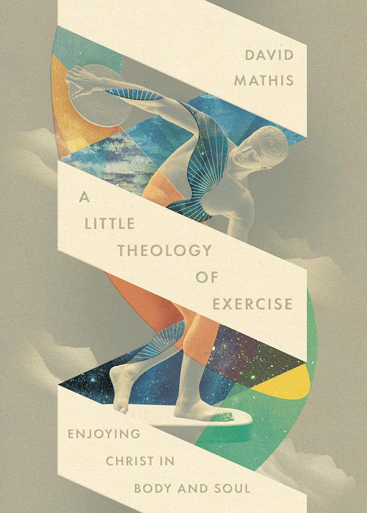
Cover design by David Fassett.

Christian titles so often reach for stereotype — something easily pigeonholed, almost like romance (for instance, unless of course I’m the one stereotyping). It’s often to the detriment of the subject: prematurely dooming the worthy, as it were.

This one very much rises above: the mountain/clouds, the spiral, the mixed and colored illustrations, and titles stacked at an angle (with slight em- or debossing?) are exceptionally well done.

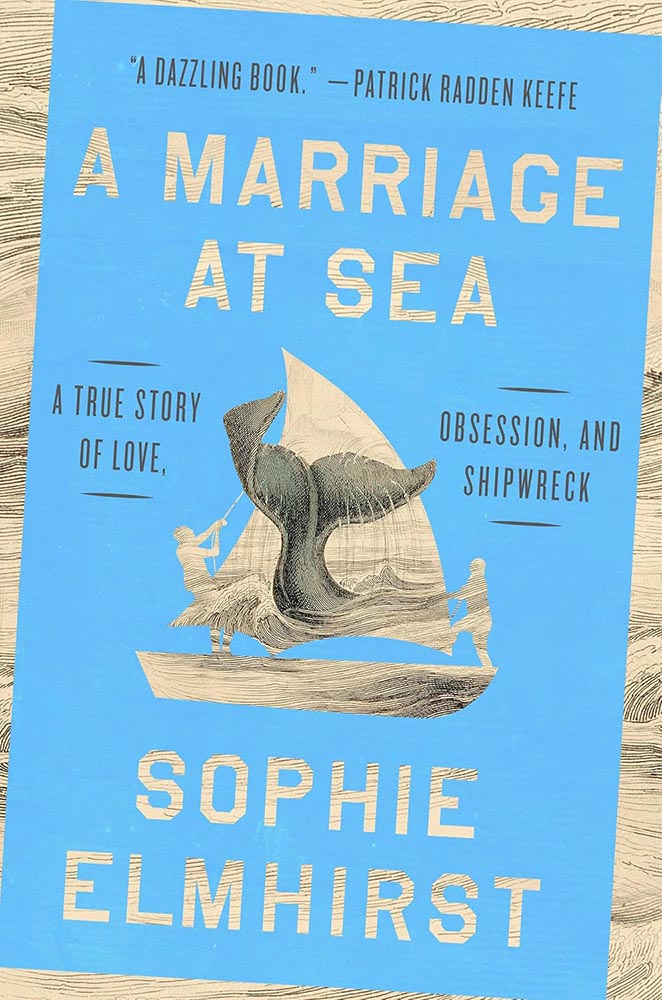
Riverhead/Penguin didn’t return a request for cover design info. Apologies.

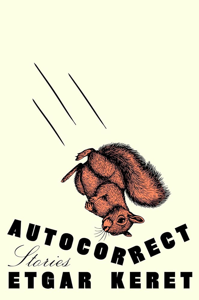
The opposite of sinking beneath the waves: a beautiful pen-and-ink illustration, a color block of sea — or sky — heeling over at just the right angle, with the wonderful knock outs. Then there’s the hint-of-blue tail, the design equivalent of a spinnaker, standing out at the fore of a crowded race. Unmistakably awesome.

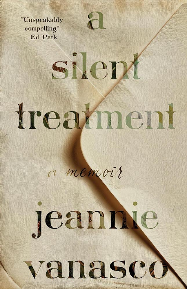
Cover design by Beth Steidle.

Simple without being simplistic, quiet while not quite, this one deserves that satisfying “thunk” that goes with a stamp of approval. (No cancellations allowed.)

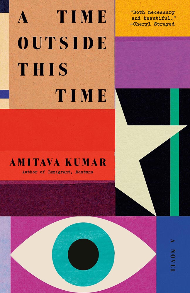
Cover design by Tom Etherington.

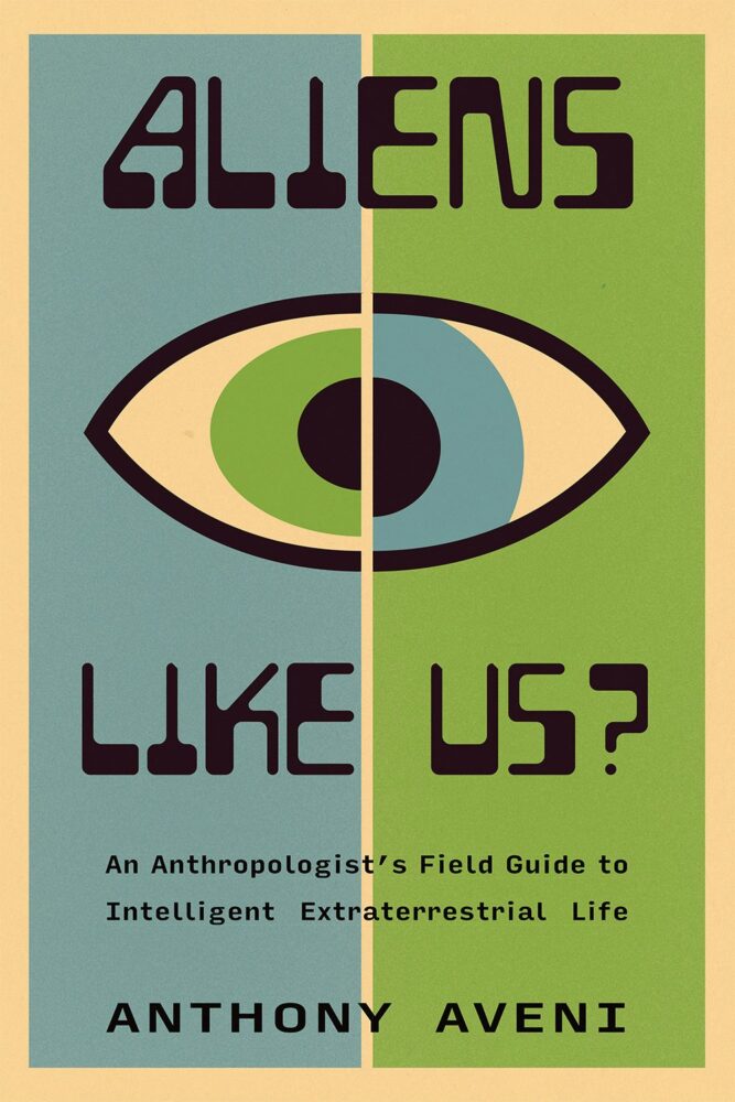
Eye-catching is a cliché too far — but it’s definitely more than just a collection of shapes artfully arranged. Bonus points for the edge between red and star, the bright(er) colors, and title spacing.

Special bonus — continues the family look:

Cover design by Tom Etherington.

Fantastic.

Cover design by Arsh Raziuddin.

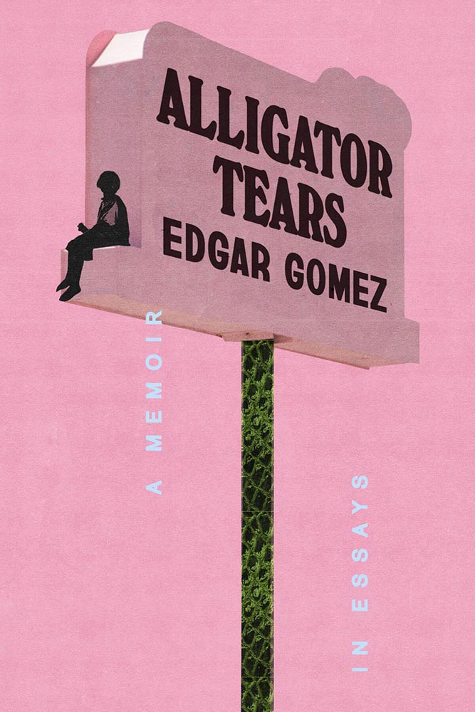
Neither a zig nor zag: the combo of pink, alligator skin, and “tears” is nigh-on perfect.

Algonquin Books didn’t return an inquiry for the cover design info — sorry. (If you know….)

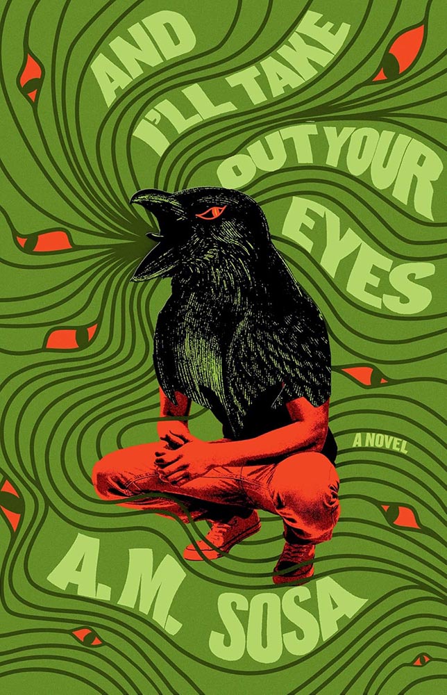
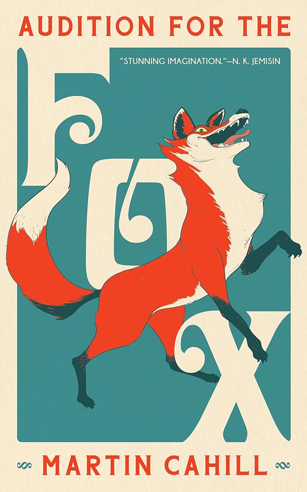
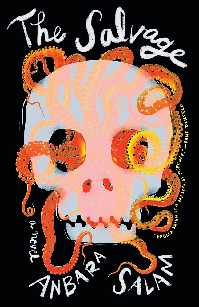
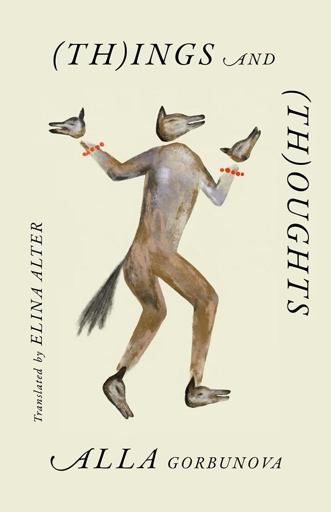
The part-human-part-animal design tool is another of those overused items — except when it’s handled as well as it is here. The eyes are brilliant; the title treatment fun, and the colors standout. The subject, superficially, is not dissimilar to Alligator Tears, above, but the details, the design — and most certainly the text within — celebrate being different.

Cover design by Beth Steidle.

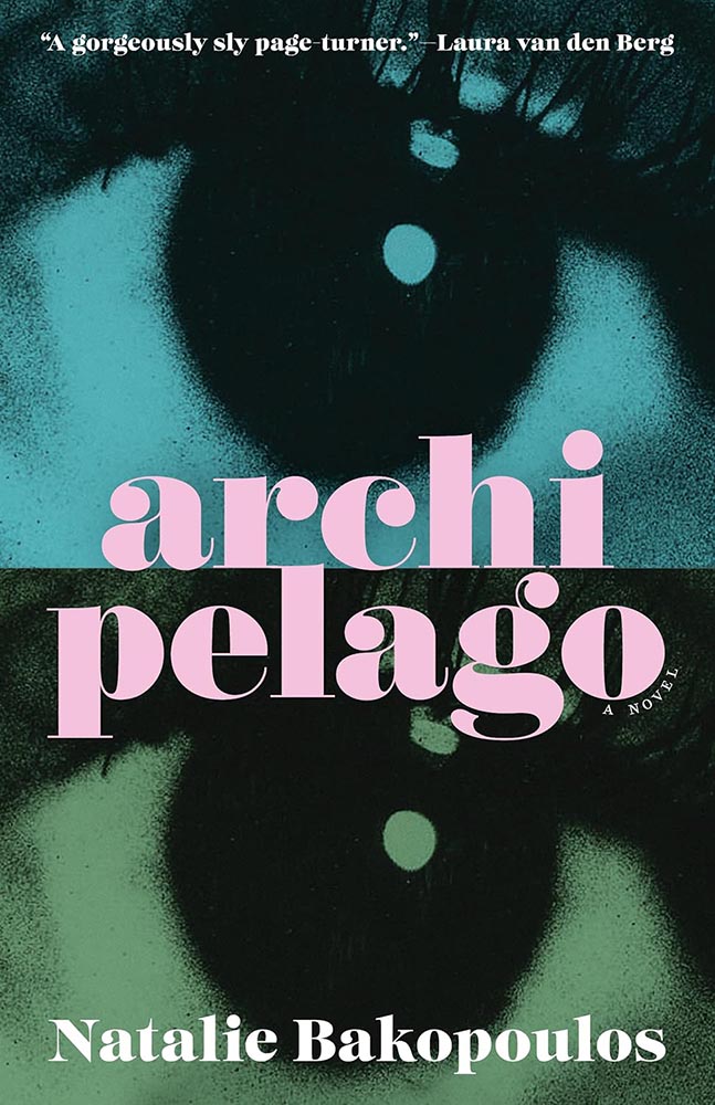
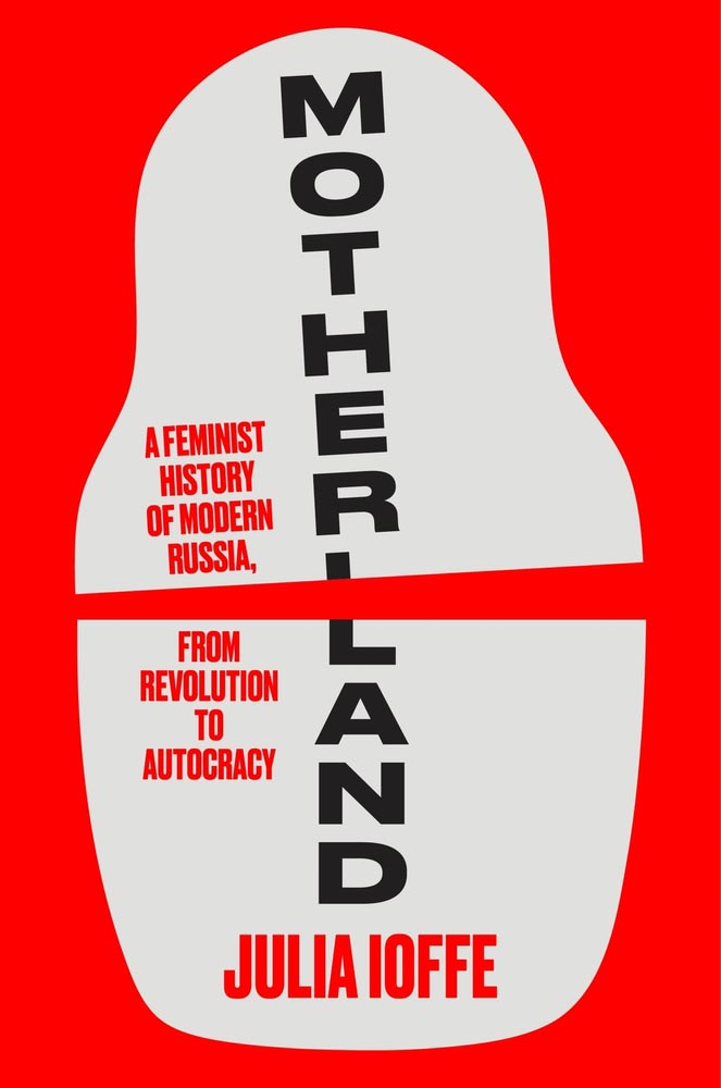
The cover-in-two-parts is another of those items potentially overused, but the repetition and title treatment — the r-l tie-up is fab — take this one to the next level. Bonus points for “a novel,” both less and yet so much more.
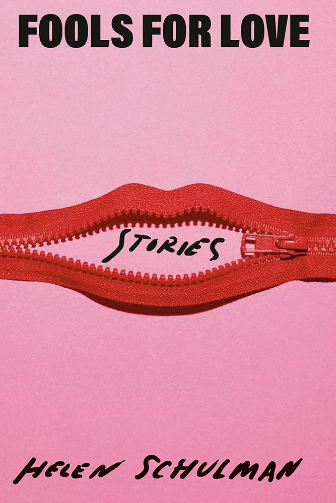
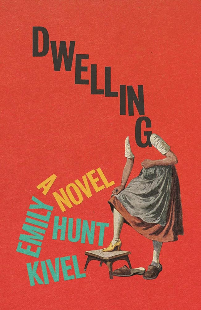
Cover design by Elena Giavaldi.

Another where the pressed/stamped ink works well — but the black on top of the almost-overstyled photo is the winner here, a photo that doesn’t say “South Dakota” in all the right ways.

Cover design and illustration by Elizabeth Story.

Never mind the awesome type, layout, and color — that illustration, or perhaps just the expression, does everything. A winner at first sight.

Cover design by Lauren Peters-Collaer.

Sometimes, it’s possible to be knocked askew awed by a simple idea.

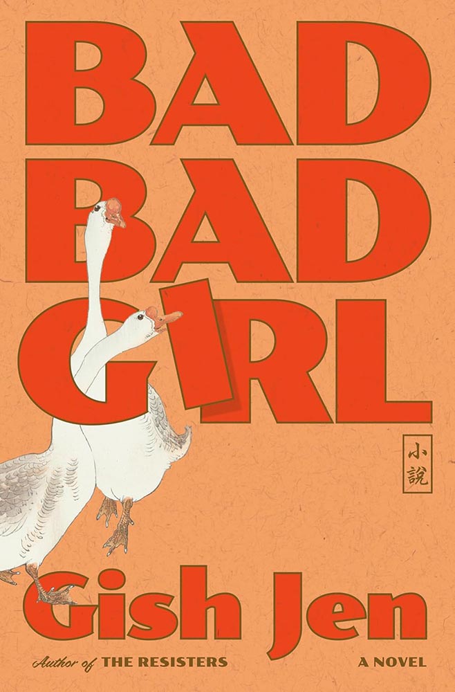
Cover design by Linda Huang.

“My aye!”

(Yeah, yeah, the paper pattern and color, aged red and great brown outlines, type choices, and inclusion of Asian name seal, not to mention the geese, are all awesome too.)

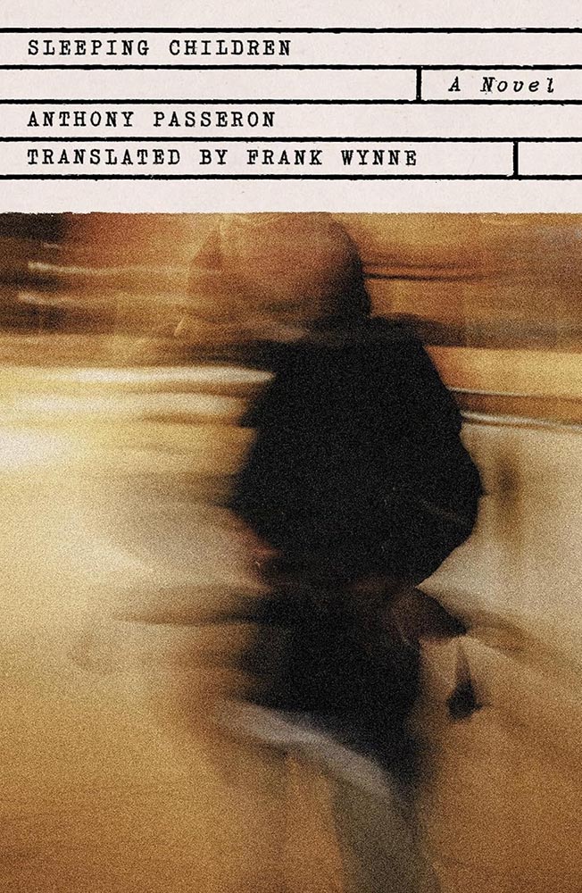
Cover design by Monograph.

One is more — one-color, that is, with a perfect combination of blur and line, “shadow” and light, simplicity and complexity. (Not the only one-color item on this list, I’m happy to see.)

Cover design by Luisa Dias.

From texture to type, photo to illustration, this is a cover that keeps giving the more the viewer keeps looking.

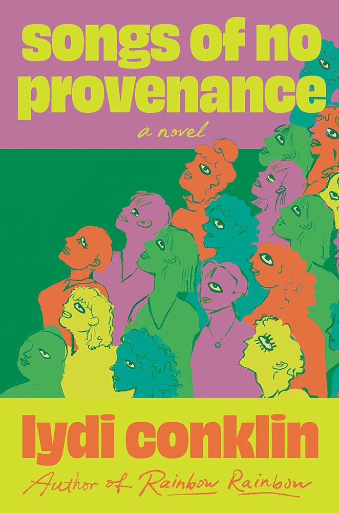
Cover design by Stephanie Ross, with art by Maria Guimaraes.

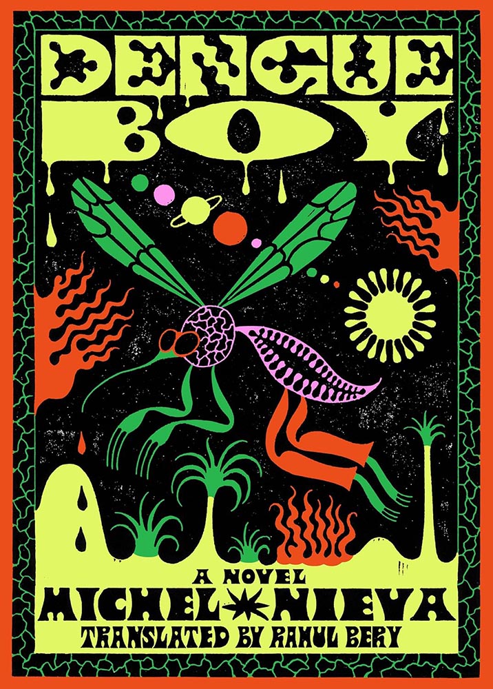
Cool illustration, cool idea — but it’s the use of color that earns this cover a spot here. The bright pink and various greens delight, as does the unusual-but-perfect background box for the title.

Cover design by Robin Bilardello.

“Guaranteed to augment your … life,” Vi thought.

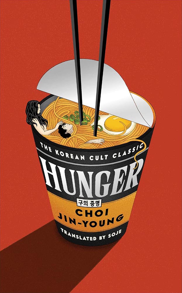
Cover design by Rodrigo Corral Studio.

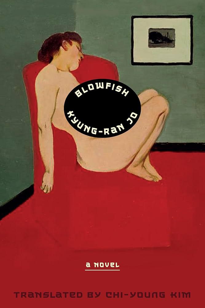
This is based on the Korean edition — the art came with the title. That said, this version uses that ah-ha moment that is title’s holding area, combined with infinitely better type — and gets serious compliments as a result.

Bonus points to the original designer for a painting that’s anything but postmodern.

Cover design and art by Na Kim.

Speaking of paintings, Na Kim’s often take center stage in her cover designs. Here, however, it’s everything. Fantastic!

Cover design by Thoman Colligan.

The two-pane cover gets overdone, no question, but like others on this list that rise above a trend, this cover triumphs in complimentary colors, type treatments, and spacing. Somehow soothing and attention-getting — an accomplishment.

Cover art by Scott Mescudi.

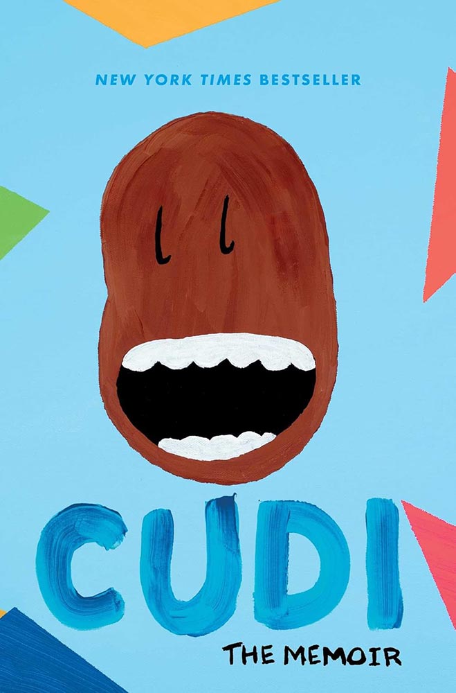
Every time one zoomed out to look at the collected — every single time — this persevered. Survived. Stayed. And then became incredibly successful.
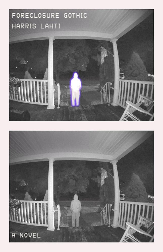
(The cover, too.)

Cover design by Josh Durham.
Pictures running in time, complimented by the vertical title. (Rare and attention-demanding use of duotone here, too — nice.) Bonus points for the title and other text being subtly different colors.

Cover design by Adriana Tonello and Frances Digiovanni, Rodrigo Corral Studio. Illustration by Sophy Hollington.

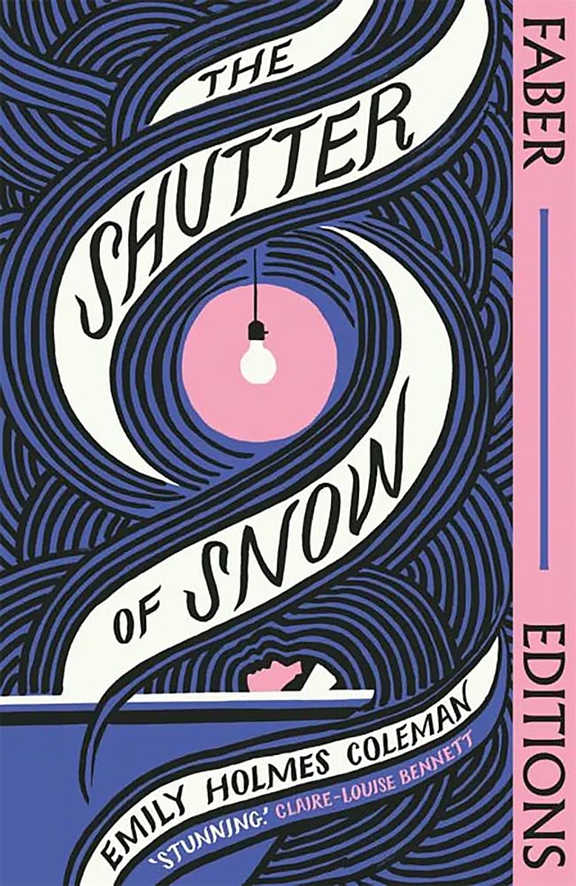
Letterpress or inkblot? When it’s as much eye candy as this, do you care?

Cover design by Na Kim.

The contrast to Na’s Brother Brontë cover, above, couldn’t be more stark — yet this one, in its … well, stark simplicity, is no less accomplished. Work that stands out, from one of the standouts.

Cover design by Chris Bentham.

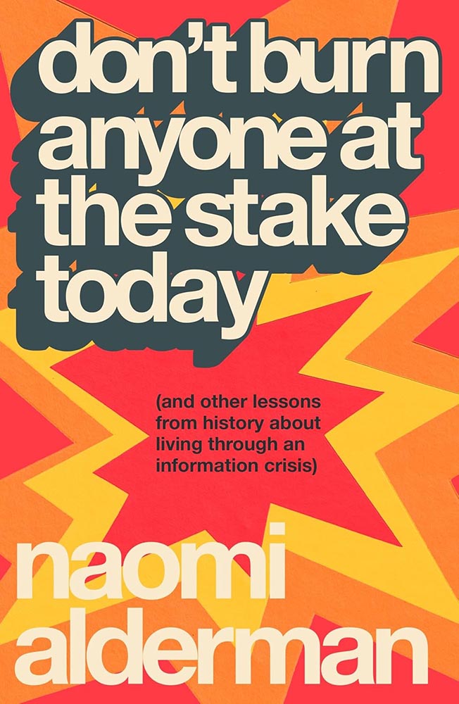
Retro-tastic burst of style that takes something ostensibly text-only to another level.
Parenthetically, the author argues that we’re in the third “information crisis,” the first being invention of writing and the second the invention of the printing press. We survived those, maybe we can survive this…. A UK title I wish were readily available in the States. (The Brit Amazon wants you to buy it together with Cory Doctorow’s Enshittification, by the way. There‘s an afternoon’s reading.)

Cover design by Matt Dorfman.

Old-fashioned illustration, type arranged in a way that’s anything but old-fashioned, and great color choices: successful in a way that suggests simple in one of those “effortless ease” ways. (Think “Yo-Yo Ma, sawing a big fiddle” kind of thing.)

Cover design by Eli Mock.

“Missle Command meets The New York Times,” you say, in an effort to describe this design to someone who hasn’t seen it — something guaranteed to get a laugh. But here it is, in all its glory.

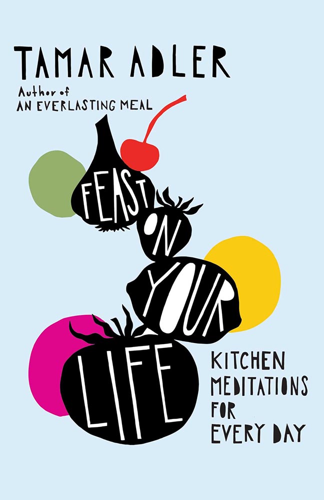
Cover design by Jaya Miceli, with art by Anna Brones.

Cookbooks are such a well-trod genre that it’s nearly impossible to break out of the pack and generate something not only truly original but truly excellent: a feast indeed.

Cover design by Jared Oriel.
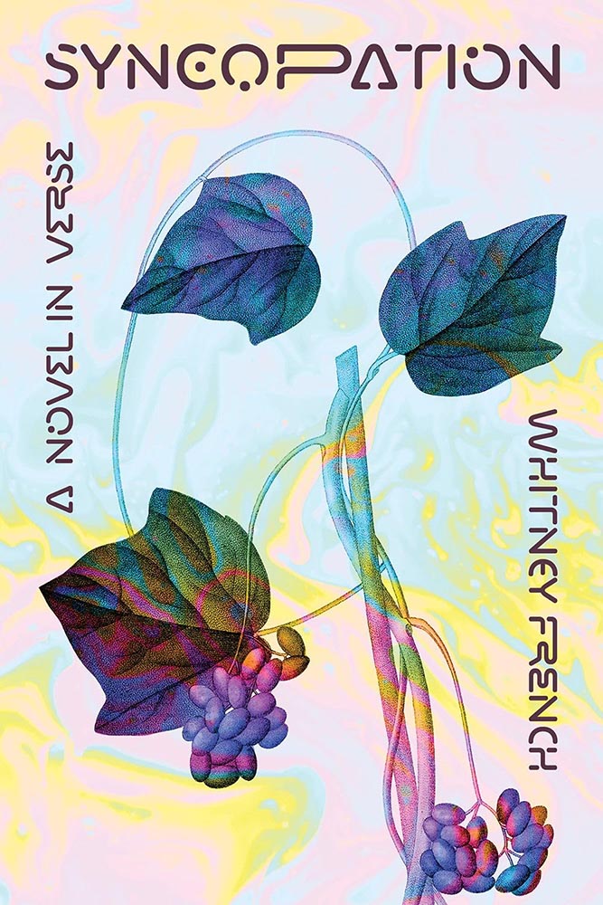
Burnt matches have never made such sweet music.
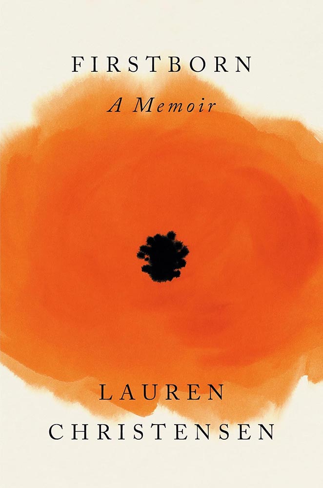
Cover design by Darren Haggar; illustration by Cecilia Caristedt.

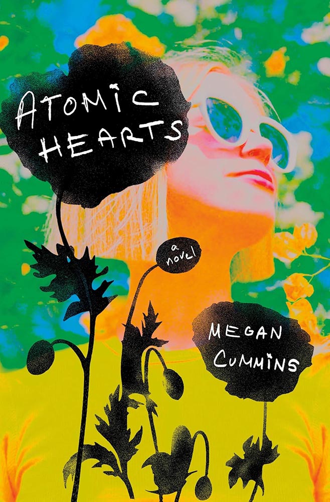
Poppy? Or a view into something deeper?

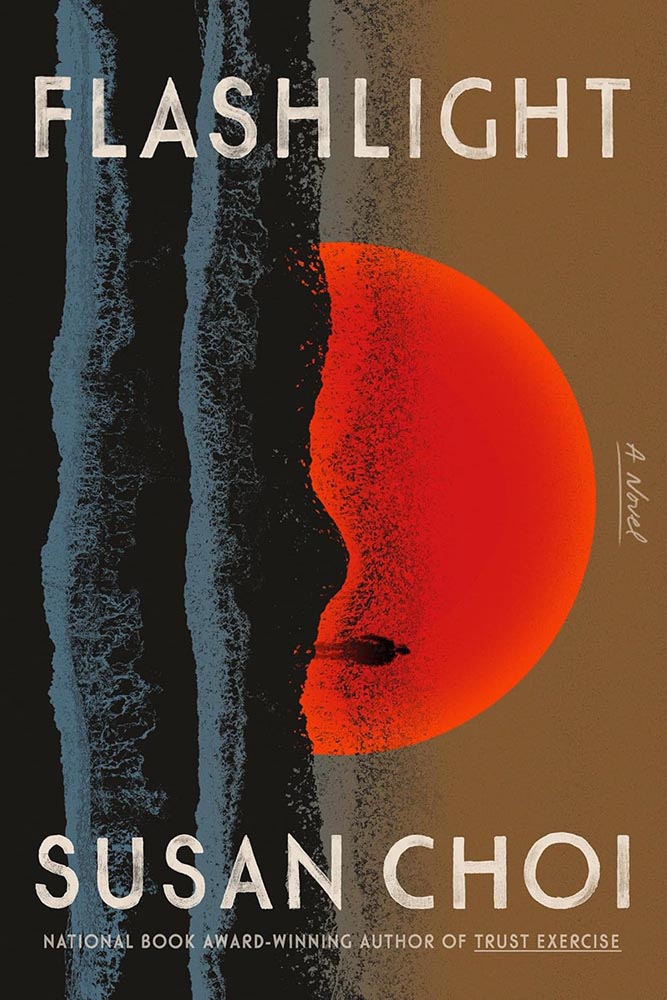
Cover design by June Park.

“What happens when your world goes sideways?” this cover — and book — ask. From illustration to style, basically … perfect.

Cover design by Janet Hansen.

Simple, practical, awesome. (“Chef’s kiss” is probably tacky, so I’ll avoid saying that.)

The author’s previous title, Lucky Dogs, was in my 2023 Favorites.

Cover design by Rodrigo Corral and Adriana Tonello.

At first glance, something we see all the time, from image to typestyle. But then it goes on to ring the bell.

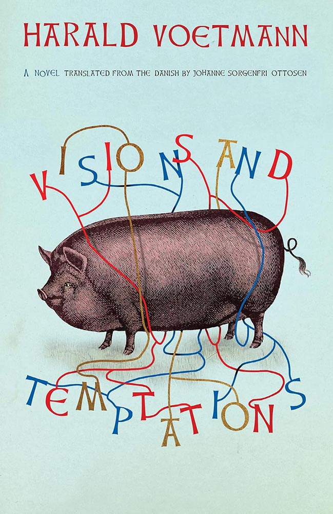
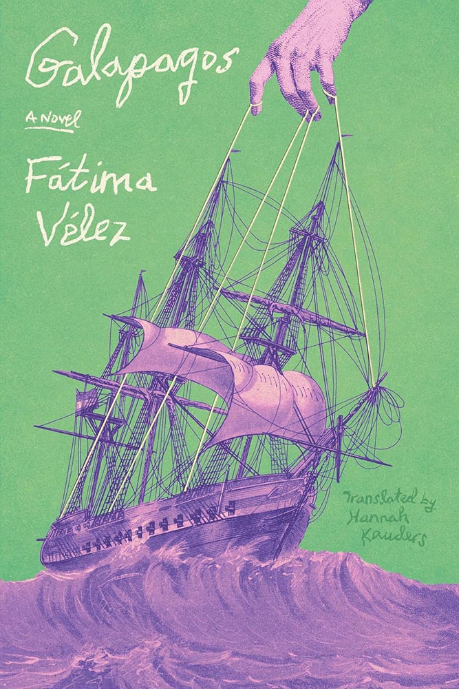
Cover design by Frances Digiovanni, Rodrigo Corral Studios.

The case where something like “a two-color triumph” feels not only cliché but a genuine undersell. The illustration, the color choices, the exquisitely shaky hand lettering — all beyond perfect, and that’s before we start talking about those strings.

And the power that’s pulling on them.

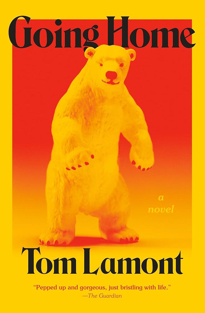
Cover design by Jared Bartman.

The bear feels like something generated by bad AI, or even a suit; as it turns out, we don’t care. Bright, funny, and fun in just the right way. (I do wish they’d kept the single quotes proper English uses.)

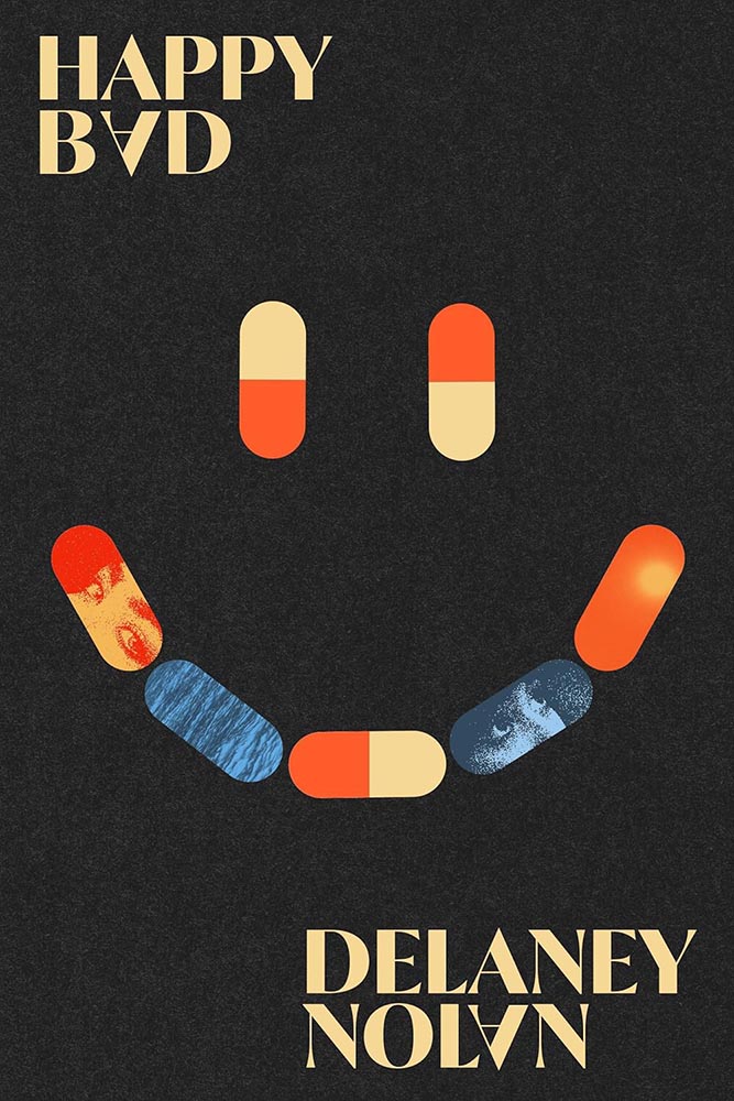
Cover design by Adriana Tonello.

On the one hand, the opposite of “bright, funny and fun” — and yet, one the other, somehow, not.

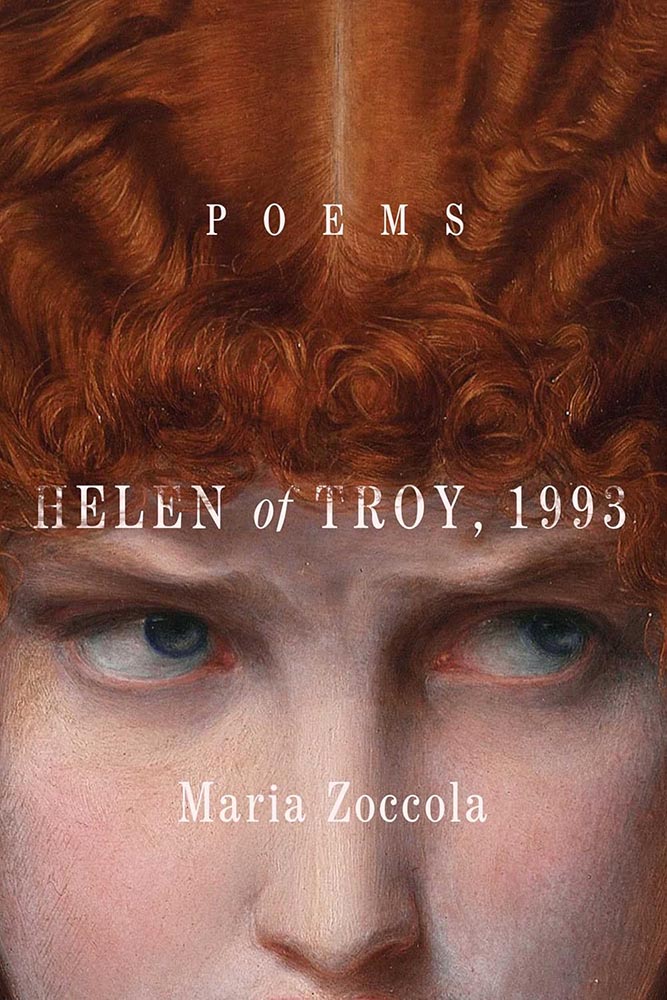
Cover design by Maddy Angstreich.

I swore, possibly in public, that cropped classical paintings is something we should move on from in book design.

Clearly, I was wrong.

Cover design and illustration by Micaela Alcaino.

One of the few times in recent memory that something so original was so funny, so satisfying, and be such a standout design … on any shelf.

(One of those covers that would work well as a print, I think.)

Cover design by Anna Morrison.

The triumph of the simple.

Cover design by Keith Kayes, with art by Jose David Morales.

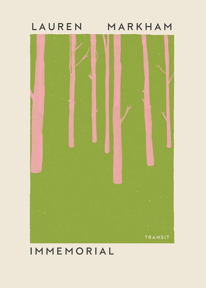
“Sometimes a new author will sidle up and whisper in your ear, and sometimes she’ll grab you by the neck,” one of this book’s blurbs reads. The design of Immemorial, above, is the former. This design is very much the latter — completely and delightfully.

Ballantine’s contact page is a 404 error — I kid you not — so the designer remains anonymous.

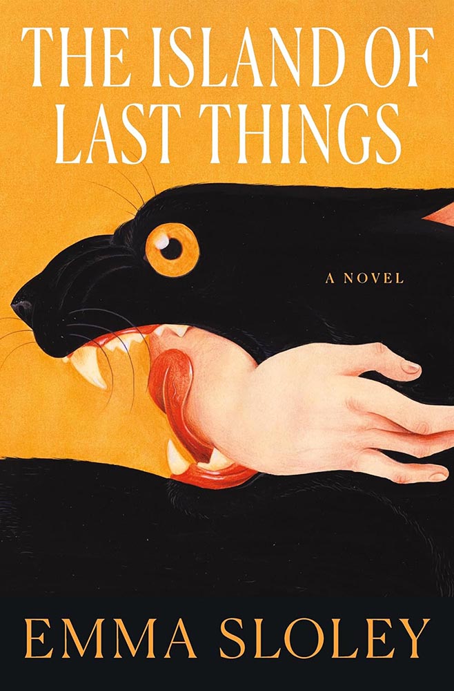
Power, grace, and color — and, of course, the title treatment. A cover that was never in danger of losing its groove. (Bonus points for the pink “earring.”)

Cover design by Matt Dorfman.

Simplicity can mask death depth.

Special bonus — related brilliance, from 2022:

Cover design by Matt Dorfman.
Cover design by Nick Misani.

Illustration and lettering triumph for this classic title, slightly reminiscent of the Farmer’s Almanac I remember from my youth (in the best possible way), with appropriately-English “characters” for the UK edition.

Cover design by Katy Homans.

I mentioned above that for photographs to work today, they have to have that something that grabs and won’t let go. This one does.

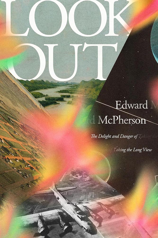
Cover design by Arsh Raziuddin.

Next-level collection of long views together with and simultaneously separated with brilliant use color. Bonus points for the repetition in author and subtitle.

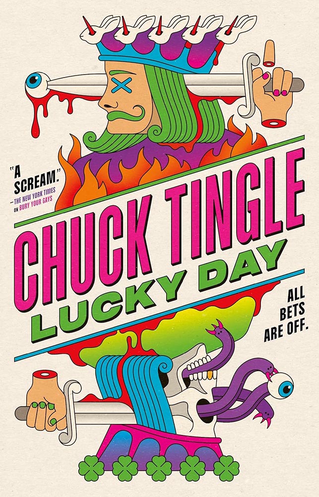
Cover design by La Boca.

Gets the award for “most zany,” in the best possible way: as the NYT says, “a scream.”

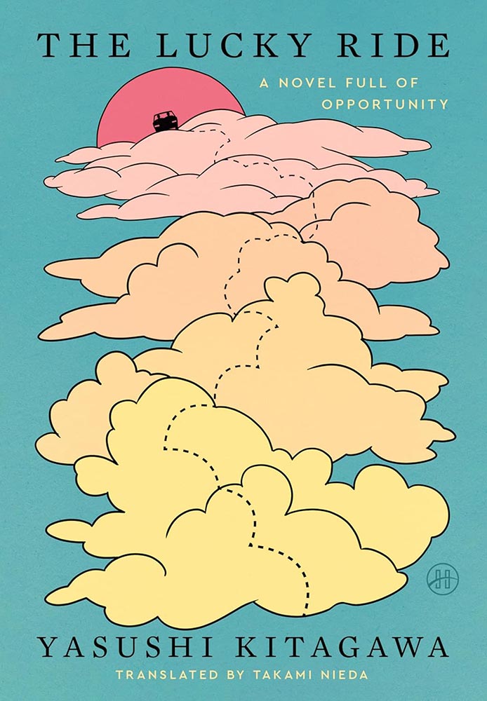
Cover design by Stephen Brayda.

Speaking of awards, let’s have one for “soothing.” The dotted path is brilliant and colors awesome. (And while it’s not design, it’s impossible not to appreciate that subtitle.)

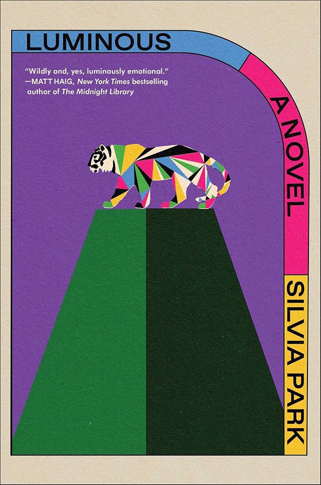
Cover design and art by Alex Merto.

Colorful, original, retro-yet-not — with that tiger. I want to make jokes about how this cover so very well illuminates, but really, I just want to go read it. Awesome.

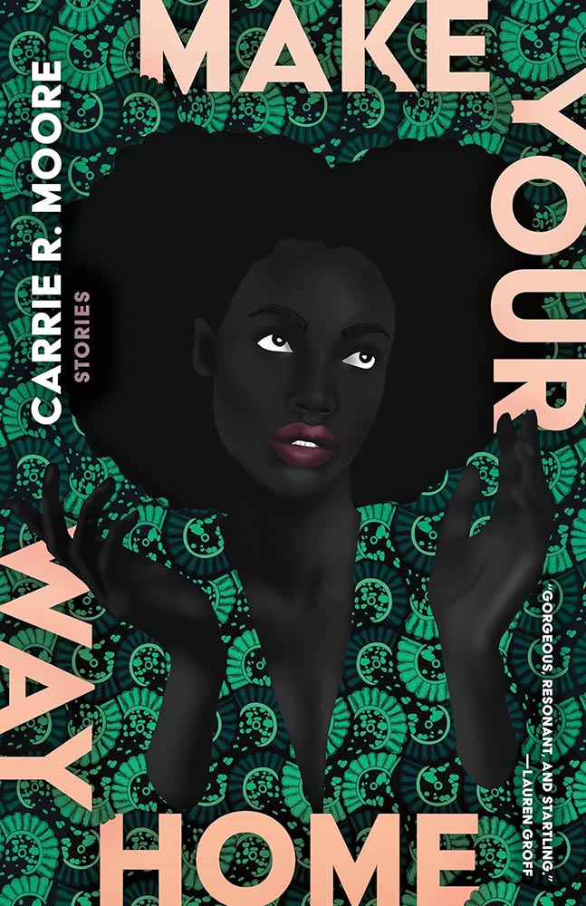
Cover design by Beth Steidle, with art by Uzo Njoku.

I’m not a fan of the text-around-the-edge trend — I get it, it’s a framing device, but, suddenly it was everywhere, too much, all at once.

Once in a while, however, it’s done so well that greatness must be acknowledged. Weaving the title text into the pattern helps, as does, of course, the fantastic art.

Cover design by Tyler Comrie.

I had the UK version of this in last year’s list — but the paperback, out this year, gives me an excuse to not only highlight the US version, but the associated redesigned back titles:

Cover designs by Tyler Comrie.

I do not believe “brilliant” is resorting to cliché.

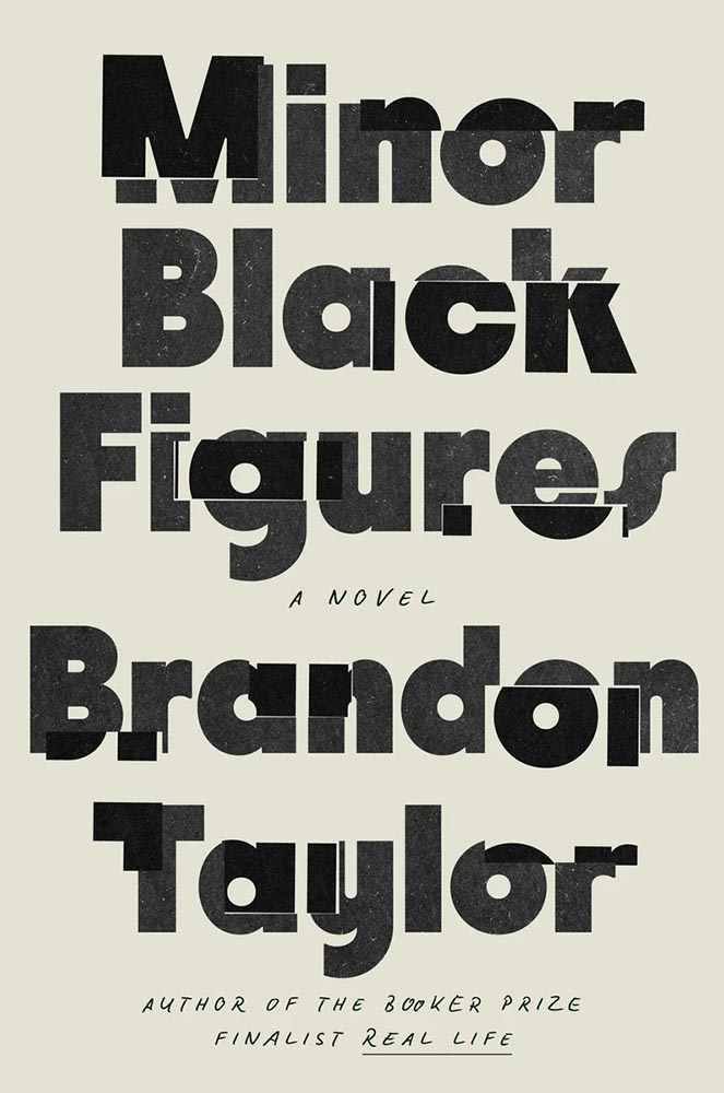
Cover design by Grace Han.

The second one-color cover on this list, whose simplicity belies the story within. (Lauren Peters-Collaer, on LitHub‘s “best of” list, describes it as “fractured,” which I love — along with the “minor Black artist” being named Wyeth.)

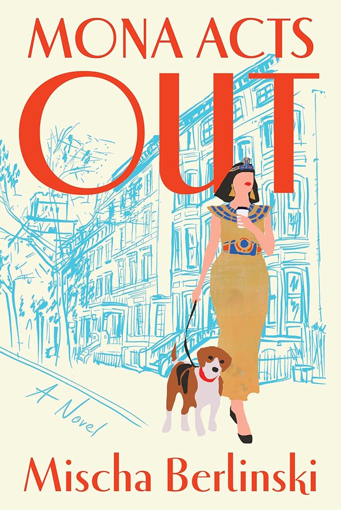
Cover design by Jaya Miceli.

“I forgot the blueprints parsley!”

Awesome stuff: the lips being the only thing on her face, the dog’s expression, the rough sketch style, the way the title stands out, um … okay, everything.

Cover design by Matt Broughton, with art by Katrien de Blauwer.

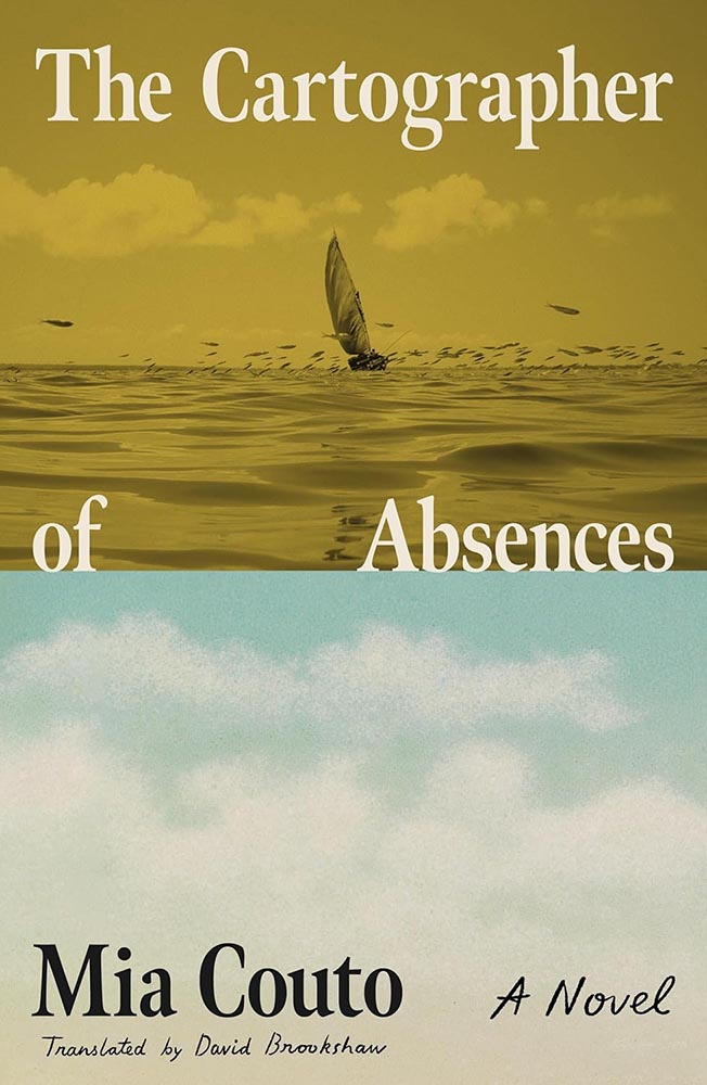
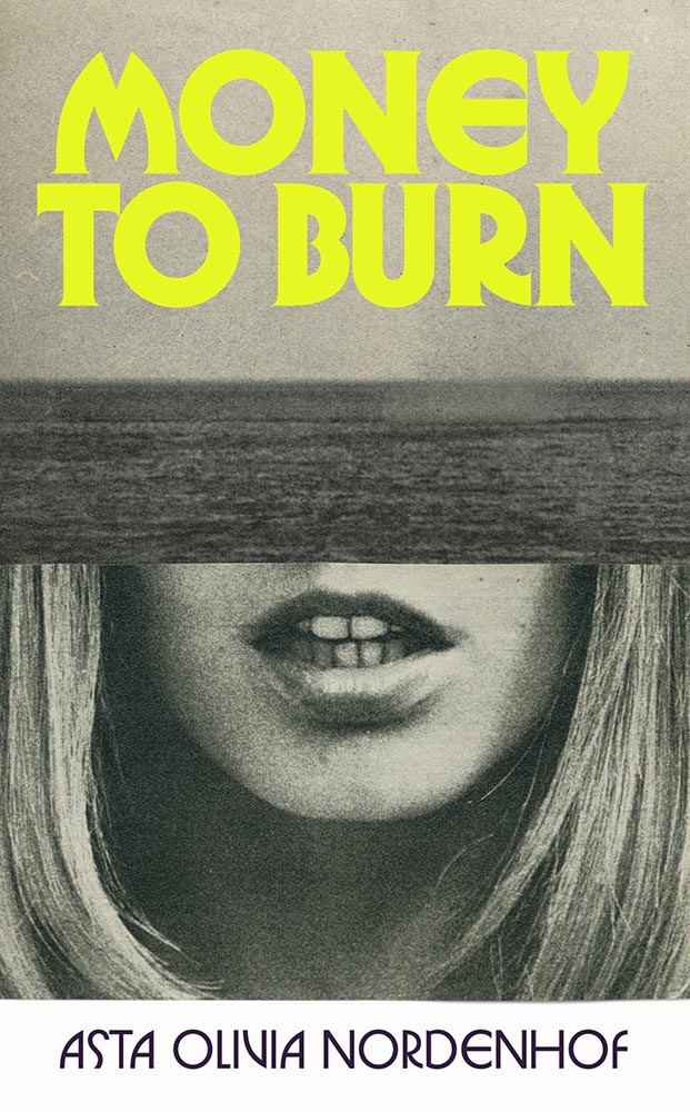
As mentioned, the two-pane cover has become a thing; this one breaks out not only with the black-and-white photos (possibly a subtle duotone) and a bright title in a great typeface (Herbus, by OTT) but cropping on the bottom photo that causes a double-take, and that hint — just a hint — of just-sank in the top photo. Good stuff.

Much stronger without the quotes fouling the water, by the way. The tug-of-war between design and marketing sometimes gets makes ugly.

Cover design by Jenny Volvovski.

Brilliantly simple stand-out: nest and enjoy.

Cover design by Arsh Raziuddin.

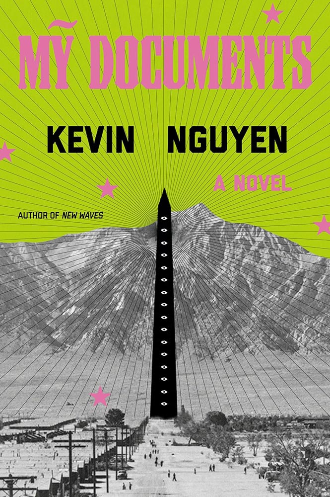
A fantastic example of a photograph plus — that illustration, those lines, that green, those stars. (And, of course, the eyes.)

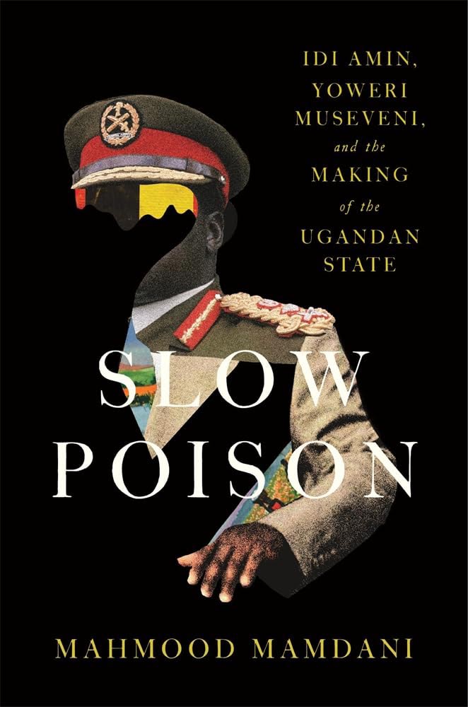
Cover design by Chris Bentham.

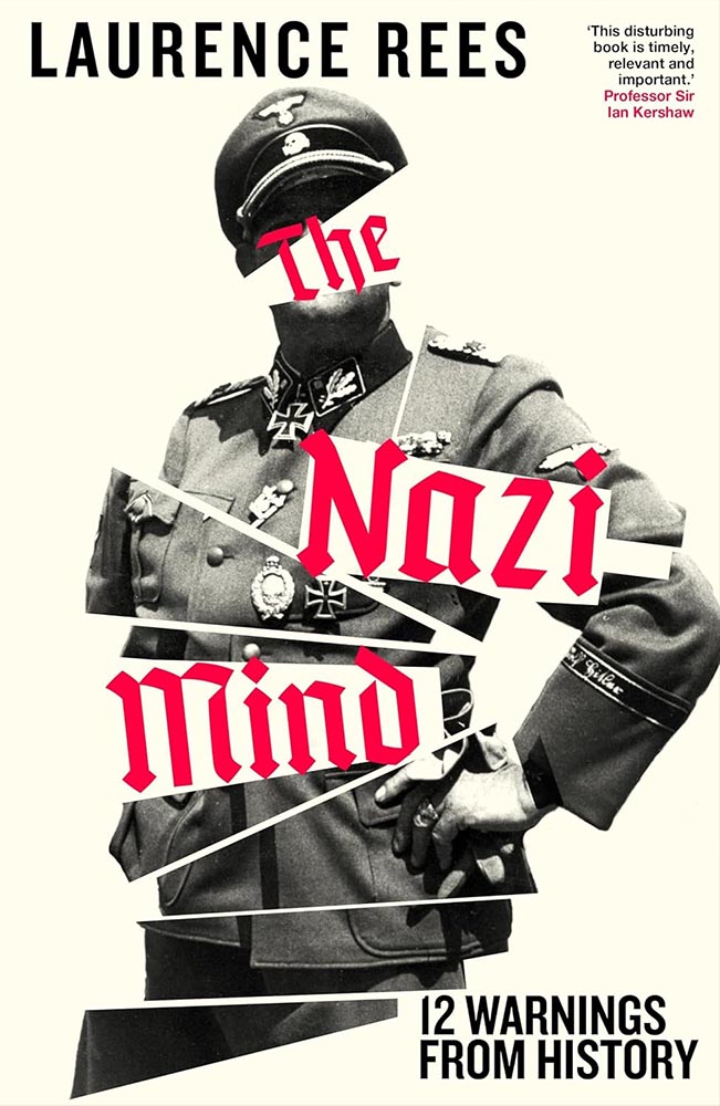
This Penguin/UK cover expresses the arrogance — the cockiness — while bringing forth all of the disjointedness and even kleptocracy. Timely and compelling.

Cover design by Matt Dorfman.

I like the design of this series — the title holding area (literally) is unusual enough to catch attention on today’s shelves socials — but the colors and treatment to this title, specifically, are the most pleasing.

Cover design by Erik Carter.

A brilliant idea, perfectly fulfilling the idea of communicating everything needed with one simple concept. (Alas, since putting this aside — the candidates for this list are gathered throughout the year — it’s gained splashy “ketchup” and what can only be described as “cheese.” Boo.)

Special bonus — the UK version:

Cover design by Jack Smyth.

No less brilliant — yet, as covers from the “right” side of the pond often are, more sophisticated.

Cover design by Janet Hansen, with art by Ahmad Sabbagh.

Okay, let’s revisit the text describing the previous title.

To quote Jason Kottke: “The US cover, like many American things, is somewhat less subtle & elegant.” In this specific instance, however, I have to disagree: sometimes, more is more.

Here, the US version brings a power to the table that US versions often struggle with; a “a few strokes of the pen” can wield enormous strength — often too much — and thought, talent, and consideration are appreciated. This is all of those.

Cover design by Claire Sullivan, with art by Alex Eckman Lawn.

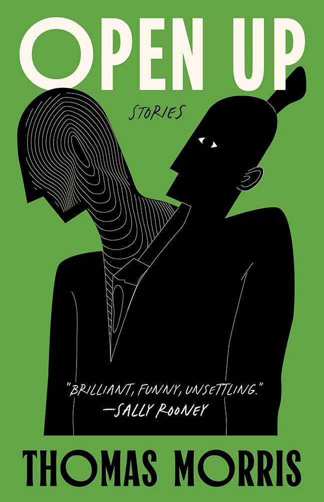
“Not for the faint of heart,” one of the blurbs for this title reads — and applies equally well to the cover, which communicates “lovely” and “grotesque” in equal measure. (The UK version trendily plays up the lighter approach.)

Cover design by Jaya Nicely, with art by Rokas Aleliunas.

A “brilliant, funny, unsettling” illustration, too. (Love the green, by the way.)

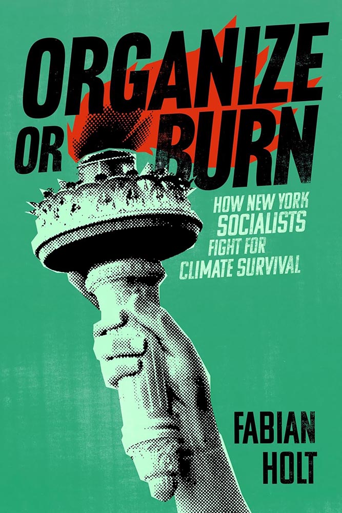
Cover design by Devon Manney.

“From screening to aging, suggestion to content, color to style, this one, put simply, gets everything right,” I said on Spine in October’s University Press Coverage column — but when it was highlighted in October’s Beautifully Briefed, here on Foreword, I added, “One could argue that this cover — and title — could work well even if the word “climate” was removed.”

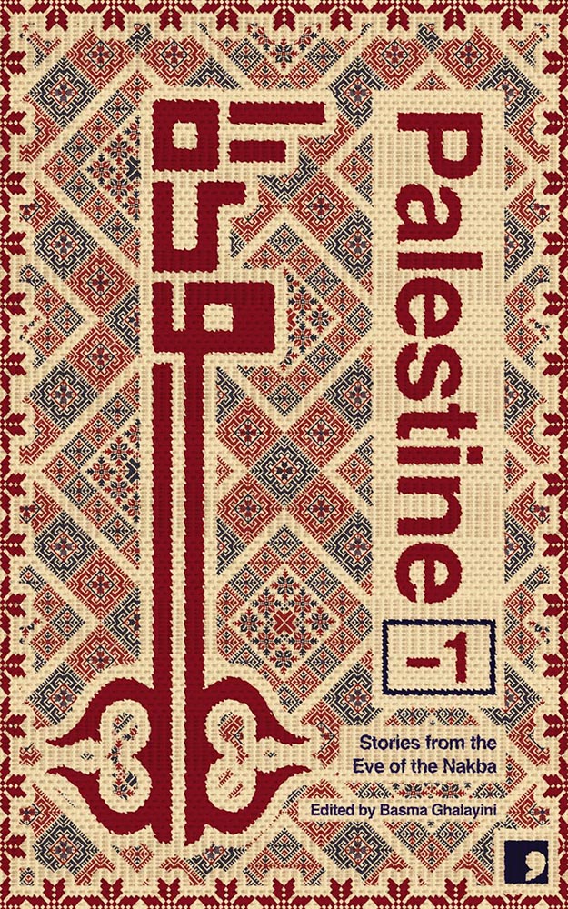
Cover design by David Eckersall.

“Tatreez, meaning ‘embroidery’ in Arabic, is used to refer to the traditional style of embroidery practiced in Palestine and Palestinian diaspora communities. The contemporary form of tatreez is often dated back to the 19th century. The style of cross-stitch embroidery called fallaḥi has been practiced amongst Arab communities in the Mediterranean for centuries,” Wikipedia notes. (NY’s Met has more.)

Beautifully applied.

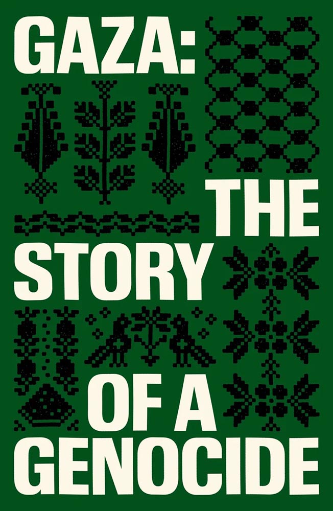
Special bonus — see also:

Cover design by Chantal Jahchan.

Yeah.

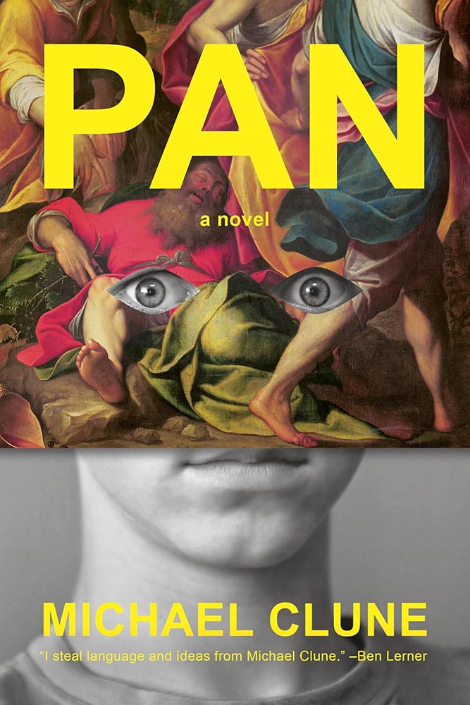
Cover design by Janet Hansen.

Pan, panic, or just surprise? No matter the expression, a delightful way to break all of the rules. (Bonus points for the knee to the nose.)

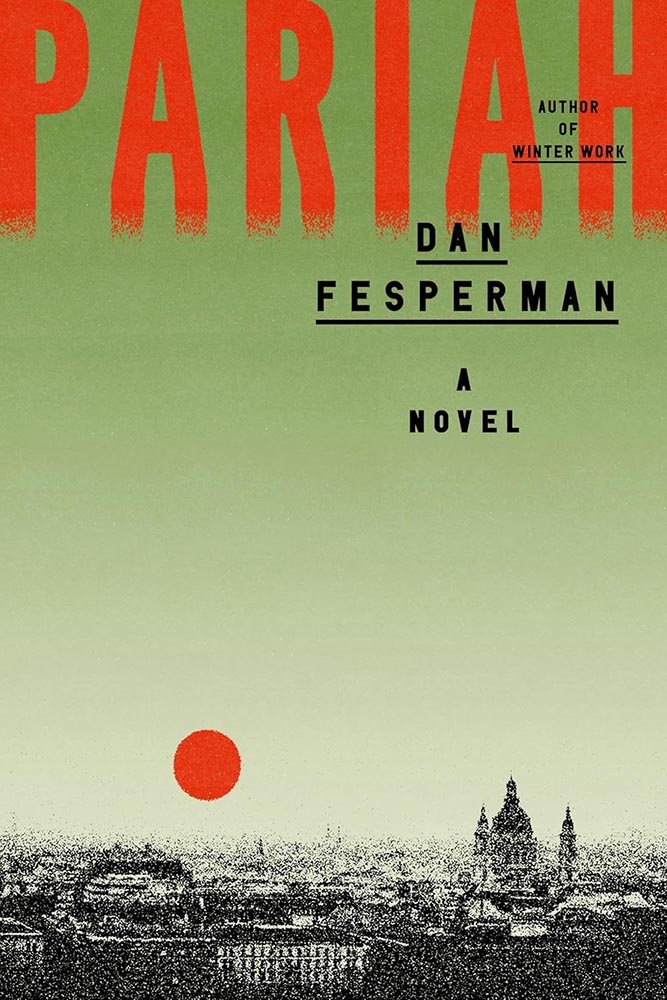
With apologies, I don’t know the designer for this cover.

A disgraced comedian-turned-politician is recruited by the CIA — a grainy prospect that you wouldn’t expect to look like this.

Um, yes.

(“This title is absolutely about Bolrovia,” he added.)

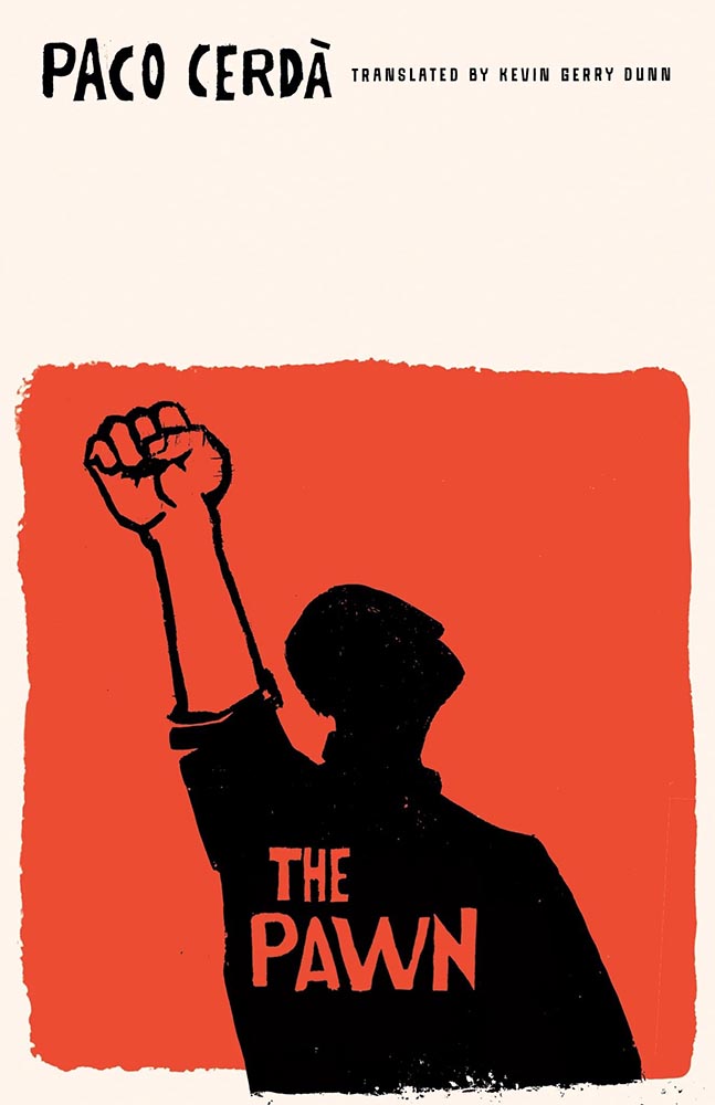
Cover design by Emily Mahon.

Less chess and more Cold War, another where a powerful, simple idea triumphs. (The orange and the hand-lettering deserve special praise, as well.)

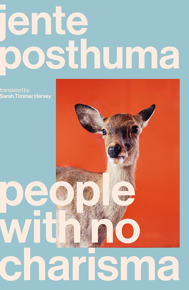
Cover design by Luke Bird.

From expression to ears, brings new delight to deer-in-the … highlights.

Rutgers University Press did not return a request for cover design information.

“From the woodcut hall of fame, we have this,” I wrote in Spine‘s November column.

(I’m sad Rutgers never returns emails, because this artist deserves named credit. If you know….)

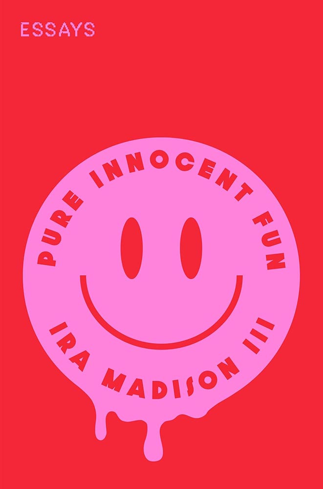
Cover design by Ella Laytham.

That “Essays” is printed in little tiny pink stamps is merely the kicker: awesomeness, defined.

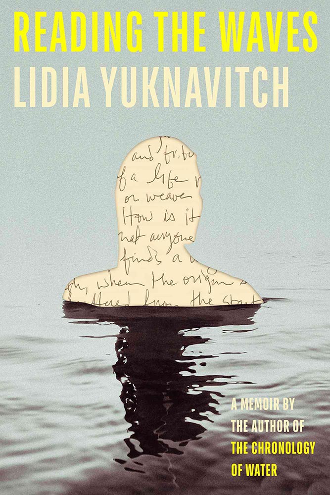
Cover design by Lauren Peters-Collaer.

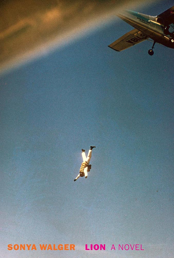
Might I have mentioned that silhouettes are overused, even trendy? And that photographs are passé? Not here.

Like The Slip, this title goes out of its way to do something different, something appreciated, with the cutout. Combined with a great photo and grainy sky, it steps out of line and requires your attention.

Cover design by Lauren Peters-Collaer.

“Deadpan wit” could be used to describe more than the contents: simultaneously simple and simply brilliant. (A cheat here: the green version is the hardcover from 2024; the paperback, from November ’25, is pink — and not quite as good.)

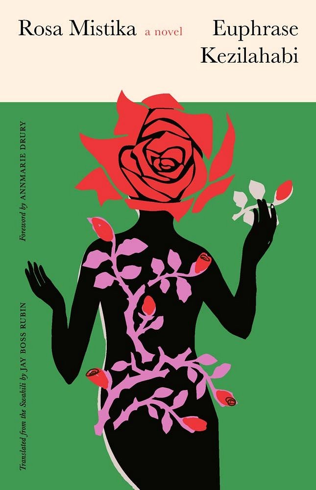
Cover design by Sarah Schulte.

“A controversial Swahili classic — banned on publication — translated into English, published by Yale, and represented with a cover best described as a gift. A design that belongs in every “best of” list,” I said in the inaugural column for Spine.

So added.

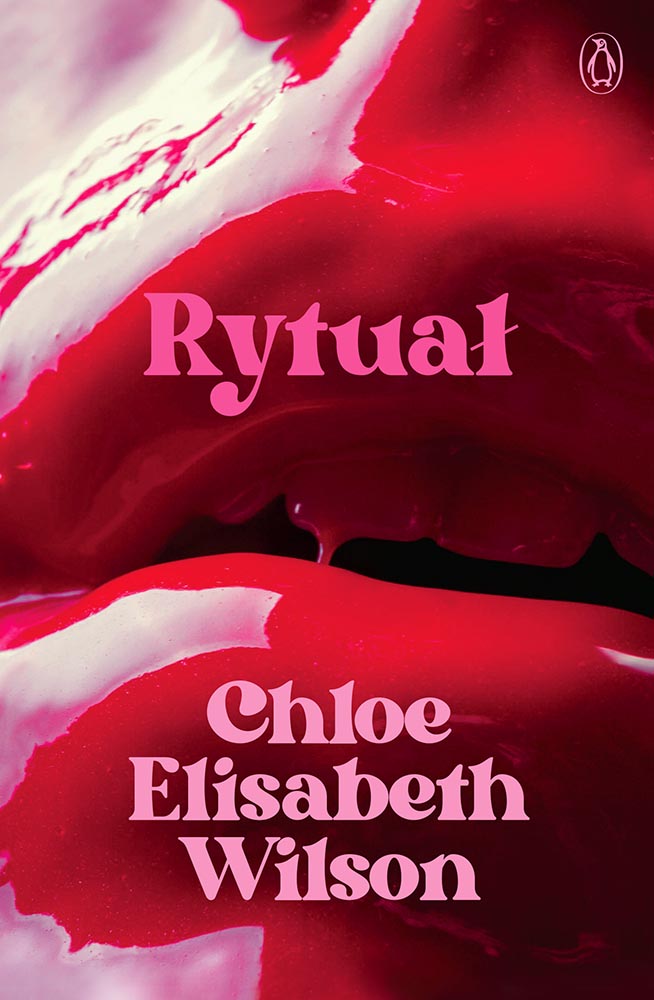
Cover design by Josh Durham.

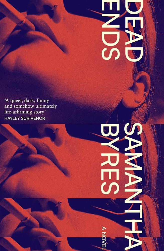
Close-ups of women’s lips is another trend I’ve been avoiding — except when it positively drips with photographic brilliance: millennial pink, taken to the next level. (Once again, a cover measurably better without the detritus rytuałły added by the publicity department.)

Cover design by Beth Steidle.

I don’t know whether Beth did the art for this — probably — but it, together with the title treatment, are just one of those “wow” covers instantly added to the list of year’s best.

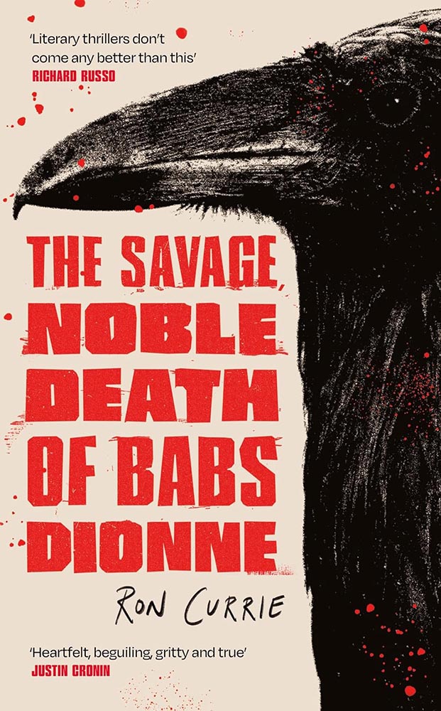
Cover design by Holly Battle.

A “doting grandmother and vicious crime matriarch”: raven mad. This UK cover gets points for illustration style, type style, and, of course, just the right dose of splatter.

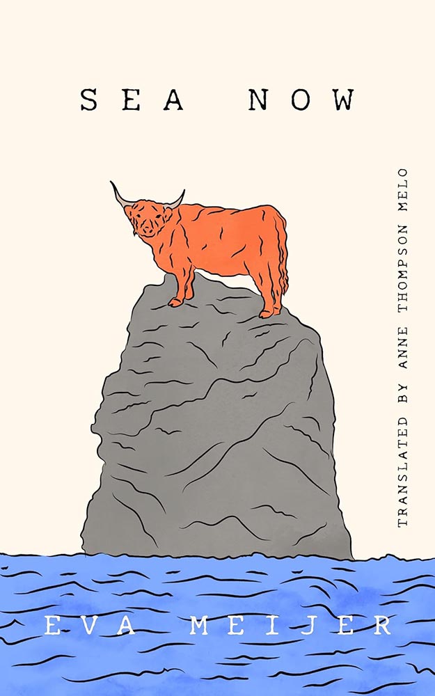
Cover design by Jared Bartman.

“The bull’s expression,” he said.

“The no bulls*** expression of nature,” she retorted.

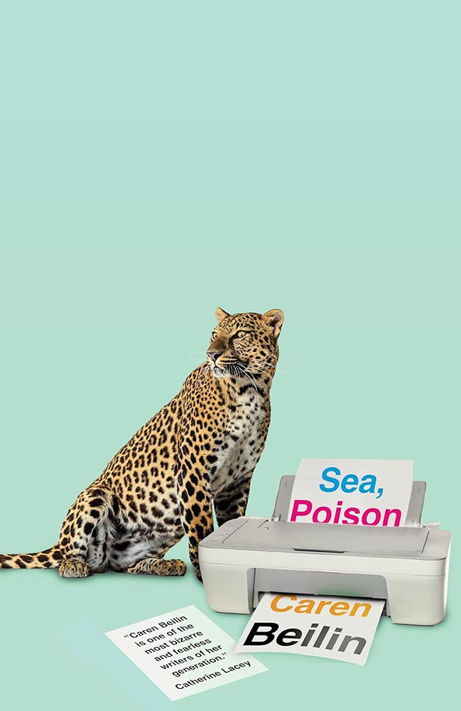
Cover design by Jamie Keener.

Never mind the huge negative space: it’s the eyes. (Okay, it’s also the unlikely collection — collision? — of leopard and printer. Plus the loose page/quote. Plus the background color. But still.)

Cover design by Farina Yasmin.

The US vs. UK “style” has been mentioned above, and here’s a great example of two great covers — both where all eyes are very much on the performer’s … uh, performance — but in remarkably different ways.

Cover design by Julia Connolly; photograph by Sandra Casado.

Even though this kicks serious a**, in this case (and to continue the back-and-forth), I don’t think the US version is any less sophisticated.

Cover design by Rodrigo Corral.

Heroin addiction, AIDS, French doctors, family drama: how do you weave that together in a compelling way? Well, this.

Cover design by Gabriele Wilson; collage by Arsh Raziuddin.

“Fragmented colonialism in Africa, illustrated incredibly well,” I said in October’s Spine column — then went on to do both designers a disservice by failing to include the appropriate credit. Sheesh. (Apologies.)

Cover design by Nicole Caputo.

Beautiful illustration, beautiful type treatment; it’s something that could almost be described as “soothing.”

(With the possible exception of the text within.)

Cover design by Steve Attardo.

An awesome illustration against one of the year’s creamiest backgrounds, yes, but absolutely one of the year’s best title type treatments.

Cover design by Jaya Miceli.

From Spine‘s University Press Week special coverage, November 10–14, brought to you in honor of the event help by the Association of University Presses:

“‘Ebullient’ is used in the description of this title, and quite frankly I can’t think of a better word to describe this text-only treatment: superlative work.

“(In Miceli’s library, this would be shelved with Milk Fed and Joy of Consent instead of Big Swiss and Victorian Psycho — but it’s telling that she’s great at both styles.)”

Special bonus — another from that post:

Cover design by Issac Morris.

“The ayes have it,” I quipped. “Also, both the title type and color choices are out of this world. (Not sorry.)”

Cover design by Jack Smyth.

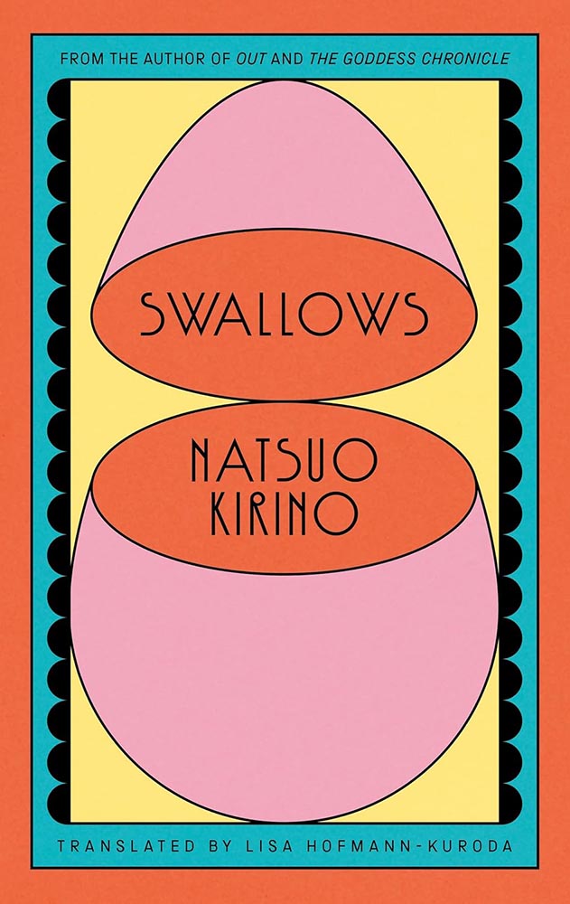
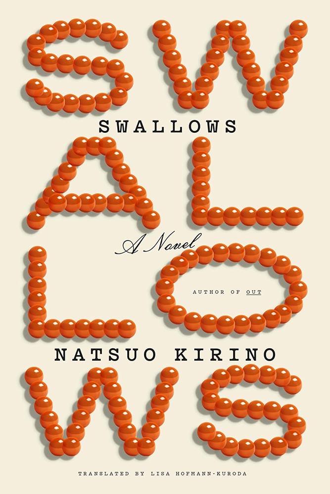
The word “acerbic” is used several times to describe this tile, but the UK cover just isn’t — the type and treatment are wonderful, and the surrogate egg is perfect.

Special bonus — the US version, which received a good deal of praise:

Cover design by Tyler Comrie.
Cover design by Dana Li.

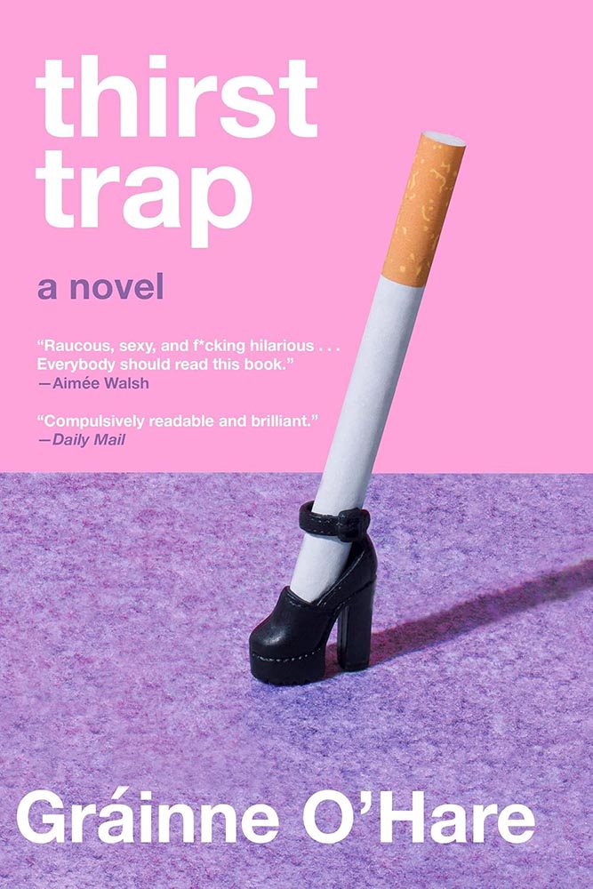
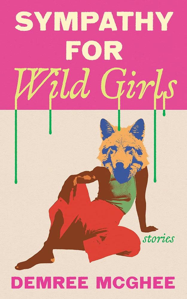
As mentioned on And I’ll Take Out Your Eyes, the part-human, part animal thing could possibly be described as “overdone.”

Here, though, it’s a home run wrapped in a night out: from colors to drips, pose to poise. Awesome.

Cover design by Michel Vrana.

A “decades-long earthquake,” indeed: layered, hopeful, wonderful.

Cover design by Sarah Schulte.

Another text-in-a-square exception to the rule: framing rarely works so well. (Besides, there’s that illustration.)

Cover design by Daisy Bates; photograph by Vanessa McKeown.

Cover photograph of the year, hands down.

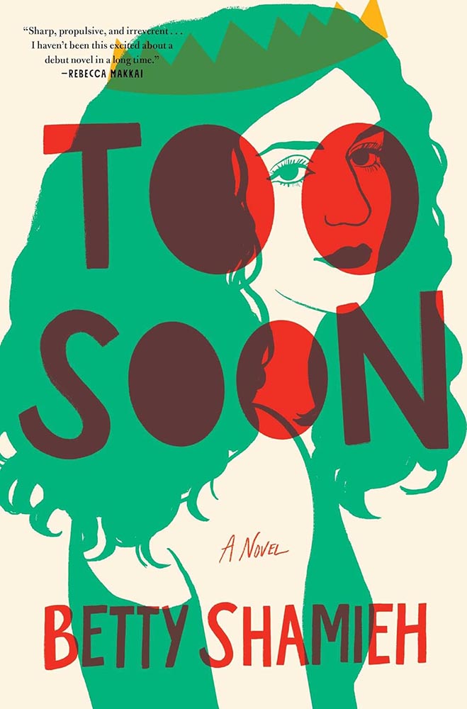
Cover design and illustration by Kimberly Glyder.

“A risqué cross-dressing interpretation of a Shakespeare classic”: I can’t decide if it’s a crown, horns, or teeth. (“Yes,” someone said.)

But it’s the red overprint that steals the show. Fantastic.

Parenthetically, the author is “a founding artistic director of The Semitic Root, a collective that supports innovative theatre cocreated by Arab and Jewish Americans.” How awesome is that?

Cover design by Kelly Hill.

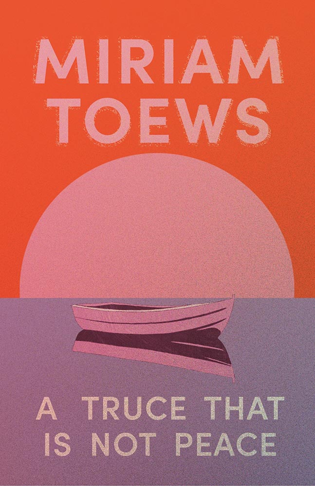
“Canadian text soothes,” some belligerent American said.

(I’d happily have that illustration on my office wall, by the way.)

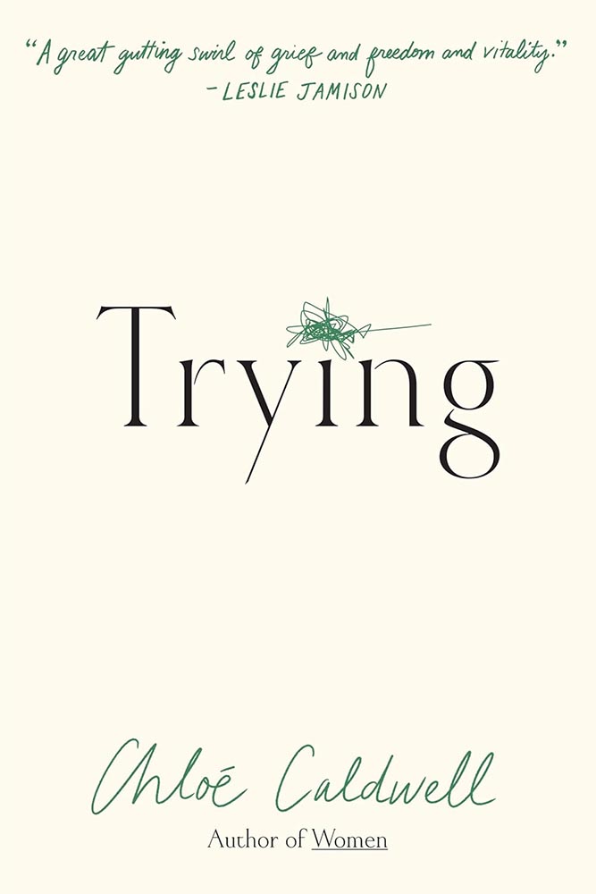
Cover design by Kimberly Glyder.

Never mind anything else: it’s the scribble. (The font’s beautiful, too, honestly.)

I try to reserve “perfect” for occasions that warrant it — this does.

Cover design by Luke Bird.

A geometric, simple triumph of illustration: I suppose if anyone can do a bird well….

(Sorry.)

As an aside, this title is not to be confused with Under the Eye of Big Bird, which is in a whole ’nuther category.

Cover design by Jamie Keenan.

Entangled in wonder. (Also, the background color is super, and the font — Celtic Hand by Dieter Steffmann — is proof that freebies sometimes work beautifully.)

2023’s Sublunar was a interesting design, too.

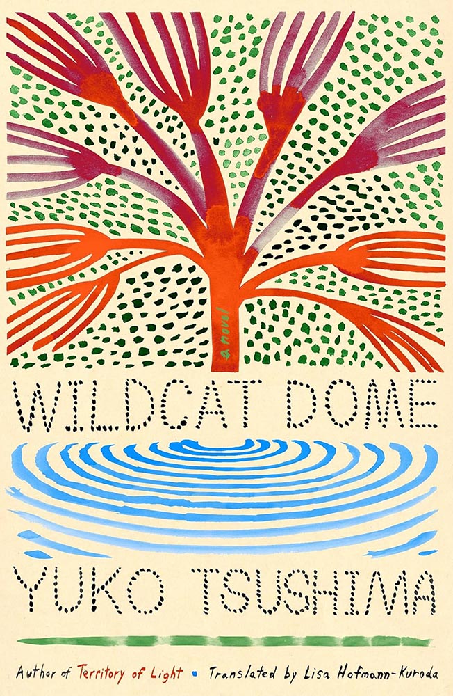
Cover design by Grace Han.

Open the window to yeokmasal: awesomeness awaits.

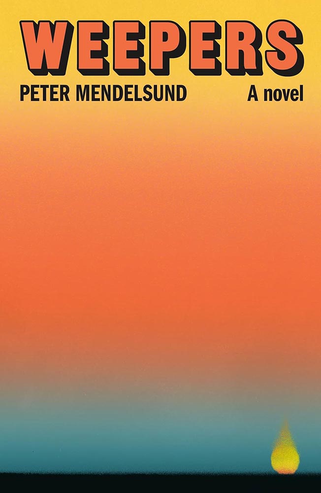
Cover design by Thomas Colligan.

A book about a professional weeper, [whose] “services are sorely needed these days, as the town, the region, the country as a whole has become more or less numb.”

Ummmm….

(The cover’s fantastic, too.)

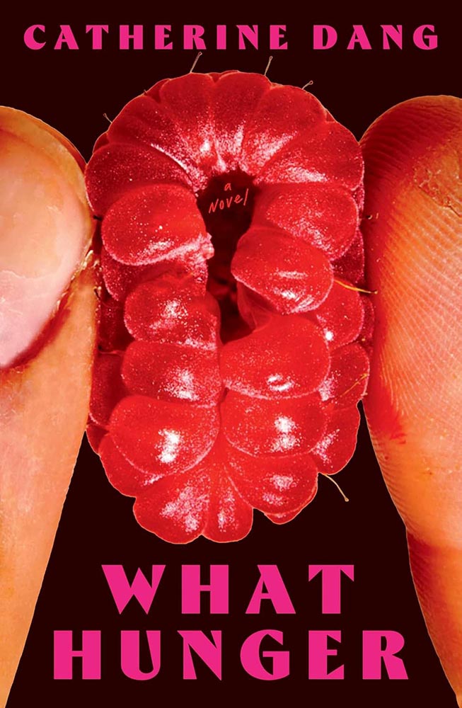
Cover design by Maddy Angstreich; photograph by Bobby Doherty.

Dang, that’s not raw meat being squeezed there. (Nor a fruit, for that matter.)

Cover design by Pablo Delcan.

From June’s Spine column: “19th-century hair styles: the absolutely fantastic world of university press cover design briefs … absolutely nailed here, with pen-and-ink illustrations and aged type handled perfectly. (Great title, too.)”

Cover design by Na Kim.

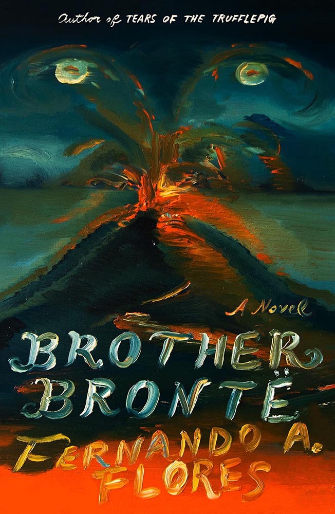
To close out, another painting by Na Kim, as visually arresting as Brother Brontë, above, but 180 degrees in the other direction. (Bonus points for the pointillist lettering.)

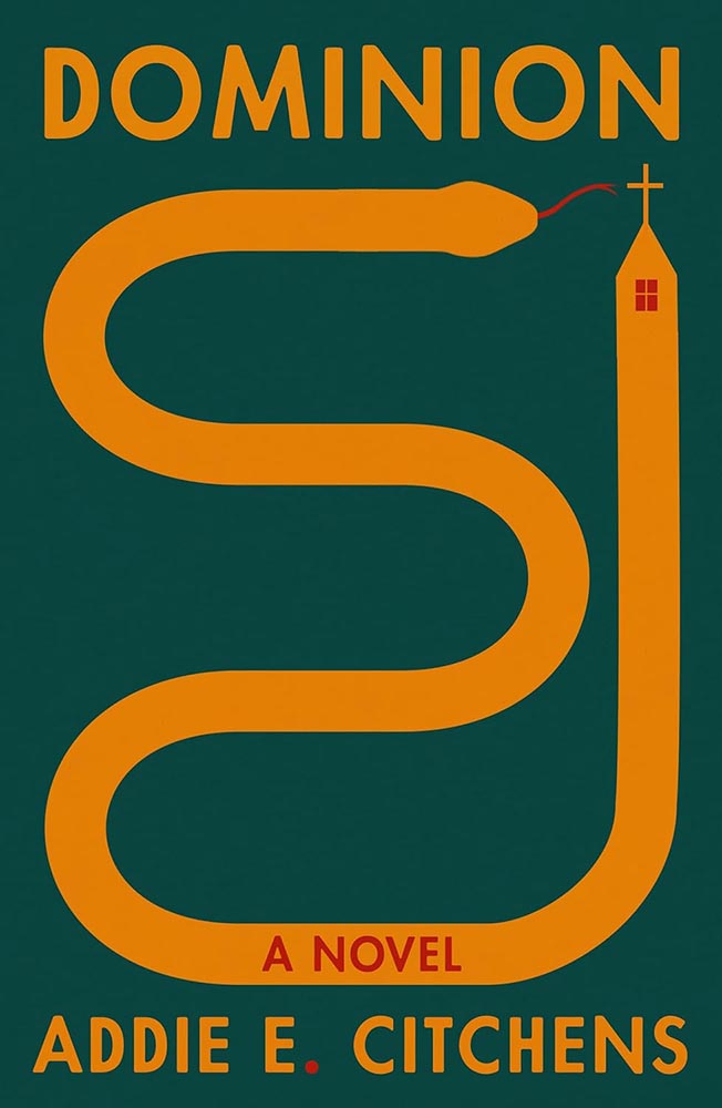
Come to think of it, it’s 180 degrees from Dominion, too. Is it possible to have a 540-degree compass? Na apparently does — awesome.

• • •

2025’s favorites folder contained more than four hundred examples by the end of the year — a hundred more than 2024 — and represented a huge variety of titles, publishers, and design styles. (Significantly different from last year, too — interesting.)

It was a huge task to whittle the selections down; 400 to 300 was relatively easy, 300 to 200 more difficult, and those last hundred involved making hard choices between covers I really liked.

One thing helped: as mentioned in the intro, I worried less this year about highlighting every style, every designer, in every category — given the drama that was 2025, there was, in fact, a smidgen of comfort food involved.

But oh, that comfort food. Michelin starred.

Another help: my column at Spine.2Vyki Hendy, Spine‘s publisher, deserves a special thank you for that opportunity. It’s reminded me of the gems that exist in an area that doesn’t get enough attention — outstanding, often great, book covers I’m more than happy to find the time to celebrate. While I enjoyed casually perusing University Press designs in the past, they didn’t live under the same microscope that they did in starting last June (and will continue to). Adding more University titles is an ongoing bonus, and several of those titles made it into this list; perhaps egotistically, I’d like to think that the exposure those titles received allowed them to make others’ lists, as well, a benefit for all. Nice.

Thank you for taking the time to spend a few minutes here today. I wish you a wonderful, successful, and above all, peaceful 2026. See you soon.

How This List was Compiled

There were fewer sources for titles in 2025 than in years past; the BBC disappeared behind a paywall, the quality of mainstream publishers continues to decline, and those articles I did read seemed to stress trends and “what’s hot” rather than actual quality. Thankfully, there’s still PRINT, Spine, LitHub, The Casual Optimist, and NPR’s Books We Love. There’s also The Guardian, which does pretty well with books; the New Yorker‘s book reviews are outstanding (although rarely centered on their design); and, of course, there’s the New York Times Book Review (likewise, although Matt Dorfman’s best designs article deserves note). If you haven’t already, when you have a moment, please enjoy some of those links— a great many more outstanding examples of book cover creativity await.

  • 1
    Publishers need to remember that not all of their readers select what to read based on influencers, what they see on Facebook, or by doomscrolling Instagram. Some of us are lifelong readers, have hundred or thousands of books, and discover by … reading. Real articles, by real people, on websites with those people’s real names on them. (Or even, occasionally, this thing called paper.)
  • 2
    Vyki Hendy, Spine‘s publisher, deserves a special thank you for that opportunity. It’s reminded me of the gems that exist in an area that doesn’t get enough attention — outstanding, often great, book covers I’m more than happy to find the time to celebrate.

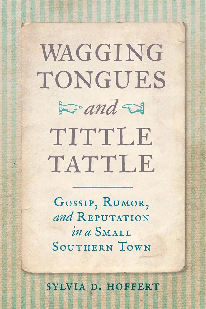
Beautifully Briefed, 25.11: More than Turkey Here

This month, the usual fontastic newness and photographic excellence. and I veer into nostalgia — maybe, perhaps, soapboxing — for the web’s “old days.” Also, for those in the U.S., I hope you had a wonderful Thanksgiving holiday. Pack up your leftovers and settle in.

University Press Coverage on Spine

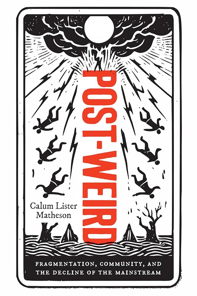
This month’s column has some good stuff — On Gaslighting has been a favorite for a minute, and Post-Weird is pretty much guaranteed to make an appearance in January — but I thought I’d give the first of two shout-outs to the University of Georgia:

Cover design by Erin Kirk.

Check out my regular column at Spine. Meanwhile, keep an eye out for the other UGA mention below.

50, Mega: It’s all Auld Neue
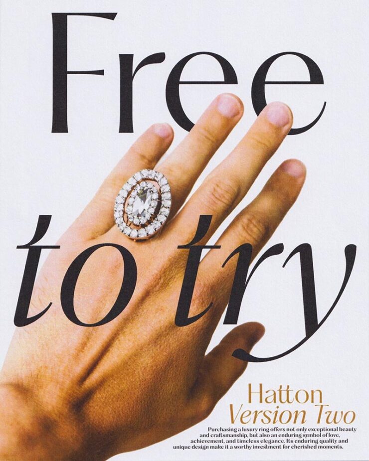
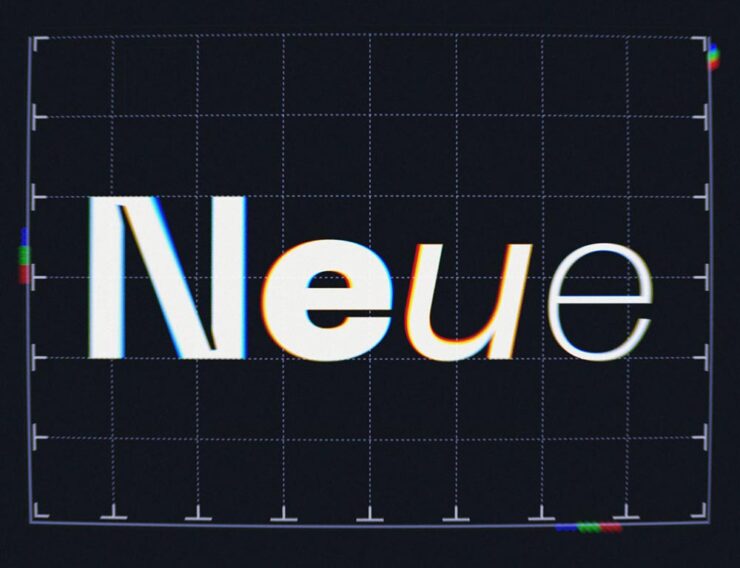
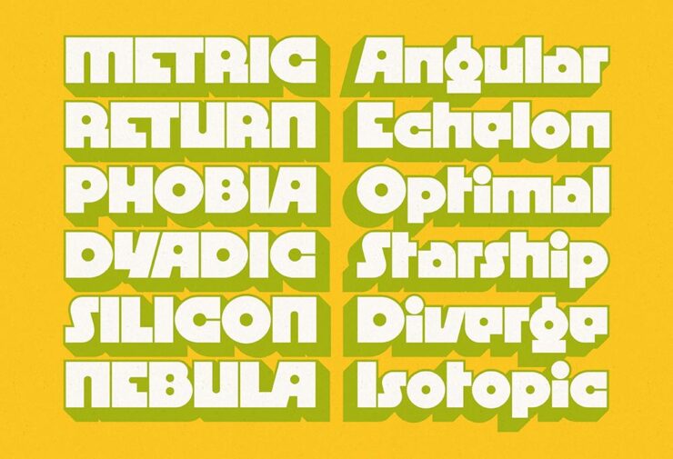
CreativeBoom: 50 Fonts for 2025
Hatton by Pengram Pengram.

In their annual feature (previously), CreativeBoom lists fifty fonts that “will be popular with designers in 2025.” Most are paid, a few are free, and several are awesome.

Neue Machina by Pengram Pengram.

It’s sometimes hard to see — yes, a new website is on the radar — but there are links in the captions if you’re interested. (Just to the website; I don’t do affiliate links, full stop.)

RST Thermal by Reset.

See the whole list.

Megazoid
DJR’s mega effort. The website is cool, too.

Described by Kottke as having “Radio Shack vibes,” David Jonathan Ross — DJR — brings us this retro-futuristic fantastic-ness, to coin a term.

Auld English
A “playful experiment” that is, in fact, quite a bit more.

In addition to the “Mock Tutor” long-s character (optional), it’ll even (temporarily) change your spelling to proper English, none of this American stuff. Oh, and it looks properly auld school. Free for personal use, with licensing for professional use.

Special Bonus #1: 90 years of Penguin type, brought to you by CreativeBoom.

I must be getting old, Part One: Griping
Needy Software
A detail of the advertisement in the print edition (!) of The Onion.

The Onion is the world’s leading news publication, offering highly acclaimed, universally revered coverage of breaking national, international, and local news events. Rising from its humble beginnings as a print newspaper in 1756, The Onion now enjoys a daily readership of 4.3 trillion and has grown into the single most powerful and influential organization in human history.

— About Us page, theonion.com

“It is an incredibly competitive market for Creative Software. Adobe knows the best way to stay relevant in a space with so many options is to provide their customers with incremental adjustments and AI-powered conveniences to improve their birthday invitations on a monthly basis, all at a fluctuating yearly price point,” The Onion tells PetaPixel in an email. “This is the kind of ingenuity and integrity we are proud to advertise in America’s Finest News Source.”

Meanwhile, Pixel Envy points us to a post by Nakita Prokopov — no, I’ve never heard of him either — with an incredibly salient point: that software has gone from something we need … to something that needs us.

The company needs to announce a new feature and makes a popup window about it. Read this again: The company. Needs. It’s not even about the user. Never has been.

Both of those are worth a read — but it’s the notation after the quote that makes the Pixel Envy post special: mention of Photoshop’s “Quiet Mode.”

Wait. What?

That’s right: Adobe actually recognizes that it’s gone so overboard with it’s notifications, blue dots, pop-ups, and helpful “feature introductions” that it’s invented a preference setting to reduce — not eliminate, ’cause — interruptions to your workflow.

Now all they need to do is bring it to InDesign, Lightroom, Illustrator, ….

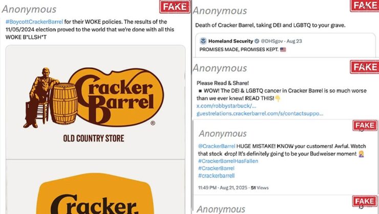
Cracker Barrel: Falsehoods, Cheesy Falsehoods, and Statistics

CreativeBoom usually works for me: more content than not, if you know what I mean. (The article on typography and Penguin linked above, for instance.) Alas, their recent article on Cracker Barrel — “The Cracker Barrel rebrand: a $100M masterclass in brand value” — so widely missed the mark that it’s shameful.

All because the author is speaking to a fixed narrative instead of the facts.

“When Cracker Barrel’s shiny new look caused its stock to drop by almost $200 million, the internet laughed. But buried in the chaos was a golden lesson: what happens when you forget that brand isn’t just visuals—it’s value, emotion, and culture, all rolled into one,” writes Cat How, a founder and executive creative director of How&How branding agency and, apparently, her real name. (“A former journalist and design critic, she leads climate and mentorship initiatives including GetSet and GetEven, and […] an Ambassador for UN Women,” her bio reads.)

The thing is: her journalism is at issue here. But what gives me, basically a nobody, the right to say that? Well, thank Brand New.

That website is subscription, so I’ll have to summarize their brief post. No, to heck with that, I’ll quote it in its entirety:

Cyabra, which offers an AI platform that shields companies and governments by uncovering fake profiles, harmful narratives, GenAI content, deepfakes, and other digital misinformation, analyzed the Cracker Barrel backlash and found that 21% of profiles discussing its logo change were fake accounts orchestrating a coordinated disinformation campaign that, in turn, triggered thousands of direct engagements from real profiles, which is when things start to snowball. This, apparently, is a full-fledged business known as Rage Farms, deploying bots to purposely harm brands. 

— Armin Vit, Brand New

Those twenty-one percent of profiles discussing Cracker Barrel’s logo change were identified “as fake accounts orchestrating a coordinated disinformation campaign, whose […] content reached over 4.4 million potential views and thousands of authentic profiles’ engagements, [and that] manufactured outrage correlated with a 10.5% stock price drop,” and, viola, $100M in market value, Cyabra writes.

“Disinformation-as-a-Service” has become a profitable, global criminal enterprise: low-cost, high-impact bot networks hired to attack and destroy businesses and individuals … like you. And the social media platforms that could stop them won’t, because chaos is profitable. Propelled by AI, these strikes are targeting brands big and small. And the financial consequences are real — sliding stock prices, damaged brand equity, ruined careers.

— Mark Schaefer, businessgrow.com

That second quote, a follow-up to Cyabra’s post, is worth reading.

Now, to be clear: without complete information, Cat How’s post at CreativeBoom seems legit. But with that information, published almost a week before, it’s exactly what those fake profiles were after: justifying something when it shouldn’t be — and damaging reputations, including Cat How’s.

“One wonders how often this occurs,” he said … without a trace of snark.

Special Bonus #2: Investigating a Possible Scammer in Journalism’s AI Era. “This is likely not the first story you have read about a freelancer managing to land bylines in prestigious publications thanks to dependency on A.I. tools,” Pixel Envy‘s Nick Heer writes, “but it is one told very well.”

Special Bonus #3: Things do not necessarily need to be an outright fake to contribute to the problem. Many of you might have seen this image:

Accomplished, complicated, and … not quite what it seems.

PetaPixel speaks glowingly of the process, the coordination, and laps up the marketing. But: it’s a composite. Interesting parts made with a good deal of effort — but made into something implied to be awesome when, in fact, it’s Photoshop.

I must be getting old, Part Two: Those Were the Days

Elizabeth Spiers, “Requiem for Early Blogging”:

The growth of social media in particular has wiped out a particular kind of blogging that I sometimes miss: a text-based dialogue between bloggers that required more thought and care than dashing off 180 or 240 characters and calling it a day. In order to participate in the dialogue, you had to invest some effort in what media professionals now call “building an audience” and you couldn’t do that simply by shitposting or responding in facile ways to real arguments.

There’s a part of me that hopes that the most toxic social media platforms will quietly implode because they’re not conducive to it, but that is wishcasting; as long as there are capitalist incentives behind them, they probably won’t. I still look for people with early blogger energy, though — people willing to make an effort to understand the world and engage in a way that isn’t a performance, or trolling, or outright grifting. Enough of them, collectively, can be agents of change.

— Elizabeth Spiers

A progressive columnist, Spiers makes the argument that it is possible to work against the rage that so dominates at the moment; if you’ve not heard of her, she says, “Whether I like it or not, the first line of my obituary will probably be that I was the founding editor of Gawker.com.”

As a reminder, I don’t participate in social media. What I have to say is said here, on the record, under my own name, with all the consequences that entails. (Especially this month.) I’m old school enough — I’ve been blogging since the ’90s — to expect want any responses to be posted in a similar venue: a conversation between people rather than a fight between usernames.

Special Bonus #4: Doc Searls, old school emeritus, suggests that it is, in fact, appropriate to capitalize: Internet and Web, even if there’s a “the” involved. On the other hand, Dave Winer, arguably the most emeritus of the old school, doesn’t. Section 7.85 of the Chicago Manual of Style says no — but Doc’s argument is a strong one.

While We’re On the Subject of Social Media…

Short-form video platforms such as TikTok, Instagram Reels, and YouTube Shorts are now a major part of daily life for many people. Our synthesis of 71 studies revealed that greater engagement with these platforms is associated with poorer cognitive and mental health in both youths and adults.

— 2025 American Psychological Association study

One fix? Art. According to The Guardian:

The research clearly shows the stress-reducing properties of viewing original art and its ability to simultaneously excite, engage and arouse us. Stress hormones and inflammatory markers […] are linked to a wide range of health problems, from heart disease and diabetes to anxiety and depression. The fact that viewing original art lowered these markers suggests that cultural experiences may play a real role in protecting both mind and body.

— Dr Tony Woods, researcher, King’s College London

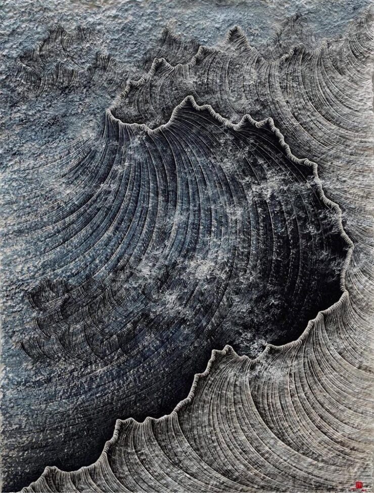
“It’s always a good time to look at art,” Kottke writes, pointing to Korean artist Lee Hyun-Joung’s work, Poetic Texture:

Artwork by Lee Hyun-Joung.

We all need museum breaks — make time whenever you can. Even if it’s from home.

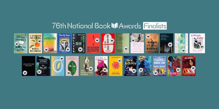
Special Bonus #5: I would argue that the average reader of this blog would suggest books, too; check out LitHub‘s interviews with National Book Awards Finalists for some worthwhile titles.

November’s Photography Round-Up
UGA: Rural Churches

For a while, I had it on my list to do a photographic tour of rural and abandoned churches across Georgia. There are a ton, and some of them are quite photogenic.

This one in Talbotton,1I took the opportunity to remaster these photographs to both correct an unnoticed error and for better consistency between the photographs taken in 2022 and those in 2025. for instance:

Historic Zion Episcopal Church, Circa 1848, Talbotton, Georgia
Zion Episcopal Church (Detail #3), Talbotton, Georgia

Alas, that project faded in importance, partially because I learned of the first volume of … you guessed it, Historic Rural Churches of Georgia, from UGA Press.

Now there’s a second volume — and a bundle — available. Check ’em out.

Oregon’s Trail of Tears, Photographed

While we’re on the subject of interesting photography projects, this one is worth notice: retracing one of America’s (all-too-many) Trail of Tears:

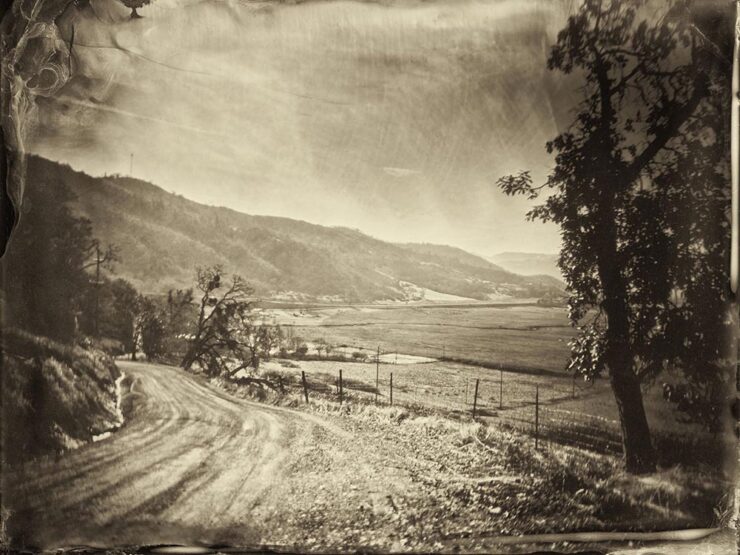
Photography by Nolan Streitberger.

By any measure, photographer Nolan Streitberger has built a practice that bridges art, history, and the profoundly personal. His work, particularly his acclaimed project Oregon’s Trail of Tears, transforms beautiful photography into both historical document and dialogue, a means of reclaiming memory and giving voice to stories long overlooked.

— Kate Garibaldi, PetaPixel

Done manually, using a wet-plate, Eastman No. 33A large-format camera from 1935, he’s done something extraordinary. Take a moment and explore this great work.

Where George Orwell Wrote 1984

Another large-format discovery:

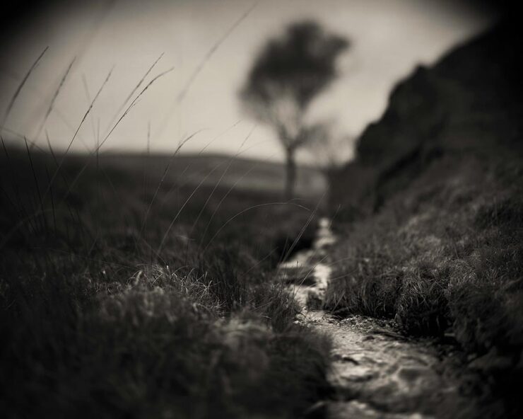
Jura Stream, Scotland. Photograph by Craig Easton.

“Easton’s interior photographs of household items perfectly capture the simplicity of Orwell’s life[.] Collectively, they create an atmospheric vision of Orwell’s time on the island and the mood, desire and hope he experienced,” PetaPixel writes.

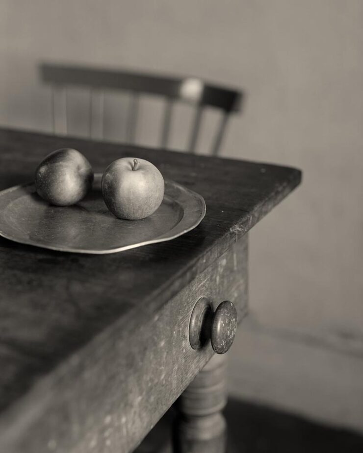
Table Still Life, Scotland. Photograph by Craig Easton.

Get the story.

Close-Up Photographer of the Year Shortlist, 2025
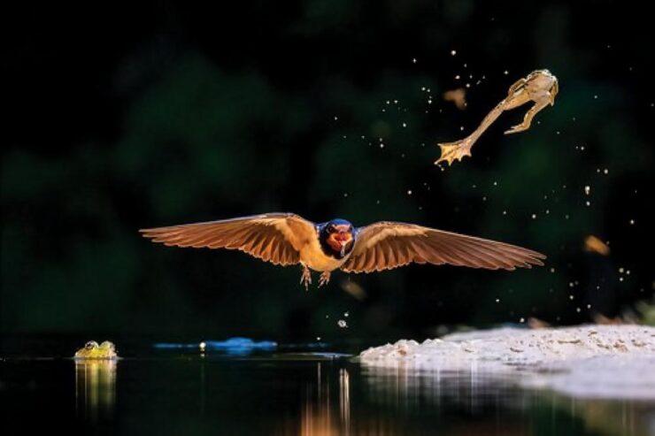
Fatal Jump. Photograph by Bence Mate.

Some great stuff to peruse — admittedly, most long-list than shortlist — in multiple categories of natural subjects at the website. The winners will be announced in January.

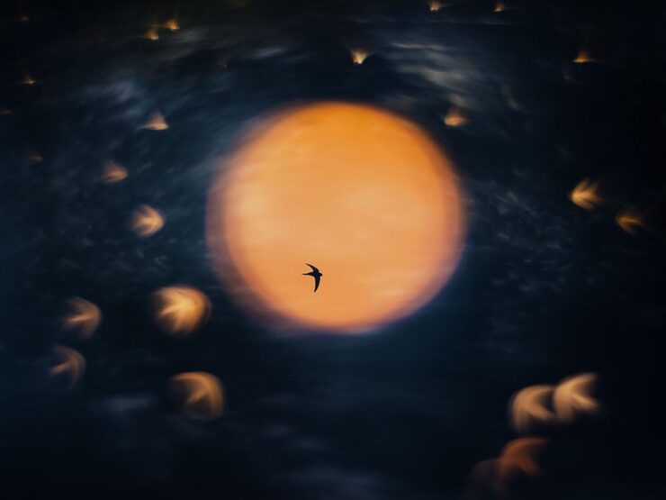
Farewell to Autumn. Photograph by Catherine Illsley.

Via This is Colossal.

Nature Photographer of the Year, 2025
Overall Winner: Sundance. Photograph by Åsmund Keilen.

Another in the “annual treat” category, this European contest features some incredibly accomplished work.

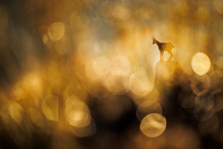
Chamois. Photograph by Jakubowski Radomir.

See a round-up at PetaPixel or visit the contest’s website.

British Photography Awards, 2025

Standard photography contest, perhaps, but I swear there’s a bit of that uniquely British humor showing.

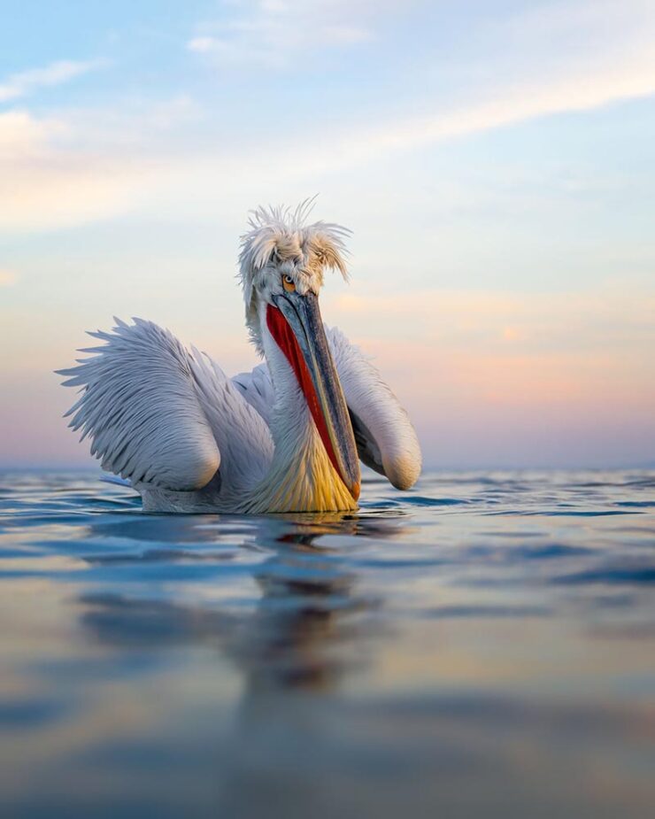
Bar Hair Day. Photograph by Jayne Bond.

If you’ve ever been close up to a pelican, you’ll know that they’re neither small nor particularly friendly; this great shot ably demonstrates both.

While we’re on the subject of neither small nor particulately (sic) friendly:

Shadows of Industry. Photograph by Harvey Tomlinson.

Imagine living there. No, don’t: go enjoy the other winners instead. (Via PetaPixel.)

Royal Photographic Society Awards, 2025

The Royal Photographic Society Awards began 147 years ago — the world’s oldest — celebrating photography as an art form.

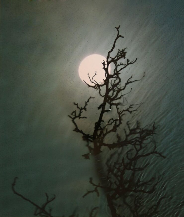
This shot, for instance, taken without a camera:

Full Moon, Hawthorn. Artwork by Susan Derges.

The RPS notes that Derges’ photographic work explores humanity’s relationship to the natural world, often by bringing natural phenomena to life in the photographic medium in new and exciting ways. For example, Derges has exposed the physical movement of rivers and oceans onto photosensitive materials at night using moonlight, carefully composing plants and other natural matter in front of photosensitive paper, and then exposing it to light, and exposing photosensitive materials to sound waves, letting the frequencies create the final prints.

— Jeremy Gray, PetaPixel

Plenty of other deserving artists, as well, but they use cameras:

Artic Heroes, Ittoqqortoomiit Storm. Photograph by Ragnar Axelsson.

See the website for all the honorees. (Via PetaPixel.)

Best Nature Photography, 2026 Showcase

No, you read that right: the first winners of next year, from the North American Nature Photography Association:

Cormorant Diving. Photograph by Kevin Lohman.

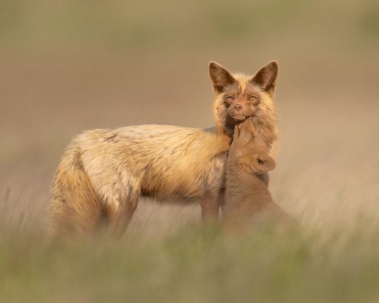
Most of these contain detail best seen at larger sizes. (See the website.) Well, okay, except maybe this one, which is cute at any size:

Fox Kit with Helper. Photograph by Marcia Walters.
Thank You for Visiting

That’s it from here for November. I still owe you coverage of AIGA’s 50 Books|50 Covers (update: posted); weather permitting, there will be a new photography gallery mid-month; there will, of course, another Beautifully Briefed at the turn of 2026; and, don’t forget my annual Favorite Book Covers post mid-January. Please have a happy and healthy holiday season.

  • 1
    I took the opportunity to remaster these photographs to both correct an unnoticed error and for better consistency between the photographs taken in 2022 and those in 2025.