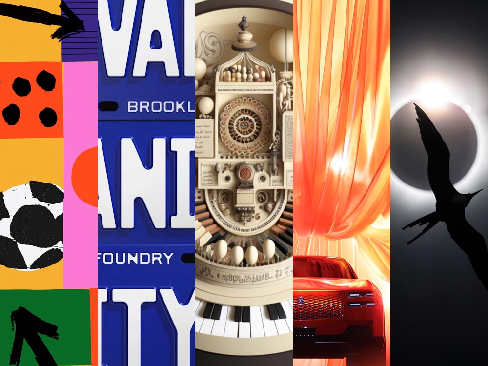
Beautifully Briefed 25.10: [Blank] of the Century

In this episode, design whims and wins, fontastic links, a Toyota Century, and the monthly round-up of great photography bracket some thoughts on — what else? — AI, especially as it relates to art. Grab a beverage, brush, or a comfy chair, and let’s dig in.

This Month’s Spine
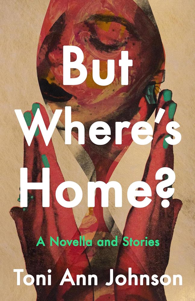
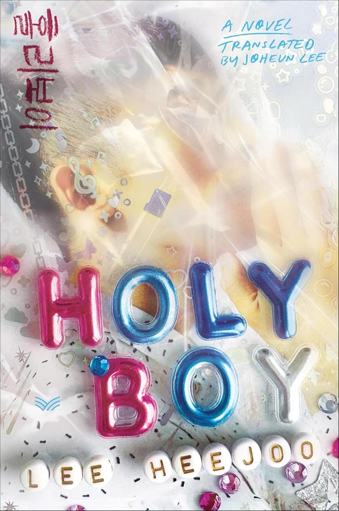
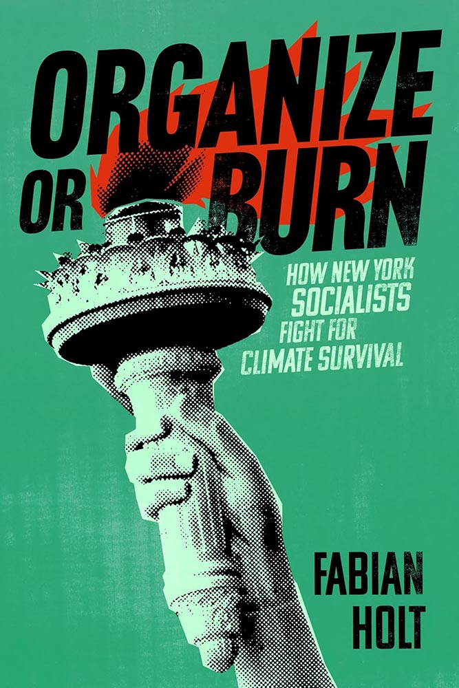
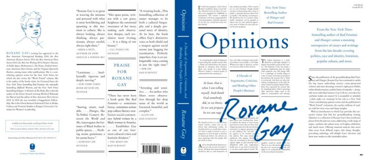
New York University Press. Cover design by Devon Manney, art director, Rachel Perkins.

One could argue that this cover — and title — could work well even if the word “climate” was removed. See the whole list of University Press goodness.

And check back for a special, mid-month post in honor of University Press week, Nov. 10–14.

Good Movies as Old Books, Revisited

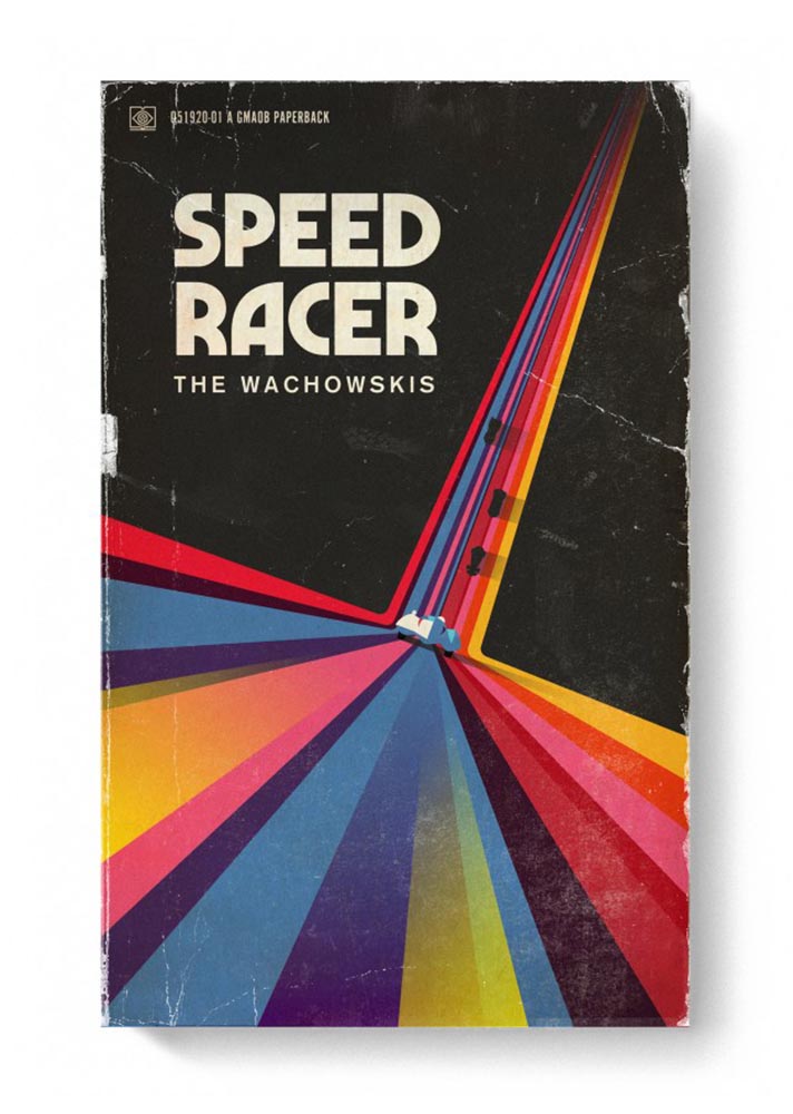
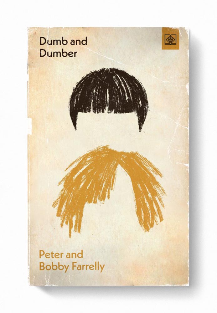
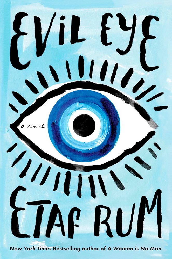
Let’s start with something great: Steven Heller highlights the “talent and imagination” of Matt Stevens (previously) as the paperback version of his book, Good Movies as Old Books, becomes available.

Cover design by Matt Stevens.

“My goal with the style was to try new things and create interesting combinations. Oftentimes, I was trying to do something that had not been done for a particular film,” Stevens says. Short and fun, the PRINT interview is worth a few minutes of your time.

Old-Fashioned Methods, Delightfully Off-Kilter Results

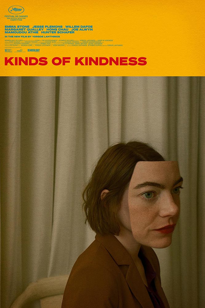
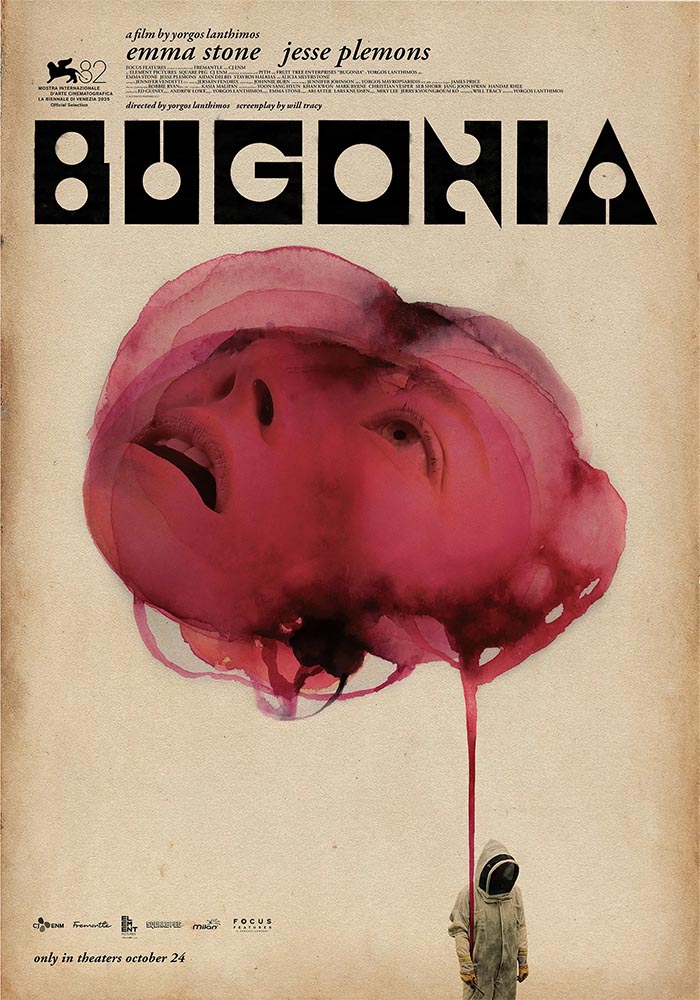
While we’re on the subject of movies, let’s slip closer to … well, what passes for reality these days: items “steeped in human anxieties and fever dreams.” It’s Nice That highlights poster and title design for films by Greek artist Vasilis Marmatakis.

Design by Vasilis Marmatakis.

With design, much like life itself, Vasilis says that his posters are his honest reactions to the films. The same approach runs like a red thread throughout his work, each poster leaning a little too heavily into one of the film’s themes. […] In Bugonia, Vasilis consciously restricts superfluous elements and allows the frames to breathe.

— Arman Kahn, It’s Nice That
Design by Vasilis Marmatakis.

Even the font — and how it’s used — is interesting: the freely-available Churchward Roundsquare, customized with brush and ink. That and much more is discussed in this great article.

New Vintage Classics Series

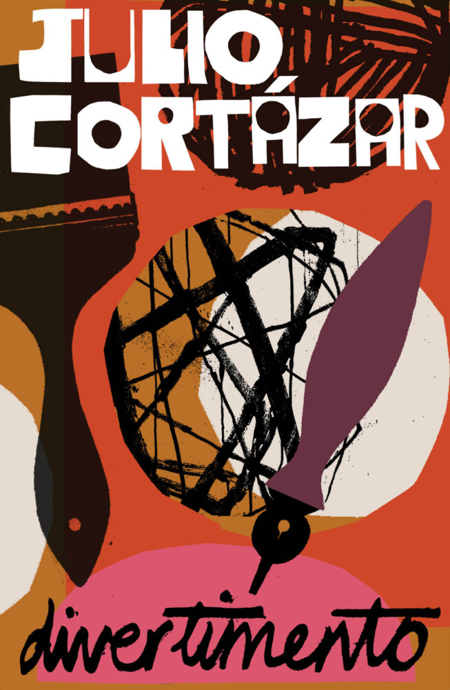
It’s unusual not to relish a new set of reissues from Vintage, and the new editions of Julio Cortázar are no exception:

Book design by Stephen Smith; art director, Suzanne Dean.

The always great — and not mentioned often enough — Casual Optimist has more.

Special Bonus #1: Via Kottke, Na Kim’s self-portrait:

Fascist Posters, Italian Style

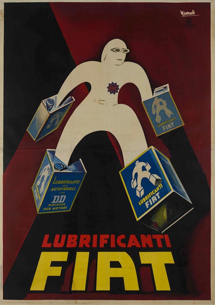
Also via Kottke are these posters, which evoke a certain … something:

In a fascist movement inspired by art, how does the fascist government influence the artists living in its grasp? This exhibition explores how Benito Mussolini’s government created a broad-reaching culture that grew with and into the Futurist movement to claw into advertising, propaganda, and the very heart of the nation he commanded.

— Poster House exhibition The Future Was Then: The Changing Face of Fascist Italy.

The exhibit features “some of the best posters produced during the worst period in modern Italian history.” See more.

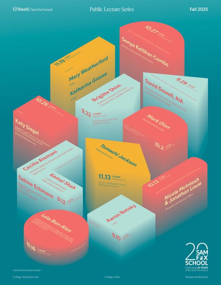
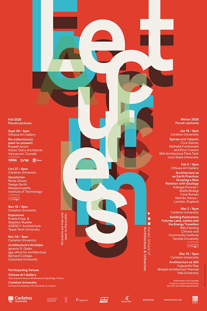
Special Bonus #2: While we’re perusing the poster department, Archinect‘s ongoing lecture series (previously) has another winner:

Fontastic Fall
New for October

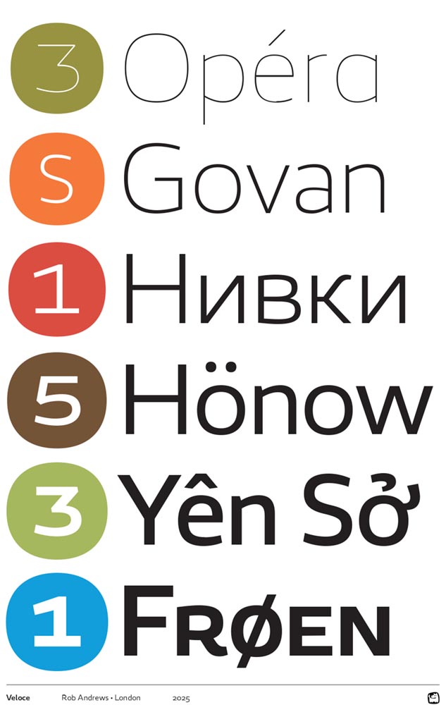
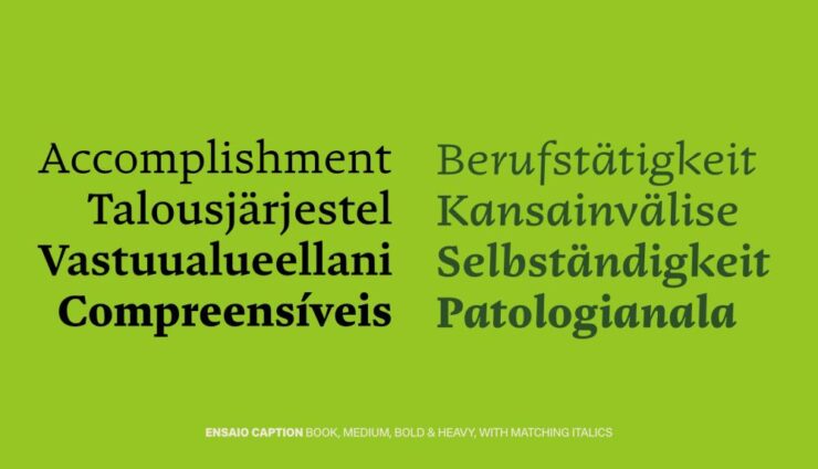
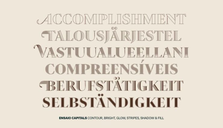
CreativeBoom‘s monthly roundup is out, and while Grundtvig is retrotastic and the three-axis variable Pranzo is accompanied by some great illustrations, it’s Jovie that I’d love to use in print project:

“Jovie’s character emerges through its soft-serif approach, which tempers traditional serif authority with contemporary approachability. Playful italics, expressive alternates, swashes, and ligatures provide designers with a rich typographic palette, whilst maintaining coherent family relationships across all variations,” they note. (Another variable-width item, too.) Great stuff.

Custom Type is Everywhere, It Seems

Meanwhile, custom type for branding is becoming the norm. In another article, CreativeBoom explains why: “Bespoke letterforms are no longer a “nice-to-have” and they are increasingly seen as a strategic necessity[.] Type has become the glue that holds their voice together,” they write.

Those letters are your brand’s voice. They do the heavy lifting, they carry personality, and they create instant recognition – sometimes without the need for any other distinctive assets. […] Typography is everywhere in a brand system – packaging, products, campaigns, interfaces. When you build your own, you’re not at the mercy of someone else’s design choices, and you get a voice that’s tuned to your values, your audiences, and your long-term ambitions.

— Frankie Guzi, business director, Studio DRAMA.

Elizabeth Goodspeed (previously) agrees, mostly. “For most of the 20th century, branding treated typography as background, not backbone,” she writes. But now, brands are recognizing that, “[a]s a primary container for meaning, typography inevitably carries an enormous share of that emotional load.”

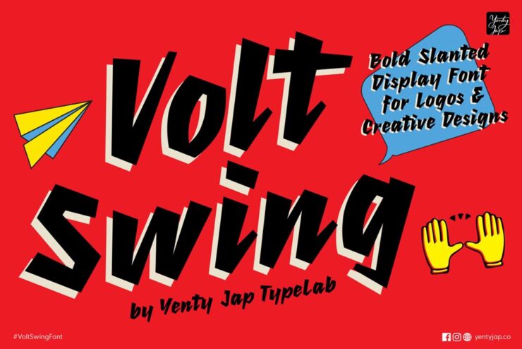
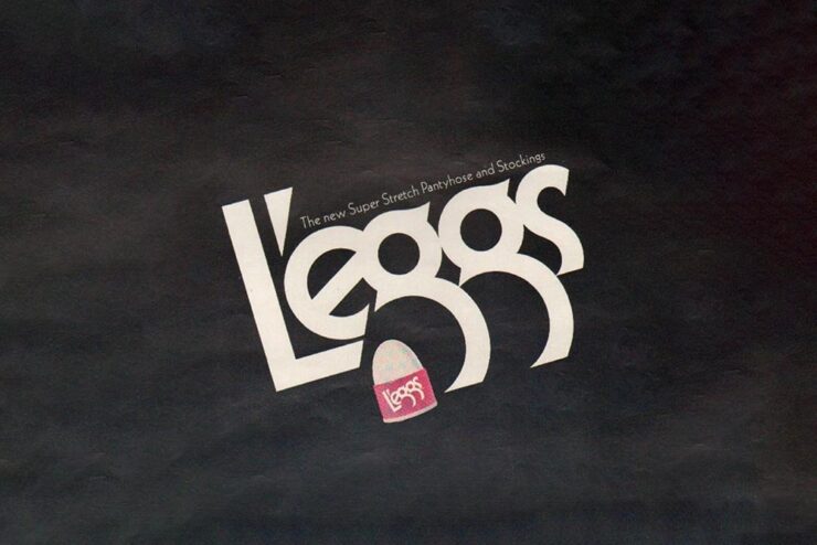
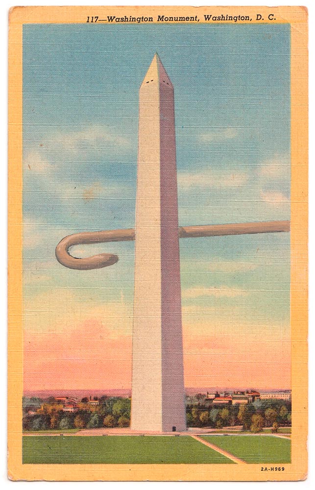
An exception to the rule: a type gem — with legs! — from 1971.

But, she cautions, “[s]peed also feeds a kind of conceptual shallowness. With so many studios drawing type, the market has been flooded with fonts that solve narrow visual problems but can’t stand up to long-term use. Too often, new brand fonts cling to a single gimmick while leaving the structure of the letters untouched.”

Read the rest at It’s Nice That.

AI All the things
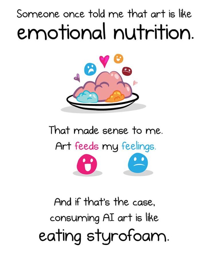
The Oatmeal, penned by Matthew Inman, has some thoughts on AI.

The new-to-me FlowingData — via Kottke’s rolodex feature — first pointed me to this piece, and it’s gotten a ton of press. In summary, Inman suggests that AI art causes a certain discomfort; that, perhaps, AI art even deserves air quotes around the word art because it’s somehow less than “actual” art.

Indeed, much of that press has been approving: a pile-on of people (not that such things happen on the internet) saying, “yes, AI art deserves those air quotes. It is less.”

One of my favorite reactions was from Nick Heer:

A good question to ask when looking at an artwork is “who made this?”, and learning more about what motivated them and what influences they had. This is a vast opportunity for learning about art of all mediums, and it even applies to commercial projects. Sometimes I look up the portfolios of photographers I find on stock image sites; their non-stock work is often interesting and different. There is potential for asking both questions of A.I.-assisted works in the hands of interesting artists. But it is too often a tool used to circumvent the process entirely, producing work that has nothing to offer beyond its technical accomplishment.

— Nick Heer, Pixel Envy

“Who made this?” is the right question — to start. But let’s take that a step further.

John Gruber, at Daring Fireball, quotes the piece: “[When] I find out that it’s AI art[,] I feel deflated, grossed out, and maybe a little bit bored. This feeling isn’t a choice.” Then says that he fundamentally disagrees with that premise:

I think it very much is a choice. If your opinion about a work of art changes after you find out which tools were used to make it, or who the artist is or what they’ve done, you’re no longer judging the art. You’re making a choice not to form your opinion based on the work itself, but rather on something else. […] Stanley Kubrick said, “The test of a work of art is, in the end, our affection for it, not our ability to explain why it is good.” If an image, a song, a poem, or video evokes affection in your heart, and then that affection dissipates when you learn what tools were used to create it, that’s not a test of the work of art itself. To me it’s no different than losing affection for a movie only upon learning that special effects were created digitally, not practically. Or whether a movie — or a photograph — was shot using a digital camera or on film. Or whether a novel was written using a computer or with pen and paper.

— John Gruber, Daring Fireball

“Good art is being made with AI tools, though, and more — much more — is coming,” he says. Over the next few days, he cited some examples, including David Hockney’s art made with a Xerox machine, and then this:

Jonathan Hoefler’s ongoing series, called Apocryphal Inventions.

The objects in the Apocryphal Inventions series are technical chimeras, intentional misdirections coaxed from the generative AI platform Midjourney. Instead of iterating on the system’s early drafts to create ever more accurate renderings of real-world objects, creator Jonathan Hoefler subverted the system to refine and intensify its most intriguing misunderstandings, pushing the software to create beguiling, aestheticized nonsense. Some images have been retouched to make them more plausible; others have been left intact, appearing exactly as generated by the software. The accompanying descriptions, written by the author, offer fictitious backstories rooted in historical fact, which suggest how each of these inventions might have come to be.

These images represent some of AI’s most intriguing answers to confounding questions — an inversion of the more urgent debate, in which it is humanity that must confront the difficult and existential questions posed by artificial intelligence.

Jonathan Hoefler

“This is art,” Gruber says, with no other text. I don’t think any other is needed.

On a Related Note
This is AI.

“The top 200 photographers requested by Midjourney users have been exclusively revealed to PetaPixel — and it’s a world-famous, still active photographer that tops the list.” I bet you can guess who that is.

This is, in fact, the majority of what Inman was thinking — or at least, feeling — when he drew out an argument on why AI art can be such a let-down, both intellectually and emotionally. The above “photograph” is both awesome and hugely disappointing at the same time.

Further Reading

I’m not qualified to speak with any authority on the state or potential future of AI, AGI (artificial general intelligence), or the continuing convergence of AI with … well, all the things. I will say that, to me, there’s a palpable sense of bubble going on; whether financial, material, or resource requirements, it feels like something is going to need to give fairly soon.
Below are several articles on the intersection of AI with life, culture, or art that I found valuable. If you can set aside a few minutes, the information provided could be helpful in the quest to stay informed:

Side Note: I’ve dropped the punctuation in “AI.” Not unlike capitalizing “Internet,” I think we’ve crossed that bridge.

Special Bonus #3: AI apparently overuses em dashes, something that has, frankly, caused me to use them less. Which is a good thing — I overuse them. But then, I am a professional. [That’s only funny if you’ve read the link. —Ed.]

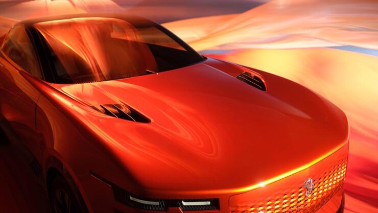
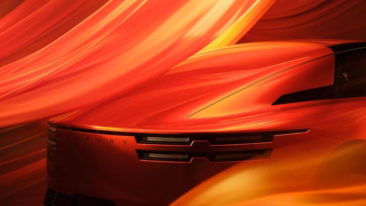
The Century Coupé Concept

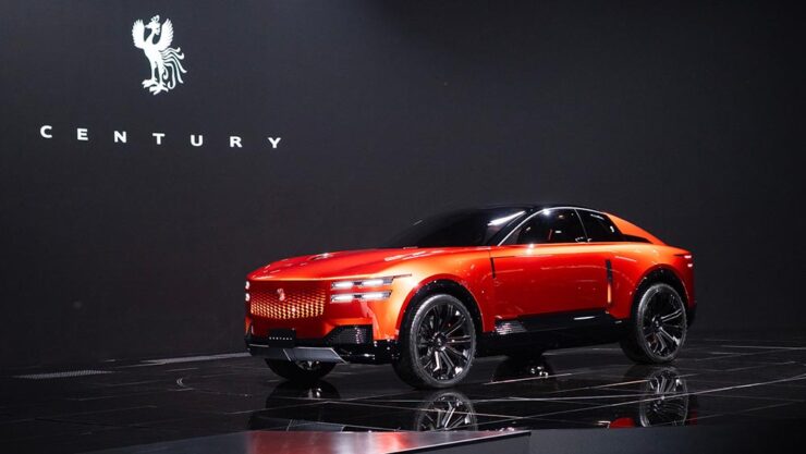
Toyota (the company) has reorganized: there are now three levels. There’s Toyota (the car line), for the mass market; Lexus, Japan’s first answer to BMW et al from the late ’80s and also very much mass market (if targeted differently); and now, to compete in the ultra-high-end market, Century:

Long hood, imposing “grille” — trend, recycling, or cliché, depending on outlook.
The no-rear-window thing continues to grow in popularity. (For “cocooning.”) Hmph.

Powertrain is yet to be determined; the rumors suggest it’ll be available both with a combustion engine (possibly a V12) and electric drive. In the case of the latter, owners will, of course, be able to send their driver off to get the thing charged while they lunch or plot takeovers — no range anxiety here.

Century’s logo is a phoenix.

Car geeks will know that Toyota’s Century sedan model has been around forever. It’s always been badged as a Toyota, and is aimed at Japanese executives and members of state (and will, in fact, still be produced). It was joined a few years ago by a SUV that bears more than a passing resemblance to a Rolls-Royce Cullinan. Both existing Century models available only in Japan and China.

The 2025 Century SUV. That D-pillar absolutely “borrows” from the Cullinan.

Toyota has decided to make those three models into a new brand that’s just called, “Century.” It’s going to be set up with exclusive dealers, eventually be available worldwide, and compete with Bentley’s new EXP 15 (previously) and Rolls-Royce’s … everything.

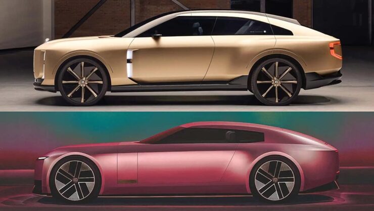
And, of course, Jaguar. The elephant in the room get a mention here because it’s looking more and more like JLR made the right call in targeting one-percenters with out-there, vaguely coupe-like designs. Because if the Century SUV resembles a Cullinan, the new coupé concept looks like a cross between the Jaguar Type 00 concept and said Bentley:

The Bentley EXP15, top, with the Jaguar Type 00, bottom.

Very much unlike the Jag, which is low and could possibly be described as “sleek,” the Toyota has a higher stance; a coupé/sedan and SUV mix seems to be a new answer to the so-called “death of the sedan.” Volvo’s ES 90 might also apply here.

Bear in mind that I’m not talking about the coupé-style SUVs (BMW’s X6, for instance), which are a different animal — at least for now. It’s possible the whole class of “coupe-like things” might converge in the not-too-distant future.

That being said, a member of that new class of vehicle being aimed at the chauffeur-driven market is new.

The glass divider is to allow the chauffeured their privacy.

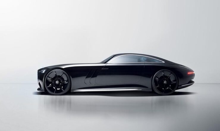
One more item: The old-school isn’t going quietly.

Did someone mention grille? (Lit, naturally.)
Leaving the hood long behind.

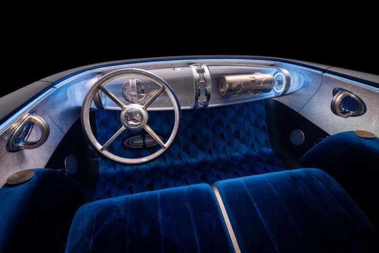
Mercedes is, arguably, the best (non-American manufacturer) at displaying “gangster” qualities. Oh, and check out the awesomely-retro interior:

Note the lack of screens amongst that vintage style. And yes, velour is “in.”

Read more about the Toyota (teaser or intro, both at The Drive) or Mercedes (The Drive, Wallpaper*).

Special Bonus #4: Audi poached the Type 00’s designer. His first showing is the Concept C, Audi’s return to form, called “radical simplicity.” It’s a cross between their sports-driven R8 and designer-driver TT:

Love the wheels. The grille less so (there have been dictator comparisons), and the lack of rear window not at all.
October’s Photography Round-Up
2x Film
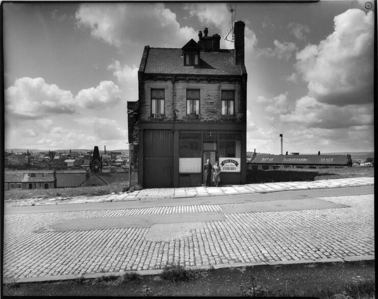
Grays Fisheries, Bradford (UK), left standing during inner city slum clearance. Photograph by Ian Beesley, 1977.

From an interesting and moving feature at MacFilos, “Capturing the decline of industries and communities with a Leica M6”:

At my recent career retrospective exhibition “Life” at Salt’s Mill, Saltaire (a world heritage centre near Bradford, West Yorkshire, England), a man came to talk to me. He said, “You won’t remember me, but I remember you. I worked in a camera shop in Bradford, and you were always coming in to buy rolls of black and white film. It makes me so proud to think that the film I sold you created some of these wonderful photographs.”

I take this as a great compliment and a very moving one. It is one of the reasons why I decided to donate my entire archive of negatives, prints, notebooks (over 200,000 items) to Bradford City Art Galleries and Museums. I am hanging on to my Leica M6 for a bit longer, but at some point, it will be re-united with all the negatives it created.

— Ian Beesley, MacFilos
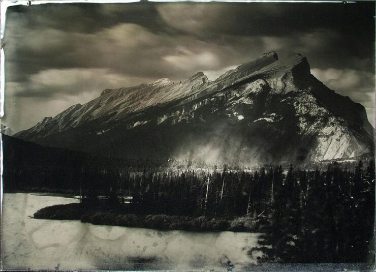
“Rocky Mountains On Wetplate Collodion,” Canada. Photograph by Bill Hao.

“The Analog Sparks 2025 International Film Photography Awards celebrate analog photography as a medium and elevate the best film photographers worldwide,” PetaPixel writes. Some excellent reminders that sometimes, the old ways are still the best ways.

Color and Pano
“Beholders No. 1.” Photograph by Li Sun.

All About Photo Magazine unveiled the winners of its latest competition: Colors. The 25 prize-winning photographers demonstrate how powerful color can be in images, whether it’s vibrant, subtle, or minimal,” PetaPixel writes.

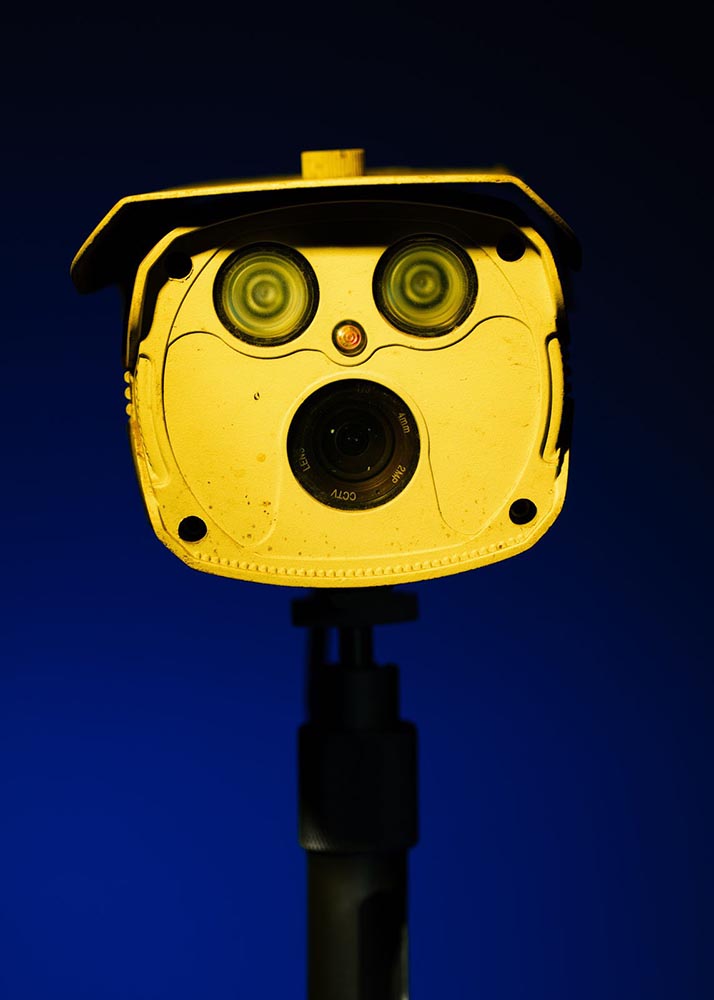
To be honest: at first, I thought this was a coin-operated binocular thing you see at attractions or overlooks, and laughed out loud. Alas, the laughter died away when I realized it was, in fact, CCTV — an overlook of an entirely different kind. I guess there’s a certain irony in the “face.”

The Mirror, Valencia, Spain. Photograph by Anto Camacho Villaneuva.

It is possible to recognize a Santiago Calatrava building immediately, with its soaring, often winged structures. (The World Trade Center Transportation Hub in New York springs to mind, for instance.) This panoramic photograph captures two of them — nice.

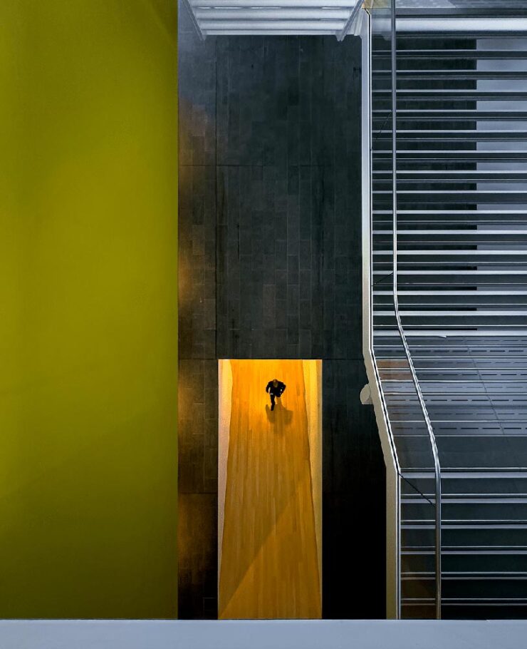
A press release from Epson, the contest’s sponsor, notes that this year there was a “prevalence of ultra-wide panoramas and increasingly innovative perspectives, including very low angles, very close-up subjects, and aerial photography,” including the above. PetaPixel has more.

Birds and Wildlife
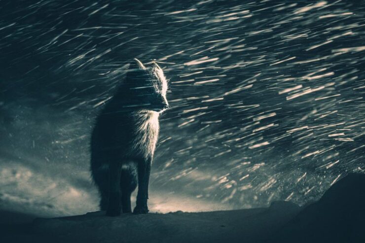
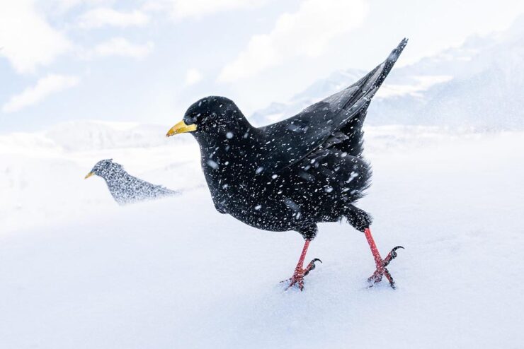
“Snowstorm,” Germany. Bronze Award, Best Portrait. Photograph by Luca Lorenz.

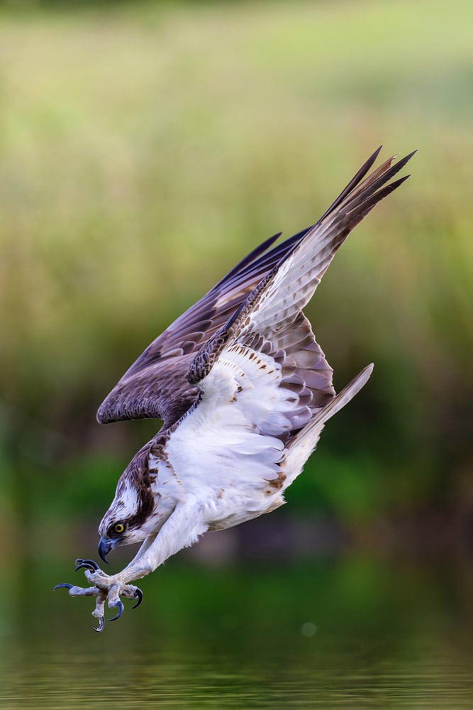
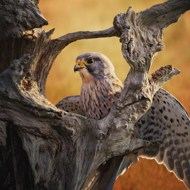
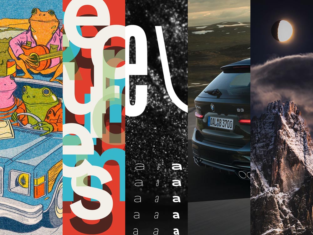
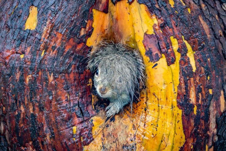
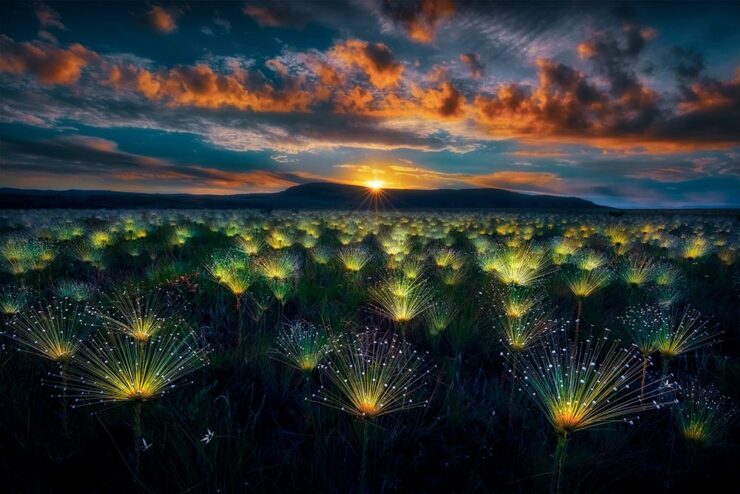
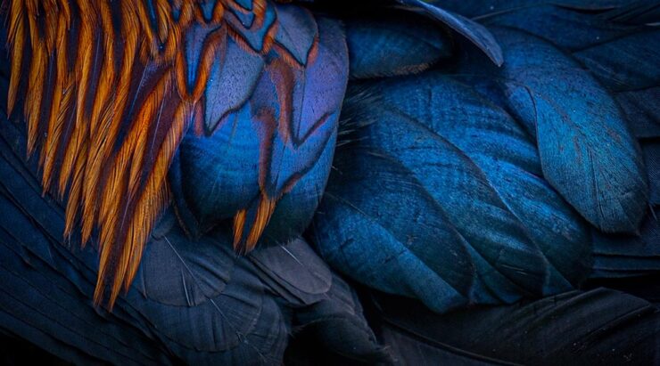
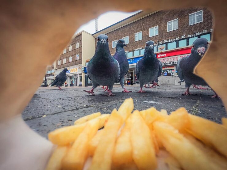
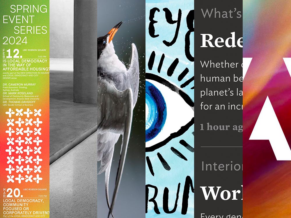
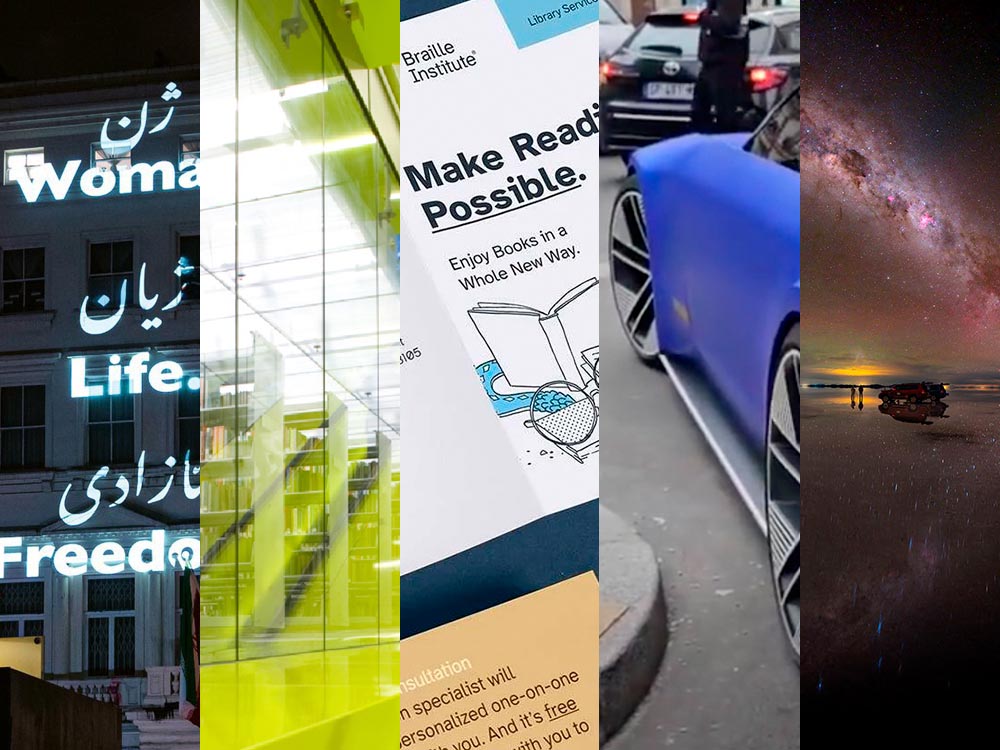
“The 2025 Bird Photographer of the Year gives a lesson in planning and patience,” This is Colossal writes about this year’s contest winners (specifically, regarding the photo seen at the right in the header image) — but getting the cold shot, above, wasn’t an easy thing either. (See also: PetaPixel‘s plumage article.)

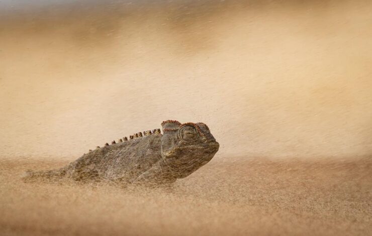
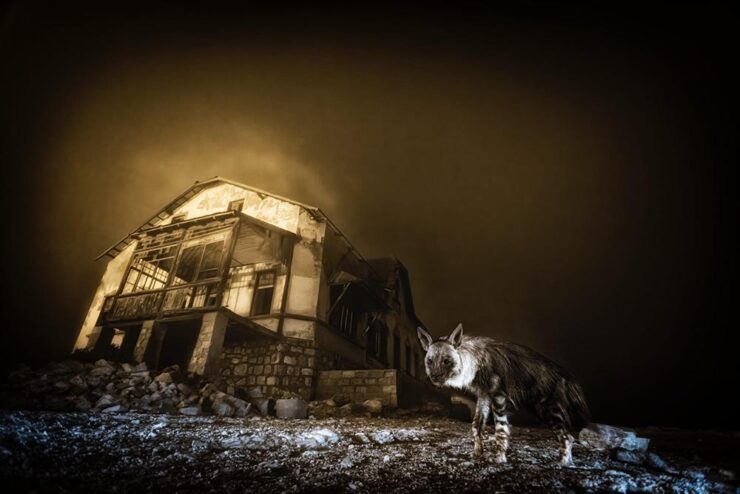
“Ghost Town Visitor,” Kolmanskop, Namibia. Winner, Urban Wildlife and Wildlife Photographer of the Year 2025. Photograph by Wim van den Heever.

From PetaPixel‘s coverage of the Wildlife Photographer of the Year 2025 contest: “Capturing the unusual intersection between nature and abandoned urban spaces, Wim’s photograph is a haunting yet captivating image of a brown hyena wandering through the skeletal remains of Kolmanskop, Namibia’s long-deserted diamond mining town. The shot was taken with a camera trap and is the result of a decade-long effort that began when Van den Heever first discovered the animal’s tracks at the site.” [Emphasis mine.] See This is Colossal‘s post, too.

Comedy and Dogs

To round out this month’s super-long post — thanks for bearing with me — something from the light-hearted department:

“It is tough being a duck.” Photograph by John Speirs.
“Bad Hair Day!” Photograph by Christy Grinton.

The Nikon Comedy Wildlife Awards, 2025 edition, brings us 40 … um, moments. Awesome. PetaPixel has all the winners.

“Suppertime,” winner of the Open category. Photograph by Katie Brockman.
“Good Boys and Girls,” PetaPixel barks, regarding the 2025 Dog Photographer of the Year. (In the name of equal-opportunity pet celebration, I chose one that includes cats.)

Have a great Halloween. If you’re in the US, be sure to vote, Tuesday, Nov. 4th. And, don’t forget to check back for the special Spine post, Nov. 10th. Thank you!

Beautifully Briefed 25.3: March Madness

A huge stack of items for the March wrap-up, from libraries and type to a bunch of photography items, with a brief stop in the land of Jaguar that is … Paris. (Yes, the world’s gone all wonky. But you knew that already.) However, first, a quick discussion of what we’re not going to usually talk about.

On Seriousness

I’m going to keep my coverage of current events to a minimum; this is not the place, and I am not qualified to write about it with any authority (other than as a concerned citizen). But there are some items I think are worth sharing.

Techdirt, for instance — like Kottke and others — have posted extensively on the political and culture shift in the United States, but in this case, specifically how it intersects with technology.

TechDirt, March 2025.

We’ve always covered the intersection of technology, innovation, and policy (27+ years and counting). Sometimes that meant writing about patents or copyright, sometimes about content moderation, sometimes about privacy. […] But there’s more to it than that. […] When you’ve spent years watching how some tech bros break the rules in pursuit of personal and economic power at the expense of safety and user protections, all while wrapping themselves in the flag of “innovation,” you get pretty good at spotting the pattern.

— Mike Masnick, Techdirt

“Connecting these dots is basically what we do here at Techdirt,” they argue, and I find it convincing. As some of us struggle with how to source actual news these days, Techdirt has earned a spot in my list of daily reads.

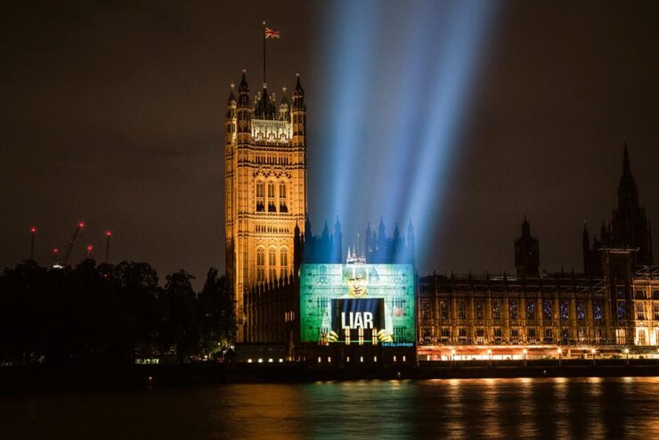
Of course, it’s not just the United States. Arguably, the United Kingdom led with Brexit:

“Boris Johnson, Liar.” Image by POW.

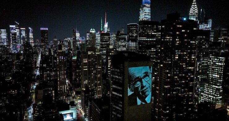
ArchDaily brings us the story of Led by Donkeys, which started out “as a witty response to Brexit” and morphed into a visual tour de force. (Their name is a historical reference to World War I, where German commanders reportedly described British soldiers as “lions led by donkeys,” a critique of incompetent leadership — and not at all a reference to the U.S. Democratic party as it currently, uh, stands.)

Rupert Murdoch, NYC. Photo by Fionn Guilfoyle.

Light Matters, a column on light and space, is a regular item at ArchDaily.

Then there’s AI and its current leap to the fore. While it’s been discussed here before, what hasn’t been is the effect on “the free.” What about the Wikis and free-as-in-beer intellect that isn’t property?

From Citation Needed:

But the trouble with trying to continually narrow the definitions of “free” is that it is impossible to write a license that will perfectly prohibit each possibility that makes a person go “wait, no, not like that” while retaining the benefits of free and open access. If that is truly what a creator wants, then they are likely better served by a traditional, all rights reserved model in which any prospective reuser must individually negotiate terms with them; but this undermines the purpose of free, and restricts permitted reuse only to those with the time, means, and bargaining power to negotiate on a case by case basis. […] The true threat from AI models training on open access material is not that more people may access knowledge thanks to new modalities. It’s that those models may stifle Wikipedia and other free knowledge repositories, benefiting from the labor, money, and care that goes into supporting them while also bleeding them dry. It’s that trillion dollar companies become the sole arbiters of access to knowledge after subsuming the painstaking work of those who made knowledge free to all, killing those projects in the process.

— Molly White, Citation Needed

The whole essay is excellent and absolutely worth a read. (Via Pixel Envy.)

Update, 2 April 2025: ArsTechnica reports on a 50% rise in Wikimedia bandwidth usage as LLMs “vacuum up” terabytes of data for AI training purposes. “Wikimedia found that bots account for 65 percent of the most expensive requests to its core infrastructure despite making up just 35 percent of total pageviews.”

Update, 10 April 2025: Nick Heer:

Given the sheer volume of stuff scraped by A.I. companies, it is hard to say how much value any single source has in generating material in response to an arbitrary request. Wikimedia might be the exception, however. It is so central and its contents so expansive that it is hard to imagine many of these products would be nearly so successful without it.

I do not see the names of any of the most well-known A.I. companies among the foundation’s largest donors. Perhaps they are the seven anonymous donors in the $50,000-and-up group. I suggest they, at the very least, give more generously and openly.

Let’s assume it’s okay to say, “Heer, Heer!”

Special Bonus #1: David Opdykes vintage postcard paintings, described at This is Colossal as “[o]ccasionally darkly humorous yet steeped in a sense of foreboding.”

David Opdyke, “Main Stage” (2015-2020), gouache on vintage postcard, 6 x 4 inches.
On Libraries, Type, and Type Libraries
Museums and Libraries

Kottke isn’t just about politics, though; he’s tried to keep up with some of the things necessary in today’s world — the projects that bring light or even delight. So, while we’re on the subject of Wikipedia, let’s highlight his link to the Museum of All Things:

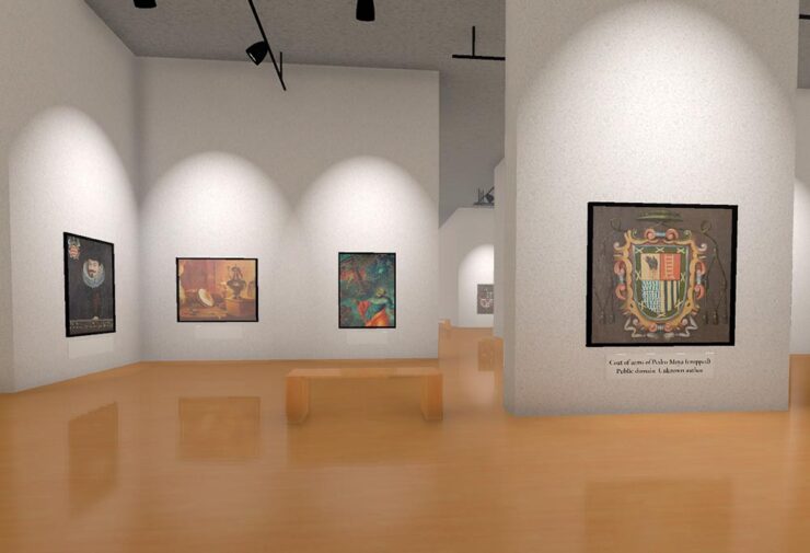
A “nearly-infinite virtual museum generated from Wikipedia,” this program is made possible by the images associated with an article. Better still, there are exits from the galleries that follow the links in those articles, leading to … well, lots to see.

Meanwhile, Cultured magazine brings us a great article on four great libraries in the U.S. — I mean, a slide!? Awesome:

The North Boulder library. Photograph by Bruce Damonte.

Visit Seattle, Scottsdale (AZ), Eastham (MA), and, as shown above, North Boulder, Colorado, and read a brief item with the architect that designed them.

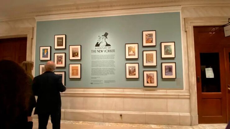
Print magazine brings us an article the New York Public Library’s celebration of 100 years of the New Yorker magazine — another institution continuing to do great work in the face of today’s realities:

Photograph by Amelia Nash.

The exhibition, which “charts the magazine’s evolution from the roaring twenties to the digital age, drawing from NYPL’s vast archives and supplemented by treasures from The New Yorker itself,” is up through February 21st, 2026. Or, if you’re not able to make it to the Big Apple, check out the film on Vimeo.

Type and Typography

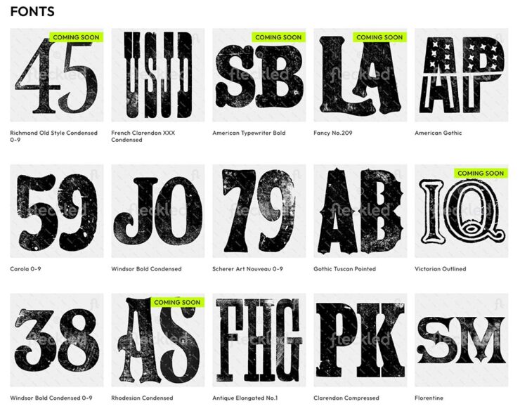
Feckled offers “150+ hand-orinted letterpress fonts for digital download,” This is Colossal highlights, mentioning creative director Jason Pattinson’s new venture. It’s not perfect — those letterpress fonts are JPG files, not installable typefaces — but nonetheless, worth a look if you need something unique for a Photoshop project:

Some of the typefaces offered at Feckled.

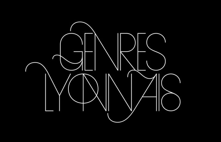
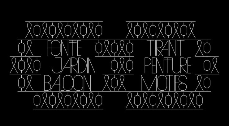
CreativeBoom brings us their monthly feature on type, with two I’d like to highlight. Naancy, new from French foundry 205tf, is Art Nouveau in all the right ways:

“Inspired by the French city of Nancy and its school of art and design,” 205tf says.

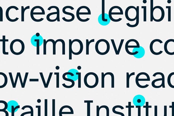
But it’s Aktinson Hyperlegible Next that gets the prize from me:

“The Atkinson Hyperlegible font uses special design principles to differentiate characters and make each one unique,” helping low-vision readers everywhere.

First introduced in 2019, it’s now been expanded to different weights and styles, with new glyphs (individual characters, that is) for different languages and situations. As before, it’s free from the Braille Institute. Fantastic.

On A Wild Jaguar

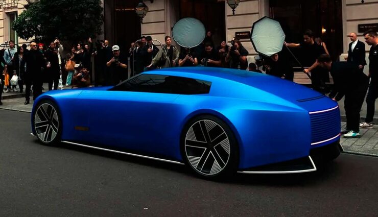
Back in December, Jaguar made a huge splash — not necessarily the graceful skipping stone we think of from the glory days, but lots of waves nonetheless — with its Type 00 concept, highlighted here on Foreword (along with literally everywhere else).

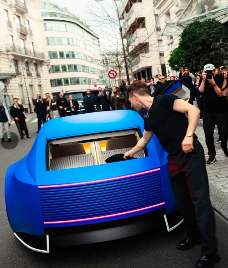
The satin blue finish is only one of the striking things in this photograph.

On March 10th, it was, um, spotted in the wild, in what was certainly a choreographed event — given the huge influencer paparazzi presence — but not gained a ton of traction (sorry) in the mainstream press. (Motor1 caught a whiff, and decided it “doesn’t even look real….”)

However, I mentioned in December that it’s too early to call a strike — a position The Autopian‘s Jason Torchinsky almost agrees with: “Holy crap, I think I like it.” Shown in Paris, and described as “gliding around and looking like it somehow doesn’t exactly fully exist as part of our reality,” it might be starting to bring people around.

There’s no rear window, but at least now we know how the trunk is accessed on the car.

The sedan this concept previews will debut this year. Let’s see how it shakes out.

On Wild Photography
Leica Turns 100
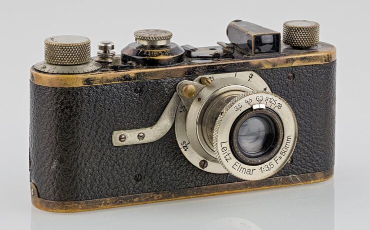
The Leica I was unveiled 100 years ago: March 1, 1925. (Photo by Kameraprojekt Graz 2015. CC-BY-SA 4.0.)

“The Leica I, the first mass-produced 35mm Leica camera, is widely celebrated for its influence on photography,” PetaPixel notes with dry understatement. (Thankfully, they use the word “revolutionary” farther down in the article.)

“I hereby decide: we will take the risk,” Ernst Leitz II said in 1925 when he decided to mass-produce the famed Oskar Barnack’s Ur-Leica invention, and modern photography was born. From the front in World War II to the weblog you’re reading and literally everything in between, Leica has led in ways large and small.

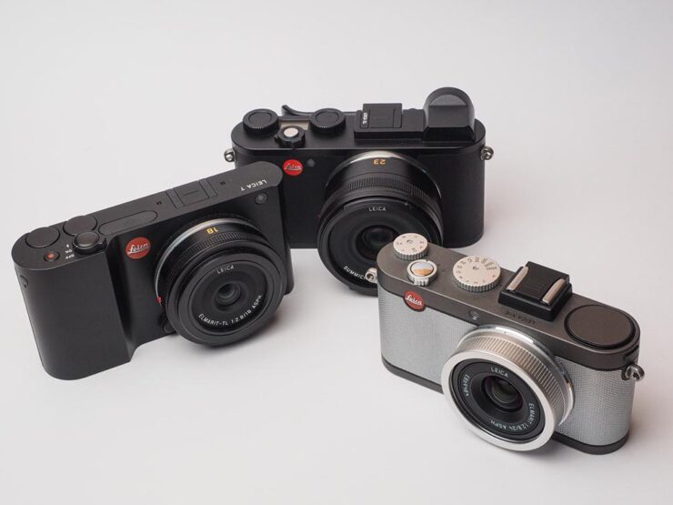
Their M system is a direct descendant of that Leica I and still produced today, to great acclaim; the Q all-in-one cameras are huge hits despite the luxury price tags; and even their missteps seem to find their place, as MacFolios highlights in “Two Leica digital cameras with legacies that defied initial criticism.

Some of Leica’s APS-C camera systems: from left, the T, the CL, and the X-E.

One of those, the CL, is my camera of choice — and despite being six years old and discontinued, is still getting software updates and a growing selection of lenses thanks to the L-Mount lens system. (Another is the T/TL mentioned last month when Sigma introduced the BF.) May it live for a good long while yet, as Leicas tend to do.

Special Bonus #2: PetaPixel bring us another interview with Sigma’s personable CEO, Kazuto Yamaki, on why he is “so passionate and driven for the success of his family business.”

Nature and Wildlife Photography Awards

Highlighting the “endless wonders of our planet,” This is Colossal brings us the fantastic results of the 2025 World Nature Photography Awards, a contest whose photography can “influence people to see the world from a different perspective and change their own habits for the good of the planet.”

Fireworks, Brazil. Photograph by Marcio Esteves Cabral.
Feathers, Sri Lanka. Photograph by Pandula Bandara.
Devghali Beach, India. Photograph by Mantanu Majumder.

Of course, it’s impossible to mention today’s wildlife without mentioning the “vulnerability of the earth’s inhabitants and juxtapositions between nature and the human-built environment,” as Colossal notes.

Ankle Bracelets, United States. Photograph by Charlotte Keast.

Meanwhile, there’s also the (unrelated) 2024 Nature Photography Awards, as highlighted by PetaPixel:

Polar Bear Amid Fireweed Blooms, unlisted Arctic location. Photograph by Christopher Paetkau.

There are also the 2025 British Wildlife Photography Awards, as noted by This is Colossal:

Street Cleaners, London. Photograph by Ben Lucas.

We do, in fact, run into too many of these contests; while I can’t argue with that, I can suggest that nature and wildlife are worthy subjects. Even in fun:

Declaration of Love. Photograph by Roland Kranitz.

Crooning, almost — Squirrel Sinatra. See more of the Nikon Comedy Wildlife Awards at PetaPixel.

2025 Sony Photography Awards

Another contest, yes, but one that’s gained a stature — almost a half a million entries this year — and one that covers a huge variety of subjects:

The Colours of the Andes, Peru. Photograph by Kunal Gupta.

Naturally, I gravitate towards the architecture category:

Monochrome Majesty: Cuatro Torres Business Area, Spain. Photograph by Robert Fülöp.
The Guard, Netherlands. Photograph by Max van Son.
Centre of the Cosmos, China. Photograph by Xuecheng Liu.

Read More at This is Colossal and Archinect or visit the World Photography Organisation.

The Darkest Skies

PetaPixel also brings us photography from Mihail Minkov, who spent nearly six months traveling to “dark sky” locations — those not suffering from the ever-increasing effects of artificial light — and brought home some spectacular results:

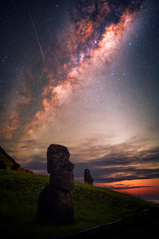
A Moai on Râpă Nui, or Easter Island, in the South Pacific. Photograph by Mihail Minkov.

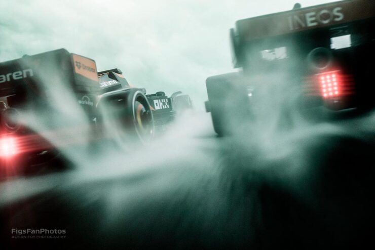
Special Bonus #3: Lego F1 action photography!

Great stuff from Hungarian photographer Benedek Lampert. (See his Star Wars Lego photographs, too.)

Beautifully Briefed 24.6: Summer of Win (Mostly)

In this installment of Beautifully Briefed, let’s take a look at some great posters, great print items, and great photography. Plus, an update from Adobe’s continued campaign to lose friends and attract government attention. Fun stuff!

GET LECTURED (ON ARCHITECTURE)

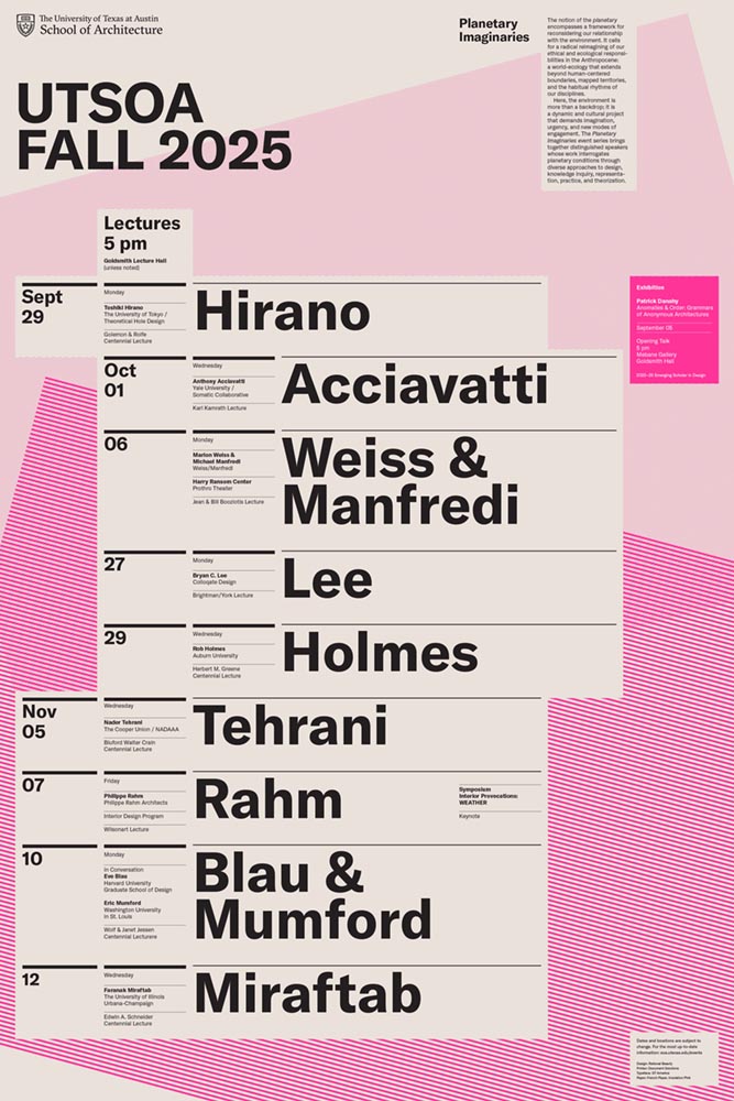
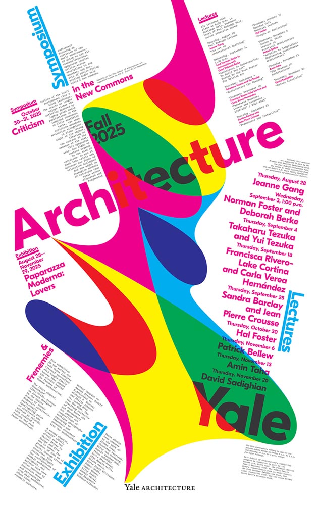
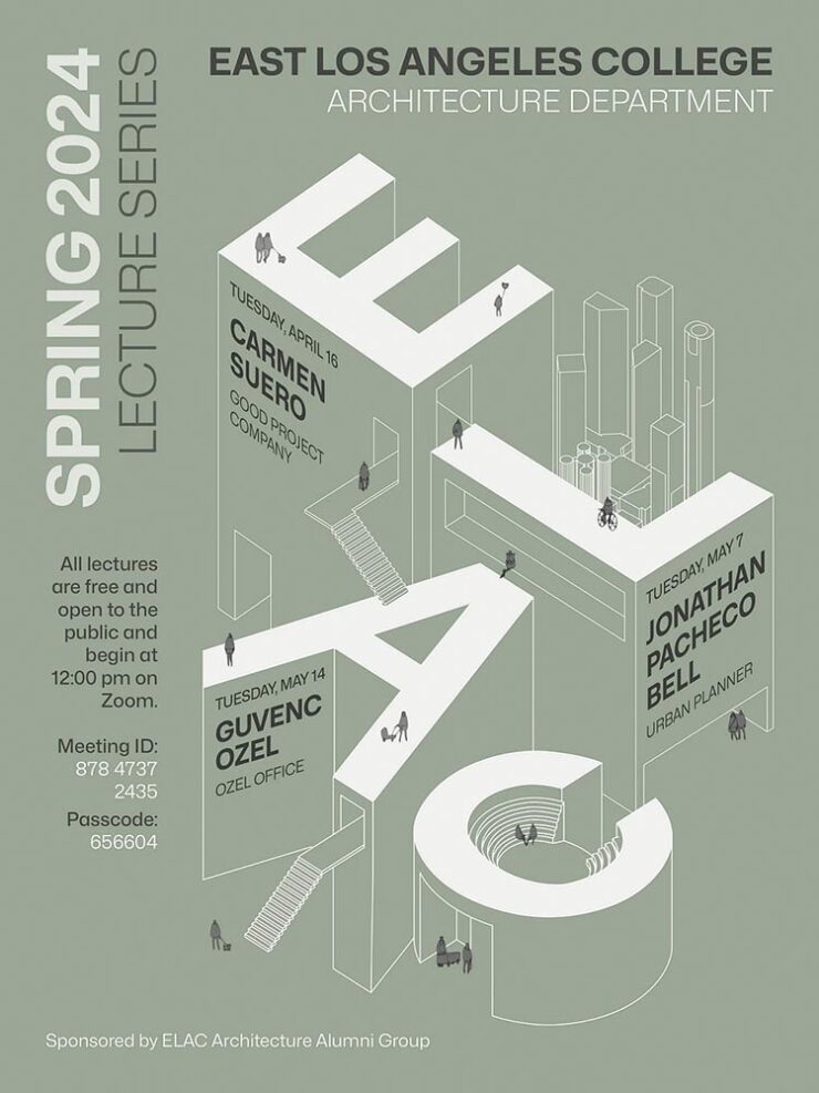
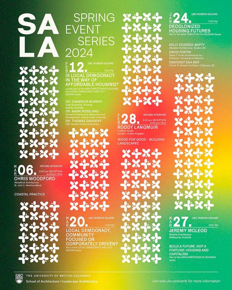
Back in September, I mentioned Archinect’s Get Lectured poster series. They’re back with the Spring 2024 winners, including these two faves:

ELAC lecture poster design by Tashfiah Ahmed.
Lecture poster from the University of British Columbia; designer not listed.

Great examples of design in a often difficult category. See the rest.

Architecture Photographs by Hélène Binet

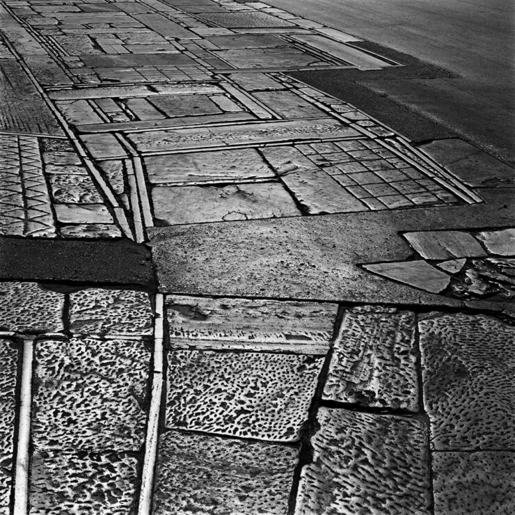
While we’re discussing architecture, let’s talk about a Dezeen post that caught my eye: photographer Hélène Binet has a new book out, adding to her long career capturing the old-school way — using film.

“A Sentimental Topography by Dimitris Pikionis, landscaping of the Acropolis, Athens, Greece.”

This series captures shadows and light with exceptional talent, including the above, where she’s praised for “captur[ing] in a single image the tactile and textured presence of tectonic form, both in built and natural environments.”

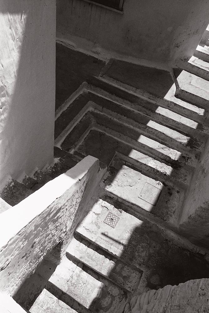
“Staircases in Sperlonga, Latina, Italy.”

I love the softer shades of gray than shown in the previous image, and both this and the image below demonstrate a deep understanding of architectural expression.

“Kolumba Museum, Cologne, Germany, by Peter Zumthor.”

Read the post from Dezeen, see more examples of outstanding work on her website, or buy the book with 170 photographs, essays, and more.

2024 Audubon Photography Winners

This is Colossal posted about this a day before my Audubon magazine showed up with these prominently featured, and they’re all winners.

Wild Turkey, Female Bird Prize Winner, by Travis Potter.

Bird photography is a difficult skill requiring patience, perseverance, and specialized gear; those who excel at it deserve recognition. Plus, there’s this:

Audubon’s climate science report Survival by Degrees reveals that two-thirds of North American birds are threatened by extinction from climate change, including species featured in this year’s Audubon Photography Awards like the Blackburnian Warbler, California Quail, and Sedge Wren.

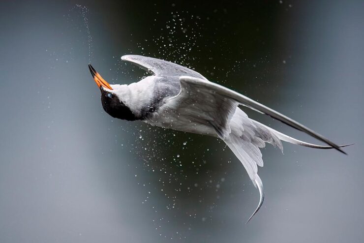
Forster’s Tern, Professional Honorable Mention, by Kevin Lohman.

Check out the Colossal post, or see the full story at the Audubon website.

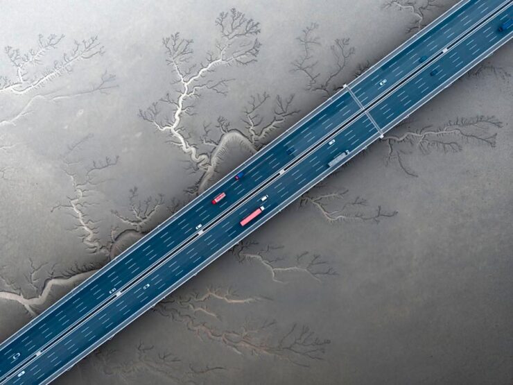
Special Bonus #1: Kottke points us towards the Siena 2024 Drone Photography Awards. “Look! Up in the sky! It’s … another contest!” Good stuff nonetheless:

“Jiashao Bridge” by Sheng Jiang, China.
PRINT 2024 Awards

The annual PRINT awards are out, featuring — natch — great items in print, including items like the Smithsonian’s annual report and a Naked Trails brochure. Here are a couple of items from the book design category:

Jacket design by Robin Bilardello.

Author sketch and lettering by the author. Also, let’s get the . . . :

Cover design by Milan Bozic, with illustration and typography by Lauren Tamaki.

Fantastic.

Special Bonus #2: Hoefler & Co. brings us Typographic Doubletakes: “While good typefaces have prodigious families of carefully related styles, some of the best typography builds unexpected relationships between unrelated fonts.”

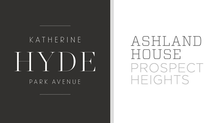
Left: Chronicle Hairline + Landmark. Right: Vitesse + Gotham.

Their blog refreshes as you scroll in more ways than one — enjoy.

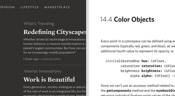
Left: Mercury Text + Ideal Sans SSm. Right: Whitney + Operator and Operator Mono.

Special Bonus #3: Kottke points us to a LitHub post arguing for adding full credit pages to books acknowledging everyone who worked on them. “How lovely it is to be seen and appreciated.”

Adobe “Too Easy to Hate,” Say Users, Employees

Adobe continues to score big with the public — in the best Boeing style, a formerly-great company has put profits before users and employees. While successful from the shareholders’ point of view (record profits, again), some are . . . upset. PetaPixel:

Just over a month ago, an Adobe exec called AI the “new digital camera.” Simultaneously, an Adobe marketing campaign chucked photographers under the bus, and not for the first time, which caught the attention of the American Society of Media Photographers (ASMP). At the very top of Adobe, there is a concerning and frustrating lack of understanding about art and the people who make it.

Even “exasperated employees implored leadership to not let it be the “evil” company customers think it is;” while that might be a stretch — “ignorant greed” is a better description — either is not a winning look.

The latest was a terms-of-service update that many saw as a rights grab, allowing the company to use users’ work to train its AI services. While those have been amended, the seemingly clear language — “We’ve never trained generative AI on customer content, taken ownership of a customer’s work, or allowed access to customer content beyond legal requirements” — comes from a company that has lost the trust of users, making those words just that — words. Time will tell if they are truth.

But there’s more: Adobe’s just been sued by the FTC (via PetaPixel, Pixel Envy) for hidden fees and difficult cancellations:

“For years, Adobe has harmed consumers by enrolling them in its default, most lucrative subscription plan without clearly disclosing important plan terms,” the lawsuit alleges. “Adobe fails to adequately disclose to consumers that by signing up for the ‘Annual, Paid Monthly’ subscription plan, they are agreeing to a yearlong commitment and a hefty early termination fee that can amount to hundreds of dollars. Adobe clearly discloses the early termination fee only when subscribers attempt to cancel, turning the stealth early termination fee into a powerful retention too that [redacted] by trapping consumers in subscriptions they no longer want.”

I’m actually glad for this, as I wasn’t aware that my $60+ monthly fee is a payment on an annual plan. (Ug.) Not too big an issue — I actually feel like there’s decent value in the plan and will continue to subscribe for the foreseeable future.

But I’d also be lying if I said I’m completely satisfied with our business arrangement: alternatives are few and far between. While Adobe does not have a monopoly legally or technically, in the publishing industry at least, they are, for all intents and purposes, the only game in town. It would be nice if they would at least demonstrate a modicum of respect for their users.

Update, 25 July 2024: “Adobe Exec Says Early Termination Fees Are ‘Like Heroin’ for the Company,” according to PetaPixel. Hmph.

Beautifully Briefed, Late June 2022: AIA’s Best Architectural Photography, 2022 Logo Trends, and … Buick!

Three items for the end of June, 2022: AIA Los Angeles announces photography awards, the 2022 edition of the Logo Lounge logo trends report is out, and Buick makes its new logo official. Let’s get into the details.

AIALA Photography Awards

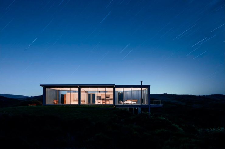
The Los Angeles chapter of the American Institute of Architects (AIA|LA) has announced this year’s winners of the annual Architectural Photography Awards, and there’s some pretty great stuff:

Ryan Gobuty: Santa Fe (Santa Fe, NM)
Taiyo Watanabe: C-Glass House (Dillon Beach, CA)
Tim Griffith: Mission Bay (San Francisco, CA)

See more at AIA|LA. (Via Archinect.)

2022 Logo Trends Report

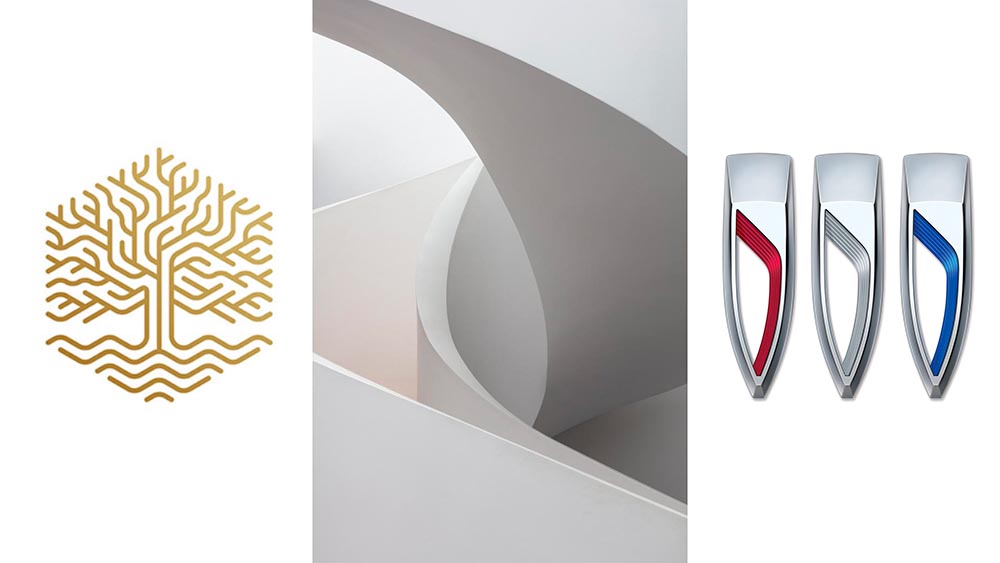
The always-excellent Brand New points us at Logo Lounge’s 2022 Logo Trends report, it’s 20th annual look at what logos and branding, as a group, are looking like this year.

Logo Lounge 2022 Logo Trends Report

[W]hile there are still corporate-looking marks being crafted there is a stronger effort to find ways to identify products that are artisanal and handcrafted.

Bill Gardner, Logo Lounge

Corporations trying to be more human. (News at 11.) But then, my use of that particular phrase perhaps betrays my lack of being in touch with the modern corporate world; I think publishing is a different animal, and prefer being part of that world despite the regular influence of corporate entities there, too.

Nonetheless, following logo trends is, from a purely graphic design perspective, worthwhile — and this report summarizes beautifully. Read on.

Buick’s New Logo, Officially

We’ve touched upon it before, but Buick has, with the release of the Electra Wildcat concept, officially updated its logo:

Official: Buick’s new logo

Electra is Buick’s name for electric cars, simultaneously stating the obvious while giving a big nod to past models — and the Wildcat concept is, dare I say it, borderline cool:

Scandinavian, American, Futuristic, Retro … Buick!

Both Buick and Cadillac have hinted at more Art Deco in their upcoming products, perhaps best illustrated on this concept’s interior:

It’s a head rest, folks.

Nice. (Not even remotely possible on a production model, but still.) Read more on Buick’s new logo and transition to an electric car brand at Car and Driver or The Drive.

See you in July!

Update, 12 August 2022: Brand New weighs in: A New Point of View… ick

Beautifully Briefed, Late February 2022: Photography, Font, and Furniture

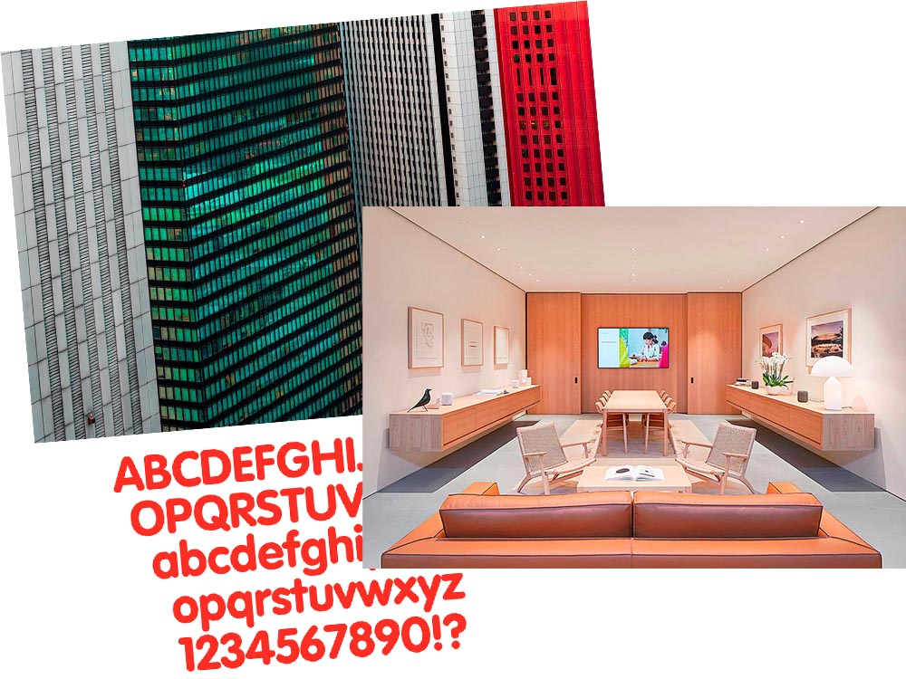
A three-fer as we wind through this February: Peter Stewart, a really talented architecture photographer from Australia; VAG Rounded, Apple’s keyboard font and how it relates to Volkswagen; and a new site called The Apple Store Glossary leads to an interesting review of furniture in Apple Stores.

Peter Stewart

November’s Beautifully Briefed covered the 2021 Architecture Photography Awards shortlist, and one of the photographers is Peter Stewart, a self-taught Australian who wanders around Asia. Gotta say: he’s better than great.

“Hanshins Web” Osaka, Japan. 2019, by Peter Stewart

His eye for pattern and color is spot-on:

“Four Columns” Tokyo, Japan. 2019, by Peter Stewart

Archinect’s In Focus feature has a great 2019 interview that not only discusses the how and where, but also the why — including his thoughts on use of Photoshop and, perhaps most insightfully, how to thrive as a photographer in this crowded age:

The hardest part of being a photographer today is finding a way to stand out among the crowd. In just the past few years Instagram has changed everything and given rise to a sizable number of highly talented new photographers. We are inherently influenced by the work we see from others, and as such has given rise to a lot of popular trends and styles of photography which has brought about a bit of a copycat culture. The point is, I think it’s important to find your own themes and ideas in order to progress, and not to simply emulate.

Peter Stewart, Archinect Interview

Check it out.

VAG Rounded and Apple

Daring Fireball is a daily stop for Apple geeks like me, but rarely does it cross into graphic design territory — except when it links to a Jalopnik article discussing how a Volkswagen font wound up on Apple’s keyboards.

Good stuff. (Bonus ’80s Dasher brochure siting, too.) Enjoy.

Apple Store’s Boardroom Furniture

Some Apple Stores have additional, not-usually-open-to-the-public spaces called boardrooms. And, as you might imagine, they’re filled with interesting stuff.

A new (to me, at least) site called The Apple Store Glossary has information and photographs of all aspects of Apple Stores, from the new Pickup area to the behind-the-scenes Boardrooms.

The latter started out as something called Briefing Rooms, intended for business customers and special events. However, they’ve evolved: more casual, more comfortable. And more interesting:

Apple Boardroom (Passeig de Gràcia store, Barcelona, Spain)

9to5Mac has a great roundup of these rooms we don’t see, from the accessories (bonus Eames Bird sightings) to the books, and perhaps most interestingly, the furniture.

Grab a seat, get comfortable, and get info.