Tag: om malik

  • Beautifully Briefed 26.6: New is Good. Old is Good.

    Beautifully Briefed 26.6: New is Good. Old is Good.

    “Welcome to the new,” he said, pointing to the old, now dressed in a new suit. You’re reading this because the words and ideas resonated — and it’s why only the style is newly tailored.

    Sometimes, though, a new look can be enormously satisfying. Enjoy.

    This month’s Spine

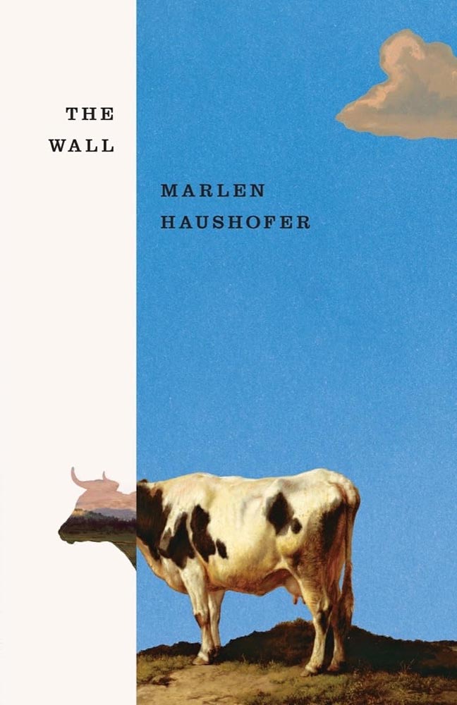
    Beacon Press.

    “Paperwork. Nice,” I said, while potentially allowing a smidgen of political speak through the door. (Not sorry.) Read the column here.

    Design and type
    Matt Dorfman’s many hats

    Matt Dorfman’s book covers are a regular item here on Foreword, including several of my Favorite Book Covers of the Year posts. So it was a delight to see a new interview with It’s Nice That.

    [B]usy days and late nights begin with, as Matt puts it, “churning out a generous amount of trash”. Much to his frustration he will be “working through what often feels like a landfill-sized hill of boring ideas”. Despite taking up quite a bit of time, it’s a necessity, as among this trash will be a shred of an idea worth expanding upon. “Usually it’s a minor detail from an earlier comp made in haste and far afield from anything that book is actually about,” he says, “but it typically has a quality of brokenness or something unfinished that just looks interesting.”

    — Harry Bennett, It’s Nice That

    “Do anything except what’s right in front of you,” he tells them, while mentioning that he often favors collage. “Collage has become one of my shorthands for pairing themes and ideas together that aren’t so readily represented in nature or culture.” As in:
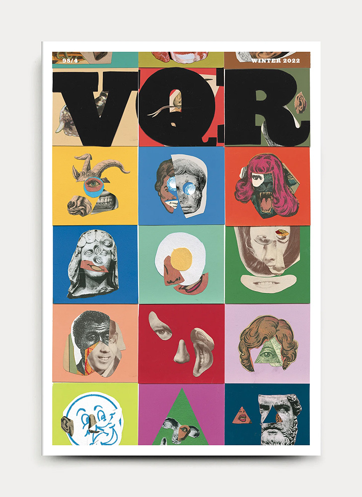
    VQR. Book design by Matt Dorfman. Image via It’s Nice That.

    Did I mention that he’s also the art director The New York Times Book Review? Yeah:
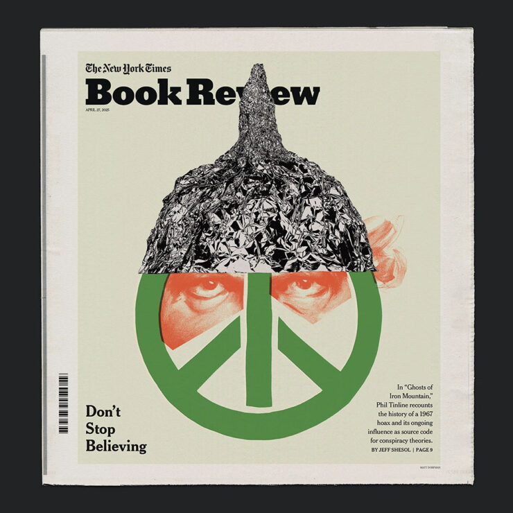
    One of Matt Dorfman’s covers for the NYT Book Review. Image via It’s Nice That.

    And a quick preview of next year’s Favorites list, with this gem:
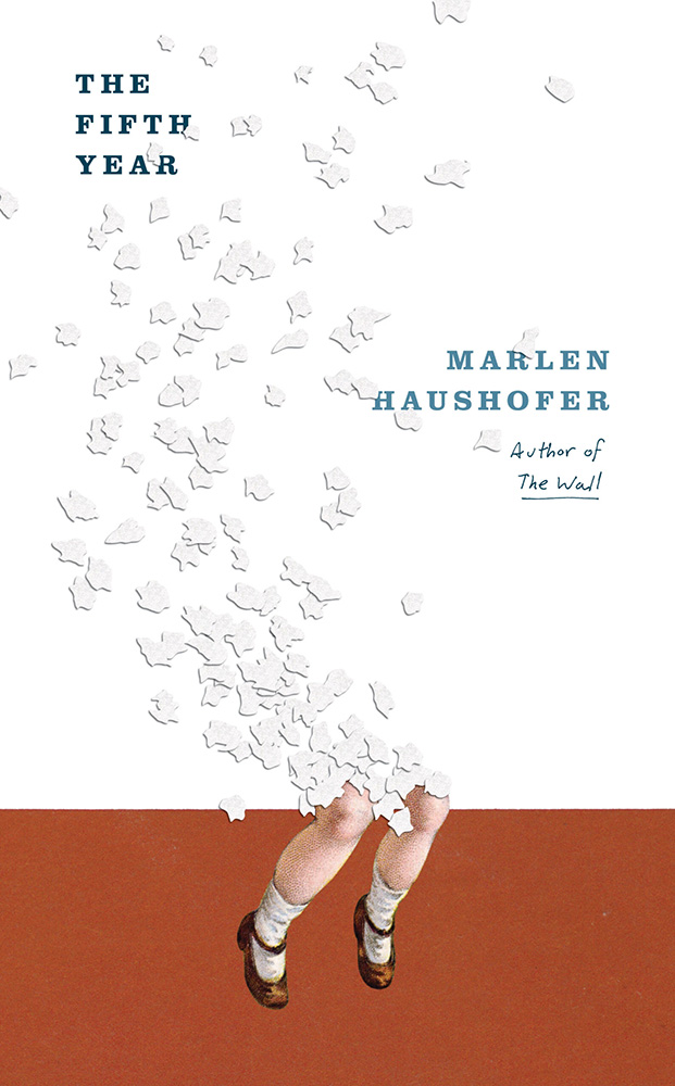
    Cover design by Matt Dorfman.

    If it looks familiar, that’s because…:
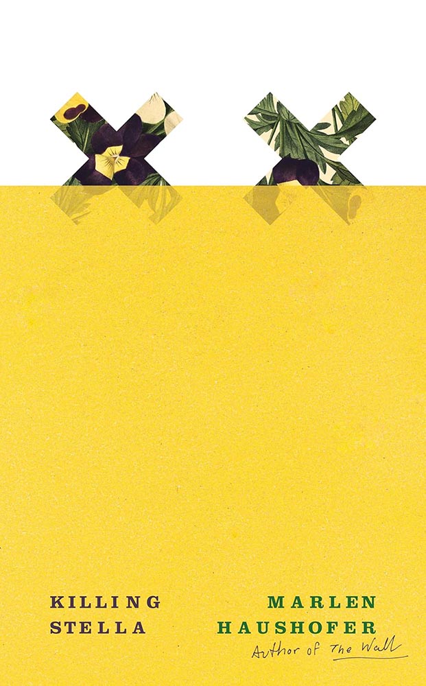
    Cover design by Matt Dorfman.
    Cover design by Matt Dorfman.

    Both previous Favorites here on Foreword. Awesome.

    Read the whole interview at It’s Nice That.

    “It’s All Greeked to Me”

    Glenn Fleishman, writing at Six Colors, points us at a YouTube documentary on the history of Lorem Ipsum:
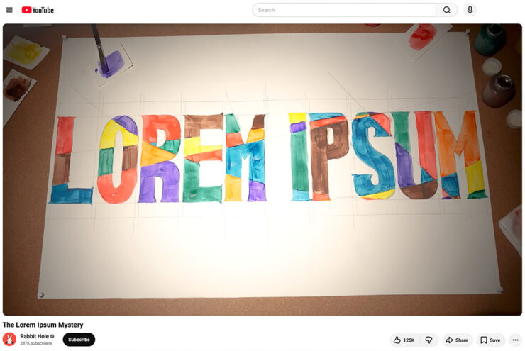
    A screenshot of the YouTube video.

    “I found it riveting and hilarious, and exactly the kind of Rabbit Hole (her channel name) that I fall down with printing and type history myself,” he writes. “[H]er dogged research has largely filled in the missing pieces of the story of where the run of seemingly Latin text used by designers to act as placeholder (or ‘Greeked’) text in mock-ups since the late 1960s came from.”

    I agree: it’s well put-together and, more importantly, answers a question you might not have actually had — but now can’t resist. Enjoy.

    Side note: Privacy where possible: I’ve switched to screenshots of YouTube videos rather than embedding them. That way folks who choose not follow the link aren’t stuck with the trackers embedding foists upon all.
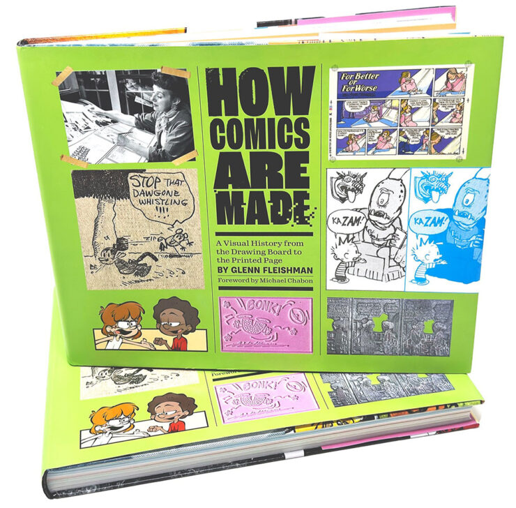
    Special bonus #1: Glenn is one of those people who wears many hats — 2019’s awesome Tiny Type Museum project is his, for instance — but it’s the comics connection that might be most appreciated. He’s got a book out about it, now in its second edition, which has just been nominated for Will Eisner Comic Industry Awards — the Eisners. Read more.

    2026 logo trends
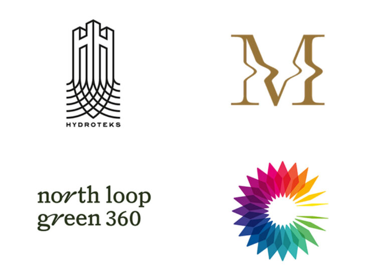
    The Logo Lounge has posted its 2026 Report.

    The quality of the Logo Trend Report has slipped over the past couple of years — there are suggestions that parts of it are generated rather of written — but I think the zoom-out is still useful for those of us in design.

    If, for no other reason, to make sure our work is ahead of the curve.

    Via Brand New, one of the only subscription sites I’ll link to. (Because it gives me an excuse to encourage you to subscribe, too: at $20/year, it’s sensibly priced and very much earns its keep.)

    Best new fonts: a one-off

    This month’s CreativeBoom post on new fonts was shorter than some — it’s summer! — with only one I’d like to highlight:
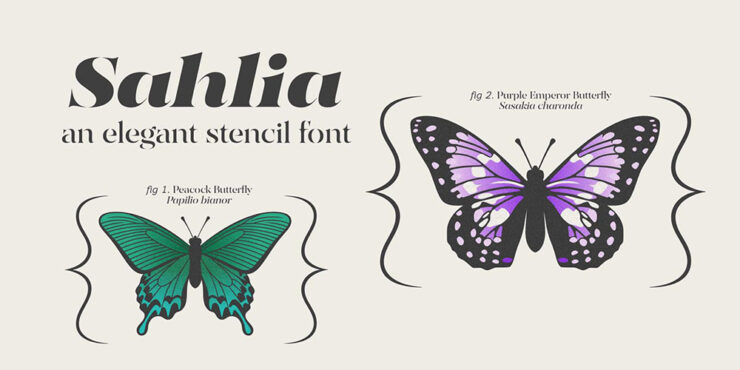
    Sahlia, by Arcane Type Foundry.

    But what a one it is. How often are we given an excuse get excited about stencil-style?
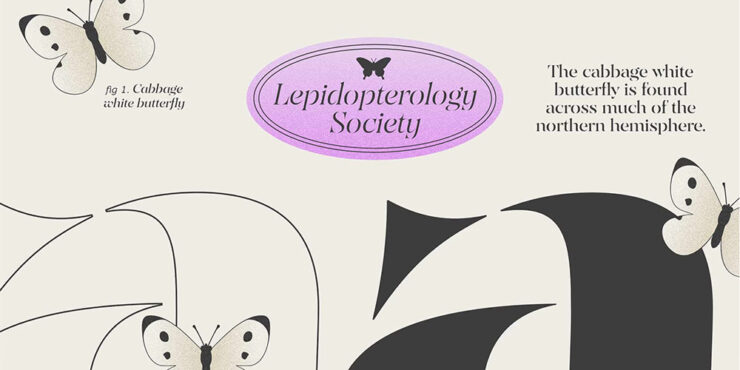
    Close-up details (and more butterflies).

    Sahlia is available from Arcane Type Foundry.

    Font previews: not simple

    Marcin Wichary, whose brilliant Unsung continues to impress, has a neat item that we’ve all seen at this point: font menus that preview the font name in the style of the typeface, sometimes poorly.

    Turns out, that’s not at all easy.
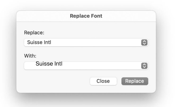
    Oopsie. Screenshot courtesy of Unsung.

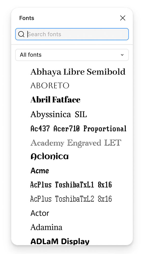
    “Font previews are fascinating because they are the perfect showcase of how tricky fonts can be at scale,” he writes. The question is: why?

    It’s actually impossible to left align or center text. Ever. Not just because each font does whatever it wants – font size is a number that doesn’t really give you anything to hang a hat on, and the font can place itself in its box however it desires, too – and not just because fonts often lie (via bad metrics) about what they store inside, but also because aligning and centering are really in the eye of the license holder, and have more than one definition.

    So, every time you align text to anything, in whatever way, it’s only an approximation. Most of the time that’s good enough. Here it is not.
    — Marcin Wichary, Unsung
    It takes a surprising amount of work to get this right. Screenshot courtesy of Unsung.

    “There are icon fonts, color fonts, and non-Western fonts so rich in variety and tradition that this category itself is basically a fractal,” he says. “There’s a craft to getting it right.”

    Read the rest.

    Special bonus #2: Wichary also built something called Fontificator. “I thought it’d be fun to share this internal tool I made over a decade ago to aid with exploring options for Medium’s typographical redesign,” he says.
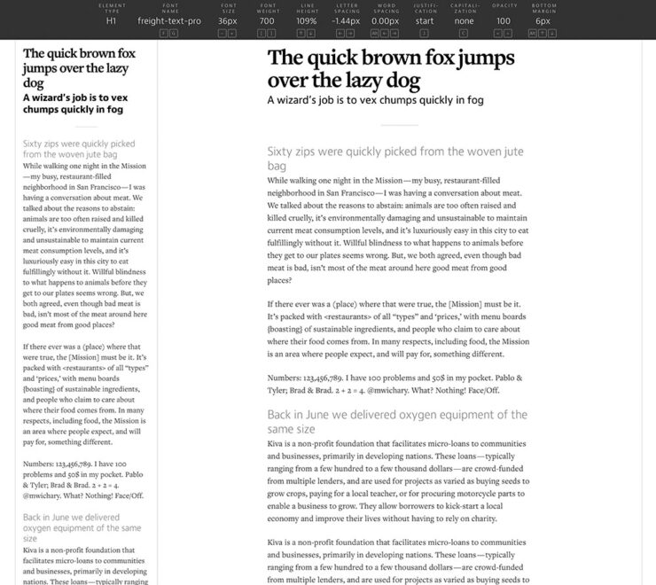
    Fontificator. Screenshot courtesy of Unsung.

    “The motivation for building Fontificator came from two observations:

    • font previews on type foundry sites were generally too limited to get a real sense of how a certain typeface feels, and it was best to see a font in situ,
    • often an extremely tiny nuance — like adding some letter spacing, or messing with line height — was what separated something that was promising from something that seemed very far from working.”

    It’s both brilliant and fun. Check it out.

    Adobe does AI

    I know, I know, more Abode stuff. I’ll keep it quick(ish).

    PetaPixel reminds us that, “the vast majority of working photographers are using AI to help save them time, handling tedious tasks that aren’t necessarily all that creative.” Adobe’s latest updates address that:
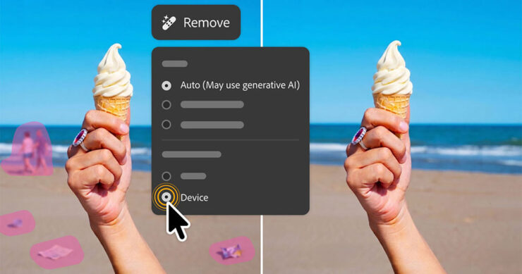
    AI removal tools now have flavors, including on-device if needed.
    • Lightroom’s AI Sharpen tool can now use Topaz Labs’ Noise-Aware Sharpen model directly in the app. This promises to recover fine details more effectively, per Adobe. (More on Topaz below.) 👍
    • Lightroom’s Assisted Culling automatically stacks similar images into groups and automatically suggests the “strongest one.” 👎
    • Lightroom has a new Photo to Video feature that uses Firefly and Google Veo to turn a still photo into “polished b-roll or reels with AI-generated motion.” 👎
    • Photoshop’s reflection removals are now isolated on a separate layer, “giving users control over opacity for more natural-looking results,” according to PetaPixel. 👍
    • Photoshop’s Remove Tool, which uses generative AI to erase a selected object and replace it with realistic-looking pixels, can now be used offline using an on-device AI model. 👍

    Get the full story at PetaPixel.
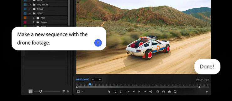
    The agentic AI “assistant” might — or might not — be good. (Subscribers pay $$ for it, so….)

    Meanwhile, Adobe’s promised “creative agent” — ’cause agentic AI — has “fully arrived” in Creative Cloud, PetaPixel writes. “Inside Premiere, Photoshop, Illustrator, InDesign, and Frame.io, users can tell Adobe’s Firefly-powered AI Assistant how to edit photos, videos, and other graphics.” It runs in a panel, like having Chat GPT or Claude right in the app.

    “As a creative, you remain in control, choosing what to hand off, what to refine and how to apply your taste, expertise and judgment to shape every editable outcome. These tools are built for how you’ve told us you actually work,” Adobe explains.

    I’m going to have to try this one. Maybe. Someday.

    Several days after the above items were debuted, Adobe purchased Topaz outright. It’ll “fully integrate Topaz’s [AI scaling] models across apps like Photoshop, Lightroom, and its AI image generator Firefly” — which should be a good thing.

    Special bonus #3: In case AI-all-the-things is getting to you, there’s this:
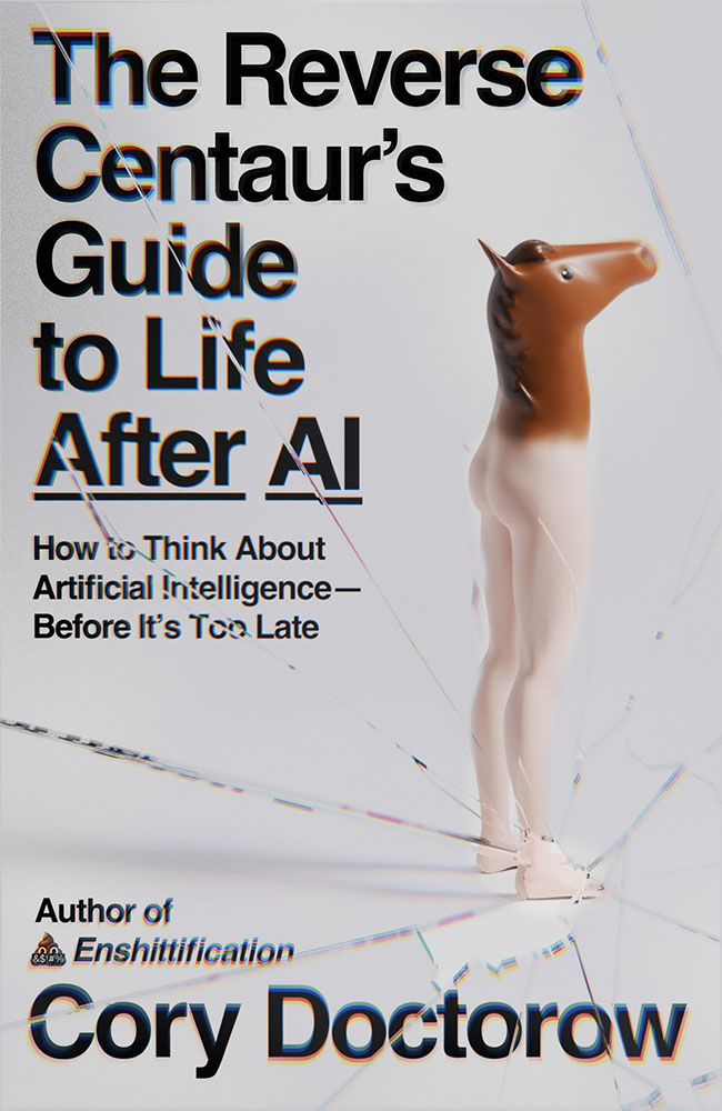
    “A ‘centaur’ describes a human augmented with a technology, like machine learning, or even just driving a car or using autocomplete,” ArsTechnica writes as part of an interview with Doctorow. “A reverse centaur ‘is a machine head on a human body, a person who is serving as a squishy meat appendage for an uncaring machine.’”

    “Being a centaur is generally viewed as a positive thing; few people relish being a reverse centaur. And yet the AI industry….” Read the rest.

    People
    Jason Snell

    Amongst the tech names I’ve know for what seems forever, Jason Snell’s is up there. He was first at MacUser, then Macworld, then hung out his own banner at Six Colors.
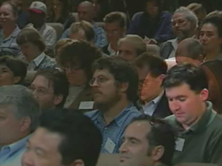
    From Macworld: Jason Snell (highlighted) at the introduction of the iPod, 2001.

    My first day on the job at Macworld, Apple was perilously close to going out of business. It was the fall of 1997, and Steve Jobs had returned to Apple and engineered the ejection of Gil Amelio as CEO, but there was no iMac yet, no visible turnaround in terms of products at all. Beyond the release of the iconic “Think Different” ad campaign, there was nothing.

    Apple’s survival hung by a thread. Steve Jobs asked everyone to trust him. At Macworld Expo, he had enlisted Bill Gates — Bill Gates, of all people! — to help him instill belief in the world that Apple would find a way to survive.

    The world was skeptical, to say the least. My family asked what job I thought I’d get once Apple went out of business.

    —Jason Snell

    Ah, the good old days. (I jest.) Hard to believe, but that was almost 30 years ago. Sheesh.

    So long, in fact, that another milestone has passed: Jason’s left Macworld. Read the column. I’m glad he’ll be continuing with Six Colors, and am looking forward to his new podcast on Apple’s history, Designed in California.

    David Hockney

    I was familiar more than a fan, but it’s undeniable that the world has lost a character — something very ably underscored by the tribute illustrations posted at CreativeBoom:
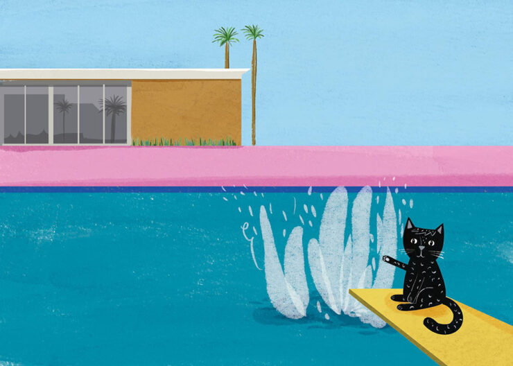
    Illustration by Nia Gould.

    “From Bradford to Beverly Hills, Hockney’s bold colours and irrepressible joy for living inspired a generation. Here’s what they created in response to his passing,” they write. See the rest.

    Om Malik

    Early this month, Om released an essay for the times — and the ages:

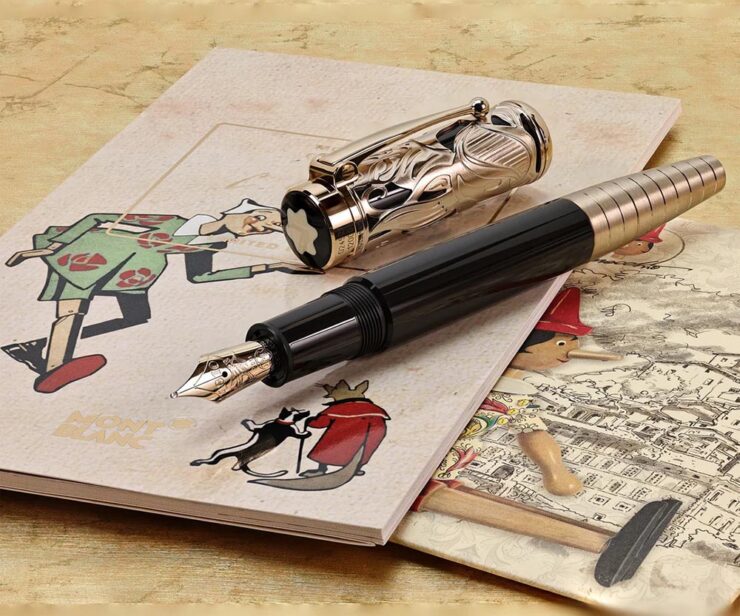
    Most people remember Pinocchio as a story about lying. The nose grows. You get caught. Lesson learned. But that reading misses almost everything Collodi was actually doing. The book is a close study of a society where deception has gone ambient, woven into every institution, every transaction. Courts punish victims. Authority figures perform competence without exercising it. Experts are decorative. Society holds together through spectacle and habit rather than accountability. Into this environment, a naive creature is released, constitutionally unable to resist a good story about easy reward.

    The nose is the least interesting lie in the book. The interesting lies are the ones that work.

    — Om Malik, om.co (Via Daring FIreball.)

    Okay, sure, it was social commentary cleverly disguised as an essay about a pen. This Mont Blanc, in fact:
    The point is, it was as insightful as ever. (See also the previously-cited “Velocity is the New Authority.”) It was immediately deposited in the to-be-posted folder. Before I could could get to that, however, heart disease snatched him away. He was 59.

    I first heard via Pixel Envy, which linked to Om’s excellent photographs posted to Glass (social media),1Forgive the repetition, but just in case: I don’t participate in social media. While I’d heard of Glass, I didn’t know of Om’s posts there — and wouldn’t have followed in any case. Perusing those photos, and posting that link, are a one-off celebrating Om’s talent. and, later, appreciated John Gruber’s thoughtful piece at Daring Fireball.

    Both reminded me of Om’s love of Leica and preference for black-and-white:
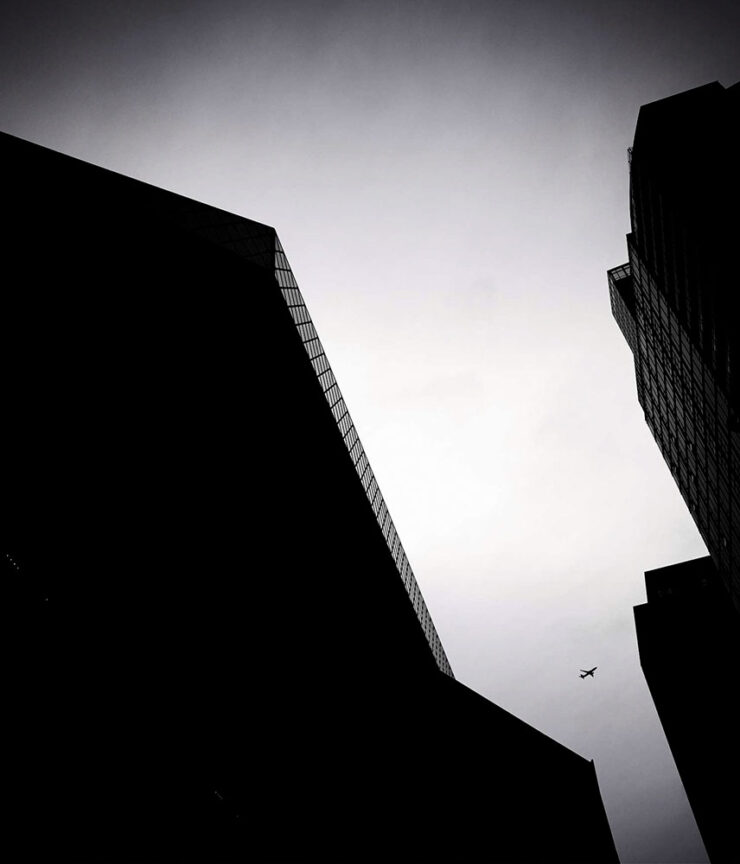
    “Sleepy in Seattle.” Photograph by Om Malik.
    “Does This Qualify as Flora?” Photograph by Om Malik.

    Or almost-black-and-white:

    Untitled. Photograph by Om Malik.

    See a few more, called “Selects,” at Om’s personal photography site.

    Special bonus #4: The day after Om’s Pinocchio essay, above, Daring Fireball posted on Jason Zweig’ on’s three ways to get paid. I won’t spoil it — just go read.

    Photography
    2026 Beaker Street Science Photography finalists

    “This is the 10th anniversary of the Australian Beaker Street Festival. Each year, the competition celebrates fantastic photos of rare and unusual scientific phenomena, endangered species, conservation missions, and much more,” PetaPixel writes.

    Some of these are awesome:
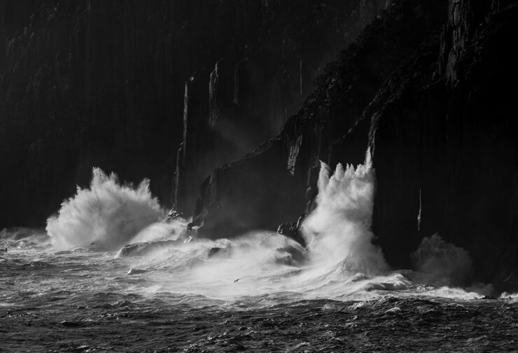
    “Southern Ocean Energy.” Photograph by Nick Green.
    “Just Another Bioluminescent Tantrum.” Photograph by Deni Cupit.

    26 finalists in all. See the rest (and, if you’d like, vote at the link).

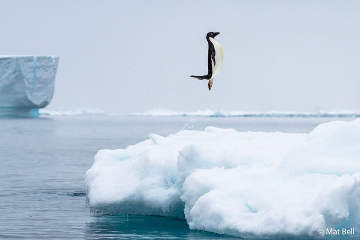
    2026 Australian Geographic Nature Photographer of the Year shortlist

    This contest takes entries from the majestic Australasian Realm, including the ANZANG bioregion consisting of Australia, New Zealand, Antarctica, and New Guinea, and to quote PetaPixel, “there are some real bangers on there.”
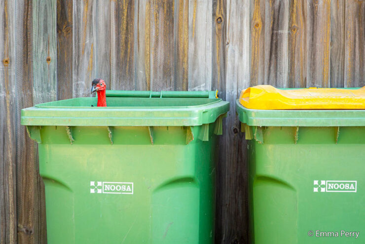
    “Bin Turkey.” Photograph by Emma Perry.
    “Penguin Poe.” Photograph by Matt Bell.

    Nature in all its marvelously diverse glory. See the rest.

    Burton’s America

    I’m surprised I haven’t linked to Brendon Burton’s work before, ’cause it’s right up my alley:

    Traces #10. Photograph by Brendon Burton.
    Traces #6. Photograph by Brendon Burton.

    His second book, Epitaph, “is a series that attempts to unravel the knot of mystery that exists within the dark corners of North America, shedding light on unseen histories and buried past lives.”

    See more. (Via This is Colossal.)

    Landscapes three-fer

    • Travel and nature photographer Jake Guzman has spent the past two years creating Otherworldly America, his new 256-page photography book:

    “Picture Lake Washington.” Photograph by Jake Guzman.
    “Richardson Highway, Alaska.” Photograph by Jake Guzman.

    • Arpan Das has fallen in love with the Kishtwar Himalaya in the Jammu and Kashmir region, part of the Indian Himalayas:
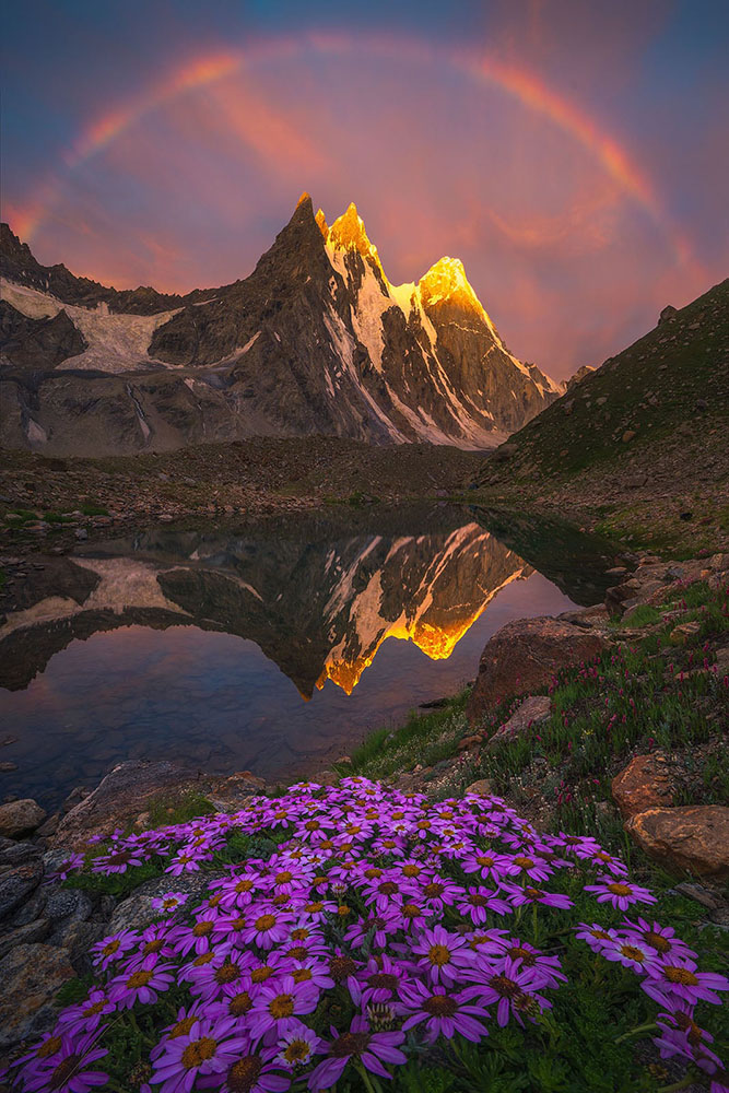
    “Barnaj Rainbow.” Photograph by Arpan Das.

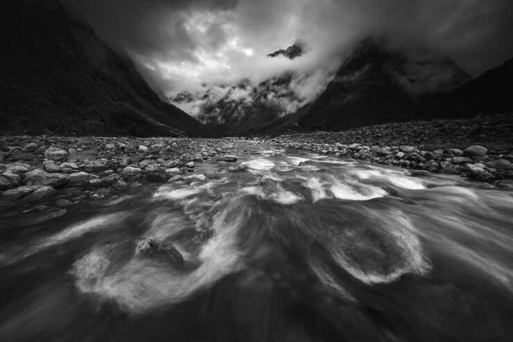
    •  Michael Shainblum photographs the volatile, weather-driven landscapes of New Zealand with “a body of work shaped less by fixed composition and more by responsiveness to constant change”:
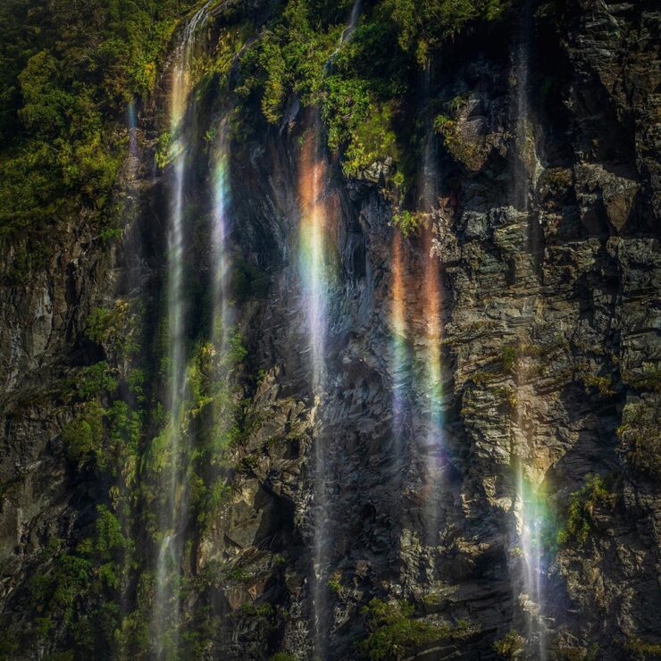
    “New Zealand #19.” Photograph by Michael Shainblum.
    “New Zealand #40.” Photograph by Michael Shainblum.

    All three are via PetaPixel: Jake Guzman, Apran Das, and a longer feature on Michael Shainblum.

    Finally: soothing surf
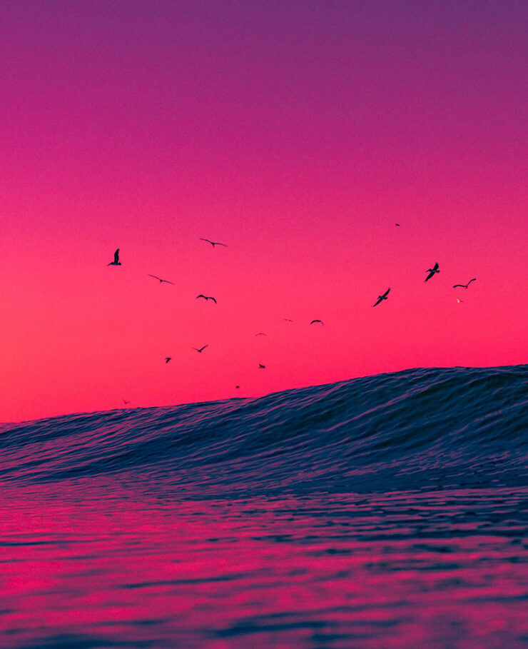
    “Venice Beach: Dreamy #3.” Photograph by Craig Hubbard.

    Hubbard’s photos are ethereal and cinematic, with surfers and wave crests illuminated by the early morning sun or backdropped by the marine layer. Sometimes the intense spray, curl, shoulder, or lip become the sole subjects of the portraits. “The water is the muse and artist,” Hubbard recently told an interviewer. “I’m just a biased translator and documentarian. Lastly, my ego relaxes in the ocean; the need to peacock recedes. This is where my best work comes from — or favorite, I should say.”

    — Kate Mothes, This is Colossal
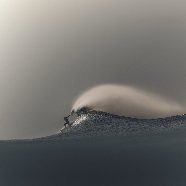
    “Venice Beach: Dreamy #9.” Photograph by Craig Hubbard.

    See more at This is Colossal.

    That’s it for this month. As always, thanks for visiting.

    For folks in the US, have a safe and enjoyable holiday weekend as America turns 250. Let’s hope that we can make it a better place.

    Also: Please don’t forget to let me know of any problems or concerns with the new site. I’ve got a list of items — going to work on them now — but always welcome feedback. Thanks.

    • 1
      Forgive the repetition, but just in case: I don’t participate in social media. While I’d heard of Glass, I didn’t know of Om’s posts there — and wouldn’t have followed in any case. Perusing those photos, and posting that link, are a one-off celebrating Om’s talent. ↩︎
  • Beautifully Briefed 26.1: Finding What’s Needed

    Beautifully Briefed 26.1: Finding What’s Needed

    We’re setting into our third snow of the season here in Georgia, an extraordinary event even in a world where “normal” doesn’t seem to happen all that often any more. Thankfully, there are still gems, waiting to be discovered. Hopefully you’ll find several in the links below.

    Note: The site was offline for several hours mid-month due entirely to my mismanaging an update; the backups took a minute and didn’t restore the plug-ins, so it wound up being rough around the edges for a couple of days. If you visited — or tried to — during that time, apologies.

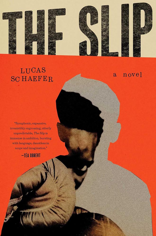
    Favorite book covers of 2025, and more

    If you’ve not seen, set aside a few minutes to enjoy:

    This image has an empty alt attribute; its file name is 25fave_slip-the_jack-smyth.jpg
    Cover design by Jack Smyth.

    More than a hundred examples of book design greatness, with commentary, for the fifth year in a row. Bring a beverage.

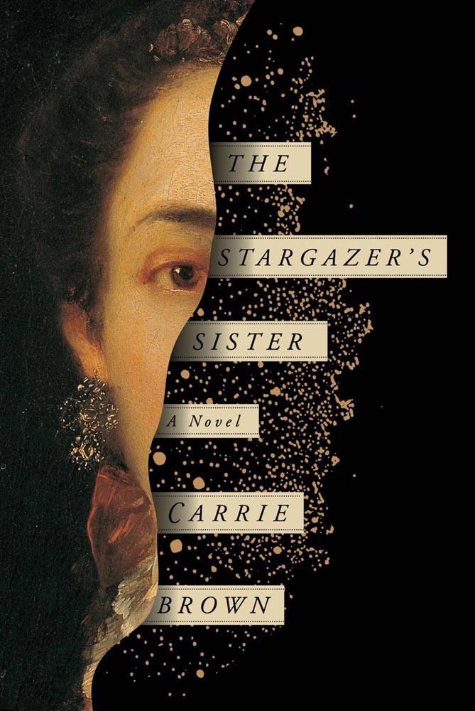
    But wait, there’s more:

    This image has an empty alt attribute; its file name is books_the-stargazers-sister_2016_oliver-munday_lithub.jpg
    Cover design by Oliver Munday.

    LitHub has posted a summary of the last decade of their favorites, too. Whew!

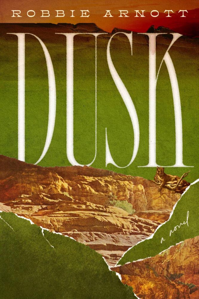
    This image has an empty alt attribute; its file name is books_dusk_alica-tatone_ourculturemag.jpg
    Cover design by Alicia Tatone.

    Special bonus #1: Our Culture has a feature on seven book designers to watch in 2026. None will be a surprise to regular readers, although Alicia Tatone hasn’t been highlighted here as much as she deserves (she had three cover designs, including Dusk, in the runners-up folder for my ’25 favorites, but didn’t appear in the final list).

    This month’s Spine

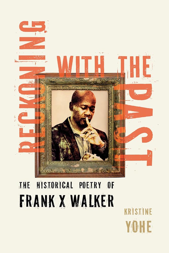
    Meanwhile, over at Spine, my monthly column on University Press goodness has been posted, including this:

    This image has an empty alt attribute; its file name is spine_kentucky_reckoning-with-the-past_jan26_kat-lynch.jpg
    Cover design by Kat Lynch for the University Press of Kentucky.

    Walker, FYI, was the first Black person to be named Kentucky Poet Laureate and coined the term, “Affrilachia.”

    More from the design department
    Heller on Roy Kuhlman

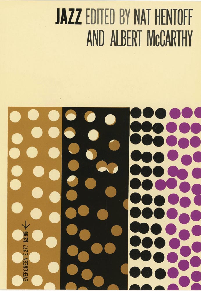
    Steven Heller’s column in PRINT is always fantastic, but some introduce designers more of us should know by name — this time, Roy Kuhlman:

    This image has an empty alt attribute; its file name is books_jazz_roy-kuhlman_print.jpg
    Cover design by Roy Kulhman.

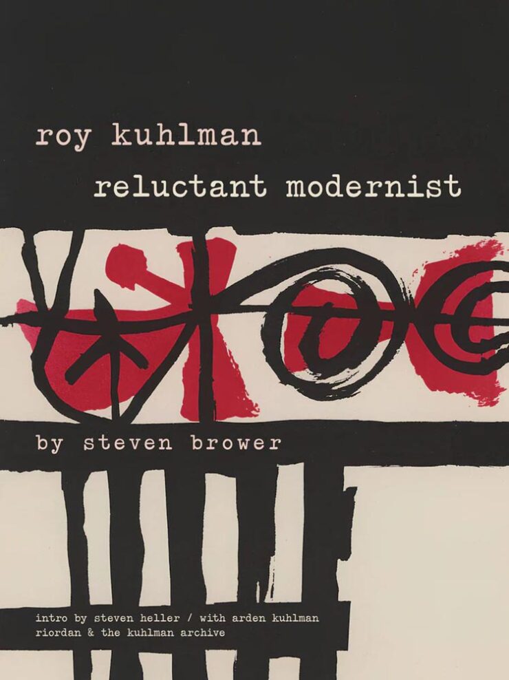
    “He designed almost exclusively for the edgy indie Grove Press, defining its list of literary, critical, philosophical and politically radical nonfiction titles,” Heller writes, discussing a new retrospective (that he wrote the introduction for):

    This image has an empty alt attribute; its file name is books_roy-kulman-reluctant-modernist_print-740x988.jpg

    Many of his abstractions tested the reader’s perception. His lexicon of kinetic, morphing shapes was usually rendered in flat colors with painterly and collage randomness. They could stand on their own. But usually, to make them functional, he used simple sans serif or elegant classic serif typefaces; fitting the abstract nature of his manner, he’d frequently draw or paint hand-scrawled titles and subsidiary texts. Much of his work employed two or three colors, as opposed to four-color process — and he was more than adept with limitations.

    — Steven Heller, PRINT

    Very cool. See the rest.

    January typeface favorites

    Speaking of CreativeBoom, their regular feature on new typefaces has several that I like. Let’s start with the elegant Appeal, by new foundry We Type:

    This image has an empty alt attribute; its file name is fonts_appeal_creativeboom-740x400.jpg

    Next up, the old-style, almost-evokes-needlepoint Bárur, by MNDT Type:

    This image has an empty alt attribute; its file name is fonts_barur_creativeboom.jpg

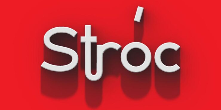
    Another new foundry, Designomatt, brings us the neat and “unpretentiously functional” Stróc:

    This image has an empty alt attribute; its file name is fonts_stroc_creativeboom-740x370.jpg

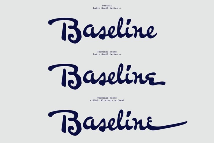
    The last to highlight is probably my favorite of the bunch, this cool and well-executed script called Pennline, from The Northern Block. It’s a “meticulous resurrection of Bulletin — a script first cast in 1899 by Philadelphia’s Keystone Type Foundry — demonstrat[ing] how historical preservation and contemporary utility can coexist when approached with respect and imagination.”

    This image has an empty alt attribute; its file name is fonts_pennline_creativeboom-740x494.jpg

    See ’em all — type joke intended — at CreativeBoom.

    Faber Editions: just my type

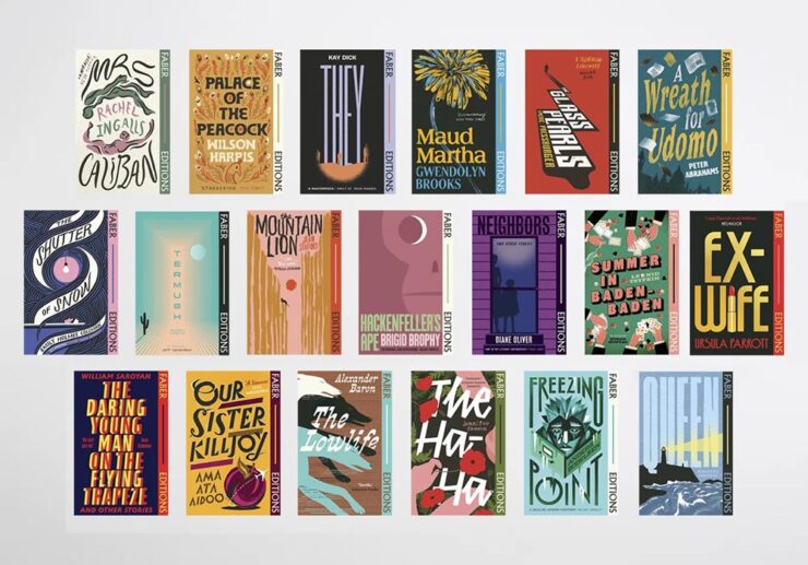
    It’s Nice That has a great feature on the new — actually, newly-revisited — Faber Edition titles, with their primarily type-driven cover designs:

    This image has an empty alt attribute; its file name is books_collected-faber-editions_various_its-nice-that-740x517.jpg

    “In an industry that can often be focused on newness, Faber Editions is a great reminder of the groundbreaking literature that’s come before us, and a clear indicator of the importance of the artwork the words sit within,” writes Olivia Hingley.

    This image has an empty alt attribute; its file name is books_the-shutter-of-snow_bill-bragg_its-nice-that.jpg
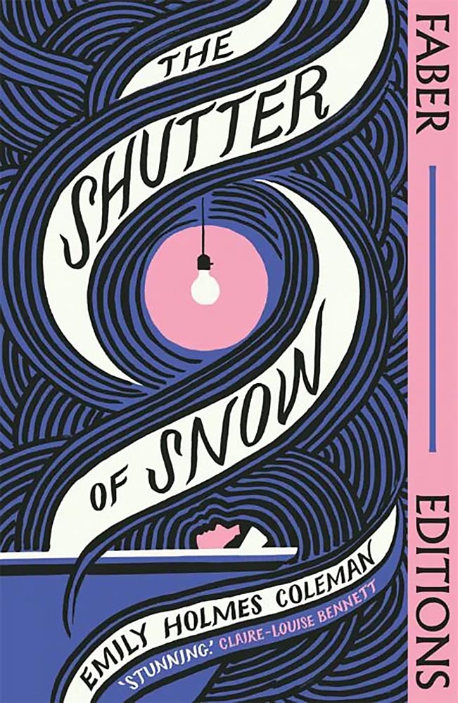
    Cover design by Bill Bragg.

    Faber is a UK publisher, so while these covers could be excellent because they’re British — see several examples of the US vs. UK titles in the favorites post — I’m just going to call the style interesting, the “look” of the complete series compelling, and the resulting work excellent. Read on.

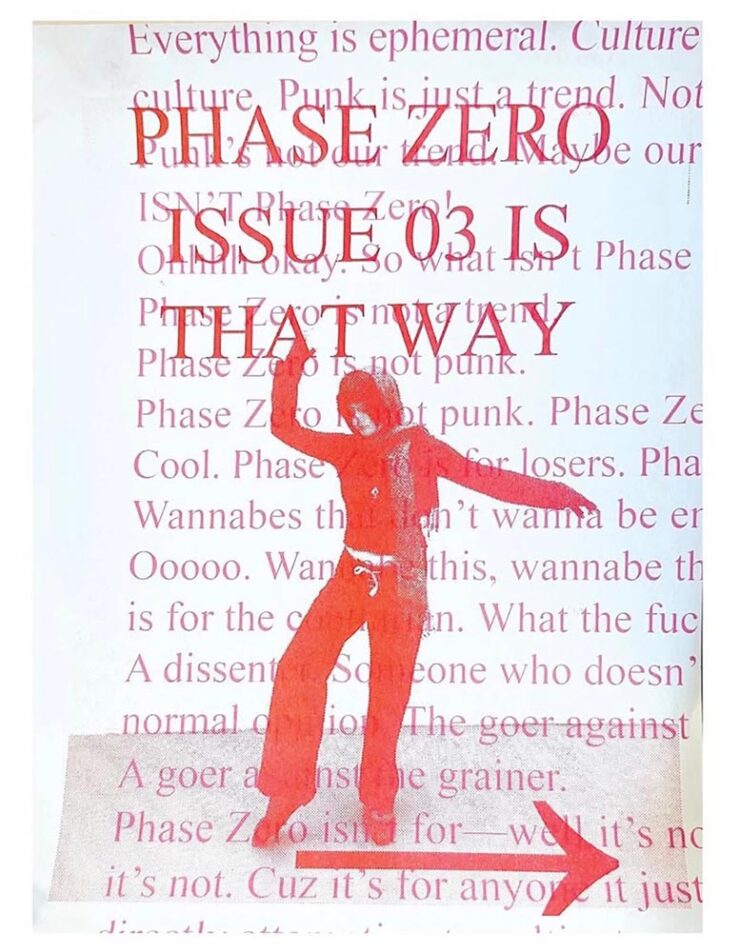
    Special bonus #2: “The graphic trends you’ll want to bookmark for 2026,” also from It’s Nice That. In short: lo-fi, anti-trends continue:

    This image has an empty alt attribute; its file name is design_phase-zero-flyer_its-nice-that-740x952.jpg
    © Maya Valencia & Sydney Maggin, Phase Zero NYC, via It’s Nice That.

    In other words, if AI struggles with it — if it’s authentic — it could be a winner. See the specifics.

    Special bonus #3: “AI isn’t the enemy. Our lack of nuance is,” Liz Seabrook writes at CreativeBoom. “The most powerful response is being more human.”

    Life in ’26: DDOS? Or Just Velocity?
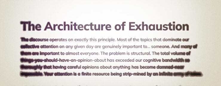
    This image has an empty alt attribute; its file name is discussion_discourse-is-a-ddos_westernberg-740x288.jpg

    A few days apart, two new essays caught my attention and wound up feeling relevant enough — significant enough — that I wanted to share. They’re new takes on where we’re at, or, the specifics of “how.”

    The first is from new-to-me author Joan Westenberg, discussing a computer term called the Distributed Denial of Service (DDOS) attack:

    [The] attack works by exhausting resources. It doesn’t need to be clever. It just needs to be overwhelming. The target’s defenses are simply overrun. The server can’t distinguish between legitimate requests and attack traffic because, in a sense, all the traffic is legitimate. The attack succeeds when the system has spent so much energy processing requests that it can no longer serve its actual function.

    — Joan Westenberg, “The Discourse is a DDOS”

    Does that sound like it might apply to life in the ’Twenties? Yeah.

    The old media ecosystem had gatekeepers, and those gatekeepers were often stupid or corrupt, but at least the stupidity and corruption were bounded. There were only so many column inches in the New York Times, only so many minutes of evening news. A finite supply of attention-worthy items existed, and someone had to decide which ones made the cut. That selection process was biased and imperfect, but it performed an important function: it told you, implicitly, that you didn’t have to have an opinion about everything. Most things that happened in the world weren’t important enough to make it into your awareness at all. Local political disputes in New South Wales? Nobody in Washington DC gave a [crap], and vice-versa. This was as close to optimal as we’ve ever got.

    But the gatekeeping function has now been distributed across millions of individual users, each of whom can boost any piece of content into viral prominence if it happens to resonate with the right combination of tribal anxieties and engagement incentives. The feed is infinite, and every slot in the feed is optimized to make you feel something strongly enough that you’ll engage with it. Outrage works, and so does fear. Disgust works, and righteousness
    really[…] works. Nuance and careful reasoning don’t work at all, because by the time you’ve finished a thought that begins with “Well, it’s complicated…” someone else has already posted a much simpler take that makes people feel validated, and the algorithm has moved on.

    — Joan Westenberg, “The Discourse is a DDOS”

    Om Malik, long-time in-the-trenches tech nerd (and fellow Leica enthusiast), completely agrees:

    Authority used to be the organizing principle of information, and thus the media. You earned attention by being right, by being first in discovery, or by being big enough to be the default. That world is gone. The new and current organizing principle of information is velocity.

    What matters now is how fast something moves through the network: how quickly it is clicked, shared, quoted, replied to, remixed, and replaced. In a system tuned for speed, authority is ornamental. The network rewards motion first and judgment later, if ever. Perhaps that’s why you feel you can’t discern between truths, half-truths, and lies.

    — Om Malik, “Velocity Is the New Authority. Here’s Why.”

    Westenberg has a suggestion I wholeheartedly recommend:

    What I do know is that the feeling of being overwhelmed, of never being able to keep up, of having strong opinions about everything and confident understanding of nothing, is not a personal failing. It’s a predictable response to an impossible situation. Your brain is being DDoS’d, and the fact that you’re struggling to think clearly under that onslaught is evidence that your brain is working normally. The servers aren’t broken. They’re overloaded. And until we figure out how to reduce the load or increase the bandwidth, the best any of us can do is recognize what’s happening and try, when possible, to step away from the flood long enough to do some actual thinking.— Joan Westenberg, “The Discourse is a DDOS”

    “Find one topic,” she says, and start there. Get with experts, get evidence, get uncomfortable, actually get into it … but just get into that one.

    And stay true to the idea that it shouldn’t — can’t — get away from you.

    I get some feedback for my lack of participation in social media. I don’t hate social media; if anything, the past few weeks of mayhem organized resistance in Minneapolis proves it has a place. But I long ago heeded advice to narrow my focus. Instead of burying my head in the sand — tempting though it may be at times — I choose to concentrate on those things that a) really hold interest and b) things I actually want to be part of my life.

    Both of these essays summarize the situation well, and both offer insights on how we got here. Westenberg’s offers good advice. When you have a spare few minutes, read both.

    (DDOS article via Doc Searls, whom I don’t link to often enough. Om’s article via Daring Fireball.)

    Wikipedia turns 25

    Let’s please turn to something that the Internet does right.

    Whenever I worry about where the Internet is headed, I remember that this example of the collective generosity and goodness of people still exists. There are so many folks just working away, every day, to make something good and valuable for strangers out there, simply from the goodness of their hearts. They have no way of ever knowing who they’ve helped. But they believe in the simple power of doing a little bit of good using some of the most basic technologies of the internet.

    — Anil Dash, “Wikipedia At 25: What The Web Can Be”

    “When Wikipedia launched 25 years ago today, I heard about it almost immediately, because the Internet was small back then, and I thought ‘Well… good luck to those guys,’” Dash writes.1I, too, remember those days of a small Internet — not a young person anymore. While I miss the community it felt like, the resources available today, of which Wiki might be at the fore, are without parallel. But it’s grown into something something amazing: the encyclopedia that’s free in every sense of the word.

    This image has an empty alt attribute; its file name is wiki25_youtube-740x861.jpg
    One of the YouTube shorts published by Wikimedia Foundation.

    Like countless others, I value being a contributor, in an incredibly small way, to the collective effort that is Wikipedia. Indeed, editors “span continents, professions and motivations,” a CreativeBoom article writes. “Together, their stories underline that, even in an age of AI, knowledge is still human and it still needs humans.”

    “The site is still amongst the most popular sites on the web,” Dash agrees. “[B]igger than almost every commercial website or app that has ever existed. There’s never been a single ad promoting it. It has unlocked trillions of dollars in value for the business world, and unmeasurable educational value for multiple generations of children.”

    Of course, all is not perfect. Like Universities, DEI, and whatever else, Wikipedia has become a target; Grokipedia, for instance, exists specifically to undermine Wiki’s centrality and success. (And, it’s important to note, Groki used Wiki as a basis … because it’s open and freely available. No hypocrisy.)

    In fact, so many rely on Wikipedia that access has become a thing. Luckily, some large enterprise users of the site have recognized that the trillions they’ve earned as a result of having access to Wiki’s collective knowledge is worth paying for:

    [T]he Wikimedia Foundation announced API access deals with Microsoft, Meta, Amazon, Perplexity, and Mistral AI, expanding its effort to get major tech companies to pay for high-volume API access to Wikipedia content, which these companies use to train AI models like Microsoft Copilot and ChatGPT. […] In April 2025, the foundation reported that bandwidth used for downloading multimedia content had grown 50 percent since January 2024, with bots accounting for 65 percent of the most expensive requests to core infrastructure despite making up just 35 percent of total pageviews.

    — Benj Edwards, Ars Technica (15 Jan 2026)

    Anil Dash best finishes up: “Twenty-five years later, all of the evidence has shown that they really have changed the world.” I couldn’t agree more.

    Happy 25 to Wikipedia. May there be countless more.

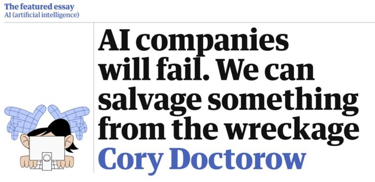
    Special bonus #4: In an excellent article, Ars calls 2025 “the year AI came back down to Earth.” And while we’re on the subject of excellence, Cory Doctorow’s essay for The Guardian applies.

    This image has an empty alt attribute; its file name is ai_ai-companies-will-fail_guardian-740x360.jpg
    Cory Doctorow in The Guardian.
    Follow-up: BMW Alpina and Honda formalize logos

    Alpina, for formerly-independent tuner — re-manufacturer, really — of BMW cars (and SUVs), has, as of the first of this year, officially become a division of BMW, akin to MINI or Rolls-Royce. With it comes a new logo.

    Well, at least, this:

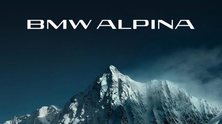
    This image has an empty alt attribute; its file name is cars_new-bmw-alpina-logo_dezeen-740x416.jpg
    Conservative, cool, collected. Definitely part of a bigger corporation now.

    That’s slightly different that what I covered back in June of 2023; the “A” is less dramatic, probably for the better. BMW calls the new logo “calm and confident,” saying the upcoming models will “master performance and comfort.”

    [Alpina] recently entered into an agreement to be purchased by BMW itself, not unlike AMG becoming part of Mercedes-Benz; starting in 2026, they are scheduled to represent the middle ground between BMW and Rolls-Royce — hopefully continuing the comfort, power, and style. It seems that the new ground will be the upmarket models only (that is, no 3-series-based items, and possibly even no 5-series), so think of items $200,000 and up.

    — Beautifully Briefed, June 2023

    Here’s the old logo, for reference:

    This image has an empty alt attribute; its file name is alpina-1962-20220-logo-740x524.png
    Alpina’s now-old logo: exhaust and crankshaft, sir. Nuthin’ like it.

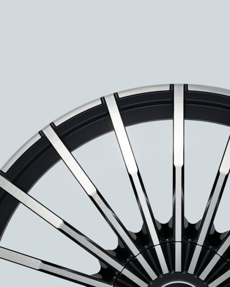
    And: they’re going to update the wheels!

    This image has an empty alt attribute; its file name is cars_new-20-spoke-alpina_bmwblog-1-740x924.jpg
    Photo via BMW Blog.

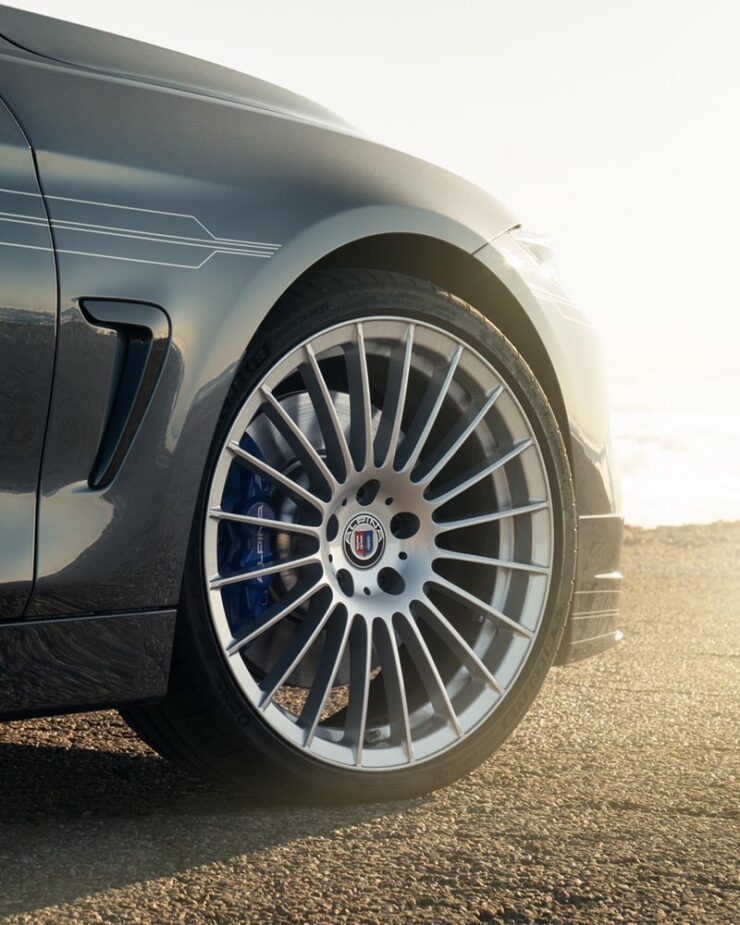
    As someone who’s become much more familiar with Alpina in the ten years I’ve owned BMWs, these wheels are iconic. Here’s the existing version, on one of my favorite pieces of unobtainium:

    This image has an empty alt attribute; its file name is cars_old-20-spoke-alpina_bmwblog-740x925.jpg
    Photo via BMW Blog.

    That’s a 2016 Aplina B4 BiTurbo Coupé, by the way. Not quite my favorite B3 Touring, but in either case, “drool” doesn’t quite cover it. (Neither were available in the States.)

    Curious to see whether this is successful. Expectations are high.

    This image has an empty alt attribute; its file name is cars_honda600-badge_autopian-740x740.jpg
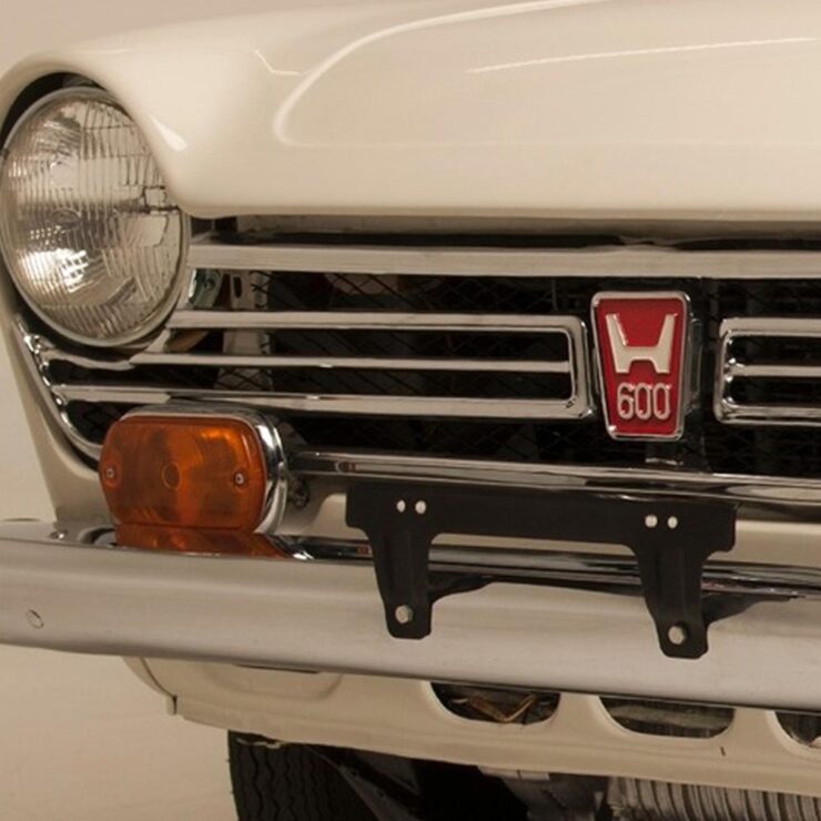
    The “old” H logo, shown on a 1971 600. (See wiki for more info.)

    Meanwhile, Honda initially said — and I reported, two years ago — that their new, slightly-retro “H” logo would be limited to electric cars. Of course, electric as a strategy has changed; they decided this month to make it official for all their cars.

    This image has an empty alt attribute; its file name is cars_honda-new-logo_the-drive-740x523.jpg

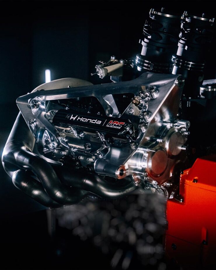
    Motorsports, too. Here’s their F1 engine with the new logo:

    This image has an empty alt attribute; its file name is cars_honda-logo-f1_the-drive-740x925.jpg
    Photo via The Drive.

    I love that both Honda and BMW are, at their heart, engineering companies.

    Get the full story on BMW Alpina at Dezeen or BMW Blog (logo, wheels). Honda’s details are available at The Drive (logo, F1) or The Autopian, where you can enjoy some sharp commentary on Honda’s press release.

    January photography round-up
    2025 Architecture Master Prize
    This image has an empty alt attribute; its file name is photo_arch-arbour-by-younes-bounhar_archinect.jpg
    “Arbour House.” Photograph by Younes Bounhar (Interior Architecture).

    I suppose it’s no surprise that an architectural photography selection tops this round-up, but the annual Architecture Photography MasterPrize highlights “compelling perspectives on buildings, cities, landscapes, and interior spaces, revealing the rich visual language of the built environment.”

    In other words, “catnip.”

    This image has an empty alt attribute; its file name is photo_arch-details-by-guanhong-chen_petapixel.jpg
    “Details (Series).” Photograph by Guanhong Chen (Other Architecture).
    This image has an empty alt attribute; its file name is photo_arch-details2-by-guanhong-chen_petapixel.jpg
    “Details (Series).” Photograph by Guanhong Chen (Other Architecture).

    There’s a huge variety of winning photographs, from professionals, amateurs, and students alike — all excellent. (They have awards for designs, firms, and products, as well.)

    This image has an empty alt attribute; its file name is photo_arch-sardinia-by-barbara-corsico_archinect.jpg
    “Mustras,” Sardinia. Photograph by Barbara Corsico (Exterior Architecture).

    I can’t possibly cover them all, but can provide links: photography winners, honorable mentions, student winners, and winners by country. Both Archinect and PetaPixel have stories. Enjoy!

    Two photographers, highlighted
    This image has an empty alt attribute; its file name is photo_greenland-lehtonen-by-dennis-lehtonen_colossal-740x494.jpg
    Photography by Dennis Lehtonen.

    Neither drone images nor folks who primarily post to social media usually get featured here, but these images of Greenland are both timely and excellent. This is Colossal has a great selection of items from photographer Dennis Lehtonen.

    This image has an empty alt attribute; its file name is photo_alps-to-andromeda_tom-rae_petapixel-740x437.jpg
    “From Alps to Andromeda.” Photograph by Tom Rae.

    “My photography style is rooted in landscape and night photography, with an emphasis on atmosphere, scale, and a strong sense of place. I’m drawn to environments that feel raw, remote, and otherworldly,” Tom Rae relates to PetaPixel. Otherworldly feels just right: good stuff.

    Society of Photographers’ Photographer of the Year 2025
    This image has an empty alt attribute; its file name is photo_soc-of-photographers_documentary-by-terry-donnelly_petapixel-740x493.jpg
    Photograph by Terry Donnelly.

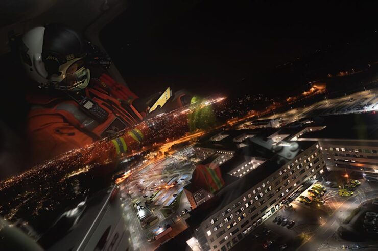
    I also usually don’t cover documentary-style photography — see narrow focus, discussed above — but there were several documentary-style photographs in this set of award winners that were excellent, including this Medivac flight from the UK.

    However — thankfully — there were more categories:

    This image has an empty alt attribute; its file name is photo_soc-of-photographers_travel-by-mark-scicluna_petapixel-740x985.jpg
    Photograph by Mark Scicluna.

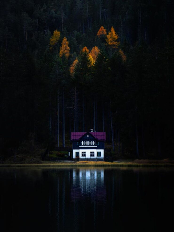
    It’s the winner in the “travel” category, because apparently they don’t have one called “dramatically soothing.” No matter the labelling, see the rest of the winners at PetaPixel or head over to the Society’s website for more.

    Finally: some cats

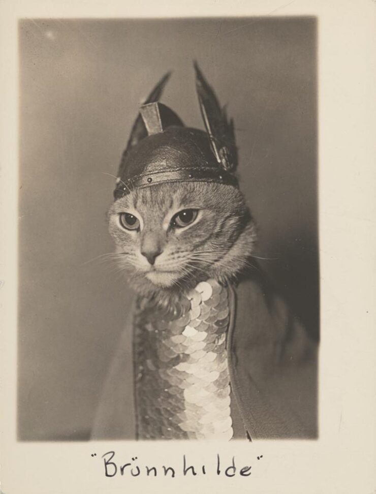
    Speaking of catnip, let’s close out with something that purrs — in soprano:

    This image has an empty alt attribute; its file name is photo_phaidon-cat2_colossal-740x972.jpg

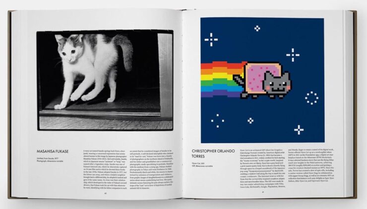
    Let’s not go ’round and ’round: that deserves framing. Or at least publication. Thankfully, Phiadon has you covered:

    This image has an empty alt attribute; its file name is photo_phaidon-cat_colossal-740x423.jpg

    A “whimsical visual survey of the house cat in art and popular culture, exploring humanity’s enduring connection to one of our most loved animal companions.” Awesome. (Via This is Colossal.)

    Have a great February, everyone!

    • 1
      I, too, remember those days of a small Internet — not a young person anymore. While I miss the community it felt like, the resources available today, of which Wiki might be at the fore, are without parallel. ↩︎
  • Beautifully Briefed 25.10: [Blank] of the Century

    Beautifully Briefed 25.10: [Blank] of the Century

    In this episode, design whims and wins, fontastic links, a Toyota Century, and the monthly round-up of great photography bracket some thoughts on — what else? — AI, especially as it relates to art. Grab a beverage, brush, or a comfy chair, and let’s dig in.

    This Month’s Spine
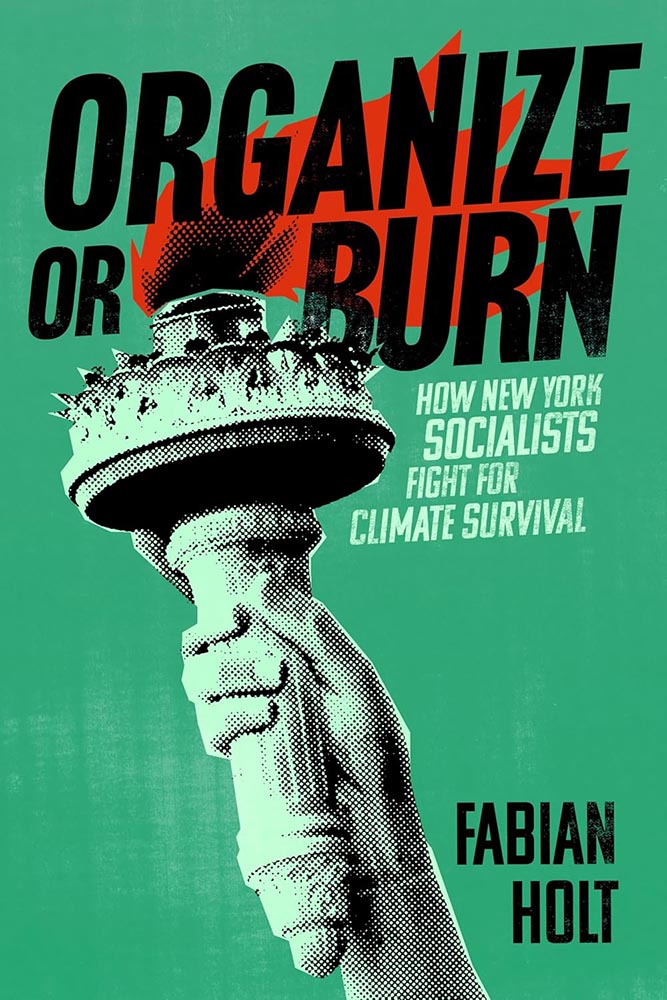
    New York University Press. Cover design by Devon Manney, art director, Rachel Perkins.

    One could argue that this cover — and title — could work well even if the word “climate” was removed. See the whole list of University Press goodness.

    And check back for a special, mid-month post in honor of University Press week, Nov. 10–14.

    Good Movies as Old Books, Revisited

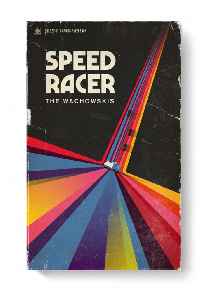
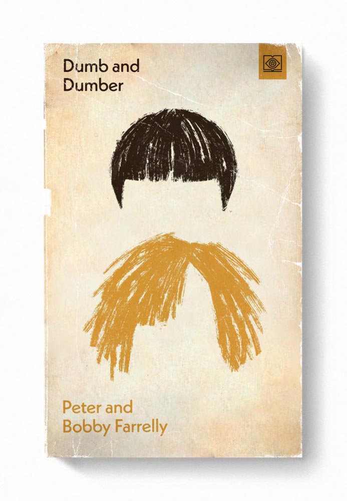
    Let’s start with something great: Steven Heller highlights the “talent and imagination” of Matt Stevens (previously) as the paperback version of his book, Good Movies as Old Books, becomes available.

    Cover design by Matt Stevens.
    Cover design by Matt Stevens.

    “My goal with the style was to try new things and create interesting combinations. Oftentimes, I was trying to do something that had not been done for a particular film,” Stevens says. Short and fun, the PRINT interview is worth a few minutes of your time.

    Old-Fashioned Methods, Delightfully Off-Kilter Results

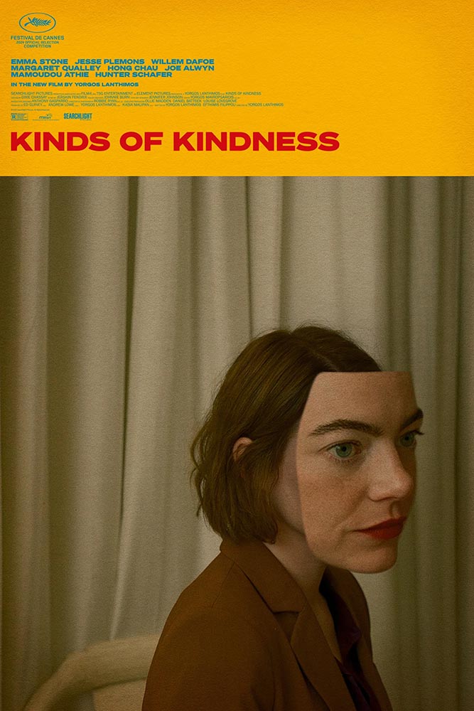
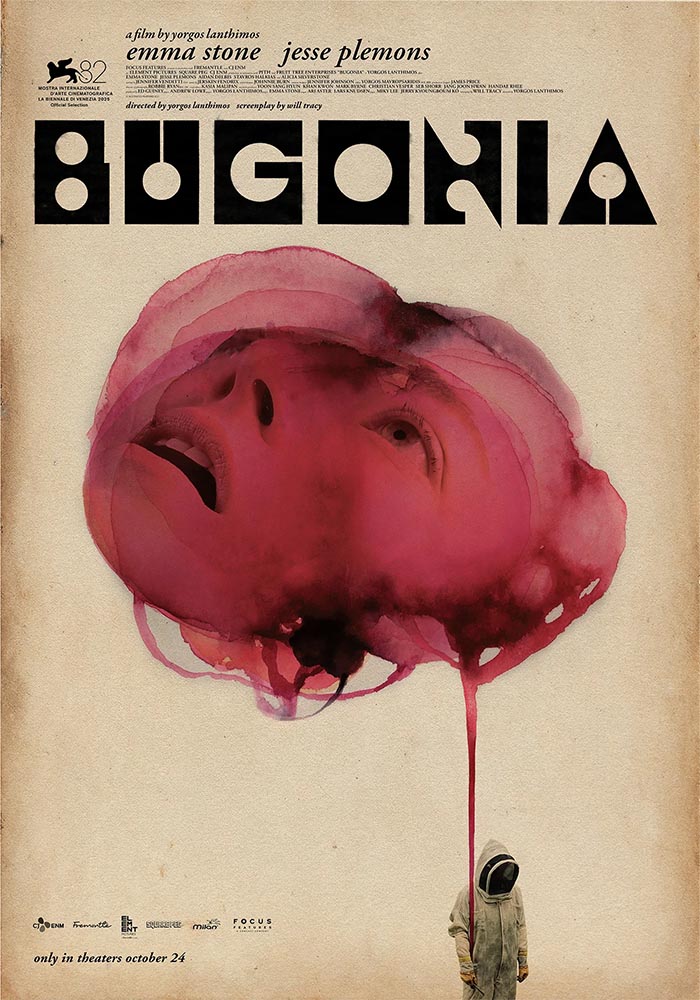
    While we’re on the subject of movies, let’s slip closer to … well, what passes for reality these days: items “steeped in human anxieties and fever dreams.” It’s Nice That highlights poster and title design for films by Greek artist Vasilis Marmatakis.

    Design by Vasilis Marmatakis.

    With design, much like life itself, Vasilis says that his posters are his honest reactions to the films. The same approach runs like a red thread throughout his work, each poster leaning a little too heavily into one of the film’s themes. […] In Bugonia, Vasilis consciously restricts superfluous elements and allows the frames to breathe.

    — Arman Kahn, It’s Nice That
    Design by Vasilis Marmatakis.

    Even the font — and how it’s used — is interesting: the freely-available Churchward Roundsquare, customized with brush and ink. That and much more is discussed in this great article.

    New Vintage Classics Series

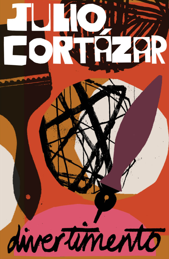
    It’s unusual not to relish a new set of reissues from Vintage, and the new editions of Julio Cortázar are no exception:

    Book design by Stephen Smith; art director, Suzanne Dean.

    The always great — and not mentioned often enough — Casual Optimist has more.

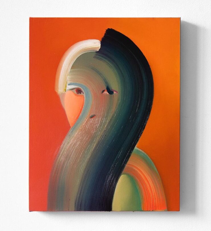
    Special Bonus #1: Via Kottke, Na Kim’s self-portrait:

    Fascist Posters, Italian Style

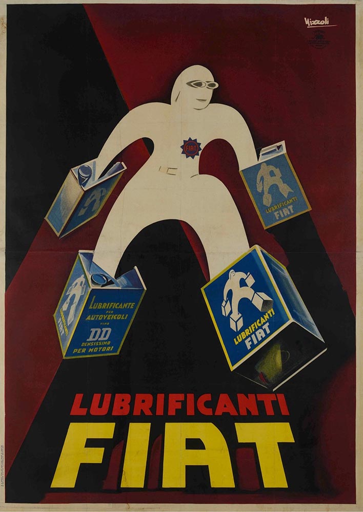
    Also via Kottke are these posters, which evoke a certain … something:

    In a fascist movement inspired by art, how does the fascist government influence the artists living in its grasp? This exhibition explores how Benito Mussolini’s government created a broad-reaching culture that grew with and into the Futurist movement to claw into advertising, propaganda, and the very heart of the nation he commanded.

    — Poster House exhibition The Future Was Then: The Changing Face of Fascist Italy.

    The exhibit features “some of the best posters produced during the worst period in modern Italian history.” See more.

    Special Bonus #2: While we’re perusing the poster department, Archinect‘s ongoing lecture series (previously) has another winner:

    Fontastic Fall
    New for October

    CreativeBoom‘s monthly roundup is out, and while Grundtvig is retrotastic and the three-axis variable Pranzo is accompanied by some great illustrations, it’s Jovie that I’d love to use in print project:

    “Jovie’s character emerges through its soft-serif approach, which tempers traditional serif authority with contemporary approachability. Playful italics, expressive alternates, swashes, and ligatures provide designers with a rich typographic palette, whilst maintaining coherent family relationships across all variations,” they note. (Another variable-width item, too.) Great stuff.

    Custom Type is Everywhere, It Seems

    Meanwhile, custom type for branding is becoming the norm. In another article, CreativeBoom explains why: “Bespoke letterforms are no longer a “nice-to-have” and they are increasingly seen as a strategic necessity[.] Type has become the glue that holds their voice together,” they write.

    Those letters are your brand’s voice. They do the heavy lifting, they carry personality, and they create instant recognition – sometimes without the need for any other distinctive assets. […] Typography is everywhere in a brand system – packaging, products, campaigns, interfaces. When you build your own, you’re not at the mercy of someone else’s design choices, and you get a voice that’s tuned to your values, your audiences, and your long-term ambitions.

    — Frankie Guzi, business director, Studio DRAMA.

    Elizabeth Goodspeed (previously) agrees, mostly. “For most of the 20th century, branding treated typography as background, not backbone,” she writes. But now, brands are recognizing that, “[a]s a primary container for meaning, typography inevitably carries an enormous share of that emotional load.”

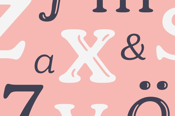
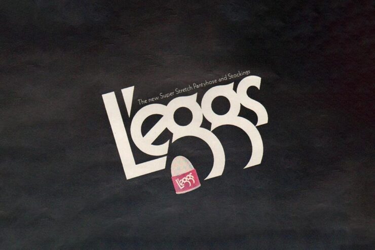
    An exception to the rule: a type gem — with legs! — from 1971.

    But, she cautions, “[s]peed also feeds a kind of conceptual shallowness. With so many studios drawing type, the market has been flooded with fonts that solve narrow visual problems but can’t stand up to long-term use. Too often, new brand fonts cling to a single gimmick while leaving the structure of the letters untouched.”

    Read the rest at It’s Nice That.

    AI All the things
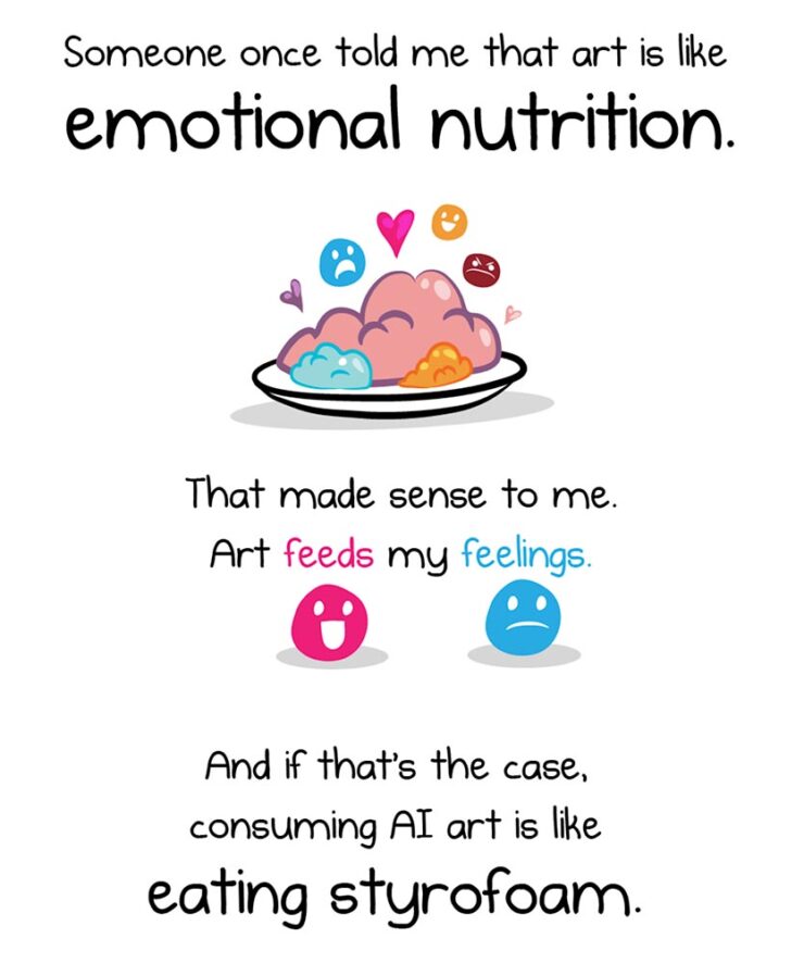
    The Oatmeal, penned by Matthew Inman, has some thoughts on AI.

    The new-to-me FlowingData — via Kottke’s rolodex feature — first pointed me to this piece, and it’s gotten a ton of press. In summary, Inman suggests that AI art causes a certain discomfort; that, perhaps, AI art even deserves air quotes around the word art because it’s somehow less than “actual” art.

    Indeed, much of that press has been approving: a pile-on of people (not that such things happen on the internet) saying, “yes, AI art deserves those air quotes. It is less.”

    One of my favorite reactions was from Nick Heer:

    A good question to ask when looking at an artwork is “who made this?”, and learning more about what motivated them and what influences they had. This is a vast opportunity for learning about art of all mediums, and it even applies to commercial projects. Sometimes I look up the portfolios of photographers I find on stock image sites; their non-stock work is often interesting and different. There is potential for asking both questions of A.I.-assisted works in the hands of interesting artists. But it is too often a tool used to circumvent the process entirely, producing work that has nothing to offer beyond its technical accomplishment.

    — Nick Heer, Pixel Envy

    “Who made this?” is the right question — to start. But let’s take that a step further.

    John Gruber, at Daring Fireball, quotes the piece: “[When] I find out that it’s AI art[,] I feel deflated, grossed out, and maybe a little bit bored. This feeling isn’t a choice.” Then says that he fundamentally disagrees with that premise:

    I think it very much is a choice. If your opinion about a work of art changes after you find out which tools were used to make it, or who the artist is or what they’ve done, you’re no longer judging the art. You’re making a choice not to form your opinion based on the work itself, but rather on something else. […] Stanley Kubrick said, “The test of a work of art is, in the end, our affection for it, not our ability to explain why it is good.” If an image, a song, a poem, or video evokes affection in your heart, and then that affection dissipates when you learn what tools were used to create it, that’s not a test of the work of art itself. To me it’s no different than losing affection for a movie only upon learning that special effects were created digitally, not practically. Or whether a movie — or a photograph — was shot using a digital camera or on film. Or whether a novel was written using a computer or with pen and paper.

    — John Gruber, Daring Fireball

    “Good art is being made with AI tools, though, and more — much more — is coming,” he says. Over the next few days, he cited some examples, including David Hockney’s art made with a Xerox machine, and then this:

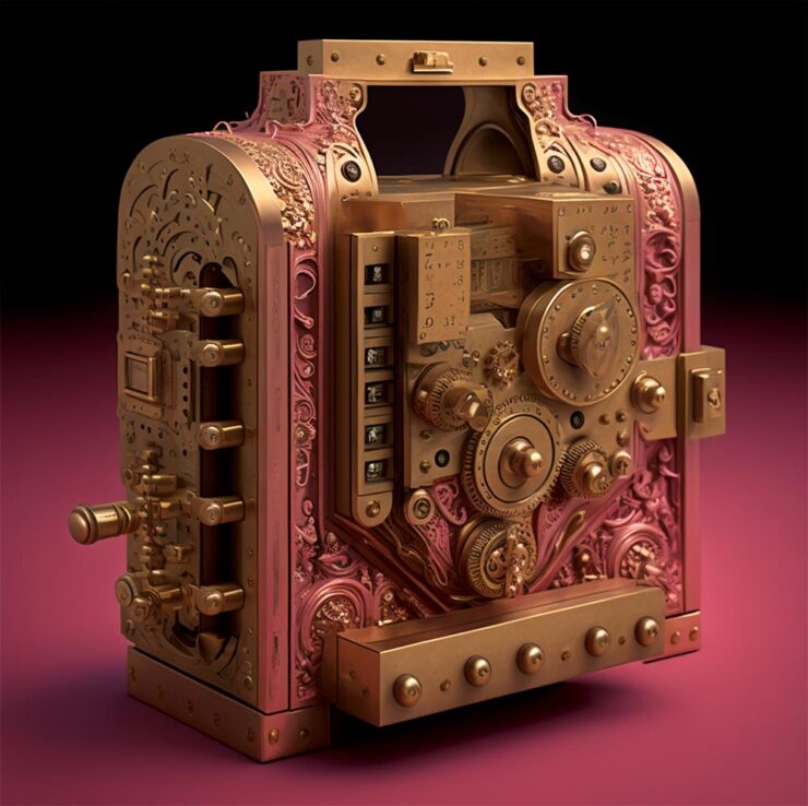
    Jonathan Hoefler’s ongoing series, called Apocryphal Inventions.

    The objects in the Apocryphal Inventions series are technical chimeras, intentional misdirections coaxed from the generative AI platform Midjourney. Instead of iterating on the system’s early drafts to create ever more accurate renderings of real-world objects, creator Jonathan Hoefler subverted the system to refine and intensify its most intriguing misunderstandings, pushing the software to create beguiling, aestheticized nonsense. Some images have been retouched to make them more plausible; others have been left intact, appearing exactly as generated by the software. The accompanying descriptions, written by the author, offer fictitious backstories rooted in historical fact, which suggest how each of these inventions might have come to be.

    These images represent some of AI’s most intriguing answers to confounding questions — an inversion of the more urgent debate, in which it is humanity that must confront the difficult and existential questions posed by artificial intelligence.

    — Jonathan Hoefler

    “This is art,” Gruber says, with no other text. I don’t think any other is needed.

    On a Related Note
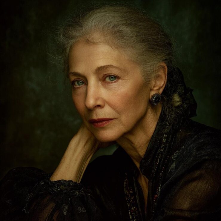
    This is AI.

    “The top 200 photographers requested by Midjourney users have been exclusively revealed to PetaPixel — and it’s a world-famous, still active photographer that tops the list.” I bet you can guess who that is.

    This is, in fact, the majority of what Inman was thinking — or at least, feeling — when he drew out an argument on why AI art can be such a let-down, both intellectually and emotionally. The above “photograph” is both awesome and hugely disappointing at the same time.

    Further Reading

    I’m not qualified to speak with any authority on the state or potential future of AI, AGI (artificial general intelligence), or the continuing convergence of AI with … well, all the things. I will say that, to me, there’s a palpable sense of bubble going on; whether financial, material, or resource requirements, it feels like something is going to need to give fairly soon.

    Below are several articles on the intersection of AI with life, culture, or art that I found valuable. If you can set aside a few minutes, the information provided could be helpful in the quest to stay informed:

    Side Note: I’ve dropped the punctuation in “AI.” Not unlike capitalizing “Internet,” I think we’ve crossed that bridge.

    Special Bonus #3: AI apparently overuses em dashes, something that has, frankly, caused me to use them less. Which is a good thing — I overuse them. But then, I am a professional. [That’s only funny if you’ve read the link. —Ed.]

    The Century Coupé Concept

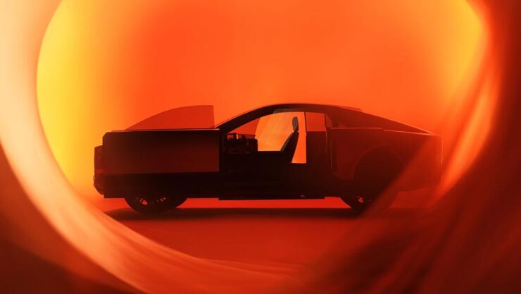
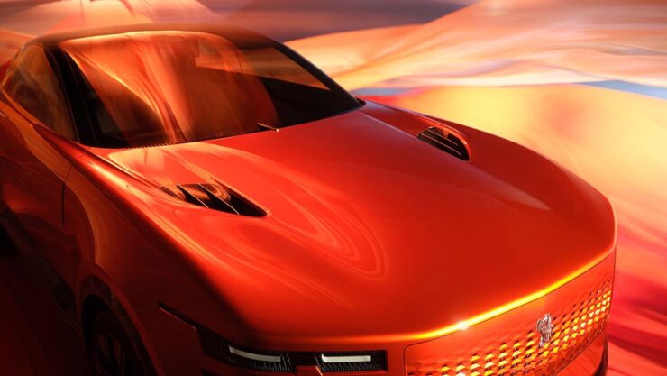
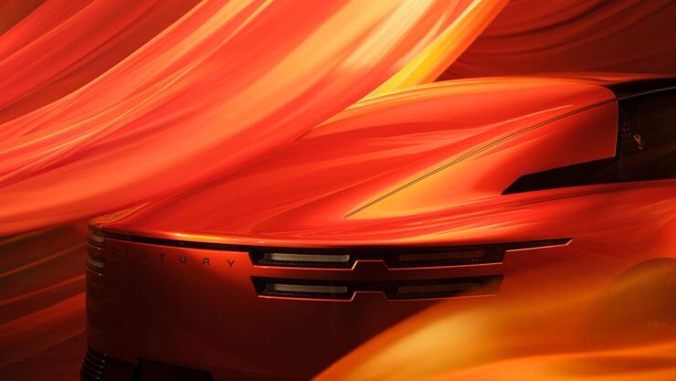
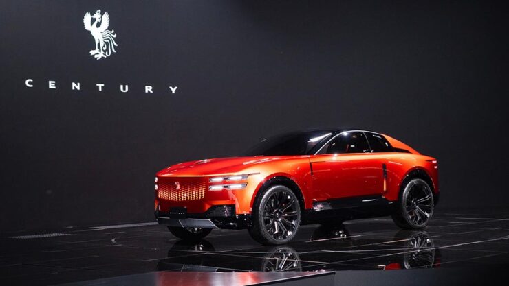
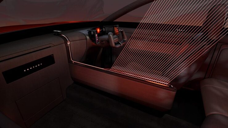
    Toyota (the company) has reorganized: there are now three levels. There’s Toyota (the car line), for the mass market; Lexus, Japan’s first answer to BMW et al from the late ’80s and also very much mass market (if targeted differently); and now, to compete in the ultra-high-end market, Century:

    Long hood, imposing “grille” — trend, recycling, or cliché, depending on outlook.
    The no-rear-window thing continues to grow in popularity. (For “cocooning.”) Hmph.

    Powertrain is yet to be determined; the rumors suggest it’ll be available both with a combustion engine (possibly a V12) and electric drive. In the case of the latter, owners will, of course, be able to send their driver off to get the thing charged while they lunch or plot takeovers — no range anxiety here.

    Century’s logo is a phoenix.

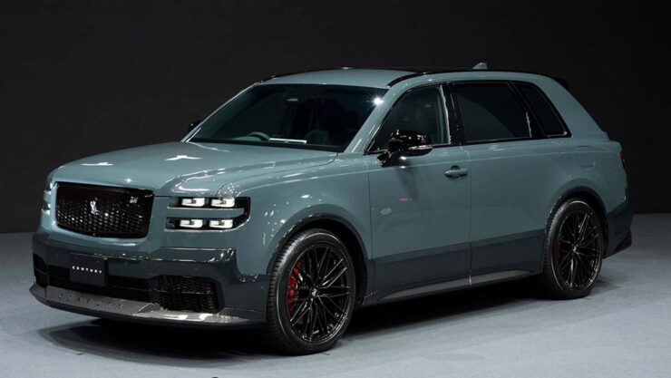
    Car geeks will know that Toyota’s Century sedan model has been around forever. It’s always been badged as a Toyota, and is aimed at Japanese executives and members of state (and will, in fact, still be produced). It was joined a few years ago by a SUV that bears more than a passing resemblance to a Rolls-Royce Cullinan. Both existing Century models available only in Japan and China.

    The 2025 Century SUV. That D-pillar absolutely “borrows” from the Cullinan.

    Toyota has decided to make those three models into a new brand that’s just called, “Century.” It’s going to be set up with exclusive dealers, eventually be available worldwide, and compete with Bentley’s new EXP 15 (previously) and Rolls-Royce’s … everything.

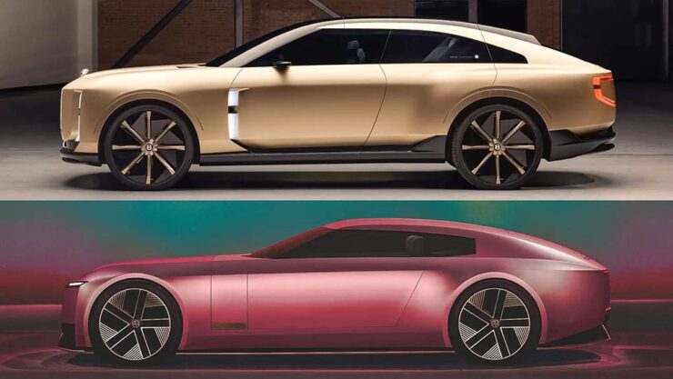
    And, of course, Jaguar. The elephant in the room get a mention here because it’s looking more and more like JLR made the right call in targeting one-percenters with out-there, vaguely coupe-like designs. Because if the Century SUV resembles a Cullinan, the new coupé concept looks like a cross between the Jaguar Type 00 concept and said Bentley:

    The Bentley EXP15, top, with the Jaguar Type 00, bottom.

    Very much unlike the Jag, which is low and could possibly be described as “sleek,” the Toyota has a higher stance; a coupé/sedan and SUV mix seems to be a new answer to the so-called “death of the sedan.” Volvo’s ES 90 might also apply here.

    Bear in mind that I’m not talking about the coupé-style SUVs (BMW’s X6, for instance), which are a different animal — at least for now. It’s possible the whole class of “coupe-like things” might converge in the not-too-distant future.

    That being said, a member of that new class of vehicle being aimed at the chauffeur-driven market is new.

    The glass divider is to allow the chauffeured their privacy.

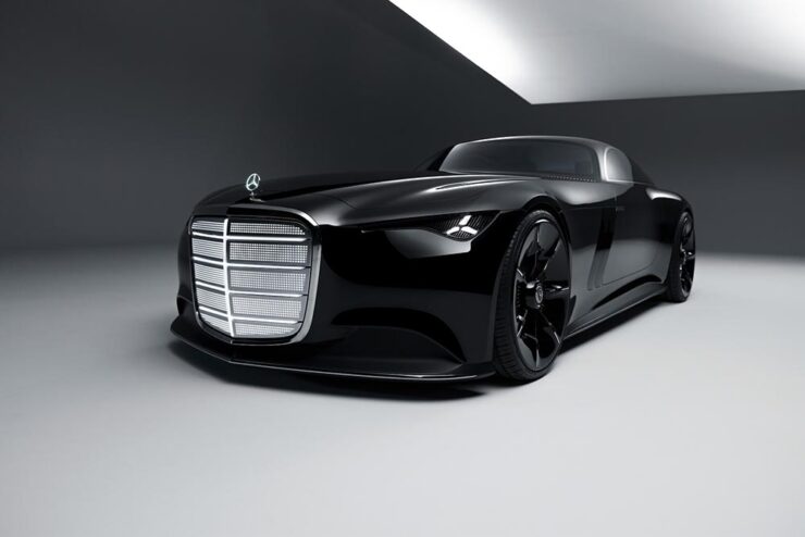
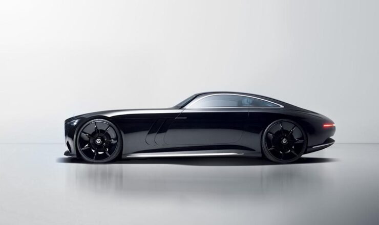
    One more item: The old-school isn’t going quietly.

    Did someone mention grille? (Lit, naturally.)
    Leaving the hood long behind.

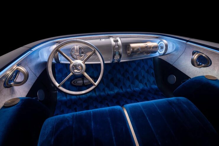
    Mercedes is, arguably, the best (non-American manufacturer) at displaying “gangster” qualities. Oh, and check out the awesomely-retro interior:

    Note the lack of screens amongst that vintage style. And yes, velour is “in.”

    Read more about the Toyota (teaser or intro, both at The Drive) or Mercedes (The Drive, Wallpaper*).

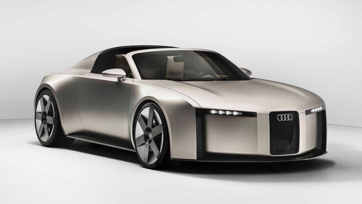
    Special Bonus #4: Audi poached the Type 00’s designer. His first showing is the Concept C, Audi’s return to form, called “radical simplicity.” It’s a cross between their sports-driven R8 and designer-driver TT:

    Love the wheels. The grille less so (there have been dictator comparisons), and the lack of rear window not at all.
    October’s Photography Round-Up
    2x Film
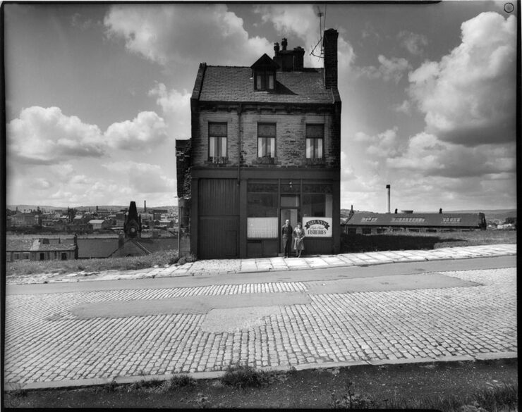
    Grays Fisheries, Bradford (UK), left standing during inner city slum clearance. Photograph by Ian Beesley, 1977.

    From an interesting and moving feature at MacFilos, “Capturing the decline of industries and communities with a Leica M6”:

    At my recent career retrospective exhibition “Life” at Salt’s Mill, Saltaire (a world heritage centre near Bradford, West Yorkshire, England), a man came to talk to me. He said, “You won’t remember me, but I remember you. I worked in a camera shop in Bradford, and you were always coming in to buy rolls of black and white film. It makes me so proud to think that the film I sold you created some of these wonderful photographs.”

    I take this as a great compliment and a very moving one. It is one of the reasons why I decided to donate my entire archive of negatives, prints, notebooks (over 200,000 items) to Bradford City Art Galleries and Museums. I am hanging on to my Leica M6 for a bit longer, but at some point, it will be re-united with all the negatives it created.

    — Ian Beesley, MacFilos
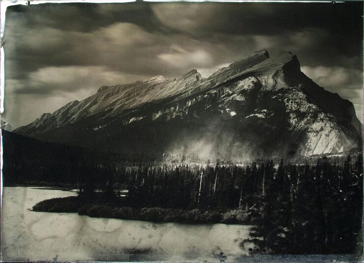
    “Rocky Mountains On Wetplate Collodion,” Canada. Photograph by Bill Hao.

    “The Analog Sparks 2025 International Film Photography Awards celebrate analog photography as a medium and elevate the best film photographers worldwide,” PetaPixel writes. Some excellent reminders that sometimes, the old ways are still the best ways.

    Color and Pano
    “Beholders No. 1.” Photograph by Li Sun.

    “All About Photo Magazine unveiled the winners of its latest competition: Colors. The 25 prize-winning photographers demonstrate how powerful color can be in images, whether it’s vibrant, subtle, or minimal,” PetaPixel writes.

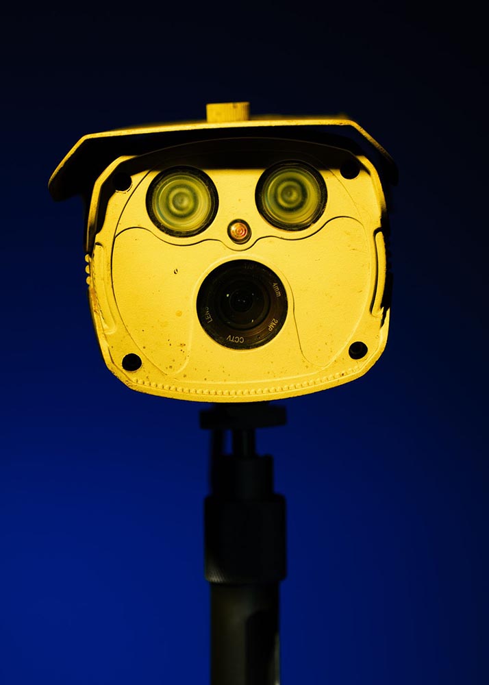
    To be honest: at first, I thought this was a coin-operated binocular thing you see at attractions or overlooks, and laughed out loud. Alas, the laughter died away when I realized it was, in fact, CCTV — an overlook of an entirely different kind. I guess there’s a certain irony in the “face.”

    The Mirror, Valencia, Spain. Photograph by Anto Camacho Villaneuva.

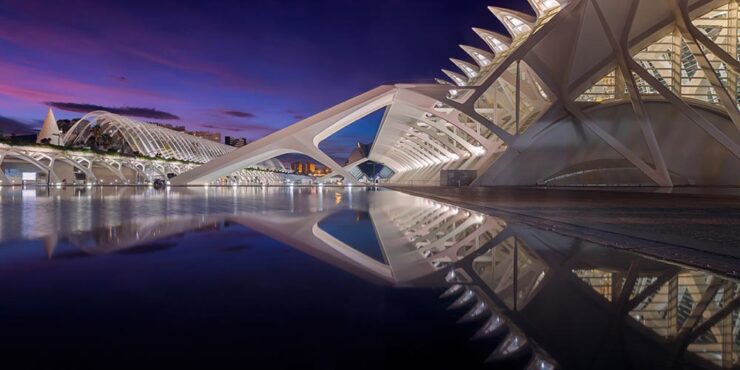
    It is possible to recognize a Santiago Calatrava building immediately, with its soaring, often winged structures. (The World Trade Center Transportation Hub in New York springs to mind, for instance.) This panoramic photograph captures two of them — nice.

    A press release from Epson, the contest’s sponsor, notes that this year there was a “prevalence of ultra-wide panoramas and increasingly innovative perspectives, including very low angles, very close-up subjects, and aerial photography,” including the above. PetaPixel has more.

    Birds and Wildlife
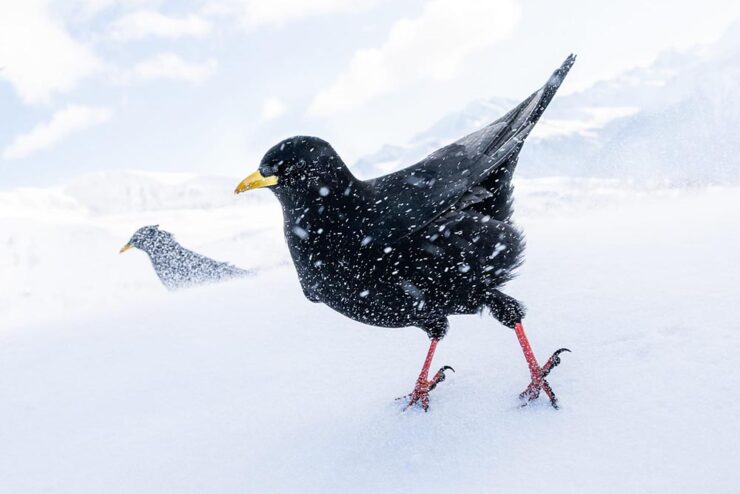
    “Snowstorm,” Germany. Bronze Award, Best Portrait. Photograph by Luca Lorenz.

    “The 2025 Bird Photographer of the Year gives a lesson in planning and patience,” This is Colossal writes about this year’s contest winners (specifically, regarding the photo seen at the right in the header image) — but getting the cold shot, above, wasn’t an easy thing either. (See also: PetaPixel‘s plumage article.)

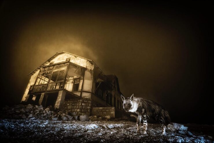
    “Ghost Town Visitor,” Kolmanskop, Namibia. Winner, Urban Wildlife and Wildlife Photographer of the Year 2025. Photograph by Wim van den Heever.

    From PetaPixel‘s coverage of the Wildlife Photographer of the Year 2025 contest: “Capturing the unusual intersection between nature and abandoned urban spaces, Wim’s photograph is a haunting yet captivating image of a brown hyena wandering through the skeletal remains of Kolmanskop, Namibia’s long-deserted diamond mining town. The shot was taken with a camera trap and is the result of a decade-long effort that began when Van den Heever first discovered the animal’s tracks at the site.” [Emphasis mine.] See This is Colossal‘s post, too.

    Comedy and Dogs

    To round out this month’s super-long post — thanks for bearing with me — something from the light-hearted department:

    “It is tough being a duck.” Photograph by John Speirs.
    “Bad Hair Day!” Photograph by Christy Grinton.

    The Nikon Comedy Wildlife Awards, 2025 edition, brings us 40 … um, moments. Awesome. PetaPixel has all the winners.

    “Suppertime,” winner of the Open category. Photograph by Katie Brockman.

    “Good Boys and Girls,” PetaPixel barks, regarding the 2025 Dog Photographer of the Year. (In the name of equal-opportunity pet celebration, I chose one that includes cats.)

    Have a great Halloween. If you’re in the US, be sure to vote, Tuesday, Nov. 4th. And, don’t forget to check back for the special Spine post, Nov. 10th. Thank you!