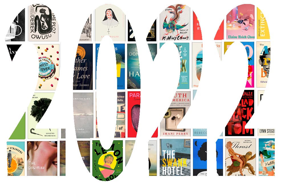
Just like last year, this post took longer than expected due to the best possible circumstance: there were so many great book cover designs in 2022 that I had a hard time whittling down the list. Even as it is, we’re busting right through last year’s limit of 50. Good times!
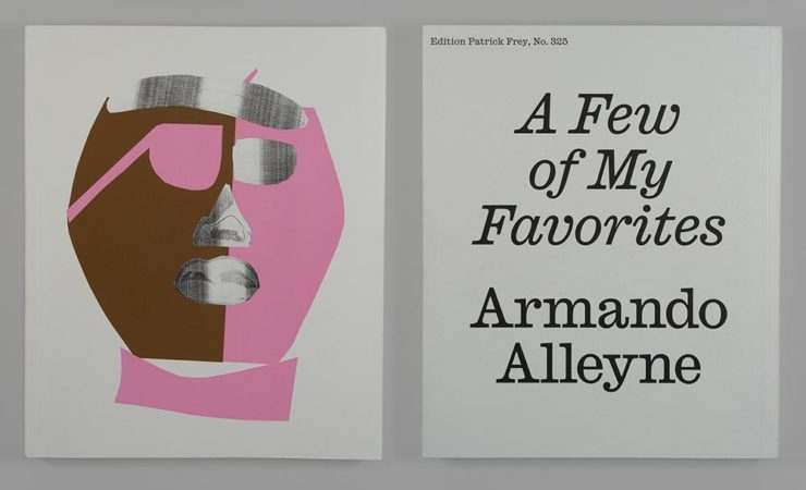
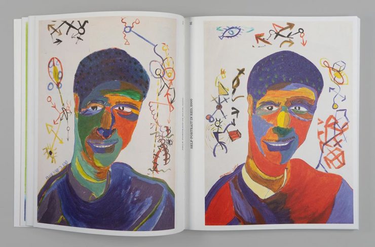
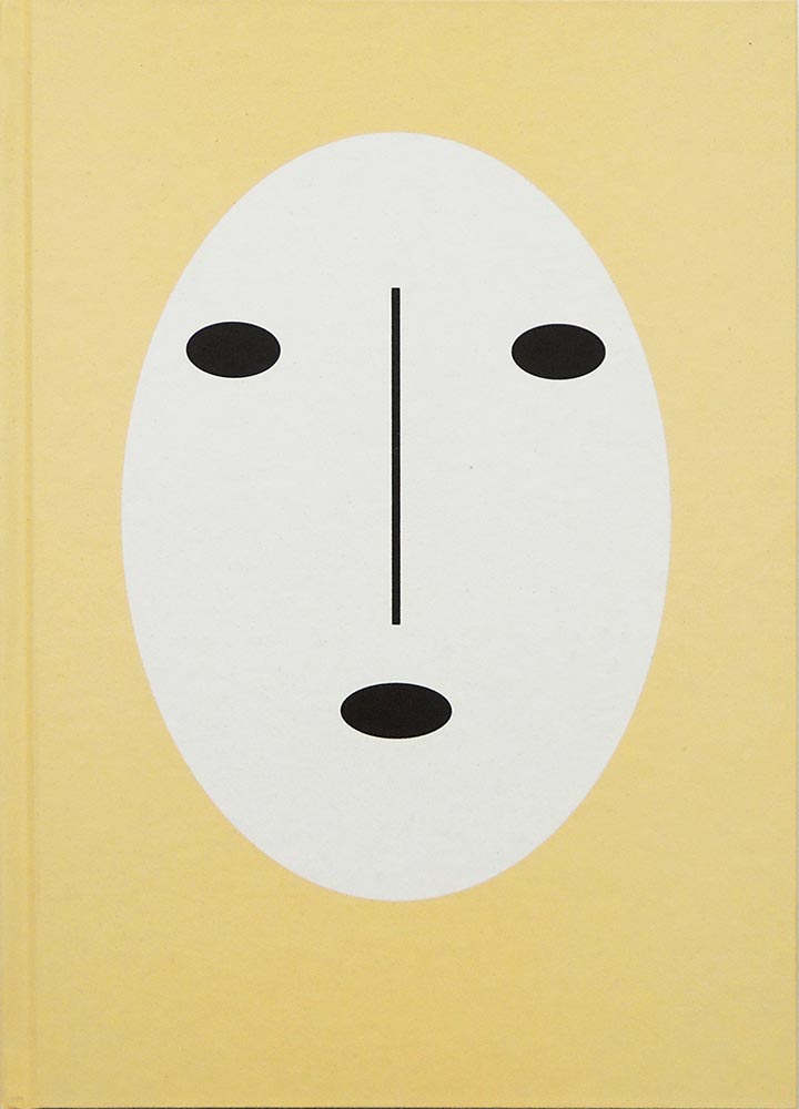
If we take a step back and look at the trends this years’ favorites represent, it’s more and better illustration, custom and hand-painted type, and a sense of a single focus — one, dominant thing on a field of color. Also, the trend of fewer photographs continues — more evidence that photography has become so ubiquitous that something different is required to stand out. (Or, of course, a really great photograph.)
Please remember that these are my favorites — others might say “best,” but I’ve been in this business long enough to know that there’s always another great title you haven’t seen or read about, and I don’t want to disrespect any of the great book designers not on this list. I’ve tried to include design credit where I could (special thanks to the folks who answered emails with that information), and I wish to stress that any mistakes in the list below (incorrect attribution, for instance) are mine.
Note: If you’re on Foreword’s main page, please click on the post title, above, to view this list. You’ll get larger covers for your viewing pleasure.
My favorite book covers for 2022 (Three-way tie):
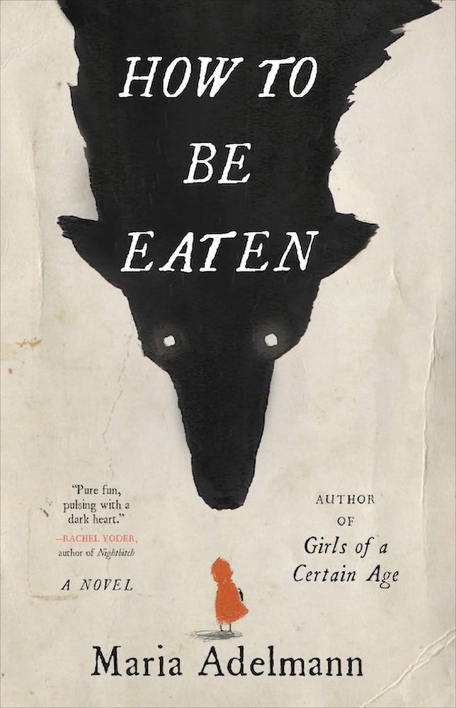
How to be Eaten combines an aged look, just a smidgen of pencil sketch, hand-drawn type, and those eyes to create something that just goes beyond. I’m certain the background wolf and creases are real, too, either photographed or scanned — bonus points for that all-too-rare practical effects — and all this in what amounts to two colors. Simply awesome.
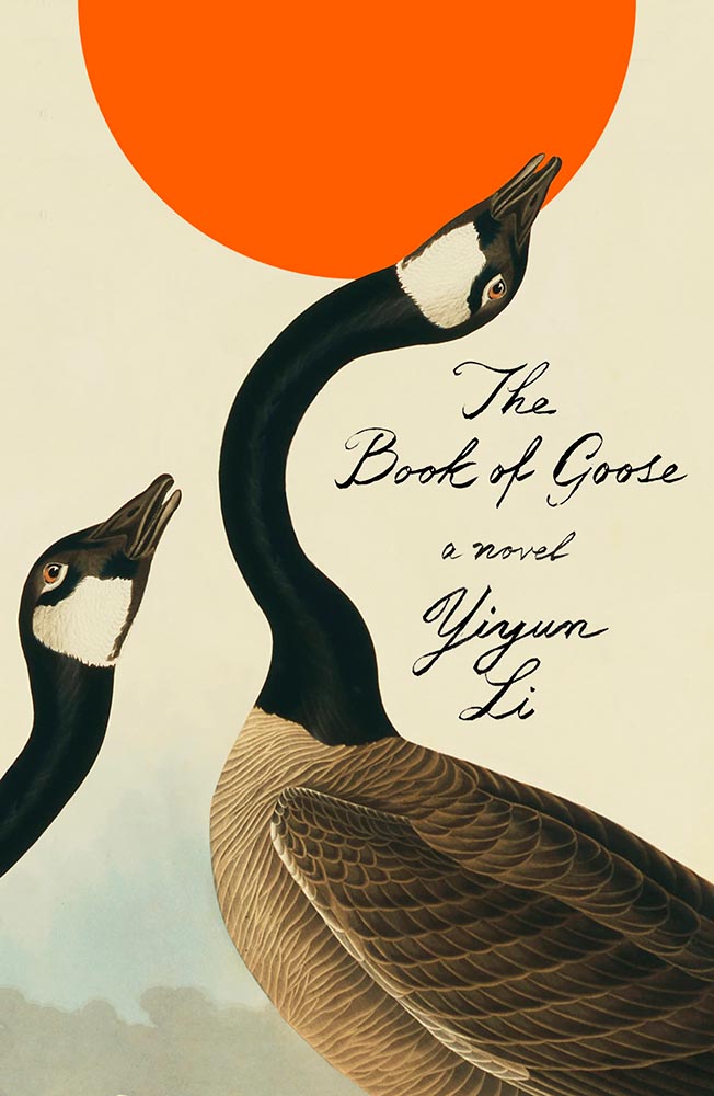
The Book of Goose defies use of the words “art form” — it’s the kind of cover that for many designers would be once-in-a-career good. However, Na’s work appears below, was here last year, and speaks to Na’s creativity being, well, a golden goose that just keeps on giving.
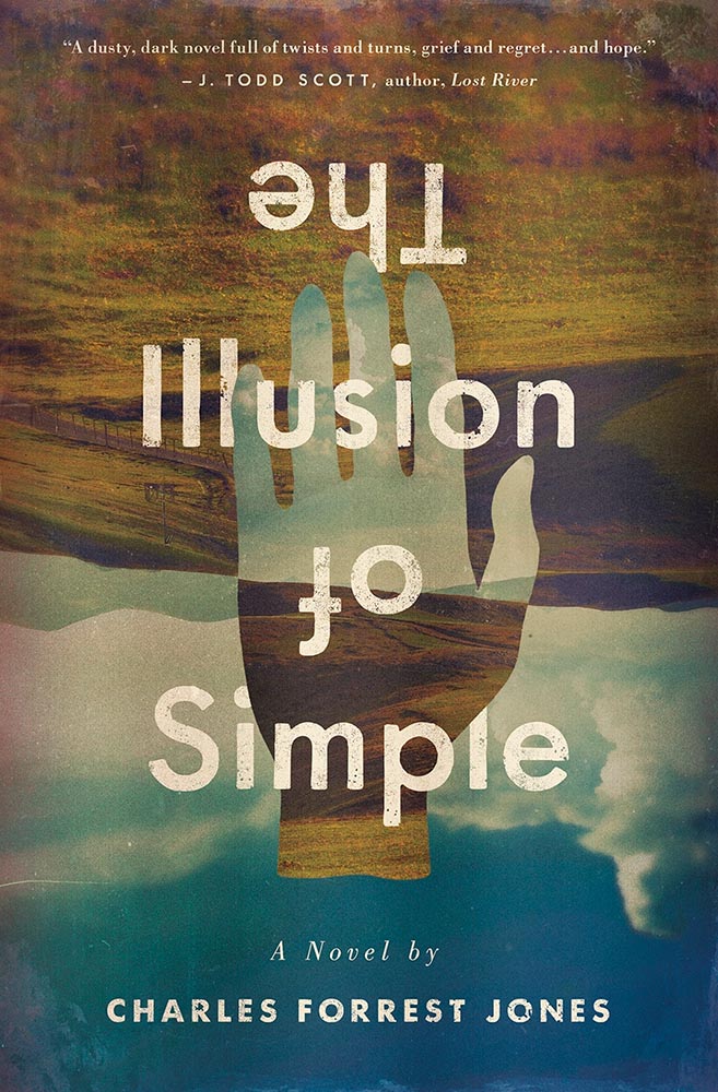
Simply put: there’s literally nothing about The Illusion of Simple that isn’t perfect. J’adore.
Other 2022 favorites, in alphabetical order:
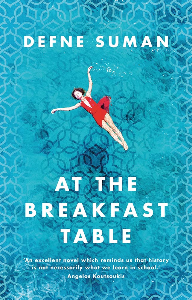
This is striking not only for the beautifully-photographed woman in the pool, but the way the pool is extended out to make that woman even more striking. The pattern overlay is fantastic, too.
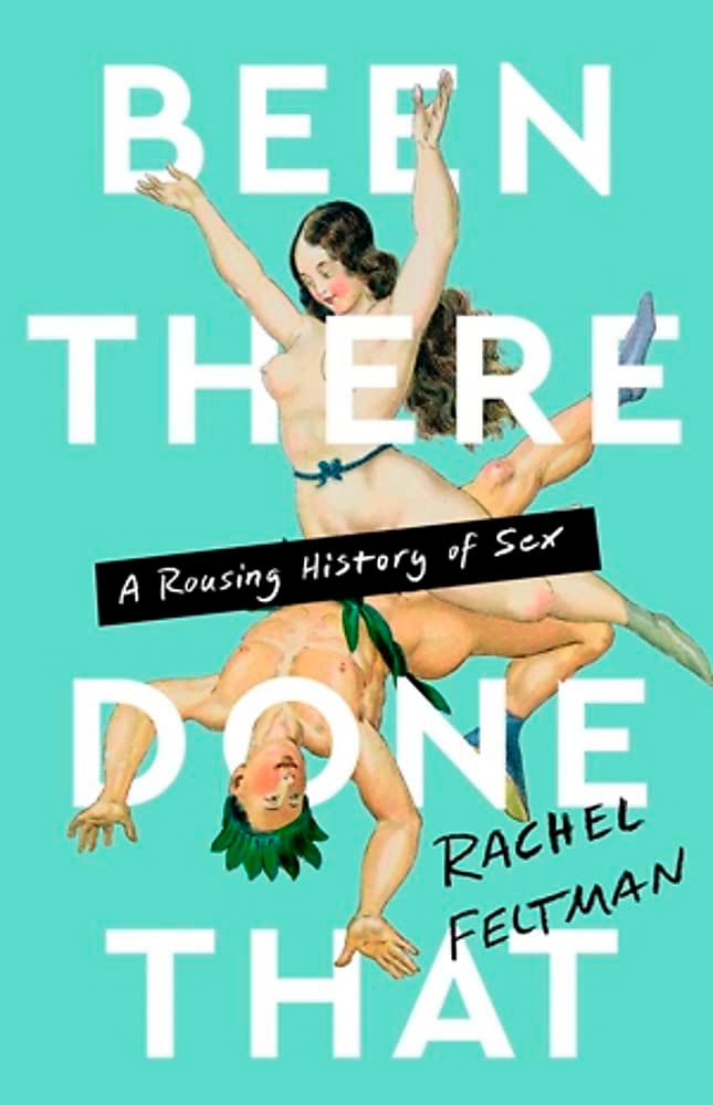
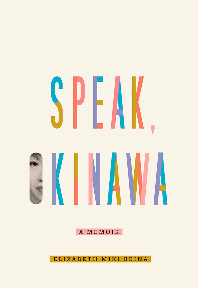
There’s nothing about this not to like: the frankly perfect illustration on a great background color, the head through the “O,” subtitle censorship bar, the sock, even the title. Enjoy-a-cigarette-after good.
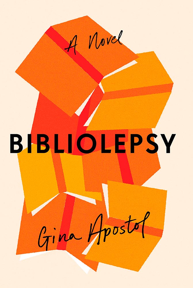
Bunch of aged books with a little type, right? Yes, by so much more: striking colors, great hand-done supplementary text, perfect title treatment, style in spades.
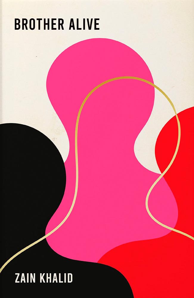
This is a UK cover — the American one is okay, but not on this list — that celebrates a minimalism that is rarely seen, let alone so well seen.
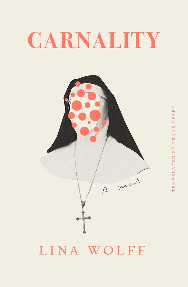
What’s not to say about this cover? While faceless women are perhaps overused, this is a book I’d snatch off the shelf — and seemly catch something from — in an instant. Well. Done.
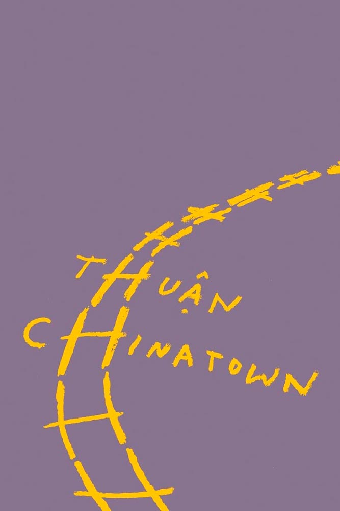
As simple illustrations go, this one in on track for the city of Superlative. Another Oliver Munday classic.
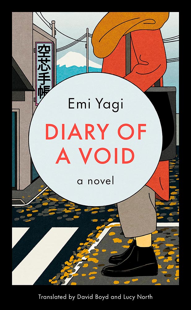
Along with “faceless woman” is “headless woman,” but the illustration here more than makes up for it. But it’s the expert, almost laugh-out-loud use of a void that makes it. Well done.
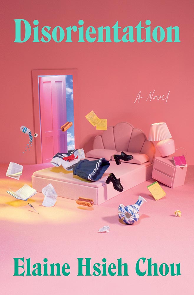
Sure, the title and background colors are neat, the sky outside is cool, and “a novel” is a nice, subtle addition. However: I want to know how this photograph happened. (And a waffle hot dog.)
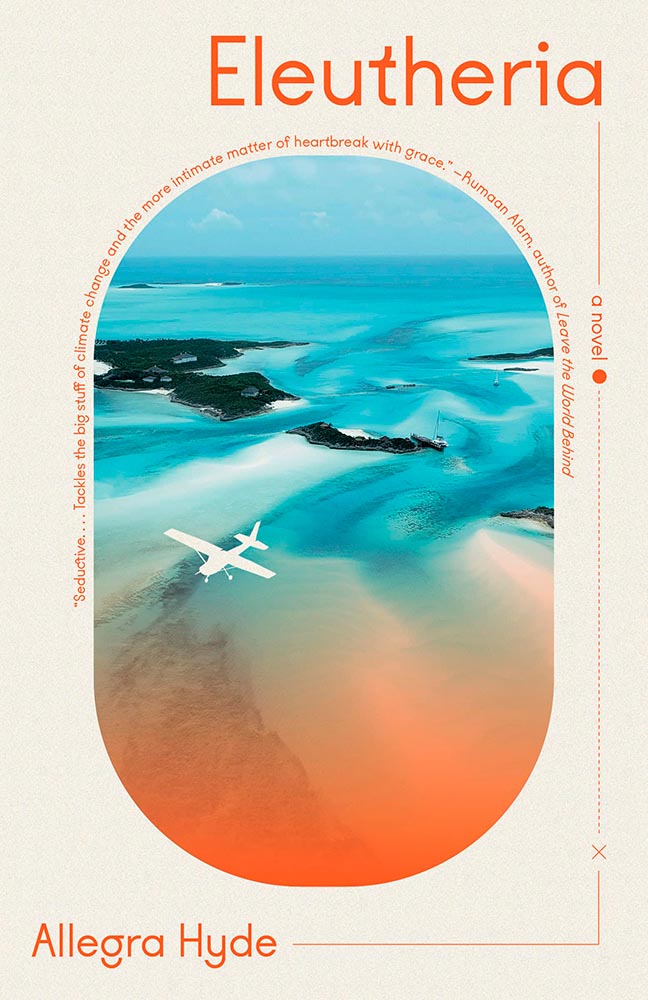
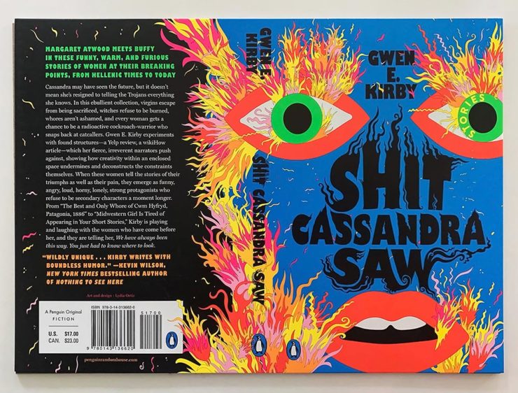
The first of a couple of titles with unexpected wrap-around type treatments, this one has great type choices, too. But the real treat for me is the plane knocked out the photograph. Fantastic.
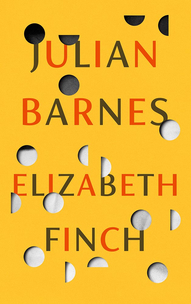
This title hides a secret: under the simple and wonderfully-die-cut jacket is a beautiful photo from René Groebli’s photoessay The Eye of Love.
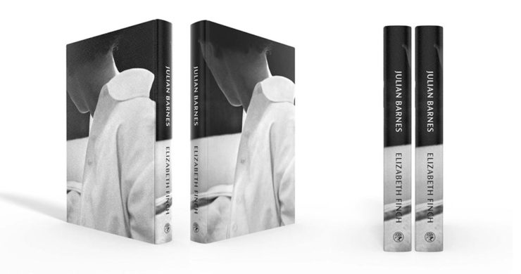
Awesome. (Note that, once again, we celebrate the UK version of the book; the US hardcover has a design not on this list. Crumpets.)
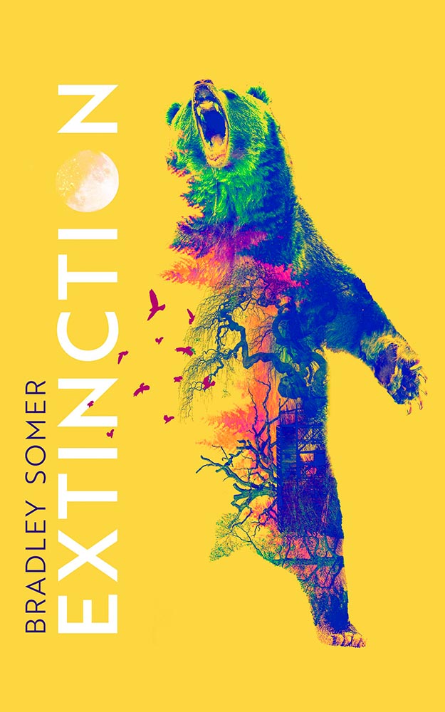
The moon as O. The birds. The graduation from fur to imagery. The yellow. Any would be good on their own, but are great together. Have to say: I’ve seen this in multiple shades of yellow. I prefer the darker — closer to the Barnes title, above — to the lighter, shown here.
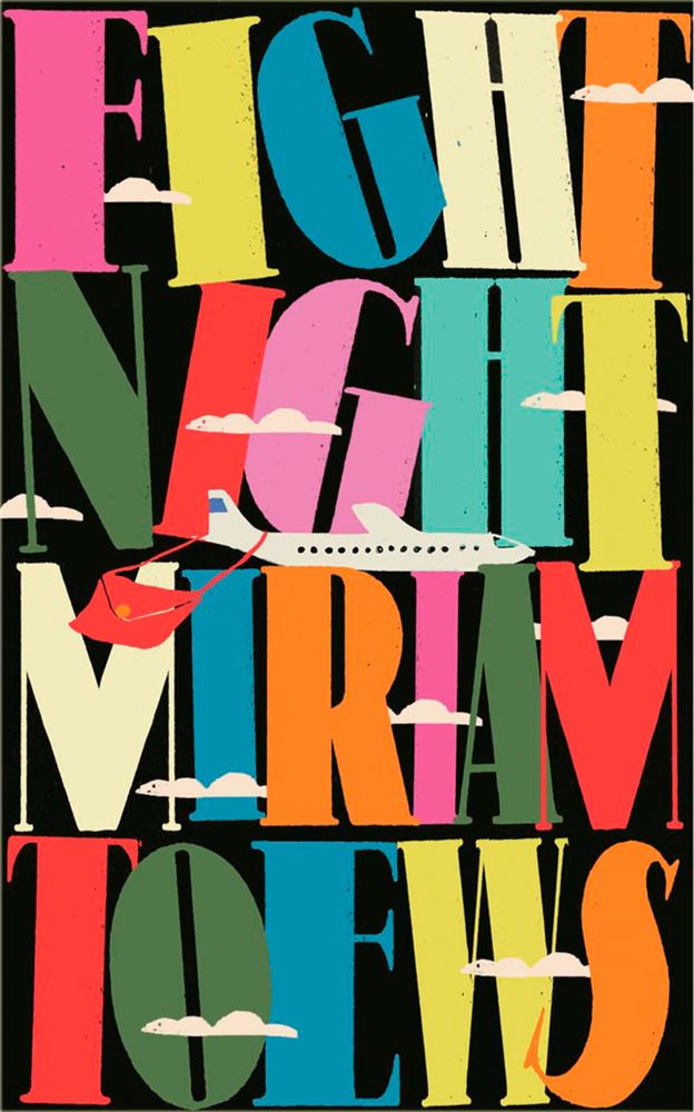
The typography, awesome little plane — the purse(r)! — the clouds, all of it: sky-high levels of good.
Interestingly, Fight Night‘s cover also had a 2021 version worthy of note:
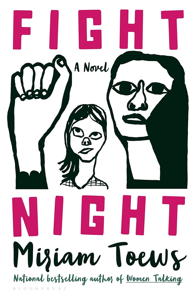
I can’t begin to imagine what caused the redesign, or why it wound up being so radically — 180 degree! — different. The old design wound up on some “best covers” lists (here’s LitHub’s October 2021 post, for instance); both have wound up on mine.
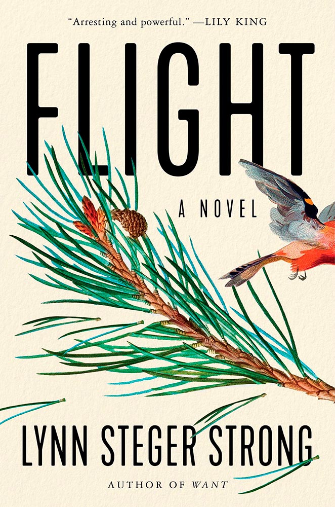
The bird exiting the scene stage right makes this just right, with bonus points for the textured paper and slightly-rounded sans serif. I think the illustration is perfect — classically done, one could say — and also love that “author of Want” is in a different font.
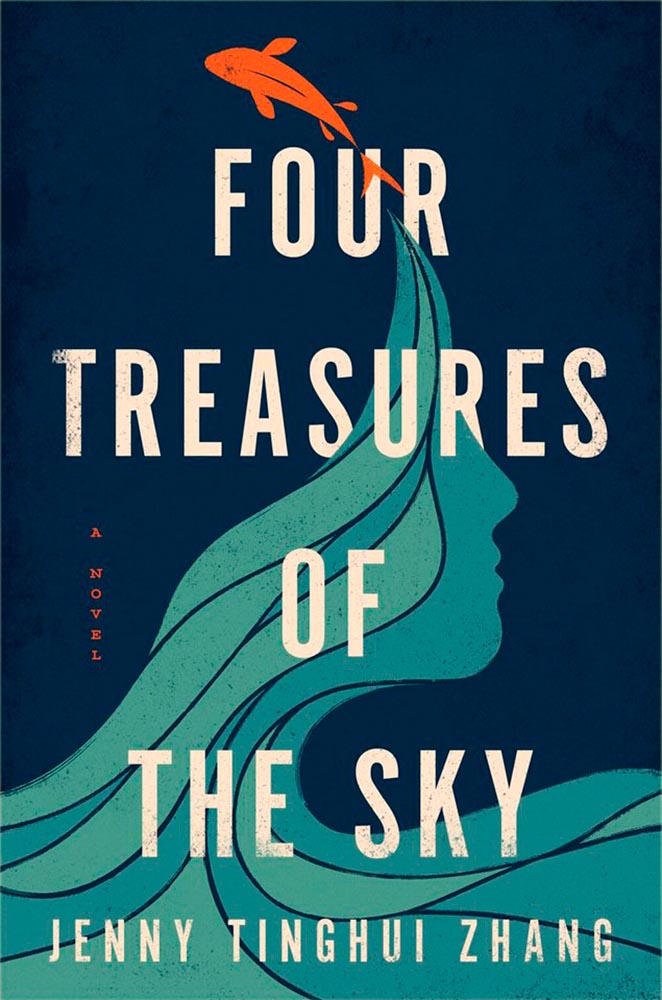
Four Treasures to the Sky, mentioned in the May book cover design roundup, leaps into the best-of-the-best list. It features an aged look, but in a woodblock way that celebrates its limited palette. Add in the illustration’s interactions with the type and the vertical “a novel” — often an afterthought — and brilliance emerges.

As photomontages go, this one is simple — yet simply powerful: red Albania meets (and hugs!) beheaded Stalin. Great choices.
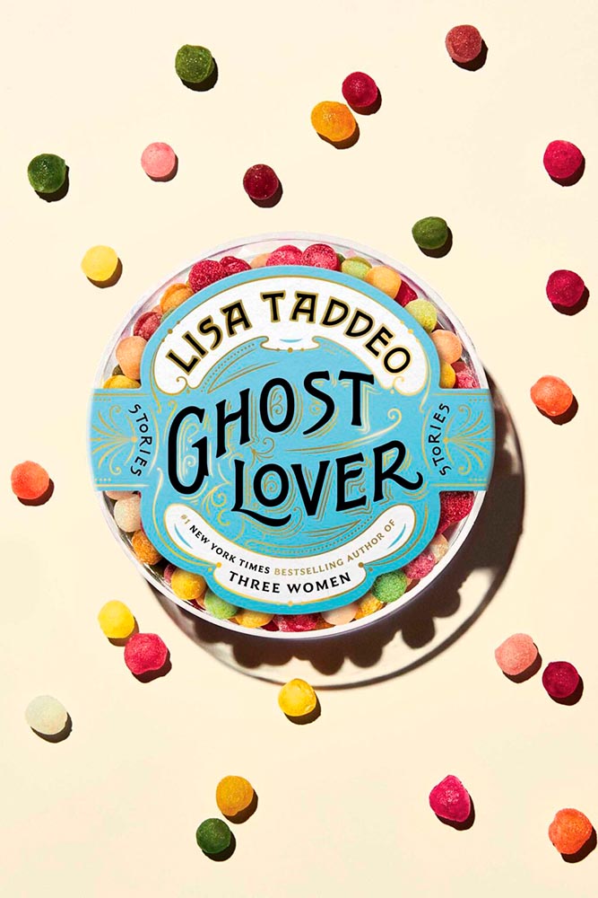
The quality of type and decorations on this “label” are beyond outstanding. This cover is candy for book design lovers and readers alike.
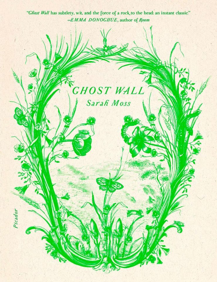
From It’s Nice That, we have a nice feature on Alex Merto — whose Ghost Wall cover is a great example of plant life adding so much more: “the force of a river to the head,” to paraphrase Emma Donoghue’s quote. Plus, one color! Win.
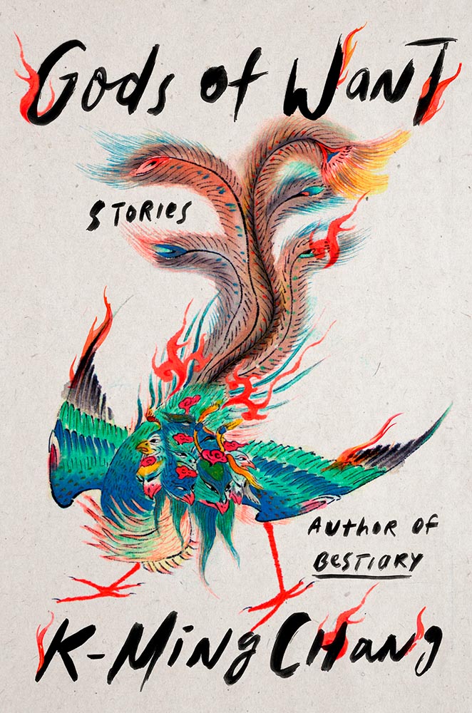
Nine parts awesome: type and illustration join to light a fire under the words “quality” and “imagination.” (Have I mentioned that I love a textured paper? Here’s a different one that’s also great.) This is one of several titles that’s not only a great book cover, but on a bunch of “best book” lists, too. Great books should have cover equal to their contents, and this one scores.
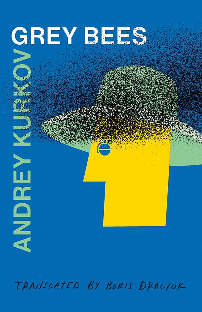
This isn’t here because of the attention Ukraine deserves these days, it’s here because of that illustration. Brilliant design needn’t be complicated, so ably proved here.
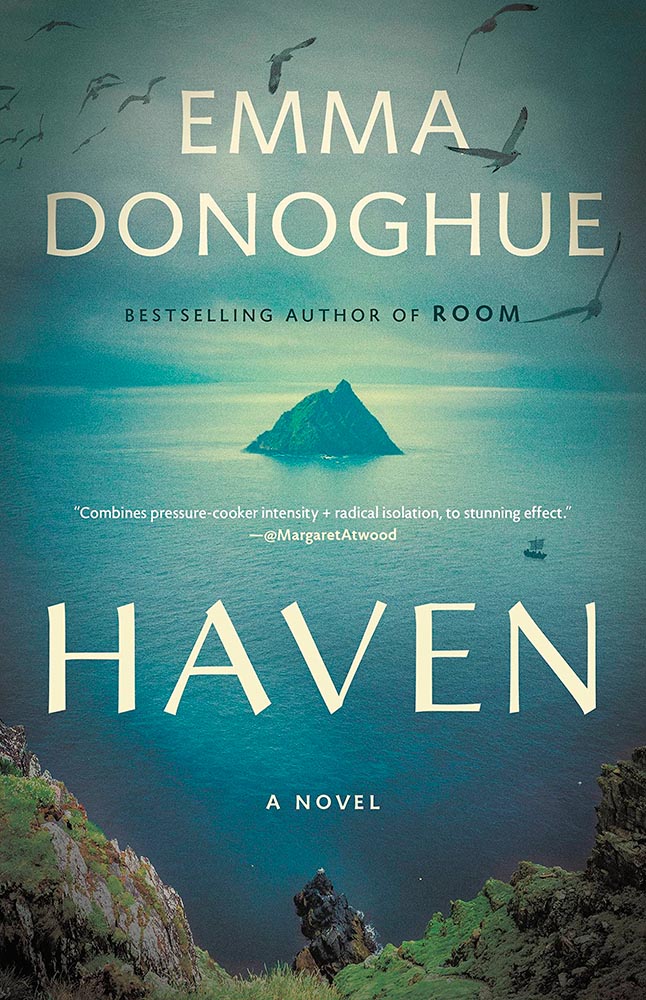
I mentioned at the top of the post that, these days, photographs have to bring something special to the table to stand out. And this cover does, from any table in any bookstore anywhere. (Lovely typography choices here, too.)
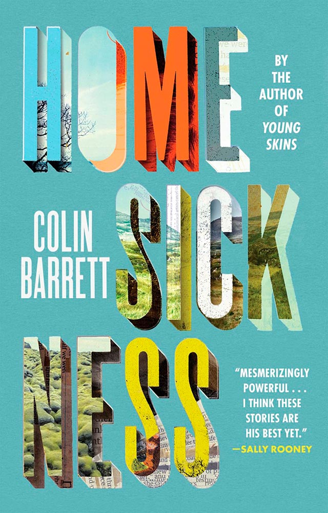
One trend I didn’t mention at the top of the article is the montage-in-type, done here to absolute perfection.
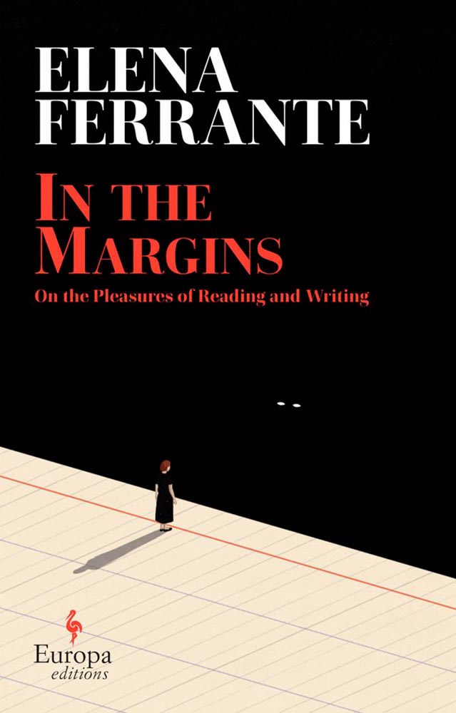
The woman in looking off the edge of the page at … something looking back. (Not only that, whatever it is casts a shadow.) The book is described as “subtle yet candid,” something that could equally be said about this brilliant cover.
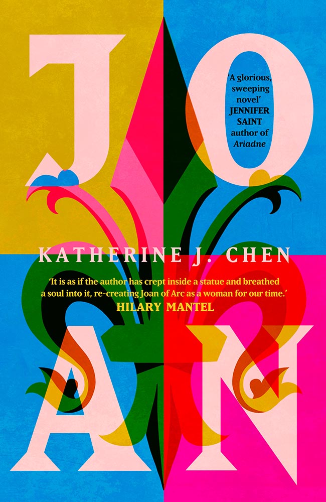
Another UK cover, this image doesn’t show the uncoated stock and debased type — but does show the jump-off-the-shelf color choices and awesome interaction of title with background. (The US cover, alas, resorted to stereotype. Perhaps we aren’t sophisticated enough?)

Choose a interesting texture, put some blocks of color on it, some type and … done. Hah! (Seriously, just look at the hands: they say it all.) Bonus to the hints of doily in heaven.
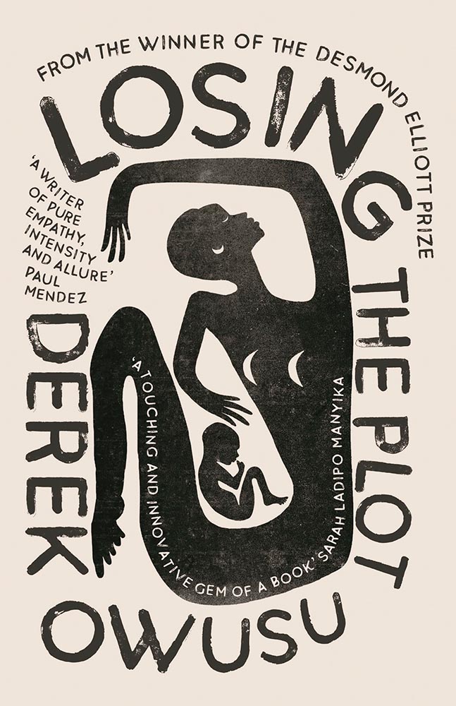
The wrap-around title treatment makes another appearance here, with bonus second and third layers and a perfectly-done pull quote. With the aged ink fill and type accenting the striking illustration, this one is in that “wall-worthy” category.
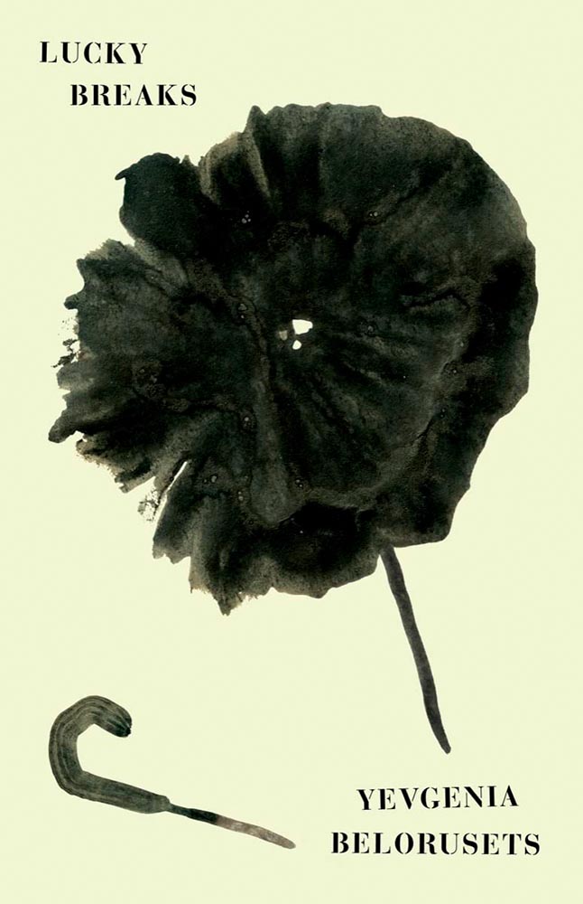
On our second Ukrainian title, both flower and umbrella work together here to force us to stop and look. (The stenciled type is a brilliant stroke, too.) Proof that genius often appears simple.
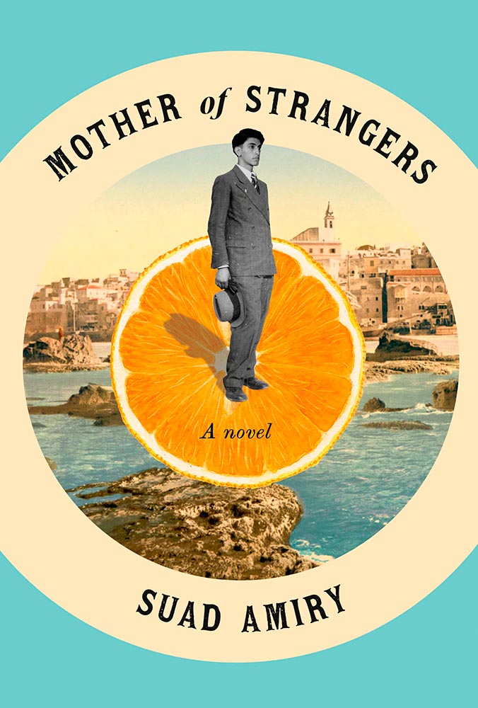
The montage, taken to the next level: Jaffa, orange exports, and an healthy serving of emotion. (Also: curved text is rarely so on-target.)
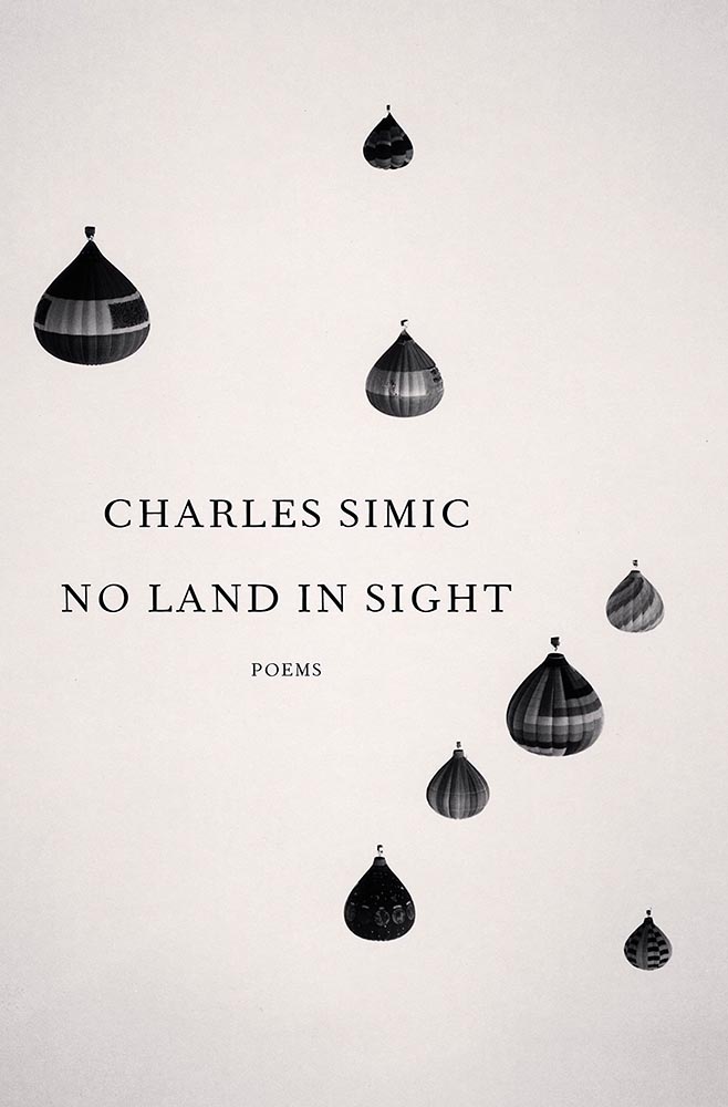
So simple, yet it is precisely that reaching off the shelf, grabbing your attention. This book is described as “spare and monumental,” and no less can be said of the cover.
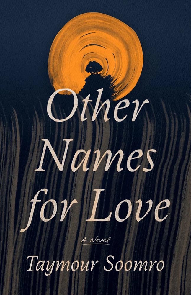
“Texture is key,” sure, but there’s texture and there’s this. The island’s brush strokes into what seem like a moon are whatever happens beyond perfection. I didn’t expect this cover for a novel about Pakistan, yet the emotion, the … evocation is perfect.
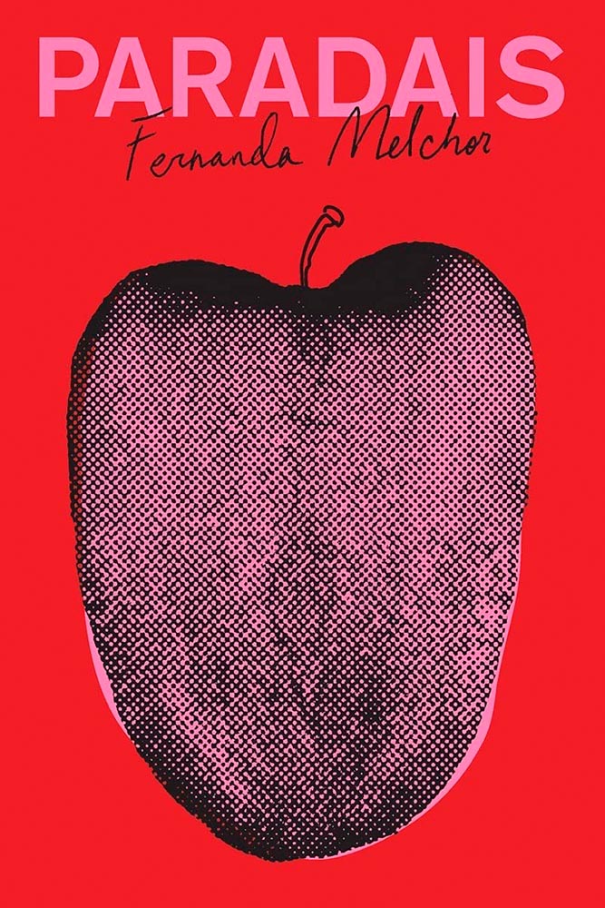
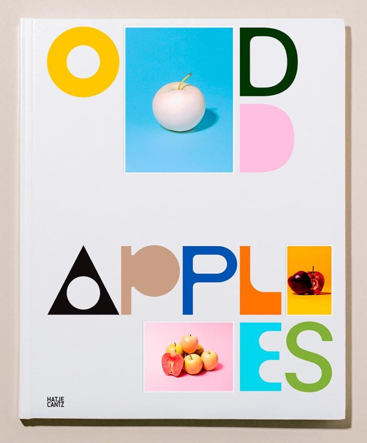
Apple? Tongue? Misfit teenager? Disturbed and distressed? Yes.

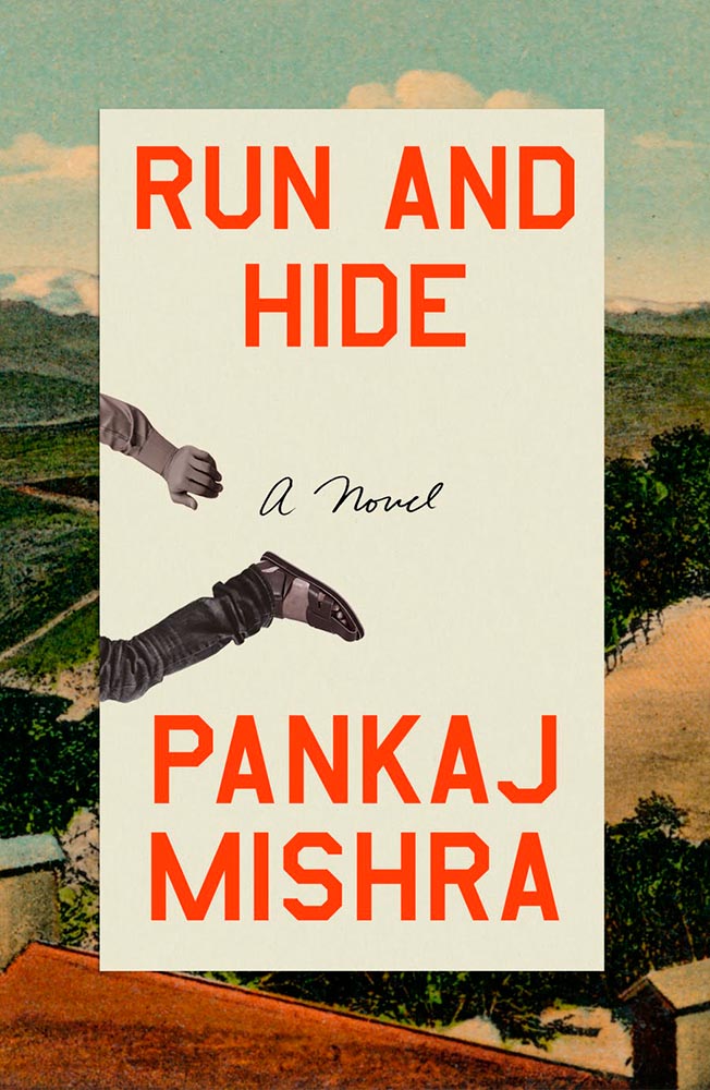
Rarely are such seemingly “dry” subjects treated with such skill: the angled type set against an urgent red, the subtitle sticker-that’s-better, and the photo choices add up to something I’d grab off a shelf immediately.
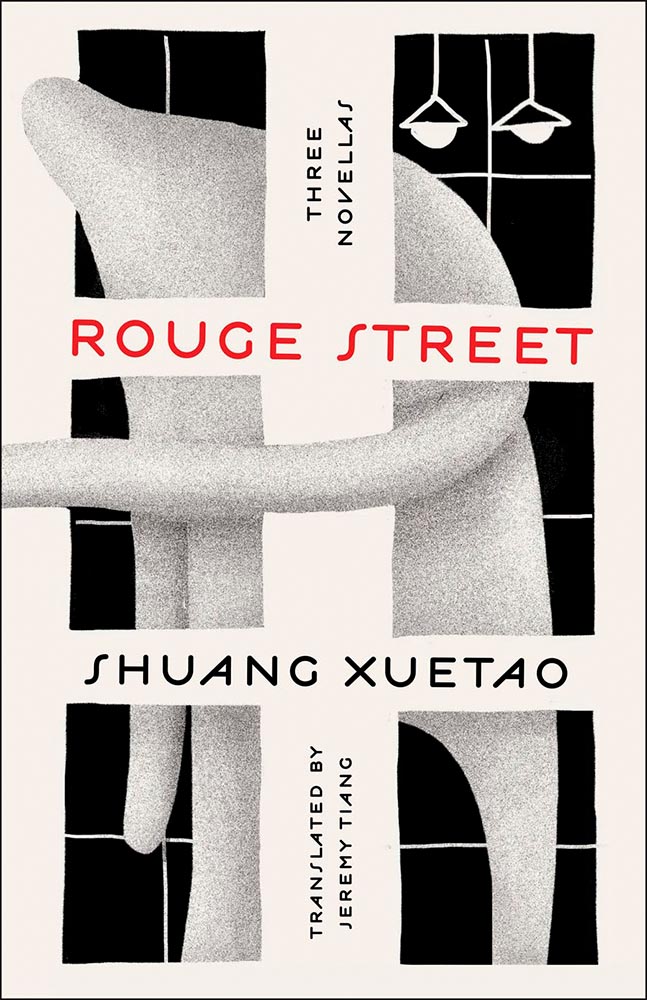
LitHub says this one has a very high “hang on the wall” factor. I can’t think of a better description — great stuff.
Na Kim just can’t help but design the best covers: a wonderful, antique background complimented by sheer brilliance. (Great typography, too.)
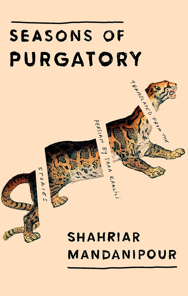
It’s nigh-on impossible to look at this cover and not flip it around to read the text trisecting the leopard. Take something simple, add the elusive more, get this. Yeah.
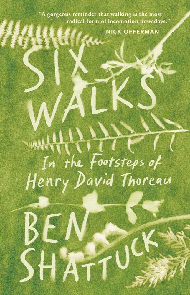
Another fantastic example of plants adding more than the sum of their parts. The mottled green background and watercolor-style falloff is perfectly complimentary. Great stuff.
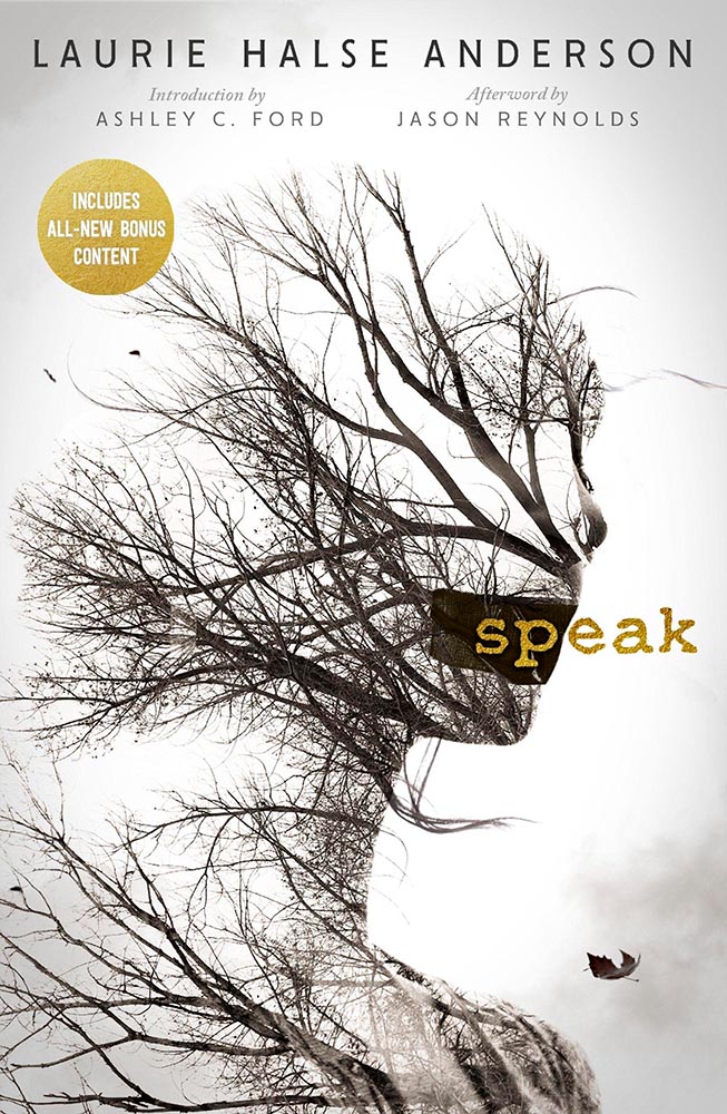
From the Banned Books Department, we have the 20th Anniversary edition of this difficult title rendered in a photo-based collage that’s nothing short of brilliant. Highest praise.
Bonus: Kudos, too, to Open Culture: The New York Public Library Provides Free Online Access to Banned Books: Catcher in the Rye, Stamped & More.
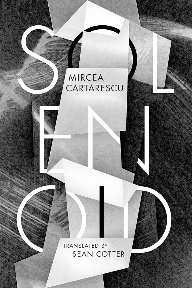
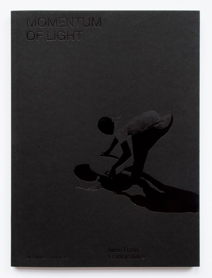
Very nearly the perfect black-and-white cover. Texture and shape combine with an incredible title treatment in a way that shrugs off the need for color. Fantastic.
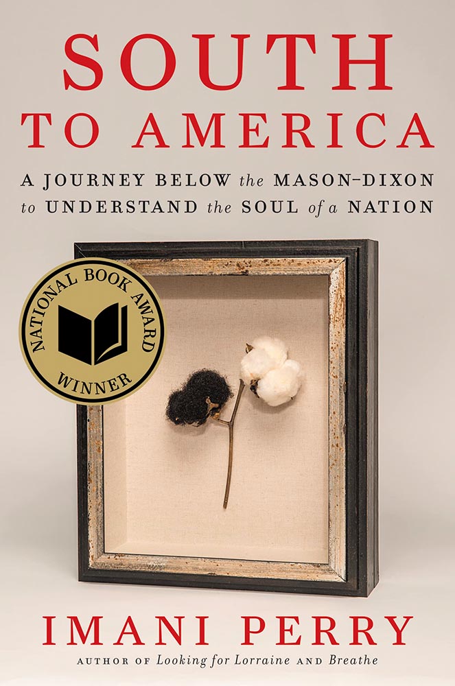
I’ve said before that moving to the South was a bit of a shock — the racism still all-too-evident jars all-too-often. This cover takes a simple, elegant idea and, without any of the stereotypes so often reached for, delights with style and simplicity, absolutely earning its spot in this list. (This is another of those titles that’s on many “best of” book lists, too. It’s a genuine pleasure to see worthy books get great covers.)
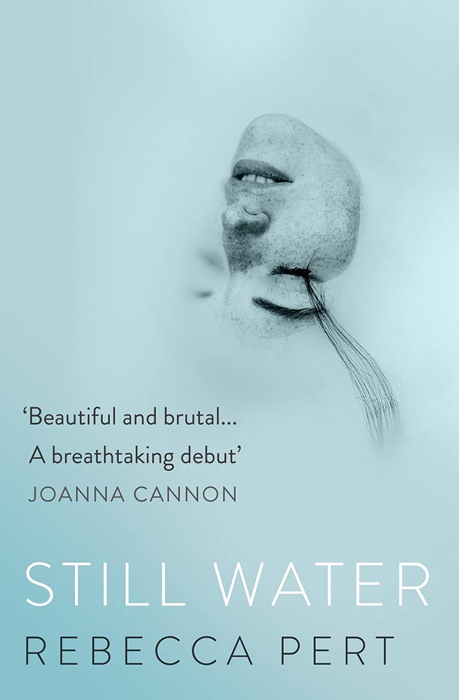
“Wow” is the only word here — a stunner of a photograph used in, if I may borrow from the cover, a breathtaking way. Simple, elevated to exquisite.
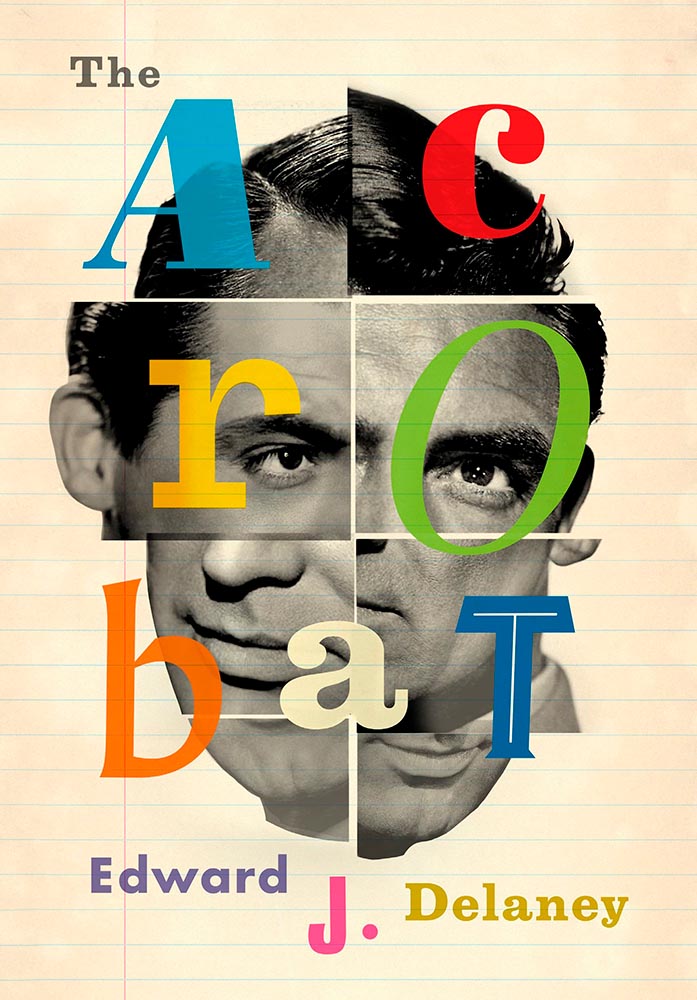
Never mind that I never knew Cary Grant was once a stilt walker (or named Archie Leach), this is an exercise in using a famous face in an innovative way, with a cast of supporting characters that flow as naturally as lines on paper. A trip through the possible — fantastically well-done.
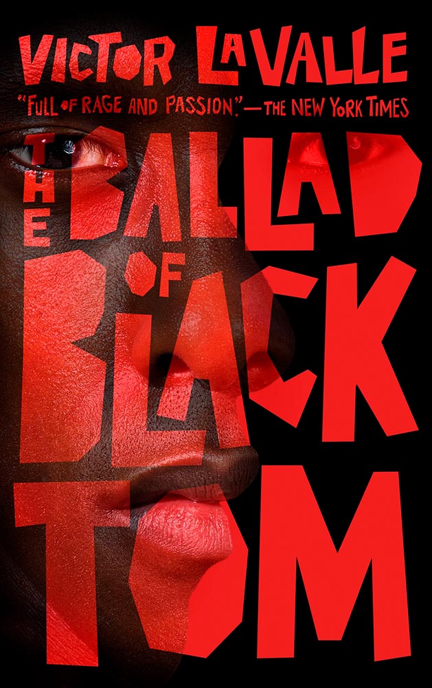
Fantastic type and color treatments, yes, but it’s the way the photograph is handled that shines: where the eyes are, the color treatment implying front and side, all of it. A 2016 book reissued in hardcover with a cover guaranteed to attract new readers.
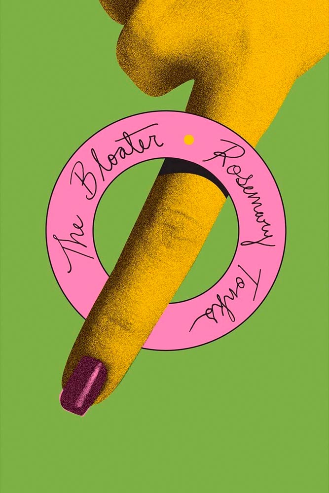
This cover is the antithesis of a swelled, salted herring: it’s brisk, to the point (if I do say so), and throws a life ring out to inspire book designers everywhere.
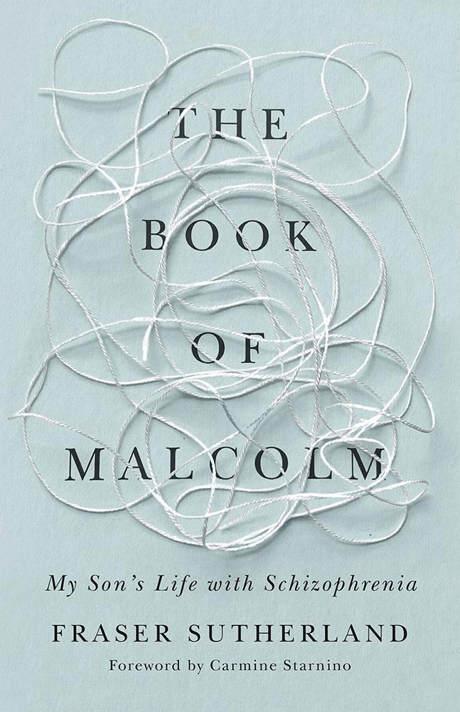
Brilliant: actual text, printed (on a great color paper, too), with actual string, photographed on said print. Not only is it exactly right for the subject matter, it’s simply and beautifully done.
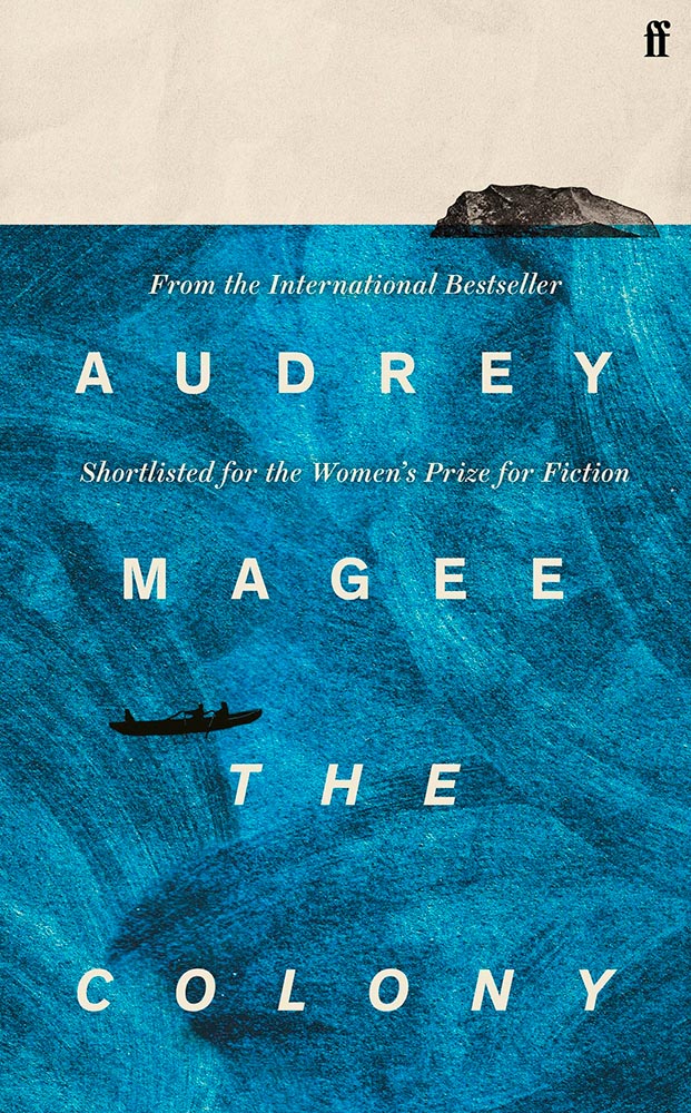
Never mind the great brushed color blocks or boat-rowing-the-ocean above the title. This is here mainly for the overlap between color and island: shortlisted for the prize for intersection-of-the-year.
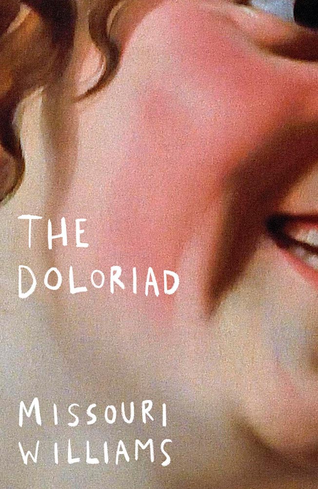
“I’ll just do a little cropping,” designers say. Then there’s … genius.
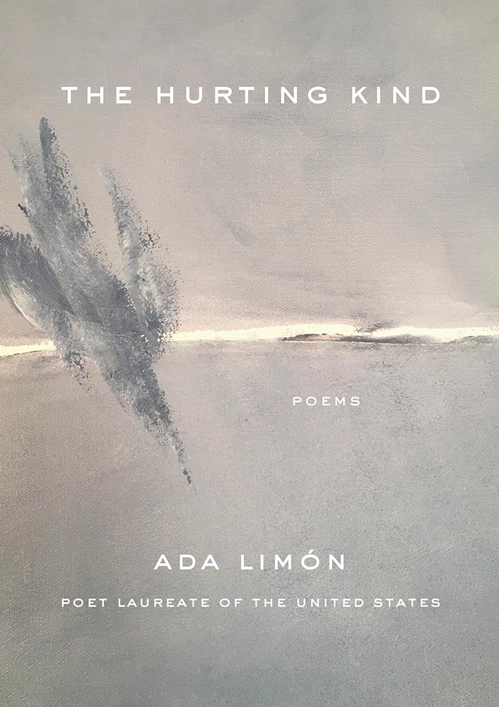
Another piece of art that’s absolutely wall-worthy — actually by the author’s mother — complimented by a tasteful type treatment with a wonderfully-offset “poems.”
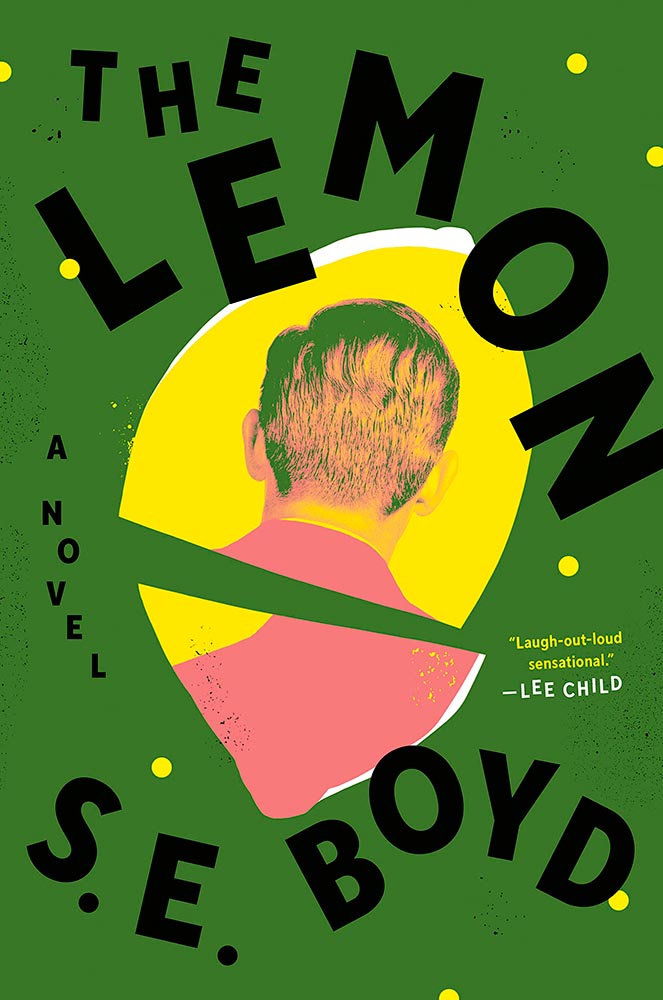
“Great” can’t even begin to describe this cover — from the lemon shape, staggered type, green background, back-of-head portrait, to the slightly-aged treatment, we have ingredients that add up to that highest of achievements: a book I’d buy knowing nothing about, no hype [machine] needed.
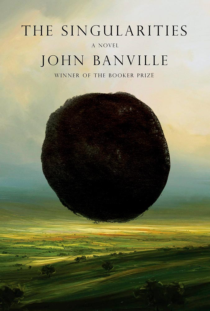
Classical painting with a singularity. Sure. So easily pulled off … if you’re John Gall.
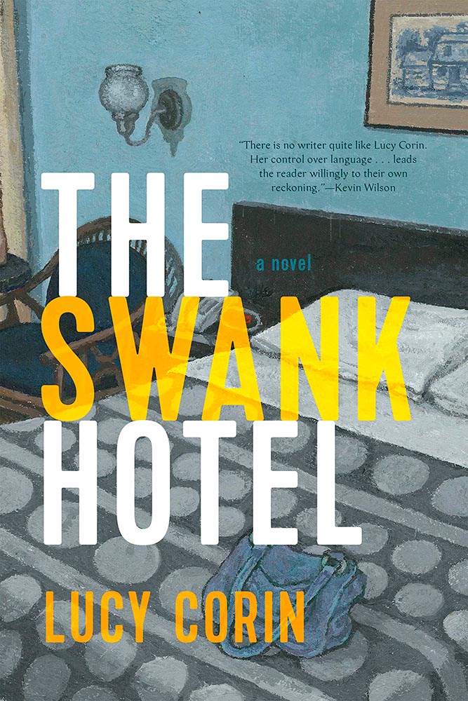
The title treatment is the winner here, using two translucent shades of orange to the best possible effect — taking a nice painting/illustration to the top floor.
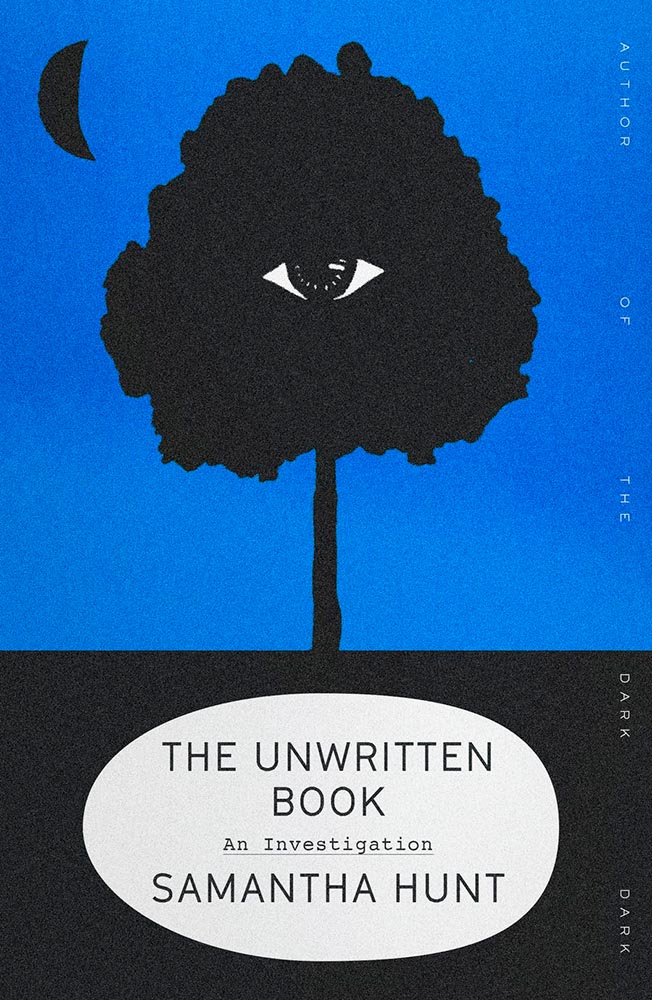
Describing this cover as “haunting” would be a cheat — but completely accurate. (Love the line of type down the right side, too.)
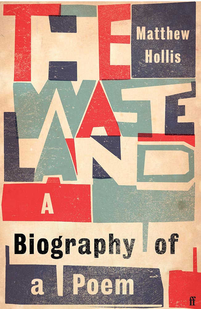
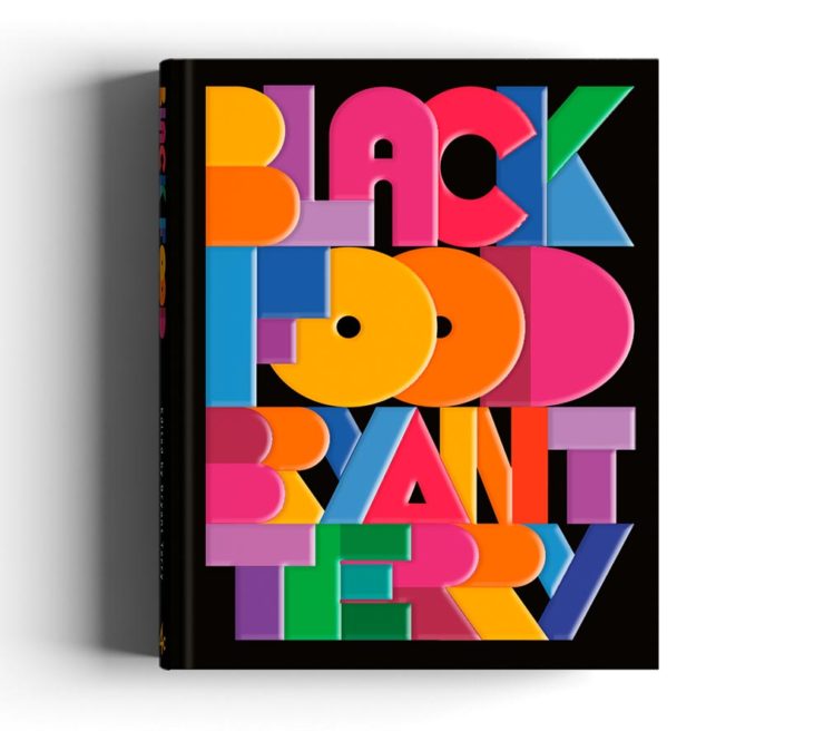
The rare type-only treatment … taken to an entirely new level. Fantastic.
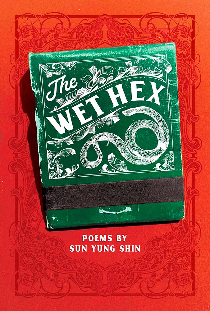
A triumph of textures: one matchbook you never want to throw away.
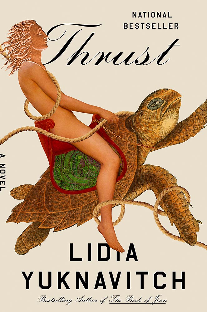
Breaks through more than water and time: it’s thrust into your memory. (See a note from the designer at LitHub’s cover reveal.)
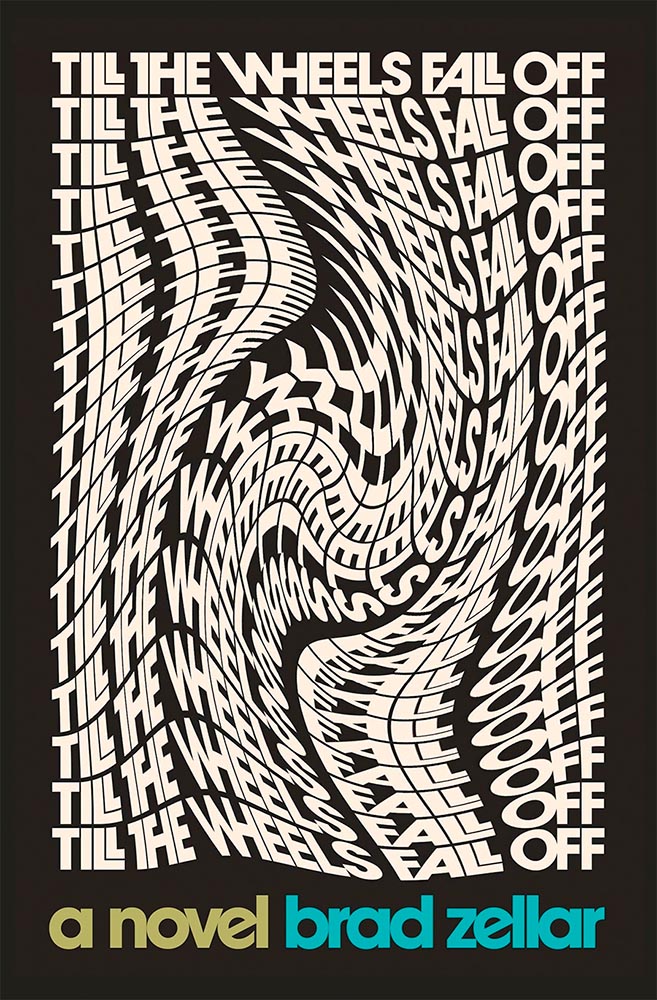
One of only two text-only treatments in this list, done in a ’70s style — yet taken to a clever and impressive level. (Love the stacked “lls.”)
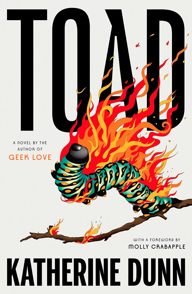
I adore how the type and frankly fantastic illustration work together here. Wonderful!
Bonus: Read how this cover came to be on Spine.
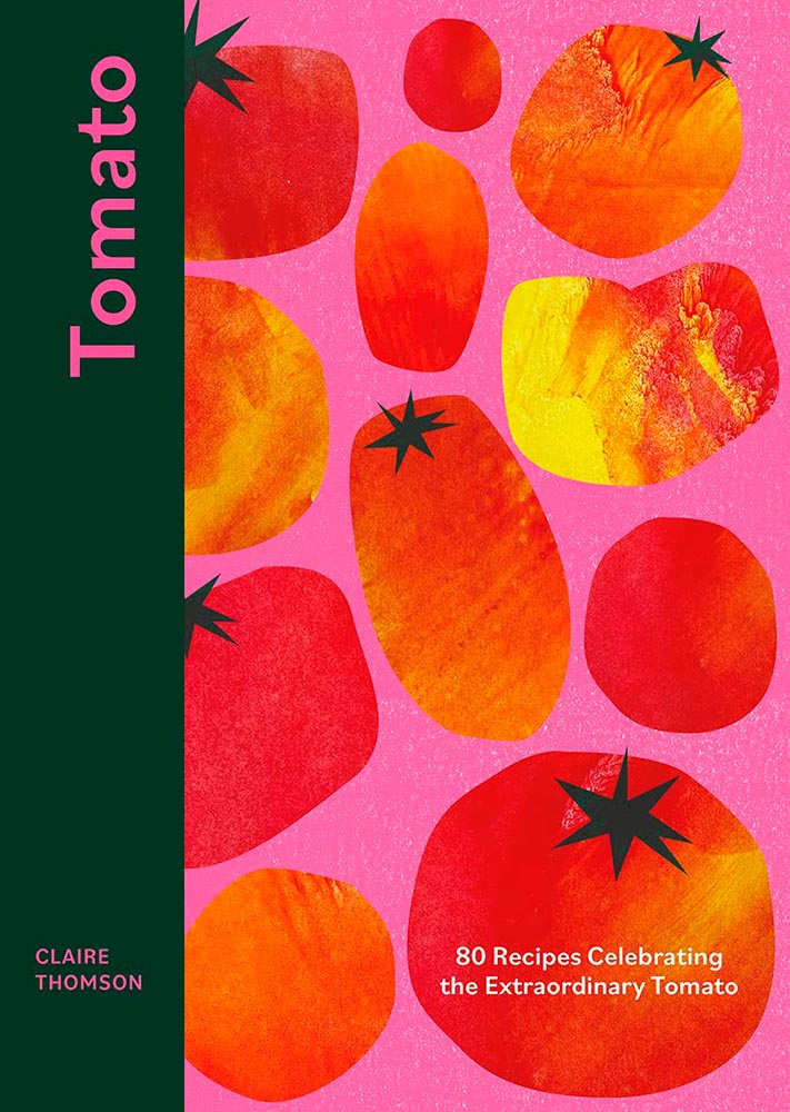
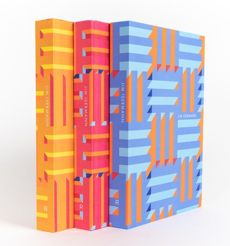
Cookbooks rarely make an appearance on “best book covers” lists — yet this one earns its spot with an antithesis-of-the-stereotype approach. Ordinary it is not, in the best possible way.
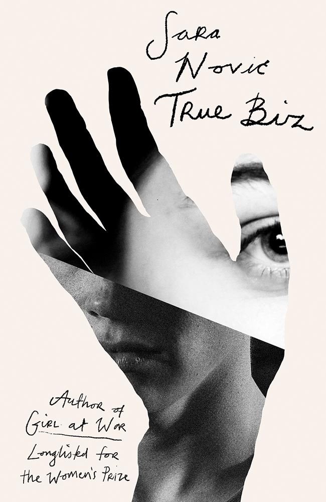
Another UK version — the US version is good, more than most even, but it’s this one that shines with its great photo choices, cut lines, and great type treatment.
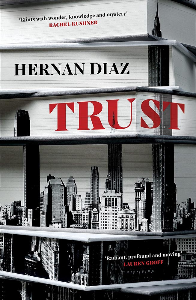
This one’s a two-fer, with the UK version, above, showing the book-edge treatment done really well, while the US version…
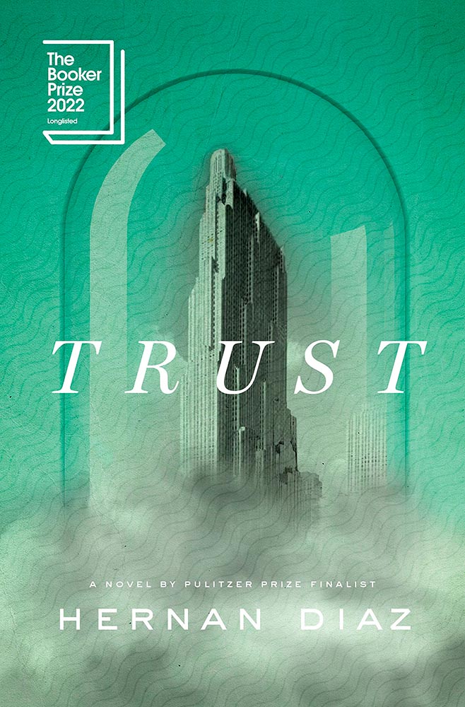
…takes it to another level. Is there such a thing as a cloud globe? Or is that one of those old-fashioned stock-ticker covers? Either way, the subtle pattern — in front in some places, receding in others — adds a wonderful touch. Great stuff. (Great, too, to see the US version take one: a rare treat.)
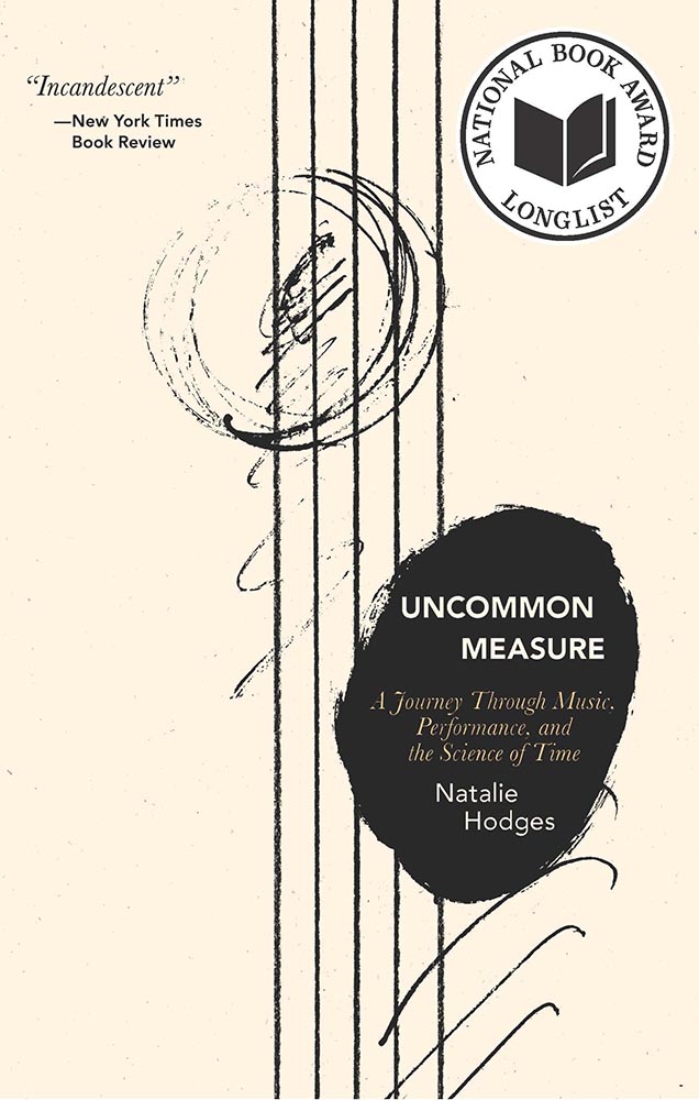
Bellevue Literary Press scores a win here, with something immediately recognizable as about music, yet so much more. Performance art, indeed.
Note: I originally attributed this title to Yale University Press instead of Bellevue Literary Press. I regret the error.
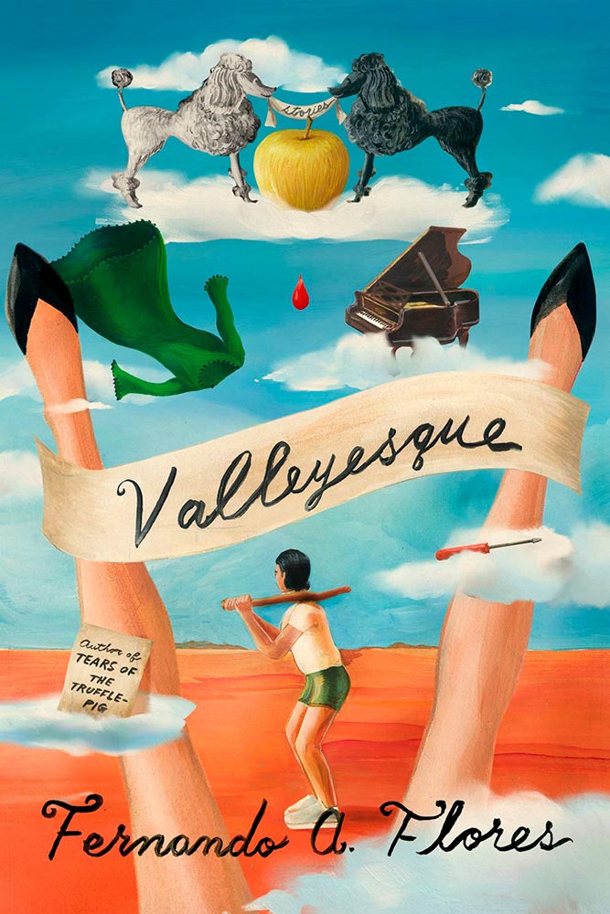
Na Kim apparently not only did the design but the illustration, as well. The rest of us can only aspire to that level of talent.
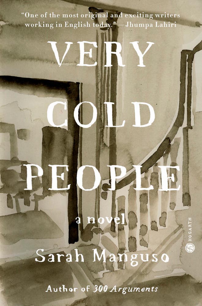
This illustration being in grayscale is, at first, a little off. But, of course, that’s exactly the point. I overuse “brilliant,” but it’s the best description. (Again, see a note from the designer at LitHub‘s cover reveal.)
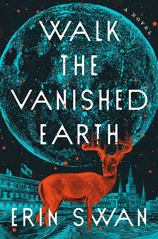
Family epics, climate change, dystopian futures, and Moon — all somehow included in this rich illustration. Two-color greatness. (Bonus: Another great use of “a novel,” something often “meh.”)
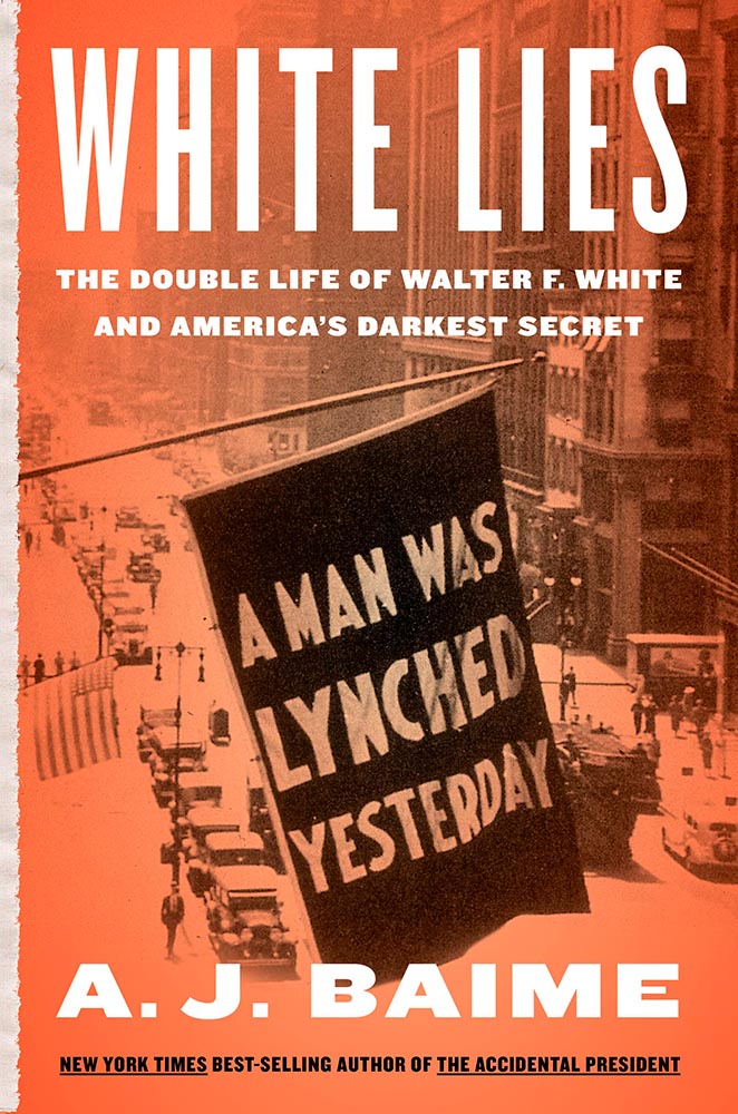
A standout historical photograph is only the beginning: it’s really the coloration that’s the story here, for both book and cover — so well done.
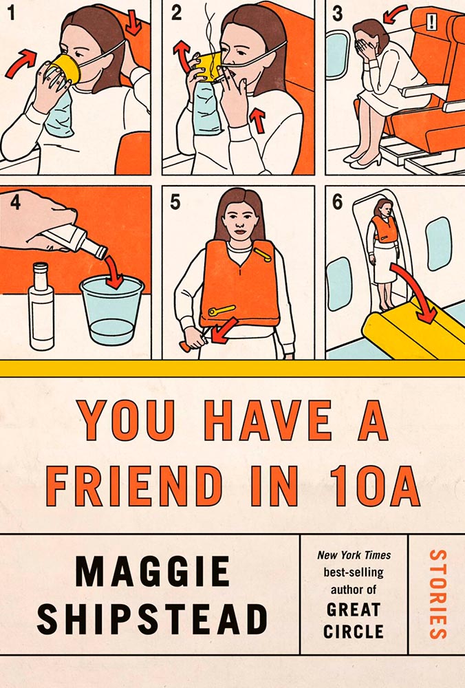
Among the best book cover illustrations ever, perfectly inserted into the seatback in front of you. (Great Circle’s cover was in last year’s list, by the way.)
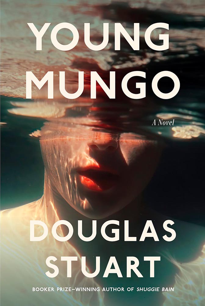
There’s something about underwater photography, with its beautiful, soft light and fascinating reflections, that is evocative — and there’s nothing about this photograph that isn’t evocative. A triumph.
• • •
Whew. Seventy great book covers. 70!
Okay, let’s summarize: 2022’s crop of favorite covers not only surpass 2021’s, the quality of work here represent what I believe to be a new standard. To all the designers — and art directors that chose them — congratulations.
Looking forward to 2023!
How we got here:
My selections stem from books I’ve seen in person; the “best of” lists from NPR, The New Yorker, Kottke, The Guardian, and the BBC; and the best book cover lists from Spine, The Washington Post, Casual Optimist, Kottke, Creative Review, and LitHub. See how my list compares with theirs — a great many more outstanding examples of cover creativity await.
See also: my favorites from 2022’s University Press Design Show.
![Beautifully Briefed, Late October 2022 [Updated X2]: Translucent Hummingbirds, Honda, Landscape Photography, and … Vampires!](https://www.gileshoover.com/wp-content/uploads/2022/10/BB-late-oct-2022.jpg)




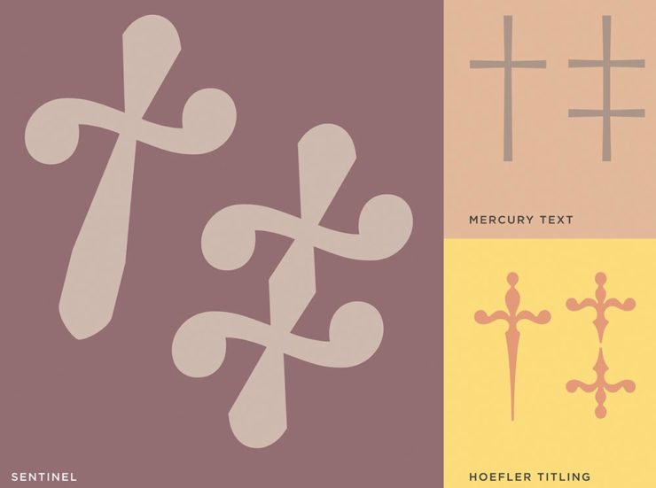
![Beautifully Briefed, Early October 2022 [Updated]: Triboro’s Lyrics, Hoefler’s Daggers, and Skoda and Citroen Provide Contrast](https://www.gileshoover.com/wp-content/uploads/2022/10/BB-2022-early-oct.jpg)







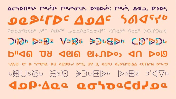
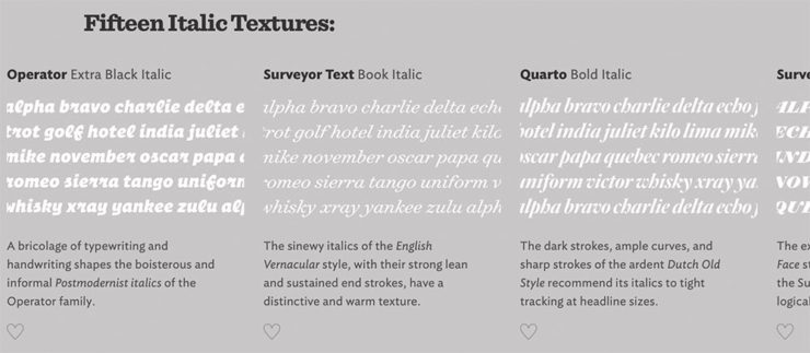
![Beautifully Briefed, Mid-September 2022 [Updated]: Indigenous Type, Italic Type, Adobe Types “Stop,” and Two Awesome New Cameras](https://www.gileshoover.com/wp-content/uploads/2022/09/bb_sept-22-1.jpg)


![Beautifully Briefed, August 2022 [Updated]: Drobo, Rolling Stone, Aston Martin, and Bugatti](https://www.gileshoover.com/wp-content/uploads/2022/08/bb_aug22.jpg)