Tag: design

  • Beautifully Briefed 24.12: New Year’s Eve Fireworks

    Beautifully Briefed 24.12: New Year’s Eve Fireworks

    Let’s continue a couple of discussions before closing out 2024, and send you into 2025 with some photographic and typographic goodness.

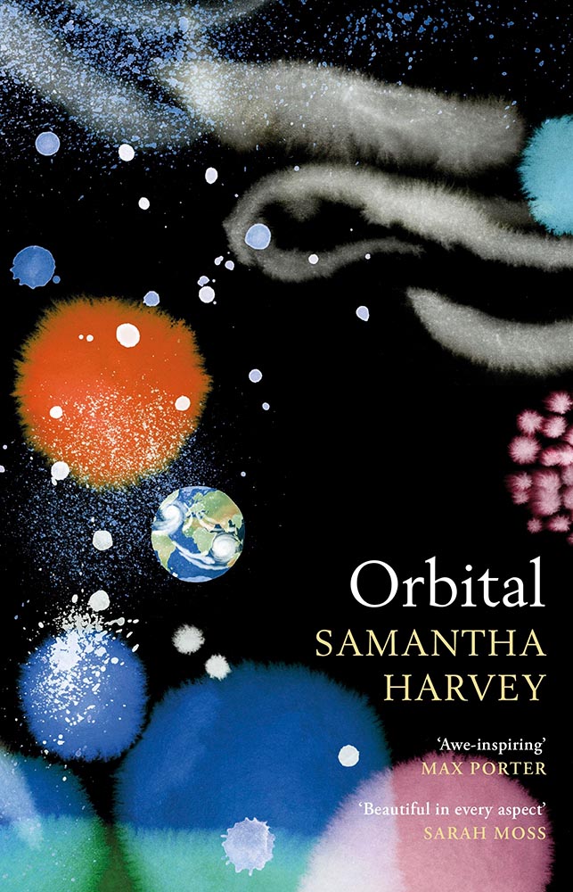
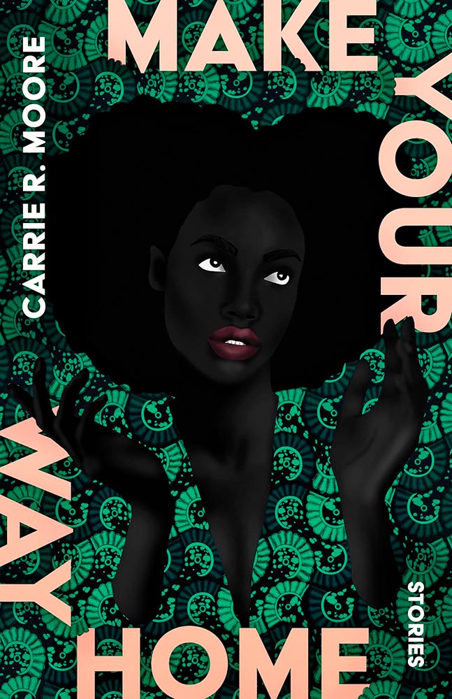
    More AI Book Design

    This was mentioned in another context in July, but is heading our way more aggressively as time goes by, with Microsoft and TikTok, among others, getting into the publishing arena.
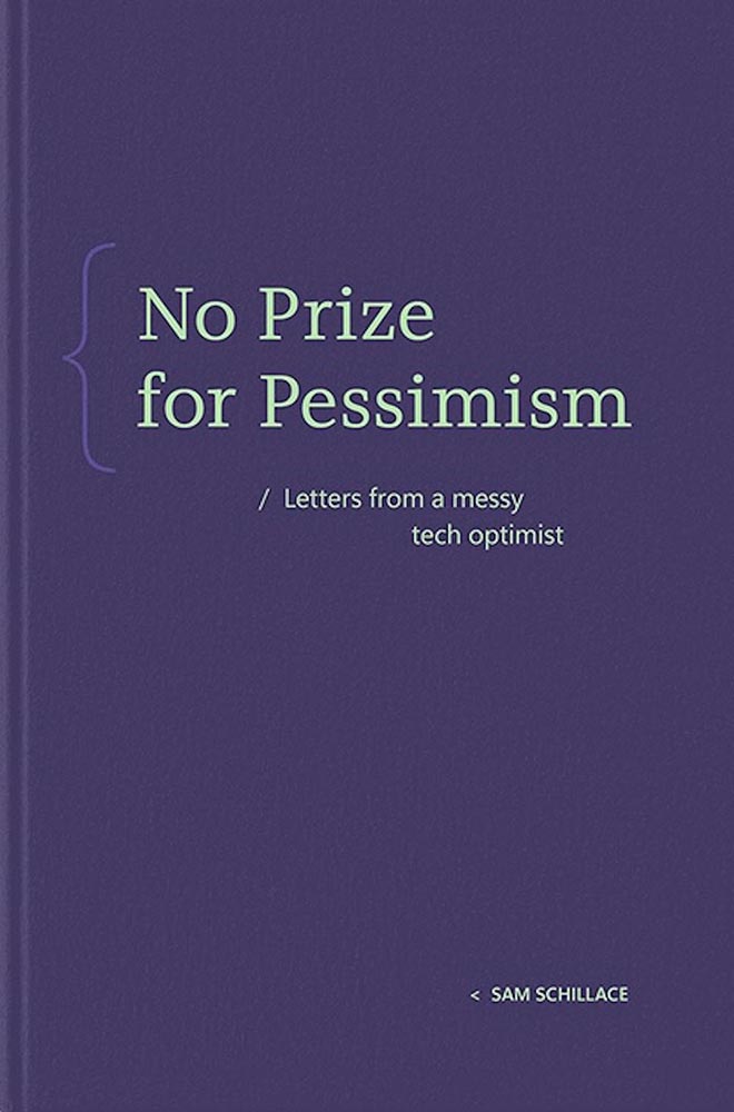
    Cover design: unknown. (Human or machine: unknown.)

    While Microsoft’s new imprint, 8080 Books, plans “to test and experiment with the latest tech to accelerate and democratize book publishing.” They’re not entirely up-front about what that is — and might not know themselves yet, given the rapidly evolving tech and marketplace. That said, with the corporate giant’s name attached, we can be assured of some level of quality.

    Yes, I just wrote a sentence suggesting that Microsoft is a guardian of quality. (“Books matter. In a deluge of data. In a bloat of blogs, a sea of social, and a maelstrom of email. Books will always matter,” they write.)

    With others, the for-profit nature — TikTok’s engagement-before-all-else approach speaks volumes (or writes volumes, as the case might be) — assures that quality might come behind, say, slop. Publisher’s Weekly reports that 320 publishing startups have emerged just in the last two years, most in the AI space, adding to the 1,300 noted as of 2022. (PW also notes, “It is widely believed that each of the Big Five publishers has internal AI projects discreetly hidden from view.”)

    And then there’s this: introducing Spams Spines, your AI book design and book completion service: “[f]rom manuscript to book in your readers’ hands – a single platform to help any author proofread, cover design, format, print, and distribute over global channels — zero tech know-how required.” Prices start at $1500 and promise a finished product in less than 30 days.

    Their goal is to release 8,000 books per year. AI is heavily involved:
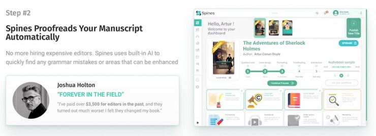
    There’s a Sherlocked joke here somewhere….

    Because, yes, you want a machine to suggest that Sir Arthur Ignatius Conan Doyle needed assistance regarding a turn of phrase. (Never mind his expensive editor.)
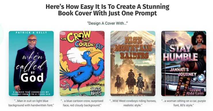
    The first and third are really “only” bad. However, Dr. Seuss would like a word with Spines’ AI training dataset, please, and the cover for “Stay Humble” defies words.

    But it’s the book design that got my attention: these are apparently the good ones, the cited examples to which someone says, “Yes! Take my money!”

    The sad thing is that people will say that. Have already said that. And there’s much, much on the publishing industry’s horizon. Our horizon.

    Read more at The Conversation, “The tech world is ‘disrupting’ book publishing. But do we want its effortless art?” Shout out to the AV Club and the aforementioned PW article.

    The Cat Leaps

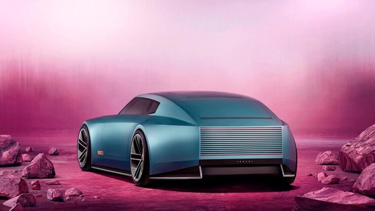
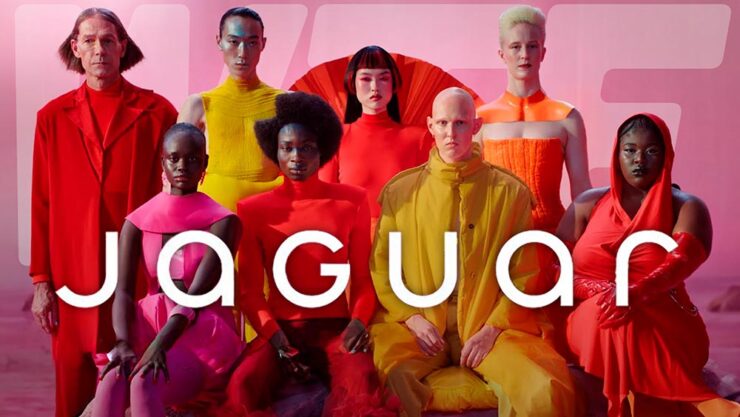
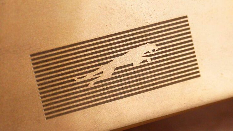
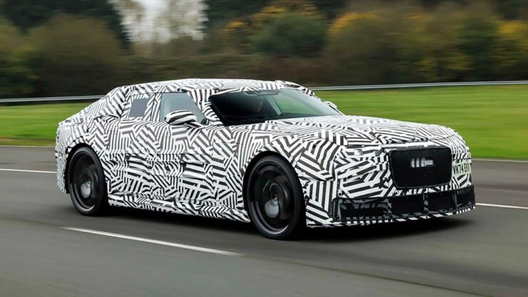
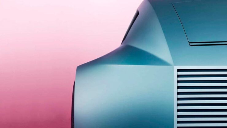
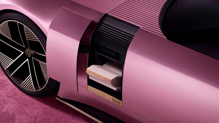
    Last month, we left off Jaguar’s continuing road trip with a teaser. Let’s get right to it. The car’s called the Type 00:
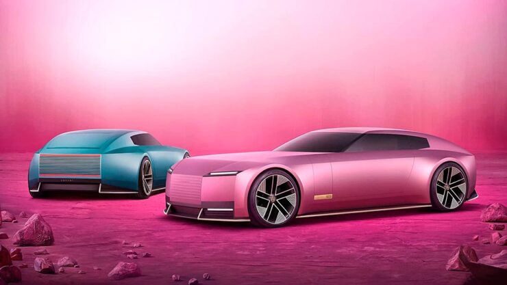
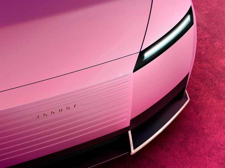
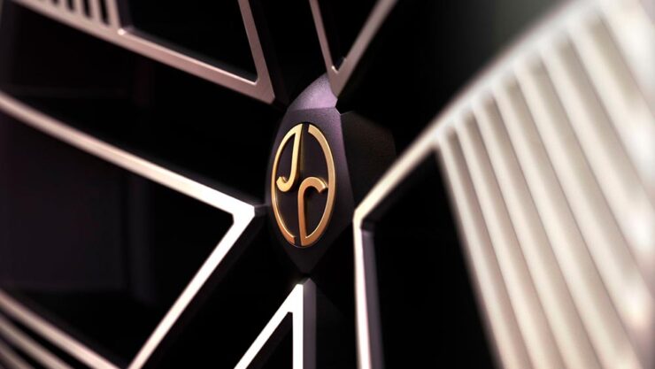
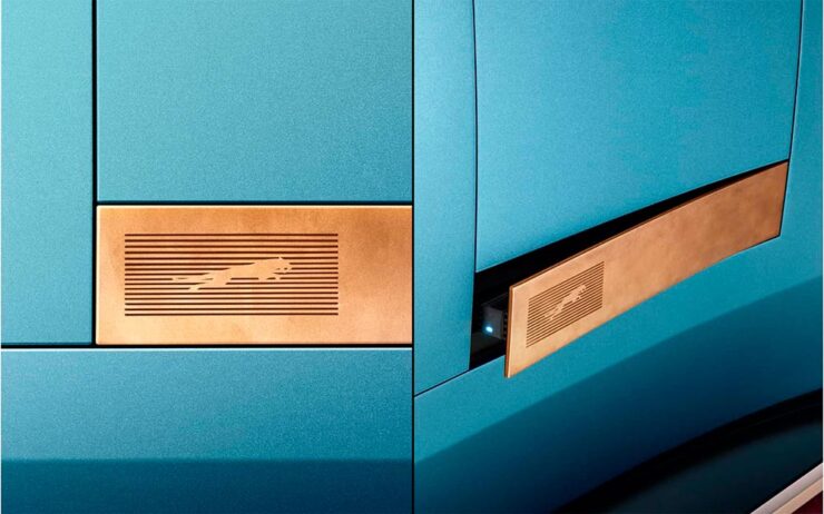
    Some details:
    The interior:
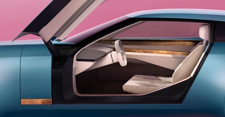
    The internet, predictably, has lost its collective … um, mind. However, amongst the melee, there are a few items worth mentioning.

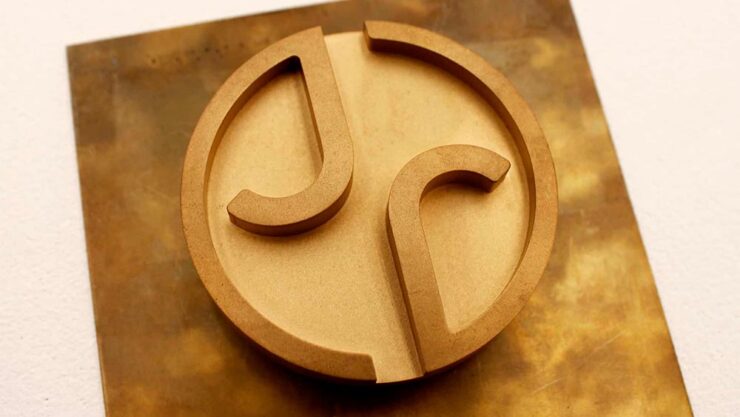
    Creative Boom: “If the new logo seemed divisive in isolation, seeing it brought to life with Type 00’s design has brought much clarity. The flush surfaces, panoramic roof, and glassless tailgate – all adorned with the new Jaguar device mark and reimagined leaper – create a cohesive vision of modern luxury. Rawdon Glover, managing director of Jaguar, emphasised the importance of this shift: ‘We have forged a fearlessly creative new character for Jaguar that is true to the DNA of the brand but future-facing, relevant and one that really stands out.’”

    The quote there is something to pay attention to. Read those words again, and think about the actual choice of language; it’s this, exactly, that has struck some. Armin at Brand New, for instance: “[W]hat I dislike the most about the new Jaguar brand: its tone of voice is INSUFFERABLE. Everything from the platitudes in the campaign to the script of McGovern’s presentation to the press releases is obnoxiously over-confident and self-congratulatory.” (Brand New, while excellent, is subscription-only — alas without a sample article. Here’s a link anyway.)

    Meanwhile, Dezeen provides us some real-world images from the Miami launch:
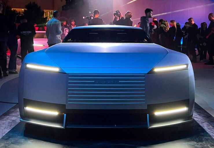
    Wai Shin Li, via Dezeen

    But it’s The Autotopian that stands out. They have not one but two excellent articles by Adrian Clarke, an ex-JLR1That’s Jaguar Land Rover, before it was, um, initialized by owner Tata. designer, who has several important points to contribute:

    A couple of weeks ago, the cancelled X351 Jaguar XJ leaked onto the internet. During my time at Land Rover, I saw this car back in 2018 and can confirm this is indeed, or rather was the EV XJ. Back when Mr. Tata was still alive every six months or so there would be a big board level presentation for him on upcoming products. […] I was privy to all the future production Jaguars and concepts. There was a J-Pace SUV to sit above the F-Pace (no problem in revealing this as it’s common knowledge) and everything else was as you’d expect. These cars were then cancelled as part of the revamp and one absolutely incredibly beautiful and exceptional proposal aside, nothing of value was lost.

    It’s the first time I’d seen the cancelled-just-before-release XJ EV, and despite the incomplete body panels and obviously-on-the-sly phone shot, it’s incredibly disappointing. They made the right call.

    Compare it next to a Rolls Royce Spectre, a car the production Type 00 will be a competitor for, and see how successfully it hides its bulk in profile. [I]n the side view, particularly in the bottom half, I’m seeing some Range Rover. The crisp shoulder line, the kick-up of the tail behind the rear wheel, and the feature line along the bottom of the bodyside all scream Range Rover. This is exacerbated by the verticality of the front and rear of the car – the new full-size Range Rover and Sport have sharply docked tails. I heard that the initial sketch of this car was done by Massimo Frascella before he departed for Audi. Frascella was McGovern’s right-hand man at Land Rover for decades before Ian Callum retired and McGovern used the opportunity to bring both the Jaguar and Land Rover studios together. So maybe that’s where this Range Rover influence comes from.
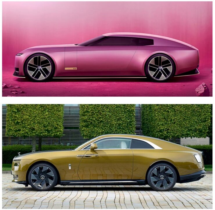
    The Jaguar Type 00, top, and Rolls-Royce Spectre, bottom, courtesy of The Autopian.

    We must remember this is only a concept. The actual production car will be a four-door GT. This is only a preview of the visual style of future Jaguar models. It’s certainly striking, but you’d struggle to call it beautiful. It’s also monolithic and slabby.

    Let’s hope this brutal revamp is […] successful, because there are a lot of jobs depending on it.

    — Adrian Clarke, ex-JLR designer

    There’s much more from those two articles, too much to quote here, so please go read them — the initial report is more on the design, while the second delves into the why: “Why Jaguar Had To Blow Up Its Brand In Order To Save It.

    Meanwhile, I’ll actually be rooting for JLR to pull this one off. I’m not in the target audience — at all — but Jaguar needed to do something radical and, by God, they did just that. The concept is interesting. Some of the details are fantastic. Here’s hoping, indeed.

    Update, 15 Jan 2025: Turns out the Jaguar’s designers were a little worried about the outcome — or the outsourcing, in this case — and its effect on the brand. The Drive has the details.

    Special Bonus #1: Motor1 has a feature on Ian Callum’s current whereabouts. There are too many hypercars these days, but the Skye looks cool:

    The Callum Skye concept. (An island buggy?)
    Some Extraordinary Items of “Normalcy”

    To close out 2024, let’s take a break, pour a beverage, and enjoy some of what you read Foreword for: great photography, typography, and design.

    Northern Lights

    I didn’t know — or didn’t remember — that amongst the glut of photography contests is one dedicated to the phenomenon known as the Northern Lights.

    Cosmic Explosion, Isteria, Croatia. Photograph by Uroš Fink.

    PetaPixel reminds us that Capture the Atlas’ Northern Lights Photographer of the Year competition features some exceptional opportunities to make spectacular captures this year due to the solar maximum — the peak of its eleven-year cycle.

    Celestial Reflection, Dartmoor National Park, UK. Photograph by Max Trafford.

    The 2024 competition awards feature 25 winners, each with a narrative and each a striking example of the larger system we’re part of. Check it out. (Also via This is Colossal.)

    Nature

    PetaPixel is among several that point us to the Nature Photographer of the Year contest, with images both poignant and funny. Since it’s New Year, let’s go with the latter:
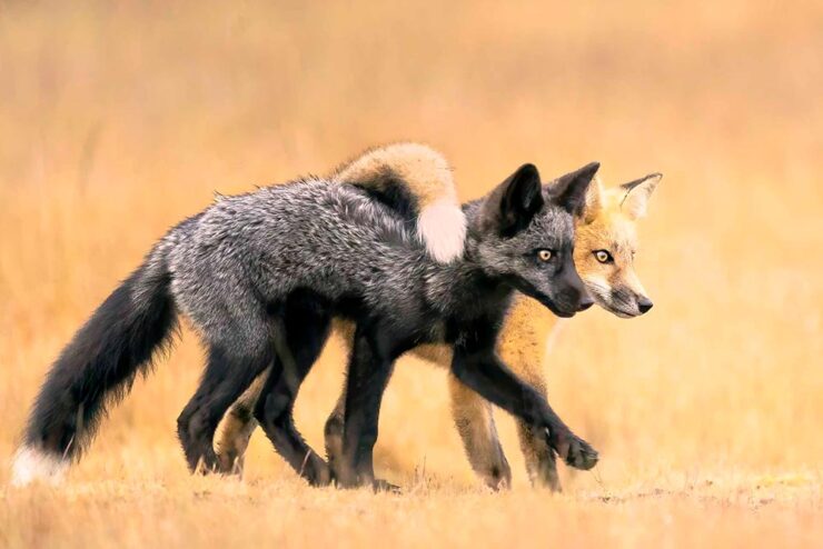
    Besties, Washington State, US. Photograph by Marcia Walters.

    Of course, there’s just “spectacular,” too:

    Cross to Bear, Talek River, Kenya. Photograph by Paul Goldstein.

    The contest’s winners page features many more, separated into categories; be sure to click on the individual photographs to get larger sizes and the story with each. Fantastic stuff.

    Frozen Prairie Landscapes

    Saskatchewan gets cold in the winter, but there’s a beauty to those temperatures, photographer Angela Boehm tells PetaPixel.
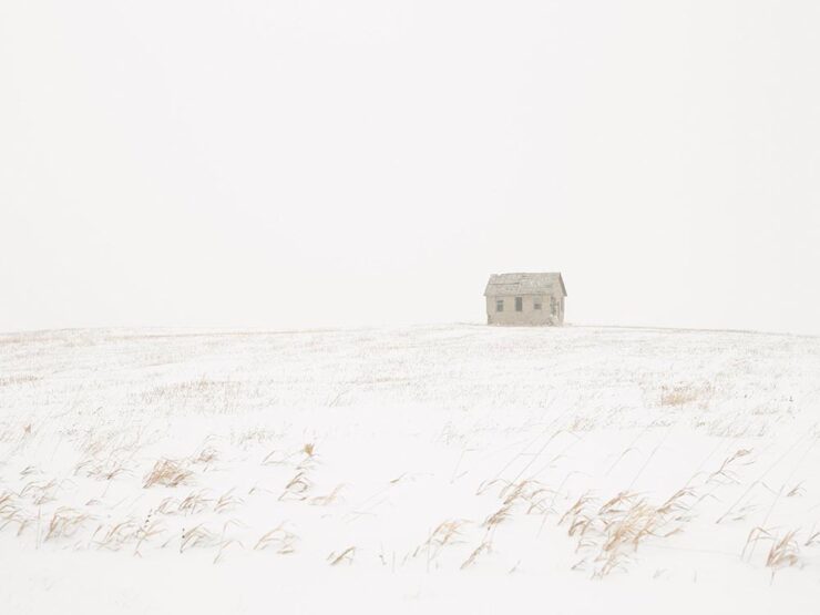
    Image from Minus Thirty. Photograph by Angela Boehm.

    “The frozen prairie landscapes, while a subject in their own right, serve as a powerful metaphor for the deeper themes the book explores: loss, memory, and resilience,” she says. […] “The loss is embodied in the emptiness and biting cold. The memory, or its gradual fading, is represented by the snow obscuring the horizon, softening and blurring the scenes. And the resilience is in the solitary tree — a steadfast survivor of countless storms in this unforgiving landscape.”

    — Angela Boehm, Minus Thirty
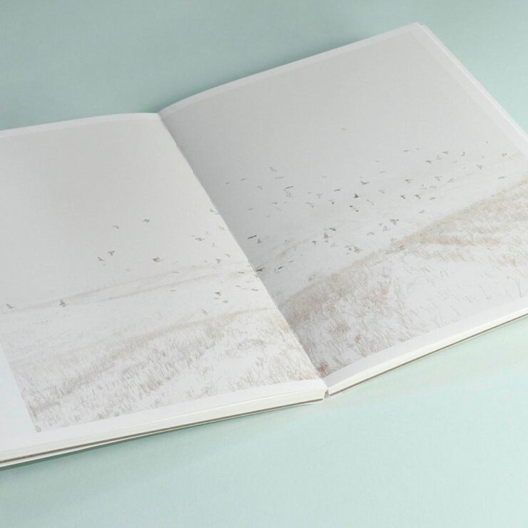
    Read more of PetaPixel‘s story of realization to publication or just check out the title.

    Special Bonus #2: Another book on an interesting subject — Japan’s brutalist architecture, which somehow manages to bring an inherent quality to the cement:
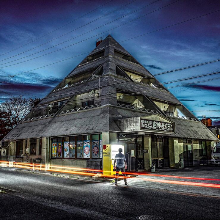
    Mixed-use complex, 1994, by Kuniyoshi Design. Photograph by Paul Tulett.

    Dezeen has more.

    Ukraine’s “Fight for Visual Identity”

    This PRINT piece is excellent: “A cultural gap persists in how history is organized and interpreted. I left the library without my requested images but with a lingering realization that how we organize history, even within the hallowed walls of an institution like the New York Public Library, can reflect the biases and oversights of a collective cultural perspective,” writes El. Stern.
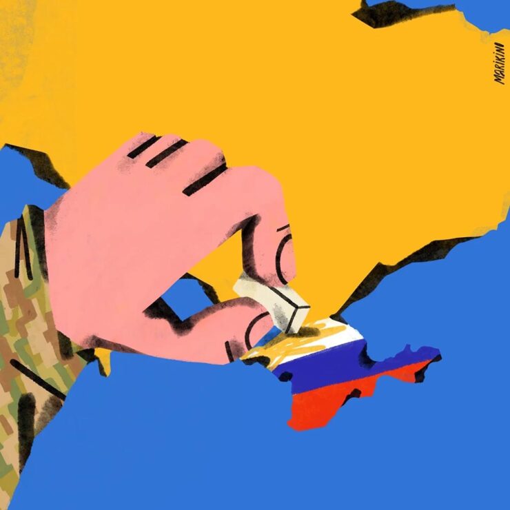
    Home Soon, Dear. Image by Maria Kinovych, 2022.

    “Today, Ukrainian graphic design is rooted in national identification, in search of future needs, and in understanding the cultural influence of a painful past on a, once again, painful present.”

    Ukraine’s search for a future — and present, and past — in design. Great read.

    “A must-have manual for hot metal enthusiasts and linotype lovers”

    Type Archived, a new book whose fundraising campaign I didn’t see in time: a “stunning visual tour of traditional typefounding and offers a definitive account of London’s legendary Type Archive,” writes Wallpaper*.
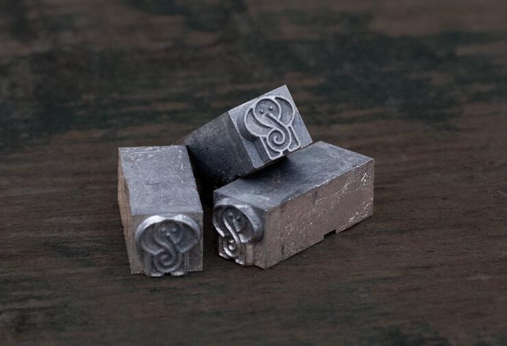
    Custom metal for the book project.

    The book “traces the origins of typography through the physical tools, objects and machinery that made the printed word possible. Full of rich photography, [it’s] a visual journey through the punches, matrices, presses, type and paper which tell the story of the UK’s preeminent typefounding industry.”

    Hopefully available at bookstores soon.

    “The Arresting Typography of the Sanborn Fire Insurance Maps”

    Jason Kottke writes, “Several years ago, Brandon Silverman become obsessed with the lettering and typography on the fire insurance maps published by the Sanborn Map Company in the late 19th and early 20th centuries.”
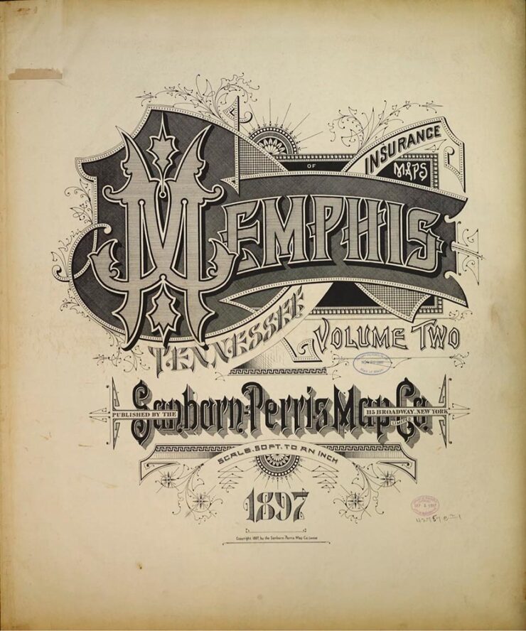
    Silverman’s launched an archive of the maps, an absolutely fantastic way to pass a few minutes hours.

    Special Bonus #3: Nick Heer, at the always-excellent Pixel Envy, has an essay on the essentials: “[E]fficiency and clarity are necessary elements, but are not the goal. There needs to be space for how things feel.” Delicious Wabi-Sabi is worth a few moments.

    Wishing you and yours a very happy New Year!

  • University Press Design Show 2024

    University Press Design Show 2024

    Significantly behind on this for the second year in a row. Apologies. —Ed.

    The annual Association of University Presses (AUPresses) Book, Jacket, and Journal Show has announced its winners published during 2023. The show, now in its 59th year, “honors the university publishing community’s design and production professionals; recognizes achievement in design, production, and manufacture of print publications; and serves as a spark to conversations and source of ideas about intelligent, creative, and resourceful publishing.”

    It is a joy to be amid the rush of creativity and exuberance that is exemplified by the Book, Jacket, and Journal Show submissions. Our jurors were spoiled with the wide variety of visual and intellectual expressions that make our community so rich and diverse. The committee members really came through as a team, making this year’s efforts virtually seamless. Here’s to another great Show!

    — David Zielonka, Stanford University Press, Book, Jacket, and Journal Show Committee chair

    Entries are extensive — 507 worldwide — and the winners are separated into several categories, which I’ve drawn from below.

    Scholarly Typographic

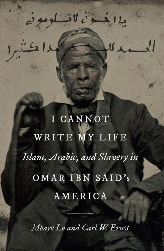
    Academia’s titles are so often subjects that you only get from university presses. A great example:

    University of North Carolina Press. Book design by Lindsay Starr.

    When important titles are accompanied by compelling design, everyone benefits. Honorary mention to Horror and Harm, whose design invokes neither. See all the winning entries.

    Scholarly Illustrated

    Because these winning entries are from all over the globe, they run the risk of being difficult for us ’Muricans to understand. But design is a universal language:

    Aarhus University Press. Book design by Jørgen Sparre.

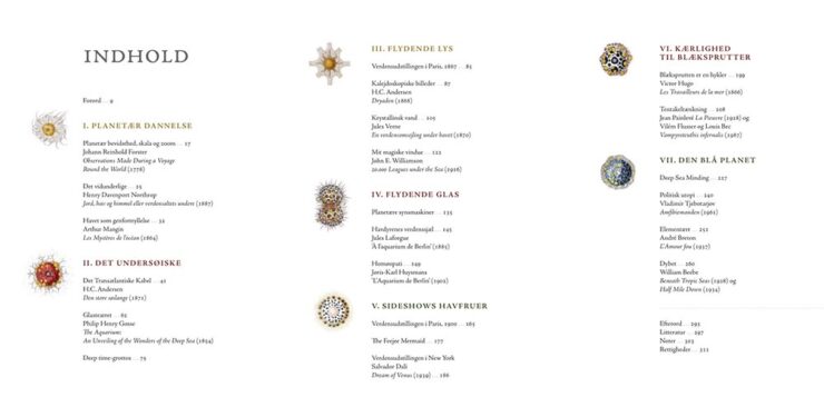
    The cover’s good, but one of the great things about this show is that you get more:

    Aarhus University Press. Book design by Jørgen Sparre.

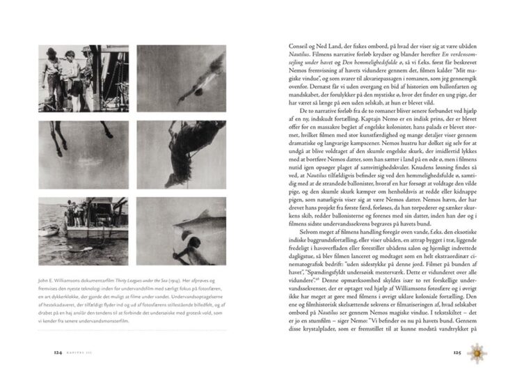
    I’m a sucker for an interesting content spread, as demonstrated here.

    Aarhus University Press. Book design by Jørgen Sparre.

    I love the dingbats next to the page numbers, too; a great way to instantly illustrate which section you’re in.

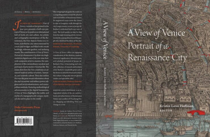
    Duke University Press. Book design by A. Mattson Gallagher.

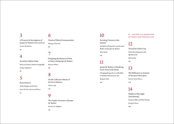
    Strong cover here, with the two shades of overlay really working in concert with the orange. Oh, and another — you guessed it — great content section, like this spread:

    Duke University Press. Book design by A. Mattson Gallagher.

    Nice. See all of the entries from the Scholarly Illustrated section.

    Trade Typographic and Poetry and Literature

    Honorable mention to the jacket for Rim to River in the former category and the illustrations in The Lamb Cycle in the latter. See all the Trade Typographic winners and the Poetry and Literature winners.

    Trade Illustrated

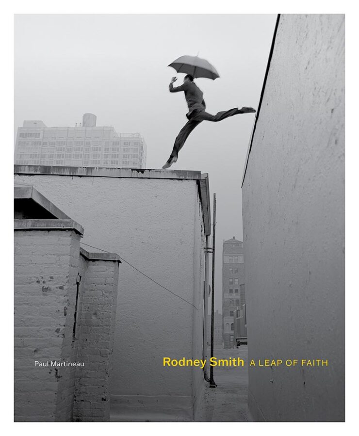
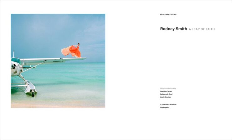
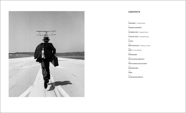
    Some incredibly talented photographers on display here, but one leapt ahead:

    Getty Publications. Book design by Jennifer Schuetz-Domer.
    Getty Publications. Book design by Jennifer Schuetz-Domer.
    Getty Publications. Book design by Jennifer Schuetz-Domer.

    More about the photography than design, admittedly, but still great stuff. Honorable mention to Looking at Venezuela, 1928-1978, which combines more-than-interesting photography with another eye-catching contents spread.

    See all the Trade Illustrated winners here.

    Reference

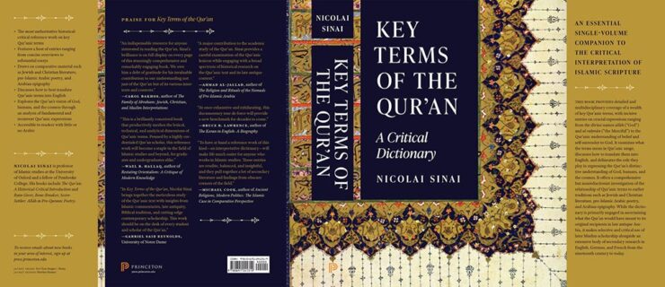
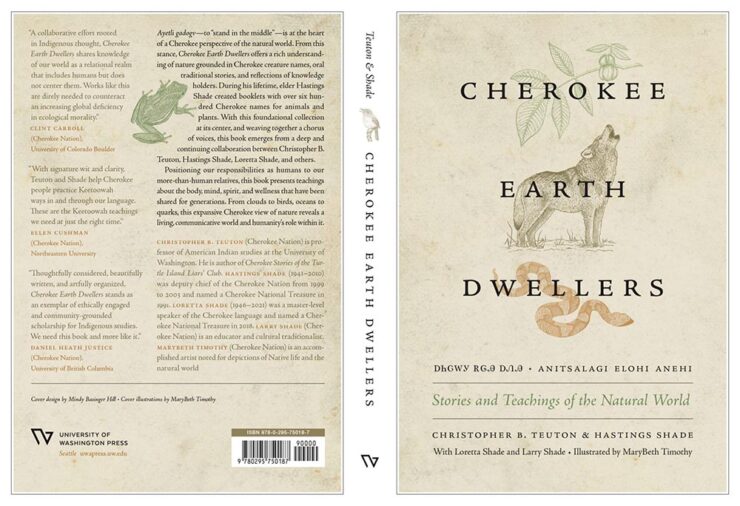
    Couple of titles to highlight:

    Princeton University Press. Book design by Heather Hansen.

    A outstanding example of the cover being good, but the jacket in its entirely being more than the sum of its parts. Also:

    University of Washington Press. Book design by Mindy Basinger Hill.

    Not resorting to stereotypes or tropes was absolutely the right move, and the strong interior design works well, too. Nice.

    See all the Reference winners here.

    Jacket and Cover

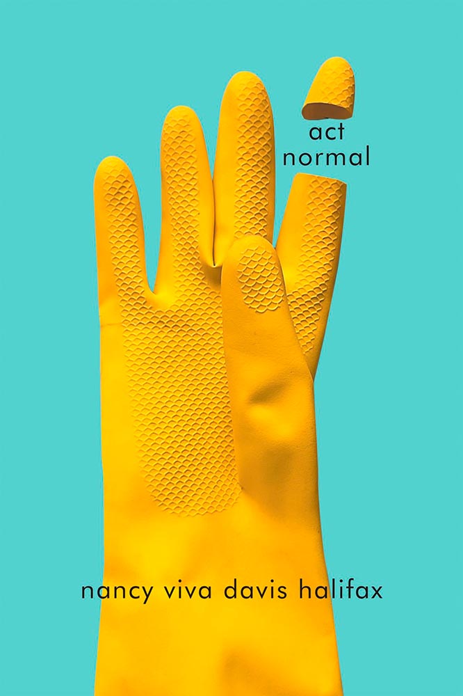
    This section is far and away the largest, and features some outstanding examples of book design — from any publisher — in subject areas that don’t always lend themselves to dynamic design. Some of my favorites, in alphabetical order:

    McGill-Queen’s University Press. Book design by David Drummond.

    Simple concept, well executed.

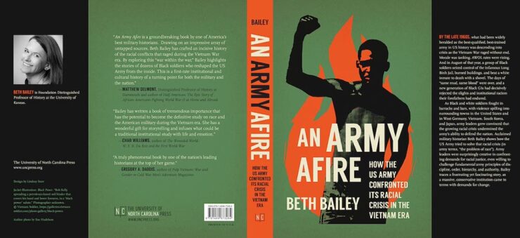
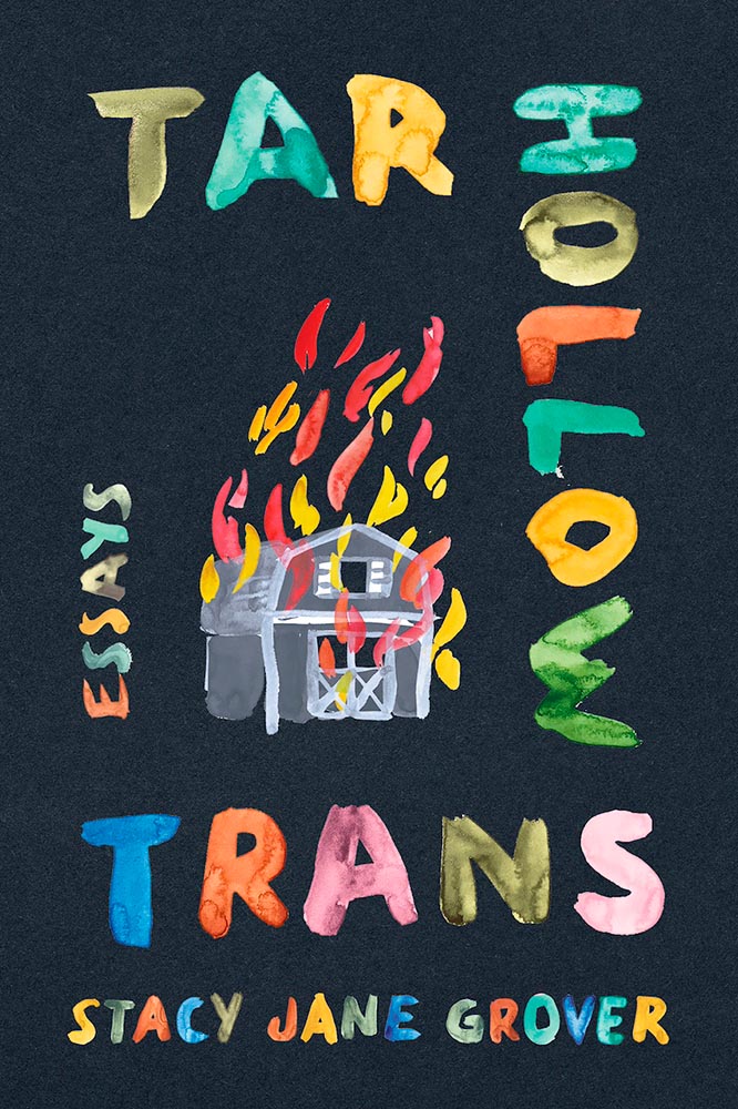
    University of North Carolina Press. Book design by Lindsay Starr.

    Strong image on this cover works extremely well with the green background and orange fire (and spine). Excellent.

    University Press of Kentucky. Book design by Kathleen Lynch.

    Love the illustration choices on the cover, with exactly the right background and interesting hand-lettering-style title.

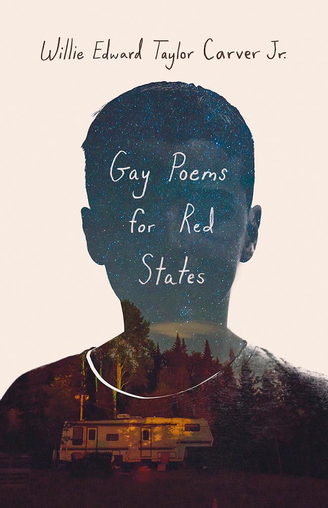
    Duke University Press. Book design by Matthew Tauch.

    Double-exposure, something hard to execute well and done perfectly here, is exactly the right choice on this strong cover.

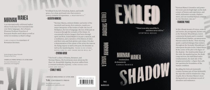
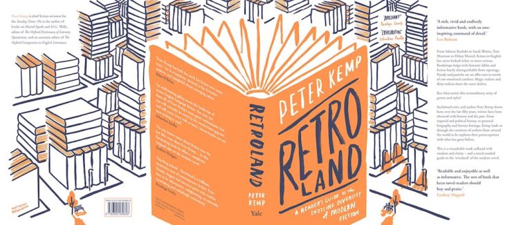
    Yale University Press. Book design by Jenny Volvovski.

    Simply put, excellent: a two-color jacket with fantastic lettering and great texture.

    University Press of Kentucky. Book design by Zoe Norvell.

    The hint of a face and the illustration within the outline combine to make this a winner on several levels.

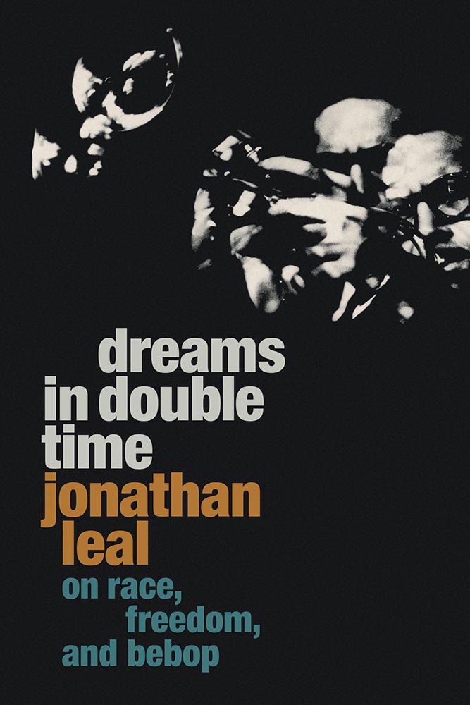
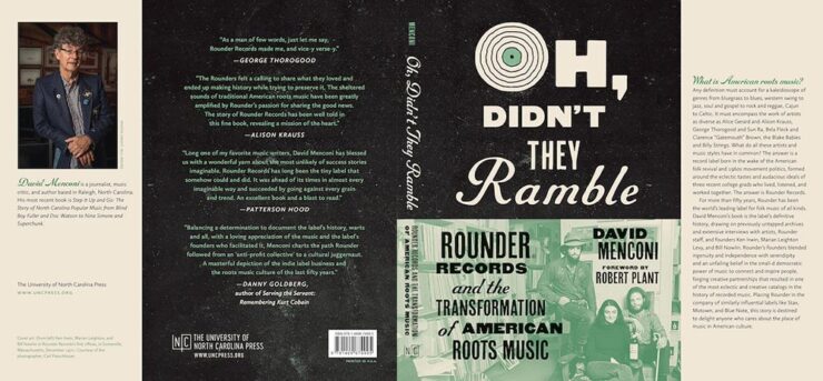
    University of North Carolina Press. Book design by Lindsay Starr.

    Oh, that O! (The rest of the type is awesome, too.) Aged to perfection.

    Yale University Press. Book design by Nathan Burton.

    Illustration and type combine to achieve a fantastic jacket.

    University Press of Kentucky. Book design by Jaya Miceli.

    This cover made an appearance on my 2023 Favorite Book Covers list, and I’m delighted to see AUPresses recognize it, too.

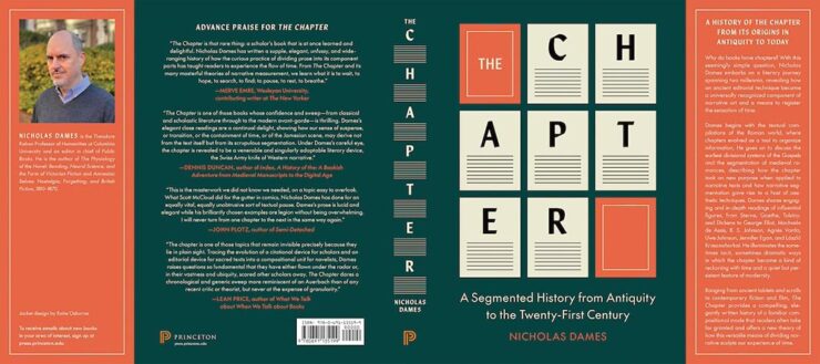
    Princeton University Press. Book design by Katie Osborne.

    Another example of simple-done-well. Love the orange.

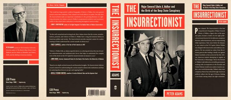
    Louisiana State University Press. Book design by Michelle A. Neustrom.

    Color blocking perfection: a lesson in how-to using limited color choices.

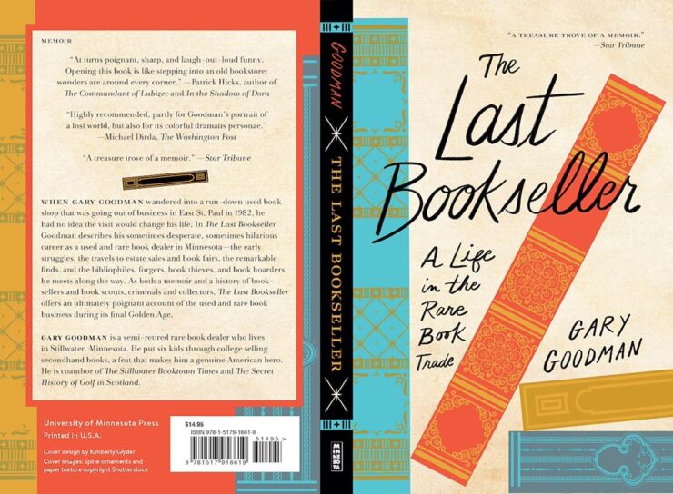
    University of Minnesota Press. Book design by Kimberly Glyder.

    Great illustration, strong type, fabulous colors. (Interestingly….)

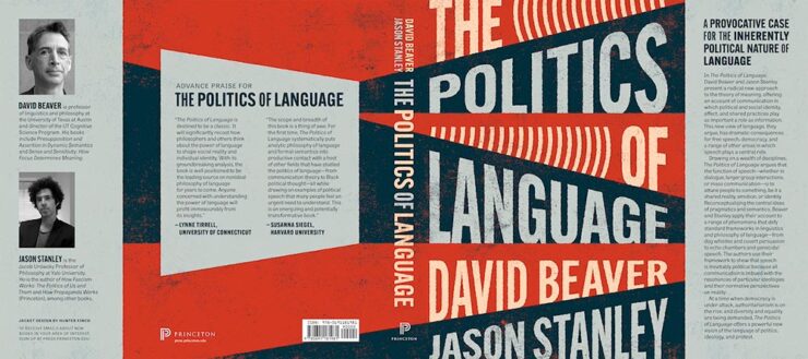
    Princeton University Press. Book design by Hunter Finch.

    Another that avoids stereotypes with a great background. The hint of megaphones is smartly done.

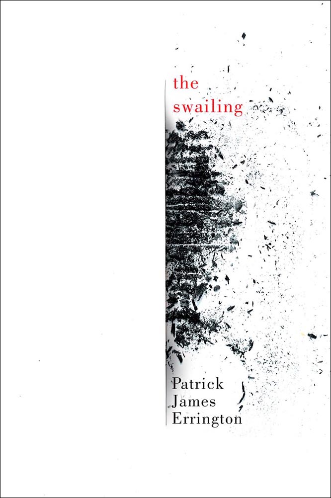
    McGill-Queen’s University Press. Book design by David Drummond.

    Brilliant: I love everything about this cover.

    Honorable mentions go to the type on Divine Days and the open book on Some Unfinished Chaos. See the whole category of winners here.

    Looking forward to next year! (Let’s hope I can post about it in a timely manner.)

    See also: Last year’s winners highlighted here on Foreword.

  • Beautifully Briefed 24.8: Picture This

    Beautifully Briefed 24.8: Picture This

    A trio of miscellany, a trio of space photography, more than a trio of great black and white photography, and a single, very serious photography question for you this time — let’s get right into it.

    Summer of Fun Miscellany
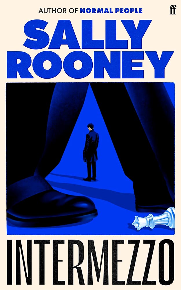
    Intermezzo, Explained
    The UK cover for Intermezzo. Book design by Kishan Rajani. (The US cover doesn’t compare.)

    GQ UK has an interview with Kishan Rajani, a senior designer at Faber, and Pete Adlington, the publisher’s art director, “about how the Intermezzo design came together, the role of social media in modern book design, and how to make books ‘as pickupable as possible.’”

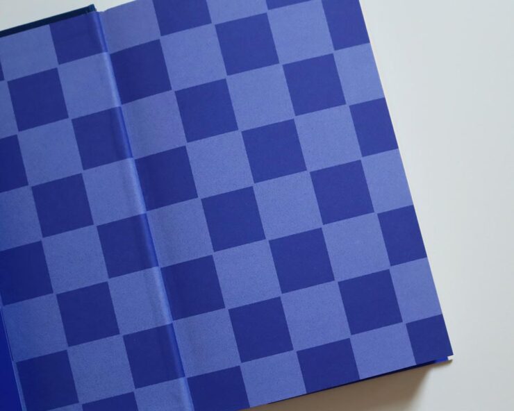
    The endpapers for Intermezzo (UK). I really like that they’ve sweated the little details.

    We can discuss “pickupable” as a word another time — your time is better spent, for now, reading the interview.

    WeTransfer Sold

    “Some of Bending Spoons’ most successful products are tools that serve creativity, therefore we are confident that this milestone will complement both businesses, supercharge our growth, and help us create even more value for creative industries at large,” says WeTransfer CEO Alexander Vassilev of the acquisition.

    I like and appreciate WeTransfer — unlike the corporatespeak above (but hey, we’re inventing words today … right?) — and hope that despite being corporatized, nothing substantive will change.

    PetaPixel: “The companies did not say whether or not all staff or leadership at WeTransfer would be maintained after the conclusion of the acquisition. That may come into question since Bending Spoons does have a track record of buying completed products, training its internal staff on their upkeep, and then releasing the original development team.”

    Crap.

    Update, 9 September, 2024: “Bending Spoons acquired file-sharing platform WeTransfer in July and has now laid off 75% of WeTransfer’s staff,” PetaPixel reports. “The Italian app company Bending Spoons has confirmed the layoffs to TechCrunch, which comprise at least 260 people based on WeTransfer’s employee headcount of around 350 people.”

    Adobe, Again
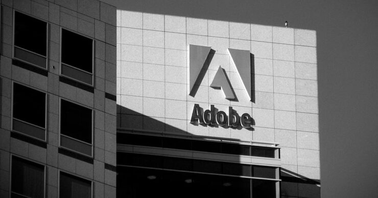
    The Adobe “World Headquarters” buildings in San Jose, California. Image via PetaPixel.

    Adobe (previously) recently sat down with PetaPixel to discuss the shambles where things stand — clearly, an attempt at damage control. PP published it … and got some feedback:

    Adobe couldn’t explain why it let its once excellent relationship with photographers and media lapse, only that it is sorry that happened. I do believe [their explanation], at least when I hear it from the people responsible for making the software. There is a big divide between the folks who code Photoshop and the C-level executives who are so out of touch with the end users. The thing is, it doesn’t matter what those people down in the trenches of development say or even how good Adobe’s software happens to be, some photographers just don’t like the feeling of giving money to the company because of the people at the helm.

    Jaron Schneider, PetaPixel

    The thing is: it’s less photography, really, than design. If you’re a photographer, how you get to the point of printing or publishing the photographs offers options in software — whether iPhoto, Affinity, Photoshop, or the Pixel 9 Magic Editor — Instagram doesn’t care, Zenfolio takes multiple file formats, and so on.

    But in design — that is, desktop publishing or especially book design — Adobe has a monopoly over the software used by the industry, full stop. I used to love working with their software. Today, not so much. (And for the record, it’s more than their fees, it’s the quality of the software.) It’s extremely frustrating and, at the moment, there is no alternative even on the horizon.

    Crap. (Again.)

    Extraordinary Astrophotography

    So, how many can place Kyrgyzstan on a map? It’s a former Soviet Republic in Central Asia, and, clearly, a great place to do some astrophotography.

    Star Trails Above Tash Rabat by Soumyadeep Mukherjee.

    PetaPixel highlights the work of Soumyadeep Mukherjee, who traveled there specifically for the purpose — and succeeded wildly. It’s awesome to see a country I’m not familiar with served so well. (My favorite, of course, is the short depth-of-field portrait — if you can call it that — of Yuri Gargarin, seen in the header image above.)

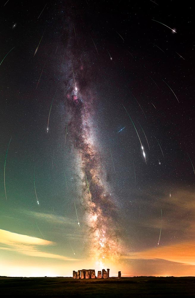
    Alternatively, This is Colossal points us at “Bisected by the Milky Way, a Stellar Image Captures the Perseid Meteor Shower Raining Down on Stonehenge“:

    Perseid Meteors over Stonehenge by Josh Dury.

    “Josh Dury, aka ‘Starman,’ is an award-winning landscape astrophotographer, presenter, speaker and writer from The Mendip Hills ‘Super National Nature Reserve’ in Somerset, United Kingdom,” his web site trumpets.

    The thing is … despite looking like he’s about 25, he’s earned it. Great stuff.

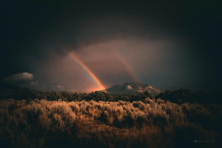
    Meanwhile, back at PetaPixel, “Photographer Aaron Watson, who goes by Skies Alive Photography, has seen many incredible things in the night sky. His latest sighting is a rare double ‘moonbow,’ a rainbow created by bright moonlight in precise conditions.”

    Double Moonbow by Aaron Watson.

    All three of these folks need special thanks for their patience. I have trouble standing still long enough to set up a tripod, let alone do long exposures under rarely-encountered combinations of time, weather, equipment and location — plus lots of good luck — in the middle of the night. Well done, all.

    “Majesty of Monochrome”

    The winners of the third annual Black and White Photo Awards have been unveiled, showcasing the best in monochrome photography across multiple categories.

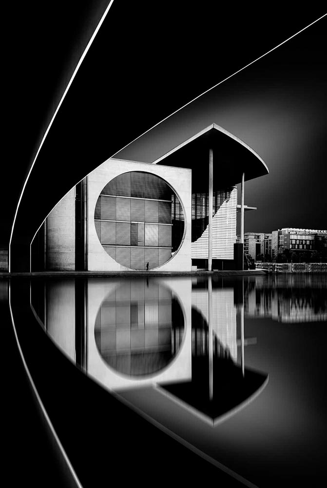
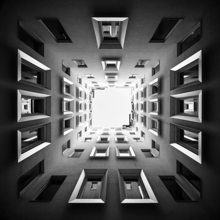
    Monochrome Majesty: Marie-Elisabeth-Lüders-Haus, by Robert Fulop. Bronze Mention from the Black and White Photo Awards 2024.

    Naturally, I gravitate towards architecture — and the winners (of the nearly 5000 entrants) demonstrate serious talent.

    Bench, by Colin Page. Finalist from the Black and White Photo Awards 2024.
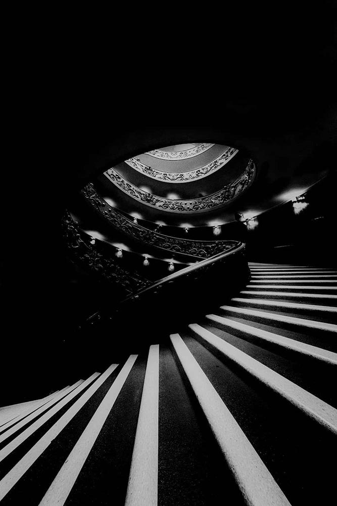
    The Double Helix, by Md Tanveer Rohan. Finalist from the Black and White Photo Awards 2024.
    Windows by Manfred Gruber. Finalist from the Black and White Photo Awards 2024.

    See the winners — and especially, take in the finalists, many of which I’d personally judge to be winners in their own right — at the contest’s web site.

    Special Bonus #1: It’s time once again for the annual iPhone Awards, “a powerful testament to the art of storytelling through photography.” I especially liked this one:

    Bicycle Forest by James Kittendorf. 3rd place in the Cityscape category, 2024 IPPAwards.

    It’s a great photograph, certainly, but it was taken by a now-quite-elderly iPhone X — proof, once again, that it’s the camera you have with you. See all the 2024 winning photographs, in multiple categories and taken worldwide, here. (Via PetaPixel.)

    So … What’s Next for Photography?

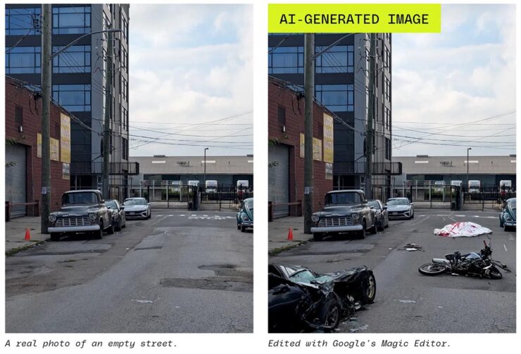
    The Verge: “Anyone who buys a Pixel 9 — the latest model of Google’s flagship phone, available starting this week — will have access to the easiest, breeziest user interface for top-tier lies, built right into their mobile device.”

    A montage from The Verge, thankfully clearly labeled.

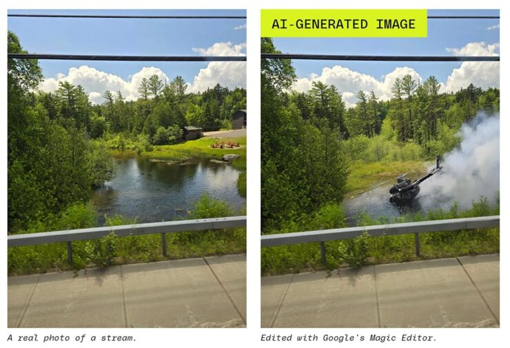
    Life-changing moments have long been captured using photography, from Moonrise to George Floyd. But, generally, fakes were the exception, not the rule. We’re, unfortunately, arming the folks who cry foul.

    Another montage from The Verge. Note the woods filled in behind the helicopter less convincingly than the accident, above — but how many are going to notice?

    It does this article disrespect to summarize. Just go read: “No one’s ready for this.”

    Special Bonus #2: Nick Heer, at Pixel Envy, articulates what needs to be said: “anyone can now radically and realistically alter an entire scene within minutes of taking a photo. [O]ur expectations need to change.”

  • Beautifully Briefed 24.7: Generated

    Beautifully Briefed 24.7: Generated

    This time, another automaker logo, some automotive and architecture photography, and the special bonuses that have all become a regular part of the Beautifully Briefed standard. But we’re going to start with some generated content.

    AI Book “Design”

    From the “We knew this was going to happen” category, we have the first — that I’ve seen, anyway — “let AI do the work” research paper suggesting that book design is something that can be automated.

    We have presented a novel approach to computationally design books. The presented system implements a generative design process which takes advantage of the scripting capabilities of Adobe InDesign to procedurally typeset books from content provided by the user. We have shown the ability of the system to (i) create book designs that consistently comply with a series of typographic rules, styles and principles identified in the literature; (ii) produce visually diversified books from the same input content; and (iii) produce visually coherent books with different contents.

    Design by “AI.”

    Let’s please remember that “AI” as the term is currently used is actually “applied machine learning;” in this case, specific rules within specific containers in a specific application. It’s a first step towards something, as most “AI” is in 2024.

    But it’s absolutely not the only step. It’s inevitable that the necessary subsequent steps will be taken, probably sooner than later.

    As usual where someone is seriously discussing replacing a human worker with a computer, there’s a pitch for the upside:

    The work presented in the paper may challenge the typical roles of both the tool and the designer. First, by automatically creating and suggesting design alternatives, the tool ends up playing a more active role in the design process. Then, by modifying and developing custom tools, the designer is no longer a mere tool user and becomes the author of tools tailored to specific needs. We believe this shift can be fruitful since it enables the exploration and discovery of new technical and creative possibilities.

    In other words, the designer is now responsible for creatively writing the rules then policing the output — like so many things in the machine-learning, or “AI” space — rather than the actual drudgery of directly designing the output. “Design great rules, get great design.”

    And there is room for this. Amazon, especially, is going to jump on book design generated this way; never mind those folks in China or India earning (a paltry few) dollars a day, the computer can do it better for less . . . . Poof! With no human interaction whatsoever, your book is ready to publish. Indeed, for some, the bar to publish has just been lowered made easier. Perhaps even Adobe, who trumpets “AI” at every turn these days, they may choose to take this up. (Probably for a surcharge to the already-high subscription pricing.)

    Let’s not even speculate about the major publishing houses for now.

    But like AI-generated anything, getting actual art requires hand-tuning the input by an artist. For what amounts to “slop” — see this fantastic PixelEnvy discussion — the generated approach to book design might even be appropriate. But for book design that’s artistic, cared-for, or even “just” thoughtful, you’re going to need a human for a long time yet to come.

    The paper is available on Cornell University’s arxiv under CC BY-NC-SA 4.0 DEED license. (Via Hackernoon.)

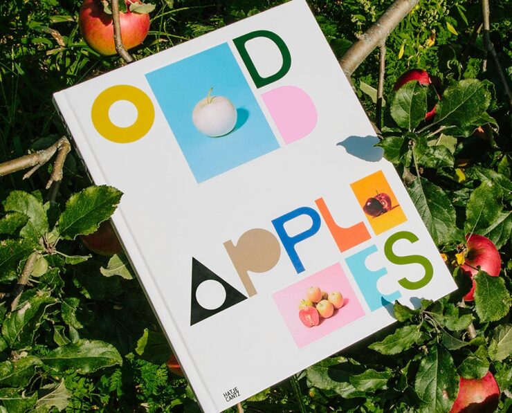
    The excellent Odd Apples, which I’m sure I’ve highlighted before — but in a very human way, can’t find.

    Special Bonus #1: I had the occasion to recently flip through Pentagram’s book design section. Some seriously interesting, seriously artistic work. (See the Odd Apples listing specifically.)

    It could probably be argued that computers took book design jobs away, but….

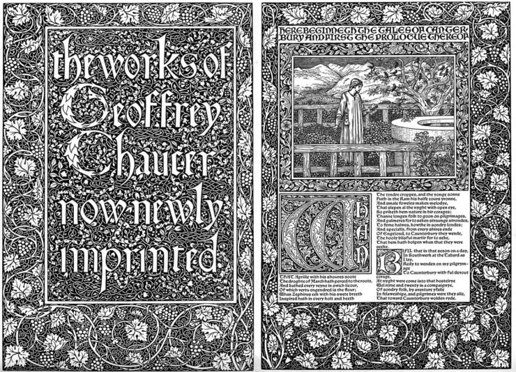
    Special Bonus #2: CreativeBoom links to three free archives on Victorian illustration to inspire — or perhaps use creatively in a book.

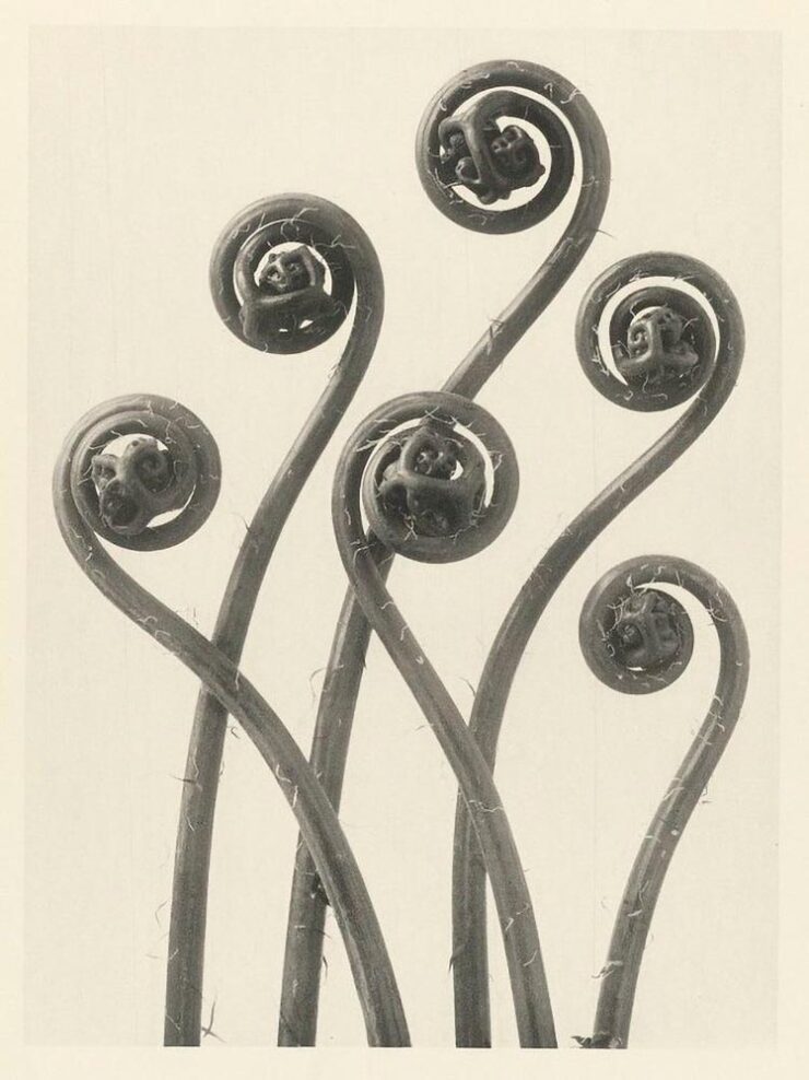
    Untitled (Fiddleheads), 1928. Photo by Karl Blossfeldt.

    Special Bonus #3: The ever-great Kottke.org. points us at Public Work, “an image search engine that boasts 100,000 “copyright-free” images from institutions like the NYPL, the Met, etc. It’s fast with a relatively simple interface and uses AI to auto-categorize and suggest possibly related images (both visually and content-wise).” As Jason Kottke points out, not great in the attribution department, but good stuff nonetheless.

    Mazda’s New Logo
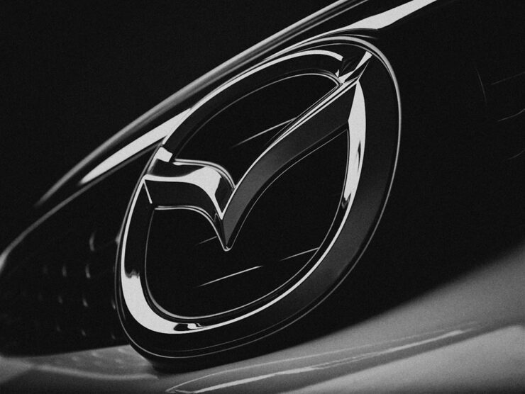
    Mazda’s logo as of 2023, seen on one of its cars.

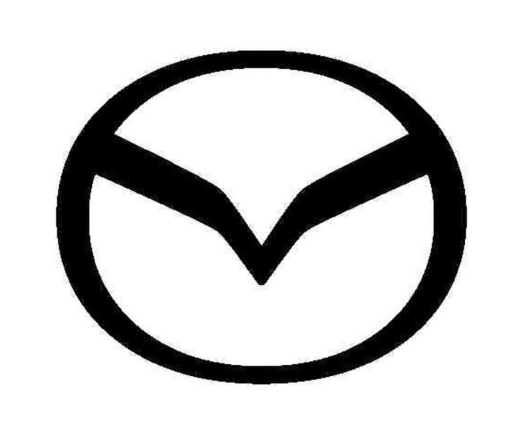
    From the automotive logo thread (previously), we have to note Mazda’s new look, reduced from the current 3D-style grayscale to flat and black and white. This one gets some criticism from me: it lacks grace, pace, or space. (Hmph. That might be someone else.)

    Angry Bird, anyone? (Pardon the artifacts — this image is enlarged from a Japanese trademark post.)

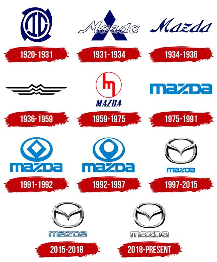
    Then again, Mazda has not always been successful with logos. Anyone remember the 1991–1997 version?

    Mazda’s complete logo history.

    The 1931–1934 version lays the name over Mitsubishi’s logo, which was responsible for sales. The 1975–1991 version is the one I remember best, but that’s likely a youth/rose-colored glasses sort of thing. See Wiki for more information.

    Meanwhile, Mazda is trying to move upmarket right now, and the new “look” isn’t really in keeping with that. Curious to see where this goes. (Via The Autopian.)

    Mazda’s new electric concept, the Errata, sporting an interim, flattened version of the current logo. Wait, might have gotten something wrong there, too….

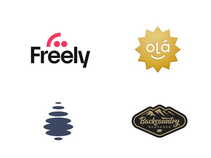
    Special Bonus #3: BrandNew points us at the 2024 Logo Trends report, the annual fun item from Logo Lounge that looks at what’s hot in this year’s crop of — you guessed it!

    Freely (Smiley category) and Droplet (Elliptic category), left, and Olá and Backcountry Wanderer, right, from the Sticker category. (Olá could be in the Smiley category, too.)

    Some of my favorites are above, but the whole report is worth a look. (Spoiler: more than flattening is on trend.)

    Auto, Auto+Arch, Arch
    Auto Photo Manual

    Via Wallpaper*, we have Auto Photo Manual, a new monograph from Benedict Redgrove that “explores the art and science of photographing the world’s most striking cars:”

    A very orange Lambo. Photo by Benedict Redgrove.

    Always a sucker for a Saab, especially this concept:

    The 2006 Saab Aero-X concept. Photo by Benedict Redgrove.

    Auto Photo Manual is a Kickstarter item that could use some love — stop by if you can. Wallpaper* has the full story.

    A Time • A Place (Vol. 1)

    Also via Wallpaper*, we have a “celebration of the European Car of the Year and changing perceptions of modern design, pairing the best buildings of the age with their automotive contemporaries:”

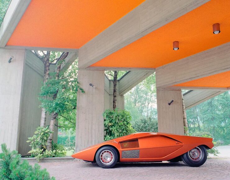
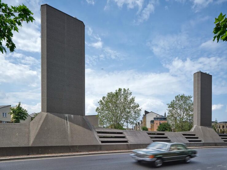
    London’s Camberwell Subamarine and the Mercedes W116. Photo by Daniel Hopkinson.

    “Through the lens of time, both [cars and buildings] have become highly symbolic of their eras and hindsight will allow us to trace the roots of each design to determine how it is viewed from a 21st century perspective,” says Holroyd, noting that over this period architecture underwent a stylistic retreat, just as car design became emboldened and more avant-garde.

    Great stuff in this new title, available now from The Modernist. Read more at Wallpaper*.

    World Architecture Festival 2024 Shortlist

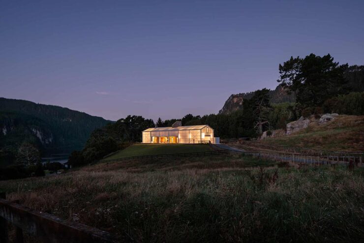
    Via The Guardian, we have The World Architecture Festival’s 2024 shortlist, revealing projects from around the world spanning categories such as childcare, energy, transport and science. A couple of faves:

    The Chodge by DCA Architects of Transformation — interesting name(s), surely — in Whakamaru, New Zealand. Photograph by Simon Devitt.

    The live awards event will take place in Singapore from November 6-8. This year’s finalists represent 71 countries.

    Woven Passage to Cloudy Peaks by line+ studio in Shaoxing, China. Photograph by line+studio.

    See more at The Guardian, or the complete shortlist at The World Architect Festival.

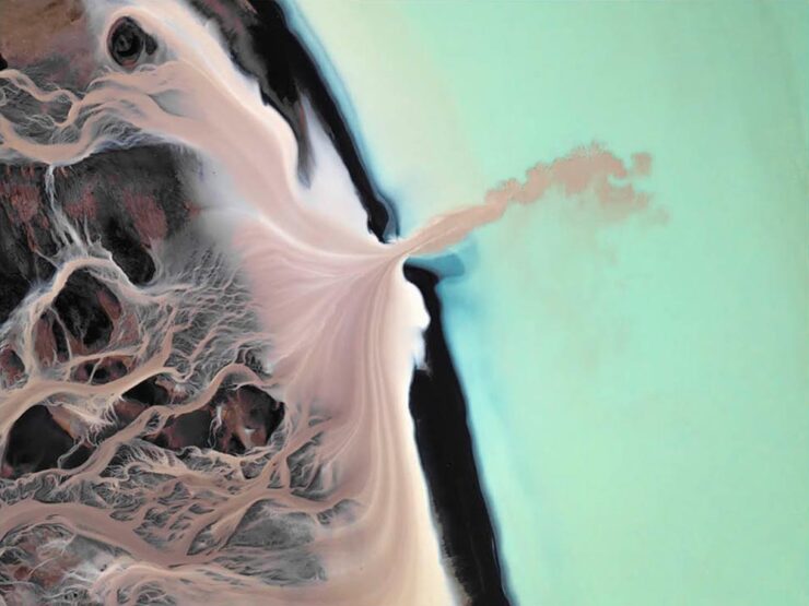
    Special Bonus #4: This is Colossal brings us the drone photography of Eric Waider, shot in Iceland:

    As glaciers expand and recede, they have the capacity to grind rock so fine that geologists refer to the pulverized material as glacial flour. It slips down rivers and into lakes, carrying the otherworldly turquoise hue through a unique and resilient ecosystem. In Iceland, the blue-green color is complemented by rivers that flow yellow, thanks to sulfur from nearby volcanoes, or red from dissolved ferrous iron—also known as bog iron. Coursing over rock and black sand, the streams take on dazzling, rhythmic patterns.

    Photograph by Erik Waider.

    Brilliant. See his website (“Abstract Landscapes of the distant North”) and enjoy that series and more — including faves such as Ocean Blues and Glacial Macro.

  • Beautifully Briefed 24.6: Summer of Win (Mostly)

    Beautifully Briefed 24.6: Summer of Win (Mostly)

    In this installment of Beautifully Briefed, let’s take a look at some great posters, great print items, and great photography. Plus, an update from Adobe’s continued campaign to lose friends and attract government attention. Fun stuff!

    GET LECTURED (ON ARCHITECTURE)

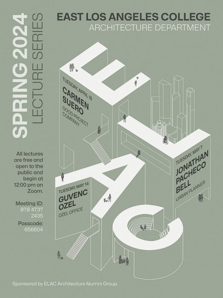
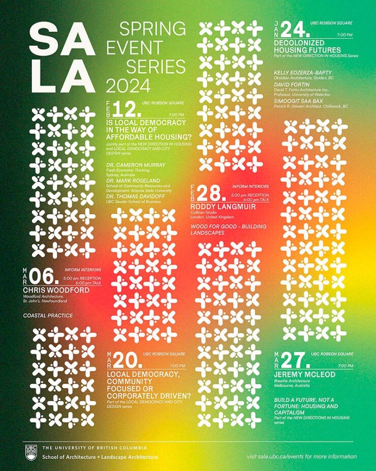
    Back in September, I mentioned Archinect’s Get Lectured poster series. They’re back with the Spring 2024 winners, including these two faves:

    ELAC lecture poster design by Tashfiah Ahmed.
    Lecture poster from the University of British Columbia; designer not listed.

    Great examples of design in a often difficult category. See the rest.

    Architecture Photographs by Hélène Binet

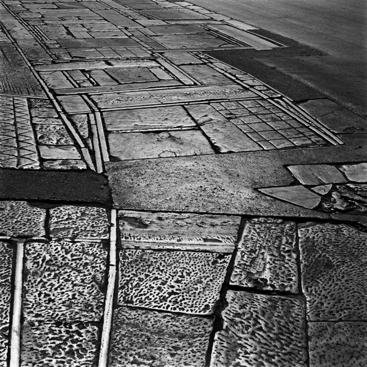
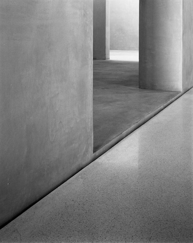
    While we’re discussing architecture, let’s talk about a Dezeen post that caught my eye: photographer Hélène Binet has a new book out, adding to her long career capturing the old-school way — using film.

    “A Sentimental Topography by Dimitris Pikionis, landscaping of the Acropolis, Athens, Greece.”

    This series captures shadows and light with exceptional talent, including the above, where she’s praised for “captur[ing] in a single image the tactile and textured presence of tectonic form, both in built and natural environments.”

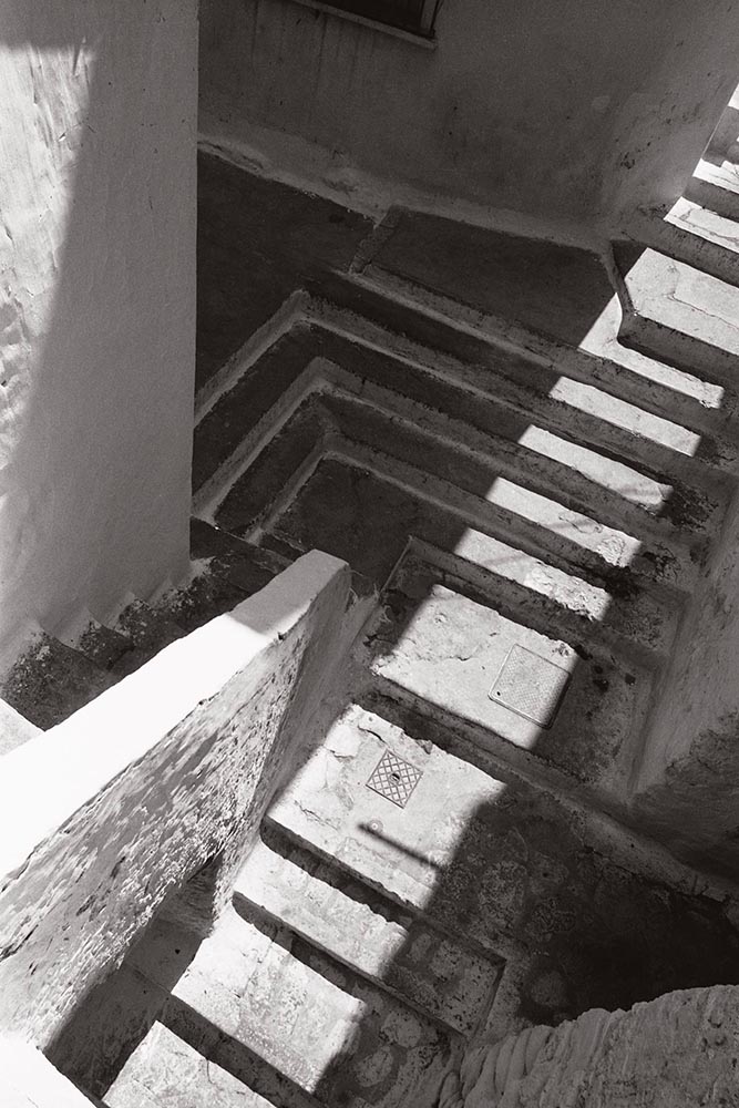
    “Staircases in Sperlonga, Latina, Italy.”

    I love the softer shades of gray than shown in the previous image, and both this and the image below demonstrate a deep understanding of architectural expression.

    “Kolumba Museum, Cologne, Germany, by Peter Zumthor.”

    Read the post from Dezeen, see more examples of outstanding work on her website, or buy the book with 170 photographs, essays, and more.

    2024 Audubon Photography Winners

    This is Colossal posted about this a day before my Audubon magazine showed up with these prominently featured, and they’re all winners.

    Wild Turkey, Female Bird Prize Winner, by Travis Potter.

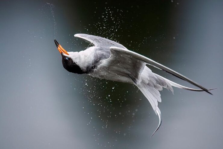
    Bird photography is a difficult skill requiring patience, perseverance, and specialized gear; those who excel at it deserve recognition. Plus, there’s this:

    Audubon’s climate science report Survival by Degrees reveals that two-thirds of North American birds are threatened by extinction from climate change, including species featured in this year’s Audubon Photography Awards like the Blackburnian Warbler, California Quail, and Sedge Wren.

    Forster’s Tern, Professional Honorable Mention, by Kevin Lohman.

    Check out the Colossal post, or see the full story at the Audubon website.

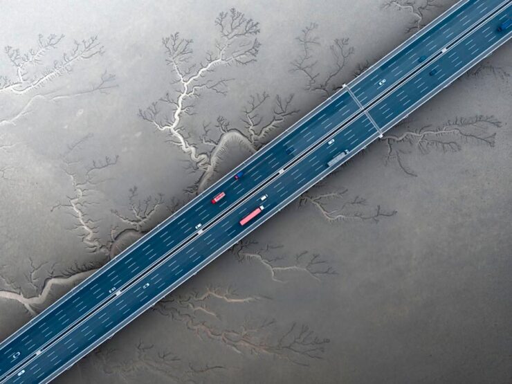
    Special Bonus #1: Kottke points us towards the Siena 2024 Drone Photography Awards. “Look! Up in the sky! It’s … another contest!” Good stuff nonetheless:

    “Jiashao Bridge” by Sheng Jiang, China.
    PRINT 2024 Awards

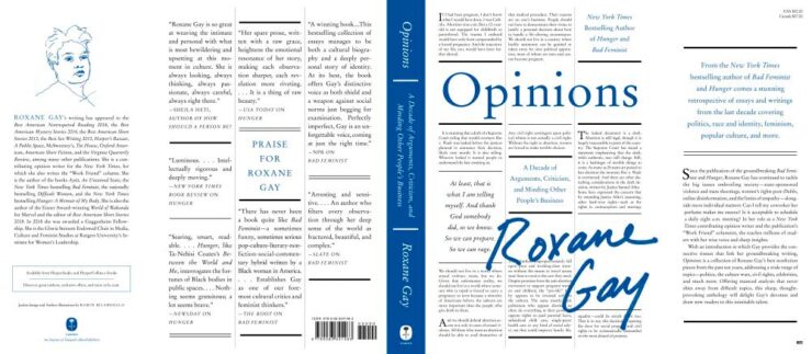
    The annual PRINT awards are out, featuring — natch — great items in print, including items like the Smithsonian’s annual report and a Naked Trails brochure. Here are a couple of items from the book design category:

    Jacket design by Robin Bilardello.

    Author sketch and lettering by the author. Also, let’s get the . . . :

    Cover design by Milan Bozic, with illustration and typography by Lauren Tamaki.

    Fantastic.

    Special Bonus #2: Hoefler & Co. brings us Typographic Doubletakes: “While good typefaces have prodigious families of carefully related styles, some of the best typography builds unexpected relationships between unrelated fonts.”

    Left: Chronicle Hairline + Landmark. Right: Vitesse + Gotham.

    Their blog refreshes as you scroll in more ways than one — enjoy.

    Left: Mercury Text + Ideal Sans SSm. Right: Whitney + Operator and Operator Mono.

    Special Bonus #3: Kottke points us to a LitHub post arguing for adding full credit pages to books acknowledging everyone who worked on them. “How lovely it is to be seen and appreciated.”

    Adobe “Too Easy to Hate,” Say Users, Employees

    Adobe continues to score big with the public — in the best Boeing style, a formerly-great company has put profits before users and employees. While successful from the shareholders’ point of view (record profits, again), some are . . . upset. PetaPixel:

    Just over a month ago, an Adobe exec called AI the “new digital camera.” Simultaneously, an Adobe marketing campaign chucked photographers under the bus, and not for the first time, which caught the attention of the American Society of Media Photographers (ASMP). At the very top of Adobe, there is a concerning and frustrating lack of understanding about art and the people who make it.

    Even “exasperated employees implored leadership to not let it be the “evil” company customers think it is;” while that might be a stretch — “ignorant greed” is a better description — either is not a winning look.

    The latest was a terms-of-service update that many saw as a rights grab, allowing the company to use users’ work to train its AI services. While those have been amended, the seemingly clear language — “We’ve never trained generative AI on customer content, taken ownership of a customer’s work, or allowed access to customer content beyond legal requirements” — comes from a company that has lost the trust of users, making those words just that — words. Time will tell if they are truth.

    But there’s more: Adobe’s just been sued by the FTC (via PetaPixel, Pixel Envy) for hidden fees and difficult cancellations:

    “For years, Adobe has harmed consumers by enrolling them in its default, most lucrative subscription plan without clearly disclosing important plan terms,” the lawsuit alleges. “Adobe fails to adequately disclose to consumers that by signing up for the ‘Annual, Paid Monthly’ subscription plan, they are agreeing to a yearlong commitment and a hefty early termination fee that can amount to hundreds of dollars. Adobe clearly discloses the early termination fee only when subscribers attempt to cancel, turning the stealth early termination fee into a powerful retention too that [redacted] by trapping consumers in subscriptions they no longer want.”

    I’m actually glad for this, as I wasn’t aware that my $60+ monthly fee is a payment on an annual plan. (Ug.) Not too big an issue — I actually feel like there’s decent value in the plan and will continue to subscribe for the foreseeable future.

    But I’d also be lying if I said I’m completely satisfied with our business arrangement: alternatives are few and far between. While Adobe does not have a monopoly legally or technically, in the publishing industry at least, they are, for all intents and purposes, the only game in town. It would be nice if they would at least demonstrate a modicum of respect for their users.

    Update, 25 July 2024: “Adobe Exec Says Early Termination Fees Are ‘Like Heroin’ for the Company,” according to PetaPixel. Hmph.

  • Beautifully Briefed 24.4: April Snow(ed Under)

    Beautifully Briefed 24.4: April Snow(ed Under)

    This April has been busy — meaning that I’ve not marked as many items for this column as usual. (I generally keep a browser tab group going throughout the month with items that could potentially be added, then weed them out/down as posting time gets near; usually, I aim for four or five diverse items.) This month, a great young Egyptian photographer and some details on what goes on, er, under the covers of book design.

    Karim Emr, Photographer
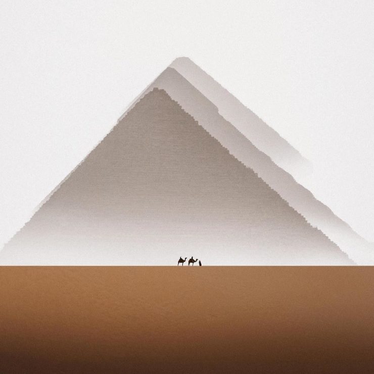
    Infinity, Karim Emr, 2021. The print is 64×64 inches(!).

    Just look at that — awesome. The moment it appeared on Kottke, it got marked for posting. It’s fantastic to see a familiar locale taken with a fresh perspective, proving once again that no matter how many cameras exist in the world, it’s what you do with it that matters.

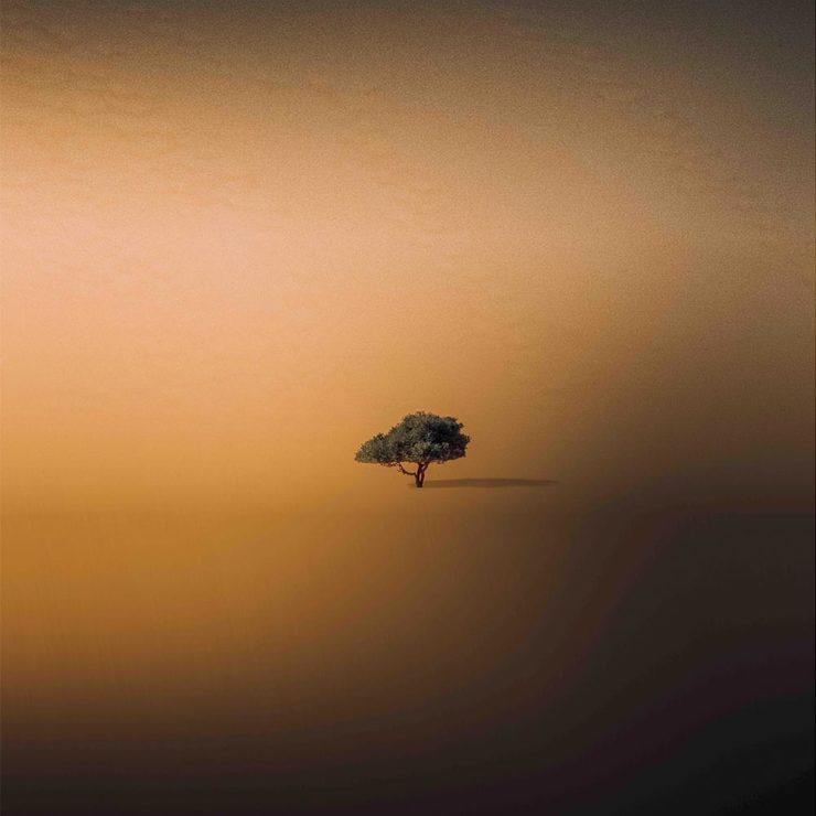
    This is great, too:

    “Water, Water, Water,” Karin Amr, 2021. (Forgive the color banding; that’s my fault, not the photographer’s.)

    I didn’t realize that was flooded at first — the desert plays many tricks. For more, check out his Instagram or order prints at 1stDibs.

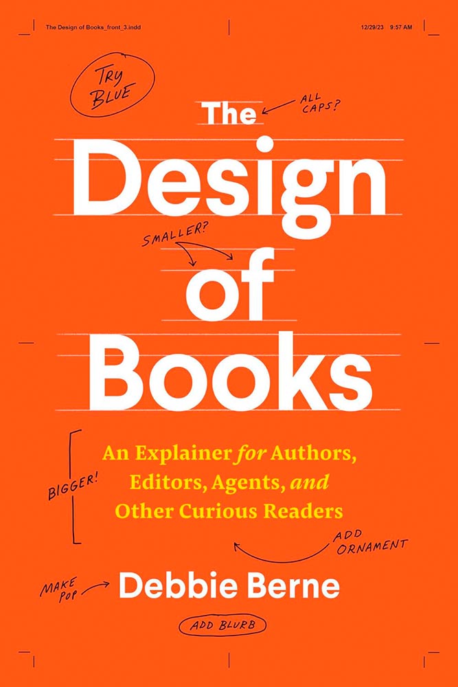
    The Design of Books

    You’re reading Foreword, so it’s safe to assume at least a passing interest in book design. So this one’s a natural to highlight:

    New title by book designer Debbie Berne

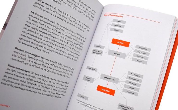
    Professional book designer Berne debuts with her first self-authored (and designed) title that seemingly anticipates every question people curious about book production might ask, as well as many they probably hadn’t thought about. . . . This title illuminates all that goes into producing and designing a book.

    — Library Journal
    Interior highlights from The Design of Books.

    From crop marks to the editorial workings, a worthy read for those in need of better understanding the process, those in the process (you’d be surprised: it’s more than authors and editors), and, as the author — and the LJ — say, “other curious readers.” Recommended.

    Special Bonus #1: The above is courtesy of another Kottke post, which has a comment regarding the redesign of the Book of Common Worship for the Church of England. It’s long and detailed, but it you have a minute: An account of the making of Common Worship: Services and Prayers for the Church of England. [PDF]

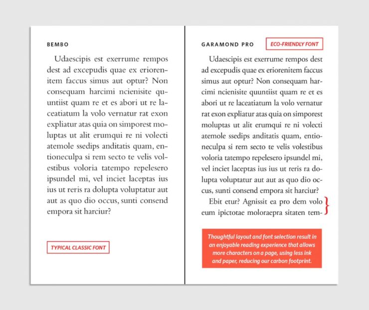
    Special Bonus #2: HarperCollins, one of the biggest publishers in the world, has something to tout: saving trees through “eco design.”

    It’s painfully clear which is easier to read: a change for the better . . . ?

    Fast Company reports on this, although to be honest I’m not sure it’s an improvement — while it’s impressive that, “so far, these subtle, imperceptible tweaks have saved 245.6 million pages, equivalent to 5,618 trees,” perhaps the startling statistic there is that a single tree can produce nearly forty-four thousand book pages. (Along with some bark mulch, presumably.)

    In any case, the VP of creative operations and production at HarperCollins — apparently an actual title — is proud of their “learnings.”

    Doctor? No, Book Designer

    The AIGA Eye on Design‘s book design category, always full of gems, highlights the career path of another book design professional, Jason Ramirez:

    One of the first in his family to attend college, he studied biological sciences and later religious studies at the University of Rochester, and after graduation he began taking night classes in typography, color theory, graphics, and web design. At nearly 30-years-old, he applied and was accepted into Parsons School of Design, where a course with cover designer Gabriele Wilson opened up a world of possibility.

    —Laura Feinstein, AIGA

    He’s done well:

    Cover design: Jason Ramirez

    A great read on the how’s and why’s of five worthy book cover designs when you have a moment.

    Special Bonus #3: CreativeBoom profiles another book designer, this time Leah Jacobs-Gordon, a freelancer in England.

    Cover design: Leah Jacobs-Gordon

    Enjoy your spring!

  • Beautifully Briefed 24.3: Bloomin’ Breadth

    Beautifully Briefed 24.3: Bloomin’ Breadth

    The end of March here in Middle Georgia means flowers aplenty, and usually with that, some photography — but I’ve not yet had a chance. (Stay tuned.) I have, however, been saving up links o’ interest: fonts, books, photography, and new(ish) car logos. Let’s go!

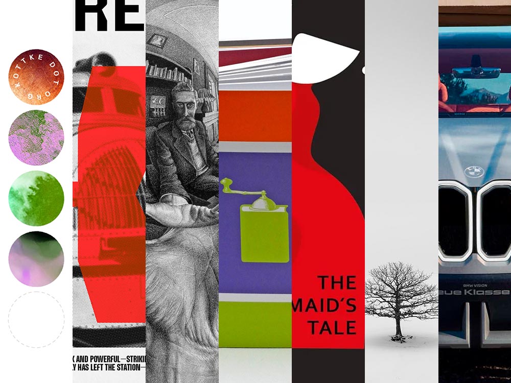
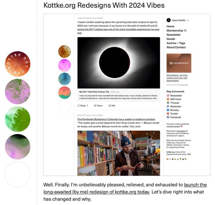
    Kottke Meets 2024

    Starting with one of the very few places that is still around from Foreword’s old days, the always-interesting Jason Kottke:

    2024 marks Kottke.org’s 26th year on the ’net.

    Great new looks for great content, with better Quick Links — the previews are ace — and incredibly-appreciated gift links to places like The New York Times and The Atlantic. If you haven’t been in a while, click and enjoy.

    Fab Spring Type

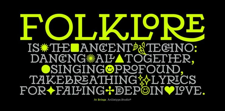
    With “a plethora of captivating new typefaces,” CreativeBoom celebrates spring with 11 new faces to tempt, inspire, and bring joy:

    Arillatype.Studio brings us a thousand glyphs of greatness.

    Zanco, with its bell-bottom style; Seabirds, inspired by 1930s book covers; Module, a “fluke side hustle;” and Graffeur, improvised from gaffer tape and glimpsed in this post’s header image, are all great. My far-and-away favorite, though, is At Briega, “inspired by the concept of hybridisation” and shown above.

    See ’em all here.

    Literary Three-Fer
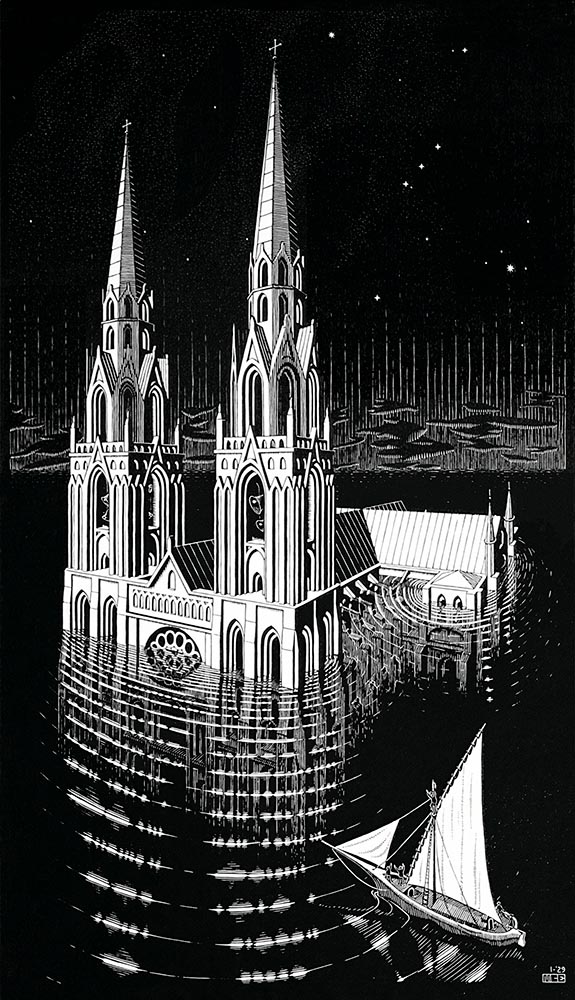
    M.C. Escher’s Lesser-Known Works
    “The Drowned Cathedral,” a 1929 woodcut.

    “Unique perspective” never does justice to someone whose name defines the term. See some never-before-seen images alongside old favorites in a new Escher book highlighted at Hyperallergic.

    Multidimensional Libri

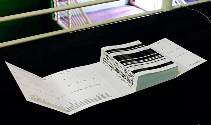
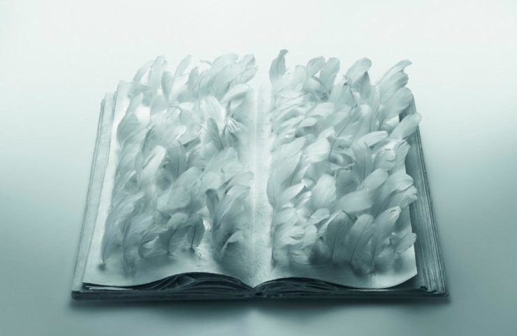
    “Experimental books are flourishing, [a]nd the evidence is seen” in this Daily Heller from PRINT: a traveling exhibition on three-dimensional books, all published titles.

    Oh, those Italians. Read on.

    Book Design Snobbery
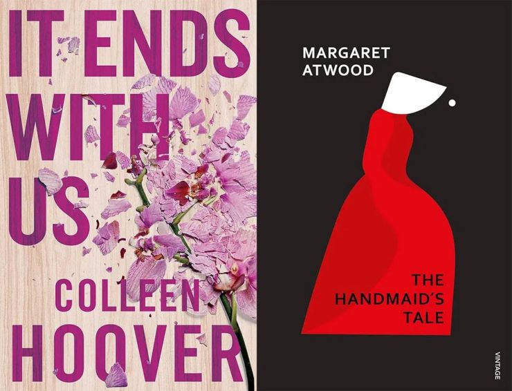
    Hoover vs. Atwood — no joke.

    “Don’t get held back from the simple pleasures of reading,” argues Natalie Fear at CreativeBloq, “not everything needs to be minimalist.” Justification for commercialism or a common-sense explanation for the bookshelves’ current look? You decide.

    Photography Three-Fer
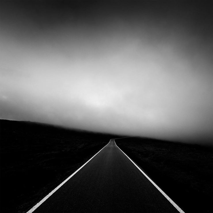
    Winners of Monochromatic Minimalism
    “Black Pearl” by Sascha Kohne. An honorable mention for the magazine, but a winner for me.

    Some incredibly good stuff here — but perhaps more importantly, did you know of Black & White Minimalism Magazine? There’s no end to today’s continued diversification, methinks.

    “Traveling through Costa da Morte, Galicia. 600m above sea level where the mountains separate the Cantabria sea from the Atlantic Ocean,” explains third-place winner Alexandre Caetano.
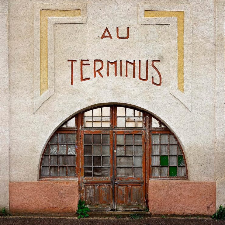
    Aging Facades of France

    “Shuttered blinds, peeling paint, and aging doors don’t usually indicate an invitation, but for French photographer Thibaut Derien, the fading facades of long-closed shops are well worth a stop,” This is Colossal says.

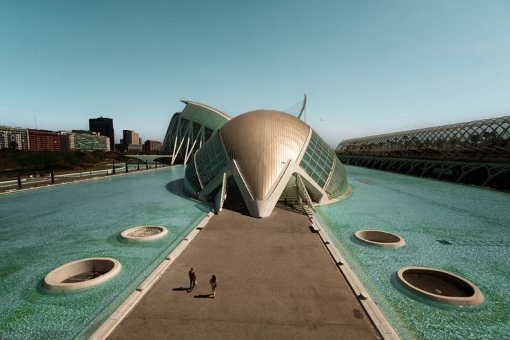
    Sony Photography Awards: Architecture
    The Ciudad de las Artes y las Ciencias (City of Arts and Sciences) in Valencia, Spain: “Hemispheric,” by Eng Tong Tan, Malaysia.

    ArchDaily‘s coverage of the annual Sony awards shortlist announcement was an insta-click.

    New Bull: Now Flat. (And a BMW.)

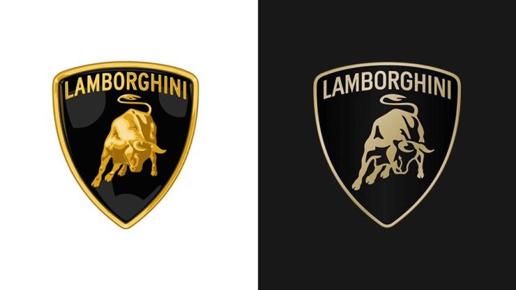
    Lamborghini practically defines flamboyant. So it’s worth a link when their logo gets less interesting:

    Old logo, left, new, right.

    Late at following the industry trend of flat-is-better, because, well, Volkswagen. (Okay, I undersell. Perhaps.) Read the lack of news at Motor11Motor1 also has a decent roundup of new car logos, from 2016-present, which underscores the “flatness” trend. or The Drive, where they manage to convey the brand’s use of the phrase “digital touchpoints.”

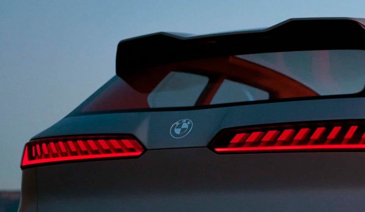
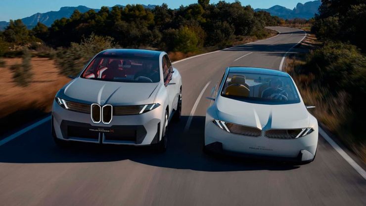
    I don’t know whether this will make any more sense in a few or even many months — which is relevant because of BMW. Four years ago, one of the industry’s design leaders expressed strong this new style, and I didn’t get it. But it’s worn better than most, and superlatively on occasion — check out the logo’s use on the Vision Neue Klasse X:

    Rather than a standalone, plastic part sitting on the paint, it’s etched into the finish. Man, I hope that makes it into production.

    Neue Klasse: do like. Bull? No so much.

    Update, 2 April: BrandNew, itself sporting a new look, has weighed in on the new Lambo style, calling it “not good.” (FYI, BrandNew is a subscription, quite possibly the best $20/year someone interested in design can spend.)

    • 1
      Motor1 also has a decent roundup of new car logos, from 2016-present, which underscores the “flatness” trend. ↩︎