Tag: automotive

  • Beautifully Briefed, Late March 2022: Type Museum, Toshiko Mori, and … Buick?

    Beautifully Briefed, Late March 2022: Type Museum, Toshiko Mori, and … Buick?

    Catching up with a few unrelated stories that I’ve been meaning to post — including one pretty significant failure on my part, one potentially significant failure, and because not everything should be about fail, an extremely interesting and thoughtful interview.

    Tiny Type Museum Sold Out

    I was cleaning up open Safari tabs on my phone the other day — the detritus that results from checking things on the fly when out and about, often or never closed — and noticed that I’d sort-of bookmarked something for action and … missed it. Crap!
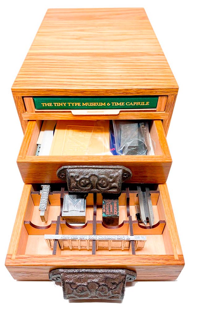
    The Tiny Type Museum & Time Capsule, with specimens and those beautiful drawer pulls.

    The Tiny Type Museum & Time Capsule is a celebration by journalist and printing historian Glenn Fleishman of type and printing, and an effort at preserving history for future generations to re-discover. Each custom, handmade wood museum case holds several dozen genuine artifacts from the past and present, including a paper mold for casting newspaper ads in metal, individual pieces of wood and metal type, a phototype “font,” and a Linotype “slug” (set with a custom message), along with original commissioned art, a letterpress-printed book, and a few replicas of items found in printing shops.
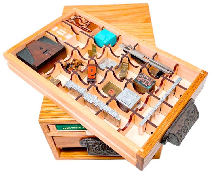
    The Tiny Type Museum. (Bottom drawer.)

    The museum includes a letterpress-printed book written for the project, Six Centuries of Type & Printing, in which Fleishman traces the development of type and printing starting before Gutenberg printed his Bible around 1450 up through the present day. This book acts as “docent” for the museum, providing insight into the stages in technological and artistic development that took place, and explaining the importance and nature of the artifacts. It also slides out neatly as part of a sled from the top of the museum case, and provides the visible name.

    The letterpress book is still available: get your copy, or subscribe to the podcast. But even if you don’t, take a moment to appreciate the work that went into this — well done, indeed.

    Buick’s New Logo

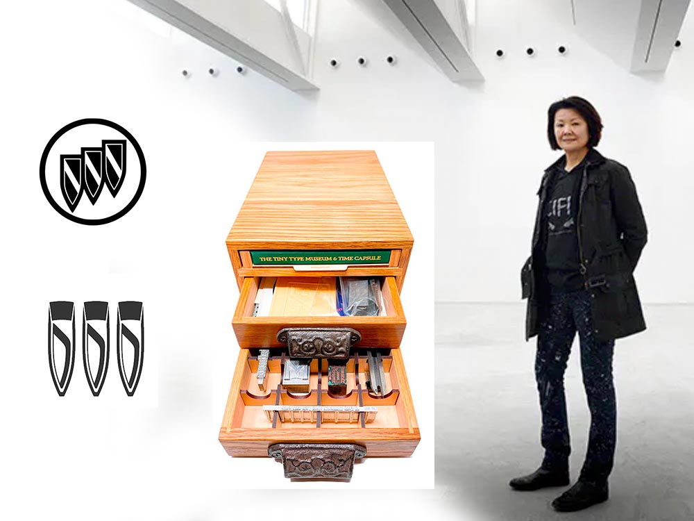
    This one … I dunno. The race to do car logos flat black-and-white has seemed like a race to the lowest common denominator. (See previous coverage of BMW, Volvo, Cadillac, and more.) Below, Buick’s old (left) and new (right) logos, courtesy of Motor1:
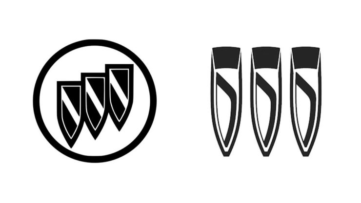
    The trademark filing for Buick’s new logo.

    Thankfully, there’s been a leak — Instagram, natch, so no link here — demonstrating that it’ll still be in color:
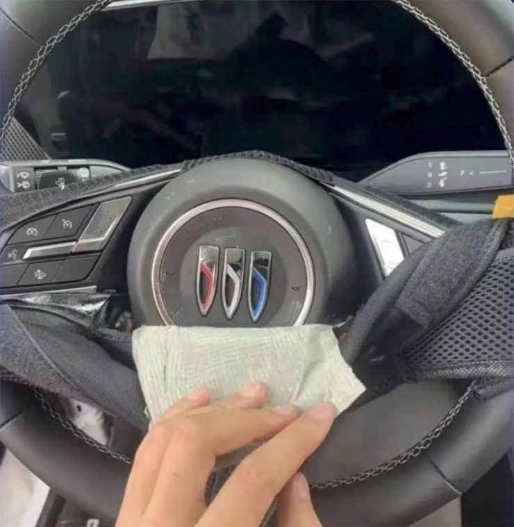
    From Instagram (alas): The new Buick logo in living color.

    Still, not sure. Will have to see the official announcement and package that goes with it; Motor Trend suggests that it might be part of an EV-only future. Stay tuned for Brand New’s take, I guess….

    Toshiko Mori

    The former chair of Harvard’s graduate architecture program has given a great and wide-ranging interview to New Reader:

    I think innovation doesn’t come in one huge leap. It’s a series of small steps. Accumulations of small discoveries, followed by incremental implementation. And then it all adds up. Innovation is not a single idea—it’s incredibly incremental and additive. Even these small discoveries can change the way we think about things very quickly. So I think every step of the way—problematizing “what are the issues?” and “what are the solutions?” filtering issues of sustainability, supply chain, accessibility, will eliminate many solutions which are not possible. And then you end up with small nuggets of potential. In a way it’s very systematic, innovation, and so is experimentation. It’s the elimination of what’s not possible and focusing on goals.

    Toshiko Mori. Image courtesy of New Reader.

    You know, history is not about the past, really. History is about the story of an individual interpreting history. Historians cannot be unbiased narrators. Every history is a story, and then yes, there are facts—which are important, but the way you connect facts and then make diverse narratives is super interesting. 

    As you can see, Fox News provides false narratives, and a lot of times they skew the facts, and that’s a problem. It can be used dangerously, but it can also be used productively. I think that’s what makes history rich. It’s not about the past, it’s about projecting into the future. So when I teach students, I ask them to make their own story based upon their research. But it’s a story—so that’s kind of their own reality. And based upon that reality, they can develop diverse narratives and then communicate the story to others. It’s not as if you have different opinions, but you have different stories to share. It’s not about controversial opinions, but about the way we each look at life very, very differently—and that enriches everybody.

    The whole thing is definitely worth a read: Archinect News called it a “nuanced interview,” and if anything, that’s an undersell. Please go, reflect, and appreciate.

    Side note: New Reader‘s notes throughout the interview deserve special mention (see the red Greek letters and separate, well, sidenotes). Nice.

  • Cadillac and Mercedes Logos: New — or Not (Updated)

    Cadillac and Mercedes Logos: New — or Not (Updated)

    NOTE: See my previous car logo redesign coverage regarding BMW, Mini, etc., and more recently, Volvo.

    Update, 7 December, 2021: Brand New has, as usual, done a superlative job of discussing the new Cadillac logo. See their post here, remembering that they’re subscription now — possibly the best $20/year available.

    Original post follows:

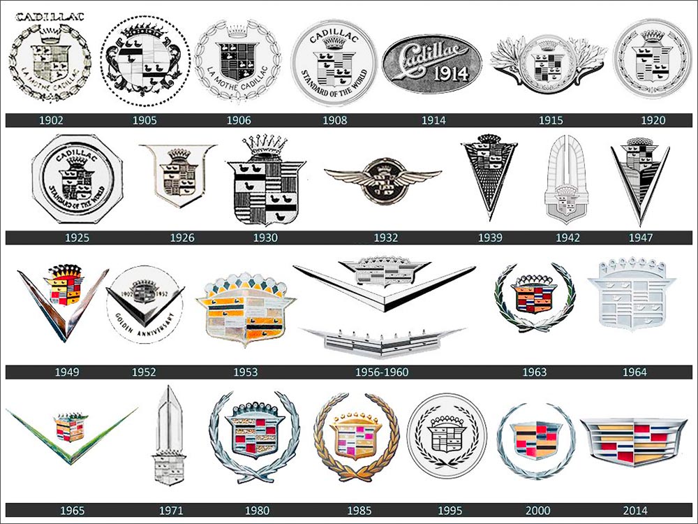
    Cadillac has updated their logo, their first redesign since 2014. First, though, some history:

    Cadillac logo history

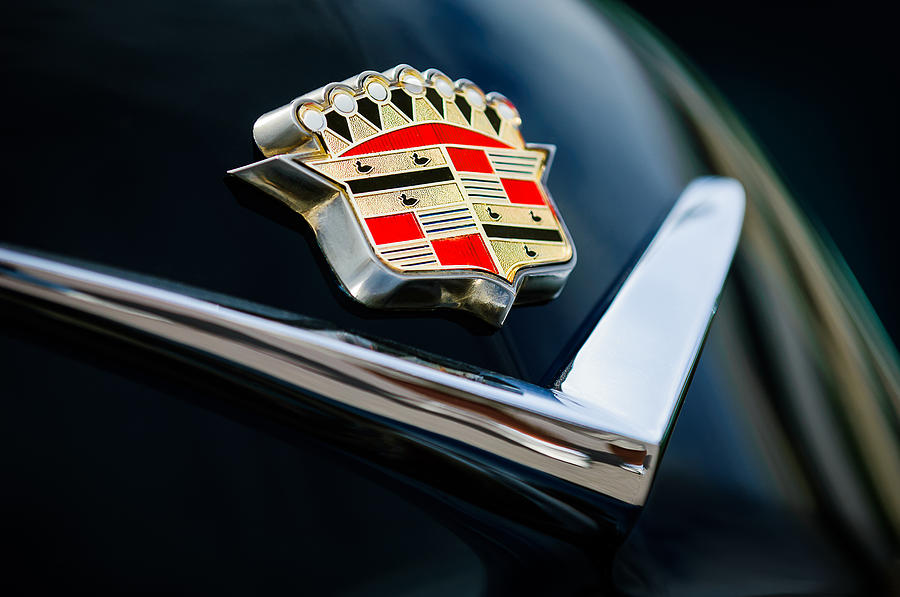
    The mid-century look, with the “crowned” logo, might be my favorite:

    Photo by Jill Refer
    Photo by Jill Reger

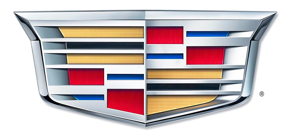
    As seen in the last line above, the 2014 logo is a simplification of the 2000 logo, sans the “old-person” wreath, and I thought quite successful:

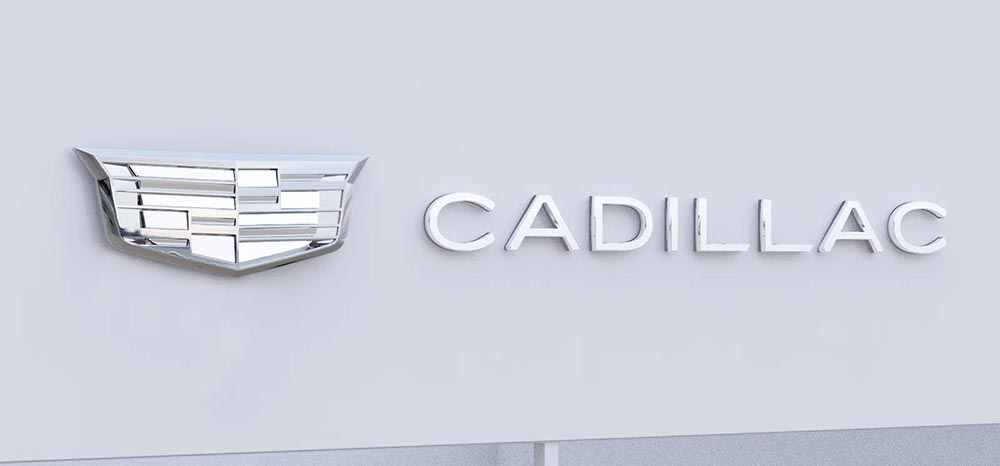
    Fast-foreword (ahem) to 2021, and the monochromatic, flat-logo thing is in full swing. The latest “old-person” target is the Cadillac script, replaced with another trendy item, a custom “Cadillac Gothic” font.

    Cadillac Dealer, 2021

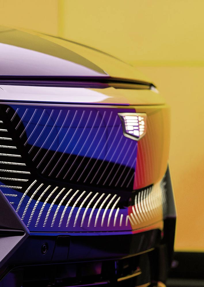
    Not only that, but there’s the new trend among luxury automobiles — mere cars aren’t good enough — of illuminated logos;

    Cadillac illuminated logo

    It’s Nice That has more on Mother Design’s new take on Cadillac.

    Mercedes, on the other hand, has just celebrated the 100th anniversary of the three-pointed star. Then:

    MB logo, historical

    Now:

    MB logo, now

    When it’s done right….

  • On Volvo’s New Logo

    On Volvo’s New Logo

    The “Iron Mark” has been given a makeover, and the result is … interesting. First, as a reminder, here’s the logo as it appeared previously — no, the one previous to that:

    2009 Volvo Iron Mark (on S80)
    My mother’s 2010 Volvo S80

    The blue has been associated with Volvo’s logo for a long while now, and it’s slowly been disappearing from the lineup (in favor of black in the same location). However, they’ve decided — they being both Volvo Cars and Volvo Group, two distinct entities (the latter including Volvo Trucks, the Volvo construction folks, Volvo Penta [marine], etc.) — to change to this new, more austere logo and word mark simultaneously. Aaaaaand:

    2021 Volvo Iron Mark

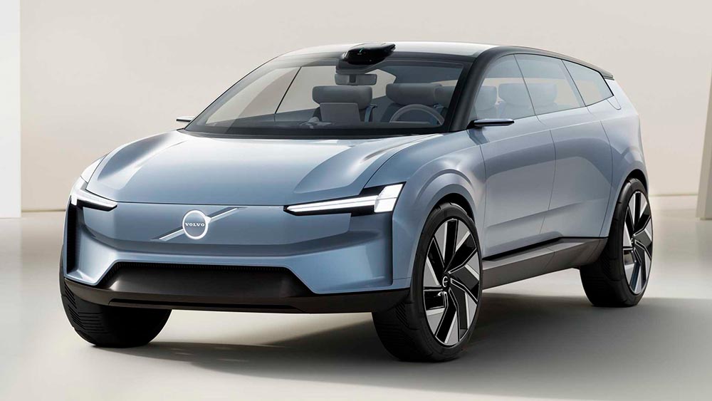
    Words fail me. Thankfully, there’s been plenty of coverage. See Brand New (subscription), CarScoops, and The Drive. What’s interesting — and largely gone under the radar — is that the logo debuted on a concept car back in June.

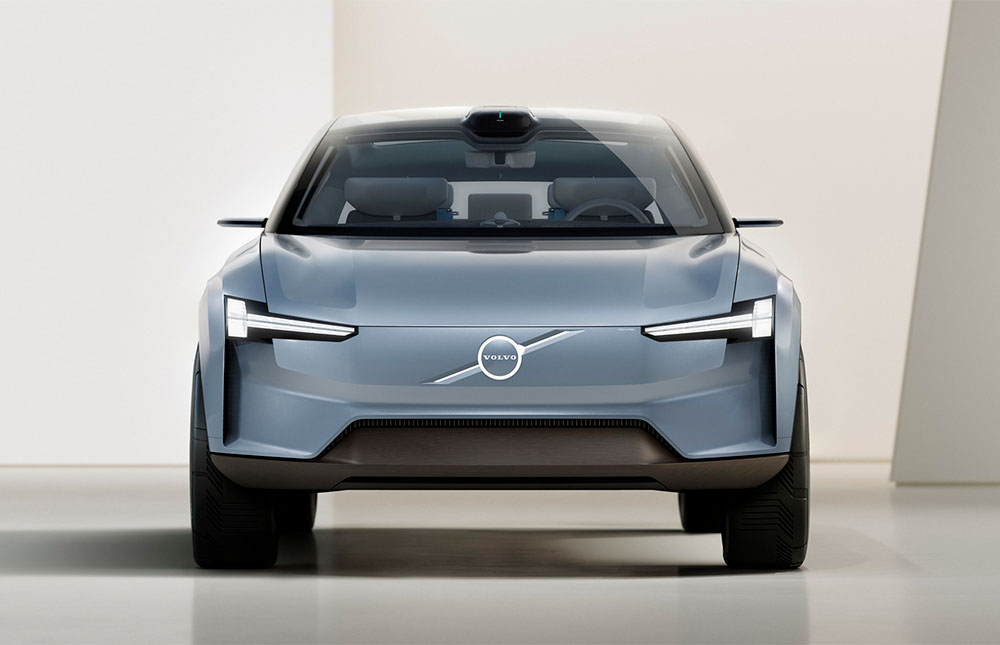
    Volvo Concept Recharge (2021)

    It’s part of a trend, too:

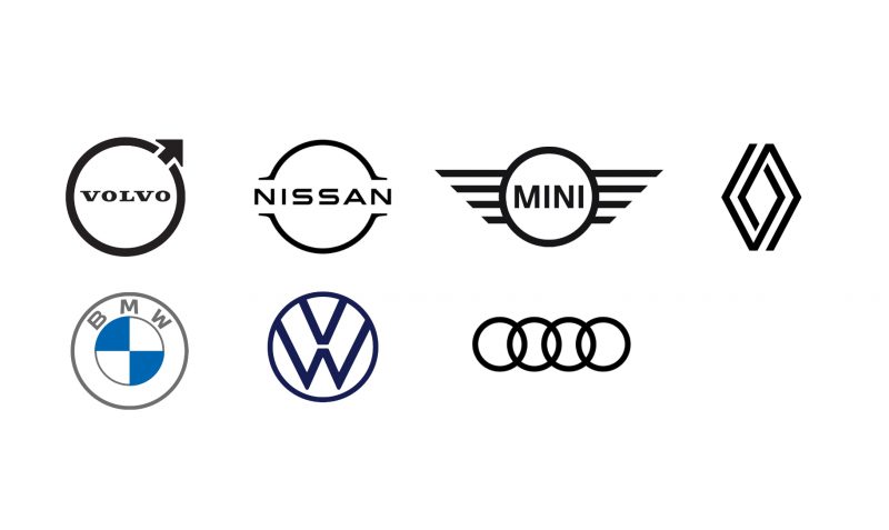
    2021 car logo redos

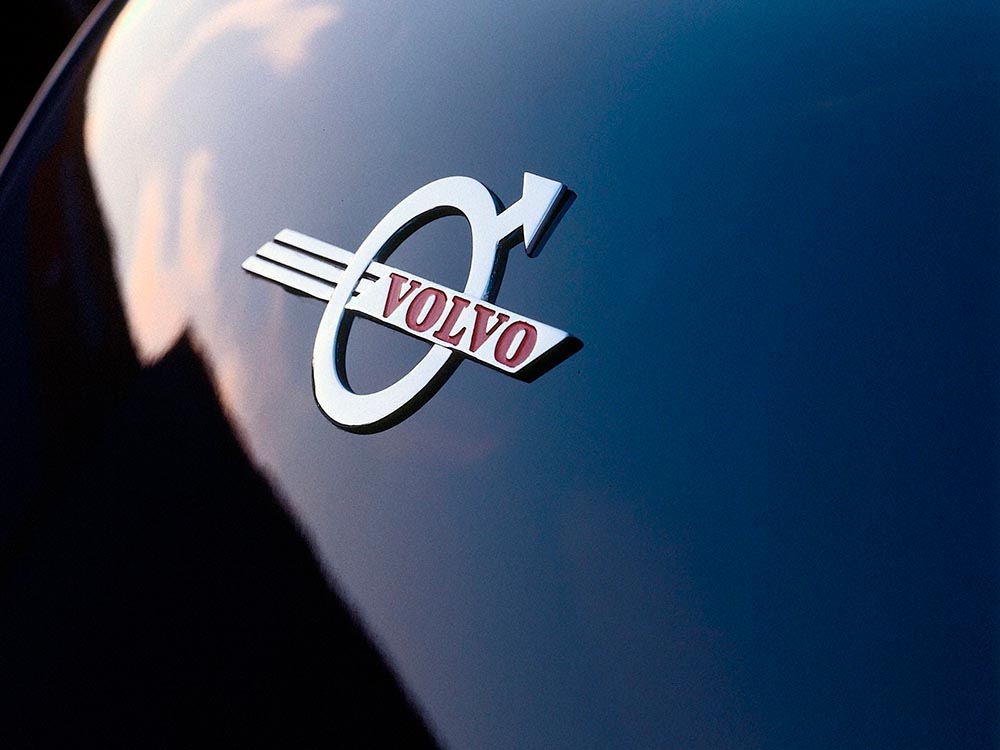
    See the previous coverage on Foreword. Can’t go, however, without a hat tip to Kristen Shaw at The Drive, who dug out this 1937 version — which, I’d argue, beats ’em all. Kudos.

    Volvo logo (1937)
  • On BMW’s New Logo (16 Updates, latest 3/20/21)

    On BMW’s New Logo (16 Updates, latest 3/20/21)

    Original post, March 5th, 2020: After 23 years, BMW has updated its logo … but there’s a problem.

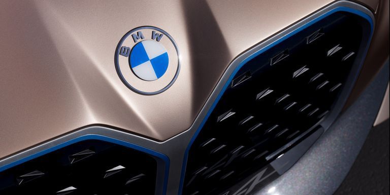
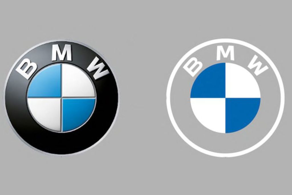
    Let’s back up a little, as even the previous logo wasn’t perfect. Debuted in 1997, it followed the then-trendy “3D” look, complete with highlights. It was, however, clearly BMW — black background, blue-and-white roundel, chrome outline, lettering. This new one, however, loses the iconic black (for transparent) and chrome outline (for white):

    BMW’s logo: 1997 (left) and 2020 (right)

    It’s less representative and less clear in my opinion, but hey, I’m only a BMW owner, not any part of their marketing team.

    Another problem: it debuted on the Concept i4. controversial all by itself.

    Why not revert to the earlier, 1963 version? (Or update it with new type — but keep the black?) Transparency is fine in some cases, but I’m not sure that this isn’t a case of style over substance in the actual use cases (web site logo, app logo, etc. — more than just on the cars, I mean).

    More from the always–excellent Brand New.

    Update: 3/11/20: “BMW speaks out on ‘misinterpretation’ of new logo.” (Think about the “Instagram-ability!! Gak.)

    Update: 3/20/20: BMW explains. (Via BMWBlog.)

    Update, 7/15/20: Copenhagen, Denmark-based Dim Newman takes a stab at an alternate solution. (I like it.)

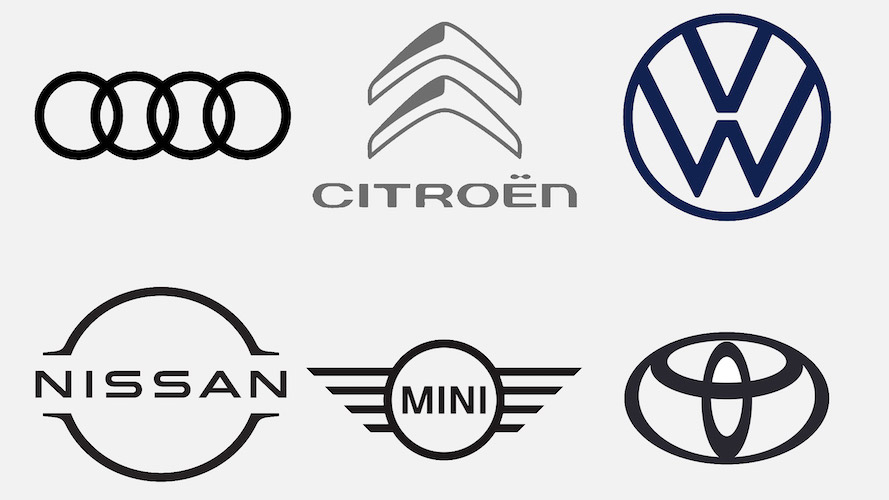
    Update, 7/27/20: Dezeen has a roundup of the six other companies that have made their logos “flat,” proving the “3D” look mentioned above is truly out of fashion:

    Audi, Citroen, VW, Nissan, Mini, and Toyota, oh boy!

    Update, 9/25/20: Vauxhall joins the trend:

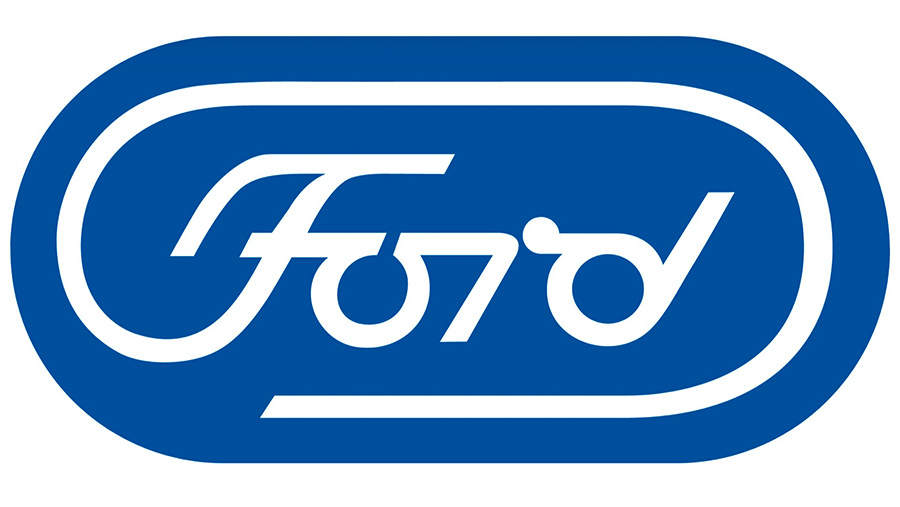
    Update, 11/27/20: The Ford update that never was:

    Ford Almost Let a Graphic Design Legend Update Its Blue Oval Logo in 1966: Paul Rand, who designed iconic logos for IBM, Cummins, ABC and numerous other companies, designed a sleek logo for Ford that went unused.

    Ford’s unused 1966 logo

    Read more at The Drive.

    Update, 12/2/20: Not enough? How ’bout Opel:

    Opel’s new “Blitz” logo, circa 2020

    “Opel Details All-New, Slimmer And More Modern ‘Blitz’ Logo,” at CarScoops.

    Update, 12/30/20: Kia’s was previewed on a show car earlier in the year, but they’ve gone and made it official:

    There were some changes along the way, if you compare what’s on the show car and what you see above — and not all for the better, as it almost gets smeared. Still, looking forward to seeing where one of the most dynamic car companies today goes with this.

    Update, 1/8/21: GM. One word: GAK.

    So bad I actually feel sorry for them. More here and here.

    Update, 1/13/21: Brand New is actually much nicer to GM’s logo update than I expected. Diplomacy? You decide. (Brand New is a subscription now, BTW — the best $20/year available, IMHO.)

    Update, 3/2/21: Peugeot has joined the fray. Not great, especially at smaller sizes, but at least not the GM train wreck — and, in many ways, better than the last couple of outline lions (this one seems to be based on the 1960 version):

    Read about the lion’s history here, Peugeot’s press release “reaffirming its personality and character” here, or one of the regular site’s notes, including a potential move upmarket here or here.

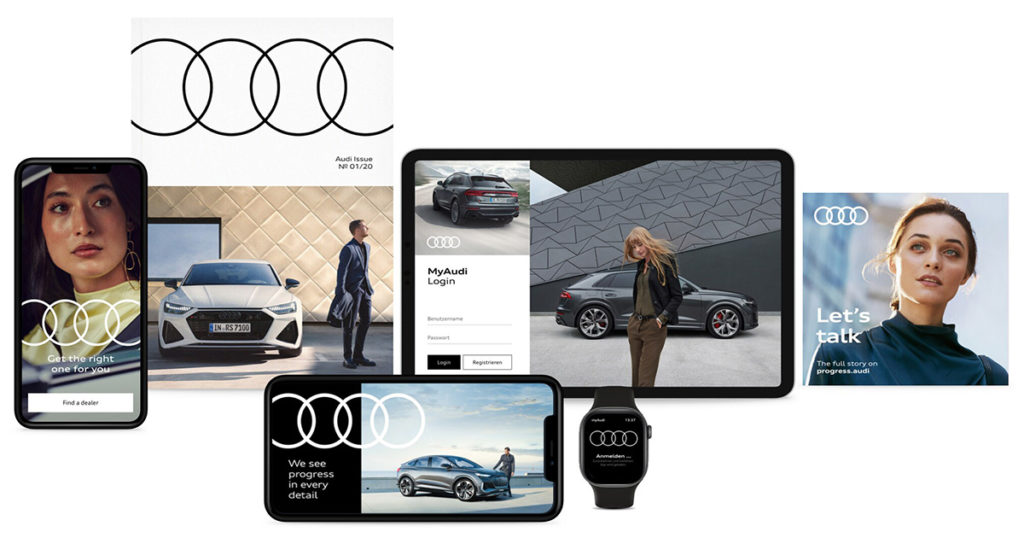
    Update, 3/4/21: Audi, while not redoing their iconic “4 rings” logo, has redone the branding around that logo:

    Brand New has more (note: BN is now subscription-only — easily the best $20 that I’ve spent in a while).

    Update, 3/6/21: Speaking of Brand New, they have a good deal more information regarding Peugeot. Good stuff!

    Update, 3/10/21: Dezeen has more on Peugeot, as well. And CarScoops has the first pictures of the new 308 — the new logo premieres on this model update — and discusses that, on the grille, some of the car’s sensors appear behind the logo. Interesting. (I still preferred the lion on the grille, myself. Not that we get Peugeots in the United States, anyway….) Check it out.

    Update, 3/10/21: CarScoops has some more on Nizzan — uh, Freudian slip there: Nissan and their new logo.

    Okay, who’s gonna be next…?

    Update, 3/13/21: Uh… Renault!

    Not as big a change as Peugeot, and more successful, too: single color, retains history well, still instantly recognizable, works at small sizes. Nice. Details from Motor1 or CarScoops.

    Update, 3/20/21: Brand New discusses the new Renault logo:

    There is nothing wrong at all with it and I do like the approach to its construction but, ultimately, it’s like it’s missing some emotion or passion or, pardon my French, a Je ne sais quoi to make it special.

    I agree that the 1972 version is superior. Let’s see how this one evolves.