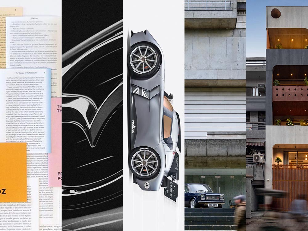
This time, another automaker logo, some automotive and architecture photography, and the special bonuses that have all become a regular part of the Beautifully Briefed standard. But we’re going to start with some generated content.
AI Book “Design”
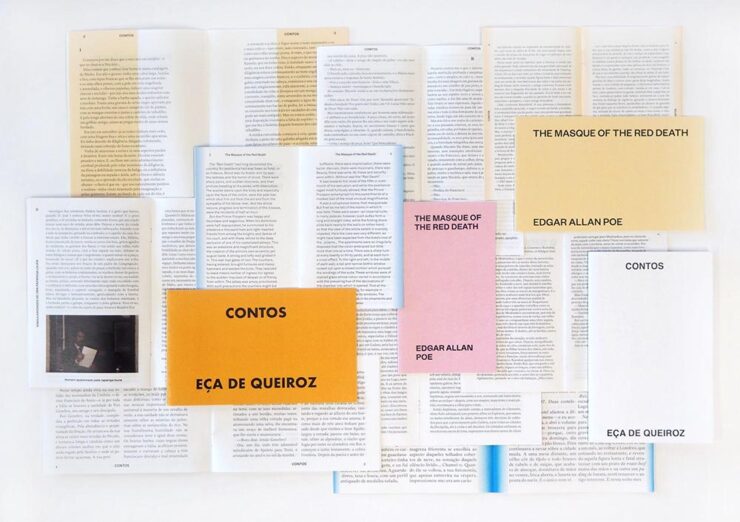
From the “We knew this was going to happen” category, we have the first — that I’ve seen, anyway — “let AI do the work” research paper suggesting that book design is something that can be automated.
We have presented a novel approach to computationally design books. The presented system implements a generative design process which takes advantage of the scripting capabilities of Adobe InDesign to procedurally typeset books from content provided by the user. We have shown the ability of the system to (i) create book designs that consistently comply with a series of typographic rules, styles and principles identified in the literature; (ii) produce visually diversified books from the same input content; and (iii) produce visually coherent books with different contents.
Design by “AI.”
Let’s please remember that “AI” as the term is currently used is actually “applied machine learning;” in this case, specific rules within specific containers in a specific application. It’s a first step towards something, as most “AI” is in 2024.
But it’s absolutely not the only step. It’s inevitable that the necessary subsequent steps will be taken, probably sooner than later.
As usual where someone is seriously discussing replacing a human worker with a computer, there’s a pitch for the upside:
The work presented in the paper may challenge the typical roles of both the tool and the designer. First, by automatically creating and suggesting design alternatives, the tool ends up playing a more active role in the design process. Then, by modifying and developing custom tools, the designer is no longer a mere tool user and becomes the author of tools tailored to specific needs. We believe this shift can be fruitful since it enables the exploration and discovery of new technical and creative possibilities.
In other words, the designer is now responsible for creatively writing the rules then policing the output — like so many things in the machine-learning, or “AI” space — rather than the actual drudgery of directly designing the output. “Design great rules, get great design.”
And there is room for this. Amazon, especially, is going to jump on book design generated this way; never mind those folks in China or India earning (a paltry few) dollars a day, the computer can do it better for less . . . . Poof! With no human interaction whatsoever, your book is ready to publish. Indeed, for some, the bar to publish has just been lowered made easier. Perhaps even Adobe, who trumpets “AI” at every turn these days, they may choose to take this up. (Probably for a surcharge to the already-high subscription pricing.)
Let’s not even speculate about the major publishing houses for now.
But like AI-generated anything, getting actual art requires hand-tuning the input by an artist. For what amounts to “slop” — see this fantastic PixelEnvy discussion — the generated approach to book design might even be appropriate. But for book design that’s artistic, cared-for, or even “just” thoughtful, you’re going to need a human for a long time yet to come.
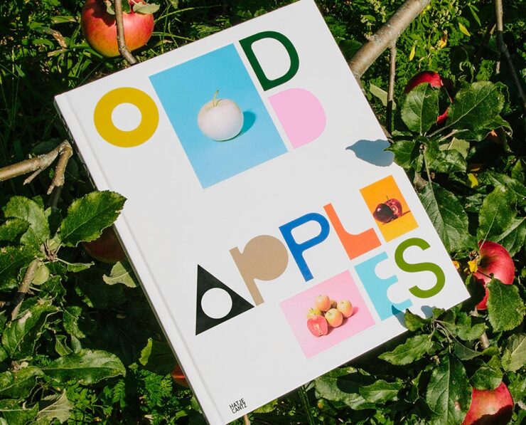
The excellent Odd Apples, which I’m sure I’ve highlighted before — but in a very human way, can’t find.
Special Bonus #1: I had the occasion to recently flip through Pentagram’s book design section. Some seriously interesting, seriously artistic work. (See the Odd Apples listing specifically.)
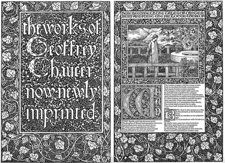
It could probably be argued that computers took book design jobs away, but….
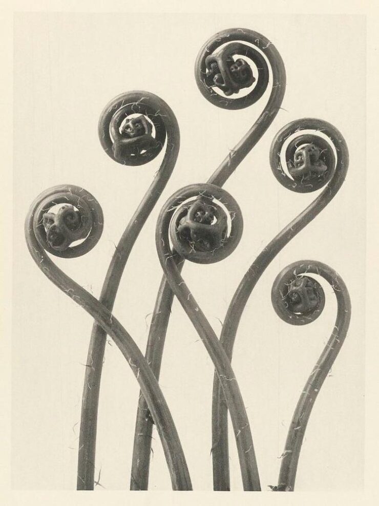
Untitled (Fiddleheads), 1928. Photo by Karl Blossfeldt.
Special Bonus #3: The ever-great Kottke.org. points us at Public Work, “an image search engine that boasts 100,000 “copyright-free” images from institutions like the NYPL, the Met, etc. It’s fast with a relatively simple interface and uses AI to auto-categorize and suggest possibly related images (both visually and content-wise).” As Jason Kottke points out, not great in the attribution department, but good stuff nonetheless.
Mazda’s New Logo
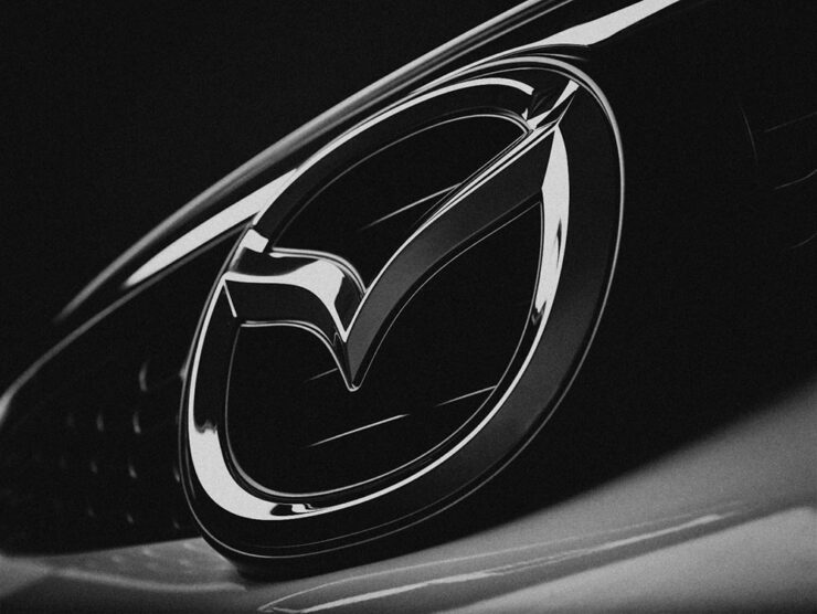
Mazda’s logo as of 2023, seen on one of its cars.
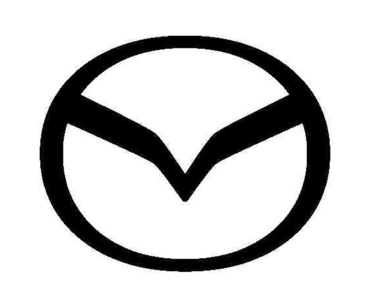
From the automotive logo thread (previously), we have to note Mazda’s new look, reduced from the current 3D-style grayscale to flat and black and white. This one gets some criticism from me: it lacks grace, pace, or space. (Hmph. That might be someone else.)
Angry Bird, anyone? (Pardon the artifacts — this image is enlarged from a Japanese trademark post.)
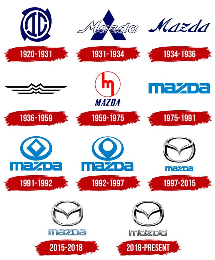
Then again, Mazda has not always been successful with logos. Anyone remember the 1991–1997 version?
Mazda’s complete logo history.
The 1931–1934 version lays the name over Mitsubishi’s logo, which was responsible for sales. The 1975–1991 version is the one I remember best, but that’s likely a youth/rose-colored glasses sort of thing. See Wiki for more information.
Meanwhile, Mazda is trying to move upmarket right now, and the new “look” isn’t really in keeping with that. Curious to see where this goes. (Via The Autopian.)
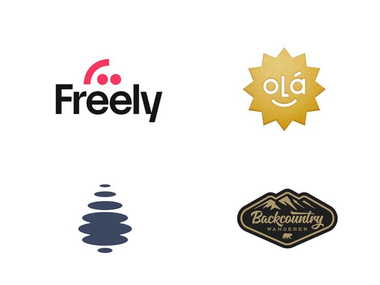
Special Bonus #3:BrandNew points us at the 2024 Logo Trends report, the annual fun item from Logo Lounge that looks at what’s hot in this year’s crop of — you guessed it!
Freely (Smiley category) and Droplet (Elliptic category), left, and Olá and Backcountry Wanderer, right, from the Sticker category. (Olá could be in the Smiley category, too.)
Some of my favorites are above, but the whole report is worth a look. (Spoiler: more than flattening is on trend.)
Auto, Auto+Arch, Arch
Auto Photo Manual
Via Wallpaper*, we have Auto Photo Manual, a new monograph from Benedict Redgrove that “explores the art and science of photographing the world’s most striking cars:”
A very orange Lambo. Photo by Benedict Redgrove.
Always a sucker for a Saab, especially this concept:
The 2006 Saab Aero-X concept. Photo by Benedict Redgrove.
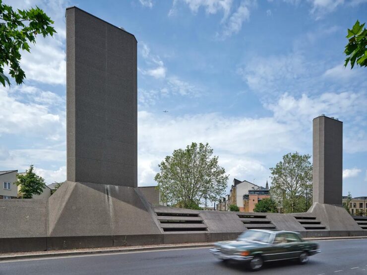
Also via Wallpaper*, we have a “celebration of the European Car of the Year and changing perceptions of modern design, pairing the best buildings of the age with their automotive contemporaries:”
London’s Camberwell Subamarine and the Mercedes W116. Photo by Daniel Hopkinson.
“Through the lens of time, both [cars and buildings] have become highly symbolic of their eras and hindsight will allow us to trace the roots of each design to determine how it is viewed from a 21st century perspective,” says Holroyd, noting that over this period architecture underwent a stylistic retreat, just as car design became emboldened and more avant-garde.
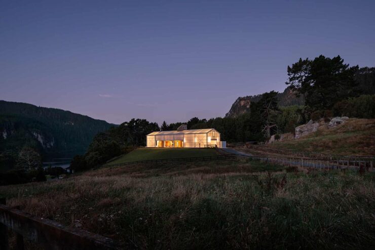
Via The Guardian, we have The World Architecture Festival’s 2024 shortlist, revealing projects from around the world spanning categories such as childcare, energy, transport and science. A couple of faves:
The Chodge by DCA Architects of Transformation — interesting name(s), surely — in Whakamaru, New Zealand. Photograph by Simon Devitt.
The live awards event will take place in Singapore from November 6-8. This year’s finalists represent 71 countries.
Woven Passage to Cloudy Peaks by line+ studio in Shaoxing, China. Photograph by line+studio.
Special Bonus #4: This is Colossalbrings us the drone photography of Eric Waider, shot in Iceland:
As glaciers expand and recede, they have the capacity to grind rock so fine that geologists refer to the pulverized material as glacial flour. It slips down rivers and into lakes, carrying the otherworldly turquoise hue through a unique and resilient ecosystem. In Iceland, the blue-green color is complemented by rivers that flow yellow, thanks to sulfur from nearby volcanoes, or red from dissolved ferrous iron—also known as bog iron. Coursing over rock and black sand, the streams take on dazzling, rhythmic patterns.
Photograph by Erik Waider.
Brilliant. See his website (“Abstract Landscapes of the distant North”) and enjoy that series and more — including faves such as Ocean Blues and Glacial Macro.
The end of March here in Middle Georgia means flowers aplenty, and usually with that, some photography — but I’ve not yet had a chance. (Stay tuned.) I have, however, been saving up links o’ interest: fonts, books, photography, and new(ish) car logos. Let’s go!
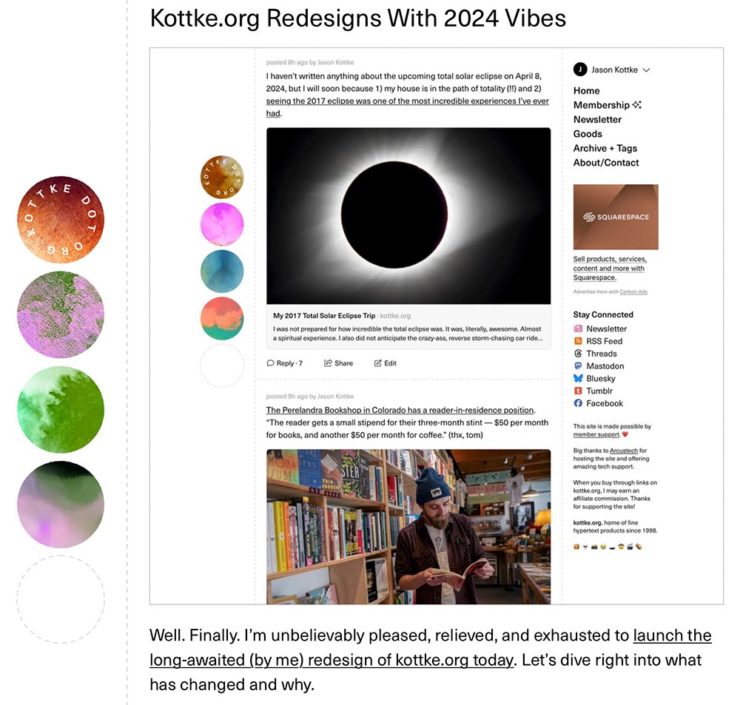
Kottke Meets 2024
Starting with one of the very few places that is still around from Foreword’s old days, the always-interesting Jason Kottke:
2024 marks Kottke.org’s 26th year on the ’net.
Great new looks for great content, with better Quick Links — the previews are ace — and incredibly-appreciated gift links to places like The New York Times and The Atlantic. If you haven’t been in a while, click and enjoy.
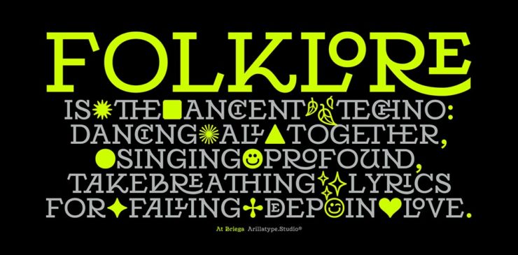
Fab Spring Type
With “a plethora of captivating new typefaces,” CreativeBoom celebrates spring with 11 new faces to tempt, inspire, and bring joy:
Arillatype.Studio brings us a thousand glyphs of greatness.
Zanco, with its bell-bottom style; Seabirds, inspired by 1930s book covers; Module, a “fluke side hustle;” and Graffeur, improvised from gaffer tape and glimpsed in this post’s header image, are all great. My far-and-away favorite, though, is At Briega, “inspired by the concept of hybridisation” and shown above.
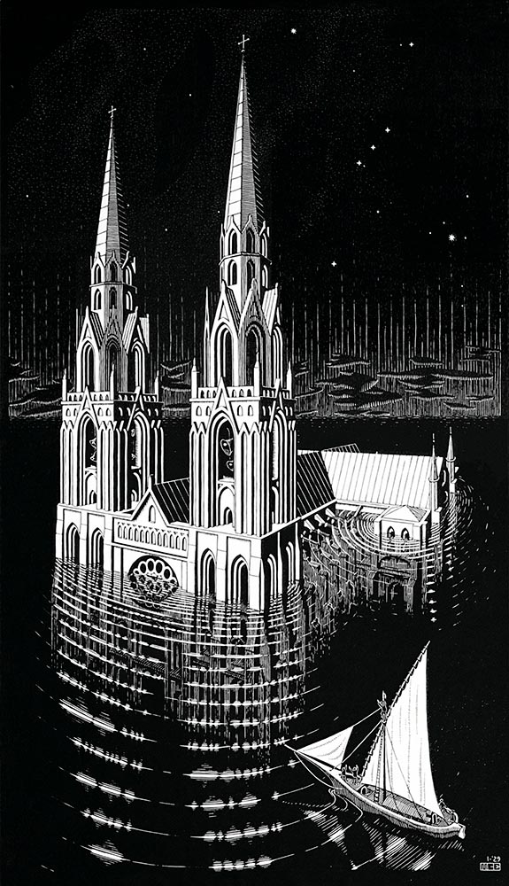
“Unique perspective” never does justice to someone whose name defines the term. See some never-before-seen images alongside old favorites in a new Escher book highlighted at Hyperallergic.
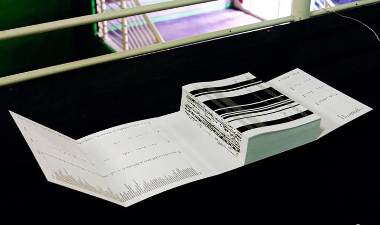
Multidimensional Libri
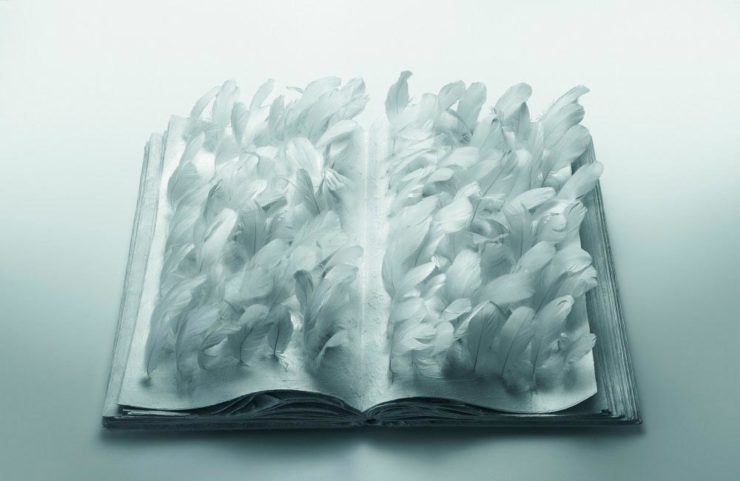
“Experimental books are flourishing, [a]nd the evidence is seen” in this Daily Heller from PRINT: a traveling exhibition on three-dimensional books, all published titles.
“Don’t get held back from the simple pleasures of reading,” argues Natalie Fear at CreativeBloq, “not everything needs to be minimalist.” Justification for commercialism or a common-sense explanation for the bookshelves’ current look? You decide.
Photography Three-Fer
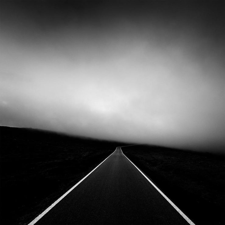
Winners of Monochromatic Minimalism
“Black Pearl” by Sascha Kohne. An honorable mention for the magazine, but a winner for me.
“Traveling through Costa da Morte, Galicia. 600m above sea level where the mountains separate the Cantabria sea from the Atlantic Ocean,” explains third-place winner Alexandre Caetano.
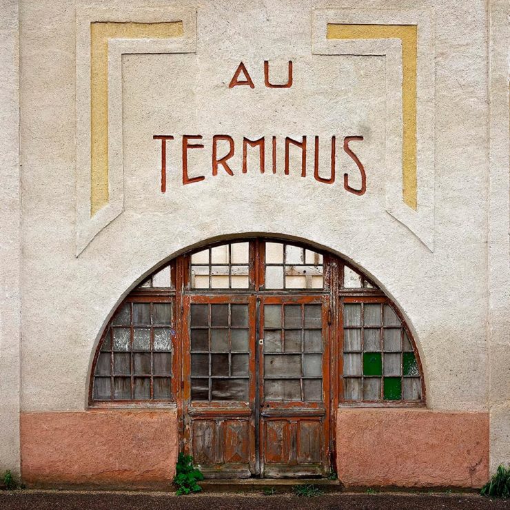
Aging Facades of France
“Shuttered blinds, peeling paint, and aging doors don’t usually indicate an invitation, but for French photographer Thibaut Derien, the fading facades of long-closed shops are well worth a stop,” This is Colossal says.
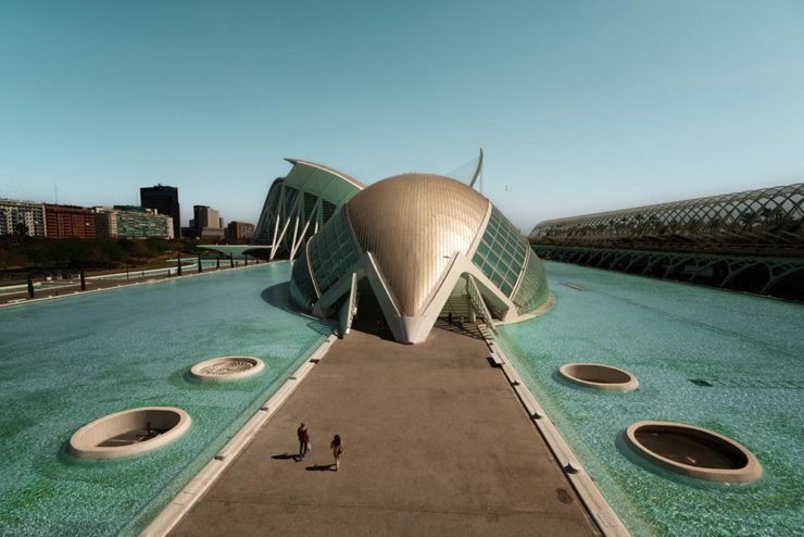
Sony Photography Awards: Architecture
The Ciudad de las Artes y las Ciencias (City of Arts and Sciences) in Valencia, Spain: “Hemispheric,” by Eng Tong Tan, Malaysia.
ArchDaily‘s coverage of the annual Sony awards shortlist announcement was an insta-click.
New Bull: Now Flat. (And a BMW.)
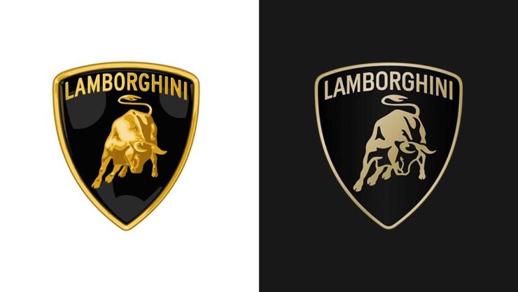
Lamborghini practically defines flamboyant. So it’s worth a link when their logo gets less interesting:
Old logo, left, new, right.
Late at following the industry trend of flat-is-better, because, well, Volkswagen. (Okay, I undersell. Perhaps.) Read the lack of news at Motor11Motor1 also has a decent roundup of new car logos, from 2016-present, which underscores the “flatness” trend. or The Drive, where they manage to convey the brand’s use of the phrase “digital touchpoints.”
I don’t know whether this will make any more sense in a few or even many months — which is relevant because of BMW. Four years ago, one of the industry’s design leaders expressed strong this new style, and I didn’t get it. But it’s worn better than most, and superlatively on occasion — check out the logo’s use on the Vision Neue Klasse X:
Rather than a standalone, plastic part sitting on the paint, it’s etched into the finish. Man, I hope that makes it into production.
Neue Klasse: do like. Bull? No so much.
Update, 2 April:BrandNew, itself sporting a new look, has weighed in on the new Lambo style, calling it “not good.” (FYI, BrandNew is a subscription, quite possibly the best $20/year someone interested in design can spend.)
1
Motor1 also has a decent roundup of new car logos, from 2016-present, which underscores the “flatness” trend.
This time, book design times two, book cutouts, album covers, and a reflection on my 2023 photographs. It’s one of those Februaries, so let’s leap into it.
Jodi Hunt’s Great British Design
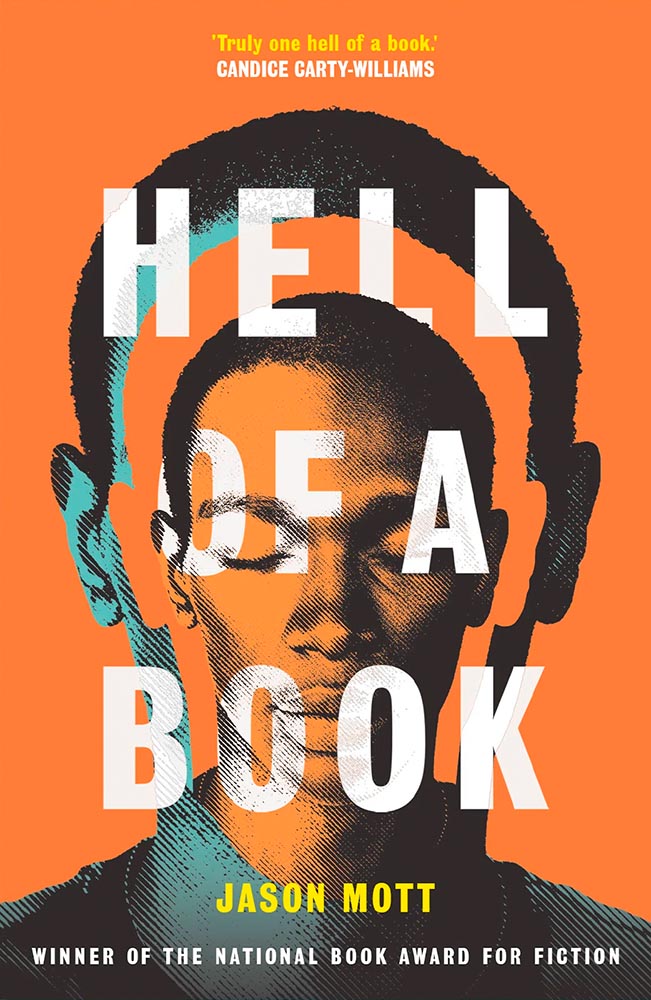
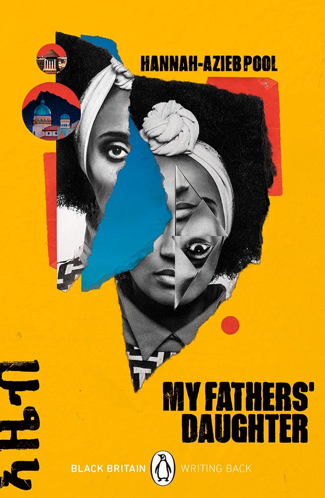
Screen print by Kate Gibb, lettering by Jodi Hunt, and photograph by Adaeze Okaro.
You might recognize the above book cover from my 2023 Favorite Book Covers post, a fantastic series of choices that speak to all colors while definitively saying, “Black.” It’s Nice That has a short post talking about Jodi Hunt, who designer that cover — and more.
Design by Jodi Hunt.
The screen printing is prominent here, too, and the interaction between that and title are, to borrow a Britishism, “ace.” And the below, with its slightly haunting image treatment (and that great text, lower left), also earns kudos:
Design by Jodi Hunt.
Great design, deservedly highlighted. See the other examples here.
The original Book Design
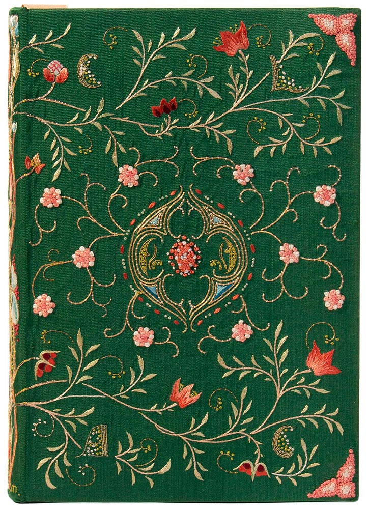
Ernest Lefébure, Embroidery and Lace: Their Manufacture and History from the Remotest Antiquity to the Present Day (1888), with binding created by May Morris
Before there was book design, or even graphic design — that is, when books and pages were thought of as art instead of design — folks were still coming up with great book covers. The Grolier Club, “America’s oldest and largest society for bibliophiles and enthusiasts,” has a wonderful exhibit of cover design . . . made up exclusively of antiques.
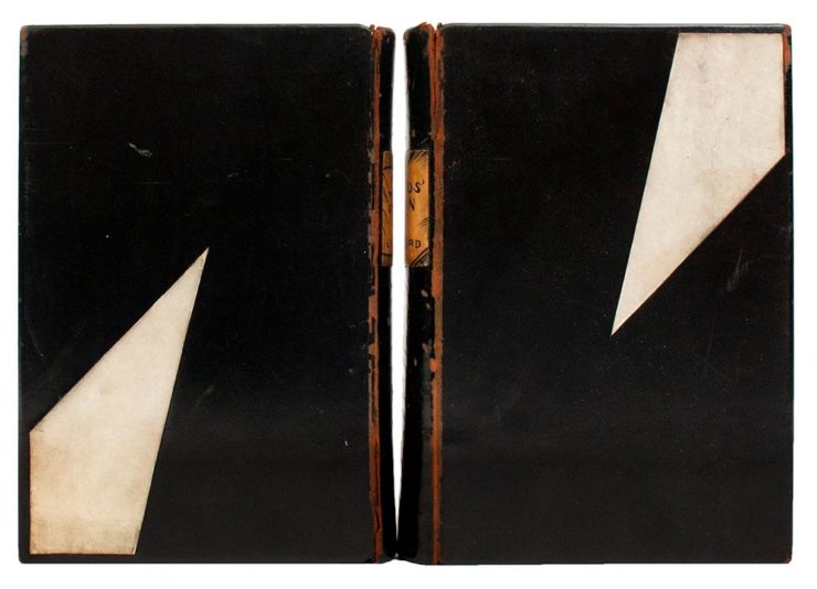
Lynd Ward, Gods’ Man: A Novel in Woodcuts, 1929, and Madman’s Drum: A Novel in Woodcuts, 1930.
One of the most memorable artworks […] is a sumptuous but comparatively delicate volume, a 1643 book of psalms created in London. Atmospheric exposure usually turns white silk-bound editions tan and brown, but this cover is a shiny cream color. The polychrome silk and gold metallic threads, which wind around one another to form a colorful floral pattern, maintain an eye-catching vibrancy. The only sign of the book’s age is the oxidized silver “stumpwork,” a type of raised embroidery that in this case resembles beading.
— Elaine Velie, Hyperallergic
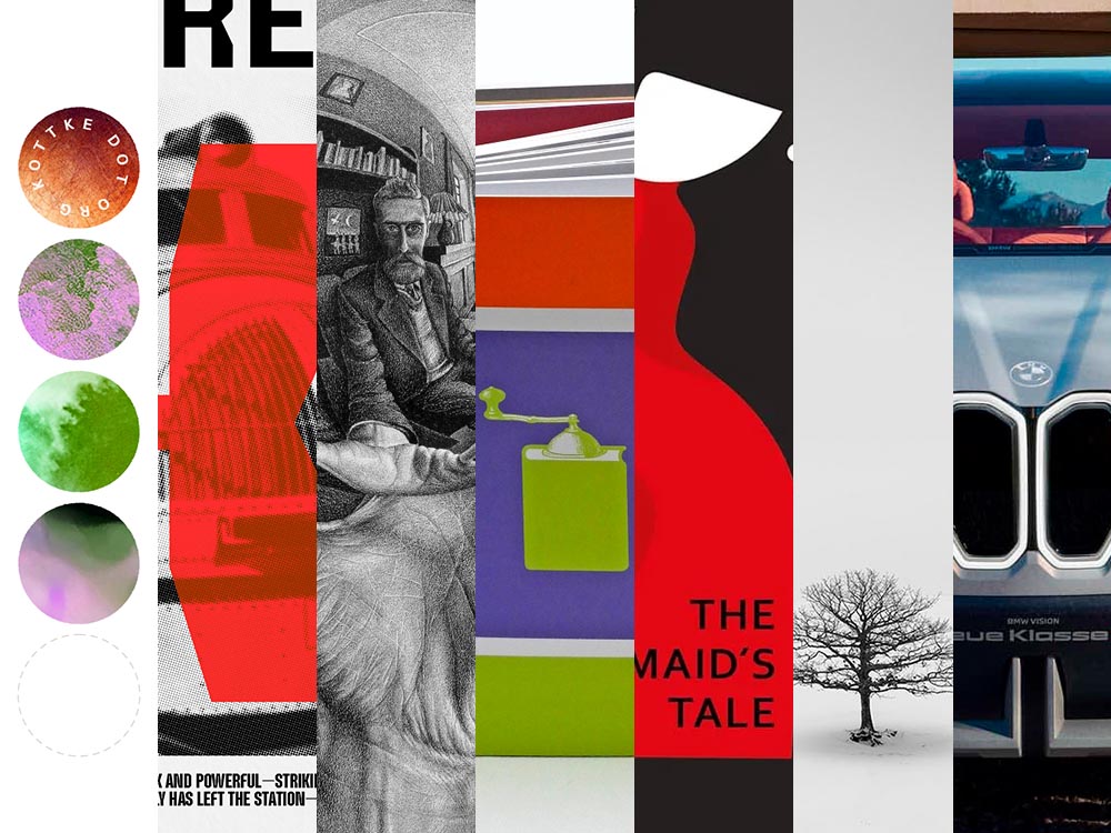
The quote above refers to the book in this month’s cover image, second from left, and is but one where what you see isn’t necessarily what you think it is — it’s more complex, more interesting, made with what the artist had available in the day. Great reminders, all, that book design has a much longer history than what we think of when we hear the term.
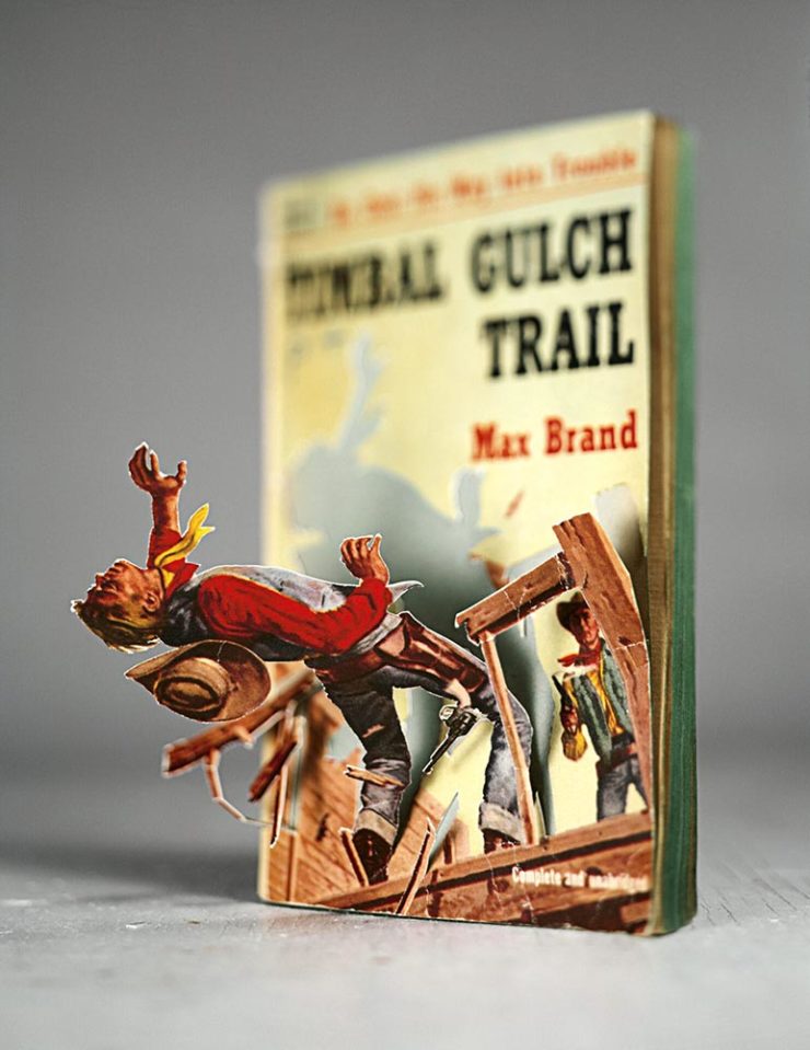
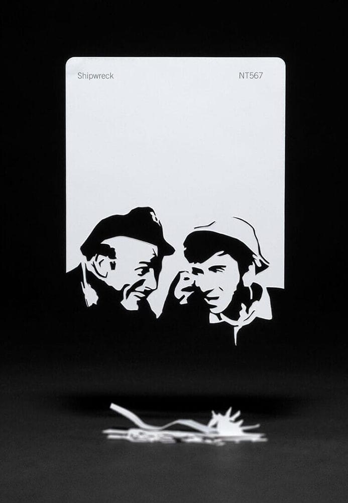
“Meticulous incisions and methodical folding allow scenes to arise from aged books and color swatches in Thomas Allen’s paper cutouts,” This is Colossal notes — but a picture is worth a thousand words:
Timber by Thomas Allen.
The vintage paperback work happened by complete accident. I was cutting into a pulp novel one afternoon with the intent of removing the illustration completely when I noticed that if I left some areas attached, folded the parts carefully, and looked at them from a single vantage point so that everything aligned, they created the illusion of 3D pop-ups. Everything snowballed from there.
— Thomas Allen, via This is Colossal
The three-hour cutout: Shipwreck, by Thomas Allen.
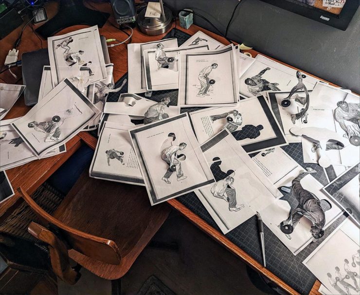
Here’s his desk — whoa:
Test cutouts in Allen’s studio, via This is Colossal.
The Article’s Great — but the Headline is the Point.
“Virality over Creativity.” Few things summarize the last few years more — it’s always about getting eyeballs, not about truth or quality. It’s satisfying the algorithm. Because, of course, these days, media is social.
Real or AI?
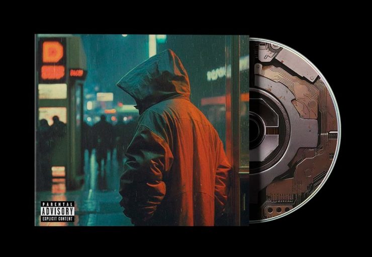
POV, a new series of articles from It’s Nice That examines, in this case, creativity and AI in design for the music industry. “If an artist isn’t putting a piece of themselves and their experience into the work,” it asks, “why should anyone care?”
All valid questions, yes. But it’s the headline that provides another potential word of the year: virality.
The times we live in . . . .
Some of my Favorite 2023 Photographs
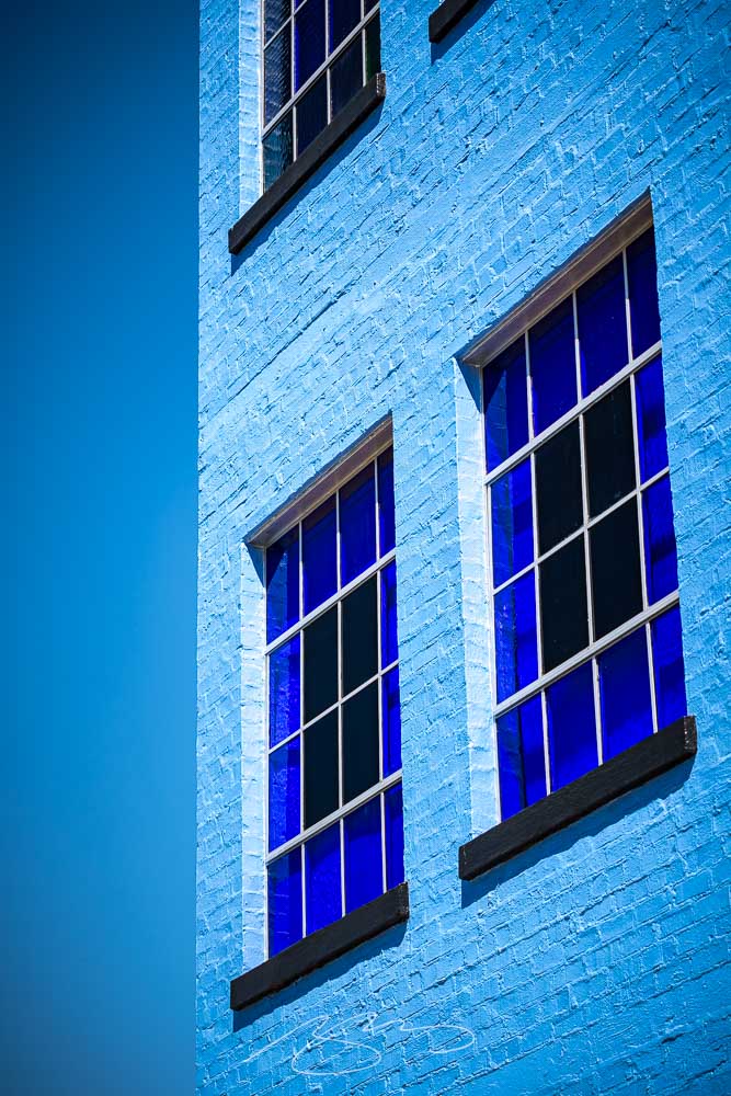
I’ve updated my photography page with my favorites of 2023, including these two:
Blue Against Blue Against Blue, 943 Ellis St.
The above, taken in Augusta, is architecture that doesn’t make me feel blue, while the below, taken on the main street in Sparta, does:
Bulb Moment, 12745 Broad St.
A couple of reflections: I didn’t get out as much as I did in 2022, and regret it, and have somehow pretty much eschewed both black-and-white and effects (film grain, light leaks, etc.), and kind of regret that, too. Both things to do differently in 2024.
That said, six years after investing in a different style of photography, I’m settling in — and looking forward to the future. I hope you are, too.
In this installment, Honda’s new(ish) logo, the Travel Photographer of the Year 2023 winners, and the Macintosh turns 40. Plus, one more thing. But first:
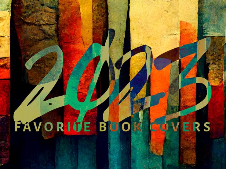
My Favorite Book Covers of 2023
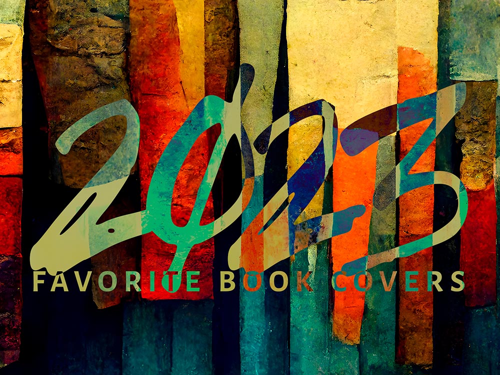
In case you missed it, the annual favorite book covers post is up — all 78 items (plus some extras). It’s best viewed large, so click and enjoy.
Honda’s New Logo: Not a Zero
Not a zero — an “H.” Clever(ish).
As car manufacturers go, Honda’s tiny. As a result, they’re way behind on the electric push: they’ve got some hybrid stuff, a hydrogen fuel-cell item only available in California, and a new battery vehicle built by GM. Not where you want to be in 2024.
So they’re trying to make a splash. And to their credit, they’re doing it in an attention-getting style. Introducing the Honda Zero series, starting with the Saloon:
Futuristic indeed.There’s no mistaking this for an Accord — but then, that’s the idea.
And the Honda Zero Space Hub:
Not minivan, Space Hub. (The no-rear-window thing is becoming a trend, alas.)
Other Zero Series cars will follow, and of course, being concepts, details are scarce. Both concepts, however, highlight a new logo for Honda’s EV effort:
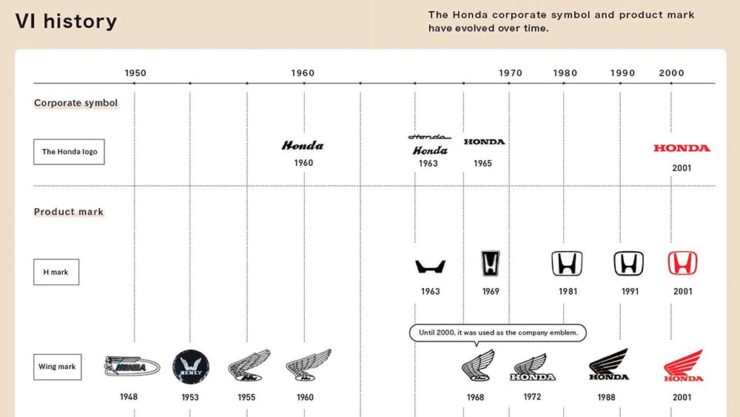
Yeah, not earth-shattering. (And distinct from the Zero-series logo, above, which does not seem to appear on the cars — only marketing materials.) Here’s a history, for reference:
It’s worth noting that the non-electric cars will retain the current logo they’ve used since 2001. Read more at Motor1 or The Drive. (The latter has more on Honda’s Zero cars, too.)
2023 Travel Photographer of the Year (Contest)
Disclaimer up front: it’s another pay-to-enter photography contest, which seem to have proliferated. The problem here is the outstanding quality of output — perhaps I should just get over it and move on.
The rules of this one require both prints for final judging, no composite images, no AI, and a RAW file to check results against. All of which mean, to me at least, a higher level of achievement in order to enter. Okay.
Shout out to the BBC for bringing this year’s winners to my — our — attention.
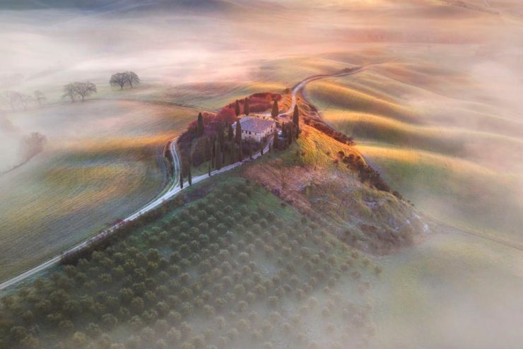
Travel Photograph of the Year 2023 overall winner: AndreJa Ravnak, Slovenia
Slovenia is a beautiful country, and AndreJa Ravnak’s winning portfolio of photographs absolutely reflects both that and its hard-working agricultural nature. But there’s more:
Nature, Wildlife, and Conservation Portfolio Winner: Martin Broen, USA
A “ray of sunshine” joke here . . . .
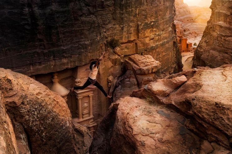
Leisure and Adventure Winner: Andrea Peruzzi, Italy
Certainly a lesson in how not to enjoy the wonderful city of Petra, in the Jordanian desert — but an attention-getting photograph.
Landscape and Environment Portfolio Winner: Armand Sarlangue, France
Seriously amazing stuff: moody, dramatic, and yes, fluvial morphology. Nice.
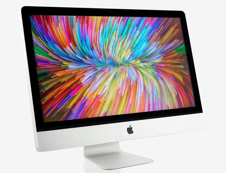
1984 seems like so very long ago — and let’s face it: 40 years is a long time. Indeed, these forty years of technological progress has been unrivaled in human history. But the Mac is not only still with us but better than ever.
We believe that [this] technology represents the future direction of all personal computers,” said Steven P. Jobs, Chairman of the Board of Apple. “Macintosh makes this technology available for the first time to a broad audience–at a price and size unavailable from any other manufacturer. By virtue of the large amount of software written for them, the Apple II and the IBM PC became the personal-computer industry’s first two standards. We expect Macintosh to become the third industry standard.
— Apple Computer, January 24, 1984
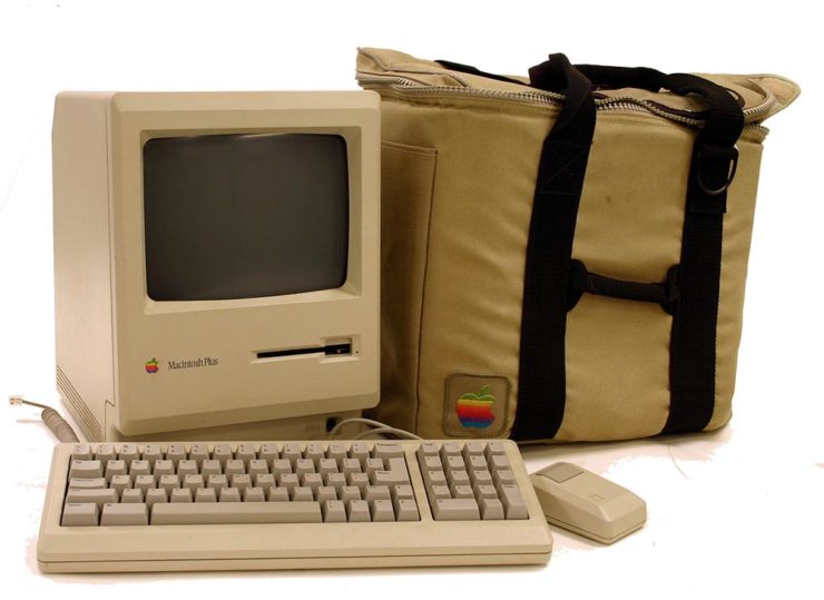
My first Mac was the one pictured above: a 1989 Mac Plus, with an external 20MB (!) Jasmine hard drive. (I even still have the case, although mine was a black Targus item.) It didn’t last long, though, because I’d been bitten by the graphic design craze and soon traded it for a Mac called a Quadra, with its separate 256-color monitor.
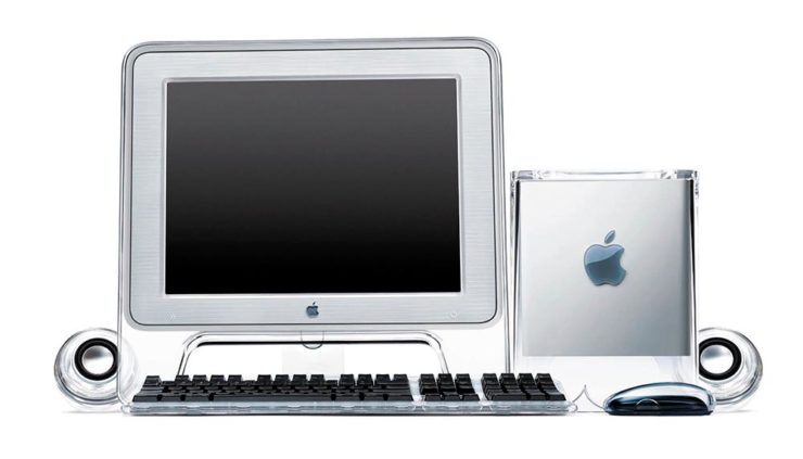
A preview of the future: 2000’s PowerMac G4 Cube.
Such was the pace of technology those days: that one was replaced with another, then another. (Including one of the Macs pictured at the top of the post. Bonus points if you know which it is.) I did not have the G4 Cube, pictured above, because by then I was rocking a tower and scoffed at Apple’s first attempt at desktop miniaturization — not to mention the inferior quality of the first generations of flat screens.
All-in-ones were — and remain — the domain of Apple’s iMac.
But less than ten years later, the computer had become part of the flat screen, and these days, I’m still using a 27″ iMac. Sure, its days are numbered, but I love its ability to get huge book and photography projects out the door with a minimum of fuss — all in a simple, elegant package with very much more than a passing resemblance to the original Macintosh.
Here’s to another 40 years, Apple. Congrats.
Special Bonus: There are few folks more “Mac” than John Siracusa, who has penned a thoughtful piece on AI: “I Made This.” (Via Pixel Envy.)
One More Thing: Word of the Year, 2023
From none other than Cory Doctorow: “enshittification.”
Here is how platforms die: first, they are good to their users; then they abuse their users to make things better for their business customers; finally, they abuse those business customers to claw back all the value for themselves. Then, they die.
— Cory Doctorow, Pluralistic, 21 January 2023
He’s specifically referring to TikTok, and cites Amazon and then Facebook as further examples, but oh, so many, many other items apply. I’ve not read something that represents where we sit — in America, sure, but beyond — at the start of 2024.
And this year promises to be a doozy.
“‘Monetize’ is a terrible word that tacitly admits that there is no such thing as an ‘Attention Economy,’” he writes. And yet, “monetize” is where business, education, and perhaps society is at. Ug.
The whole thing is fantastic and very much worth a read. But, “[n]ow that [they] have been infected by enshittifcation, the only thing left is to kill [them] with fire” might be taking things a bit far. Let’s hope — and work — for a better solution. For all of us.
2023 seemed to go by with greater speed than normal, meaning the process of accumulating my favorite book covers occurred more hastily than I would have sometimes preferred — after all, perusing the best of the new releases is tremendously enjoyable. It’s just that, due to this year’s hefty undertakings, I was not able to make as much time as I’d have liked.
So I was surprised when, in early January, the tally of candidates in the favorites folder was over two hundred items. A bounty of goodness.
Narrowing those down to the list below was exceptionally difficult. I tried to get to last year’s limit of 70 titles, but failed; I managed to narrow it to 80, then 78, but just couldn’t winnow any further.
Pull up a chair. This one’s gonna take a minute.
Please remember that these are my favorites — others might say “best,” but I’ve been in this business long enough to know that there’s always another title you haven’t seen or read about, and I don’t want to disrespect any of the talented book designers not on this list. I’ve tried to include design credit where I could — special thanks to the folks who answered emails with that information — and wish to stress that any mistakes in the list below are mine.
Note: If you’re on Foreword’s main page, please click on the post title, above, to view this list. You’ll get larger covers for your viewing pleasure.
My Favorite Book Covers of 2023 (three-way tie)
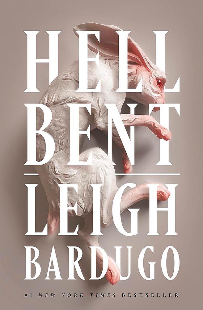
Design by Keith Hayes with art by Sasha Vinogradova.
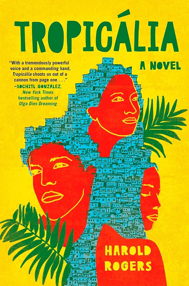
“Find a gateway to the underworld. Steal a soul out of hell. A simple plan,” the Amazon description starts, and it’s a sequel of magic, secret societies, and whatever else.
But never mind all that. This cover grabbed my attention in a way few do, with its combination of art, shadow, and type, all carved to perfection.
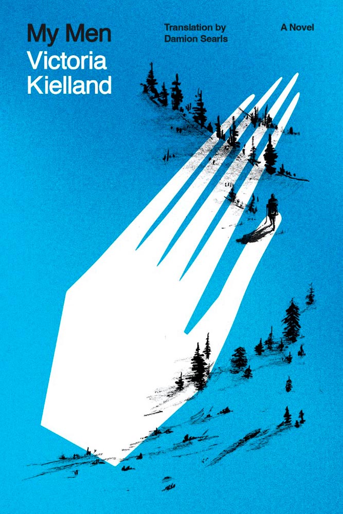
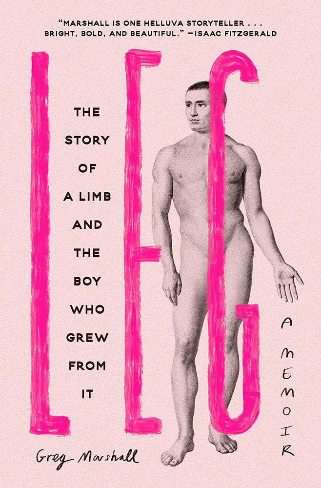
Design by Oliver Munday.
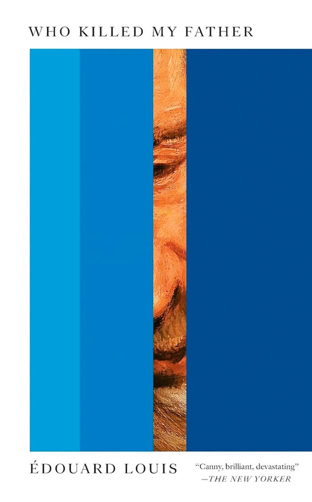
I dare say that only Oliver Munday could have done this expression of so much with so little. Enormously appropriate, then, for a memoir only 64 pages long.
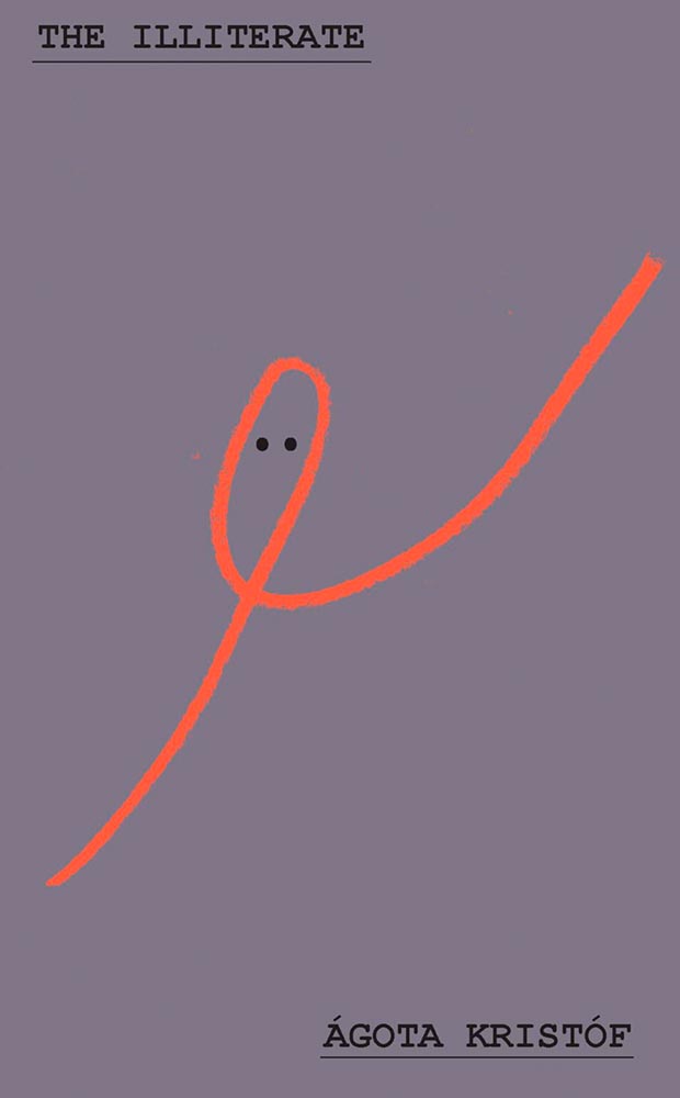
Design by Adriana Tonello.
From The Illiterate‘s Hungarian refugee in Switzerland we move to a Norwegian immigrant seeking freedom in America. Alas, she turns out to be our first (known) serial killer — giving this hand a quiet, eerie yet somehow classic quality that quietly compels like few others. Outstanding.
Other 2023 Favorites, in alphabetical order:
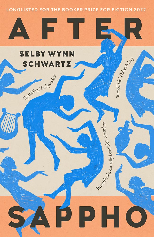
Design by Holly Ovenden.
Impressive sense of movement from these figures, whose interplay with the title type combines with quotes-on-a-path (something of a trend this year) and great color choices to provide something memorable.
Design by Keith Hayes.
Such a simple concept. Such superlative results. No other concerns.
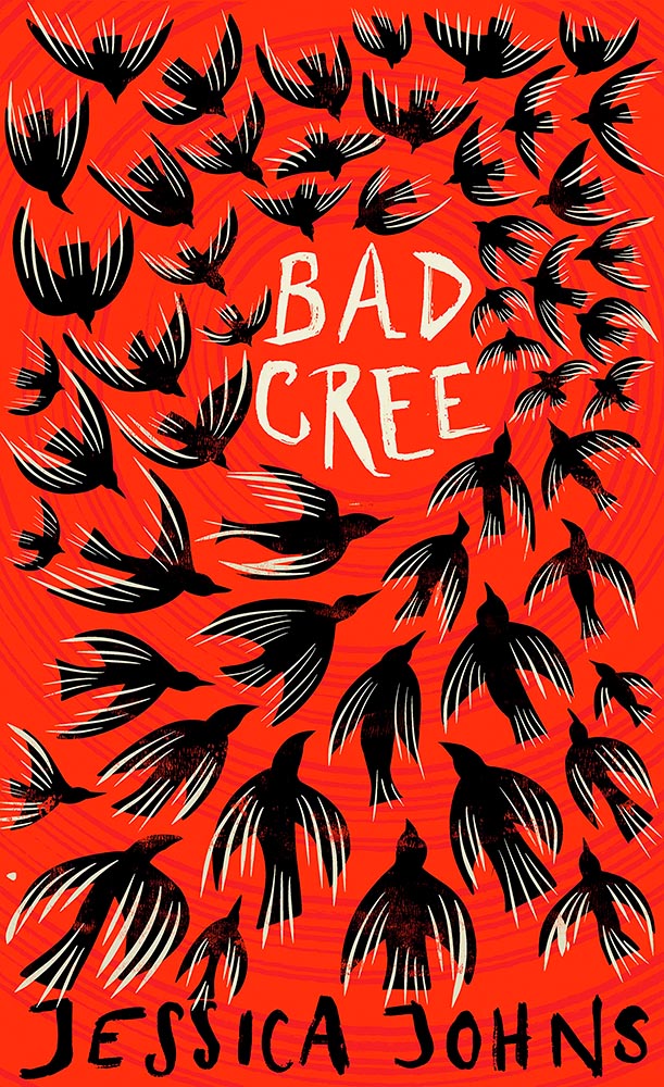
Design by Holly Ovenden.
There is another version of this on one of the “best of” lists, but I much prefer this one, with the circling birds and hand-done lettering. A two-color triumph.
Design by Oliver Munday.
Oooollllliiiiivvvvvveerr!
Design for the US version by Anna Weyant.
One of those examples where the art just shouts off the shelf, although the type treatment works exceptionally well, too. Better still, it’s one of the rare US versions that bests its UK treatment:
Design for the UK version by Kishan Rajani.
Not at all bad — in several “best of” lists, in fact. Just not mine.
Design by Sarah Wood.
I’m not sure whether the items on the page are models, made (or found) objects, or some extremely well-done Photoshop work, but ultimately it’s combination of the simple graphics and brilliant typographic treatment that earned this title its spot. Fantastic.
Design by Caroline Johnson.
The ’70s are hot right now, but this is 2023, aged to perfection. Very nearly made the “best of,” not just the “best of the rest.” Horrifically good.
Design by Oliver Munday.
Type, color, pattern, brilliance. Must be a Munday.
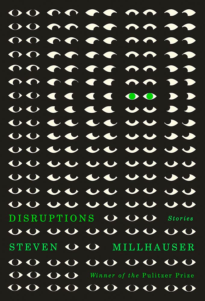
Design by Dylan C. Lathrop.
Eyes are a frequent guest on book covers. Rarely so many, though, and rarely in two-color. Winner of more than a Pulitzer.
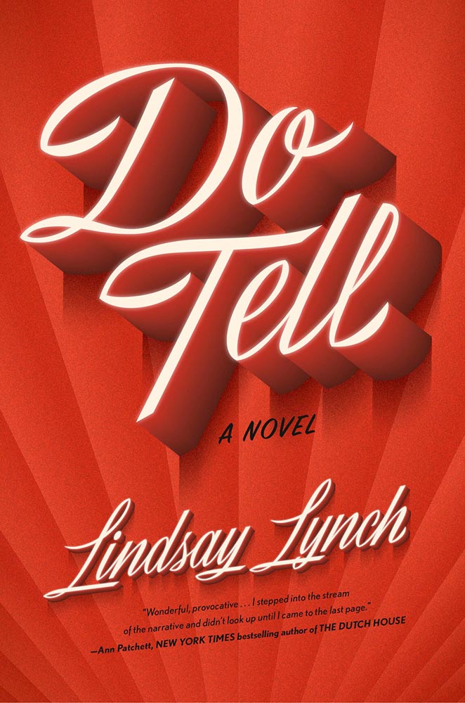
Design by Emily Mahon, lettering by Martina Flor.
Edie O’Dare does tell, it turns out. “Cinematic” might be a cliché, but….
Design by Pete Garceau.
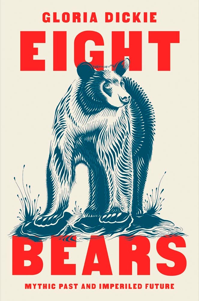
I’m a sucker for a great woodcut-style illustration. Great type treatment propels it into a standout book cover.
Design by Ingsu Liu.
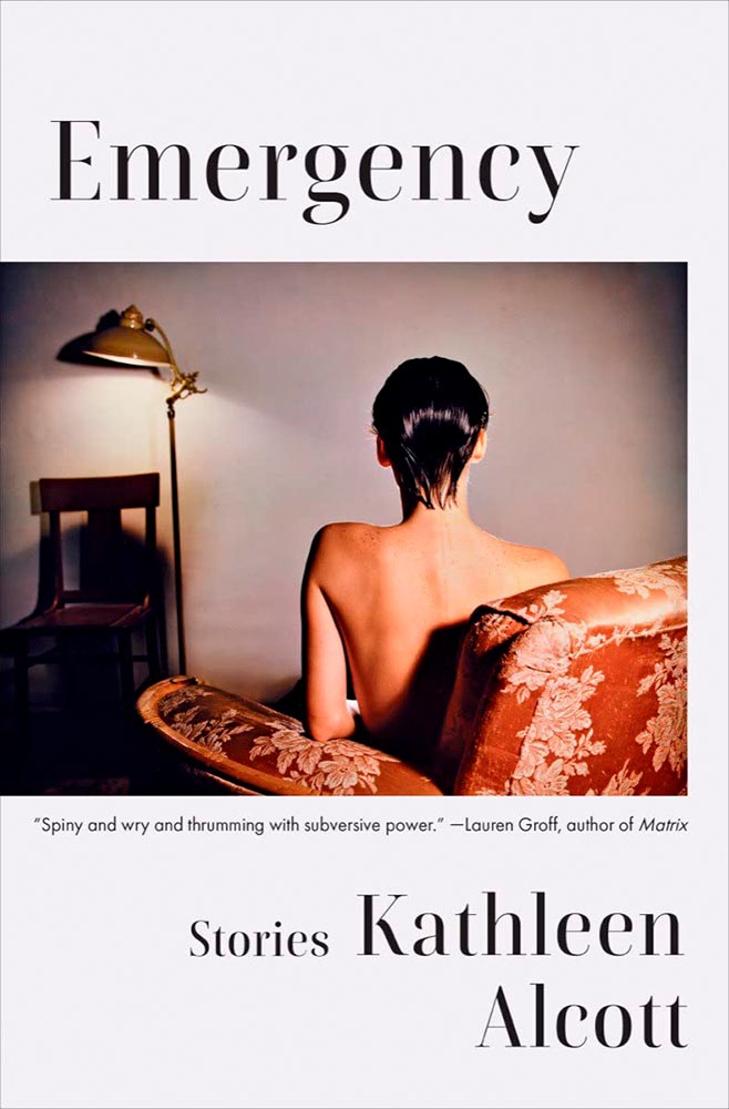
There’s something decidedly non-emergency about this, yet once you understand, it works perfectly: simple, yet so very not.
Design by Eric C. Wilder.
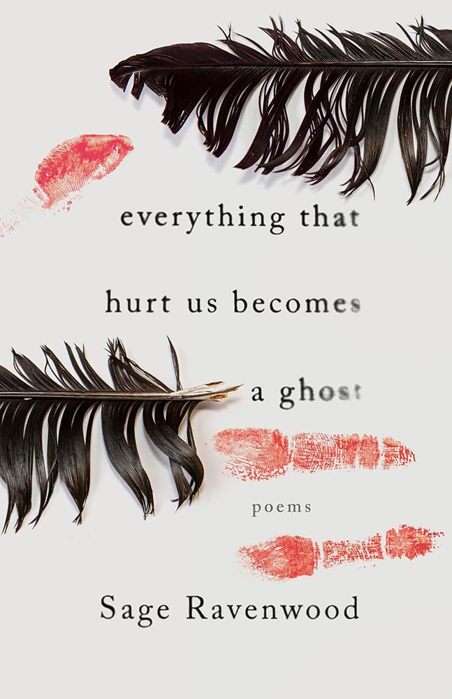
This book of Native poetry ranges from Missing and Murdered Indigenous Women (MMIW) to reverence to the natural world to “the machinations of colonialism,” a cover assignment that could border on impossible. Yet, here . . . absolutely brilliant. Expressive and so much more, including possibly my favorite type treatment of all on this list.
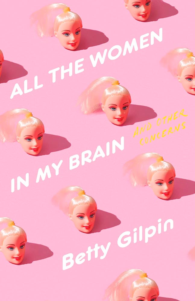
Design by Arsh Raziuddin.
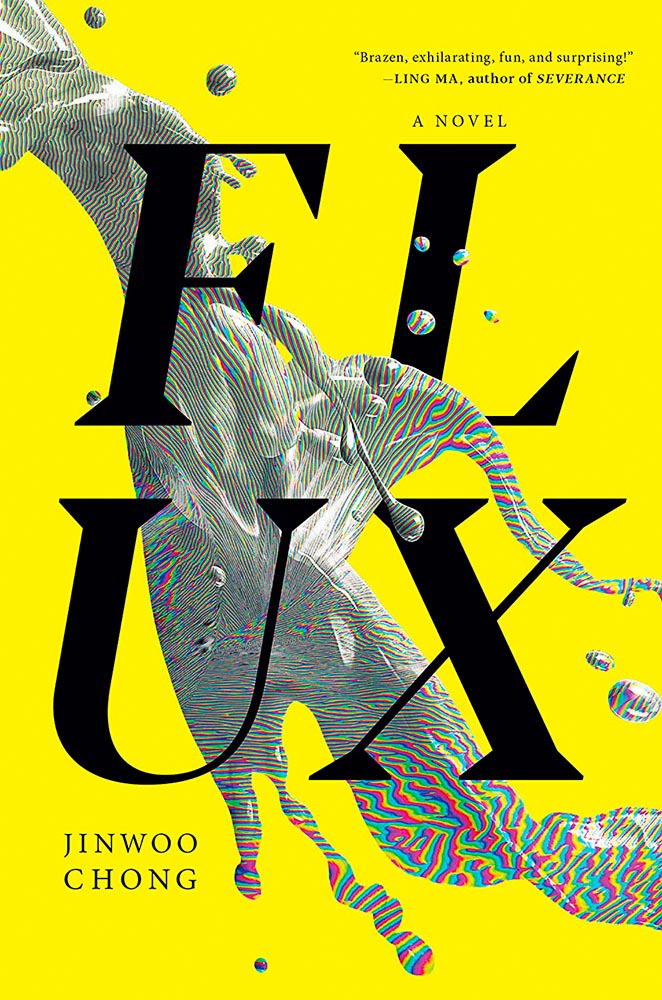
Danger: UXB. (The pink is an inspired choice, too.)
Design by Tom Etherington.
Fear knows no bounds, only stylish hats. (On the LitHub list, someone said it has “serious 2024 vibes,” which I’m concerned may turn out to have some truth to it.)
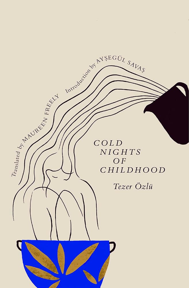
Screen print by Kate Gibb, lettering by Jodi Hunt, and photograph by Adaeze Okaro.
Rarely have photo and type worked so well together. Fantastically well done, with plenty of room for the soon-to-be-added kudos, quotes, and awards.
Design by Beste Miray Doğan.
Who splits a four-letter word onto two lines? Someone after great results, as it turns out — with bonus points for the pattern and color in the “splash.” Nice.
I’m at a bit of a loss to describe why I like this so much, except that every time I look at it, I like it even more.
Design by Kate Sinclair.
Perfect execution of a simple concept, from colors to art to type.
Design by Devin Grosz.
Wins the “best-placed title” award, among so many others.
Design by Greg Heinimann.
A reminder that something done often can still be done with originality — and incredibly well.
Design by Emily Mahon.
The collage-as-book-cover is another (perhaps) overused item, but when in the hands of Emily Mahon, this one looks you in the eye and won’t let go.
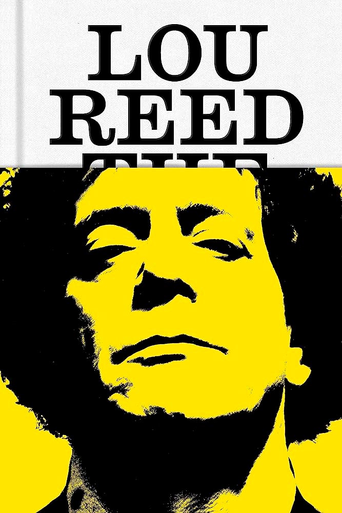
Design by No Ideas.
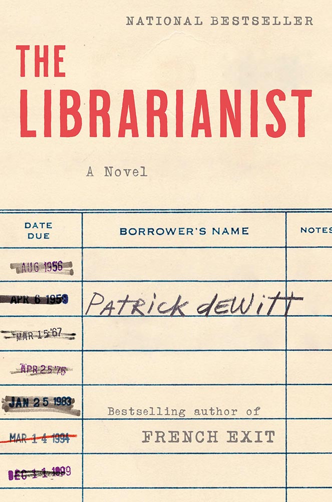
The jacket that covers The King of New York with . . . Lou Reed. “Well played” seems like an undersell.
Design by Janet Hansen.
From the textured paper to the type choices, this cover’s great. But with that photo choice, it’s vaulted into “best” category.
Design by Alex Merto.
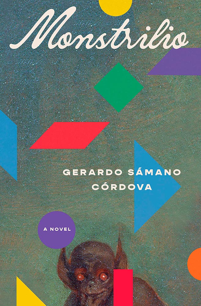
The combination of geometric shapes and unexpected typography mean this little guy will never get painted into a corner.
Design by David Drummond.
“Type here,” someone said.
Design by Oliver Munday.
Type-as-a-border is a trend — one I’m surprised to see on a Munday — that’s actually a great counter to the purposely irreverent illustration. I dig it.
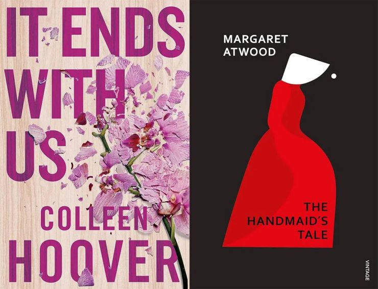
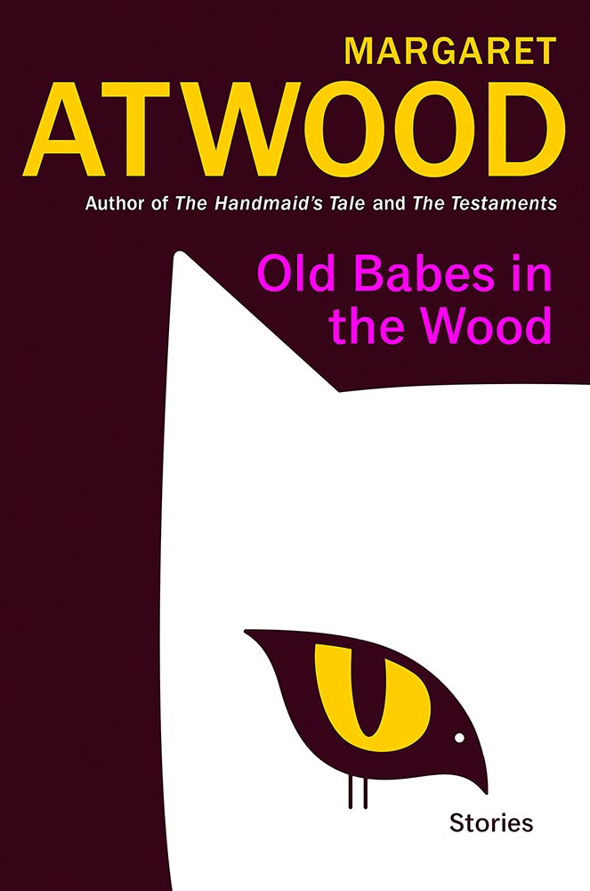
Bird-as-cat’s-eye. On a Margaret Atwood. ’Nuff said.
Design by Luke Bird.
Brilliantly, uh, substantive: a lesson in how-to.
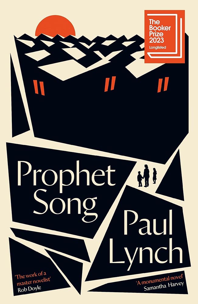
Design by Jack Smyth.
The rooftops alone make this, but avoiding the stereotypical Irish colors is a huge bonus, too. (This title went on to win the 2023 Booker Prize, by the way.)
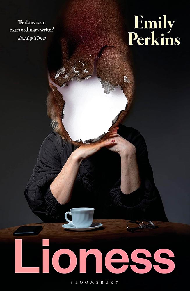
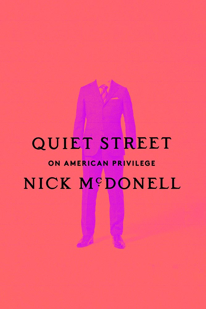
Design by Janet Hansen.
A triumph of the less-is-more approach, starring a headless human and superlative typography. Fantastic.
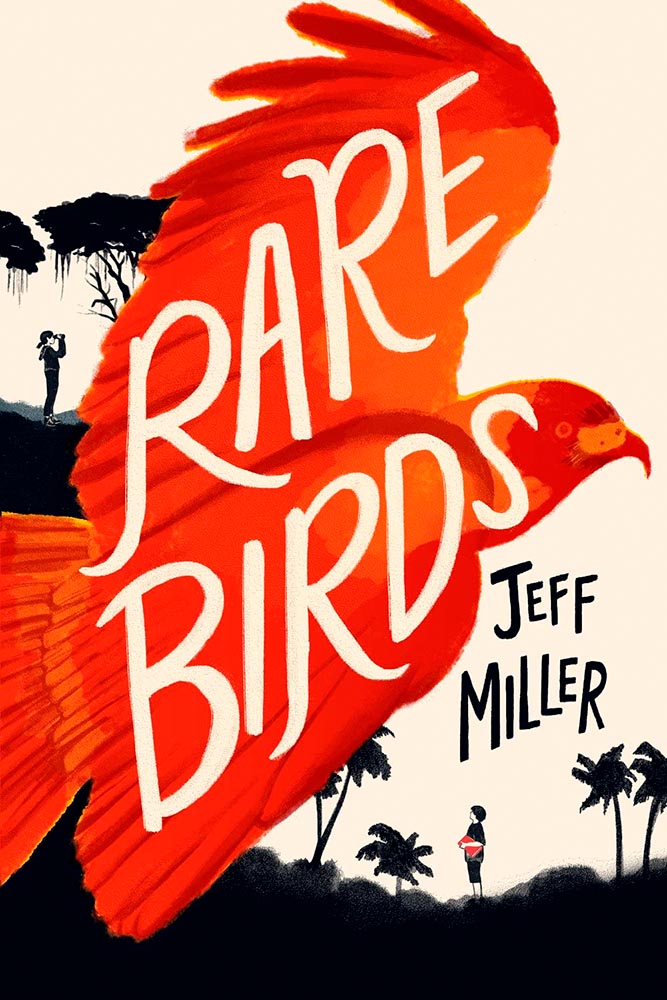
Design by Kimberly Glyder.
It’s rare to see children’s literature graced with such a great cover — this one literally flies off the shelf to grab your attention. A rare bird, indeed.
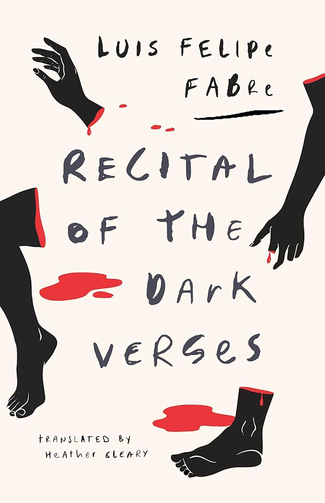
Design by Alban Fischer.
St. John called: this cover is fabulous, from evocative body parts to hand-lettering to die for. Awesome.
Design by Will Staehle.
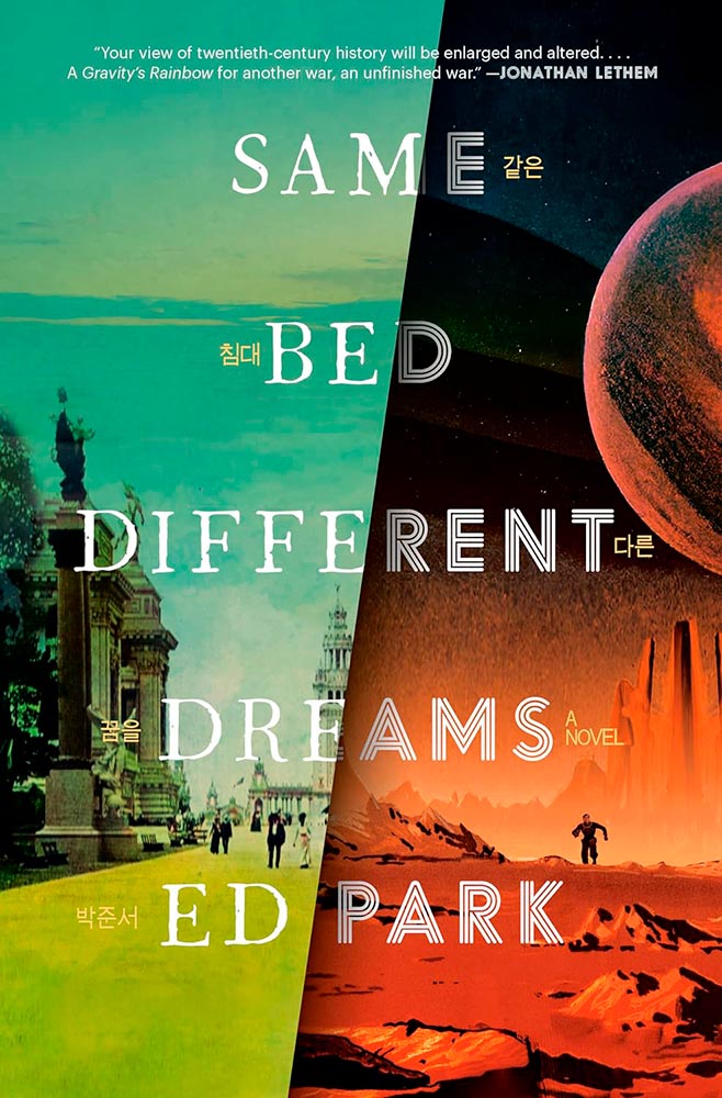
A novel on the Korean Provisional Government — and so very much more. The split treatment, with both halves running at 11, get fantastic typography and the Korean characters (in gold, obvious in person) are a great touch.
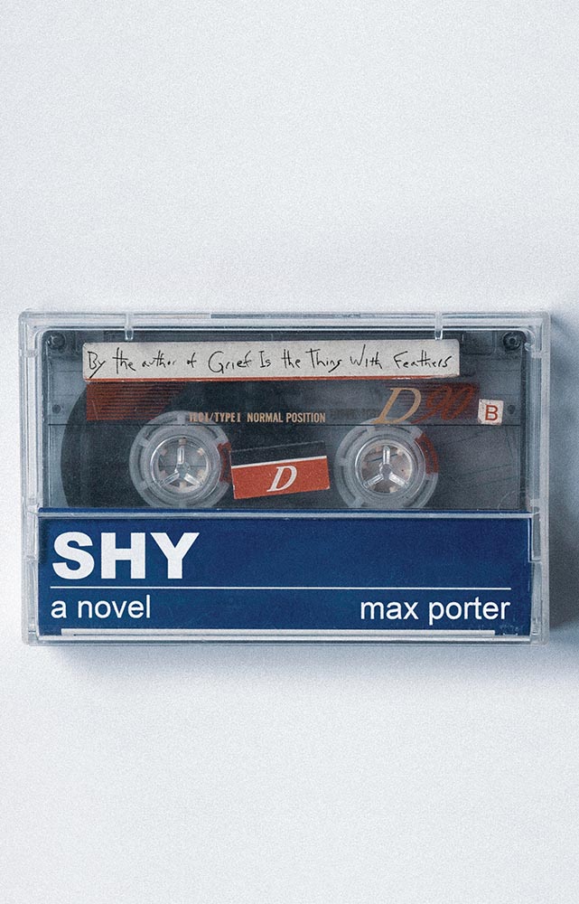
Another where the US version shines, especially as cassettes are coming back into fashion. (Special points for the subtitle-as-label.) A B-side no longer.
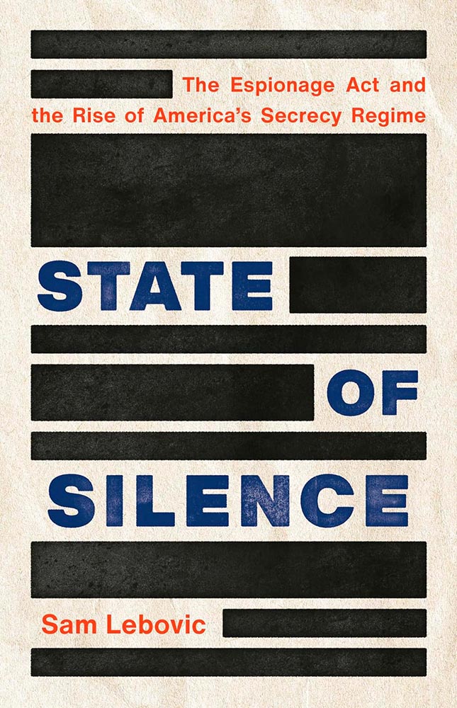
Design by Emmily O’Connor.
Brilliant comment redacted.
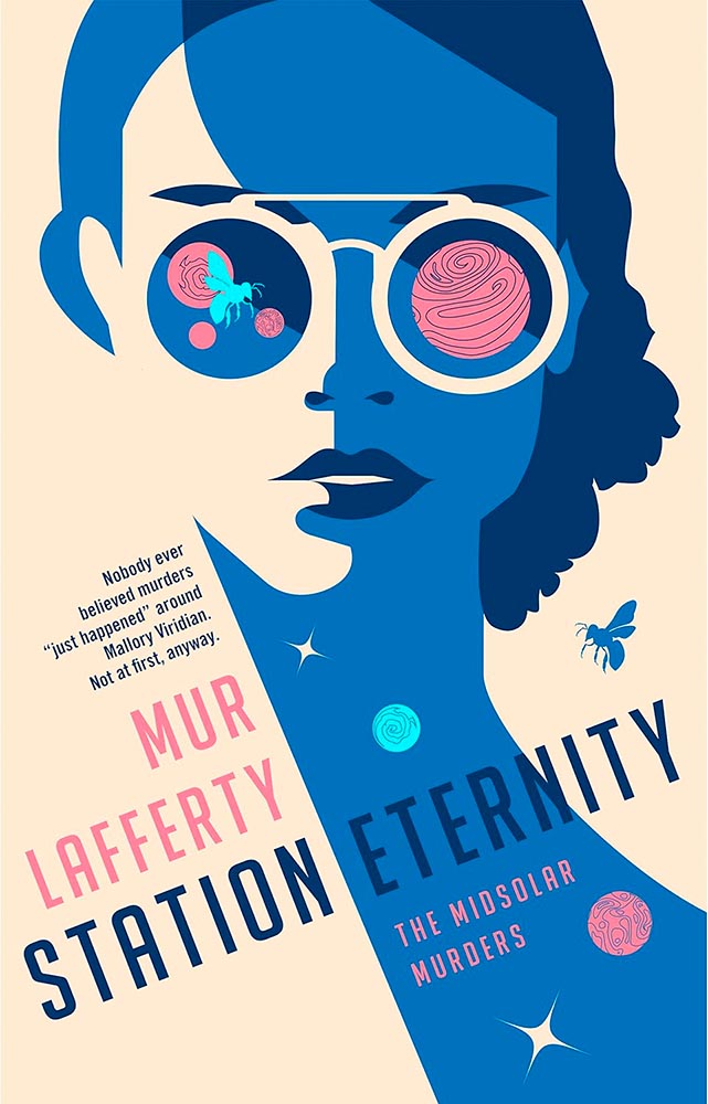
Design by Will Staehle.
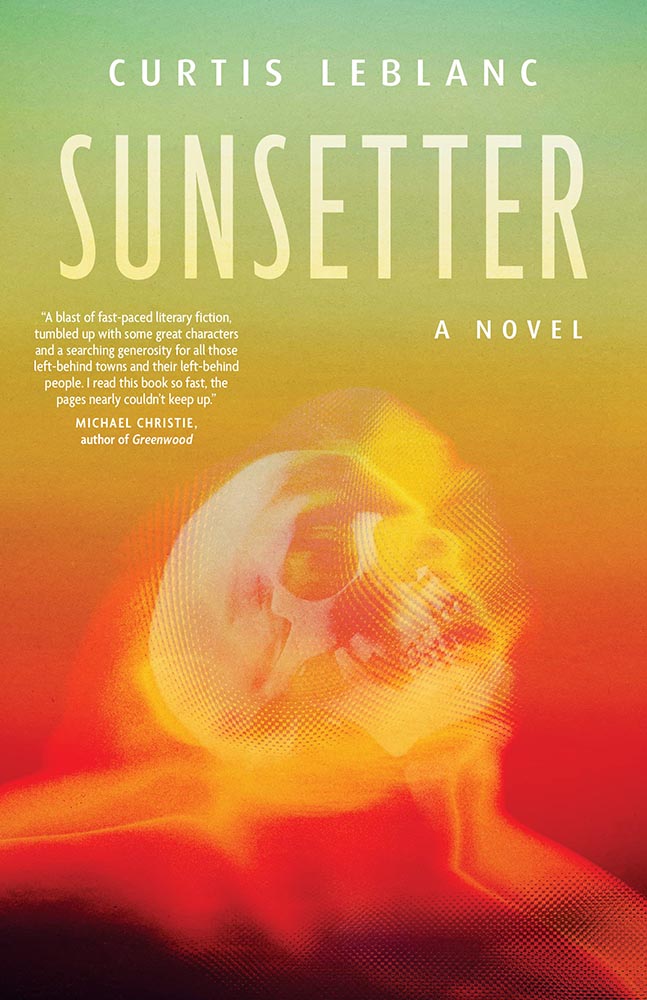
Mallory Viridian is an amateur detective on an extraterrestrial (and sentient!) space station — perfectly sold with this line-art-only cover. Fantastic.
Design by Anna Green.
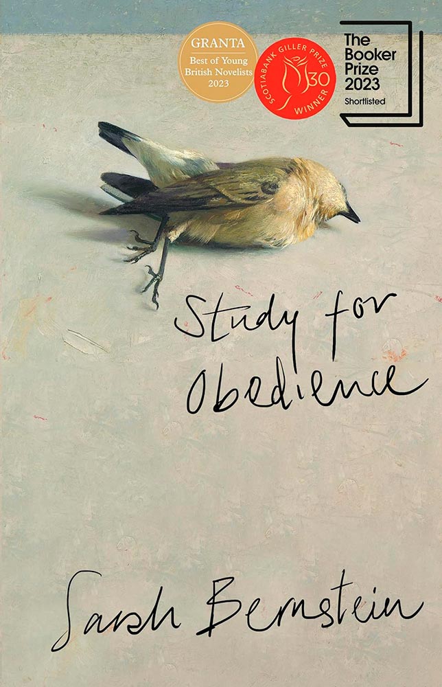
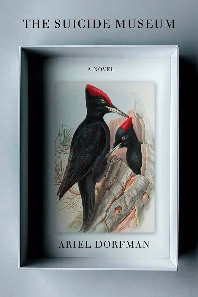
Dead birds wouldn’t ordinarily be my go-to for cover excellence. But this one, with its painterly quality and hand lettering, perfectly hints at the haunting, slightly bizarre adventure within. Perhaps I should study more; as many will testify, it’s certainly not an obedience thing. (Read the Booker Prize listing.)
Design by Caroline Suzuki.
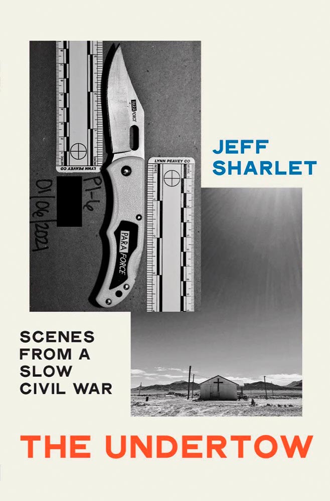
One of those instances where the graphic just sells the cover. Brilliant.
Design by Jaya Miceli.
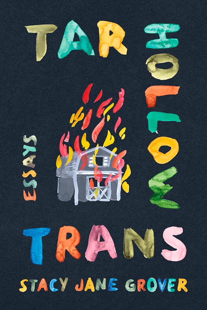
The continuing stigmatization of the LGBTQ+ population in the United States is so perfectly summarized here. (I’m curious how this cover was done, too: white paint, then watercolored? Gouache? Either way, the colors serve the overall so very well.)
Design by John Gall.
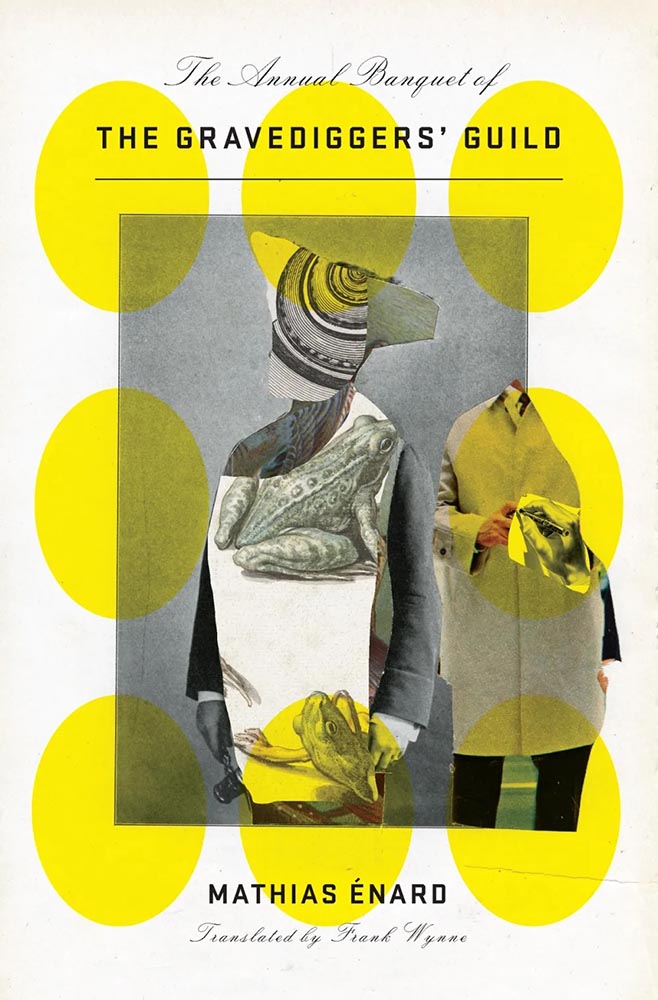
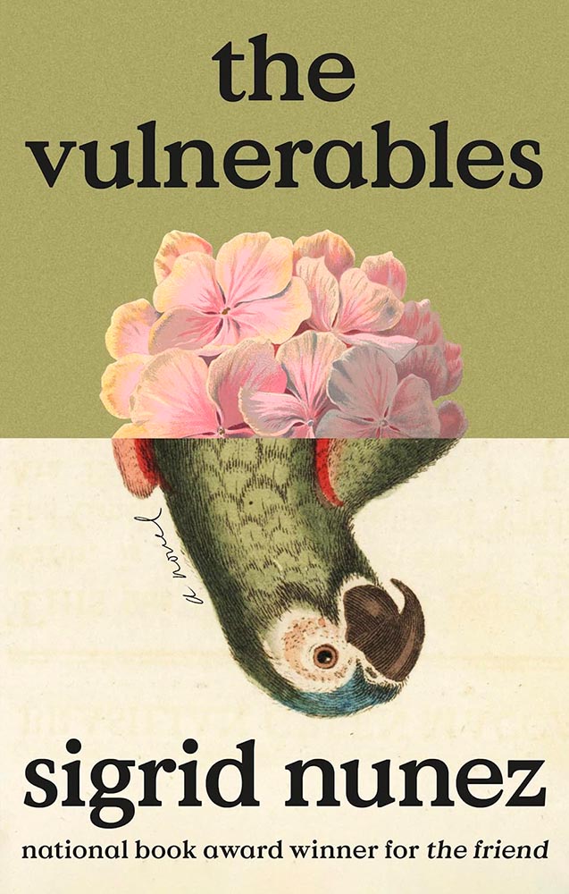
This collage jumps through my psyche: sophisticated, off-kilter, and yet, somehow, completely right.
Design by Jamie Keenan.
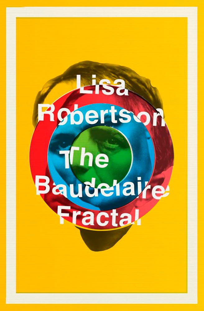
I had to look up Charles Baudelaire, I have to admit — but didn’t need to know in order to get the disjointed, colorful appeal of this cover.
Design by Na Kim.
Leaving a trail, all right. (Also: the text colors.) This version is mercifully short of Booker notifications, too — sometimes, I wish all the callouts and clubs would just go away.
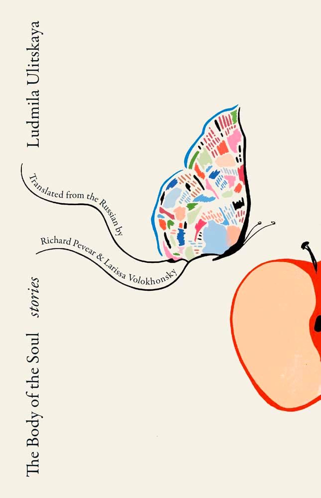
Design (and illustration) by Sarah Schulte.
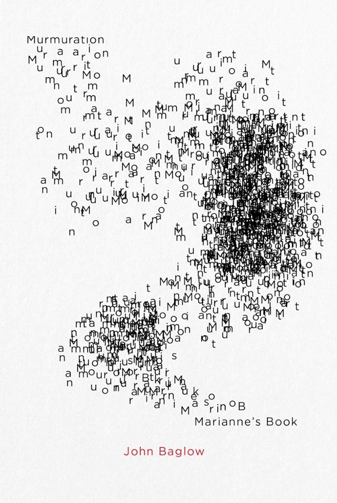
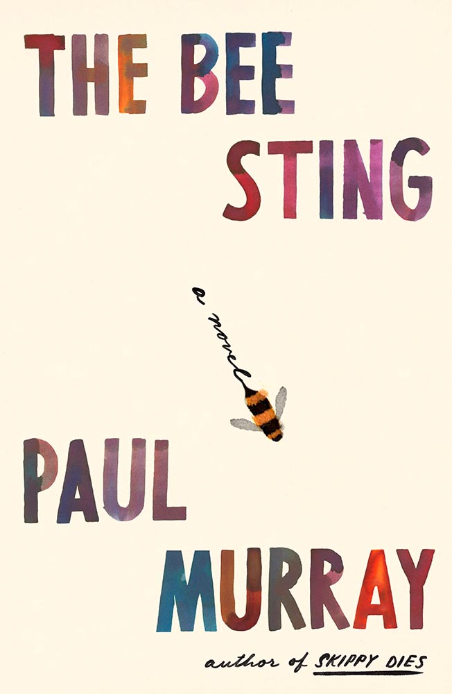
Type on a path can be fraught, as can simple illustrations on off-white. Except when simple ideas are translated into compelling book design. Completely different from the above, yes, but just as accomplished.
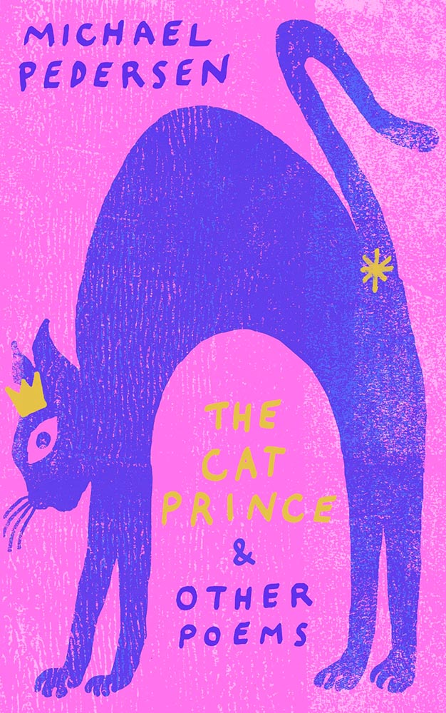
Design by Gray318.
Crown. Asterisk. Print!
Design by Sarah Shulte.
As the risk of repeating myself: “Type on a path can be fraught, as can simple illustrations on off-white. Except when simple ideas are translated into compelling book design. Completely different from the above, yes, but just as accomplished.”
Design by Jamie Keenan.
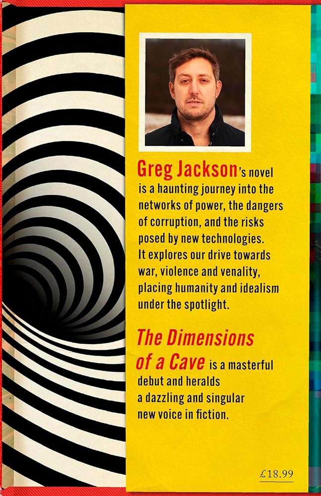
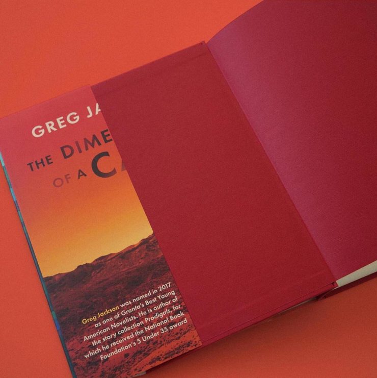
This trick can only be pulled once, and book designers everywhere are envious downright jealous. Here’s the cover — uh, flap:
“Continued on rear flap,” it doesn’t say.
Design by Lauren Peters-Callaer.
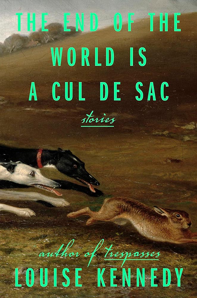
Brilliance in titling aside, check the glint in the rabbit’s eye. Wonderful.
Design by Grace Han.
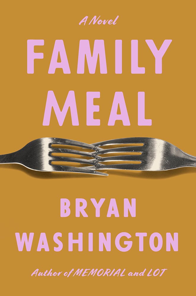
Interlocking forks, LOL. (Also, color choices.)
Design by Alex Merto.
This has gotten a bunch of well-deserved attention: from the embossed type to the gradually-increasing repetition of the artwork, Alex Merto scores and scores then repeats. Great stuff.
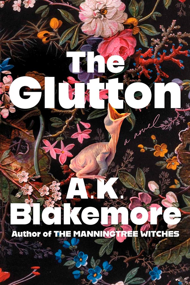
Design for the US version by Alicia Tatone.
Gluttonously hits a bunch of high notes, and keeps coming back for more — until:
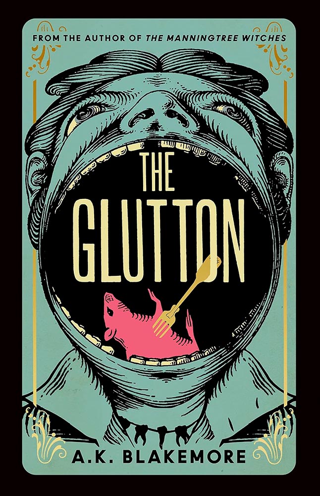
Design for the UK version by Jo Walker.
Yeah. Score one for the UK.
Design by Kelly Winton.
Is it possible for something Escher-esque to be soothing? Yes, it turns out.
Design by Oliver Munday.
Perfectly abstract, brilliantly pulling together the remarkably disparate stories within.
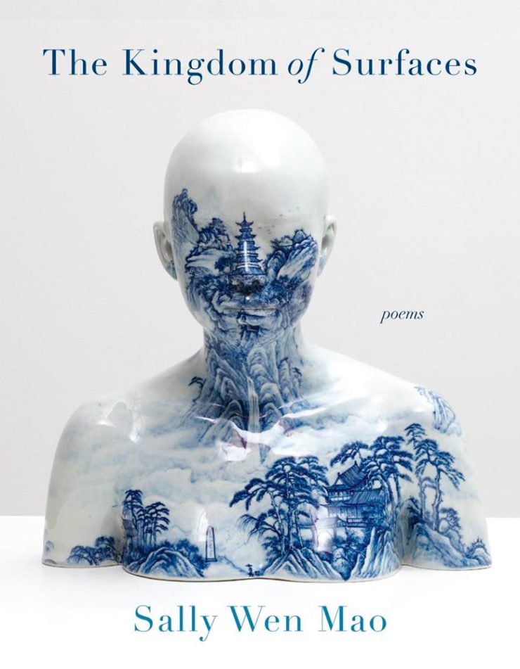
Design by Kapo Ng.
“Kingdom of surfaces,” so very indeed.
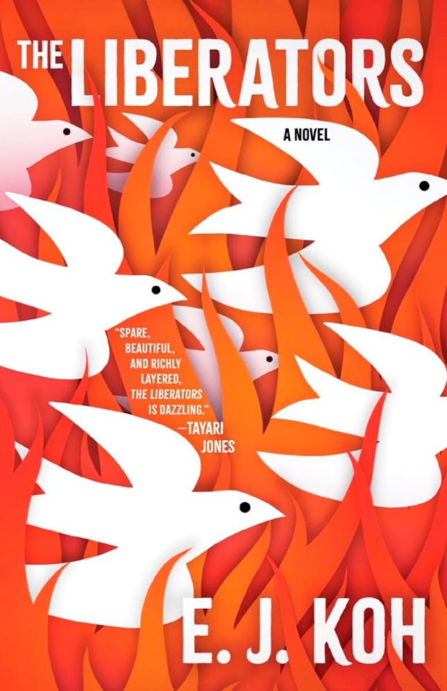
Design by Beth Steidle.
“Spare, beautiful, and richly layered, the [book’s cover] is dazzling.” —Foreword
Design by Allison Saltzman.
Another of those too-simply concepts that checks out on every level. Awesome.
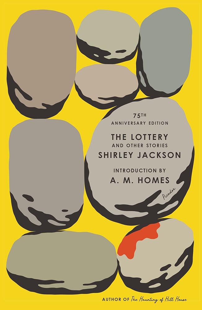
Design by Alex Merto.
Rarely does so much text take up so little space yet work so well — this 75th anniversary reprint stacks up. (Imagine inspiring a school-aged Stephen King, by the way. That’s “The Lottery.”)
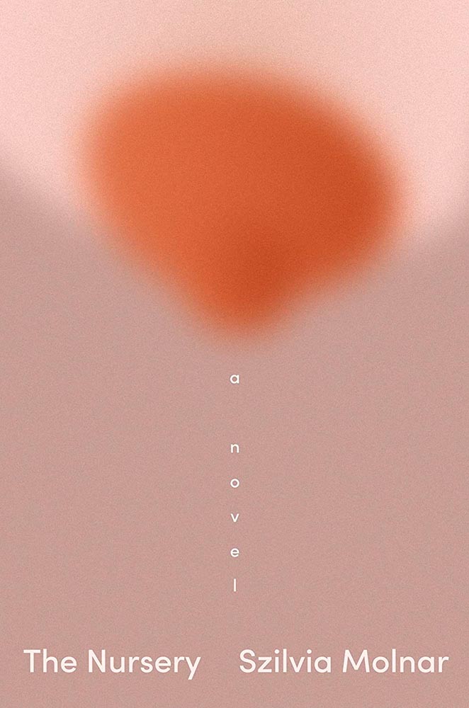
Design by Linda Huang.
“A novel” has never played so well.
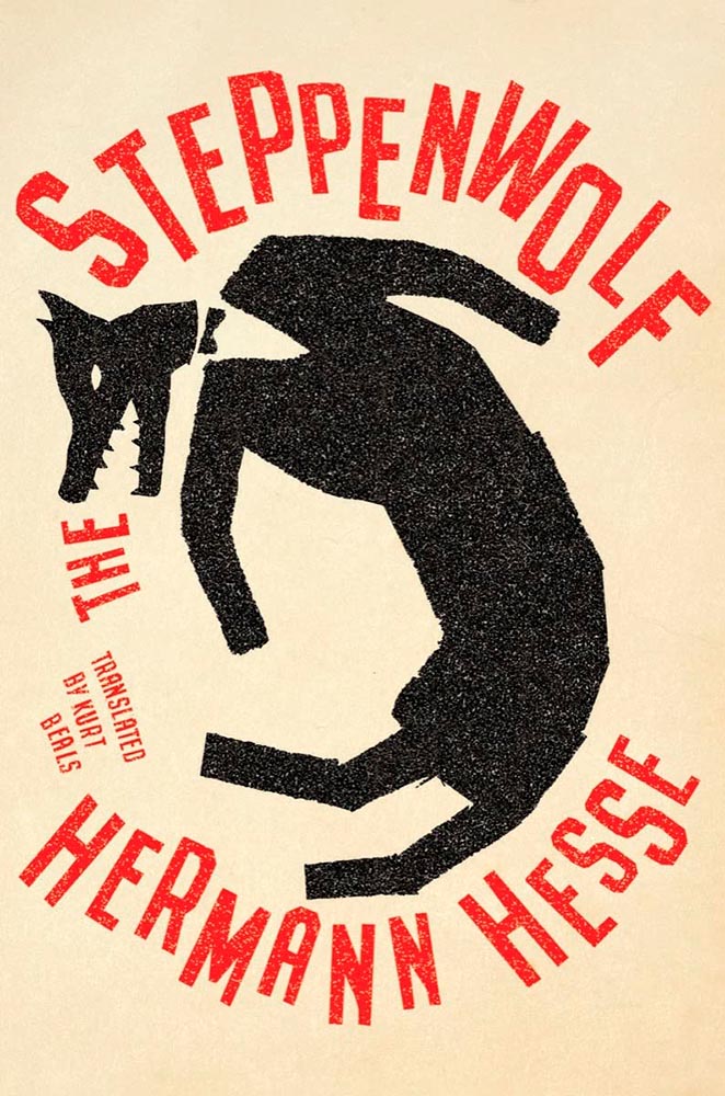
Design by Jaya Miceli.
Steppen-out: this new translation gets new meaning. (In the text, too, I understand.)
Design by John Gall.
Multi-layered shadowboxing. Nice.
Design by Steve Attardo.
A study in simple perfection. For a book examining heightening fascism, toning down the cover speaks volumes. Great choices on every level.
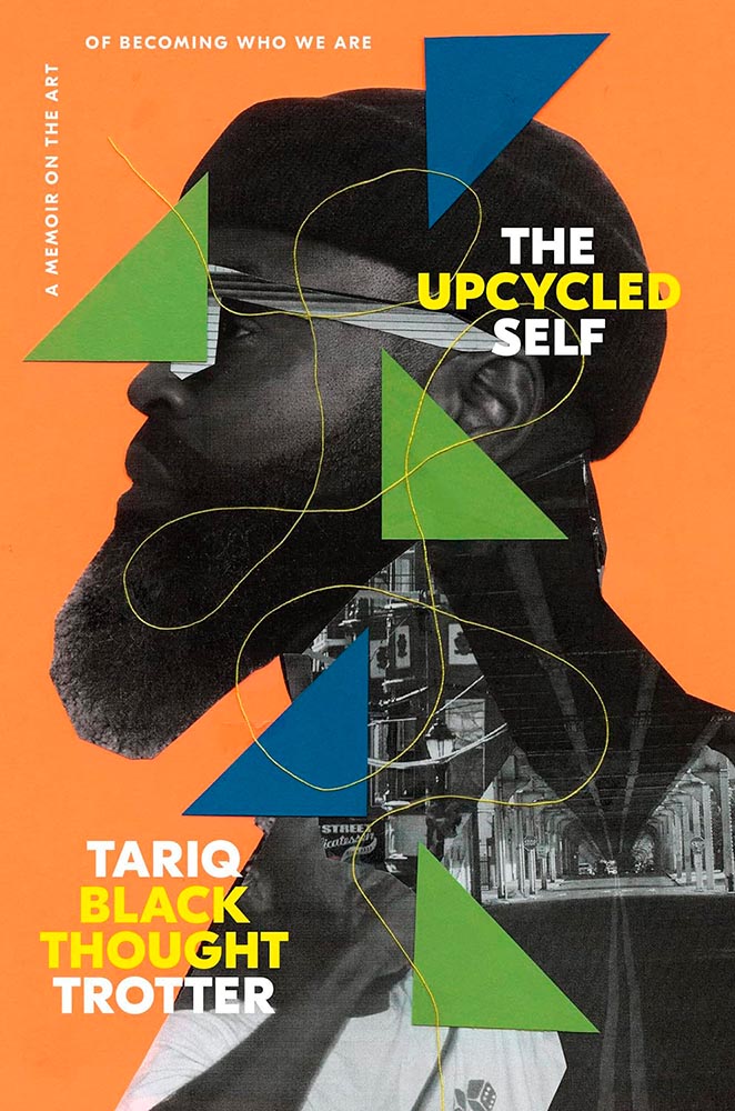
Design by Greg Mollica.
To collage in a way that the resulting product is of higher value than the original items: upcycling, indeed. (“The thread tying the cover together is a masterstroke,” he said.)
Design by Lauren Peters-Callaer.
“The humor of a great conversation,” one of the reviews said, and better words could not be found for the cover. Masterful.
Design by Andrew Davis.
The woodcut-style illustration is back, in two-color and aged to perfection. (The paperback kept the illustration but changed out and dulled the colors, to a much less satisfying effect. Curses.)
Design by Tom Etherington.
“Permeable boundaries,” illustrated brilliantly, with perfect texture and typography.
Design by Tyler Comrie.
“Sings,” someone said. “Seconded,” I said.
Design by Jonathan Pelham.
Stories told in a triumph of less is more. (The US version is good — another that’s one some others’ “best of” lists — but here’s another one where I think the UK slam dunks.)
Design by Laywan Kwan.
This is one of those covers that keeps giving, a three-color triumph of telling the book’s story. (Also: typographically counter-riffic.)
Design by Na Kim.
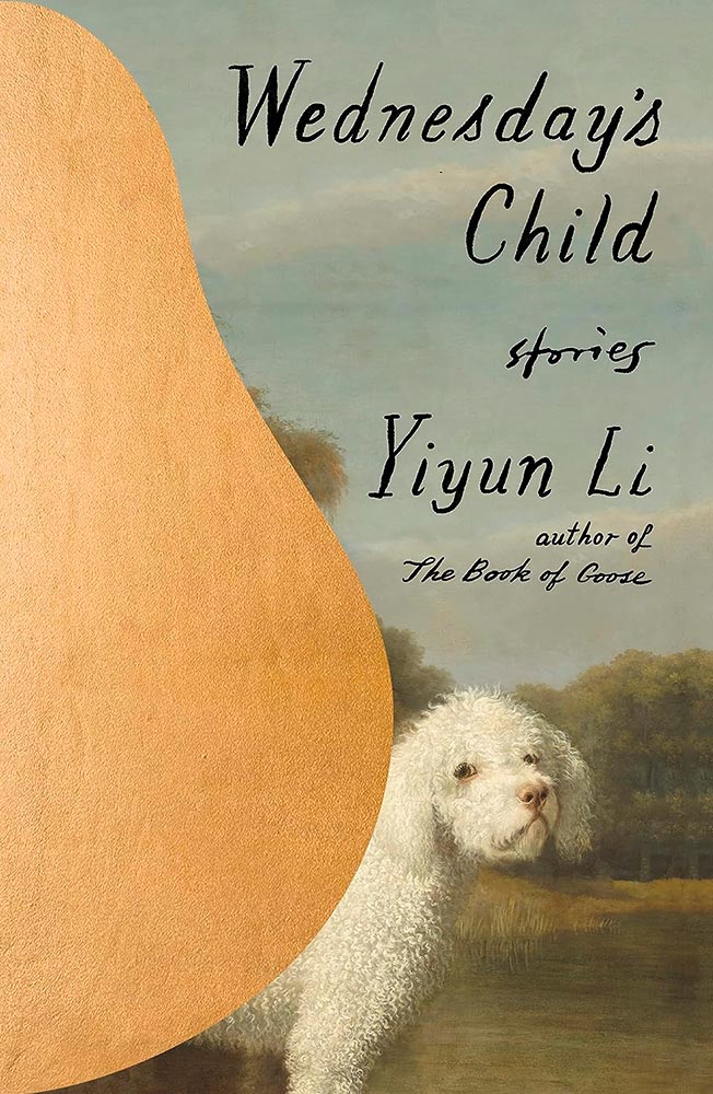
The Book of Goose was one of my top three covers last year, but high expectations are nothing when Na Kim is covering it. Storied, indeed.
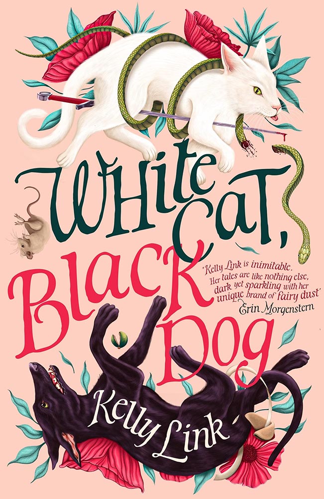
UK version design by Andrew Davis.
I was going to go on for a minute, again, about how the UK gets all the good covers — and this one earned a spot in this post — but…:
US version design by Owen Gent.
…the more I look at this US version, the more I like it. The hint of cat, the red shading, the paper’s tone and texture, and the type treatment stand in direct contrast with the fabulously literal interpretation of the UK version. Given both, I literally couldn’t choose.
Design by Matt Dorfman.
“There’s a painting at the door,” in the most amazing state. (Political pun intended.)
William Morrow didn’t return a request for the cover design’s name, unfortunately.
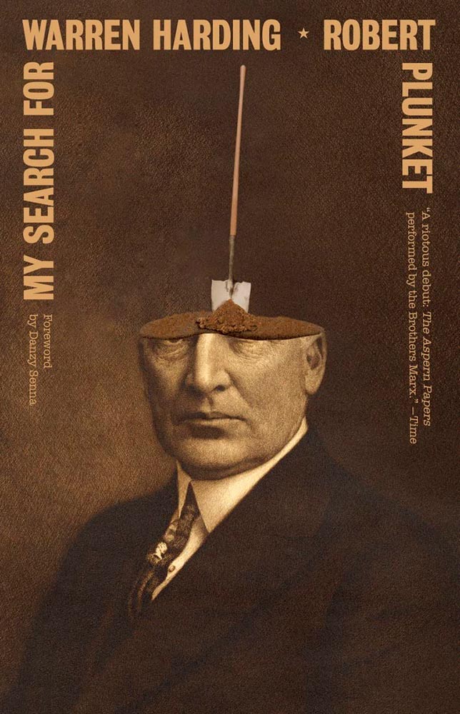
There are so many ways to get this design wrong — but wow: someone took a cliché and literally flew in the face of it, to brilliant, memorable effect. I wish I could give appropriate credit.
• • •
Dan Wagstaff over at The Casual Optimist comments that,
[I]t’s like we’re stuck in a holding pattern, circling the same design ideas. Trends have stuck around. A lot of covers feel safe. Some of this was the books themselves. I’m not sure exactly how many celebrity memoirs is too many, but I’m pretty sure we reached that point and sailed right past it in 2023. No doubt some of it is sales and marketing departments sanding down all the edges and demanding the tried and true (see Zachary Petit’s alternative best of 2023 piece on killed covers for Fast Company). But I would not be surprised if it designers were just getting caught up in the churn — too many books, too many covers, and too much other stuff to worry about.
— Dan Wagstaff, The Casual Optimist
I think he’s right. Despite growing the number of selected covers this year over last, I feel that despite the outstanding items above, the majority of the book covers and jackets — almost certainly by publishers’ explicit direction — are playing it safe. After all, here in the Roaring Twenties, rocking the boat brings nothing short of vilification.
Thankfully, the designers on this list have battled the committees bent on mediocrity and overcome with great talent, great design, and great perseverance. Power to them, and I wish them — indeed, all of us — continued success in 2024.
Please note: I somehow missed the 2023 University Press Design Show — usually linked here — so please stay tuned for that post soon (and then again in July for the ’24 Show). Apologies.
As summer turns to fall, let’s take a look at Type 1 fonts, a library index, revolutionary posters, posters for “get lectured,” and two different photography contests. Let’s get right into it.
Adobe discontinues a standard: The Type 1 font
Back in the early days of desktop publishing — up to about the turn of the century, give or take — everything typographic used PostScript, a programming language by Adobe. (Other stuff, too, like Adobe’s vector program, Illustrator.) PostScript fonts were the so-called “Type 1” variety, made up of a bitmapped “suitcase” that housed the standard display sizes and an outline file used by the output device to print clean, what-you-see-is-what-you-get beauty.
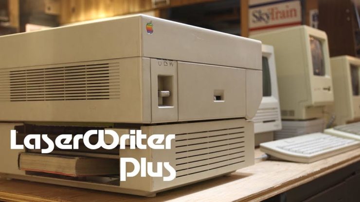
The Apple LaserWriter Plus and some vintage Macs: nostalgia! (Note the book — heh.) Image: YouTube.
Companies from Apple to Microsoft didn’t want Adobe to hold a monopoly on output tech, so later fonts evolved into TrueType and then OpenType, the latter of which is the standard today.
So much so that Adobe has now discontinued Type 1, and they, along with Microsoft, have stopped being supported. Which is understandable and yet a shame: some of us still have hundreds of them.
It’s Nice That has a post that reminds us of a library’s central purpose: to leave knowing more than you did when you entered. “The library, in our shared public imagination, is a special place,” the author argues — reminding us of what libraries were established to do, often distinctly different from the modern reality (especially in the United States).
In the library you begin to be convinced that language matters, that words have the power to clarify, to rouse, to make us feel something, to help us understand the political and cultural features of historical and contemporary moments.
Lola Olufemi, It’s Nice That
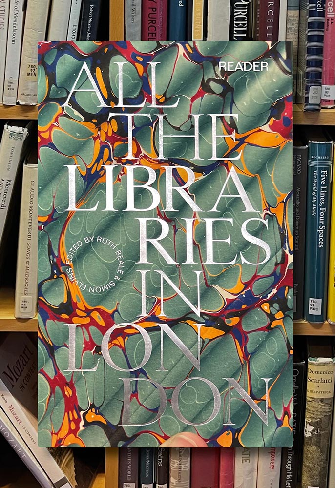
All the Libraries in London. Cover design: unknown. Image via It’s Nice That.
All the Libraries in London does something artistic with a simple listing, elevating it, reminding us how compelling the ideal that libraries represent really is:
This is a political and artistic listing, one that invites the reader to rediscover their own memories of their local library as a site of discovery. The book’s authors invite us to reflect on our personal relationship to libraries as well as the necessity of collectively securing their future existence.
Lola Olufemi, It’s Nice That
Alan Kitching, Durning Library. Image via It’s Nice That.
We need more of this everywhere, but especially here in the States. Meanwhile, check out this great item at It’s Nice That.
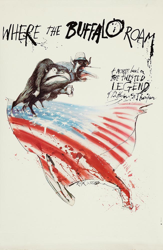
Special Bonus #1: Another British treasure, via the very British Antiques Roadshow (a British original, natch): this incredible poster by Ralph Steadman.
Ralph Steadman’s Where the Buffalo Roam (1980) poster. Image via Wikipedia.
Special Bonus #2: British book designer Steve Leard has launched a new book design podcast, Cover Meeting, featuring interviews between Leard and fellow book designers on the work, the industry, and more. The Bookseller has more.
Cuban Movie Posters. No, Really.
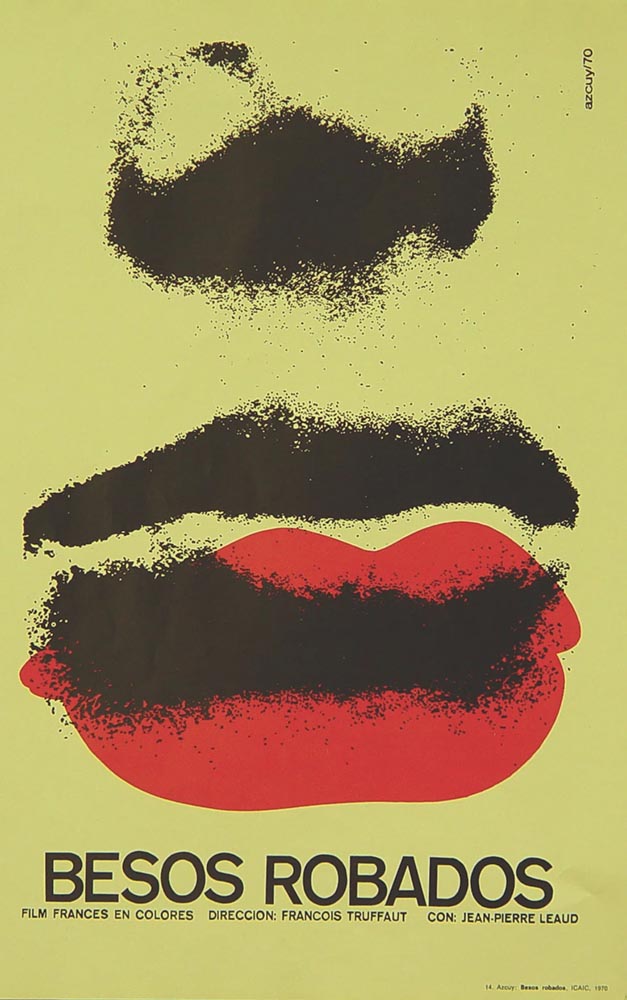
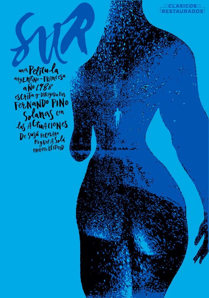
While we’re on the subject of great posters — and It’s Nice That — let’s talk about how Cuba’s revolution-era political posters transformed their poster design for films. Appropriately enough, a new film, El Cartel Cubano, highlights these amazing (and, likely, never seen before) items.
Besos Robados, ICAIC, by Sotolongo & Carole Goodman. Image via It’s Nice That.
“How come our posters in the US aren’t this beautiful? What did this say about the priorities of the revolution? What did the medium or choices in the scarcity of materials used say about the economic situation in Cuba?” It’s these questions which form the bedrock of El Cartel Cubano, a fascinating and tender tribute to the artists on the island.
Adrienne Hall, co-director, El Cartel Cubano
Sur, by Michael Myiares Holland. Image via It’s Nice That.
I have to admit: this isn’t a subject I would have leapt at, but It’s Nice That sold it. Awesome.
Get Lectured (on Architecture)
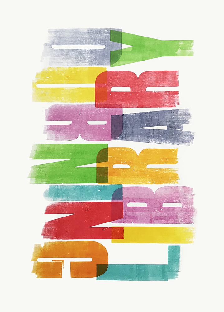
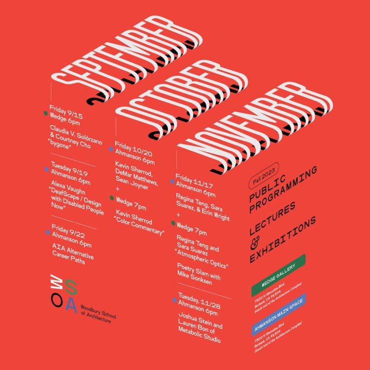
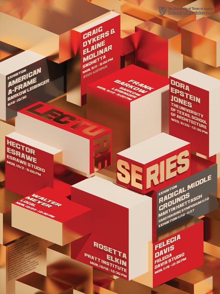
Closing out our trifecta of great posters, Archinect‘s Get Lectured series brings us these fantastic items from their Fall 2023 series:
Woodbury University School of Architecture’s Fall 2023 lecture series.The University of Texas at Austin School of Architecture’s Fall 2023 lecture series
Going to soapbox a little here: pay-to-enter photo contests aren’t usually something I want to spread the word about. So ArchDaily‘s basically-a-press-release, “URBAN Photo Awards 2023 has announced its list of Finalist Photographers, marking the penultimate stage of the international contest,” was guaranteed a pass.
But there’s a problem: some of the photographs are really compelling.
Winners of the 2023 Black and White Photography Awards
Another contest, yes. They’re everywhere. But … wow.
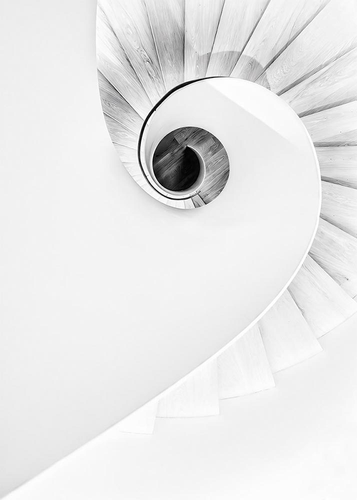
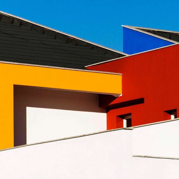
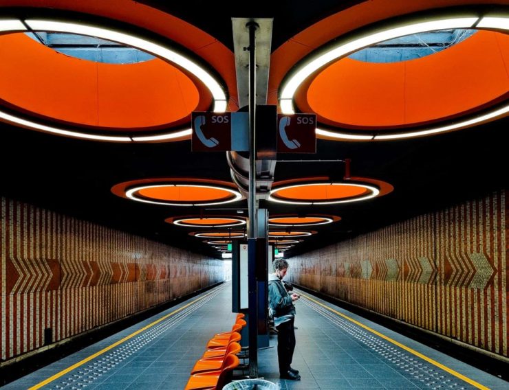
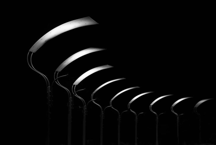
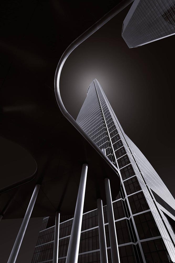
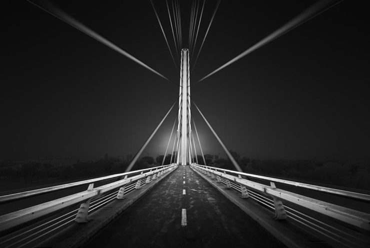
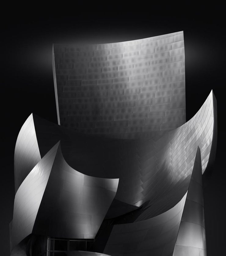
Street Lights – Ottawa, by Gareth Jones, category winner, architectureAnother mushroom? By Hector Ballester Ballester. Silver mention, architecture.Alamillo bridge, by Manuel Ponce Luque. Finalist.The concert, by Helena García Huertas. Finalist.Reflections on the stairwell, by Max Dobens. Finalist.
And that’s just the buildings/architecture — there are portraits, street photography, landscapes, and more. A reminder to aspire, every day, with every image.
The August heat is met with some refreshingly cool items for you this time: beloved movies reimagined as vintage paperbacks, graphic design on the Internet Archive, and winners of the 2023 iPhone photography awards. Plus, a bit on social media that hopefully won’t leave an aftertaste. Let’s dig in.
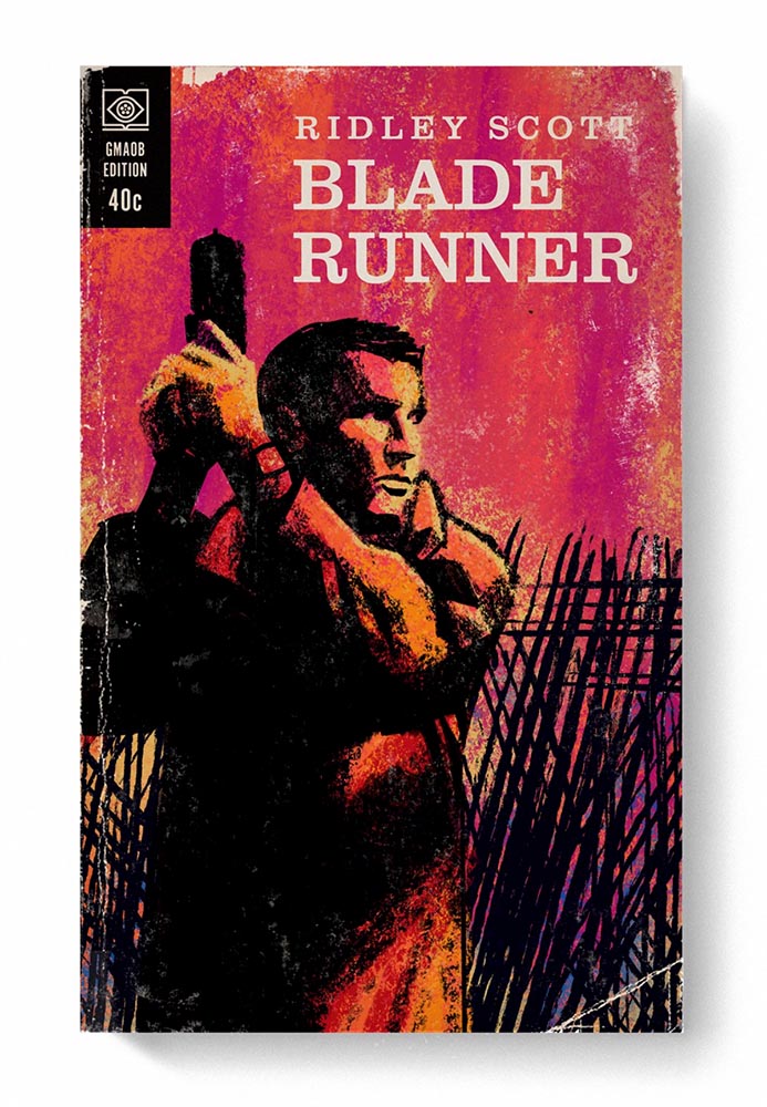
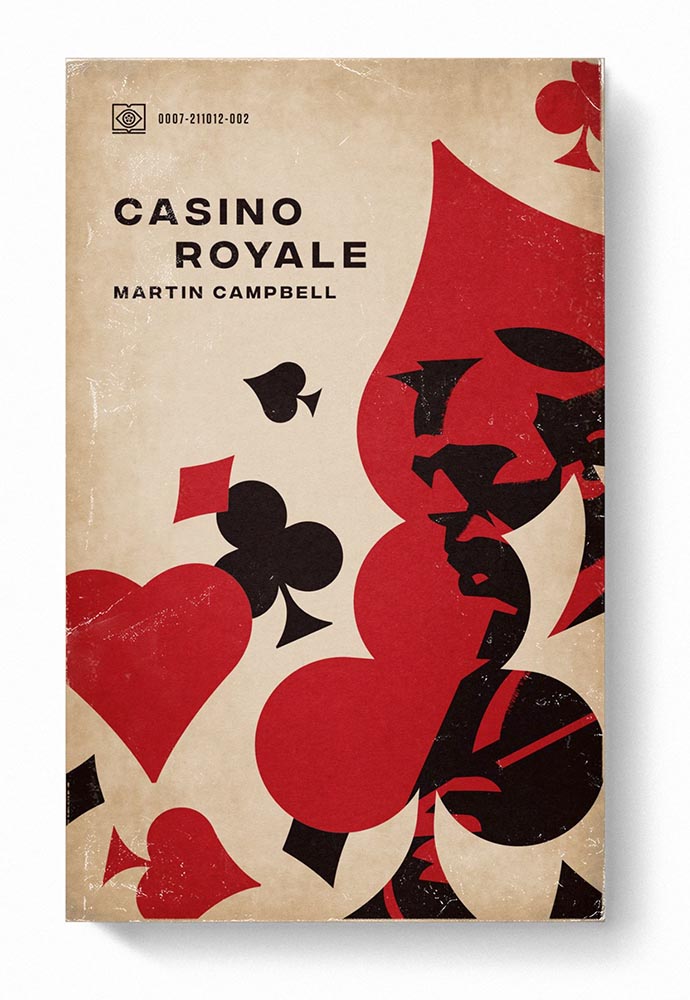
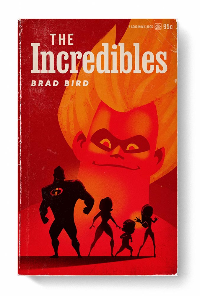
From the aged look, illustration choices, and director-as-author to the logo and occasional price, these are all … perfect.
Volume One is 100 titles, and while that book is sold out, prints are available at his website. The items in Volume Two, due this month, are guaranteed to be awesome.
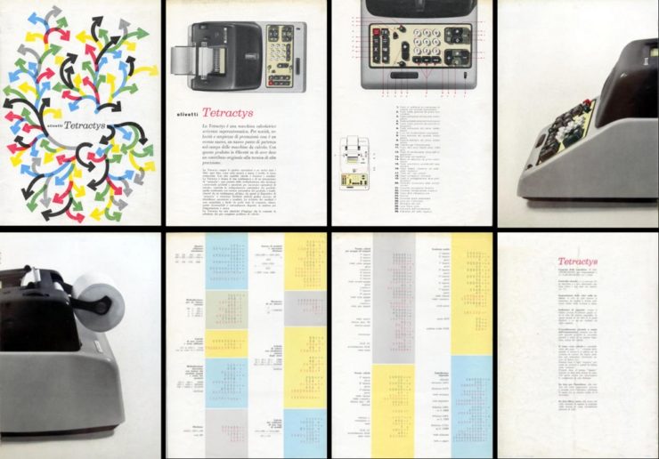
Graphic Design on the Internet Archive
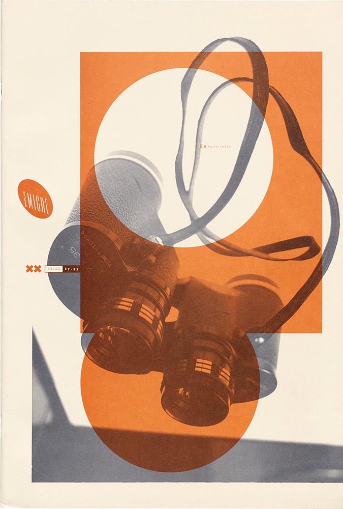
Emigre #20 – Expatriates. Courtesy of the Internet Archive via archive.digital.
I don’t always link to these contests — it often seems like the publicity (and rights!) are all about the folks holding the contest rather than the people entering them — but I often look, and am always impressed with the quality coming out of a “simple” iPhone.
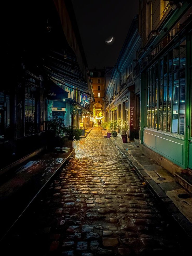
Long Nguyen, France – 1st Place, Travel – “Last Night before Xmas”Scott Galloway, United States – 1st Place, Nature – “Wonder Wheel”
And while both of the above are (relatively) recent phones, in the latter case showing the macro capabilities of an iPhone 12 Pro Max, even older phones can highlight the talent of the person using it:
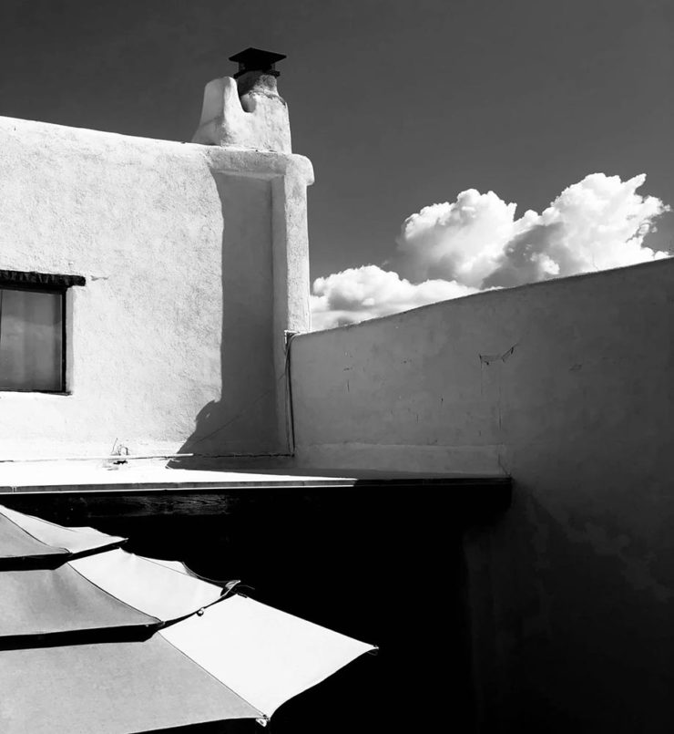
Derek Hager, United States – 3rd Place, Photographer of the Year – “Tucson Morning”
I’m not going to spend much time on this; I eschewed pretty much all forms of social media years ago now, and don’t regret it. That said, I do keep up with social media in the meta sense (a word that’s been stolen, as far as I’m concerned, by — wait for it — a social media company), and have noted the pain and concern associated with the implosion of Twitter.
While this conversation started with Nick Heer and the always-excellent Pixel Envy, it’s obviously evolved as the year has seen one extraordinary cage fight event after another.
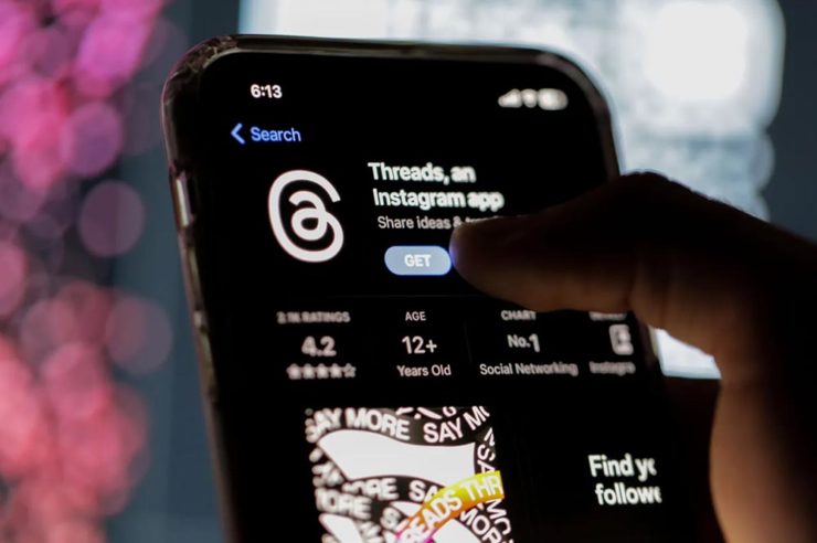
Threads on Apple’s App Store, via the BBC.
For the past decade, It’s been all but required for serious brands to maintain a social media presence […] yet instead of scrambling to claim digital real estate across all these newly emerging platforms, some companies are choosing to be more judicious about which platforms they choose to join. In some cases, they’re learning from brands who jumped the social media ship years ago.
Chris Stokel-Walker, BBC
The quote above, from the BBC, attempts to answer the question, “Why your favourite brand may be taking a social media break.” Short answer: it’s complicated. I’d argue there’s an even shorter answer — it’s smart! — but for people and brands that aren’t yet established, social media is often key to discoverability.
This may be especially true for artists, designers, photographers, and others in the self- and small-business-employed creative field. Indeed, let’s go to a great source for those in the arena, Creative Boom, who recently spent a minute asking, “Creatives are saying social media is over… so what next?”
Like any new craze, it was fun for a while. But there’s certainly nothing new about it any more. Facebook’s now been around for almost two decades. Twitter’s 17 years old. Even Instagram has reached its teens. And while many of us joined these platforms during their fun, “anything goes” eras, when everything was about the users, now it’s all about the algorithms and their use to make venture capitalists vast amounts of money.
Tom May, Creative Boom
While I agree that social media is a mess and has been for a while, I’m absolutely not going to tell you to give it up — only to remind you that I have given it up and continue to be completely okay with the decision.
I do want to ask you, though, to choose wisely:
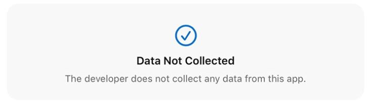
Facebook’s “Threads (an Instagram app),” their answer to the Twitter/X debacle, as shown via Apple’s iOS App Store privacy report.Tapbot’s “Ivory,” available in Apple’s iOS App Store and showing that app’s privacy report, for the Mastodon social platform.
Enough said. Turn off the computer, go forth, and enjoy a beautiful summer’s day.
Gerald and I were in Georgia’s lower Chattahoochee River valley yesterday, visiting the city of Columbus — and ran across a couple of treasures. Naturally, there was a camera handy.
The first is the best restaurant I’ve enjoyed in a long while: The Animal Farm.
The Animal Farm, 105 W. 12th St.
If you’re in or going to be going to Columbus anytime soon, I cannot recommend it highly enough. The food was superlative, the service excellent, and the ambiance simultaneously upscale, casual, and fresh.
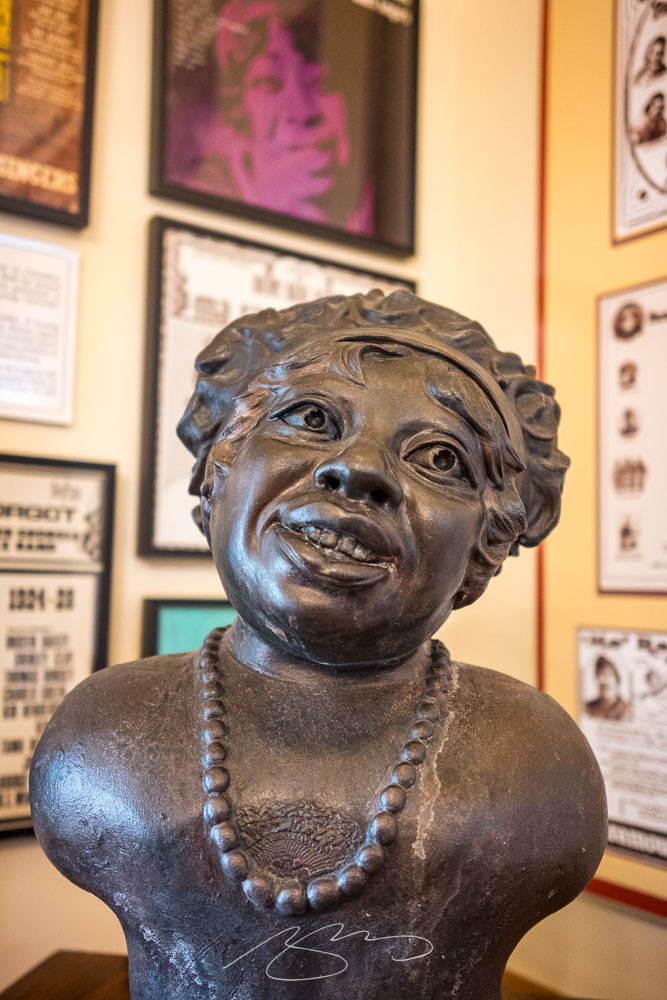
The second — and no less tasty — stop was the Ma Rainey Museum of the Blues. This period house downtown is small but demonstrates a remarkable comeback from the (literal) wreckage they started with in the ’90s. I’d originally wanted to return to the Columbus Museum, but it’s being renovated; Gerald’s suggestion here was pitch-perfect.
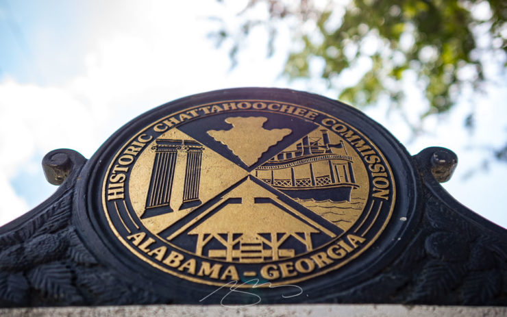
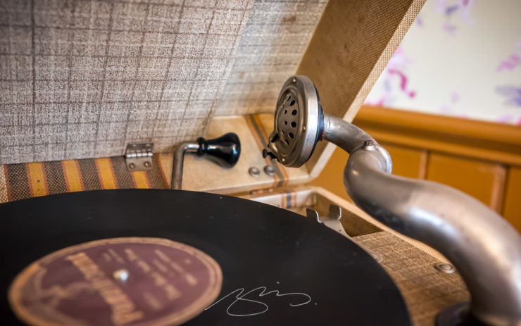
Ma Rainey House, 805 5th Ave.Ma Rainey House Marker, 805 5th Ave.Bust and Albums, Ma Rainey House, 805 5th Ave.Record Player Detail, Ma Rainey House, 805 5th Ave.
Inside, Gerald and I enjoyed a lengthy conversation with Xavier, a guide who was knowledgeable and enthusiastic; he absolutely made us want to explore more blues history. (I’m also going to be listening to some Ma Rainey on Tidal.)
Meanwhile, gallery of Columbus photographs is deep and varied, spanning almost fifteen years and 180 items — check it out.