This time, book design times two, book cutouts, album covers, and a reflection on my 2023 photographs. It’s one of those Februaries, so let’s leap into it.
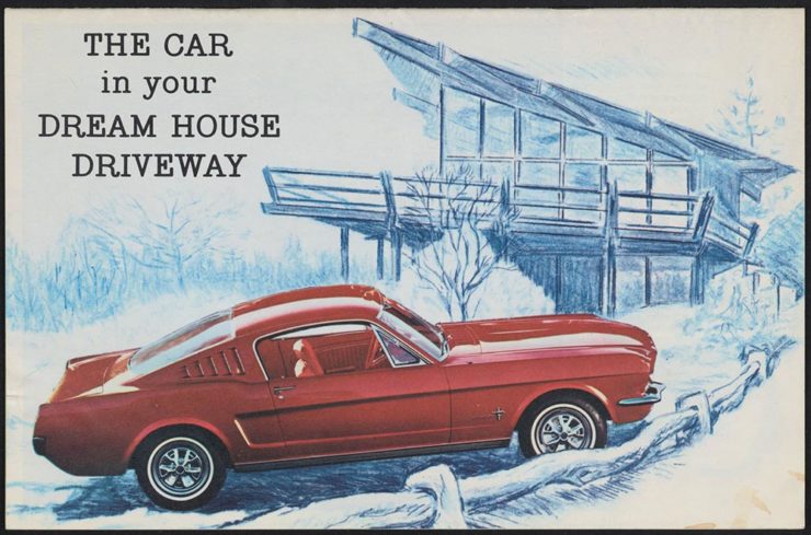
Jodi Hunt’s Great British Design
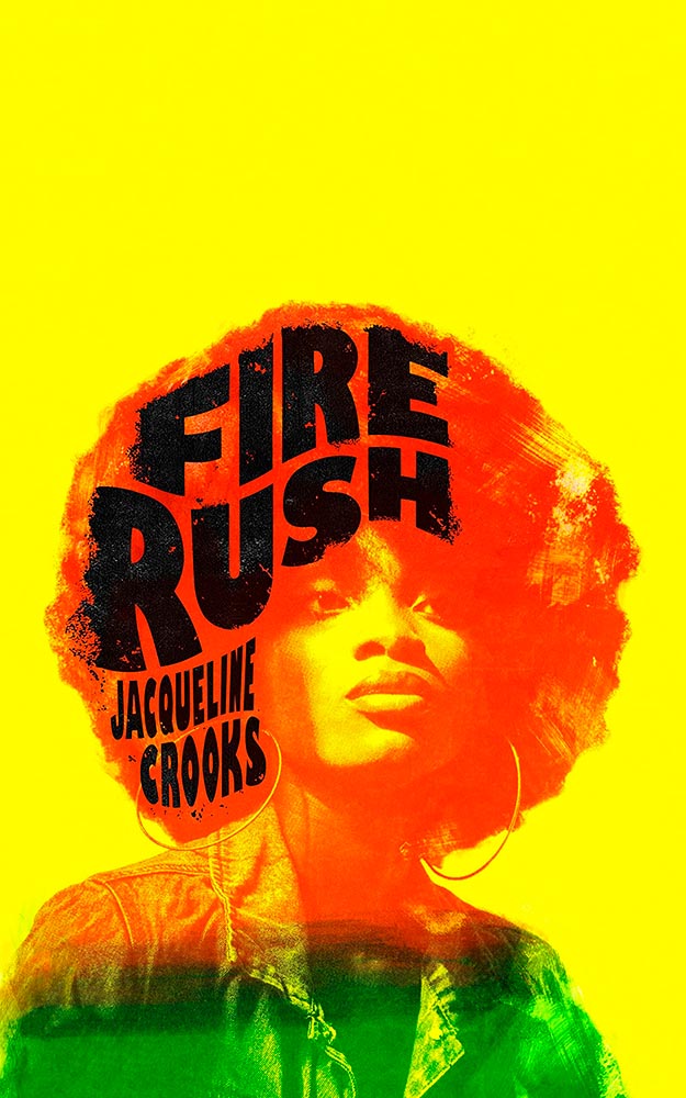
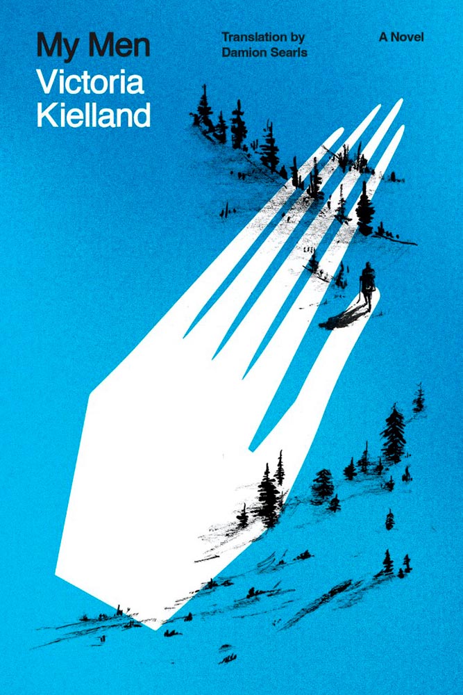
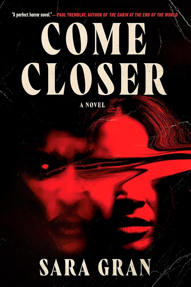
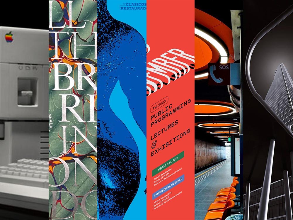
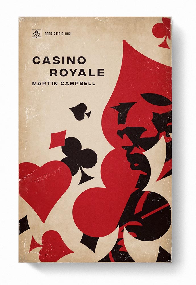
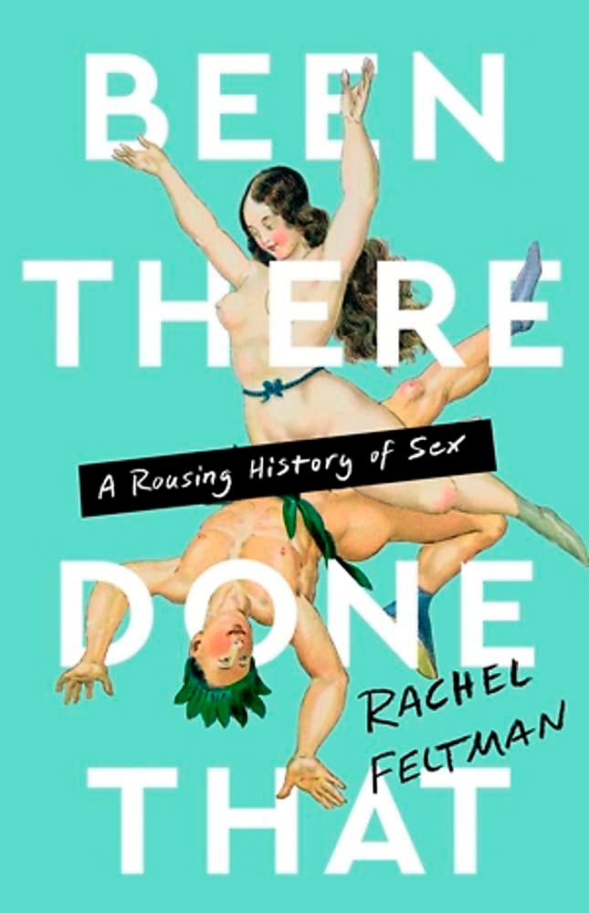
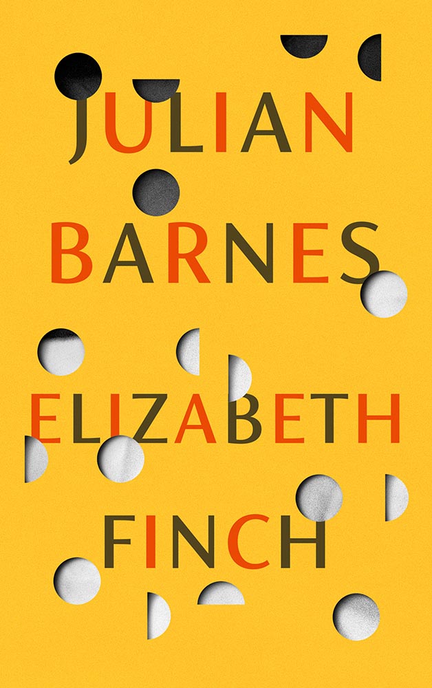
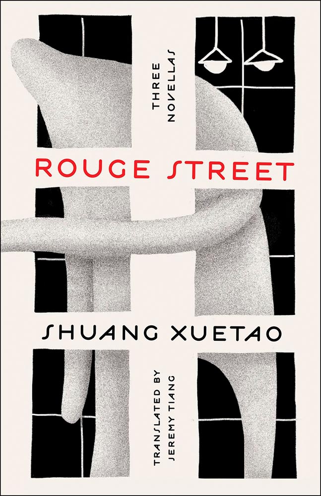
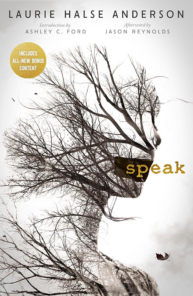
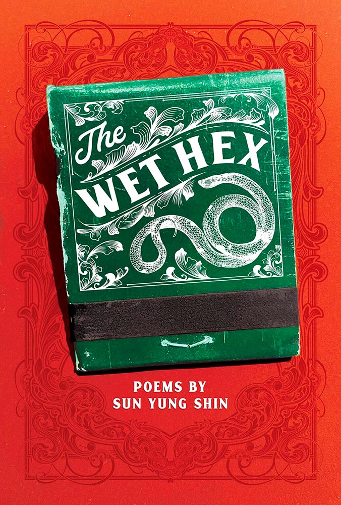
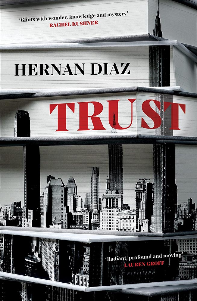
Screen print by Kate Gibb, lettering by Jodi Hunt, and photograph by Adaeze Okaro.
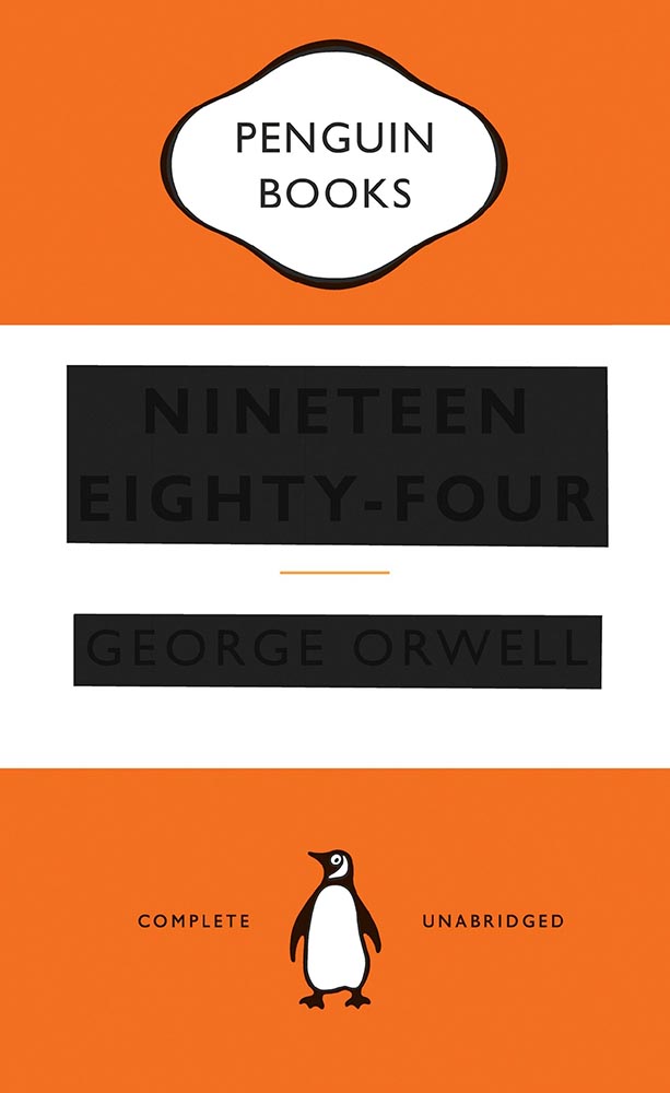
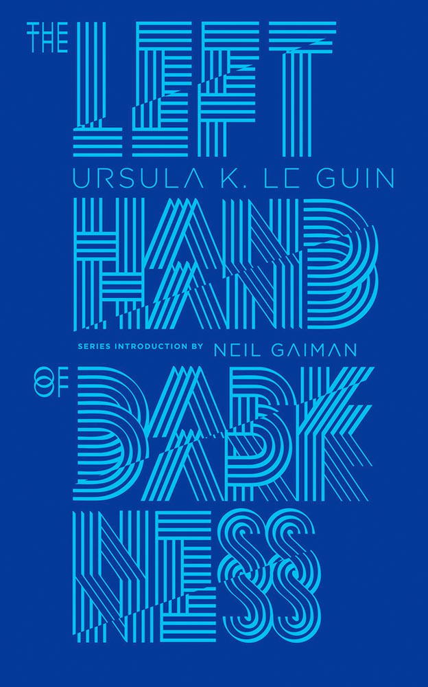
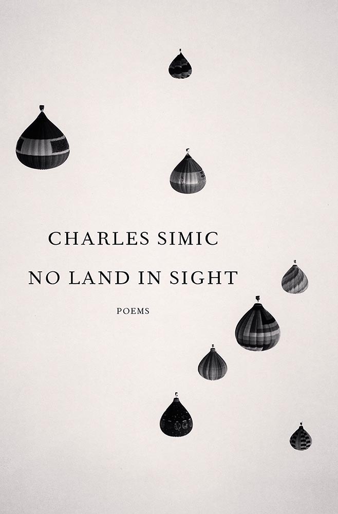
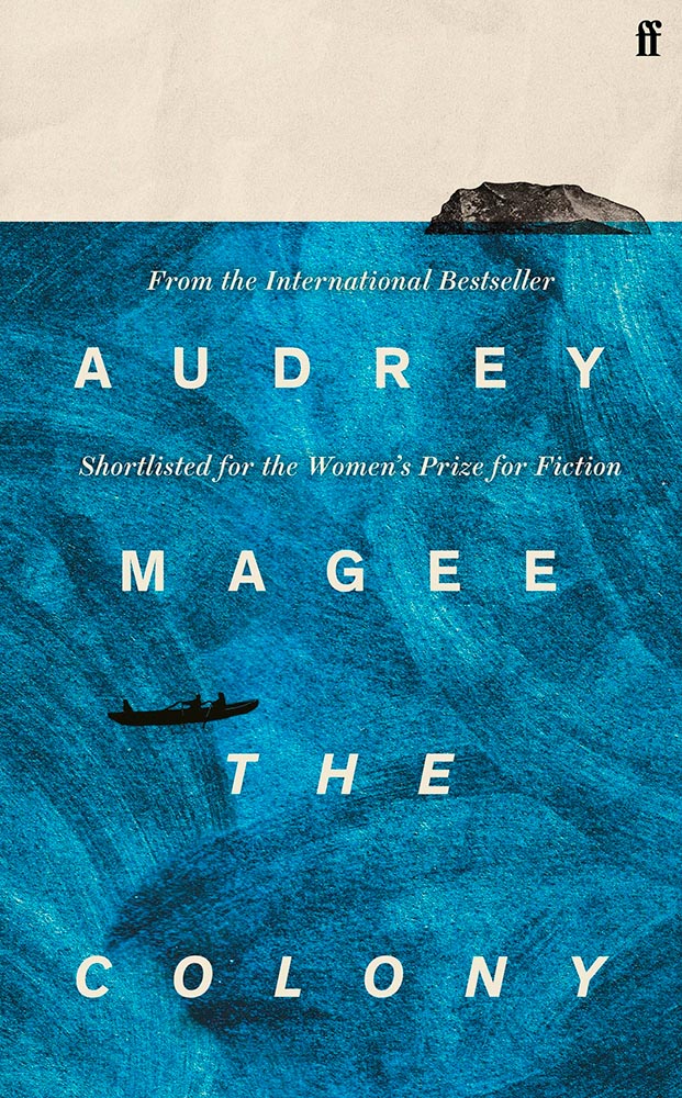
You might recognize the above book cover from my 2023 Favorite Book Covers post, a fantastic series of choices that speak to all colors while definitively saying, “Black.” It’s Nice That has a short post talking about Jodi Hunt, who designer that cover — and more.
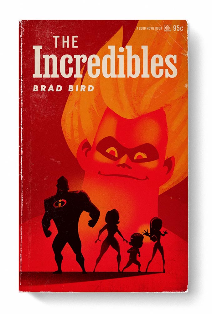
Design by Jodi Hunt.
The screen printing is prominent here, too, and the interaction between that and title are, to borrow a Britishism, “ace.” And the below, with its slightly haunting image treatment (and that great text, lower left), also earns kudos:
Design by Jodi Hunt.
Great design, deservedly highlighted. See the other examples here.
The original Book Design
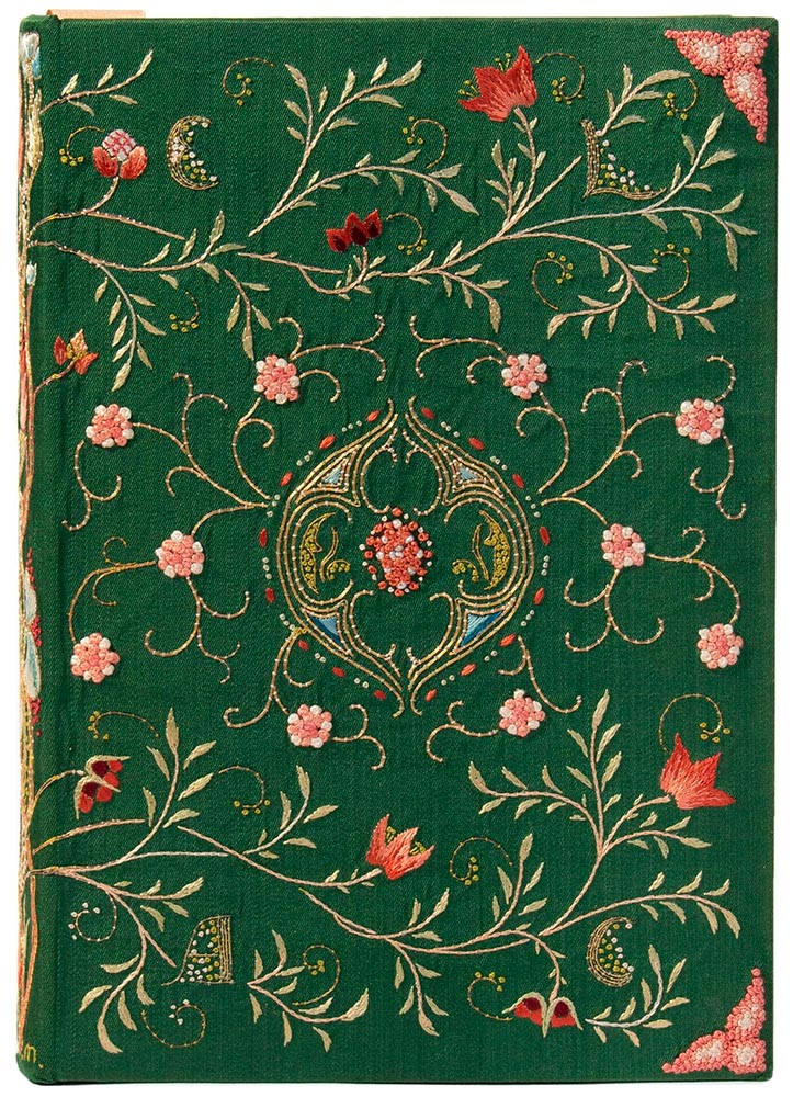
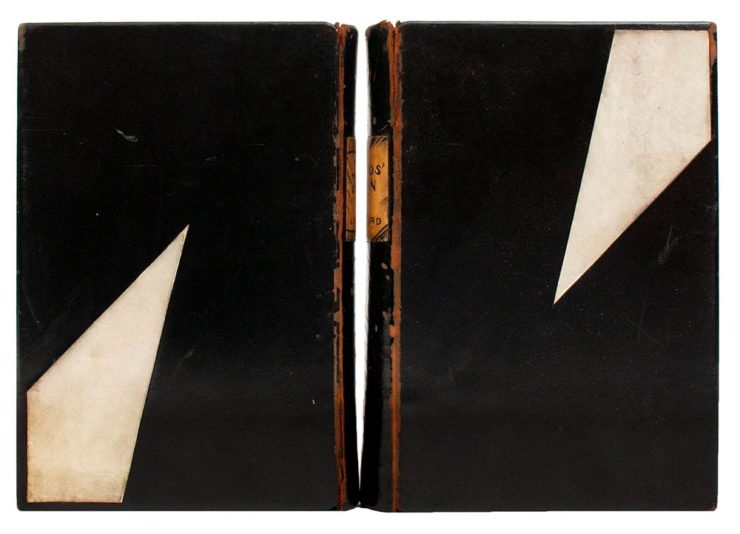
Ernest Lefébure, Embroidery and Lace: Their Manufacture and History from the Remotest Antiquity to the Present Day (1888), with binding created by May Morris
Before there was book design, or even graphic design — that is, when books and pages were thought of as art instead of design — folks were still coming up with great book covers. The Grolier Club, “America’s oldest and largest society for bibliophiles and enthusiasts,” has a wonderful exhibit of cover design . . . made up exclusively of antiques.
Lynd Ward, Gods’ Man: A Novel in Woodcuts, 1929, and Madman’s Drum: A Novel in Woodcuts, 1930.
One of the most memorable artworks […] is a sumptuous but comparatively delicate volume, a 1643 book of psalms created in London. Atmospheric exposure usually turns white silk-bound editions tan and brown, but this cover is a shiny cream color. The polychrome silk and gold metallic threads, which wind around one another to form a colorful floral pattern, maintain an eye-catching vibrancy. The only sign of the book’s age is the oxidized silver “stumpwork,” a type of raised embroidery that in this case resembles beading.
— Elaine Velie, Hyperallergic
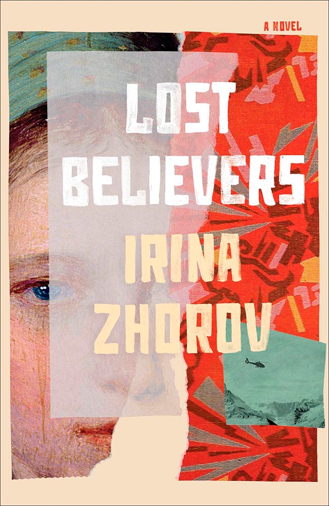
The quote above refers to the book in this month’s cover image, second from left, and is but one where what you see isn’t necessarily what you think it is — it’s more complex, more interesting, made with what the artist had available in the day. Great reminders, all, that book design has a much longer history than what we think of when we hear the term.
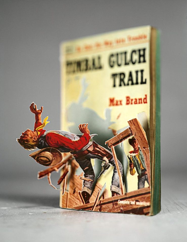
“Meticulous incisions and methodical folding allow scenes to arise from aged books and color swatches in Thomas Allen’s paper cutouts,” This is Colossal notes — but a picture is worth a thousand words:
Timber by Thomas Allen.
The vintage paperback work happened by complete accident. I was cutting into a pulp novel one afternoon with the intent of removing the illustration completely when I noticed that if I left some areas attached, folded the parts carefully, and looked at them from a single vantage point so that everything aligned, they created the illusion of 3D pop-ups. Everything snowballed from there.
— Thomas Allen, via This is Colossal
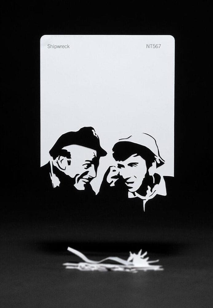
The three-hour cutout: Shipwreck, by Thomas Allen.
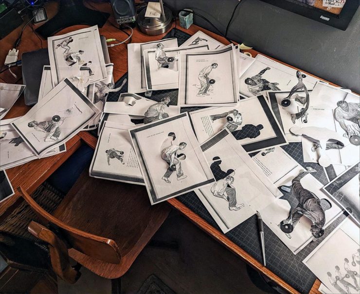
Here’s his desk — whoa:
Test cutouts in Allen’s studio, via This is Colossal.
The Article’s Great — but the Headline is the Point.
“Virality over Creativity.” Few things summarize the last few years more — it’s always about getting eyeballs, not about truth or quality. It’s satisfying the algorithm. Because, of course, these days, media is social.
Real or AI?
POV, a new series of articles from It’s Nice That examines, in this case, creativity and AI in design for the music industry. “If an artist isn’t putting a piece of themselves and their experience into the work,” it asks, “why should anyone care?”
All valid questions, yes. But it’s the headline that provides another potential word of the year: virality.
The times we live in . . . .
Some of my Favorite 2023 Photographs
I’ve updated my photography page with my favorites of 2023, including these two:
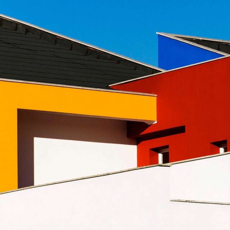
Blue Against Blue Against Blue, 943 Ellis St.
The above, taken in Augusta, is architecture that doesn’t make me feel blue, while the below, taken on the main street in Sparta, does:
Bulb Moment, 12745 Broad St.
A couple of reflections: I didn’t get out as much as I did in 2022, and regret it, and have somehow pretty much eschewed both black-and-white and effects (film grain, light leaks, etc.), and kind of regret that, too. Both things to do differently in 2024.
That said, six years after investing in a different style of photography, I’m settling in — and looking forward to the future. I hope you are, too.
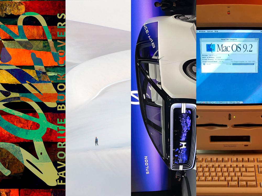
In this installment, Honda’s new(ish) logo, the Travel Photographer of the Year 2023 winners, and the Macintosh turns 40. Plus, one more thing. But first:
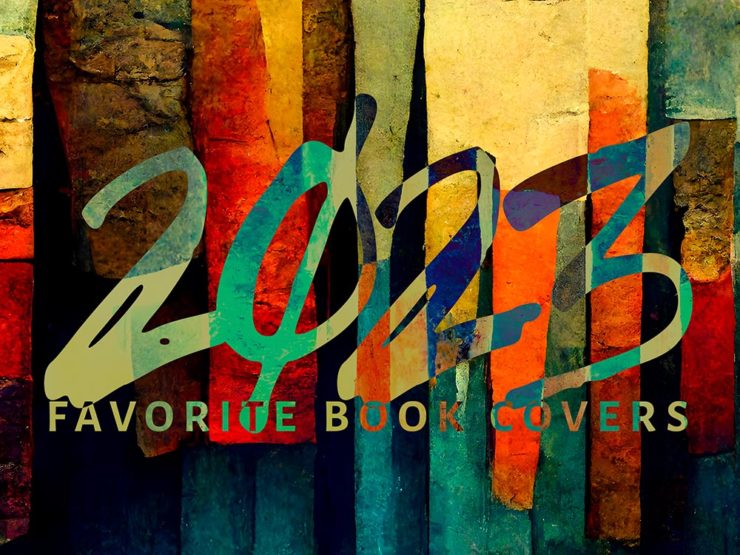
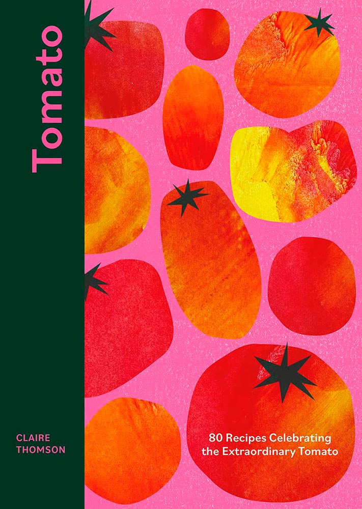
My Favorite Book Covers of 2023
In case you missed it, the annual favorite book covers post is up — all 78 items (plus some extras). It’s best viewed large, so click and enjoy.
Honda’s New Logo: Not a Zero
Not a zero — an “H.” Clever(ish).
As car manufacturers go, Honda’s tiny. As a result, they’re way behind on the electric push: they’ve got some hybrid stuff, a hydrogen fuel-cell item only available in California, and a new battery vehicle built by GM. Not where you want to be in 2024.
So they’re trying to make a splash. And to their credit, they’re doing it in an attention-getting style. Introducing the Honda Zero series, starting with the Saloon:
Futuristic indeed.There’s no mistaking this for an Accord — but then, that’s the idea.
And the Honda Zero Space Hub:
Not minivan, Space Hub. (The no-rear-window thing is becoming a trend, alas.)
Other Zero Series cars will follow, and of course, being concepts, details are scarce. Both concepts, however, highlight a new logo for Honda’s EV effort:
Yeah, not earth-shattering. (And distinct from the Zero-series logo, above, which does not seem to appear on the cars — only marketing materials.) Here’s a history, for reference:
It’s worth noting that the non-electric cars will retain the current logo they’ve used since 2001. Read more at Motor1 or The Drive. (The latter has more on Honda’s Zero cars, too.)
2023 Travel Photographer of the Year (Contest)
Disclaimer up front: it’s another pay-to-enter photography contest, which seem to have proliferated. The problem here is the outstanding quality of output — perhaps I should just get over it and move on.
The rules of this one require both prints for final judging, no composite images, no AI, and a RAW file to check results against. All of which mean, to me at least, a higher level of achievement in order to enter. Okay.
Shout out to the BBC for bringing this year’s winners to my — our — attention.
Travel Photograph of the Year 2023 overall winner: AndreJa Ravnak, Slovenia
Slovenia is a beautiful country, and AndreJa Ravnak’s winning portfolio of photographs absolutely reflects both that and its hard-working agricultural nature. But there’s more:
Nature, Wildlife, and Conservation Portfolio Winner: Martin Broen, USA
A “ray of sunshine” joke here . . . .
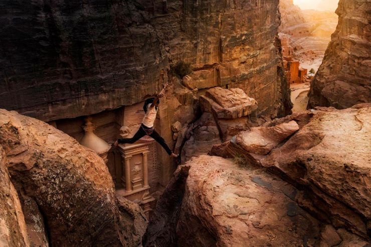
Leisure and Adventure Winner: Andrea Peruzzi, Italy
Certainly a lesson in how not to enjoy the wonderful city of Petra, in the Jordanian desert — but an attention-getting photograph.
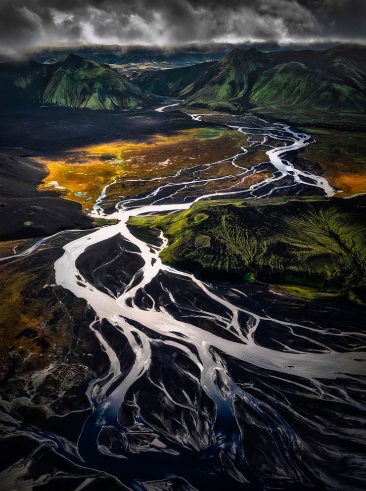
Landscape and Environment Portfolio Winner: Armand Sarlangue, France
Seriously amazing stuff: moody, dramatic, and yes, fluvial morphology. Nice.
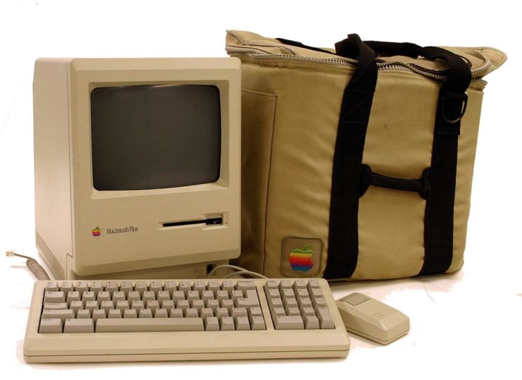
1984 seems like so very long ago — and let’s face it: 40 years is a long time. Indeed, these forty years of technological progress has been unrivaled in human history. But the Mac is not only still with us but better than ever.
We believe that [this] technology represents the future direction of all personal computers,” said Steven P. Jobs, Chairman of the Board of Apple. “Macintosh makes this technology available for the first time to a broad audience–at a price and size unavailable from any other manufacturer. By virtue of the large amount of software written for them, the Apple II and the IBM PC became the personal-computer industry’s first two standards. We expect Macintosh to become the third industry standard.
— Apple Computer, January 24, 1984
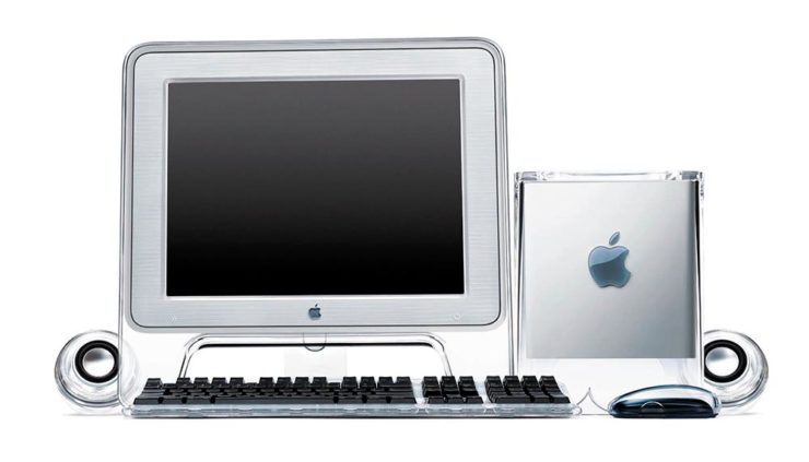
My first Mac was the one pictured above: a 1989 Mac Plus, with an external 20MB (!) Jasmine hard drive. (I even still have the case, although mine was a black Targus item.) It didn’t last long, though, because I’d been bitten by the graphic design craze and soon traded it for a Mac called a Quadra, with its separate 256-color monitor.
A preview of the future: 2000’s PowerMac G4 Cube.
Such was the pace of technology those days: that one was replaced with another, then another. (Including one of the Macs pictured at the top of the post. Bonus points if you know which it is.) I did not have the G4 Cube, pictured above, because by then I was rocking a tower and scoffed at Apple’s first attempt at desktop miniaturization — not to mention the inferior quality of the first generations of flat screens.
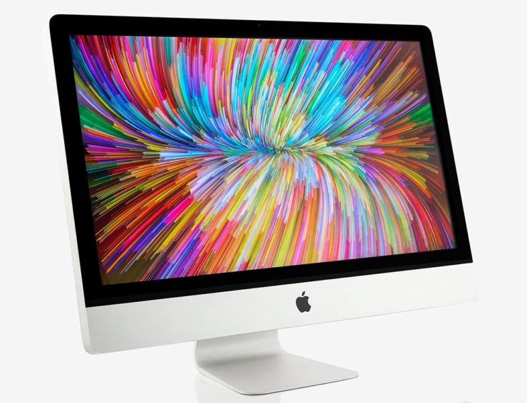
All-in-ones were — and remain — the domain of Apple’s iMac.
But less than ten years later, the computer had become part of the flat screen, and these days, I’m still using a 27″ iMac. Sure, its days are numbered, but I love its ability to get huge book and photography projects out the door with a minimum of fuss — all in a simple, elegant package with very much more than a passing resemblance to the original Macintosh.
Here’s to another 40 years, Apple. Congrats.
Special Bonus: There are few folks more “Mac” than John Siracusa, who has penned a thoughtful piece on AI: “I Made This.” (Via Pixel Envy.)
One More Thing: Word of the Year, 2023
From none other than Cory Doctorow: “enshittification.”
Here is how platforms die: first, they are good to their users; then they abuse their users to make things better for their business customers; finally, they abuse those business customers to claw back all the value for themselves. Then, they die.
— Cory Doctorow, Pluralistic, 21 January 2023
He’s specifically referring to TikTok, and cites Amazon and then Facebook as further examples, but oh, so many, many other items apply. I’ve not read something that represents where we sit — in America, sure, but beyond — at the start of 2024.
And this year promises to be a doozy.
“‘Monetize’ is a terrible word that tacitly admits that there is no such thing as an ‘Attention Economy,'” he writes. And yet, “monetize” is where business, education, and perhaps society is at. Ug.
The whole thing is fantastic and very much worth a read. But, “[n]ow that [they] have been infected by enshittifcation, the only thing left is to kill [them] with fire” might be taking things a bit far. Let’s hope — and work — for a better solution. For all of us.
2023 seemed to go by with greater speed than normal, meaning the process of accumulating my favorite book covers occurred more hastily than I would have sometimes preferred — after all, perusing the best of the new releases is tremendously enjoyable. It’s just that, due to this year’s hefty undertakings, I was not able to make as much time as I’d have liked.
So I was surprised when, in early January, the tally of candidates in the favorites folder was over two hundred items. A bounty of goodness.
Narrowing those down to the list below was exceptionally difficult. I tried to get to last year’s limit of 70 titles, but failed; I managed to narrow it to 80, then 78, but just couldn’t winnow any further.
Pull up a chair. This one’s gonna take a minute.
Please remember that these are my favorites — others might say “best,” but I’ve been in this business long enough to know that there’s always another title you haven’t seen or read about, and I don’t want to disrespect any of the talented book designers not on this list. I’ve tried to include design credit where I could — special thanks to the folks who answered emails with that information — and wish to stress that any mistakes in the list below are mine.
Note: If you’re on Foreword’s main page, please click on the post title, above, to view this list. You’ll get larger covers for your viewing pleasure.
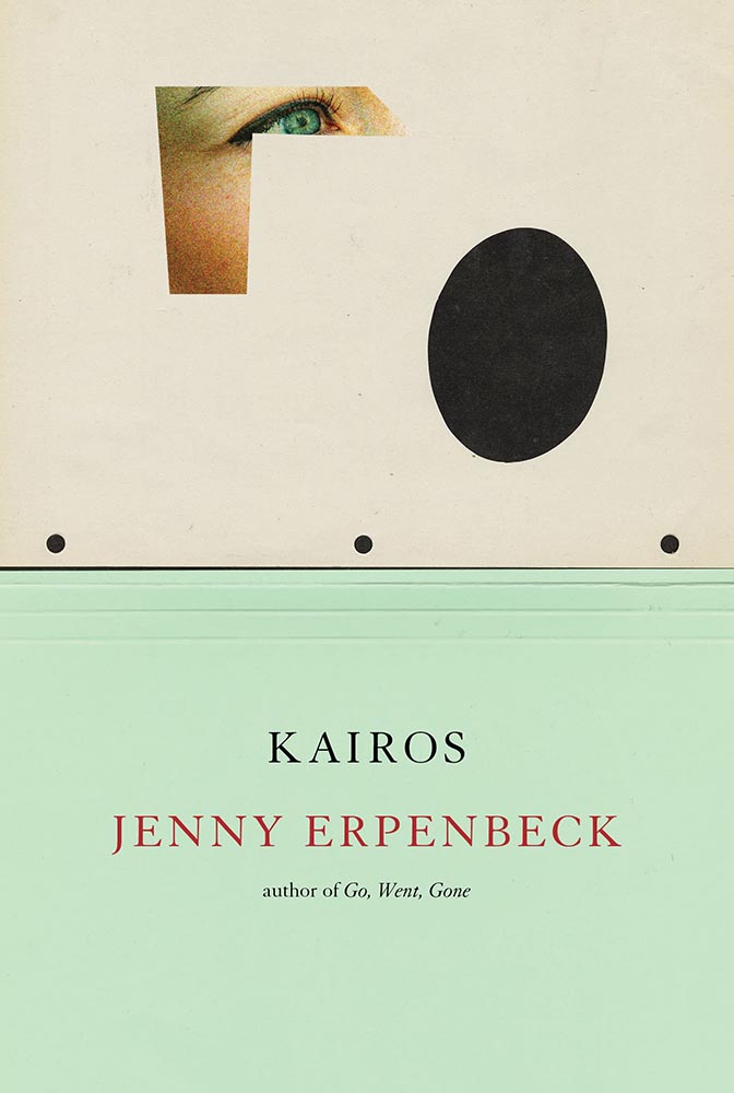
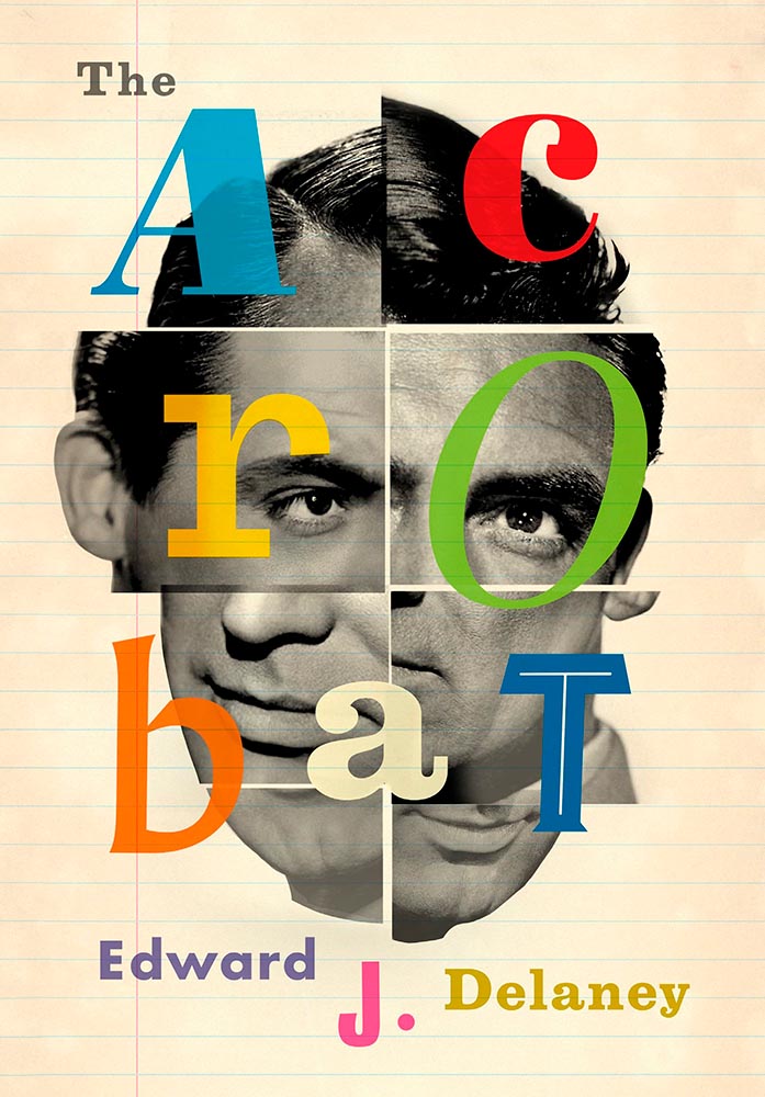
My Favorite Book Covers of 2023 (three-way tie)
Design by Keith Hayes with art by Sasha Vinogradova.
“Find a gateway to the underworld. Steal a soul out of hell. A simple plan,” the Amazon description starts, and it’s a sequel of magic, secret societies, and whatever else.
But never mind all that. This cover grabbed my attention in a way few do, with its combination of art, shadow, and type, all carved to perfection.
Design by Oliver Munday.
I dare say that only Oliver Munday could have done this expression of so much with so little. Enormously appropriate, then, for a memoir only 64 pages long.
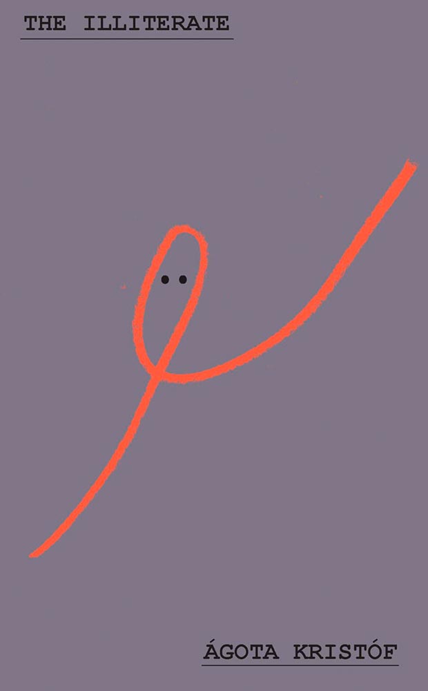
Design by Adriana Tonello.
From The Illiterate‘s Hungarian refugee in Switzerland we move to a Norwegian immigrant seeking freedom in America. Alas, she turns out to be our first (known) serial killer — giving this hand a quiet, eerie yet somehow classic quality that quietly compels like few others. Outstanding.
Other 2023 Favorites, in alphabetical order:
Design by Holly Ovenden.
Impressive sense of movement from these figures, whose interplay with the title type combines with quotes-on-a-path (something of a trend this year) and great color choices to provide something memorable.
Design by Keith Hayes.
Such a simple concept. Such superlative results. No other concerns.
Design by Holly Ovenden.
There is another version of this on one of the “best of” lists, but I much prefer this one, with the circling birds and hand-done lettering. A two-color triumph.
Design by Oliver Munday.
Oooollllliiiiivvvvvveerr!
Design for the US version by Anna Weyant.
One of those examples where the art just shouts off the shelf, although the type treatment works exceptionally well, too. Better still, it’s one of the rare US versions that bests its UK treatment:
Design for the UK version by Kishan Rajani.
Not at all bad — in several “best of” lists, in fact. Just not mine.
Design by Sarah Wood.
I’m not sure whether the items on the page are models, made (or found) objects, or some extremely well-done Photoshop work, but ultimately it’s combination of the simple graphics and brilliant typographic treatment that earned this title its spot. Fantastic.
Design by Caroline Johnson.
The ’70s are hot right now, but this is 2023, aged to perfection. Very nearly made the “best of,” not just the “best of the rest.” Horrifically good.
Design by Oliver Munday.
Type, color, pattern, brilliance. Must be a Munday.
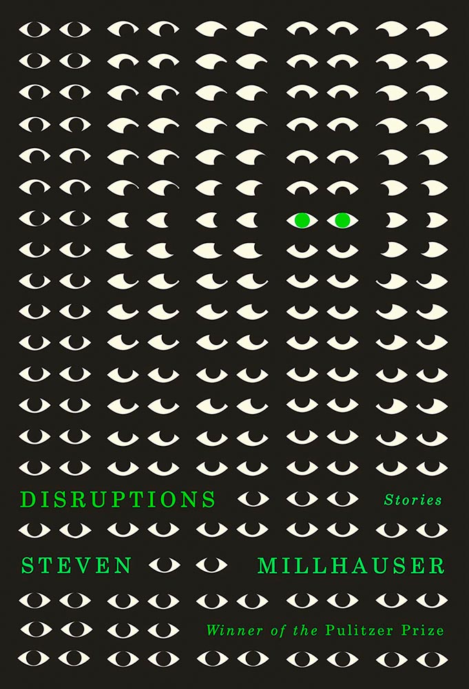
Design by Dylan C. Lathrop.
Eyes are a frequent guest on book covers. Rarely so many, though, and rarely in two-color. Winner of more than a Pulitzer.
Design by Emily Mahon, lettering by Martina Flor.
Edie O’Dare does tell, it turns out. “Cinematic” might be a cliché, but….
Design by Pete Garceau.
I’m a sucker for a great woodcut-style illustration. Great type treatment propels it into a standout book cover.
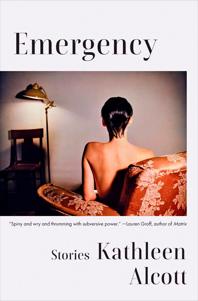
Design by Ingsu Liu.
There’s something decidedly non-emergency about this, yet once you understand, it works perfectly: simple, yet so very not.
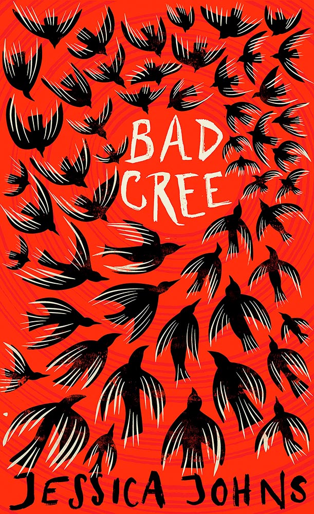
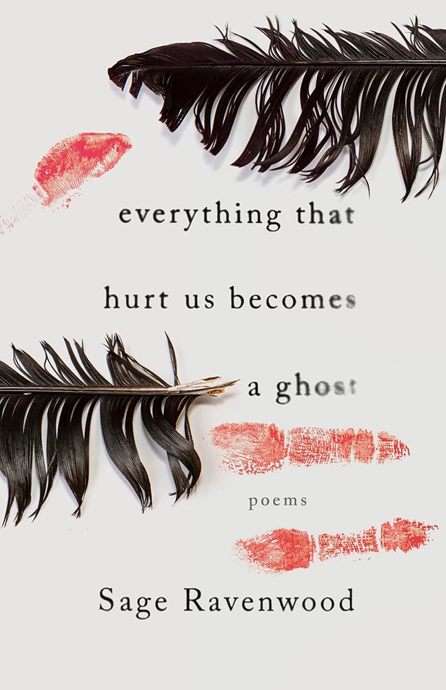
Design by Eric C. Wilder.
This book of Native poetry ranges from Missing and Murdered Indigenous Women (MMIW) to reverence to the natural world to “the machinations of colonialism,” a cover assignment that could border on impossible. Yet, here . . . absolutely brilliant. Expressive and so much more, including possibly my favorite type treatment of all on this list.
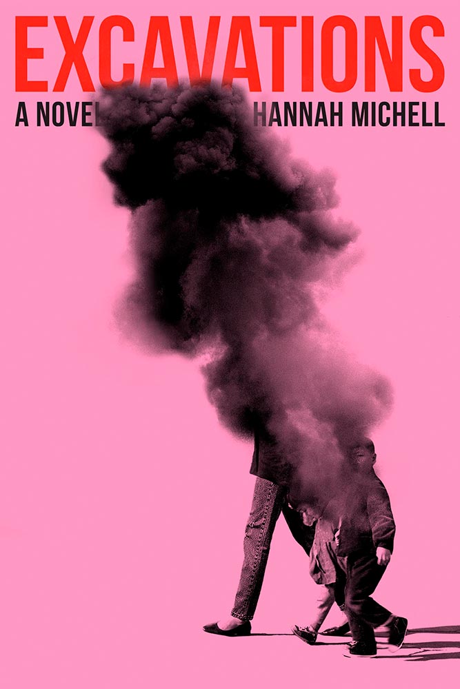
Design by Arsh Raziuddin.
Danger: UXB. (The pink is an inspired choice, too.)
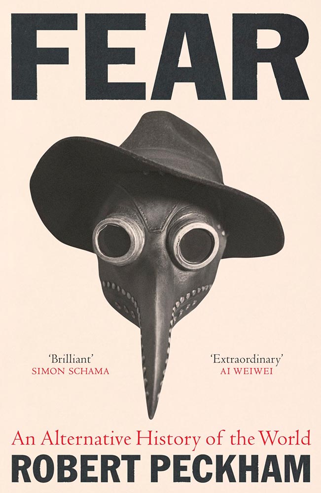
Design by Tom Etherington.
Fear knows no bounds, only stylish hats. (On the LitHub list, someone said it has “serious 2024 vibes,” which I’m concerned may turn out to have some truth to it.)
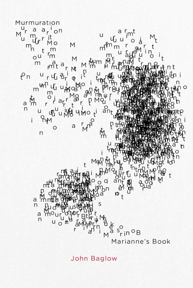
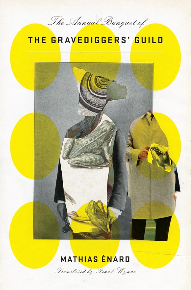
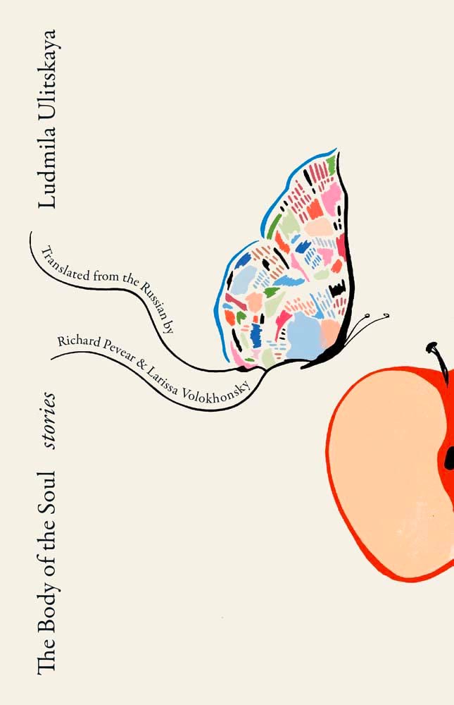
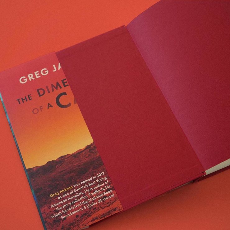
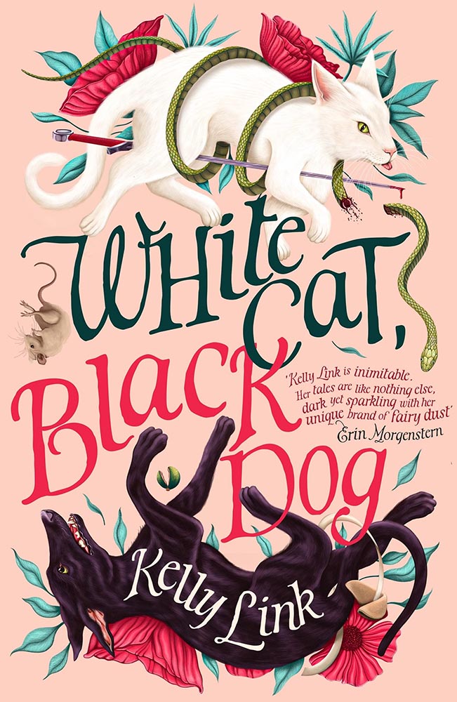
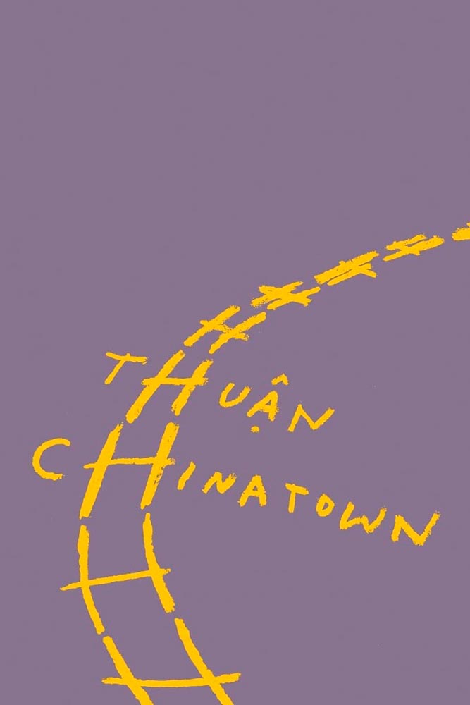
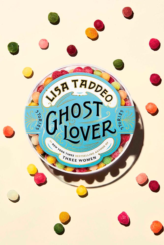
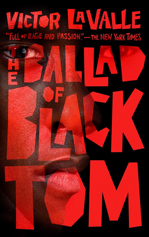
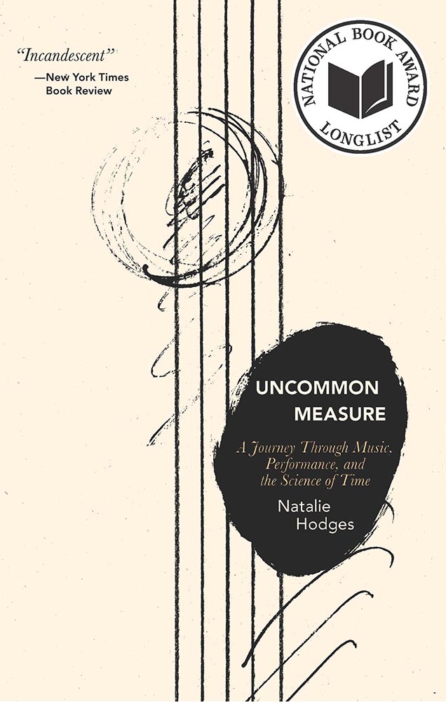
Screen print by Kate Gibb, lettering by Jodi Hunt, and photograph by Adaeze Okaro.
Rarely have photo and type worked so well together. Fantastically well done, with plenty of room for the soon-to-be-added kudos, quotes, and awards.
Design by Beste Miray Doğan.
Who splits a four-letter word onto two lines? Someone after great results, as it turns out — with bonus points for the pattern and color in the “splash.” Nice.
I’m at a bit of a loss to describe why I like this so much, except that every time I look at it, I like it even more.
Design by Kate Sinclair.
Perfect execution of a simple concept, from colors to art to type.
Design by Devin Grosz.
Wins the “best-placed title” award, among so many others.
Design by Greg Heinimann.
A reminder that something done often can still be done with originality — and incredibly well.
Design by Emily Mahon.
The collage-as-book-cover is another (perhaps) overused item, but when in the hands of Emily Mahon, this one looks you in the eye and won’t let go.
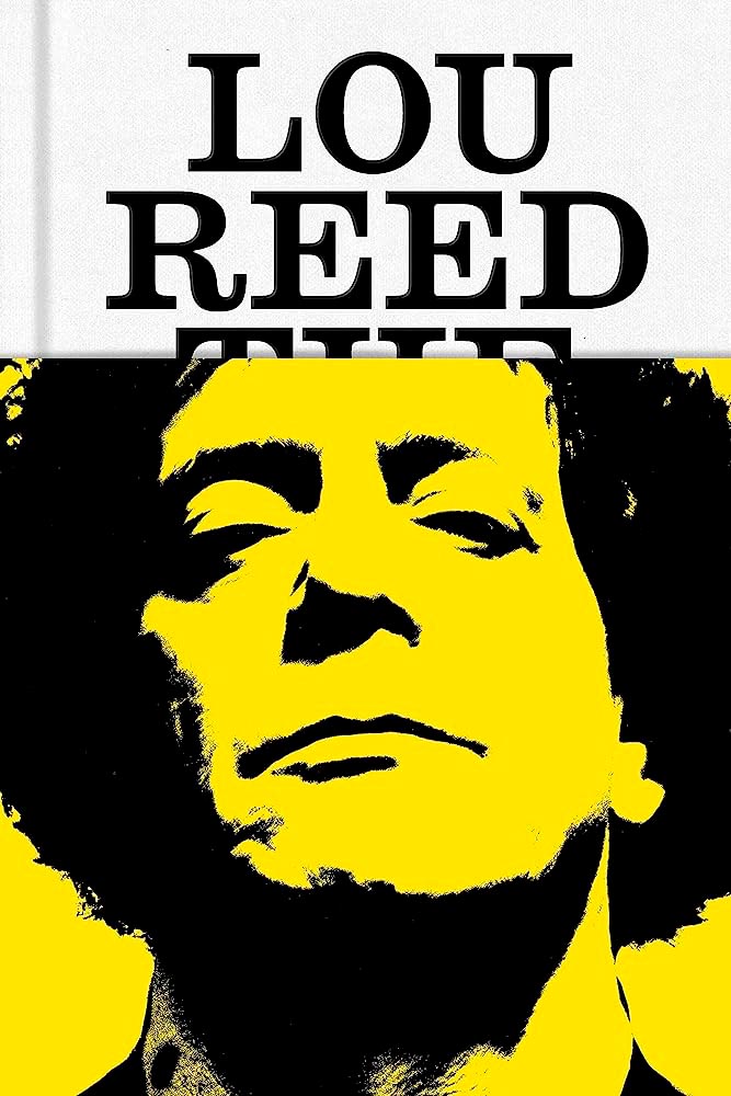
Design by No Ideas.
The jacket that covers The King of New York with . . . Lou Reed. “Well played” seems like an undersell.
Design by Janet Hansen.
From the textured paper to the type choices, this cover’s great. But with that photo choice, it’s vaulted into “best” category.
Design by Alex Merto.
The combination of geometric shapes and unexpected typography mean this little guy will never get painted into a corner.
Design by David Drummond.
“Type here,” someone said.
Design by Oliver Munday.
Type-as-a-border is a trend — one I’m surprised to see on a Munday — that’s actually a great counter to the purposely irreverent illustration. I dig it.
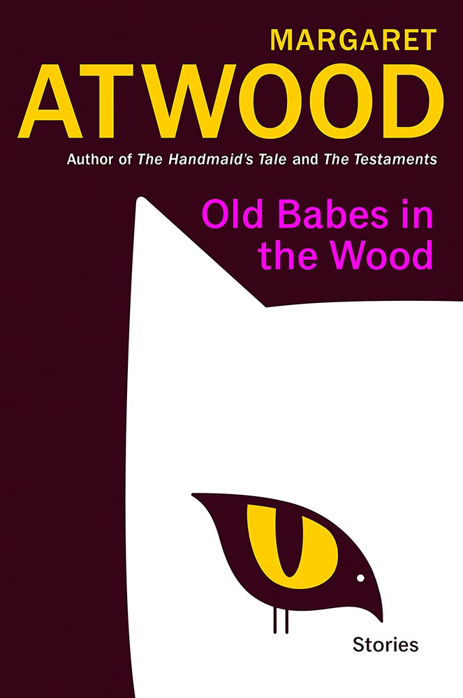
Bird-as-cat’s-eye. On a Margaret Atwood. ’Nuff said.
Design by Luke Bird.
Brilliantly, uh, substantive: a lesson in how-to.
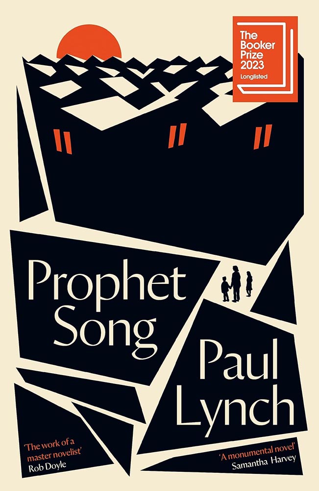
Design by Jack Smyth.
The rooftops alone make this, but avoiding the stereotypical Irish colors is a huge bonus, too. (This title went on to win the 2023 Booker Prize, by the way.)
Design by Janet Hansen.
A triumph of the less-is-more approach, starring a headless human and superlative typography. Fantastic.
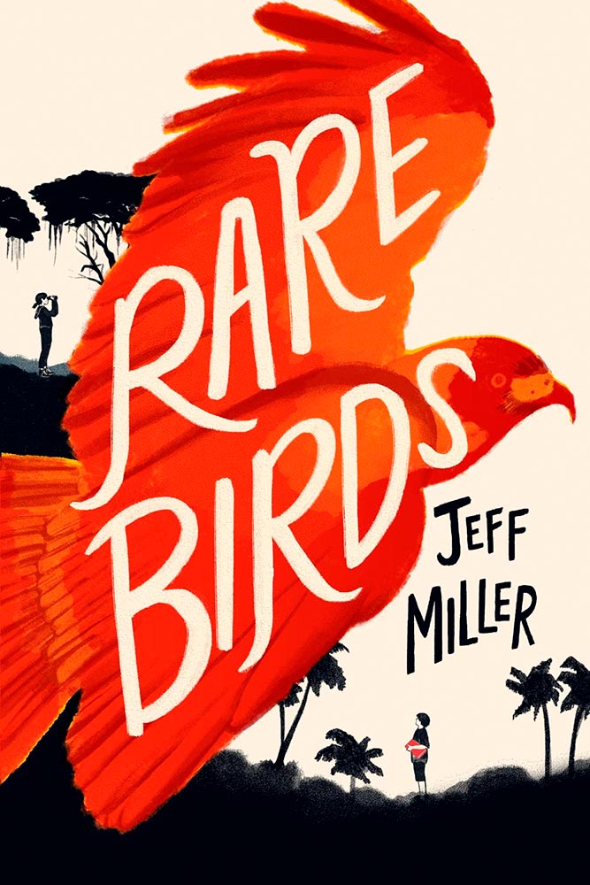
Design by Kimberly Glyder.
It’s rare to see children’s literature graced with such a great cover — this one literally flies off the shelf to grab your attention. A rare bird, indeed.
Design by Alban Fischer.
St. John called: this cover is fabulous, from evocative body parts to hand-lettering to die for. Awesome.
Design by Will Staehle.
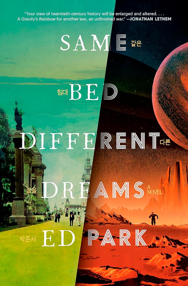
A novel on the Korean Provisional Government — and so very much more. The split treatment, with both halves running at 11, get fantastic typography and the Korean characters (in gold, obvious in person) are a great touch.
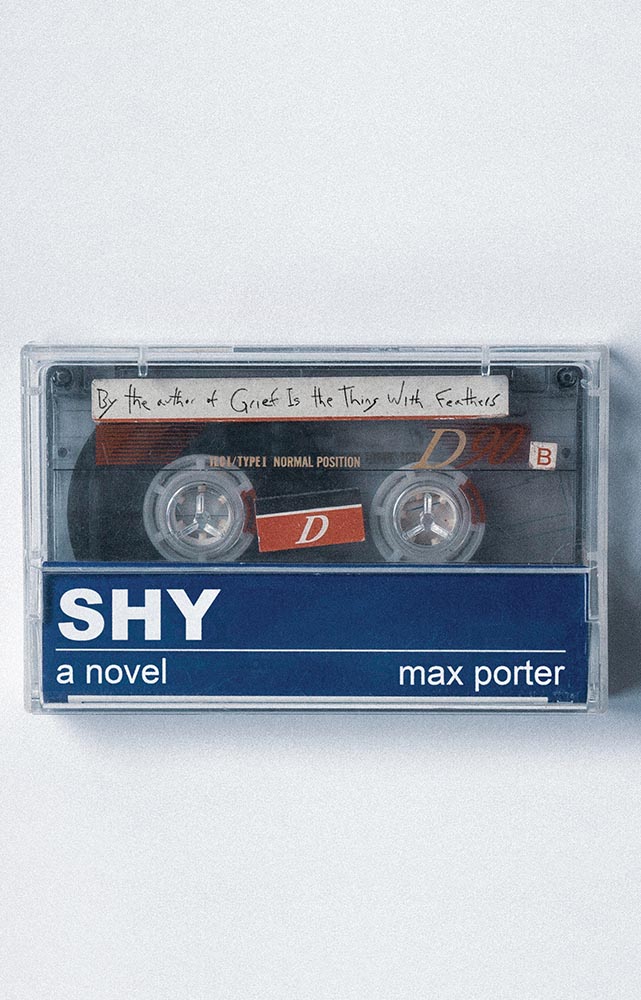
Another where the US version shines, especially as cassettes are coming back into fashion. (Special points for the subtitle-as-label.) A B-side no longer.
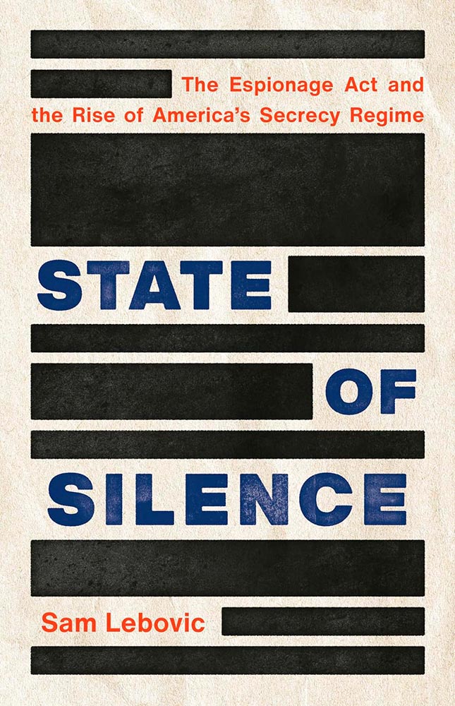
Design by Emmily O’Connor.
Brilliant comment redacted.
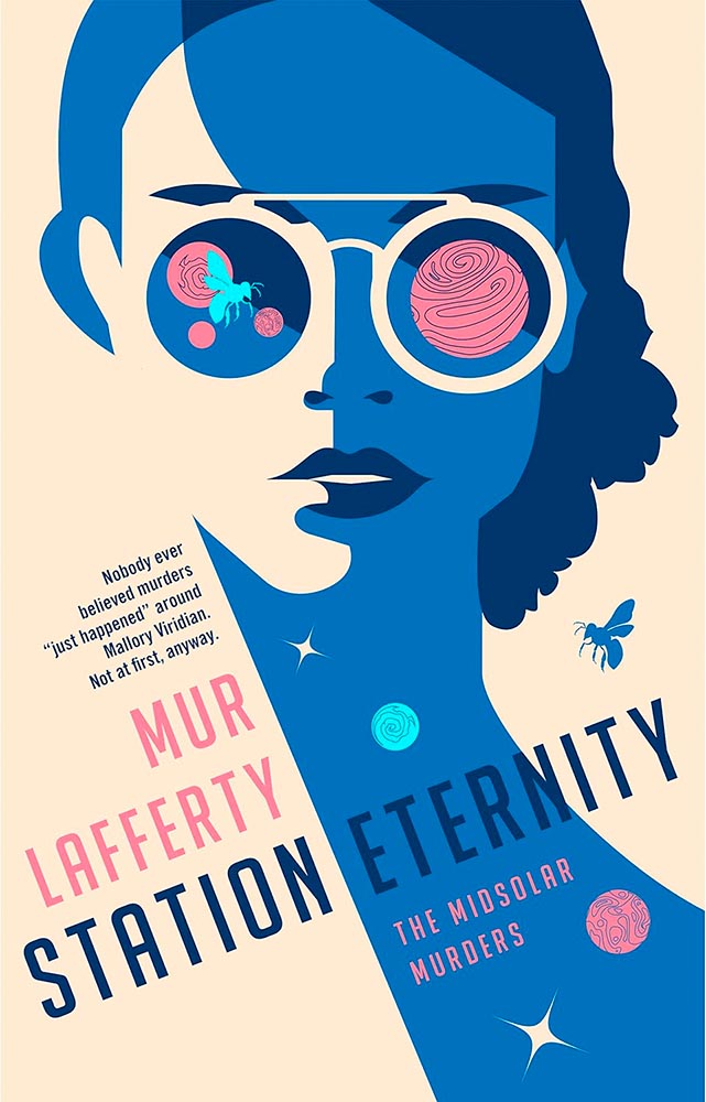
Design by Will Staehle.
Mallory Viridian is an amateur detective on an extraterrestrial (and sentient!) space station — perfectly sold with this line-art-only cover. Fantastic.
Design by Anna Green.
Dead birds wouldn’t ordinarily be my go-to for cover excellence. But this one, with its painterly quality and hand lettering, perfectly hints at the haunting, slightly bizarre adventure within. Perhaps I should study more; as many will testify, it’s certainly not an obedience thing. (Read the Booker Prize listing.)
Design by Caroline Suzuki.
One of those instances where the graphic just sells the cover. Brilliant.
Design by Jaya Miceli.
The continuing stigmatization of the LGBTQ+ population in the United States is so perfectly summarized here. (I’m curious how this cover was done, too: white paint, then watercolored? Gouache? Either way, the colors serve the overall so very well.)
Design by John Gall.
This collage jumps through my psyche: sophisticated, off-kilter, and yet, somehow, completely right.
Design by Jamie Keenan.
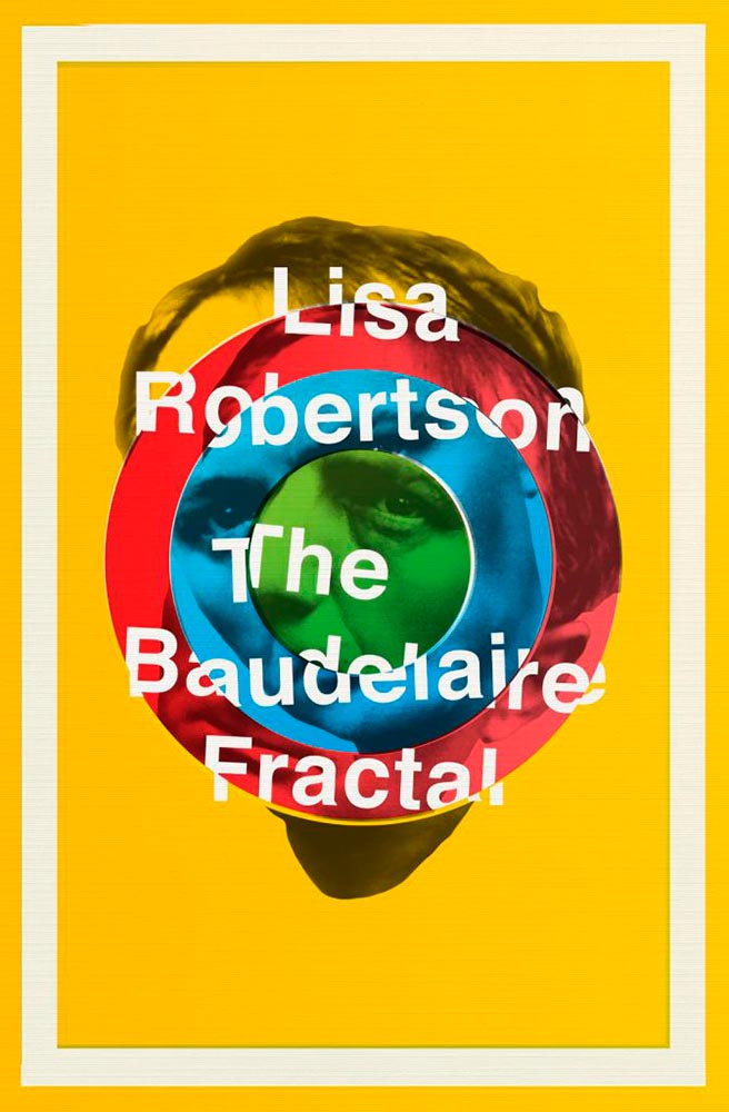
I had to look up Charles Baudelaire, I have to admit — but didn’t need to know in order to get the disjointed, colorful appeal of this cover.
Design by Na Kim.
Leaving a trail, all right. (Also: the text colors.) This version is mercifully short of Booker notifications, too — sometimes, I wish all the callouts and clubs would just go away.
Design (and illustration) by Sarah Schulte.
Type on a path can be fraught, as can simple illustrations on off-white. Except when simple ideas are translated into compelling book design. Completely different from the above, yes, but just as accomplished.
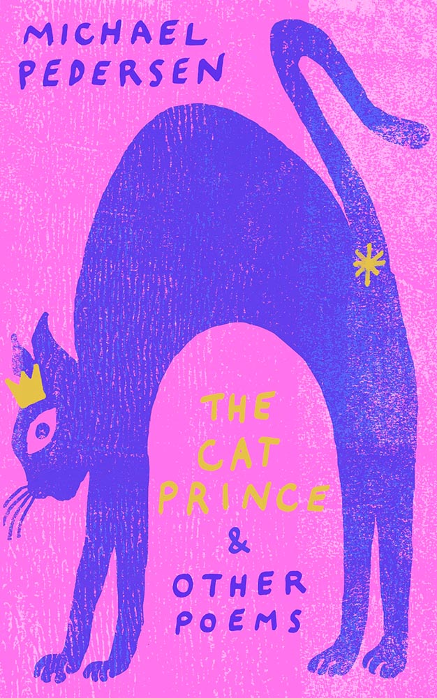
Design by Gray318.
Crown. Asterisk. Print!
Design by Sarah Shulte.
As the risk of repeating myself: “Type on a path can be fraught, as can simple illustrations on off-white. Except when simple ideas are translated into compelling book design. Completely different from the above, yes, but just as accomplished.”
Design by Jamie Keenan.
This trick can only be pulled once, and book designers everywhere are envious downright jealous. Here’s the cover — uh, flap:
“Continued on rear flap,” it doesn’t say.
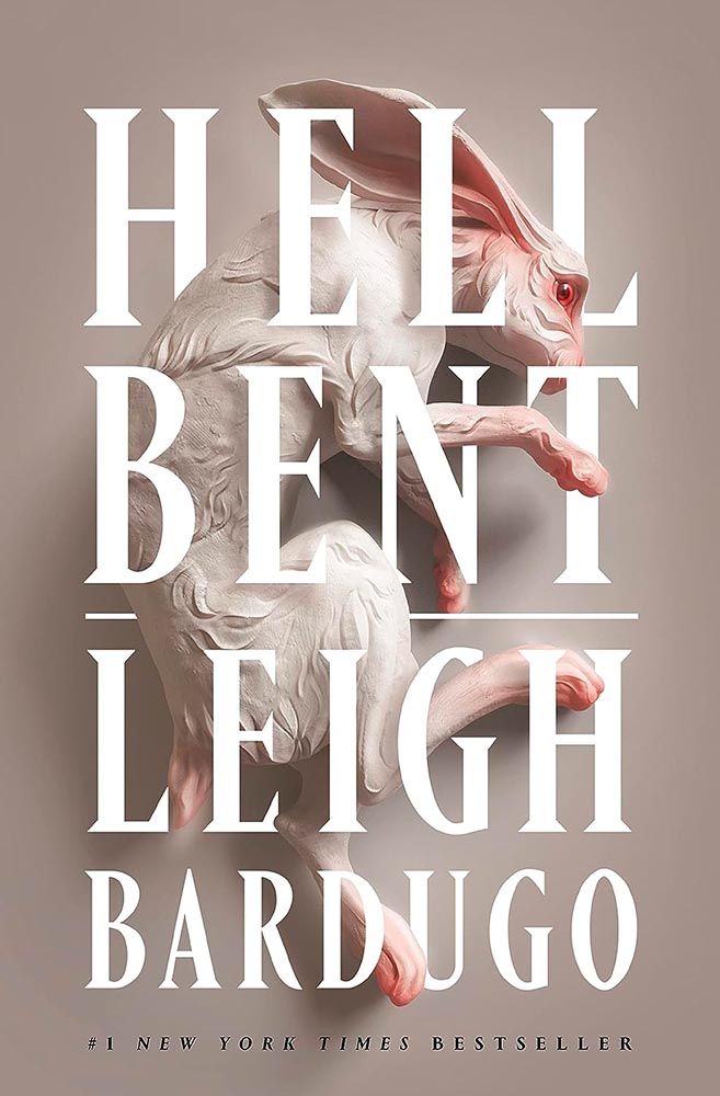
Design by Lauren Peters-Callaer.
Brilliance in titling aside, check the glint in the rabbit’s eye. Wonderful.
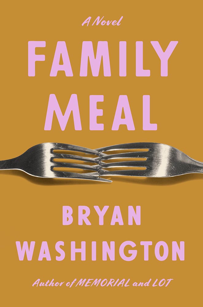
Design by Grace Han.
Interlocking forks, LOL. (Also, color choices.)
Design by Alex Merto.
This has gotten a bunch of well-deserved attention: from the embossed type to the gradually-increasing repetition of the artwork, Alex Merto scores and scores then repeats. Great stuff.
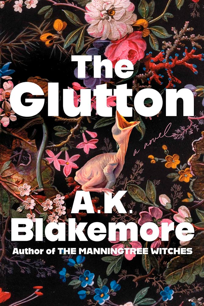
Design for the US version by Alicia Tatone.
Gluttonously hits a bunch of high notes, and keeps coming back for more — until:
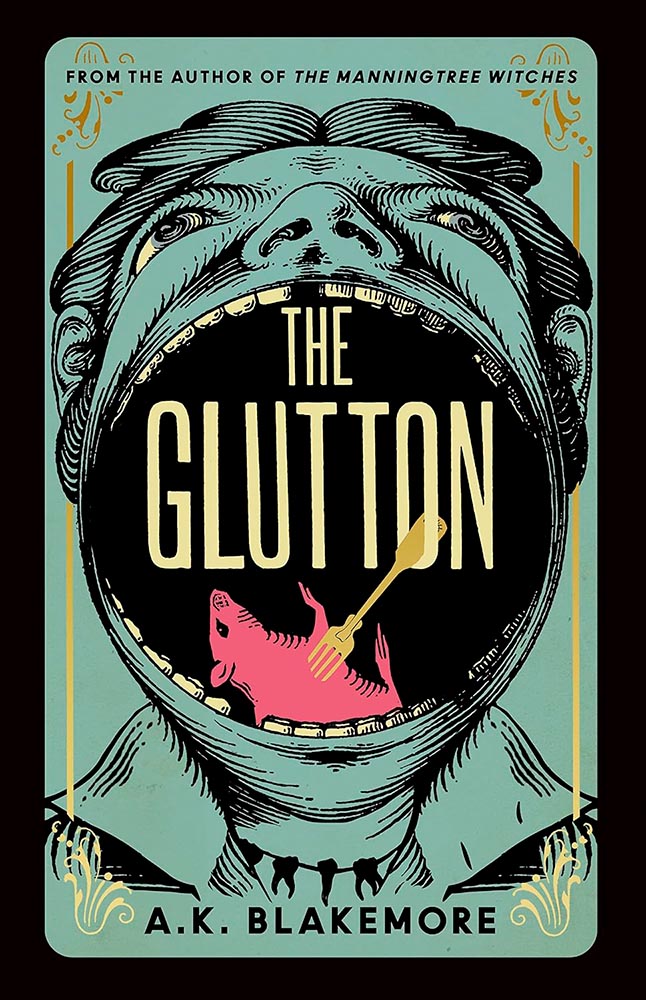
Design for the UK version by Jo Walker.
Yeah. Score one for the UK.
Design by Kelly Winton.
Is it possible for something Escher-esque to be soothing? Yes, it turns out.
Design by Oliver Munday.
Perfectly abstract, brilliantly pulling together the remarkably disparate stories within.
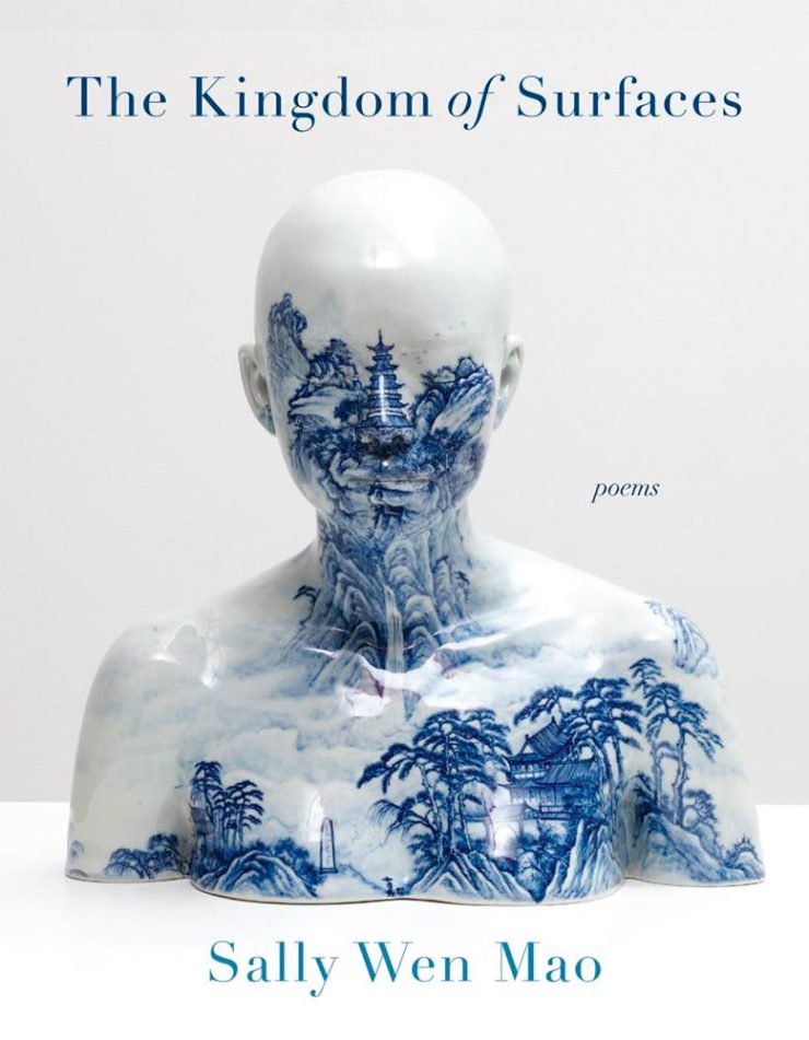
Design by Kapo Ng.
“Kingdom of surfaces,” so very indeed.
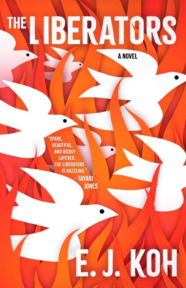
Design by Beth Steidle.
“Spare, beautiful, and richly layered, the [book’s cover] is dazzling.” —Foreword
Design by Allison Saltzman.
Another of those too-simply concepts that checks out on every level. Awesome.
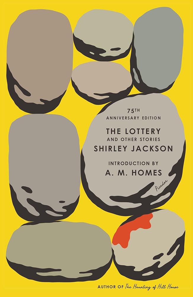
Design by Alex Merto.
Rarely does so much text take up so little space yet work so well — this 75th anniversary reprint stacks up. (Imagine inspiring a school-aged Stephen King, by the way. That’s “The Lottery.”)
Design by Linda Huang.
“A novel” has never played so well.
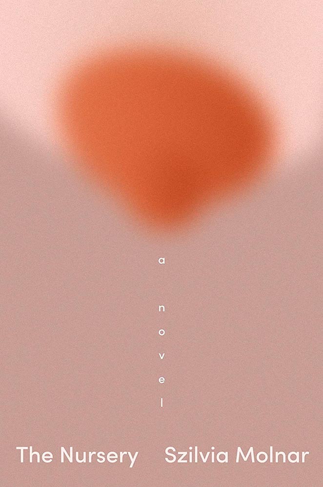
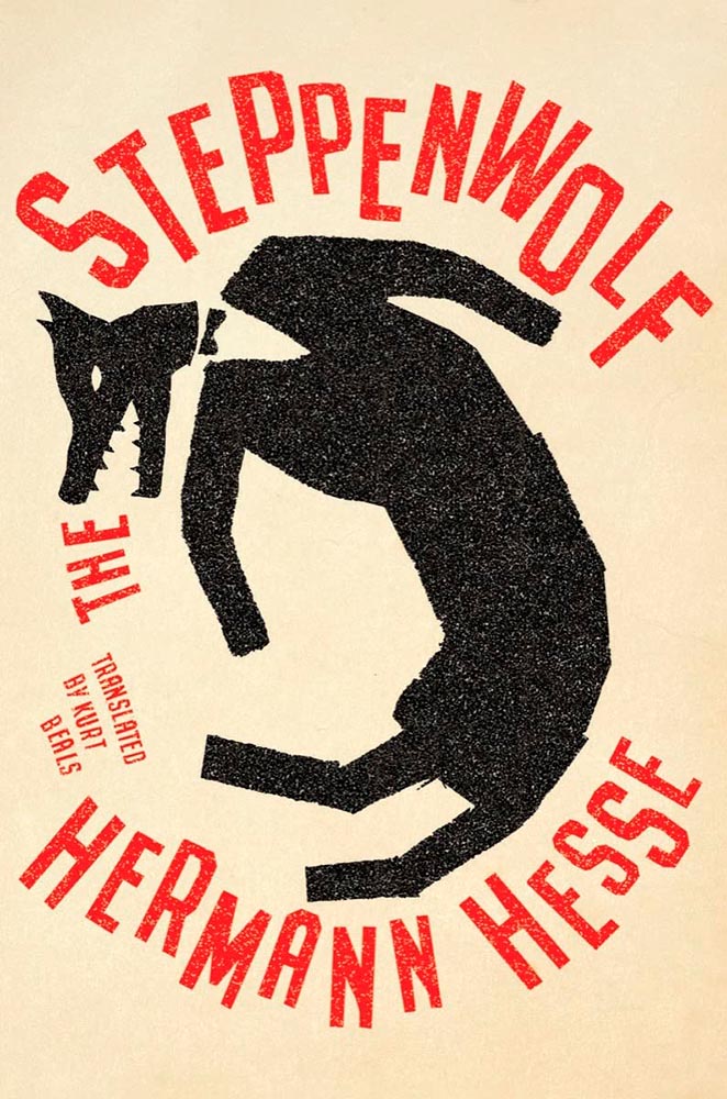
Design by Jaya Miceli.
Steppen-out: this new translation gets new meaning. (In the text, too, I understand.)
Design by John Gall.
Multi-layered shadowboxing. Nice.
Design by Steve Attardo.
A study in simple perfection. For a book examining heightening fascism, toning down the cover speaks volumes. Great choices on every level.
Design by Greg Mollica.
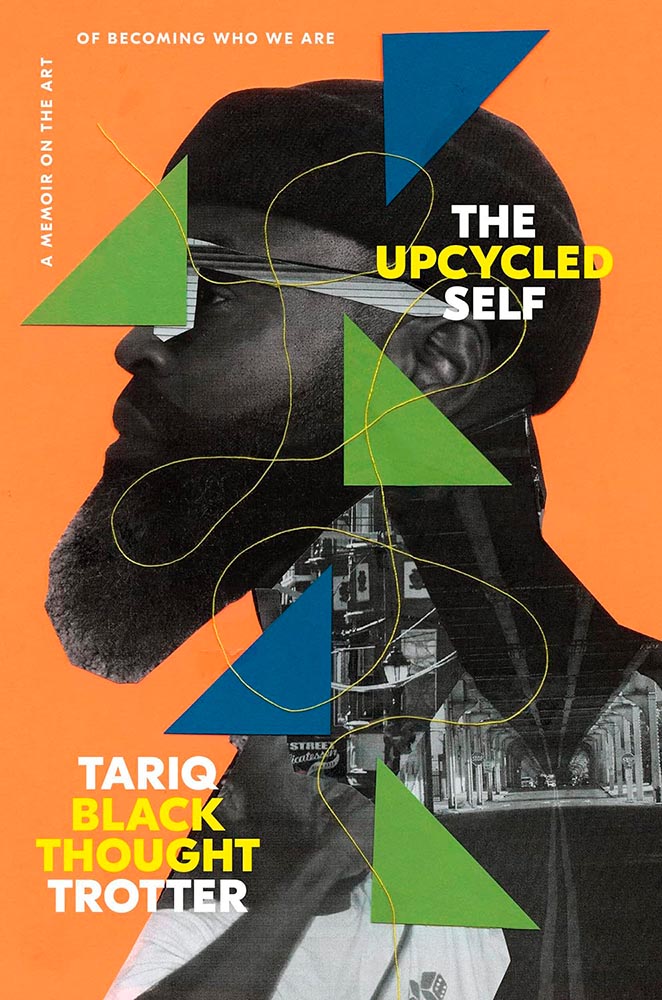
To collage in a way that the resulting product is of higher value than the original items: upcycling, indeed. (“The thread tying the cover together is a masterstroke,” he said.)
Design by Lauren Peters-Callaer.
“The humor of a great conversation,” one of the reviews said, and better words could not be found for the cover. Masterful.
Design by Andrew Davis.
The woodcut-style illustration is back, in two-color and aged to perfection. (The paperback kept the illustration but changed out and dulled the colors, to a much less satisfying effect. Curses.)
Design by Tom Etherington.
“Permeable boundaries,” illustrated brilliantly, with perfect texture and typography.
Design by Tyler Comrie.
“Sings,” someone said. “Seconded,” I said.
Design by Jonathan Pelham.
Stories told in a triumph of less is more. (The US version is good — another that’s one some others’ “best of” lists — but here’s another one where I think the UK slam dunks.)
Design by Laywan Kwan.
This is one of those covers that keeps giving, a three-color triumph of telling the book’s story. (Also: typographically counter-riffic.)
Design by Na Kim.
The Book of Goose was one of my top three covers last year, but high expectations are nothing when Na Kim is covering it. Storied, indeed.
UK version design by Andrew Davis.
I was going to go on for a minute, again, about how the UK gets all the good covers — and this one earned a spot in this post — but…:
US version design by Owen Gent.
…the more I look at this US version, the more I like it. The hint of cat, the red shading, the paper’s tone and texture, and the type treatment stand in direct contrast with the fabulously literal interpretation of the UK version. Given both, I literally couldn’t choose.
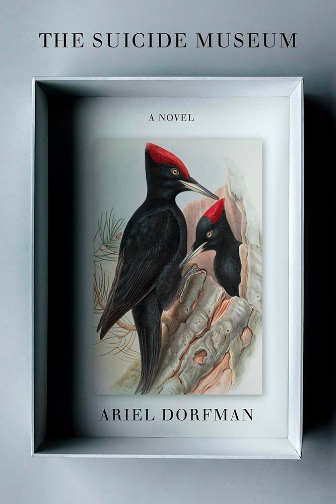
Design by Matt Dorfman.
“There’s a painting at the door,” in the most amazing state. (Political pun intended.)
William Morrow didn’t return a request for the cover design’s name, unfortunately.
There are so many ways to get this design wrong — but wow: someone took a cliché and literally flew in the face of it, to brilliant, memorable effect. I wish I could give appropriate credit.
• • •
Dan Wagstaff over at The Casual Optimist comments that,
[I]t’s like we’re stuck in a holding pattern, circling the same design ideas. Trends have stuck around. A lot of covers feel safe. Some of this was the books themselves. I’m not sure exactly how many celebrity memoirs is too many, but I’m pretty sure we reached that point and sailed right past it in 2023. No doubt some of it is sales and marketing departments sanding down all the edges and demanding the tried and true (see Zachary Petit’s alternative best of 2023 piece on killed covers for Fast Company). But I would not be surprised if it designers were just getting caught up in the churn — too many books, too many covers, and too much other stuff to worry about.
— Dan Wagstaff, The Casual Optimist
I think he’s right. Despite growing the number of selected covers this year over last, I feel that despite the outstanding items above, the majority of the book covers and jackets — almost certainly by publishers’ explicit direction — are playing it safe. After all, here in the Roaring Twenties, rocking the boat brings nothing short of vilification.
Thankfully, the designers on this list have battled the committees bent on mediocrity and overcome with great talent, great design, and great perseverance. Power to them, and I wish them — indeed, all of us — continued success in 2024.
Please note: I somehow missed the 2023 University Press Design Show — usually linked here — so please stay tuned for that post soon (and then again in July for the ’24 Show). Apologies.
As summer turns to fall, let’s take a look at Type 1 fonts, a library index, revolutionary posters, posters for “get lectured,” and two different photography contests. Let’s get right into it.
Adobe discontinues a standard: The Type 1 font
Back in the early days of desktop publishing — up to about the turn of the century, give or take — everything typographic used PostScript, a programming language by Adobe. (Other stuff, too, like Adobe’s vector program, Illustrator.) PostScript fonts were the so-called “Type 1” variety, made up of a bitmapped “suitcase” that housed the standard display sizes and an outline file used by the output device to print clean, what-you-see-is-what-you-get beauty.
The Apple LaserWriter Plus and some vintage Macs: nostalgia! (Note the book — heh.) Image: YouTube.
Companies from Apple to Microsoft didn’t want Adobe to hold a monopoly on output tech, so later fonts evolved into TrueType and then OpenType, the latter of which is the standard today.
So much so that Adobe has now discontinued Type 1, and they, along with Microsoft, have stopped being supported. Which is understandable and yet a shame: some of us still have hundreds of them.
It’s Nice That has a post that reminds us of a library’s central purpose: to leave knowing more than you did when you entered. “The library, in our shared public imagination, is a special place,” the author argues — reminding us of what libraries were established to do, often distinctly different from the modern reality (especially in the United States).
In the library you begin to be convinced that language matters, that words have the power to clarify, to rouse, to make us feel something, to help us understand the political and cultural features of historical and contemporary moments.
Lola Olufemi, It’s Nice That
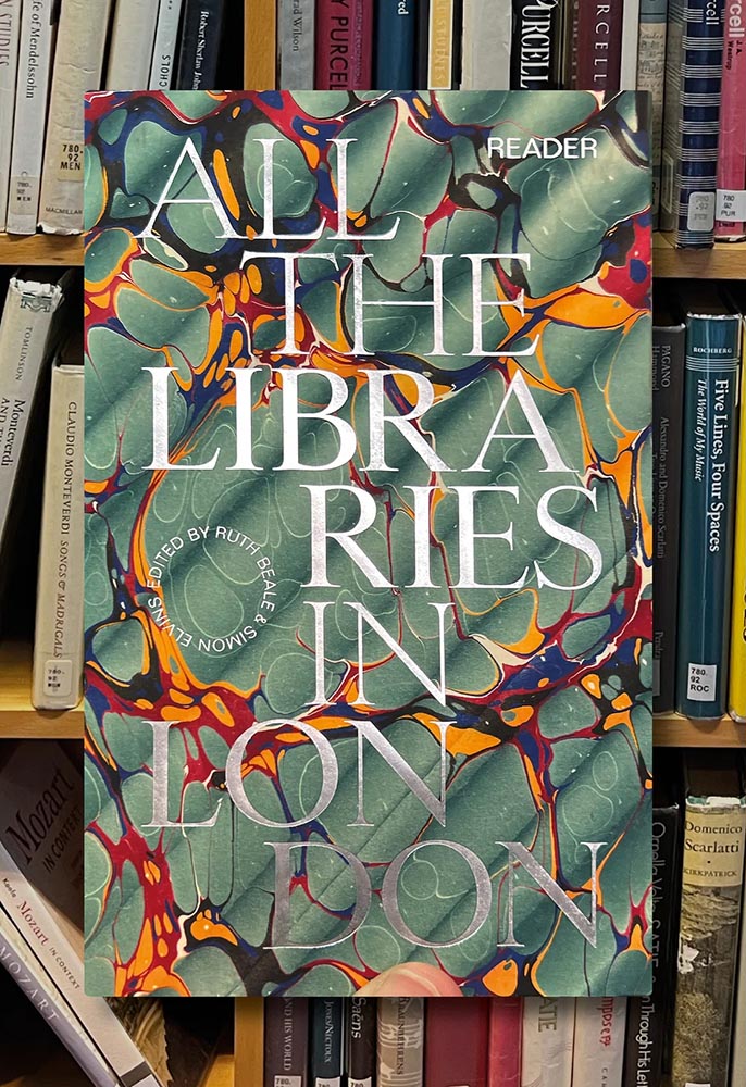
All the Libraries in London. Cover design: unknown. Image via It’s Nice That.
All the Libraries in London does something artistic with a simple listing, elevating it, reminding us how compelling the ideal that libraries represent really is:
This is a political and artistic listing, one that invites the reader to rediscover their own memories of their local library as a site of discovery. The book’s authors invite us to reflect on our personal relationship to libraries as well as the necessity of collectively securing their future existence.
Lola Olufemi, It’s Nice That
Alan Kitching, Durning Library. Image via It’s Nice That.
We need more of this everywhere, but especially here in the States. Meanwhile, check out this great item at It’s Nice That.
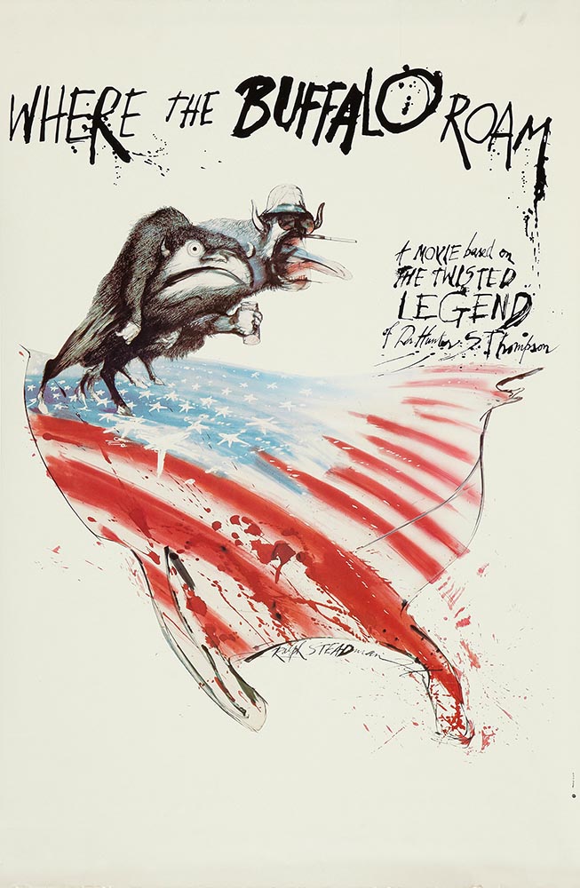
Special Bonus #1: Another British treasure, via the very British Antiques Roadshow (a British original, natch): this incredible poster by Ralph Steadman.
Ralph Steadman’s Where the Buffalo Roam (1980) poster. Image via Wikipedia.
Special Bonus #2: British book designer Steve Leard has launched a new book design podcast, Cover Meeting, featuring interviews between Leard and fellow book designers on the work, the industry, and more. The Bookseller has more.
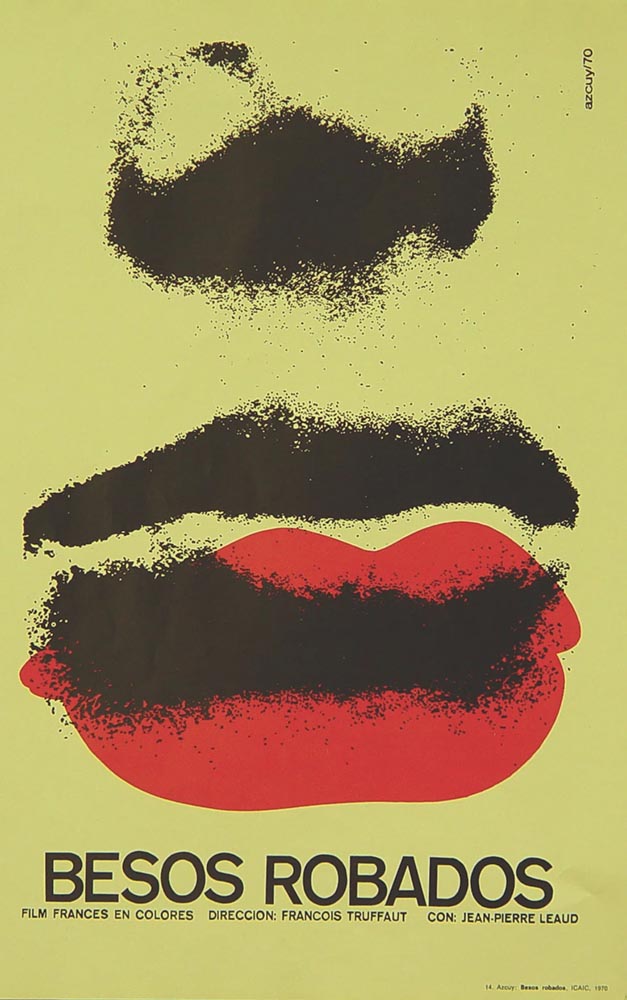
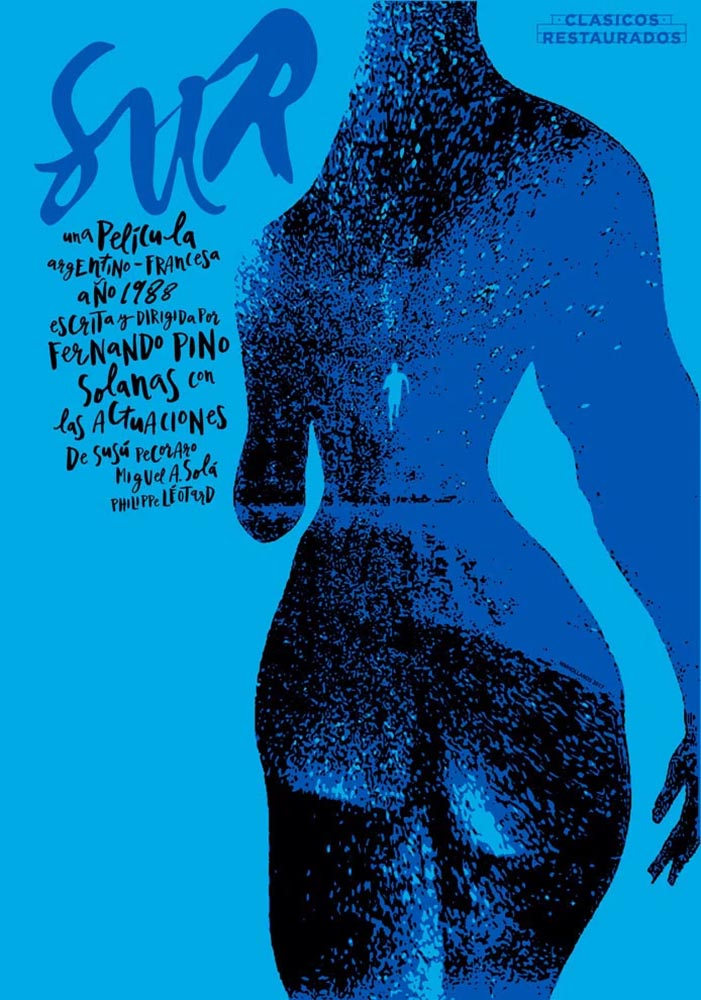
Cuban Movie Posters. No, Really.
While we’re on the subject of great posters — and It’s Nice That — let’s talk about how Cuba’s revolution-era political posters transformed their poster design for films. Appropriately enough, a new film, El Cartel Cubano, highlights these amazing (and, likely, never seen before) items.
Besos Robados, ICAIC, by Sotolongo & Carole Goodman. Image via It’s Nice That.
“How come our posters in the US aren’t this beautiful? What did this say about the priorities of the revolution? What did the medium or choices in the scarcity of materials used say about the economic situation in Cuba?” It’s these questions which form the bedrock of El Cartel Cubano, a fascinating and tender tribute to the artists on the island.
Adrienne Hall, co-director, El Cartel Cubano
Sur, by Michael Myiares Holland. Image via It’s Nice That.
I have to admit: this isn’t a subject I would have leapt at, but It’s Nice That sold it. Awesome.
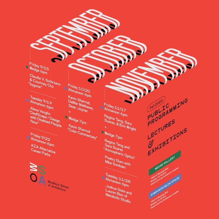
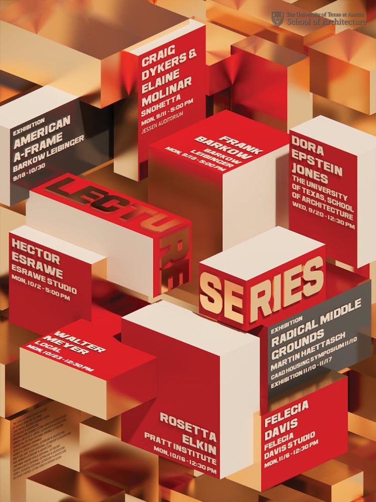
Get Lectured (on Architecture)
Closing out our trifecta of great posters, Archinect‘s Get Lectured series brings us these fantastic items from their Fall 2023 series:
Woodbury University School of Architecture’s Fall 2023 lecture series.The University of Texas at Austin School of Architecture’s Fall 2023 lecture series
Going to soapbox a little here: pay-to-enter photo contests aren’t usually something I want to spread the word about. So ArchDaily‘s basically-a-press-release, “URBAN Photo Awards 2023 has announced its list of Finalist Photographers, marking the penultimate stage of the international contest,” was guaranteed a pass.
But there’s a problem: some of the photographs are really compelling.
Winners of the 2023 Black and White Photography Awards
Another contest, yes. They’re everywhere. But … wow.
Street Lights – Ottawa, by Gareth Jones, category winner, architectureAnother mushroom? By Hector Ballester Ballester. Silver mention, architecture.Alamillo bridge, by Manuel Ponce Luque. Finalist.The concert, by Helena García Huertas. Finalist.Reflections on the stairwell, by Max Dobens. Finalist.
And that’s just the buildings/architecture — there are portraits, street photography, landscapes, and more. A reminder to aspire, every day, with every image.
The August heat is met with some refreshingly cool items for you this time: beloved movies reimagined as vintage paperbacks, graphic design on the Internet Archive, and winners of the 2023 iPhone photography awards. Plus, a bit on social media that hopefully won’t leave an aftertaste. Let’s dig in.
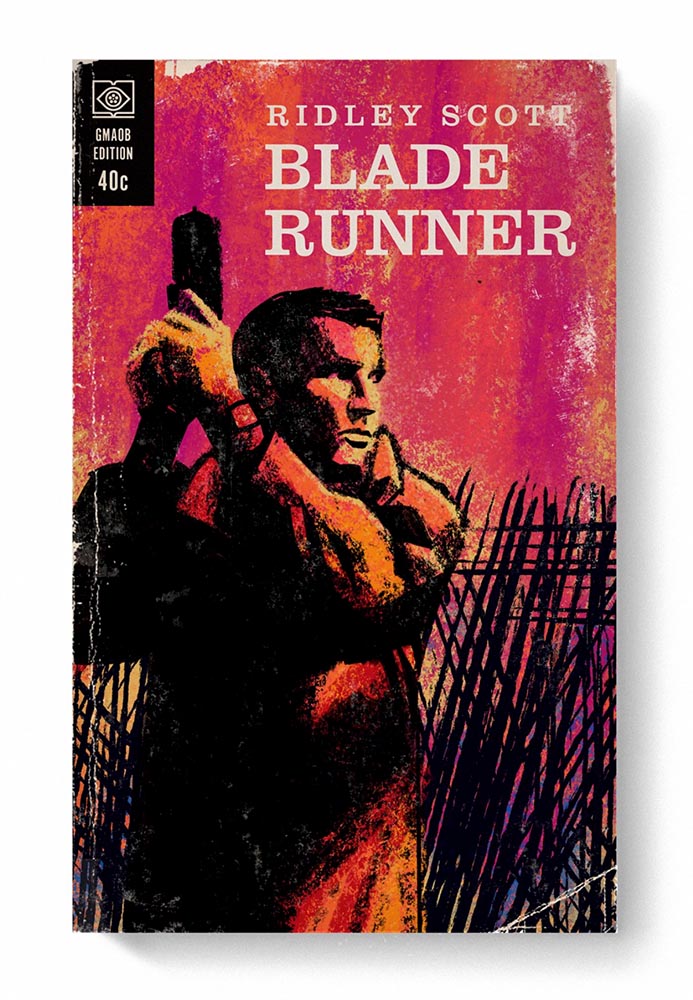
From the aged look, illustration choices, and director-as-author to the logo and occasional price, these are all … perfect.
Volume One is 100 titles, and while that book is sold out, prints are available at his website. The items in Volume Two, due this month, are guaranteed to be awesome.
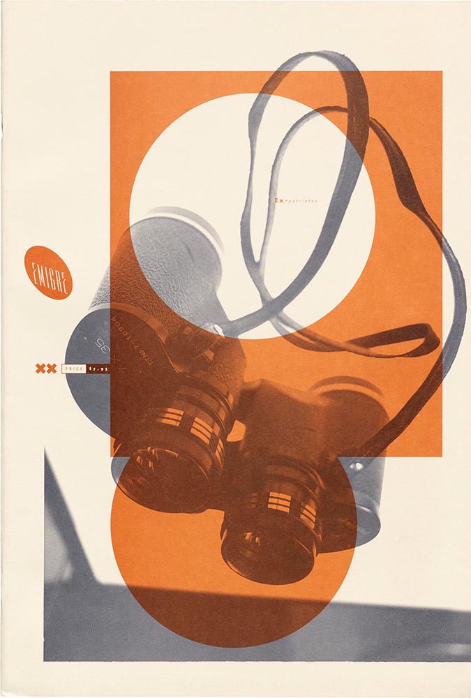
Graphic Design on the Internet Archive
Emigre #20 – Expatriates. Courtesy of the Internet Archive via archive.digital.
I don’t always link to these contests — it often seems like the publicity (and rights!) are all about the folks holding the contest rather than the people entering them — but I often look, and am always impressed with the quality coming out of a “simple” iPhone.
Long Nguyen, France – 1st Place, Travel – “Last Night before Xmas”
Scott Galloway, United States – 1st Place, Nature – “Wonder Wheel”
And while both of the above are (relatively) recent phones, in the latter case showing the macro capabilities of an iPhone 12 Pro Max, even older phones can highlight the talent of the person using it:
Derek Hager, United States – 3rd Place, Photographer of the Year – “Tucson Morning”
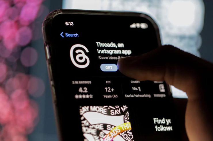
I’m not going to spend much time on this; I eschewed pretty much all forms of social media years ago now, and don’t regret it. That said, I do keep up with social media in the meta sense (a word that’s been stolen, as far as I’m concerned, by — wait for it — a social media company), and have noted the pain and concern associated with the implosion of Twitter.
While this conversation started with Nick Heer and the always-excellent Pixel Envy, it’s obviously evolved as the year has seen one extraordinary cage fight event after another.
Threads on Apple’s App Store, via the BBC.
For the past decade, It’s been all but required for serious brands to maintain a social media presence […] yet instead of scrambling to claim digital real estate across all these newly emerging platforms, some companies are choosing to be more judicious about which platforms they choose to join. In some cases, they’re learning from brands who jumped the social media ship years ago.
Chris Stokel-Walker, BBC
The quote above, from the BBC, attempts to answer the question, “Why your favourite brand may be taking a social media break.” Short answer: it’s complicated. I’d argue there’s an even shorter answer — it’s smart! — but for people and brands that aren’t yet established, social media is often key to discoverability.
This may be especially true for artists, designers, photographers, and others in the self- and small-business-employed creative field. Indeed, let’s go to a great source for those in the arena, Creative Boom, who recently spent a minute asking, “Creatives are saying social media is over… so what next?”
Like any new craze, it was fun for a while. But there’s certainly nothing new about it any more. Facebook’s now been around for almost two decades. Twitter’s 17 years old. Even Instagram has reached its teens. And while many of us joined these platforms during their fun, “anything goes” eras, when everything was about the users, now it’s all about the algorithms and their use to make venture capitalists vast amounts of money.
Tom May, Creative Boom
While I agree that social media is a mess and has been for a while, I’m absolutely not going to tell you to give it up — only to remind you that I have given it up and continue to be completely okay with the decision.
I do want to ask you, though, to choose wisely:
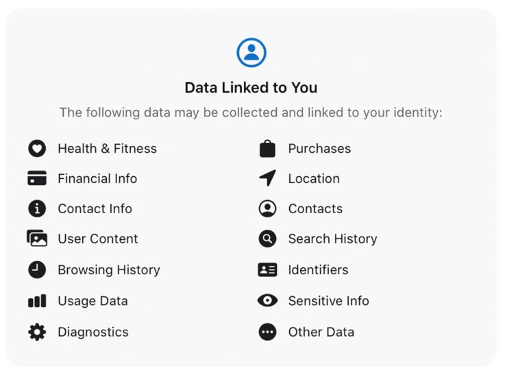
Facebook’s “Threads (an Instagram app),” their answer to the Twitter/X debacle, as shown via Apple’s iOS App Store privacy report.Tapbot’s “Ivory,” available in Apple’s iOS App Store and showing that app’s privacy report, for the Mastodon social platform.
Enough said. Turn off the computer, go forth, and enjoy a beautiful summer’s day.
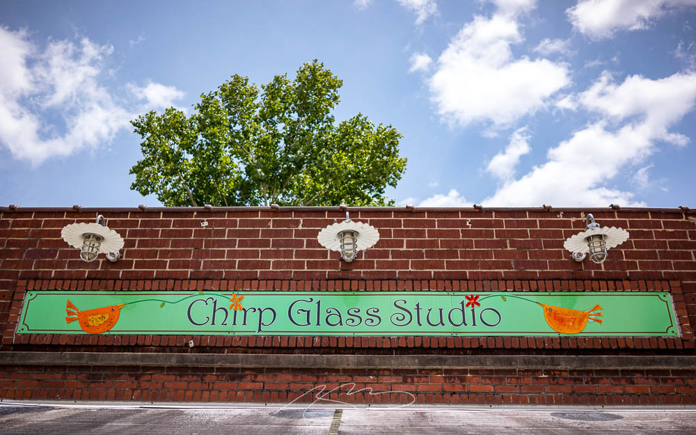
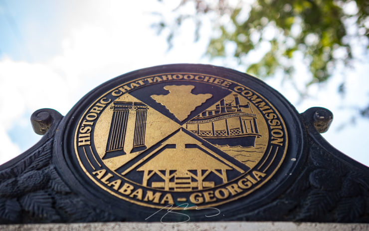
Gerald and I were in Georgia’s lower Chattahoochee River valley yesterday, visiting the city of Columbus — and ran across a couple of treasures. Naturally, there was a camera handy.
The first is the best restaurant I’ve enjoyed in a long while: The Animal Farm.
The Animal Farm, 105 W. 12th St.
If you’re in or going to be going to Columbus anytime soon, I cannot recommend it highly enough. The food was superlative, the service excellent, and the ambiance simultaneously upscale, casual, and fresh.
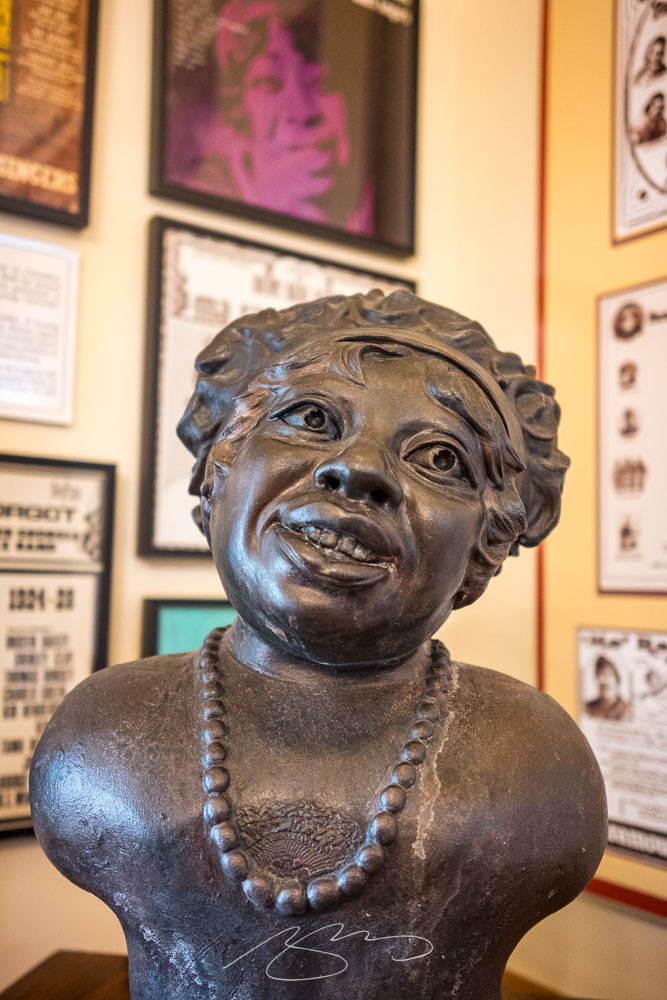
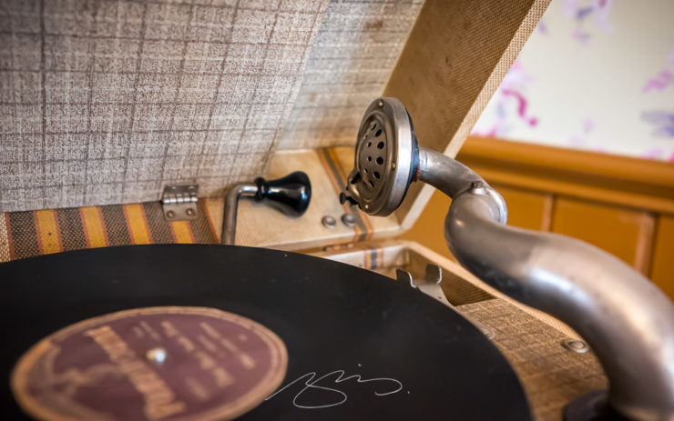
The second — and no less tasty — stop was the Ma Rainey Museum of the Blues. This period house downtown is small but demonstrates a remarkable comeback from the (literal) wreckage they started with in the ’90s. I’d originally wanted to return to the Columbus Museum, but it’s being renovated; Gerald’s suggestion here was pitch-perfect.
Ma Rainey House, 805 5th Ave.Ma Rainey House Marker, 805 5th Ave.Bust and Albums, Ma Rainey House, 805 5th Ave.Record Player Detail, Ma Rainey House, 805 5th Ave.
Inside, Gerald and I enjoyed a lengthy conversation with Xavier, a guide who was knowledgeable and enthusiastic; he absolutely made us want to explore more blues history. (I’m also going to be listening to some Ma Rainey on Tidal.)
Meanwhile, gallery of Columbus photographs is deep and varied, spanning almost fifteen years and 180 items — check it out.
The mission for these posts is simple: independent, unrelated items which add up to something interesting. This time, it’s nifty type, aka NFTy.pe, photographic AI (or not), the 2023 Logo Trends Report, great London Review of Books illustrations, and a worthy art book list hijacked for a rant on stickers. Boom!
Better Than it Sounds: NFTy.pe
Typefaces have become, from this designer’s point of view, become commodities — perhaps even part of a broken system. Most clients don’t have a budget for unique type, there are too many spread across too many different sites, and, as Creative Boom puts it, “ownership has become poorly policed, if not non-existent.”
NFType really flips the script on all of that and attempts to reimagine the industry from creation to sale. In a nutshell, NFTy.pe uses a combination of modular type design and generative scripts to create fonts with unique visual attributes. The upshot is that no two character sets are exactly the same. And thanks to smart contracts and embedded metadata, ownership is quick and easy to verify.
— Craig Ward, NFTy.pe creator, via Creative Boom
Create a unique typeface that rewards, in more ways than one.
As pointed out, it’s not just for type users:
There’s a lot of work to be done to put some distance between the dumpster fire that represents much of the NFT space and projects – like this one – with actual utility. I wouldn’t vouch for the worth of a lot of what I’ve seen out there, but the underlying tech – the smart contracts themselves – [is] actually genius and will be a game changer for any industry where provenance is a key factor – agriculture, property, fashion etc.
This year has been centered around AI, it seems — and, as illustrations go, some of the results are indeed a new form of art. Take this one posted by Dezeen as part of their AItopia competition:
Created by Midjourney for Daniel Riopel.
Fantastic. Its creator, a production technician in the prefabricated housing industry, deserves major kudos for describing something to the Midjourney engine that’s intricate and, if I dare use the term with AI, creative. (Several of the images there are excellent — check ’em out.)
That said, I’m not a fan of articles like PetaPixel‘s recently-posted “Photographers May Have to Embrace AI, Whether They Want To or Not.” Simply put: no. I don’t have to embrace it, because nothing has changed — either I can get the photograph I want using the cameras and lenses I have or I can’t. I’m not going to “generate the fill,” pure and simple. (I don’t control the computational photography my phone produces, but Apple isn’t prone to creating what isn’t there.)
I’ve been trying to write on this subject for a while, without success. Possibly because I don’t need a longer version of the above paragraph, possibly because it’s something else I haven’t been able to articulate yet — even to myself.
The 2023 Logo Trends Report
It’s back! BrandNew points us to the latest in styles and, as advertised on the tin, trends:
“Sonics,” part of the 2023 Logo Trends Report.“Ritz,” as in the cracker, part of the 2023 Logo Trends Report.
Always an interesting read, including this fantastic tidbit directly related to the previous section:
“Don’t worry about AI stealing your job. To replace graphic designers with AI, clients will need to accurately describe what they want. We’re safe.”
— Bill Gardner, LogoLounge
Read the full report, “a whirlwind of ideas, symbols, and AI, evolving how creators like us create,” at LogoLounge.
Illustrations at the London Review of Books
Because we cover books here often (pun intended), an article on Jon McNaught’s awesome illustrations for the London Review of Books absolutely caught my eye. “A collaborative relationship,” it’s called — and the results produced not only illustrate a huge variety of subjects in a consistent style, but do so in a way that delights:
A great illustration by Jon McNaught. Of the examples posted, there’s not a single one I don’t like. Copyright Jon McNaught.
Since 2011, Jon has been collaborating with the renowned literary journal, creating works that have a quietly mesmerising quality. His scenes breed comfort with their universality, but also their ability to evoke specific memories and feelings in the individual viewer. Through his covers, Jon artfully captures the essence of everyday life by representing the vastly contrasting nature of British weather, plus the uniqueness of London’s architecture, green spaces and public transport.
As usual, whenever I see something like this, I’m going to do something else at the same time: mine it for potentially great book design. Which, if you’ll indulge, leads to this short rant: I hate good covers marred by stickers.
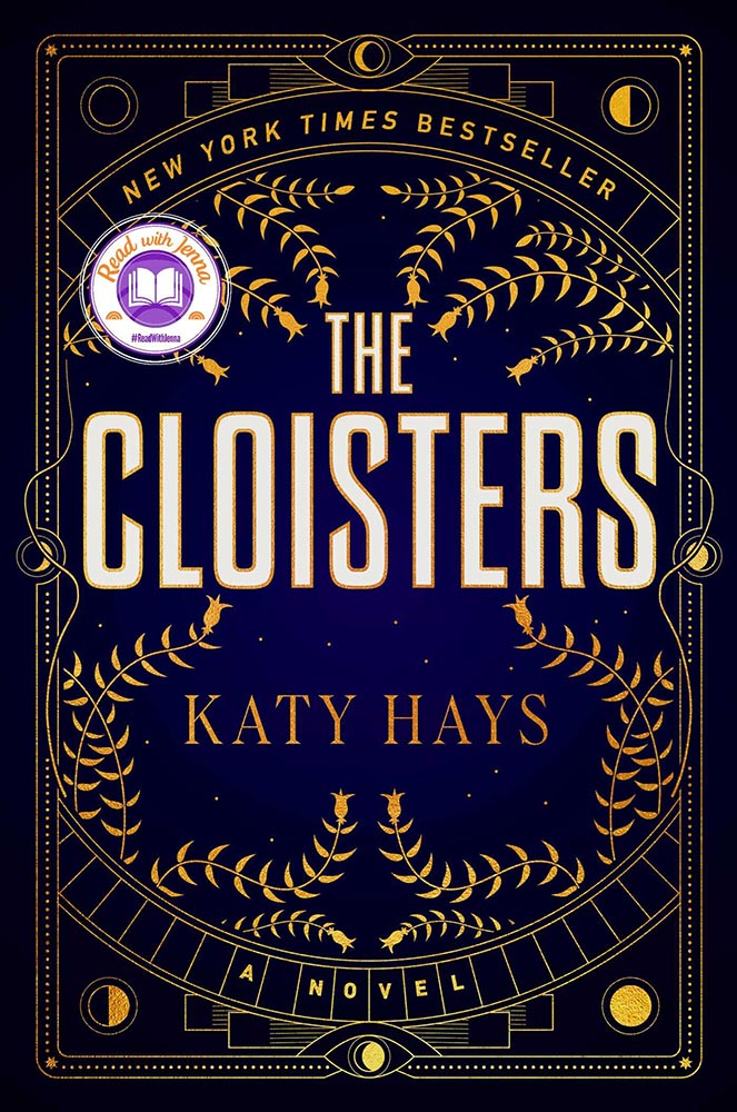
“Read with Jenna?” Seriously?
Solid cover. Soooo, who’s Jenna? Is she important enough to mar the cover with? (I DuckDuckGo’d the answer: maybe … if you watch television. Not sure that’s the audience publishers should want to cater to.)
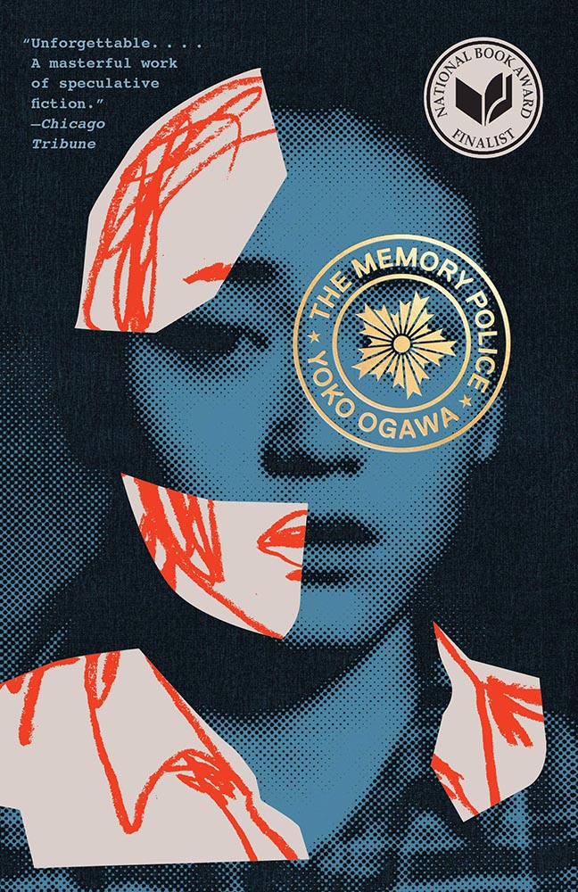
This time, the “sticker” is National Book Award Finalist. Better, but still.
Another solid cover — perhaps even really good, something that’s appropriate for a title up for the National Book Award. Real shame, then, that the sticker gets in the way, winding up completely distracting from the very nice circular title treatment (I’m sorry I don’t know either book designer to list here.)
I understand that it’s a little like trying to hold back the tide with a shovel, but it’s something I needed to express. [/rant]
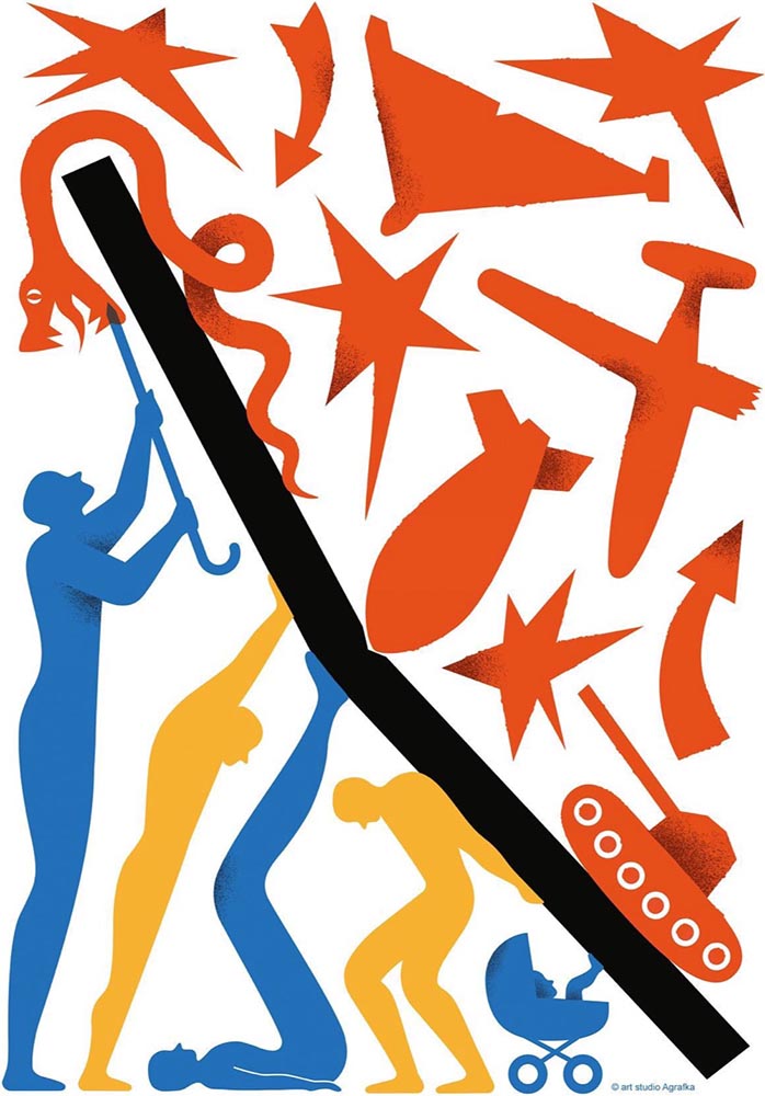
Bonus #2 (amazing):Via Kottke, a fantastic poster and perhaps better question:
Poster for the 2023 International Book Arsenal Festival, by Art Studio Agrafka
A book festival. During a war. In a city under martial law. While schools and legislatures here in the US ban books about Black and LGBTQ+ experiences based on bad faith complaints of tiny fundamentalist parent groups. Tell me, who’s doing democracy better right now?
— Jason Kottke, Kottke.org
That’s all for early July, folks. Go forth and make your summer a better place.
Lettuce first apologize for not having an update in a minute, but I’m going to try to make up for it with this word salad delicious selection of items I’ve been setting aside: ABCD book design, impossible book design, some thoughts on DPReview, Architecture in Music, Hoefler’s typographic illusions, and, because you deserve it, the Great Wave in 1-bit. Enjoy.
Book Design #1: ABCD
“Winner of All Winners,” says The Academy of British Cover Design (ABCD):
Cover design by David Pearson.
“Pearson’s design was judged to be the best book design to have won an ABCD award in its decade-long history,” says The Bookseller.
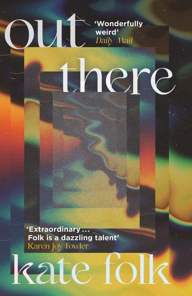
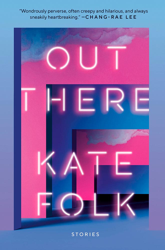
Meanwhile, their “Best of 2022” list included several I named as well, along with a few I hadn’t seen. The illustration that is the cover design for this young adult title, for instance:
Cover design by Michelle Brackenborough.
Out There fills its “wonderfully weird” billing incredibly well, too:
Cover design by Lydia Blagden.
Alas, the US version:
Cover designer unknown. (Probably just as well.)
I often discuss UK covers when they’re pointed out somewhere, but as a general rule, my book design coverage, for lack of a better term, is US-based. Some other time, I do want to discuss why the UK covers are, generally, better than their US counterparts — as the above illustrates.
Anyway, read Design Week‘s excellent article on those and all the Academy of British Cover Design winners of 2022.
Bonus: I ran across Penguin Galaxy’s 2016 version of an Ursula Le Guin title I’ve got on my read-that-someday list — and love the cover design:
Cover designer unknown — I’ll look into it and update this post if possible.
The whole series is awesome, in fact. Check it out.
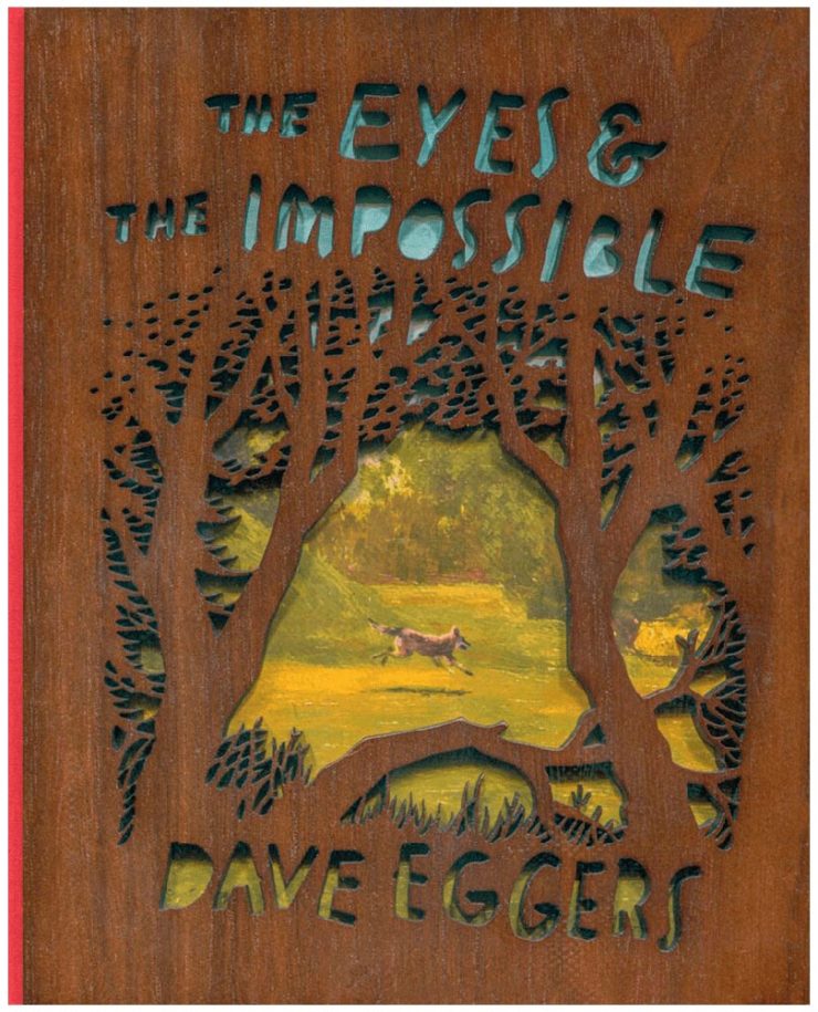
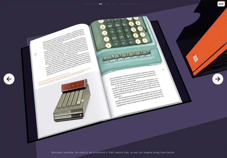
Book Design #2: The Impossible Bamboo Hardback
The Eyes & the Impossible the first-ever book to be published in two editions, for two readerships, and from two publishers: Knopf has one, in standard form, for the young adult audience.
The other one, however…:
Cover design concept by the author.
Yes, that’s an illustration showing through laser-cut bamboo, with a glimpse at the red cloth spine. There’s no way to summarize this design story in a way that does it justice, so just go to PRINT and read the whole article. Great stuff.
Photography #1: DPReview Shuttering
Digital Photography Review, long known as just DPReview, is being shut down. Started in 1998 by Phil Askey, it’s currently part of Amazon and is arguably the internet’s leading camera database — with over a thousand reviews of cameras, lenses, and related items, 24,000 articles, some 2.7 million comments, and more.
Perhaps most valuable, and something that will be missed by many, is their large selection of galleries: lenses and cameras, all in a way that can be compared side-by-side, an invaluable tool for those looking to purchase a new toy essential item for their photography bag.
Askey, who left in 2010 (three years after the Amazon acquisition) blasted Amazon’s short-sightedness:
I meant to write about this long before now, but there’s an interesting thing commenting more than a month later: they’re still there. Like many corporate decisions these days (ahem, Twitter), something changed — but it doesn’t matter. The damage has been done, foot shot, whatever. The reporters have moved on, the articles have slowed to a trickle, and updates have been greeted with skepticism.
What a shame.
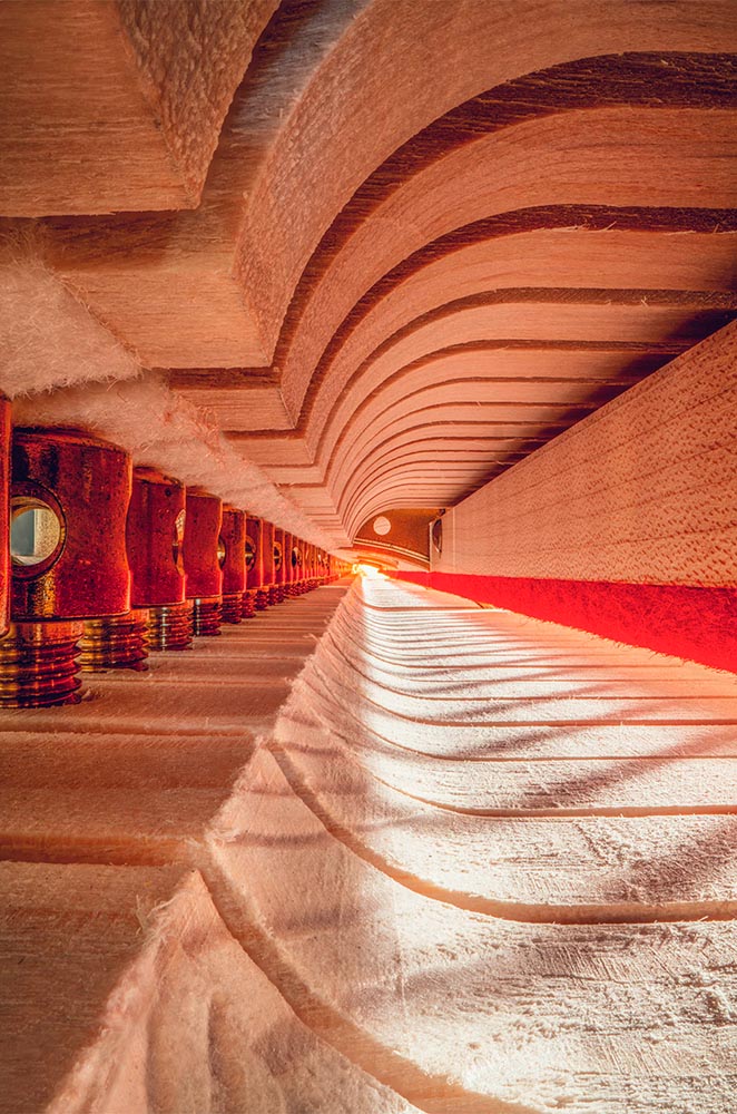
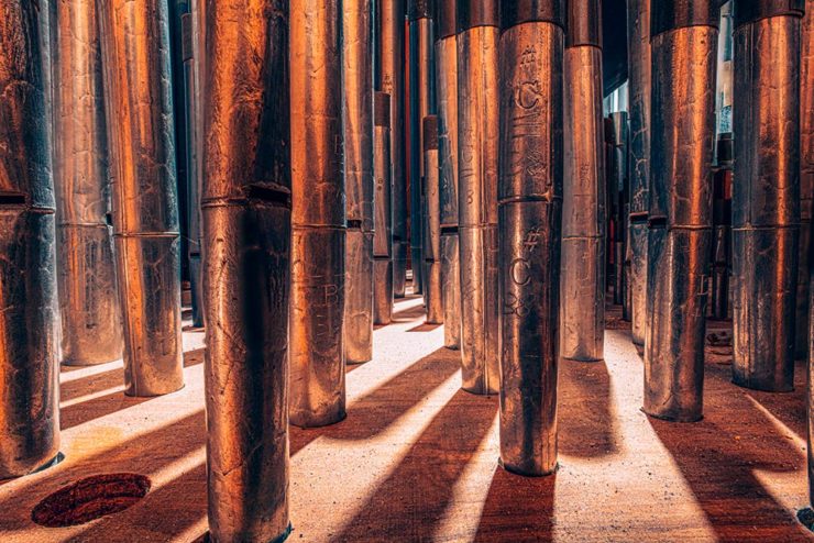
Photography #2: Architecture in Music
I somehow didn’t write on this one last time I saw it — so when a new series was covered by This is Colossal, there’s no way it wasn’t going to be celebrated here:
“1995 Low C Prestige Bass Clarinet,” by Charles Brooks
Recognize it? No? How about this one:
“The Exquisite Architecture of Steinway, Part 8,” Steinway Spirio R piano, by Charles Brooks
Charles Brooks, a twenty-plus-year overran of orchestras around the world and a cellist since childhood, has taken a probe lens and put it inside some of the world’s amazing instruments. The results are magical:
“St. Marks Pipe Organ, Part 1,” by Charles Brooks
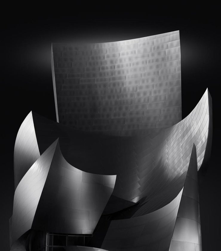
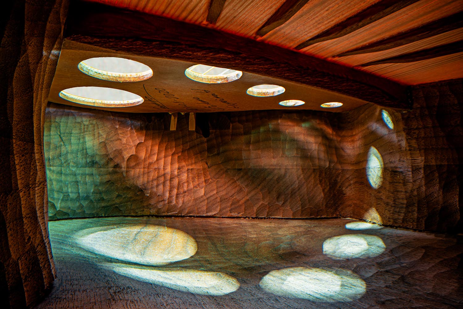
See many more here (2023) and here (2022). (See also this post’s header image, “Siete Lunas’ Guitar by Roberto Hernandez.”)
Typographic Illusions
Hoefler & Co. points us at necessary illusions in typography:
Highlighted on Netflix’s Abstract: The Art of Design, these “cheats” show us that letterforms are so much more than just shapes drawn to stylize characters.
Since a number of people who teach design have suggested that we manufacture these for use in the classroom, I thought I’d take the more direct approach, and make them available as a free download, as a PDF that can be printed on transparencies. Whether you’re teaching typography, studying it, or just giving letters a closer look for the first time, I hope you’ll find these useful.
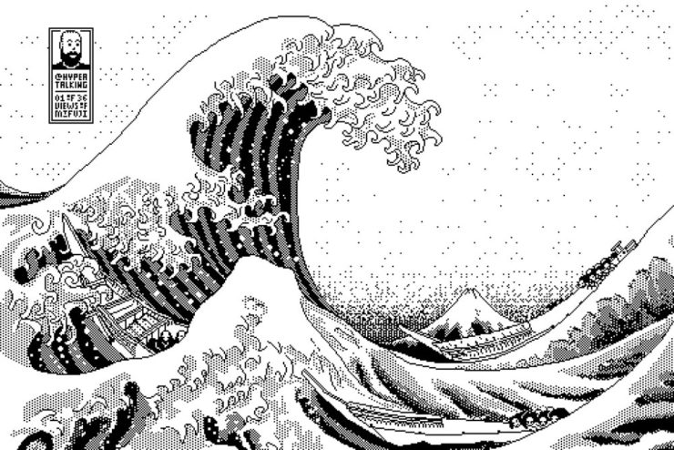
Last but not least this Monday morning, let’s please celebrate Great Wave Off Kanagawa — in glorious 1-bit greatness:
I usually use either my Quadra 700 or PowerBook 100, mostly because those are my reliable and easy to access computers (that run System 7, my favourite and most familiar OS of that era).
Software-wise I use Aldus SuperPaint 3.0, which is what my family had when I was a kid. Yes, I’d say that all of this is 99% nostalgia-driven…
—James Weiner
Incredible. There’s more info at his fantastic web site (done, naturally, in the style of a classic Mac system). Thanks to Kottke for the link.
From book design and minimalist photography to … well, book design and what absolutely isn’t minimalist photography, plus some street signs and another warning about Adobe. Let’s dig in.
Book Design #1: People Really Do Judge a Book by its Cover
From University College Cork — that’s Ireland, folks — we have something that, on the surface, seems obvious: a book cover“is the most likely factor to convince a person to read a book if they are unfamiliar with the work or its author.” Maria Butler, a PhD candidate in the School of English and Digital Humanities at UCC, reminds us why.
Design by Kimberly Glyder.
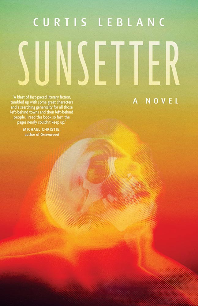
You’re reading Foreword, so you likely agree — and shown above is one of those worth-a-thousand-words images: the first of the 2023 titles I’ve set aside for my favorites of the year, and absolutely something good enough to make me pluck it off the shelf without knowing anything about either the title or author.
A screenshot from the Shift Happens website. Great stuff.
This project not only scores with great web design — check the interactive version of the book, pictured above — but what also seems like great book design. It’s a Kickstarter project (or will be, next month), so the usual cautions apply, but I might just go ahead and take the leap.
Couple of interesting book design items, by the way: the TOC is at the back, the endpapers are awesome, and the macro photography is tops. The book design reminds me of The Playmakers, still my favorite book design project ever.
Bonus: Tim Walsh, author of The Playmakers, is still going strong. Nice.
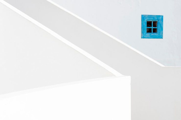
Photography #1: Minimalism
The winners of the Minimalist Photography of 2022 awards are in, some are fantastic. Here are a couple of favorites, from the architecture category:
“Prince Claus Bridge in the Netherlands,” by Arthur van Orden“Blue Window,” by Andrea Richey
The Minimalist Photography Award is the only foundation that deals extensively and professionally with minimalist photography as a branch of photography in which the photographic artistic vision takes the lead.
Milad Safabakhsh, President of Minimalist Photography Awards
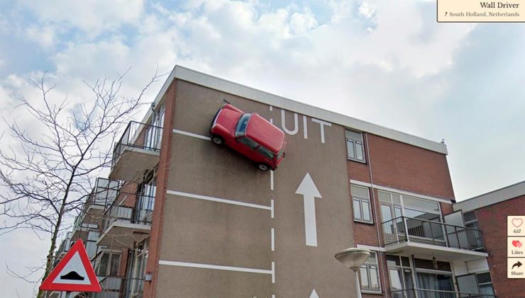
Direct quote, just because: “A man with three legs, a vintage car scaling a building, and an unsettling formation of people donning bird masks are a few of the scenarios highlighted in the terrifically bizarre Wonders of Street View.”
I didn’t know it was a thing to dress up and pose for the Google cameras. Perfect.
Street Sign Style Guide
Speaking of street views, did you know there’s a style guide for highway signs? Would you believe that I’m a fan?
Interestingly, there is an I-42/I-17 interchange in Phoenix, but this ain’t it: these signs are representational.
As with most things government, there’s confusion, too many regulations, and yet it’s based around good ideas. Beautiful Public Data has a guide to the guide.
Adobe Steps in it, Again
From DPReview: “If you’re an Adobe Creative Cloud subscriber, you might want to go and turn off a new setting immediately. It’s been discovered that Adobe has automatically opted users into a ‘Content analysis’ program that allows Adobe to analyze your media files […] for use in its machine learning training programs.”
It’s important to note that Adobe only uses the files saved in the “Creative Cloud,” something I don’t do as a matter of course, but even still, this is yet another example of Adobe using its monopoly position in the creative field to take advantage of its paying customers.
Adobe, unsurprisingly, didn’t return DPReview’s request for a comment/clarification.
Just like last year, this post took longer than expected due to the best possible circumstance: there were so many great book cover designs in 2022 that I had a hard time whittling down the list. Even as it is, we’re busting right through last year’s limit of 50. Good times!
If we take a step back and look at the trends this years’ favorites represent, it’s more and better illustration, custom and hand-painted type, and a sense of a single focus — one, dominant thing on a field of color. Also, the trend of fewer photographs continues — more evidence that photography has become so ubiquitous that something different is required to stand out. (Or, of course, a really great photograph.)
Please remember that these are my favorites — others might say “best,” but I’ve been in this business long enough to know that there’s always another great title you haven’t seen or read about, and I don’t want to disrespect any of the great book designers not on this list. I’ve tried to include design credit where I could (special thanks to the folks who answered emails with that information), and I wish to stress that any mistakes in the list below (incorrect attribution, for instance) are mine.
Note: If you’re on Foreword’s main page, please click on the post title, above, to view this list. You’ll get larger covers for your viewing pleasure.
My favorite book covers for 2022 (Three-way tie):
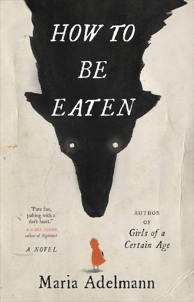
Design by Julianna Lee.
How to be Eaten combines an aged look, just a smidgen of pencil sketch, hand-drawn type, and those eyes to create something that just goes beyond. I’m certain the background wolf and creases are real, too, either photographed or scanned — bonus points for that all-too-rare practical effects — and all this in what amounts to two colors. Simply awesome.
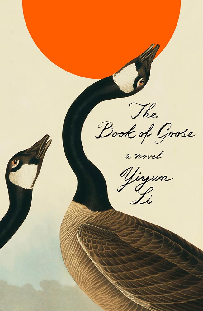
Design by Na Kim.
The Book of Goose defies use of the words “art form” — it’s the kind of cover that for many designers would be once-in-a-career good. However, Na’s work appears below, was here last year, and speaks to Na’s creativity being, well, a golden goose that just keeps on giving.
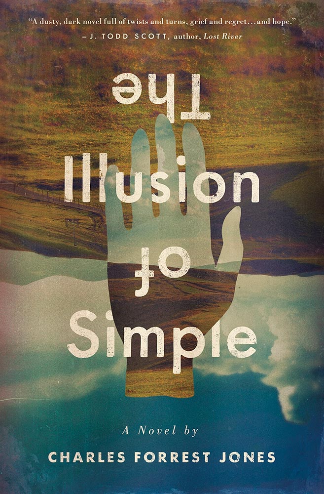
Design by Derek Thornton.
Simply put: there’s literally nothing about The Illusion of Simple that isn’t perfect. J’adore.
Other 2022 favorites, in alphabetical order:
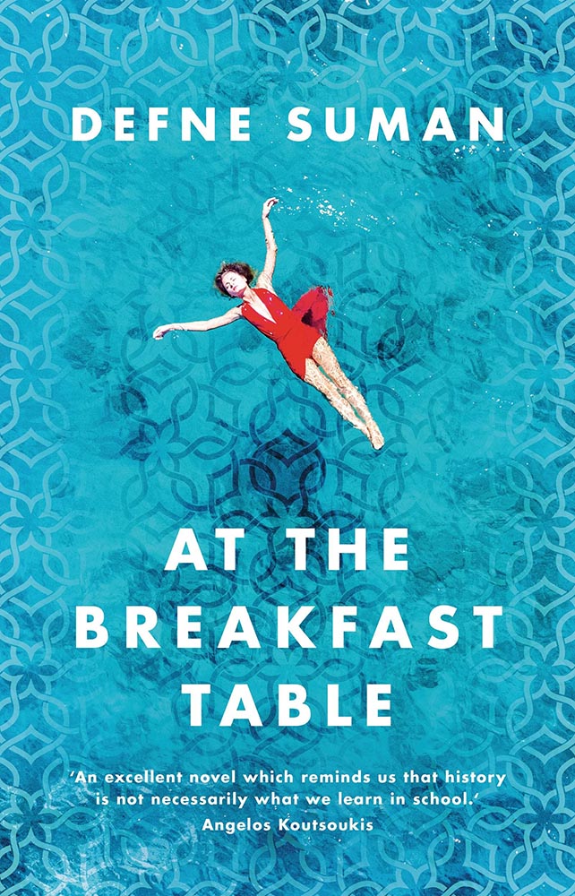
Design by Matt Bray.
This is striking not only for the beautifully-photographed woman in the pool, but the way the pool is extended out to make that woman even more striking. The pattern overlay is fantastic, too.
Design by Pete Garceau.
There’s nothing about this not to like: the frankly perfect illustration on a great background color, the head through the “O,” subtitle censorship bar, the sock, even the title. Enjoy-a-cigarette-after good.
SoHo Press didn’t return a request for cover design information.
Bunch of aged books with a little type, right? Yes, by so much more: striking colors, great hand-done supplementary text, perfect title treatment, style in spades.
Design by Jo Walker.
This is a UK cover — the American one is okay, but not on this list — that celebrates a minimalism that is rarely seen, let alone so well seen.
Design by Tyler Comrie.
What’s not to say about this cover? While faceless women are perhaps overused, this is a book I’d snatch off the shelf — and seemly catch something from — in an instant. Well. Done.
Design by Oliver Munday.
As simple illustrations go, this one in on track for the city of Superlative. Another Oliver Munday classic.
Illustration by Seb Agresti.
Along with “faceless woman” is “headless woman,” but the illustration here more than makes up for it. But it’s the expert, almost laugh-out-loud use of a void that makes it. Well done.
Design by Aleia Murawski and Sam Copeland.
Sure, the title and background colors are neat, the sky outside is cool, and “a novel” is a nice, subtle addition. However: I want to know how this photograph happened. (And a waffle hot dog.)
Design by Maddie Partner.
The first of a couple of titles with unexpected wrap-around type treatments, this one has great type choices, too. But the real treat for me is the plane knocked out the photograph. Fantastic.
Design by Suzanne Dean.
This title hides a secret: under the simple and wonderfully-die-cut jacket is a beautiful photo from René Groebli’s photoessay The Eye of Love.
Awesome. (Note that, once again, we celebrate the UK version of the book; the US hardcover has a design not on this list. Crumpets.)
Design by Mike Topping.
The moon as O. The birds. The graduation from fur to imagery. The yellow. Any would be good on their own, but are great together. Have to say: I’ve seen this in multiple shades of yellow. I prefer the darker — closer to the Barnes title, above — to the lighter, shown here.
Design by Anna Morrison.
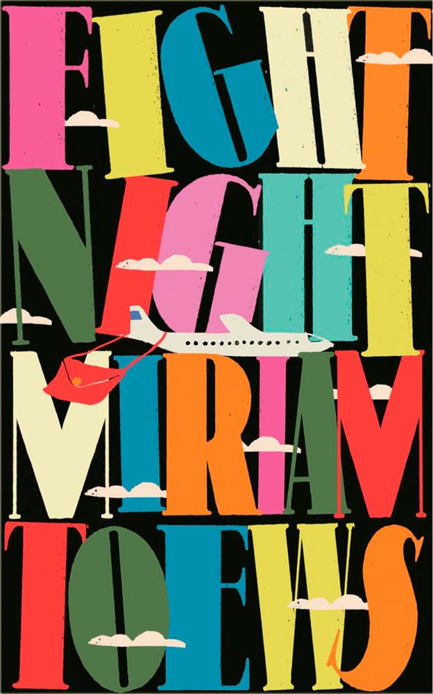
The typography, awesome little plane — the purse(r)! — the clouds, all of it: sky-high levels of good.
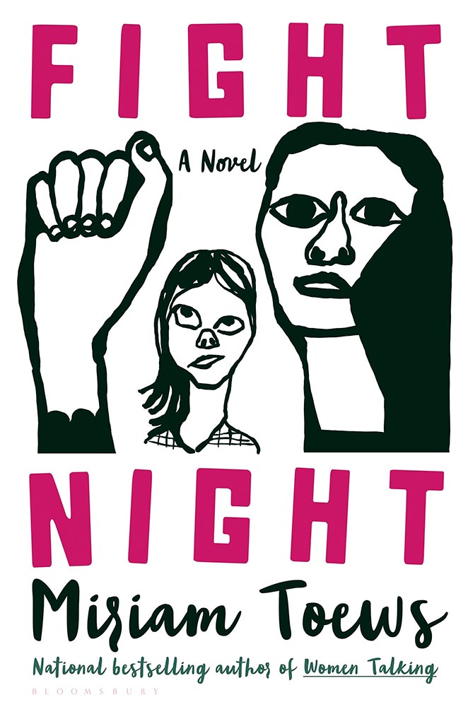
Interestingly, Fight Night‘s cover also had a 2021 version worthy of note:
Design by Patti Ratchford, illustration by Christina Zimpel.
I can’t begin to imagine what caused the redesign, or why it wound up being so radically — 180 degree! — different. The old design wound up on some “best covers” lists (here’s LitHub’s October 2021 post, for instance); both have wound up on mine.
Design by Ploy Siripant.
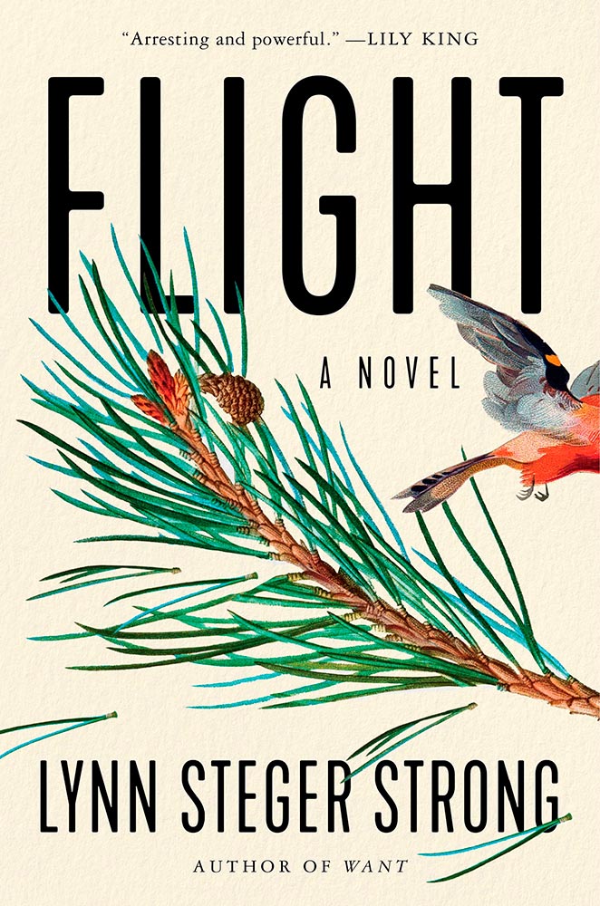
The bird exiting the scene stage right makes this just right, with bonus points for the textured paper and slightly-rounded sans serif. I think the illustration is perfect — classically done, one could say — and also love that “author of Want” is in a different font.
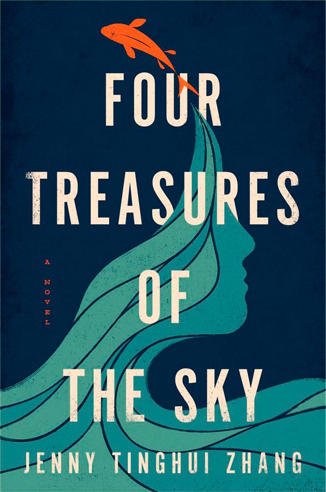
Design by Vi-An Nguyen.
Four Treasures to the Sky, mentioned in the May book cover design roundup, leaps into the best-of-the-best list. It features an aged look, but in a woodblock way that celebrates its limited palette. Add in the illustration’s interactions with the type and the vertical “a novel” — often an afterthought — and brilliance emerges.
W. W. Norton didn’t respond to a cover designer request. Apologies.
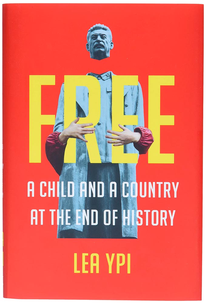
As photomontages go, this one is simple — yet simply powerful: red Albania meets (and hugs!) beheaded Stalin. Great choices.
Design by Alison Forner.
The quality of type and decorations on this “label” are beyond outstanding. This cover is candy for book design lovers and readers alike.
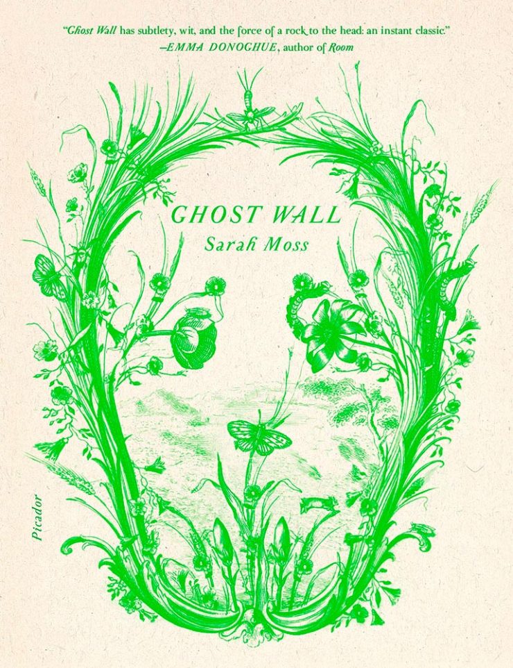
Design by Alex Merto.
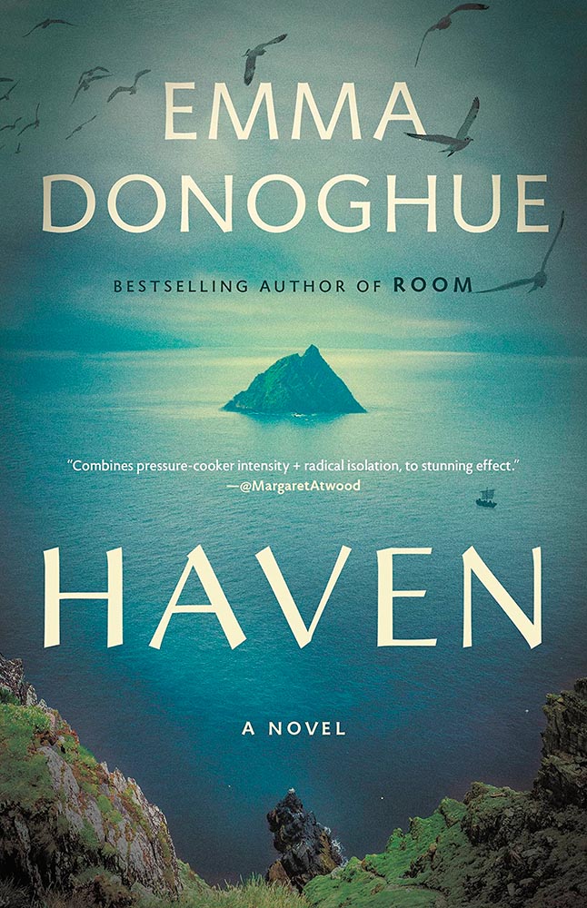
From It’s Nice That, we have a nice feature on Alex Merto — whose Ghost Wall cover is a great example of plant life adding so much more: “the force of a river to the head,” to paraphrase Emma Donoghue’s quote. Plus, one color! Win.
Design by Grace Han.
Nine parts awesome: type and illustration join to light a fire under the words “quality” and “imagination.” (Have I mentioned that I love a textured paper? Here’s a different one that’s also great.) This is one of several titles that’s not only a great book cover, but on a bunch of “best book” lists, too. Great books should have cover equal to their contents, and this one scores.
Design by Emily Mahon.
This isn’t here because of the attention Ukraine deserves these days, it’s here because of that illustration. Brilliant design needn’t be complicated, so ably proved here.
Design by Lucy Kim.
I mentioned at the top of the post that, these days, photographs have to bring something special to the table to stand out. And this cover does, from any table in any bookstore anywhere. (Lovely typography choices here, too.)
Design by Matthew Broughton.
One trend I didn’t mention at the top of the article is the montage-in-type, done here to absolute perfection.
Design by Andrea Ucini.
The woman in looking off the edge of the page at … something looking back. (Not only that, whatever it is casts a shadow.) The book is described as “subtle yet candid,” something that could equally be said about this brilliant cover.
Design by Holly Ovenden.
Another UK cover, this image doesn’t show the uncoated stock and debased type — but does show the jump-off-the-shelf color choices and awesome interaction of title with background. (The US cover, alas, resorted to stereotype. Perhaps we aren’t sophisticated enough?)
Yale Univ. Press didn’t respond to a request for the cover designer.
Choose a interesting texture, put some blocks of color on it, some type and … done. Hah! (Seriously, just look at the hands: they say it all.) Bonus to the hints of doily in heaven.
Design by Emma Ewbank.
The wrap-around title treatment makes another appearance here, with bonus second and third layers and a perfectly-done pull quote. With the aged ink fill and type accenting the striking illustration, this one is in that “wall-worthy” category.
Design by Matt Dorfman.
On our second Ukrainian title, both flower and umbrella work together here to force us to stop and look. (The stenciled type is a brilliant stroke, too.) Proof that genius often appears simple.
Design by Jenny Carrow.
The montage, taken to the next level: Jaffa, orange exports, and an healthy serving of emotion. (Also: curved text is rarely so on-target.)
Design by John Gall.
So simple, yet it is precisely that reaching off the shelf, grabbing your attention. This book is described as “spare and monumental,” and no less can be said of the cover.
Design by June Park.
“Texture is key,” sure, but there’s texture and there’s this. The island’s brush strokes into what seem like a moon are whatever happens beyond perfection. I didn’t expect this cover for a novel about Pakistan, yet the emotion, the … evocation is perfect.
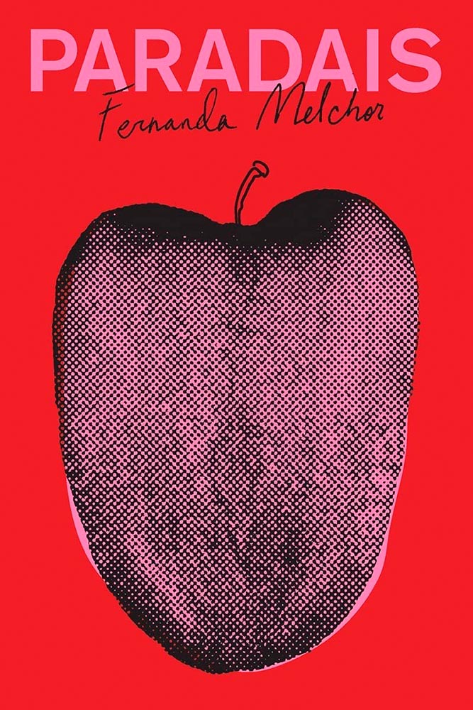
Design by Oliver Munday.
Apple? Tongue? Misfit teenager? Disturbed and distressed? Yes.
W. W. Norton didn’t respond to a request for cover design information.
Rarely are such seemingly “dry” subjects treated with such skill: the angled type set against an urgent red, the subtitle sticker-that’s-better, and the photo choices add up to something I’d grab off a shelf immediately.
Cover design: Christopher Sergio
LitHub says this one has a very high “hang on the wall” factor. I can’t think of a better description — great stuff.
Cover design: Na Kim
Na Kim just can’t help but design the best covers: a wonderful, antique background complimented by sheer brilliance. (Great typography, too.)
Cover design: Emily Mahon
It’s nigh-on impossible to look at this cover and not flip it around to read the text trisecting the leopard. Take something simple, add the elusive more, get this. Yeah.
Cover design: Jim Tierney
Another fantastic example of plants adding more than the sum of their parts. The mottled green background and watercolor-style falloff is perfectly complimentary. Great stuff.
Macmillan did not return my inquiry regarding a cover designer.
From the Banned Books Department, we have the 20th Anniversary edition of this difficult title rendered in a photo-based collage that’s nothing short of brilliant. Highest praise.
Very nearly the perfect black-and-white cover. Texture and shape combine with an incredible title treatment in a way that shrugs off the need for color. Fantastic.
Design by Allison Saltzman, art by Sonya Clark.
I’ve said before that moving to the South was a bit of a shock — the racism still all-too-evident jars all-too-often. This cover takes a simple, elegant idea and, without any of the stereotypes so often reached for, delights with style and simplicity, absolutely earning its spot in this list. (This is another of those titles that’s on many “best of” book lists, too. It’s a genuine pleasure to see worthy books get great covers.)
Design by Holly Macdonald.
“Wow” is the only word here — a stunner of a photograph used in, if I may borrow from the cover, a breathtaking way. Simple, elevated to exquisite.
Design by Jamie Keenan.
Never mind that I never knew Cary Grant was once a stilt walker (or named Archie Leach), this is an exercise in using a famous face in an innovative way, with a cast of supporting characters that flow as naturally as lines on paper. A trip through the possible — fantastically well-done.
Design by Jamie Stafford-Hill.
Fantastic type and color treatments, yes, but it’s the way the photograph is handled that shines: where the eyes are, the color treatment implying front and side, all of it. A 2016 book reissued in hardcover with a cover guaranteed to attract new readers.
Design by Oliver Munday, or perhaps Erik Rieselbach (depending on who you ask).
This cover is the antithesis of a swelled, salted herring: it’s brisk, to the point (if I do say so), and throws a life ring out to inspire book designers everywhere.
Book design: David Drummond
Brilliant: actual text, printed (on a great color paper, too), with actual string, photographed on said print. Not only is it exactly right for the subject matter, it’s simply and beautifully done.
Cover design: Jack Smyth
Never mind the great brushed color blocks or boat-rowing-the-ocean above the title. This is here mainly for the overlap between color and island: shortlisted for the prize for intersection-of-the-year.
Design by Luke Bird.
“I’ll just do a little cropping,” designers say. Then there’s … genius.
Design by Mary Austin Speaker, art by Stacia Brady.
Another piece of art that’s absolutely wall-worthy — actually by the author’s mother — complimented by a tasteful type treatment with a wonderfully-offset “poems.”
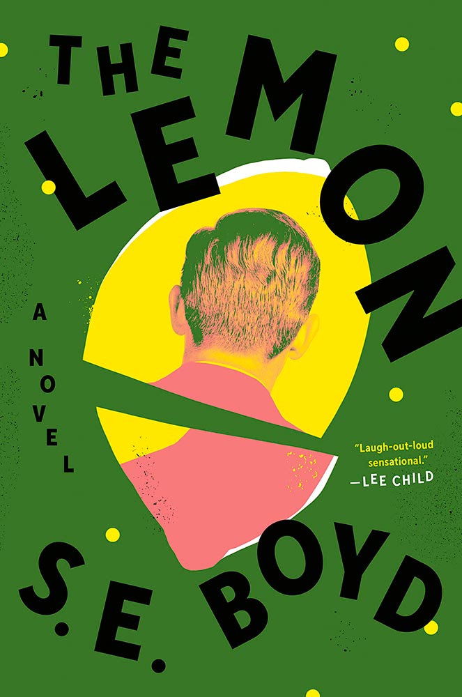
Design by Colin Webber.
“Great” can’t even begin to describe this cover — from the lemon shape, staggered type, green background, back-of-head portrait, to the slightly-aged treatment, we have ingredients that add up to that highest of achievements: a book I’d buy knowing nothing about, no hype [machine] needed.
Design by John Gall.
Classical painting with a singularity. Sure. So easily pulled off … if you’re John Gall.
Graywolf Press didn’t respond to a request regarding cover design.
The title treatment is the winner here, using two translucent shades of orange to the best possible effect — taking a nice painting/illustration to the top floor.
Design by Alex Merto.
Describing this cover as “haunting” would be a cheat — but completely accurate. (Love the line of type down the right side, too.)
Design by Jamie Keenan.
The rare type-only treatment … taken to an entirely new level. Fantastic.
Design by Christina Vang.
A triumph of textures: one matchbook you never want to throw away.
Design by Lauren Peters-Collier.
Breaks through more than water and time: it’s thrust into your memory. (See a note from the designer at LitHub’s cover reveal.)
Design by Albon Fischer.
One of only two text-only treatments in this list, done in a ’70s style — yet taken to a clever and impressive level. (Love the stacked “lls.”)
Design by June Park.
I adore how the type and frankly fantastic illustration work together here. Wonderful!
Cookbooks rarely make an appearance on “best book covers” lists — yet this one earns its spot with an antithesis-of-the-stereotype approach. Ordinary it is not, in the best possible way.
Design by Jack Smyth.
Another UK version — the US version is good, more than most even, but it’s this one that shines with its great photo choices, cut lines, and great type treatment.
Design by Katie Tooke.
This one’s a two-fer, with the UK version, above, showing the book-edge treatment done really well, while the US version…
Design by … ?
…takes it to another level. Is there such a thing as a cloud globe? Or is that one of those old-fashioned stock-ticker covers? Either way, the subtle pattern — in front in some places, receding in others — adds a wonderful touch. Great stuff. (Great, too, to see the US version take one: a rare treat.)
Cover design by Roman Muradov.
Bellevue Literary Press scores a win here, with something immediately recognizable as about music, yet so much more. Performance art, indeed.
Note: I originally attributed this title to Yale University Press instead of Bellevue Literary Press. I regret the error.
Design by Na Kim.
Na Kim apparently not only did the design but the illustration, as well. The rest of us can only aspire to that level of talent.
Cover design: Leanne Shapton
This illustration being in grayscale is, at first, a little off. But, of course, that’s exactly the point. I overuse “brilliant,” but it’s the best description. (Again, see a note from the designer at LitHub‘s cover reveal.)
Design by Elizabeth Yaffe.
Family epics, climate change, dystopian futures, and Moon — all somehow included in this rich illustration. Two-color greatness. (Bonus: Another great use of “a novel,” something often “meh.”)
Design by Brian Moore.
A standout historical photograph is only the beginning: it’s really the coloration that’s the story here, for both book and cover — so well done.
Design by Kelly Blair. Illustration by Toby Leigh.
Among the best book cover illustrations ever, perfectly inserted into the seatback in front of you. (Great Circle’s cover was in last year’s list, by the way.)
Design by Christopher Moisan.
There’s something about underwater photography, with its beautiful, soft light and fascinating reflections, that is evocative — and there’s nothing about this photograph that isn’t evocative. A triumph.
• • •
Whew. Seventy great book covers. 70!
Okay, let’s summarize: 2022’s crop of favorite covers not only surpass 2021’s, the quality of work here represent what I believe to be a new standard. To all the designers — and art directors that chose them — congratulations.
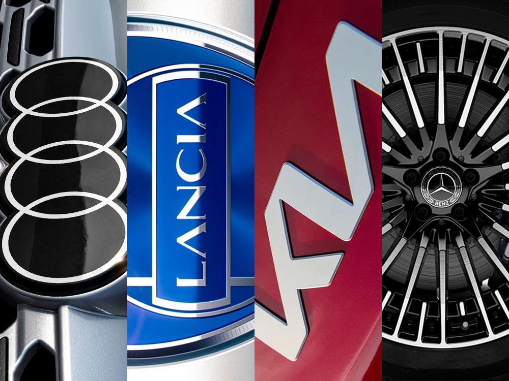
This time, it’s three automotive logos . . . and Mercedes’ accounting department, plus a holiday bonus. Joy to the Auto!
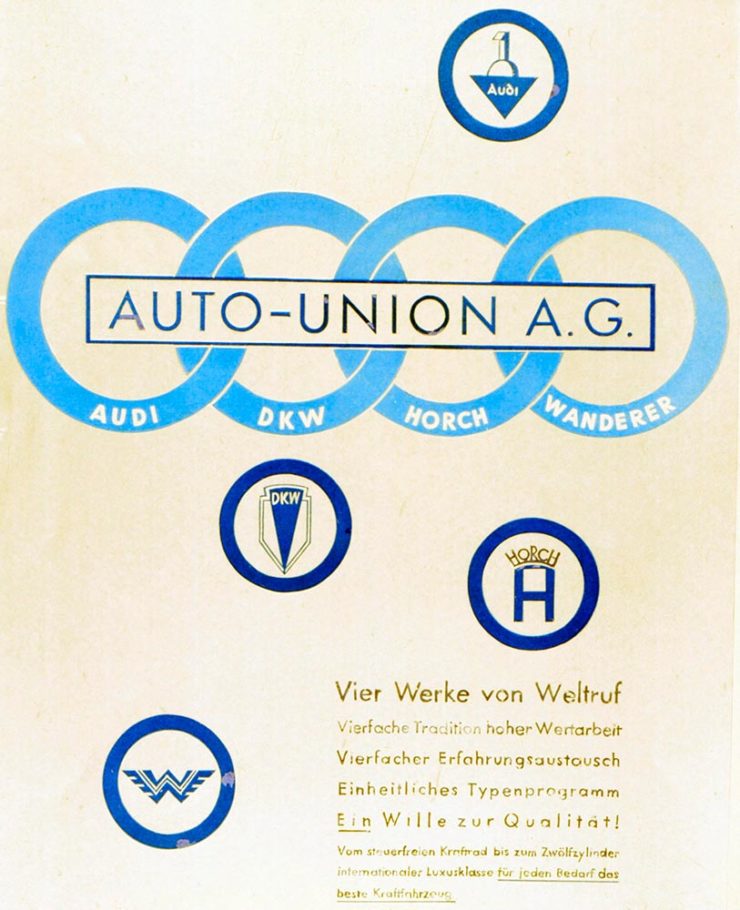
New Audi Logo Falls Flat
Audi’s “Four Rings” have been around for a long time — since Auto Union was formed, ninety years ago:
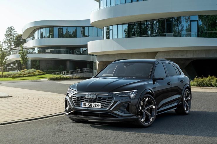
Now Audi follows the pack (see VW, Mini, Volvo, etc.) and converts their logo from three-dimensional to two; the rings now are either white and framed by a thin black border or dark grey with black borders.
Four-ring closeup. (It’s hiding sensors, too.)
Not an improvement, IMHO. One of the articles mentions the concept of “a consequence of digitalization,” and think that’s about as good a description as you’re gonna get.
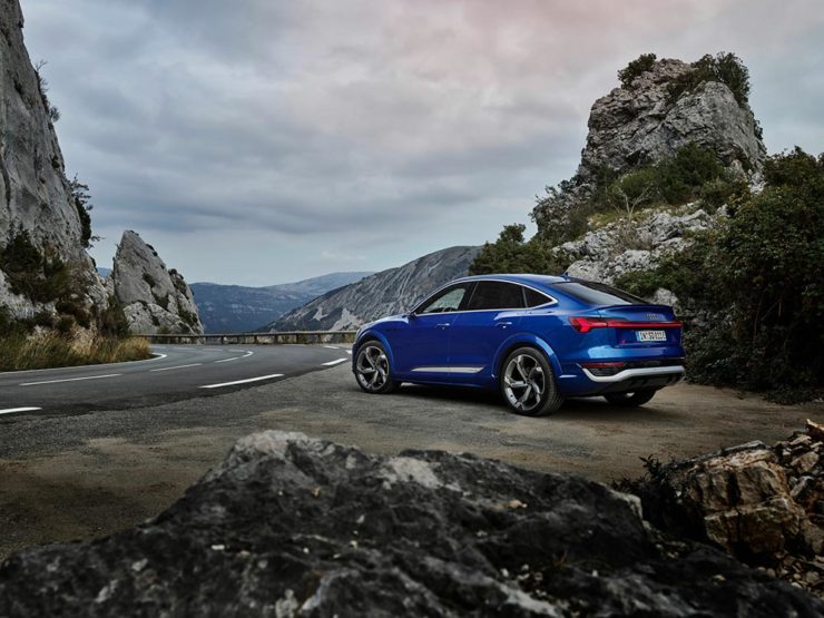
The change will roll out starting with the updated Q8 e-tron — which, thankfully, still looks good:
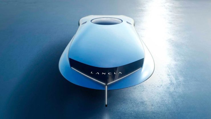
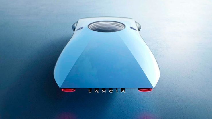
Okay, it’s not really — it’s a conceptual sculpture, titled “Pu+Ra Zero,” that represents their rebirth:
They call it a “a three-dimensional manifesto,” and no, I don’t get it either. (The light signatures and, apparently, the circular sunroof will carry through to the new models, however.) The logo, their eighth in 116 years, is new as well:
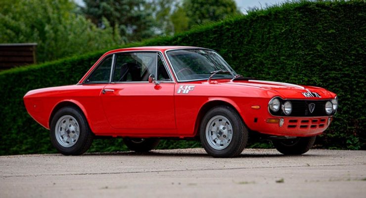
I didn’t know Lancia well (only in passing? Eh. —Ed.) until the famous Top Gearsegment naming them “the Greatest Car Manufacturer of All Time,” although I knew of the Delta Integrale — and think that the Fulvia is one of the prettiest sedans ever:
The 1972 Lancia Fulvia
Let’s hope their new models, and conversion to an all-electric manufacturer, lives up to their past achievements. Meanwhile, The Autopian has the best roundup of the new Lancia.
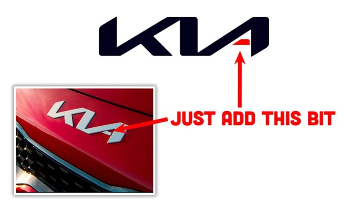
Kia, KN, and … Wait, What?
30 thousand folks a year are doing Google searches for “the KN car.” Why? Kia’s logo, of course:
I’m not a huge fan of the new Kia logo — and can absolutely see the “KN problem” — but I think it speaks more to modern society that this is a news item than anything related to graphic design. Willing to be wrong.
Mercedes: $1200/yr for Full Output
This subscription thing has gotten seriously out of hand: Mercedes-Benz USA, in an effort to further bilk their customers — ’cause, y’know, MBs don’t cost enough — has decided that the last 60-110 horsepower available on their 2023 electric vehicles are only available for a yearly fee.
This time, art from old encyclopedias, architectural art, and an appeal to add art to your post-holiday shopping and giving plans.
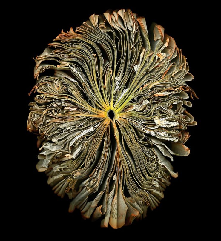
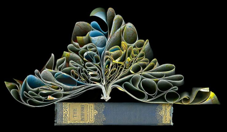
Books as Art — In a Different Way
Cara Barer says, “Books, physical objects and repositories of information, are being displaced by zeros and ones in a digital universe with no physicality. Through my art, I document this and raise questions about the fragile and ephemeral nature of books and their future.”
It’s more than that, though:
As This is Colossal puts it: “With cracked spins and crinkled pages, the manipulated objects reference the relationship between the natural and human-made as they evoke flowers at peak bloom.”
As a book designer, I’m glad that the titles used aren’t something a designers labored over but rather mostly instruction manuals and old encyclopedias. Either way, they’re a beautiful way to make commentary.
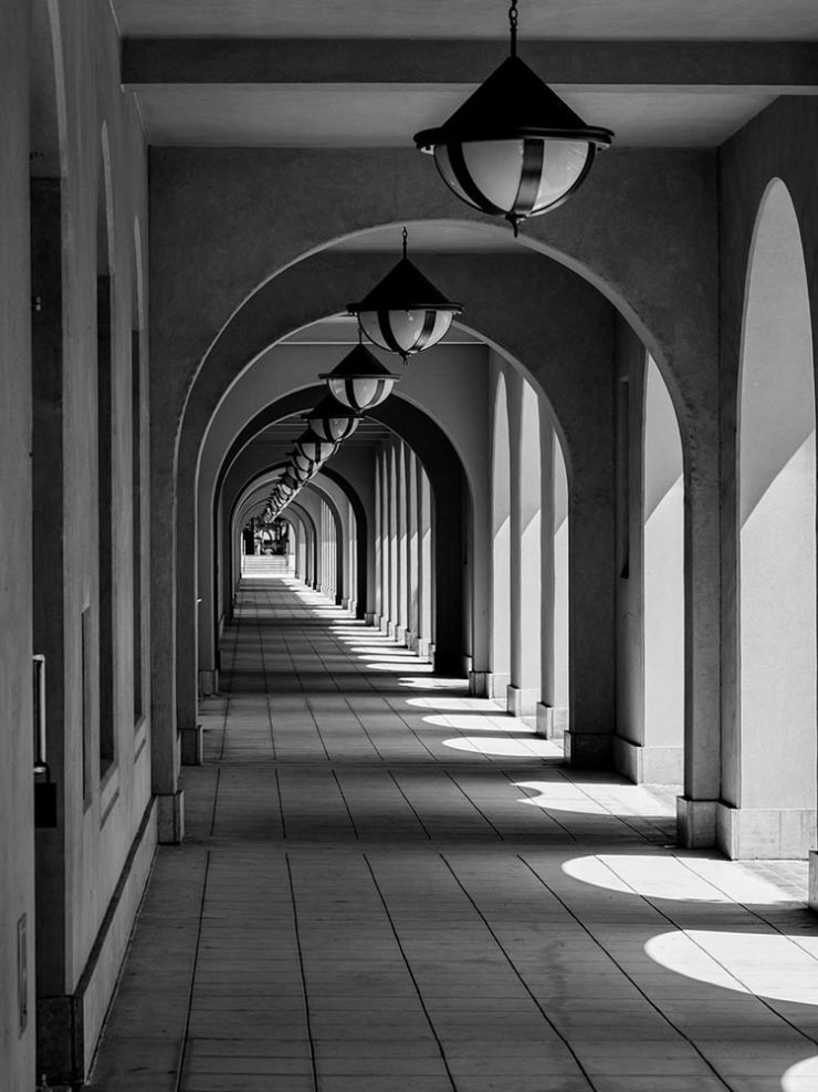
“Photographic escapades in arcades and colonnades”
Liberty Station, San Diego by Keith James
Few scenes set my photographic heart aflutter as does the view down a long covered walkway towards a distant, barely visible vanishing point. As a self-confessed symmetry addict drawn to architectural images in black and white, photographing these vistas scratches a deep creative itch.
Keith James, MacFolios
His article is well-illustrated, informative, and speaks to my heart: I love a good arcade — although, in some cases, I feel like an entry or exit makes the point:
Vassar College Chapel Arcade, September 2021
This is not the first time I’ve admired Keith’s work. His “Architecture Meets Sculpture in Black and White: the Interplay of Light and Form” was great work. Both articles are highly recommended.
Artist Sunday
For those of you in the United States, this weekend is the Thanksgiving holiday. It’s also that most American of traditions: a shopping weekend. I have spent recent years boycotting Black Friday and Cyber Monday, and am encouraged by the emergence of Giving Tuesday. Here’s something to add to that list:
Photographer Chris Sherman developed the concept of “Artists Sunday” in 2019, after noticing a bump in sales on that day in November. “The idea struck,” Sherman told Hyperallergic. “What a great time to patronize artists — during the busiest shopping weekend of the year.”
In 2020, Sherman launched the project alongside Cynthia Freese, a fellow artist who has also spent extensive time on the boards of arts nonprofits. On a dedicated website, Sherman and Freese provide artists and arts organizations with free marketing materials to promote the event. Now in its third year, over 4,000 artists and more than 600 towns and cities across the country have signed onto the initiative, which takes advantage of special events and partnerships (with nonprofits, individual artists, and businesses) to spread the message.
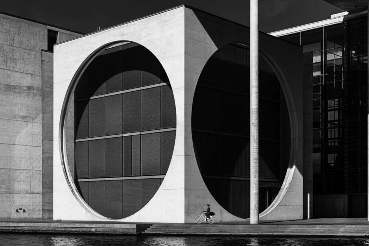
As most of you know, I’m not a huge fan of photography competitions. Like I did last year, though, there’s an exception for this one: not because it’s better than some — there’s still the problem with rights, methods of compensation, etc. — but because it’s so up my alley. (Pun intended.)
If you’ll pardon the cliché, great architectural photography is more than the sum of the building’s parts. These great shots show just that:
Cycling Under the Circles, Berlin, Germany, by Marco Tagliarino (Exterior)Shapes of Soul, Milan, Italy, also by Marco Tagliarino (Interior)
Entry photographs are divided into six categories: Exterior, Interior, Sense of Place, Buildings in Use, Mobile (with Bridges being this year’s theme), and Portfolio (focusing on the theme of Transport Hubs).
Glass Floor, Tokyo, Japan, by Tom Ponessa (Buildings in Use)Architecture 1, location not listed (but pretty cool, IMHO), by Stephane Navailles (Bridges)Shenzhen Bao’an International Airport, China, by Kangyu Hu (Transport Hubs)
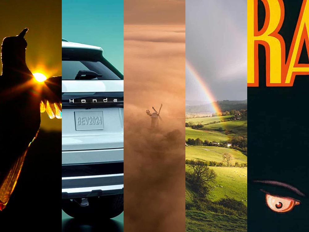
In this edition: Hummingbirds, the UK’s 2022 Landscape Photography of the Year 2022, a potential new logo treatment from Honda, and something just in time for Halloween.
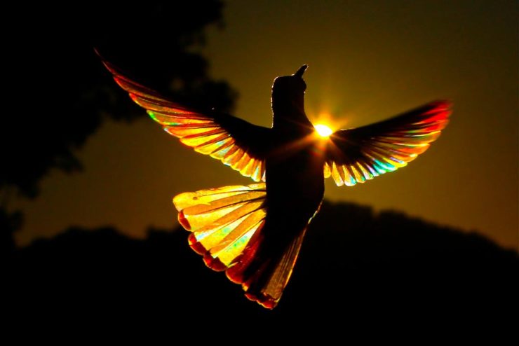
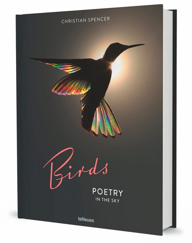
Who Knew: Hummingbird Edition
Wow.
Taken when the creatures are mid-flight and beating their wings at incredible speeds, Spencer’s striking photos capture sunlight as it filters through their feathers, emitting a full spectrum of color. The opalescent phenomenon is caused by diffraction and transforms their limbs into tiny, ephemeral rainbows.
This is Colossal
Let’s set aside for the moment the time and energy get these photographs and just celebrate that Australian photographer Christian Spencer worked to get these shots. Better still, there’s a book:
Like the typography in addition to the photograph, too. Thanks to This is Colossal for pointing us in this pretty wonderful direction.
New Honda Logo?
This hasn’t been reported anywhere, so I don’t know whether there’s a shift ahead for Honda (pardon the expression), but…:
This is a photograph — well, graphic — of the 2024 Prologue EV. Note that instead of the classic “H” seen on every Honda since I don’t know when, the name is spelled out.
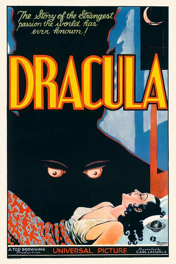
Speaking of slideshows on The Guardian, they had a great subject just in time for Halloween: “Cinema’s unquenchable thirst for vampires celebrated in posters.”
A classic.A future classic — scary-great.
Unquenchable thirst, indeed. Enjoy.
1
The aptly-named Dragon’s Back is in the Brecon Beacons National Park, Black Mountains, Wales. Take a walk.
Car site The Autopian scores with book design, Ford posts old marketing material gold mine, and more on the Eames Institute of Infinite Curiosity in this edition of Beautifully Briefed.
Autopian suggests book design
The Autopian, founded by a couple of former Jalopnik writers, is a new automotive gem: in these days of more-of-the-sameism sites trying to make money of others’ ideas, the Autopian has a retro style and interesting, original content.
Including this short post from their Cold Start column:
Sometimes you may encounter an old car ad and realize that the design of it could lend itself very well to something completely different. In this case, this 1958 Ford Zodiac ad, with its rich, saturated colors, striking dress on the model, and evocative name with understated typography just feel like something you’d see on modern book cover design.
Jason Torchinsky, Autopian Founder
The ad:
A 1958 Ford Zodiac (European)
His book design idea “realized”:
Jason’s book cover mock-up. Love the author name.
Nice.
The Ford Heritage Vault
Ford has taken the unusual step of posting a good chunk of their old — 1903 to 2003, their first 100 years — marketing materials online: “promotional materials, photographs, and all kinds of other historical goodies,” according to CarScoops.
“Our archives were established 70 years ago, and for the first time, we’re opening the vault for the public to see. This is just a first step for all that will come in the future,” says Ted Ryan, Ford archive and heritage brand manager.
Here’s a personal favorite: the 1965 full line brochure, showing the cars set in architectural drawings — presumably, matching the car to the house:
We discussed the Eames Institute of Infinite Curiosity back in April, but Metropolis magazine has published an extensive article covering a visit to the Institute.
Modernism has largely been diluted from a series of ideas rooted in social change to one of just style—Instagram moments, if you will. The Eameses insisted that they did not have a style or even an “ism.” […] Modernism was an idea, not a style. With the establishment of the Eames Institute, I hope Charles and Ray will be remembered most of all for their ideas and processes.
Kenneth Caldwell, Metropolis
An exhibit at the Eames Institute of Infinite Curiosity.
With our ongoing struggle to use materials more efficiently, many of the Eameses’ ideas and ideals need to be taken for the solutions that they are: style with incredible substance.