Author: Giles Hoover

  • Beautifully Briefed 23.5: Spring Mix

    Beautifully Briefed 23.5: Spring Mix

    Lettuce first apologize for not having an update in a minute, but I’m going to try to make up for it with this word salad delicious selection of items I’ve been setting aside: ABCD book design, impossible book design, some thoughts on DPReview, Architecture in Music, Hoefler’s typographic illusions, and, because you deserve it, the Great Wave in 1-bit. Enjoy.

    Book Design #1: ABCD

    “Winner of All Winners,” says The Academy of British Cover Design (ABCD):

    Cover design by David Pearson.

    “Pearson’s design was judged to be the best book design to have won an ABCD award in its decade-long history,” says The Bookseller.

    Meanwhile, their “Best of 2022” list included several I named as well, along with a few I hadn’t seen. The illustration that is the cover design for this young adult title, for instance:
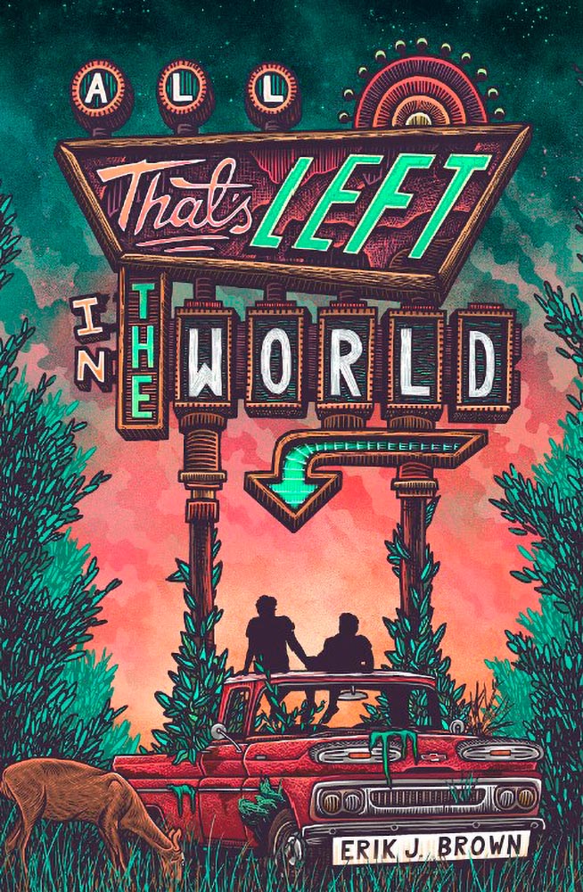
    Cover design by Michelle Brackenborough.

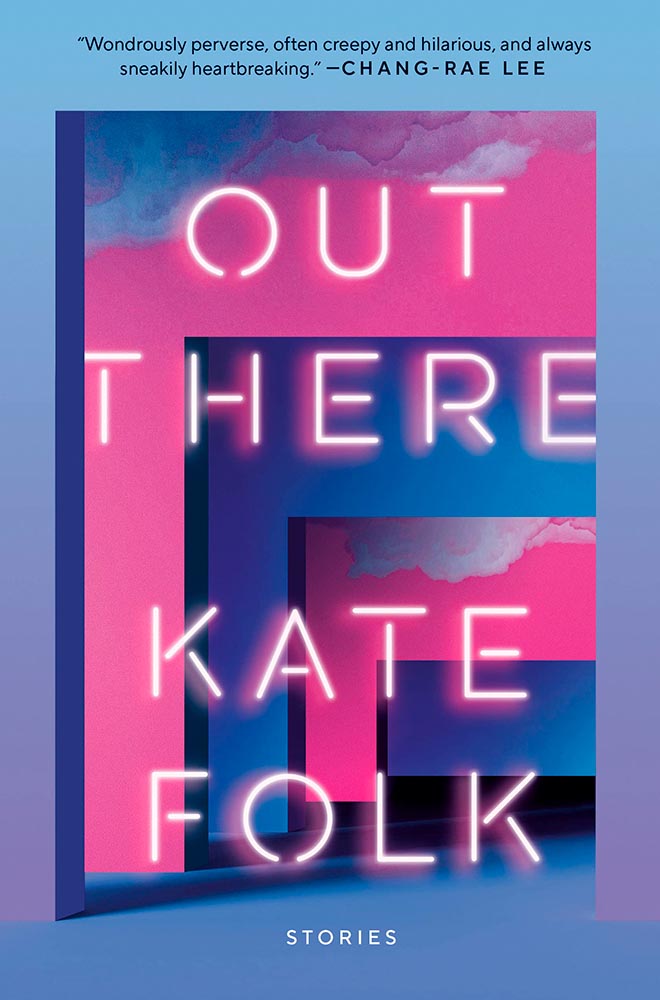
    Out There fills its “wonderfully weird” billing incredibly well, too:
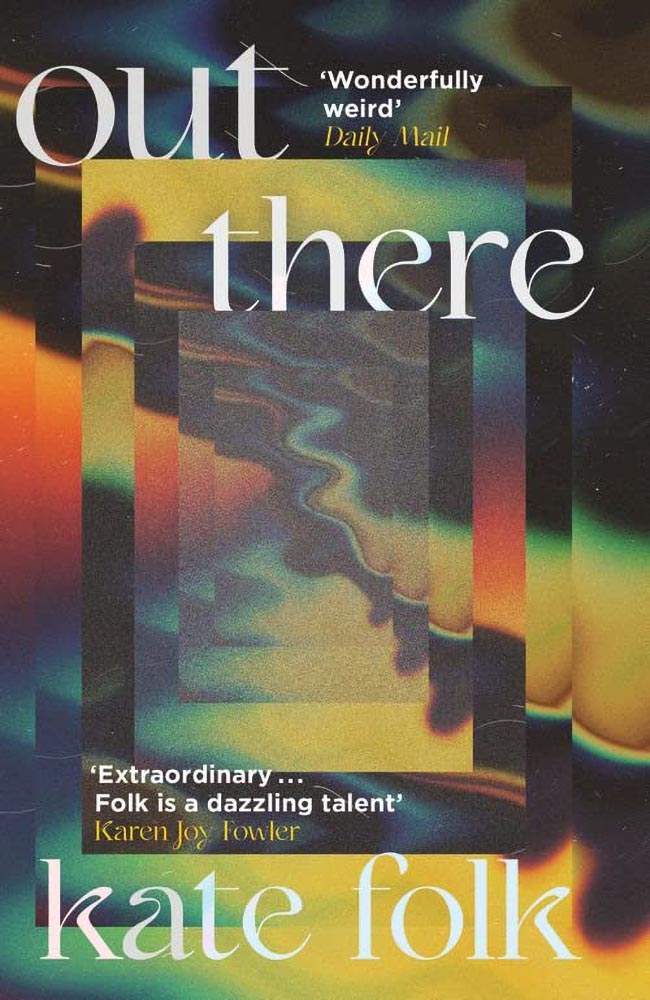
    Cover design by Lydia Blagden.

    Alas, the US version:

    Cover designer unknown. (Probably just as well.)

    I often discuss UK covers when they’re pointed out somewhere, but as a general rule, my book design coverage, for lack of a better term, is US-based. Some other time, I do want to discuss why the UK covers are, generally, better than their US counterparts — as the above illustrates.

    Anyway, read Design Week‘s excellent article on those and all the Academy of British Cover Design winners of 2022.

    Bonus: I ran across Penguin Galaxy’s 2016 version of an Ursula Le Guin title I’ve got on my read-that-someday list — and love the cover design:
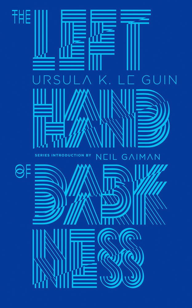
    Cover designer unknown — I’ll look into it and update this post if possible.

    The whole series is awesome, in fact. Check it out.

    Book Design #2: The Impossible Bamboo Hardback

    The Eyes & the Impossible the first-ever book to be published in two editions, for two readerships, and from two publishers: Knopf has one, in standard form, for the young adult audience.

    The other one, however…:
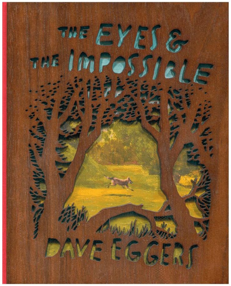
    Cover design concept by the author.

    Yes, that’s an illustration showing through laser-cut bamboo, with a glimpse at the red cloth spine. There’s no way to summarize this design story in a way that does it justice, so just go to PRINT and read the whole article. Great stuff.

    Photography #1: DPReview Shuttering

    Digital Photography Review, long known as just DPReview, is being shut down. Started in 1998 by Phil Askey, it’s currently part of Amazon and is arguably the internet’s leading camera database — with over a thousand reviews of cameras, lenses, and related items, 24,000 articles, some 2.7 million comments, and more.

    Perhaps most valuable, and something that will be missed by many, is their large selection of galleries: lenses and cameras, all in a way that can be compared side-by-side, an invaluable tool for those looking to purchase a new toy essential item for their photography bag.

    Askey, who left in 2010 (three years after the Amazon acquisition) blasted Amazon’s short-sightedness:
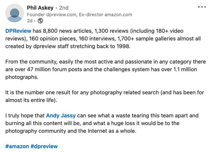
    I meant to write about this long before now, but there’s an interesting thing commenting more than a month later: they’re still there. Like many corporate decisions these days (ahem, Twitter), something changed — but it doesn’t matter. The damage has been done, foot shot, whatever. The reporters have moved on, the articles have slowed to a trickle, and updates have been greeted with skepticism.

    What a shame.

    Photography #2: Architecture in Music

    I somehow didn’t write on this one last time I saw it — so when a new series was covered by This is Colossal, there’s no way it wasn’t going to be celebrated here:
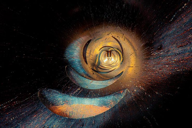
    “1995 Low C Prestige Bass Clarinet,” by Charles Brooks

    Recognize it? No? How about this one:
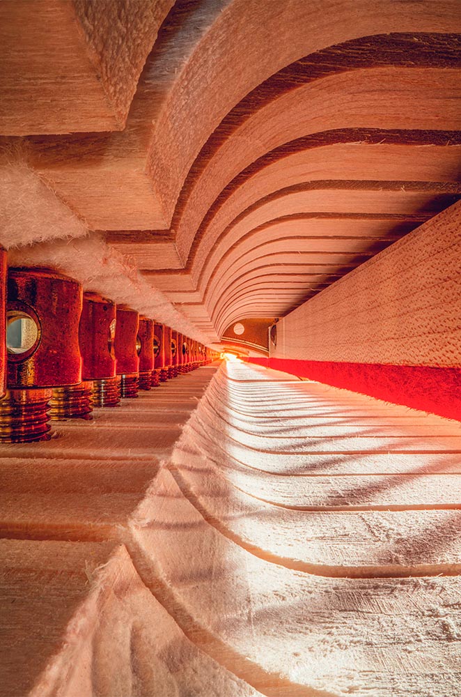
    “The Exquisite Architecture of Steinway, Part 8,” Steinway Spirio R piano, by Charles Brooks

    Charles Brooks, a twenty-plus-year overran of orchestras around the world and a cellist since childhood, has taken a probe lens and put it inside some of the world’s amazing instruments. The results are magical:
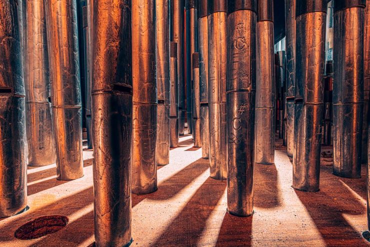
    “St. Marks Pipe Organ, Part 1,” by Charles Brooks

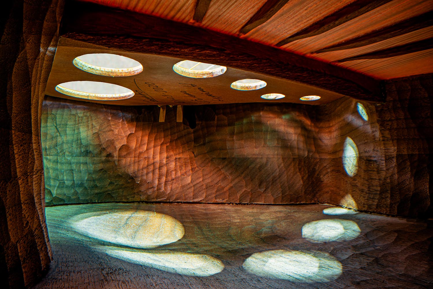
    See many more here (2023) and here (2022). (See also this post’s header image, “Siete Lunas’ Guitar by Roberto Hernandez.”)

    Typographic Illusions

    Hoefler & Co. points us at necessary illusions in typography:

    Highlighted on Netflix’s Abstract: The Art of Design, these “cheats” show us that letterforms are so much more than just shapes drawn to stylize characters.

    Since a number of people who teach design have suggested that we manufacture these for use in the classroom, I thought I’d take the more direct approach, and make them available as a free download, as a PDF that can be printed on transparencies. Whether you’re teaching typography, studying it, or just giving letters a closer look for the first time, I hope you’ll find these useful.

    —Hoefler & Co.

    Absolutely. Check ’em out.

    One-Bit Wave

    Last but not least this Monday morning, let’s please celebrate Great Wave Off Kanagawa — in glorious 1-bit greatness:
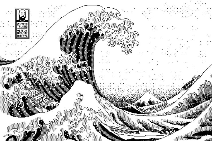
    I usually use either my Quadra 700 or PowerBook 100, mostly because those are my reliable and easy to access computers (that run System 7, my favourite and most familiar OS of that era).

    Software-wise I use Aldus SuperPaint 3.0, which is what my family had when I was a kid. Yes, I’d say that all of this is 99% nostalgia-driven…

    —James Weiner

    Incredible. There’s more info at his fantastic web site (done, naturally, in the style of a classic Mac system). Thanks to Kottke for the link.

    Bonus: As I was writing this, he was posting 1-bit emoji. Sweet!

    Have a great week!
  • Updated Gallery: Downtown Macon

    Updated Gallery: Downtown Macon

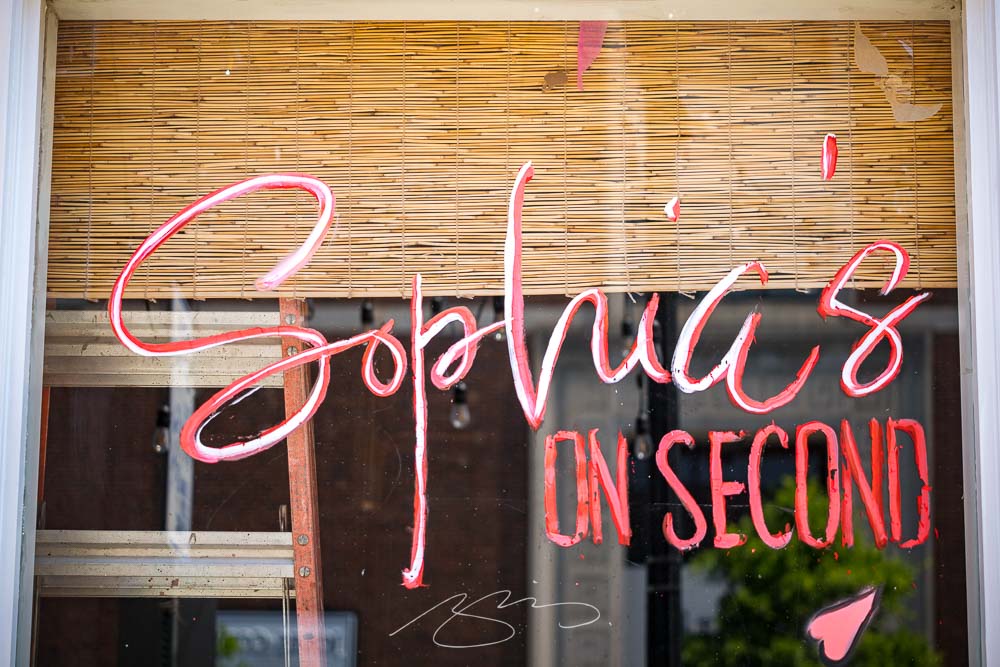
    I had the occasion to have lunch downtown yesterday, a day of simply beautiful spring weather — which I absolutely used as an excuse to take the camera for a spin.

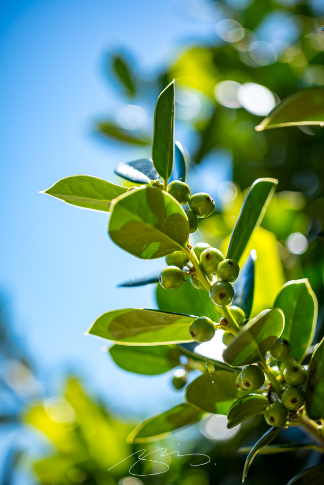
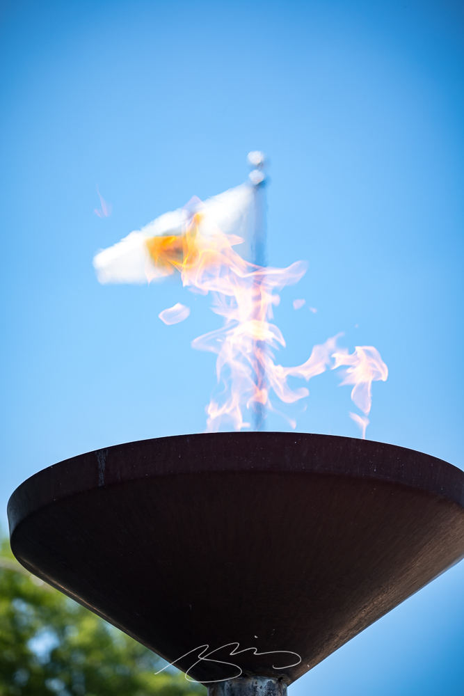
    The vast majority of the time, I use what I call my standard lens: 35mm. (Some would argue that 50mm is the “standard,” but I really prefer the wider angle of view due to its additional context.) This time, however, I was using Leica’s superb — and, sadly, no longer available — 90mm macro. The detail, the color, everything about this lens excels:

    Leaves and Berries, Poplar & New Sts.
    Veteran’s Flame and Flag, Macon-Bibb Government Center, 700 Poplar St.

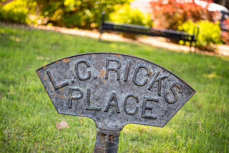
    It’s sometimes a challenge to be creative in an area you’ve photographed often, but I enjoy trying to spy new details:

    L.C. Rick’s Place, D.T. Walton Sr. Way & Poplar St.
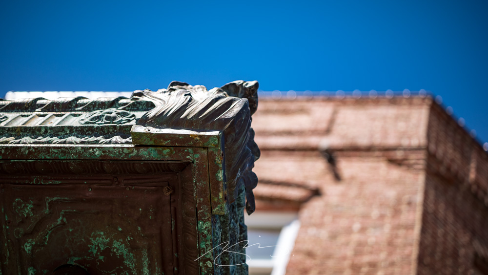
    Kudzu Signs and Building Cornice, 512 Poplar St.

    Or revisit favorite architectural items:

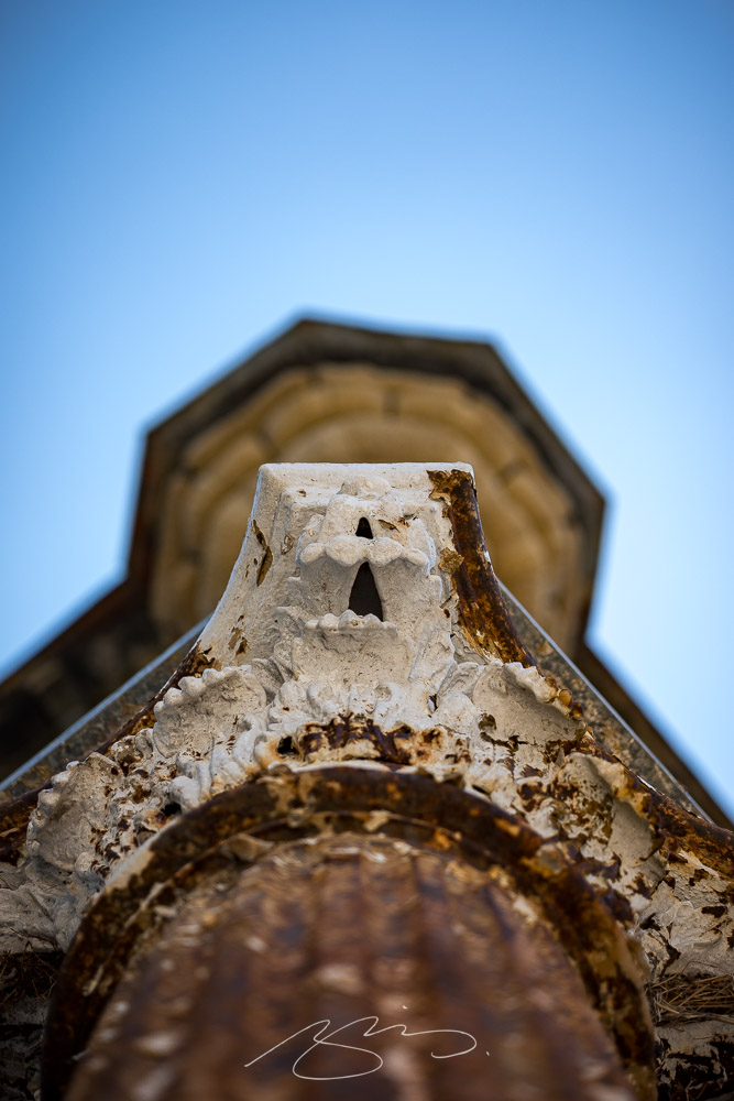
    Post and Turret, 690 Poplar St.

    23 new photographs have been added to the Macon Downtown (2022–2023) gallery, bringing the total to 110. (Don’t forget about the 2008–2018 and 2020–2021 galleries, either.)

    Remember, once in a gallery, clicking on any photograph will start a slide show, with much larger images, titles, and more. Peruse and enjoy!
  • New Gallery: Senoia, Georgia

    New Gallery: Senoia, Georgia

    After leaving Zebulon (see below) last Thursday, I continued northeast into the beautiful spring morning. My destination was Senoia, a town of about 5,000 that has a lovely, old-time feel, and is usually busy due to its “touristy” nature. There’s a film studio (!), and major productions like Driving Miss Daisy and The Walking Dead have used it for a location. Plus, given its proximity to Atlanta, it’s a popular day trip for city dwellers looking for a getaway.

    Gerald and I were there last April, and while I had a camera with me, I only took a few photographs and didn’t like any of them. But a church window had stuck in my head, we enjoyed the visit, and I determined to return.

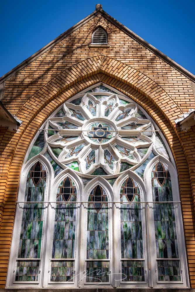
    This time: success. Starting with that church window:

    Church of God of Prophesy (Window #1), Main and Johnson Sts.

    Elsewhere in the historic district, fantastic Southern porches await:

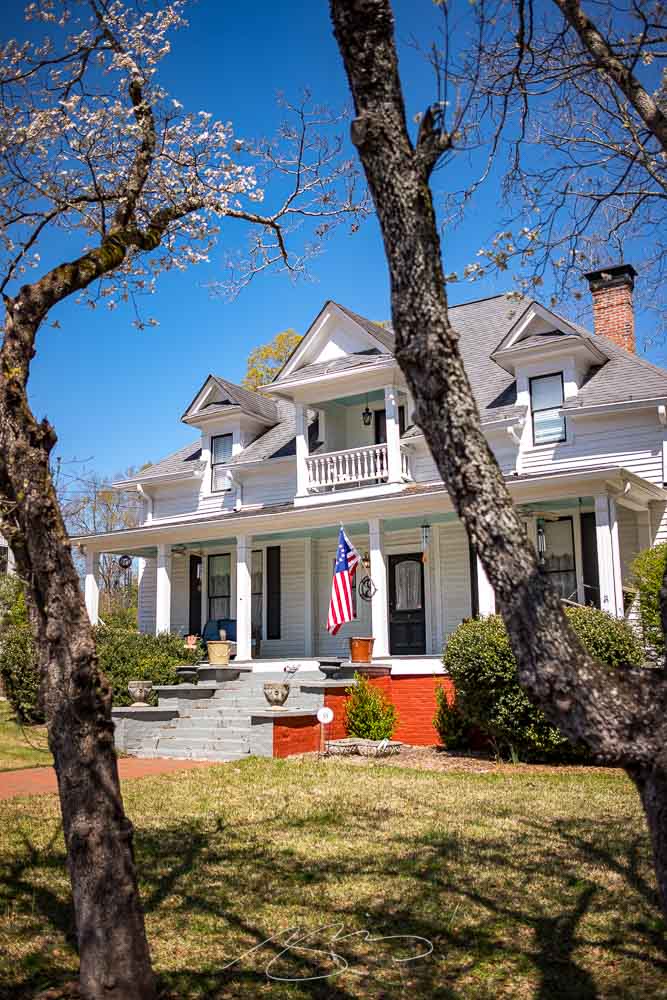
    The Veranda Historic Inn, 252 Seavy St.

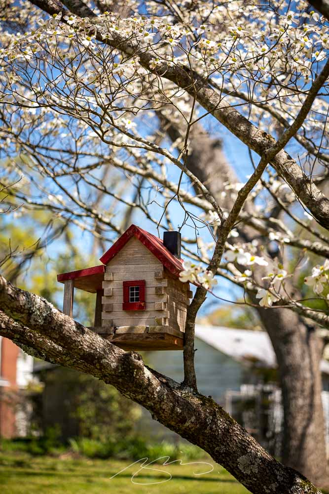
    While amongst the dogwood blossoms, there was even a porch for our feathered friends:

    Bird House, 128 Travis St.

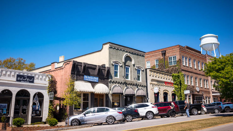
    But it’s downtown that folks come to visit:

    Shops and Eats on the Hill (#2), Main St.
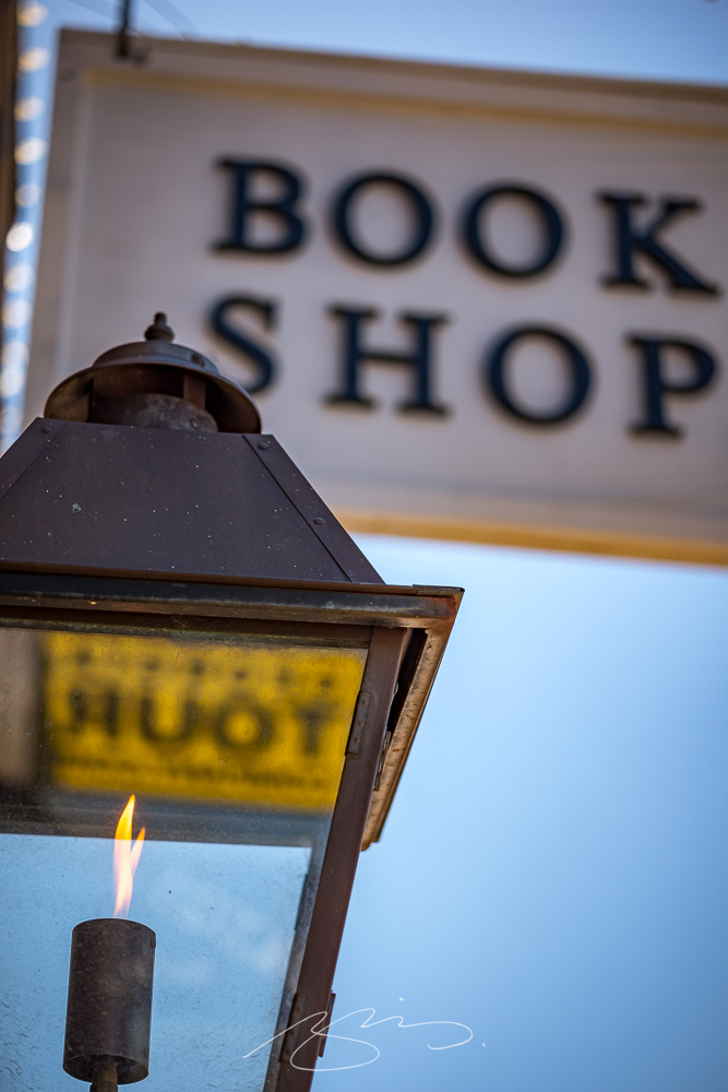
    Book Light (Reflecting Tour), 53 Main St.
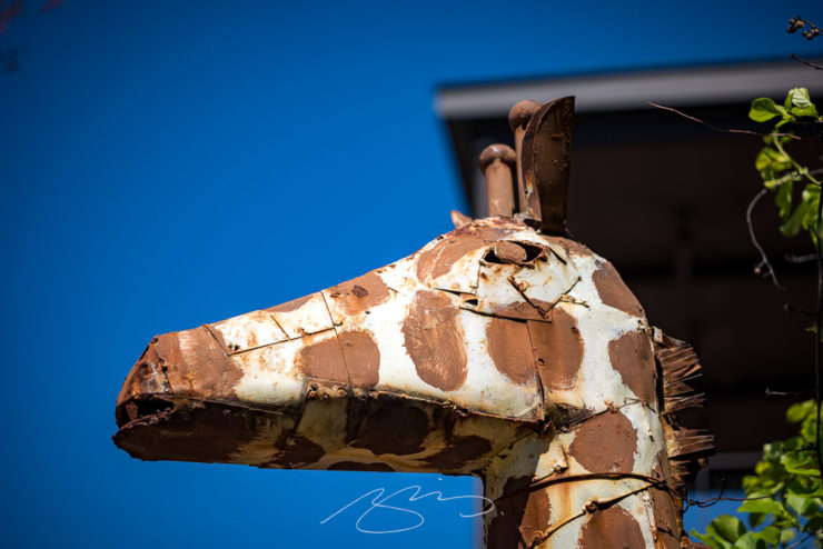
    Giraffe at Foxhollow, 7 Main St.
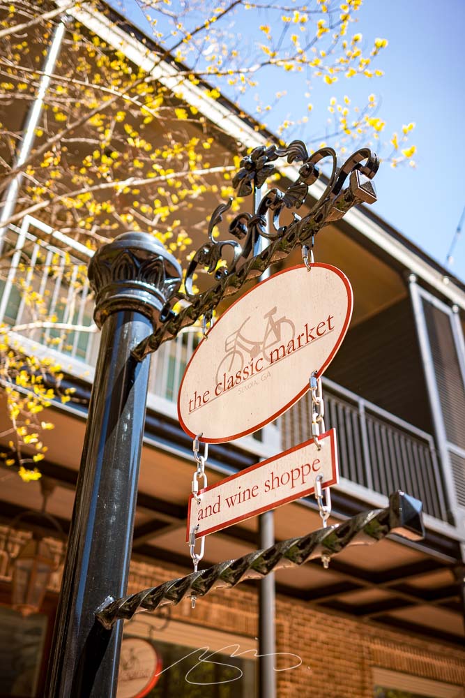
    The Classic Market, 30 Barnes St.

    Plenty of history here, too:

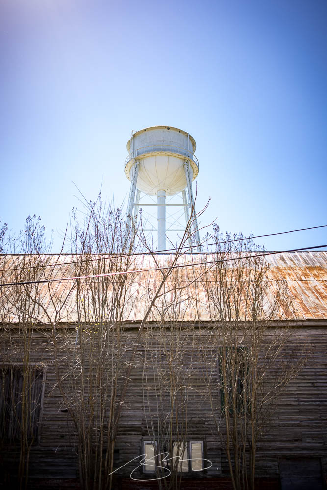
    The Museum and the Water Tower (From Baggarly Way)
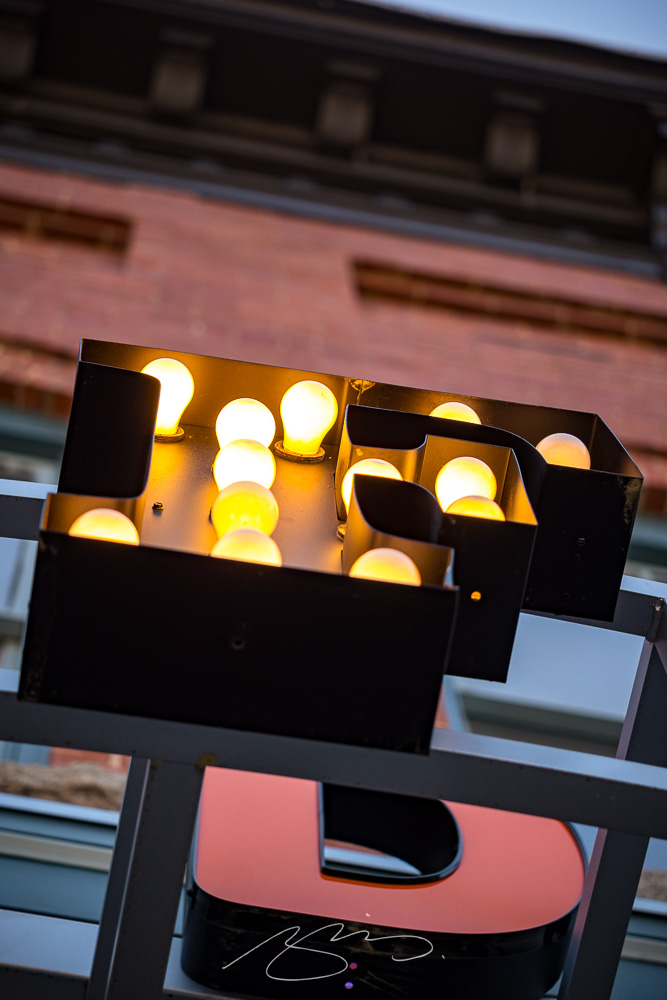
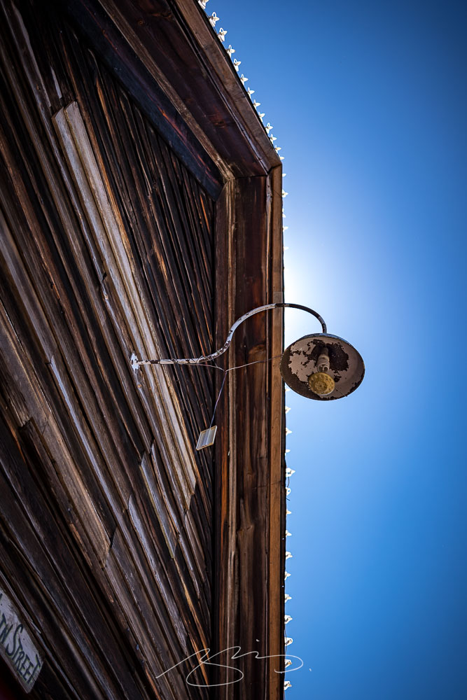
    Light and Lights Detail, 61 Main St.

    A total of 57 photographs — clearly, it was a good time — have been posted to the Senoia gallery. No matter the weather where you are, wander a picturesque small town on a beautiful spring day.

    Thank you!

  • New Gallery: Zebulon, Georgia

    New Gallery: Zebulon, Georgia

    We’re having an absolutely beautiful March here in Georgia — apologies to places that absolutely aren’t — and I’ve been trying to take advantage by getting out and taking photographs.

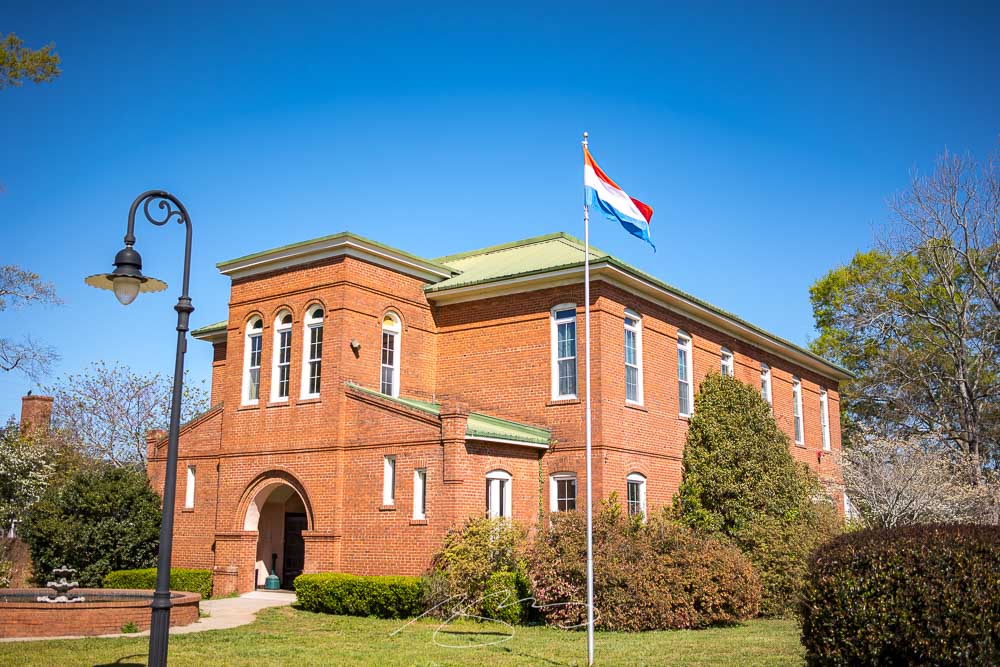
    The latest photostroll starts in the small town (pop. 1225) of Zebulon1Named for Zebulon Pike, the general and explorer (for whom Colorado’s Pike’s Peak is named, among other things), in Pike County, northwest of Macon, with the typical courthouse square:

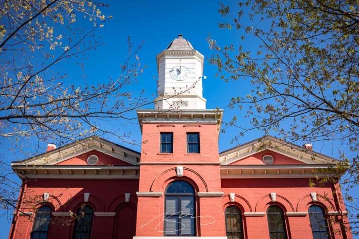
    Pike County Courthouse, Barnesville St.

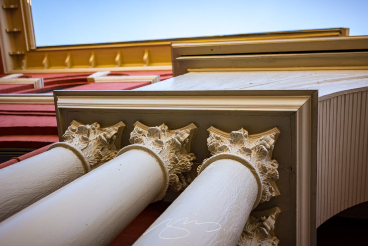
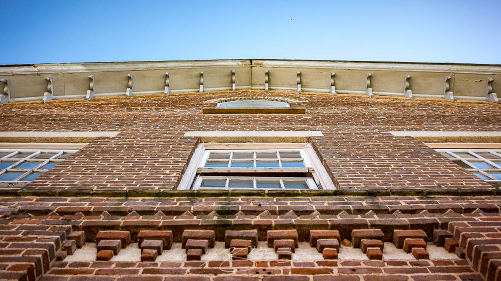
    The building, from 1895 and on the National Register of Historic Places, is wonderfully detailed, sporting columns aplenty and lots of Colonial Revival details:

    Pike County Courthouse (Column Detail #1)
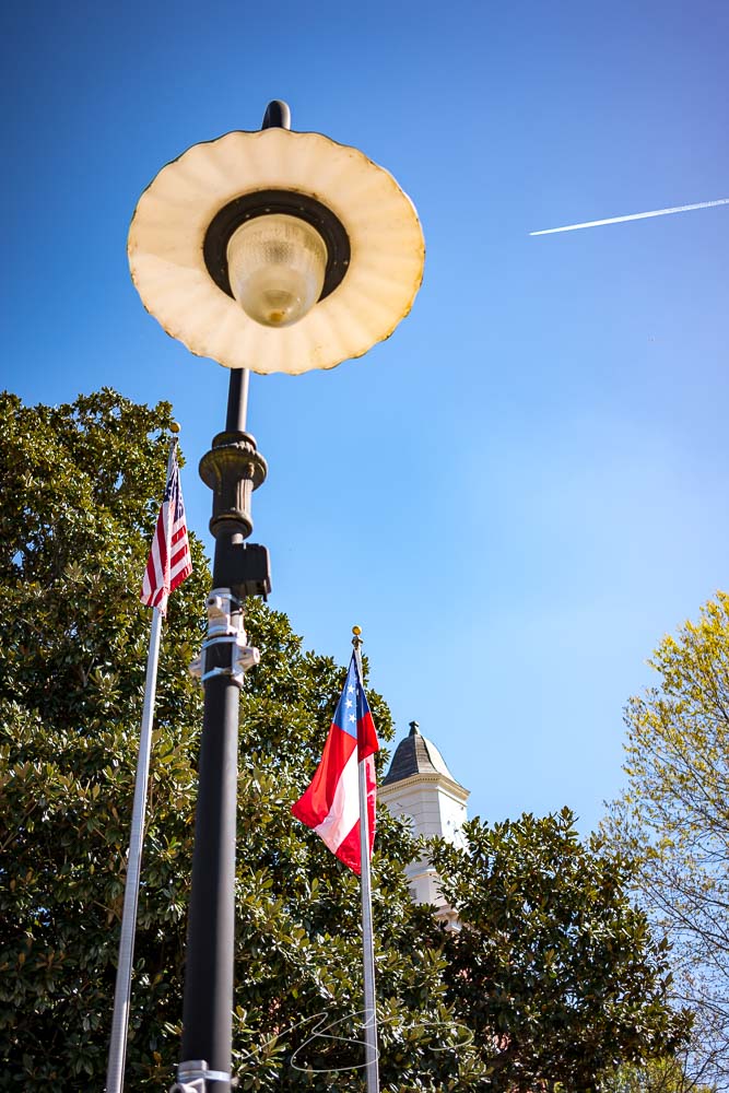
    Courthouse Square Composition, Barnesville and Thomaston

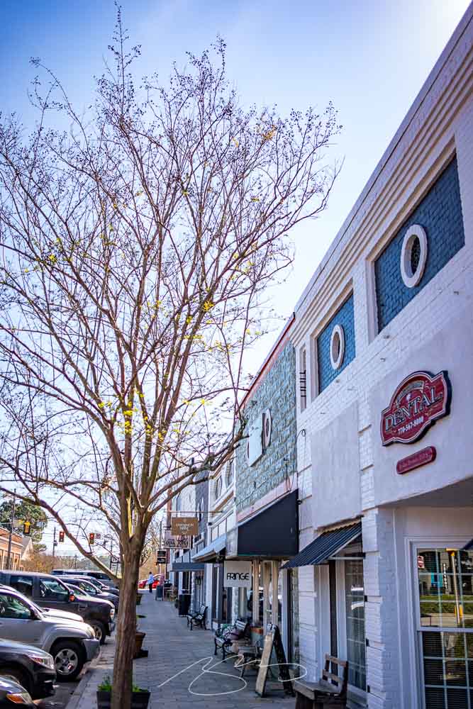
    The small downtown is well-kept and bustling in a way that small downtowns should be:

    Barnesville St. Storefonts, Zebulon

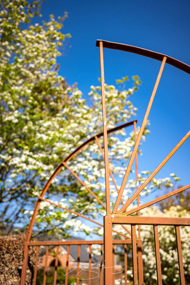
    Better still, spring is in full bloom:

    Garden Gate in Spring (#2)

    Enjoy the 25 posted photographs from Zebulon — and stay tuned for the main destination of the trip: Senoia. Have a good weekend!

    • 1
      Named for Zebulon Pike, the general and explorer (for whom Colorado’s Pike’s Peak is named, among other things) ↩︎
  • Beautifully Briefed 23.3: Kottke’s 25, The Book Cover Review, B&N Back to its Roots, The End of Type 1 Fonts, and I Don’t Want to Log In

    Beautifully Briefed 23.3: Kottke’s 25, The Book Cover Review, B&N Back to its Roots, The End of Type 1 Fonts, and I Don’t Want to Log In

    This time, the twenty-fifth anniversary of one of my favorite websites, a new book cover review site, an interview with B&N’s CEO, the end of Type 1 fonts, and a world-class rant.

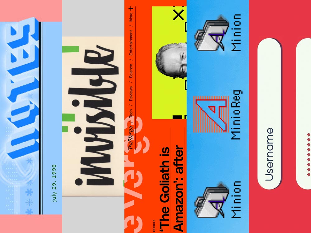
    Kottke Turns 25
    “Fine Hypertext Products,” indeed.

    Jason Kottke has been publishing a blog continuously for twenty-five years — more than half his life — and along the way, earned many an eye. (It’s been a full-time job since 2005.) Some of his thoughts from the anniversary post:

    My love for the web has ebbed and flowed, but mainly it’s persisted — so much so that as of today, I’ve been writing kottke.org for 25 years. A little context for just how long that is: kottke.org is older than Google. 25 years is more than half of my life, spanning four decades (the 90s, 00s, 10s, and 20s) and around 40,000 posts — almost cartoonishly long for a medium optimized for impermanence.

    I had a personal realization recently: kottke.org isn’t so much a thing I’m making but a process I’m going through. A journey. A journey towards knowledge, discovery, empathy, connection, and a better way of seeing the world. Along the way, I’ve found myself and all of you. I feel so so so lucky to have had this opportunity.

    — Jason Kottke, Kottke.org

    Cited here often, always brimming with interesting items, and a regular source of learning, Jason deserves massive congratulations. Happy 25! Here’s to many more.

    Bonus: Kottke was a guest on Daring Fireball’s The Talk Show. Check the links — Textism! — and enjoy a trip down blogging’s memory lane.

    The Book Cover Review
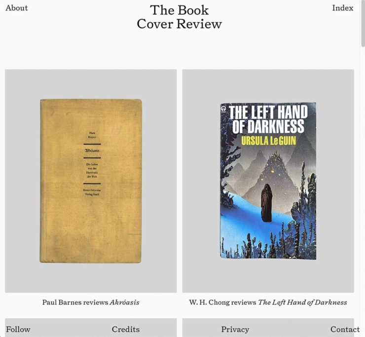
    NYT? No, English, actually.

    FastCompany points us to a new and interesting cover review site: mostly classic titles, covered in ~500 words “from a range of voices around the world.” Good stuff, with a NYT Book Review look and feel, updated regularly. Give it a try.

    The Verge interviews B&N’s CEO
    Decode B&N with James Daunt

    I’m not a regular listener of The Verge’s Decoder — it’s usually business-centric, going so far as to describe itself as secretly about org charts — but this one’s interesting: an interview between Nilay Patel and Barnes and Noble CEO James Daunt. They cover changes at B&N (with emphasis on why) and, of course, the elephant in any room:

    [Amazon is] really terrible at putting a book in front of you that you never thought you’d want to read, that you have no reason to read and no tether to at all. Whereas a bookstore is precisely the place that does that. You pick up the book that you never thought you would want to read, might read, or could even think about reading, by an author you’ve never even heard of until that moment. When a bookseller says, “Look at that,” “Read that when you next come in,” or “I love that,” or whatever it is, all those small, little recommendations are personal and able to attach themselves to books that otherwise have nothing going for them at all.

    James Daunt, CEO, B&N

    Props to The Verge for providing a full transcript, especially helpful for folks who would rather read the interview than listen to it. Whether you want to read or listen, though, book lovers in the US should take in this interview.

    Adobe Discontinues Type 1 Support
    Flying Suitcases.

    Back in the old days, Type 1 fonts were the backbone of desktop publishing. They were multi-part, often incomplete or corrupted, and always getting in the way of perfect print output — and yet beautiful and opening never-before-appreciated horizons of possibility for your projects.

    Now, in these days of OpenType, Google Fonts, and digital output, Adobe has taken the decision to discontinue support for the legacy Type 1 format. TypeNetwork has the full story, along with some options, and there are other converters if you need ’em.

    Bonus: TypeNetwork also has all of the Adobe Originals, from back when Adobe was your go-to instead of the corporate behemoth. Classy classics: see the list.

    The end of an era. (Via BrandNew.)

    The Perfect Rant: Solved
    There’s a park calling your name.

    One more from The Verge: “I don’t want to log in to your website.” The surge of login and email requests before being allowed to read “free” content is addressed brilliantly:

    So what we’re looking at here is creating a worse user experience in order to pursue a variety of scummy money-making schemes. And that sucks because there are no real public spaces on the internet. Here in reality, I can fuck off to a park and hug a tree and sit on a bench and do stuff without ads, without anyone trying to track me, and without having to pay a dime. There was a time within my memory when people tried to make websites feel like semipublic places — you could hang out on someone’s cool blog and enjoy yourself. 

    Elizabeth Lopatto, The Verge

    Read the whole thing, nod in agreement, and go enjoy that park.

  • New Gallery: Eatonton, Georgia

    New Gallery: Eatonton, Georgia

    Confession: For the last several years, I’ve been avoiding Eatonton. Its four-lane bypass is notorious as a revenue generator for Putnam County, so when heading north to Madison or Athens I have been taking the prettier Monticello route instead.

    My mistake. In almost twenty years of living less than fifty miles from this gem — and perhaps because of that bypass — I’d not explored downtown. It’s definitely earned another visit.

    Residence Above Maggie Lane (Mind Your Step)
    Putnam County Courthouse (Tree)

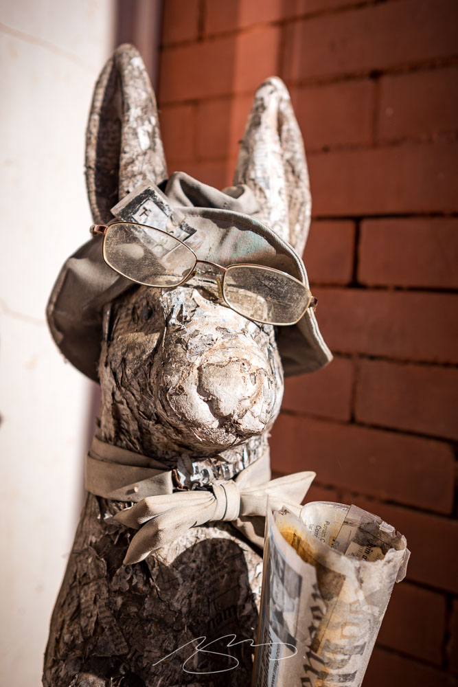
    I also wasn’t aware that Alice Walker (The Color Purple) and Joel Harris (Uncle Remus) were locals — the latter explaining the prevalence of rabbits hopping about:

    Rabbit (Paper Jeff)

    Interesting art, too:

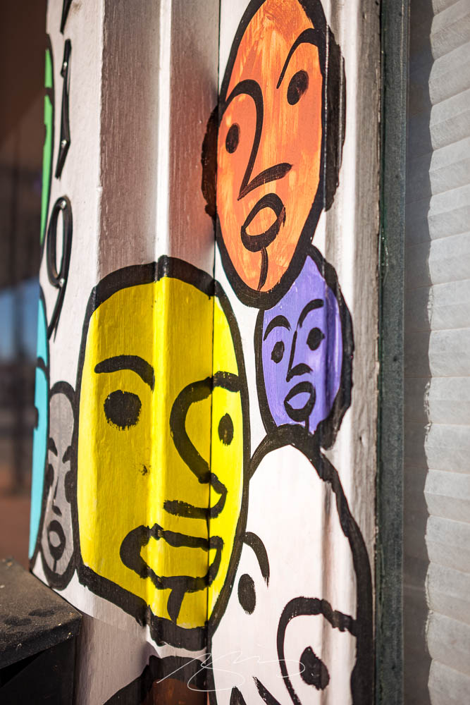
    The FolksArt, 119 S. Jefferson
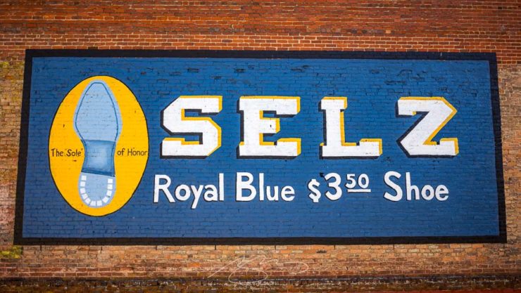
    Selz (The “Sole” of Honor), 107 N. Madison

    Please enjoy the 30 photographs posted — and stay tuned: I’ll try to travel the Historic Piedmont Scenic Byway again soon.

  • New Gallery: Sparta, Georgia

    New Gallery: Sparta, Georgia

    I’ve been meaning to take a camera to Sparta for a minute now; its downtown is small yet old and photogenic in a distinctly Southern way.

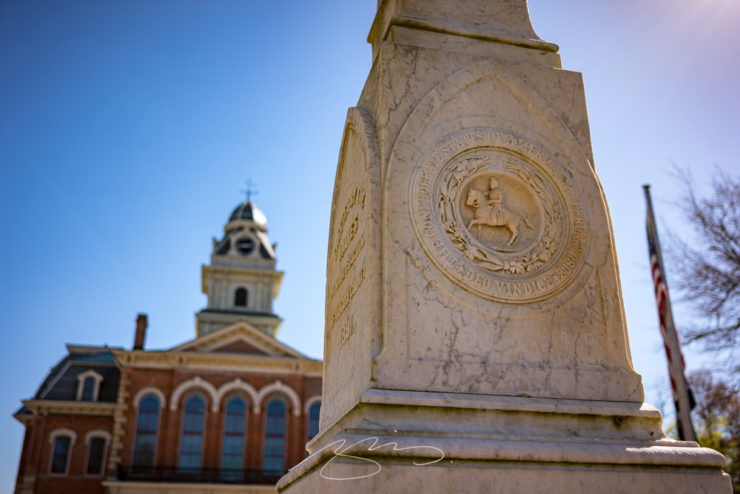
    Confederate State of Hancock County

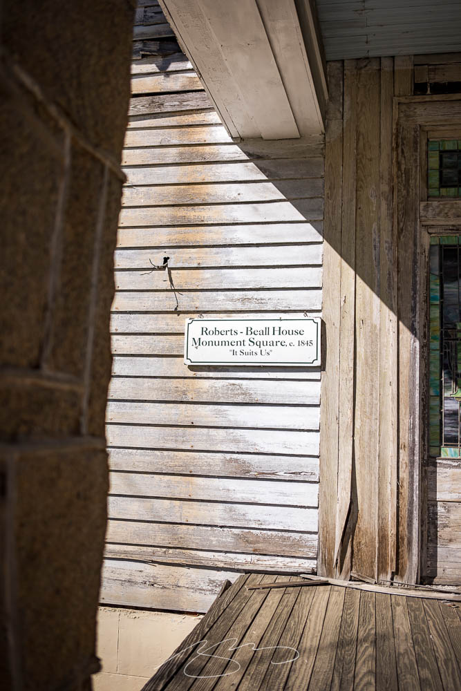
    On that subject: let’s get the elephant in the room out front and center. Sparta is 85% Black, arguably economically and socially suffering, and yet this monument stands front and center. Why?

    Neglect: “It Suits Us”
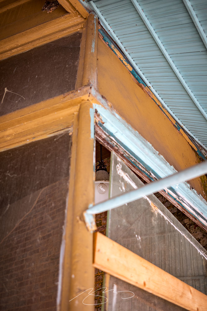
    Lightbulb Moment, 12745 Broad St.

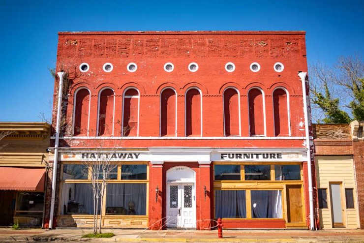
    However, there are signs of hope. More than one building downtown is being refurbished, and there are at least a couple of businesses that are surviving — perhaps even thriving — by providing a sense of community:

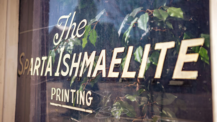
    The Sparta Ishmaelite (Printing)
    Hattaway Furniture, 12755 Broad St.

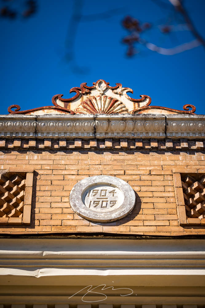
    By the way, those old buildings often have beautiful cast iron details:

    Building Detail, 12699 Broad St.

    I was glad to have made the trip, and hope that you’ll be glad to take a moment and look and Sparta’s downtown in the new gallery.

    Up tomorrow: Eatonton. Thanks for stopping by.

  • Gallery Update: Milledgeville, Georgia

    Gallery Update: Milledgeville, Georgia

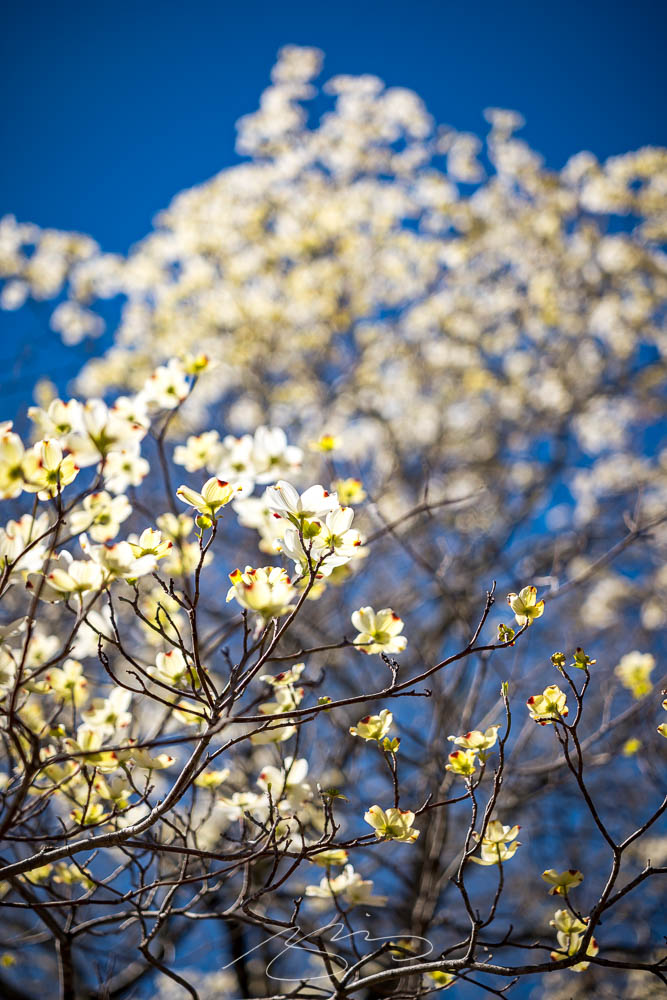
    Spring has sprung here in Middle Georgia:

    Downtown Dogwood

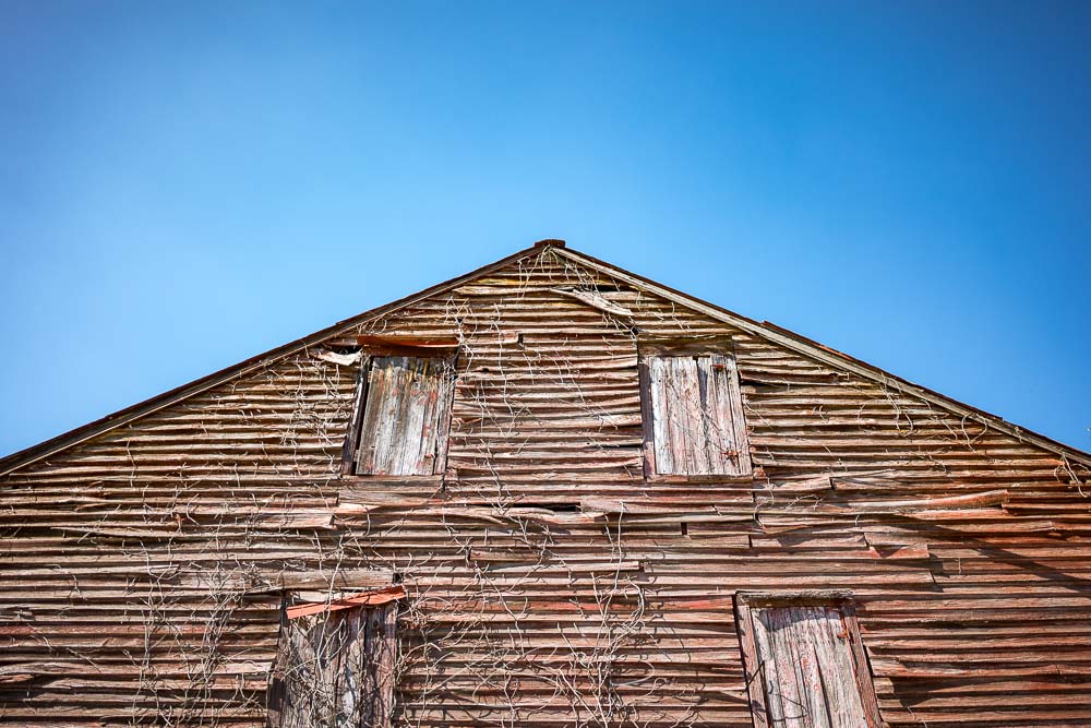
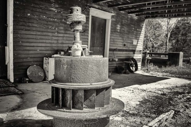
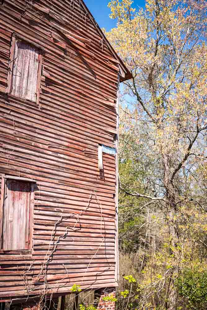
    Gerald and I took advantage of a warm and cloudless March day for a lengthy photostroll which started in Milledgeville — lunch — and wandered northeast, starting at the nearby O’Quinn Mill:

    Old O’Quinn Mill (Wheel)
    Old O’Quinn Mill (Siding Detail #2)

    The old mill building is situated on, natch, O’Quinn pond — a man-made addition to Town Creek:

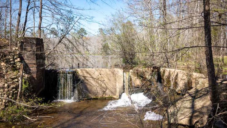
    O’Quinn Pond Dam (Town Creek)

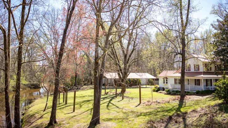
    There’s a dock and old farm buildings in the complex, which these days is a picturesque event venue:

    O’Quinn Mill on Town Creek

    We continued on to Sparta, then returned through Eatonton, stopping in both towns for photographs. (Updates coming tomorrow and Wednesday: stay tuned.)

    Meanwhile, take a look at the updated Milledgeville gallery, now up to 100 photographs spanning the last twelve years. Enjoy!