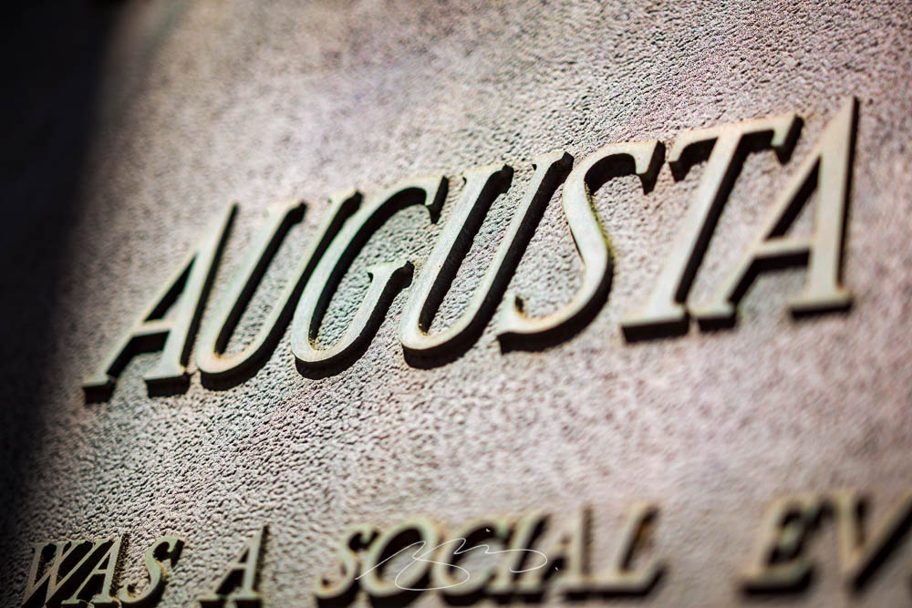
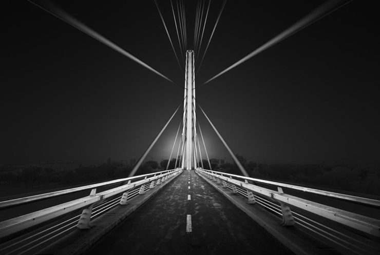
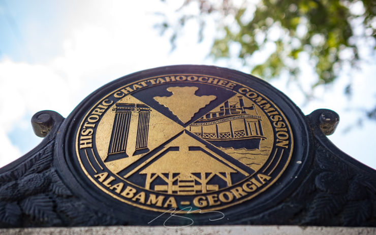
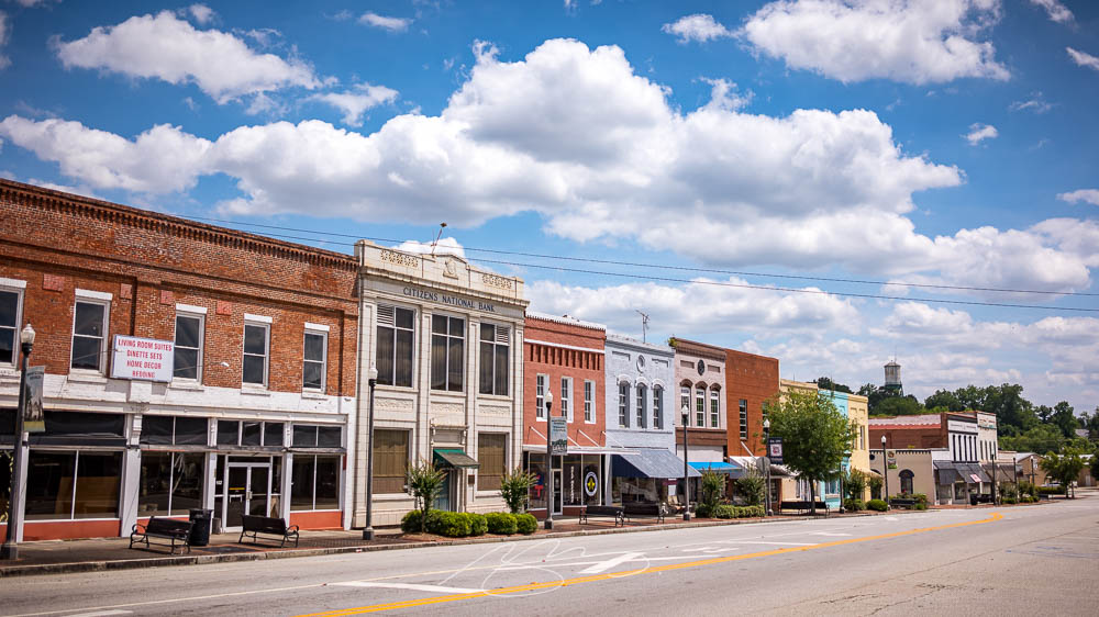
Together with Columbus and Macon, Augusta is one of Georgia’s “Fall Line” cities, and is home to more than 200,000 people. Located on the eastern edge of the state on the Savannah River, it was founded by James Oglethorpe in 1736 on the site of a Native American river crossing.
Augusta has long been on the to-photograph list, but it’s just far enough away from Macon to make a quick, unplanned trip difficult — so this past weekend, when another trip was cancelled, I took advantage of the available time and made it happen.
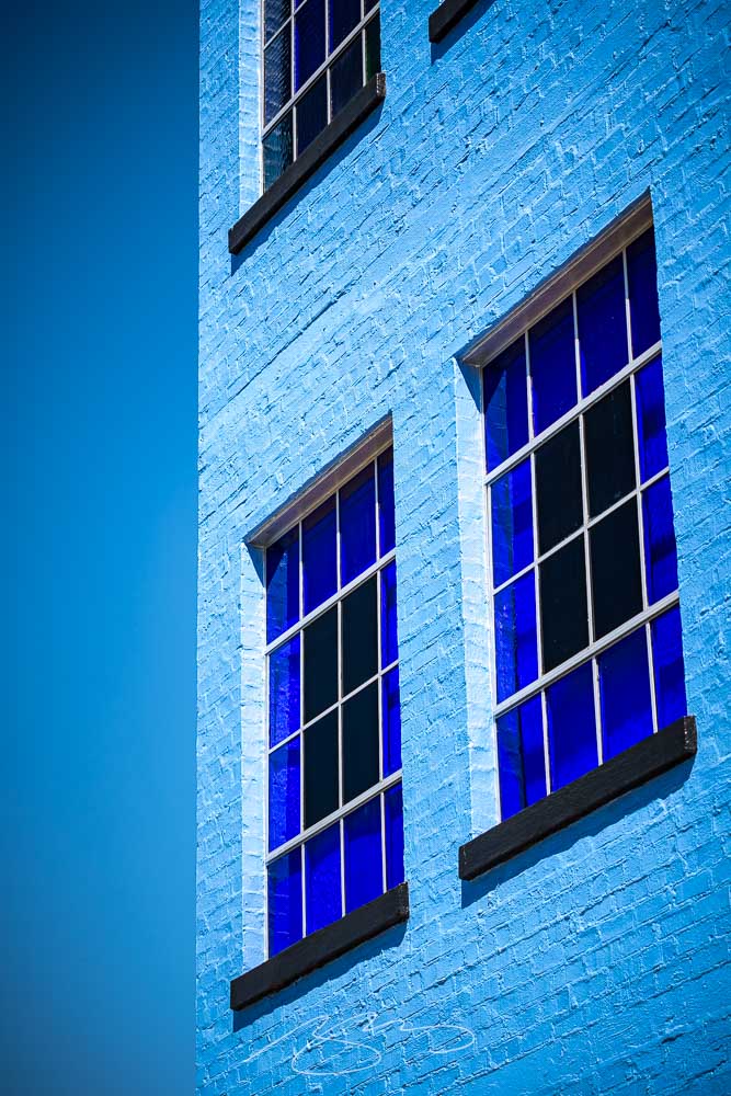
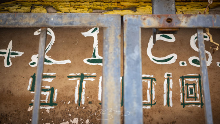
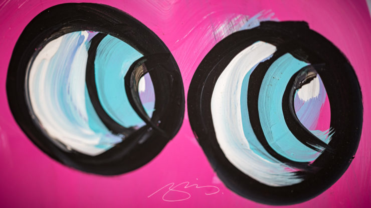
Blue Against Blue Against Blue, 943 Ellis St.
Of course, rather than a quiet Sunday downtown, I ran headlong — no pun intended — into the Augusta Ironman marathon. There were crowded street corners, intersections closed aplenty, and a combination of competitors and supporters everywhere.
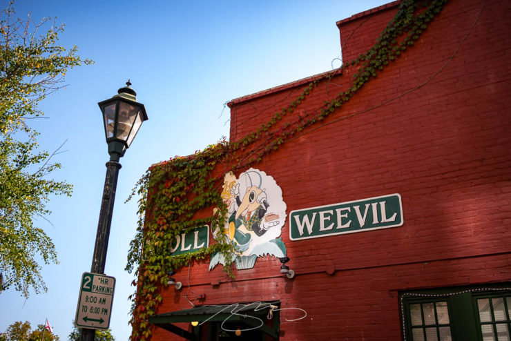
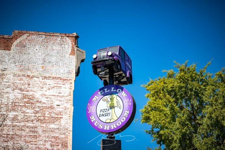
Boll Weevil Cafe and Sweetery, 10 James Brown Blvd.
Nonetheless, it was a beautiful early-fall day in Georgia, and over the course of several hours, I really enjoyed photography in downtown Augusta — as usual, without people in the shots.
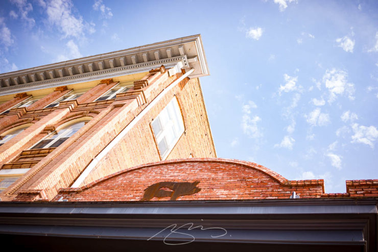
Decorative Facade, 103 Macartan St.
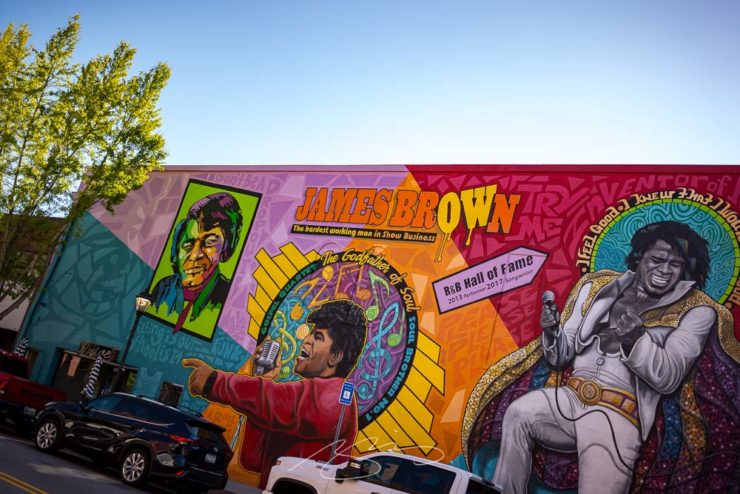
Excepting, of course, The Godfather of Soul:
Spirit of Funk Mural, 190 James Brown Blvd.
The photostroll also included the Riverwalk, a stretch both at water level and atop the levee — doing my best to stay out of the runners’ way, moving around to the chants of “water!” and “ice!”
Fountain at Riverwalk Enterance (#1), James Brown Blvd.Savannah River at Augusta, Georgia
The first 64 photographs — part one of two — have been posted to the new Augusta gallery. Stay tuned for the second part, along with a bonus gallery and some housekeeping news, tomorrow.
As summer turns to fall, let’s take a look at Type 1 fonts, a library index, revolutionary posters, posters for “get lectured,” and two different photography contests. Let’s get right into it.
Adobe discontinues a standard: The Type 1 font
Back in the early days of desktop publishing — up to about the turn of the century, give or take — everything typographic used PostScript, a programming language by Adobe. (Other stuff, too, like Adobe’s vector program, Illustrator.) PostScript fonts were the so-called “Type 1” variety, made up of a bitmapped “suitcase” that housed the standard display sizes and an outline file used by the output device to print clean, what-you-see-is-what-you-get beauty.
The Apple LaserWriter Plus and some vintage Macs: nostalgia! (Note the book — heh.) Image: YouTube.
Companies from Apple to Microsoft didn’t want Adobe to hold a monopoly on output tech, so later fonts evolved into TrueType and then OpenType, the latter of which is the standard today.
So much so that Adobe has now discontinued Type 1, and they, along with Microsoft, have stopped being supported. Which is understandable and yet a shame: some of us still have hundreds of them.
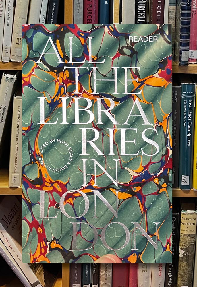
It’s Nice That has a post that reminds us of a library’s central purpose: to leave knowing more than you did when you entered. “The library, in our shared public imagination, is a special place,” the author argues — reminding us of what libraries were established to do, often distinctly different from the modern reality (especially in the United States).
In the library you begin to be convinced that language matters, that words have the power to clarify, to rouse, to make us feel something, to help us understand the political and cultural features of historical and contemporary moments.
Lola Olufemi, It’s Nice That
All the Libraries in London. Cover design: unknown. Image via It’s Nice That.
All the Libraries in London does something artistic with a simple listing, elevating it, reminding us how compelling the ideal that libraries represent really is:
This is a political and artistic listing, one that invites the reader to rediscover their own memories of their local library as a site of discovery. The book’s authors invite us to reflect on our personal relationship to libraries as well as the necessity of collectively securing their future existence.
Lola Olufemi, It’s Nice That
Alan Kitching, Durning Library. Image via It’s Nice That.
We need more of this everywhere, but especially here in the States. Meanwhile, check out this great item at It’s Nice That.
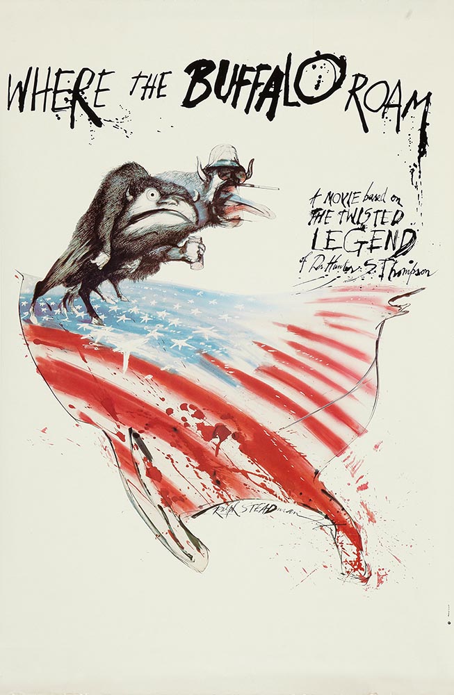
Special Bonus #1: Another British treasure, via the very British Antiques Roadshow (a British original, natch): this incredible poster by Ralph Steadman.
Ralph Steadman’s Where the Buffalo Roam (1980) poster. Image via Wikipedia.
Special Bonus #2: British book designer Steve Leard has launched a new book design podcast, Cover Meeting, featuring interviews between Leard and fellow book designers on the work, the industry, and more. The Bookseller has more.
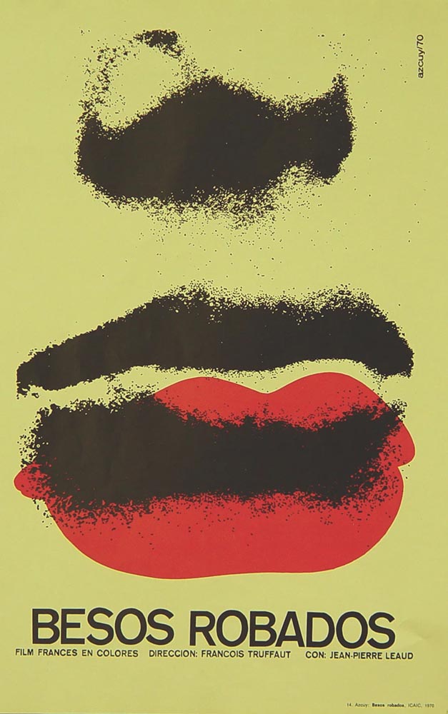
Cuban Movie Posters. No, Really.
While we’re on the subject of great posters — and It’s Nice That — let’s talk about how Cuba’s revolution-era political posters transformed their poster design for films. Appropriately enough, a new film, El Cartel Cubano, highlights these amazing (and, likely, never seen before) items.
Besos Robados, ICAIC, by Sotolongo & Carole Goodman. Image via It’s Nice That.
“How come our posters in the US aren’t this beautiful? What did this say about the priorities of the revolution? What did the medium or choices in the scarcity of materials used say about the economic situation in Cuba?” It’s these questions which form the bedrock of El Cartel Cubano, a fascinating and tender tribute to the artists on the island.
Adrienne Hall, co-director, El Cartel Cubano
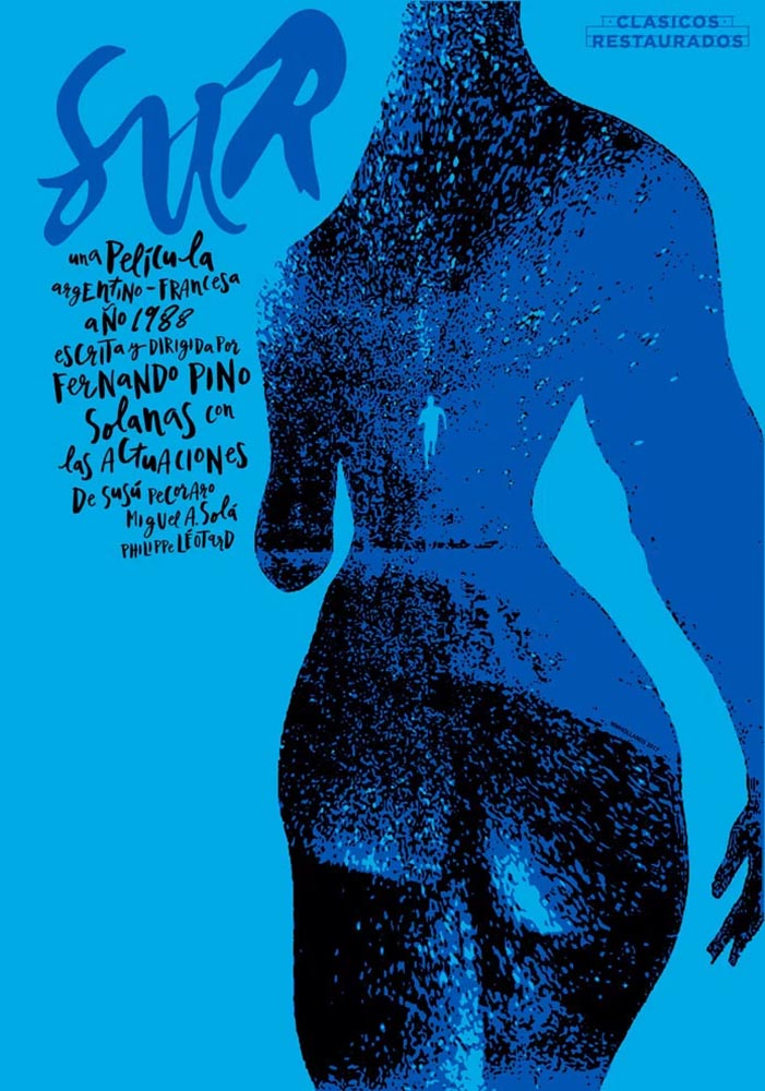
Sur, by Michael Myiares Holland. Image via It’s Nice That.
I have to admit: this isn’t a subject I would have leapt at, but It’s Nice That sold it. Awesome.
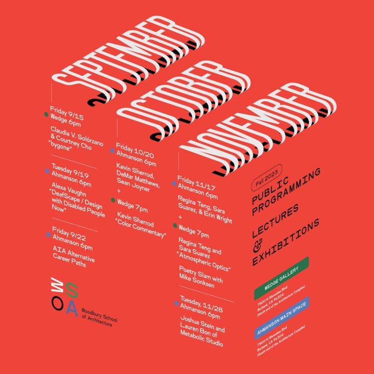
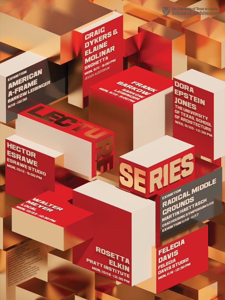
Get Lectured (on Architecture)
Closing out our trifecta of great posters, Archinect‘s Get Lectured series brings us these fantastic items from their Fall 2023 series:
Woodbury University School of Architecture’s Fall 2023 lecture series.The University of Texas at Austin School of Architecture’s Fall 2023 lecture series
Going to soapbox a little here: pay-to-enter photo contests aren’t usually something I want to spread the word about. So ArchDaily‘s basically-a-press-release, “URBAN Photo Awards 2023 has announced its list of Finalist Photographers, marking the penultimate stage of the international contest,” was guaranteed a pass.
But there’s a problem: some of the photographs are really compelling.
Winners of the 2023 Black and White Photography Awards
Another contest, yes. They’re everywhere. But … wow.
Street Lights – Ottawa, by Gareth Jones, category winner, architectureAnother mushroom? By Hector Ballester Ballester. Silver mention, architecture.Alamillo bridge, by Manuel Ponce Luque. Finalist.The concert, by Helena García Huertas. Finalist.Reflections on the stairwell, by Max Dobens. Finalist.
And that’s just the buildings/architecture — there are portraits, street photography, landscapes, and more. A reminder to aspire, every day, with every image.
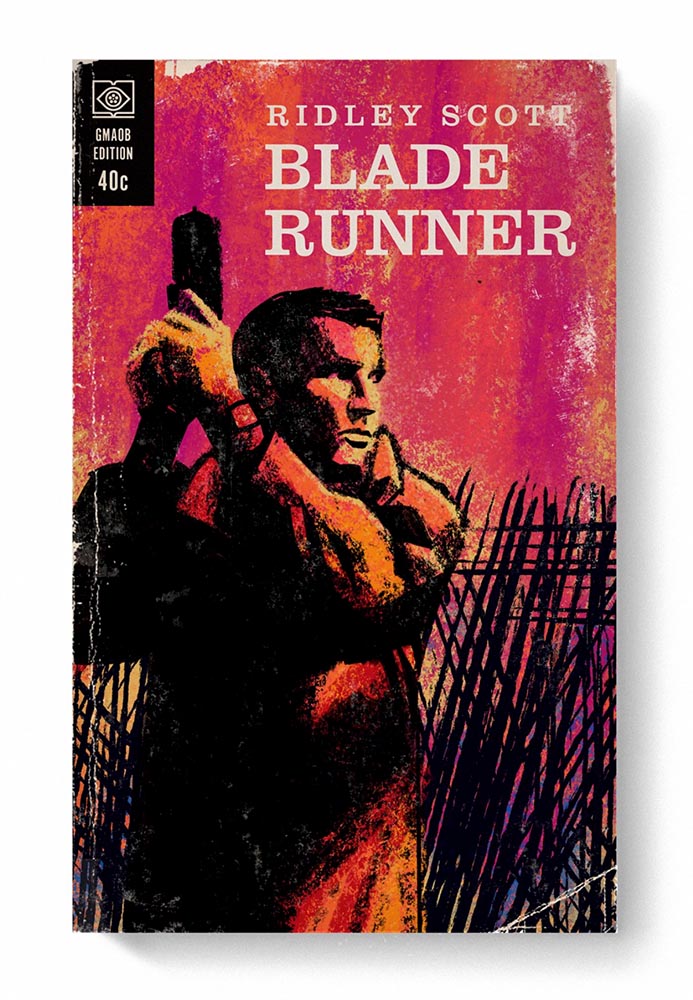
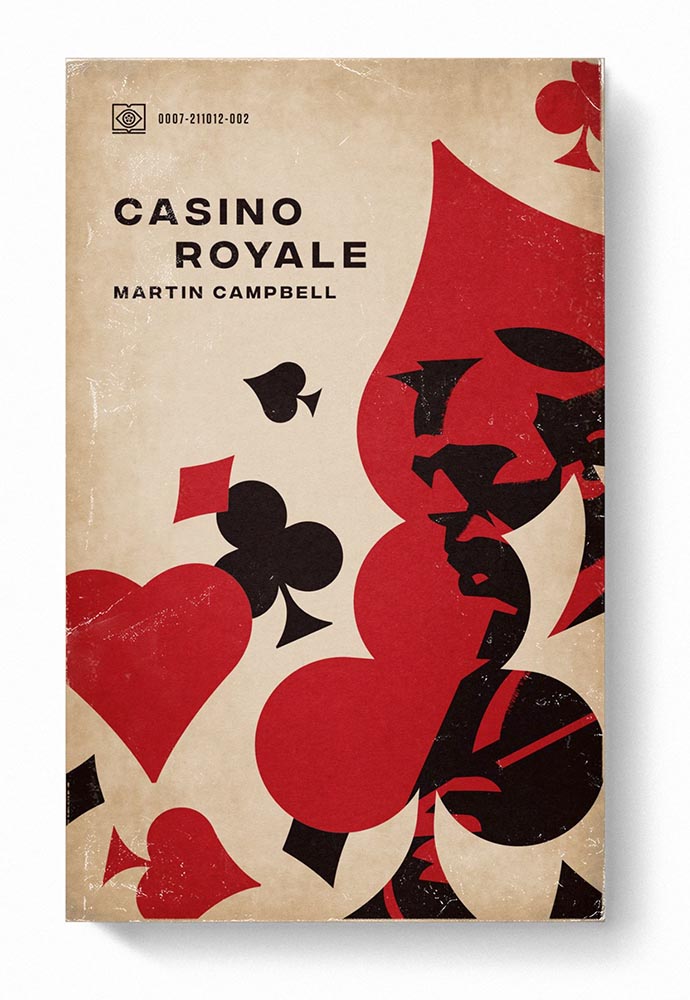
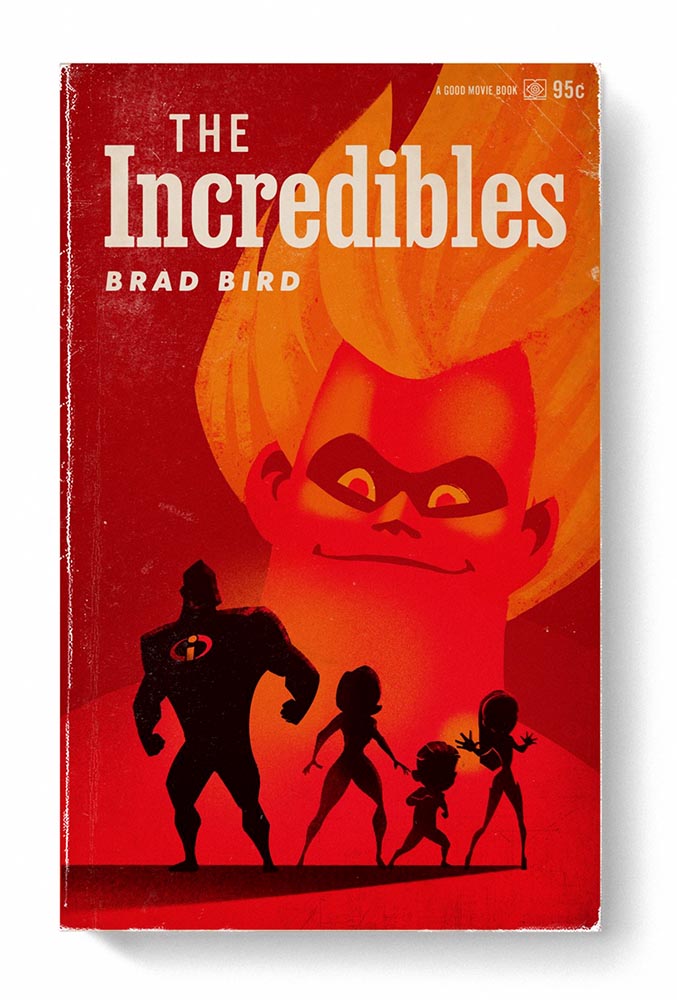
The August heat is met with some refreshingly cool items for you this time: beloved movies reimagined as vintage paperbacks, graphic design on the Internet Archive, and winners of the 2023 iPhone photography awards. Plus, a bit on social media that hopefully won’t leave an aftertaste. Let’s dig in.
From the aged look, illustration choices, and director-as-author to the logo and occasional price, these are all … perfect.
Volume One is 100 titles, and while that book is sold out, prints are available at his website. The items in Volume Two, due this month, are guaranteed to be awesome.
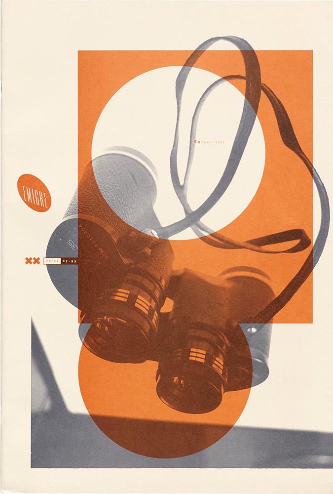
Graphic Design on the Internet Archive
Emigre #20 – Expatriates. Courtesy of the Internet Archive via archive.digital.
I don’t always link to these contests — it often seems like the publicity (and rights!) are all about the folks holding the contest rather than the people entering them — but I often look, and am always impressed with the quality coming out of a “simple” iPhone.
Long Nguyen, France – 1st Place, Travel – “Last Night before Xmas”
Scott Galloway, United States – 1st Place, Nature – “Wonder Wheel”
And while both of the above are (relatively) recent phones, in the latter case showing the macro capabilities of an iPhone 12 Pro Max, even older phones can highlight the talent of the person using it:
Derek Hager, United States – 3rd Place, Photographer of the Year – “Tucson Morning”
I’m not going to spend much time on this; I eschewed pretty much all forms of social media years ago now, and don’t regret it. That said, I do keep up with social media in the meta sense (a word that’s been stolen, as far as I’m concerned, by — wait for it — a social media company), and have noted the pain and concern associated with the implosion of Twitter.
While this conversation started with Nick Heer and the always-excellent Pixel Envy, it’s obviously evolved as the year has seen one extraordinary cage fight event after another.
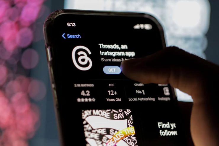
Threads on Apple’s App Store, via the BBC.
For the past decade, It’s been all but required for serious brands to maintain a social media presence […] yet instead of scrambling to claim digital real estate across all these newly emerging platforms, some companies are choosing to be more judicious about which platforms they choose to join. In some cases, they’re learning from brands who jumped the social media ship years ago.
Chris Stokel-Walker, BBC
The quote above, from the BBC, attempts to answer the question, “Why your favourite brand may be taking a social media break.” Short answer: it’s complicated. I’d argue there’s an even shorter answer — it’s smart! — but for people and brands that aren’t yet established, social media is often key to discoverability.
This may be especially true for artists, designers, photographers, and others in the self- and small-business-employed creative field. Indeed, let’s go to a great source for those in the arena, Creative Boom, who recently spent a minute asking, “Creatives are saying social media is over… so what next?”
Like any new craze, it was fun for a while. But there’s certainly nothing new about it any more. Facebook’s now been around for almost two decades. Twitter’s 17 years old. Even Instagram has reached its teens. And while many of us joined these platforms during their fun, “anything goes” eras, when everything was about the users, now it’s all about the algorithms and their use to make venture capitalists vast amounts of money.
Tom May, Creative Boom
While I agree that social media is a mess and has been for a while, I’m absolutely not going to tell you to give it up — only to remind you that I have given it up and continue to be completely okay with the decision.
I do want to ask you, though, to choose wisely:
Facebook’s “Threads (an Instagram app),” their answer to the Twitter/X debacle, as shown via Apple’s iOS App Store privacy report.Tapbot’s “Ivory,” available in Apple’s iOS App Store and showing that app’s privacy report, for the Mastodon social platform.
Enough said. Turn off the computer, go forth, and enjoy a beautiful summer’s day.
Two different photographic opportunities have meant additions to the Automotive gallery recently: some motorcycles in Columbus, and some BMWs at an event in Hampton, a suburb of Atlanta and home to the Atlanta Motor Speedway.
All of these were taken with Leica’s superlative APO 90mm macro (yes, I know, I go on and on about this lens — it’s that good), and almost all are just details — a lens that long in a crowd means leaving the big picture aside in favor of the minutiae. Luckily, that’s a strength of the camera system, and one of my favorite ways to use it.
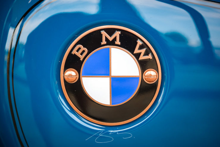
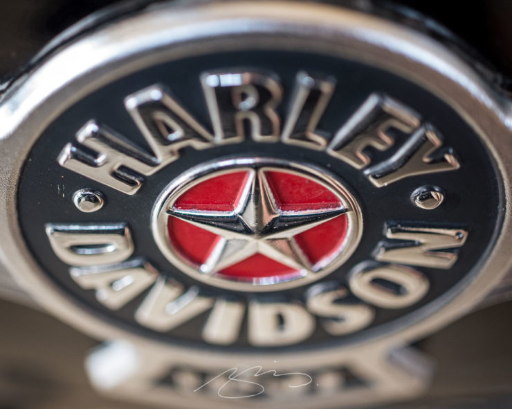
Retro BMW (Motorrad) RoundelHarley Davidson Star Logo (Detail)
The Harley logo wasn’t one I was familiar with — and it’s great — but the BMW is fantastic in its retro glory, complete with copper screws.
Meanwhile, speaking of BMWs, they hold their Ultimate Drive Experience yearly in the Atlanta area, and Gerald and I are in regular attendance. It was my first time seeing a number of new models, including the new M2:
M2 (Headlight Detail)
Didn’t like this until I saw it there; it’s a shortened M4 but wide and swollen in all the right ways. However, the undisputed star of the show was the new XM. Like many modern BMWs, it’s better in person — exuding presence:
XM (Charging)
I wish I’d somehow been able to better convey its stance, its proportions, and what I imagine it would look like coming up behind you. Then again, $160k and 664 horsepower will do that. Speaking of horsepower:
XM (M Power V8 Hybrid)
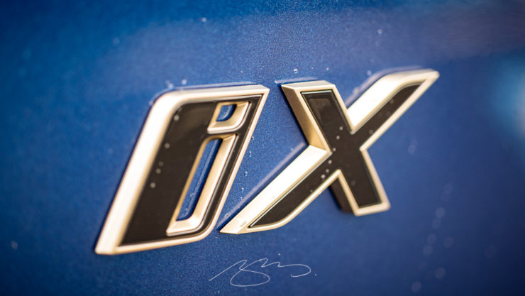
Nuthin’ like a carbon fiber engine cover in a three-ton machine. That said, for both Gerald and I the far-and-away favorite wasn’t the XM but rather the iX:
iX (Badge Detail)
The iX is a little ungainly from some angles, but its battery-powered, carbon fiber goodness is both fast and efficient. Plus, it sports one of the best BMW interiors going right now, and that’s saying something. (Ventilated wool seats for the win, folks.)
These events usually boast parking lots filled with classics, but either the late Sunday afternoon or thunderstorms kept the older items safely garaged. However, there was a sweet and very bright red i8 gracing the scene:
Gerald and I were in Georgia’s lower Chattahoochee River valley yesterday, visiting the city of Columbus — and ran across a couple of treasures. Naturally, there was a camera handy.
The first is the best restaurant I’ve enjoyed in a long while: The Animal Farm.
The Animal Farm, 105 W. 12th St.
If you’re in or going to be going to Columbus anytime soon, I cannot recommend it highly enough. The food was superlative, the service excellent, and the ambiance simultaneously upscale, casual, and fresh.
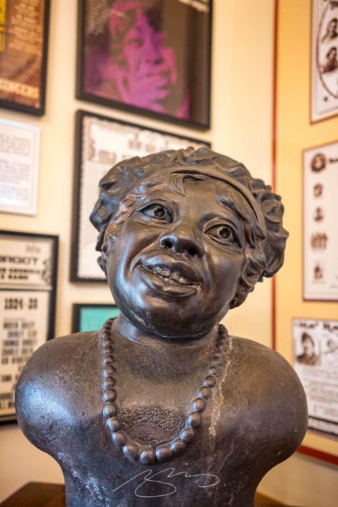
The second — and no less tasty — stop was the Ma Rainey Museum of the Blues. This period house downtown is small but demonstrates a remarkable comeback from the (literal) wreckage they started with in the ’90s. I’d originally wanted to return to the Columbus Museum, but it’s being renovated; Gerald’s suggestion here was pitch-perfect.
Ma Rainey House, 805 5th Ave.Ma Rainey House Marker, 805 5th Ave.Bust and Albums, Ma Rainey House, 805 5th Ave.Record Player Detail, Ma Rainey House, 805 5th Ave.
Inside, Gerald and I enjoyed a lengthy conversation with Xavier, a guide who was knowledgeable and enthusiastic; he absolutely made us want to explore more blues history. (I’m also going to be listening to some Ma Rainey on Tidal.)
Meanwhile, gallery of Columbus photographs is deep and varied, spanning almost fifteen years and 180 items — check it out.
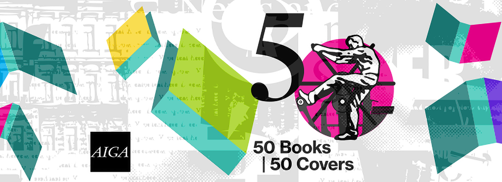
Since its inception in 1923 as the Fifty Books of the Year competition, this annual event highlights AIGA’s continued commitment to uplifting powerful and compelling design in a familiar format we know and love. As book jackets became more prevalent, the competition evolved with the field to acknowledge excellence in cover design. Beginning in 1995, the competition became known as 50 Books | 50 Covers.
AIGA Press Release
The jury and I were very impressed with both the quantity and quality of the entries this year, which made choosing only 50 extremely difficult. Among the trending techniques this year were use of exposed bindings and elaborate page sequencing and mixed paper choices. For me, there was a greater overall sophistication in book design, with a mix of aesthetically beautiful and graphically brash approaches in the final choices.
Andrew Satake Blauvelt, Director, Cranbrook Art Museum (Chair)
As usual, there’s some overlap with various lists of “best of 2022” — here’s Foreword’s — but, as LitHub puts it, these are the best book [designs] of 2022 that you (probably) haven’t seen.
A selection of my favorites, in alphabetical order:
Cover design by Mary Austin Speaker
Simplicity itself — along with some awesome block type — add up to a great cover. (Love the angled blurb, too.)
Book design by Zack Robbins and Bentzion Goldman
One of the great things about this post is the “50 Books” part; this cover’s okay, and the spine more than okay, but it’s the interior design that really wins in my book (pardon the expression):
Book design by Zack Robbins and Bentzion GoldmanBook design by Zack Robbins and Bentzion Goldman
Kudos: the photography is great, but the spread above is artistic in wonderful way.
Book design by Kimberly Varella.
The trend, mentioned above, to mix paper stocks and styles is shown to full effect here. This book has too many great examples to post; see more.
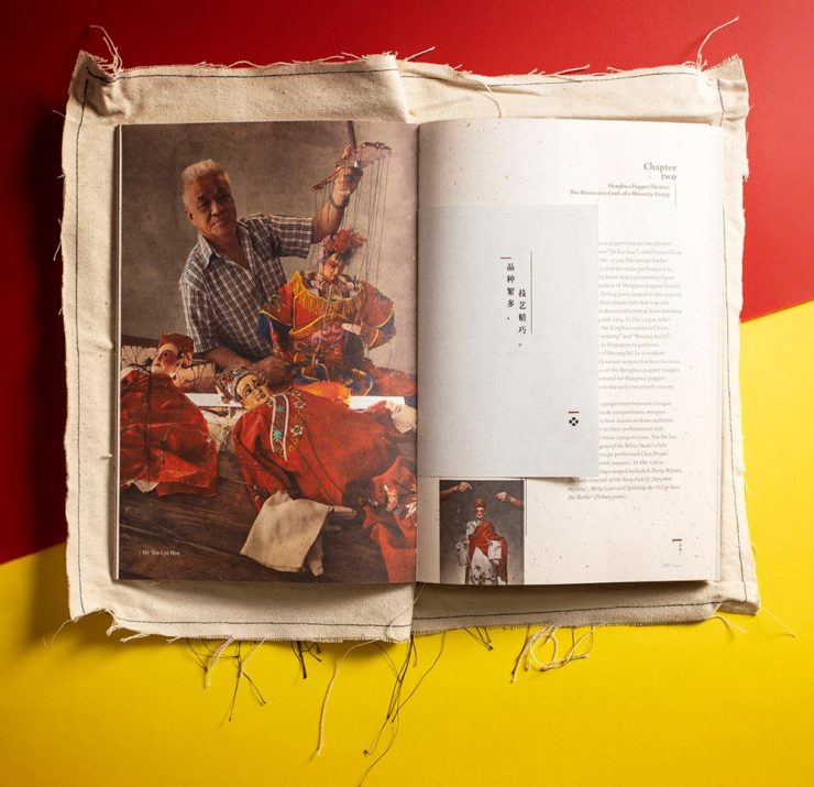
Meanwhile, Uncovering Singapore’s Traditional Chinese Puppets may not be a title you’d automatically reach for, but…:
Book design by Alvin Ng and Jesvin Yeo.Book design by Alvin Ng and Jesvin Yeo.
This is an interesting, compelling cover and jacket design as shown above. However, once again, rather than post it all here, I’m just hoping to whet your appetite — you need to see this one unfold (literally).
Cover design by Raúl Aguayo.
Great colors, great combinations, great cover.
Cover design by Vi An Nguyen.
I’m always a sucker for photographs of practical items used in ways that make book covers great, and this one’s a shining (pink) example.
Book design by Maria Elias.
There’s so much great design work done in the children’s book market it’s not even funny. The first of two great examples. (See more from this title.)
I’ve highlighted this design before, but every time I see it I like it more. Glad to see it as an AIGA 50 Covers winner.
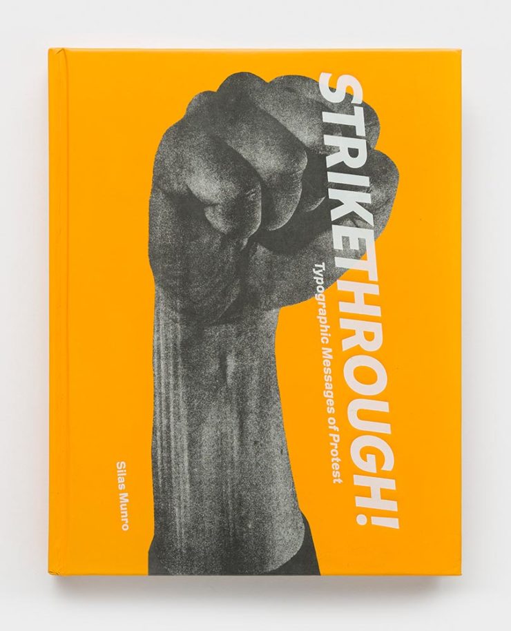
Book design by Brian Johnson, Michelle Lamb and SilasMunro.
Typographic Messages of Protest, indeed — done in an appropriately powerful way. The suggestion of motion is a great touch.
Cover design by Chris Allen.
“Block party,” defined. Excellent.
Book design by Jay Marvel.
The second children’s title on this list, including an interesting and distinctive style. (See the interior of this book.)
Again, these are only some of my favorites — there are many more, all of which deserve a look. Congrats to all the designers who made these title happen and thanks to the AIGA for this annual delight.
As is typical in July in Georgia, it was hot yesterday — but not so much that I didn’t spend a few minutes wandering around with the camera and superb 90mm. Especially since I was down on MLK, an area of downtown Macon I don’t frequent as much as, say, 2nd St.
Macon Rocks Mural (401 Cherry St.)Music Marker (MLK and Mulberry)
Some detail shots (as usual):
Studio Door, Serenity Entertainment, Cherry St. Ln.Visit Macon’s Keyboard Building Detail, 450 MLK Blvd.Decorated Transit, MLK and Cherry
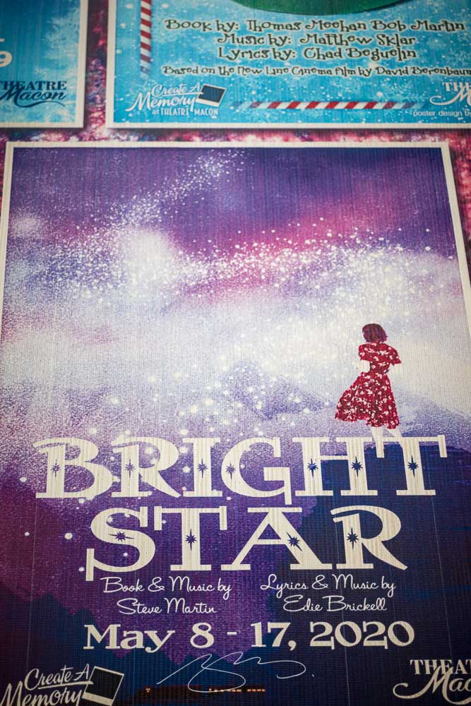
Side note: I was completely unaware that Steve Martin and Edie Brickell had teamed up for Bright Star, a musical set in the Appalachians. (I presume, unfortunately, that the 2020 season at Theatre Macon might not have shown.) It probably won’t surprise that I enjoy a musical now and than — and am a big fan of both Martin and Brickell — so was glad to find it on Tidal.
Bright Star (Painted) Poster, Theatre Macon, 3rd St. Ln.
The mission for these posts is simple: independent, unrelated items which add up to something interesting. This time, it’s nifty type, aka NFTy.pe, photographic AI (or not), the 2023 Logo Trends Report, great London Review of Books illustrations, and a worthy art book list hijacked for a rant on stickers. Boom!
Better Than it Sounds: NFTy.pe
Typefaces have become, from this designer’s point of view, become commodities — perhaps even part of a broken system. Most clients don’t have a budget for unique type, there are too many spread across too many different sites, and, as Creative Boom puts it, “ownership has become poorly policed, if not non-existent.”
NFType really flips the script on all of that and attempts to reimagine the industry from creation to sale. In a nutshell, NFTy.pe uses a combination of modular type design and generative scripts to create fonts with unique visual attributes. The upshot is that no two character sets are exactly the same. And thanks to smart contracts and embedded metadata, ownership is quick and easy to verify.
— Craig Ward, NFTy.pe creator, via Creative Boom
Create a unique typeface that rewards, in more ways than one.
As pointed out, it’s not just for type users:
There’s a lot of work to be done to put some distance between the dumpster fire that represents much of the NFT space and projects – like this one – with actual utility. I wouldn’t vouch for the worth of a lot of what I’ve seen out there, but the underlying tech – the smart contracts themselves – [is] actually genius and will be a game changer for any industry where provenance is a key factor – agriculture, property, fashion etc.
This year has been centered around AI, it seems — and, as illustrations go, some of the results are indeed a new form of art. Take this one posted by Dezeen as part of their AItopia competition:
Created by Midjourney for Daniel Riopel.
Fantastic. Its creator, a production technician in the prefabricated housing industry, deserves major kudos for describing something to the Midjourney engine that’s intricate and, if I dare use the term with AI, creative. (Several of the images there are excellent — check ’em out.)
That said, I’m not a fan of articles like PetaPixel‘s recently-posted “Photographers May Have to Embrace AI, Whether They Want To or Not.” Simply put: no. I don’t have to embrace it, because nothing has changed — either I can get the photograph I want using the cameras and lenses I have or I can’t. I’m not going to “generate the fill,” pure and simple. (I don’t control the computational photography my phone produces, but Apple isn’t prone to creating what isn’t there.)
I’ve been trying to write on this subject for a while, without success. Possibly because I don’t need a longer version of the above paragraph, possibly because it’s something else I haven’t been able to articulate yet — even to myself.
The 2023 Logo Trends Report
It’s back! BrandNew points us to the latest in styles and, as advertised on the tin, trends:
“Sonics,” part of the 2023 Logo Trends Report.“Ritz,” as in the cracker, part of the 2023 Logo Trends Report.
Always an interesting read, including this fantastic tidbit directly related to the previous section:
“Don’t worry about AI stealing your job. To replace graphic designers with AI, clients will need to accurately describe what they want. We’re safe.”
— Bill Gardner, LogoLounge
Read the full report, “a whirlwind of ideas, symbols, and AI, evolving how creators like us create,” at LogoLounge.
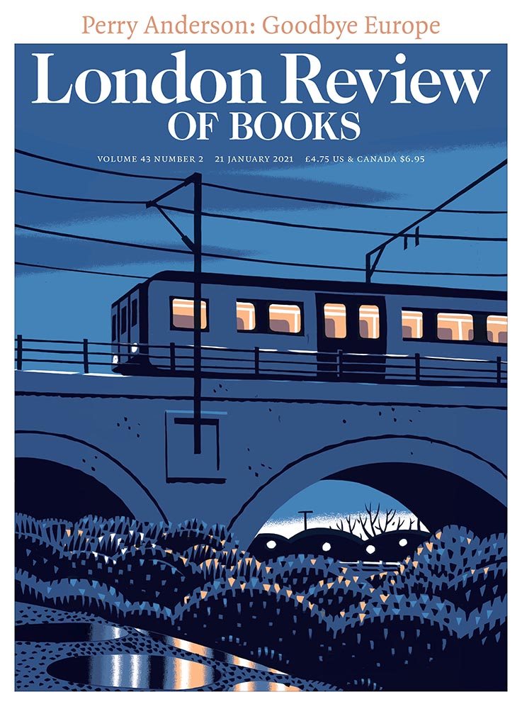
Illustrations at the London Review of Books
Because we cover books here often (pun intended), an article on Jon McNaught’s awesome illustrations for the London Review of Books absolutely caught my eye. “A collaborative relationship,” it’s called — and the results produced not only illustrate a huge variety of subjects in a consistent style, but do so in a way that delights:
A great illustration by Jon McNaught. Of the examples posted, there’s not a single one I don’t like. Copyright Jon McNaught.
Since 2011, Jon has been collaborating with the renowned literary journal, creating works that have a quietly mesmerising quality. His scenes breed comfort with their universality, but also their ability to evoke specific memories and feelings in the individual viewer. Through his covers, Jon artfully captures the essence of everyday life by representing the vastly contrasting nature of British weather, plus the uniqueness of London’s architecture, green spaces and public transport.
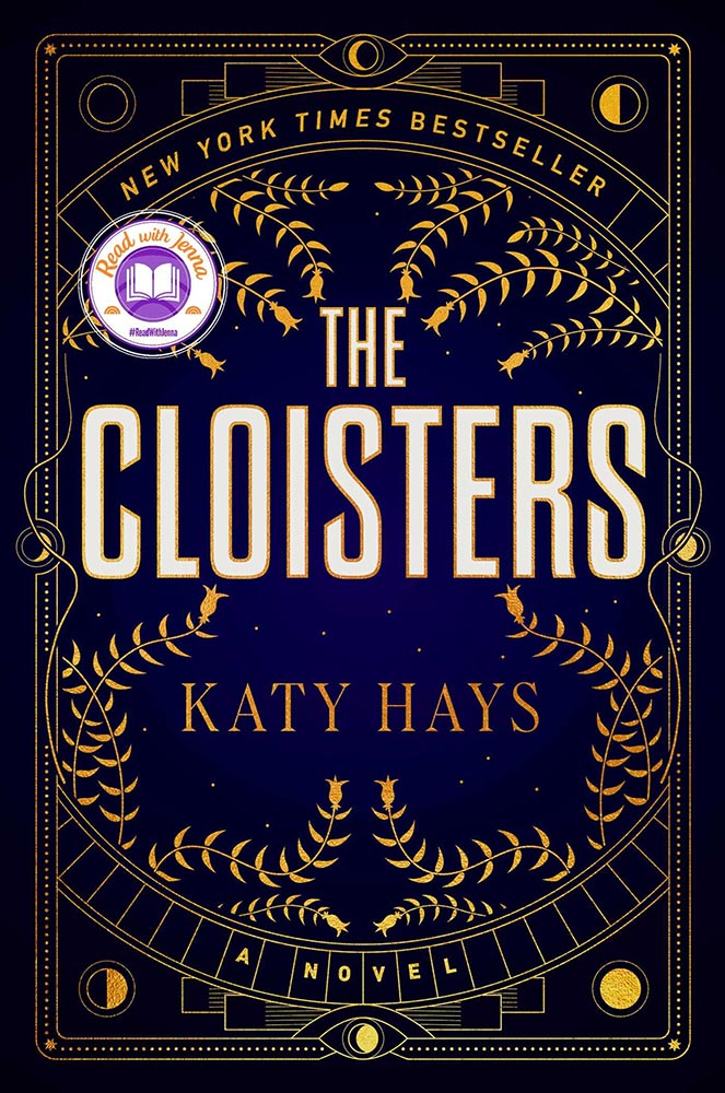
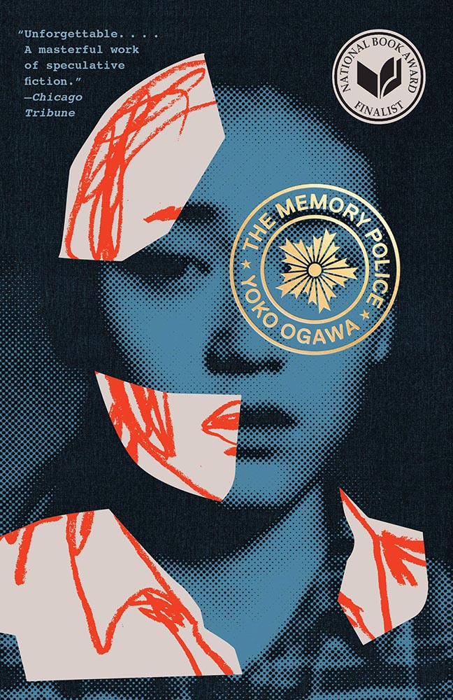
As usual, whenever I see something like this, I’m going to do something else at the same time: mine it for potentially great book design. Which, if you’ll indulge, leads to this short rant: I hate good covers marred by stickers.
“Read with Jenna?” Seriously?
Solid cover. Soooo, who’s Jenna? Is she important enough to mar the cover with? (I DuckDuckGo’d the answer: maybe … if you watch television. Not sure that’s the audience publishers should want to cater to.)
This time, the “sticker” is National Book Award Finalist. Better, but still.
Another solid cover — perhaps even really good, something that’s appropriate for a title up for the National Book Award. Real shame, then, that the sticker gets in the way, winding up completely distracting from the very nice circular title treatment (I’m sorry I don’t know either book designer to list here.)
I understand that it’s a little like trying to hold back the tide with a shovel, but it’s something I needed to express. [/rant]
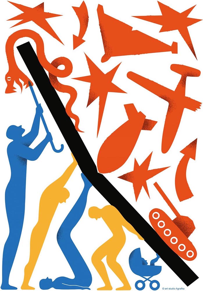
Bonus #2 (amazing):Via Kottke, a fantastic poster and perhaps better question:
Poster for the 2023 International Book Arsenal Festival, by Art Studio Agrafka
A book festival. During a war. In a city under martial law. While schools and legislatures here in the US ban books about Black and LGBTQ+ experiences based on bad faith complaints of tiny fundamentalist parent groups. Tell me, who’s doing democracy better right now?
— Jason Kottke, Kottke.org
That’s all for early July, folks. Go forth and make your summer a better place.
Within literal days of my writing that we should be done with the automobile companies’ logo updates, we got three. (Well, two and a preview.) Details follow.
Infinity
Back in the early ’90s, Nissan introduced a premium brand called Infiniti. Following the likes of Lexus (Toyota) and Acura (Honda), Nissan wanted a piece of the upscale action and knew that a public that still remembered Datsun would need convincing.
So they embraced the home country: Japan. They leaned heavily into the distinctive style and craftsmanship; their initial products were different and put up an interesting argument when compared to (especially) Lexus.
Awesome original emblem from the 1991 Q45’s “grille.” Photo by Ben Hsu.
Alas, they lost the cachet almost immediately — to a point where today, I almost always get out of an Infiniti’s way due to their being the official representative of the poorest-quality drivers on the road. (And I say that as a BMW driver.) It’s also, unfortunately, one of the most-likely brands to wear a coffee-can-sized exhaust finisher, heavily-tinted windows, and/or dubious lowering springs.
Enhancing customer connection and delivering thoughtful hospitality across all touch points underpins INFINITI’s comprehensive refresh. Central to the update is a new global retail architecture design, along with an evolved logo and new multisensory experience.
— Infiniti Press Release
So to hear them recommit to the “Japaneseness” of their brand is, well, interesting. Perhaps the signature scent will help.
Infiniti’s logo evolution, with the oldest at the left.Note the available illumination.
Opel earned a brief mention here on Foreword in December 2020, when they joined were sold to PSA — Peugeot, Citroen, and company — which a month later (!) merged with Fiat Chrysler to form Stellantis. They’re back with an unfortunate update to embrace their 2028 switch to all-electric.
The “increased sharpness,” as Motor1 puts it, is appreciated, I suppose — but the break in the middle goes against everything the lightning bolt its meant to represent. In fact, I’d argue that the mark now doesn’t resemble lightning at all. (Perhaps clouds?)
Sigh.
Preview: Alpina
So, on to more interesting things: Alpina. Established in 1962 as a tuner and racer of BMWs, it’s had more or less the same logo since 1967 and was established as an actual manufacturer in 1983: they do more than just tune BMWs, they reengineer them. These days, they stand for the ultimate Grand Tour cars, simultaneously more comfortable, more powerful, and more stylish than the cars they’re based on. (See the lovely Alpina Z8 at the top of this post, for instance.)
Alpina’s current logo: exhaust and crankshaft, sir. Nuthin’ like it.
Naturally, that means most of them aren’t available here in the US.
The ultimate unobtanium machine: a 2022 Alpina B3 touring. Drool.
In any case, they’ve recently entered into an agreement to be purchased by BMW itself, not unlike AMG becoming part of Mercedes-Benz; starting in 2026, they are scheduled to represent the middle ground between BMW and Rolls-Royce — hopefully continuing the comfort, power, and style. It seems that the new ground will be the upmarket models only (that is, no 3-series-based items, and possibly even no 5-series), so think of items $200,000 and up.
Now, an eagle-eyed I5 Talk forum poster noted a filing with the German government:
The proposed wordmark, horizontal.A close-up of the Alpina “A.” Note that it’s the trailing one; hopefully, not a sign of things to come.
This time, several items related to books and bookstores; two more — possibly the last two — from the automotive logo category; and PRINT Magazine’s 2023 roundup of great design.
Book Four-For
AI book covers? Here, now.
Creative Bloq, which I wasn’t familiar with, has a post up that’s only here because it’s the first I’ve seen of what is sure to be a trend: AI imagery on a book cover.
Image: Bloomsbury UK (Also: Where’s the body to go with the head?)
“Causing controversy,” they say, in that…:
[F]or a while now, with concerns over copyright and ethics plaguing text-to-image generators. Perhaps the most existential worry of all is the idea that AI could put human artists out of work – and while many still find the idea fanciful, we’re already seeing examples of AI-generated art being used commercially.
— Daniel Piper, Creative Bloq
The article itself has a hint of click-bait about it, what with Twitter users spotting a NY Times bestseller but complaining about the UK version of the cover design . . . but the larger question of AI coming for the book designers everywhere is valid.
Then again, AI imagery has the potential to reshape much of the creative landscape. Let’s hope — hope! — that it’s deployed ethically.
B&N’s Market Repositioning
Image: NYTimes (modified)
BookRiot asks whether Barnes & Noble’s new presentation as “a local bookstore” — something that’s part of the community in a way that Amazon can never be —is genuine, let alone successful. (We have a B&N here in Macon, which I visit infrequently, and which doesn’t feel “local.”)
Background: The BookRiot article (and the image) above ultimately stem, I believe, from a NY Timesoption piece from 2018.
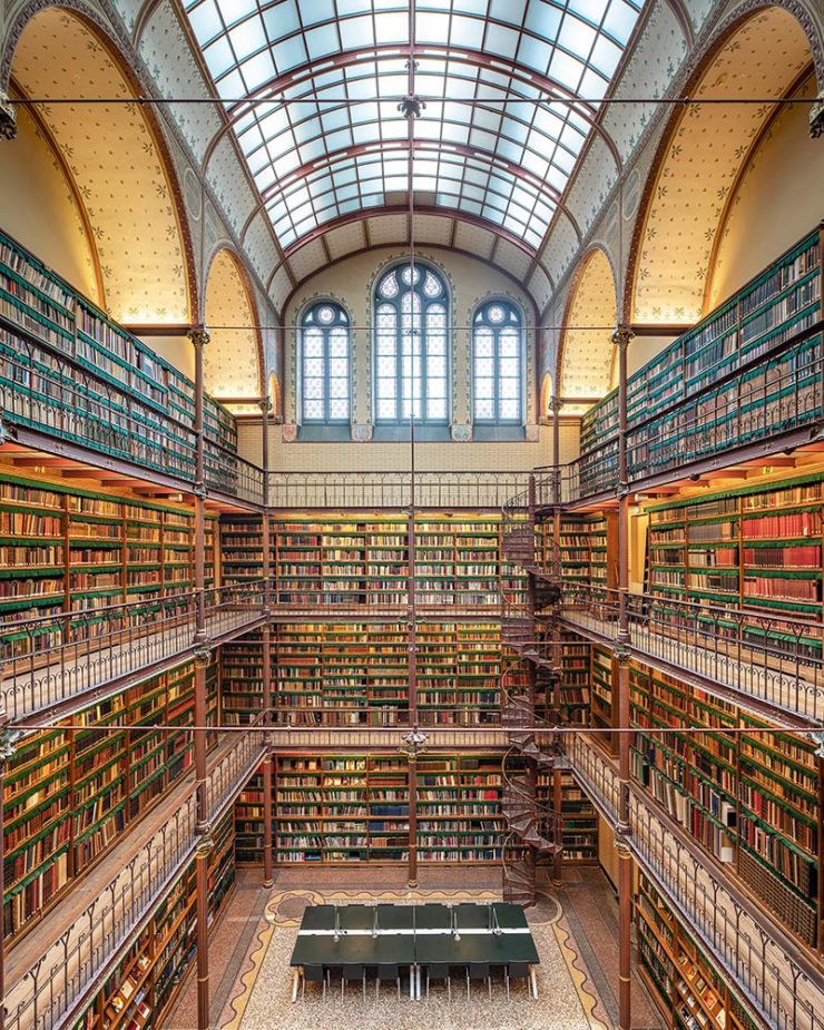
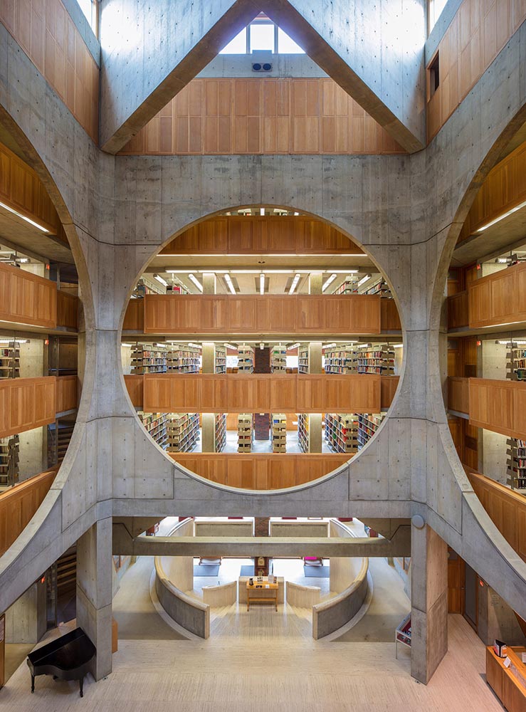
Temples of Books
As regular readers know, I’m a huge fan of combining books and photography. Naturally, great photographs of great libraries strike just the right chord:
Phillips Exeter Academy Library, Exeter, New Hampshire
Positioning these spaces as intellectual havens, Temples of Books highlights their wide array of offerings, including botanic gardens, archival repositories, and of course, room to read. “As an institution that can curate knowledge, scrutinize the status quo, and encourage education, the library is more important today than ever,” a statement says. “This responsibility is only growing as the freedom to publish on all manner of channels increases.”
— Grace Ebert, This is Colossal
Instant wishlist item!
Take Action for Libraries
Image: everylibrary.org
Simple brilliance: a handy step-by-step guide on what to do if you don’t like a book at your local library.
Carmaker Logo Updates: Porsche and JLR
Jaguar Land Rover > JLR
No, that’s really it.
Formerly Jaguar Land Rover, but generally known in the industry as JLR, the British company1Technically, it’s an Indian company, as JLR is a subsidiary of the TATA conglomerate. decided to have a FedEx moment and rebranded. Alas, Paul Rand was unavailable, so there’s no brilliance in the execution. (We’ll absolutely leave whether walking away from Land Rover as a brand is a smart move for another, longer discussion.) Motor1 has the details.
Porsche > Almost all other mainstream car brands
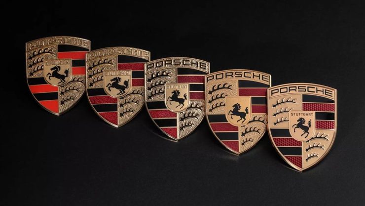
There’s a new Porsche logo!
The new 2023 version of the Porsche logo. (Image: Porsche)
That’s right: it’s a very subtle change. But it’s a significant one, perhaps because it’s only the fifth in the company’s 75-year history:
All five Porsche badges. (Image: Porsche)
The biggest changes are the backgrounds and the prancing horse in the middle, which is completely redrawn. (And, yes, has more than a passing — heh — resemblance to Ferrari’s.)
PRINT reminds us that not everything is digital these days — so much of the work still goes on paper or packaging — in their 2023 roundup of great stuff:
The 2023 PRINT Awards celebrated outstanding design in every shape and form, from the delicate texture and exquisite form of print to digital design that married technical skill with precise craftsmanship.
— PRINT Magazine
The best in show is a brilliant environmental design, the annual reports category is oddly satisfying (I didn’t know that Land O’ Lakes is a cooperative that owns Purina, for instance), the editorial category contains brilliance, and many, many more worthy of a design lover’s attention.
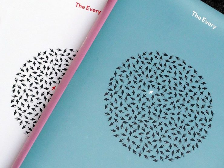
Sadly, their book design category is a bust. I like “The Every,” but pretty much any of my Best of 2022 picks run circles around it (and the other two choices):
The Every as photographed by PRINT.
But there are gems. I really like Bakemono, for instance, a winner in the fonts category and the best monospaced font I’ve seen:
Italian foundry Zetafonts brings us Bake Mono.
It’s a long article (they call it a 74-minute read!), but when you have a moment, grab a drink and an iPad and enjoy — hopefully as much as I did.
And that’s it! Settle into summer, and stay tuned for more soon.
1
Technically, it’s an Indian company, as JLR is a subsidiary of the TATA conglomerate.
It’s hard to understate how much downtown Macon has changed for the better in the last fifteen years: new residents (and lofts), new restaurants, new shops, a high-end hotel, and more — all without losing its feeling of an historic Southern city.
Balconies, 389 1st St.(Sign of) Hotel Forty-Five, 401 Cotton Ave.
On the subject of Southern, I’m glad to see the completion of the new Cotton Avenue Plaza, a pocket park that replaces not only an awkward intersection but one that had, at its center, a Confederate celebratory statue. Something everyone can share is a big upgrade:
Cotton Avenue Plaza (with Lawrence Mayer Building)
Meanwhile, it wouldn’t be a gallery post without some of my signature detail photographs:
Flower Detail #2, Mulberry St.Eyes on Cherry St. (Window)
The downtown gallery (2022–23) is now up to 132 photographs — check ’em out. (Once you’ve followed the link, click on any photograph for a larger, captioned version.) And, if you’re interested in the city’s downtown evolution, see also the 2020–21 and 2008–2018 galleries.
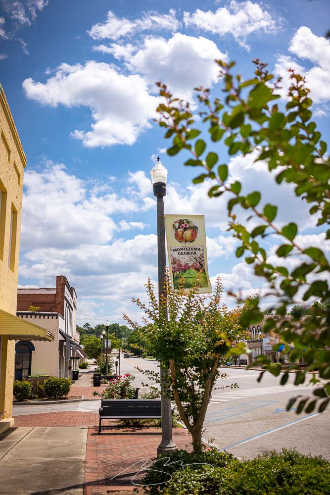
Macon County, Georgia, hosts Montezuma, a railroad crossroads on the Flint River. Officially dating to 1851, it was named after the Aztec leader by soldiers returning from the Mexican-American War.
Montezuma Sign (Crepe Myrtles), S. Dooly St.
I’ve been meaning to stop with a camera for a while, but it’s always been a pass-through on the way elsewhere — the route from Macon to Andersonville, Americus, and all points southwest go through Montezuma — but it’s taken until now to actually stop.
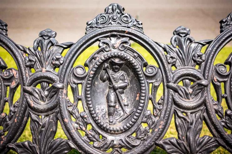
Bench Detail, Montezuma Methodist, N. Dooly St.
Like a substantial part of rural Georgia, Montezuma has fallen on increasingly hard times; the population continues to drop1See Wiki’s article., the empty storefronts multiply, and many of the beautiful old Southern houses need some attention:
Slight Repairs Needed, 510 S. Dooly St.
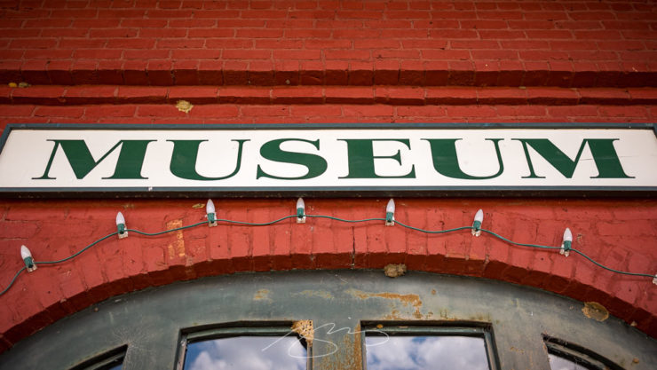
There’s an attractive downtown, though, with old brick buildings and a wonderful historic railroad depot:
Museum Sign, Old Railroad Depot, Dooly & E. Railroad Sts.Bracket Detail #1, Old Railroad Depot, Dooly & E. Railroad Sts.
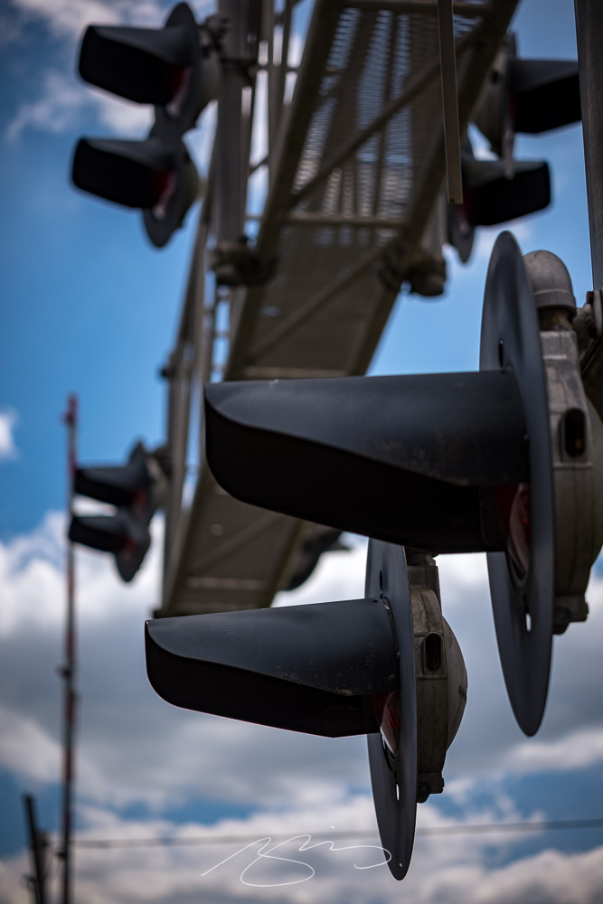
Did I mention that it’s a railroad crossing? There are two sets downtown:
Railroad Apparatus #4, Dooly & E. Railroad Sts.
Despite the population loss and storefronts marked “for rent,” however, all isn’t lost. There are some new businesses opening:
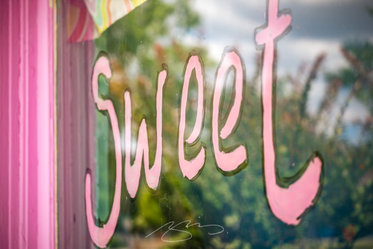
Sweet Window, 127 Cherry St.
I’ve posted 55 photographs in the new Montezuma gallery — peruse and enjoy. And, as always, thanks for stopping by.
Lettuce first apologize for not having an update in a minute, but I’m going to try to make up for it with this word salad delicious selection of items I’ve been setting aside: ABCD book design, impossible book design, some thoughts on DPReview, Architecture in Music, Hoefler’s typographic illusions, and, because you deserve it, the Great Wave in 1-bit. Enjoy.
Book Design #1: ABCD
“Winner of All Winners,” says The Academy of British Cover Design (ABCD):
Cover design by David Pearson.
“Pearson’s design was judged to be the best book design to have won an ABCD award in its decade-long history,” says The Bookseller.
Meanwhile, their “Best of 2022” list included several I named as well, along with a few I hadn’t seen. The illustration that is the cover design for this young adult title, for instance:
Cover design by Michelle Brackenborough.
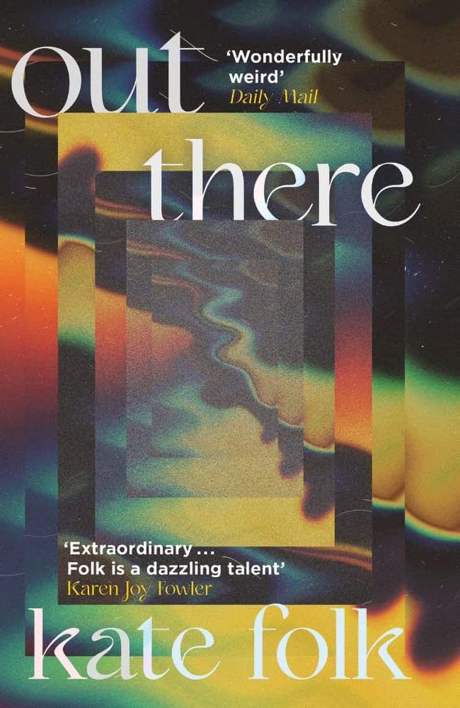
Out There fills its “wonderfully weird” billing incredibly well, too:
Cover design by Lydia Blagden.
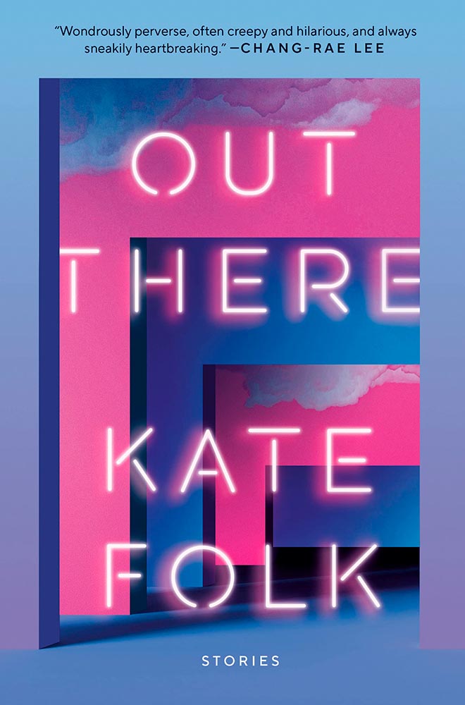
Alas, the US version:
Cover designer unknown. (Probably just as well.)
I often discuss UK covers when they’re pointed out somewhere, but as a general rule, my book design coverage, for lack of a better term, is US-based. Some other time, I do want to discuss why the UK covers are, generally, better than their US counterparts — as the above illustrates.
Anyway, read Design Week‘s excellent article on those and all the Academy of British Cover Design winners of 2022.
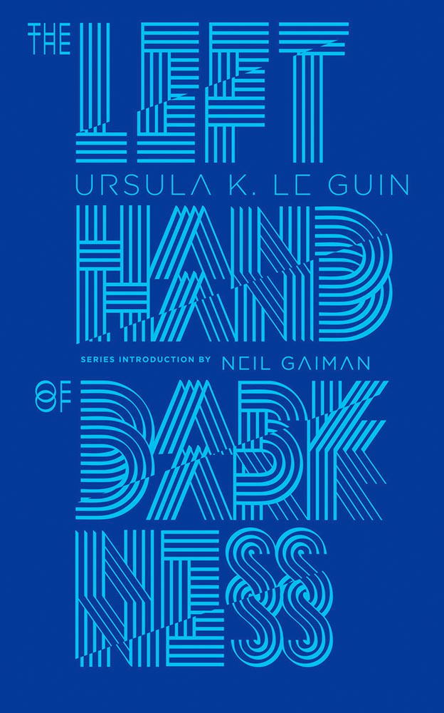
Bonus: I ran across Penguin Galaxy’s 2016 version of an Ursula Le Guin title I’ve got on my read-that-someday list — and love the cover design:
Cover designer unknown — I’ll look into it and update this post if possible.
The whole series is awesome, in fact. Check it out.
Book Design #2: The Impossible Bamboo Hardback
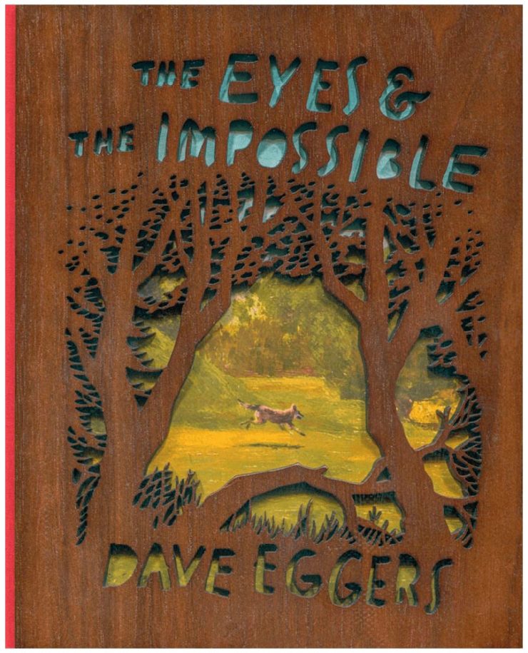
The Eyes & the Impossible the first-ever book to be published in two editions, for two readerships, and from two publishers: Knopf has one, in standard form, for the young adult audience.
The other one, however…:
Cover design concept by the author.
Yes, that’s an illustration showing through laser-cut bamboo, with a glimpse at the red cloth spine. There’s no way to summarize this design story in a way that does it justice, so just go to PRINT and read the whole article. Great stuff.
Photography #1: DPReview Shuttering
Digital Photography Review, long known as just DPReview, is being shut down. Started in 1998 by Phil Askey, it’s currently part of Amazon and is arguably the internet’s leading camera database — with over a thousand reviews of cameras, lenses, and related items, 24,000 articles, some 2.7 million comments, and more.
Perhaps most valuable, and something that will be missed by many, is their large selection of galleries: lenses and cameras, all in a way that can be compared side-by-side, an invaluable tool for those looking to purchase a new toy essential item for their photography bag.
Askey, who left in 2010 (three years after the Amazon acquisition) blasted Amazon’s short-sightedness:
I meant to write about this long before now, but there’s an interesting thing commenting more than a month later: they’re still there. Like many corporate decisions these days (ahem, Twitter), something changed — but it doesn’t matter. The damage has been done, foot shot, whatever. The reporters have moved on, the articles have slowed to a trickle, and updates have been greeted with skepticism.
What a shame.
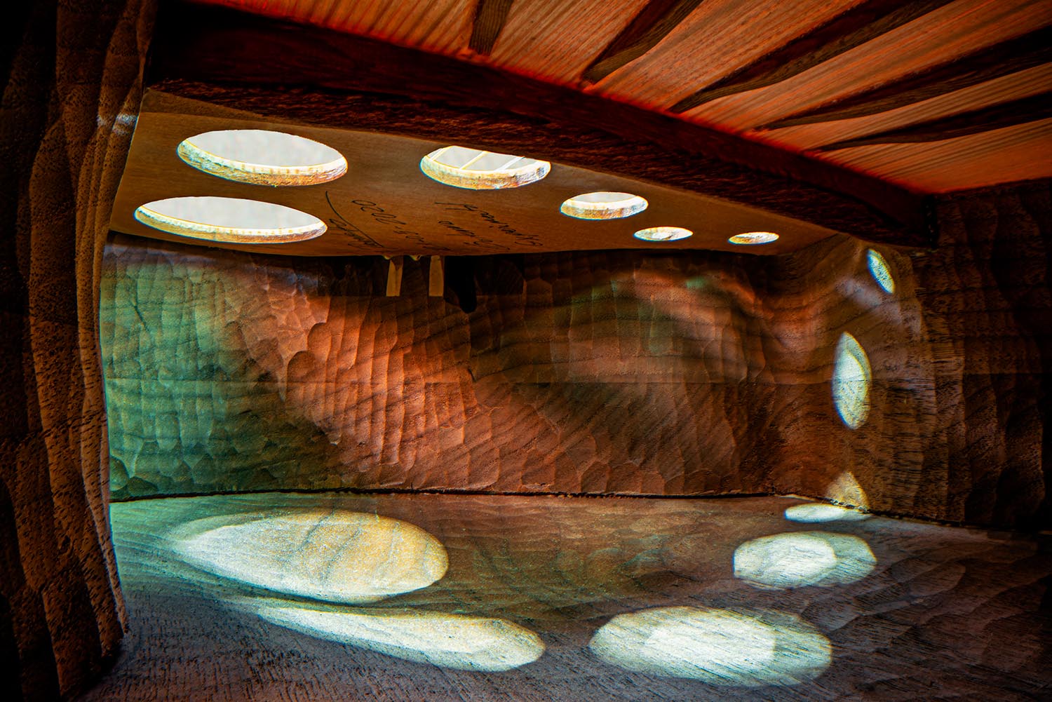
Photography #2: Architecture in Music
I somehow didn’t write on this one last time I saw it — so when a new series was covered by This is Colossal, there’s no way it wasn’t going to be celebrated here:
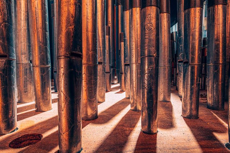
“1995 Low C Prestige Bass Clarinet,” by Charles Brooks
Recognize it? No? How about this one:
“The Exquisite Architecture of Steinway, Part 8,” Steinway Spirio R piano, by Charles Brooks
Charles Brooks, a twenty-plus-year overran of orchestras around the world and a cellist since childhood, has taken a probe lens and put it inside some of the world’s amazing instruments. The results are magical:
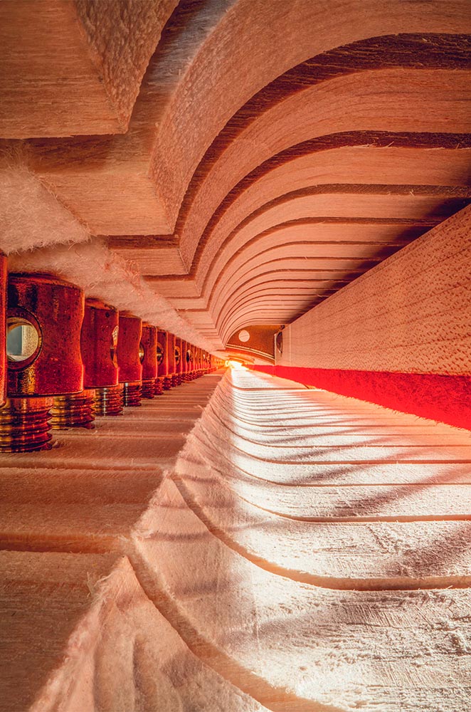
“St. Marks Pipe Organ, Part 1,” by Charles Brooks
See many more here (2023) and here (2022). (See also this post’s header image, “Siete Lunas’ Guitar by Roberto Hernandez.”)
Typographic Illusions
Hoefler & Co. points us at necessary illusions in typography:
Highlighted on Netflix’s Abstract: The Art of Design, these “cheats” show us that letterforms are so much more than just shapes drawn to stylize characters.
Since a number of people who teach design have suggested that we manufacture these for use in the classroom, I thought I’d take the more direct approach, and make them available as a free download, as a PDF that can be printed on transparencies. Whether you’re teaching typography, studying it, or just giving letters a closer look for the first time, I hope you’ll find these useful.
Last but not least this Monday morning, let’s please celebrate Great Wave Off Kanagawa — in glorious 1-bit greatness:
I usually use either my Quadra 700 or PowerBook 100, mostly because those are my reliable and easy to access computers (that run System 7, my favourite and most familiar OS of that era).
Software-wise I use Aldus SuperPaint 3.0, which is what my family had when I was a kid. Yes, I’d say that all of this is 99% nostalgia-driven…
—James Weiner
Incredible. There’s more info at his fantastic web site (done, naturally, in the style of a classic Mac system). Thanks to Kottke for the link.
I had the occasion to have lunch downtown yesterday, a day of simply beautiful spring weather — which I absolutely used as an excuse to take the camera for a spin.
The vast majority of the time, I use what I call my standard lens: 35mm. (Some would argue that 50mm is the “standard,” but I really prefer the wider angle of view due to its additional context.) This time, however, I was using Leica’s superb — and, sadly, no longer available — 90mm macro. The detail, the color, everything about this lens excels:
Leaves and Berries, Poplar & New Sts.Veteran’s Flame and Flag, Macon-Bibb Government Center, 700 Poplar St.
It’s sometimes a challenge to be creative in an area you’ve photographed often, but I enjoy trying to spy new details:
L.C. Rick’s Place, D.T. Walton Sr. Way & Poplar St.Kudzu Signs and Building Cornice, 512 Poplar St.
After leaving Zebulon (see below) last Thursday, I continued northeast into the beautiful spring morning. My destination was Senoia, a town of about 5,000 that has a lovely, old-time feel, and is usually busy due to its “touristy” nature. There’s a film studio (!), and major productions like Driving Miss Daisy and The Walking Dead have used it for a location. Plus, given its proximity to Atlanta, it’s a popular day trip for city dwellers looking for a getaway.
Gerald and I were there last April, and while I had a camera with me, I only took a few photographs and didn’t like any of them. But a church window had stuck in my head, we enjoyed the visit, and I determined to return.
This time: success. Starting with that church window:
Church of God of Prophesy (Window #1), Main and Johnson Sts.
Elsewhere in the historic district, fantastic Southern porches await:
The Veranda Historic Inn, 252 Seavy St.
While amongst the dogwood blossoms, there was even a porch for our feathered friends:
Bird House, 128 Travis St.
But it’s downtown that folks come to visit:
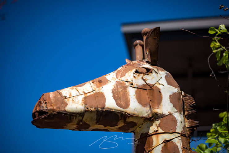
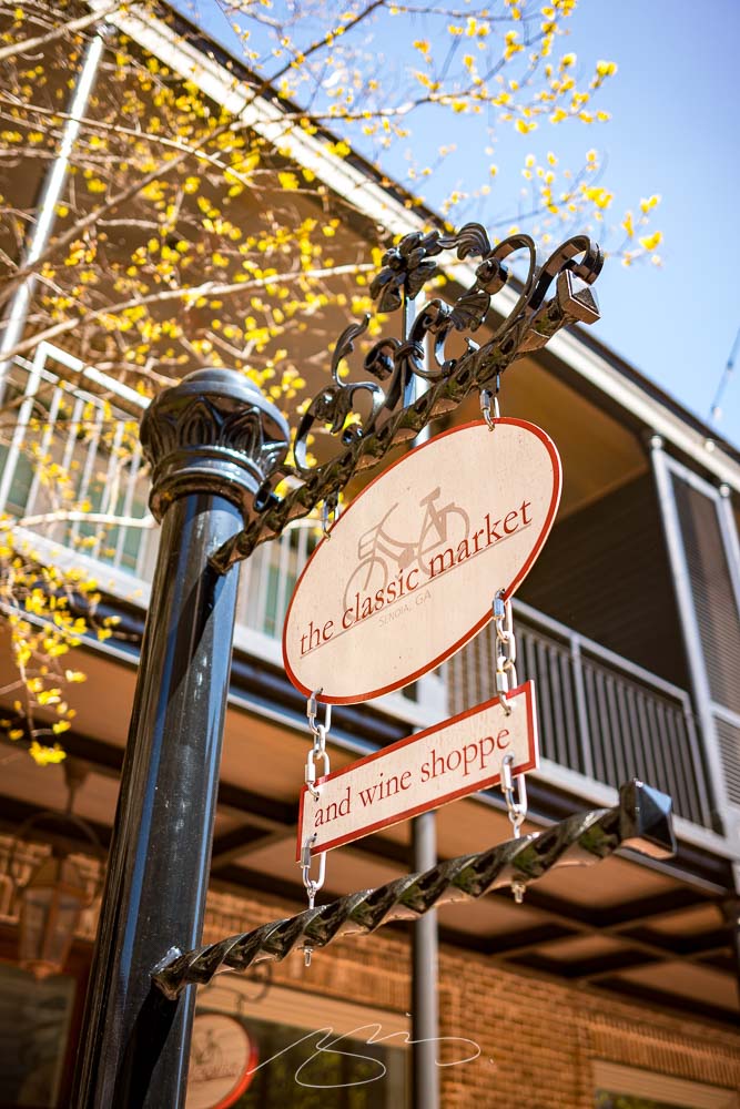
Shops and Eats on the Hill (#2), Main St.Book Light (Reflecting Tour), 53 Main St.Giraffe at Foxhollow, 7 Main St.The Classic Market, 30 Barnes St.
Plenty of history here, too:
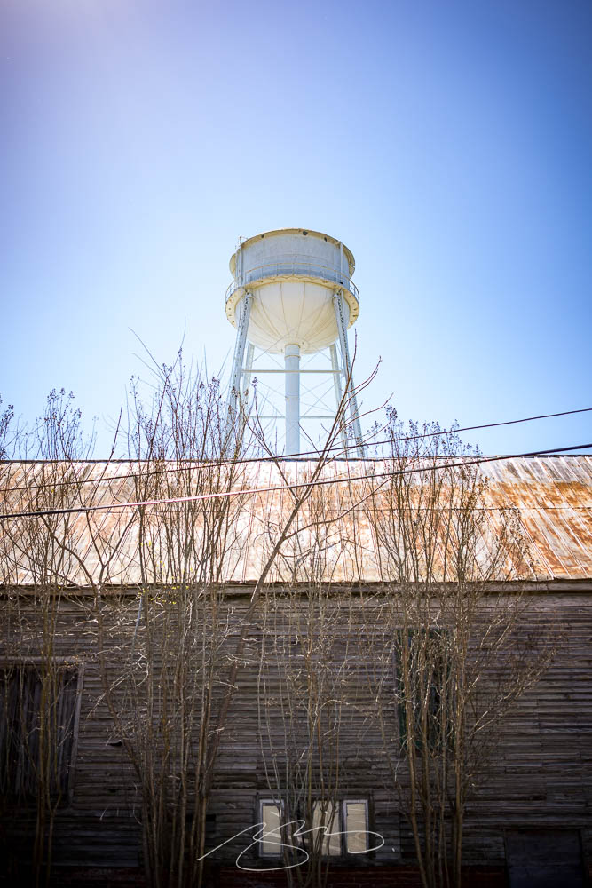
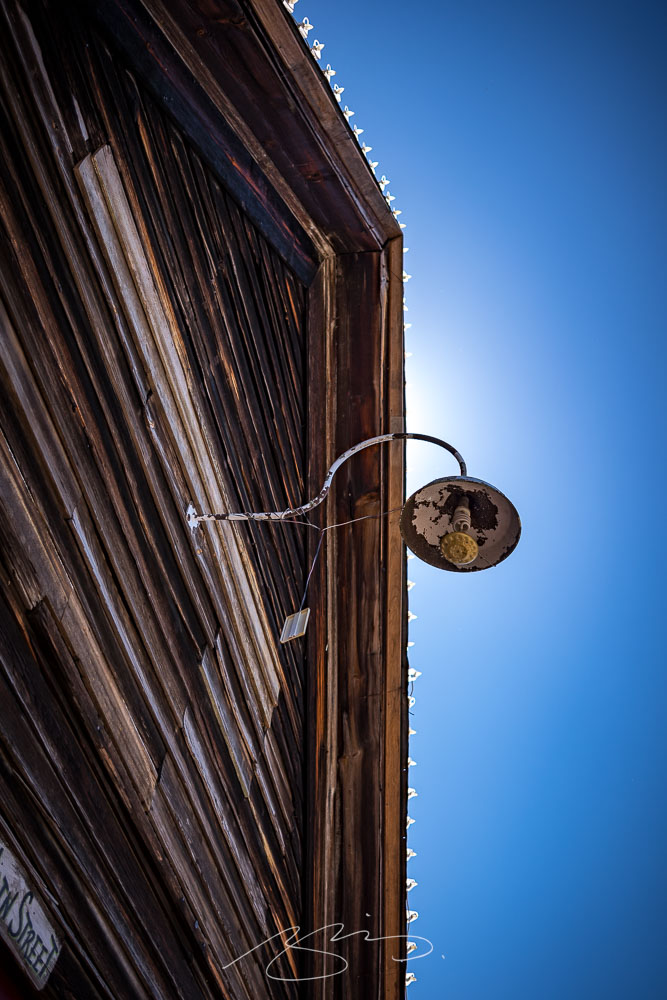
The Museum and the Water Tower (From Baggarly Way)Light and Lights Detail, 61 Main St.
A total of 57 photographs — clearly, it was a good time — have been posted to the Senoia gallery. No matter the weather where you are, wander a picturesque small town on a beautiful spring day.