
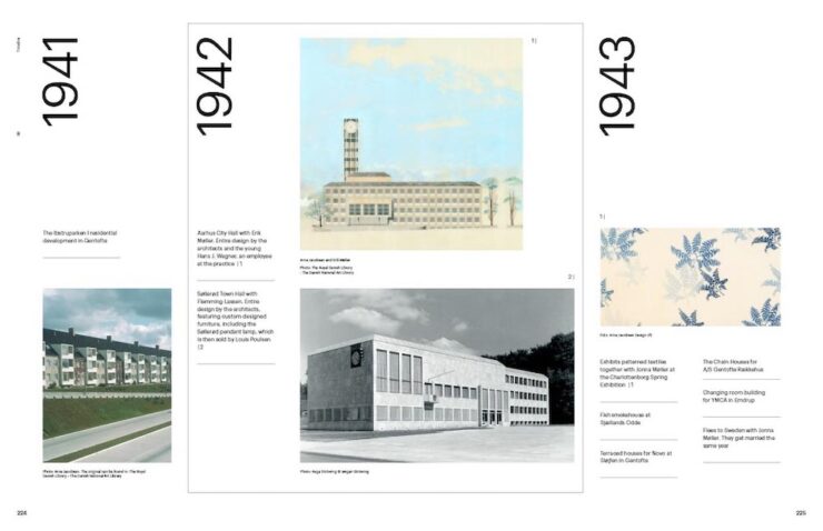
Please note: This article is now also available on SPINE.
The annual Association of University Presses (AUPresses) Book, Jacket, and Journal Show has announced its winners for items published during 2024. The show, now in its 60th year, “honors the university publishing community’s design and production professionals. By recognizing achievement in design, production, and manufacture of print publications, it also sparks thoughtful, creative, and resourceful publishing design in the future.”
“The impressive compilation of this year’s award-winning books is evident of the commitment, skill, and craftsmanship alive and well in academic publishing. It has been an honor not only to witness this work, but to feel its impact.”
— AUPresses Show Judge Lara Minja, Lime Design Inc., Victoria, British Columbia
Entries are extensive — up to 575 this year, from universities all over the world — with the winners are separated into eight categories. Some of my favorites are listed below, but by no means all of them; this post is long enough as is.
Grab a refreshing beverage, pull up a chair, and enjoy.
Please note: This is one of those posts that’s better seen in full width. Please click on the title, above, to get there. Thanks.
Scholarly Typographic
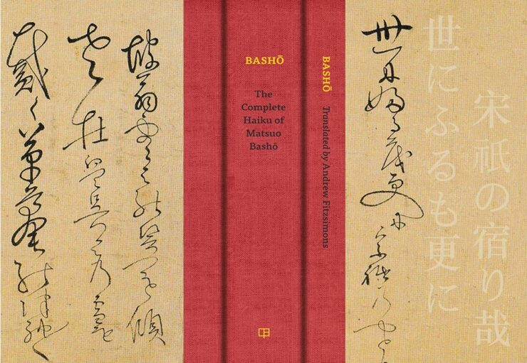
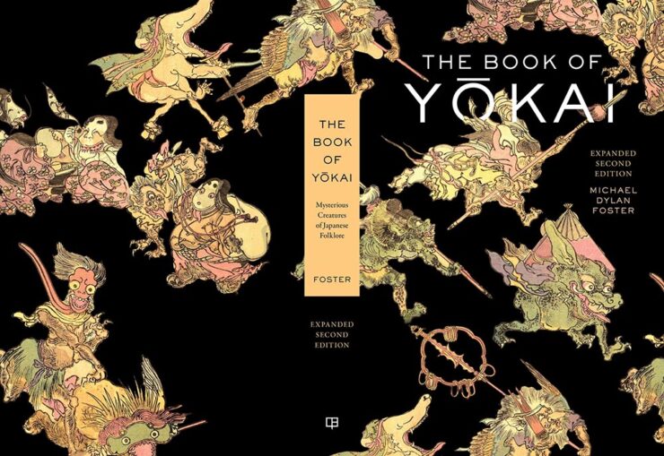
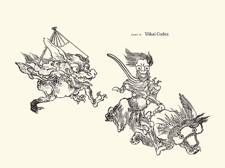
Japanese … in cursive. Typography? Dunno, but the overall look is great.
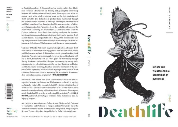
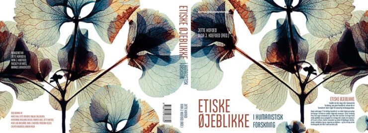
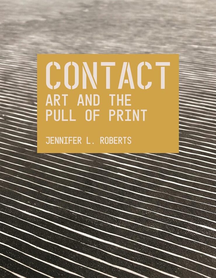
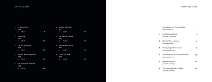
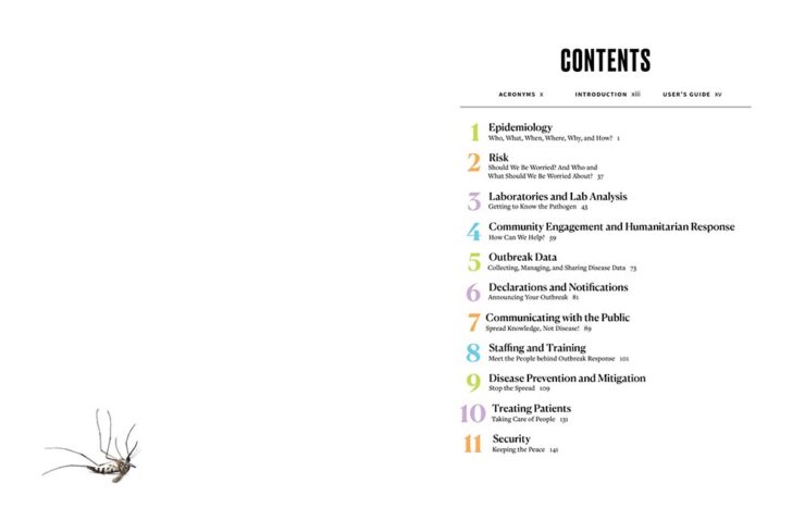
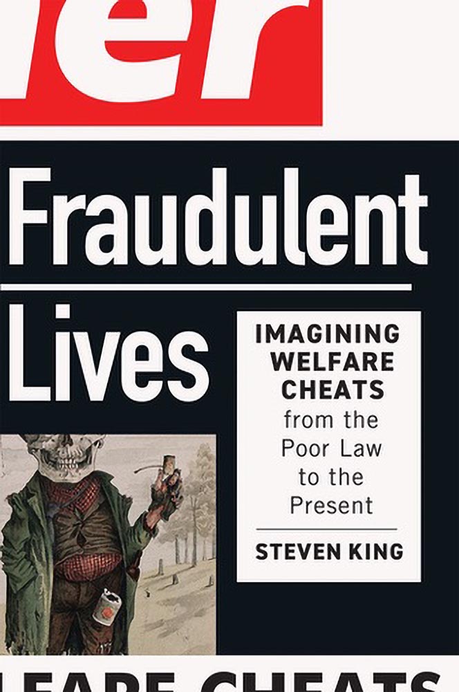
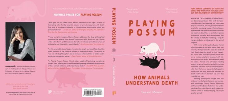
One of the great things about this show is seeing an entire cover (or jacket). Note here the great treatment of filing/info in the upper left, the publisher in the lower left, and how well they tie in with the author info on the front. Love the skulls, too., and even the bar code is well-handled. Kudos all around.
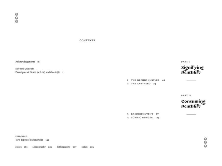
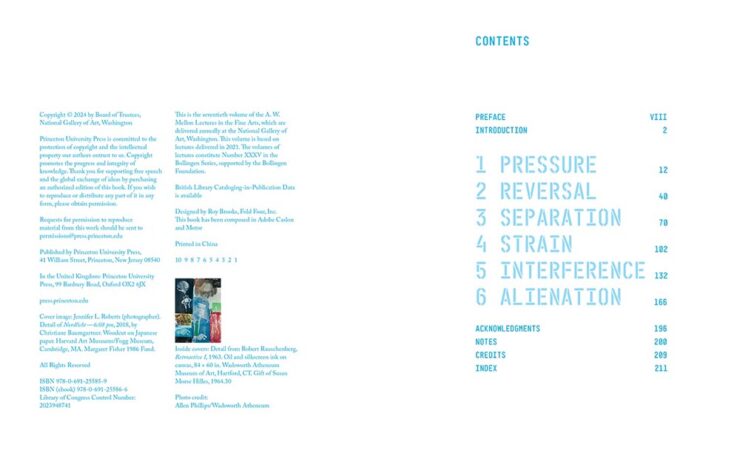
The goodness continues inside, too; the contents spread is fantastic. Nice.
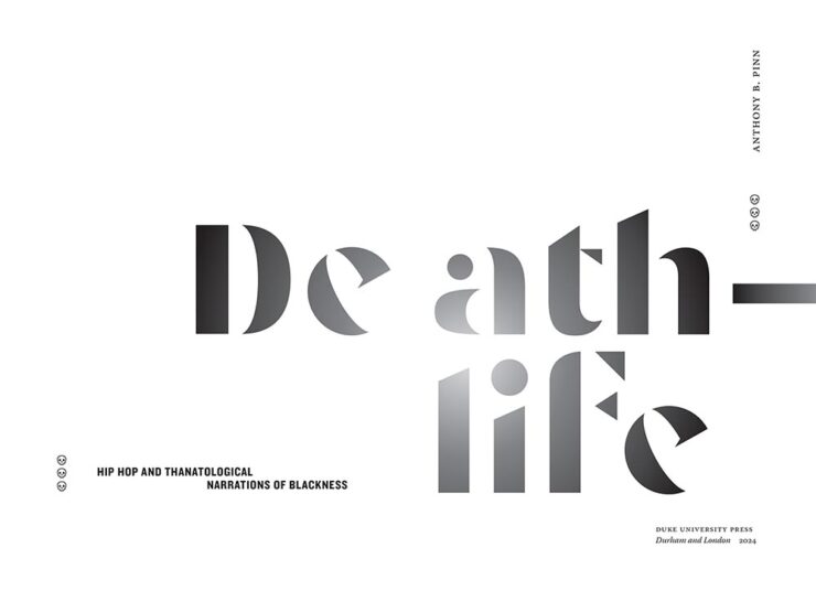
Eye-catching and interesting illustrations that become an integral part of the design. Well done.
See the rest of the category entries here.
Scholarly Illustrated
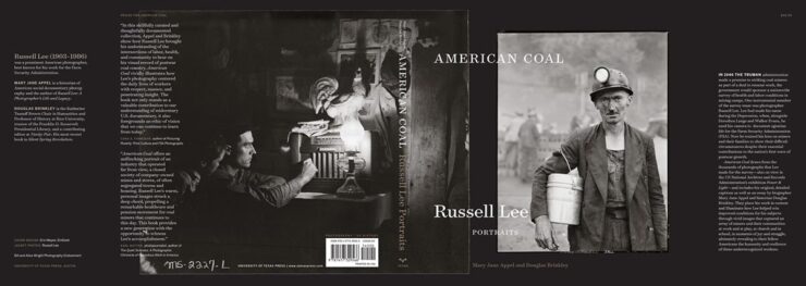
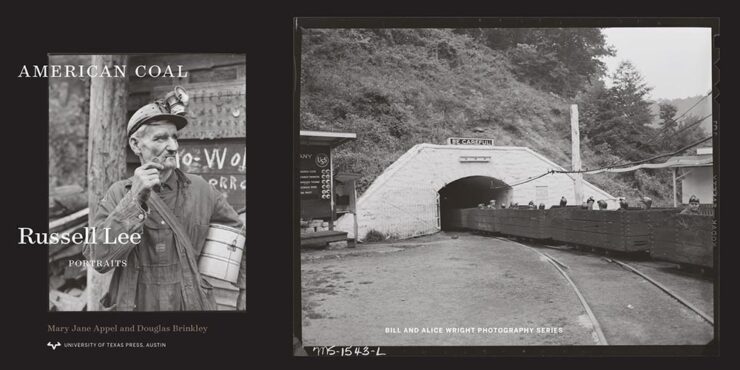

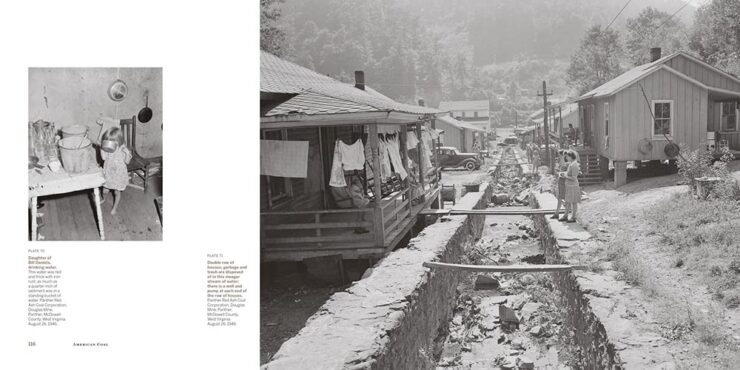
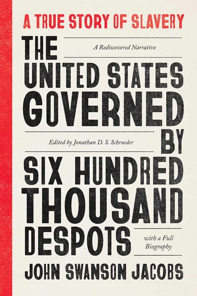
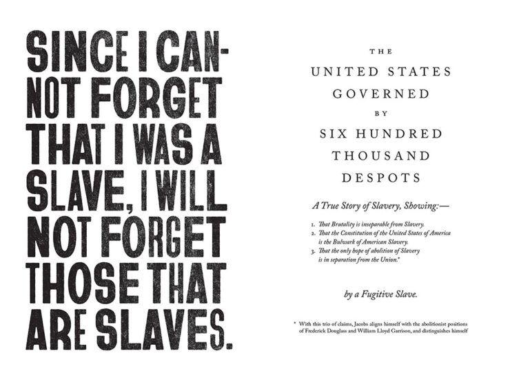
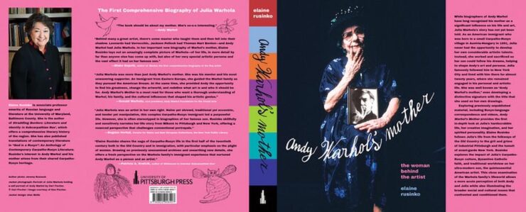
Essential American historical photographs, presented in exactly the right way.
The cover is great, but that section title spread…!
I don’t suffer from insta-buy often, but a copy of this title was ordered for my library the moment I saw it. Excellent on every level.
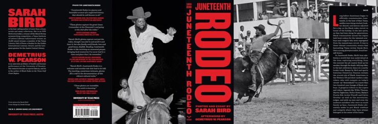
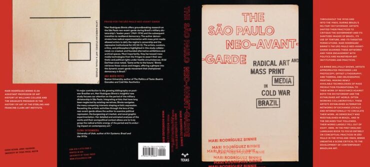
Great to see this title from UTexas (another example of why university presses are essential — in every political environment.) The great design is deserved … and received.
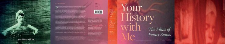
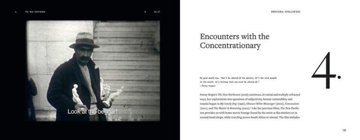
Fabulous cover combined with well-handled interior design, the contents and chapter numbers especially.
Honorable mention for the art and typography in Paul Kane’s Travels in Indigenous North America. See all the entries in the category here.
Trade Typographic
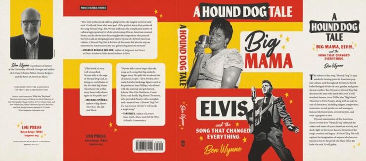
Love this jacket, from the type boxes and general typography to color choices; a great way to handle black-and-white photographs in a dynamic way. Special mention for the author’s photo.
Perfect title, handled with aplomb — the juxtaposition of the two pages, above, is brilliant.
Honorable mentions to the endpapers in Consider the Turkey and illustrations in Devoured. See all the entries in the category here.
Trade Illustrated
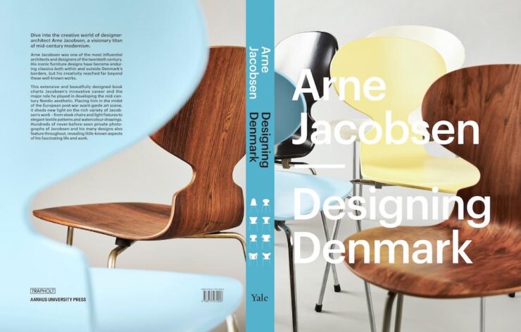
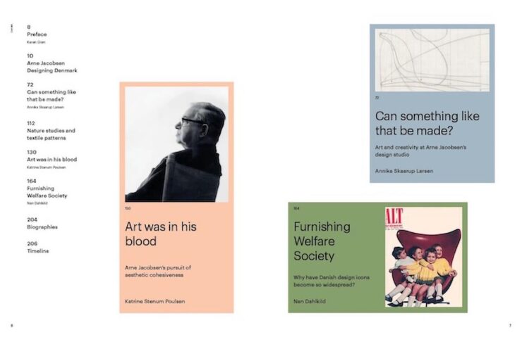
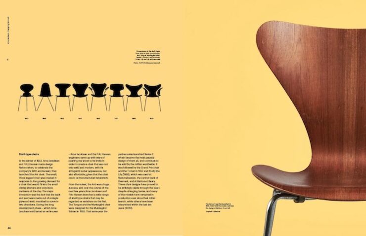
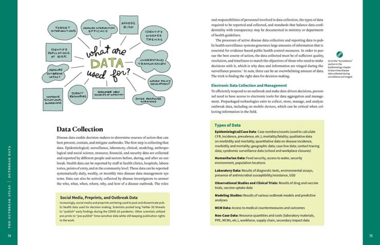
Good cover — the shape of the chair on the back is used well — with a fab contents spread, well-done callout pages (love the yellow), and awesome timeline design. As pages on seating go, these do, in fact, stand out.
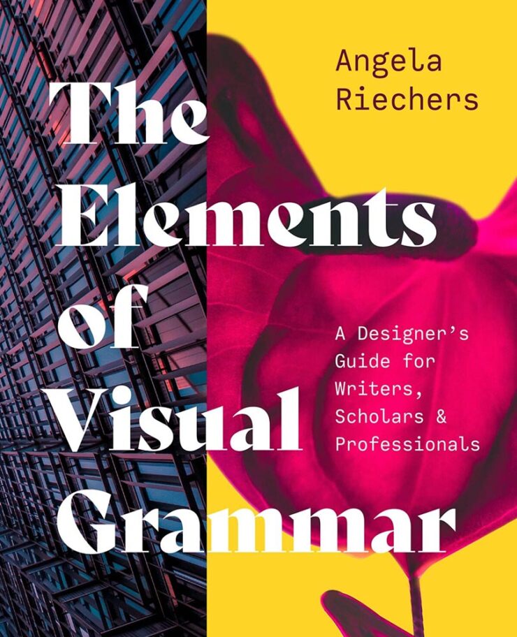
It’s only appropriate that a book on book design is laid out well — no pressure. It’s approachable for folks not familiar with the lingo and systems, and deserving of the selection.
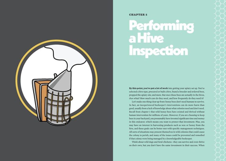
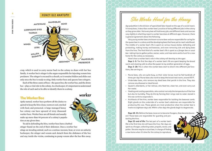
For the Bees’ subtitle reads, “A Handbook for Happy Beekeeping,” and the design and illustrations work hard to meet that goal. Get the buzz: another deserving title.
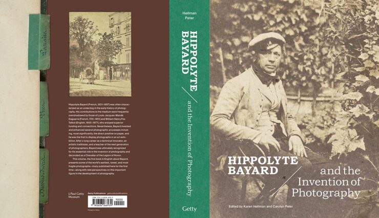
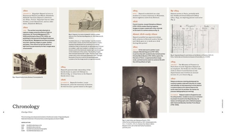
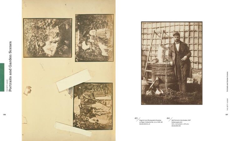
The back cover rocks. There’s also good use of “the aged look” — with bonus points for “tape” — and great typography, especially the great layout from the chronology department. It all adds up to a very well-deserved selection. (Getty Publications is the educational arm of the Getty Museum, by the way.)
Honorable mention to Uta Barth for great layout. See all the selections for Trade Illustrated here.
Poetry and Literature
The wide spine tape is definitely a look this year (because it works), but it’s the illustrations that carry the day here.
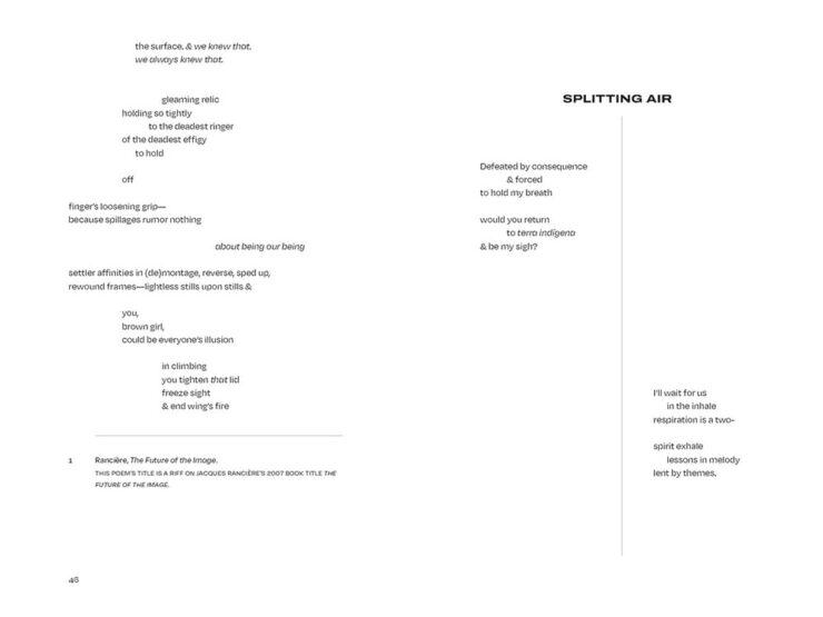
Book design for poetry is a tough thing to do well. Left Turns in Brown Study does the work and earns this win.
See all the entries in this category.
Journals
Honorable mention to Monsoon, the Journal of the Indian Ocean Rim, for being there at all, and The Hopkins Review for layout. See those and the other selected entry here.
Reference
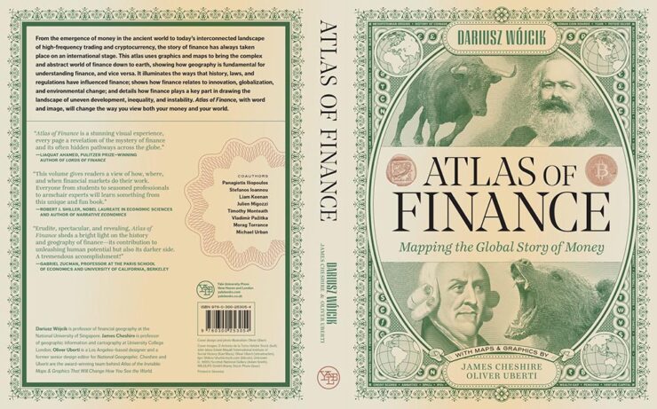
I did not expect something with this title to have standout design, but taking inspiration from money — often the very definition of great design — was a genius move. The spread above, though, proves that the book was treated with thoughtfulness and thoroughness throughout. Kudos.
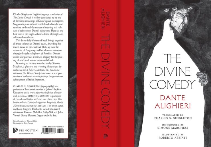
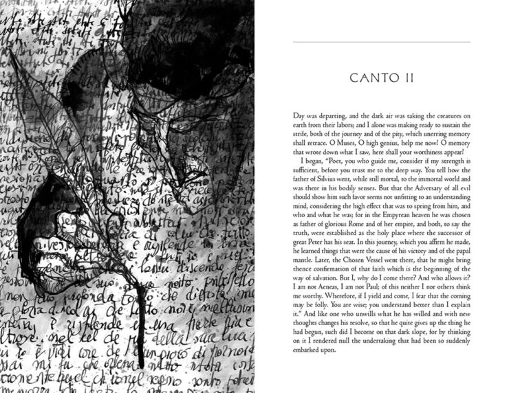
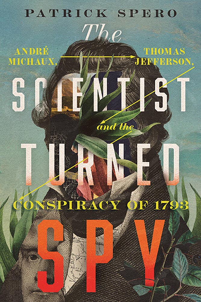
Another insta-buy. (Score: 2–0, Princeton.) I’d like to make this title required reading for book design clients everywhere.
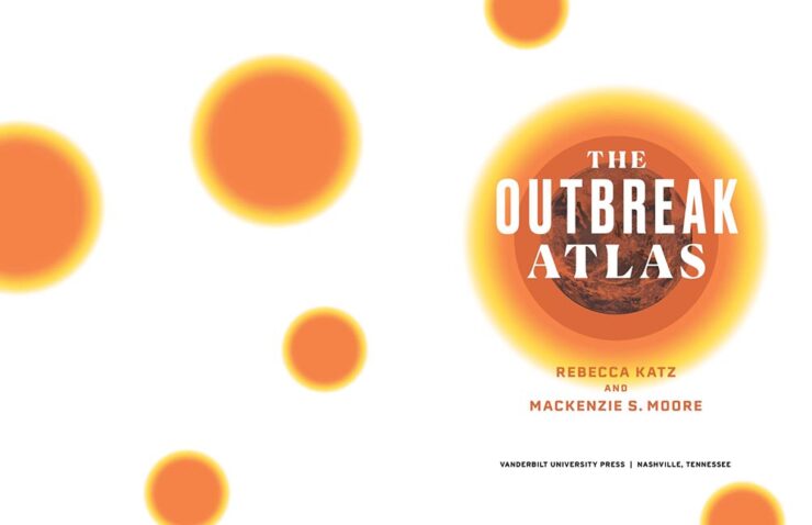
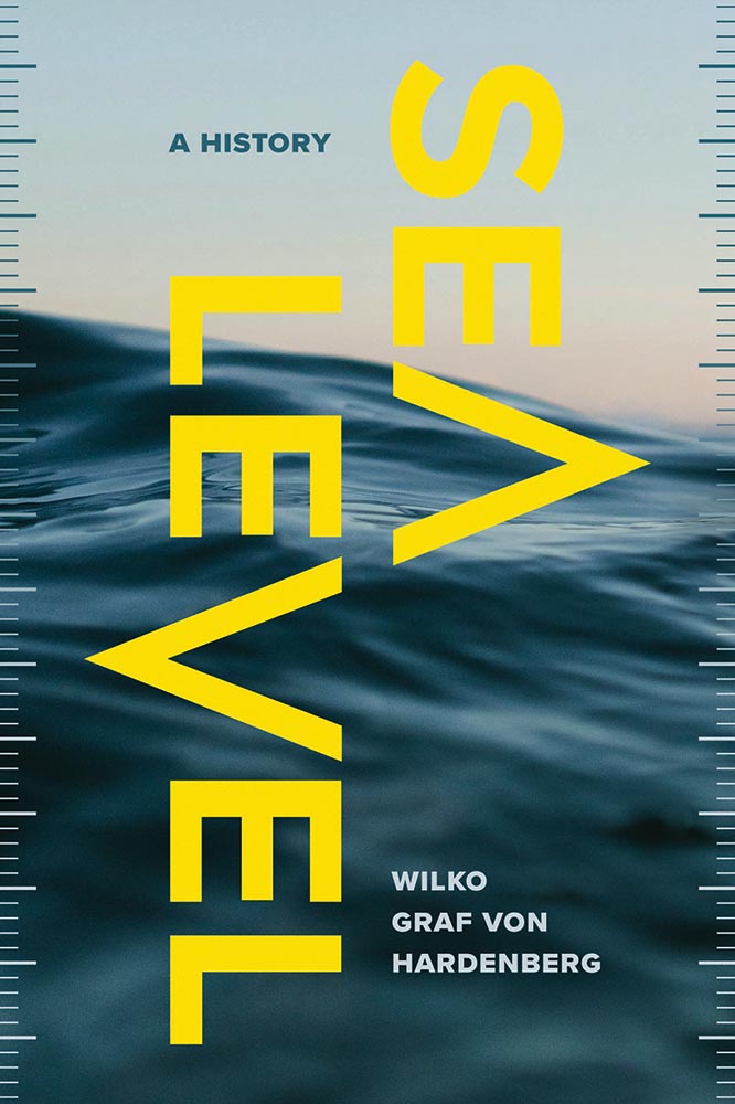
With the pandemic still visible in the rear-view mirror, this title should be on the shelf in every government department, in every location worldwide (and the shelves of a good chunk of the general public, too). Great layout and good use of color, with bonus points for the contents spread, add to this approachable book — well done.
See all the selections in the Reference category.
Jackets and Covers
There were a stack of books in this (largest) category; it was tough not to list more than I have. Let’s dig into it, in alphabetical order:
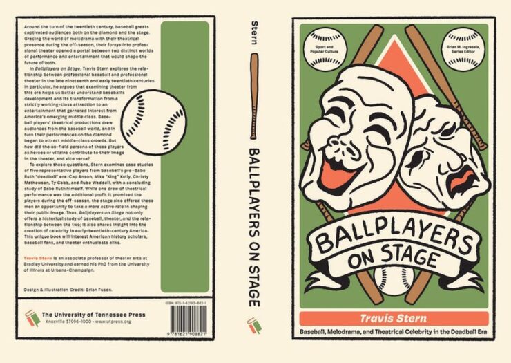
Great colors, great photograph, great script on the cover — basically, the whole thing.
An unexpected combination handled well; the colors and style are right.
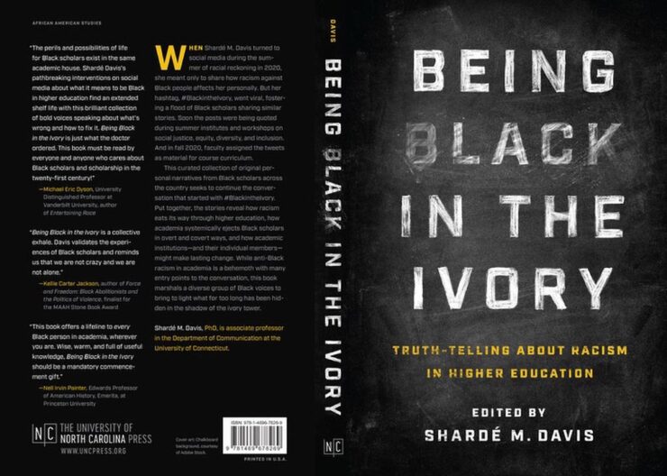
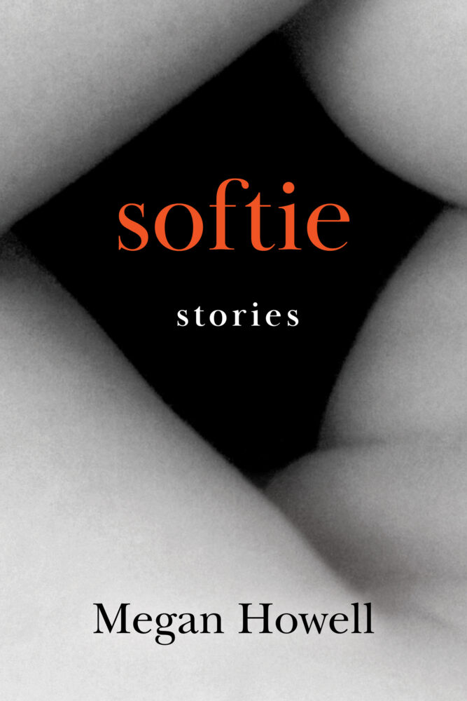
Erasure for the win. (Irony, too.)
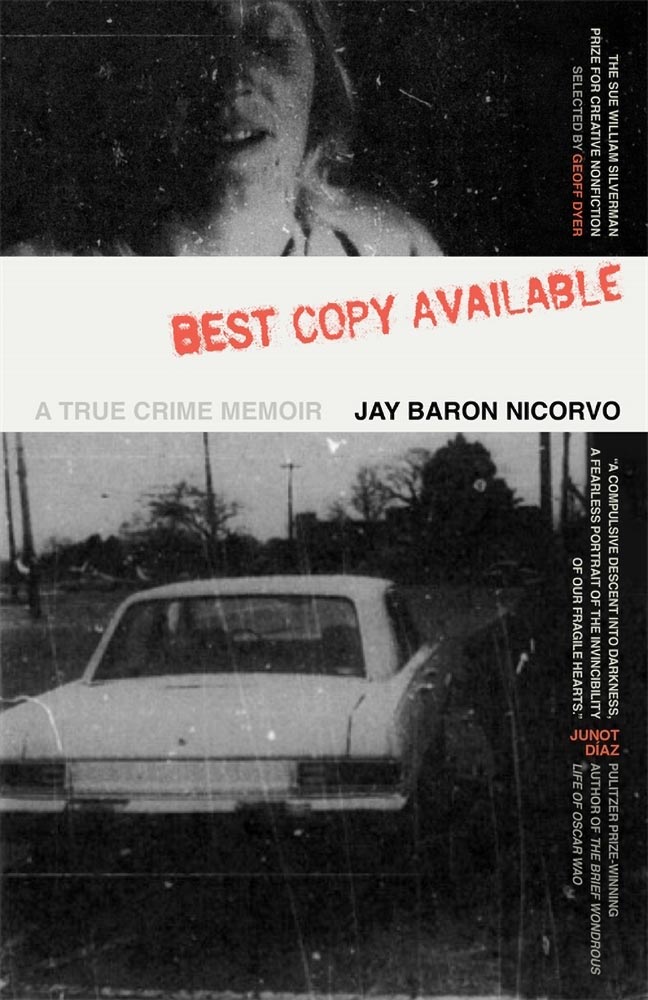
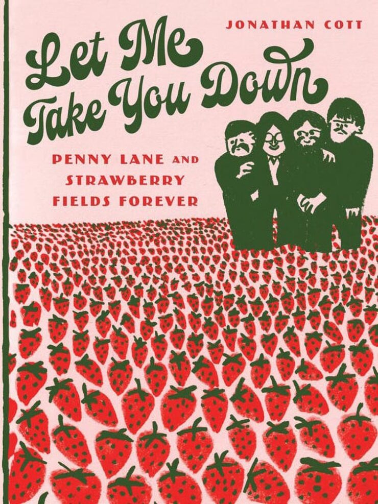
Compelling combo of photographs and title, with a great type treatment running along the right edge. Perfect texture, too. “Best available,” indeed.
“Feel good” in all the right ways, from photography to typography. Have a treat.
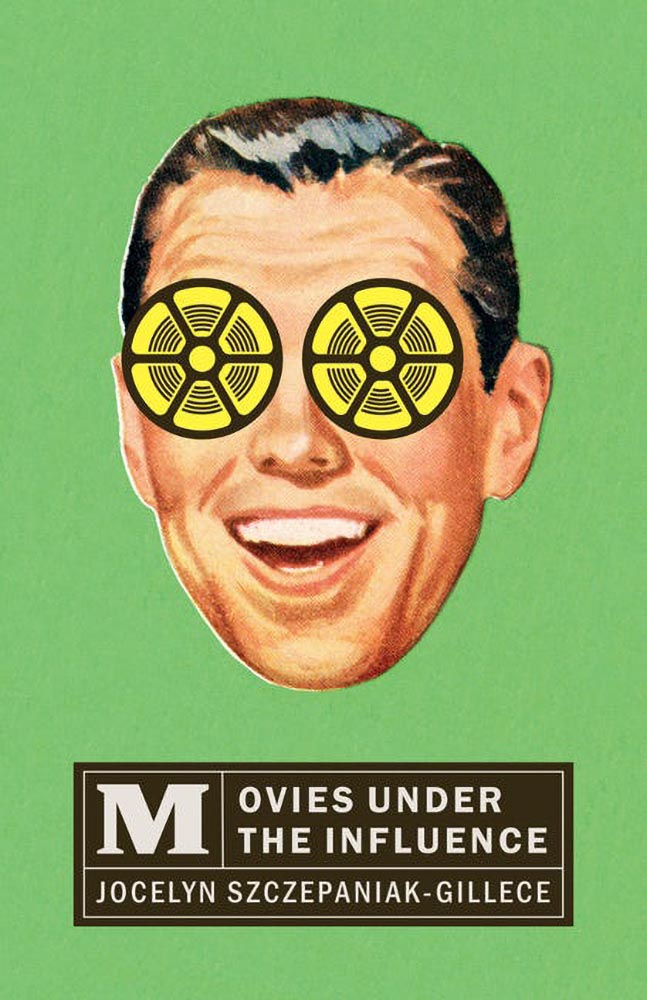
Scholarly title meets pop culture book design. Bonus points for texture.
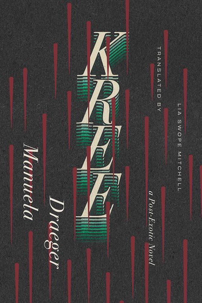
Book design heavy hitter David Drummond nails it with a creative hint hit at the National Examiner, America’s poshest paper.
Another from the cutting edge of book design trends, and another that feels “just right.”
“Unexpected style,” the Out-In-Left-Field department said. Overall pick, surely.
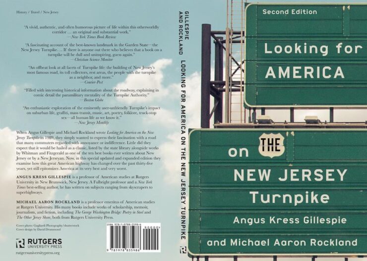
Signs of a design done well, especially “the” in a shield — nice. (I might just have to read this title to test out the theory of finding anything on the Jersey Turnpike.)
Familiar and compelling while simultaneously fresh and compelling, if that makes any sense. I like.
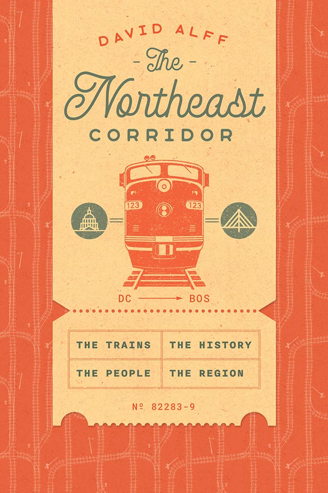
Tracks perfectly.
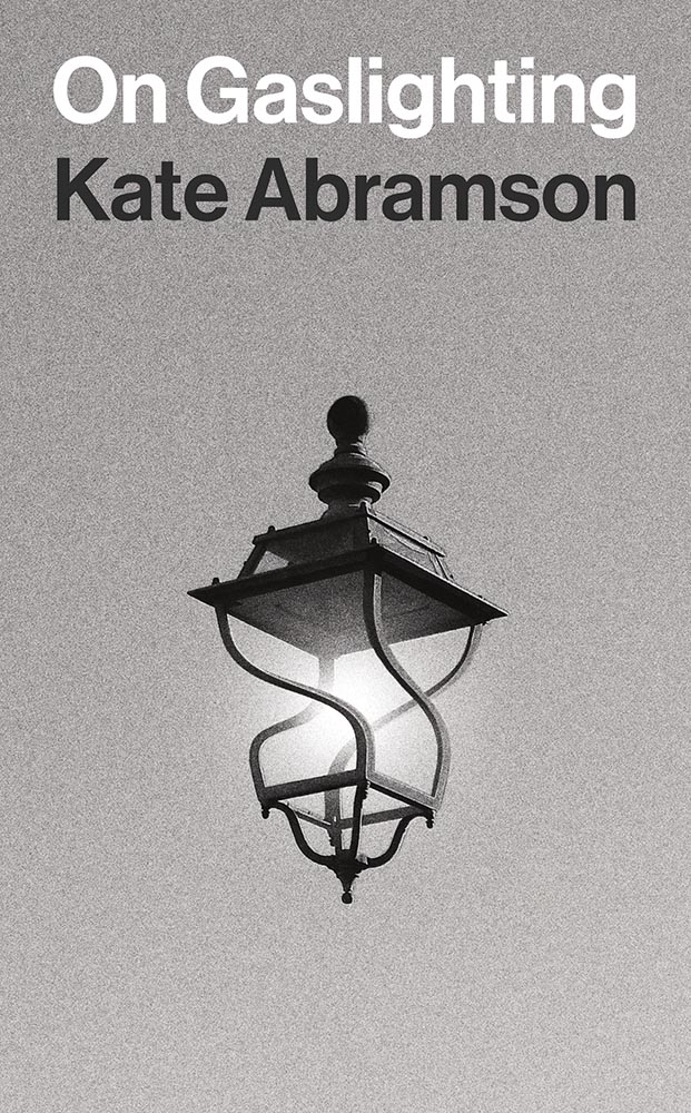
If there were ever a better illustration of gaslighting…. (Also, grain. And did I mention that it’s one color!?)
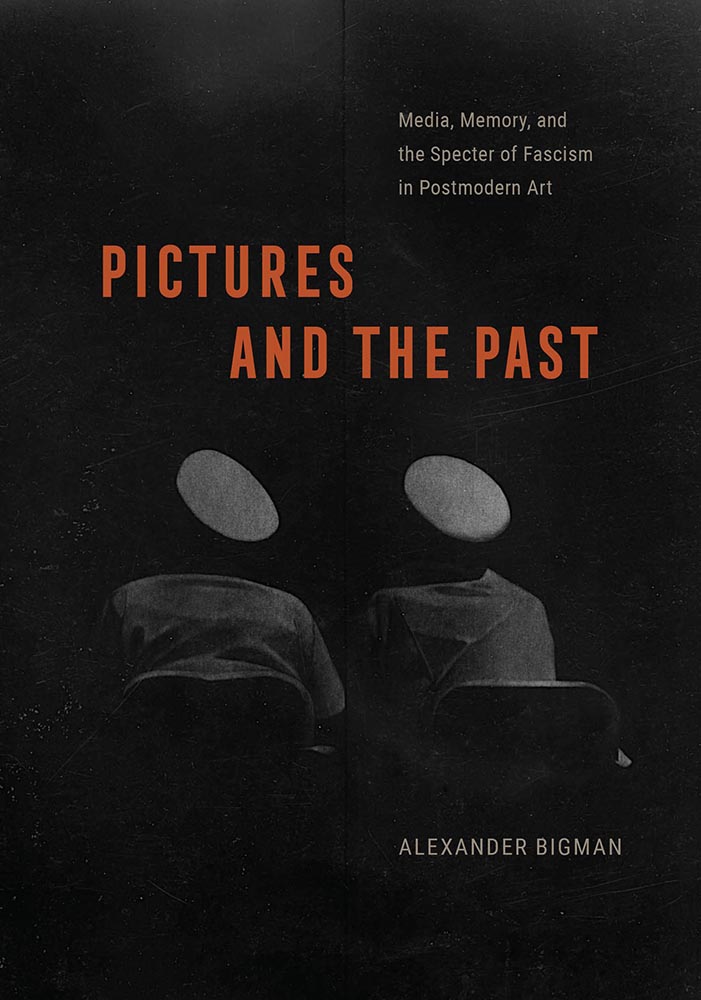
Specter, indeed: those caps could be eyes, fingerprints, pick something. Great use of texture on this one, too.
The unexpected choice of pink here works together with the type and illustrations to make this potentially difficult title approachable.

Front cover treatment for all the wins — awesome.
Stamping out. (Also, color blocks.)
Chef’s kiss collage … and title treatment.
Yes. Seriously, just “yes.”
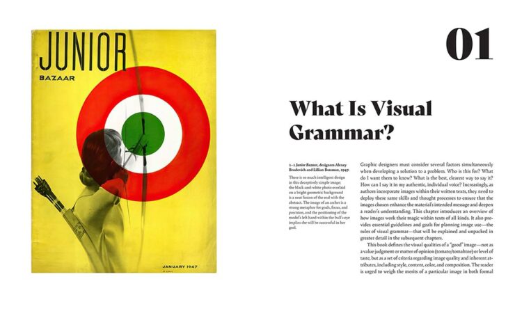
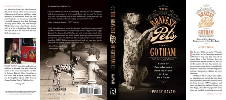
Not sure what this is a photograph of, and that’s just right for the title. Props to both the designer and art director who approved it. (West Virginia. Just a reminder.)
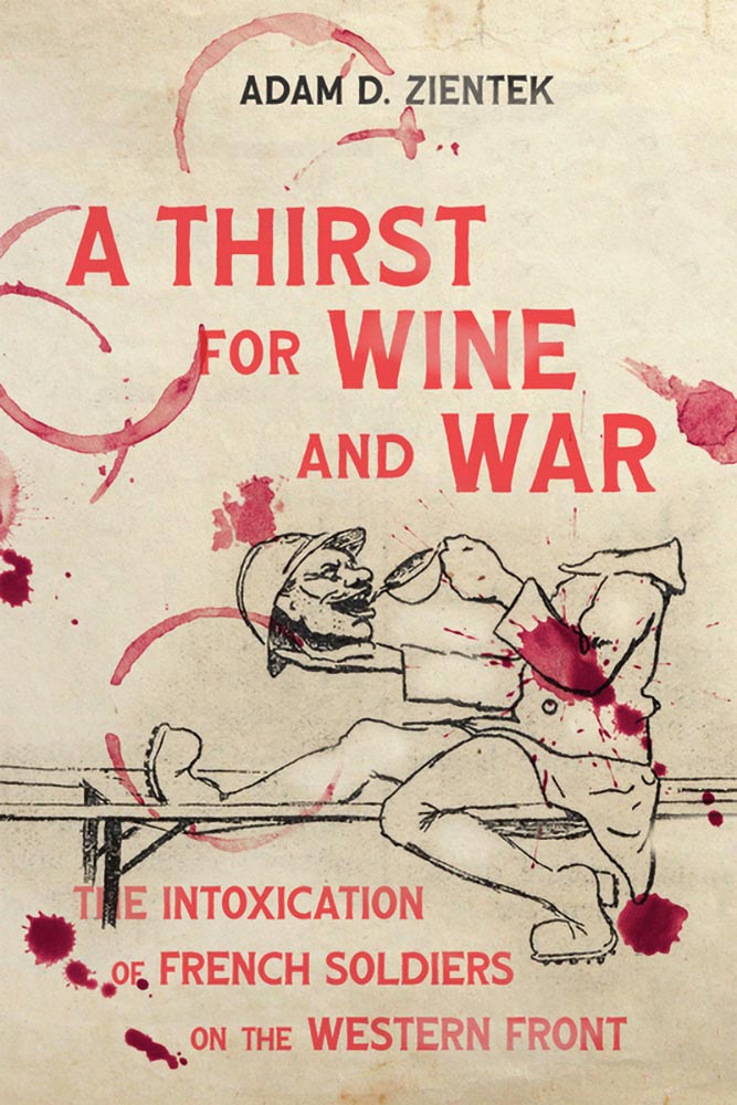
Splattered with drops of … brilliance.
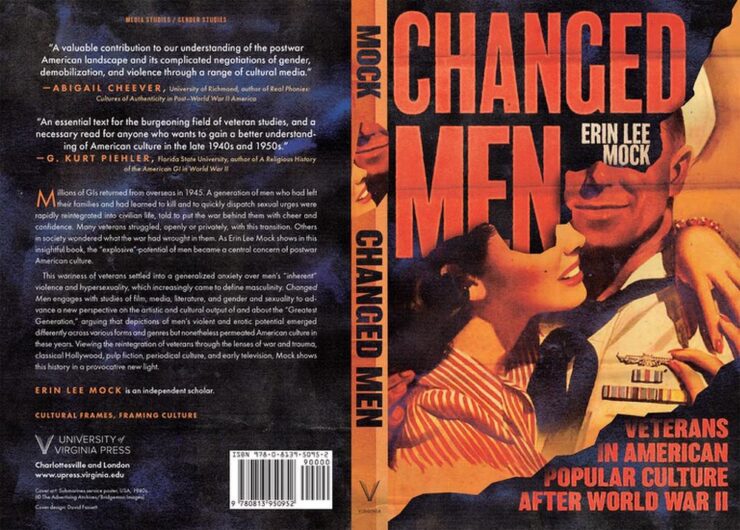
Title and treatment in perfect sync, this analysis says.
Honorable mentions to Just City and London for doing cities justice; Resistant Practices in Communities of Sound for the waves (and title, frankly); The Fenway Effect for The Wall; and the Phoenix Poets Series for illustration. See the whole Jackets and Covers category here.
• • •
That’s a bunch of book design — thanks for going through ’em with me — and a bunch of great titles from university and academic presses that so often go overlooked in a world that seems to value education less and less every day. Congratulations to all for their entries, wins, and effort. See you next year!
See all the entries at the AUPresses Book, Jacket, and Journal Show website, or read the press release.
See also: The 2024 and 2023 posts on AUPresses winners here on Foreword.