Tag: typography

  • Beautifully Briefed, December 2021: Holiday Edition

    Beautifully Briefed, December 2021: Holiday Edition

    It’s the yearly wrap-up and the holiday season! Recap and Rejoice!

    Hermès Does Windows

    “Journey of a Lifetime” is this year’s window display for Hermès — yes, Hermès should have an accent, but I can’t seem to summon it today fixed! — so let’s go with a picture instead:
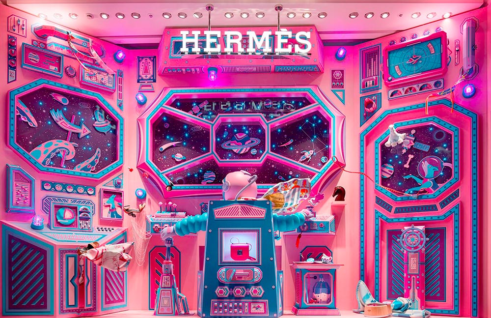
    Hermes window display

    All in paper. No, let me repeat that: it’s all paper. (Well, perhaps some glue.) From artists Zim and Zou. Here’s another, one of their earlier works:
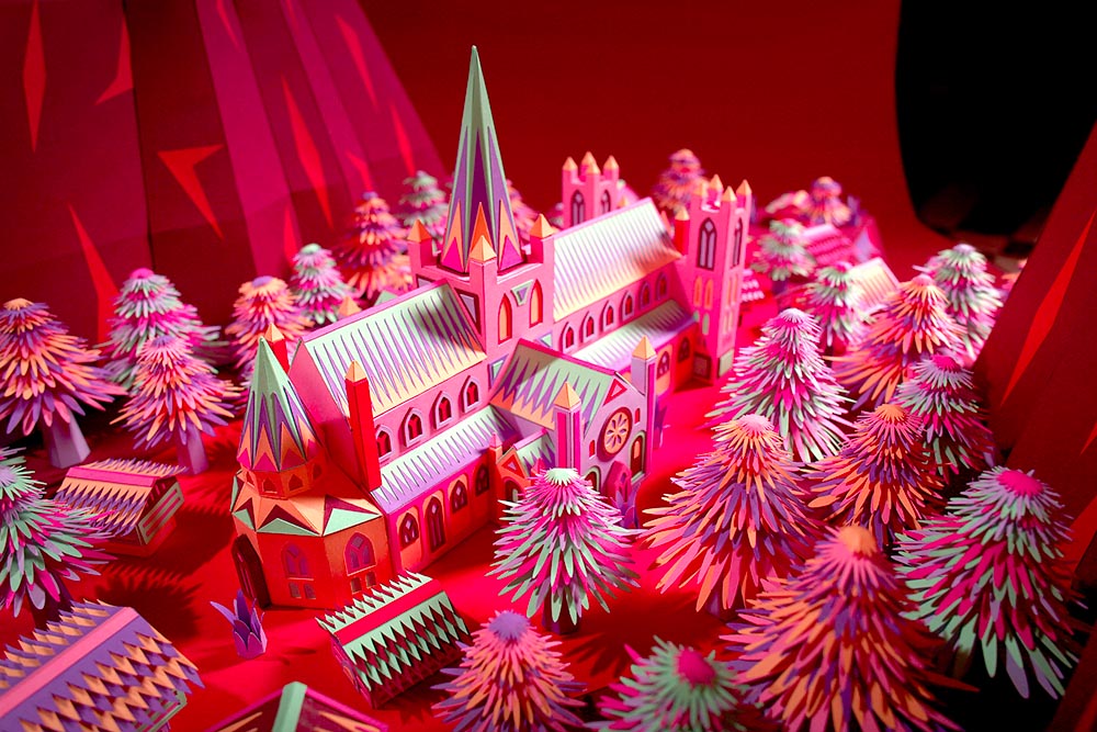
    Zim and Zou, previously

    Read more at This is Colossal about the window and the church. Nice.

    Yule Ogg

    While we’re on the subject of the holidays, check this out:
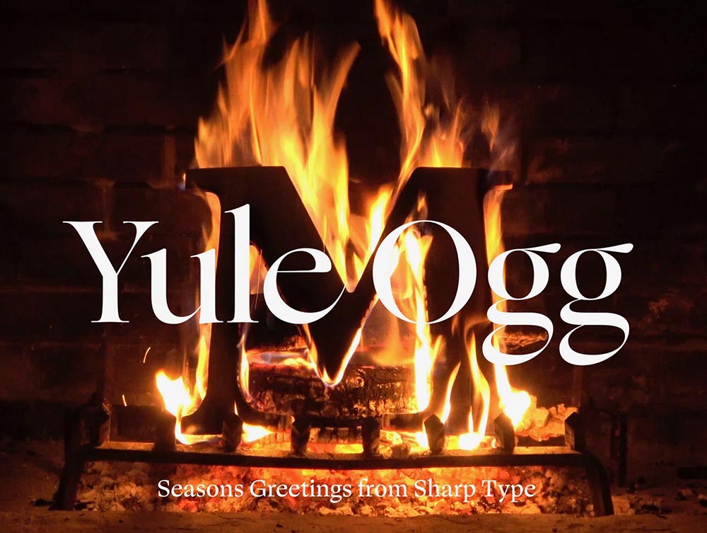
    Yule Ogg

    That’s right, it’s one of those four-hour Yule log videos — but with a twist. Those are wooden type pieces going up the flame. Check it out, along with the backstory, at It’s Nice That.

    Top Architectural Photography Projects

    Closing out, we start the year’s “best of” round-ups, this one Dezeen’s top 10 architectural photography projects of 2021:
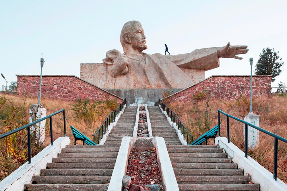
    Soviet (Asia) Photography

    Above, Soviet architecture, central Asia, by Roberto Conte and Stefano Perego. Below, Structure Photography by Nikola Olic:
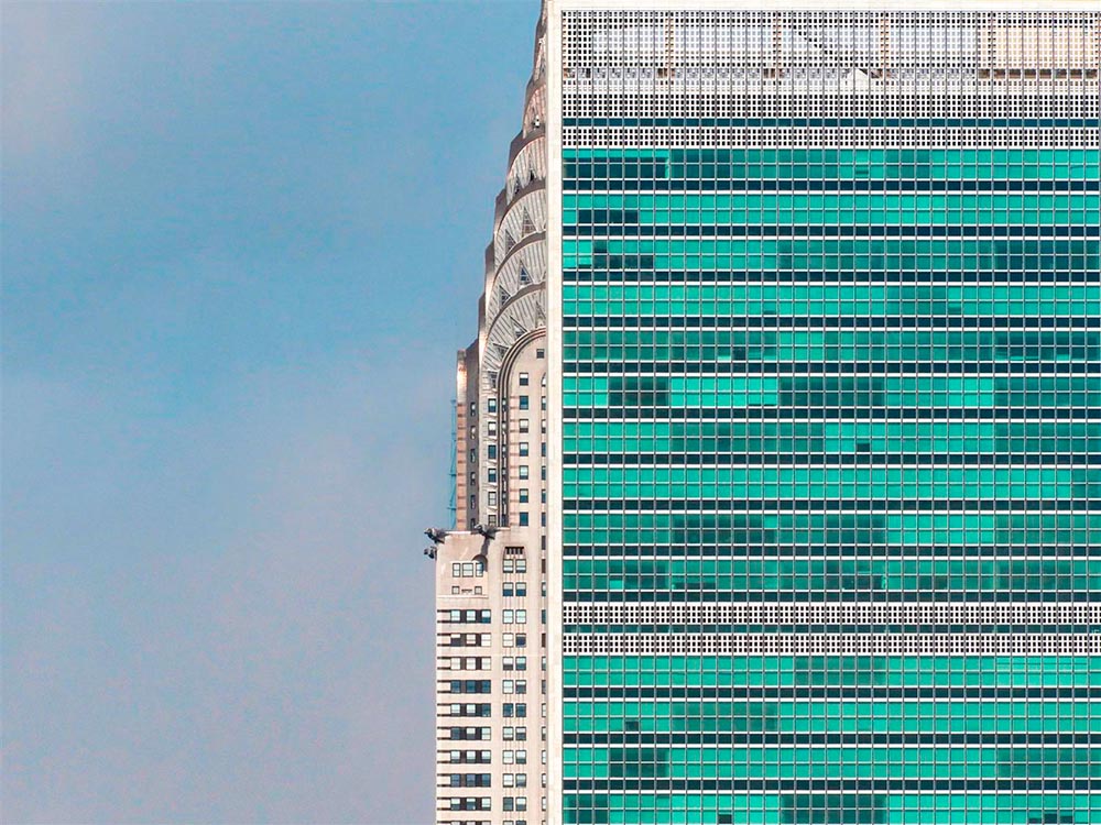
    "Poetic" Architecture Photography

    The latter is called “poetic,” a description I’d completely agree with. The Mother Road, USA, by Hayley Eichenbaum (previously mentioned) is there, too. Enjoy.

    That’s it until after the holiday. Around the first, stay tuned for my favorite book designs of 2021 and more. Take care!
  • Letterpress Typeface from Plymouth Press

    Letterpress Typeface from Plymouth Press

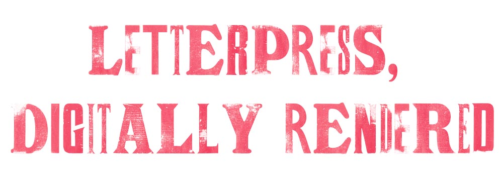
    James Brocklehurst is leading a new kind of innovation method for typography, harking back to the good old days of the letterpress. The technology uses scanned letterpress prints for each letter, and through scripting, randomly cycl[ing] through a range of alternate letterforms whilst you type.

    The font uses OpenType scripting to automatically cycle through a range of alternate glyphs for each character, giving a ‘random’ appearance as you type. (Alternates can also be chosen manually in supported applications.) Very nice, and if you jump through some hoops, some neat results:

    Letterpress type, digitally

    It’s display only — no numbers, limited punctuation — but absolutely worth the download. And did I mention it’s free? Go!

    (Via It’s Nice That. Thank you.)

  • Beautifully Briefed: Icons and Typography, Mid-June, 2021

    Beautifully Briefed: Icons and Typography, Mid-June, 2021

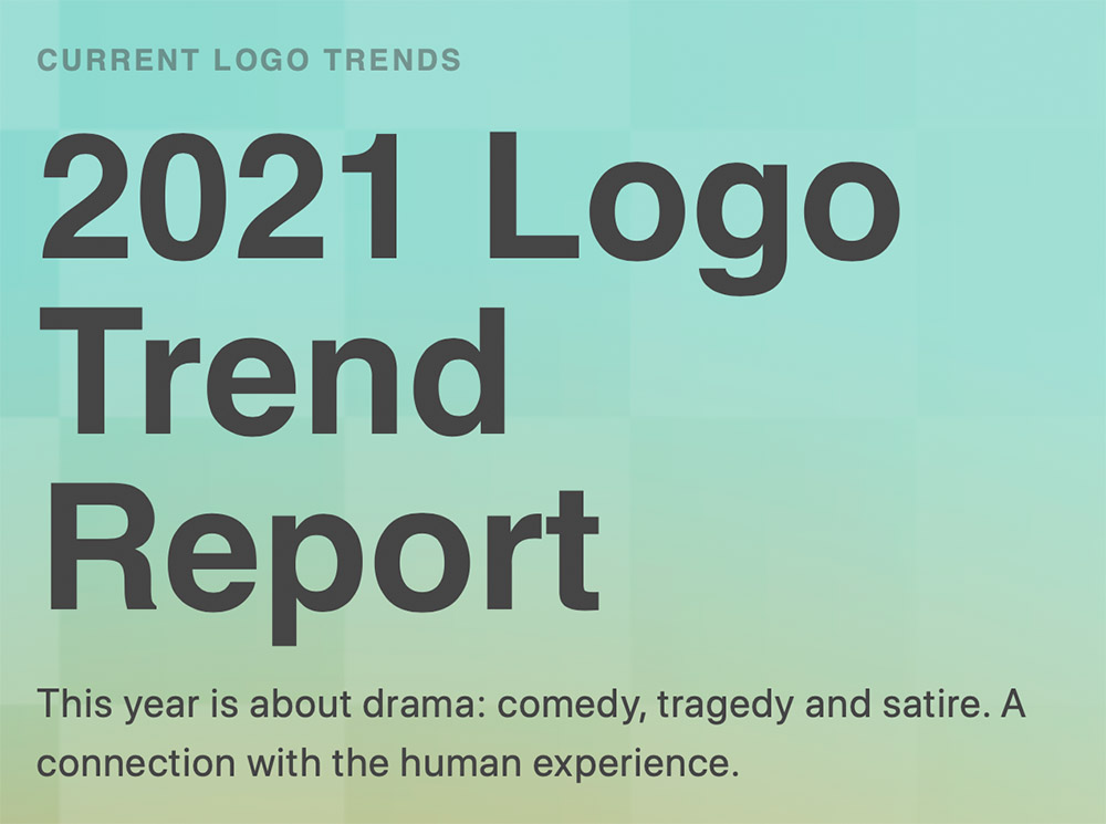
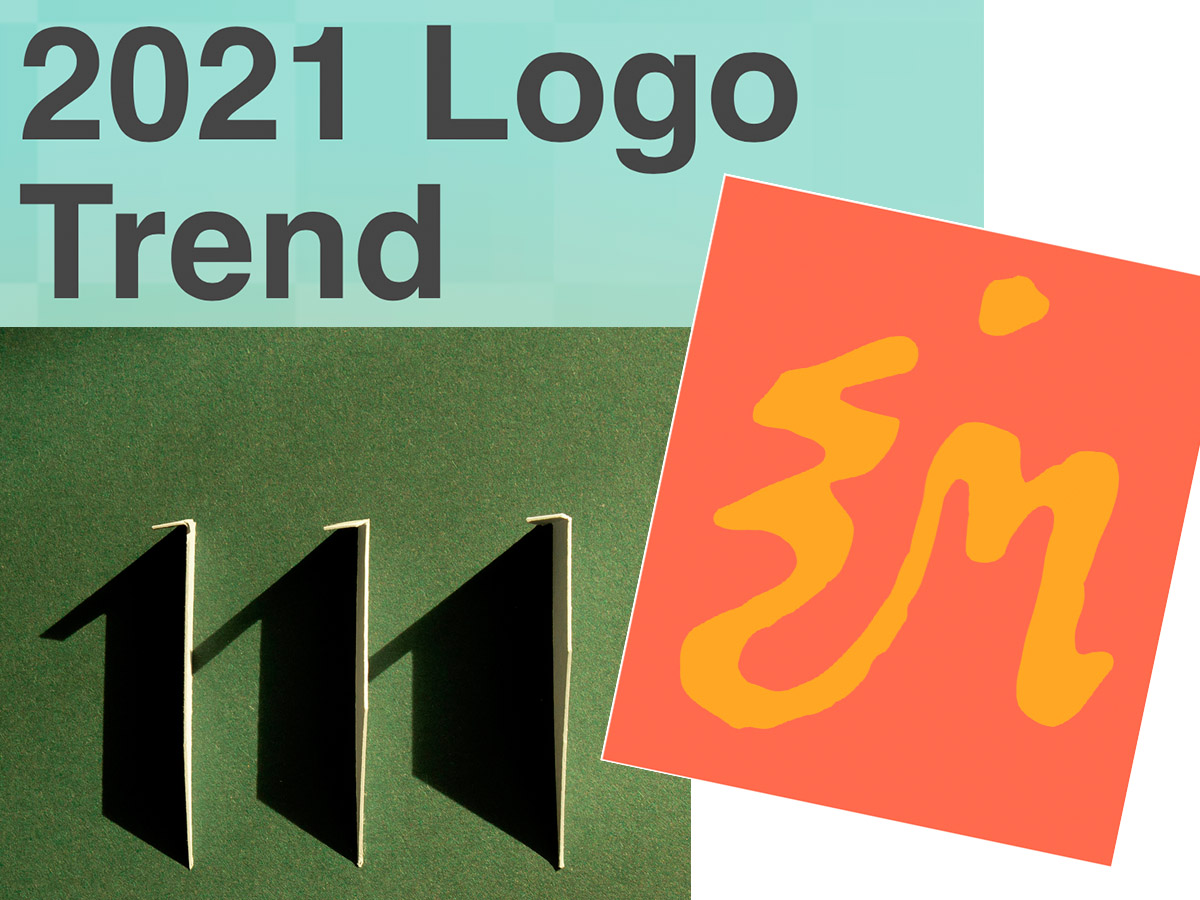
    Three items for you here, starting off with the 2021 Logo Trend Report, from the Logo Lounge. From the Asterisk to Electric Tape, Quads, Chains, and more:

    2021 Logo Trend Report

    Bill Gardner discusses all fifteen different trends, with logos to back ’em up (naturally).

    Next, “A Cabinet of Curiosities” from Hoefler & Co.

    Printers once used the colorful term ‘nut fractions’ to denote vertically stacked numerators and denominators that fit into an en-space. (Compare the em-width ‘mutton fraction.’)

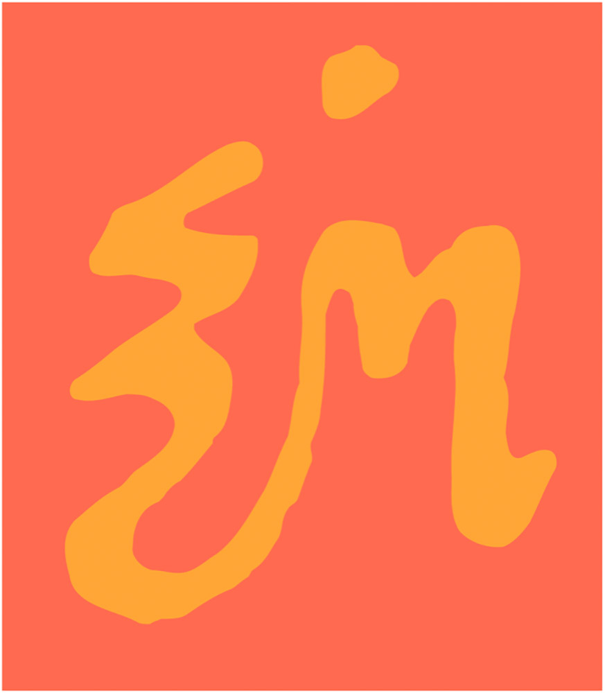
    This is beautiful:

    Dutch Curio, H&Co

    A Dutch curio, representing the letters z-i-j.

    Read all of the rest.

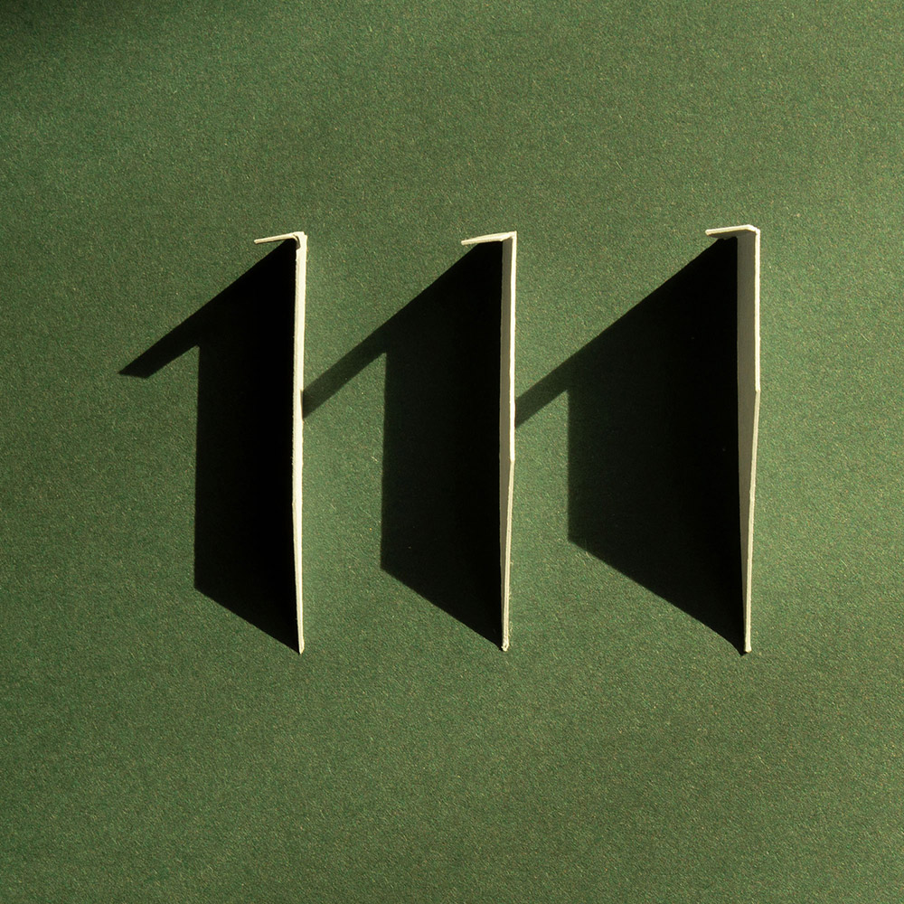
    Lastly, these are amazing . . . and simple, the better form of “simply amazing.” Yeah:

    111 Shadow

    See the rest at This is Colossal.

    Happy June!

  • (More) Beautifully Briefed, Books and Design, May 2021

    (More) Beautifully Briefed, Books and Design, May 2021

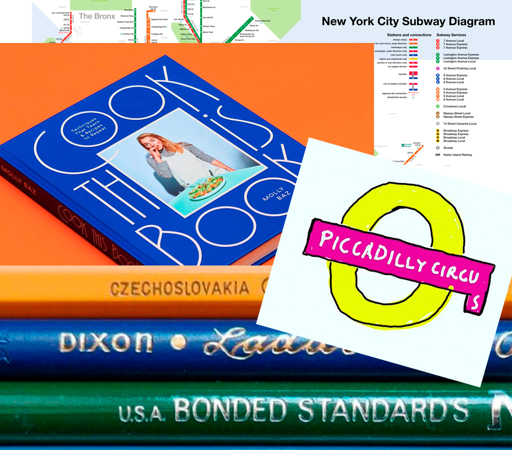
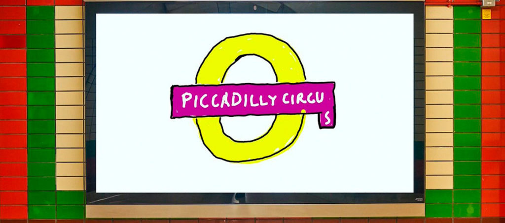
    On David Hockney’s Piccadilly Circus logo:

    piccadilly-circus

    It’s been a minute since I’ve been in London — 2011, to be exact — and I’d love to go back. The food, the parks, the museums, the Thames, the short train rides to more interesting places (Hello, Cambridge?), and even the Tube. (We’ll leave the anti-Americanism aside for right now — we’re post-Trump and post-Covid, so traveling is at least an option!) Yet even the cultural masterpiece that is London is showing some cracks; from the New Statesman:

    Hockney’s Piccadilly Circus has also drawn criticism for its simplistic approach. Over on the cesspit of arts criticism that is Twitter, anonymous accounts that decry all art made post-1920 as an abomination have ridiculed Hockney’s scrawl as indicative of the death of art. Other critics have rightly argued that the work feels like a red flag to a bull: fuelling culture-war debates about the legitimacy of public art, rather than encouraging the public to get onside.

    I like it more every time I see it. Read more at It’s Nice That.

    On the NYC subway map:

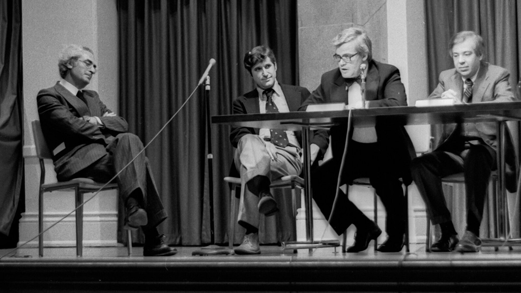
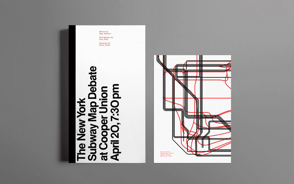
    Speaking of It’s Nice That, an interesting new book from Gary Hustwit . . . on the debate over the New York City subway map. On the one side, the iconic Massimo Vignelli version, introduced in 1972, representing the less-is-more approach. On the other, the replacement version from John Tauranac, introduced in 1979, representing the more-accurate-is-more approach. (An updated version of the latter is still in use today.)

    But back in 1978, the two got up on stage at Cooper Union’s Great Hall — home to debates of, among others, Abraham Lincoln — and pitched their case:

    They Look Happy! (Subway debate 1978)

    Newly discovered photographs and audio lead to this new, smartly-designed, book. Read more at It’s Nice That; Dezeen has an interview with the author. Pre-order the book and get a limited-edition letterpress print at Oh You Pretty Things.

    Subway Map Debate Book

    On books and book design:

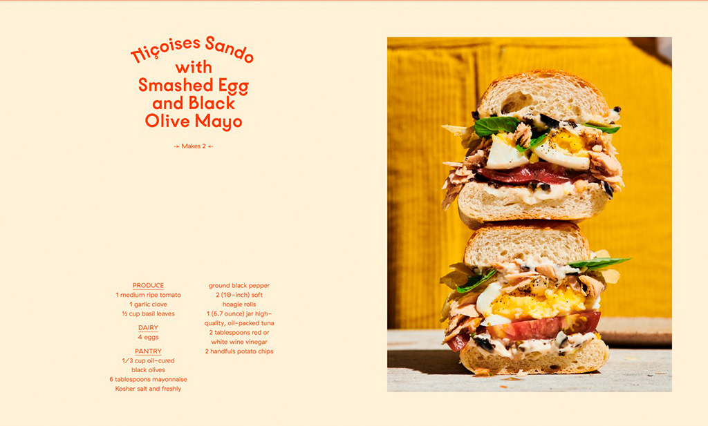
    Nice new cookbook chock full o’ seventies-era design, “Violaine et Jérémy returns with a cookbook for Molly Baz, featuring three of the studio’s much-loved typefaces,” at — wait for it — It’s Nice That:

    Nicoise Sandwich

    Sandwich Nicoice. Mmmmmmm.

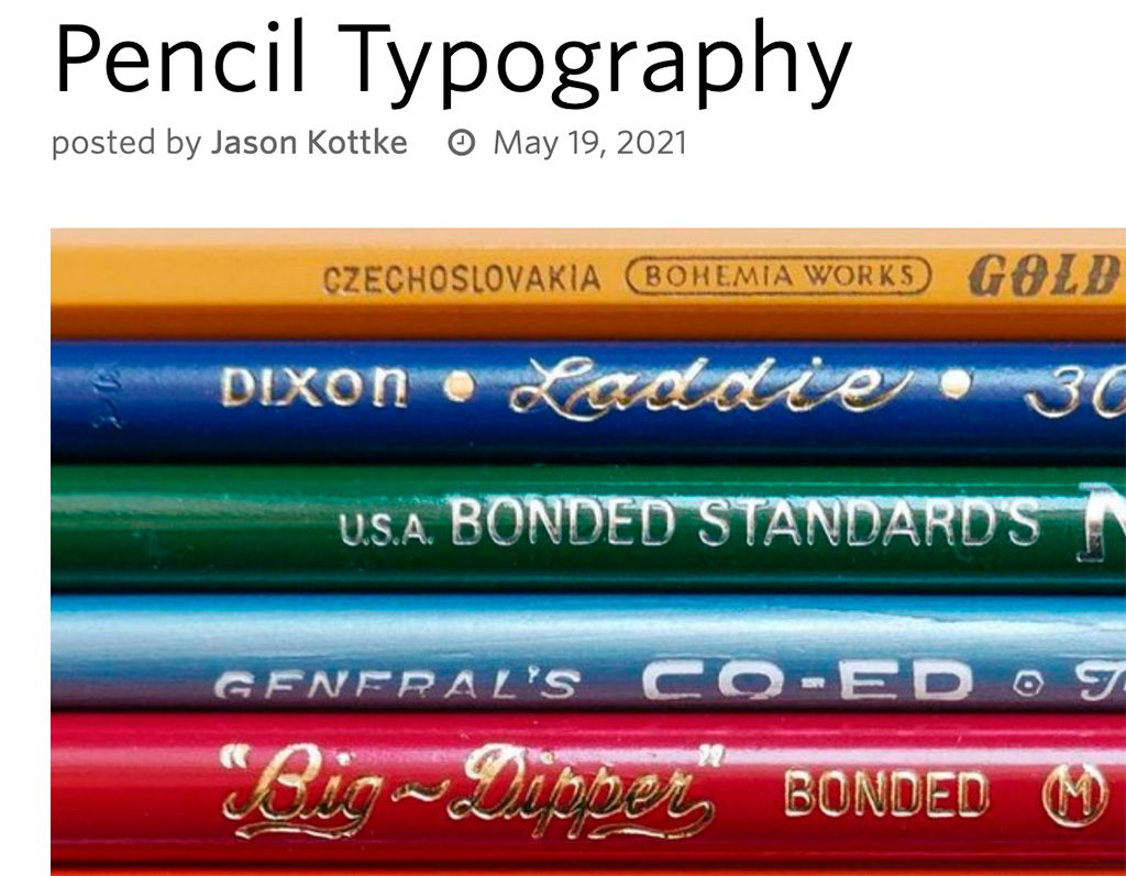
    Lastly, just because, Kottke collects pencil photography to examine the typography. Nice.

    Kottke on Pencil Photography

  • I Love Typography’s 2020 Favorites

    I Love Typography’s 2020 Favorites

    “It’s hard to believe that a decade has passed since I published one of these annual Favorite Fonts lists. A lot has happened in the interim: I now have less hair, more grey hairs, sometimes complain about my back, and now live in another country! Anyway, that’s quite enough about me. Here are, then, in no particular order, my favorite typefaces of 2020…”

    Some great choices here, especially:

    A layer font — something described as “fashionable for a while” — this one deserves to be on a book cover.

    Special mention: ILT’s web design. This blog and this entry both are easy to look at, well put-together, and something that makes me a little envious.

    Read all of the 2020 favorites, or ILT’s main page.

  • Jazz Musician Lettering

    The history of the album cover and show poster begins with jazz.

    Cue the record.

  • Typeset in the Future on Star Trek: The Motion Picture

    Typeset in the Future on Star Trek: The Motion Picture

    Lots and lots covered here, including things this huge fan of the movie never knew — including specifics on the fonts, type, and more. When you have a few minutes, grab a beverage and enjoy!