Tag: this is colossal

  • Beautifully Briefed 24.12: New Year’s Eve Fireworks

    Beautifully Briefed 24.12: New Year’s Eve Fireworks

    Let’s continue a couple of discussions before closing out 2024, and send you into 2025 with some photographic and typographic goodness.

    More AI Book Design

    This was mentioned in another context in July, but is heading our way more aggressively as time goes by, with Microsoft and TikTok, among others, getting into the publishing arena.
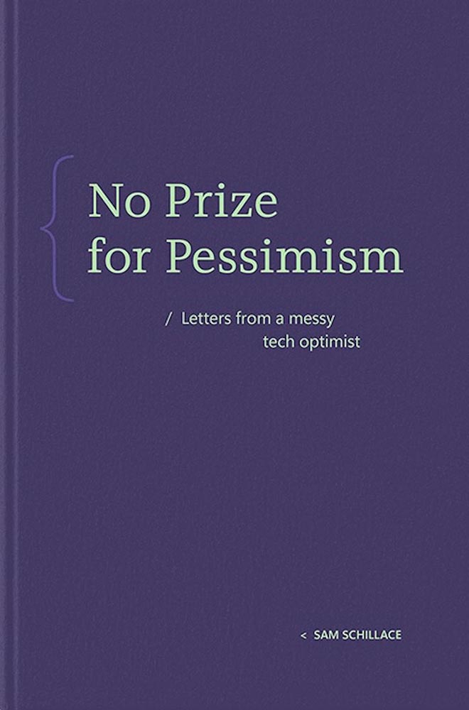
    Cover design: unknown. (Human or machine: unknown.)

    While Microsoft’s new imprint, 8080 Books, plans “to test and experiment with the latest tech to accelerate and democratize book publishing.” They’re not entirely up-front about what that is — and might not know themselves yet, given the rapidly evolving tech and marketplace. That said, with the corporate giant’s name attached, we can be assured of some level of quality.

    Yes, I just wrote a sentence suggesting that Microsoft is a guardian of quality. (“Books matter. In a deluge of data. In a bloat of blogs, a sea of social, and a maelstrom of email. Books will always matter,” they write.)

    With others, the for-profit nature — TikTok’s engagement-before-all-else approach speaks volumes (or writes volumes, as the case might be) — assures that quality might come behind, say, slop. Publisher’s Weekly reports that 320 publishing startups have emerged just in the last two years, most in the AI space, adding to the 1,300 noted as of 2022. (PW also notes, “It is widely believed that each of the Big Five publishers has internal AI projects discreetly hidden from view.”)

    And then there’s this: introducing Spams Spines, your AI book design and book completion service: “[f]rom manuscript to book in your readers’ hands – a single platform to help any author proofread, cover design, format, print, and distribute over global channels — zero tech know-how required.” Prices start at $1500 and promise a finished product in less than 30 days.

    Their goal is to release 8,000 books per year. AI is heavily involved:
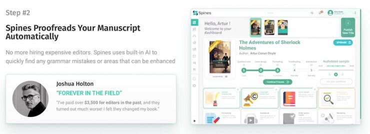
    There’s a Sherlocked joke here somewhere….

    Because, yes, you want a machine to suggest that Sir Arthur Ignatius Conan Doyle needed assistance regarding a turn of phrase. (Never mind his expensive editor.)
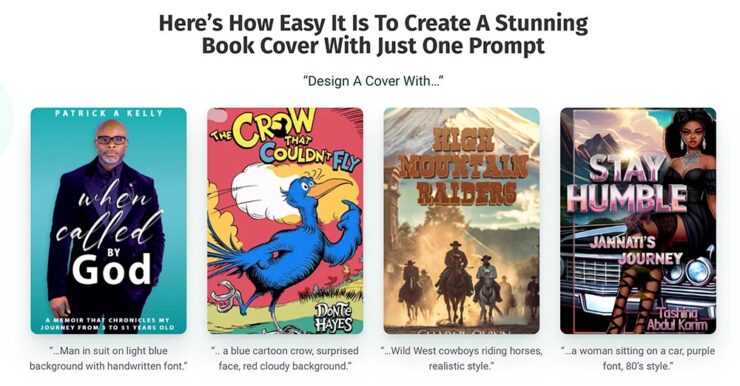
    The first and third are really “only” bad. However, Dr. Seuss would like a word with Spines’ AI training dataset, please, and the cover for “Stay Humble” defies words.

    But it’s the book design that got my attention: these are apparently the good ones, the cited examples to which someone says, “Yes! Take my money!”

    The sad thing is that people will say that. Have already said that. And there’s much, much on the publishing industry’s horizon. Our horizon.

    Read more at The Conversation, “The tech world is ‘disrupting’ book publishing. But do we want its effortless art?” Shout out to the AV Club and the aforementioned PW article.

    The Cat Leaps

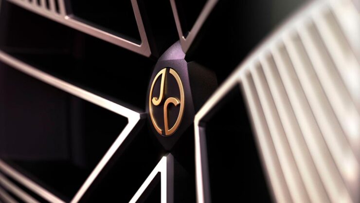
    Last month, we left off Jaguar’s continuing road trip with a teaser. Let’s get right to it. The car’s called the Type 00:
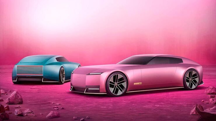
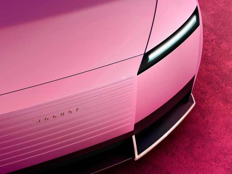
    Some details:

    The interior:
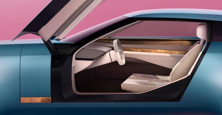
    The internet, predictably, has lost its collective … um, mind. However, amongst the melee, there are a few items worth mentioning.

    Creative Boom: “If the new logo seemed divisive in isolation, seeing it brought to life with Type 00’s design has brought much clarity. The flush surfaces, panoramic roof, and glassless tailgate – all adorned with the new Jaguar device mark and reimagined leaper – create a cohesive vision of modern luxury. Rawdon Glover, managing director of Jaguar, emphasised the importance of this shift: ‘We have forged a fearlessly creative new character for Jaguar that is true to the DNA of the brand but future-facing, relevant and one that really stands out.’”

    The quote there is something to pay attention to. Read those words again, and think about the actual choice of language; it’s this, exactly, that has struck some. Armin at Brand New, for instance: “[W]hat I dislike the most about the new Jaguar brand: its tone of voice is INSUFFERABLE. Everything from the platitudes in the campaign to the script of McGovern’s presentation to the press releases is obnoxiously over-confident and self-congratulatory.” (Brand New, while excellent, is subscription-only — alas without a sample article. Here’s a link anyway.)

    Meanwhile, Dezeen provides us some real-world images from the Miami launch:
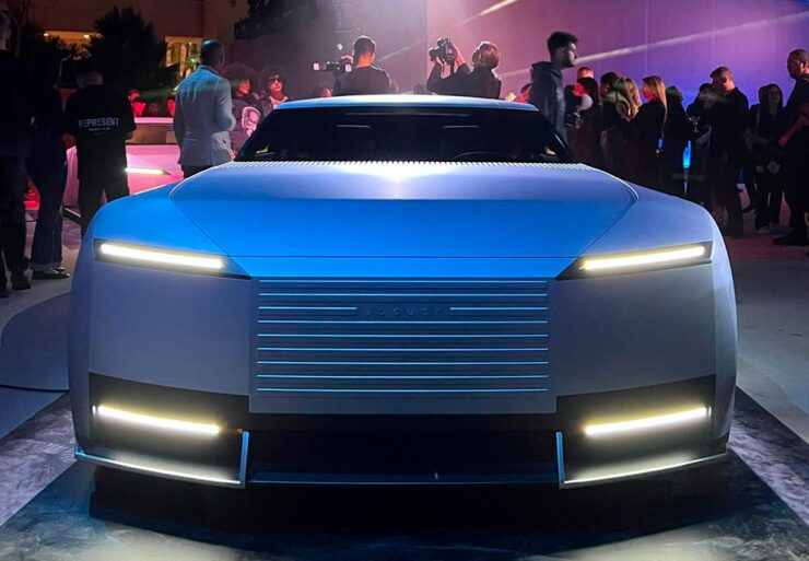
    Wai Shin Li, via Dezeen

    But it’s The Autotopian that stands out. They have not one but two excellent articles by Adrian Clarke, an ex-JLR1That’s Jaguar Land Rover, before it was, um, initialized by owner Tata. designer, who has several important points to contribute:

    A couple of weeks ago, the cancelled X351 Jaguar XJ leaked onto the internet. During my time at Land Rover, I saw this car back in 2018 and can confirm this is indeed, or rather was the EV XJ. Back when Mr. Tata was still alive every six months or so there would be a big board level presentation for him on upcoming products. […] I was privy to all the future production Jaguars and concepts. There was a J-Pace SUV to sit above the F-Pace (no problem in revealing this as it’s common knowledge) and everything else was as you’d expect. These cars were then cancelled as part of the revamp and one absolutely incredibly beautiful and exceptional proposal aside, nothing of value was lost.

    It’s the first time I’d seen the cancelled-just-before-release XJ EV, and despite the incomplete body panels and obviously-on-the-sly phone shot, it’s incredibly disappointing. They made the right call.

    Compare it next to a Rolls Royce Spectre, a car the production Type 00 will be a competitor for, and see how successfully it hides its bulk in profile. [I]n the side view, particularly in the bottom half, I’m seeing some Range Rover. The crisp shoulder line, the kick-up of the tail behind the rear wheel, and the feature line along the bottom of the bodyside all scream Range Rover. This is exacerbated by the verticality of the front and rear of the car – the new full-size Range Rover and Sport have sharply docked tails. I heard that the initial sketch of this car was done by Massimo Frascella before he departed for Audi. Frascella was McGovern’s right-hand man at Land Rover for decades before Ian Callum retired and McGovern used the opportunity to bring both the Jaguar and Land Rover studios together. So maybe that’s where this Range Rover influence comes from.
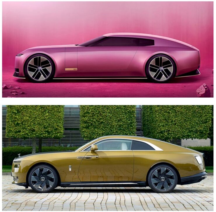
    The Jaguar Type 00, top, and Rolls-Royce Spectre, bottom, courtesy of The Autopian.

    We must remember this is only a concept. The actual production car will be a four-door GT. This is only a preview of the visual style of future Jaguar models. It’s certainly striking, but you’d struggle to call it beautiful. It’s also monolithic and slabby.

    Let’s hope this brutal revamp is […] successful, because there are a lot of jobs depending on it.

    — Adrian Clarke, ex-JLR designer

    There’s much more from those two articles, too much to quote here, so please go read them — the initial report is more on the design, while the second delves into the why: “Why Jaguar Had To Blow Up Its Brand In Order To Save It.

    Meanwhile, I’ll actually be rooting for JLR to pull this one off. I’m not in the target audience — at all — but Jaguar needed to do something radical and, by God, they did just that. The concept is interesting. Some of the details are fantastic. Here’s hoping, indeed.

    Update, 15 Jan 2025: Turns out the Jaguar’s designers were a little worried about the outcome — or the outsourcing, in this case — and its effect on the brand. The Drive has the details.

    Special Bonus #1: Motor1 has a feature on Ian Callum’s current whereabouts. There are too many hypercars these days, but the Skye looks cool:
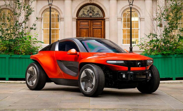
    The Callum Skye concept. (An island buggy?)
    Some Extraordinary Items of “Normalcy”

    To close out 2024, let’s take a break, pour a beverage, and enjoy some of what you read Foreword for: great photography, typography, and design.

    Northern Lights

    I didn’t know — or didn’t remember — that amongst the glut of photography contests is one dedicated to the phenomenon known as the Northern Lights.
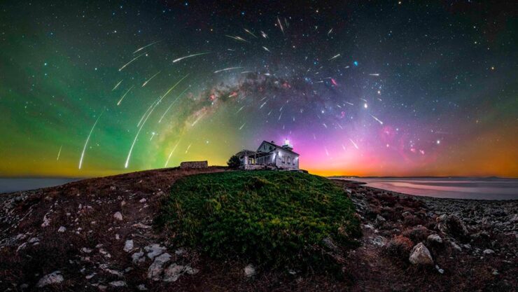
    Cosmic Explosion, Isteria, Croatia. Photograph by Uroš Fink.

    PetaPixel reminds us that Capture the Atlas’ Northern Lights Photographer of the Year competition features some exceptional opportunities to make spectacular captures this year due to the solar maximum — the peak of its eleven-year cycle.
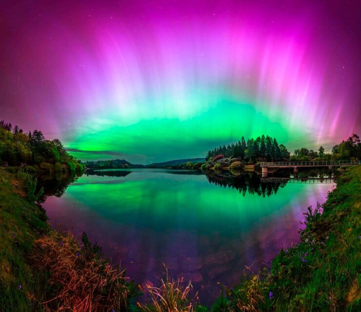
    Celestial Reflection, Dartmoor National Park, UK. Photograph by Max Trafford.

    The 2024 competition awards feature 25 winners, each with a narrative and each a striking example of the larger system we’re part of. Check it out. (Also via This is Colossal.)

    Nature

    PetaPixel is among several that point us to the Nature Photographer of the Year contest, with images both poignant and funny. Since it’s New Year, let’s go with the latter:
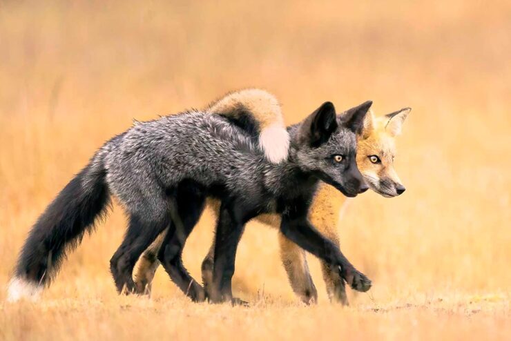
    Besties, Washington State, US. Photograph by Marcia Walters.

    Of course, there’s just “spectacular,” too:
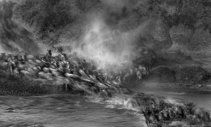
    Cross to Bear, Talek River, Kenya. Photograph by Paul Goldstein.

    The contest’s winners page features many more, separated into categories; be sure to click on the individual photographs to get larger sizes and the story with each. Fantastic stuff.

    Frozen Prairie Landscapes

    Saskatchewan gets cold in the winter, but there’s a beauty to those temperatures, photographer Angela Boehm tells PetaPixel.
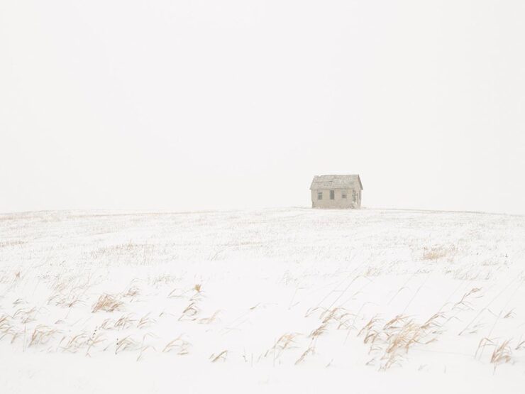
    Image from Minus Thirty. Photograph by Angela Boehm.

    “The frozen prairie landscapes, while a subject in their own right, serve as a powerful metaphor for the deeper themes the book explores: loss, memory, and resilience,” she says. […] “The loss is embodied in the emptiness and biting cold. The memory, or its gradual fading, is represented by the snow obscuring the horizon, softening and blurring the scenes. And the resilience is in the solitary tree — a steadfast survivor of countless storms in this unforgiving landscape.”

    — Angela Boehm, Minus Thirty
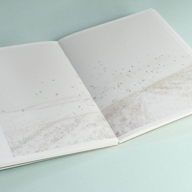
    Read more of PetaPixel‘s story of realization to publication or just check out the title.

    Special Bonus #2: Another book on an interesting subject — Japan’s brutalist architecture, which somehow manages to bring an inherent quality to the cement:
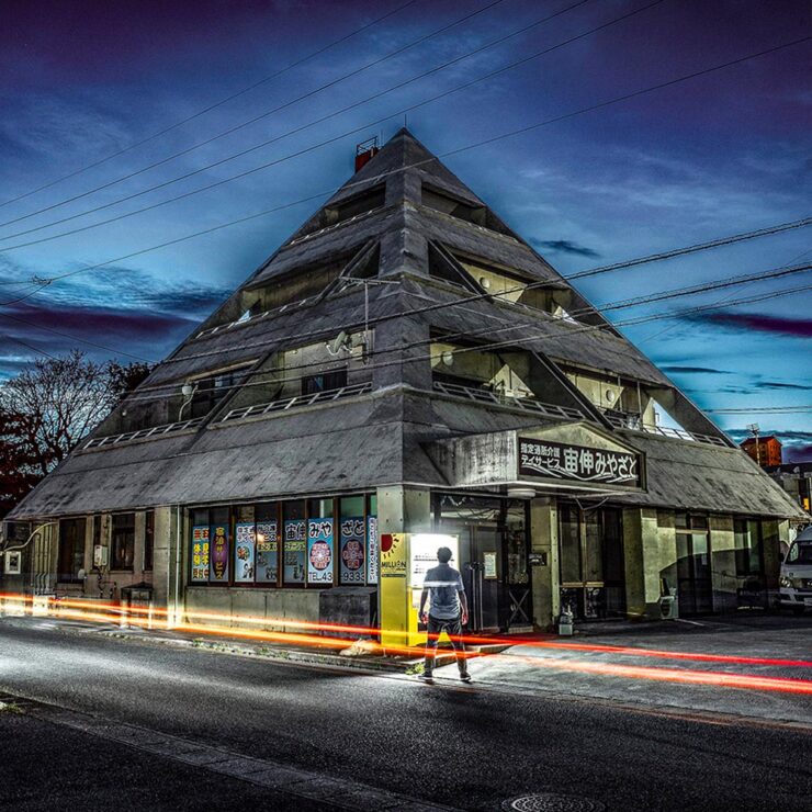
    Mixed-use complex, 1994, by Kuniyoshi Design. Photograph by Paul Tulett.

    Dezeen has more.

    Ukraine’s “Fight for Visual Identity”

    This PRINT piece is excellent: “A cultural gap persists in how history is organized and interpreted. I left the library without my requested images but with a lingering realization that how we organize history, even within the hallowed walls of an institution like the New York Public Library, can reflect the biases and oversights of a collective cultural perspective,” writes El. Stern.
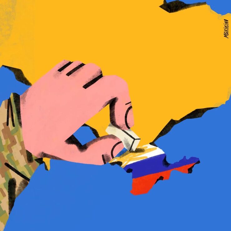
    Home Soon, Dear. Image by Maria Kinovych, 2022.

    “Today, Ukrainian graphic design is rooted in national identification, in search of future needs, and in understanding the cultural influence of a painful past on a, once again, painful present.”

    Ukraine’s search for a future — and present, and past — in design. Great read.

    “A must-have manual for hot metal enthusiasts and linotype lovers”

    Type Archived, a new book whose fundraising campaign I didn’t see in time: a “stunning visual tour of traditional typefounding and offers a definitive account of London’s legendary Type Archive,” writes Wallpaper*.
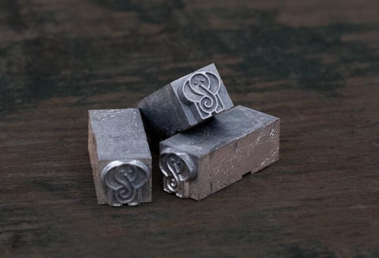
    Custom metal for the book project.

    The book “traces the origins of typography through the physical tools, objects and machinery that made the printed word possible. Full of rich photography, [it’s] a visual journey through the punches, matrices, presses, type and paper which tell the story of the UK’s preeminent typefounding industry.”

    Hopefully available at bookstores soon.

    “The Arresting Typography of the Sanborn Fire Insurance Maps”

    Jason Kottke writes, “Several years ago, Brandon Silverman become obsessed with the lettering and typography on the fire insurance maps published by the Sanborn Map Company in the late 19th and early 20th centuries.”
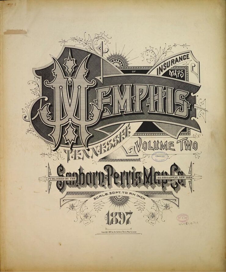
    Silverman’s launched an archive of the maps, an absolutely fantastic way to pass a few minutes hours.

    Special Bonus #3: Nick Heer, at the always-excellent Pixel Envy, has an essay on the essentials: “[E]fficiency and clarity are necessary elements, but are not the goal. There needs to be space for how things feel.” Delicious Wabi-Sabi is worth a few moments.

    Wishing you and yours a very happy New Year!

  • Beautifully Briefed 24.10: Content with Worthwhile Content

    Beautifully Briefed 24.10: Content with Worthwhile Content

    “Content,” that is, the feeling of satisfaction — contentedness — is a word I’d much rather use than “content,” that which is required of folks who produce material for their website/YouTube channel/social media feed/whatever. It’s a shame the world favors the latter over the former.

    Or does it? We’ll get to that — right in the midst of the other content that caught my eye in October, 2024.

    Adobe Content Credentials, Continued

    Adobe’s positive messaging continues, saying “[it is] dedicated to responsibly developing tools that empower creators to express themselves and tell their stories while helping address their concerns.” It even carried out a study to get some feedback from creatives on generative AI and one of the standout insights was rising concerns over unauthorised sharing of their work or misattribution with 91% of creators seeking a reliable method to attach attribution to their work.

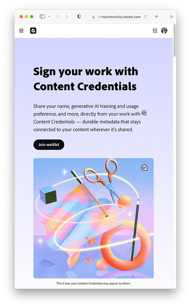
    Bring on Adobe Content Authenticity. It’s a “powerful new web application that helps creators protect and get recognition for their work.”

    A screenshot of Adobe Content Authenticity website.

    In today’s rapidly evolving digital landscape, creators are understandably concerned about safeguarding and gaining attribution for their work and having more control over how it’s used. That’s why we’re excited to introduce Adobe Content Authenticity, a new, free web app that allows creators to easily attach Content Credentials to their digital work — helping you protect your work, show attribution and better connect with your audiences online.

    —Andy Parson, Senior Director, Content Authenticity Initiative, Adobe

    For now, it’s limited to a beta Chrome extension, with a wider beta opening to the general public in spring 2025. (I don’t use Chrome, but have signed up to the waitlist, and will update Foreword readers when I hear back.) Content Credentials are already available in Photoshop and Lightroom — provided you’re using the latest versions, which may require the latest OS.

    Three on Book Design
    PBS on del Rey

    I’d known the publishing house since . . . well, as long as I can remember. What I’d not known is the story behind the publishing house:

    Set aside thirteen minutes when you can — absolutely worth it.

    Multi-Panel Book Covers

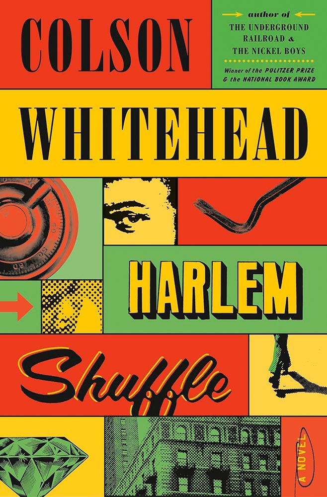
    I agree with Jason Kottke: “Bento Books” is the term. A great example:

    Book design by Oliver Munday.

    Here’s the impetus discussing this latest book design trend, with many more examples.

    It’s Nice That: Book Design in Brazil
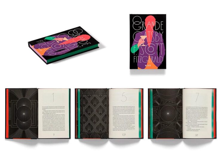
    Book design by Bloco Gráfico.

    Any foreigner entering a bookshop in São Paulo is likely to be impressed by the quality of the books on display. For a country with relatively few readers, few high quality printers and binders, and a very limited assortment of paper, the Brazilian publishing market shows remarkable graphic ingenuity[.]

    — Elaine Ramos, It’s Nice That

    Never mind the country, the great book design caught my attention: from The Great Gatsby, above, to the J.M. Coetzee series, Orwell’s 1984, even Melville — amongst others. A great read.

    Special Bonus #1: Life outside the internet . . . and physical books, please:

    “The whole internet social complex … and the way people use their computers to conduct life is doomed sooner than later,” said Justin Murphy, the founder of the media and education company Other Life. “The smartest people, the people who are the most cutting-edge, will increasingly live their lives outside of computers.”

    Whether or not that’s true — or even a potential — isn’t as relevant as an actual trend: physical book sales are up:

    Print, too, is on the rise, from books to magazines to newspapers. Print book sales had a pop with the pandemic in 2020, and have continued to maintain sales of more than 750 million units sold each year. Meanwhile, even though they’re cheaper, sales for ebooks are down slightly, which may be owed to the fact that younger readers, much like older generations, overwhelmingly prefer printed formats.

    — Zoë Bernard, Vox

    Flip phones, vinyl LPs, and . . . books: Read the whole article.

    See also: The Guardian: Bookstores are Suddenly Cool.

    50 Fonts for 2025

    CreativeBoom is out with their annual post on future type, “50 fonts that will be popular with creatives [next year].” Some of my favorites (links in captions):

    Editorial New, by Pangram Pangram.
    Nave, by Jamie Clark Type. (Bonus points for the great illustration.)
    Right Grotesk, especially the Casual flavor, by Pangram Pangram.
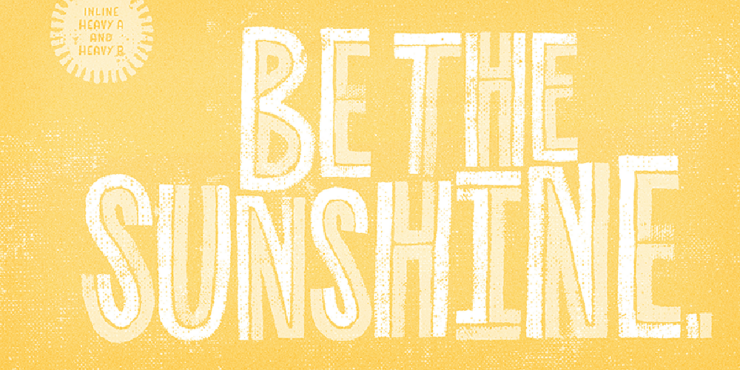
    Canvas Inline, designed by Ryan Martinson from Yellow Design Studio. Available through Adobe Fonts.
    Ssonder, from Type of Feeling. (Easily the most on-trend of my highlighted items.)

    An honorable mention goes to Gamuth Sans, from Production Type. See CreativeBoom’s 2025 popular fonts list here. (Note: some are available through Google Fonts, and thus free-to-use. Nice.)

    See also: Two more from CreativeBoom on the 2025 type scene: font trends and independent foundries.

    Photography that causes content
    Forest Fireflies

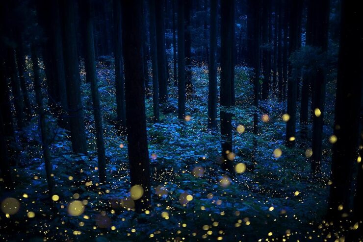
    From This is Colossal, we have Kazuaki Koseki, who describes himebotaru — fireflies — as “artists who paint light on the forest.”

    From the series “Summer Faeries” by Kazuaki Koseki.

    Artistry, all right. See more.

    Epson International Pano Awards

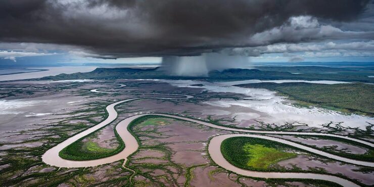
    The 2024 Pano Awards have been announced, with a wealth of great wide-angle shots for your viewing pleasure. Two of my favorites:

    “Storm Dump,” by Tom Putt. Taken near Wyndham, Western Australia.
    “Uprooted,” by Nickolas Warner. Taken in Moab, Utah.

    Epson’s rules are a little looser than some, but don’t diminish the sheer creativity displayed by the entrants. See coverage from PetaPixel or This is Colossal, or go to the source for the full list.

    Siena Creative Photo Awards 2024

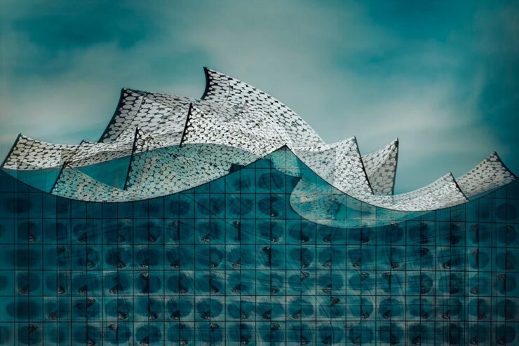
    Just one favorite to highlight here, but what a favorite it is:

    “Storm on the Elbe,” by Anna Wacker. 1st Prize, Architecture.

    See some amazing sleeping bears — and much more — at the PetaPixel post or the full list at the Siena contest website.

    Architecture MasterPrize

    Few contests are more up my alley than this one, which inspires me to get back out there sooner rather than later:

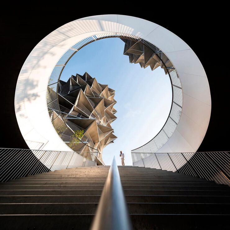
    Kaktus Tower, Copenhagen, by Shoayb Khattab. See more from this series.
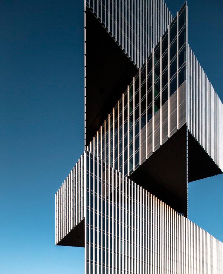
    “Fragments,” taken at the Nhow Hotel, Amsterdam, by Max van Son. See larger.

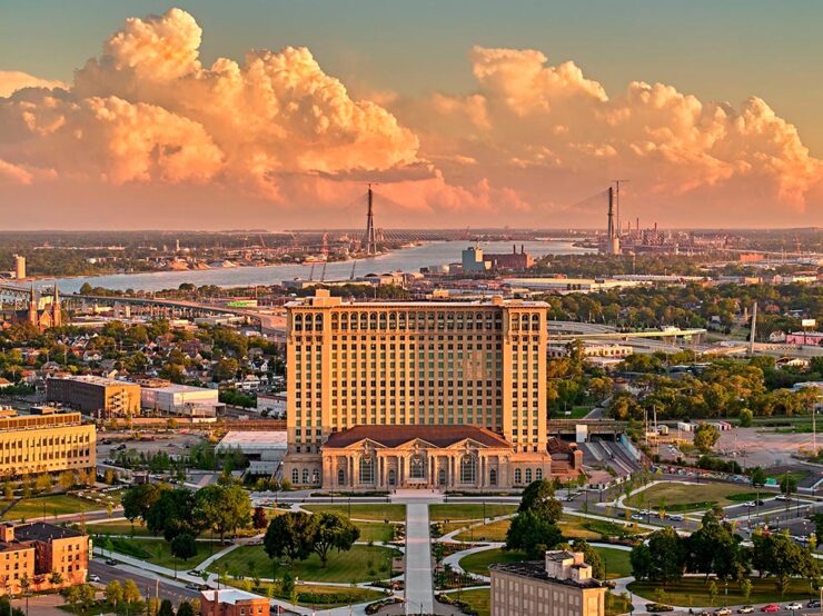
    Awesome. Meanwhile, the below caught my attention not due to the striking photograph, but the striking content — which, indeed, caused contentedness. Such a huge change to anyone who might recognize this former hulk, now beautifully refurbished and in a new park setting:

    “Michigan Central Station,” Detroit, by Jason Keen. See the full series here.

    See the post from PetaPixel or the full list of 2024 winners at the Architecture Masterprize 2024 website.

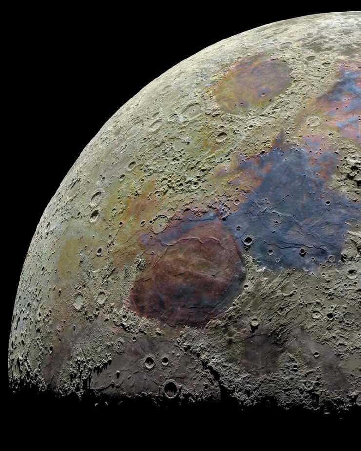
    Special Bonus #2: To close us out on this Halloween, the moon:

    Photograph by Darya Kawa Mirza. See more.
  • Beautifully Briefed 24.9: Falling Up

    Beautifully Briefed 24.9: Falling Up

    A long and diverse list this time, with a few thoughtful things and a ton of photography. Set aside a few minutes to get lost in links — and enjoy!

    Books and Values

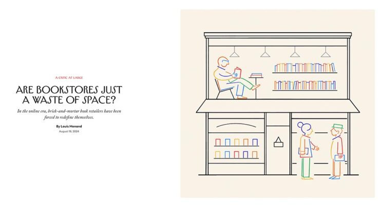
    This article from the New Yorker is highlighted a little behind schedule — it’s from August (although, in my defense, I get my NYers second-hand) — but worth the read for the phrase “practitioners of bibliotherapy” alone.

    Illustration by Pierre Buttin. © New Yorker.

    Before we get into the meat of it, though, a primer on the growth of available titles in the United States:

    • 1939: 10,640 (est.)
    • 1970: 36,000
    • 2020: 1,000,000 (est., including ebooks)

    The New Yorker article lists this last figure as three million, but various internet sources dispute this; either way, it’s a huge number that no store could ever hope to stock. But … on to the important stuff.

    The central question:

    Amazon offers something like thirty million different print titles. The company has deals with purveyors of used and remaindered books, who are linked to on the site. It owns AbeBooks, the leading site for rare and out-of-print books. And there are many other places online where you can buy books, including barnesandnoble.com. So why does the world need bookstores?

    — Louis Menand, New Yorker, August 29, 2024 issue

    The New Yorker is kind enough to let you read a few articles a month without crashing into a paywall, so go find out the answer, appropriately enough, in their book review of Evan Friss’ The Bookshop: A History of the American Bookstore.

    Meanwhile, Nick Heer of the always-excellent Pixel Envy cites another New Yorker article on pricing for non-physical books — “The Surprisingly Big Business of eBooks” — and comes up with a few spending figures of note regarding the New York Public Library and Barack Obama’s title, A Promised Land:

    • $29,450, for 310 perpetual audiobook licenses at ninety-five dollars each;
    • $22,512, for 639 one- and two-year licenses for the e-book; and,
    • $5,300, for 226 copies of the hardcover edition.

    If you want to know why publishers so aggressively fought the Internet Archive on its model of lending out scanned copies of physical books, this is the reason. Publishers have created a model which fundamentally upsets a library’s ability to function. There is no scarcity in bytes, so publishers have created a way to charge more for something limitless, weightless, with nearly no storage costs.

    — Nick Heer, Pixel Envy

    You know what you can’t do with an ebook license? Put it on a shelf for re-reading in ten years’ time. Or resell it. In other words: control what happens to it. “[I]t is hard not to see publishers as the real villains in this mess. They are consolidating power and charging even legitimate libraries unreasonable amounts of money for electronic copies of books which the publishers and their intermediaries ultimately still control,” Heer writes.

    Exactly.

    Special Bonus #1: Nick Heer gets something else right, too, by noting the sharply divergent goals of social media platforms and his own wishes — indeed, those of what we would idealize as “normal people.” “Guided by Vices” is excellent. Check it out.

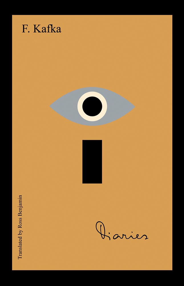
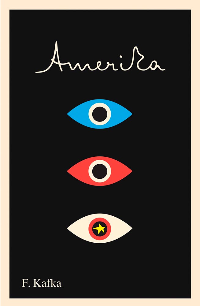
    Book Design: Kafka
    Cover design by Peter Mendelsund.

    Few subjects could more appropriately follow the above, so it is with a certain sense of joy that I highlight these fantastic new covers Frank Kafka’s works, brought to us by the incredibly talented Peter Mendelsund1Get inside the mind of Peter Mendelsund, the pianist who went from Tchaikovsky to Tolstoy and became one of the best book cover designers working today, with editor Zac Petit’s interview in PRINT’s 75th Anniversary Issue,” with the link at the source article. via an interview with Steven Heller at PRINT:

    Cover design by Peter Mendelsund.

    The whole article, and especially, the whole series of title designs, are exactly why I treasure book design. Read on.

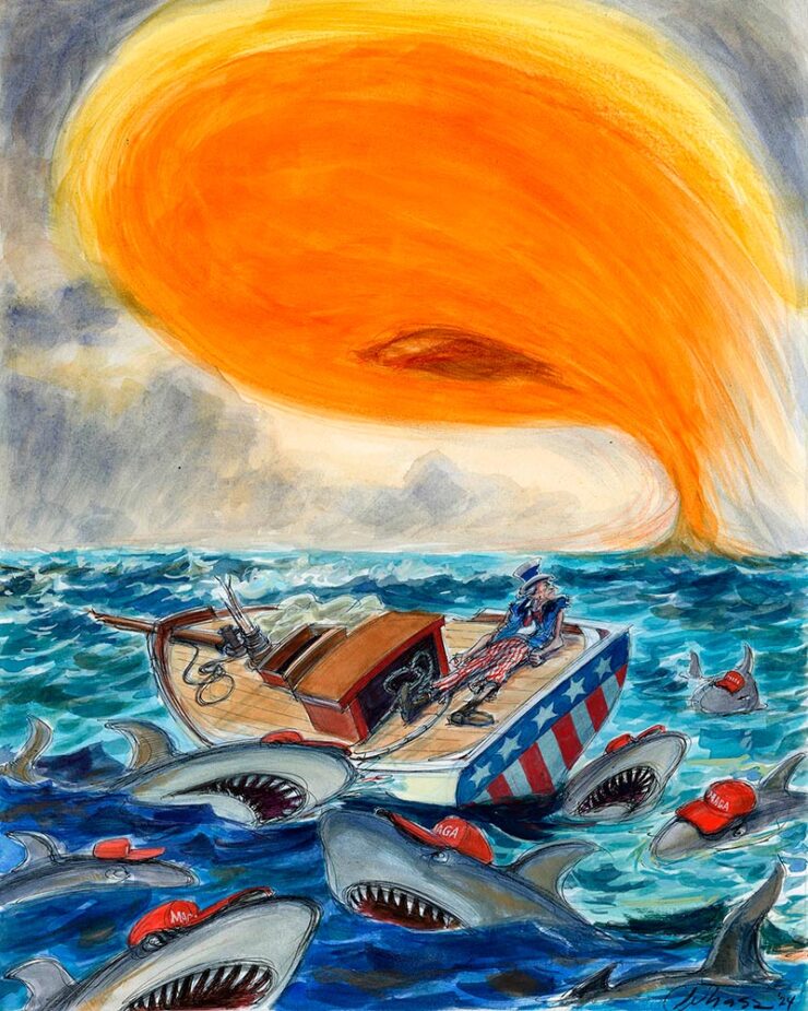
    Special Bonus #2: From Rolling Stone, an image reposted without comment (and absolutely not related to Kafka):

    Illustration by Victor Juhasz. © Rolling Stone.
    Colossally New

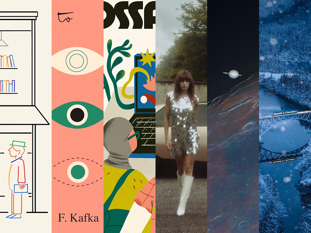
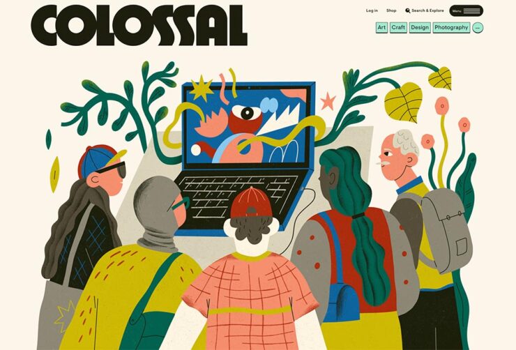
    This is Colossal, one of the very few sites elevated to “check daily” status and a frequent contributor to posts here on Foreword, has a new look:

    The new look of This is Colossal, September 2024.

    The last site, more than seven years old and designed by the great Armin Vit — he of Brand New fame — needed a refresh, mostly for technical reasons.

    Check it out. (And, separately, read the details.)

    Update, 4 Oct: More details from Firebelly. Great to see the progression of ideas.

    Update, 18 Oct: Part 3, “Crafting Colossal’s Whimsical Web.”

    SM[all] Majesté
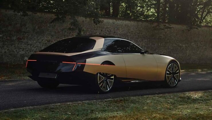
    Photograph by DS Automobiles.

    I had to lead with an image there — even as concept cars go, wow. “DS’ tribute to the bewitching Citroën SM is the cure for concept car burnout,” The Autopian says, and I completely agree.

    The lights bleeding into the skirted rear wheels is, perhaps, perfection:

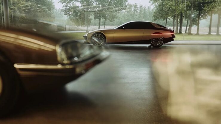
    Photograph by DS Automobiles.
    Photograph by DS Automobiles.

    Okay, it’s not even a Citroen, and the 1970’s are hot right now, but still, it’s an out-of-the-park home run from the staggering — perhaps even stumbling — juggernaut that is Stallantis. Read about it at Motor1 or Wallpaper*, or see one of these two YouTube videos from DS or YouCar.

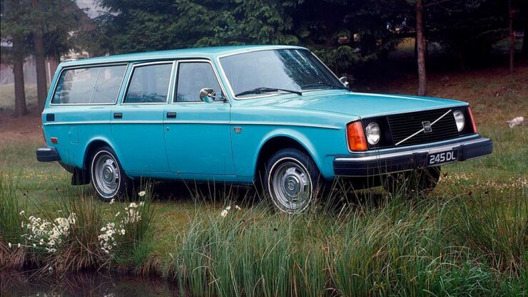
    Special Bonus #3: Another design icon, the Volvo 240 series, celebrates its 50th birthday this year. (I learned how to drive on a 145, the immediate predecessor, and was surrounded by 240s in my teens. I remember them fondly.)

    A 1974 Volvo 245 in the perfect shade of blue. Fabulous.
    Photography Turns 200

    According to an article in French photography publication Réponses Photo, quoted on PetaPixel, photography turned 200 on September 16. While that’s surely a conclusion rather than documented fact, it’s worth remembering and considering the journey photography has taken over the past two hundred years.

    Indeed, one need only glance at the “phone” we all carry around to realize how democratized photography has become; those of us who carry bigger, more professional gear have become the exception — and our reasons for doing do more varied. (More on that soon.)

    Meanwhile, let’s celebrate with some of the latest and greatest photography from September, 2024.

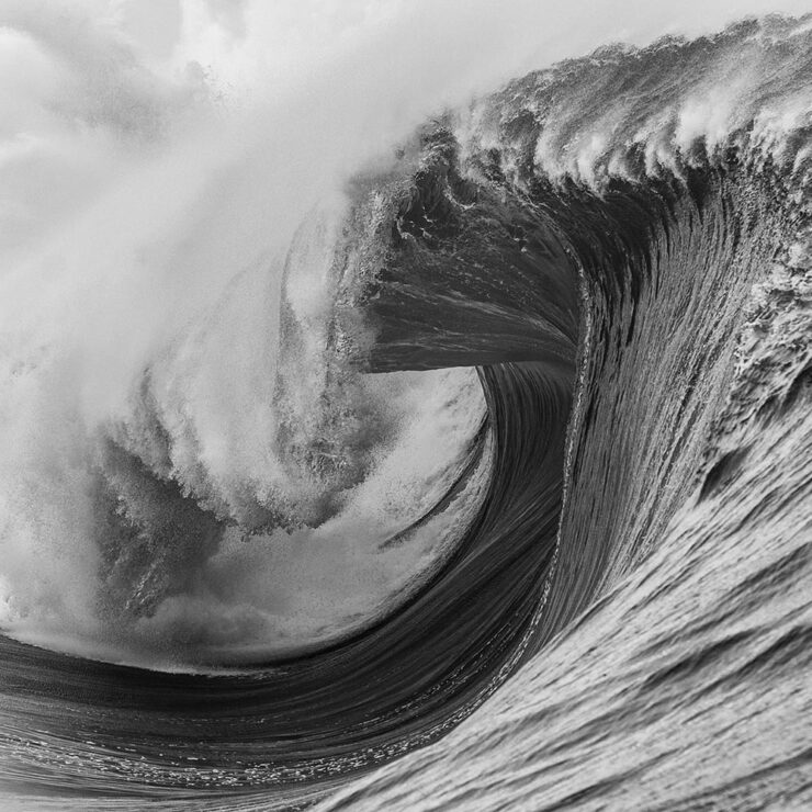
    Tahiti Waves

    Via Kottke and This is Colossal, a great series of ocean photographs from Tim McKenna:

    Heaving Waves (Tahiti). Photograph by Tim McKenna.
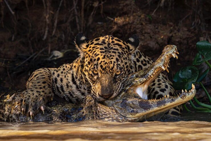
    2024 Wildlife Photographer of the Year

    Via This is Colossal, something quite, uh, jaw-dropping:

    “Deadly Bite.” Photograph by Ian Ford.

    “The 2024 Wildlife Photographer of the Year competition broke its 60-year record with a whopping 59,228 entries from 117 countries and territories,” and is connected with the Natural History Museum in London. (See also the 2024 Bird Photographer of the Year, via the BBC.)

    2024 Astronomy Photographer of the Year

    “The Royal Observatory Greenwich, in partnership with BBC Sky at Night Magazine, announced the beautiful winners of its 16th annual Astronomy Photographer of the Year competition. The images show some of the most incredible cosmic objects and events in the Universe,” PetaPixel writes. (Also noted via This is Colossal, just ’cause.)

    “Shadow Peaks of Sinus Iridum.” Photograph by Gábor Balázs.

    See all the winners at Royal Museums Greenwich.

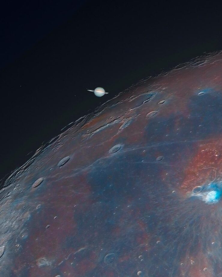
    Not included in that — taken too late to be entered, I understand — is this stunning photograph:

    “Saturn’s Ingress.” Photograph by Andrew McCarthy.
    2024 Natural Landscape Photography Awards

    Last but not least, some fantastic photography in this newish contest, now in its fourth year, set up to “promote the best landscape and nature photography by digital and film photographers who value realism and authenticity in their work.”

    Some of my favorites:

    “Waterton Lakes National Park in Alberta, Canada.” Photograph by Andrew Mielzynski.
    Guatemala Adventure Volcano Panorama. Photograph by Thomas Skinner.
    Nightscape, 3rd place. Photograph by Takeshi Kameyama.

    Via PetaPixel.

    Special Bonus #4: Phil Edwards brings us a history of one the most iconic photographs ever:

    • 1
      Get inside the mind of Peter Mendelsund, the pianist who went from Tchaikovsky to Tolstoy and became one of the best book cover designers working today, with editor Zac Petit’s interview in PRINT’s 75th Anniversary Issue,” with the link at the source article. ↩︎
  • Beautifully Briefed 24.6: Summer of Win (Mostly)

    Beautifully Briefed 24.6: Summer of Win (Mostly)

    In this installment of Beautifully Briefed, let’s take a look at some great posters, great print items, and great photography. Plus, an update from Adobe’s continued campaign to lose friends and attract government attention. Fun stuff!

    GET LECTURED (ON ARCHITECTURE)

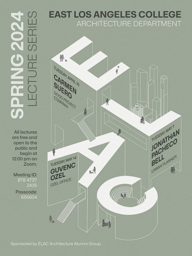
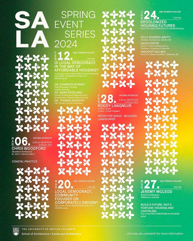
    Back in September, I mentioned Archinect’s Get Lectured poster series. They’re back with the Spring 2024 winners, including these two faves:

    ELAC lecture poster design by Tashfiah Ahmed.
    Lecture poster from the University of British Columbia; designer not listed.

    Great examples of design in a often difficult category. See the rest.

    Architecture Photographs by Hélène Binet

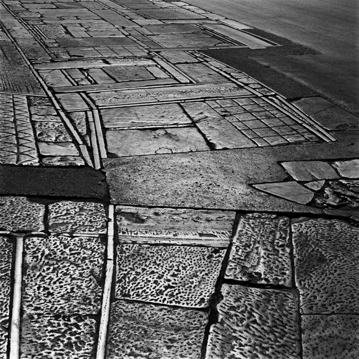
    While we’re discussing architecture, let’s talk about a Dezeen post that caught my eye: photographer Hélène Binet has a new book out, adding to her long career capturing the old-school way — using film.

    “A Sentimental Topography by Dimitris Pikionis, landscaping of the Acropolis, Athens, Greece.”

    This series captures shadows and light with exceptional talent, including the above, where she’s praised for “captur[ing] in a single image the tactile and textured presence of tectonic form, both in built and natural environments.”

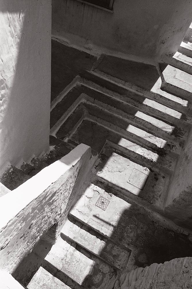
    “Staircases in Sperlonga, Latina, Italy.”

    I love the softer shades of gray than shown in the previous image, and both this and the image below demonstrate a deep understanding of architectural expression.

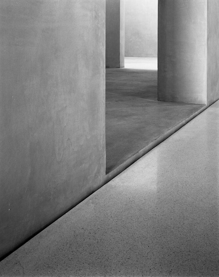
    “Kolumba Museum, Cologne, Germany, by Peter Zumthor.”

    Read the post from Dezeen, see more examples of outstanding work on her website, or buy the book with 170 photographs, essays, and more.

    2024 Audubon Photography Winners

    This is Colossal posted about this a day before my Audubon magazine showed up with these prominently featured, and they’re all winners.

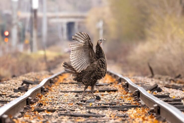
    Wild Turkey, Female Bird Prize Winner, by Travis Potter.

    Bird photography is a difficult skill requiring patience, perseverance, and specialized gear; those who excel at it deserve recognition. Plus, there’s this:

    Audubon’s climate science report Survival by Degrees reveals that two-thirds of North American birds are threatened by extinction from climate change, including species featured in this year’s Audubon Photography Awards like the Blackburnian Warbler, California Quail, and Sedge Wren.

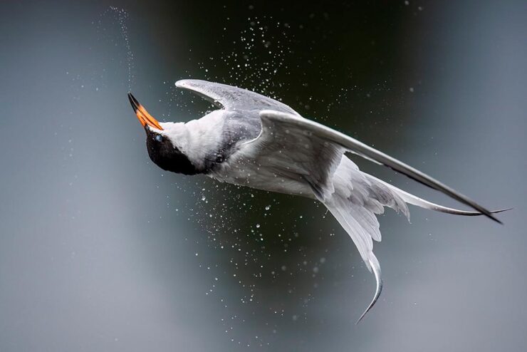
    Forster’s Tern, Professional Honorable Mention, by Kevin Lohman.

    Check out the Colossal post, or see the full story at the Audubon website.

    Special Bonus #1: Kottke points us towards the Siena 2024 Drone Photography Awards. “Look! Up in the sky! It’s … another contest!” Good stuff nonetheless:

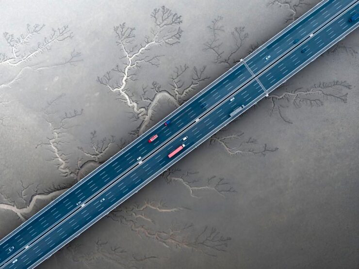
    “Jiashao Bridge” by Sheng Jiang, China.
    PRINT 2024 Awards

    The annual PRINT awards are out, featuring — natch — great items in print, including items like the Smithsonian’s annual report and a Naked Trails brochure. Here are a couple of items from the book design category:

    Jacket design by Robin Bilardello.

    Author sketch and lettering by the author. Also, let’s get the . . . :

    Cover design by Milan Bozic, with illustration and typography by Lauren Tamaki.

    Fantastic.

    Special Bonus #2: Hoefler & Co. brings us Typographic Doubletakes: “While good typefaces have prodigious families of carefully related styles, some of the best typography builds unexpected relationships between unrelated fonts.”

    Left: Chronicle Hairline + Landmark. Right: Vitesse + Gotham.

    Their blog refreshes as you scroll in more ways than one — enjoy.

    Left: Mercury Text + Ideal Sans SSm. Right: Whitney + Operator and Operator Mono.

    Special Bonus #3: Kottke points us to a LitHub post arguing for adding full credit pages to books acknowledging everyone who worked on them. “How lovely it is to be seen and appreciated.”

    Adobe “Too Easy to Hate,” Say Users, Employees

    Adobe continues to score big with the public — in the best Boeing style, a formerly-great company has put profits before users and employees. While successful from the shareholders’ point of view (record profits, again), some are . . . upset. PetaPixel:

    Just over a month ago, an Adobe exec called AI the “new digital camera.” Simultaneously, an Adobe marketing campaign chucked photographers under the bus, and not for the first time, which caught the attention of the American Society of Media Photographers (ASMP). At the very top of Adobe, there is a concerning and frustrating lack of understanding about art and the people who make it.

    Even “exasperated employees implored leadership to not let it be the “evil” company customers think it is;” while that might be a stretch — “ignorant greed” is a better description — either is not a winning look.

    The latest was a terms-of-service update that many saw as a rights grab, allowing the company to use users’ work to train its AI services. While those have been amended, the seemingly clear language — “We’ve never trained generative AI on customer content, taken ownership of a customer’s work, or allowed access to customer content beyond legal requirements” — comes from a company that has lost the trust of users, making those words just that — words. Time will tell if they are truth.

    But there’s more: Adobe’s just been sued by the FTC (via PetaPixel, Pixel Envy) for hidden fees and difficult cancellations:

    “For years, Adobe has harmed consumers by enrolling them in its default, most lucrative subscription plan without clearly disclosing important plan terms,” the lawsuit alleges. “Adobe fails to adequately disclose to consumers that by signing up for the ‘Annual, Paid Monthly’ subscription plan, they are agreeing to a yearlong commitment and a hefty early termination fee that can amount to hundreds of dollars. Adobe clearly discloses the early termination fee only when subscribers attempt to cancel, turning the stealth early termination fee into a powerful retention too that [redacted] by trapping consumers in subscriptions they no longer want.”

    I’m actually glad for this, as I wasn’t aware that my $60+ monthly fee is a payment on an annual plan. (Ug.) Not too big an issue — I actually feel like there’s decent value in the plan and will continue to subscribe for the foreseeable future.

    But I’d also be lying if I said I’m completely satisfied with our business arrangement: alternatives are few and far between. While Adobe does not have a monopoly legally or technically, in the publishing industry at least, they are, for all intents and purposes, the only game in town. It would be nice if they would at least demonstrate a modicum of respect for their users.

    Update, 25 July 2024: “Adobe Exec Says Early Termination Fees Are ‘Like Heroin’ for the Company,” according to PetaPixel. Hmph.

  • Beautifully Briefed 24.3: Bloomin’ Breadth

    Beautifully Briefed 24.3: Bloomin’ Breadth

    The end of March here in Middle Georgia means flowers aplenty, and usually with that, some photography — but I’ve not yet had a chance. (Stay tuned.) I have, however, been saving up links o’ interest: fonts, books, photography, and new(ish) car logos. Let’s go!

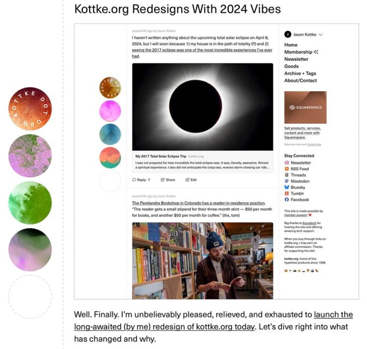
    Kottke Meets 2024

    Starting with one of the very few places that is still around from Foreword’s old days, the always-interesting Jason Kottke:

    2024 marks Kottke.org’s 26th year on the ’net.

    Great new looks for great content, with better Quick Links — the previews are ace — and incredibly-appreciated gift links to places like The New York Times and The Atlantic. If you haven’t been in a while, click and enjoy.

    Fab Spring Type

    With “a plethora of captivating new typefaces,” CreativeBoom celebrates spring with 11 new faces to tempt, inspire, and bring joy:
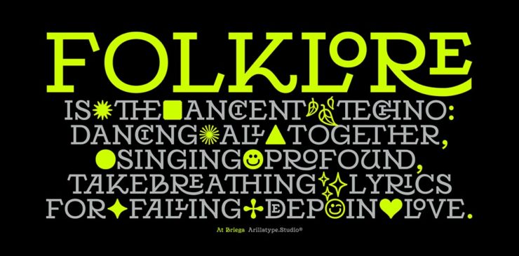
    Arillatype.Studio brings us a thousand glyphs of greatness.

    Zanco, with its bell-bottom style; Seabirds, inspired by 1930s book covers; Module, a “fluke side hustle;” and Graffeur, improvised from gaffer tape and glimpsed in this post’s header image, are all great. My far-and-away favorite, though, is At Briega, “inspired by the concept of hybridisation” and shown above.

    See ’em all here.

    Literary Three-Fer
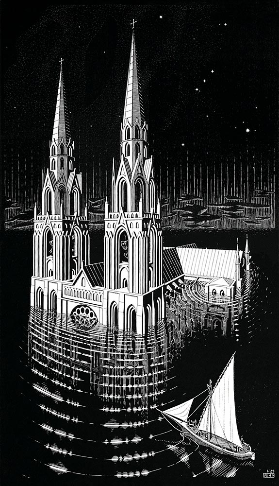
    M.C. Escher’s Lesser-Known Works
    “The Drowned Cathedral,” a 1929 woodcut.

    “Unique perspective” never does justice to someone whose name defines the term. See some never-before-seen images alongside old favorites in a new Escher book highlighted at Hyperallergic.

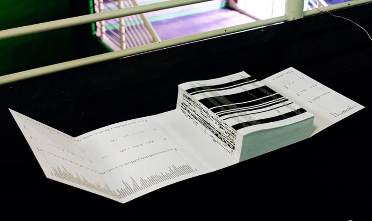
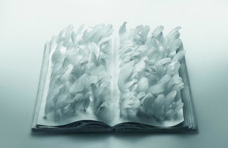
    Multidimensional Libri

    “Experimental books are flourishing, [a]nd the evidence is seen” in this Daily Heller from PRINT: a traveling exhibition on three-dimensional books, all published titles.

    Oh, those Italians. Read on.

    Book Design Snobbery
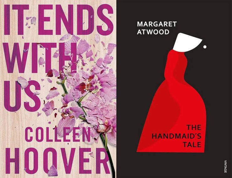
    Hoover vs. Atwood — no joke.

    “Don’t get held back from the simple pleasures of reading,” argues Natalie Fear at CreativeBloq, “not everything needs to be minimalist.” Justification for commercialism or a common-sense explanation for the bookshelves’ current look? You decide.

    Photography Three-Fer
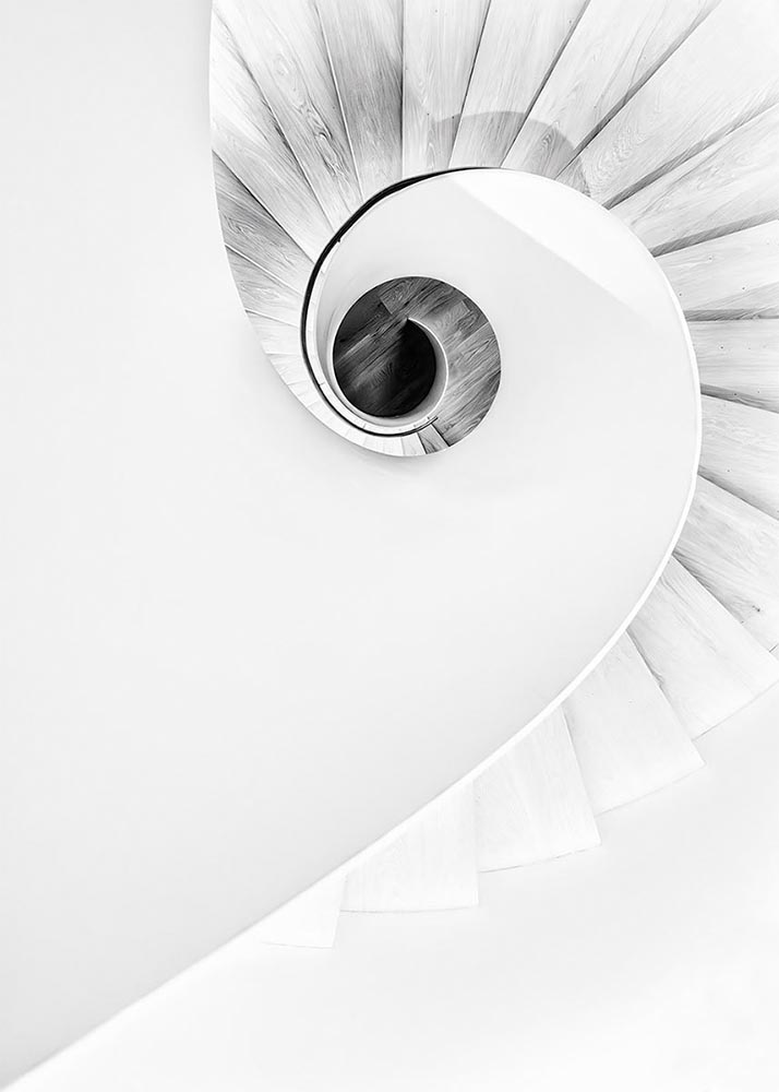
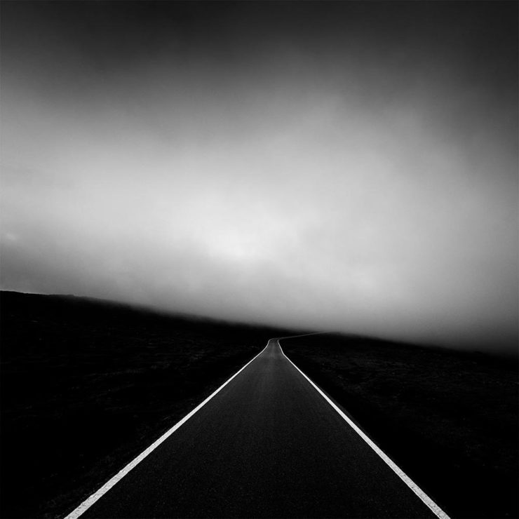
    Winners of Monochromatic Minimalism
    “Black Pearl” by Sascha Kohne. An honorable mention for the magazine, but a winner for me.

    Some incredibly good stuff here — but perhaps more importantly, did you know of Black & White Minimalism Magazine? There’s no end to today’s continued diversification, methinks.

    “Traveling through Costa da Morte, Galicia. 600m above sea level where the mountains separate the Cantabria sea from the Atlantic Ocean,” explains third-place winner Alexandre Caetano.
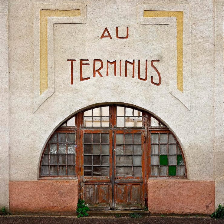
    Aging Facades of France

    “Shuttered blinds, peeling paint, and aging doors don’t usually indicate an invitation, but for French photographer Thibaut Derien, the fading facades of long-closed shops are well worth a stop,” This is Colossal says.

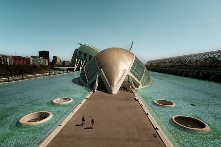
    Sony Photography Awards: Architecture
    The Ciudad de las Artes y las Ciencias (City of Arts and Sciences) in Valencia, Spain: “Hemispheric,” by Eng Tong Tan, Malaysia.

    ArchDaily‘s coverage of the annual Sony awards shortlist announcement was an insta-click.

    New Bull: Now Flat. (And a BMW.)

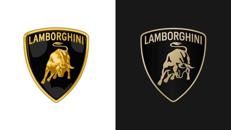
    Lamborghini practically defines flamboyant. So it’s worth a link when their logo gets less interesting:

    Old logo, left, new, right.

    Late at following the industry trend of flat-is-better, because, well, Volkswagen. (Okay, I undersell. Perhaps.) Read the lack of news at Motor11Motor1 also has a decent roundup of new car logos, from 2016-present, which underscores the “flatness” trend. or The Drive, where they manage to convey the brand’s use of the phrase “digital touchpoints.”

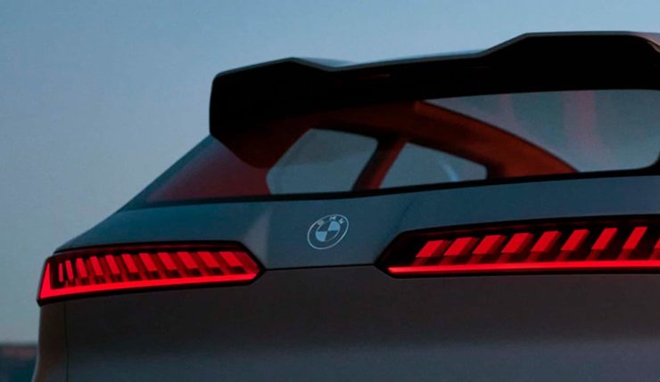
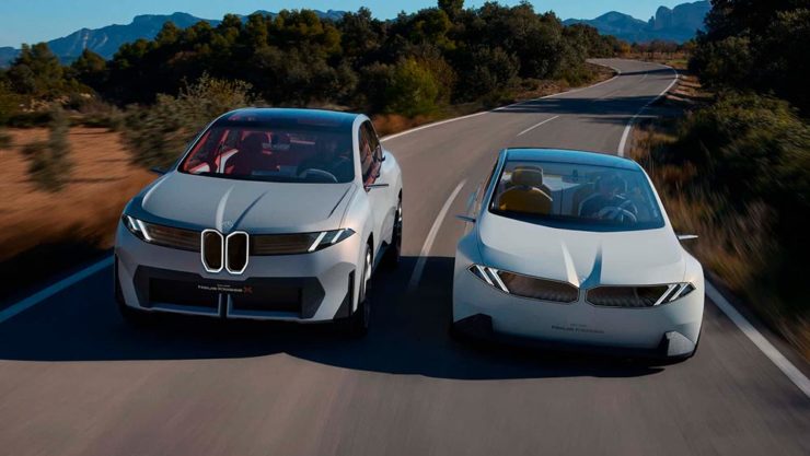
    I don’t know whether this will make any more sense in a few or even many months — which is relevant because of BMW. Four years ago, one of the industry’s design leaders expressed strong this new style, and I didn’t get it. But it’s worn better than most, and superlatively on occasion — check out the logo’s use on the Vision Neue Klasse X:

    Rather than a standalone, plastic part sitting on the paint, it’s etched into the finish. Man, I hope that makes it into production.

    Neue Klasse: do like. Bull? No so much.

    Update, 2 April: BrandNew, itself sporting a new look, has weighed in on the new Lambo style, calling it “not good.” (FYI, BrandNew is a subscription, quite possibly the best $20/year someone interested in design can spend.)

    • 1
      Motor1 also has a decent roundup of new car logos, from 2016-present, which underscores the “flatness” trend. ↩︎
  • Beautifully Briefed 24.2: February Favorites

    Beautifully Briefed 24.2: February Favorites

    This time, book design times two, book cutouts, album covers, and a reflection on my 2023 photographs. It’s one of those Februaries, so let’s leap into it.

    Jodi Hunt’s Great British Design
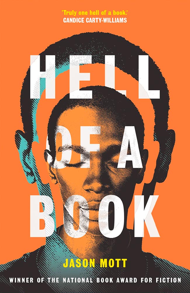
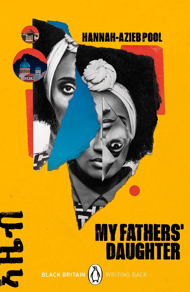
    Screen print by Kate Gibb, lettering by Jodi Hunt, and photograph by Adaeze Okaro.

    You might recognize the above book cover from my 2023 Favorite Book Covers post, a fantastic series of choices that speak to all colors while definitively saying, “Black.” It’s Nice That has a short post talking about Jodi Hunt, who designer that cover — and more.

    Design by Jodi Hunt.

    The screen printing is prominent here, too, and the interaction between that and title are, to borrow a Britishism, “ace.” And the below, with its slightly haunting image treatment (and that great text, lower left), also earns kudos:

    Design by Jodi Hunt.

    Great design, deservedly highlighted. See the other examples here.

    The original Book Design
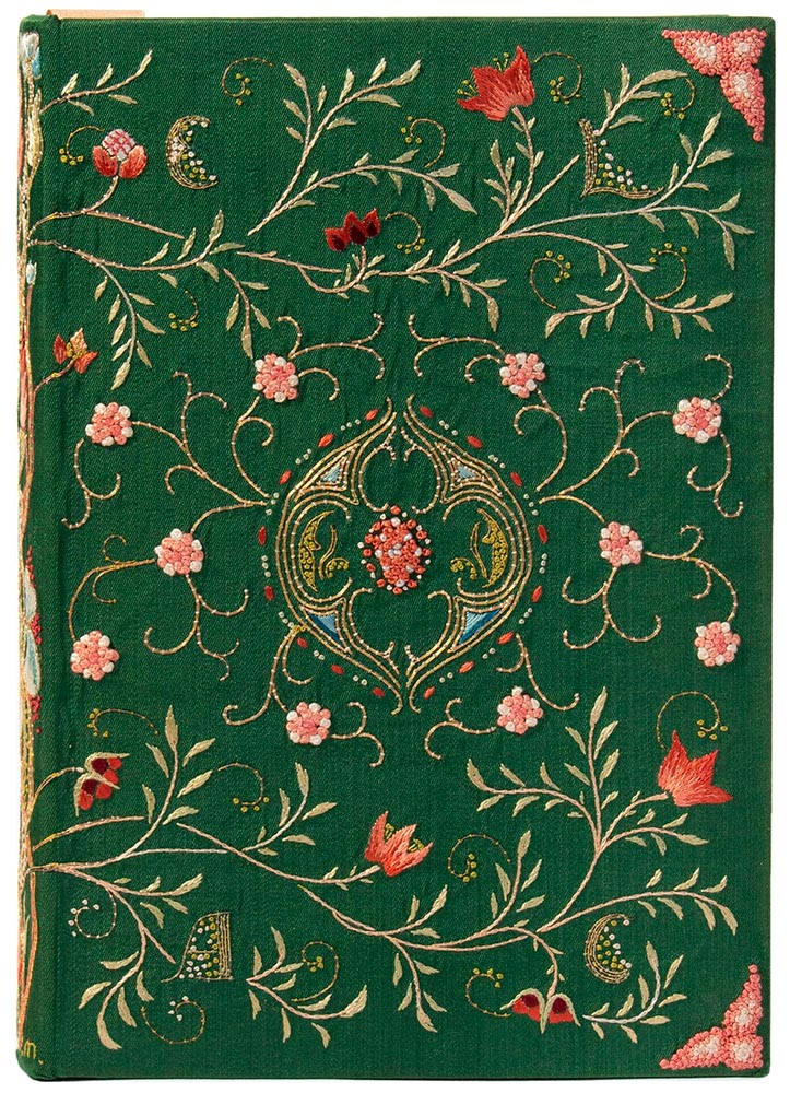
    Ernest Lefébure, Embroidery and Lace: Their Manufacture and History from the Remotest Antiquity to the Present Day (1888), with binding created by May Morris

    Before there was book design, or even graphic design — that is, when books and pages were thought of as art instead of design — folks were still coming up with great book covers. The Grolier Club, “America’s oldest and largest society for bibliophiles and enthusiasts,” has a wonderful exhibit of cover design . . . made up exclusively of antiques.

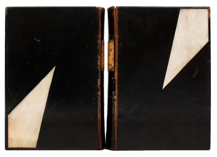
    Lynd Ward, Gods’ Man: A Novel in Woodcuts, 1929, and Madman’s Drum: A Novel in Woodcuts, 1930.

    One of the most memorable artworks […] is a sumptuous but comparatively delicate volume, a 1643 book of psalms created in London. Atmospheric exposure usually turns white silk-bound editions tan and brown, but this cover is a shiny cream color. The polychrome silk and gold metallic threads, which wind around one another to form a colorful floral pattern, maintain an eye-catching vibrancy. The only sign of the book’s age is the oxidized silver “stumpwork,” a type of raised embroidery that in this case resembles beading.

    Elaine Velie, Hyperallergic

    The quote above refers to the book in this month’s cover image, second from left, and is but one where what you see isn’t necessarily what you think it is — it’s more complex, more interesting, made with what the artist had available in the day. Great reminders, all, that book design has a much longer history than what we think of when we hear the term.

    Check out that Hyperallergic article, another on This is Colossal, or, if you’re near NYC, go to the exhibit at the Grolier, 66th and Park. If, like me, you’re not able to visit in person, give them props for also posting the exhibit online.

    Books Manufacture Realities

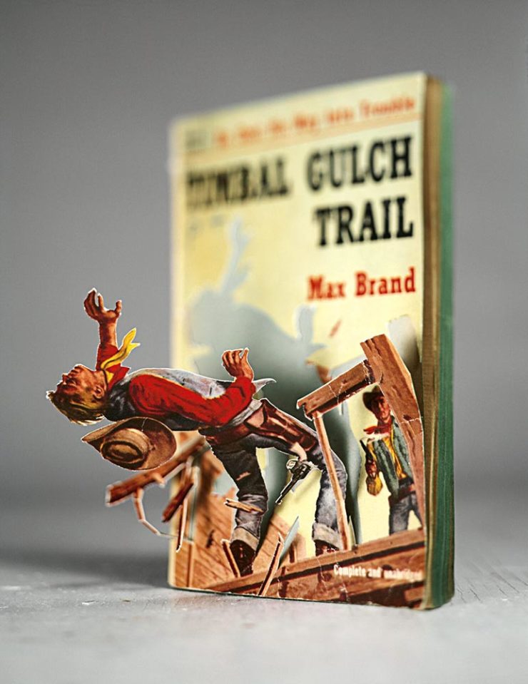
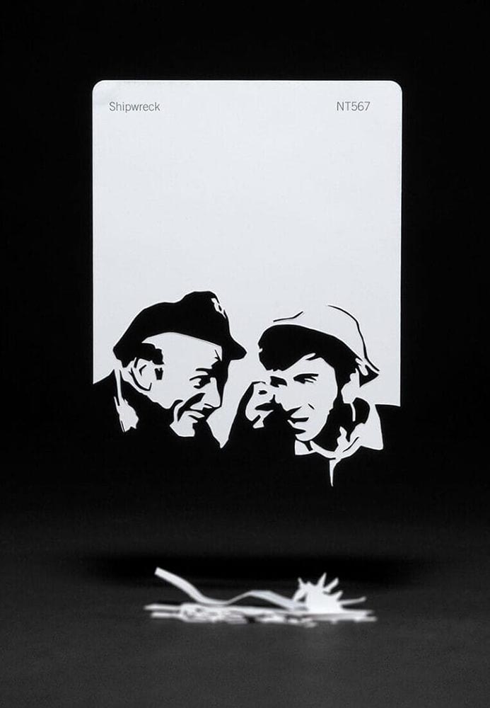
    “Meticulous incisions and methodical folding allow scenes to arise from aged books and color swatches in Thomas Allen’s paper cutouts,” This is Colossal notes — but a picture is worth a thousand words:

    Timber by Thomas Allen.

    The vintage paperback work happened by complete accident. I was cutting into a pulp novel one afternoon with the intent of removing the illustration completely when I noticed that if I left some areas attached, folded the parts carefully, and looked at them from a single vantage point so that everything aligned, they created the illusion of 3D pop-ups. Everything snowballed from there.

    — Thomas Allen, via This is Colossal
    The three-hour cutout: Shipwreck, by Thomas Allen.

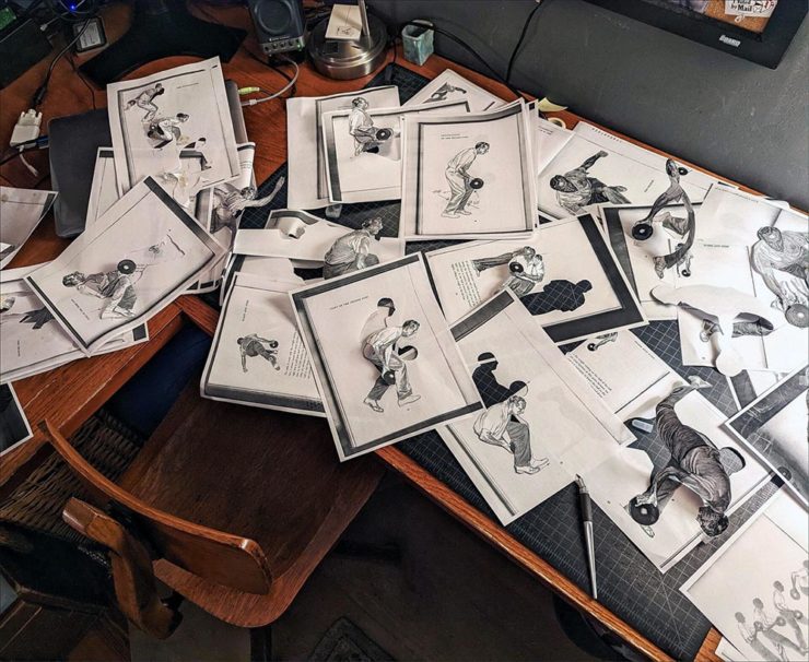
    Here’s his desk — whoa:

    Test cutouts in Allen’s studio, via This is Colossal.

    The article is a must-read. Awesome stuff.

    The Article’s Great — but the Headline is the Point.

    “Virality over Creativity.” Few things summarize the last few years more — it’s always about getting eyeballs, not about truth or quality. It’s satisfying the algorithm. Because, of course, these days, media is social.

    Real or AI?

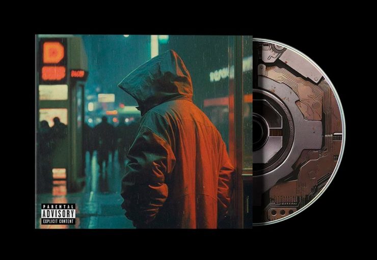
    POV, a new series of articles from It’s Nice That examines, in this case, creativity and AI in design for the music industry. “If an artist isn’t putting a piece of themselves and their experience into the work,” it asks, “why should anyone care?”

    All valid questions, yes. But it’s the headline that provides another potential word of the year: virality.

    The times we live in . . . .

    Some of my Favorite 2023 Photographs

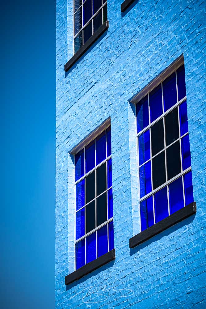
    I’ve updated my photography page with my favorites of 2023, including these two:

    Blue Against Blue Against Blue, 943 Ellis St.

    The above, taken in Augusta, is architecture that doesn’t make me feel blue, while the below, taken on the main street in Sparta, does:

    Bulb Moment, 12745 Broad St.

    A couple of reflections: I didn’t get out as much as I did in 2022, and regret it, and have somehow pretty much eschewed both black-and-white and effects (film grain, light leaks, etc.), and kind of regret that, too. Both things to do differently in 2024.

    That said, six years after investing in a different style of photography, I’m settling in — and looking forward to the future. I hope you are, too.

  • Beautifully Briefed 23.8: Summer Stew

    Beautifully Briefed 23.8: Summer Stew

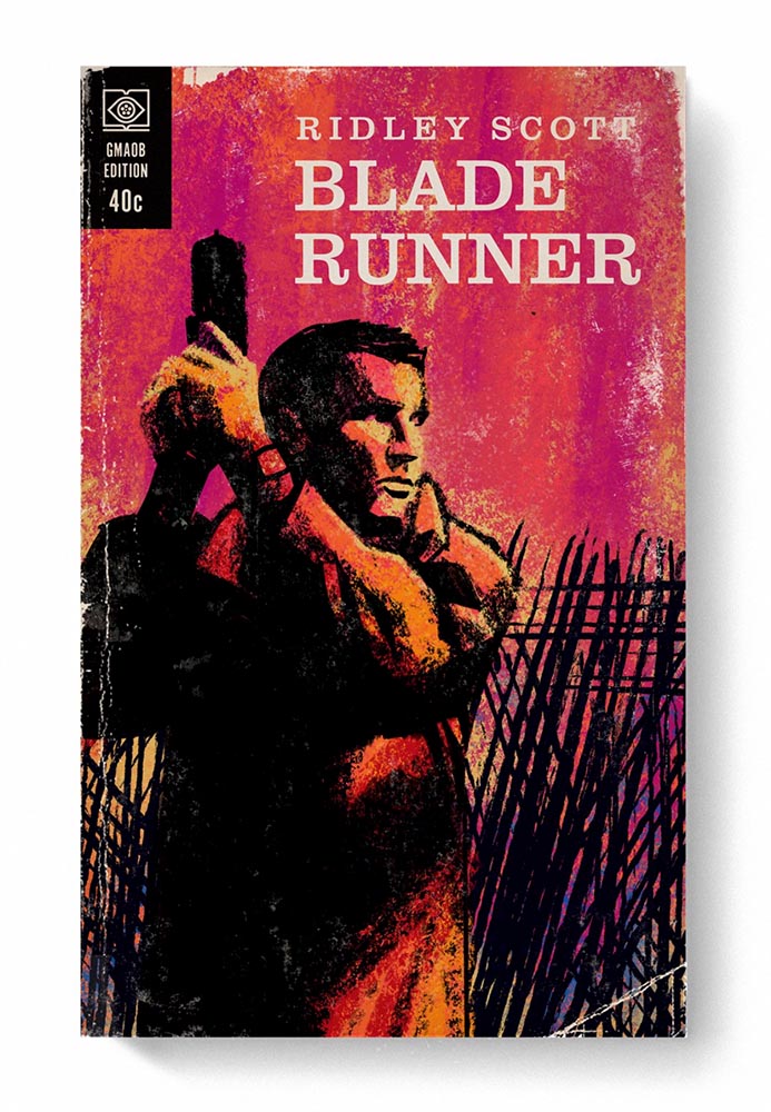
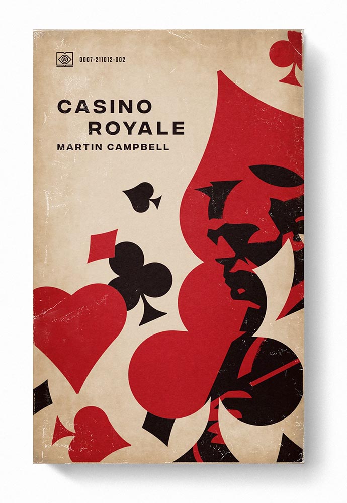
    The August heat is met with some refreshingly cool items for you this time: beloved movies reimagined as vintage paperbacks, graphic design on the Internet Archive, and winners of the 2023 iPhone photography awards. Plus, a bit on social media that hopefully won’t leave an aftertaste. Let’s dig in.

    “Good Movies as Old Books”

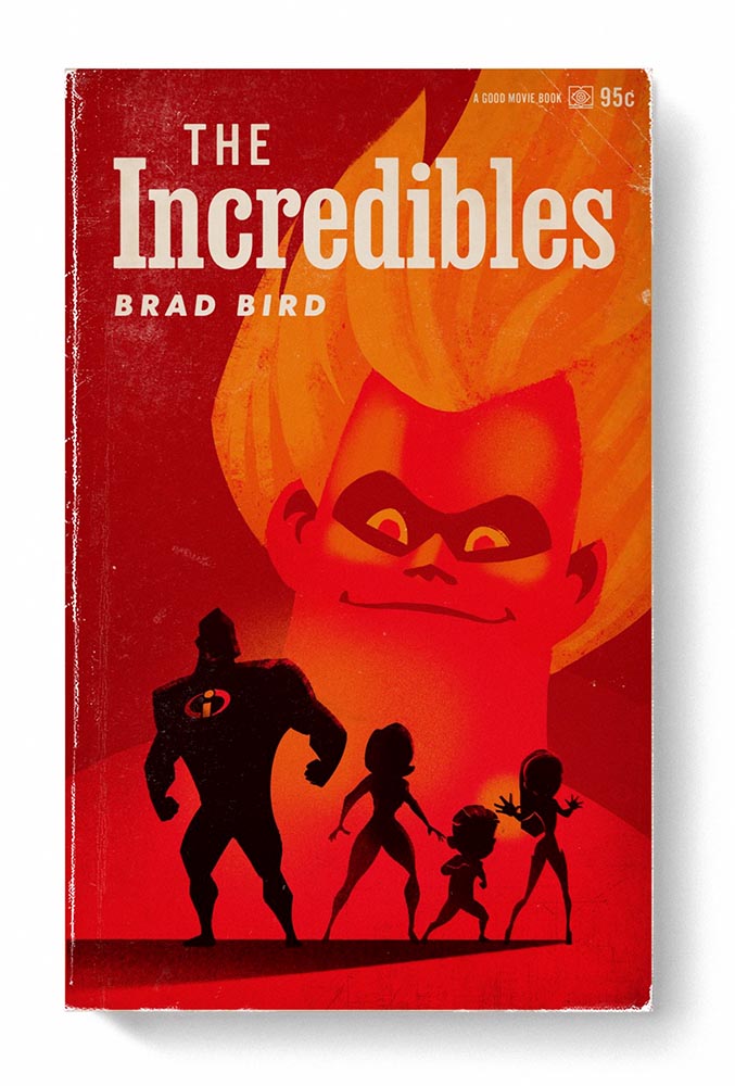
    This is Colossal points us to an extraordinary personal project by graphic designer Matt Stevens: classic, acclaimed movies visualized as vintage paperback books. Everything about these spells “win.”

    From the aged look, illustration choices, and director-as-author to the logo and occasional price, these are all … perfect.

    Volume One is 100 titles, and while that book is sold out, prints are available at his website. The items in Volume Two, due this month, are guaranteed to be awesome.

    Graphic Design on the Internet Archive
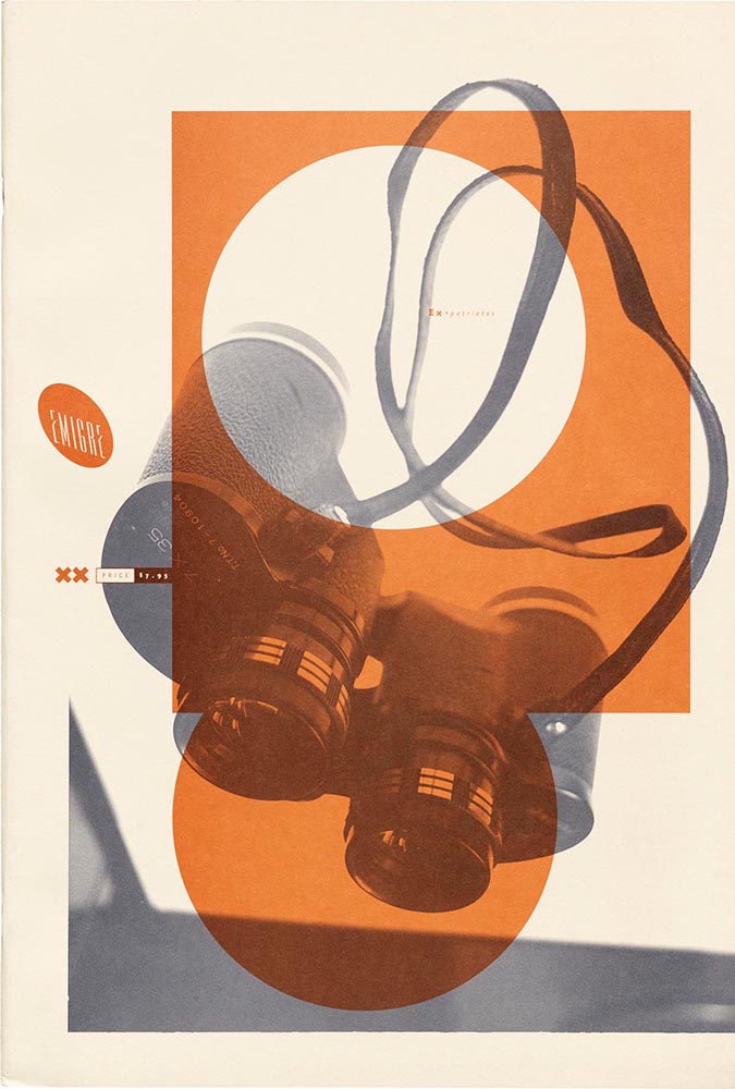
    Emigre #20 – Expatriates. Courtesy of the Internet Archive via archive.digital.

    Another treasure via Jason Kottke:

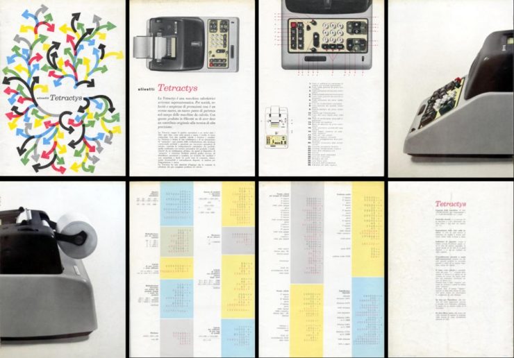
    archives.design is a labor of love site run by Valery Marier where she collects graphic design related materials that are available to freely borrow, stream, or download from the Internet Archive. I’ve only scratched the surface in poking around, but so far I’ve found Olivetti brochures, a collection of theater programs from the 19th and early 20th centuries, several Apple thingsThe Vignelli Canona specimen book of wood type from the 1880s, and many issues of Emigre. What a resource!

    Jason Kottke, kottke.org
    An advertising brochure for the Olivetti Tetractys, circa 1956.

    Some of these are fantastic — set aside some time to explore and enjoy.

    2023 iPhone Photography Winners

    I don’t always link to these contests — it often seems like the publicity (and rights!) are all about the folks holding the contest rather than the people entering them — but I often look, and am always impressed with the quality coming out of a “simple” iPhone.

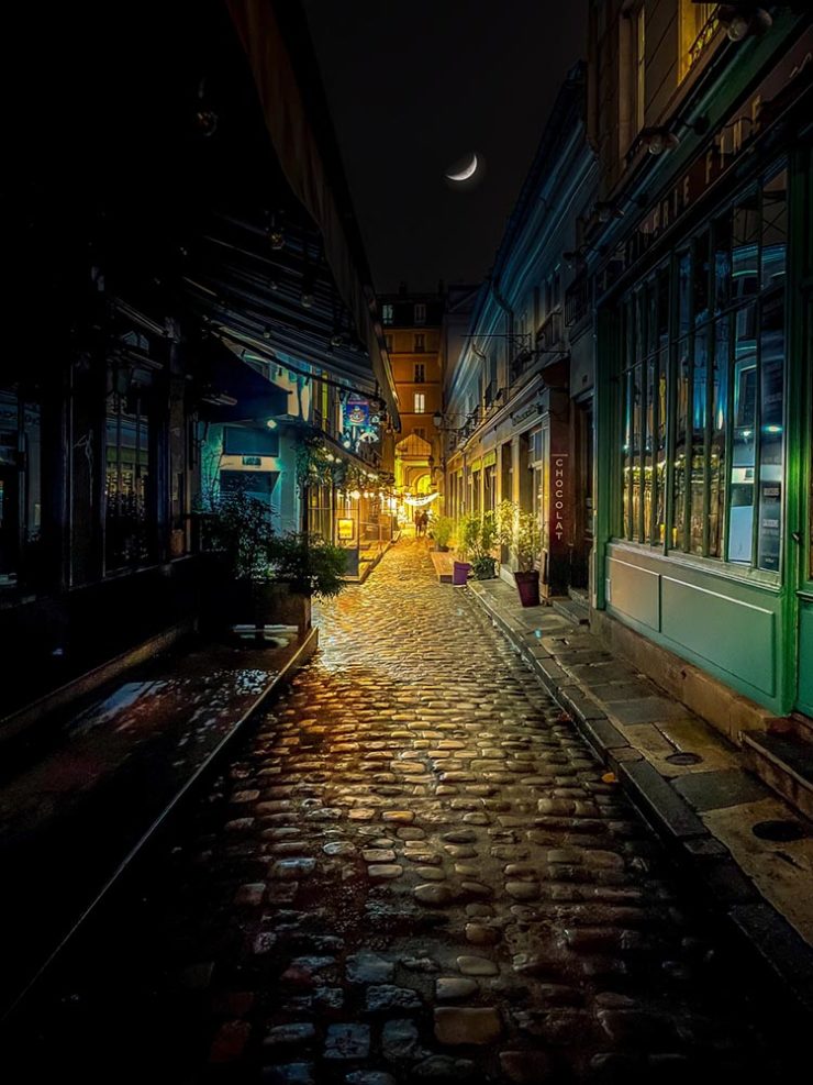
    Long Nguyen, France – 1st Place, Travel – “Last Night before Xmas”
    Scott Galloway, United States – 1st Place, Nature – “Wonder Wheel”

    And while both of the above are (relatively) recent phones, in the latter case showing the macro capabilities of an iPhone 12 Pro Max, even older phones can highlight the talent of the person using it:

    Derek Hager, United States – 3rd Place, Photographer of the Year – “Tucson Morning”

    Shot on a 2017 iPhone X. Nice.

    See all the winners, for 2023 and years past, at IPPAwards.com. (Via PetaPixel.)

    A Moment Regarding Social Media

    I’m not going to spend much time on this; I eschewed pretty much all forms of social media years ago now, and don’t regret it. That said, I do keep up with social media in the meta sense (a word that’s been stolen, as far as I’m concerned, by — wait for it — a social media company), and have noted the pain and concern associated with the implosion of Twitter.

    While this conversation started with Nick Heer and the always-excellent Pixel Envy, it’s obviously evolved as the year has seen one extraordinary cage fight event after another.

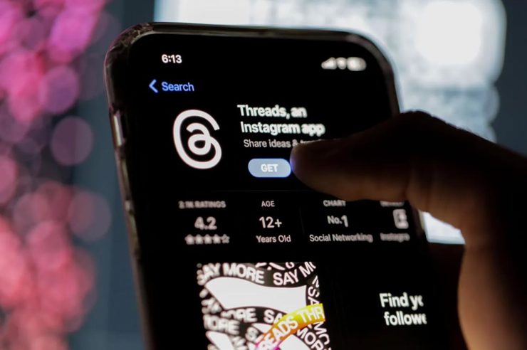
    Threads on Apple’s App Store, via the BBC.

    For the past decade, It’s been all but required for serious brands to maintain a social media presence […] yet instead of scrambling to claim digital real estate across all these newly emerging platforms, some companies are choosing to be more judicious about which platforms they choose to join. In some cases, they’re learning from brands who jumped the social media ship years ago.

    Chris Stokel-Walker, BBC

    The quote above, from the BBC, attempts to answer the question, “Why your favourite brand may be taking a social media break.” Short answer: it’s complicated. I’d argue there’s an even shorter answer — it’s smart! — but for people and brands that aren’t yet established, social media is often key to discoverability.

    This may be especially true for artists, designers, photographers, and others in the self- and small-business-employed creative field. Indeed, let’s go to a great source for those in the arena, Creative Boom, who recently spent a minute asking, “Creatives are saying social media is over… so what next?”

    Like any new craze, it was fun for a while. But there’s certainly nothing new about it any more. Facebook’s now been around for almost two decades. Twitter’s 17 years old. Even Instagram has reached its teens. And while many of us joined these platforms during their fun, “anything goes” eras, when everything was about the users, now it’s all about the algorithms and their use to make venture capitalists vast amounts of money.

    Tom May, Creative Boom

    While I agree that social media is a mess and has been for a while, I’m absolutely not going to tell you to give it up — only to remind you that I have given it up and continue to be completely okay with the decision.

    I do want to ask you, though, to choose wisely:

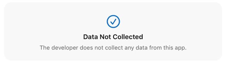
    Facebook’s “Threads (an Instagram app),” their answer to the Twitter/X debacle, as shown via Apple’s iOS App Store privacy report.
    Tapbot’s “Ivory,” available in Apple’s iOS App Store and showing that app’s privacy report, for the Mastodon social platform.

    Enough said. Turn off the computer, go forth, and enjoy a beautiful summer’s day.

  • Beautifully Briefed 23.6: Welcome to Summer

    Beautifully Briefed 23.6: Welcome to Summer

    This time, several items related to books and bookstores; two more — possibly the last two — from the automotive logo category; and PRINT Magazine’s 2023 roundup of great design.

    Book Four-For
    AI book covers? Here, now.

    Creative Bloq, which I wasn’t familiar with, has a post up that’s only here because it’s the first I’ve seen of what is sure to be a trend: AI imagery on a book cover.

    Image: Bloomsbury UK (Also: Where’s the body to go with the head?)

    “Causing controversy,” they say, in that…:

    [F]or a while now, with concerns over copyright and ethics plaguing text-to-image generators. Perhaps the most existential worry of all is the idea that AI could put human artists out of work – and while many still find the idea fanciful, we’re already seeing examples of AI-generated art being used commercially.

    — Daniel Piper, Creative Bloq

    The article itself has a hint of click-bait about it, what with Twitter users spotting a NY Times bestseller but complaining about the UK version of the cover design . . . but the larger question of AI coming for the book designers everywhere is valid.

    Then again, AI imagery has the potential to reshape much of the creative landscape. Let’s hope — hope! — that it’s deployed ethically.

    B&N’s Market Repositioning
    Image: NYTimes (modified)

    BookRiot asks whether Barnes & Noble’s new presentation as “a local bookstore” — something that’s part of the community in a way that Amazon can never be —is genuine, let alone successful. (We have a B&N here in Macon, which I visit infrequently, and which doesn’t feel “local.”)

    Background: The BookRiot article (and the image) above ultimately stem, I believe, from a NY Times option piece from 2018.

    Temples of Books

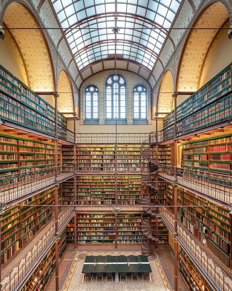
    As regular readers know, I’m a huge fan of combining books and photography. Naturally, great photographs of great libraries strike just the right chord:

    Cuypersbibliotheek, Amsterdam, Netherlands

    As This is Colossal puts it, “Written by Marianne Julia StraussTemples of Books: Magnificent Libraries Around the World celebrates the stunning architecture and quietude associated with wandering the stacks.”

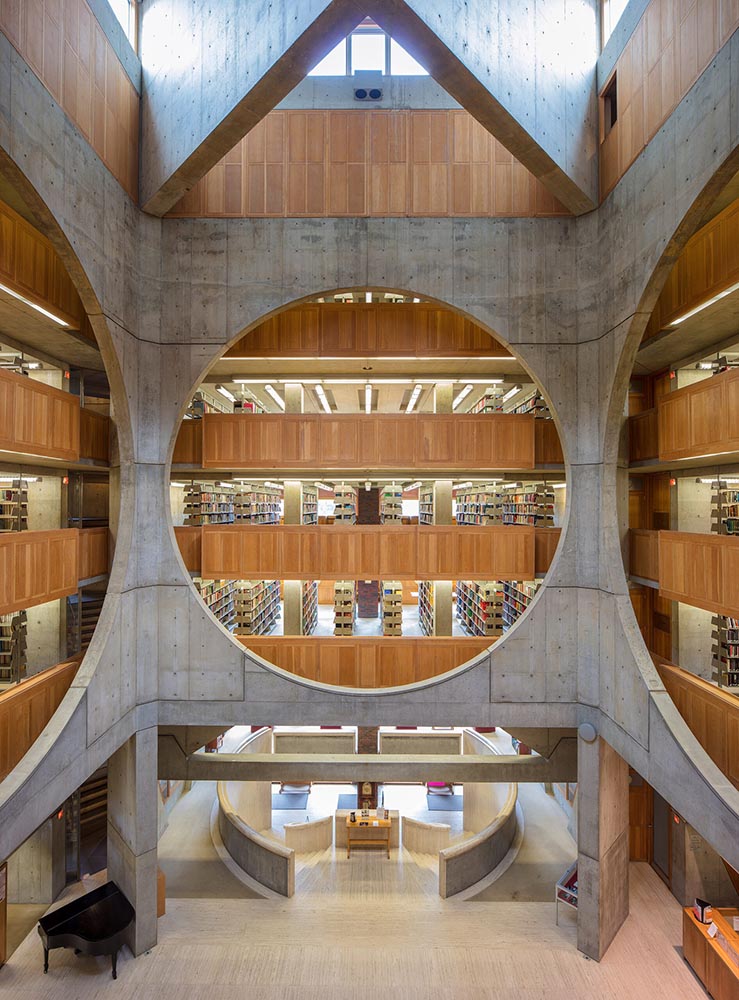
    Phillips Exeter Academy Library, Exeter, New Hampshire

    Positioning these spaces as intellectual havens, Temples of Books highlights their wide array of offerings, including botanic gardens, archival repositories, and of course, room to read. “As an institution that can curate knowledge, scrutinize the status quo, and encourage education, the library is more important today than ever,” a statement says. “This responsibility is only growing as the freedom to publish on all manner of channels increases.”

    — Grace Ebert, This is Colossal

    Instant wishlist item!

    Take Action for Libraries
    Image: everylibrary.org

    Simple brilliance: a handy step-by-step guide on what to do if you don’t like a book at your local library.

    Carmaker Logo Updates: Porsche and JLR
    Jaguar Land Rover > JLR
    No, that’s really it.

    Formerly Jaguar Land Rover, but generally known in the industry as JLR, the British company1Technically, it’s an Indian company, as JLR is a subsidiary of the TATA conglomerate. decided to have a FedEx moment and rebranded. Alas, Paul Rand was unavailable, so there’s no brilliance in the execution. (We’ll absolutely leave whether walking away from Land Rover as a brand is a smart move for another, longer discussion.) Motor1 has the details.

    Porsche > Almost all other mainstream car brands

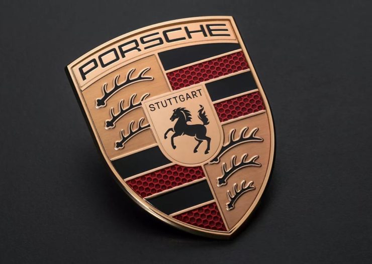
    There’s a new Porsche logo!

    The new 2023 version of the Porsche logo. (Image: Porsche)

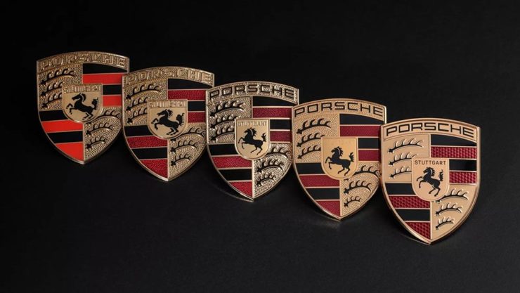
    That’s right: it’s a very subtle change. But it’s a significant one, perhaps because it’s only the fifth in the company’s 75-year history:

    All five Porsche badges. (Image: Porsche)

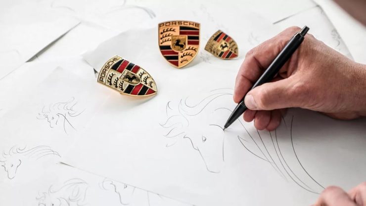
    The biggest changes are the backgrounds and the prancing horse in the middle, which is completely redrawn. (And, yes, has more than a passing — heh — resemblance to Ferrari’s.)

    Not-at-all-staged photograph by Porsche.

    Wallpaper* has the best coverage I’ve seen.

    Bonus: Motor1 has a roundup of every recent (2015+) automotive change in branding. Of course, I’ve covered most of ’em here, too.

    Update: Nissan, already on the updated list above, might be up to something.

    PRINT‘s Best of 2023

    PRINT reminds us that not everything is digital these days — so much of the work still goes on paper or packaging — in their 2023 roundup of great stuff:

    The 2023 PRINT Awards celebrated outstanding design in every shape and form, from the delicate texture and exquisite form of print to digital design that married technical skill with precise craftsmanship.

    — PRINT Magazine

    The best in show is a brilliant environmental design, the annual reports category is oddly satisfying (I didn’t know that Land O’ Lakes is a cooperative that owns Purina, for instance), the editorial category contains brilliance, and many, many more worthy of a design lover’s attention.

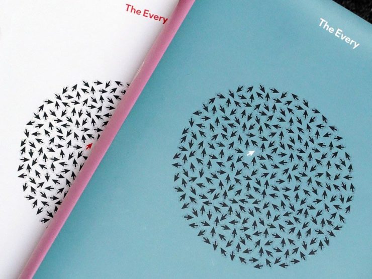
    Sadly, their book design category is a bust. I like “The Every,” but pretty much any of my Best of 2022 picks run circles around it (and the other two choices):

    The Every as photographed by PRINT.

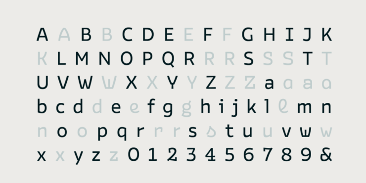
    But there are gems. I really like Bakemono, for instance, a winner in the fonts category and the best monospaced font I’ve seen:

    Italian foundry Zetafonts brings us Bake Mono.

    It’s a long article (they call it a 74-minute read!), but when you have a moment, grab a drink and an iPad and enjoy — hopefully as much as I did.

    And that’s it! Settle into summer, and stay tuned for more soon.