This time: authenticity fake and real, practical photography, and lots more goodness — things you can connect with. Enjoy.
This Month’s Spine
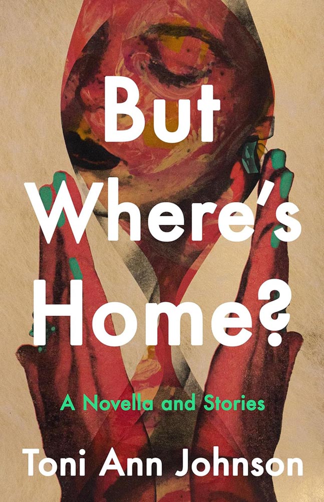
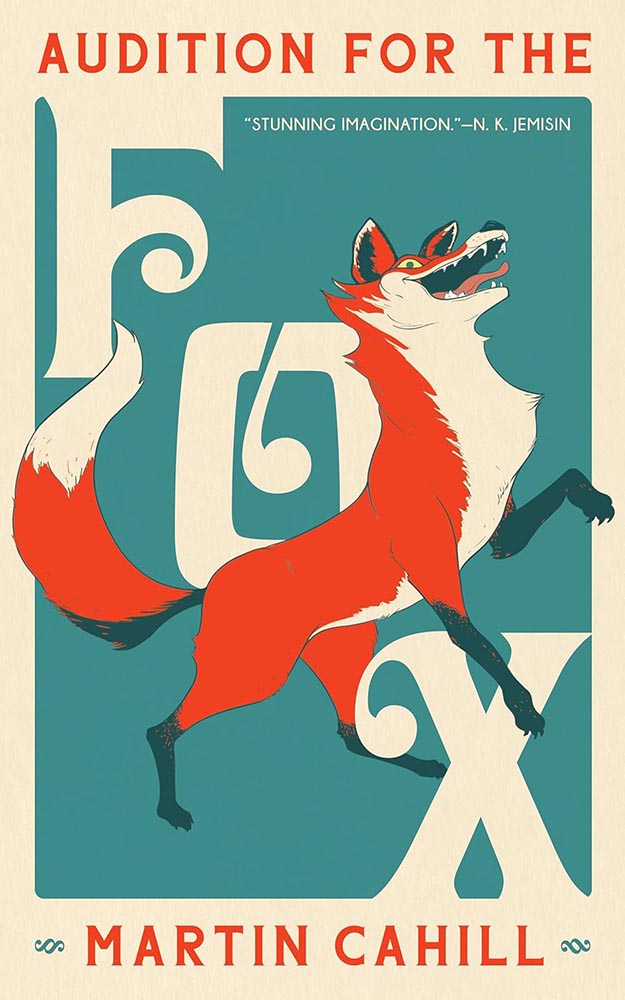
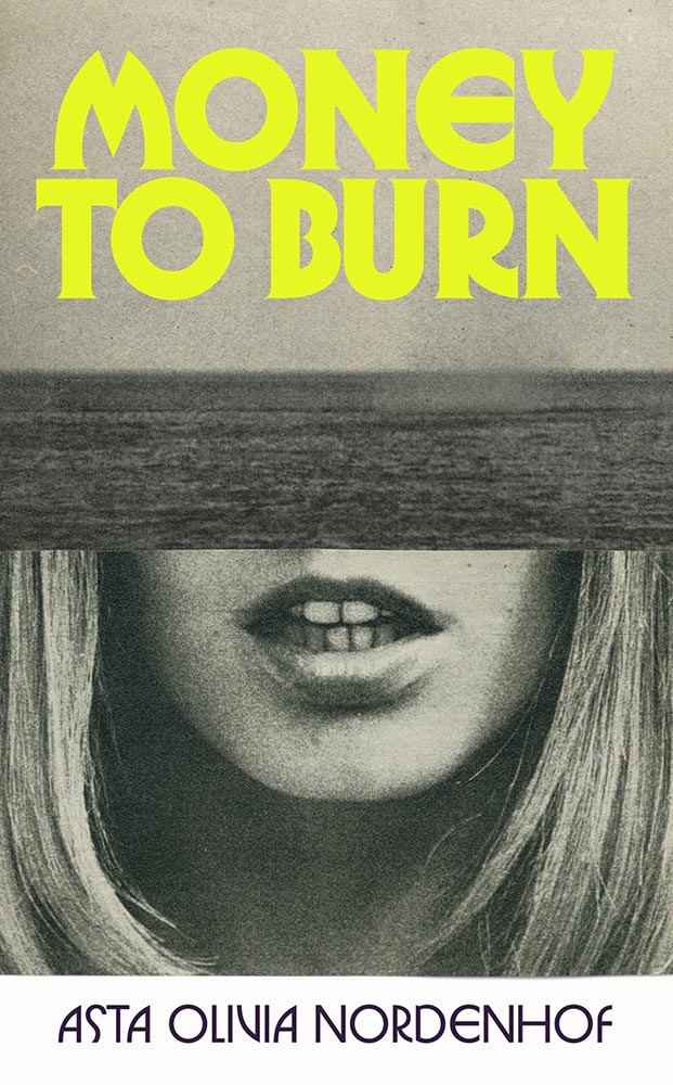
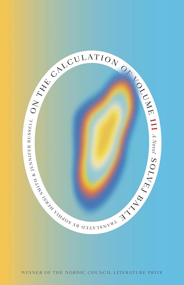
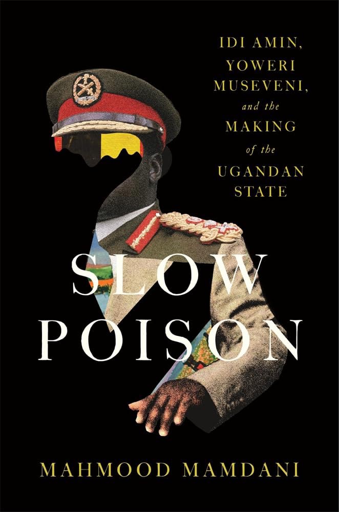
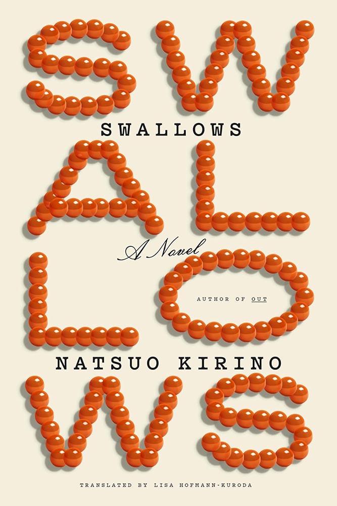
University of Kentucky Press. Cover design by Dominique Jones.
“[T]his collection of connected stories is about a Black family moving to and living in a very white New York town — begging the question that is the title. This is supported by an absolutely superb cover, whose painterly qualities and expert composition evoke emotions and make potential readers want to seek answers,” I said in this month’s University Press Coverage.
“There’s well-done, and then there’s next-level. This is definitely the latter.”
But Where’s Home is one of fifteen covers highlighted this month. Check it out.
Elsewhere in Book Design
While we’re on subject of Spine, Linnea Gradin posted an article — she’s usually a writer for Reedsy — about design trends for ’25 and predictions for this year.
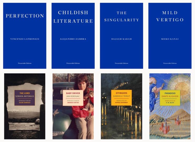
A selection of titles the article calls, “The Serialized Standalone.”
I didn’t devote much time to book design trends in my annual Favorite Book Covers post, so if you’re not familiar with what’s hot in book design at the moment, this article could be worth a moment of your time.
That’s not to say trends aren’t important. I completely (begrudgingly?) acknowledge trends exist and definitely drive design, from book design to logos; however, like so many things these days, trends seem to beare about chasing social media — and I’m not going to celebrate popular opinion when I can celebrate excellence.
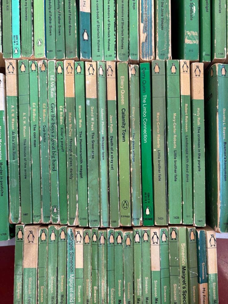
A selection of 1960s Penguin crime novels.
Meanwhile, Jason Kottke posted a link to The Case of the Green Covers, a risograph-printed zine that documents the history of the “Green Penguins”, “a series of hundreds of crime novels published with green covers by the UK publisher Penguin in the 1960s.”
After years and years of doggedly collecting what are commonly called “Green Penguins,” a series of hundreds of crime novels published with green covers by the UK publisher Penguin in the 1960s, I’ve both mounted an exhibition of the collection, and created a zine that documents the history of the books, their design, and the designers that made them. The content in the zine is an expansion and re-crafting of the writing I did about these books here, on the Justseeds blog, for my old Judging Books By Their Covers series (you can read those HERE).
— Josh MacPhee, Justseeds
Great stuff. If you’re in Philly, go see the exhibit — “held at Tomorrow Today, a very cool art & politics bookshop that recently opened,” Josh writes — but if not, the zine might very well be fun.
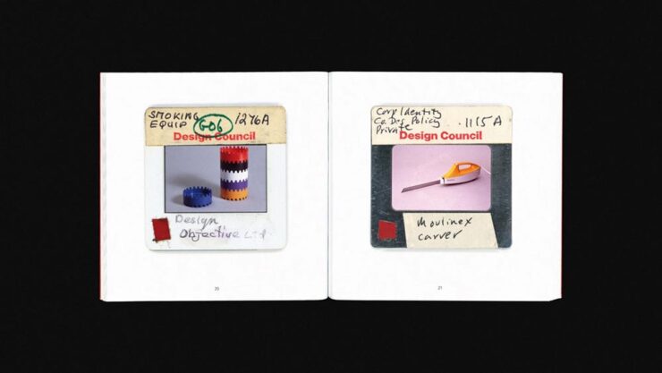
Special Bonus #1: It’s Nice That highlights a new title from the British Design Council:
Tucked away in a Manchester Metropolitan University archive lies 22,000 photographic slides of iconic British post-war design, ranging from the grand (a high-speed passenger train, for example) to the seemingly inconspicuous (plush bean bags and stackable ashtrays). These 35mm slides were made between 1948-1994 by the UK’s Design Council […] as a means of cataloging and preserving the UK’s design history, alongside a select handful of items from abroad. Now, Projecting British Design, a book published by the modernist, documents a selection of 100 of those slides — in the process demonstrating the vast array of objects that have changed the way we live.
— Olivia Hingley, It’s Nice That
I do wish the collection were online, but the post is cool — there are a bunch of examples — and the book will be fun for aficionados of British design, no matter the era.
Faking Analog
Elizabeth Goodspeed, by now a regular here on Foreword, has a new column up at It’s Nice That, in which she posits on imperfection as a design strategy: “Faking ‘realness’ on a computer doesn’t get us anywhere new.”
By now, the central point — “[f]or every person declaring that analogue is back, there’s someone offering the same explanation why: AI and other digital tools have made perfection cheap, fast, and easy, so imperfection now signals authenticity” — is generally accepted in design circles. (See comments regarding trends, above.) But she asks a better question: “But if analogue only matters as a foil to the digital, why are analogue aesthetics being embraced without analogue tools?”
She provides a lovely — and classic — graphic.
“[T]his suggests that what’s being described as an “analogue revival” is less a material shift than a semiotic one. Terms like “handcrafted” no longer reliably describe how something was produced, but how an image wants to be read. Whether something was made with ink, a brush, or film often seems secondary, if it matters at all. What’s actually taken on weight is the idea of analogue, and the set of values now projected onto it.
As ever, the blame doesn’t fall on artists (or even the people selling texture packs). The practical reality is that most people no longer have the time, tools, or support to make fully analogue work, even if they want to. The creative infrastructure that would make it viable – materials access, slower timelines, financial stability – isn’t widely available. Designers and illustrators are stuck in a bind: analogue signals value, but digital is what’s feasible.”
— Elizabeth Goodspeed, It’s Nice That
It’s another case of I-could-quote-the-whole-thing-but-should’t, of course — so please just go read it. Because she’s right: it’s a trend, it’s a response, and it’s something that needs to be recognized. (Additional teasers for the article: a stack o’ pancakes and pre-stained Prada. No mention of who’s wearing it.)
Actual Analog
A three-fer for you:
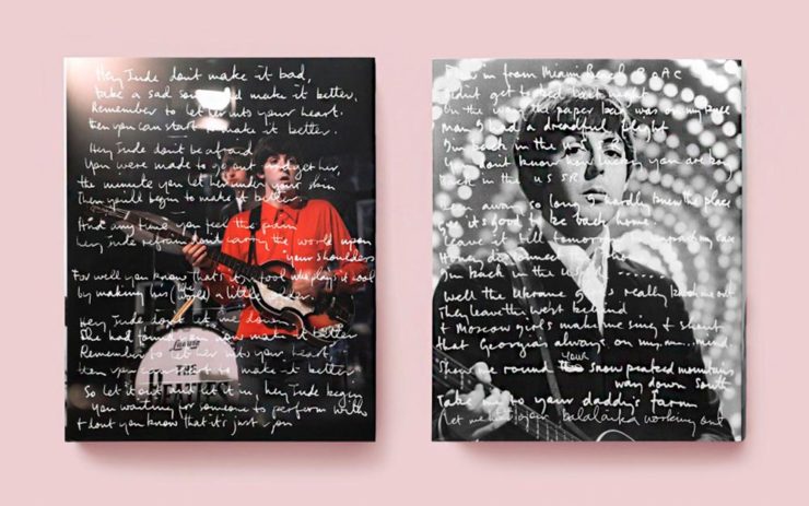
Cover design by Samantha Hahn.
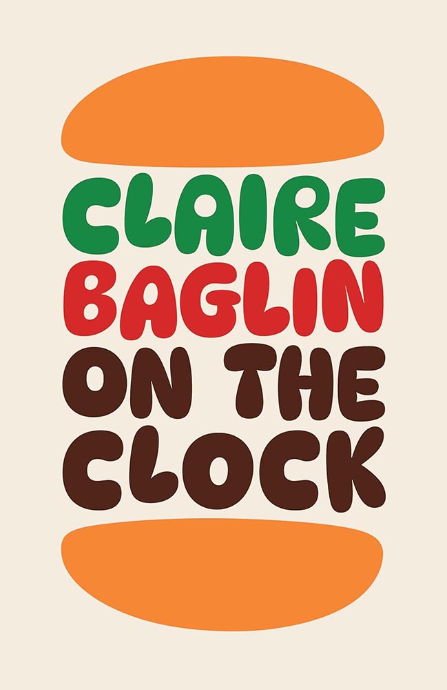
• From Spine, a book cover where analog — that is, actual composition of items, arranged and photographed, won the day. See the other options presented.
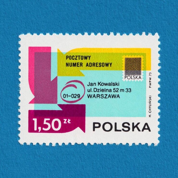
A lovely additive-printed stamp from Poland.
• From It’s Nice That, via Kottke: lovely collection of stamps. If you’re into great examples of “graphic design in miniature,” “from the recurring Olympics theme to the colourful modernist designs” — and you can stomach Instagram — you can enjoy daily goodness. If not, there are plenty of still to choose from at the links.
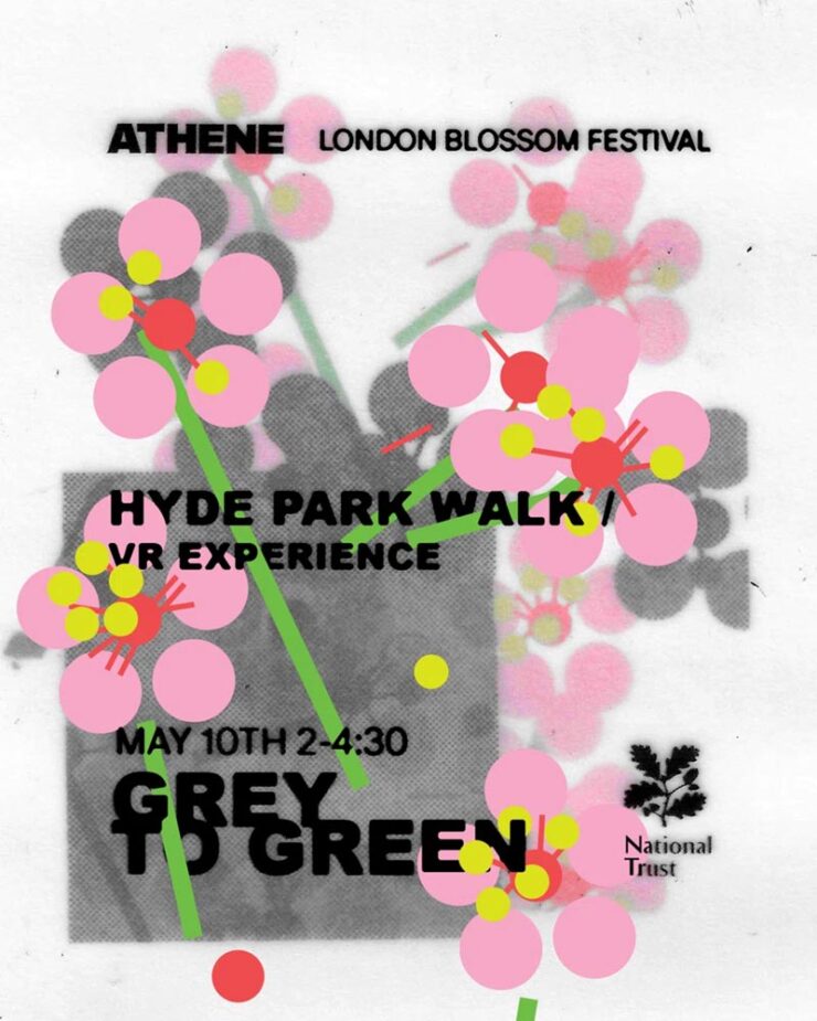
Flyer design by Cat Duncan.
• An identity for Athene Club, a women-centred run and hike club in the UK, designed by Cat Duncan. Done in a style that’s awesomely analog — okay, okay, there might be a computer involved — and started before it became a trend. (Also via It’s Nice That.)
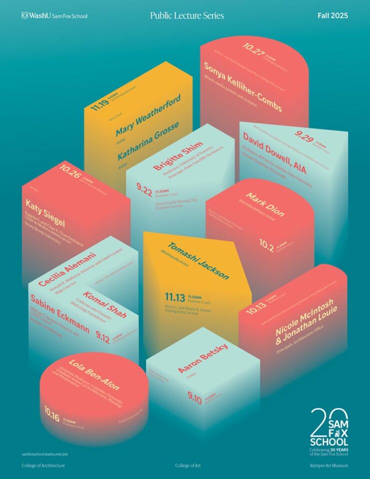
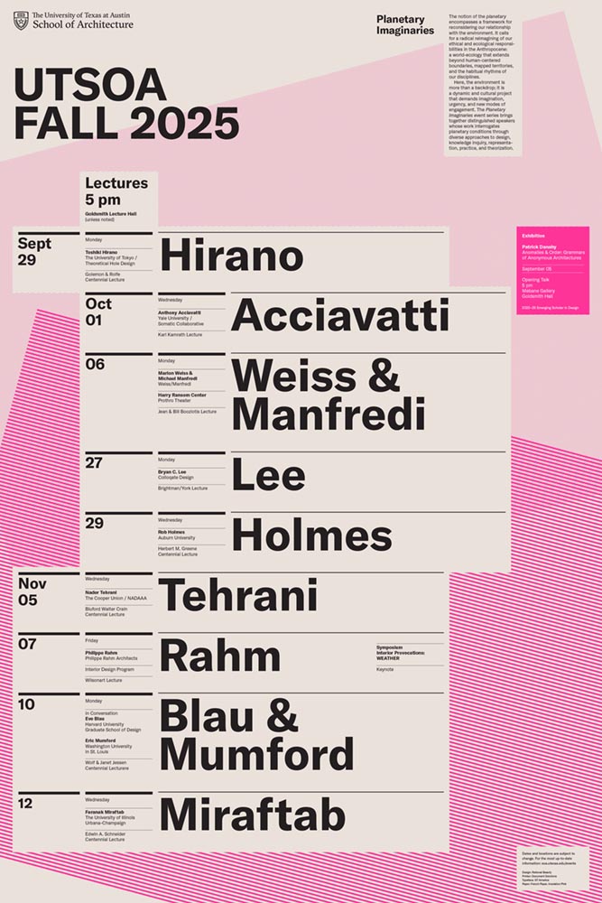
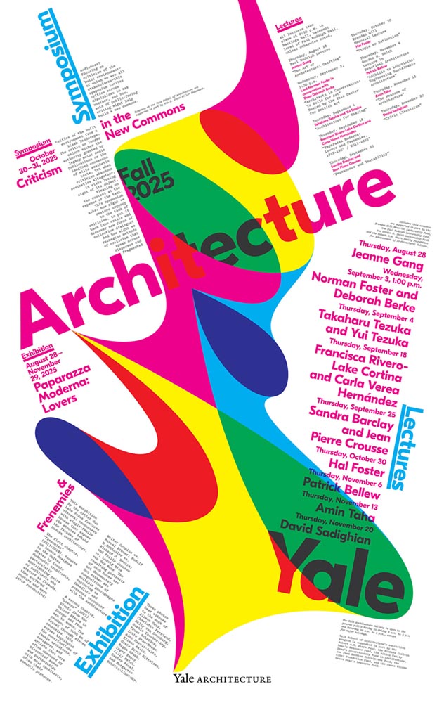
Architecture Poster Favorites, Again
Archinect‘s ongoing series of architecture school lecture posters (previously) highlights examples that continue serve an informational purpose with fantastic design:
Washington University.UTexas at Austin. Yale University.
Although their contest for readers to vote for their favorite closed yesterday, it’s not the winner — it’s that they all pretty much win. See the whole list. (And get a head start with the Spring ’26 posters with one from Pratt.)
Your February Fonts
CreativeBoom‘s usually-monthly roundup of new fonts includes some I’d like to mention — and hopefully use. (Is typeface addiction a thing?)
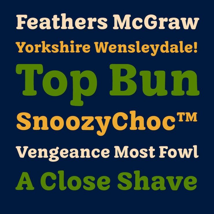
WG Buttered Crumpet by Jamie Clark Type
Yes, absolutely, the name has everything to do with Wallace and Gromit.
“The finished typeface – Buttered Crumpet – gives Aardman [Studios] a timeless, familiar tone of voice with bundles of charm. It includes over 200 characters, covering all Western European languages, and was designed in a single, carefully crafted weight with room for future expansion,” Clark writes. “As a Bristol-based designer, it was a joy to create a lasting connection with my home city and one of its most renowned creative studios.”
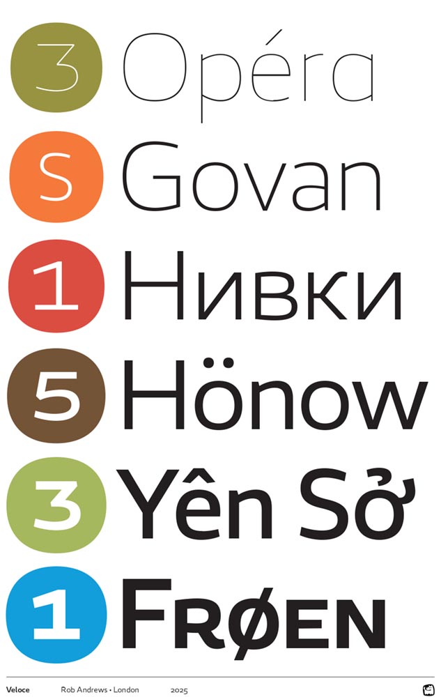
Veloce by Rob Andrews
Yes, absolutely named after an Alfa Romeo.
“Veloce began as a single-weight studio font and grew into something with real range. Clear and neutral, with enough personality to avoid feeling anonymous, it’s a strong choice for both body text and signage,” CreativeBoom writes. “What really sets it apart, though, is the language coverage. […] It’s an unusually thoughtful decision for a debut, reflecting serious long-term thinking about global communication.”
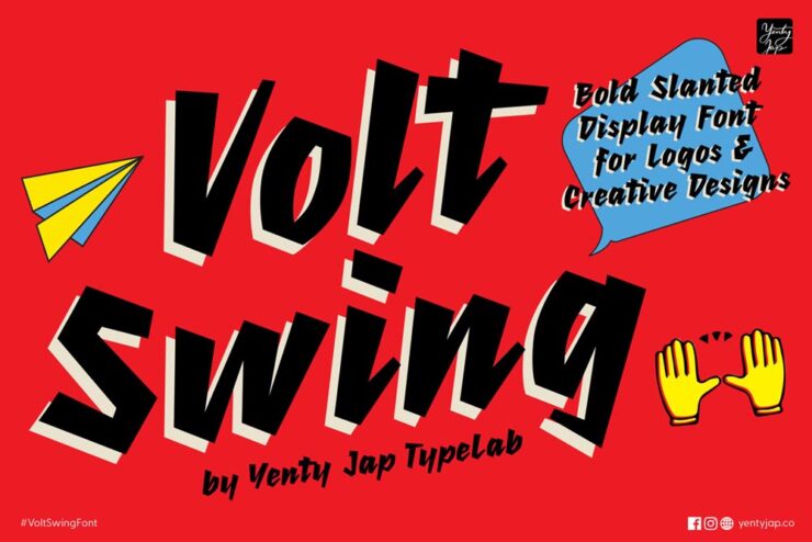
“[A] font born from a spark of energy and a little nudge of mischief. It started as a scribble with attitude, leaning forward like it had somewhere important to be — and honestly, it still does,” Yenty Jap writes on her site. “YJC Volt Swing carries that charged-up spirit into every letter, giving your words a bold voice that feels alive, confident, and just a tiny bit rebellious (in the good, hug-you-after kind of way).”
(CreativeBoom had listed — and spoke well of — YJ Knotted Ink, something completely different, while using pictures from YJC Volt Swing. Oops.)
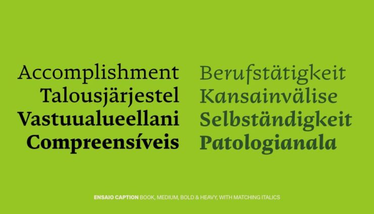
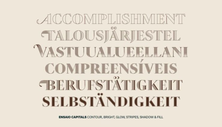
Special Bonus #2:PRINT says, “From DSType Foundry [and] designed by Dino dos Santos in 2025, Ensaio feels like a modular system for book design.” The caption flavor is my favorite — but they’re all awesome.
“Rather than having one set of forms stretch across every application, it’s built into four purpose-built variants: Text, Cover, Caption, and Capitals — acknowledging that the typographic needs of a novel’s body copy are fundamentally different from those of a cover or a footnote,” PRINT says.
“Yes,” this book designer agrees.
BMW-Alpina, Again
Last month’s Beautifully Briefed mentioned the new BMW-Alpina wordmark. (I incorrectly used the word logo, ’cause someone did in something I read and I repeated it without thinking — sorry). The actual logo, which is to say, the badge you’ll see on the vehicles, the website, and some marketing materials, has now been made public:
Still an exhaust and crankshaft, but in the “flat” style also used by BMW (and countless others — see trends, above).
Parenthetically, BMW has suggested that at some point their logo will be etched into the paint rather than a chrome add-on (as on the concept, below), or possibly used as a backlight on the grille (much more trendy likely, I believe):
From the Vision Neue Classe X concept.
In any case, here’s a before-and-after, courtesy of The Autopian:
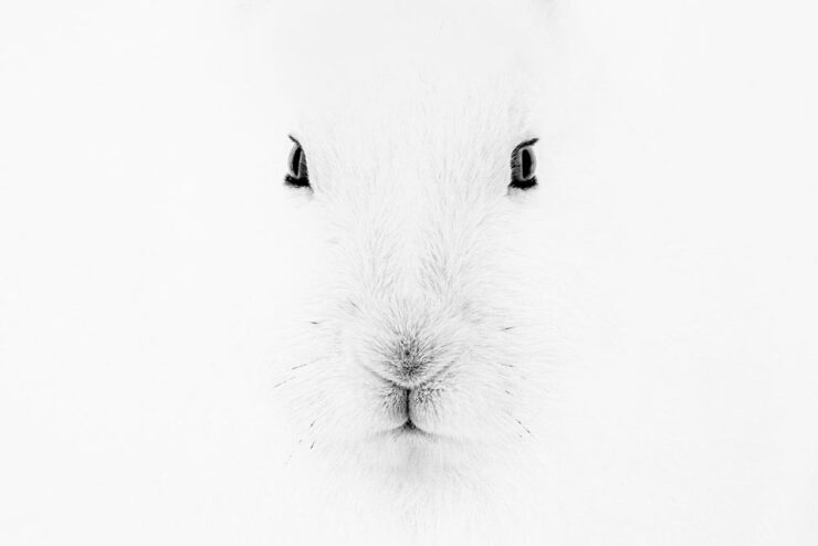
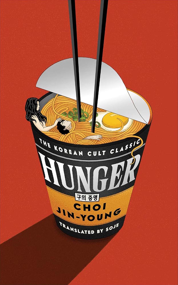
MacFilos‘ title for their profile of Italian photographer Marco Ronconi suggests a certain negativity — which, in a way, is true. But in the positive sense.
Face to Face (Arctic Hare). Photograph by Marco Ronconi.
He “masters the art of reducing his images to what is essential. By omitting everything he believes to be unnecessary, even colour, he creates unusual wildlife images.”
An image from the Chiaro | Scuro Project. Photograph by Marco Ronconi.
Special Bonus #3: “Berlin-based Italian photographer Paride Ambrogi recently combined two of his loves, photography and pasta, in a brilliant, possibly tasty way,” PetaPixel writes. “Ambrogi made the Ravihole Camera, a working pinhole camera made entirely from fresh pasta dough.”
Al Dente Photography.
SINWP Bird Photographer of the Year 2025
Bird photography is an incredibly specialized skill. So contest winners are usually pretty amazing photographs. These absolutely don’t disappoint:
Photograph by Liam McBride.
“With over 2,200 photographs submitted from around the globe, the SINWP Bird Photographer of the Year 2025 competition has revealed a stunning celebration of avian beauty, from kingfishers and bald eagles to owls, flamingos, and countless species beyond. The diversity and quality of the entries have been truly breathtaking,” a press release reads. The contest benefits the Royal Society for the Protection of Birds, or RSPB.
Photograph by Emma Brooke.
That’s Society of International Nature and Wildlife Photographers, by the way. See more at PetaPixel.
Sony World Photography Awards Open Competition Winners 2025
Sony has announced the “10 category winners and the 120 shortlisted photographs from its Open competition, which recognizes the best single images captured by photographers worldwide in the past year.”
Winner, Architecture. Photograph by Markus Naarttijarvi.
Photographers do not need Sony cameras or lenses, only talent — of which there’s plenty.
Shortlisted, Motion. Photograph by Christoph Oberschneider.
As is often the case, I prefer some of the shortlisted photographs to the winners. Like the skier above, or this dystopian, almost science fiction shot from Asia:
Shortlisted, Architecture. Photograph by Utshaho Gupta.
A couple of celebrities, lots of great portraits, and many of nature. That latter category has what’s probably my favorite:
Winner, Natural World and Wildlife. Photograph by Klaus Hellmich.
“The World Nature Photography Awards were founded in 2020 with the goal of not only promoting the world’s best nature photos but also inspiring people to connect deeper with nature,” PetaPixel writes. “WNPA partners with Ecologi to plant a tree every time someone enters the competition as well.”
“Shy but Still Majestic.” Silver, Black and White. Photograph by Ross Wheeler.
“This year’s winning images are a powerful reminder of both the wonder of our planet and the importance of protecting it,” a press release perhaps understates.
“Stoicism in a Sandstorm.” Gold, Behavior — Amphibians and Reptiles. Photograph by Dewalkd Tromp.
Special Bonus #4: “My photography boomed when I stopped looking at social media,” Ivor Rackham writes at PetaPixel, with tips and ideas for successful business alternatives aplenty.
Cold and wet — but happy. Photograph by Ivor Rackham.
Interesting comparison to soap operas — or is that soapboxing? You decide, but I’d argue that his photos prove some talent.
The flowers are just starting to come out here in Georgia. May spring bloom for all of you, too. See you soon.
When it comes to describing 2025, “tumultuous” is probably an understatement.
So it’s probably not a surprise that, when looking at the hundred covers that make up this list, there’s a definite direction: favoring quality over quantity. Which is to say, consciously or not, I’ve tended to prefer designs where more is said with less.
Perhaps I’m striving for calm in a world that just … isn’t. Perhaps it’s my choice not to participate in social media and its race for likes, loves, and “latests.”1Publishers need to remember that not all of their customers select what to read based on influencers, what they see on Facebook, or by doomscrolling Instagram. Some of us are lifelong learners, have hundred or thousands of books, and discover by … reading. Real articles, by real people, on websites with those people’s real names on them. (Or even, occasionally, this thing called paper.) Perhaps it’s my advancing age — closing in on 60 now — and thus “old-fashioned” standards.
In fact, it could be said that I value not keeping up: I don’t want to highlight the trendy. I want to celebrate great talent, design that’s standout in its day but will still be great as time passes.
However, it’s appropriate to emphasize that these are my favorites. Others might say “best,” but I’ve been in this business long enough to know that there’s always another title you haven’t seen or read about, and I don’t want to disrespect any of the talented book designers whose work I didn’t see, and consequently didn’t feature. I’ve tried to include design credit where I could — many thanks to the folks who answered requests for that information — and wish to stress that any mistakes in the list below are mine.
Note: By request, titles starting with “The” are alphabetized correctly. Also, if you’re on Foreword’s main page, please click on the post title, above, to read this list. You’ll get larger covers for your viewing pleasure.
• • •
My Favorite Book Cover of 2025
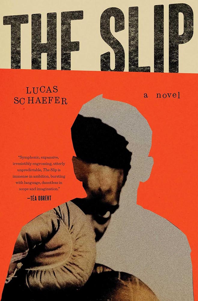
Cover design by Jack Smyth.
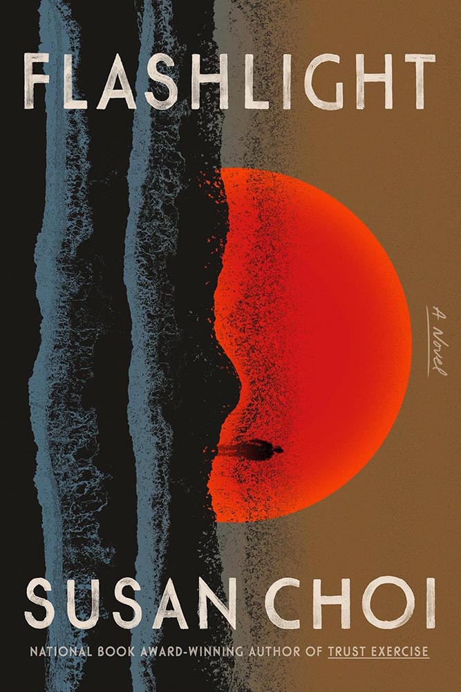
There was no question which of these hundred titles would take the title: this heavyweight, brought to us by Dublin-based Jack Smyth. Fellow cover designer Jaya Nicely, in LitHub‘s 2025 list, called it “tactile,” but it’s more than that — it’s downright visceral.
In fact, and indeed in direct contradiction to what I said in the intro, I’m celebrating something trendy: silhouettes are “in” — even overused — but I love this cover because I don’t recall ever seeing one more effectively implemented. Simultaneously hiding around the edge and using it to an advantage, our boxer (presumably the book’s subject, Nathaniel) looks poised to strike.
When combined with type and lines slightly off kilter, use of a fantastic orange, and aging and grain that ice the cake, this cover has it down.
2025’s Runners-Up
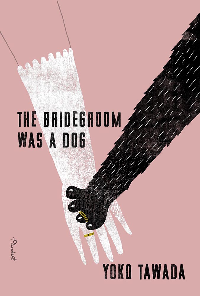
Cover design by Paul Sahre, with illustration by David Plunkert.
A triumph of less-is-more illustration, with color and a title treatment that knows how compliment. The pressed or sprayed, aged-but-not, white and black are magnificent, while the rings stand out as the only use of “gold.” I love that the arm above the glove is just an outline.
Cover design by Kris Potter; photography by Laurent Tixador.
Photography seems almost passé these days, so its use requires something extra — here served up in spades. On the one hand, I want the boats on the horizon to have been removed, but on the other, it highlights the fraud within in a subtle, realize-after-the-fact way that’s awesome.
I have to say, too: this is about fifteen light years beyond the woman-folded-into-the-chair edition, one of those trends that needs to just stop.
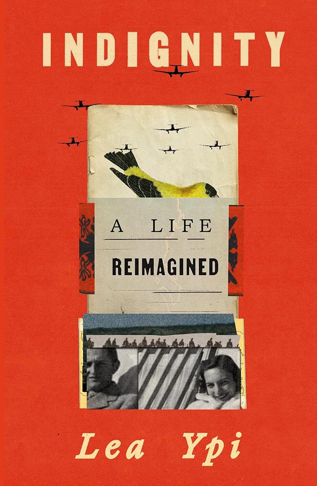
Cover design by Arsh Raziuddin.
While it compliments Free, from 2022’s list, it’s more: more sophisticated, more of a story, and leaves you with more questions — and more likely that you’ll pick it up to get those answers.
Bonus points for the folded papers, the Albanian coat of arms, and planes “outside” the collage.
• • •
Other 2025 Favorites, in Alphabetical Order
Cover design by David Fassett.
Christian titles so often reach for stereotype — something easily pigeonholed, almost like romance (for instance, unless of course I’m the one stereotyping). It’s often to the detriment of the subject: prematurely dooming the worthy, as it were.
This one very much rises above: the mountain/clouds, the spiral, the mixed and colored illustrations, and titles stacked at an angle (with slight em- or debossing?) are all exceptionally well done.
Riverhead/Penguin didn’t return a request for cover design info. Apologies.
The opposite of sinking beneath the waves: a beautiful pen-and-ink illustration, a color block of sea — or sky — heeling over at just the right angle, with the wonderful knock outs. Then there’s the hint-of-blue tail, the design equivalent of a spinnaker, standing out at the fore of a crowded race. Unmistakably awesome.
Cover design by Beth Steidle.
Simple without being simplistic, quiet while not quite, this one deserves that satisfying “thunk” that goes with a stamp of approval. (No cancellations allowed.)
Cover design by Tom Etherington.
Eye-catching is a cliché too far — but it’s definitely more than just a collection of shapes artfully arranged. Bonus points for the edge between red and star, the color choices, and title spacing.
Special bonus — continues the family look:
Cover design by Tom Etherington.
Fantastic.
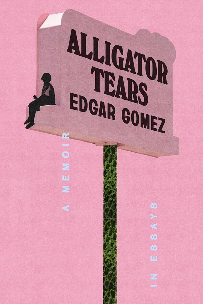
Cover design by Arsh Raziuddin.
Neither a zig nor zag: the combo of pink, alligator skin, and “tears” is nigh-on perfect.
Algonquin Books didn’t return an inquiry for the cover design info — sorry. (If you know….)
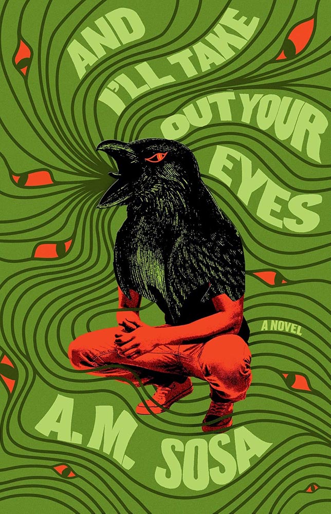
The part-human-part-animal design tool is another of those overused items — except when it’s handled as well as it is here. The eyes are brilliant, the title treatment fun, and the colors standout. The subject, superficially, is not dissimilar to Alligator Tears, above, but the details, the design — and most certainly the text within — celebrate being different.
Cover design by Beth Steidle.
The cover-in-two-parts is another of those items potentially overused, but the repetition and title treatment — the r-l tie-up is fab — take this one to the next level. Bonus points for “a novel,” both less and so much more.
Cover design by Elena Giavaldi.
Another where the pressed/stamped ink works well — but the black on top of the almost-overstyled photo is the winner here, a photo that doesn’t say “South Dakota” in all the right ways.
Cover design and illustration by Elizabeth Story.
Never mind the awesome type, layout, and color — that illustration, or perhaps just the expression, does everything. A winner at first sight.
Cover design by Lauren Peters-Collaer.
Sometimes, it’s possible to be knocked askew awed by a simple idea.
Cover design by Linda Huang.
“My aye!”
(Yeah, yeah, the paper pattern and color, aged red and great brown outlines, type choices, and inclusion of Asian name seal, not to mention the geese, are all awesome too.)
Cover design by Monograph.
One is more — one-color, that is, with a perfect combination of blur and line, “shadow” and light, simplicity and complexity.
Not the only one-color item on this list, I’m happy to see.
Cover design by Luisa Dias.
From texture to type, photo to illustration, this is a cover that keeps giving the more the viewer keeps looking.
Cover design by Stephanie Ross, with art by Maria Guimaraes.
Cool illustration, cool idea — but it’s the use of color that earns this cover a spot here. The bright pink and various greens delight, as does the unusual-but-perfect background box for the title.
Cover design by Robin Bilardello.
“Guaranteed to augment your … life,” Vi thought.
Cover design by Rodrigo Corral Studio.
This is based on the Korean edition; the art came with the title. That said, this version uses that ah-ha moment that is title’s holding area, combined with infinitely better type — and gets serious compliments as a result.
Bonus points to the original designer for a painting that’s anything but postmodern.
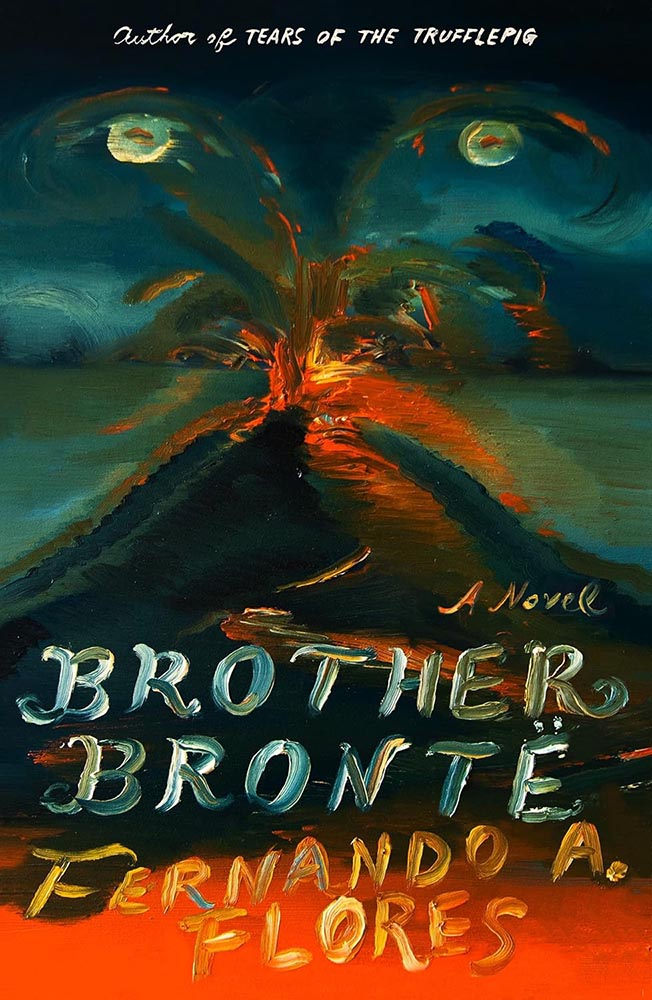
Cover design and art by Na Kim.
Speaking of paintings, Na Kim’s often take center stage in her cover designs. Here, however, it’s everything. Fantastic!
Cover design by Thoman Colligan.
The two-pane cover gets overdone, no question, but like others on this list that rise above a trend, this cover triumphs in complimentary colors, type treatments, and spacing. Somehow soothing and attention-getting — an accomplishment.
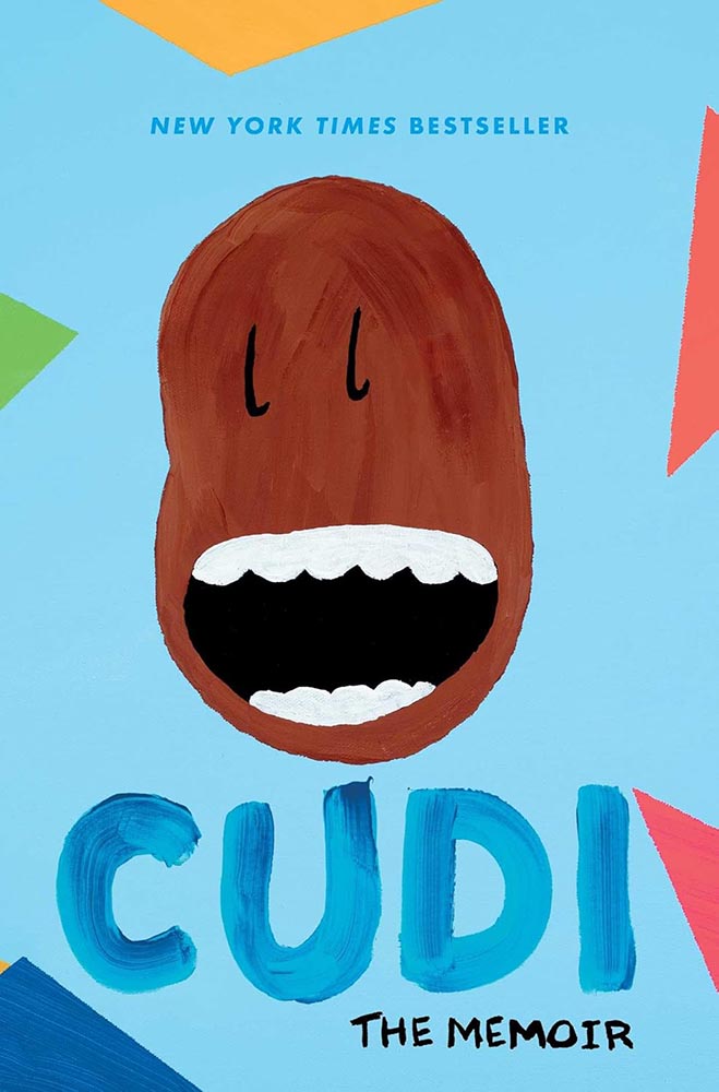
Cover art by Scott Mescudi.
Every time one zoomed out to look at the collected — every single time — this persevered. Survived. Stayed. And then became incredibly successful.
(The cover, too.)
Cover design by Josh Durham.
Pictures running in time, complimented by the vertical title. (Rare and attention-demanding use of duotone here, too — nice.) Bonus points for the title and other text being subtly different colors.
Cover design by Adriana Tonello and Frances Digiovanni, Rodrigo Corral Studio. Illustration by Sophy Hollington.
Letterpress or inkblot? When it’s as much eye candy as this, do you care?
Cover design by Na Kim.
The contrast to Na’s Brother Brontë cover, above, couldn’t be more stark — yet this one, in its … well, stark simplicity, is no less accomplished.
Work that stands out, from one of the standouts.
Cover design by Chris Bentham.
Retro-tastic burst of style that takes something ostensibly text-only to another level.
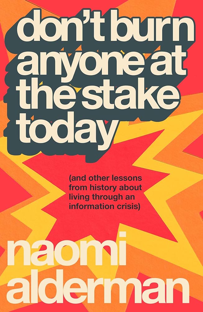
Parenthetically, the author argues that we’re in the third “information crisis,” the first being invention of writing and the second the invention of the printing press. We survived those, maybe we can survive this…. A UK title I wish were readily available in the States. (The Brit Amazon wants you to buy it together with Cory Doctorow’s Enshittification, by the way. There‘s an afternoon’s reading.)
Cover design by Matt Dorfman.
Old-fashioned illustration, type arranged in a way that’s anything but old-fashioned, and great color choices: successful in a way that suggests simple in one of those “effortless ease” ways. (“Yo-Yo Ma just saws on a big fiddle” kind of thing.)
Cover design by Eli Mock.
“Missile Command meets The New York Times,” you say, in an effort to describe this design to someone who hasn’t seen it — something guaranteed to get a laugh. But here it is, in all its glory.
Cover design by Jaya Miceli, with art by Anna Brones.
Cookbooks are such a well-trod genre that it’s nearly impossible to break out of the pack and generate something not only truly original but truly excellent: a feast indeed.
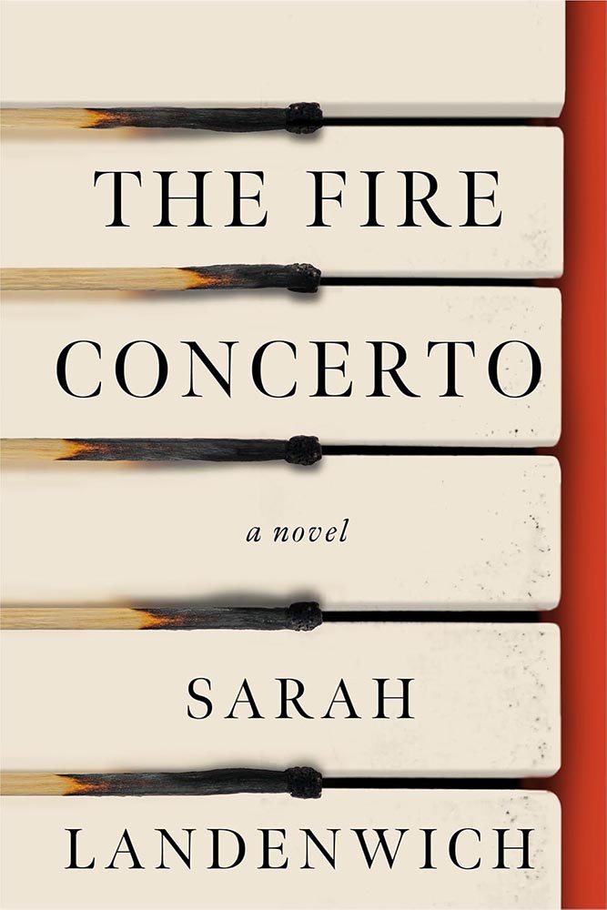
Cover design by Jared Oriel.
Burnt matches have never made such sweet music.
Cover design by Darren Haggar; illustration by Cecilia Caristedt.
Poppy? Or a view into something deeper?
Cover design by June Park.
“What happens when your world goes sideways?” this cover — and book — ask. From illustration to style, basically … perfect.
Cover design by Janet Hansen.
Simple, practical, awesome. (“Chef’s kiss” is probably tacky, so I’ll avoid saying that.)
The author’s previous title, Lucky Dogs, was in my 2023 Favorites.
Cover design by Rodrigo Corral and Adriana Tonello.
At first glance, something we see all the time, from image to typestyle.
But then it goes on to ring the bell.
Cover design by Frances Digiovanni, Rodrigo Corral Studios.
The case where something like “a two-color triumph” feels not only cliché but a genuine undersell. The illustration, the color choices, the exquisitely shaky hand lettering — all beyond perfect, and that’s before we start talking about those strings. And the power that’s pulling on them.
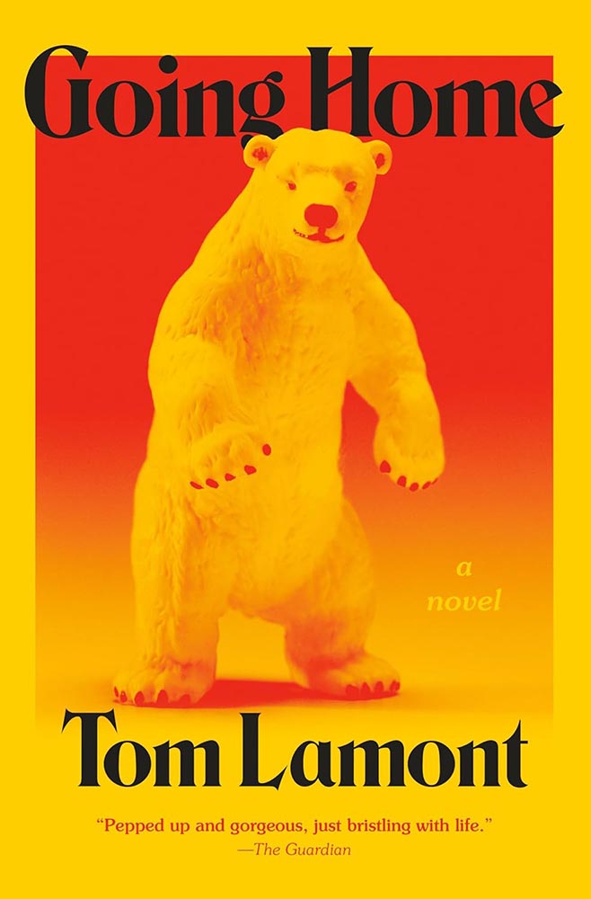
Cover design by Jared Bartman.
The bear feels like something generated by bad AI, or even a suit; as it turns out, we don’t care. Bright, funny, and fun in just the right way. (I do wish they’d kept the single quotes proper English uses.)
Cover design by Adriana Tonello.
On the one hand, the opposite of “bright, funny and fun” — and yet, one the other, somehow, not.
Cover design by Maddy Angstreich.
I swore, possibly in public, that cropped classical paintings is something we should move on from in book design.
Clearly, I was wrong.
Cover design and illustration by Micaela Alcaino.
One of the few times in recent memory that something so original was so funny, so satisfying, and such a standout design … on any shelf.
(One of those covers that would work well as a print, I think.)
Cover design by Anna Morrison.
The triumph of the simple.
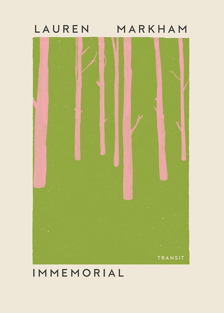
Cover design by Keith Kayes, with art by Jose David Morales.
“Sometimes a new author will sidle up and whisper in your ear, and sometimes she’ll grab you by the neck,” one of this book’s blurbs reads. The design of Immemorial, above, is the former. This design is very much the latter — completely and delightfully.
Ballantine’s contact page is a 404 error — I kid you not — so the designer remains anonymous.
Power, grace, and color — and, of course, the title treatment. A cover that was never in danger of losing its groove. (Bonus points for the pink “earring.”)
Cover design by Matt Dorfman.
Simplicity can mask death depth.
Special bonus — related brilliance, from 2022:
Cover design by Matt Dorfman.Cover design by Nick Misani.
Illustration and lettering triumph for this classic title, slightly reminiscent of the Farmer’s Almanac I remember from my youth (in the most complimentary way), with appropriately-English “characters” for the UK edition.
Cover design by Katy Homans.
I mentioned above that for photographs to work today, they have to have that something that grabs and won’t let go. This one does.
Cover design by Arsh Raziuddin.
Next-level collection of long views both together with and simultaneously separated by brilliant use color. Bonus points for the repetition in author and subtitle.
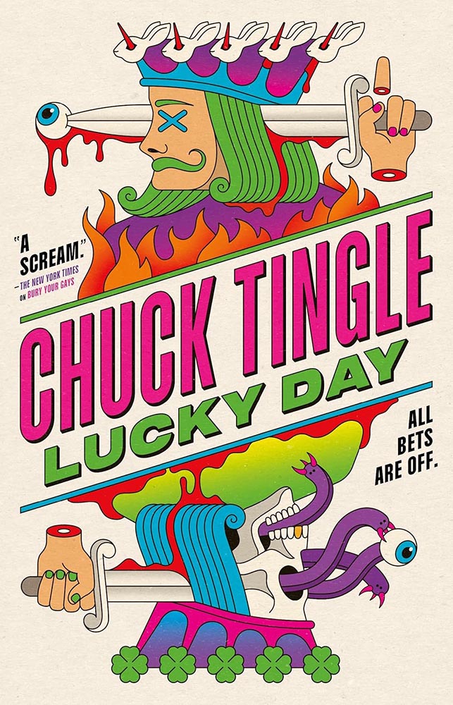
Cover design by La Boca.
Gets the award for “most zany,” in the best possible way: “a scream,” indeed.
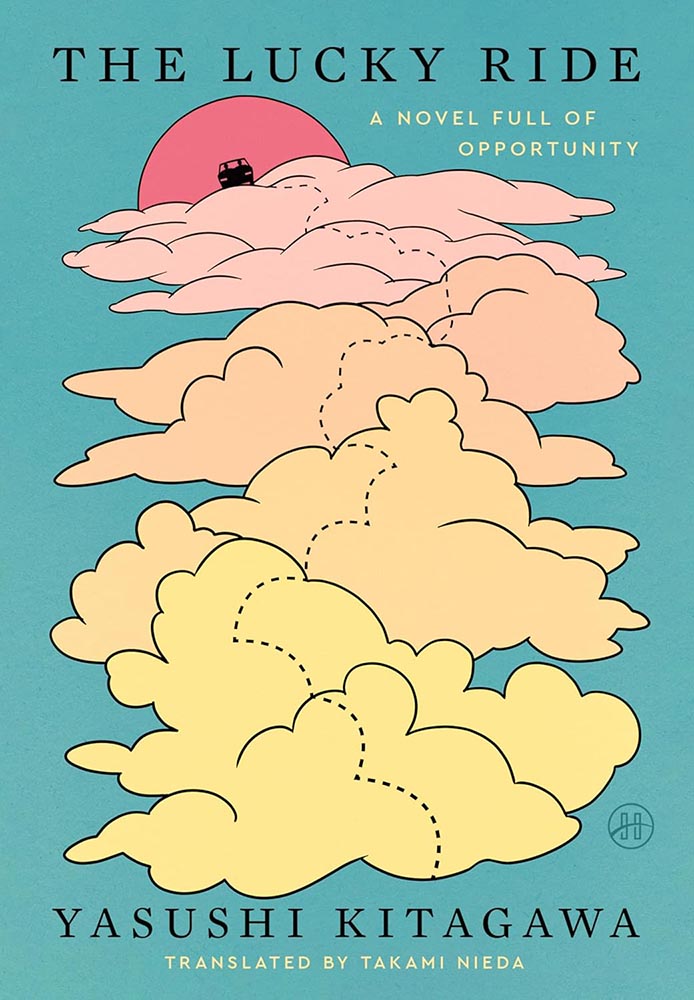
Cover design by Stephen Brayda.
Speaking of awards, let’s have one for “soothing.” The dotted path is brilliant and colors awesome. (And while it’s not part of the design, it’s impossible not to appreciate that subtitle.)
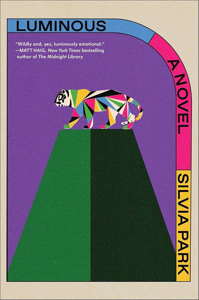
Cover design and art by Alex Merto.
Colorful, original, retro-yet-not — with that tiger. I want to make jokes about how this cover so very well illuminates, but really, I just want to go read it. Awesome.
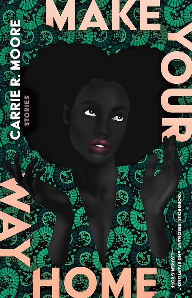
Cover design by Beth Steidle, with art by Uzo Njoku.
I’m not a fan of the text-around-the-edge trend — I get it, it’s a framing device, but, suddenly it was everywhere, too much, all at once.
Once in a while, however, it’s done so well that greatness must be acknowledged. Weaving the title text into the pattern helps, as does, of course, the fantastic art.
Cover design by Tyler Comrie.
I had the UK version of this in last year’s list — but the paperback, out this year, gives me an excuse to not only highlight the US version, but the associated redesigned back titles:
Cover designs by Tyler Comrie.
I do not believe “brilliant” is resorting to cliché.
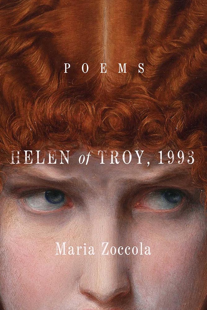
Cover design by Grace Han.
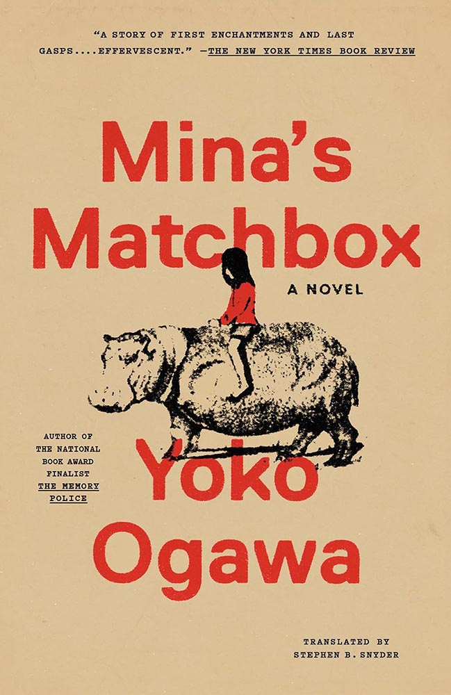
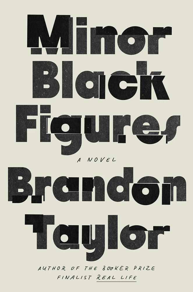
The second one-color cover on this list, whose simplicity belies the story within. (Lauren Peters-Collaer, on LitHub‘s “best of” list, describes it as “fractured,” which I love — along with the “minor Black artist” being named Wyeth.)
Cover design by Jaya Miceli.
“I forgot the blueprints parsley!”
Awesome stuff: the lips being the only thing on her face, the dog’s expression, the rough sketch style, the way the title stands out, um … okay, everything.
Cover design by Matt Broughton, with art by Katrien de Blauwer.
As mentioned, the two-pane cover has become a thing; this one breaks out not only with the black-and-white photos (possibly a subtle duotone) and a bright title in a great typeface (Herbus, by OTT) but cropping on the bottom photo that causes a double-take, and that hint — just a hint — of just-sank in the top photo. Good stuff.
Much stronger without the quotes fouling the water, by the way. The tug-of-war between design and marketing sometimes gets makes ugly.
Cover design by Jenny Volvovski.
Brilliantly simple stand-out: nest and enjoy.
Cover design by Arsh Raziuddin.
A fantastic example of a photograph plus — that illustration, those lines, that green, those stars. (And, of course, the eyes.)
Cover design by Chris Bentham.
This UK cover expresses the arrogance — the cockiness — while bringing forth all of the disjointedness and even kleptocracy. Timely and compelling.
Cover design by Matt Dorfman.
I like the design of this series — the title holding area (literally) is unusual enough to catch attention on today’s shelves socials — but the colors and treatment on this title, specifically, are the most pleasing.
Cover design by Erik Carter.
A brilliant idea, perfectly fulfilling the idea of communicating everything needed with one simple concept. (Alas, since putting this aside — the candidates for this list are gathered throughout the year — it’s gained splashy “ketchup” and what can only be described as “cheese.” Boo.)
Special bonus — the UK version:
Cover design by Jack Smyth.
No less brilliant — yet, as covers from the “right” side of the pond often are, more sophisticated.
Cover design by Janet Hansen, with art by Ahmad Sabbagh.
Okay, let’s revisit the text describing the previous title.
To quote Jason Kottke: “The US cover, like many American things, is somewhat less subtle & elegant.” In this specific instance, however, I have to disagree: sometimes, more is more.
Here, the US version brings a power to the table that US versions often struggle with; a “a few strokes of the pen” can wield enormous strength — often too much — and thought, talent, and consideration are appreciated. This is all of those.
Cover design by Claire Sullivan, with art by Alex Eckman Lawn.
“Not for the faint of heart,” one of the blurbs for this title reads — and applies equally well to the cover, which communicates “lovely” and “grotesque” in equal measure. (The UK version trendily plays up the lighter approach.)
Cover design by Jaya Nicely, with art by Rokas Aleliunas.
A “brilliant, funny, unsettling” illustration, too. (Love the green, by the way.)
Cover design by Devon Manney.
“From screening to aging, suggestion to content, color to style, this one, put simply, gets everything right,” I said on Spine in October’s University Press Coverage column — but when it was highlighted in October’s Beautifully Briefed, here on Foreword, I added, “One could argue that this cover — and title — could work well even if the word “climate” was removed.”
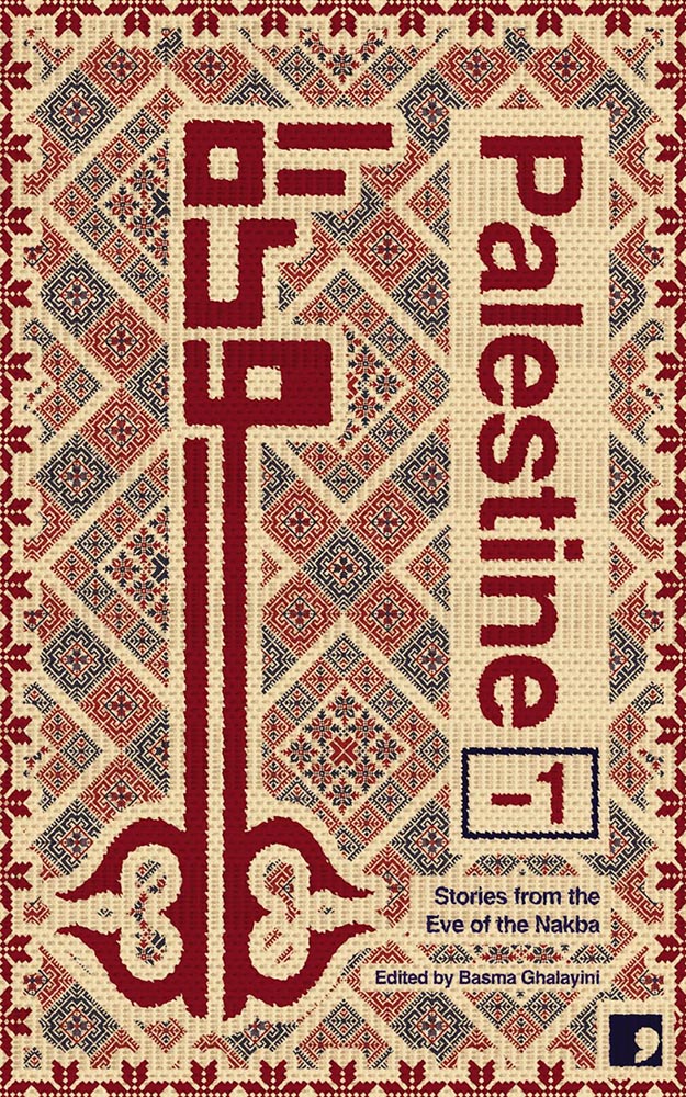
Cover design by David Eckersall.
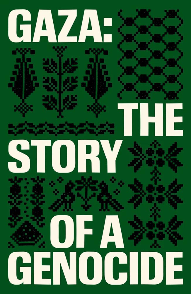
“Tatreez, meaning ‘embroidery’ in Arabic, is used to refer to the traditional style of embroidery practiced in Palestine and Palestinian diaspora communities. The contemporary form of tatreez is often dated back to the 19th century. The style of cross-stitch embroidery called fallaḥi has been practiced amongst Arab communities in the Mediterranean for centuries,” Wikipedia notes. (NY’s Met Museum has more.)
Beautifully applied.
Special bonus — see also:
Cover design by Chantal Jahchan.
Yeah.
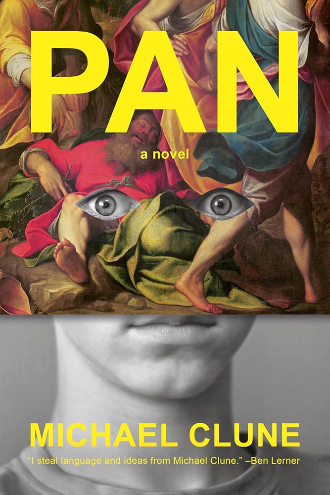
Cover design by Janet Hansen.
Pan, panic, or just surprise? No matter the expression, a delightful way to break all of the rules. (Bonus points for the knee to the nose.)
With apologies, I don’t know the designer for this cover.
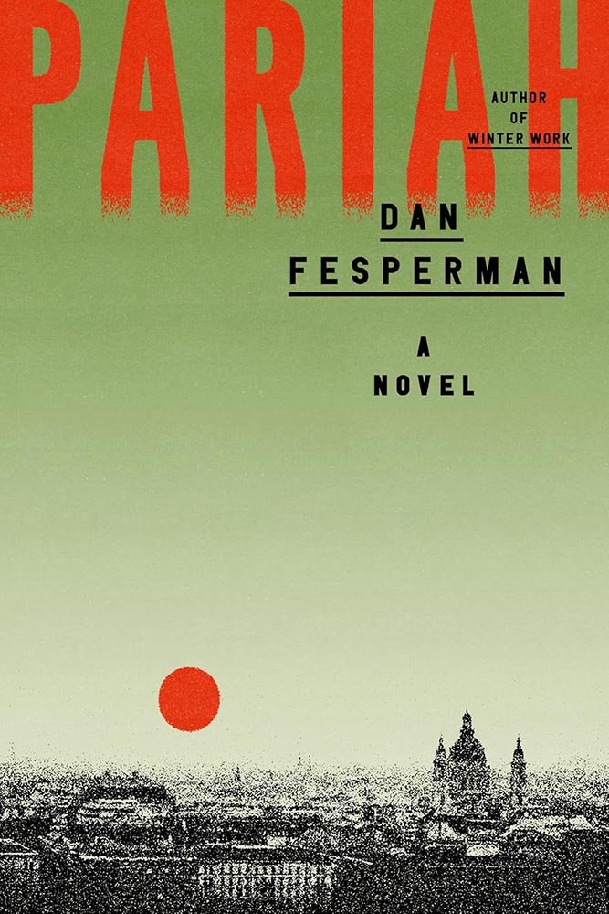
A disgraced comedian-turned-politician is recruited by the CIA — a grainy prospect that you wouldn’t expect to look like this.
Um, yes.
(“This title is absolutely about Bolrovia,” he added.)
Cover design by Emily Mahon.
Less chess and more Cold War, another where a powerful, simple idea triumphs. The orange and the hand-lettering deserve special praise, as well.
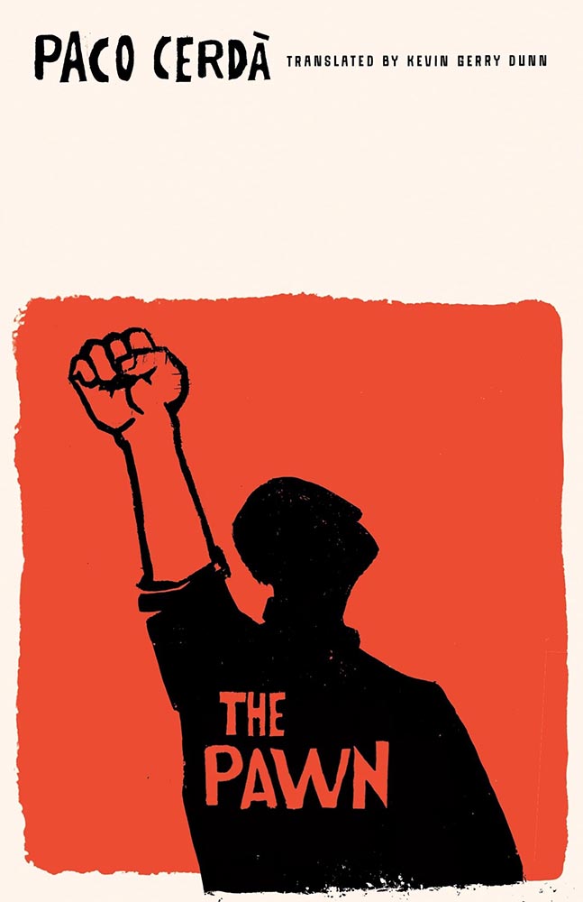
Cover design by Luke Bird.
From expression to ears, brings new delight to deer-in-the … highlights.
Rutgers University Press did not return a request for cover design information.
“From the woodcut hall of fame, we have this,” I wrote in Spine‘s November column.
(I’m sad Rutgers never returns emails, because this artist deserves named credit. If you know….)
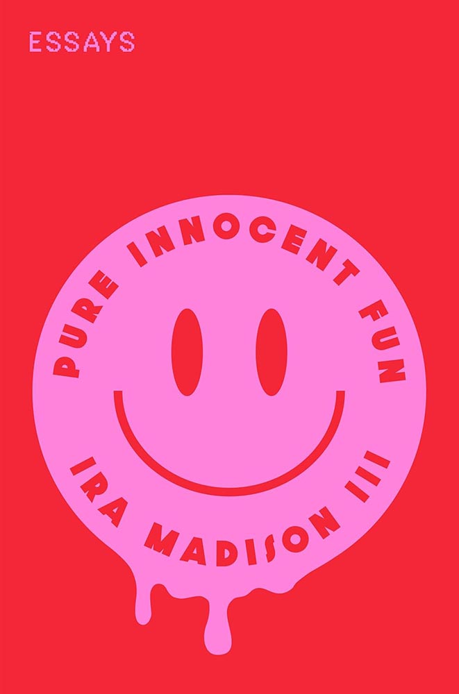
Cover design by Ella Laytham.
That “Essays” is printed in little tiny pink stamps is merely the kicker: awesomeness, defined.
Cover design by Lauren Peters-Collaer.
Might I have mentioned that silhouettes are overused, even trendy? And that photographs are passé? Not here.
Like The Slip, this title goes out of its way to do something different, something appreciated, with the cutout. Combined with a great photo and grainy sky, it steps out of line and requires your attention.
Cover design by Lauren Peters-Collaer.
“Deadpan wit” could be used to describe more than the contents: simultaneously simple and simply brilliant.
A cheat here: the green version is the hardcover from 2024; the paperback, from November ’25, is orange with a pink chair — and not quite as good.
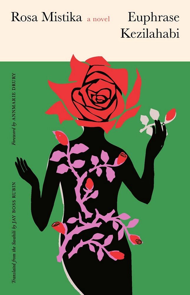
Cover design by Sarah Schulte.
“A controversial Swahili classic — banned on publication — translated into English, published by Yale, and represented with a cover best described as a gift. A design that belongs in every ‘best of’ list,” I said in the inaugural column for Spine.
So added.
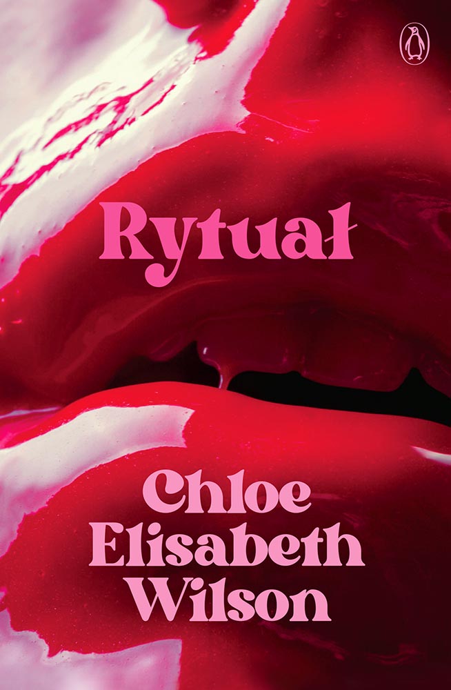
Cover design by Josh Durham.
Close-ups of women’s lips is another trend I’ve been avoiding — except when it positively drips with photographic brilliance: millennial pink, taken to the next level. (Once again, a cover measurably better without the detritus rytuałły added by the publicity department.)
Cover design by Beth Steidle.
I don’t know whether Beth did the art for this — presumably — but that art, together with the title treatment, add up to one of those “wow” covers instantly added to the list of year’s best.
Cover design by Holly Battle.
A “doting grandmother and vicious crime matriarch”: raven mad. This UK cover gets points for illustration style, type style, and, of course, just the right dose of splatter.
Cover design by Jared Bartman.
“The bull’s expression,” he said.
“The no bulls*** expression of nature,” she retorted.
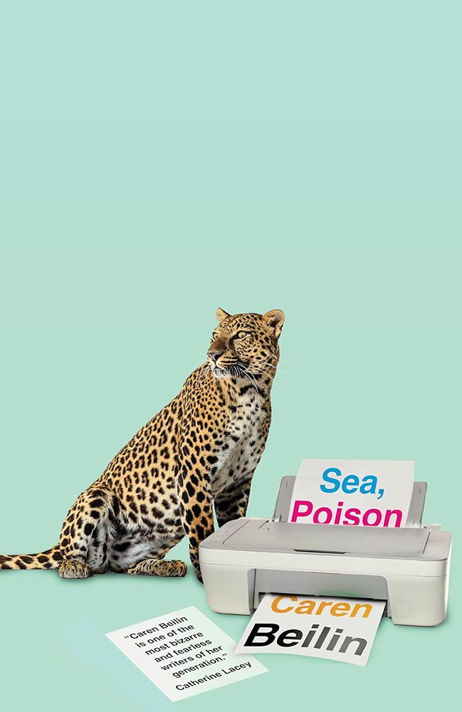
Cover design by Jamie Keener.
Never mind the huge negative space: it’s the eyes. (Okay, it’s also the unlikely collection — collision? — of leopard and printer. Plus the loose page/quote. Plus the background color. But still.)
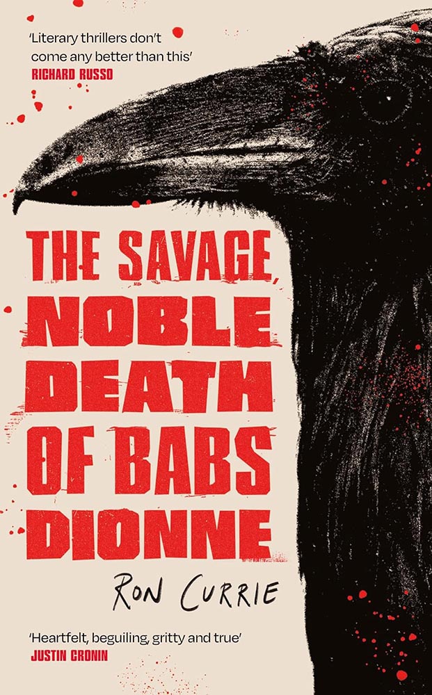
Cover design by Rodrigo Corral.
Heroin addiction, AIDS, French doctors, family drama: how do you weave that together into a compelling cover? Well, this.
Cover design by Gabriele Wilson; collage by Arsh Raziuddin.
“Fragmented colonialism in Africa, illustrated incredibly well,” I said in October’s Spine column — then went on to do both designers a disservice by failing to include the appropriate credit. Sheesh. (Apologies.)
Cover design by Farina Yasmin.
The US vs. UK “style” has been mentioned, well, possibly too much. Sorry.
But.
Here’s a great example of two great covers — both where all eyes are very much on the performer’s … uh, performance — yet in remarkably different ways.
Cover design by Julia Connolly; photograph by Sandra Casado.
Even though this kicks serious a**, in this case (and to continue the back-and-forth), I don’t think the US version is any less sophisticated.
Cover design by Nicole Caputo.
Beautiful illustration, beautiful type treatment; it’s something that could almost be described as “soothing.”
(With the possible exception of the text within.)
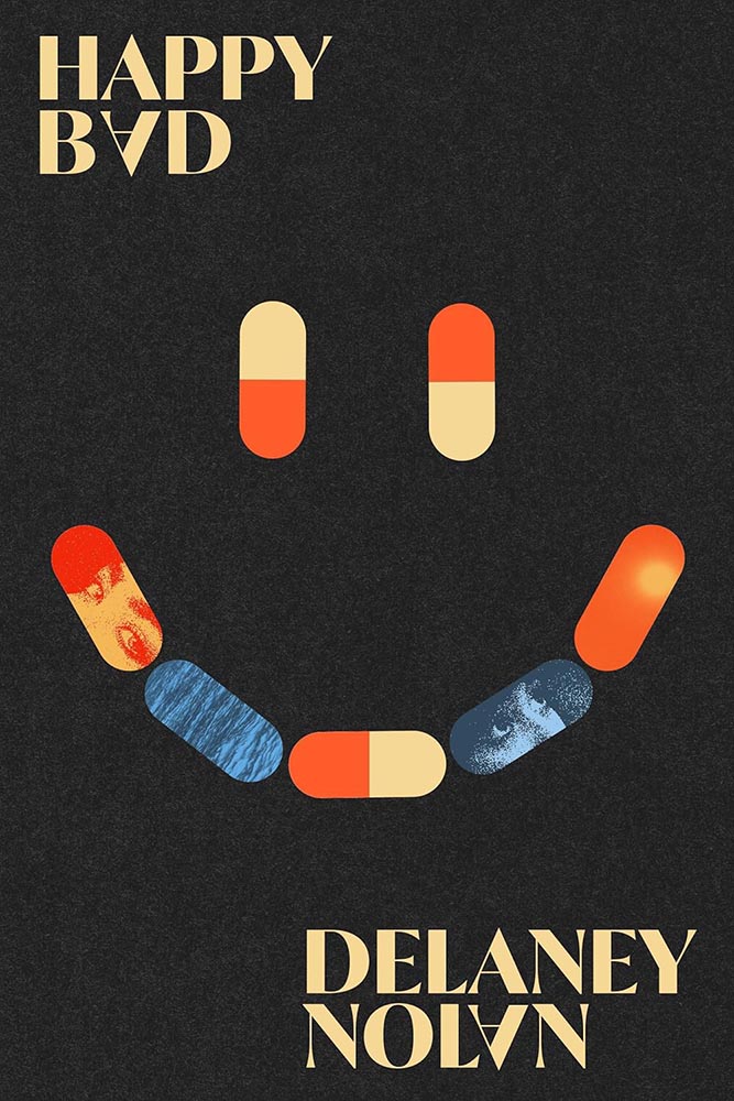
Cover design by Steve Attardo.
An awesome illustration against one of the year’s creamiest backgrounds, yes, but absolutely one of the year’s best title type treatments.
“‘Ebullient’ is used in the description of this title, and quite frankly I can’t think of a better word to describe this text-only treatment: superlative work.
“(In Miceli’s library, this would be shelved with Milk Fed and Joy of Consent instead of Big Swiss and Victorian Psycho — but it’s telling that she’s great at both styles.)”
Special bonus — another from that post:
Cover design by Issac Morris.
“The ayes have it,” I quipped. “Also, both the title type and color choices are out of this world. (Not sorry.)”
Cover design by Jack Smyth.
The word “acerbic” is used several times to describe this tile, but the UK cover just isn’t — the type and treatment are wonderful, and the surrogate egg is perfect.
Special bonus — the US version, which received a good deal of praise:
Cover design by Tyler Comrie.Cover design by Dana Li.
As mentioned on And I’ll Take Out Your Eyes, the part-human, part animal thing could possibly be described as “overdone.”
Here, though, it’s a home run wrapped in a night out: from colors to drips, pose to poise. Awesome.
Cover design by Michel Vrana.
A “decades-long earthquake,” indeed: layered, hopeful, wonderful.
Cover design by Sarah Schulte.
Another text-in-a-square exception to the rule: framing rarely works so well. (Besides, there’s that illustration.)
Cover design by Daisy Bates; photograph by Vanessa McKeown.
Cover photograph of the year, foot hands down.
Cover design and illustration by Kimberly Glyder.
“A risqué cross-dressing interpretation of a Shakespeare classic”: I can’t decide if it’s a crown, horns, or teeth. (“Yes,” someone said.)
But it’s the red overprint that steals the show. Fantastic.
Parenthetically, the author is “a founding artistic director of The Semitic Root, a collective that supports innovative theatre co-created by Arab and Jewish Americans.” How awesome is that?
Cover design by Kelly Hill.
“Canadian text soothes,” some belligerent American said.
(Another one of those illustrations I’d happily hang on my office wall, by the way.)
Cover design by Kimberly Glyder.
Never mind anything else: it’s the scribble. (The title font’s beautiful, too, honestly.)
I try to reserve “perfect” for occasions that warrant it — this does.
Cover design by Luke Bird.
A geometric, simple triumph of illustration: I suppose if anyone can do a bird well….
(Sorry.)
As an aside, this title is not to be confused with Under the Eye of Big Bird, which is in a whole ’nuther category.
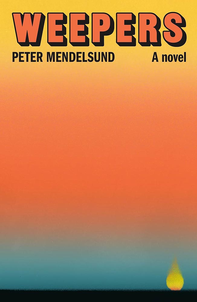
Cover design by Jamie Keenan.
Entangled in wonder. (Also, the background color is super, and the font — Celtic Hand by Dieter Steffmann — is proof that freebies sometimes work beautifully.)
A book about a professional weeper, [whose] “services are sorely needed these days, as the town, the region, the country as a whole has become more or less numb.”
Ummmm….
(The cover’s fantastic, too.)
Cover design by Maddy Angstreich; photograph by Bobby Doherty.
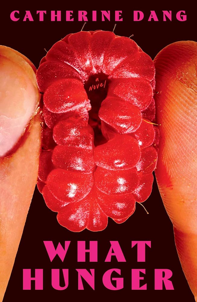
Dang, that’s not raw meat being squeezed there. (Nor a fruit, for that matter.)
Cover design by Pablo Delcan.
From June’s Spine column: “19th-century hair styles: the absolutely fantastic world of university press cover design briefs … absolutely nailed here, with pen-and-ink illustrations and aged type handled perfectly. (Great title, too.)”
Cover design by Na Kim.
To close out, another painting by Na Kim, as visually arresting as Brother Brontë, above, but 180 degrees in the other direction. (Bonus points for the pointillist lettering.)
Come to think of it, it’s 180 degrees from Dominion, too. Is it possible to have a 540-degree compass? Na apparently does — awesome.
• • •
2025’s favorites folder contained more than four hundred examples by the end of the year — a hundred more than 2024 — and represented a huge variety of titles, publishers, and design styles. (Significantly different from last year, too — interesting.)
It was a huge task to whittle the selections down; 400 to 300 was relatively easy, 300 to 200 more difficult, and those last hundred involved making hard choices between covers I really liked.
One thing helped: as mentioned in the intro, I worried less this year about highlighting every style, every designer, in every category — given the drama that was 2025, there was, in fact, a smidgen of comfort food involved.
But oh, that comfort food. Michelin starred.
Another help: my column at Spine.2Vyki Hendy, Spine‘s publisher, deserves a special thank you for that opportunity. It’s reminded me of the gems that exist in an area that doesn’t get enough attention — outstanding, often great, book covers I’m more than happy to find the time to celebrate. While I enjoyed casually perusing University Press designs in the past, they didn’t live under the same microscope that they did starting last June (and will continue to). Adding more University titles is an ongoing bonus, and several of those titles made it into this list; perhaps egotistically, I’d like to think that the exposure those titles received allowed them to make others’ lists, as well, a benefit for all. Nice.
Thank you for taking the time to spend a few minutes here today. I wish you a wonderful, successful, and above all, peaceful 2026. See you soon.
How This List was Compiled
There were fewer sources for titles in 2025 than in years past; the BBC disappeared behind a paywall, the quality of mainstream publishers continues to decline, and those articles I did read seemed to stress trends and “what’s hot” rather than actual quality. Thankfully, there’s still PRINT, Spine, LitHub, The Casual Optimist, and NPR’s Books We Love. There’s also The Guardian, which does pretty well with books; the New Yorker‘s book reviews are outstanding (although rarely centered on their design); and, of course, there’s the New York Times Book Review (likewise, although Matt Dorfman’s best designs article deserves note). If you haven’t already, when you have a moment, please enjoy some of those links— a great many more outstanding examples of book cover creativity await.
1
Publishers need to remember that not all of their customers select what to read based on influencers, what they see on Facebook, or by doomscrolling Instagram. Some of us are lifelong learners, have hundred or thousands of books, and discover by … reading. Real articles, by real people, on websites with those people’s real names on them. (Or even, occasionally, this thing called paper.)
2
Vyki Hendy, Spine‘s publisher, deserves a special thank you for that opportunity. It’s reminded me of the gems that exist in an area that doesn’t get enough attention — outstanding, often great, book covers I’m more than happy to find the time to celebrate.
In this episode, design whims and wins, fontastic links, a Toyota Century, and the monthly round-up of great photography bracket some thoughts on — what else? — AI, especially as it relates to art. Grab a beverage, brush, or a comfy chair, and let’s dig in.
This Month’s Spine
New York University Press. Cover design by Devon Manney, art director, Rachel Perkins.
One could argue that this cover — and title — could work well even if the word “climate” was removed. See the whole list of University Press goodness.
And check back for a special, mid-month post in honor of University Press week, Nov. 10–14.
Good Movies as Old Books, Revisited
Let’s start with something great: Steven Heller highlights the “talent and imagination” of Matt Stevens (previously) as the paperback version of his book, Good Movies as Old Books, becomes available.
Cover design by Matt Stevens.Cover design by Matt Stevens.
“My goal with the style was to try new things and create interesting combinations. Oftentimes, I was trying to do something that had not been done for a particular film,” Stevens says. Short and fun, the PRINT interview is worth a few minutes of your time.
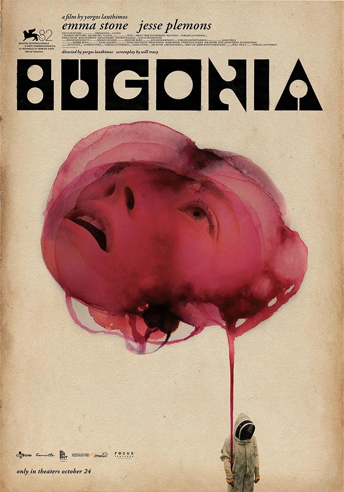
While we’re on the subject of movies, let’s slip closer to … well, what passes for reality these days: items “steeped in human anxieties and fever dreams.” It’s Nice That highlights poster and title design for films by Greek artist Vasilis Marmatakis.
Design by Vasilis Marmatakis.
With design, much like life itself, Vasilis says that his posters are his honest reactions to the films. The same approach runs like a red thread throughout his work, each poster leaning a little too heavily into one of the film’s themes. […] In Bugonia, Vasilis consciously restricts superfluous elements and allows the frames to breathe.
— Arman Kahn, It’s Nice That
Design by Vasilis Marmatakis.
Even the font — and how it’s used — is interesting: the freely-available Churchward Roundsquare, customized with brush and ink. That and much more is discussed in this great article.
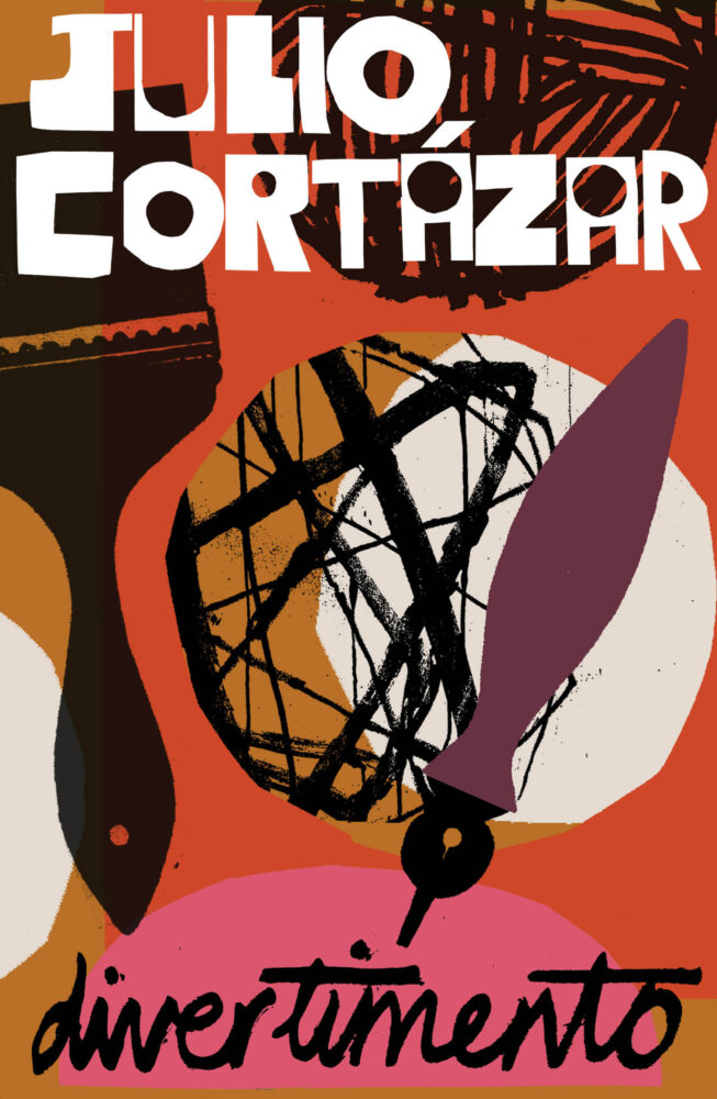
New Vintage Classics Series
It’s unusual not to relish a new set of reissues from Vintage, and the new editions of Julio Cortázar are no exception:
Also via Kottke are these posters, which evoke a certain … something:
In a fascist movement inspired by art, how does the fascist government influence the artists living in its grasp? This exhibition explores how Benito Mussolini’s government created a broad-reaching culture that grew with and into the Futurist movement to claw into advertising, propaganda, and the very heart of the nation he commanded.
The exhibit features “some of the best posters produced during the worst period in modern Italian history.” See more.
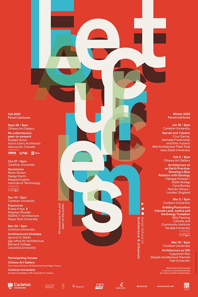
Special Bonus #2: While we’re perusing the poster department, Archinect‘s ongoing lecture series (previously) has another winner:
Fontastic Fall
New for October
CreativeBoom‘s monthly roundup is out, and while Grundtvig is retrotastic and the three-axis variable Pranzo is accompanied by some great illustrations, it’s Jovie that I’d love to use in print project:
“Jovie’s character emerges through its soft-serif approach, which tempers traditional serif authority with contemporary approachability. Playful italics, expressive alternates, swashes, and ligatures provide designers with a rich typographic palette, whilst maintaining coherent family relationships across all variations,” they note. (Another variable-width item, too.) Great stuff.
Custom Type is Everywhere, It Seems
Meanwhile, custom type for branding is becoming the norm. In another article, CreativeBoom explains why: “Bespoke letterforms are no longer a “nice-to-have” and they are increasingly seen as a strategic necessity[.] Type has become the glue that holds their voice together,” they write.
Those letters are your brand’s voice. They do the heavy lifting, they carry personality, and they create instant recognition – sometimes without the need for any other distinctive assets. […] Typography is everywhere in a brand system – packaging, products, campaigns, interfaces. When you build your own, you’re not at the mercy of someone else’s design choices, and you get a voice that’s tuned to your values, your audiences, and your long-term ambitions.
Elizabeth Goodspeed (previously) agrees, mostly. “For most of the 20th century, branding treated typography as background, not backbone,” she writes. But now, brands are recognizing that, “[a]s a primary container for meaning, typography inevitably carries an enormous share of that emotional load.”
An exception to the rule: a type gem — with legs! — from 1971.
But, she cautions, “[s]peed also feeds a kind of conceptual shallowness. With so many studios drawing type, the market has been flooded with fonts that solve narrow visual problems but can’t stand up to long-term use. Too often, new brand fonts cling to a single gimmick while leaving the structure of the letters untouched.”
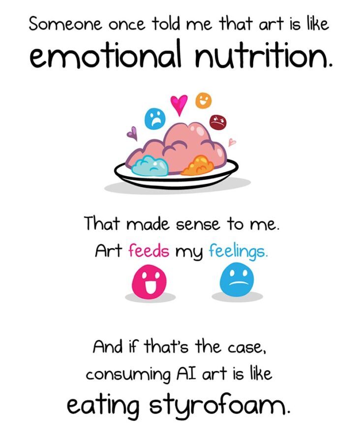
The Oatmeal, penned by Matthew Inman, has some thoughts on AI.
The new-to-me FlowingData — via Kottke’s rolodex feature — first pointed me to this piece, and it’s gotten a ton of press. In summary, Inman suggests that AI art causes a certain discomfort; that, perhaps, AI art even deserves air quotes around the word art because it’s somehow less than “actual” art.
Indeed, much of that press has been approving: a pile-on of people (not that such things happen on the internet) saying, “yes, AI art deserves those air quotes. It is less.”
One of my favorite reactions was from Nick Heer:
A good question to ask when looking at an artwork is “who made this?”, and learning more about what motivated them and what influences they had. This is a vast opportunity for learning about art of all mediums, and it even applies to commercial projects. Sometimes I look up the portfolios of photographers I find on stock image sites; their non-stock work is often interesting and different. There is potential for asking both questions of A.I.-assisted works in the hands of interesting artists. But it is too often a tool used to circumvent the process entirely, producing work that has nothing to offer beyond its technical accomplishment.
— Nick Heer, Pixel Envy
“Who made this?” is the right question — to start. But let’s take that a step further.
John Gruber, at Daring Fireball, quotes the piece: “[When] I find out that it’s AI art[,] I feel deflated, grossed out, and maybe a little bit bored. This feeling isn’t a choice.” Then says that he fundamentally disagrees with that premise:
I think it very much is a choice. If your opinion about a work of art changes after you find out which tools were used to make it, or who the artist is or what they’ve done, you’re no longer judging the art. You’re making a choice not to form your opinion based on the work itself, but rather on something else. […] Stanley Kubrick said, “The test of a work of art is, in the end, our affection for it, not our ability to explain why it is good.” If an image, a song, a poem, or video evokes affection in your heart, and then that affection dissipates when you learn what tools were used to create it, that’s not a test of the work of art itself. To me it’s no different than losing affection for a movie only upon learning that special effects were created digitally, not practically. Or whether a movie — or a photograph — was shot using a digital camera or on film. Or whether a novel was written using a computer or with pen and paper.
— John Gruber, Daring Fireball
“Good art is being made with AI tools, though, and more — much more — is coming,” he says. Over the next few days, he cited some examples, including David Hockney’s art made with a Xerox machine, and then this:
Jonathan Hoefler’s ongoing series, called Apocryphal Inventions.
The objects in the Apocryphal Inventions series are technical chimeras, intentional misdirections coaxed from the generative AI platform Midjourney. Instead of iterating on the system’s early drafts to create ever more accurate renderings of real-world objects, creator Jonathan Hoefler subverted the system to refine and intensify its most intriguing misunderstandings, pushing the software to create beguiling, aestheticized nonsense. Some images have been retouched to make them more plausible; others have been left intact, appearing exactly as generated by the software. The accompanying descriptions, written by the author, offer fictitious backstories rooted in historical fact, which suggest how each of these inventions might have come to be.
These images represent some of AI’s most intriguing answers to confounding questions — an inversion of the more urgent debate, in which it is humanity that must confront the difficult and existential questions posed by artificial intelligence.
“This is art,” Gruber says, with no other text. I don’t think any other is needed.
On a Related Note
This is AI.
“The top 200 photographers requested by Midjourney users have been exclusively revealed to PetaPixel — and it’s a world-famous, still active photographer that tops the list.” I bet you can guess who that is.
This is, in fact, the majority of what Inman was thinking — or at least, feeling — when he drew out an argument on why AI art can be such a let-down, both intellectually and emotionally. The above “photograph” is both awesome and hugely disappointing at the same time.
Further Reading
I’m not qualified to speak with any authority on the state or potential future of AI, AGI (artificial general intelligence), or the continuing convergence of AI with … well, all the things. I will say that, to me, there’s a palpable sense of bubble going on; whether financial, material, or resource requirements, it feels like something is going to need to give fairly soon.
Below are several articles on the intersection of AI with life, culture, or art that I found valuable. If you can set aside a few minutes, the information provided could be helpful in the quest to stay informed:
Side Note: I’ve dropped the punctuation in “AI.” Not unlike capitalizing “Internet,” I think we’ve crossed that bridge.
Special Bonus #3: AI apparently overuses em dashes, something that has, frankly, caused me to use them less. Which is a good thing — I overuse them. But then, I am a professional. [That’s only funny if you’ve read the link. —Ed.]
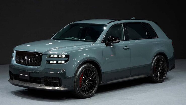
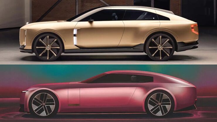
The Century Coupé Concept
Toyota (the company) has reorganized: there are now three levels. There’s Toyota (the car line), for the mass market; Lexus, Japan’s first answer to BMW et al from the late ’80s and also very much mass market (if targeted differently); and now, to compete in the ultra-high-end market, Century:
Long hood, imposing “grille” — trend, recycling, or cliché, depending on outlook.The no-rear-window thing continues to grow in popularity. (For “cocooning.”) Hmph.
Powertrain is yet to be determined; the rumors suggest it’ll be available both with a combustion engine (possibly a V12) and electric drive. In the case of the latter, owners will, of course, be able to send their driver off to get the thing charged while they lunch or plot takeovers — no range anxiety here.
Century’s logo is a phoenix.
Car geeks will know that Toyota’s Century sedan model has been around forever. It’s always been badged as a Toyota, and is aimed at Japanese executives and members of state (and will, in fact, still be produced). It was joined a few years ago by a SUV that bears more than a passing resemblance to a Rolls-Royce Cullinan. Both existing Century models available only in Japan and China.
The 2025 Century SUV. That D-pillar absolutely “borrows” from the Cullinan.
Toyota has decided to make those three models into a new brand that’s just called, “Century.” It’s going to be set up with exclusive dealers, eventually be available worldwide, and compete with Bentley’s new EXP 15 (previously) and Rolls-Royce’s … everything.
And, of course, Jaguar. The elephant in the room get a mention here because it’s looking more and more like JLR made the right call in targeting one-percenters with out-there, vaguely coupe-like designs. Because if the Century SUV resembles a Cullinan, the new coupé concept looks like a cross between the Jaguar Type 00 concept and said Bentley:
The Bentley EXP15, top, with the Jaguar Type 00, bottom.
Very much unlike the Jag, which is low and could possibly be described as “sleek,” the Toyota has a higher stance; a coupé/sedan and SUV mix seems to be a new answer to the so-called “death of the sedan.” Volvo’s ES 90 might also apply here.
Bear in mind that I’m not talking about the coupé-style SUVs (BMW’s X6, for instance), which are a different animal — at least for now. It’s possible the whole class of “coupe-like things” might converge in the not-too-distant future.
That being said, a member of that new class of vehicle being aimed at the chauffeur-driven market is new.
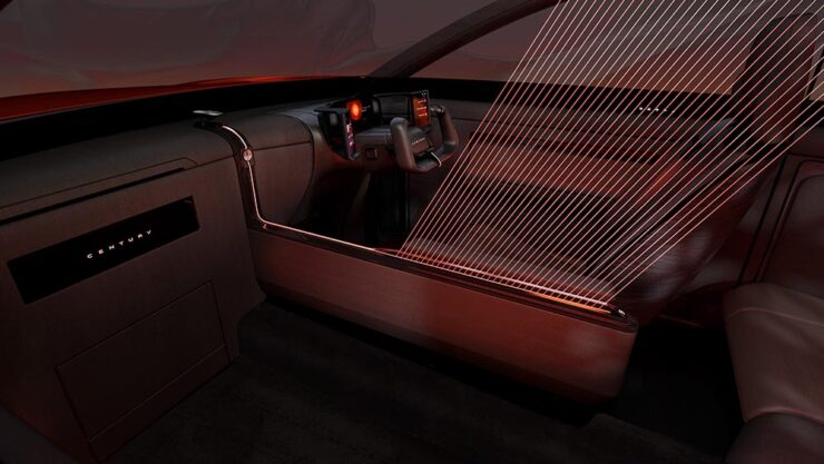
The glass divider is to allow the chauffeured their privacy.
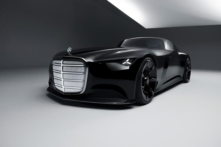
One more item: The old-school isn’t going quietly.
Did someone mention grille? (Lit, naturally.)Leaving the hood long behind.
Mercedes is, arguably, the best (non-American manufacturer) at displaying “gangster” qualities. Oh, and check out the awesomely-retro interior:
Note the lack of screens amongst that vintage style. And yes, velour is “in.”
Special Bonus #4: Audi poached the Type 00’s designer. His first showing is the Concept C, Audi’s return to form, called “radical simplicity.” It’s a cross between their sports-driven R8 and designer-driver TT:
Love the wheels. The grille less so (there have been dictator comparisons), and the lack of rear window not at all.
October’s Photography Round-Up
2x Film
Grays Fisheries, Bradford (UK), left standing during inner city slum clearance. Photograph by Ian Beesley, 1977.
From an interesting and moving feature at MacFilos, “Capturing the decline of industries and communities with a Leica M6”:
At my recent career retrospective exhibition “Life” at Salt’s Mill, Saltaire (a world heritage centre near Bradford, West Yorkshire, England), a man came to talk to me. He said, “You won’t remember me, but I remember you. I worked in a camera shop in Bradford, and you were always coming in to buy rolls of black and white film. It makes me so proud to think that the film I sold you created some of these wonderful photographs.”
I take this as a great compliment and a very moving one. It is one of the reasons why I decided to donate my entire archive of negatives, prints, notebooks (over 200,000 items) to Bradford City Art Galleries and Museums. I am hanging on to my Leica M6 for a bit longer, but at some point, it will be re-united with all the negatives it created.
— Ian Beesley, MacFilos
“Rocky Mountains On Wetplate Collodion,” Canada. Photograph by Bill Hao.
“The Analog Sparks 2025 International Film Photography Awards celebrate analog photography as a medium and elevate the best film photographers worldwide,” PetaPixel writes. Some excellent reminders that sometimes, the old ways are still the best ways.
Color and Pano
“Beholders No. 1.” Photograph by Li Sun.
“All About Photo Magazine unveiled the winners of its latest competition: Colors. The 25 prize-winning photographers demonstrate how powerful color can be in images, whether it’s vibrant, subtle, or minimal,” PetaPixel writes.
To be honest: at first, I thought this was a coin-operated binocular thing you see at attractions or overlooks, and laughed out loud. Alas, the laughter died away when I realized it was, in fact, CCTV — an overlook of an entirely different kind. I guess there’s a certain irony in the “face.”
The Mirror, Valencia, Spain. Photograph by Anto Camacho Villaneuva.
It is possible to recognize a Santiago Calatrava building immediately, with its soaring, often winged structures. (The World Trade Center Transportation Hub in New York springs to mind, for instance.) This panoramic photograph captures two of them — nice.
A press release from Epson, the contest’s sponsor, notes that this year there was a “prevalence of ultra-wide panoramas and increasingly innovative perspectives, including very low angles, very close-up subjects, and aerial photography,” including the above. PetaPixel has more.
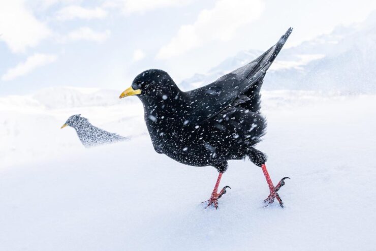
Birds and Wildlife
“Snowstorm,” Germany. Bronze Award, Best Portrait. Photograph by Luca Lorenz.
“The 2025 Bird Photographer of the Year gives a lesson in planning and patience,” This is Colossalwrites about this year’s contest winners (specifically, regarding the photo seen at the right in the header image) — but getting the cold shot, above, wasn’t an easy thing either. (See also: PetaPixel‘s plumagearticle.)
“Ghost Town Visitor,” Kolmanskop, Namibia. Winner, Urban Wildlife and Wildlife Photographer of the Year 2025. Photograph by Wim van den Heever.
From PetaPixel‘s coverage of the Wildlife Photographer of the Year 2025 contest: “Capturing the unusual intersection between nature and abandoned urban spaces, Wim’s photograph is a haunting yet captivating image of a brown hyena wandering through the skeletal remains of Kolmanskop, Namibia’s long-deserted diamond mining town. The shot was taken with a camera trap and is the result of a decade-long effort that began when Van den Heever first discovered the animal’s tracks at the site.” [Emphasis mine.] See This is Colossal‘s post, too.
Comedy and Dogs
To round out this month’s super-long post — thanks for bearing with me — something from the light-hearted department:
“It is tough being a duck.” Photograph by John Speirs.“Bad Hair Day!” Photograph by Christy Grinton.
The Nikon Comedy Wildlife Awards, 2025 edition, brings us 40 … um, moments. Awesome. PetaPixel has all the winners.
“Suppertime,” winner of the Open category. Photograph by Katie Brockman.
“Good Boys and Girls,” PetaPixel barks, regarding the 2025 Dog Photographer of the Year. (In the name of equal-opportunity pet celebration, I chose one that includes cats.)
Have a great Halloween. If you’re in the US, be sure to vote, Tuesday, Nov. 4th. And, don’t forget to check back for the special Spine post, Nov. 10th. Thank you!
AIGA’s annual deep dive into great book design is out — later this year, for some reason — and brings deep satisfaction with a huge variety of titles, foreign and domestic.
“One hundred years into this competition, the book seems to be as protean and chimeric as ever. At times confounded and delighted, we asked ourselves [during the judging process], Is this a course packet or a manifesto? A sculpture or a monograph? A glossary or a guidebook? Is this book contemporary or retro? Gauche or chic? We debated books that blended the grotesque with the goofy alongside books that were delicate, subtle, and difficult to emotionally classify. In the end, we felt we found some of the best of this year’s offerings, books that in every case seem to show what design can do to bring the experience of reading to riskier-yet-more-rewarding places.”
— Rob Giampietro, AIGA 50 Books | 50 Covers Chair
As pointed out above, it’s the 100th year of the competition, this time with 542 book and cover designs entered from 28 countries. In order to be eligible, submitted designs had to have been published and used in the marketplace in 2023.
Some of my favorites, in alphabetical order:
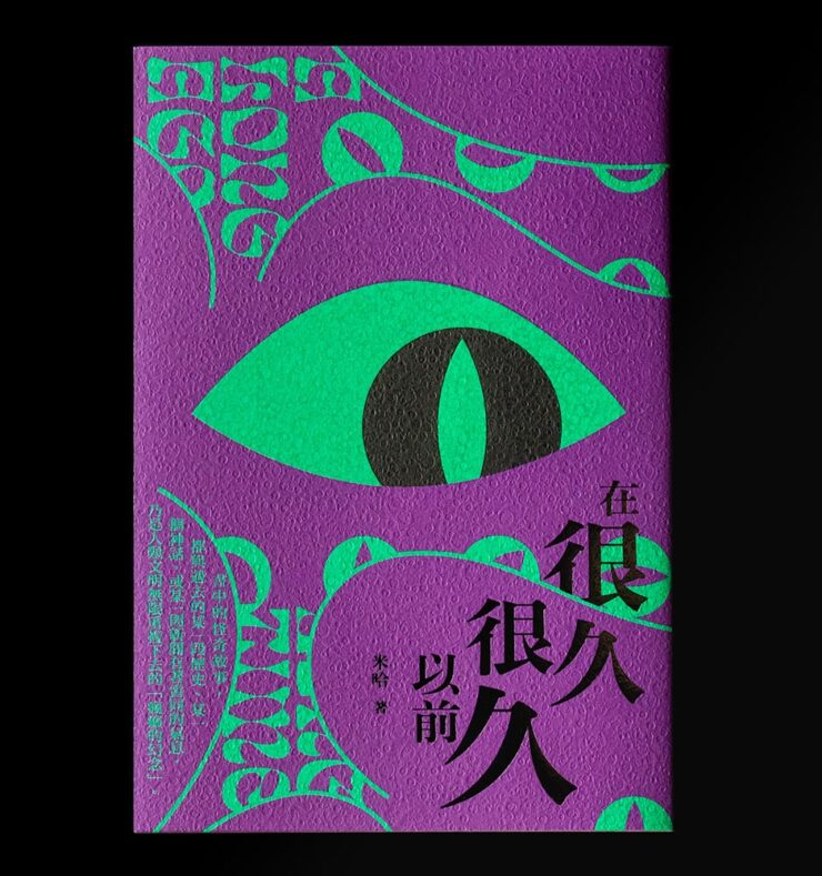
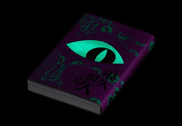
A Long Long Time Ago. Book design by You Kwok Ho.
Great texture, great graphics — on the theme of “observer.” Indeed.
A Long Long Time Ago (glow-in-the-dark detail). Book design by You Kwok Ho.
But wait: there’s more. This one observes more dramatically than it might seem, uh, at first glance.
A Long Long Time Ago (shelf detail). Book design by You Kwok Ho.
I want to get a copy just so one of my bookshelves will have this moment. Fantastic.
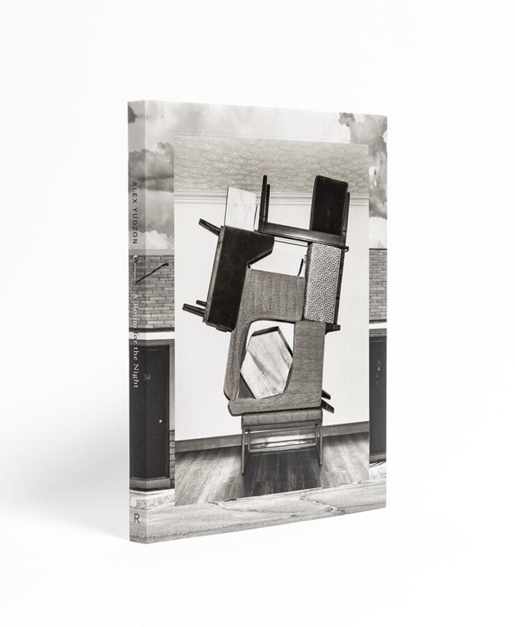
Alex Yudzon: A Room for the Night. Book design by David Chickey and Mat Patalano.
“Yudzon stacks, leans, and balances furniture [in the hotel rooms where he’s a guest] in configurations that transform these generic interiors into hallucinatory worlds where the laws of physics are suspended and dormant emotions released.” (After the installations are documented, crime-scene style, they are dismantled and the rooms returned to their original condition.) Really: who could resist? The compelling design isn’t even the icing on that cake — we’re well past that — it’s a fancy fork, ready to dig in.
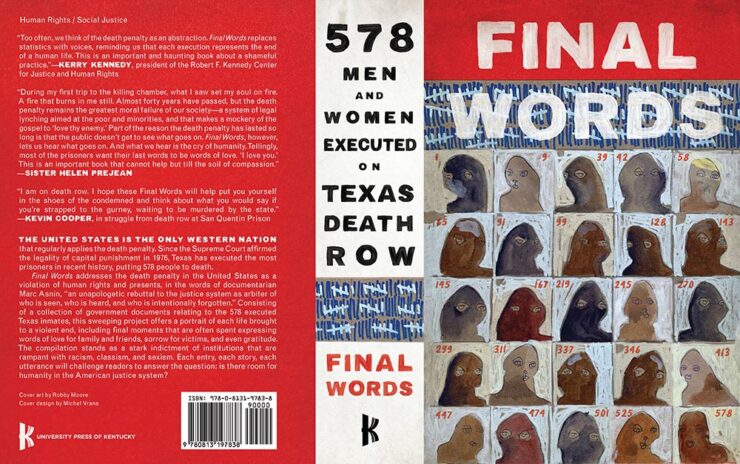
Final Words: 578 Men and Women Executed on Texas Death Row. Book design by Michel Vrana.
I’m glad we have the whole cover here; the spine definitely adds to the overall, and the illustrations on the front add so much.
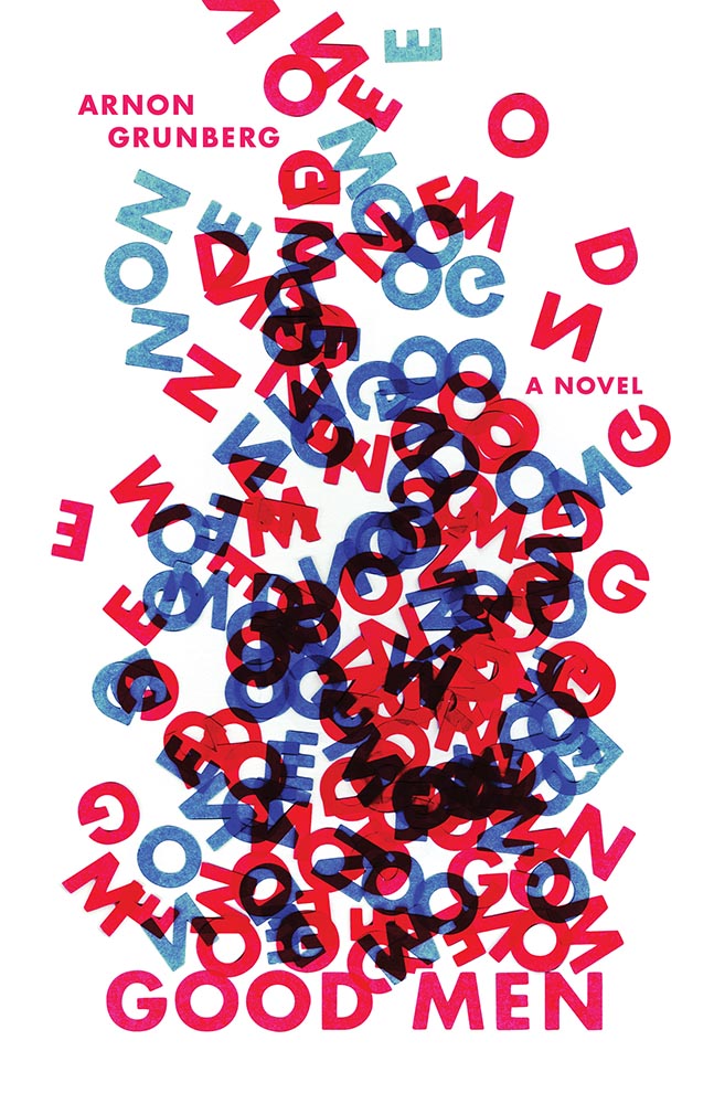
Good Men. Book design by Anna Jordan.
“I cut the letters of the title out of paper and arranged them in a way that is reminiscent of a fire – as if the words “GOOD MEN” are going up in flames. The letters rise up in a smoke-like form. Blue and red is used to emphasize the visual association with fire. The result is a visual metaphor for “GOOD MEN” blazing into entropic chaos,” designer Anna Jordan says of this novel about a firefighter, “an ordinary, sympathetic guy lost in a turbulent existence.”
Good Men (lettering detail). Book design by Anna Jordan.
Nice.
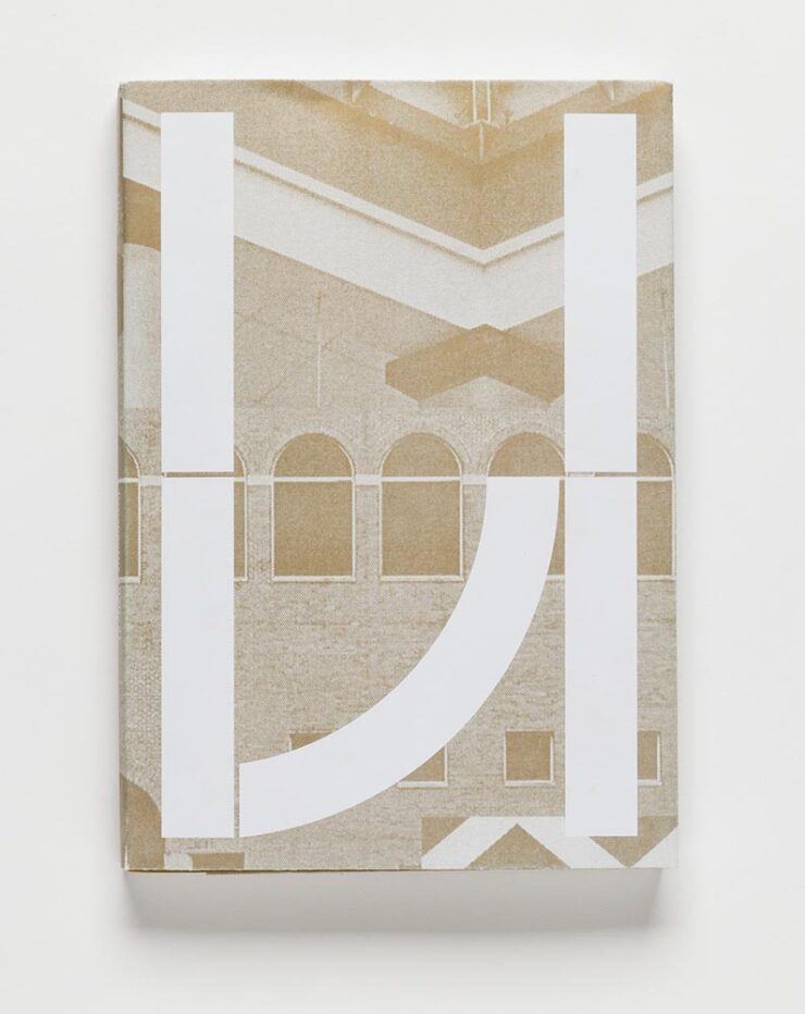
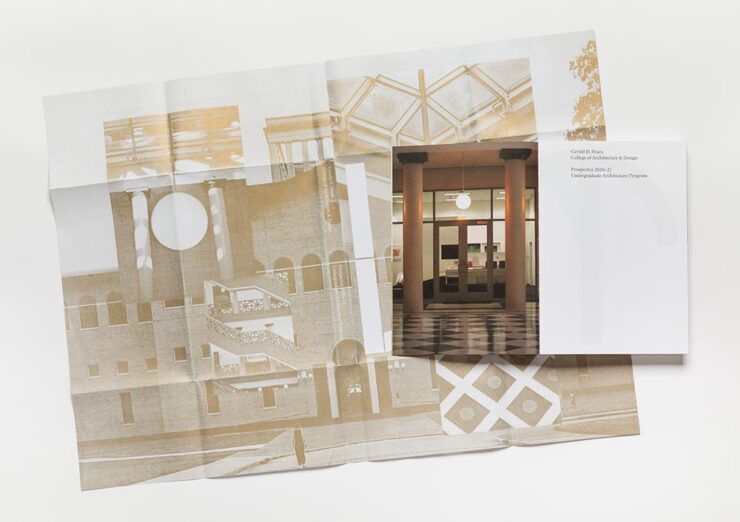
The Gerald D. Hines College of Architecture and Design: 2020–21 Prospectus. Book design by Renata Graw and Lucas Reif.
This prospectus for the University of Houston has a special bonus:
The Hines College 2020–21 Prospectus, with its jacket casually tossed over its shoulder. Book design by Renata Graw and Lucas Reif.
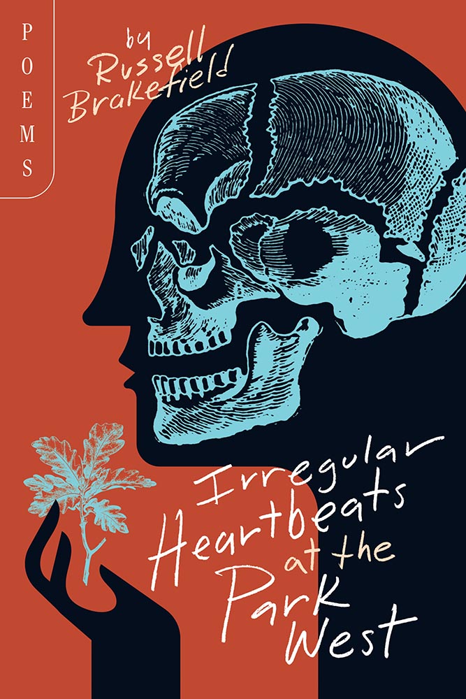
Irregular Heartbeats at the Park West. Book design by Brad Norr.
“Rural gothic,” they say. “Goodness,” I append.
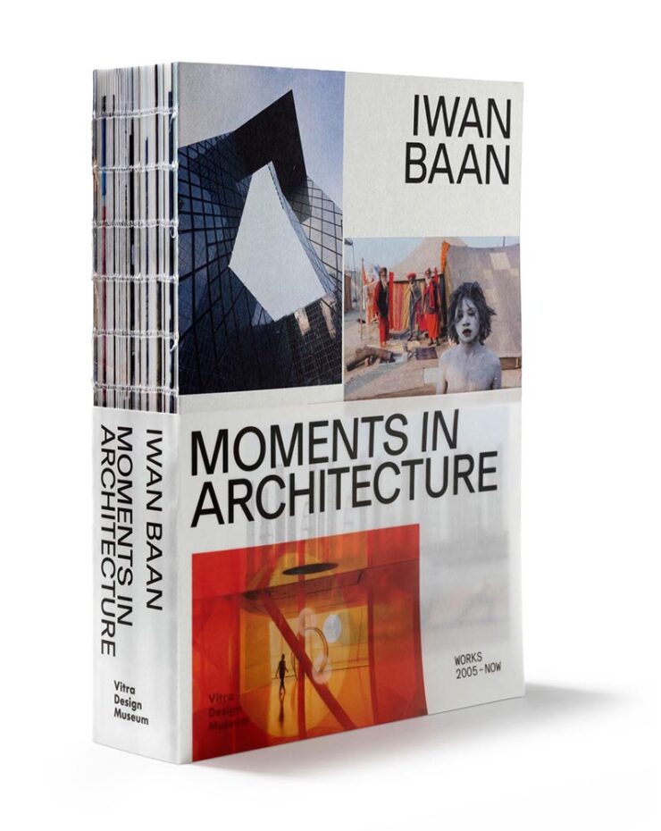
Iwan Baan: Moments in Architecture. Book design by Haller Brun.
Each year, 50 Books seems to latch onto a particular theme. Last year, it was irregular page sizes (often multiple sizes in the same book); this year, it’s irregular, often hand-sewn bindings, seen here with a slip jacket starring the other recurring theme this year: translucency.
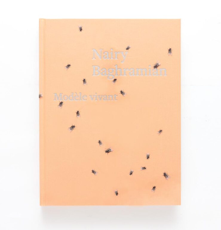
Nairy Baghramian: Modèle vivant. Book design by Green Dragon Office with Nairy Baghramian.
Speaking of translucency, this jacket is that … and something more, shall we say, eye-catching. Compelling, but does it make you want to pick it up?
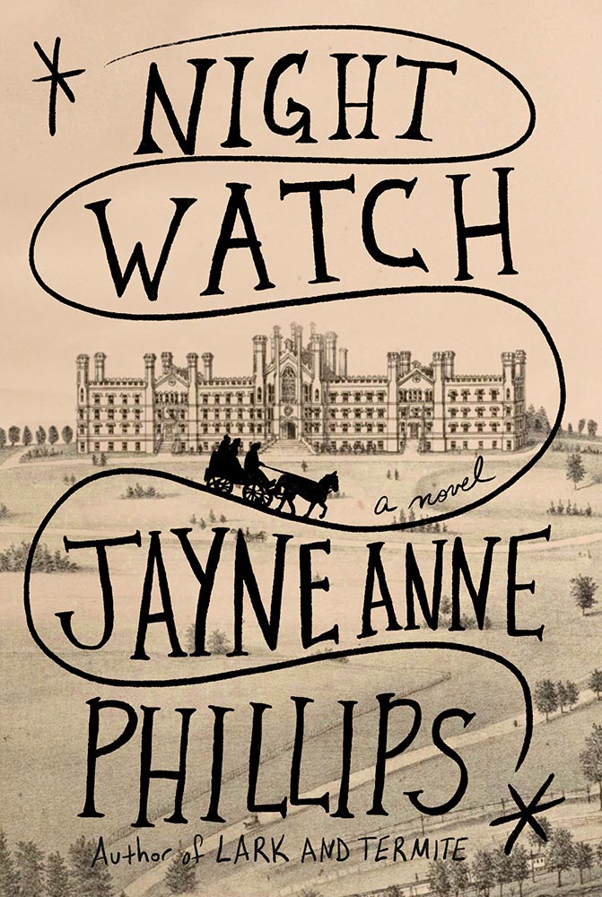
Night Watch. Book design by Kelly Blair.
This title was in my folder of finalists for Foreword‘s Favorite Book Covers of 2023 but ultimately not selected. Glad to see it get some recognition. (Note that The Guest Lecture and The Nursery, two other 50 Covers winners, did make my list.)
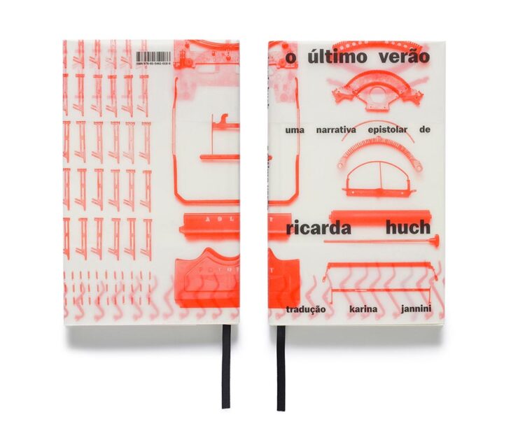
The Last Summer. Book design by Gabriela Castro, Gustavo Marchetti and Paulo Chagas.
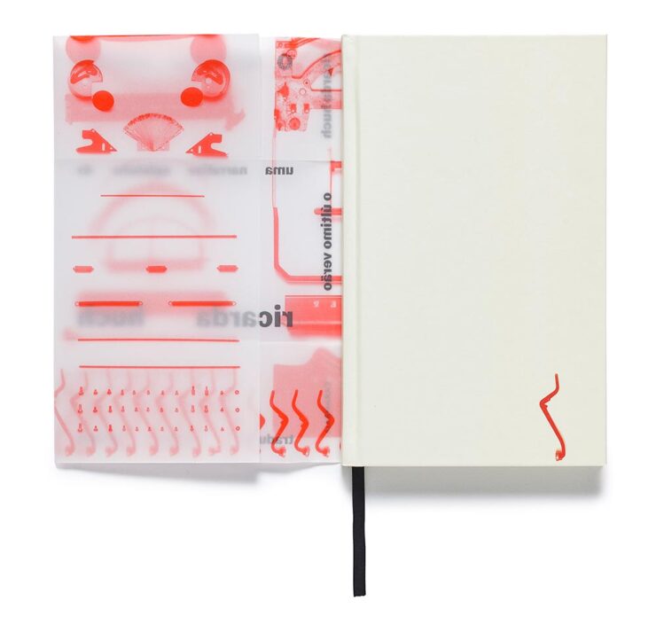
The translucency is back, this time covering — well, jacketing — a newly-republished 1910 detective novel set in pre-revolutionary Russia.
The Last Summer (jacket detail). Book design by Gabriela Castro, Gustavo Marchetti and Paulo Chagas.Only on Saturday. Book design by Chuck Byrne.
“Printing legend Jack Stauffacher’s experimental make-ready sheets informed both the cover and the jacket for the regular edition,” 50 Books says, in another red-and-white triumph.
Overlap/Dissolve. Book design by Nancy Skolos and Thomas Wedell.
Great three-dimensionality on this cover, with an equally compelling interior:
Overlap/Dissolve interior spread. Book design by Nancy Skolos.
“We set up compositional frameworks to express harmony, conflict, resolution, or both,” the designers write. “For us there is never one perfect design solution, but the process generates one idea that overlaps and dissolves into the next.”
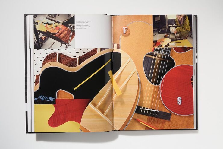
Sketches on Everlasting Plastics. Book design by Renata Graw and Lucas Reif.
Sketches on Everlasting Plastics, which “explores the infinite ways in which plastic permeates our bodies and our world,” accompanied the exhibition Everlasting Plastics at the 2023 Venice Architecture Biennale. (Note the binding.)
Steel Like Paper. Book design by Wolfe Hall.
Debossed type, linen spine, great photographs. Nice.
And, last but certainly not least:
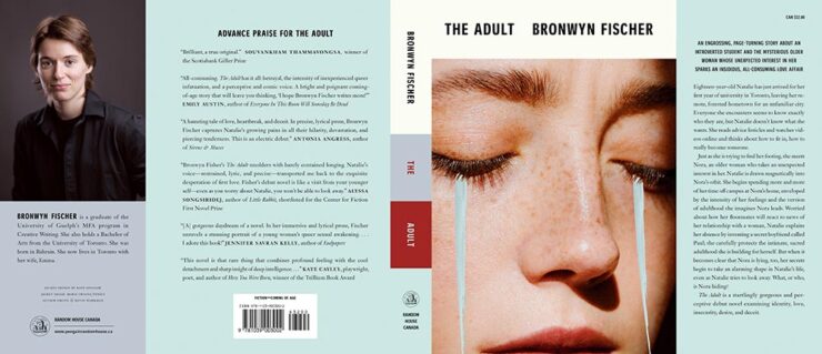
The Adult (full jacket). Book design by Kate Sinclair.
Simple at first glance, yet brings more on multiple levels. Great.
This time, several items related to books and bookstores; two more — possibly the last two — from the automotive logo category; and PRINT Magazine’s 2023 roundup of great design.
Book Four-For
AI book covers? Here, now.
Creative Bloq, which I wasn’t familiar with, has a post up that’s only here because it’s the first I’ve seen of what is sure to be a trend: AI imagery on a book cover.
Image: Bloomsbury UK (Also: Where’s the body to go with the head?)
“Causing controversy,” they say, in that…:
[F]or a while now, with concerns over copyright and ethics plaguing text-to-image generators. Perhaps the most existential worry of all is the idea that AI could put human artists out of work – and while many still find the idea fanciful, we’re already seeing examples of AI-generated art being used commercially.
— Daniel Piper, Creative Bloq
The article itself has a hint of click-bait about it, what with Twitter users spotting a NY Times bestseller but complaining about the UK version of the cover design . . . but the larger question of AI coming for the book designers everywhere is valid.
Then again, AI imagery has the potential to reshape much of the creative landscape. Let’s hope — hope! — that it’s deployed ethically.
B&N’s Market Repositioning
Image: NYTimes (modified)
BookRiot asks whether Barnes & Noble’s new presentation as “a local bookstore” — something that’s part of the community in a way that Amazon can never be —is genuine, let alone successful. (We have a B&N here in Macon, which I visit infrequently, and which doesn’t feel “local.”)
Background: The BookRiot article (and the image) above ultimately stem, I believe, from a NY Timesoption piece from 2018.
Temples of Books
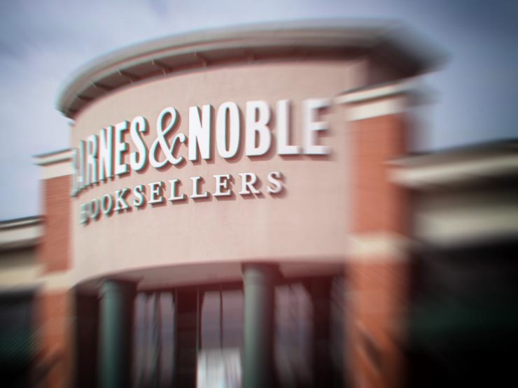
As regular readers know, I’m a huge fan of combining books and photography. Naturally, great photographs of great libraries strike just the right chord:
Phillips Exeter Academy Library, Exeter, New Hampshire
Positioning these spaces as intellectual havens, Temples of Books highlights their wide array of offerings, including botanic gardens, archival repositories, and of course, room to read. “As an institution that can curate knowledge, scrutinize the status quo, and encourage education, the library is more important today than ever,” a statement says. “This responsibility is only growing as the freedom to publish on all manner of channels increases.”
— Grace Ebert, This is Colossal
Instant wishlist item!
Take Action for Libraries
Image: everylibrary.org
Simple brilliance: a handy step-by-step guide on what to do if you don’t like a book at your local library.
Carmaker Logo Updates: Porsche and JLR
Jaguar Land Rover > JLR
No, that’s really it.
Formerly Jaguar Land Rover, but generally known in the industry as JLR, the British company1Technically, it’s an Indian company, as JLR is a subsidiary of the TATA conglomerate. decided to have a FedEx moment and rebranded. Alas, Paul Rand was unavailable, so there’s no brilliance in the execution. (We’ll absolutely leave whether walking away from Land Rover as a brand is a smart move for another, longer discussion.) Motor1 has the details.
Porsche > Almost all other mainstream car brands
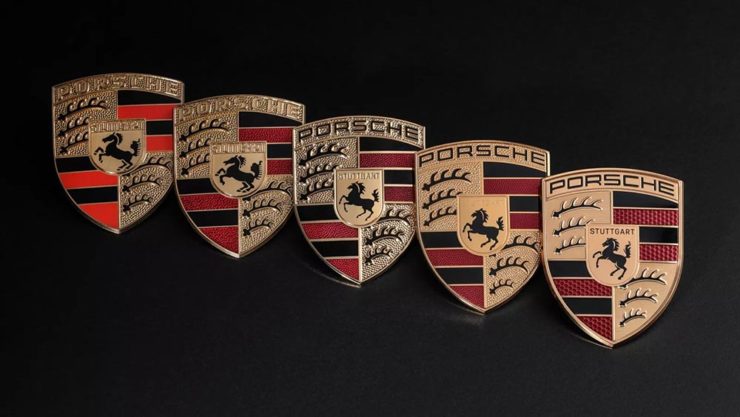
There’s a new Porsche logo!
The new 2023 version of the Porsche logo. (Image: Porsche)
That’s right: it’s a very subtle change. But it’s a significant one, perhaps because it’s only the fifth in the company’s 75-year history:
All five Porsche badges. (Image: Porsche)
The biggest changes are the backgrounds and the prancing horse in the middle, which is completely redrawn. (And, yes, has more than a passing — heh — resemblance to Ferrari’s.)
PRINT reminds us that not everything is digital these days — so much of the work still goes on paper or packaging — in their 2023 roundup of great stuff:
The 2023 PRINT Awards celebrated outstanding design in every shape and form, from the delicate texture and exquisite form of print to digital design that married technical skill with precise craftsmanship.
— PRINT Magazine
The best in show is a brilliant environmental design, the annual reports category is oddly satisfying (I didn’t know that Land O’ Lakes is a cooperative that owns Purina, for instance), the editorial category contains brilliance, and many, many more worthy of a design lover’s attention.
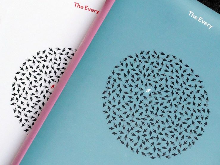
Sadly, their book design category is a bust. I like “The Every,” but pretty much any of my Best of 2022 picks run circles around it (and the other two choices):
The Every as photographed by PRINT.
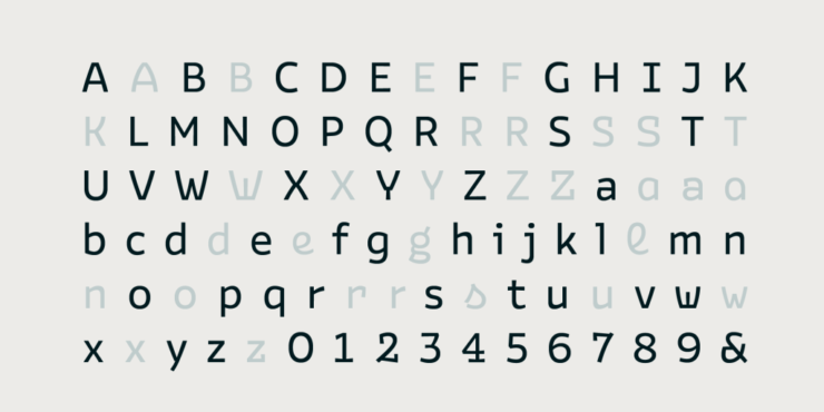
But there are gems. I really like Bakemono, for instance, a winner in the fonts category and the best monospaced font I’ve seen:
Italian foundry Zetafonts brings us Bake Mono.
It’s a long article (they call it a 74-minute read!), but when you have a moment, grab a drink and an iPad and enjoy — hopefully as much as I did.
And that’s it! Settle into summer, and stay tuned for more soon.
1
Technically, it’s an Indian company, as JLR is a subsidiary of the TATA conglomerate.
This time, we’ve got some great book design (with a bonus), Hoefler educates on typography (with a bonus), and two updated car company logos. Let’s get right to it!
Print Magazine on the design of Lyrics
The still-very-relevant-in-2022 Print Magazine brings us a great feature on the design of Paul McCartney’s book, Lyrics:
Front and back covers of Paul McCartney’s Lyrics, by Triboro Design.
Turns out it was designed by an outfit called Triboro Design, from Brooklyn (appropriately). Print brings us an interesting interview with David Heasty, the principal:
I […] found him to be sharp, quick, articulate, and modest. Below, we discuss Paul’s involvement with the project, the book’s gorgeous bespoke typeface, and the importance of staying true to a legend’s vision.
Ellen Shapiro, Print Mag
The “S” spread of Paul McCartney’s Lyrics, by Triboro Design.
Bonus: Looking at Triboro’s website, this lovely piece of typography stood out:
Triboro Design’s Zolo Jesus album typography creates desire.
Hoefler Discusses Daggers
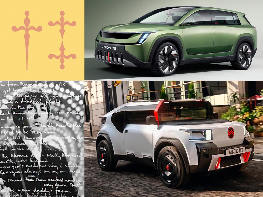
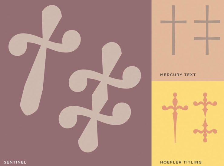
In “House of Flying Reference Marks,” Jonathan Hoefler talks about daggers, or, what you use when an asterisk isn’t enough:
Hoefler on daggers.
Beautiful examples, complete with a phrase you don’t hear everyday: “twisted quillon.” Read and enjoy. (If the opportunity presents, follow on with the ampersand article — which, uh, takes a stab at where the word came from. Nice.)
It seems like nearly all of the major car manufacturers have introduced a new logo in the past couple of years, but here are two more. One’s best described as “an update,” while the other … goes a little farther.
Skoda, for those that don’t know, is a Czech company and part of the massive VW Group. Frankly, it shows:
Skoda’s 2022 Kodiaq, a thoroughly VW Group product.
For 2023, they’re introducing a push to separate themselves from VW a little, resisting the downmarket image. As is (now) normal with updated car company identities, there’s a concept:
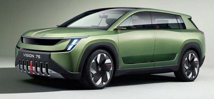
Skoda’s Vision 7s concept.
It’s … not inspiring. Maybe the actual updated logo will turn the corner:
Skoda’s 2022 logo.
Solid. (Pardon the pun.) But seriously, even an avid car nut like me didn’t know that represents a winged arrow — and I’m not sure the new version helps. At least they get points for consistency:
Then there’s Citroen. Even under the potentially-smothering corporate blanket that is Stellantis (there’s a name!), the pioneer of decades past still manages to actually thrive. First their new logo:
Citroen’s 2022 logo.
They’re not quite as consistent — the dual chevrons have varied a bit. This time, they’ve literally gone back to their roots, pulling the 1919/1921/1936 version out and dusting it off for modern use:
History of Citroen’s logos, 1919–2022.
Points to them for hinting at what’s to come, too:
Citroen’s 2022 logo, with just a slice of concept car showing.
…Which turns out to be something with, ahem, Oli bits:
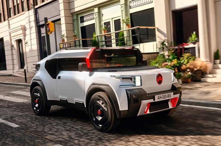
Citroen’s Oli: the antithesis of a Skoda.
“Nothing moves us like Citroen,” they say. The Oli moves me, to a point where I truly wish Citroen was once again available in the ’States. Cool and radically innovative, without losing sight of something VW has truly lost: fun. Well done.
Updated, 19 October, 2022:Brand New adds to Citroen’s new logo story, with a slightly-less-than-enthusiastic take on the logo and has frankly unkind things to say about the new, custom typeface (custom typefaces are now de rigueur — a policy as much related to rights ownership than creativity, alas).
I really like the cursive in this Vimeo screenshot:
YouTube? What YouTube? Citroen posts to Vimeo. Ahh, the French.
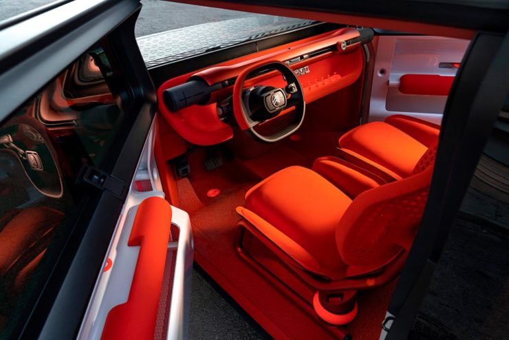
BN also includes a number of extra photographs of the simply awesome Oli, too. Here are a couple, for your enjoyment:
Plug-and-Citroen.
Note the removable Bluetooth speakers (the black tubes with “+” and “-“) and, especially, the seats: