Beautifully Briefed 25.6: Spine

It’s hard to believe that 2025 is half over — but at the same time, the amount of water under the bridge in the first half of this year is quite astonishing. For those of us in the United States (indeed, worldwide), this year seems to rival the pandemic for necessary use of the word, “unprecedented.”

Therefore, your monthly dose of sanity great design and photography awaits. Enjoy.

University Presses Coverage on Spine

Spine is a regular stop for book designers everywhere. The site’s interviews with designers, authors and illustrators and especially their monthly book design faves are all items not to be missed; they do, in fact, live up to the tagline, “how books are put together.”

Unfortunately, their “Uni-Press Round Up” — Uni, of course, being English for University — has been MIA since the columnist left in 2021. So it was a great honor when Spine editor Vyki Hendy accepted my offer to republish my best of the Association of University Presses (AUPresses) Show 2025. (Indeed, Spine republished this year’s Foreword post in its entirety.) But that’s just the beginning: she asked me to take over the column, too.

I said “yes” without a second thought.

It’s important to me that I share a word or two about why: simply put, I believe that university presses worldwide deserve celebration. Part of it is the political atmosphere in the US recently, sure, but conservatives have been targeting higher education for a minute now. (See New College of Florida, “where education goes to die.”)

It’s more that I feel that university presses are the unsung hero of the publishing world. Titles are often complicated and difficult to visualize, and limited budgets often make it difficult to attract talent for great book design. An opportunity to highlight the best is not to be ignored.

Please head on over to Spine to enjoy the books I gathered for the first post, covering titles published in May and June of this year. But I’d like to call out a couple of favorites here:

University of Texas Press. Cover design by Lauren Michelle Smith, art director Derek George. Cover image, “Hybrid Paper Gods & Queens,” by Julius Poncelet Manapul.

Extraordinary artwork, handled extremely well. Also:

Yale University Press. Cover design and illustration by Sarah Schulte, art director, Dustin Kilgore.

A difficulty subject — and book design brief, surely — treated with classic style and an illustration showing an uncommon depth of meaning.

It’ll be an incredible pleasure to keep a closer eye on the university press publications with monthly round-ups of the best new work. I hope you’ll read the column regularly.

Special mention: Macon’s Mercer University Press:

It’s fulfilling to become more familiar with a great resource right here in town.

University Center stairs (2021), Mercer University campus, Macon, Georgia.

I’ve wandered around Mercer with a camera twice, and have just found an excuse to do it again. Stay tuned.

The Creative Independent: “On Developing a Solid Foundation,” with Creative Director Arsh Raziuddin

Book designer extraordinaire Arsh Raziuddin has been featured here before — this year’s Favorite Book Covers post, for instance — but it turns out she wears many hats indeed, as this interview at The Creative Independent proves.

An insightful highlight:

Book covers taught me how to pay attention to detail both in terms of the story and the design. What’s different between magazine work and book design is that with a book, you’re often condensing a 300-page story into a single cover; whereas editorial work might involve an 800- or 1,000-word essay that you need to visualize. It’s so difficult to capture the essence of an entire novel in one image — something really has to stand out. […] It feels a bit daunting to fit an entire novel in a 6×9-inch rectangle.

— Arsh Raziuddin, wearing her book design hat

Her cover design for Salman Rushdie’s Knife is discussed, an extraordinarily good example of, as she puts it, “not overcomplicating”:
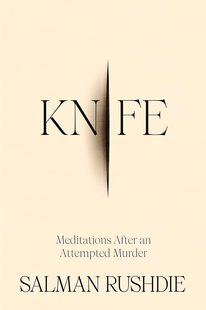
Book design by Arsh Raziuddin.

It’s a treat to see some rough drafts:
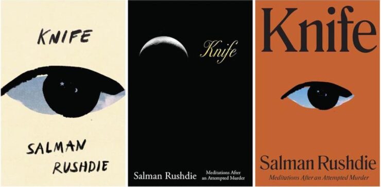
Book design by Arsh Raziuddin.

“We’re [that is, book designers] all trying to make something sexy or loud without a solid foundation,” she says. “We all need to collectively focus on craft.” Perhaps like this fantastic book cover, this time for a Pulitzer prize-winning poet:
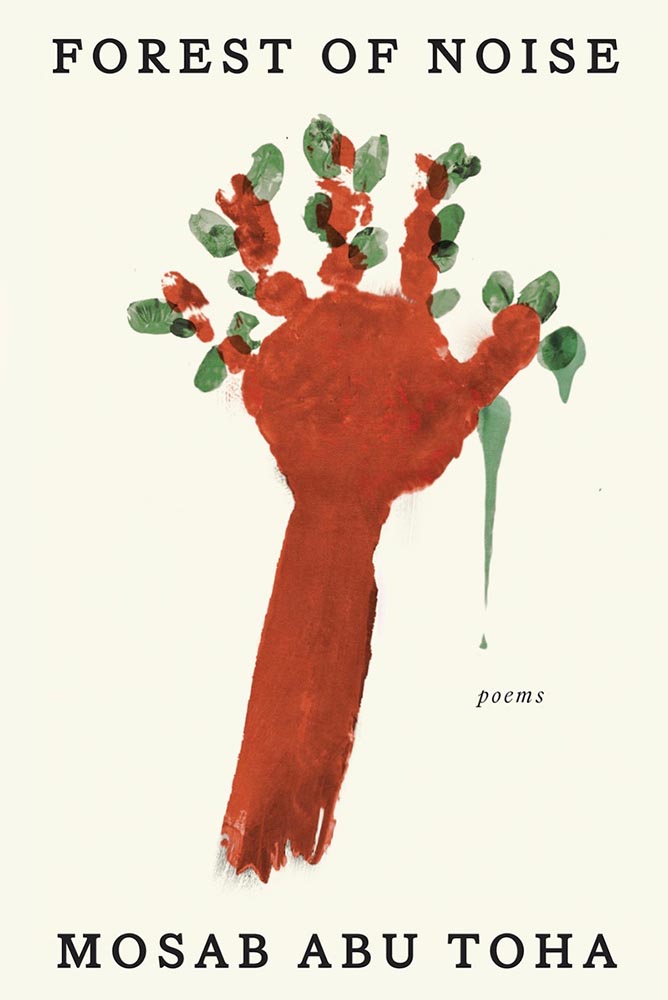
Book design by Arsh Raziuddin.

The entire interview is a gold mine. Read and enjoy.

More Great Design Items, Briefly

“The 2025 PRINT Awards Honorees in Advertising & Editorial Cut Through the Noise,” the headline reads. Yes.

It’s Nice That asks, “Are social media pile-ons stifling the creative industry?” Yes, I’d argue, and for more than just rebranding exercises. Read the article to see if you agree.

“Jon McNaught has created more than forty covers for the LRB as well as artwork for books, diaries, posters and campaigns.” Follow his process.

“Chris Ware, known for his New Yorker magazine covers, is hailed as a master of the comic art form.” Follow his process.
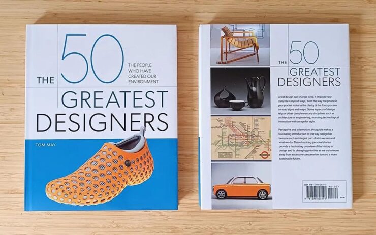
“Designers needed a book about their history that didn’t exist… so I wrote it myself,” Tom May says at CreativeBoom.
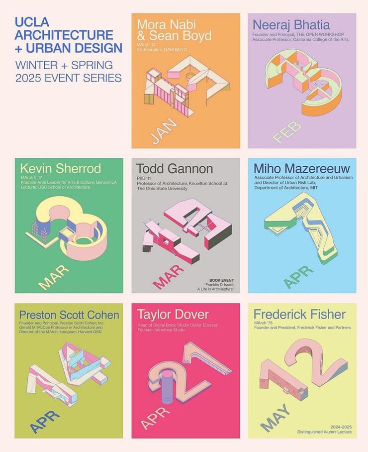
Archinect covers the best of the spring lecture series posters. (Previously.) Building an intersection of design and architecture: when getting a lecture is a good thing.

AI: Desctructive to Books — Literally
Photograph: Alexander Spatari via Google Images.

Anthropic destroyed millions of print books to build its AI models, Ars Technica reports.

On Monday, court documents revealed that AI company Anthropic spent millions of dollars physically scanning print books to build Claude, an AI assistant similar to ChatGPT. In the process, the company cut millions of print books from their bindings, scanned them into digital files, and threw away the originals solely for the purpose of training AI[.]

— Benj Edwards, Ars Technica

“Buying used physical books sidestepped licensing entirely while providing the high-quality, professionally edited text that AI models need, and destructive scanning was simply the fastest way to digitize millions of volumes,” they continue.

Sigh.

Special Bonus #1: While the original reference has — annoyingly — disappeared, this Pixel Envy piece on AI Calvin and Hobbes still stands. Another example of link gold, including:

“The glove,” he said.

Special Bonus #2: Quentin Blake illustrates Animal Farm.

Not sure what made me think to include this.
Tech Corner: The Mac’s Finder Icon

Stephen Hackett, 512 Pixels: “Something jumped out at me in the macOS Tahoe segment of the WWDC keynote today: the Finder icon is reversed.”

Existing MacOS 15 (left), future MacOS 16/26 (right). Note also the change in title location.

“I know I am going to sound old and fussy, but Apple needs to roll this back,” he writes — but then, being who he is, gives us an illustrated history of the Finder icon. Natch.

Thankfully, Apple listened. Sort of.

The icon as of MacOS 16/26 Beta 2 (right). And the title, uh….

Calling it only “slightly better” — something I agree with — John Gruber’s Daring Fireball makes a strong case for something that sticks closer to tradition, with this specific example:

“Glasses it up but keeps it true to itself.” — Gruber. (Icon by Michael Flarup.)

I have a feeling that Apple is going to keep the outline; generally, when it does these redesigns, the rules tend to overrule, if that makes sense.

In other words: Liquid Glass > tradition.

Special Bonus #3: In a word, “glasslighting.” (Also via DF.)

Photographic Goodness
Theibault Trebles

This is Colossal: “Architectural Symmetry in Europe’s Subways,” Say no more.
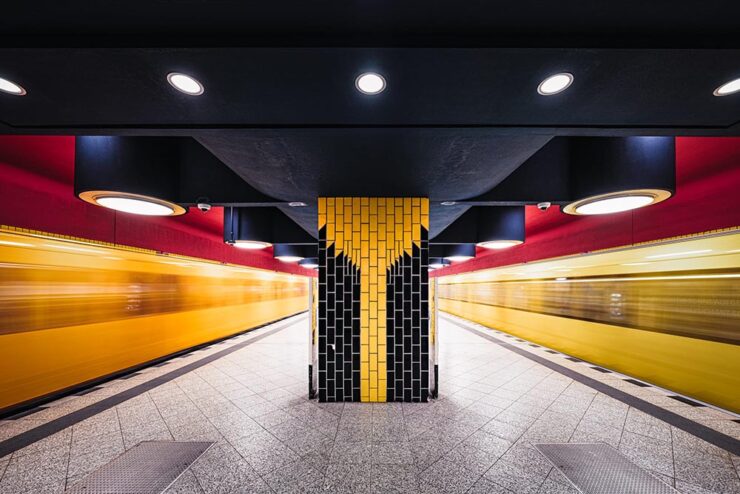
Richard Wagner station, Berlin. Photograph by Theibault Drutel.

Brilliant on many levels, but it’s the dual trains-in-motion that takes it over the top. Another:

Solna Centrum station, Stockholm. Photograph by Theibault Drutel.

“Each city approaches underground architecture differently, mixing brutalism, futurism, minimalism, or sometimes unexpected touches of ornamentation,” the photographer says. Read the article or visit Theibault’s website.

Nat Geo Traveler Photo Contest 2025

PetaPixel covers the National Geographic Traveler (UK) contest, honoring the best travel images by photographers in the United Kingdom and Ireland. My favorite:
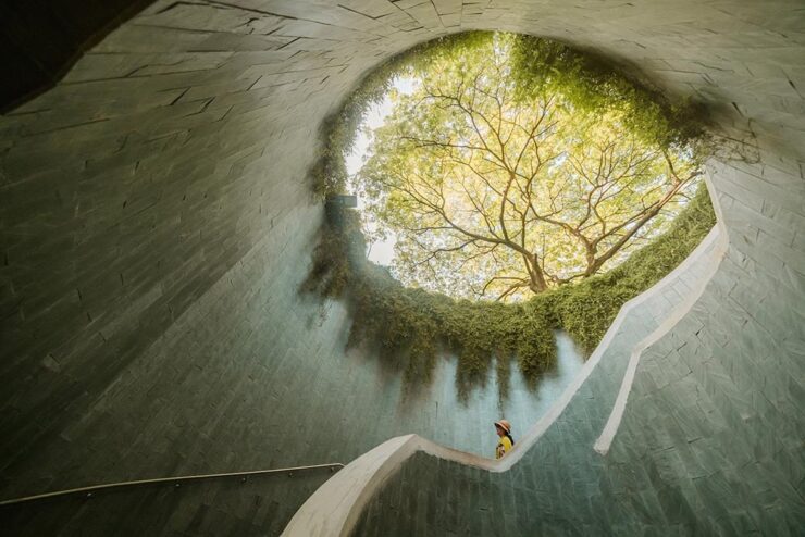
“Tree Tunnel,” Singapore. Photograph by Scott Antcliffe.

“I found this spot and was struck by the sheer density of the foliage — vines had completely enveloped the supporting walls, but the view of the Yellow Rain Tree at the top was simply stunning and utterly mesmerizing,” the photographer says.

See more. (NatGeo’s website has an article, but it requires you to enter your email to read. Boo.)

National Park Foundation Celebrates America the Beautiful

The National Park Foundation has announced the winners of its 2024 Share the Experience photo contest — the official competition of America’s national parks, for amateurs only. Still:
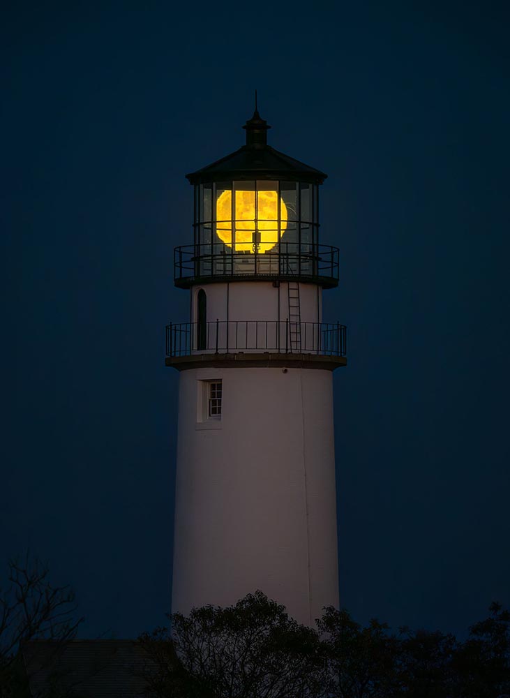
History & Heritage category winner, Cape Cod National Seashore. Photograph by Matt Ley.

See more at PetaPixel.

Toy Miniatures, Cinematic Worlds
Batman on a snowboard. Photograph by Alex Gusev.

Doesn’t really require too much explanation: brilliant stuff. It may be little more than a fluff piece, but the photography makes it worth visiting this PetaPixel post. (Reminds me, on some level, of the tongue-in-cheek mentality of the ’60s TV series.)

Full Circle: 2.1 Trillion

Humanity is overflowing with imagery, according to research from Photutorial:

162 billion photos are taken every month.
That’s 5.3 billion photos per day.
Or 221 million photos per hour.
3.7 million photos per minute.
61,400 photos per second.

94 percent of those are taken on smartphones — itself a shocking number — but there’s an important statistic in the data:
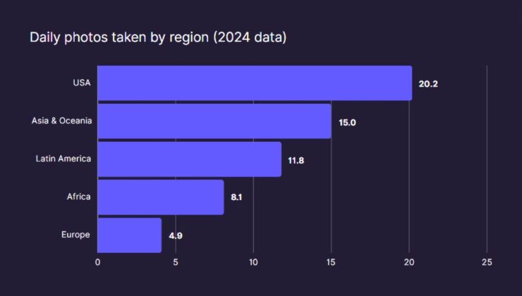
Source: Photutorial

It doesn’t take much to wonder why the US takes, on average, four times the number of photographs Europeans do.

Special Bonus #4: An Adobe two-fer: AI-powered culling tools for Lightroom — see last month’s Beautifully Briefed regarding AI and Adobe’s recent price increases — and, because I refuse to leave y’all on a down note, info regarding Project Indigo, Adobe’s promising new computational camera app.

Beautifully Briefed 24.1: Optimism, Hopefully

In this installment, Honda’s new(ish) logo, the Travel Photographer of the Year 2023 winners, and the Macintosh turns 40. Plus, one more thing. But first:

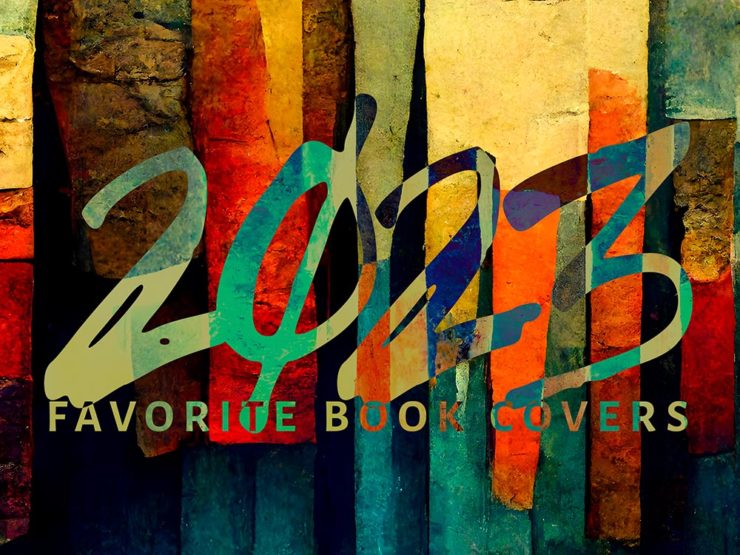
My Favorite Book Covers of 2023

In case you missed it, the annual favorite book covers post is up — all 78 items (plus some extras). It’s best viewed large, so click and enjoy.

Honda’s New Logo: Not a Zero
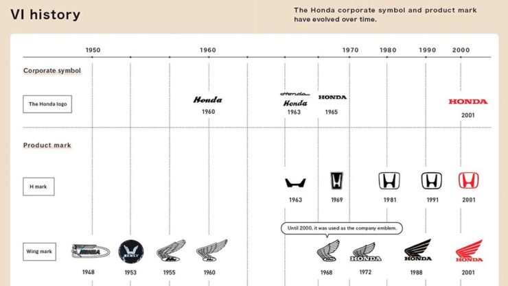
Not a zero — an “H.” Clever(ish).

As car manufacturers go, Honda’s tiny. As a result, they’re way behind on the electric push: they’ve got some hybrid stuff, a hydrogen fuel-cell item only available in California, and a new battery vehicle built by GM. Not where you want to be in 2024.

So they’re trying to make a splash. And to their credit, they’re doing it in an attention-getting style. Introducing the Honda Zero series, starting with the Saloon:

Futuristic indeed.
There’s no mistaking this for an Accord — but then, that’s the idea.

And the Honda Zero Space Hub:

Not minivan, Space Hub. (The no-rear-window thing is becoming a trend, alas.)

Other Zero Series cars will follow, and of course, being concepts, details are scarce. Both concepts, however, highlight a new logo for Honda’s EV effort:

Yeah, not earth-shattering. (And distinct from the Zero-series logo, above, which does not seem to appear on the cars — only marketing materials.) Here’s a history, for reference:

It’s worth noting that the non-electric cars will retain the current logo they’ve used since 2001. Read more at Motor1 or The Drive. (The latter has more on Honda’s Zero cars, too.)

2023 Travel Photographer of the Year (Contest)

Disclaimer up front: it’s another pay-to-enter photography contest, which seem to have proliferated. The problem here is the outstanding quality of output — perhaps I should just get over it and move on.

The rules of this one require both prints for final judging, no composite images, no AI, and a RAW file to check results against. All of which mean, to me at least, a higher level of achievement in order to enter. Okay.

Shout out to the BBC for bringing this year’s winners to my — our — attention.

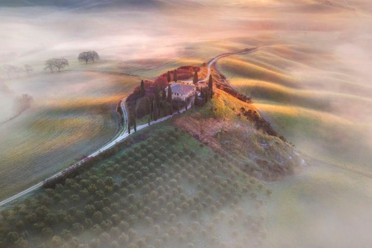
Travel Photograph of the Year 2023 overall winner: AndreJa Ravnak, Slovenia

Slovenia is a beautiful country, and AndreJa Ravnak’s winning portfolio of photographs absolutely reflects both that and its hard-working agricultural nature. But there’s more:

Nature, Wildlife, and Conservation Portfolio Winner: Martin Broen, USA

A “ray of sunshine” joke here . . . .

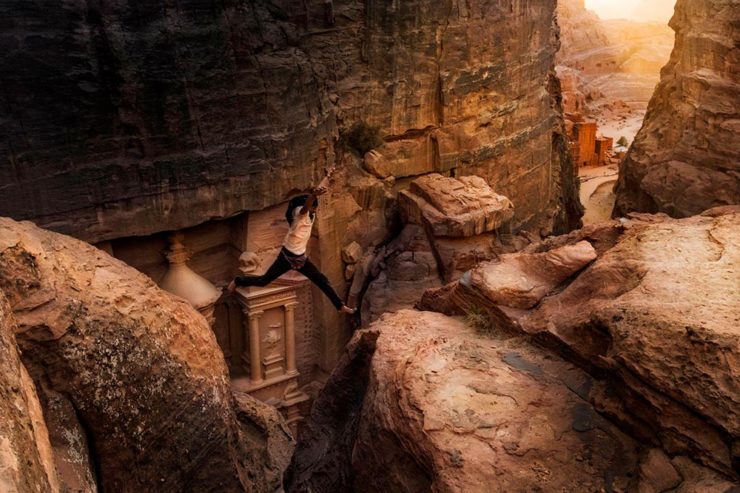
Leisure and Adventure Winner: Andrea Peruzzi, Italy

Certainly a lesson in how not to enjoy the wonderful city of Petra, in the Jordanian desert — but an attention-getting photograph.

Landscape and Environment Portfolio Winner: Armand Sarlangue, France

Seriously amazing stuff: moody, dramatic, and yes, fluvial morphology. Nice.

See more at the Travel Photographer of the Year website. (Also via PetaPixel.)

The Macintosh Turns 40

1984 seems like so very long ago — and let’s face it: 40 years is a long time. Indeed, these forty years of technological progress has been unrivaled in human history. But the Mac is not only still with us but better than ever.

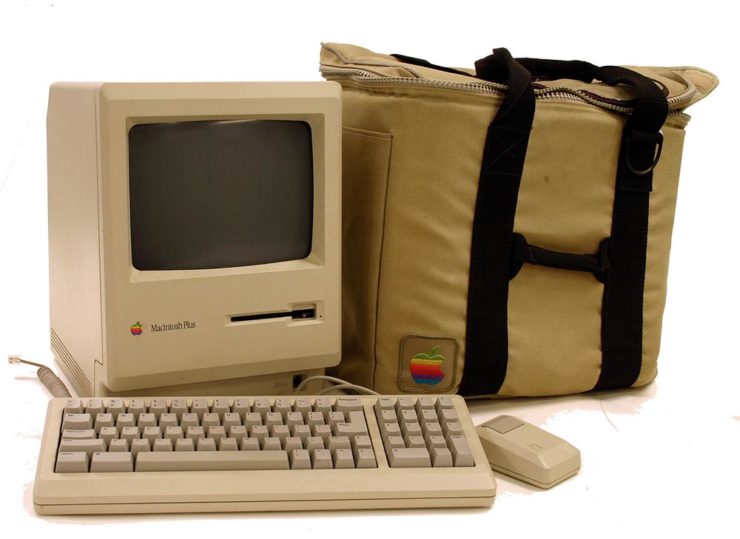
A Mac Plus, circa 1986.

There are a stack of articles that’ll retrace the history, tell a story, cite unusual examples of the breed, or even come up with the original press release:

We believe that [this] technology represents the future direction of all personal computers,” said Steven P. Jobs, Chairman of the Board of Apple. “Macintosh makes this technology available for the first time to a broad audience–at a price and size unavailable from any other manufacturer. By virtue of the large amount of software written for them, the Apple II and the IBM PC became the personal-computer industry’s first two standards. We expect Macintosh to become the third industry standard.

— Apple Computer, January 24, 1984

My first Mac was the one pictured above: a 1989 Mac Plus, with an external 20MB (!) Jasmine hard drive. (I even still have the case, although mine was a black Targus item.) It didn’t last long, though, because I’d been bitten by the graphic design craze and soon traded it for a Mac called a Quadra, with its separate 256-color monitor.

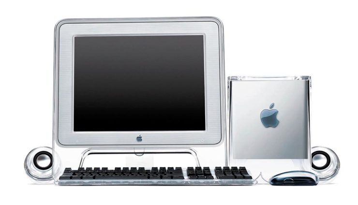
A preview of the future: 2000’s PowerMac G4 Cube.

Such was the pace of technology those days: that one was replaced with another, then another. (Including one of the Macs pictured at the top of the post. Bonus points if you know which it is.) I did not have the G4 Cube, pictured above, because by then I was rocking a tower and scoffed at Apple’s first attempt at desktop miniaturization — not to mention the inferior quality of the first generations of flat screens.

All-in-ones were — and remain — the domain of Apple’s iMac.

But less than ten years later, the computer had become part of the flat screen, and these days, I’m still using a 27″ iMac. Sure, its days are numbered, but I love its ability to get huge book and photography projects out the door with a minimum of fuss — all in a simple, elegant package with very much more than a passing resemblance to the original Macintosh.

Here’s to another 40 years, Apple. Congrats.

Special Bonus: There are few folks more “Mac” than John Siracusa, who has penned a thoughtful piece on AI: “I Made This.” (Via Pixel Envy.)

One More Thing: Word of the Year, 2023

From none other than Cory Doctorow: “enshittification.”

Here is how platforms die: first, they are good to their users; then they abuse their users to make things better for their business customers; finally, they abuse those business customers to claw back all the value for themselves. Then, they die.

— Cory Doctorow, Pluralistic, 21 January 2023

He’s specifically referring to TikTok, and cites Amazon and then Facebook as further examples, but oh, so many, many other items apply. I’ve not read something that represents where we sit — in America, sure, but beyond — at the start of 2024.

And this year promises to be a doozy.

“‘Monetize’ is a terrible word that tacitly admits that there is no such thing as an ‘Attention Economy,'” he writes. And yet, “monetize” is where business, education, and perhaps society is at. Ug.

The whole thing is fantastic and very much worth a read. But, “[n]ow that [they] have been infected by enshittifcation, the only thing left is to kill [them] with fire” might be taking things a bit far. Let’s hope — and work — for a better solution. For all of us.

Beautifully Briefed, Late April 2022: Old Macs, More or Less, to the Fore(word)

This time: System Six, from Glider’s programmer; MacOS 8 — including Glider — in your browser; and a pictorial history of Apple monitors. Nostalgia for your enjoyment!

System Six

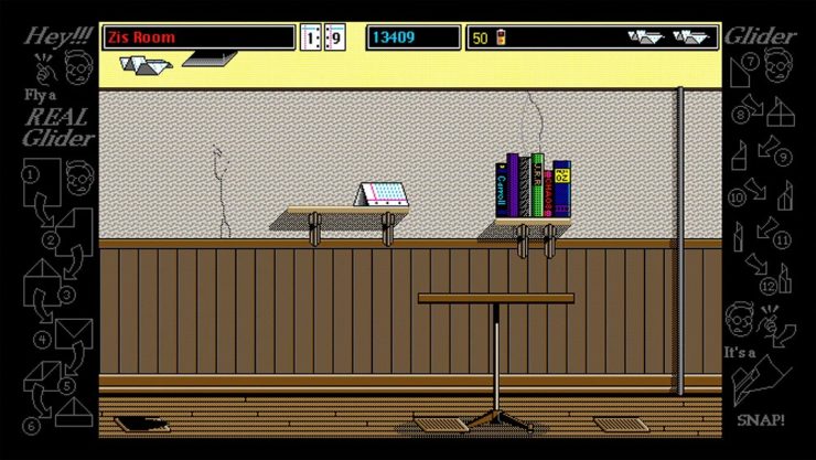
John Calhoun, who wrote one of my all-time favorite games for the classic Mac, Glider, has taken a Raspberry Pi, an e-ink screen, and a great deal of ingenuity to make this:

It’s only got the shape of a classic Mac — and yet….

Calendar events, the current moon phase, and more, in a form that can’t help but bring a smile. Better still, he’s written about the process so others can make one, too. (Ahem, Gerald.) Best desk accessory evah, to coin a phrase.

Infinite Mac
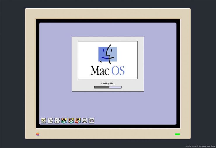
Fastest MacOS 8 startup times in history.

A project to have an easily browsable collection of classic Macintosh software from the comfort of a (modern) web browser. […S]ee what using a Mac in the mid-1990’s was like.

Well, naturally, I’ve been . . . here:

Glider works — and wastes time — just as well as on the original.

MacOS8, with infinite fun. But that’s not all! For — wait for it — $0, you also get System 7 and KanjiTalk. (Set aside a few hours before clicking.)

Mac Monitor history, detailed

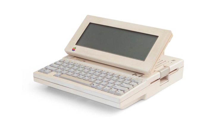
With the advent of the Apple Studio Display, Steven Hackett, of 512 Pixels fame (along with a variety of podcasts — he’s the co-founder of Relay FM), decided it was a good time to look back at some of Apple’s monitors. Starting with this gem:

Apple IIc with its LCD screen!

It takes a footnote — hmph — to get to what Steven and I both agree is a favorite, the last iteration of the CRT-based Apple Studio Display (you knew that name was familiar, right?):

The last great CRT monitor, IMHO.

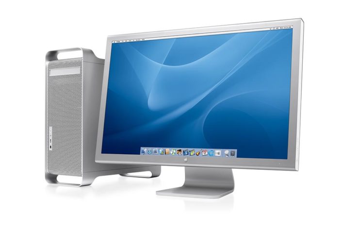
And then there’s the 30-inch Cinema Display, shown here with the G5 tower:

Awesome.

I had several of these monitors, including one of the 30-inchers, and have loved every one of them. And while I, like a lot of creatives, use a 27-inch iMac these days, thanks to Apple’s discontinuation of said iMac, the next iteration of my office setup will include a standalone Apple monitor. I’m glad Steven took the time to remind us what’s been — thanks.

Bonus: Steven has an eMac G4 article up, too. Great times.