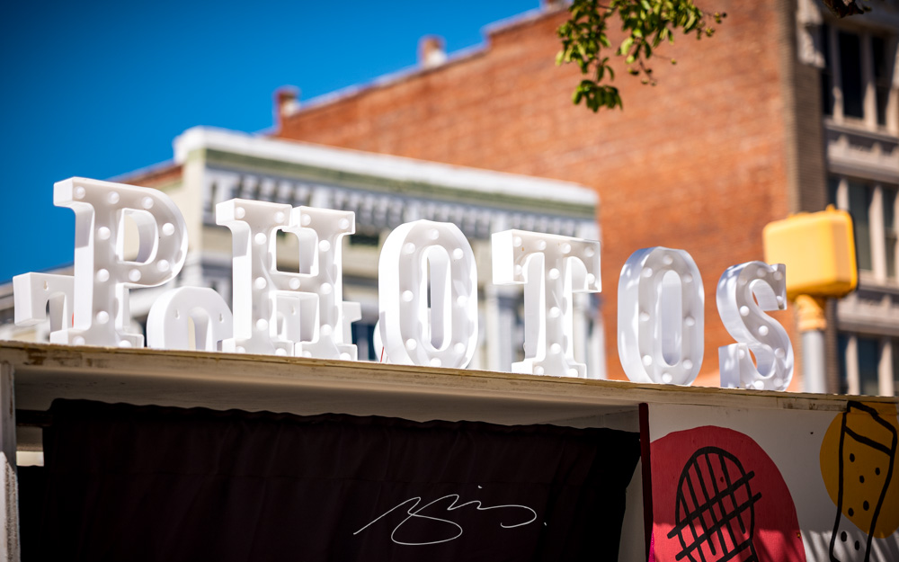
Type opens up, the best designer you’ve never heard of, and photography to admire and inspire: all this and more for your August edification and enjoyment.
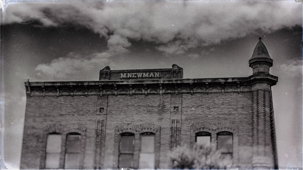
August University Press Coverage on Spine
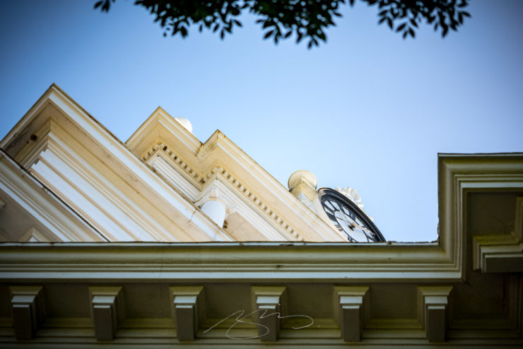
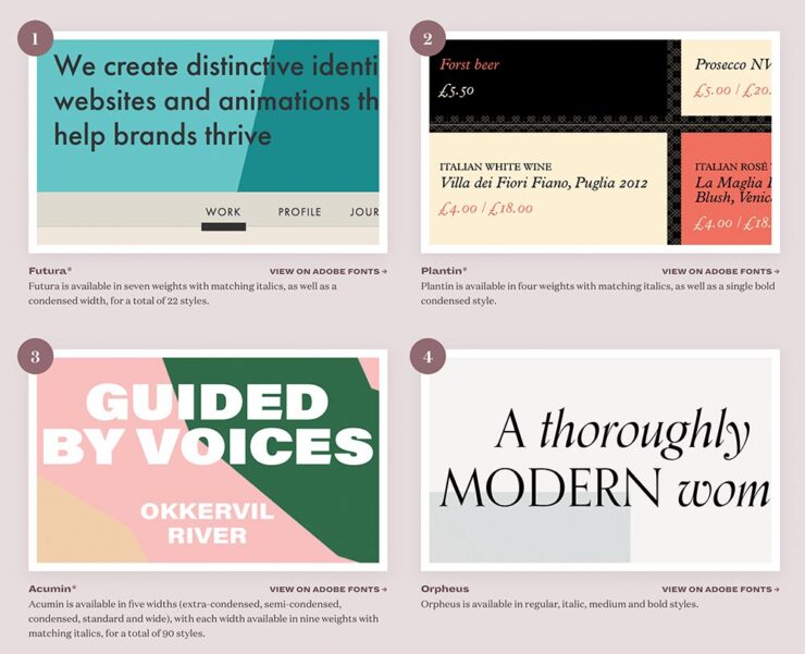
Rather than show my favorite this month, I thought I’d share four of the runners up:
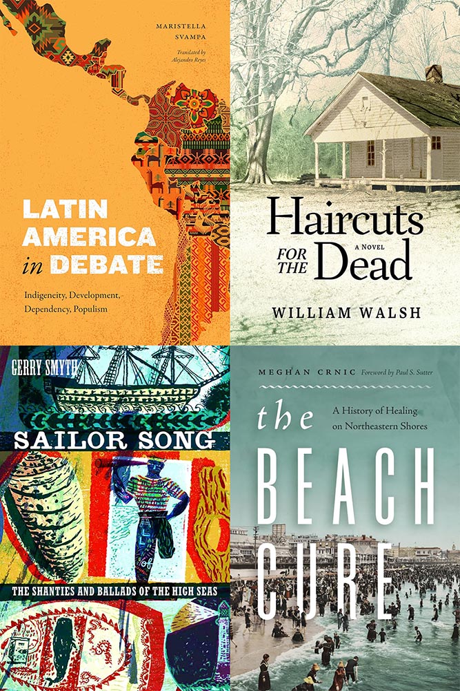
Clockwise from upper left: Duke University Press, Mercer University Press, and two from the University of Washington. These are all good, but just missed being in the post because another option offered a better design — or story.
I’m highlighting these to celebrate the strong design in university work; despite limited budgets — or whatever other, shall we say, challenges universities face these days — most have realized that great design is worth the extra. Long live the University Press!
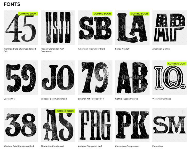
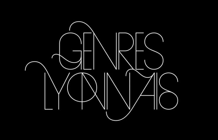
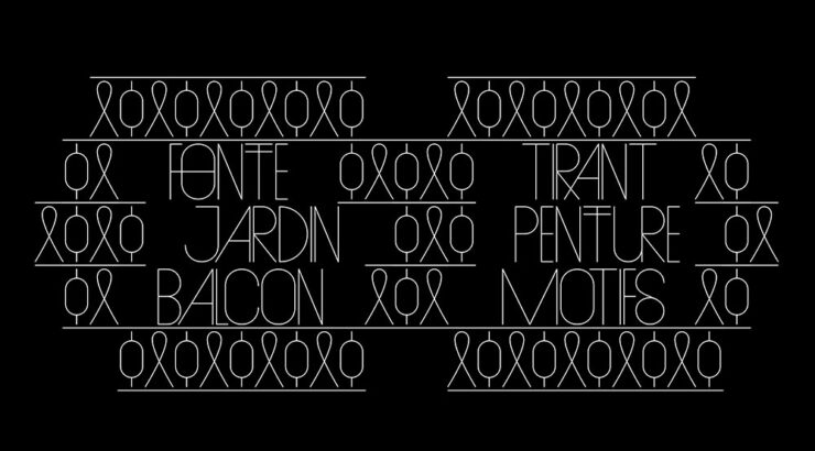
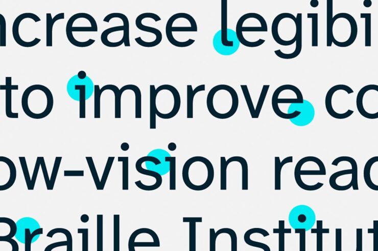
Fontastically usable
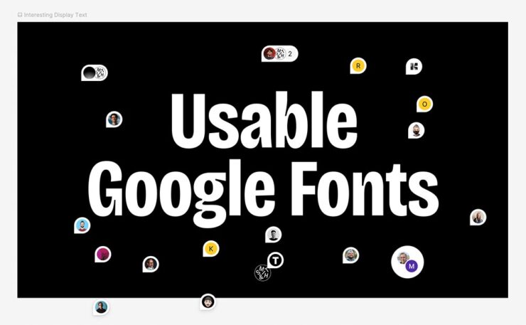
BrandNew points us at a little treasure posted by Smith and Diction: an expert’s take on which among the Google fonts are worth it, helpfully organized by category. Check it out.
FYI, it’s at Figma, a site I’d heard of but not interacted with (it’s aimed at the collaborative market, aka “teams”); it took me a minute to orient myself. (Use the zoom in the upper right, then drag.)
In the comments at BrandNew, several folks point to the two Typewolf lists on the subject, one for Google and one for Adobe/Typekit. (Interestingly, I was not familiar with Typewolf — it was good enough to earn an instant bookmark. Stay tuned for more from them.)
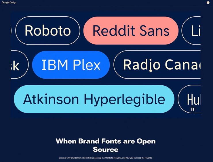
That was on the 7th. On the 8th, BrandNew linked to a Google Design article on “the benefits of brands — for the brands and for users — making their proprietary typefaces open source and available to all to use, modify, and tinker with.” Google Fonts currently has 17 of them.
Lastly, on the 15th: Keep Calm and Icon. “Bettina Reinemann, Staff Experience Designer, Brand & Icons, at Adobe, offers an interesting and comprehensive deep dive into the evolution of a handful of Adobe’s most iconic, well, icons and how they have changed over the decades in style, meaning, and depiction.”
BrandNew is subscription, yes, but it’s one of the web’s subscription bargains at less than $25/year and packed with great stuff. I do wish they’d offer a free article or two within a given period of time so new folks can sample before purchasing, but that criticism aside, I can’t recommend them highly enough.
Many Thanks to … Double-Oh Who?
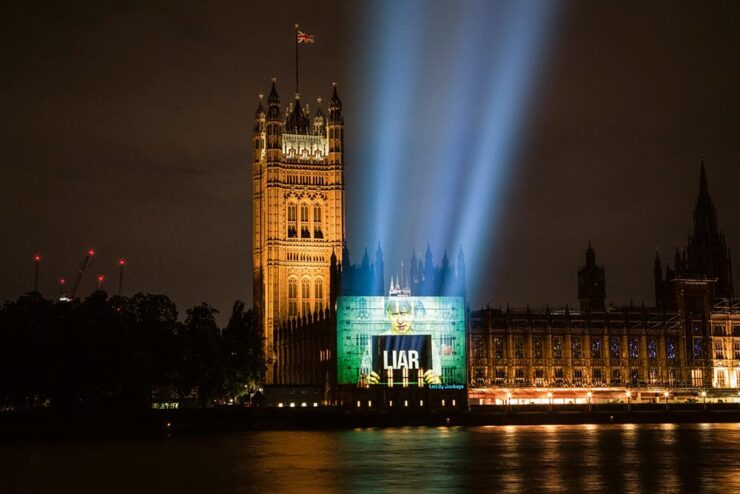
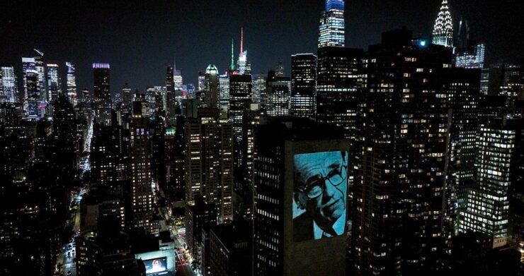
Joe Caroff, designer of so many things yet a so completely unknown personality, died on the 17th — one day short of his 104th (!) birthday. The Guardian has a nice obit … with this graphic:
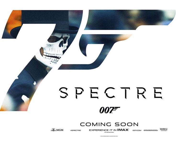
That’s right, he’s the guy who designed that logo. John Gruber, at Daring Fireball, has a nice discussion of the logo and, specifically, its subtle evolution within the Bond franchise. (Did you know it was initially created for use on letterhead? Wow.)
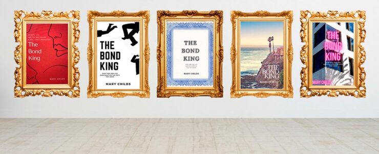
He also links to a bunch of Bond one-sheet posters, a couple of which I’d like to post:
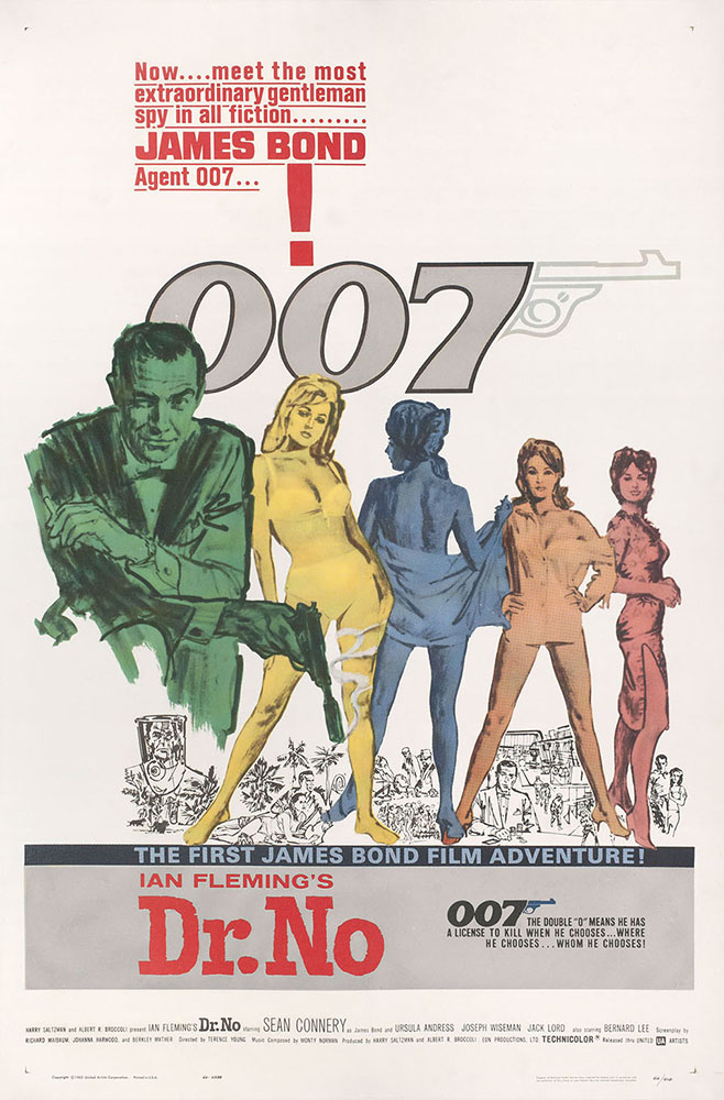
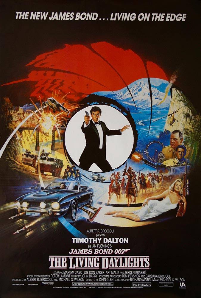
I’m of the age to have grown up with Roger Moore, and really liked Timothy Dalton’s first film — it’s a shame it crashed and burned with the second — whose portrayal of the character has an edge you don’t see again until Daniel Craig stepped into the role.
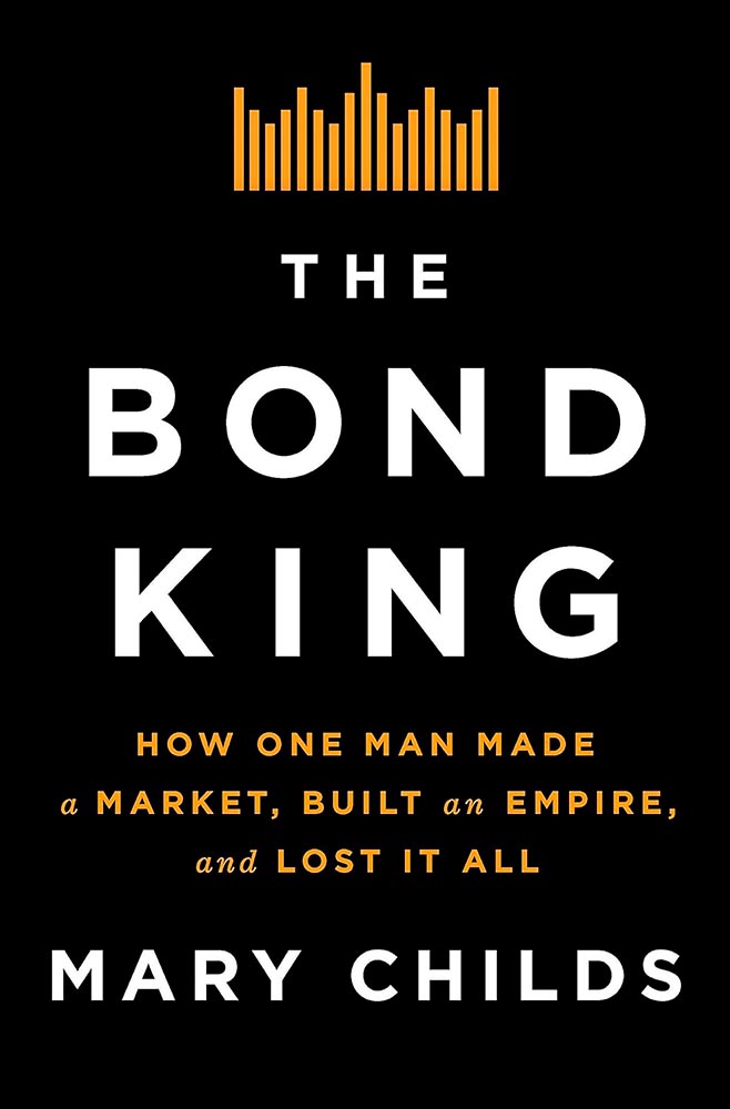
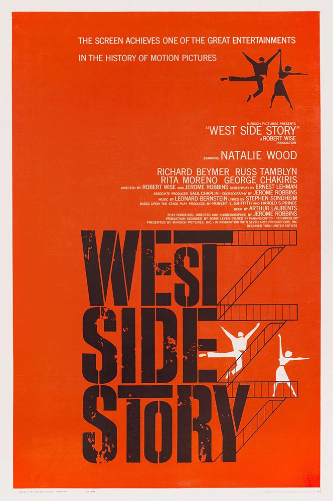
But I digress. Joe Caroff’s poster history covers some greats, including this one:
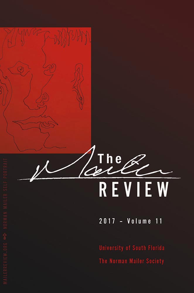
But it’s a tidbit on the Wiki entry that warrants my publicly spending a minute remembering Joe Caroff: he designed the original jacket for Norman Mailer’s The Naked and the Dead:
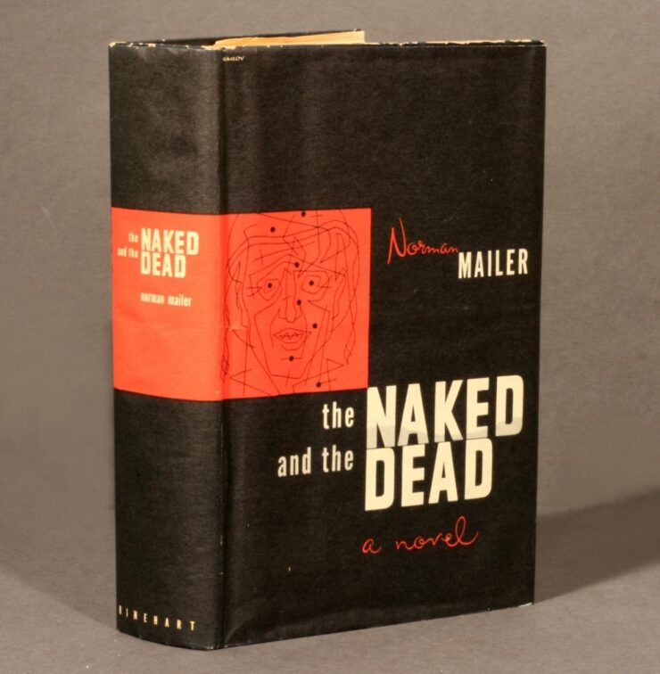
When I had the privilege of redesigning The Mailer Review in 2017, the first cover paid homage to the above design:
Read more about Joe Caroff’s many accomplishments at Print (spoiler: Steven Heller hadn’t heard of him before 2016!) or DesignWeek.
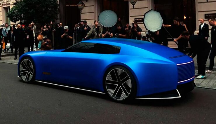
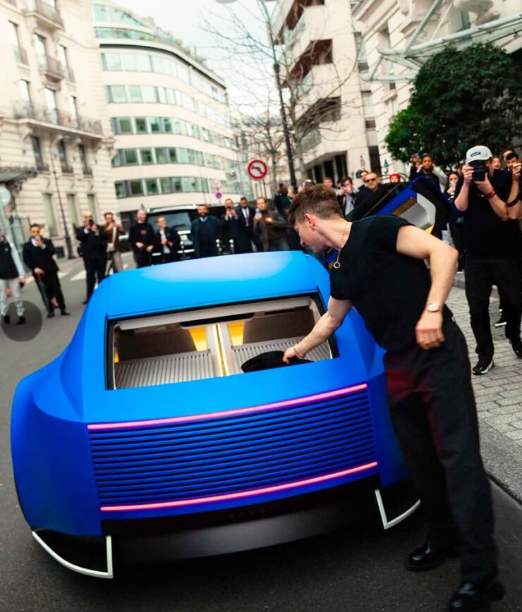
And Now For Something Completely … Wait.
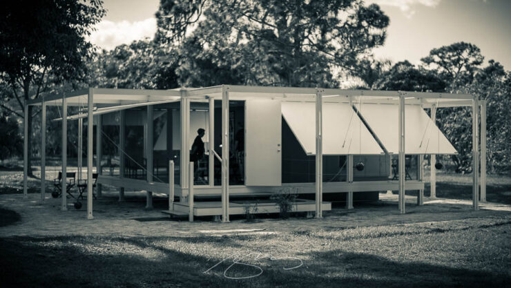
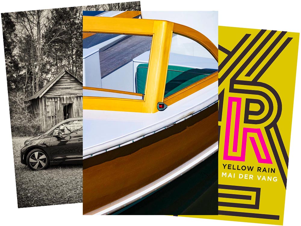
A quick drive-by here: this is a Buick.


It’s quite literally out of this world: the Electra Orbit Concept is only for the Chinese market — their biggest. The interior, especially, has more than a few overtones of the Jaguar Type 00 concept. (Which is looking more and more prescient, frankly; see previous coverage.) Read more at Motor1 or the Autopian.

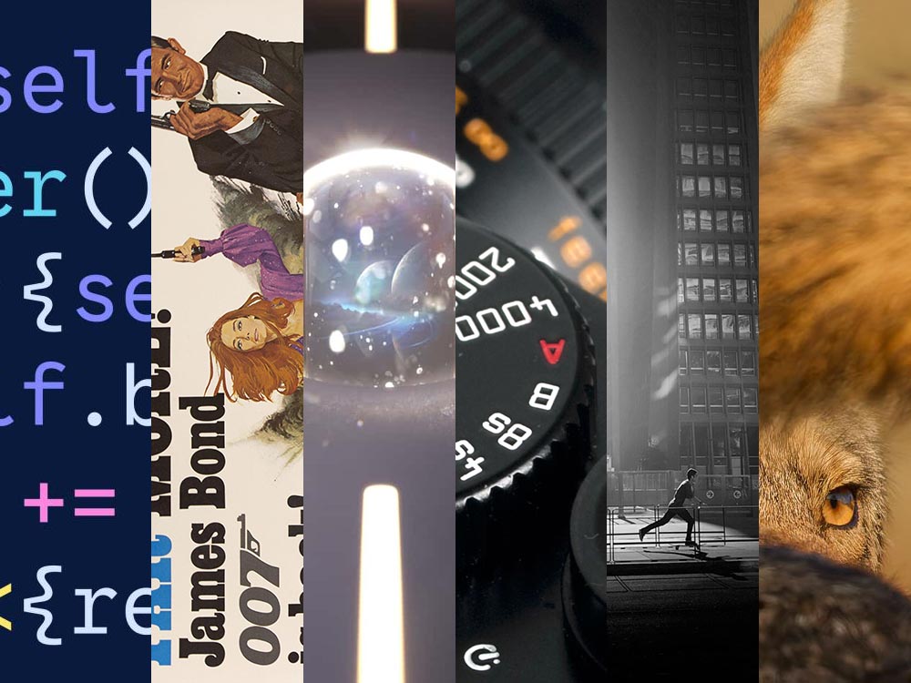
August’s Photography Faves
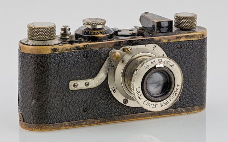
100 Years of the Leica 1
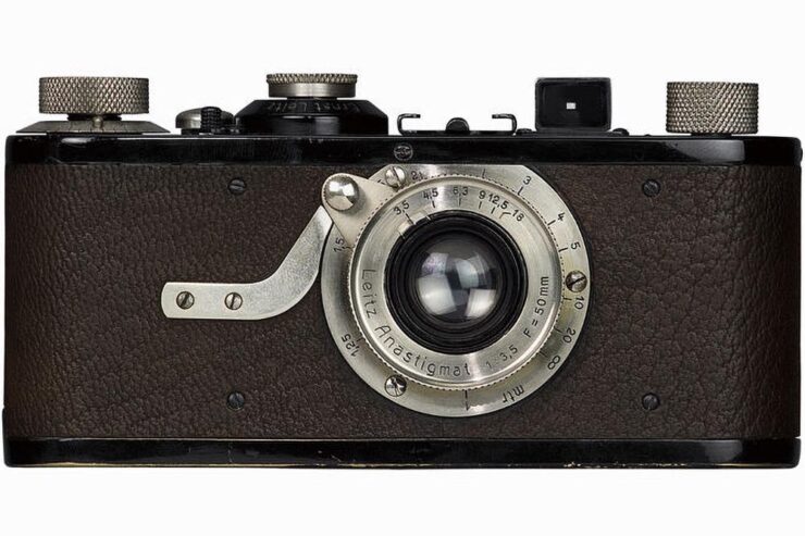
PetaPixel has a nice piece covering all of the many ways the Leica 1 — the first from “a tiny German camera company” — has had such an outsized influence on the huge world that is photography today.
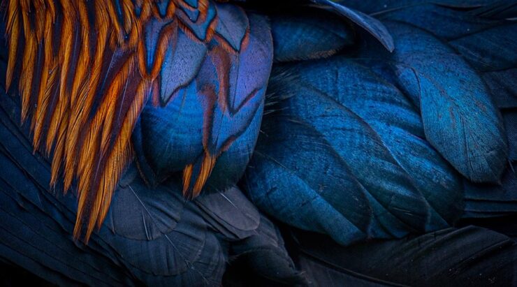
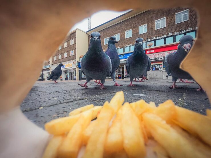
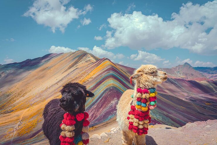
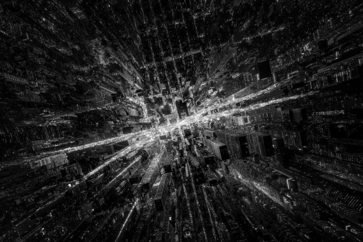
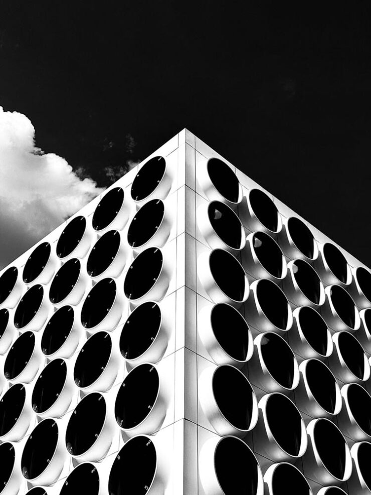
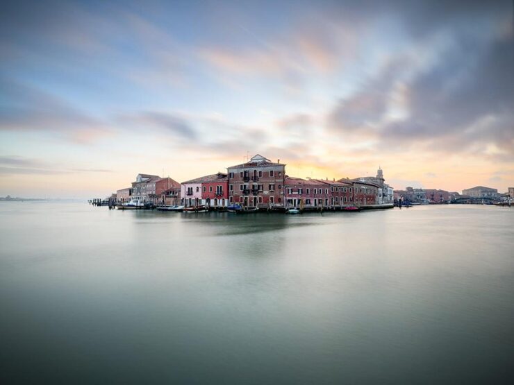
2025 iPhone Photography Awards
It’s time for the annual iPhone Photography Awards — along with my annual observation that the camera you have with you is the most powerful of all. And since a substantial percentage of the world carries an iPhone, the possibilities are nearly endless.
PetaPixel has a round up of the winners, but it’s the honorable mentions I’d like to highlight:
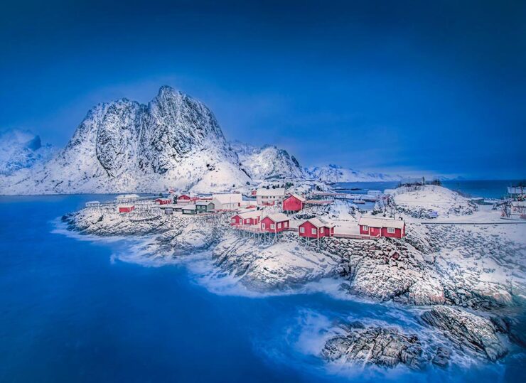
Okay, one photograph that placed (2nd):
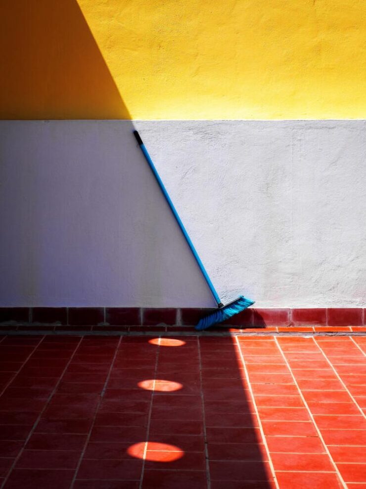
See many, many more — nearly all fantastic — at the IPPAwards website: 2025 iPhone Photography Awards Announces Winners of Its 18th Annual Competition.
Special Bonus #1: “Perhaps no building in the world captures the early 20th-century art deco movement quite like the Chrysler Building, which has been an iconic fixture in the Manhattan skyline since 1930. Its grace and beauty have captivated photographers for decades. For one NYC shooter, the building has become his life’s work. Mitchell Funk has been photographing the Chrysler Building for 50 years; his images are vibrant, eye-catching, and extremely creative.”
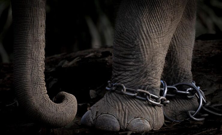
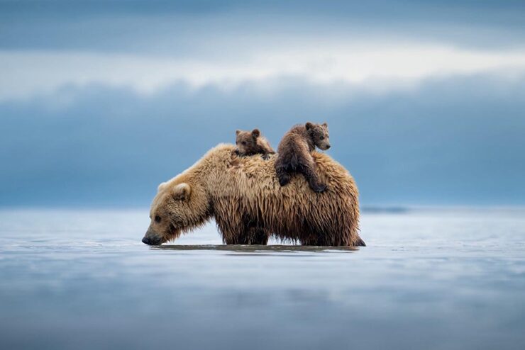
2025 Ocean Photographer of the Year Awards, and Prints for Wildlife
“Fragility, beauty, and urgency characterize” this competition, with “an emphasis on ocean conservation and the outsize influence humans have on marine life,” This is Colossal says. (More at PetaPixel, too.)

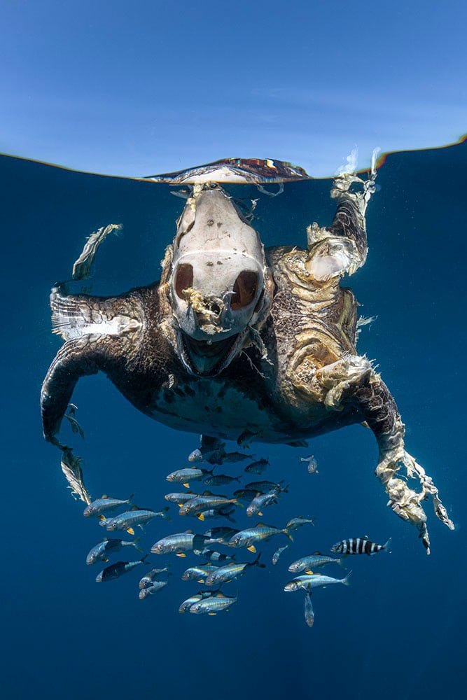
On that last one: “This green turtle was killed by a boat strike, an unnatural and unnecessary death for an endangered species,” says photographer Henley Spiers. “Only recently deceased, it is partly decomposed, with the haunting view of the bare skull in contrast to the skin, which remains on the rest of its body, and the juvenile fish which have adopted the turtle carcass as a form of safe refuge. We came across this turtle by chance, a dispiriting sight at the end of a long and fruitless day at sea. I can only hope that this image acts as a reminder of the enormous human burden placed on turtles and the ocean as a whole.”
It had the intended effect. Impact, indeed.
So, you might ask: how can I help? Prints for Wildlife is one way.
“In 2025, the crisis isn’t a virus — it’s a withdrawal of critical funding for wildlife and conservation,” says program co-founder Pie Aerts. “Prints for Wildlife is more than a fundraiser; it’s a platform for connection, consciousness and hope in a time of crisis.” Browse photos by more than 200 photographers on the fundraiser’s website. The limited-edition prints will be available until September 21.
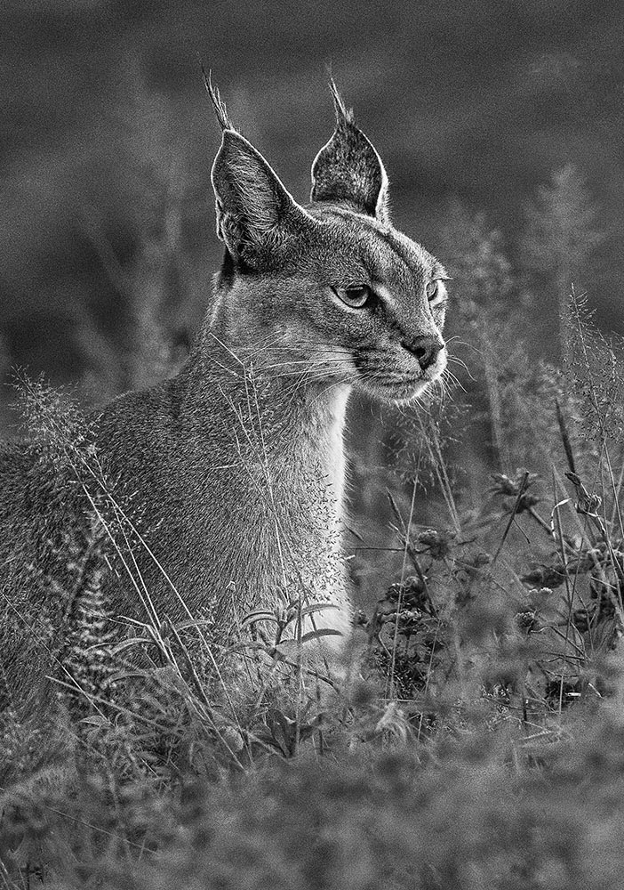
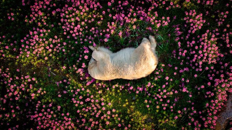
Special Bonus #2: “The Natural History Museum in London unveiled a first look at 15 of the breathtaking photos that are in the running to win the 61st Wildlife Photographer of the Year competition, including a lion staring down a cobra, a pack of Arctic wolves, and bats flying through the dark toward the camera; the 2025 Wildlife Photographer of the Year contest attracted 60,636 total entries, the most ever in the contest’s illustrious history.”
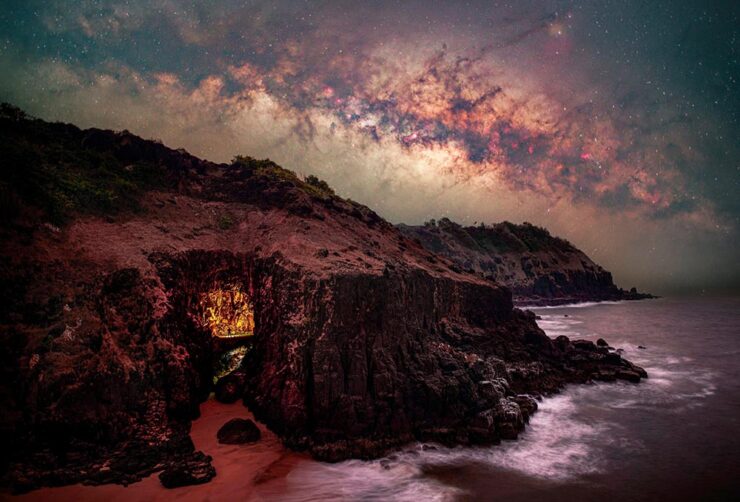
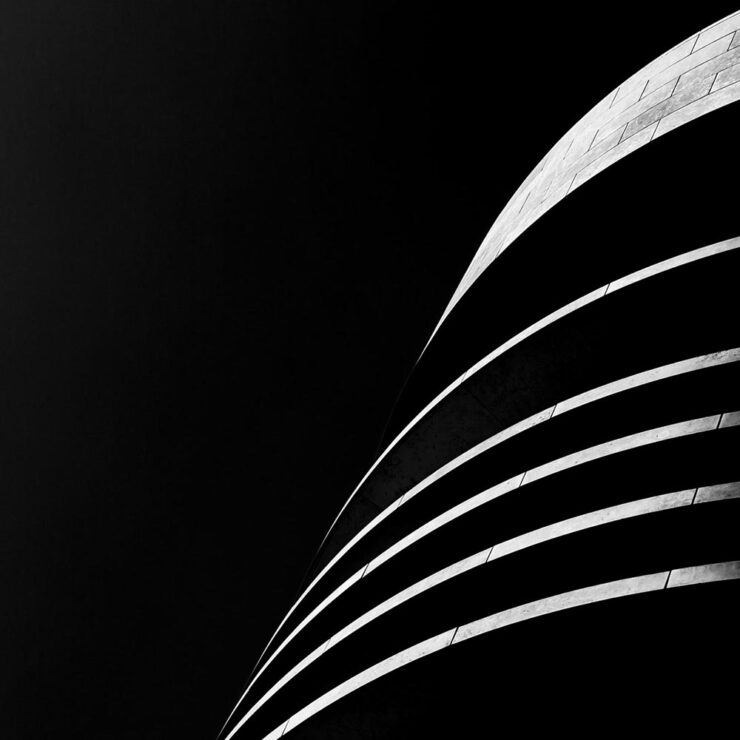
2025 Capture the Dark Sky Contest
DarkSky International announced the winners of its fifth annual Capture the Dark photography contest. Winners across eight main categories showcase the best in astrophotography and demonstrate why it is vital to protect dark skies worldwide; PetaPixel has a nice roundup.
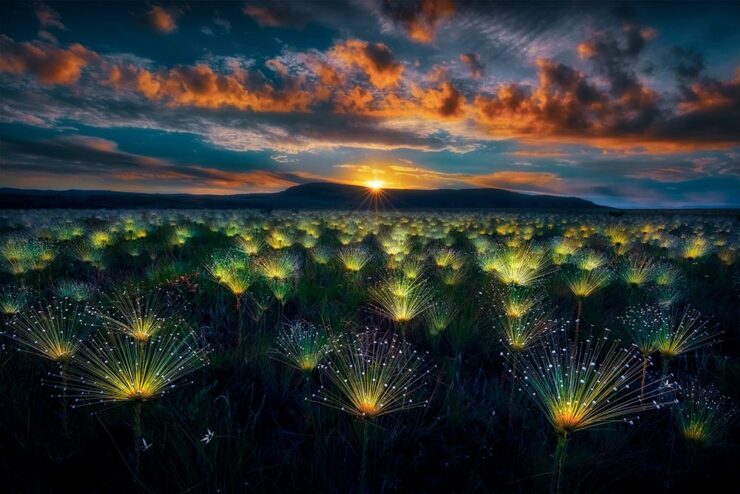
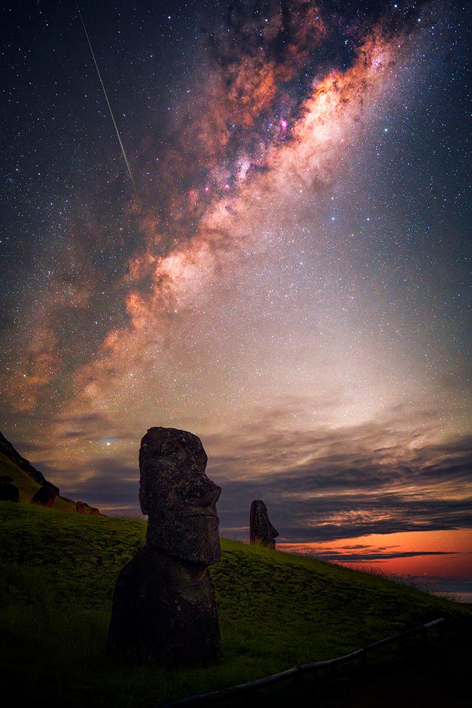
In other words, I’m not going to let you go enjoy your Labor Day weekend (here in the US, at least) without once again closing with a photograph of two of my favorite things: lupines against a beautiful night sky.

Have a great September, everyone.