Tag: iphone photography

  • Beautifully Briefed 26.7: The Long Heat

    Beautifully Briefed 26.7: The Long Heat

    It’s July, and it’s hot. Bring a beverage. Umbrella optional.

    Spine!
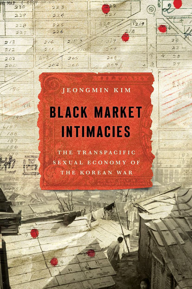
    Stanford University Press. Cover design by Lindy Kasler; art director, Michele Wetherbee. Cover art: Map of Kunitachi, Japan, National Archives and Records Administration; photograph of refugee dwellings in Busan, Korea, United Nations Archives; US military payment certificates note, US Army Finance Corps.

    “The cover asks questions,” I wrote in this month’s column for Spine. “Illustrations and scripts combine in myriad ways; maps plot; and blood drops. Rather than telling you what the title is about, it suggests that it’s not easily summarized — in all the right ways.”

    Read!
    The End of Reading is Here
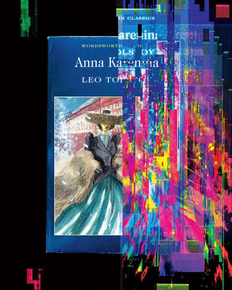
    Cool header graphic from The Atlantic article.

    “Optimists once believed that universal literacy was inevitable. Now it seems that the age of reading might be a short anomaly in human history,” The Atlantic writes. “The decline of reading will bring about changes of the same magnitude. It will affect our innermost thoughts, our society’s politics and culture, and how we tell the history of our civilization.”

    Reading requires imagination; consumption, whether social media, television, or gaming, really doesn’t. It’s no surprise that the lowering of the common denominator is the result.

    But what if the premise is, in fact, true? I can’t imagine a life without reading — and you’re reading this, so you probably can’t either. Will humanity reach to a point where ingestion of knowledge doesn’t involve the written word? Should it?

    Read the article here. (Gift link via Kottke.)

    Update, 31 July (after publishing): The gift link has expired, darn it — apologies. (One of the downsides of gathering items throughout the month, I guess; this is from the 8th of July.)

    “Read More. Read Often. Read Every Day.”
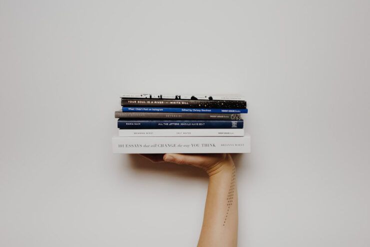
    We keep searching for lifehacks, productivity tips, and bullshit, but the answer is right there. If you want to be better, grow more, understand your life, understand your purpose, learn something, or just find somewhere to stay a while when life gets overwhelming — pick up a damn book.

    — Joan Westenberg

    She calls it the 80/20 rule: “I believe that spending 20% of your time buried in a book, buried in something that will inspire you, excite you, and make you want to jump out of your seat is going to give you the fuel, the ideas, and the power to create 80% of your output.”

    It’s worrying to think that The Atlantic might be right. This, In its brevity and forthrightness, is a strong counter-argument.

    Special bonus #1: Uncovered is a site for judging books by their first pages. “No cover. No bestseller sticker, no celebrity book club, no BookTok trend. You read the opening of a real book, blind, and answer the only question that matters: would you keep reading?”
    Great address, by the way — I didn’t know .ink was a thing. (Also via Kottke.)

    250 for 250
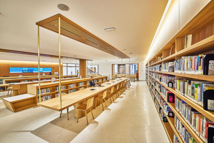
    Photograph of the Brooklyn Library’s main branch by the Municipal Art Society of New York.

    Brooklyn Public Library is celebrating our country’s 250th anniversary the best way we know how: with a thoughtful, surprising, irresistible booklist. Organized by genre and category of interest, this all-ages list is a deep dive on the stories, voices and moments that shaped America. Selected by our expert librarians — with help from a few notable New Yorkers! — here are the 250 most influential books in United States history.

    — Brooklyn Library’s 250 for 250 Booklist Intro

    Whether it’s actually the most influential 250 titles in the country’s history is probably intentionally debatable, but it’s still a great list. From The Hunger Games to The Snowy Day, The Warmth of Other Suns to Where the Sidewalk Ends, the choices are sometimes surprising, sometimes great memories, and sometimes inspirational.

    If you’re looking for the next title to read — or the next gift to give — start here. (Also available in a handy PDF if you’d like to send to someone.)

    Special bonus #2: Bookmobile, my favorite short-run printer, has been sold — but remains privately-owned, non-corporate, and dedicated to craft. Founder Don Leeper is retiring after 44 years; Michael Shoemaker is the new owner.

    “Mike is the perfect buyer for Bookmobile, with the passion, skills and resources to continue and improve our services to publishers. From the beginning of our discussions he displayed an aptitude for grasping the complexities of book publishing in the 21st century and bringing to bear his deep experience in technology, ecommerce, and business in general. Last but not least, he has an understanding and appreciation for the importance of book culture. I am damned lucky we connected.”

    — Don Leeper, Bookmobile

    “No major changes are planned,” the press release says. “Under its new ownership, Bookmobile will continue to invest in the growth of the business and the success of its publisher customers.”

    (Via Publisher’s Weekly.)

    Type!

    This month has seen a wealth of new typefaces introduced. A few that caught my eye are below, but it’s start with a question.

    “What is Queer Typography?”

    “Looking for queer anything often feels lonely,” Paul Soulellis writes. “The word queer resists definition, sometimes aligned with ideas about rejection, refusal, deviating from the expected, away from the normative. It’s certainly a political word, one that’s taken on expansive qualities throughout its history, qualities that aren’t necessarily confined to gender and sexuality.”
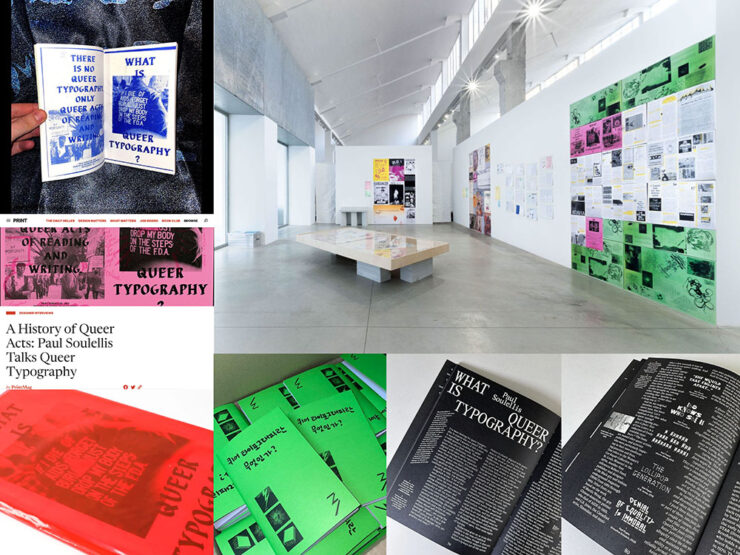
    Image via soulellis.com.

    An interesting text, certainly, with many possible answers to the question and accompanying designs and images. “[W]e need to stay with queer as an action, actively engaging with the past and the future as a verb.”

    Read more. (This is from 2024, but was recently linked at Kottke — and was new to me, so forgive the late notice/attention.)

    Emigre’s Modulator now at Adobe Type

    Adobe prices are a regular gripe amongst many, but one of their strongest offerings is the type catalog — and it just got better:
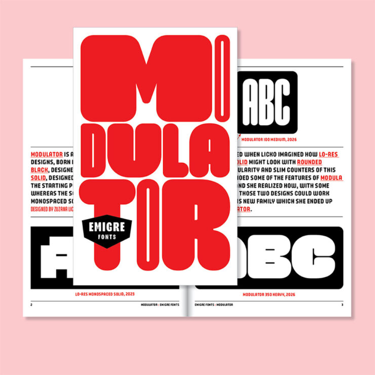
    “Modulator was conceived as a dialogue between two designs separated by nearly three decades: Modula Round Black (1995) and Lo-Res Monospaced Solid (2023),” Emigre writes. The results are Modulator and its companion Modulator Text Variable, “optimized for smaller sizes by expanding the stem and counter dimensions to improve legibility.”

    Pretty much everything Emigre is awesome, and this is a welcome addition.

    Data as type
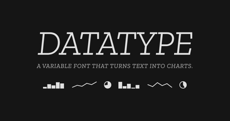
    “Datatype is an OpenType variable font that turns simple text expressions into inline charts. No JavaScript, no images, no rendering library — just type the syntax and Datatype’s ligature substitution does the rest.”
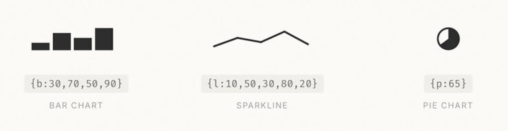
    Very cool — and very open source, thus very free. Available on GitHub or Google Fonts.

    Special bonus #3: I don’t actually know how much AI is driving new typeface design; honestly, it seems like an art form requiring human decision-making. Dutch foundry Mass-Driver is one that will always design fonts by hand:

    AI tools perceive reality as a finite set of data, up-to-date as of about 2021: the shadows on the wall of Plato’s Cave. Right now they are very good at making shadow puppets, but they cannot see the world outside.

    If we allow these tools to dictate our visual culture, we must accept that it will be vitrified by machines which consider a few billion webpages equivalent to the sum total of human existence. I don’t accept that. How dare we abandon so many countless traditions and people and ideas and nuances, simply because they are under­represented in the training data?

    — Rutherford Craze & Co., known as Mass-Driver
    CreativeBoom’s July Fonts

    Fourteen in all this time — last month’s suggestion of a summer lull was wrong, apparently — with some strong selections. I wanted to show several, but narrowed it down to three that deserve highlighting:
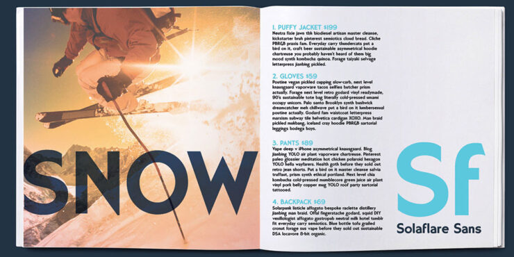

    Solaflare Sans, by John Reshell of Swell Type.
    Solaflare Flare.

    “Solaflare’s mood is both unmistakable and timely, evoking warm evenings, hand-painted shop signs, and the particular quality of light in a California coastal town. John Roshell of Swell Type was inspired by the hand-painted signage of Santa Barbara, but rather than simply reviving that aesthetic, he built a variable font around it; one that lets designers slide between three distinct typographic personalities within a single file.”
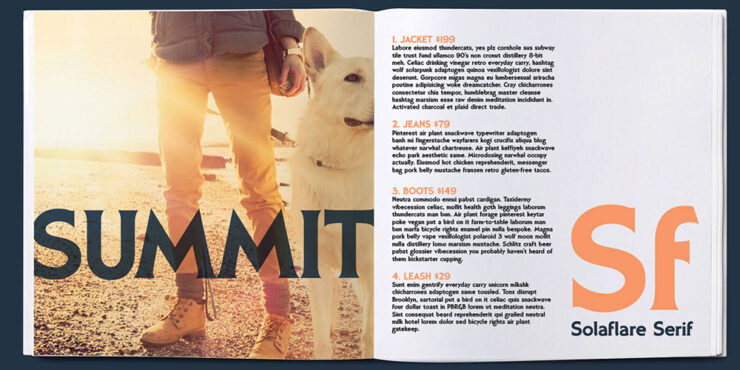
    Solaflare Serif.

    That’s right: a variable flare — meaning sans on one end, flare in the middle, serif on the other. Check it out.

    Oratorio, by Alex Chavot of Apex Type Foundry.

    “Alex Chavot’s latest release for Apex Type Foundry — launched alongside a comprehensively rebuilt foundry website — takes Halbfette Cantate, a display face released around 1910 by H. Berthold AG and designed by Johann Graf, as its starting point, then runs it through the filter of Ed Benguiat’s flamboyant 1970s classics. The result is sweeping swashes, lyrical terminals, high contrast, and an unapologetically theatrical personality that Chavot describes, accurately, as ornamental excess meeting typographic swagger, with just enough restraint to keep it printable.”
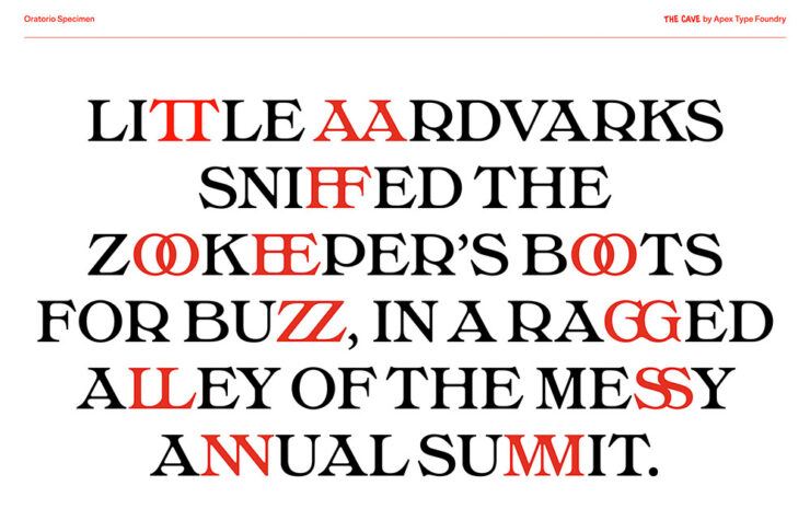
    Oratorio.

    Single-weight fonts are rare these days — but oh, what a weight it is. Expressive, serious, almost lavish. Check it out.
    Milgram, by Max Phillips of Signal Type Foundry.

    “Max Phillips of Signal Type Foundry has a gift for describing typefaces, and his account of Milgram is direct. They’d always wanted to add a humanist sans to the library, and always wanted to add a rounded sans. So they decided to save time by making them the same typeface and seeing what happened. What happened was a wave of nostalgia for Frankfurter, VAG Rundschrift, and an all-caps dry-transfer face called Formula One that nobody else seems to remember.”
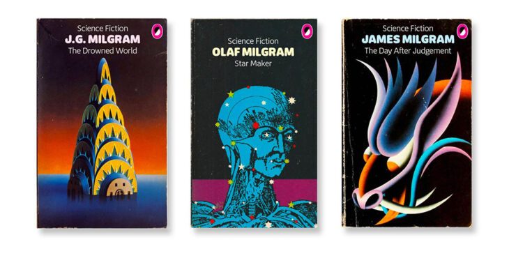
    Milgram.

    ’Course, anybody who mocks up book covers with their new font … instaclick! Check it out.

    Vote!
    Archinect’s Spring ’26 lecture posters

    Twice a year, Archinect holds a contest for their readers to decide which of the season’s lecture posters from architecture schools around the country are their favorites.
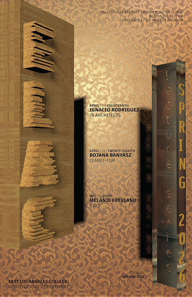
    East Los Angeles College.

    Alas, the contest usually ends just before this column gets posted, so sometimes y’all are able to vote, sometimes not. This time, we only get to compare my favorites with the results.
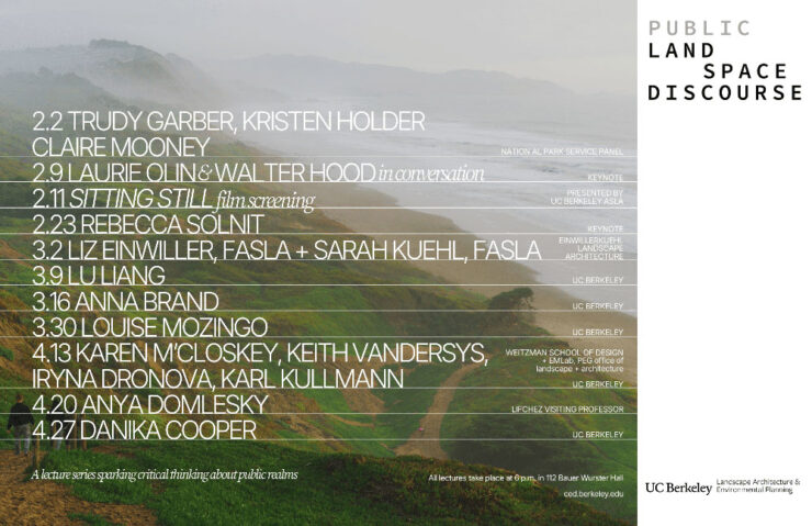
    University of California at Berkley.

    Along with these three, I’d also give honorable mentions to Yale, Sci-Arc, and the University of Tennessee at Knoxville.
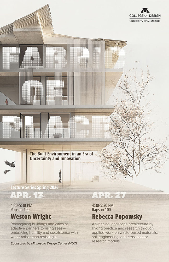
    University of Minnesota.

    ELEC won the contest, too. As for the rest, we’ll just have to agree that they’re all winners in one way or another. See the readers’ and editors’ choices.

    “Choose Euro’n Adventure”

    Brand New‘s penchant for punny-yet-perfect post titles scores another with this one — another one that voting might be just out of reach for, depending on where you’re reading this from.
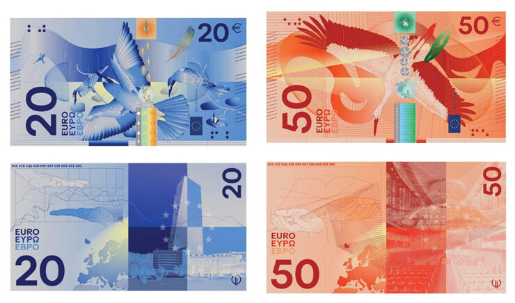
    Design submission by Rudy Guedj and François Girard-Meunier.

    That’s right: it’s time to redesign the Euro! Finalists have been chosen.

    “A panel of jurors selected the designs, which follow one of two themes: European places and ideas or birds and rivers, the latter of which is meant to symbolize freedom and unity,” This is Colossal writes.
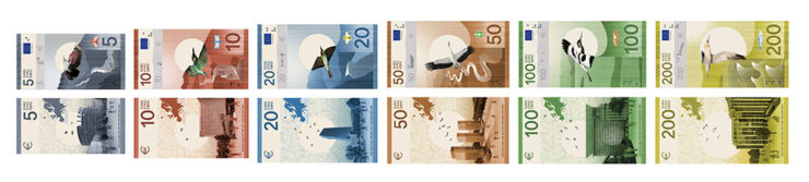
    Design submission by Isabelle Daëron.

    Interestingly, the notes get bigger with denomination — the 5 is the smallest, then 10, then 20; the 50, 100, and 200 are all the same size. (Not the boring uniformity we get here in the States.)
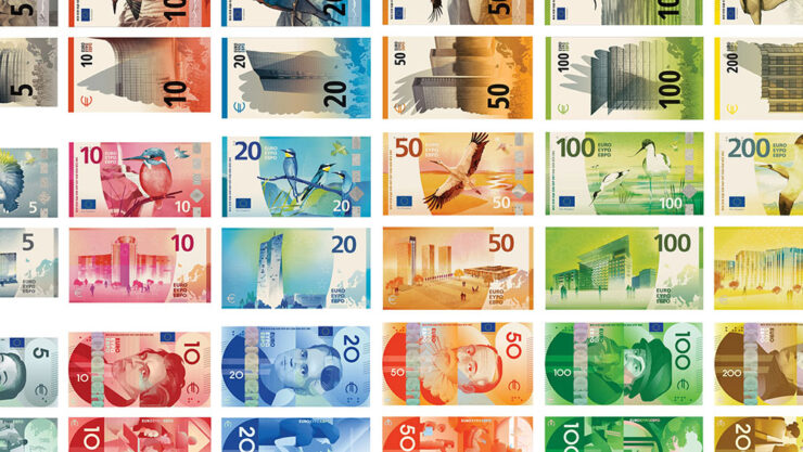
    Same colors, same denominations, vastly differing details. (Overview via Brand New.)

    “While basic elements are the same — all collections devoted to culture feature the same six figures, for example — individual approaches appear in the layout, aesthetic, and composition,” Colossal continues.
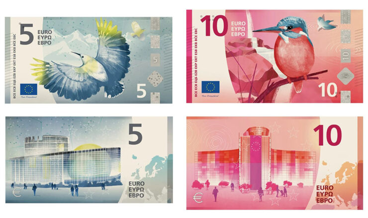
    Design submission by Atelier Goppel-Toperngpong.

    I’m unsurprisingly partial to the birds & places, but no matter which theme or which specific design, these are all excellent. See all the available options at the European Central Bank website — and, if you’re in the EU, take the survey!

    Special bonus #4: It’s not the Europeans, it’s the English we have to thank: Getty has abandoned its takeover/merger with/of Shutterstock. Hooray!

    Amuse!
    Lil’ Finder Guy
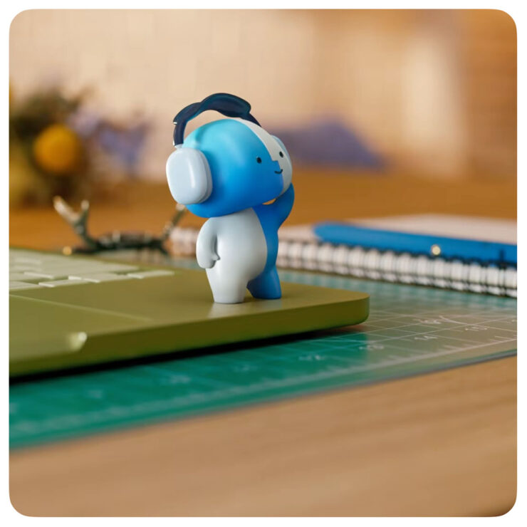
    It may be a social media campaign, but darn it’s cute.

    Basic Apple Guy, who introduced me to Apple’s social media campaign1As you probably know, I don’t participate in social media. I have to rely on others to bring Apple’s media efforts to my attention — folks covering the coverage, as it were. for the MacBook Neo, has an update with all things regarding this unofficial mascot.
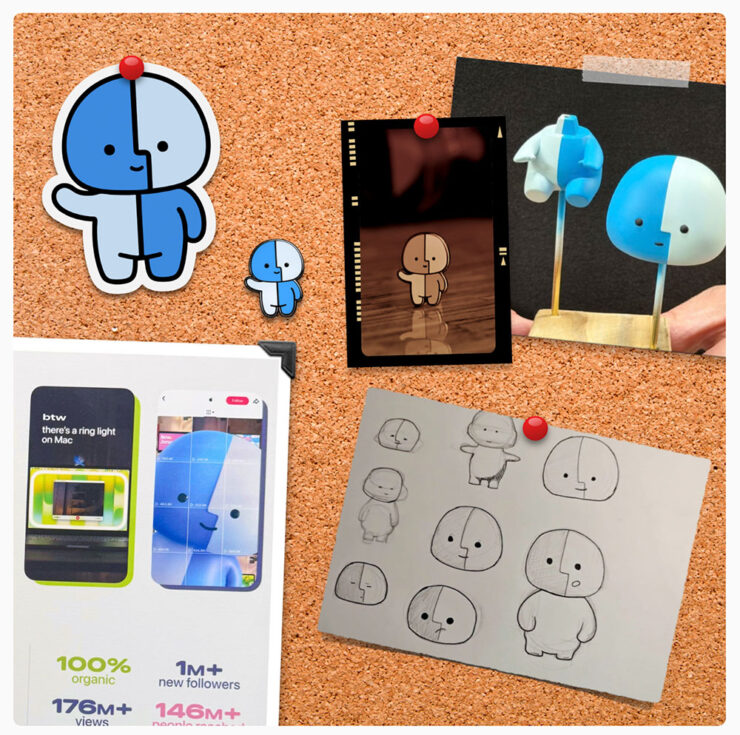
    Details, stickers, and more.

    It’s the Internet, of course, so even items that have been posted briefly then deleted are fodder for careful investigation — and some of the details he’s dug up are neat. (He’s also done a bunch of generated varieties of the character, which make occasional — and often delightful — appearances in his articles.)

    Save the manuals

    No, not of the RTFM variety. It’s actually a non sequitur.
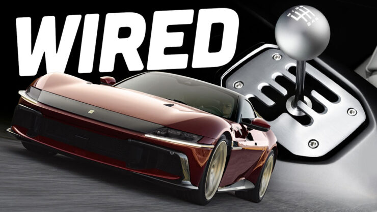
    Image via The Autopian.

    Ferrari went and did something interesting, again: having introduced the world of high-performance motoring to the automated manual (the F1, in 1997),2Ferrari’s F1 wasn’t actually the first automated or even semi-automated manual gearbox/transmission, by a long shot. It is, however, the one that brought it to sports cars, followed almost immediately by BMW’s SMG. Wiki has a history, if you’re interested. it’s now introducing … the manualized automatic.3Technically, Koenigsegg got there first with its CC850. However, a) you have to be a car geek to know Koenigsegg, and b) that shift-by-wire unit doesn’t use traditional selector forks, or synchronizers. Instead, it uses seven wet clutches, six to select forward ratios and one for reverse, all with their own pressure sensors and mechatronic actuators. “Changing up is as simple as engaging the right clutches,” The Autopian says. Ferrari’s is a gated dual-clutch automatic, although to call that an oversimplification is an undersell.
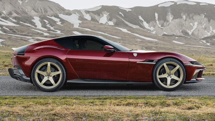
    Photograph via Ferrari’s press department.

    First of all, let’s all please agree that the 12 Cilindri, their 819-horsepower, half-million-Euro, two-seater Grand Touring masterpiece, is a beautiful thing — retro, but in a modern way. Especially in this merlot-and-gold combo.
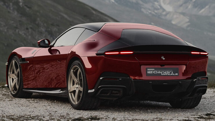
    Photograph via Ferrari’s press department.

    In the new Manuale model, the transmission is the story: a gated dual-clutch automatic, or DCT, with a twist. It’s got buttons for drive, reverse, etc., as usual — but a clutch and a shift lever instead of paddles.

    By doing so, offers a road map for other automakers (cough *BMW*) whose customers are demanding the engagement of a manual but whose governments are demanding reduced emissions and increased mileage — plus all those safety mandates like automatic braking and conveniences like adaptive cruise control.
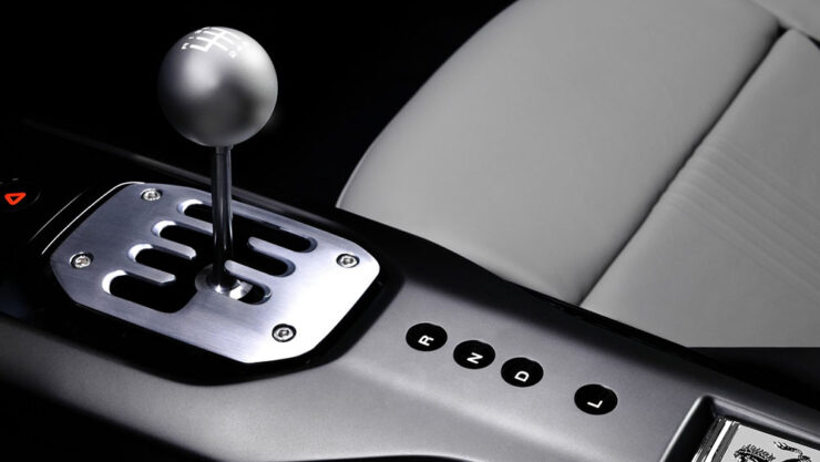
    Photograph via Ferrari’s press department.

    I’m convinced this is the future of the manual transmission. It’s unconventional, unexpected, and is going to take a minute to trickle down. But … fingers crossed.

    Get details at The Autopian or The Drive.

    Special bonus #5: Driving stick can help prevent dementia. Okay, sure, it’s not the most scientific post extant, but it makes sense.

    Gaze!
    Astronomy Photographer of the Year finalists 2026

    “Now in its 18th year, the ZWO Astronomy Photographer of the Year contest is among the premier photo competitions that celebrate the art of astrophotography and astronomy,” PetaPixel writes.
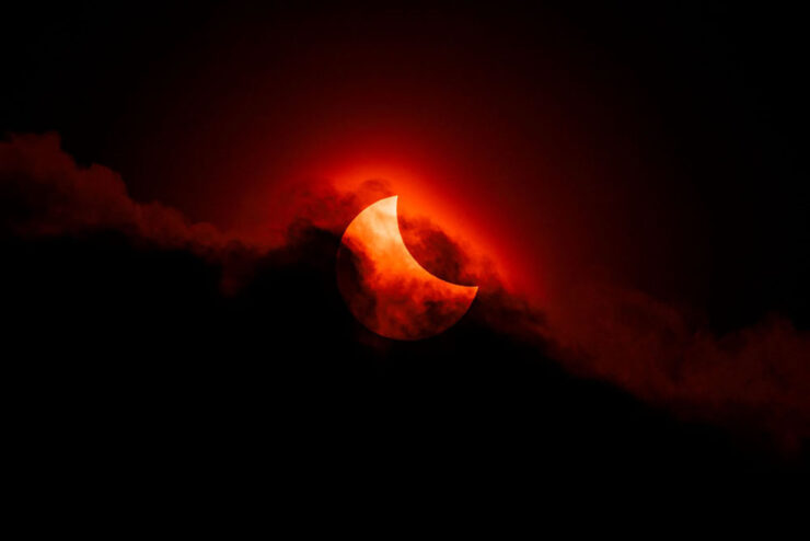
    Moody Partial Solar Eclipse. “Our Sun” category. Photograph by James McBeath, UK.

    “The competition features nine categories, a pair of special prizes, and the expert panel of judges selects a single overall winner, all of which will be showcased in an exhibition at the National Maritime Museum in England starting on September 18.”

    Te Hoho Rock Moonrise. “Skyscapes” category. Photograph by Evan McKay, New Zealand.

    Astrophotography is fascinating — a reminder that we’re merely a blip — and requires patience, skill, and specialized gear. But the results … wow.

    See all 29 finalists.

    25 Amazing JWST photographs

    While we’re on the subject of space photography, the imagery from space-based cameras amaze no less. The James Webb Space Telescope just celebrated its fourth birthday, and PetaPixel has gathered 25 of its most spectacular and insightful images.
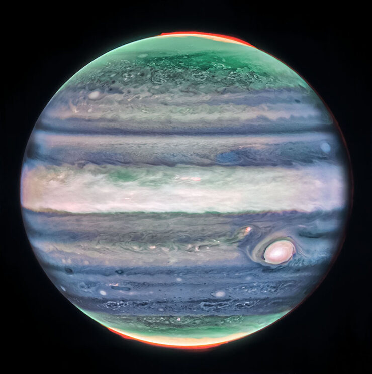
    Jupiter. Photograph credits: NASA, ESA, CSA, STScI, R. Hueso (UPV), I. de Pater (UC Berkeley), T. Fouchet (Observatory of Paris), L. Fletcher (University of Leicester), M.H. Wong (UC Berkeley), J. DePasquale (STScI).

    Cloud details, aurora, the eye — and all on a planet we’re “familiar” with.
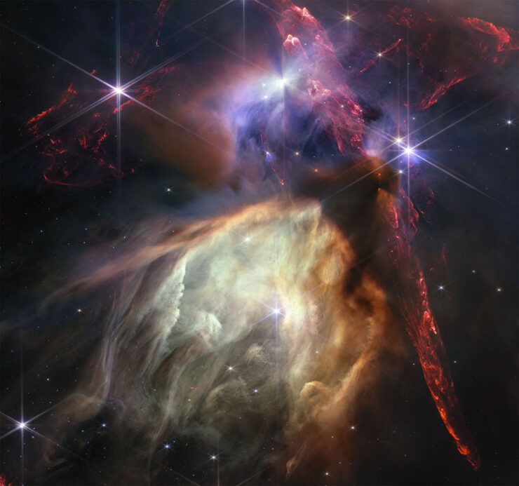
    Rho Ophiuchi cloud complex. Photograph credits: NASA, ESA, CSA, STScI, K. Pontoppidan (STScI), A. Pagan (STScI).

    The Rho Ophiuchi cloud complex is the closest star-forming region to Earth, and demonstrates both the beauty and power of the Universe.

    “The $10 billion NASA/ESA/CSA JWST has produced a great deal of exceptional scientific work in its first four years of operation, much of which is utterly groundbreaking,” PetaPixel writes. “However, that alone is not enough to warrant a photo’s inclusion. While scientific value is important, a Webb image featured here must also be beautiful.”

    See also: PetaPixel‘s selections from JWST’s second birthday two years ago.

    Illumination

    What do these two photographs have in common?
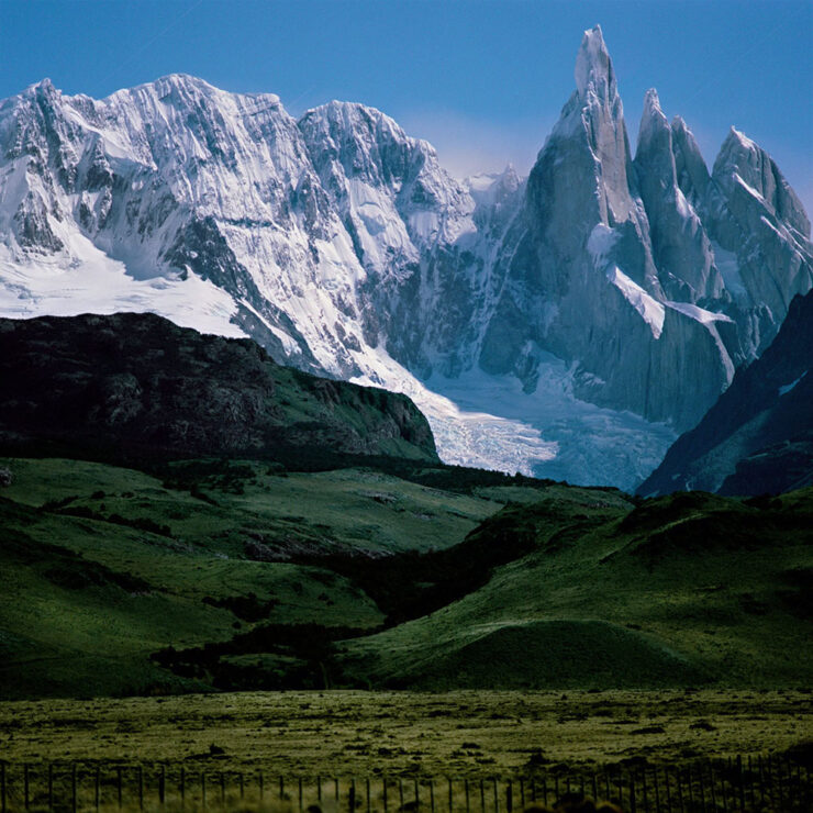
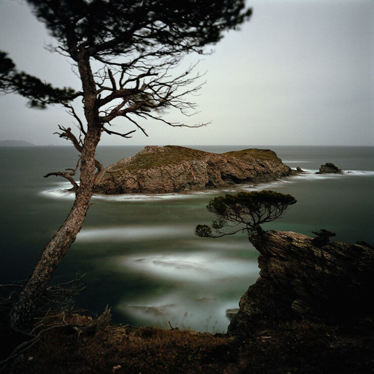
    Cerro Torre. Photograph by Darren Almond.
    Porquerolles. Photograph by Darren Almond.

    Both were taken by the light of the full moon!

    In his new book, aptly named Darren Almond. Fullmoon, “the light of the Moon is eerily enhanced, infusing the landscape with haunting ideas of nature and time,” PetaPixel (dramatically) writes.

    iPhone Photographer of the Year 2026

    It’s that time of year again: the iPhone Photography Awards, now in its 20th season, has announced its annual competition winners.
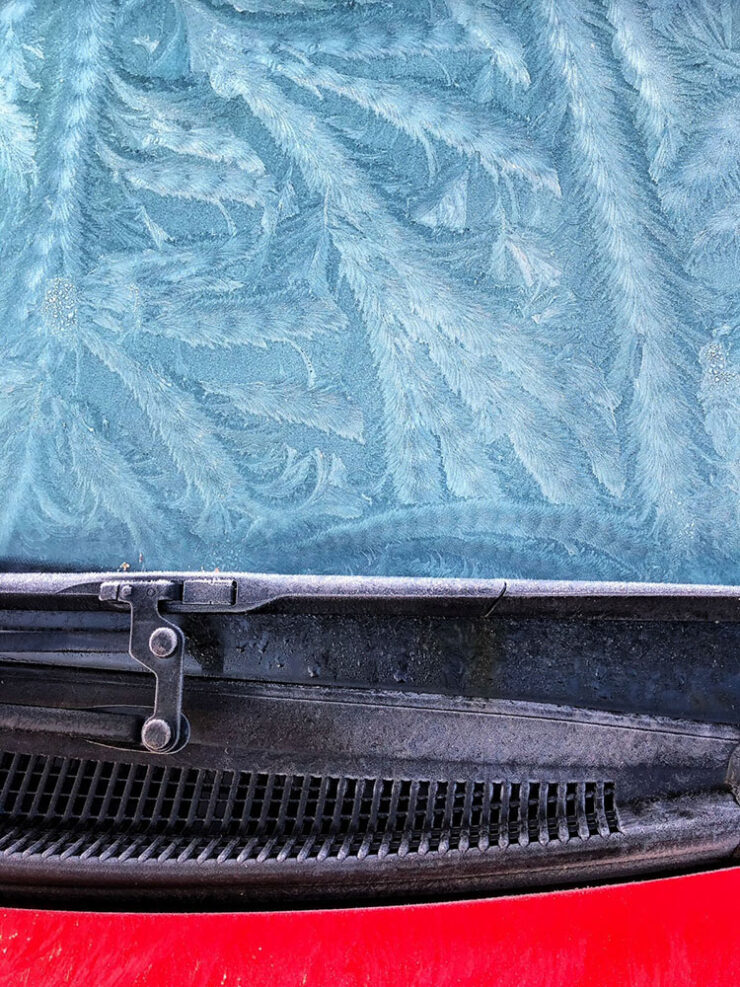
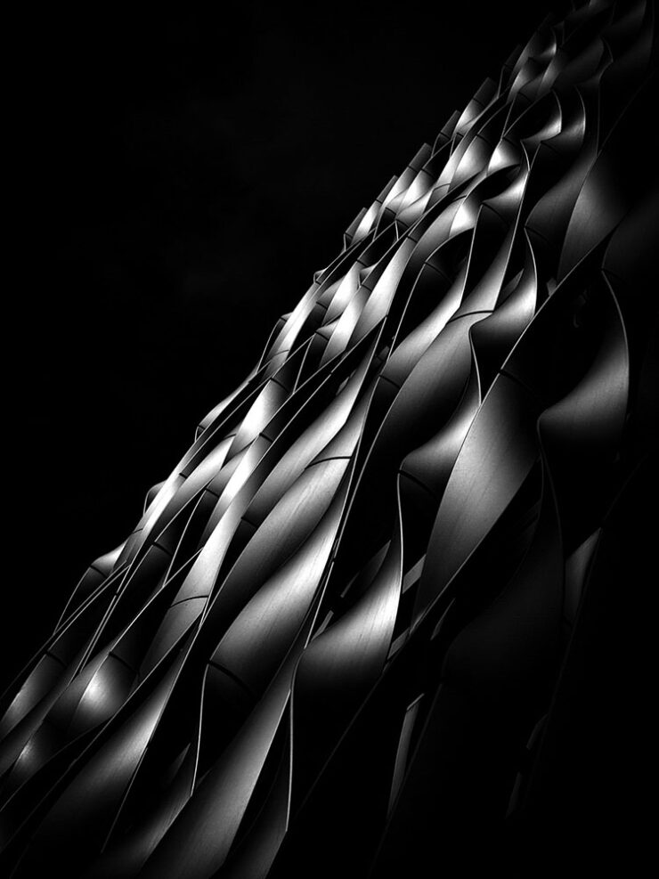
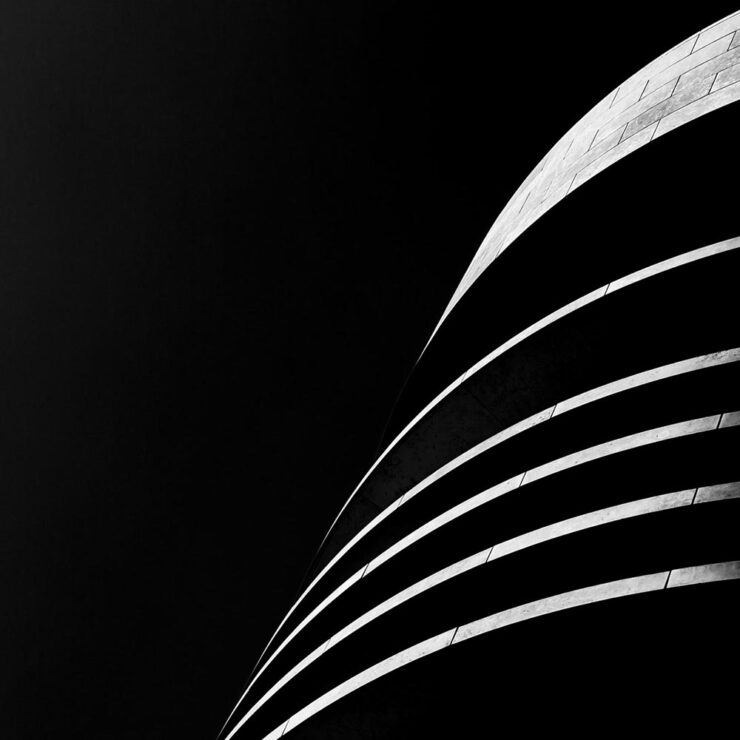
    Winner, Abstract category. Photograph by Barry Mayes, UK.

    Entrants from more than 140 countries “showed just how powerful an iPhone can be in the right hands and how great photos don’t always require high-end, dedicated camera equipment,” PetaPixel writes.
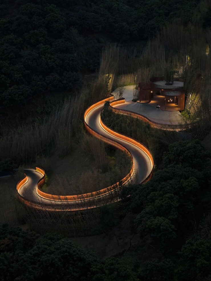
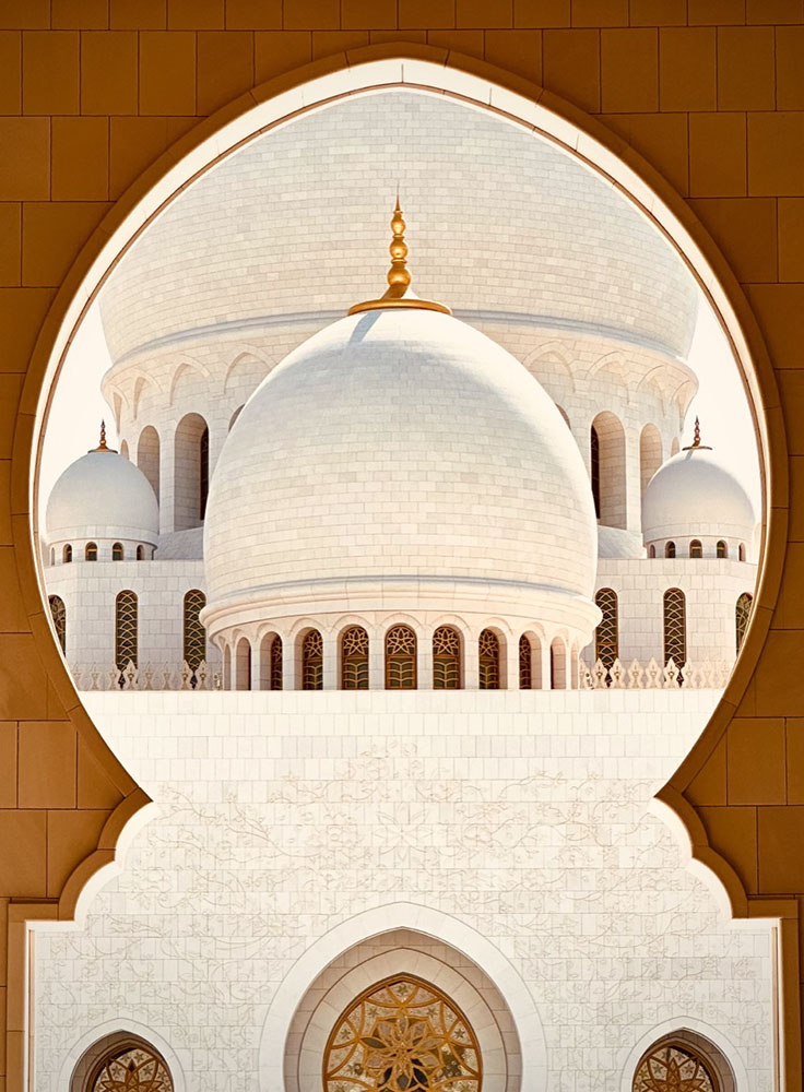
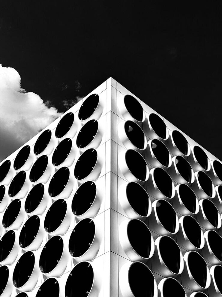
    Winner, Architecture category. Photograph by Ziwen Chen, China.
    3rd Place, Architecture category. Photograph by Preethy Ganesan, US.
    Honorable Mention, Architecture category. Photograph by Adrian Beasley, UK.

    Of course, these four barely scratch the surface of the fantastic selection from a variety of categories; see all the winners, runners-up, and more at the official website.

    The Architecture of Connection

    A left turn, so to speak:
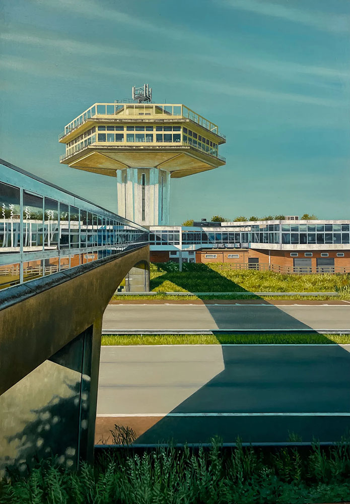
    The Last Landmark. Image by Jen Orpin.

    The Modernist Society takes a detour from its usual publishing habits with a new monograph, The Architecture of Connection,” Wallpaper* writes, “featuring the work of painter Jen Orpin.”
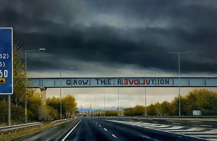
    Let Love Grow. Image by Jen Orpin.

    That’s right: paintings. We’re “in the realm of unseen and overlooked infrastructure, with Orpin’s eye – and careful framing – capturing over 200 images of the bridges that span Britain’s motorways. […] The Architecture of Connection brings the entire series together in a monograph for the first time, together with some of the artist’s writings about the work.”

    Without traffic, but with something bordering tranquility, it’s of course right up my street. I sometimes wish I could stop and photograph every interesting bridge — or even roadside attraction — while out in the world, but don’t, of course; few of us do. Orpin did. With an easel, no less.

    2026 International Pet Photography finalists

    Finally, something to send you into August with a smile on your face: humanity’s best friends.
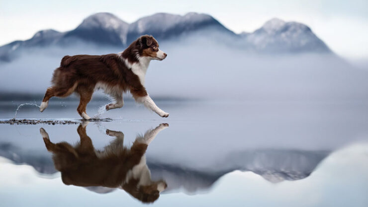
    Untitled, Action category. Photograph by Shandess Griffin.
    ‘Cat Goalkeeper,’ Phone category. Photograph by He Huapei.
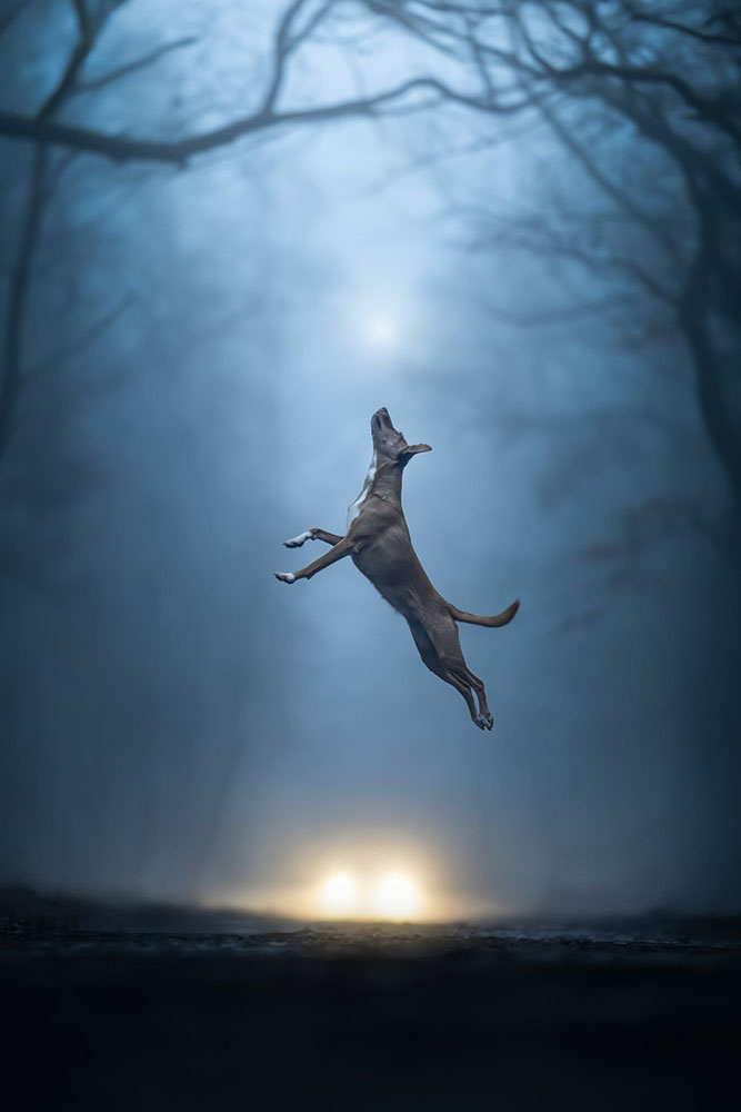
    “Weightless,” Action category. Photograph by Linda Glomb.

    The winners will be announced tomorrow, August 1st.

    Happy summer, everyone!

    • 1
      As you probably know, I don’t participate in social media. I have to rely on others to bring Apple’s media efforts to my attention — folks covering the coverage, as it were. ↩︎
    • 2
      Ferrari’s F1 wasn’t actually the first automated or even semi-automated manual gearbox/transmission, by a long shot. It is, however, the one that brought it to sports cars, followed almost immediately by BMW’s SMG. Wiki has a history, if you’re interested. ↩︎
    • 3
      Technically, Koenigsegg got there first with its CC850. However, a) you have to be a car geek to know Koenigsegg, and b) that shift-by-wire unit doesn’t use traditional selector forks, or synchronizers. Instead, it uses seven wet clutches, six to select forward ratios and one for reverse, all with their own pressure sensors and mechatronic actuators. “Changing up is as simple as engaging the right clutches,” The Autopian says. Ferrari’s is a gated dual-clutch automatic, although to call that an oversimplification is an undersell. ↩︎
  • Beautifully Briefed 25.8: Calming, Hopefully

    Beautifully Briefed 25.8: Calming, Hopefully

    Type opens up, the best designer you’ve never heard of, and photography to admire and inspire: all this and more for your August edification and enjoyment.

    August University Press Coverage on Spine

    Rather than show my favorite this month, I thought I’d share four of the runners up:

    My favorite of the covers not in the Spine post.

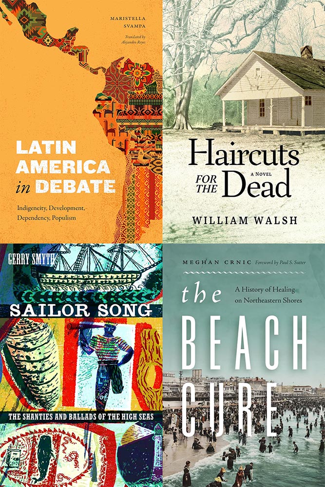
    Clockwise from upper left: Duke University Press, Mercer University Press, and two from the University of Washington. These are all good, but just missed being in the post because another option offered a better design — or story.

    I’m highlighting these to celebrate the strong design in university work; despite limited budgets — or whatever other, shall we say, challenges universities face these days — most have realized that great design is worth the extra. Long live the University Press!

    See the rest at Spine.

    Fontastically usable

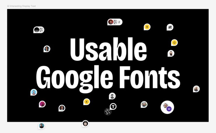
    BrandNew points us at a little treasure posted by Smith and Diction: an expert’s take on which among the Google fonts are worth it, helpfully organized by category. Check it out.

    FYI, it’s at Figma, a site I’d heard of but not interacted with (it’s aimed at the collaborative market, aka “teams”); it took me a minute to orient myself. (Use the zoom in the upper right, then drag.)

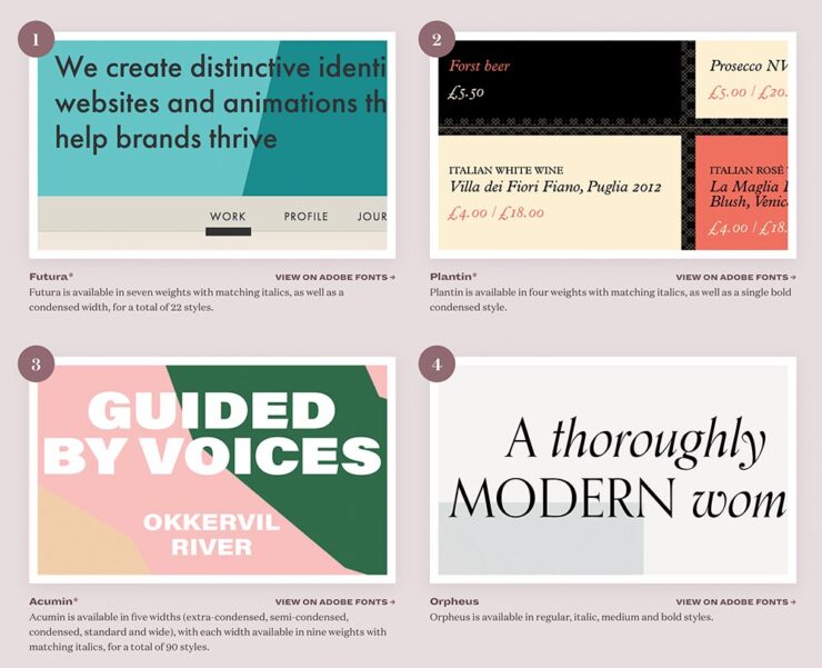
    In the comments at BrandNew, several folks point to the two Typewolf lists on the subject, one for Google and one for Adobe/Typekit. (Interestingly, I was not familiar with Typewolf — it was good enough to earn an instant bookmark. Stay tuned for more from them.)

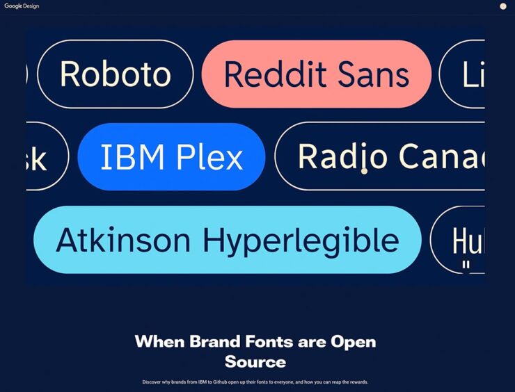
    That was on the 7th. On the 8th, BrandNew linked to a Google Design article on “the benefits of brands — for the brands and for users — making their proprietary typefaces open source and available to all to use, modify, and tinker with.” Google Fonts currently has 17 of them.

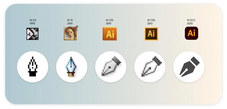
    Lastly, on the 15th: Keep Calm and Icon. “Bettina Reinemann, Staff Experience Designer, Brand & Icons, at Adobe, offers an interesting and comprehensive deep dive into the evolution of a handful of Adobe’s most iconic, well, icons and how they have changed over the decades in style, meaning, and depiction.”

    BrandNew is subscription, yes, but it’s one of the web’s subscription bargains at less than $25/year and packed with great stuff. I do wish they’d offer a free article or two within a given period of time so new folks can sample before purchasing, but that criticism aside, I can’t recommend them highly enough.

    Many Thanks to … Double-Oh Who?

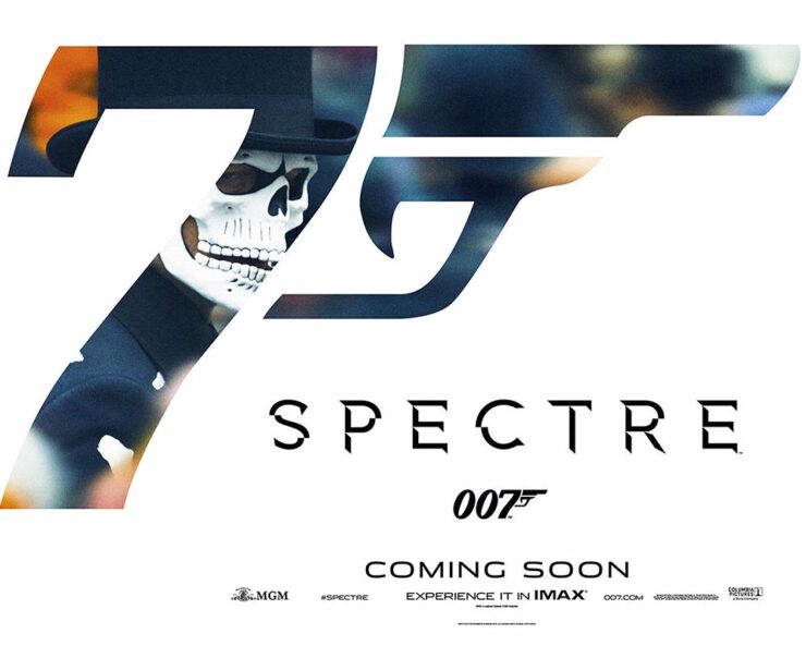
    Joe Caroff, designer of so many things yet a so completely unknown personality, died on the 17th — one day short of his 104th (!) birthday. The Guardian has a nice obit … with this graphic:

    The 2015 film by Sam Mendes, the 24th James Bond adventure.

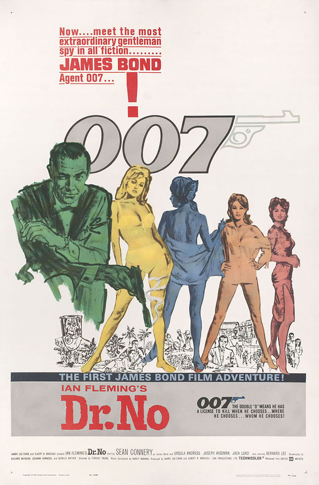
    That’s right, he’s the guy who designed that logo. John Gruber, at Daring Fireball, has a nice discussion of the logo and, specifically, its subtle evolution within the Bond franchise. (Did you know it was initially created for use on letterhead? Wow.)

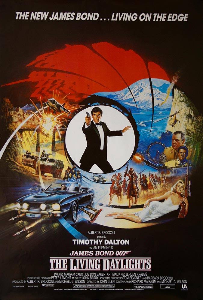
    He also links to a bunch of Bond one-sheet posters, a couple of which I’d like to post:

    The 1962 film by Terence Young, and
    The 1987 film by John Glen, the 15th.

    I’m of the age to have grown up with Roger Moore, and really liked Timothy Dalton’s first film — it’s a shame it crashed and burned with the second — whose portrayal of the character has an edge you don’t see again until Daniel Craig stepped into the role.

    But I digress. Joe Caroff’s poster history covers some greats, including this one:

    Original 1961 U.S. one sheet poster by Joe Caroff.

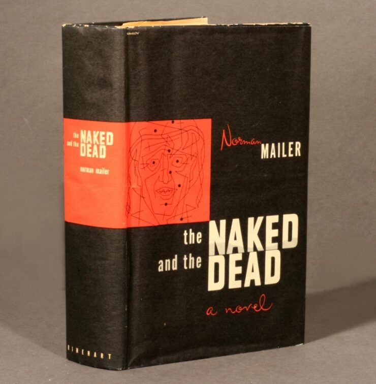
    But it’s a tidbit on the Wiki entry that warrants my publicly spending a minute remembering Joe Caroff: he designed the original jacket for Norman Mailer’s The Naked and the Dead:

    Jacket design by Joe Caroff. Photograph courtesy of The Norman Mailer Society.

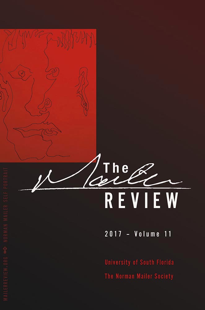
    When I had the privilege of redesigning The Mailer Review in 2017, the first cover paid homage to the above design:

    The illustration is a self-portrait by Norman Mailer. (See Wikipedia for the old design.)

    Read more about Joe Caroff’s many accomplishments at Print (spoiler: Steven Heller hadn’t heard of him before 2016!) or DesignWeek.

    And Now For Something Completely … Wait.

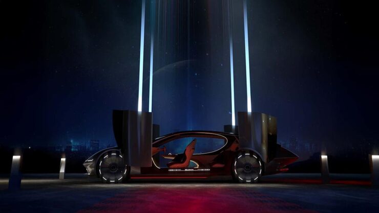
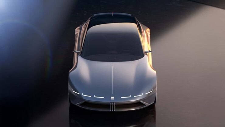
    A quick drive-by here: this is a Buick.

    It’s quite literally out of this world: the Electra Orbit Concept is only for the Chinese market — their biggest. The interior, especially, has more than a few overtones of the Jaguar Type 00 concept. (Which is looking more and more prescient, frankly; see previous coverage.) Read more at Motor1 or the Autopian.

    “Sedans are dead,” someone said. Hmph.
    August’s Photography Faves
    100 Years of the Leica 1
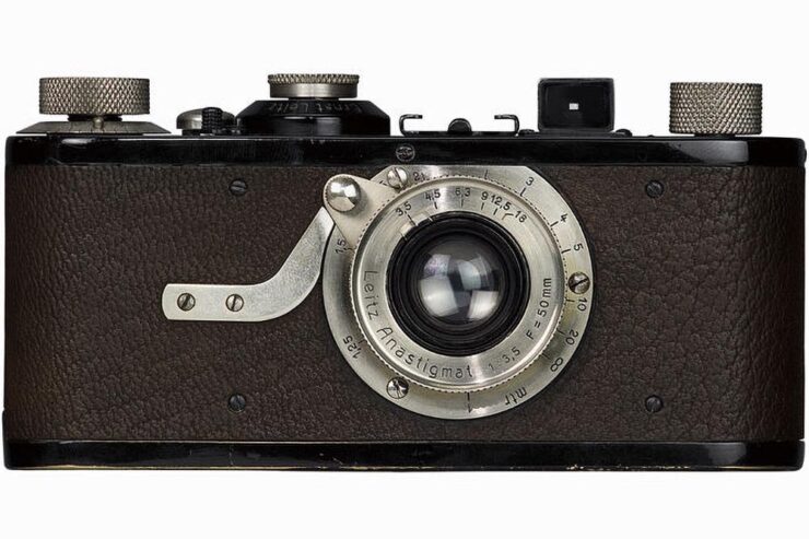
    1925’s Leica 1, the world’s first mass-produced 35mm camera.

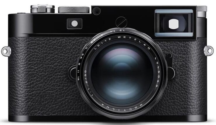
    PetaPixel has a nice piece covering all of the many ways the Leica 1 — the first from “a tiny German camera company” — has had such an outsized influence on the huge world that is photography today.

    The 2025 M11 New York Edition. You can absolutely see the family resemblance.
    2025 iPhone Photography Awards

    It’s time for the annual iPhone Photography Awards — along with my annual observation that the camera you have with you is the most powerful of all. And since a substantial percentage of the world carries an iPhone, the possibilities are nearly endless.

    PetaPixel has a round up of the winners, but it’s the honorable mentions I’d like to highlight:

    Architecture: Photograph by Adrian Beasley, United Kingdom.
    Architecture: Photograph by Vladyslav Vasylkevych, Ukraine.
    Cityscapes: A second from Adrian Beasley, United Kingdom. (I didn’t see that until after I’d selected ones to post — and decided to post it anyway.)

    Okay, one photograph that placed (2nd):

    The famed “Other” category: Dominic Martín Dähncke, Tenerife, Canary Islands (Spain).

    See many, many more — nearly all fantastic — at the IPPAwards website: 2025 iPhone Photography Awards Announces Winners of Its 18th Annual Competition.

    Special Bonus #1: “Perhaps no building in the world captures the early 20th-century art deco movement quite like the Chrysler Building, which has been an iconic fixture in the Manhattan skyline since 1930. Its grace and beauty have captivated photographers for decades. For one NYC shooter, the building has become his life’s work. Mitchell Funk has been photographing the Chrysler Building for 50 years; his images are vibrant, eye-catching, and extremely creative.”

    2025 Ocean Photographer of the Year Awards, and Prints for Wildlife

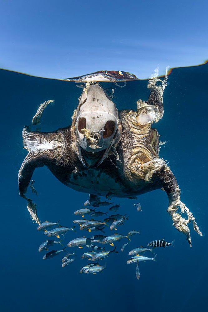
    “Fragility, beauty, and urgency characterize” this competition, with “an emphasis on ocean conservation and the outsize influence humans have on marine life,” This is Colossal says. (More at PetaPixel, too.)

    From the Adventure category: photograph by Ben Thouard.
    Human Connections: photograph by Jianping Li.
    Impact: photograph by Henley Spiers.

    On that last one: “This green turtle was killed by a boat strike, an unnatural and unnecessary death for an endangered species,” says photographer Henley Spiers. “Only recently deceased, it is partly decomposed, with the haunting view of the bare skull in contrast to the skin, which remains on the rest of its body, and the juvenile fish which have adopted the turtle carcass as a form of safe refuge. We came across this turtle by chance, a dispiriting sight at the end of a long and fruitless day at sea. I can only hope that this image acts as a reminder of the enormous human burden placed on turtles and the ocean as a whole.”

    It had the intended effect. Impact, indeed.

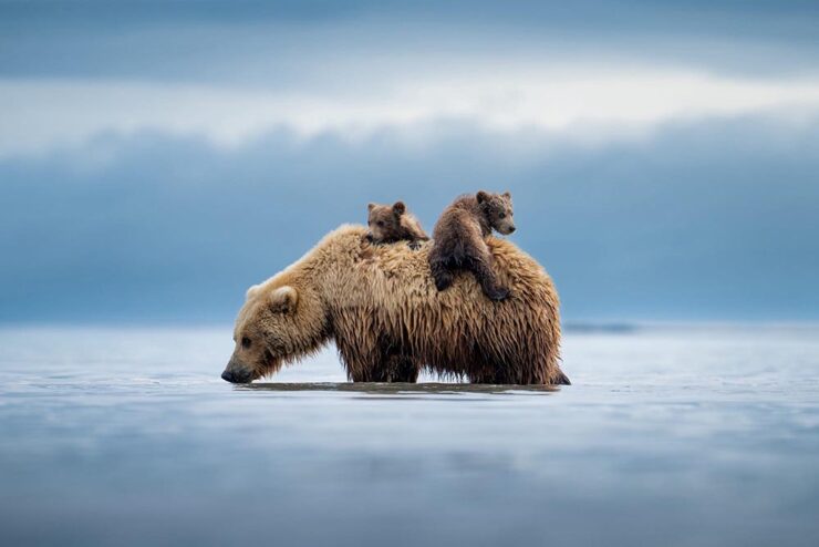
    So, you might ask: how can I help? Prints for Wildlife is one way.

    “Lifeboat,” Alaska. Photograph by Casey Cooper. (Sold out, alas.)

    “In 2025, the crisis isn’t a virus — it’s a withdrawal of critical funding for wildlife and conservation,” says program co-founder Pie Aerts. “Prints for Wildlife is more than a fundraiser; it’s a platform for connection, consciousness and hope in a time of crisis.” Browse photos by more than 200 photographers on the fundraiser’s website. The limited-edition prints will be available until September 21.

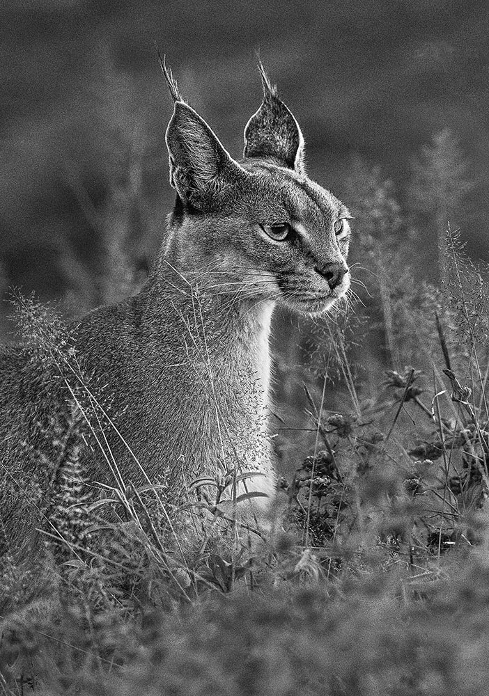
    “Caracal,” Tanzania. Photograph by Elena Didevska.

    Special Bonus #2: “The Natural History Museum in London unveiled a first look at 15 of the breathtaking photos that are in the running to win the 61st Wildlife Photographer of the Year competition, including a lion staring down a cobra, a pack of Arctic wolves, and bats flying through the dark toward the camera; the 2025 Wildlife Photographer of the Year contest attracted 60,636 total entries, the most ever in the contest’s illustrious history.”

    2025 Capture the Dark Sky Contest

    DarkSky International announced the winners of its fifth annual Capture the Dark photography contest. Winners across eight main categories showcase the best in astrophotography and demonstrate why it is vital to protect dark skies worldwide; PetaPixel has a nice roundup.

    In other words, I’m not going to let you go enjoy your Labor Day weekend (here in the US, at least) without once again closing with a photograph of two of my favorite things: lupines against a beautiful night sky.

    “Celestial Dance over Lupine Fields,” New Zealand. Photograph by Lucy Yunxi Hu.

    Have a great September, everyone.

  • Beautifully Briefed 24.8: Picture This

    Beautifully Briefed 24.8: Picture This

    A trio of miscellany, a trio of space photography, more than a trio of great black and white photography, and a single, very serious photography question for you this time — let’s get right into it.

    Summer of Fun Miscellany
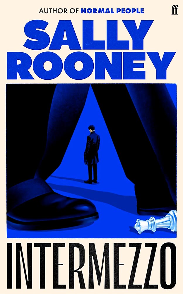
    Intermezzo, Explained
    The UK cover for Intermezzo. Book design by Kishan Rajani. (The US cover doesn’t compare.)

    GQ UK has an interview with Kishan Rajani, a senior designer at Faber, and Pete Adlington, the publisher’s art director, “about how the Intermezzo design came together, the role of social media in modern book design, and how to make books ‘as pickupable as possible.’”

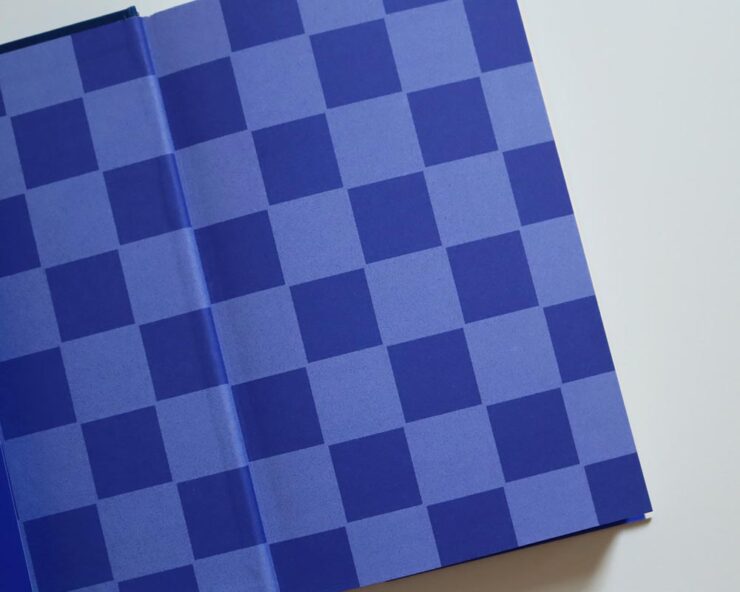
    The endpapers for Intermezzo (UK). I really like that they’ve sweated the little details.

    We can discuss “pickupable” as a word another time — your time is better spent, for now, reading the interview.

    WeTransfer Sold

    “Some of Bending Spoons’ most successful products are tools that serve creativity, therefore we are confident that this milestone will complement both businesses, supercharge our growth, and help us create even more value for creative industries at large,” says WeTransfer CEO Alexander Vassilev of the acquisition.

    I like and appreciate WeTransfer — unlike the corporatespeak above (but hey, we’re inventing words today … right?) — and hope that despite being corporatized, nothing substantive will change.

    PetaPixel: “The companies did not say whether or not all staff or leadership at WeTransfer would be maintained after the conclusion of the acquisition. That may come into question since Bending Spoons does have a track record of buying completed products, training its internal staff on their upkeep, and then releasing the original development team.”

    Crap.

    Update, 9 September, 2024: “Bending Spoons acquired file-sharing platform WeTransfer in July and has now laid off 75% of WeTransfer’s staff,” PetaPixel reports. “The Italian app company Bending Spoons has confirmed the layoffs to TechCrunch, which comprise at least 260 people based on WeTransfer’s employee headcount of around 350 people.”

    Adobe, Again
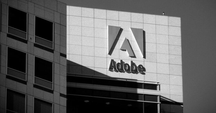
    The Adobe “World Headquarters” buildings in San Jose, California. Image via PetaPixel.

    Adobe (previously) recently sat down with PetaPixel to discuss the shambles where things stand — clearly, an attempt at damage control. PP published it … and got some feedback:

    Adobe couldn’t explain why it let its once excellent relationship with photographers and media lapse, only that it is sorry that happened. I do believe [their explanation], at least when I hear it from the people responsible for making the software. There is a big divide between the folks who code Photoshop and the C-level executives who are so out of touch with the end users. The thing is, it doesn’t matter what those people down in the trenches of development say or even how good Adobe’s software happens to be, some photographers just don’t like the feeling of giving money to the company because of the people at the helm.

    Jaron Schneider, PetaPixel

    The thing is: it’s less photography, really, than design. If you’re a photographer, how you get to the point of printing or publishing the photographs offers options in software — whether iPhoto, Affinity, Photoshop, or the Pixel 9 Magic Editor — Instagram doesn’t care, Zenfolio takes multiple file formats, and so on.

    But in design — that is, desktop publishing or especially book design — Adobe has a monopoly over the software used by the industry, full stop. I used to love working with their software. Today, not so much. (And for the record, it’s more than their fees, it’s the quality of the software.) It’s extremely frustrating and, at the moment, there is no alternative even on the horizon.

    Crap. (Again.)

    Extraordinary Astrophotography

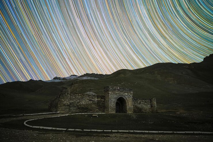
    So, how many can place Kyrgyzstan on a map? It’s a former Soviet Republic in Central Asia, and, clearly, a great place to do some astrophotography.

    Star Trails Above Tash Rabat by Soumyadeep Mukherjee.

    PetaPixel highlights the work of Soumyadeep Mukherjee, who traveled there specifically for the purpose — and succeeded wildly. It’s awesome to see a country I’m not familiar with served so well. (My favorite, of course, is the short depth-of-field portrait — if you can call it that — of Yuri Gargarin, seen in the header image above.)

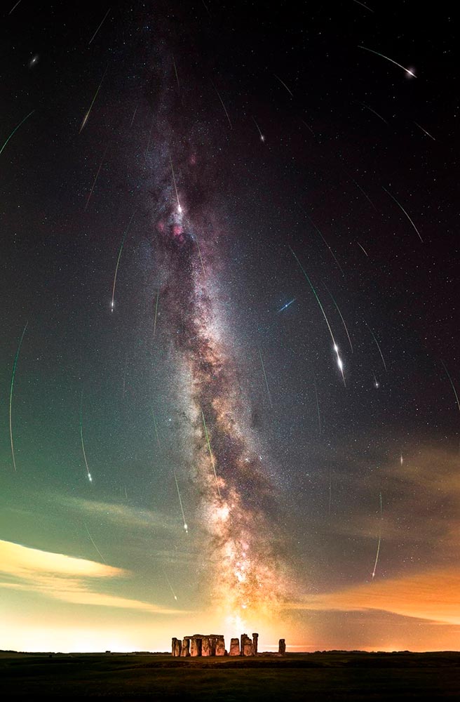
    Alternatively, This is Colossal points us at “Bisected by the Milky Way, a Stellar Image Captures the Perseid Meteor Shower Raining Down on Stonehenge“:

    Perseid Meteors over Stonehenge by Josh Dury.

    “Josh Dury, aka ‘Starman,’ is an award-winning landscape astrophotographer, presenter, speaker and writer from The Mendip Hills ‘Super National Nature Reserve’ in Somerset, United Kingdom,” his web site trumpets.

    The thing is … despite looking like he’s about 25, he’s earned it. Great stuff.

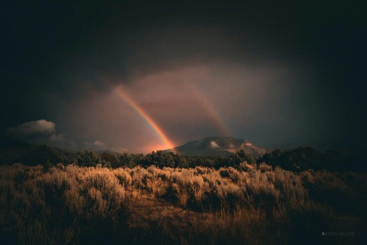
    Meanwhile, back at PetaPixel, “Photographer Aaron Watson, who goes by Skies Alive Photography, has seen many incredible things in the night sky. His latest sighting is a rare double ‘moonbow,’ a rainbow created by bright moonlight in precise conditions.”

    Double Moonbow by Aaron Watson.

    All three of these folks need special thanks for their patience. I have trouble standing still long enough to set up a tripod, let alone do long exposures under rarely-encountered combinations of time, weather, equipment and location — plus lots of good luck — in the middle of the night. Well done, all.

    “Majesty of Monochrome”

    The winners of the third annual Black and White Photo Awards have been unveiled, showcasing the best in monochrome photography across multiple categories.

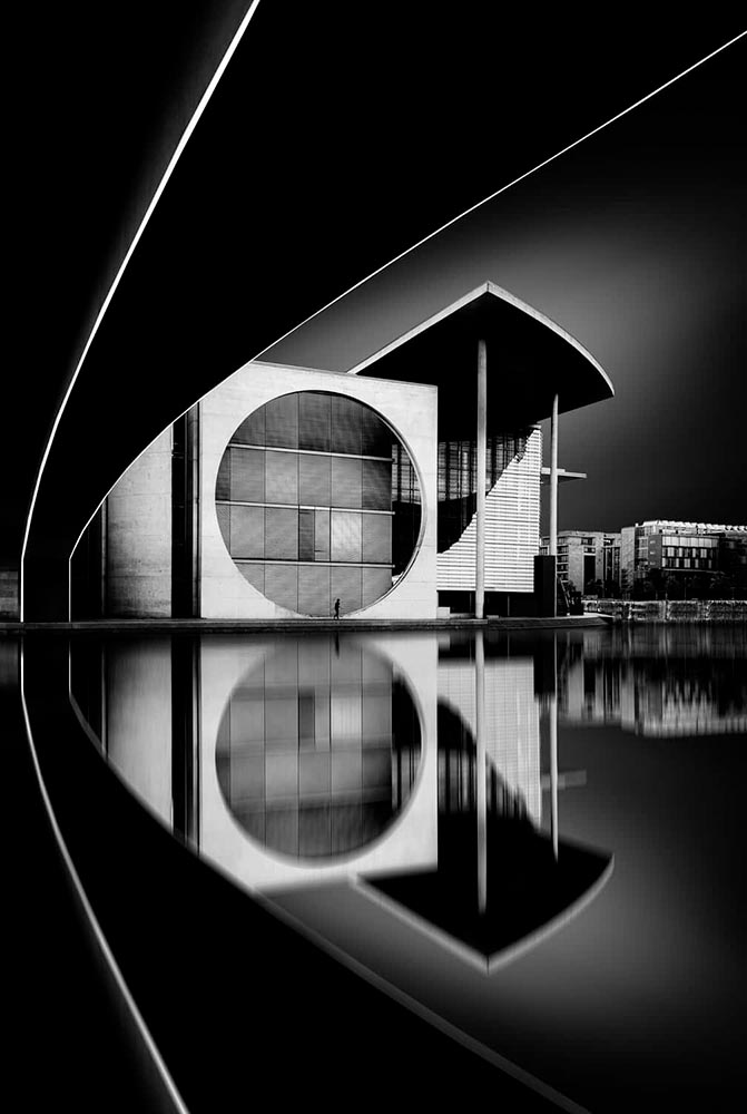
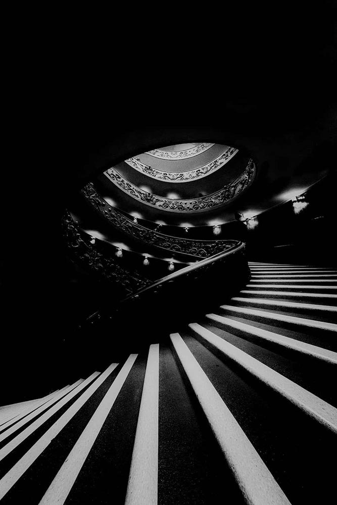
    Monochrome Majesty: Marie-Elisabeth-Lüders-Haus, by Robert Fulop. Bronze Mention from the Black and White Photo Awards 2024.

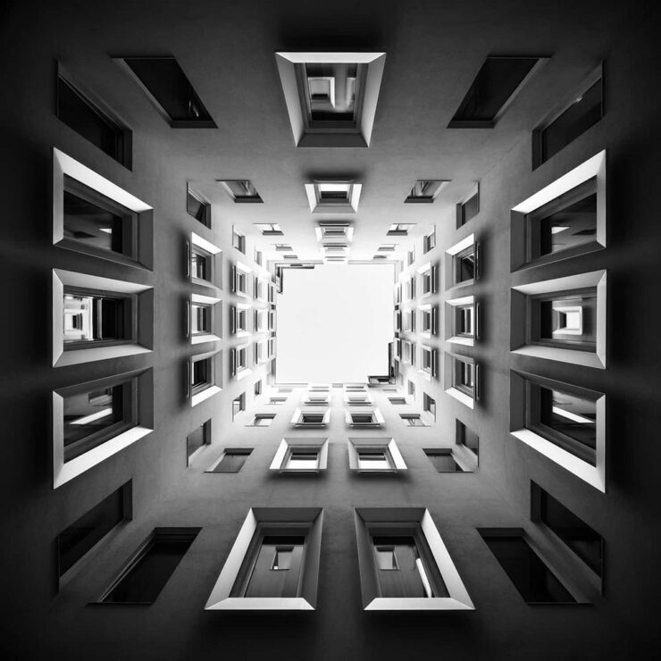
    Naturally, I gravitate towards architecture — and the winners (of the nearly 5000 entrants) demonstrate serious talent.

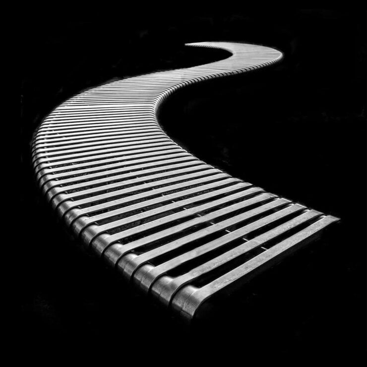
    Bench, by Colin Page. Finalist from the Black and White Photo Awards 2024.
    The Double Helix, by Md Tanveer Rohan. Finalist from the Black and White Photo Awards 2024.
    Windows by Manfred Gruber. Finalist from the Black and White Photo Awards 2024.

    See the winners — and especially, take in the finalists, many of which I’d personally judge to be winners in their own right — at the contest’s web site.

    Special Bonus #1: It’s time once again for the annual iPhone Awards, “a powerful testament to the art of storytelling through photography.” I especially liked this one:

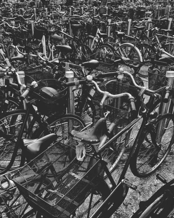
    Bicycle Forest by James Kittendorf. 3rd place in the Cityscape category, 2024 IPPAwards.

    It’s a great photograph, certainly, but it was taken by a now-quite-elderly iPhone X — proof, once again, that it’s the camera you have with you. See all the 2024 winning photographs, in multiple categories and taken worldwide, here. (Via PetaPixel.)

    So … What’s Next for Photography?

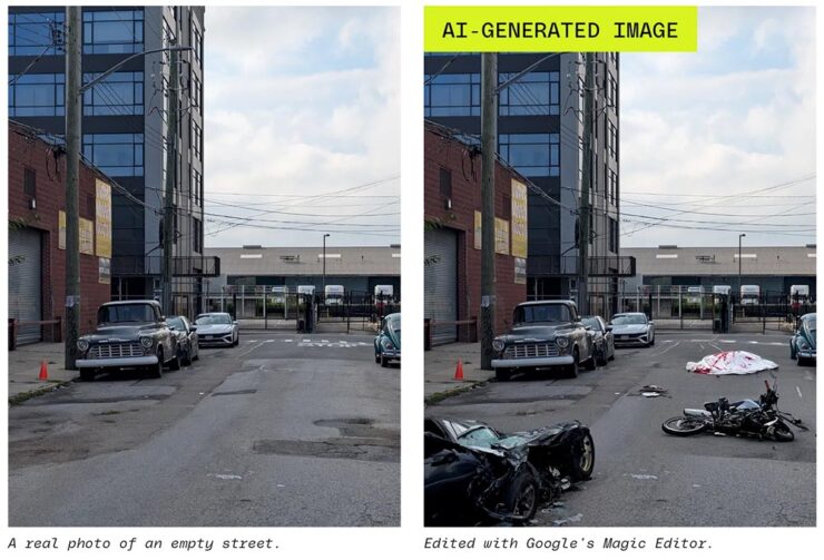
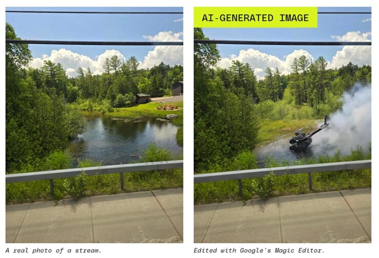
    The Verge: “Anyone who buys a Pixel 9 — the latest model of Google’s flagship phone, available starting this week — will have access to the easiest, breeziest user interface for top-tier lies, built right into their mobile device.”

    A montage from The Verge, thankfully clearly labeled.

    Life-changing moments have long been captured using photography, from Moonrise to George Floyd. But, generally, fakes were the exception, not the rule. We’re, unfortunately, arming the folks who cry foul.

    Another montage from The Verge. Note the woods filled in behind the helicopter less convincingly than the accident, above — but how many are going to notice?

    It does this article disrespect to summarize. Just go read: “No one’s ready for this.”

    Special Bonus #2: Nick Heer, at Pixel Envy, articulates what needs to be said: “anyone can now radically and realistically alter an entire scene within minutes of taking a photo. [O]ur expectations need to change.”

  • Beautifully Briefed 23.8: Summer Stew

    Beautifully Briefed 23.8: Summer Stew

    The August heat is met with some refreshingly cool items for you this time: beloved movies reimagined as vintage paperbacks, graphic design on the Internet Archive, and winners of the 2023 iPhone photography awards. Plus, a bit on social media that hopefully won’t leave an aftertaste. Let’s dig in.

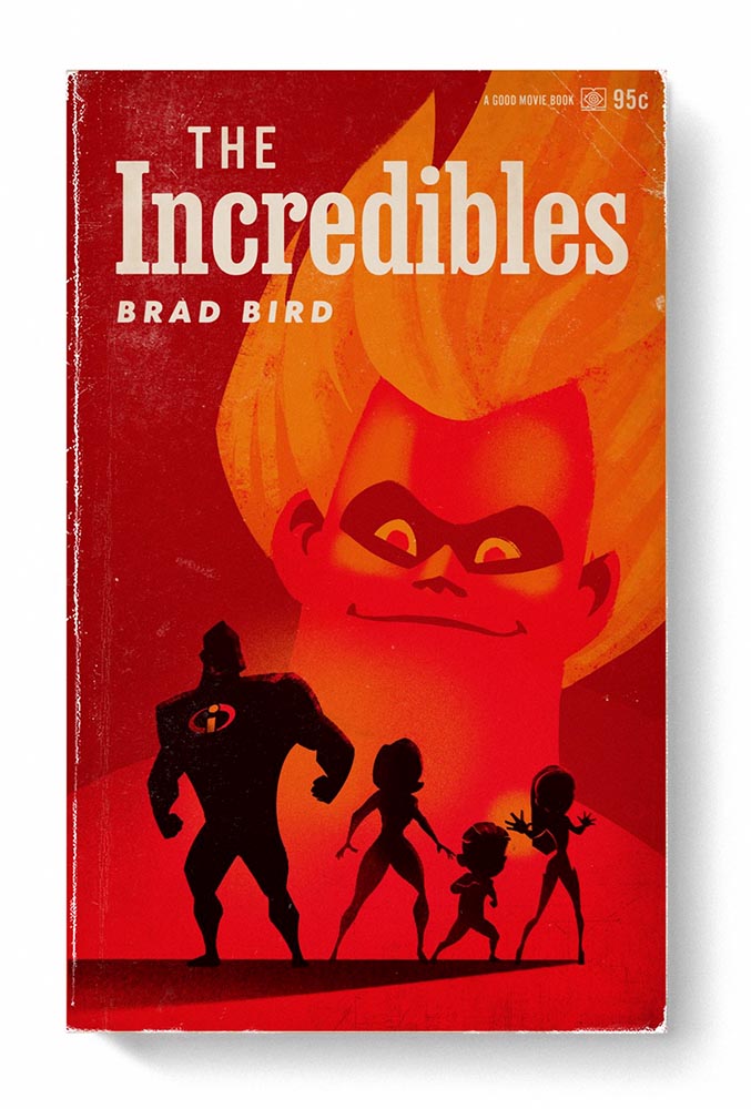
    “Good Movies as Old Books”

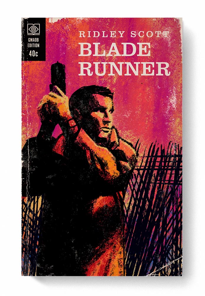
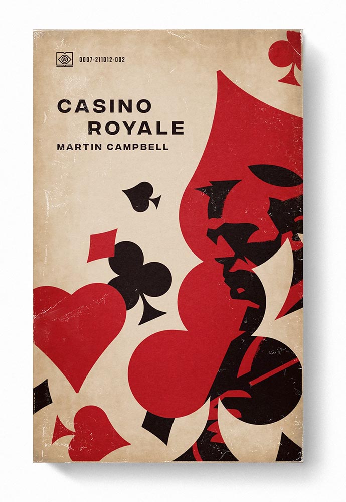
    This is Colossal points us to an extraordinary personal project by graphic designer Matt Stevens: classic, acclaimed movies visualized as vintage paperback books. Everything about these spells “win.”

    From the aged look, illustration choices, and director-as-author to the logo and occasional price, these are all … perfect.

    Volume One is 100 titles, and while that book is sold out, prints are available at his website. The items in Volume Two, due this month, are guaranteed to be awesome.

    Graphic Design on the Internet Archive
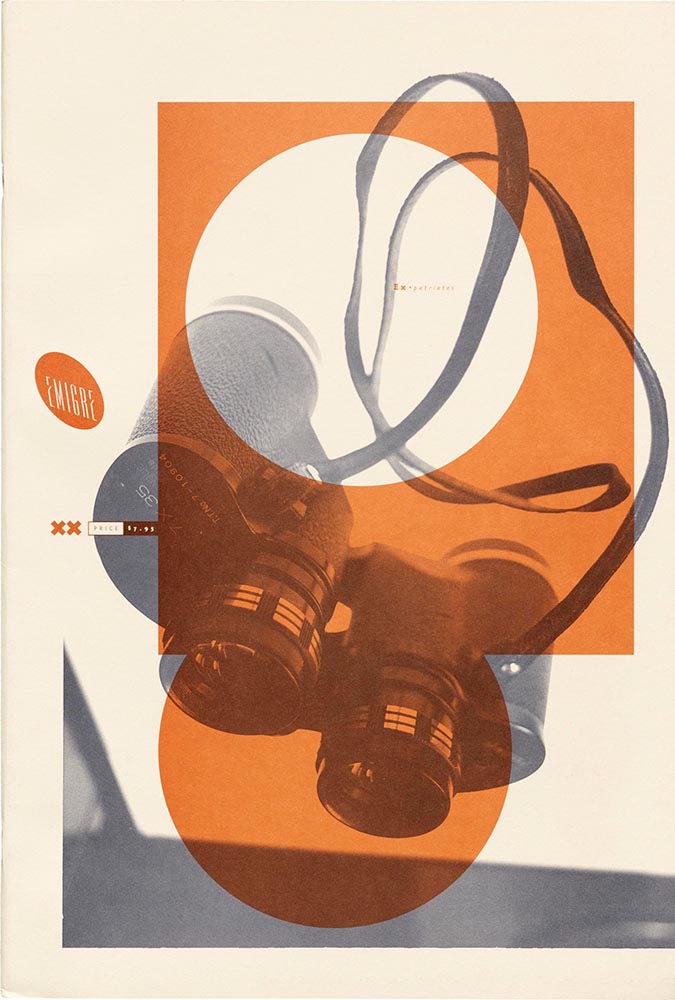
    Emigre #20 – Expatriates. Courtesy of the Internet Archive via archive.digital.

    Another treasure via Jason Kottke:

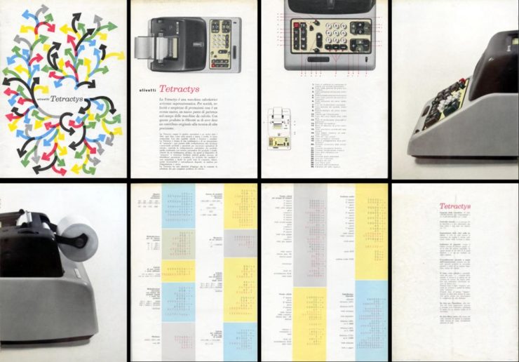
    archives.design is a labor of love site run by Valery Marier where she collects graphic design related materials that are available to freely borrow, stream, or download from the Internet Archive. I’ve only scratched the surface in poking around, but so far I’ve found Olivetti brochures, a collection of theater programs from the 19th and early 20th centuries, several Apple thingsThe Vignelli Canona specimen book of wood type from the 1880s, and many issues of Emigre. What a resource!

    Jason Kottke, kottke.org
    An advertising brochure for the Olivetti Tetractys, circa 1956.

    Some of these are fantastic — set aside some time to explore and enjoy.

    2023 iPhone Photography Winners

    I don’t always link to these contests — it often seems like the publicity (and rights!) are all about the folks holding the contest rather than the people entering them — but I often look, and am always impressed with the quality coming out of a “simple” iPhone.

    Long Nguyen, France – 1st Place, Travel – “Last Night before Xmas”
    Scott Galloway, United States – 1st Place, Nature – “Wonder Wheel”

    And while both of the above are (relatively) recent phones, in the latter case showing the macro capabilities of an iPhone 12 Pro Max, even older phones can highlight the talent of the person using it:

    Derek Hager, United States – 3rd Place, Photographer of the Year – “Tucson Morning”

    Shot on a 2017 iPhone X. Nice.

    See all the winners, for 2023 and years past, at IPPAwards.com. (Via PetaPixel.)

    A Moment Regarding Social Media

    I’m not going to spend much time on this; I eschewed pretty much all forms of social media years ago now, and don’t regret it. That said, I do keep up with social media in the meta sense (a word that’s been stolen, as far as I’m concerned, by — wait for it — a social media company), and have noted the pain and concern associated with the implosion of Twitter.

    While this conversation started with Nick Heer and the always-excellent Pixel Envy, it’s obviously evolved as the year has seen one extraordinary cage fight event after another.

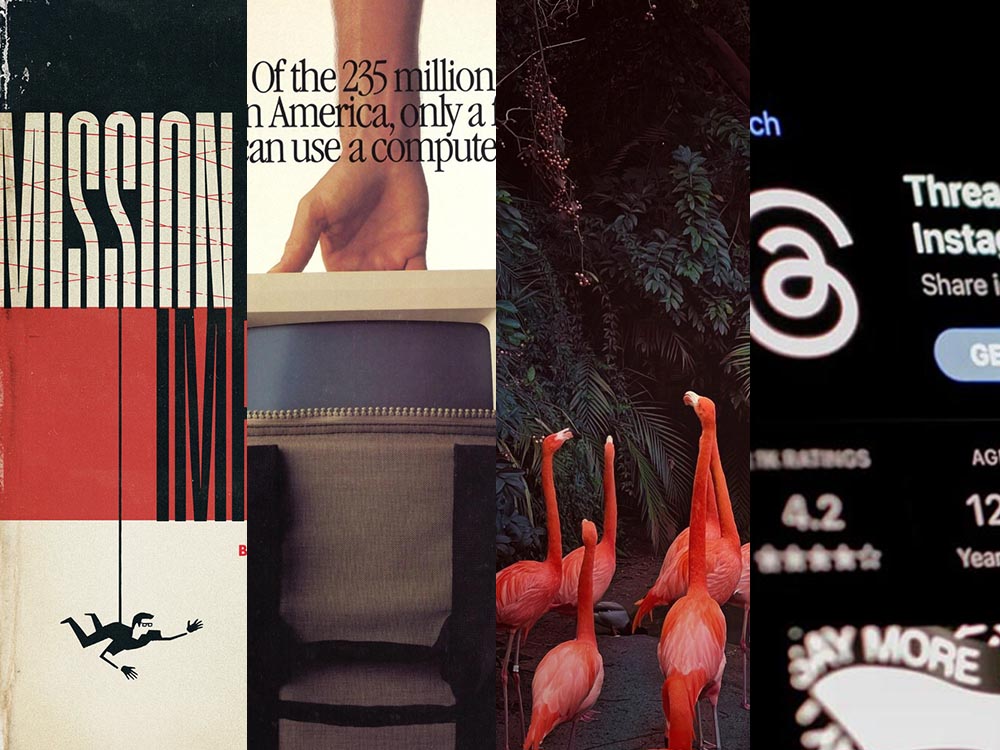
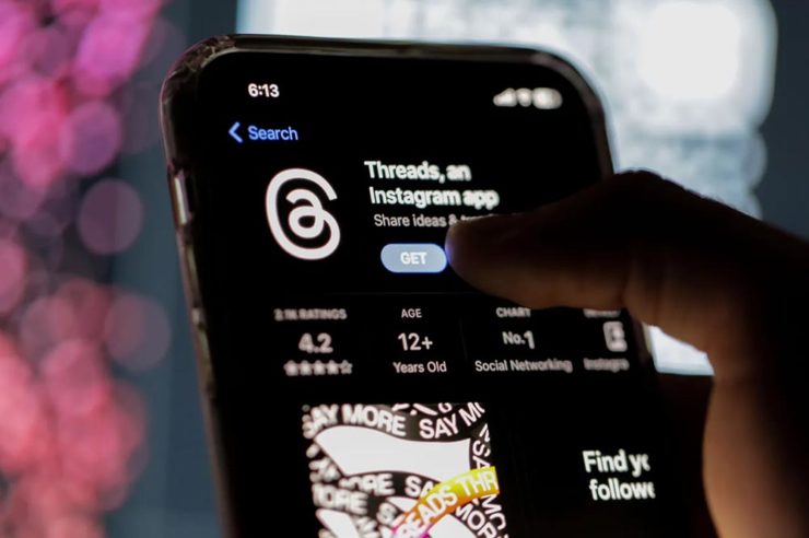
    Threads on Apple’s App Store, via the BBC.

    For the past decade, It’s been all but required for serious brands to maintain a social media presence […] yet instead of scrambling to claim digital real estate across all these newly emerging platforms, some companies are choosing to be more judicious about which platforms they choose to join. In some cases, they’re learning from brands who jumped the social media ship years ago.

    Chris Stokel-Walker, BBC

    The quote above, from the BBC, attempts to answer the question, “Why your favourite brand may be taking a social media break.” Short answer: it’s complicated. I’d argue there’s an even shorter answer — it’s smart! — but for people and brands that aren’t yet established, social media is often key to discoverability.

    This may be especially true for artists, designers, photographers, and others in the self- and small-business-employed creative field. Indeed, let’s go to a great source for those in the arena, Creative Boom, who recently spent a minute asking, “Creatives are saying social media is over… so what next?”

    Like any new craze, it was fun for a while. But there’s certainly nothing new about it any more. Facebook’s now been around for almost two decades. Twitter’s 17 years old. Even Instagram has reached its teens. And while many of us joined these platforms during their fun, “anything goes” eras, when everything was about the users, now it’s all about the algorithms and their use to make venture capitalists vast amounts of money.

    Tom May, Creative Boom

    While I agree that social media is a mess and has been for a while, I’m absolutely not going to tell you to give it up — only to remind you that I have given it up and continue to be completely okay with the decision.

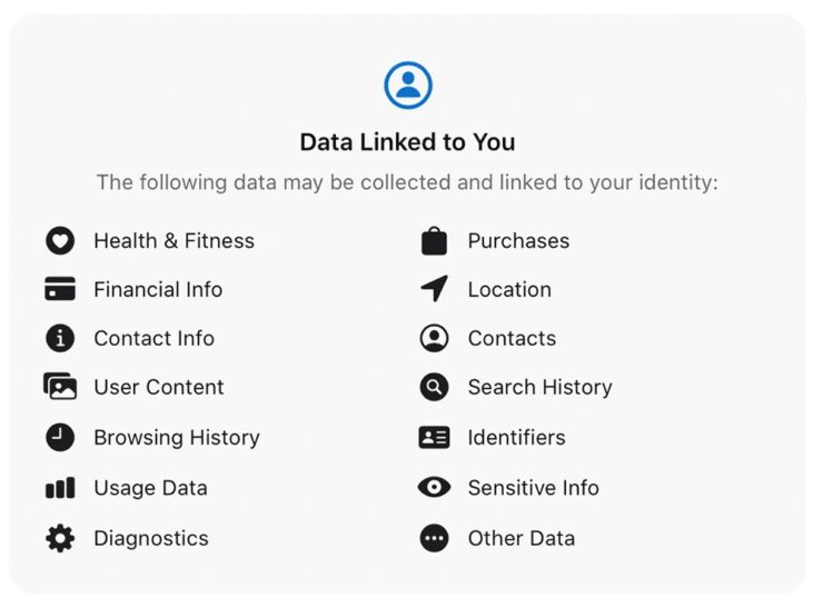
    I do want to ask you, though, to choose wisely:

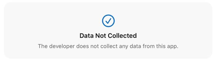
    Facebook’s “Threads (an Instagram app),” their answer to the Twitter/X debacle, as shown via Apple’s iOS App Store privacy report.
    Tapbot’s “Ivory,” available in Apple’s iOS App Store and showing that app’s privacy report, for the Mastodon social platform.

    Enough said. Turn off the computer, go forth, and enjoy a beautiful summer’s day.

  • Beautifully Briefed, July/August 2021

    Beautifully Briefed, July/August 2021

    It’s been a busy summer here in Middle Georgia; after regular updates to Foreword for several months, things have slowed down a little. Thus, some good items have piled up.

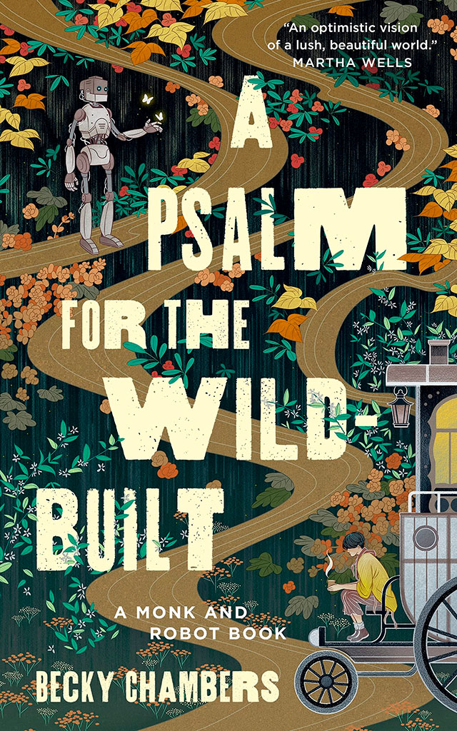
    Starting with a book design I really like:

    NPR describes it as, “A Monk And A Robot Meet In A Forest … And Talk Philosophy.” Interesting description, interesting design. I’d pick it up off a shelf.

    Speaking of bookshelves, a notable quote from Andy Hunter, of Bookshop.org:

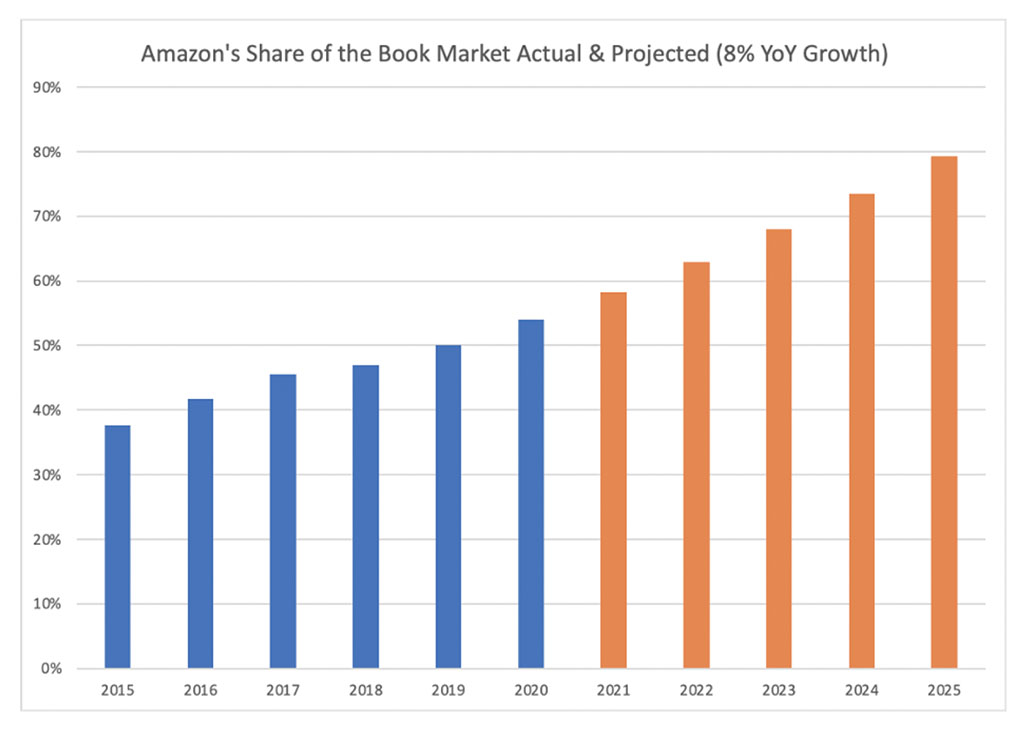
    Take a look at this graph. The blue is Amazon’s share of book sales in the past six years. The orange is where we are headed if their average growth rate (8%) continues. If nothing slows their momentum, Amazon will control nearly 80% of the consumer book market by the end of 2025. Every single book lover should worry. After we’re done worrying, we must change the way we buy books.

    The graph:

    I’m not a fan of Medium — Andy, please choose a better place to post your very valid point — but it’s worth reading. Then change your book-buying habits if possible!

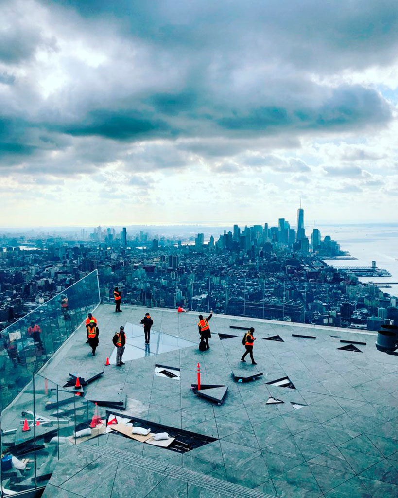
    Also from the book category, check out Skidmore, Owings, and Merrill’s latest book of built work 2009-2019. Tons of great work here, but one example might tower over the others:

    Great photography, too. designboom has more, in their famous all-lower-case style.

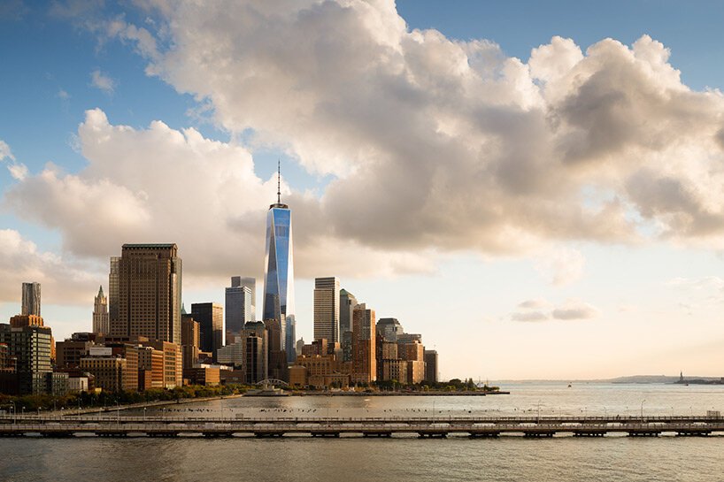
    While we’re talking about great photographs of New York City, check this out — complete with 1WTC in the background:

    A winner from the recent 2021 iPhone Photography Awards, which I enjoyed … until I found out it’s just another contest, complete with entry fee. (Hey, at least they don’t reassign copyright.)

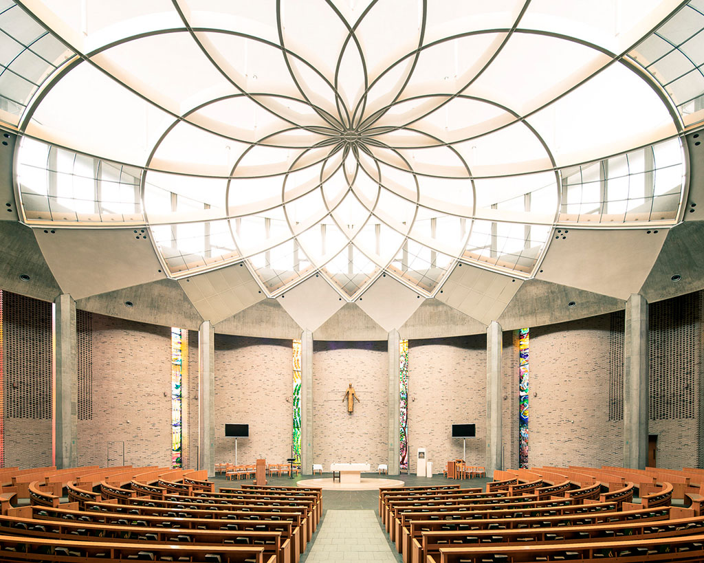
    While we’re at the intersection of photography and architecture, these shots of modern churches across Europe are stunningly beautiful:

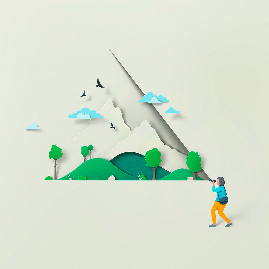
    From the nearby intersection of photography and illustration:

    The whole series is great, great stuff, and has very deservingly been used by the likes of Apple, The New Yorker, and more. Read on.

    Last and almost certainly least, I’ve updated the Musella gallery:

    Check that gallery out, look at the Middle Georgia collection, or peruse all my Georgia photographs on the road to purchasing a print or getting in touch to let me know you’d like to use something in a book or design project. Thank you.

    On to September!