Beautifully Briefed 24.8: Picture This

A trio of miscellany, a trio of space photography, more than a trio of great black and white photography, and a single, very serious photography question for you this time — let’s get right into it.

Summer of Fun Miscellany
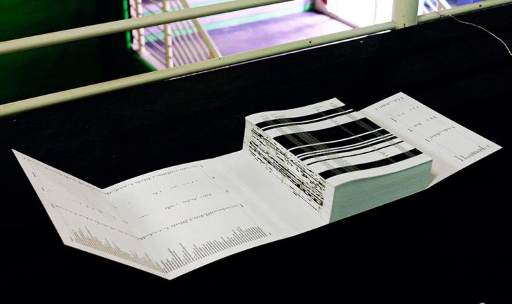
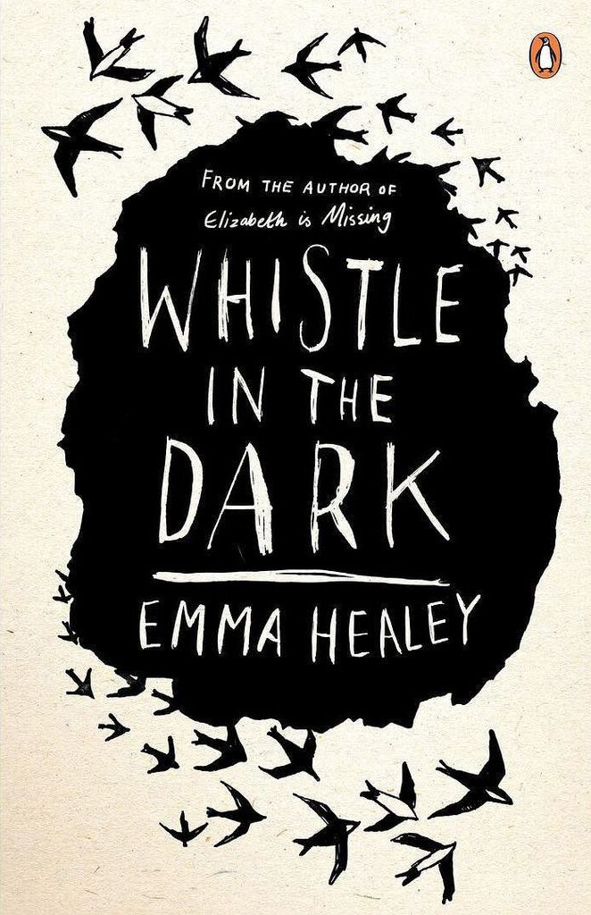
Intermezzo, Explained
The UK cover for Intermezzo. Book design by Kishan Rajani. (The US cover doesn’t compare.)

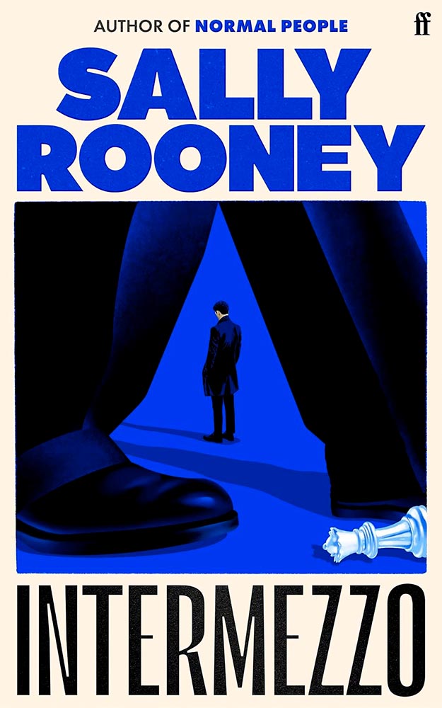
GQ UK has an interview with Kishan Rajani, a senior designer at Faber, and Pete Adlington, the publisher’s art director, “about how the Intermezzo design came together, the role of social media in modern book design, and how to make books ‘as pickupable as possible.'”

The endpapers for Intermezzo (UK). I really like that they’ve sweated the little details.

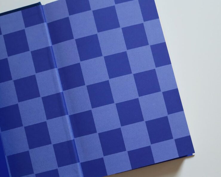
We can discuss “pickupable” as a word another time — your time is better spent, for now, reading the interview.

WeTransfer Sold

“Some of Bending Spoons’ most successful products are tools that serve creativity, therefore we are confident that this milestone will complement both businesses, supercharge our growth, and help us create even more value for creative industries at large,” says WeTransfer CEO Alexander Vassilev of the acquisition.

I like and appreciate WeTransfer — unlike the corporatespeak above (but hey, we’re inventing words today … right?) — and hope that despite being corporatized, nothing substantive will change.

PetaPixel: “The companies did not say whether or not all staff or leadership at WeTransfer would be maintained after the conclusion of the acquisition. That may come into question since Bending Spoons does have a track record of buying completed products, training its internal staff on their upkeep, and then releasing the original development team.”

Crap.

Update, 9 September, 2024: “Bending Spoons acquired file-sharing platform WeTransfer in July and has now laid off 75% of WeTransfer’s staff,” PetaPixel reports. “The Italian app company Bending Spoons has confirmed the layoffs to TechCrunch, which comprise at least 260 people based on WeTransfer’s employee headcount of around 350 people.”

Adobe, Again
The Adobe “World Headquarters” buildings in San Jose, California. Image via PetaPixel.

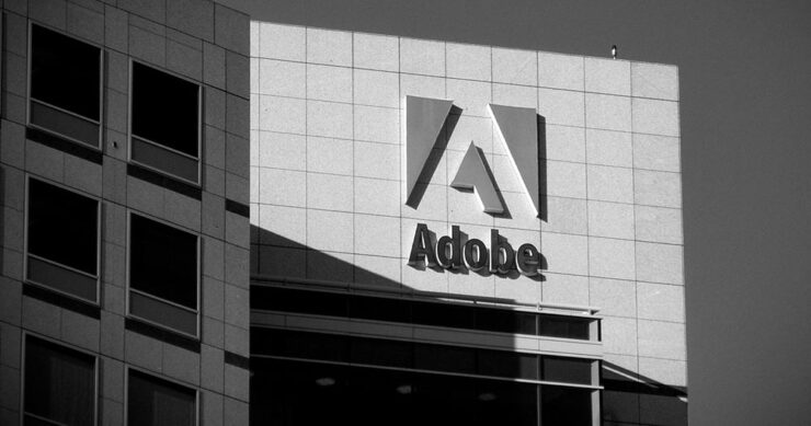
Adobe (previously) recently sat down with PetaPixel to discuss the shambles where things stand — clearly, an attempt at damage control. PP published it … and got some feedback:

Adobe couldn’t explain why it let its once excellent relationship with photographers and media lapse, only that it is sorry that happened. I do believe [their explanation], at least when I hear it from the people responsible for making the software. There is a big divide between the folks who code Photoshop and the C-level executives who are so out of touch with the end users. The thing is, it doesn’t matter what those people down in the trenches of development say or even how good Adobe’s software happens to be, some photographers just don’t like the feeling of giving money to the company because of the people at the helm.

Jaron Schneider, PetaPixel

The thing is: it’s less photography, really, than design. If you’re a photographer, how you get to the point of printing or publishing the photographs offers options in software — whether iPhoto, Affinity, Photoshop, or the Pixel 9 Magic Editor — Instagram doesn’t care, Zenfolio takes multiple file formats, and so on.

But in design — that is, desktop publishing or especially book design — Adobe has a monopoly over the software used by the industry, full stop. I used to love working with their software. Today, not so much. (And for the record, it’s more than their fees, it’s the quality of the software.) It’s extremely frustrating and, at the moment, there is no alternative even on the horizon.

Crap. (Again.)

Extraordinary Astrophotography

So, how many can place Kyrgyzstan on a map? It’s a former Soviet Republic in Central Asia, and, clearly, a great place to do some astrophotography.

Star Trails Above Tash Rabat by Soumyadeep Mukherjee.

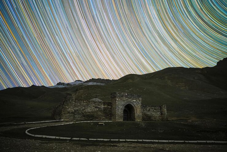
PetaPixel highlights the work of Soumyadeep Mukherjee, who traveled there specifically for the purpose — and succeeded wildly. It’s awesome to see a country I’m not familiar with served so well. (My favorite, of course, is the short depth-of-field portrait — if you can call it that — of Yuri Gargarin, seen in the header image above.)

Alternatively, This is Colossal points us at “Bisected by the Milky Way, a Stellar Image Captures the Perseid Meteor Shower Raining Down on Stonehenge“:

Perseid Meteors over Stonehenge by Josh Dury.

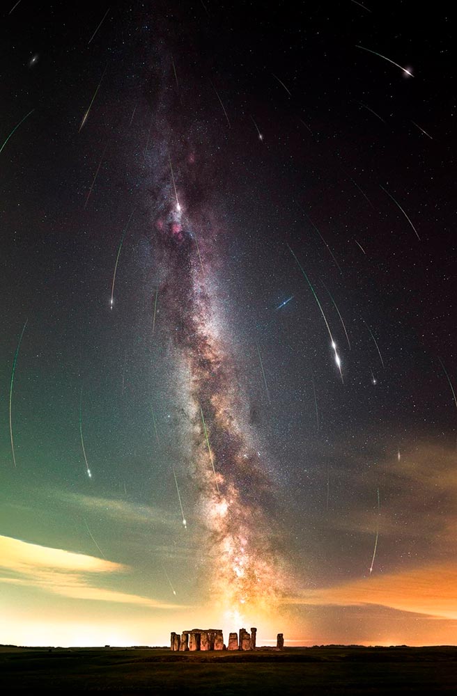
“Josh Dury, aka ‘Starman,’ is an award-winning landscape astrophotographer, presenter, speaker and writer from The Mendip Hills ‘Super National Nature Reserve’ in Somerset, United Kingdom,” his web site trumpets.

The thing is … despite looking like he’s about 25, he’s earned it. Great stuff.

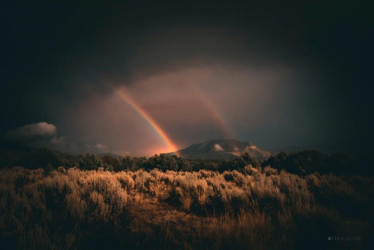
Meanwhile, back at PetaPixel, “Photographer Aaron Watson, who goes by Skies Alive Photography, has seen many incredible things in the night sky. His latest sighting is a rare double ‘moonbow,’ a rainbow created by bright moonlight in precise conditions.”

Double Moonbow by Aaron Watson.

All three of these folks need special thanks for their patience. I have trouble standing still long enough to set up a tripod, let alone do long exposures under rarely-encountered combinations of time, weather, equipment and location — plus lots of good luck — in the middle of the night. Well done, all.

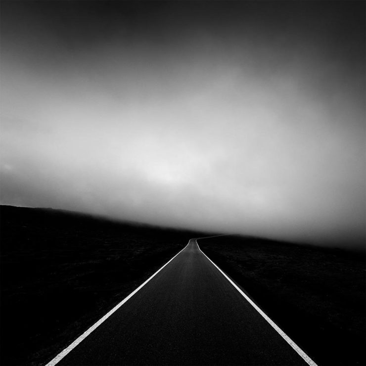
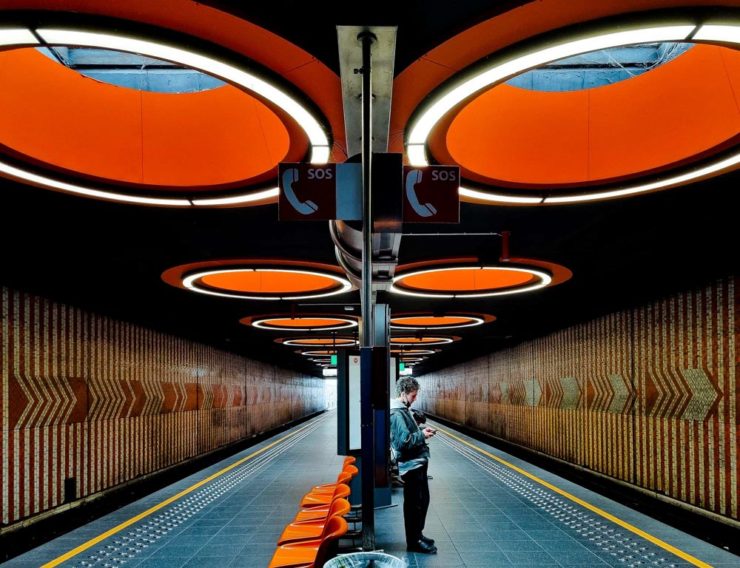
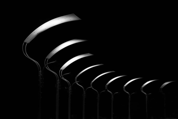
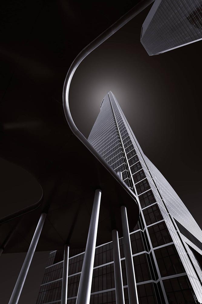
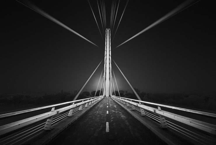
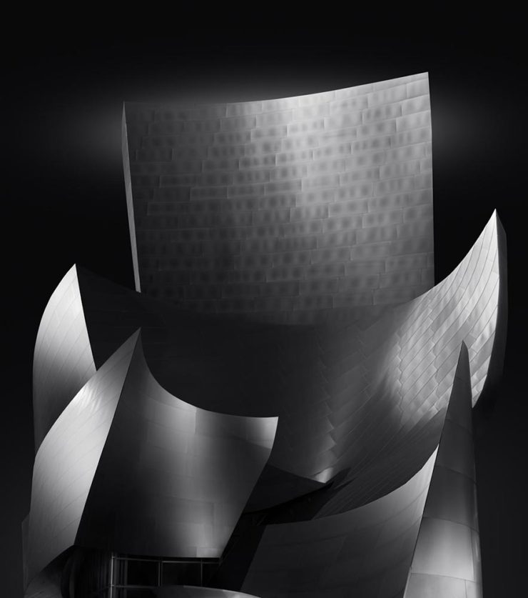
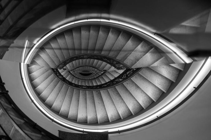
“Majesty of Monochrome”

The winners of the third annual Black and White Photo Awards have been unveiled, showcasing the best in monochrome photography across multiple categories.

Monochrome Majesty: Marie-Elisabeth-Lüders-Haus, by Robert Fulop. Bronze Mention from the Black and White Photo Awards 2024.

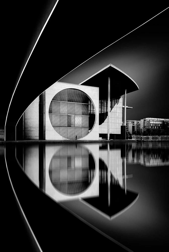
Naturally, I gravitate towards architecture — and the winners (of the nearly 5000 entrants) demonstrate serious talent.

Bench, by Colin Page. Finalist from the Black and White Photo Awards 2024.
The Double Helix, by Md Tanveer Rohan. Finalist from the Black and White Photo Awards 2024.
Windows by Manfred Gruber. Finalist from the Black and White Photo Awards 2024.

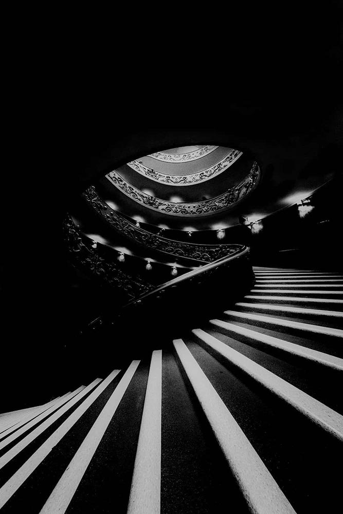
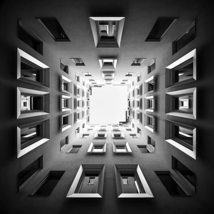
See the winners — and especially, take in the finalists, many of which I’d personally judge to be winners in their own right — at the contest’s web site.

Special Bonus #1: It’s time once again for the annual iPhone Awards, “a powerful testament to the art of storytelling through photography.” I especially liked this one:

Bicycle Forest by James Kittendorf. 3rd place in the Cityscape category, 2024 IPPAwards.

It’s a great photograph, certainly, but it was taken by a now-quite-elderly iPhone X — proof, once again, that it’s the camera you have with you. See all the 2024 winning photographs, in multiple categories and taken worldwide, here. (Via PetaPixel.)

So … What’s Next for Photography?

The Verge: “Anyone who buys a Pixel 9 — the latest model of Google’s flagship phone, available starting this week — will have access to the easiest, breeziest user interface for top-tier lies, built right into their mobile device.”

A montage from The Verge, thankfully clearly labeled.

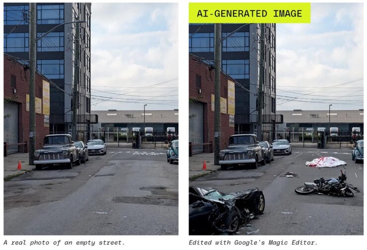
Life-changing moments have long been captured using photography, from Moonrise to George Floyd. But, generally, fakes were the exception, not the rule. We’re, unfortunately, arming the folks who cry foul.

Another montage from The Verge. Note the woods filled in behind the helicopter less convincingly than the accident, above — but how many are going to notice?

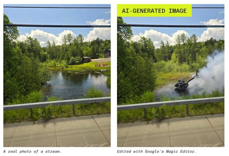
It does this article disrespect to summarize. Just go read: “No one’s ready for this.”

Special Bonus #2: Nick Heer, at Pixel Envy, articulates what needs to be said: “anyone can now radically and realistically alter an entire scene within minutes of taking a photo. [O]ur expectations need to change.”

Beautifully Briefed 24.3: Bloomin’ Breadth

The end of March here in Middle Georgia means flowers aplenty, and usually with that, some photography — but I’ve not yet had a chance. (Stay tuned.) I have, however, been saving up links o’ interest: fonts, books, photography, and new(ish) car logos. Let’s go!

Kottke Meets 2024

Starting with one of the very few places that is still around from Foreword’s old days, the always-interesting Jason Kottke:

2024 marks Kottke.org’s 26th year on the ’net.

Great new looks for great content, with better Quick Links — the previews are ace — and incredibly-appreciated gift links to places like The New York Times and The Atlantic. If you haven’t been in a while, click and enjoy.

Fab Spring Type

With “a plethora of captivating new typefaces,” CreativeBoom celebrates spring with 11 new faces to tempt, inspire, and bring joy:

Arillatype.Studio brings us a thousand glyphs of greatness.

Zanco, with its bell-bottom style; Seabirds, inspired by 1930s book covers; Module, a “fluke side hustle;” and Graffeur, improvised from gaffer tape and glimpsed in this post’s header image, are all great. My far-and-away favorite, though, is At Briega, “inspired by the concept of hybridisation” and shown above.

See ’em all here.

Literary Three-Fer
M.C. Escher’s Lesser-Known Works
“The Drowned Cathedral,” a 1929 woodcut.

“Unique perspective” never does justice to someone whose name defines the term. See some never-before-seen images alongside old favorites in a new Escher book highlighted at Hyperallergic.

Multidimensional Libri

“Experimental books are flourishing, [a]nd the evidence is seen” in this Daily Heller from PRINT: a traveling exhibition on three-dimensional books, all published titles.

Oh, those Italians. Read on.

Book Design Snobbery
Hoover vs. Atwood — no joke.

“Don’t get held back from the simple pleasures of reading,” argues Natalie Fear at CreativeBloq, “not everything needs to be minimalist.” Justification for commercialism or a common-sense explanation for the bookshelves’ current look? You decide.

Photography Three-Fer
Winners of Monochromatic Minimalism
“Black Pearl” by Sascha Kohne. An honorable mention for the magazine, but a winner for me.

Some incredibly good stuff here — but perhaps more importantly, did you know of Black & White Minimalism Magazine? There’s no end to today’s continued diversification, methinks.

“Traveling through Costa da Morte, Galicia. 600m above sea level where the mountains separate the Cantabria sea from the Atlantic Ocean,” explains third-place winner Alexandre Caetano.
Aging Facades of France

“Shuttered blinds, peeling paint, and aging doors don’t usually indicate an invitation, but for French photographer Thibaut Derien, the fading facades of long-closed shops are well worth a stop,” This is Colossal says.

Sony Photography Awards: Architecture
The Ciudad de las Artes y las Ciencias (City of Arts and Sciences) in Valencia, Spain: “Hemispheric,” by Eng Tong Tan, Malaysia.

ArchDaily‘s coverage of the annual Sony awards shortlist announcement was an insta-click.

New Bull: Now Flat. (And a BMW.)

Lamborghini practically defines flamboyant. So it’s worth a link when their logo gets less interesting:

Old logo, left, new, right.

Late at following the industry trend of flat-is-better, because, well, Volkswagen. (Okay, I undersell. Perhaps.) Read the lack of news at Motor11Motor1 also has a decent roundup of new car logos, from 2016-present, which underscores the “flatness” trend. or The Drive, where they manage to convey the brand’s use of the phrase “digital touchpoints.”

I don’t know whether this will make any more sense in a few or even many months — which is relevant because of BMW. Four years ago, one of the industry’s design leaders expressed strong this new style, and I didn’t get it. But it’s worn better than most, and superlatively on occasion — check out the logo’s use on the Vision Neue Klasse X:

Rather than a standalone, plastic part sitting on the paint, it’s etched into the finish. Man, I hope that makes it into production.

Neue Klasse: do like. Bull? No so much.

Update, 2 April: BrandNew, itself sporting a new look, has weighed in on the new Lambo style, calling it “not good.” (FYI, BrandNew is a subscription, quite possibly the best $20/year someone interested in design can spend.)

  • 1
    Motor1 also has a decent roundup of new car logos, from 2016-present, which underscores the “flatness” trend.

Beautifully Briefed 23.9: Falling into Brilliance

As summer turns to fall, let’s take a look at Type 1 fonts, a library index, revolutionary posters, posters for “get lectured,” and two different photography contests. Let’s get right into it.

Adobe discontinues a standard: The Type 1 font

Back in the early days of desktop publishing — up to about the turn of the century, give or take — everything typographic used PostScript, a programming language by Adobe. (Other stuff, too, like Adobe’s vector program, Illustrator.) PostScript fonts were the so-called “Type 1” variety, made up of a bitmapped “suitcase” that housed the standard display sizes and an outline file used by the output device to print clean, what-you-see-is-what-you-get beauty.

The Apple LaserWriter Plus and some vintage Macs: nostalgia! (Note the book — heh.) Image: YouTube.

Companies from Apple to Microsoft didn’t want Adobe to hold a monopoly on output tech, so later fonts evolved into TrueType and then OpenType, the latter of which is the standard today.

So much so that Adobe has now discontinued Type 1, and they, along with Microsoft, have stopped being supported. Which is understandable and yet a shame: some of us still have hundreds of them.

Ars Technica has the best roundup.

Meanwhile, I’m going to investigate a conversion utility. Will report back.

All the Libraries in London

It’s Nice That has a post that reminds us of a library’s central purpose: to leave knowing more than you did when you entered. “The library, in our shared public imagination, is a special place,” the author argues — reminding us of what libraries were established to do, often distinctly different from the modern reality (especially in the United States).

In the library you begin to be convinced that language matters, that words have the power to clarify, to rouse, to make us feel something, to help us understand the political and cultural features of historical and contemporary moments.

Lola Olufemi, It’s Nice That
All the Libraries in London. Cover design: unknown. Image via It’s Nice That.

All the Libraries in London does something artistic with a simple listing, elevating it, reminding us how compelling the ideal that libraries represent really is:

This is a political and artistic listing, one that invites the reader to rediscover their own memories of their local library as a site of discovery. The book’s authors invite us to reflect on our personal relationship to libraries as well as the necessity of collectively securing their future existence.

Lola Olufemi, It’s Nice That
Alan Kitching, Durning Library. Image via It’s Nice That.

We need more of this everywhere, but especially here in the States. Meanwhile, check out this great item at It’s Nice That.

Special Bonus #1: Another British treasure, via the very British Antiques Roadshow (a British original, natch): this incredible poster by Ralph Steadman.

Ralph Steadman’s Where the Buffalo Roam (1980) poster. Image via Wikipedia.

Special Bonus #2: British book designer Steve Leard has launched a new book design podcast, Cover Meeting, featuring interviews between Leard and fellow book designers on the work, the industry, and more. The Bookseller has more.

Cuban Movie Posters. No, Really.

While we’re on the subject of great posters — and It’s Nice That — let’s talk about how Cuba’s revolution-era political posters transformed their poster design for films. Appropriately enough, a new film, El Cartel Cubano, highlights these amazing (and, likely, never seen before) items.

Besos Robados, ICAIC, by Sotolongo & Carole Goodman. Image via It’s Nice That.

How come our posters in the US aren’t this beautiful? What did this say about the priorities of the revolution? What did the medium or choices in the scarcity of materials used say about the economic situation in Cuba?” It’s these questions which form the bedrock of El Cartel Cubano, a fascinating and tender tribute to the artists on the island.

Adrienne Hall, co-director, El Cartel Cubano
Sur, by Michael Myiares Holland. Image via It’s Nice That.

I have to admit: this isn’t a subject I would have leapt at, but It’s Nice That sold it. Awesome.

Get Lectured (on Architecture)

Closing out our trifecta of great posters, Archinect‘s Get Lectured series brings us these fantastic items from their Fall 2023 series:

Woodbury University School of Architecture’s Fall 2023 lecture series.
The University of Texas at Austin School of Architecture’s Fall 2023 lecture series

Some real gems: see more.

Finalists of the 2023 Urban Photography Awards

Going to soapbox a little here: pay-to-enter photo contests aren’t usually something I want to spread the word about. So ArchDaily‘s basically-a-press-release, “URBAN Photo Awards 2023 has announced its list of Finalist Photographers, marking the penultimate stage of the international contest,” was guaranteed a pass.

But there’s a problem: some of the photographs are really compelling.

Untitled, by Claudia Costantino

This one’s my fave:

Back to the 70s, by Stephane Navailles

See the contest website, or ArchDaily‘s post.

Winners of the 2023 Black and White Photography Awards

Another contest, yes. They’re everywhere. But … wow.

Street Lights – Ottawa, by Gareth Jones, category winner, architecture
Another mushroom? By Hector Ballester Ballester. Silver mention, architecture.
Alamillo bridge, by Manuel Ponce Luque. Finalist.
The concert, by Helena García Huertas. Finalist.
Reflections on the stairwell, by Max Dobens. Finalist.

And that’s just the buildings/architecture — there are portraits, street photography, landscapes, and more. A reminder to aspire, every day, with every image.

The Black and White Photo Awards (2023). (Via PetaPixel.)

The Joy of Monochrome, from Spine

“A technicoloured cover can draw me to it like the proverbial moth to a flame. But as covers get more vivid, the buyers’ senses can become overwhelmed. They can’t see the books for the rainbow.”

Spine’s Vyki Hendy argues that monochrome — by which she means black-and-white-or-shades-thereof — is powerful. I’d argue that single-color items should belong in this category, too, but her piece stands on its own. Take a look.