Washington Square News discusses NYU’s attempts to — like pretty much everything else — get book design online:
The studio course focuses on book art and teaches students about the production of books, from interior and exterior design to binding techniques. Without the physical studio space and the materials it provides, digital learning has paved an unprecedented pathway for the course to continue.
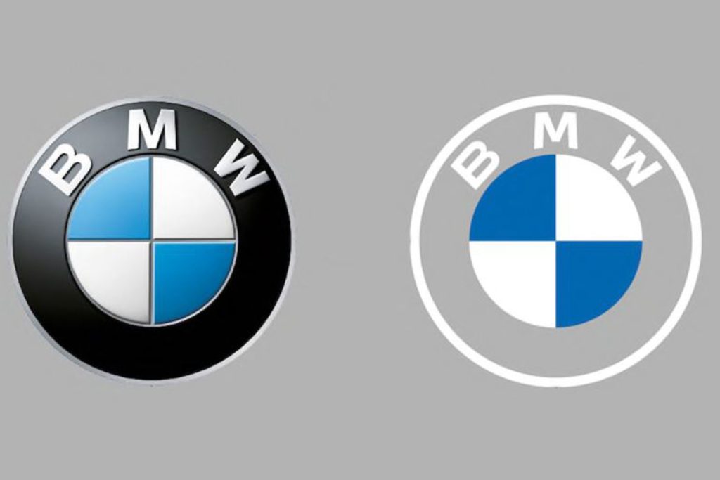
Original post, March 5th, 2020: After 23 years, BMW has updated its logo … but there’s a problem.
Let’s back up a little, as even the previous logo wasn’t perfect. Debuted in 1997, it followed the then-trendy “3D” look, complete with highlights. It was, however, clearly BMW — black background, blue-and-white roundel, chrome outline, lettering. This new one, however, loses the iconic black (for transparent) and chrome outline (for white):
BMW’s logo: 1997 (left) and 2020 (right)
It’s less representative and less clear in my opinion, but hey, I’m only a BMW owner, not any part of their marketing team.
Another problem: it debuted on the Concept i4. controversial all by itself.
Why not revert to the earlier, 1963 version? (Or update it with new type — but keep the black?) Transparency is fine in some cases, but I’m not sure that this isn’t a case of style over substance in the actual use cases (web site logo, app logo, etc. — more than just on the cars, I mean).
Update, 7/27/20: Dezeen has a roundup of the six other companies that have made their logos “flat,” proving the “3D” look mentioned above is truly out of fashion:
Audi, Citroen, VW, Nissan, Mini, and Toyota, oh boy!
Ford Almost Let a Graphic Design Legend Update Its Blue Oval Logo in 1966: Paul Rand, who designed iconic logos for IBM, Cummins, ABC and numerous other companies, designed a sleek logo for Ford that went unused.
“Opel Details All-New, Slimmer And More Modern ‘Blitz’ Logo,” at CarScoops.
Update, 12/30/20: Kia’s was previewed on a show car earlier in the year, but they’ve gone and made it official:
There were some changes along the way, if you compare what’s on the show car and what you see above — and not all for the better, as it almost gets smeared. Still, looking forward to seeing where one of the most dynamic car companies today goes with this.
Update, 1/8/21: GM. One word: GAK.
So bad I actually feel sorry for them. More here and here.
Update, 1/13/21: Brand New is actually much nicer to GM’s logo update than I expected. Diplomacy? You decide. (Brand New is a subscription now, BTW — the best $20/year available, IMHO.)
Update, 3/2/21: Peugeot has joined the fray. Not great, especially at smaller sizes, but at least not the GM train wreck — and, in many ways, better than the last couple of outline lions (this one seems to be based on the 1960 version):
Read about the lion’s history here, Peugeot’s press release “reaffirming its personality and character” here, or one of the regular site’s notes, including a potential move upmarket here or here.
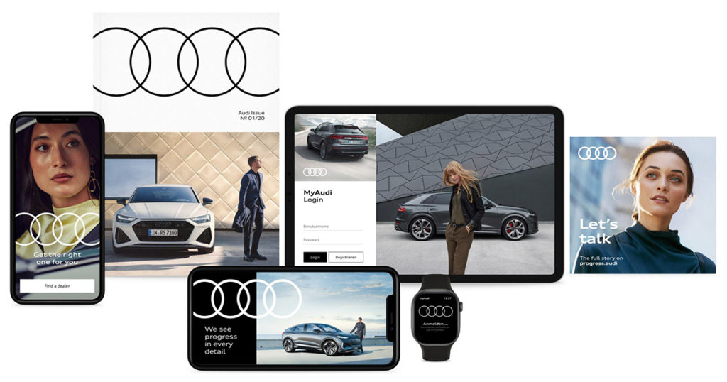
Update, 3/4/21: Audi, while not redoing their iconic “4 rings” logo, has redone the branding around that logo:
Update, 3/6/21: Speaking of Brand New, they have a good deal more information regarding Peugeot. Good stuff!
Update, 3/10/21:Dezeen has more on Peugeot, as well. And CarScoops has the first pictures of the new 308 — the new logo premieres on this model update — and discusses that, on the grille, some of the car’s sensors appear behind the logo. Interesting. (I still preferred the lion on the grille, myself. Not that we get Peugeots in the United States, anyway….) Check it out.
Update, 3/10/21: CarScoops has some more on Nizzan — uh, Freudian slip there: Nissan and their new logo.
Okay, who’s gonna be next…?
Update, 3/13/21: Uh… Renault!
Not as big a change as Peugeot, and more successful, too: single color, retains history well, still instantly recognizable, works at small sizes. Nice. Details from Motor1 or CarScoops.
Update, 3/20/21: Brand New discusses the new Renault logo:
There is nothing wrong at all with it and I do like the approach to its construction but, ultimately, it’s like it’s missing some emotion or passion or, pardon my French, a Je ne sais quoi to make it special.
I agree that the 1972 version is superior. Let’s see how this one evolves.
Way back in the day — that is, before the mid-nineties — publishing on the Mac consisted of Quark XPress. Okay, sure, there was Aldus Publisher and some bit players, but it was basically Quark or nothing. I used Quark in book design back then, and … basically hated it.
I was one of the early adopters of InDesign, dragging co-workers and companies along with me, as part of my time working at Tropicana. Not the juice cartons themselves — those were done in Illustrator — but the ancillary stuff, like marketing materials, sell sheets, and so on.
AppleInsider ran a piece a while ago (I’d missed it, initially), “How Adobe InDesign took over publishing with Steve Jobs’ help.” Good history for those of you who don’t know about those days or want a trip down memory lane, best summarized, in fact, by a commenter on the article: “This covers an interesting arc. Adobe went from an ambitious upstart trying to unseat an established, albeit arrogant, standard, to becoming the arrogant standard.”
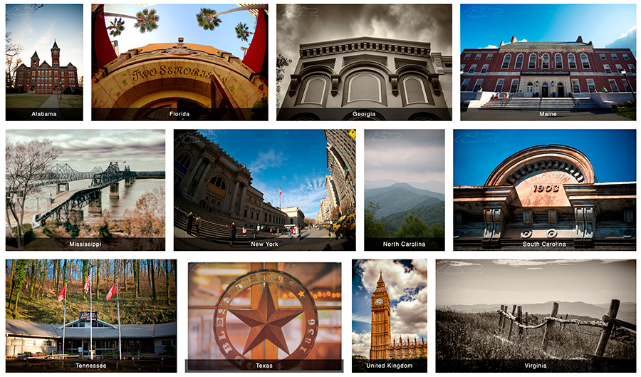
As part of the new web site, I’ve redone the media.gileshoover.com section to better highlight the more than 5000 photographs available.
Note that those items are available as prints, framed or unframed, starting at a very reasonable $5. My web commerce provider, Zenfolio, also offers museum-quality fine prints, also framed or unframed, and a variety of other merchandise, from card sets to mousepads, pins, and mugs.
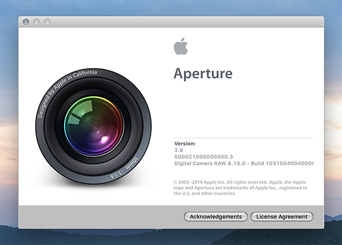
Apple’s Aperture photography software debuted in 2005, as a sort of hi-end iPhoto; it combined sorting and editing into one application, using libraries to keep large collections. It was almost immediately followed by Adobe’s Lightroom, which performed basically the exact same functions — and came with better integration with Adobe’s own Photoshop, as well.
Aperture was developed through several versions, but a change in Apple’s strategy led to a end to development in 2015; however, it’s still been useable in every new version of the MacOS since. Until now — with the debut of MacOS Catalina in September of this year, Aperture will cease to work.
That’s led me — and likely many others — to migrate our Aperture libraries into Lightroom. Now let’s be clear: I’ve been using Lightroom for several years now (I pay the $53 per month Adobe subscription, which offers all applications Adobe currently makes, including Photoshop, InDesign, and Illustrator in addition to Lightroom) and have gotten quite used to the workflow. So when the announcement was made that Aperture was going to stop working, I went into Aperture and . . . was lost. Migrating was necessary.
In the long run, though, it’s been a good thing. Since Lightroom doesn’t import all of the changes and corrections that Aperture makes into Lightroom, I’ve had cause to revisit some of the libraries with a fresh eye.
The first of these is the England library from 2011. Check it out soon.
Back in the ’90s and Aughts, my ex-wife and I ran a popular book design blog called Foreword. For a variety of reasons, from divorce to moving to Georgia and then deciding to do photography full-time, I got away from it. I even let the company name, ospreydesign, get away from me.
I’ve been seriously regretting losing Foreword for a while now — and its return one of the driving reasons for the new web site. Part of that has to do with a return to book design, and wanting to comment on the same, but also because I don’t do social media and have wanted a space to talk about — and get feedback on — items to do with book design, photography, and so much more. There’s no place better than your own web site. Thus, Foreword is back, this time as part of my personal site: gileshoover.com.
Memory Lane
Here’s what ospreydesign looked like way back when:
ospreydesign as of February, 2001
The site evolved, but only to a point — those were the days of having to pay attention to screen width. Remember: 15-17-inch screens were the new hotness; 13-inch was more normal. (Hence the small layout.) There was something comforting about it, though, and this look preserved for years. Here’s another screenshot:
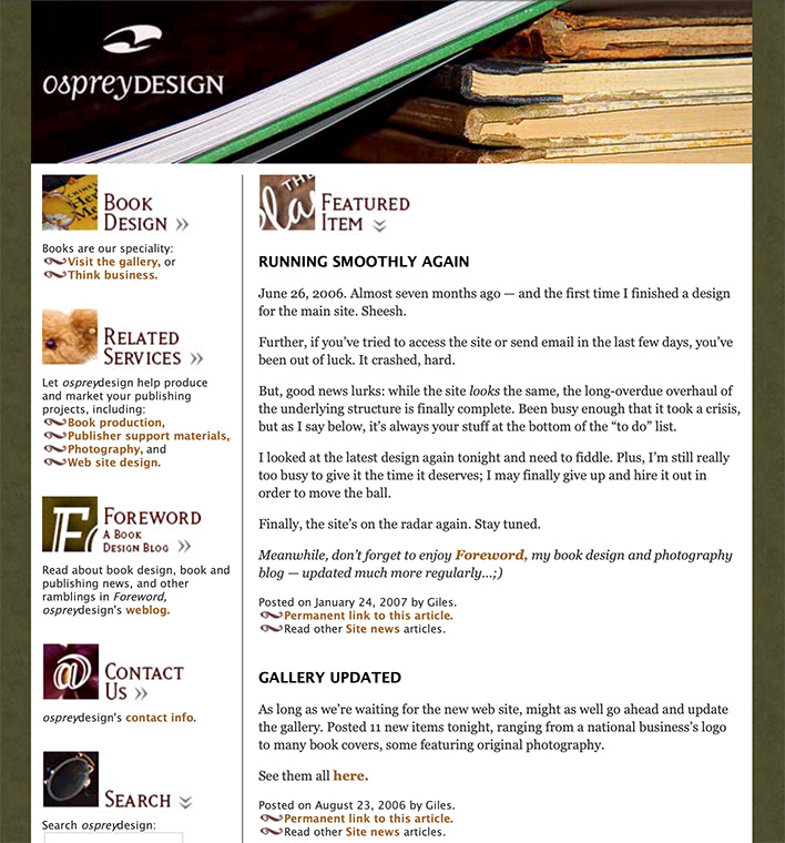
ospreydesign’s home page, as of January, 2007
Foreword, a relatively new item called a weblog, or blog, was both a vehicle of discussion and publicity. And it worked — this little blog grew and gained followers, basically riding the early “wave” of blogs.
Here it is from 2005:
Foreword in March, 2005
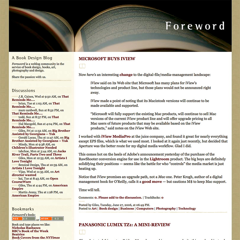
The “look” changed shortly after, while the popularity continued to grow. Here’s another, from fourteen months later:
Foreword‘s new, wider-columned look, from June, ’06
At this point, Foreword was at its utmost; thousands of readers, #1 in a Google search for “book design,” pretty much everything — and I, quite frankly, decided to throw it all away.
The Photography Era
Changing my priority to photography full-time was both awesome and a completely mixed bag. I absolutely loved the instant results of digital photography, and enjoyed the possibilities of editing them; filters, textures, black and white, and more. The creativity was more immediate, as well, in that I was my own “editor,” for lack of a better term, not answering to as many people as designing books can be.
Making money was more difficult than with book design, but somehow more exciting; in many ways, it’s a performance art — I had to get it right at the time (there are no redos — events move on!), then make it better in the edit. But, I quickly found that weddings and events were not my strong suit. Like many making a profession out of a passion, I too often clashed with the “vision” thing; what I wanted to do — architecture, landscapes, “things” more than people — wasn’t what you made money on.
Maine Schooners, 2009
Worse, I was ahead of an extremely powerful wave: photography as something ubiquitous. With the rise of everything from a flood of new folks doing photography full-time to practically everyone “being” a photographer with just their cell phone, there was absolutely no way I could make the success out of it that I could have had I just stayed with book design first and photography second. Sure, I still did book design — I was early in the photography book genre — but photography as a career proved unsustainable.
Lesson learned.
New Memories
So, book design is again what I describe my profession as, with photography back to being a passion instead of a full-time job, and Foreword has returned. I’m better for it, frankly; so, hopefully, will my readers, as we can again share my love book design — along with why I’ve returned to it full-time.
Having a blog again also gives me a chance to talk about design, book production, photography and how they’ve changed in the intervening years, and recommit myself to regular posting; something I’ve missed and hope others have, too.