Category: Typography

Design specifically regarding typography; that is, letterforms, type on a page, cover, or web site, and more.

  • Beautifully Briefed: Icons and Typography, Mid-June, 2021

    Beautifully Briefed: Icons and Typography, Mid-June, 2021

    Three items for you here, starting off with the 2021 Logo Trend Report, from the Logo Lounge. From the Asterisk to Electric Tape, Quads, Chains, and more:

    2021 Logo Trend Report

    Bill Gardner discusses all fifteen different trends, with logos to back ’em up (naturally).

    Next, “A Cabinet of Curiosities” from Hoefler & Co.

    Printers once used the colorful term ‘nut fractions’ to denote vertically stacked numerators and denominators that fit into an en-space. (Compare the em-width ‘mutton fraction.’)

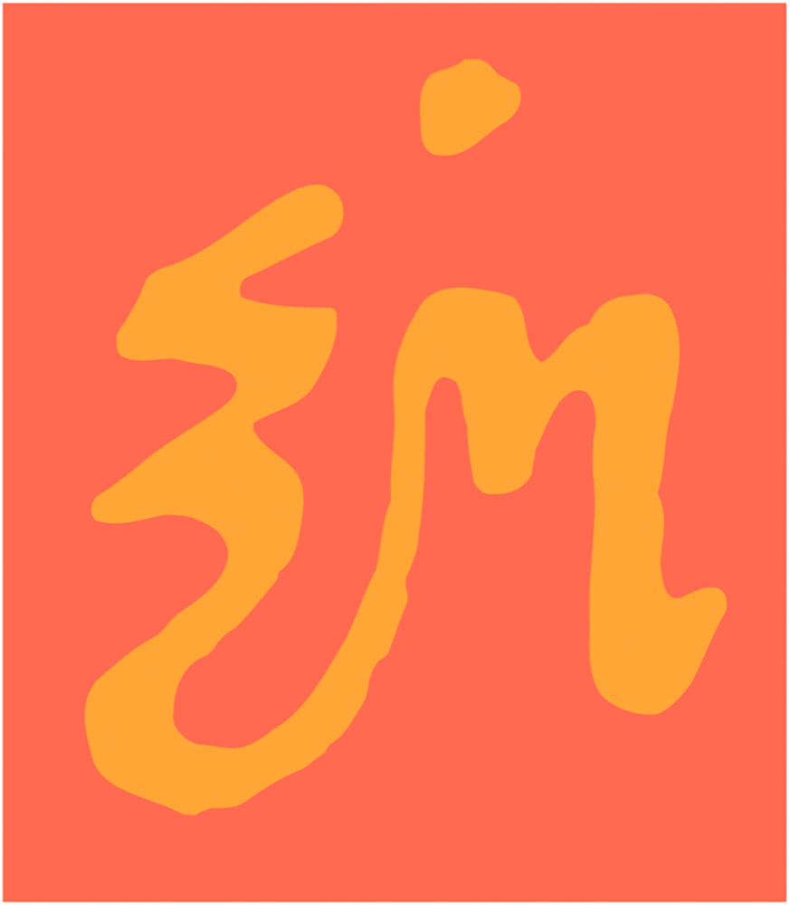
    This is beautiful:

    Dutch Curio, H&Co

    A Dutch curio, representing the letters z-i-j.

    Read all of the rest.

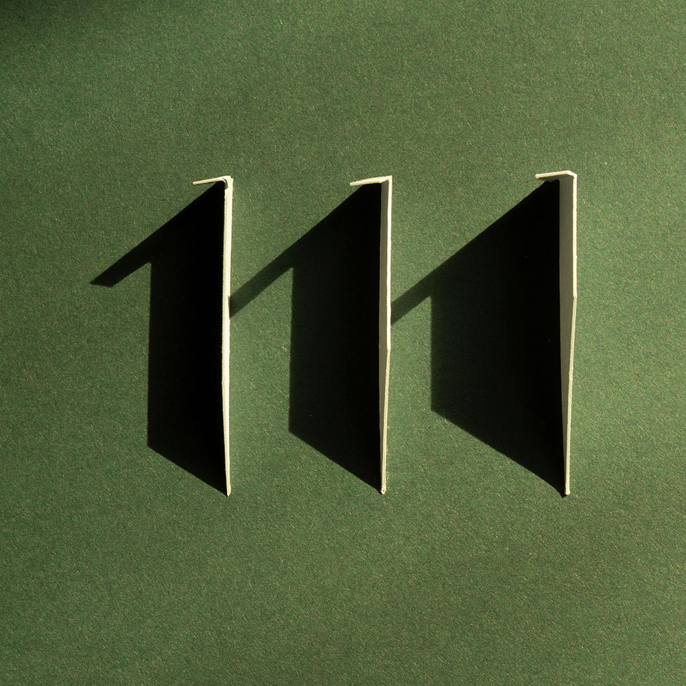
    Lastly, these are amazing . . . and simple, the better form of “simply amazing.” Yeah:

    111 Shadow

    See the rest at This is Colossal.

    Happy June!

  • (More) Beautifully Briefed, Books and Design, May 2021

    (More) Beautifully Briefed, Books and Design, May 2021

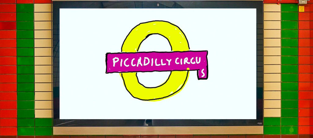
    On David Hockney’s Piccadilly Circus logo:

    piccadilly-circus

    It’s been a minute since I’ve been in London — 2011, to be exact — and I’d love to go back. The food, the parks, the museums, the Thames, the short train rides to more interesting places (Hello, Cambridge?), and even the Tube. (We’ll leave the anti-Americanism aside for right now — we’re post-Trump and post-Covid, so traveling is at least an option!) Yet even the cultural masterpiece that is London is showing some cracks; from the New Statesman:

    Hockney’s Piccadilly Circus has also drawn criticism for its simplistic approach. Over on the cesspit of arts criticism that is Twitter, anonymous accounts that decry all art made post-1920 as an abomination have ridiculed Hockney’s scrawl as indicative of the death of art. Other critics have rightly argued that the work feels like a red flag to a bull: fuelling culture-war debates about the legitimacy of public art, rather than encouraging the public to get onside.

    I like it more every time I see it. Read more at It’s Nice That.

    On the NYC subway map:

    Speaking of It’s Nice That, an interesting new book from Gary Hustwit . . . on the debate over the New York City subway map. On the one side, the iconic Massimo Vignelli version, introduced in 1972, representing the less-is-more approach. On the other, the replacement version from John Tauranac, introduced in 1979, representing the more-accurate-is-more approach. (An updated version of the latter is still in use today.)

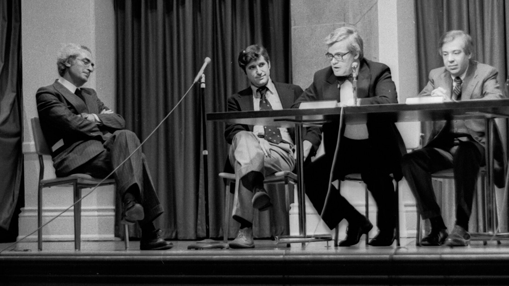
    But back in 1978, the two got up on stage at Cooper Union’s Great Hall — home to debates of, among others, Abraham Lincoln — and pitched their case:

    They Look Happy! (Subway debate 1978)

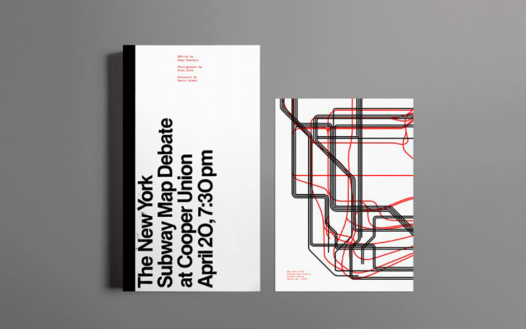
    Newly discovered photographs and audio lead to this new, smartly-designed, book. Read more at It’s Nice That; Dezeen has an interview with the author. Pre-order the book and get a limited-edition letterpress print at Oh You Pretty Things.

    Subway Map Debate Book

    On books and book design:

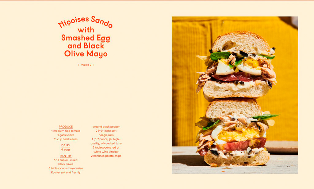
    Nice new cookbook chock full o’ seventies-era design, “Violaine et Jérémy returns with a cookbook for Molly Baz, featuring three of the studio’s much-loved typefaces,” at — wait for it — It’s Nice That:

    Nicoise Sandwich

    Sandwich Nicoice. Mmmmmmm.

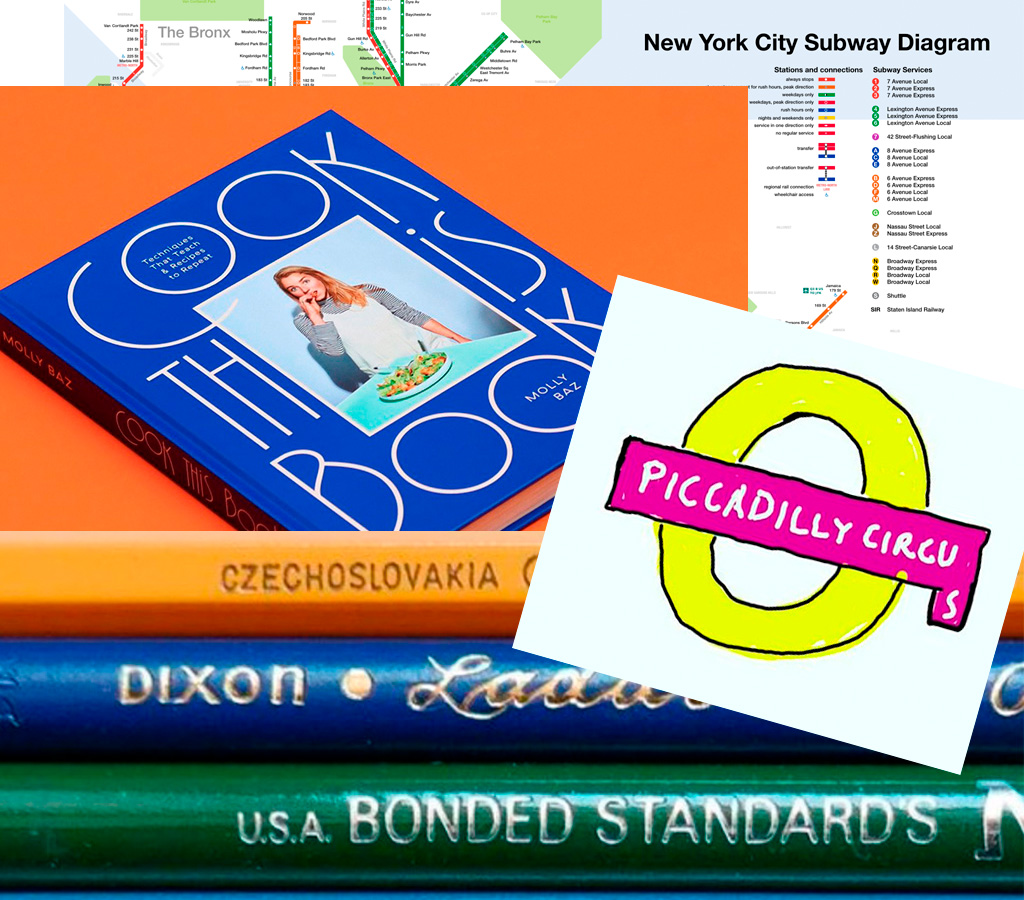
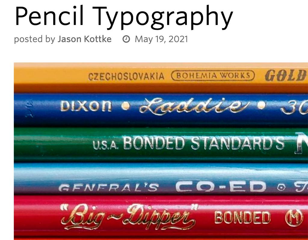
    Lastly, just because, Kottke collects pencil photography to examine the typography. Nice.

    Kottke on Pencil Photography

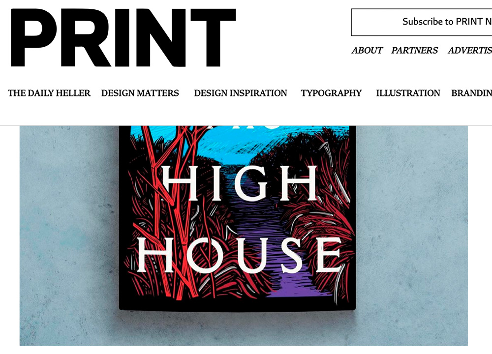
  • Print Magazine: 30 of the best book covers of 2021 (so far)

    Print Magazine: 30 of the best book covers of 2021 (so far)

    Great list — I agree with almost all of them, but wanted to call a few out especially:

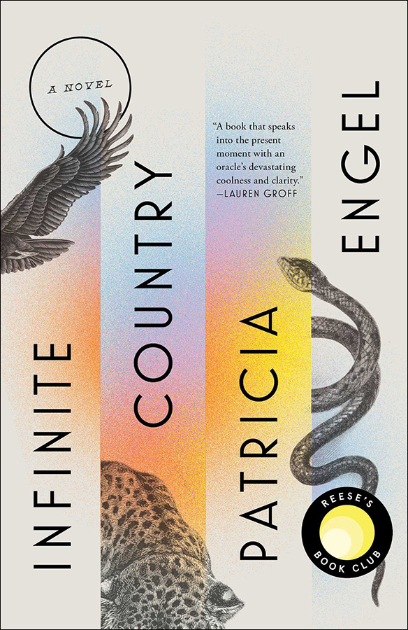
    Infinite Country, mentioned here;

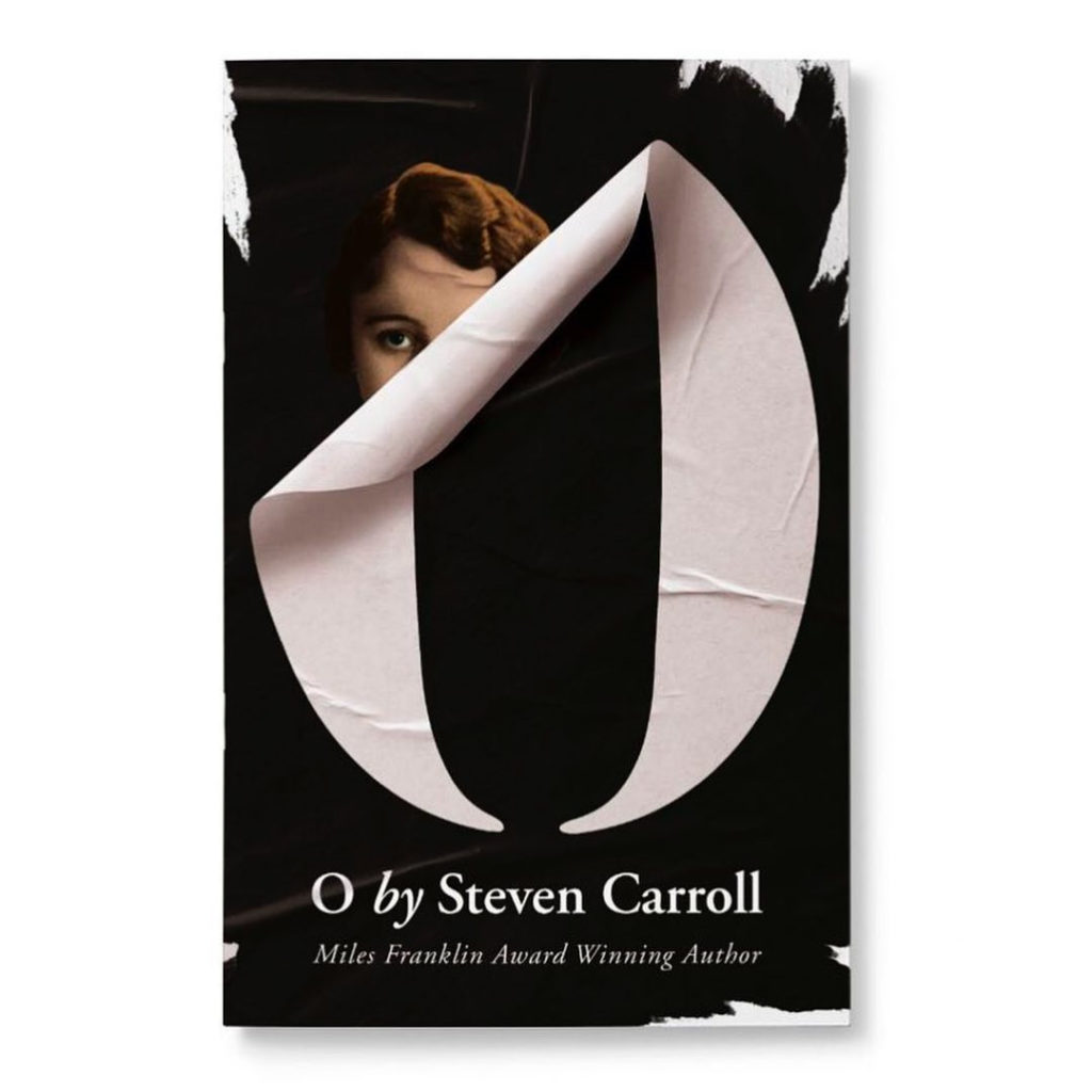
    O, Steven Carroll, cover by John Gray;

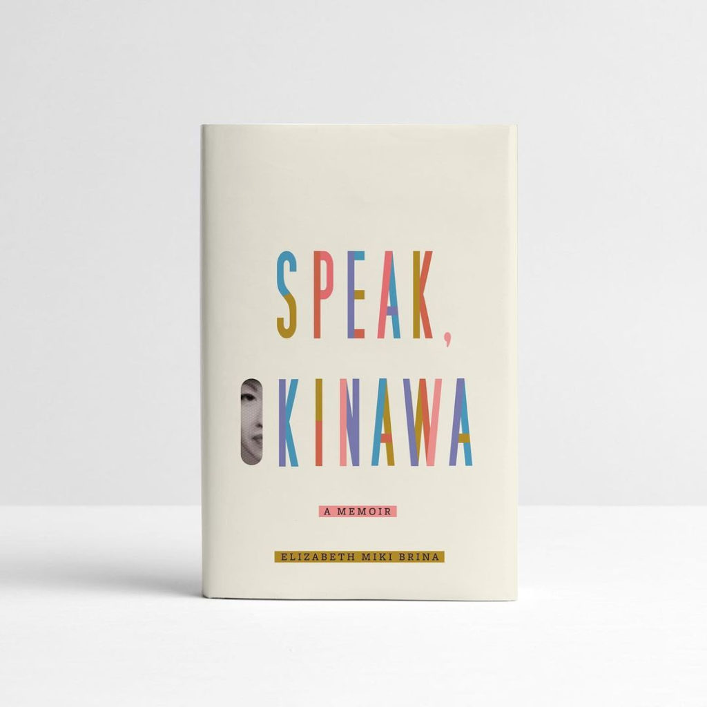
    Speak, Okinawa, Elizabeth Miki Brina, cover by Janet Hansen; and

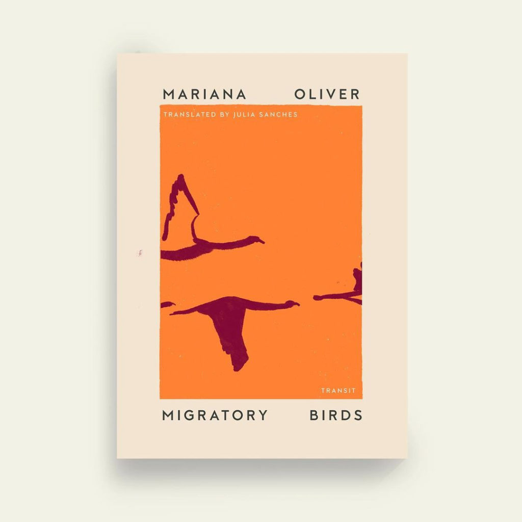
    Migratory Birds, Mariana Oliver, cover by Anna Morrison.

    See the rest.

  • Beautifully Briefed: Books, March 2021

    Beautifully Briefed: Books, March 2021

    Five book design items that caught my attention recently.

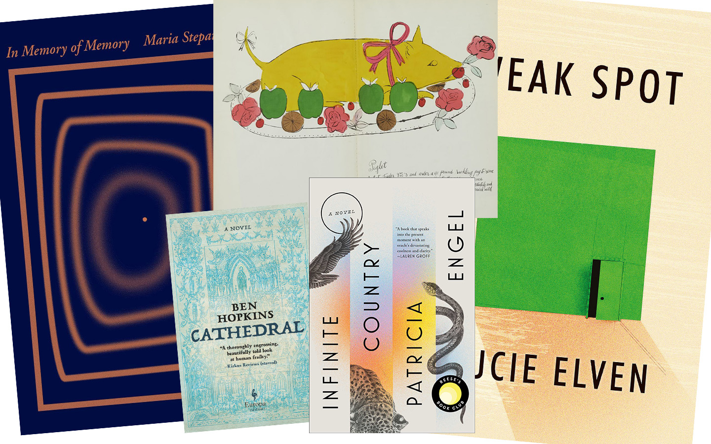
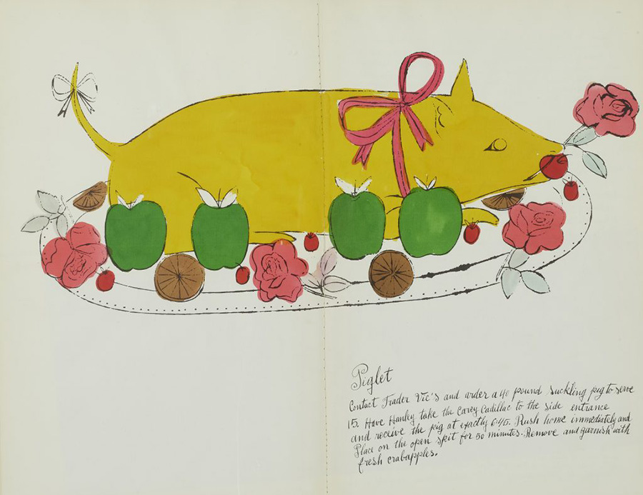
    First, from ArtNet News. Prior to basically everything, Andy Warhol did this:

    “The whimsical book was a collaboration with interior decorator Suzie Frankfurt, who wrote the ridiculous recipes, and the artist’s mother, Julia Warhola, who provided the calligraphy, replete with charming misspellings. [It] was the last of a number of books Warhol designed in the 1950s, before he shot to fame in 1962 with Pop art compositions featuring Campbell’s soup and Coca-Cola. Book design offered him a valuable creative outlet during the years he worked as a commercial illustrator.” See more.

    The rest are from the New Yorker‘s “Briefly Noted” reviews — which, I’ll admit, inspired the title of this post. They pick four titles weekly, and while I’m sure many are great, actually great book design is rare. So to have four in two weeks … well, just had to say, “noted.” (The New Yorker is, of course, subscription — but there is a free account with limited options if you’d like to read their review.)

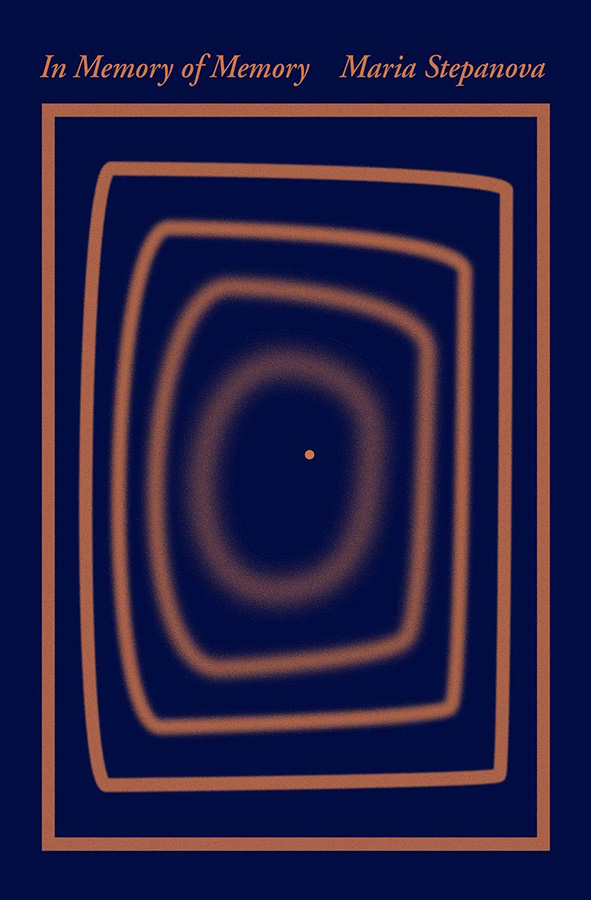
    The first three are from the March 8th, 2021, issue, starting with In Memory of Memory:

    The simplicity of the concentric rectangles — and “destination” dot — is mesmerizing.

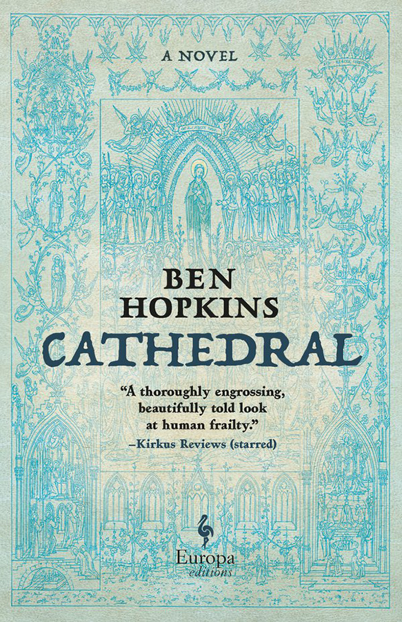
    Next, Cathedral:

    Not a simple illustration in this case, and still an attention-getter in the background. Nice.

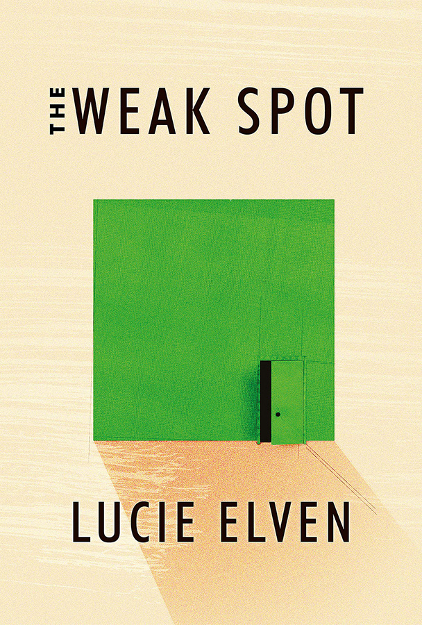
    Next, my favorite of this set, The Weak Spot:

    A very brief (176 page!) debut novel with hits-above-its-weight cover design. (Content, too, presumably…;)

    Lastly, from the March 15th issue, Infinite Country:

    Color and composition unite into something … infinitely good.

    Enjoy.
  • Penguin UK on the semicolon

    Penguin UK on the semicolon

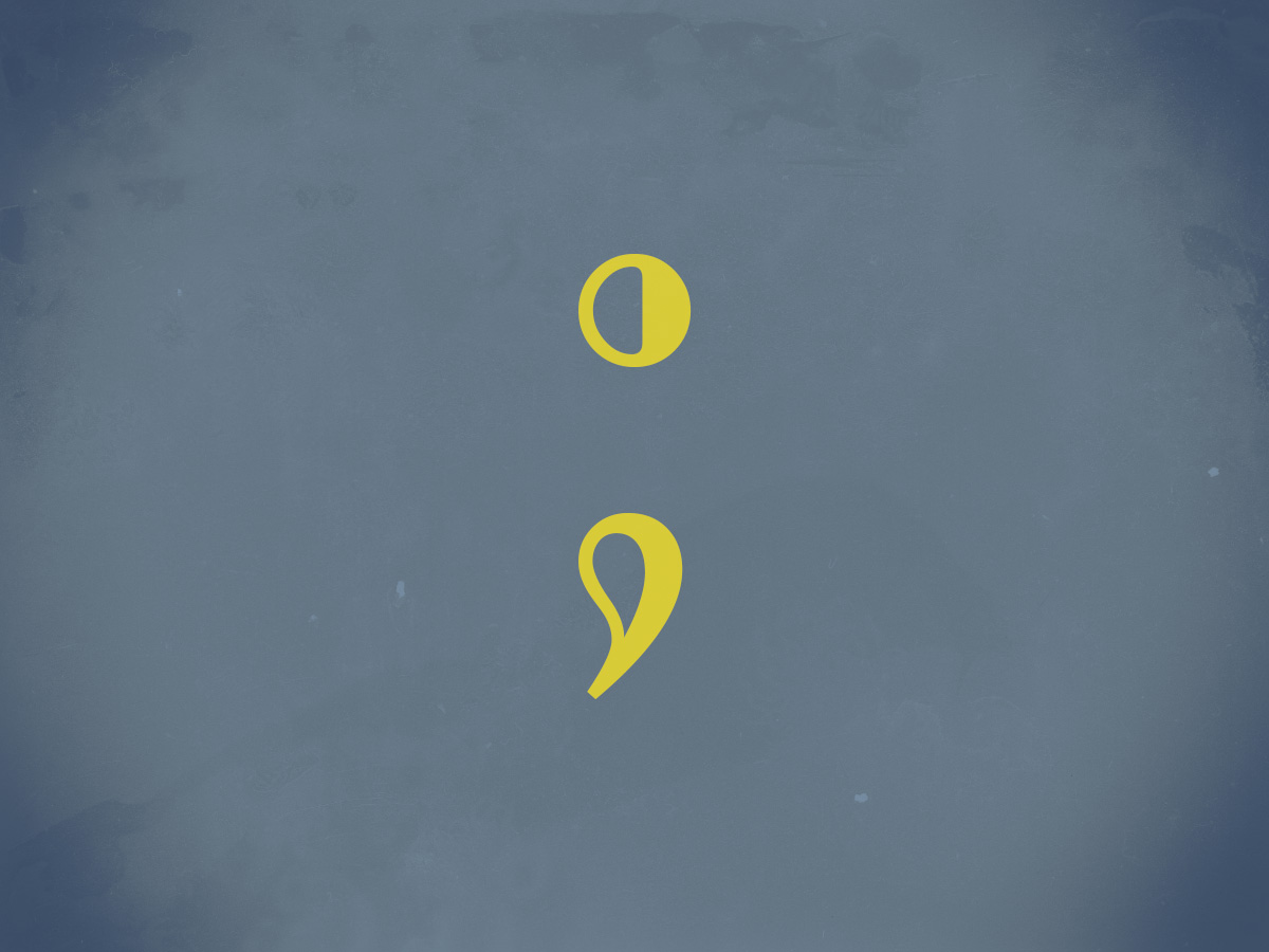
    “Do not use semicolons,” wrote Kurt Vonnegut; “All they do is show you’ve been to college.”

    I love a semicolon. (Perhaps a little too much, some might say.) Read more about this underutilized punctuation: Semi-colons; or, learning to love literature’s most misunderstood punctuation

  • Latest in Regular Sport: New Orwell Covers

    Latest in Regular Sport: New Orwell Covers

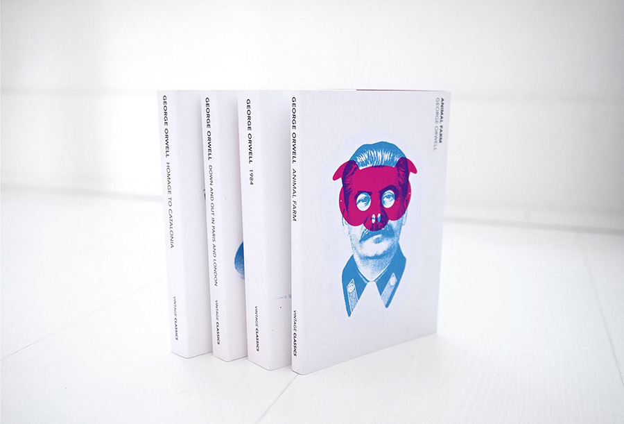
    Creativeboom points out that Heath Kane, not a citizen but in fact a subject of the Crown, has designed new covers for George Orwell’s classics Animal Farm, 1984, and more.

    Two interesting things about this: they call it the “final printed edition,” without further explanation. I somehow doubt there won’t be more editions in print — high schoolers everywhere would mourn, professors cry, and surveillance societies everywhere smile. Okay, overdramatic, but still.

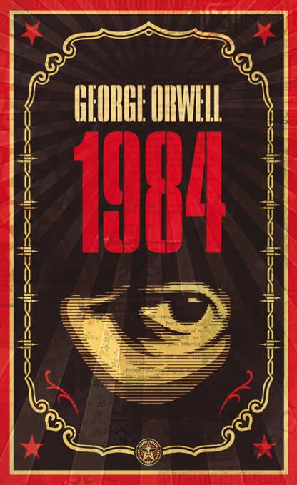
    And, I really preferred this one:

    More from Penguin on Orwells through the ages.