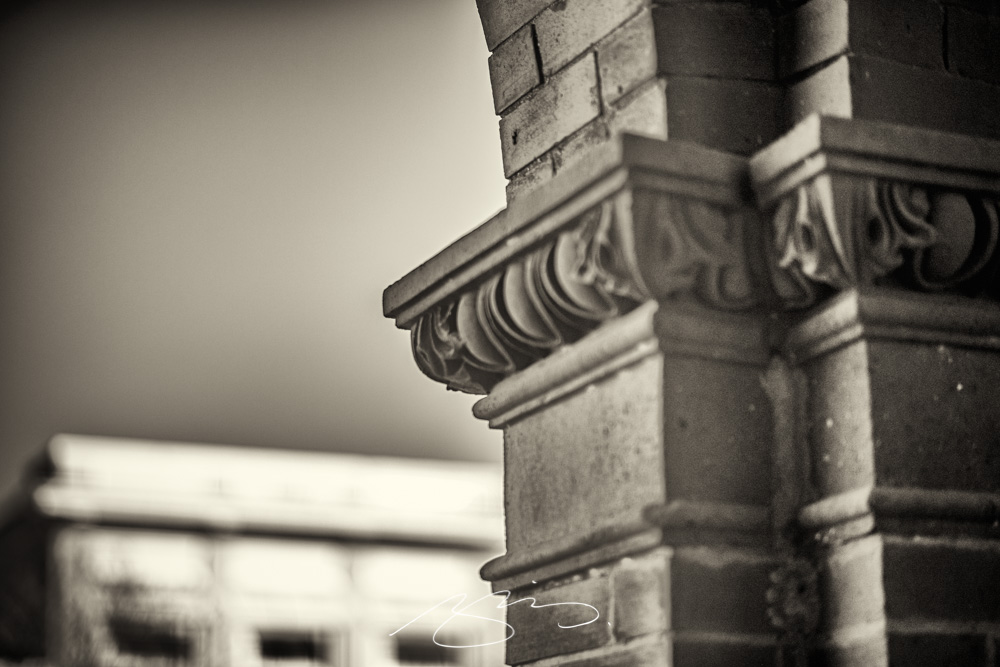
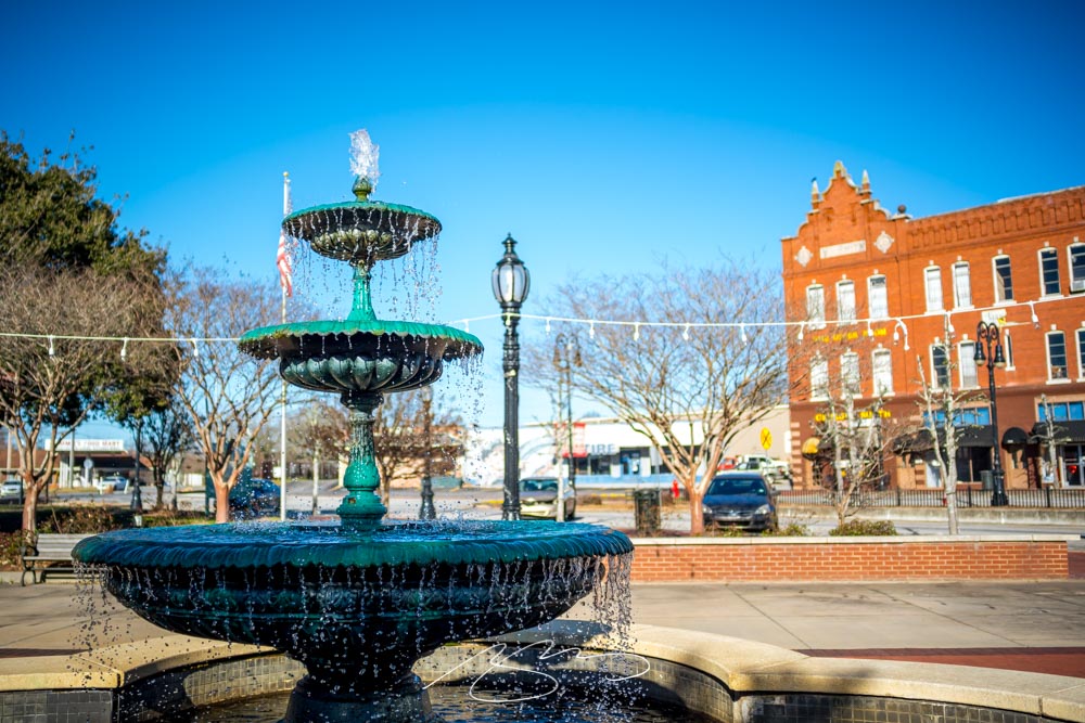
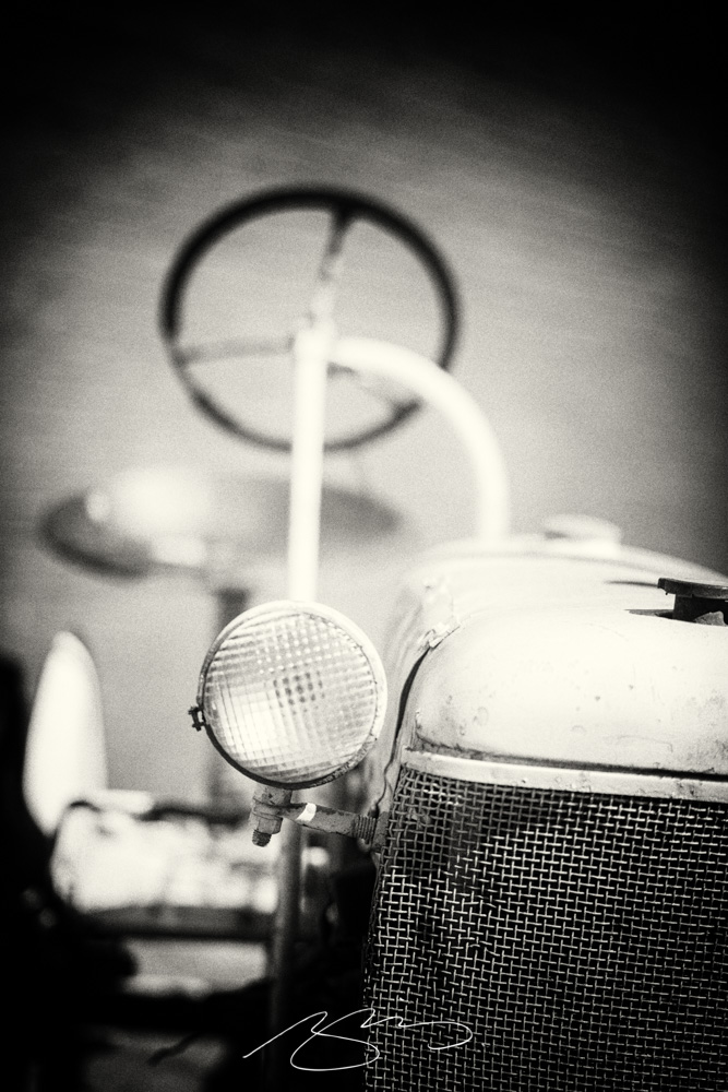
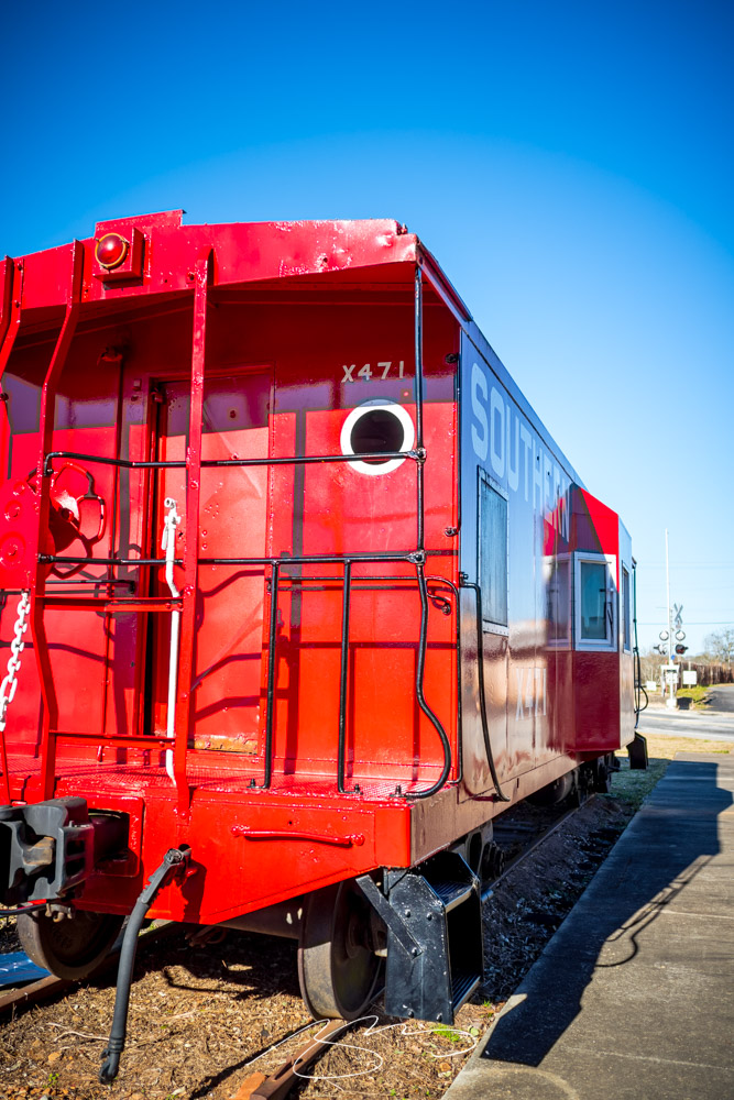
The end of winter here in Georgia means beautifully warm days, flowers and trees budding, and photography. Gerald and I took a road trip this weekend, enjoying almost 200 miles of driving — and four photostrolls.
We’ll cover three today, heading west from Middle Georgia:
This past weekend’s road trip included five stops, including Monticello and Barnesville, which I covered in the last post. However, there were three more stops in the middle.
Jackson Dam, which forms the headwaters of the Ocmulgee River — and which has a fishing area with this neat scene:
Walk and Deck, Jackson Dam
Jackson Lake, formed by the Yellow, Alcovy, and South Rivers:
Jackson Lake (Wideangle)
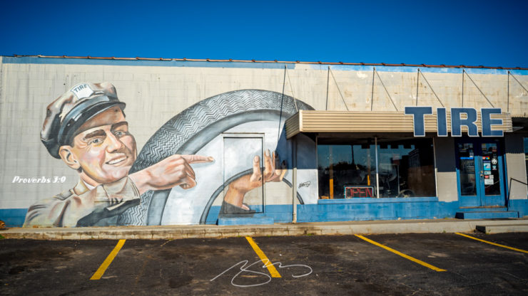
And Jackson proper, which has a traditional (for Georgia, at least) town square with a courthouse:
Butts County Courthouse #5, Jackson
Also, this — with perhaps too cute a title:
Downtown Door During Reconstruction, Jackson
All of these have been added to a new gallery. Check it out.
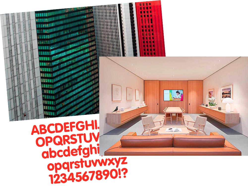
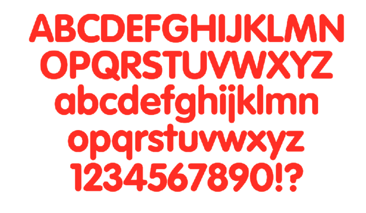
A three-fer as we wind through this February: Peter Stewart, a really talented architecture photographer from Australia; VAG Rounded, Apple’s keyboard font and how it relates to Volkswagen; and a new site called The Apple Store Glossary leads to an interesting review of furniture in Apple Stores.
Peter Stewart
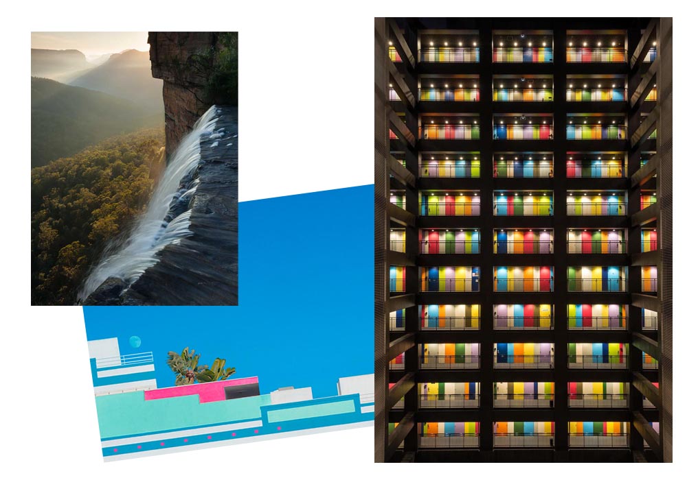
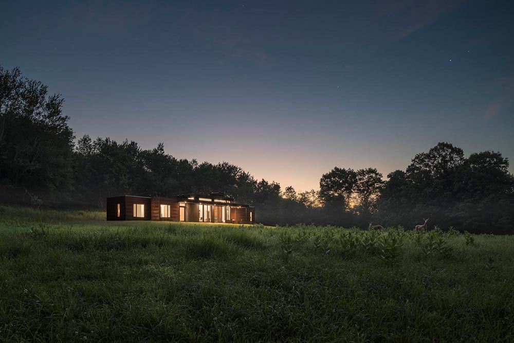
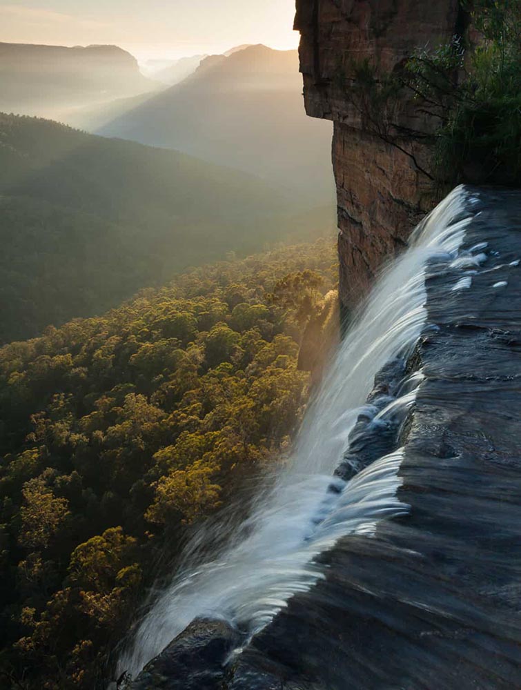
November’s Beautifully Briefed covered the 2021 Architecture Photography Awards shortlist, and one of the photographers is Peter Stewart, a self-taught Australian who wanders around Asia. Gotta say: he’s better than great.
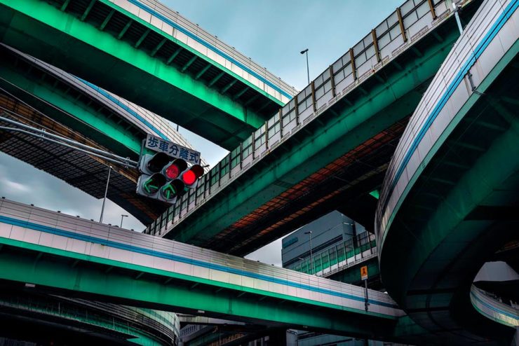
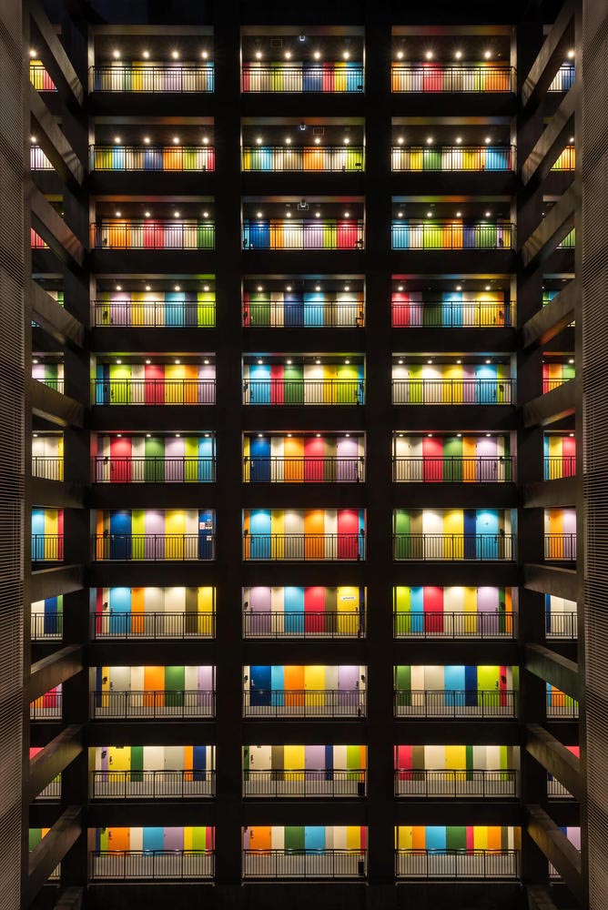
“Hanshins Web” Osaka, Japan. 2019, by Peter Stewart
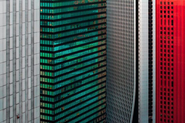
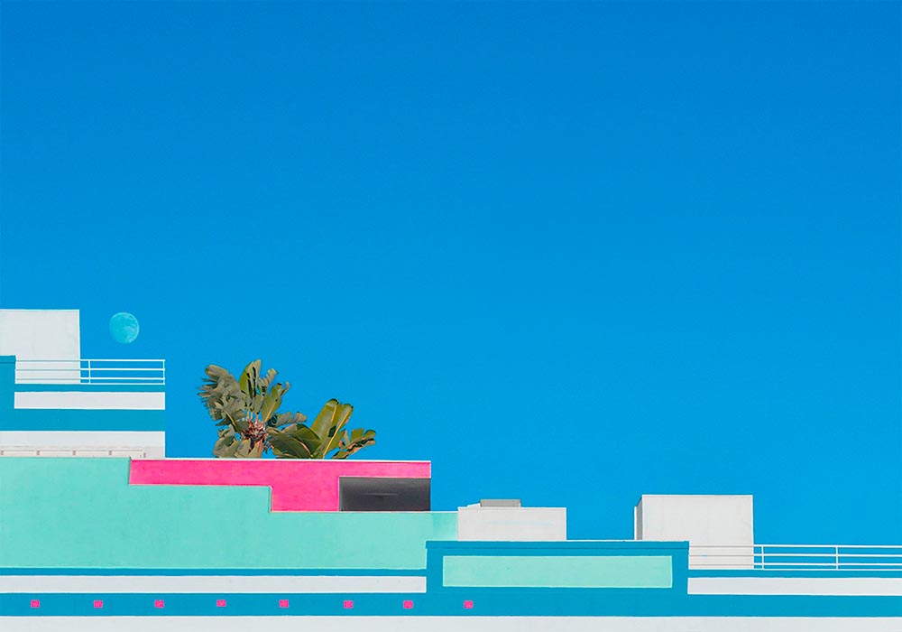
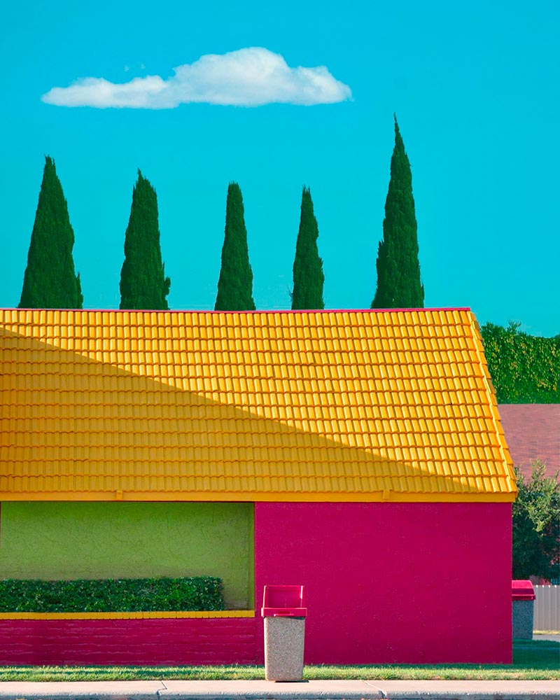
His eye for pattern and color is spot-on:
“Four Columns” Tokyo, Japan. 2019, by Peter Stewart
Archinect’s In Focus feature has a great 2019 interview that not only discusses the how and where, but also the why — including his thoughts on use of Photoshop and, perhaps most insightfully, how to thrive as a photographer in this crowded age:
The hardest part of being a photographer today is finding a way to stand out among the crowd. In just the past few years Instagram has changed everything and given rise to a sizable number of highly talented new photographers. We are inherently influenced by the work we see from others, and as such has given rise to a lot of popular trends and styles of photography which has brought about a bit of a copycat culture. The point is, I think it’s important to find your own themes and ideas in order to progress, and not to simply emulate.
Daring Fireball is a daily stop for Apple geeks like me, but rarely does it cross into graphic design territory — except when it links to a Jalopnik article discussing how a Volkswagen font wound up on Apple’s keyboards.
Good stuff. (Bonus ’80s Dasher brochure siting, too.) Enjoy.
Apple Store’s Boardroom Furniture
Some Apple Stores have additional, not-usually-open-to-the-public spaces called boardrooms. And, as you might imagine, they’re filled with interesting stuff.
A new (to me, at least) site called The Apple Store Glossary has information and photographs of all aspects of Apple Stores, from the new Pickup area to the behind-the-scenes Boardrooms.
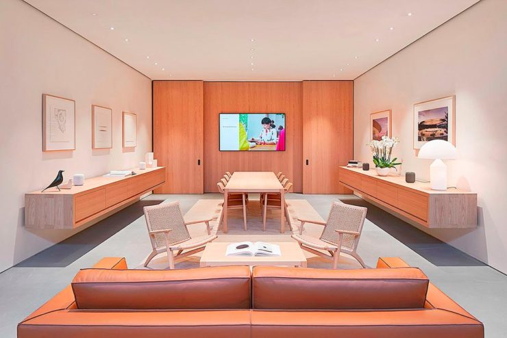
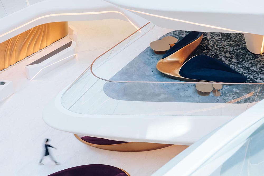
The latter started out as something called Briefing Rooms, intended for business customers and special events. However, they’ve evolved: more casual, more comfortable. And more interesting:
Apple Boardroom (Passeig de Gràcia store, Barcelona, Spain)
9to5Mac has a great roundup of these rooms we don’t see, from the accessories (bonus Eames Bird sightings) to the books, and perhaps most interestingly, the furniture.
Happy New Year! Stephen Colbert called it, “an unprecedented third year of 2020.” Let’s hope it turns out better than that.
To that end, here are some neat things to catch your eye.
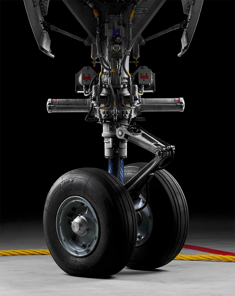
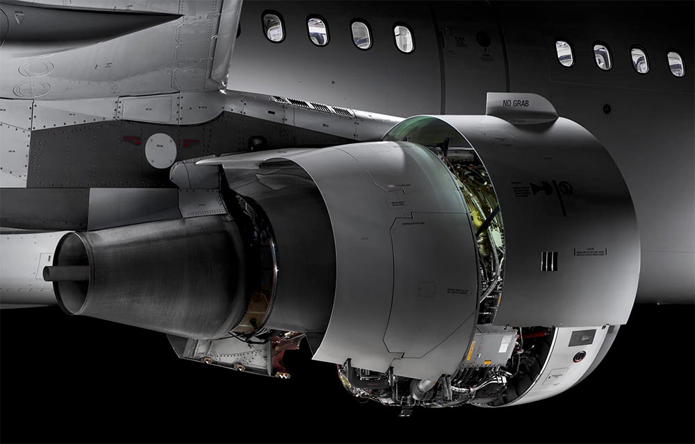
Airliner Photography, to the nth degree
I’ve been a plane junkie since, well, forever; to this day, I watch YouTube videos of things flying around, often the big ‘uns. I follow Airliners.net’s Civil Aviation forum, and can tell you at a glance whether something sitting at the gate is a Embraer 190 or Airbus 220. So this new title by photographer Maxime Guyon has my complete attention.
Very much looking forward to getting my hands on. Beautifully done, sir. (Via a great article at It’s Nice That.)
ArchDaily’s New Branding
Meanwhile, another subject I follow:
Arch Daily has already teamed up with Architonic, a site for products, last year. For 2022, they’ve rebranded and both sites are now linked with DesignBoom, one of the web’s original sites for design and architecture (since 1999!). Dezeen has more.
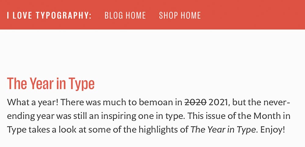
The Year in Type
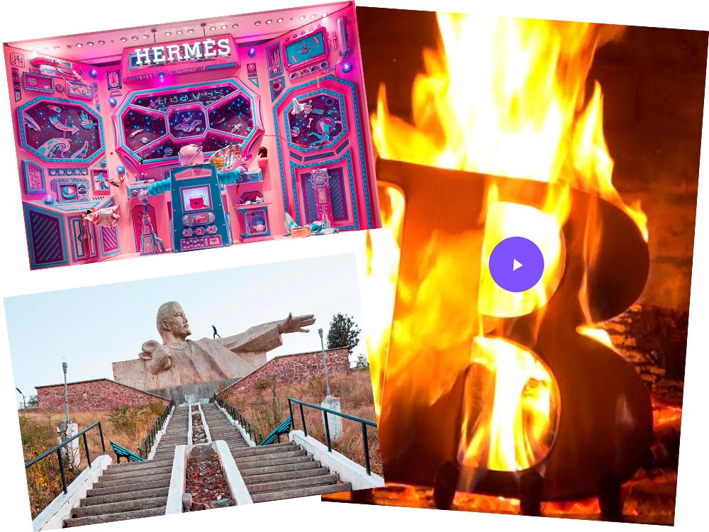
Last but certainly not least, I Love Typography has a great roundup of 2021: The Year in Type.
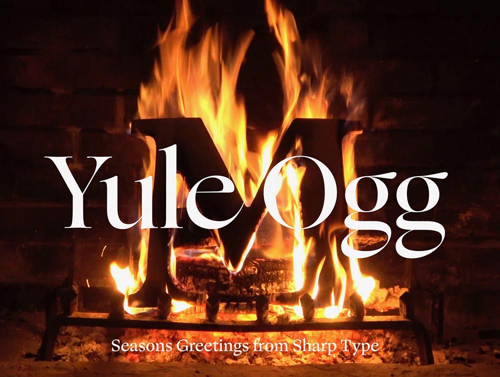
It’s the yearly wrap-up and the holiday season! Recap and Rejoice!
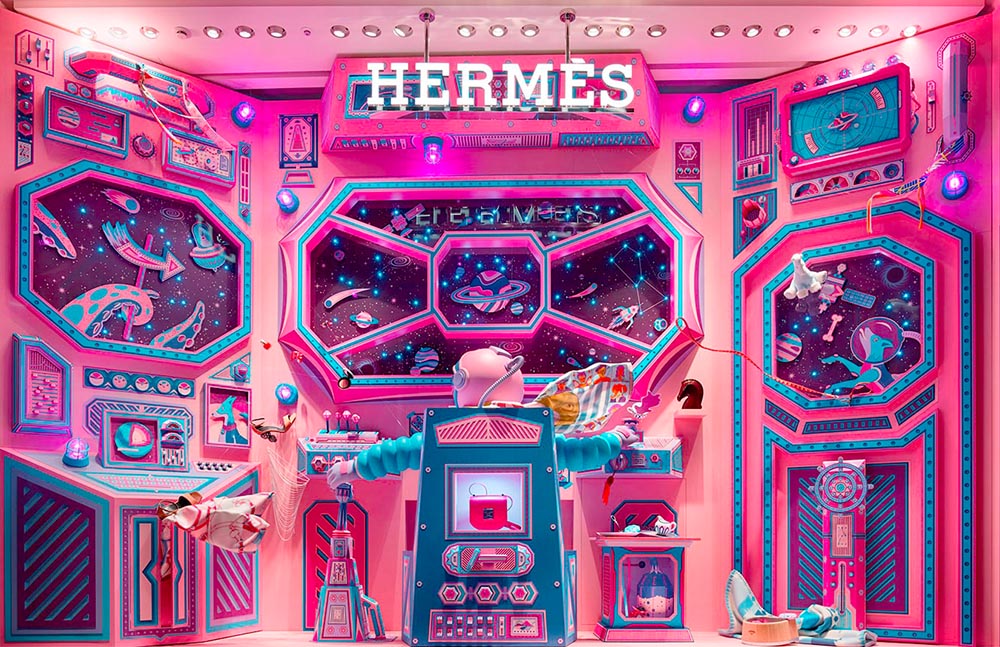
Hermès Does Windows
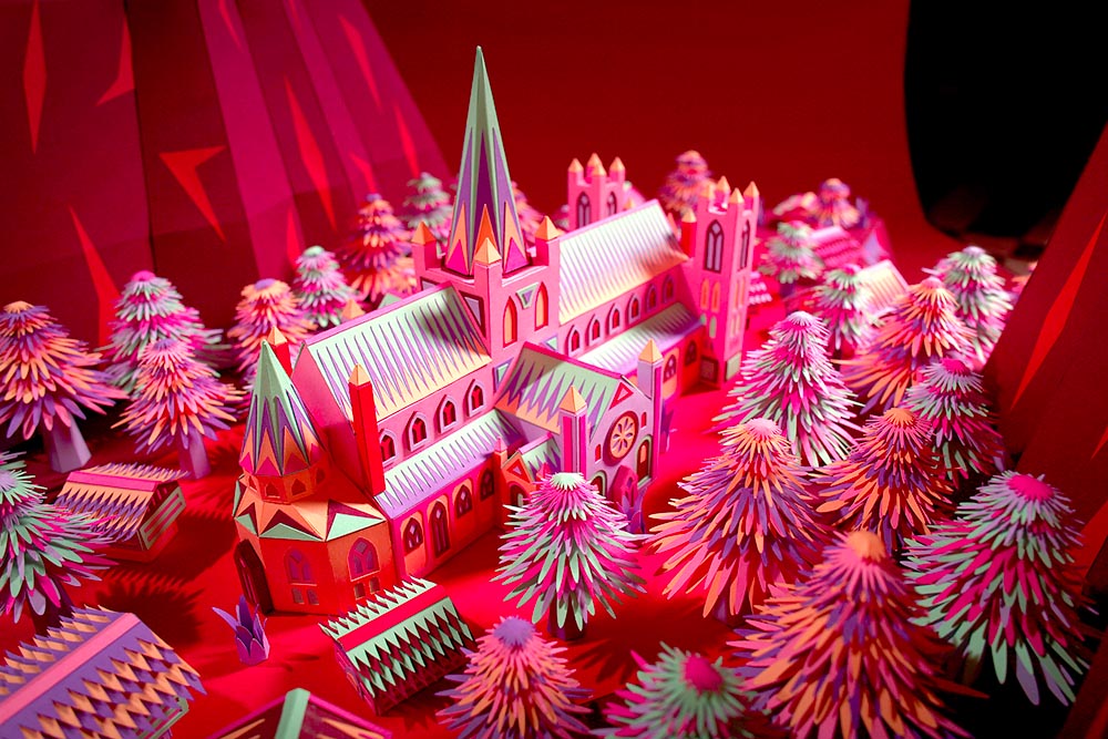
“Journey of a Lifetime” is this year’s window display for Hermès — yes, Hermès should have an accent, but I can’t seem to summon it today fixed! — so let’s go with a picture instead:
All in paper. No, let me repeat that: it’s all paper. (Well, perhaps some glue.) From artists Zim and Zou. Here’s another, one of their earlier works:
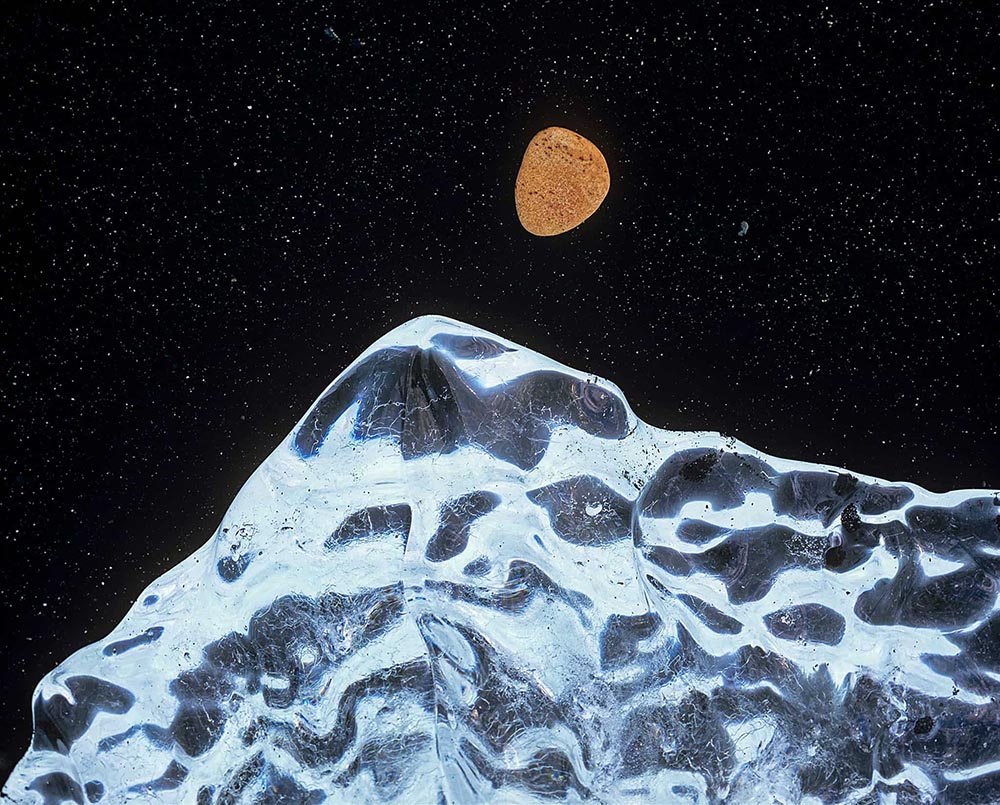
It has been, and continues to be, a rough time for a nature photographer who makes a living shooting around the world. This kind of time period sometimes makes we artists think about our life missions and convictions, and delve deeper into our beliefs and the way we view our art and what makes it worthwhile. While some people don’t see photography as art, I definitely do, and for that reason I feel that a discussion is needed about what makes photography an art form rather than technical labor.
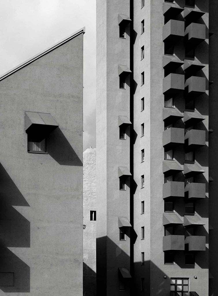
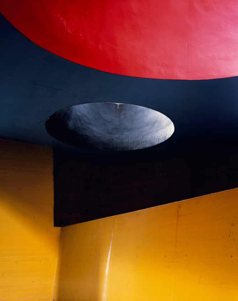
“It’s like being a musician in front a big audience. You can’t get it wrong. In that instant, you have to be the best of yourself, you bring your mind to a place, not to lose that unique moment.” Hélène Binet is explaining her commitment to working with the venerable techniques of analogue, as opposed to digital, photography[…].”
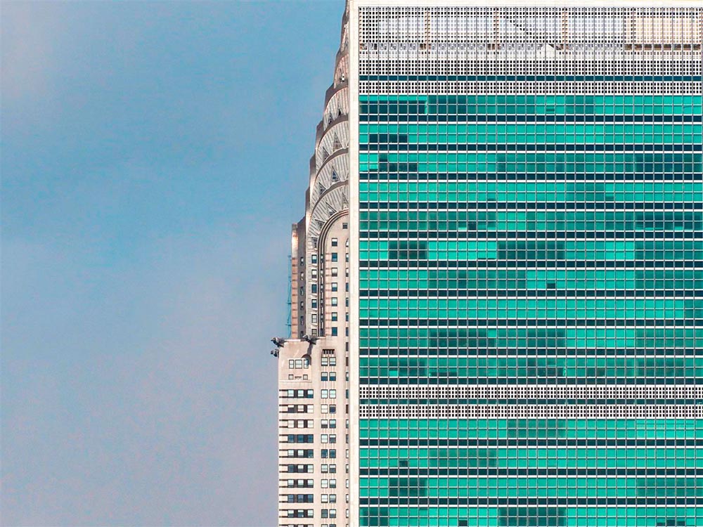
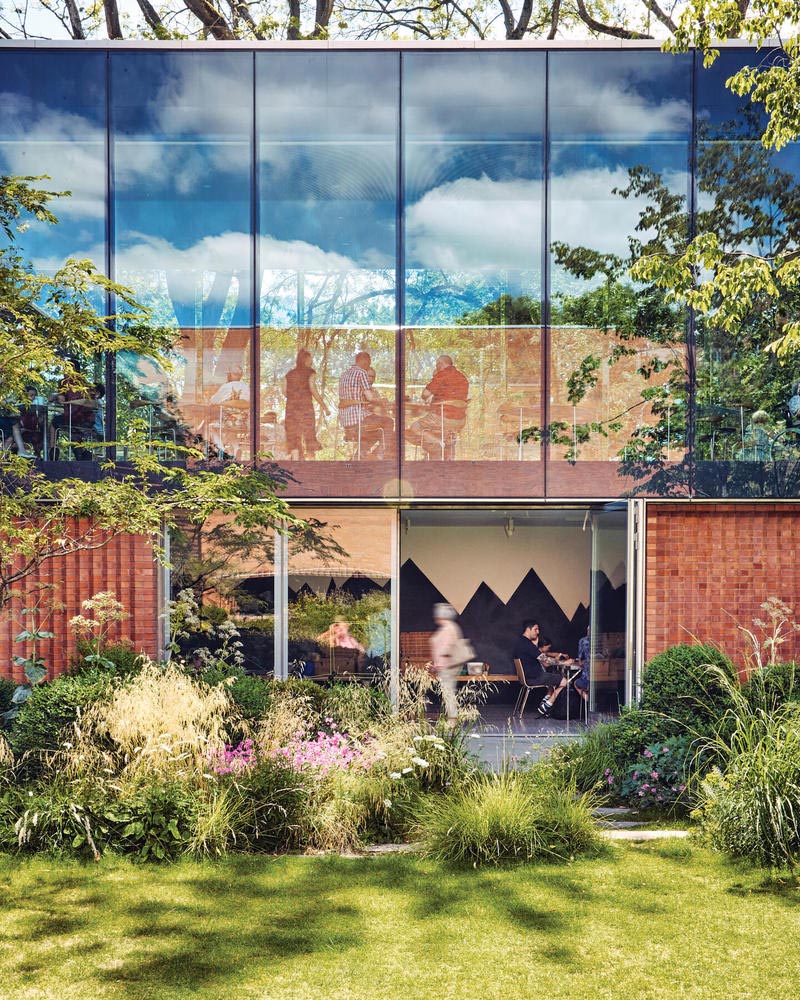
She manages to capture exactly the kind of thing I strive for — potentially abstract, detail-oriented, yet somehow . . . different: