Tag: porsche

  • Beautifully Briefed 26.10: You’ll Want a Tall

    Beautifully Briefed 26.10: You’ll Want a Tall

    Usually, I try to limit the Briefed posts to ~30 photographs. Today, you get fifty-four. So, unlike some months, where I encourage just any beverage….

    Also, if you’ve not seen, I recently had a few-hour layover in beautiful Asheville, North Carolina. There was a camera involved.

    This month’s Spine
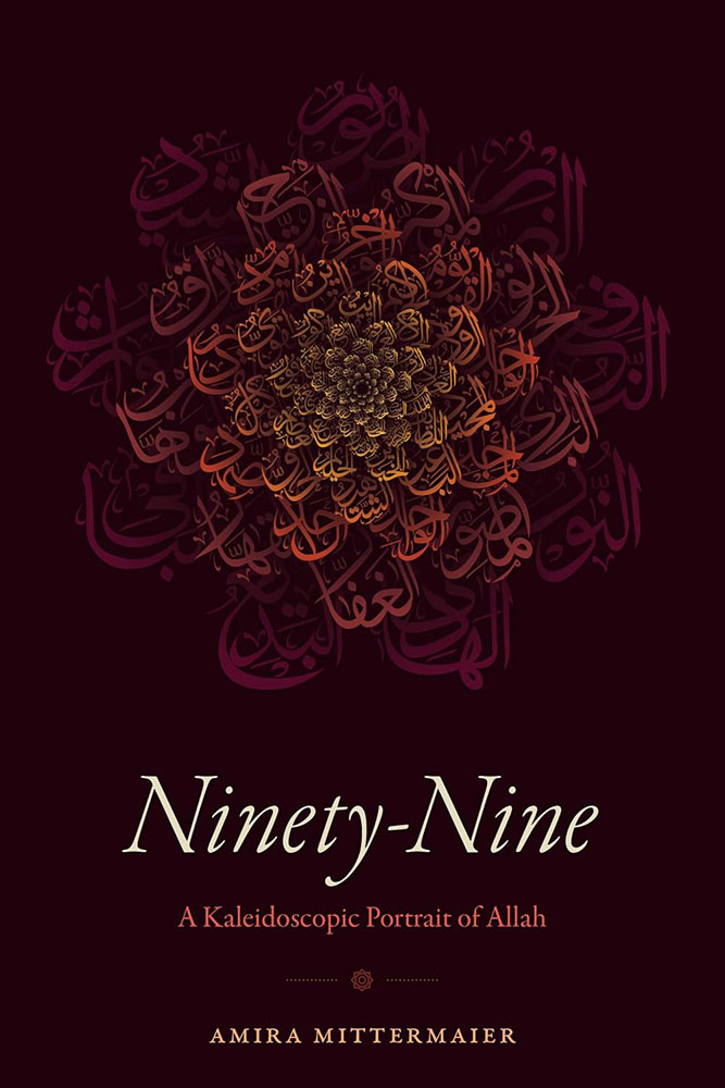
    Duke University Press. Cover design by Matthew Tauch with calligraphy by Md. Zahid Hasan; art director, Dave Rainey.

    “According to Islamic tradition, God has at least ninety-nine names,” the description says. But it’s the flower on the cover — a mosaic of script, best described as a “calligraphic gift” — that catapults this to the fore. Combined with a simple and classic title treatment, only one characterization is needed: brilliant.

    Read the rest.

    Design
    The PRINT Magazine Awards 2026

    Now in its 46th year, the PRINT Awards “continue a legacy of recognizing creative excellence across the design industry,” recognizing “89 winners whose work represents some of the most exciting, innovative, and thoughtful design today.”
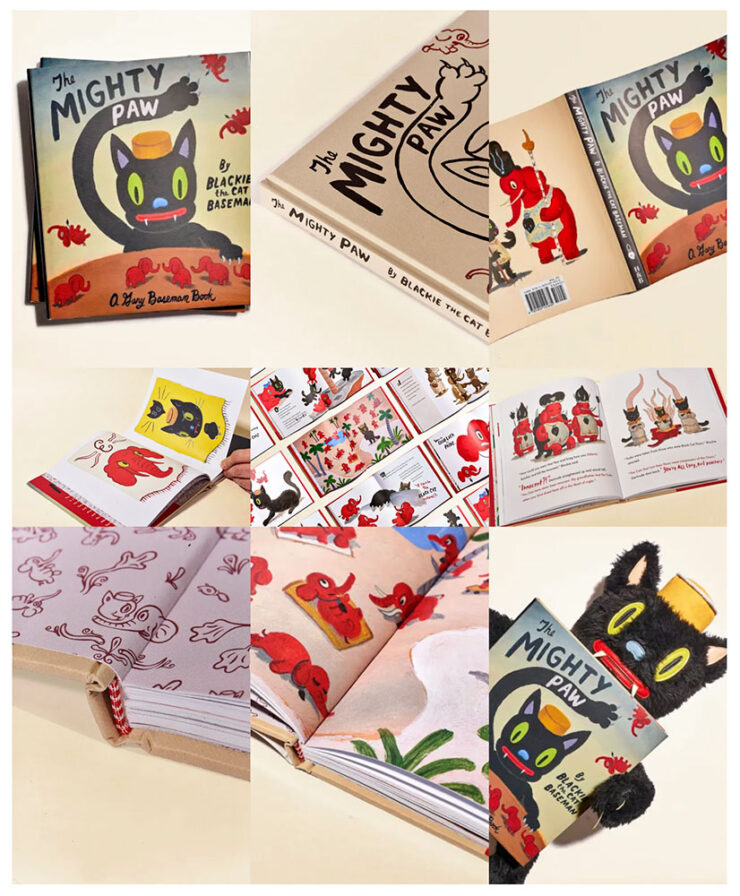
    The award for best book package is not actually called, “The Mighty Paw PRINT.”

    One defining quality stood out across this year’s winning work, reflecting a theme that continues to emerge throughout the history of the PRINT Awards: the power of design as a form of expression, activism, and reflection of the world around us.

    — The PRINT Awards jury

    The item above exemplifies this: The Mighty Paw is a “visually striking illustrated book that uses the story of a lone cat surviving an ‘Era of the Great Hate’ to explore themes of identity, displacement, war, and intolerance.”

    See the rest of the awards at PRINT.

    Special bonus #1: The Touch of Art: American Book Design 1880-1930 exhibition is on now through April 9, 2027, at the Wilson Library, UNC Chapel Hill.

    Reelizer: Movie Art
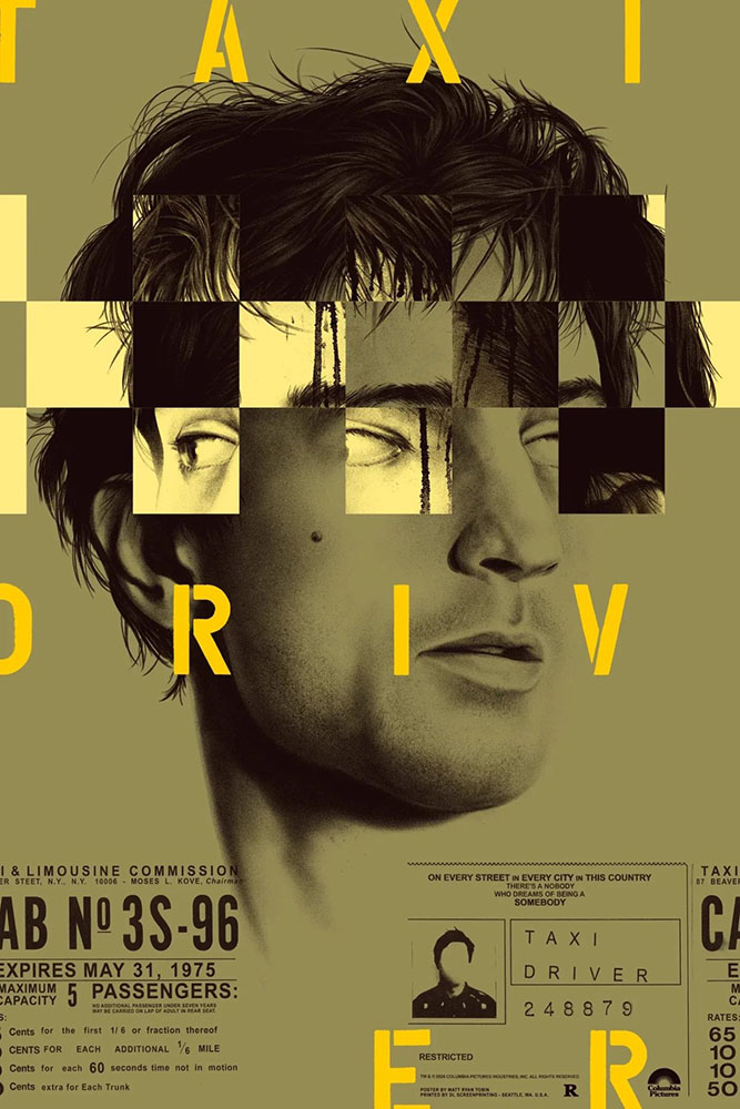
    Taxi Driver. Artwork by Roger Erik Tinch.

    “Reelizer is a personal project by Roger Erik Tinch,” Jason Kottke writes, “that is a collection of movie art: prints, posters, illustrations, albums, books, covers, etc. Careful, you can lose hours here . . . Tinch has a great eye.”

    Russian and Eastern European posters
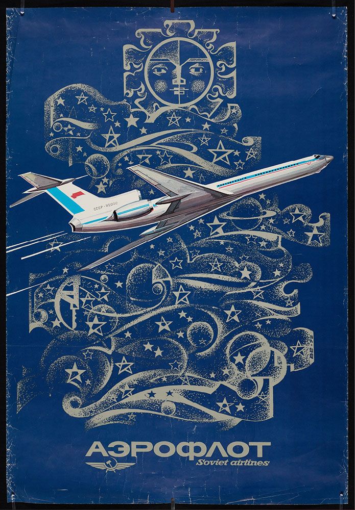
    An Aeroflot Tupolev TU-164 climbs into a stylized Soviet sky in this example.

    Also from Kottke: “Princeton houses a large digital collection of posters from Russia and Eastern Europe, almost 5000 total items, spanning 101 years (1904-2004).”

    Special bonus #2: Nathan Yau, at Flowing Data, writes: “OKpalette is a tool to grab a color palette from an image. Load the image in the browser, set the number of colors, and define a region in the image and you get a collection of shades. Images stay on your computer and the color picking is in-browser. Nifty.” Bonus movie poster content in their example images — awesome.
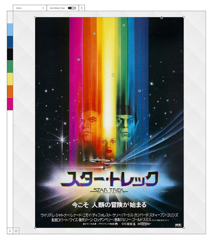
    Yes, that’s The Motion Picture . . . in Japanese. Note the dots — and corresponding colors on the left.
    Type

    Creative Boom‘s post is also a honker this month, with 23 choices. My favorites:

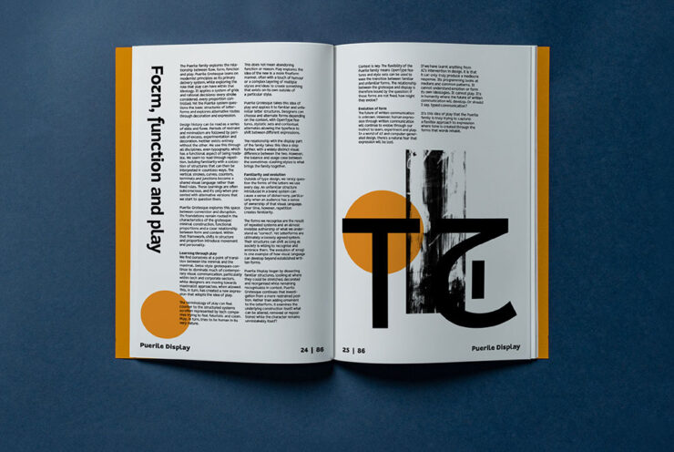
    Puerile Grotesque
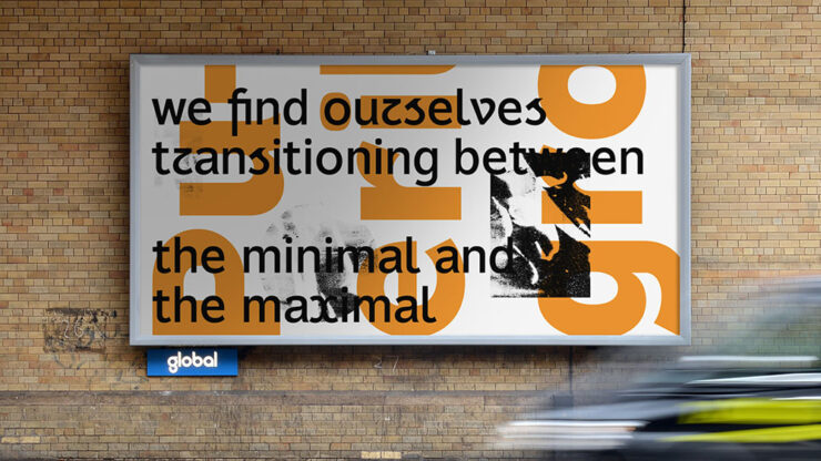
    Puerile Grotesque, from Applied Systems.

    Social media isn’t a part of my life, but you can bet I heard about Instagram’s redesign; the Style Set 01 variant of a new typeface from Applied Systems feels like the same branch — just slightly farther out. Perhaps amongst the leaves.
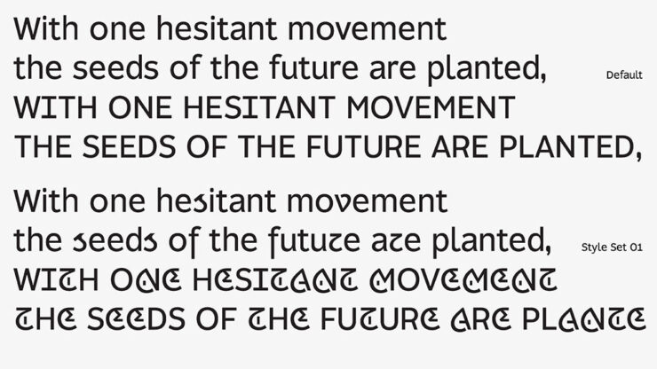
    “Alister Shapley at Applied Systems Design Studio has been thinking about what ‘play’ actually means in typography,” CreativeBoom writes. “Puerile Grotesque is his answer. While his earlier font, Puerile Display, explored ornament and expressive forms, Puerile Grotesque questions the underlying structure of letterforms. Together, they form a complementary, convention-busting family.”
    Pen by DDOTT

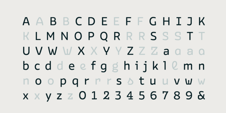
    What happens when a pen pauses on paper? “Those small drops of ink … form the core concept of Pen, a new typeface from DDOTT, developed in collaboration with Morula,” CreativeBoom writes.
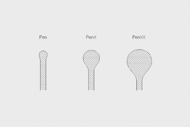
    Pen, by DDOTT in conjunction with Morula.

    “Pen turns a pause into a mark,” DDOTT writes. “Inspired by the small accumulations of ink left when a pen pauses on paper, it turns these human moments of hesitation, correction, and decision into visible features of the letterform. What would normally be treated as an error becomes part of the design.”
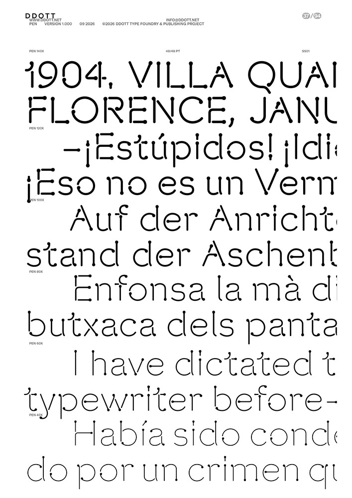
    “Pen’s roots lie in standardised lettering systems that accompanied industrialisation, when technical lettering became increasingly regulated and executed through mechanical and digital systems such as plotters and printers. Based on the tradition of round-pen lettering, Pen follows a monoline skeleton without stroke contrast or optical correction, drawing its underlying forms from neo-grotesque models.”
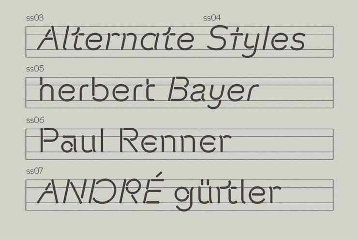
    Hyperspace Cargo by Swell Type
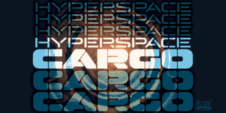
    Hyperspace Cargo, by Swell Type

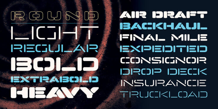
    “Hyperspace Cargo looks exactly like its name,” CreativeBoom writes (and I agree). “Derived from the earlier Hyperspace Race, it’s an all-caps, stencil typeface available in a range of weights from Light to Heavy.”
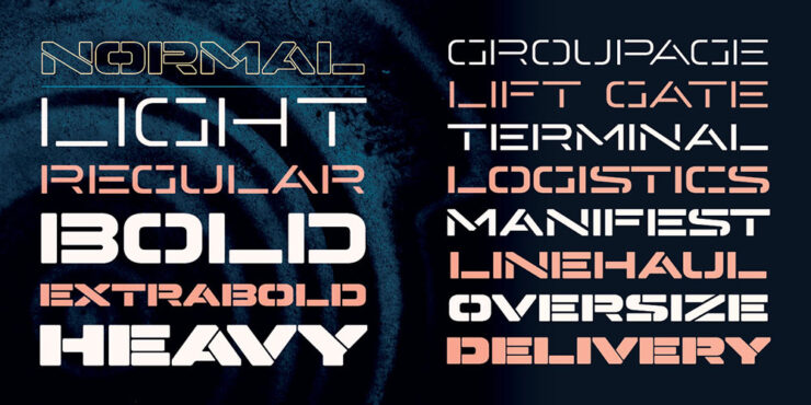
    “Horizontal-line Stylistic Alternates add further variety, and it also supports Cyrillic, Greek and Vietnamese. The variable version offers Weight and Roundness axes for extra flexibility.”
    Special bonus #3: “Bastardica is ‘a foundry for bastard web fonts. Mix, stretch and/or squish them.’ E.g. Nervous Sans: ‘Arial is stacked five times, pseudo-randomly twitching out of line.’” Kottke finds the best stuff.
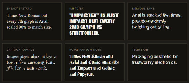
    Mix it up on the Web type platter.

    Special bonus #4: On the starboard side of the space shuttle Discovery, the “s” is upside-down. See for yourself at The Autopian.

    “Software is Over”

    You’ve no doubt heard of utilizing various AI systems to create code, known as “vibe-coding.” The same systems can reverse-engineer, too, a software version of those sites that run new iPhones through X-ray machines to see what’s inside. Fair turnabout, I suppose.

    But what happens when you do the same to, say, Adobe’s Creative Cloud? Microsoft Office?

    ArtCraft’s new suite of apps.

    For a while, those hoping to avoid the difficulty and expense of dealing with Adobe’s Creative Suite have been able to use several free and/or open source alternatives that replicate some or all of those capabilities. Now, one developer is using AI-powered reverse engineering to mimic the look, feel, and functionality of Adobe’s well-known software with what he hopes will soon be perfect fidelity.

    — Kyle Orland, Ars Technica

    That’s right: one guy.

    It’s clean-sheet, which is to say using completely new code. It’s open-source. And, as of this writing, it’s three weeks old and Adobe hasn’t sued — yet. “That practice has generally been found legally acceptable,” Ars reminds us, but “the ArtCraft apps could still face legal trouble if their “trade dress” too closely mimics Adobe’s familiar appearance and interface.”
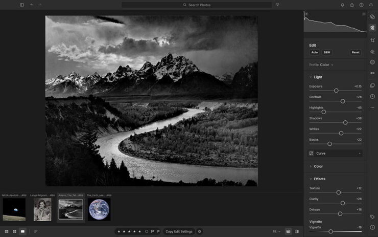
    Here’s the interface for LightCraft, which is only superficially similar to Adobe’s.

    AI lets us take back tech and set the clock back to the pre-shitty era. But now you can just create 1:1 functional equivalents, clean room, that are highly performant and cross-platform. Nothing is stopping you. We’ll replace Google Search; we’ll build our own smartphones; we’ll build better infra. We’ll remove all the ads and de-enshittify the entire tech world.

    Big tech sowed the seeds of their own commodification with AI. It’s all going to come down to this now that we can rebuild everything without toiling for years to even get close to scaling software capability moats. The internet is going to reset to 1990-2004 (pre-Facebook / “Web 2.0” era). The indie web era. Everything is going to be reborn as open source. We’re going to own it all.

    — Brandon Thomas, YCombinator

    “The swagger is immense,” Tom May remarks at Creative Boom.. But the same article wonders whether software is facing a Napster moment — and they might be on to something.

    As a profession, we’ve become used to the idea that developing creative software requires thousands of highly paid programmers and decades of work. That serves as a moat for a company like Adobe: few others can afford to build anything on the scale of the Creative Cloud. But will AI bring all that crashing down around them?

    — Tom May, Creative Boom

    “It’s one thing to make a huge promise like this and another thing entirely to actually deliver,” Jeremy Gray at PetaPixel comments. “An app is more than just its codebase; it is also its stability, performance, functionality, and ability to handle the extreme edge cases that make or break professional success.” 

    “If you’re worried this is just some one-off flash in the pan that will die, it isn’t,” Thomas promises.

    Time will tell.

    Special bonus #5: On the subject of AI: “Apple, Content Authenticity, and the War to Prove What’s Real,” from PetaPixel, details Apple’s new Reference Image technology. Different from other content authentication systems, for sure, taking advantage of Apple’s ownership of the entire pipeline from camera to output — but of course limited to Apple cameras.
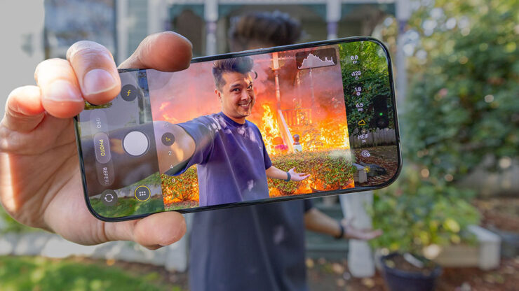
    PetaPixel’s header image for the article is awesome.

    Special bonus #6: The ongoing Getty/Shutterstock saga/failed merger fallout continues — Getty’s declared bankruptcy. Looks like they’re clearing the road for an equity grab private ownership; together with the Getty family, the Koch bros are involved. Ug. MacFolis has an overview, or PetaPixel has more detail (3 links there).

    Automotive
    McLaren and Vauxhall

    New branding from, shall we say, opposite ends of the automotive spectrum. Let’s start on the high end.
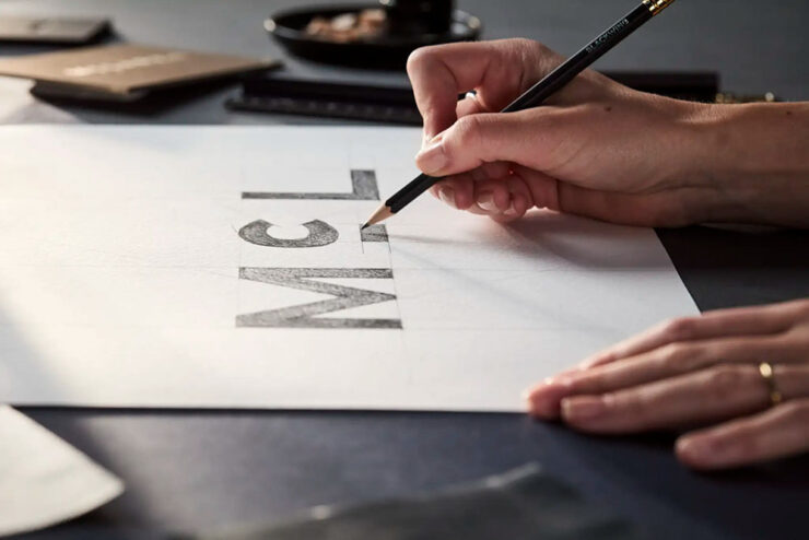
    A detail — marketing image, really — of McLaren’s 2026 logo update, highlighting the underlined “c.”

    The Internet, in its infinite wisdom, doesn’t like it, suggesting that the new wordmark is more upscale food item than sports car. I disagree — the swoosh/arrow is still very much there, it’s just that the name is styled differently; since it’ll be rolled out with redesigned models, it should serve them well into the next decade. The new look debuts on the M6 GT I drooled on covered last month.
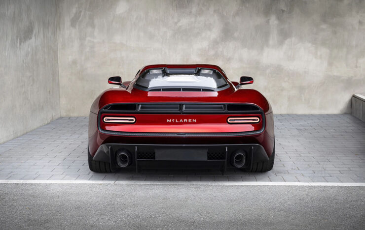
    The M6 GT, highlighted here on Foreword in August, wearing the new wordmark.

    Creative Boom has an overview of the new branding, and a commentary post from someone on the inside.

    Meanwhile, Vauxhall, part of the sprawling Stellantis empire, has redone the whole brand — griffin, wordmark, and stores:

    Before, left; after, right.

    This one I’m going to have to mark as less successful. With each change, the creature looks less like its namesake and more . . . well, they’ve got the “bird head” thing kinda right, but the wing, the talons, and the whole “lion thing” are tragically missing in action.

    “In the latest update, [the] previous flat logo introduced in 2020 was further simplified,” Dezeen writes,1Dezeen, too, has “new” written all over it — while the logo is the same, the website has been refreshed, simultaneously making its homepage both less readable and more difficult to tell what’s new. Not all bad news, though: the posts themselves feel more modern and are still filled with interesting stuff. “with the griffin made more angular. In particular, the mythical creature’s neck hair was simplified while its beak was closed.”

    Also, “for the first time in the logo’s 121-year history, the flag depicting the letter V no longer forms part of the logo.”
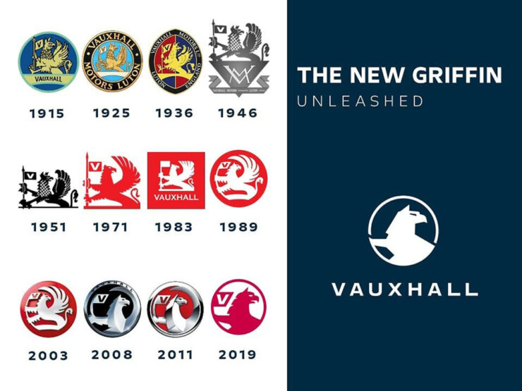
    I mentioned it only in passing in 2020; this time, not so much. Take a look at the progression pictured above. Is this the best it’s ever been? Better than ’71 or ’89? I’m honestly surprised the corporate executives evaluated those, looked at the new proposal, and said, “yes.” (See their press release for some “reasons,” along with a few more images.)

    The Jaguar Type 01

    On the subject of the Internet’s wisdom, as you know, Jaguar’s Type 00 concept car landed with what could be best described as a “thud.”
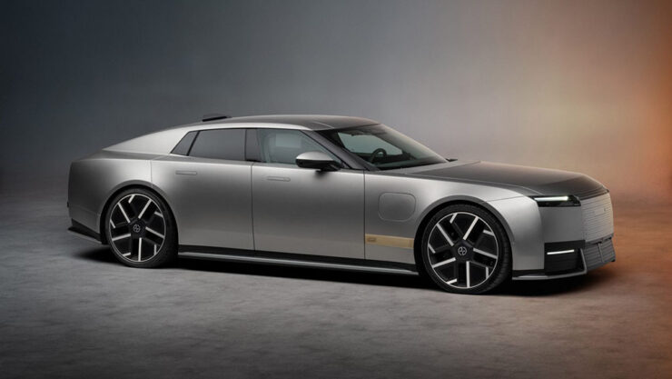
    But wait: that’s not the concept — that’s the production version.

    It still lacks a rear window, and it’s still festooned with the new logo that may or may not do it any favors. The did, at least, more prominently feature the leaping cat.

    But the rest hews remarkably close to the concept: it’s long, low, wide, and with 1015 horsepower and four cocooned seats, it seems like something that steamroll through traffic with ease. (Less sure about a back road.)
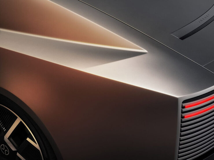
    The “impossible panel,” named for its difficult manufacturing process.

    I’m glad Jaguar stuck to its guns here. To say it has “presence” is an understatement.

    Tons of coverage, unsurprisingly: Dezeen, CreativeBoom, even Daring Fireball — none car sites, which speaks volumes — along with Ars Technica, The Drive and The Autopian.

    Special bonus #7: The reviews for Ferrari’s 12Cilindri Manuale are out — none better than Jason Cammisa’s fabulous Icons series for Hagerty on YouTube:2Folks will notice that I’ve stopped embedding YouTube videos; my site is prominently labeled, “no information collected,” something embedded videos violate by requiring cookies. YouTube, along with any other sites requiring data collection, will be limited to links only. Thanks for understanding.

    Ferrari “reinvented the transmission,” Jason Cammisa argues. (Note the pin striping — it’s relevant.)

    When Foreword previewed this expensive delicacy in July, I said was convinced that this setup — or, at least, something like it — is the future of the manual transmission. Cammisa agrees, and lo and behold, so might Porsche. I hope BMW hears the call, too.

    The Porsche Mission S

    Porsche’s fortunes of late haven’t been spectacular: between too many EVs aimed at folks who aren’t convinced electric is “right” for a sports car brand — or, at least, for them — and being tied to Volkswagen’s many, many missteps have meant buyers’ interests have waned.

    Fortunately, they decided to do something about it.

    It’s called the Mission S. It’s a concept, with no production planned, but make no mistake: a production version, which will sit above the 911 in Porsche’s lineup, will be along.
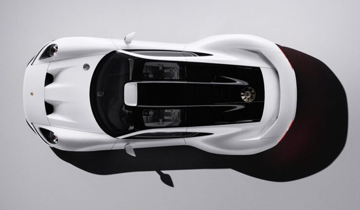
    It’s mid-engined. Rumors say it runs a flat-eight, although Porsche themselves are coy about the drivetrain. It’s an automatic in pictures, but:

    And get this: the interior basically defines “minimalist.” The screen, pictured below, is your phone.
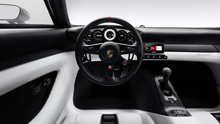
    That’s right, Porsche has declared that “real sports cars” should not feature distractions. It even has a real tach. (“Digital detox is now a luxury item,” The Drive says. They may be right.)

    But never mind that: equal parts nostalgia — 917, 959, many more — and future, the Mission S is the first Porsche I’ve insta-clicked in a minute. Well done.

    Read more at Ars Technica, The Autopian, or The Drive.

    The Paris Motor Show

    Cornucopia of goodness — almost entirely unobtanium, but still.
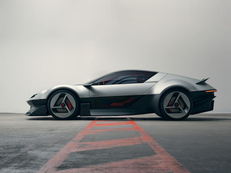
    “Alpine offered up one of the true show stars in the shape of the Alpine A310 Concept. Another exercise in retro design, this two-seater sports car is a contemporary update of the 1971 original.” — Wallpaper*
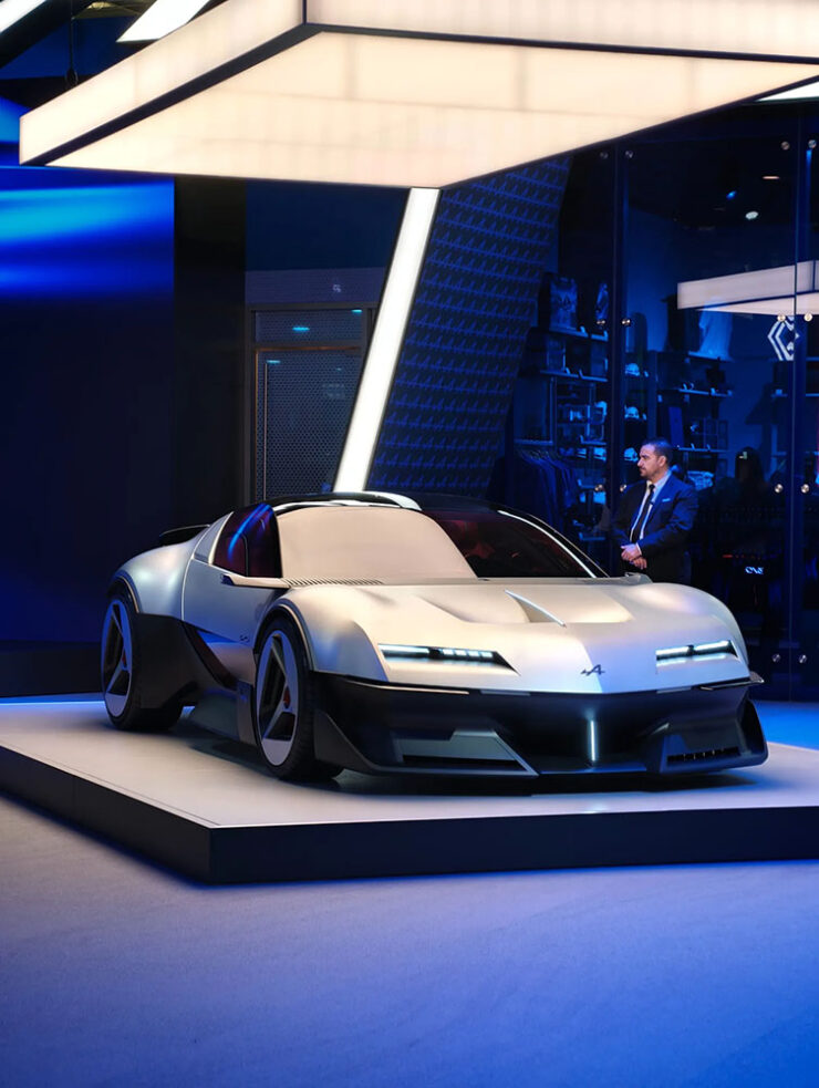
    “The modern version doesn’t stray too far from the proportions and details of the striking four-seater 1970s version, one of the most futuristic production cars of the era. If it goes into production, the new A310 will be an electric supercar that … would only be built in very limited numbers.” — Wallpaper*

    “The French hot hatch has always been celebrated for its excellence. In essence, it’s about combining a small, light car with a peppy engine, not a world removed from the core principle of a sports car, even if most French hatchbacks are front-wheel-drive. You still get the full usability and versatility of the hatchback on which the hot hatch in question is based, but it’s faster and drives even better. There have been a number of cars like that throughout the years, but the Peugeot 205 GTI is one of the best known. That’s why the 205’s rally variant, the 205 T16 Group B rally car, was such a beastly creation: it looks like a 205 that’s gone to the gym, a lot, and taken a few supplements.

    “Peugeot’s new E-T16 electric concept manages two things: it’s a successful visual throwback to the 205, and it’s also the most powerful Peugeot anywhere, ever.” — The Autopian
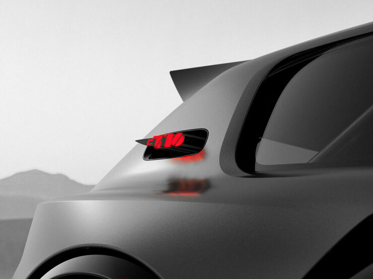
    “The Peugeot 205 GTi was a Gallic alternative to the late ’80s-era Golf GTIs that Americans will be familiar with, and it’s into this well that Peugeot dipped for Paris. Or rather, the wild 205 T16 Group B rally homologation special that the 205 GTi gave birth to, a car that won the world Rally Championships in 1985–86. The E-T16 Concept shows us that hatchbacks needn’t just be humble devices for running errands; they can excite, too.” — Ars Technica

    “The original Renault Espace was very much loved and created the people-carrier segment out of thin air, at least in Europe. The familiar one-box shape remains for the new E-Space Concept … There is a criminal lack of electric minivans on the market today.” — Ars Technica
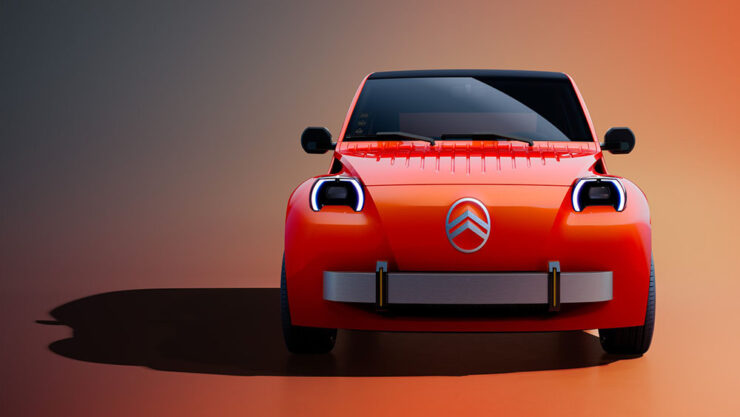
    “I’ve been excited to hear that the car is intended to fit the spirit of the original 2CV (you can read that as affordable) and not just be a retro, nostalgia-flavored cash grab. Well, yesterday the full new 2CV concept was revealed at the Paris Motor Show, and I’m happy to say I think Citroën did a damn good job of translating the archaic 2CV into a modern design vocabulary.” — The Autopian
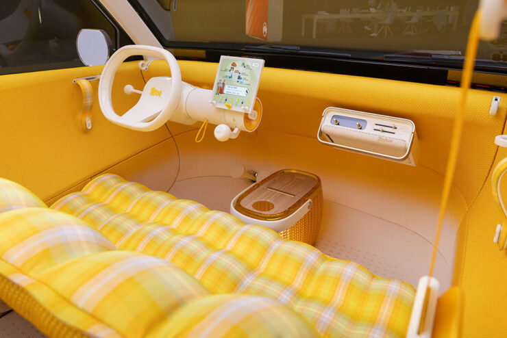
    “The best-received concept … was the long-awaited revival of the legendary Citroën 2CV. Electric only, the concept is — we’re promised — apparently very close to the production reality.

    “There’s a wealth of genuinely entertaining detailing here, all of which hasn’t just been carried out in homage to the original, but as a way of finding new methods to keep costs down. Citroën aims to get the production 2CV … to come in at the magic €15,000 mark. Nostalgists will have a field day, and it’s still a delightful sight for the rest of us.” — Wallpaper*
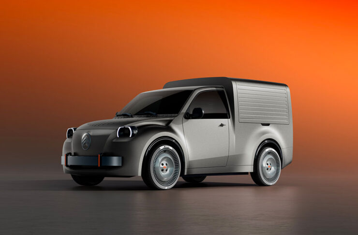
    “Back in the day, the original 2CV wasn’t just a family car, it was the vehicle of choice for French business big and small. From La Poste to the local boulangerie, the box-backed 2CV van was everywhere.” — Wallpaper*
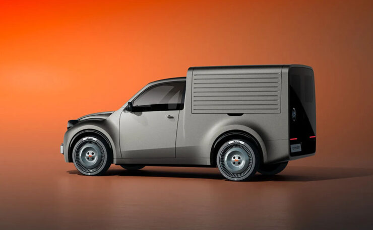
    “Citroën is hoping that the new generation 2CV Fourgonnette will do similar business. Bringing the admirable simplicity of the passenger car concept to a small van, the focus here is on maximising load space and practicality, whilst not losing sight of the character that will give this tiny van its competitive edge — a serve as a lovable mobile advert for whichever businesses chose to adopt it.” — Wallpaper*
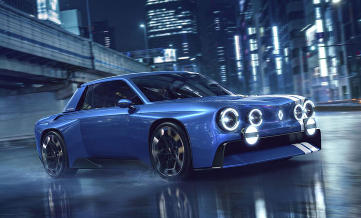
    “The French carmaker Renault seems to be having a blast digging into the treasure trove that is its historic output. As Renault’s concept cars show, it’s not done digging.

    “Between 1962 and 1976, Renault built a rear-engined family sedan called the 8. The company exported these cars to the United States, and despite being down on power, they were simply marketed as being faster than the previous cars! Yet, the R8 also provided the basis for one of Renault’s early sports sedans, the Renault 8 Gordini. The most recent concept car from Renault takes the visual identity of that late-1960s car and reinvents it for the future.” — The Autopian
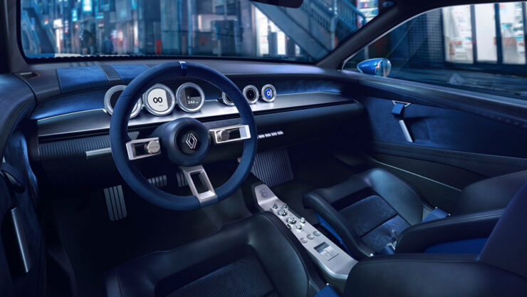
    “The interior is all 1960s-styled concept car aesthetic, with brushed metal on a very narrow center console. The interior looks great in both renders and photographs, with suede on the steering wheel and velour on the dash.” — The Autopian
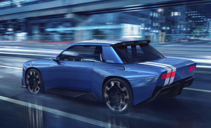
    “The rear is now swept up, with blocky taillights glowing through a pixelated texture, on a surface that’s completely blank with the lights switched off. To maintain a visual connection to the original, there’s no rear spoiler on the rear deck. Instead, the spoiler is up there at the rear edge of the roof, and the diffuser presumably deals with the rest of the airflow. A large GORDINI logo is proudly affixed to the wide C-pillars.

    “It all looks like a school kid’s dream, which it will also remain: no production plans exist, even if some of the detailing and ethos are likely to trickle down to production versions.” — The Autopian

    Literally all of these tickle my fancy in one way or another, but it’s the Gordini — naturally the one least likely to make production, let alone come to the US — that I’d have without question. (Well, the Ferrari . . . .)

    But that only scratches the surface of the goodness introduced in Paris: from Alfa to Volkswagen, there were dozens of concepts and production cars to delight the eye. The best overview is at Wallpaper* (1, 2), but also see coverage at Ars Technica and The Autopian (1, 2, 3, and 4).

    Special bonus #8: Inside GM’s Global Technical Center in Michigan. A long item from Wallpaper* featuring “ample opportunity to celebrate GM’s products, heritage and the all-important ‘surprise and delight.’”
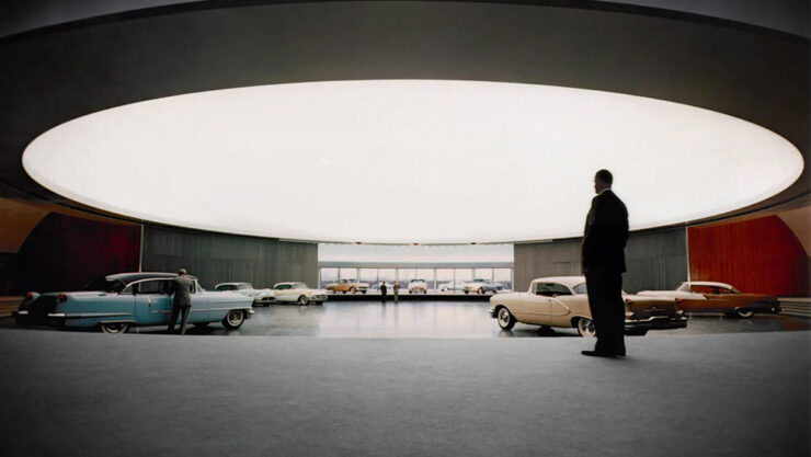
    Harley Earl beneath the “dome” back in the day.

    “This was the ‘dream factory’, the birthplace of the stylish, status-driven mobility that convinced a nation of its place at the forefront of the industrialised world. To visit the campus today is to simultaneously step back in time to the auto industry’s heyday of boundless confidence, whilst also sampling the far future of manufacturing.” — Wallpaper*
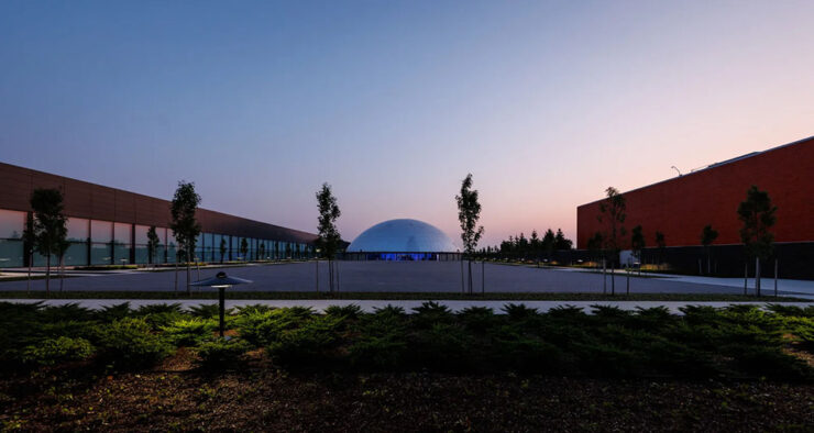
    The Center today. The exterior of the “dome” is visible amongst newer buildings and additions.
    Photography
    “Occasionally bizarre”

    “This work does not propose conclusions. It documents a condition in which biological life and technological systems are no longer separable, yet remain unevenly aligned,” photographer Spencer Lowell says.
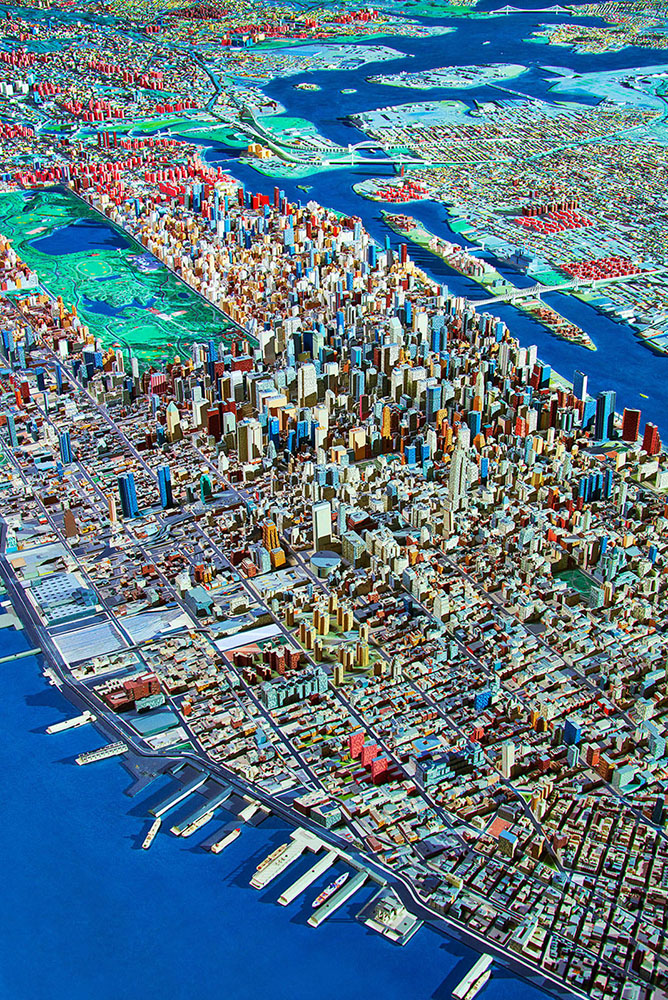
    Aerial of Manhattan and Queens, 2016. Photograph by Spencer Lowell.

    Lowell describes himself as a photographer of “science, technology, industry, environment, and people,” and all of that is shown throughout his debut monograph, Futures Past. PetaPixel has more.

    2026 Epson Pano Awards

    The 17th Epson International Pano Awards have announced its 2026 winners, which drew 4,084 entries from photographers in 93 countries.

    ‘Center of the Cosmos.’ Photograph by Xuecheng Liu. Winner of the Open Built Environment category.

    Tons of great stuff here; according to their rules, by the way, “pano” is defined as a ratio of at least 2:1. See all of the winners and finalists at the Pano Awards website, check out Kottke’s favorites, or see PetaPixel‘s top 10.

    2026 Astrophotography Prize

    “Established in 2023,” PetaPixel writes, “the Astrophotography Prize is an international astrophotography competition run by astrophotographers, for astrophotographers.” 
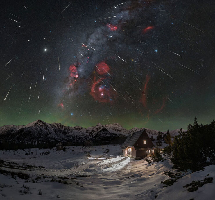
    “Geminids Above Betlejemka,” Poland. Photograph by Lukasz Remkowicz..Finalist in the Astro Landscape category.

    They continue: “the competition recognizes excellence across Astro Landscape, Aurora, Deep Space and Remote Imaging. Its emphasis on public live judging and constructive feedback gives entrants an opportunity to have their work assessed by experienced photographers while allowing a wider audience to learn about the craft.”

    Some really spectacular stuff. See more.

    Special bonus #9: See also this year’s Natural Landscape Photography Awards winners, “a collection of beautiful landscape and nature photos that emphasize realism and authenticity.” (Via PetaPixel.)

    2026 Architecture Photography MasterPrize
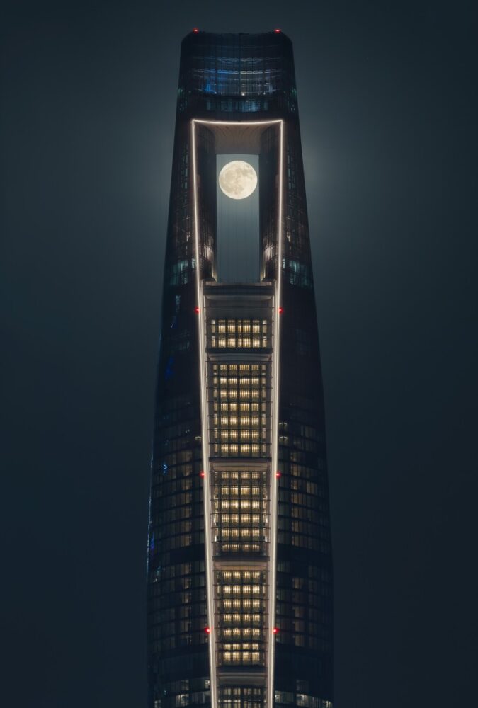
    “The Needle,” Qatar. Photograph by Ahmad Alnaji. Winner in the Hospitality Exterior category.

    This contest is a little different, in that it’s winners from the photography program of the Architecture MasterPrize (AMP), “an international awards program now in its eleventh edition that also recognizes architecture, interior design, landscape architecture, and product design.”
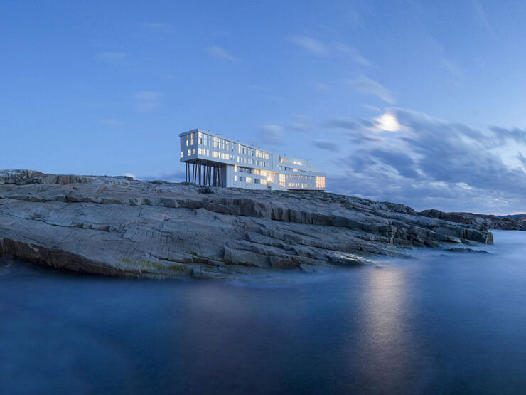
    “Fogo Island Inn,” Newfoundland. Photograph by Alex Fradkin. Winner in the Hospitality Exterior category.

    Not at all described as “catnip,” this contest has some of the best architecture photography extant, year after year. The complete list of 2026 winners is on the AMP website. (Via PetaPixel.)

    “Handcrafted images of memory and time”

    Photographer Lara Porzak “works exclusively with analog techniques,” PetaPixel writes, “including tintypes and gelatin silver printing, using a slow, hands-on process to produce her photographs. She often develops images on site in a mobile darkroom, creating handcrafted prints that explore the relationship between photography, memory, and time.”
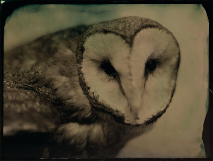
    “Barn Owl.” Photograph by Lara Porzak.

    As many of you know, I love tin- and old-style photography, and these are excellent. Better still, Los Angeles-based Porzak has brought “over 140 of her photographs together in her first monograph, The Chemistry of Memory.”

    Have I mentioned that open-sewn bindings are hot right now?
    2026 Nikon Comedy Wildlife Awards

    Finally, to close out October’s post, we have . . . a smile or two:

    “Are you kidding me?” Photograph by Kevin Lohman.

    I inadvertently selected three owl photographs in a row — but left it. Owls are awesome. (We have several that live on my block here in Macon; hearing them hoot and howl at each other — despite being on the urban-suburban boundary — is one of the reasons I treasure them.)

    “Two little owls form one,” Al Qudra Desert, Dubai. Photograph by Lynn Emery.

    “Each year the competition supports a sustainable conservation organization,” PetaPixel writes. “This year Comedy Wildlife is working with the Born Free Foundation, an international charity rescuing and protecting wild animals from exploitation and conserving threatened species.”

    The People’s Choice Award is open now until March 1, 2027. Vote!

    • • •

    On that last subject: in the United States, Election Day is next Tuesday, November 3rd. Please make your vote heard.

    • 1
      Dezeen, too, has “new” written all over it — while the logo is the same, the website has been refreshed, simultaneously making its homepage both less readable and more difficult to tell what’s new. Not all bad news, though: the posts themselves feel more modern and are still filled with interesting stuff. ↩︎
    • 2
      Folks will notice that I’ve stopped embedding YouTube videos; my site is prominently labeled, “no information collected,” something embedded videos violate by requiring cookies. YouTube, along with any other sites requiring data collection, will be limited to links only. Thanks for understanding. ↩︎
  • Beautifully Briefed 26.8: The Anti-Drought

    Beautifully Briefed 26.8: The Anti-Drought

    It’s finally dried out here in Georgia, after a summer best described as “WTF” — where the “F” stands for flood, because you know it does. (As opposed to England, for instance, which is WTF in the other direction.)

    So: some design, typography, and imagery to inform and cheer. And ten special bonuses. You deserve no less.

    This Month’s Spine
    Vanderbilt University Press. Cover design and art direction by Alissa Faden.

    It was my pleasure to feature some titles from Vanderbilt University, the University of South Carolina, and the University of Louisiana — because Stanford and NYU don’t have a lock on my attention. (’Sides, it’s fall catalog season, so there’s lots to choose from.)

    Enjoy fourteen great covers from University Press titles in my regular column for Spine Magazine.

    Reading reports that its death is greatly exaggerated

    As you’ll recall — or not, depending on whether you were able to read the article — The Atlantic worried out loud that reading is in such decline that we may have to think in terms of living in a “post-literate” world. (Because “post-truth” isn’t enough.)

    Turns out that there’s a back story to that take; it originated on a Substack titled, “The dawn of the post-literate society, and the end of civilisation,” by someone whose profile I can’t see because I refuse to create an account.1Soap box: getting a website, whose contents you own, is so painfully simple that I tend to discount those that rely on other platforms to publish what might otherwise be interesting material/thoughts/content. And in this case, the author is a Times journalist, who should definitely know better.

    So, I owe you an apology: this “moral panic,” as it’s been termed, originates in . . . what amounts to social media.2It’s been pointed out that blogs are social media, too (the original social media, in fact) — something I don’t necessarily disagree with. From my perspective, writing that is owned, put out there due to belief, and read by folks who trust your opinion, is completely distinct from having your potentially-anonymous “take” promoted to strangers by an algorithmic mechanism that profits from conflict — or, at least, provocation. In my opinion, it’s the latter that defines “social media.” I’m disappointed in The Atlantic for taking that bait, and in myself for trusting them and then making something of it here.

    Time for a reality check.

    Which comes courtesy of an article that’s part of It’s Nice That‘s POV series:

    It’s Nice That discusses Stack Reading Habits Report.

    . . . whose author puts forth just the right perspective, one that folks here can relate to:

    “The death of reading sounds uncannily similar to the death of print, which is another issue that’s prone to over-simplification.”

    — Steven Watson, It’s Nice That

    I still work in print. Many of us do. While it’s become a more specialized area of expertise, it’s still very much viable; whether it’s reached the stage of the horse post-motorcar or the manual transmission post-electric is something else entirely. (More on that latter item below, by the way.)

    The author quotes another response to the piece, which I almost completely agree with:

    All these pieces — from The Atlantic and elsewhere — about “the end” make this seem like a problem because of how they’re framing it, and who they’re framing it for. Maybe kids aren’t reading the classics, but look at the romantasy moral panic stewing in the background of social media. It’s a whole bunch of mostly men — who, demographically, do not read or buy books at all — declaring it the death of literature even though women and queer people are reading a ton of it. [. . .] It seems as though Americans have decided that the amount and kind of reading they personally do is normal and someone else doing it any more or less or differently than them is a social emergency. We may be seeing the end of certain kinds of reading [. . .] or certain kinds of culture, but that also means that something is replacing it. And good God do we need to replace a lot of it. If only to break up the corporations that dictate how it all currently works.

    — Ryan Broderick, Garbage Day

    To summarize, I fell for the “intellectual tragedy” represented by “the end of reading as we know it” and said something without thinking it through. I’ll try to do better.

    Rare books > AI. Unless…

    If you can truly appreciate an old book — and maybe even marvel at how its fragile, yellowing pages contain some of the earliest ways that people tried to make sense of the world around them — then headlines about tech companies that are destroying books to train AI likely torture a tender part of your soul.

    — Ashley Belanger, Ars Technica

    This article, dated August 12th, reminds us that, “Google patented a non-destructive book-scanning technology in 2009 that AI firms could use to efficiently scan books — if they were willing to slow down and invest in the process.”

    It continues, “The biggest fear for people who want to see books preserved through the training process is that AI firms will callously pulp rare books that can never be replaced.” Rare book dealers, it turns out, have started to flag suspicious bulk orders to safeguard the irreplaceable.

    Not Google’s patented process . . . but you can probably guess where this is going.

    Five days later, the same author reported:

    On Monday, 404 Media revealed that it had connected with a bookseller who agreed to plant an [Apple] Airtag in a rare book that was part of a bulk order. That Airtag was then tracked to an Amazon AI training facility in Las Vegas that housed a team focused on tearing books from their spines and scanning pages, 404 Media reported. Apparently tone-deaf to the escalating backlash over destructive book scanning, a logo on the door of that team’s warehouse, VGT3, showed a Tyrannosaurus rex preparing to devour a book, 404 Media documented.

    “Amazon declined to comment on 404 Media’s findings,” the article continues, “only providing Ars with the same statement it gave to 404 Media, which does not mention AI training specifically: ‘Amazon purchases books through commercial channels to help develop and improve the products and services our customers use.‘“

    The Internet, in its wisdom, has suggested that it’s all for profit — to “hide history behind a paywall.” How likely is that? After all, we know that Amazon, Anthropic, and Meta are altruistic.

    And now, courtesy of the ’Net’s most-trusted source, we have insider details: “when I see a one-of-a-kind, three-hundred-year-old tome taking up six whole inches of shelf space, I immediately start thinking about scale and efficiency.”

    Profit, efficiency, whatever — chewing up rare books for AI training is the very definition of “facepalm.”

    Special bonus #1: McSweeney’s new book, Obey in Advance, How to Survive and Thrive under Authoritarianism, is available this fall. An early review:

    “Democracy is priceless, but fascism sure seems to pay well. If you’re morally bankrupt and looking to sell your soul, Obey in Advance has everything you need for a profitable life of lickspittlery.”

    — Kevin Kruse, Professor of History, Princeton University

    Naturally, the book arrives at your door pre-scanned by AI.

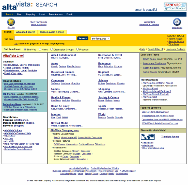
    Special bonus #2: Remembering the pre-Google web, when search was an experiment. ”It was an era when the term ‘discovery’ carried actual weight, when you could authentically be one of the first people viewing a piece of content, regardless of its quality or how long it may have existed — an era of equal parts wonder and frustration.”

    Four scores and twenty-seven years ago . . . .
    The story behind Present & Correct
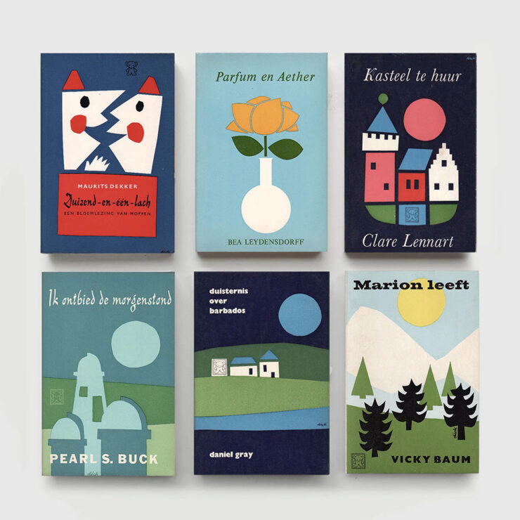
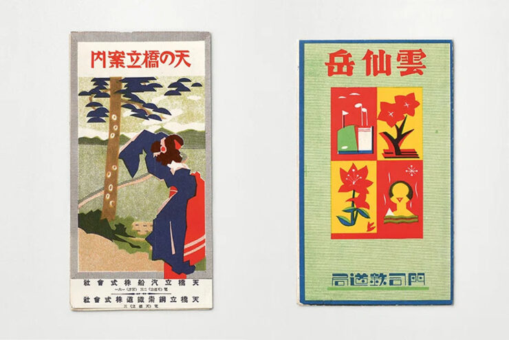
    Dick Bruna book covers, 1970s, from the Zwarte Beertjes publishing house. Image by Present & Correct.

    “The perfectly curated stationery shop that’s every graphic designer’s dream” has a new gig: publishing. But first, the origin story, thanks to a Q&A with It’s Nice That.

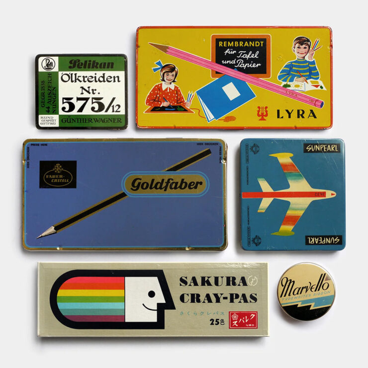
    Tins and boxes for crayons and pencils, mixed eras. Germany, USA & Japan. Image by Present & Correct.

    To talk more about this publishing journey and the designers’ joint practice, we spoke to [the owners] about the story of Present & Correct to date, tracing habits of collecting and archiving all the way back to a childhood spent carefully putting away scrapbooks of sugar sachets, napkins, postcards and coasters, a final major project at art school (a paper concept store called . . . Present & Correct), to their joint travels across the world today, foraging for original vintage stationery to curate the shop’s stocks from over 18 different countries.

    — Ellis Tree, It’s Nice That

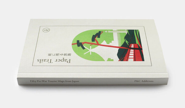
    ”This habit of archiving and collecting vintage ephemera,” the article continues, ”has informed your first self-published book at P&C Paper Trails: Pre-war tourist maps from Japan featuring fifty incredibly illustrated maps for various attractions around Japan.”

    Paper Trails, the first title published by P&C Additions.

    “We named it P&C Additions because we hope to make editions of varying sizes (might be a single sheet, might be a book) and they are additional to what we generally do (a stationery shop!). And yes, we want to make more as and when we can. No pressure, just a natural offshoot which will manifest as a published item when we feel the content is strong enough,” the owners report.

    The interview is awesome. Give it a moment of your time.

    Special bonus #3: The Last Museum’s curators: ““We currently have around five million artworks indexed, and strive to eventually index all museum art in the world.” Not sure about the name, but definitely bookmarked under useful resources. (Via This is Colossal.)

    “A Dutch Courtyard” by Pieter de Hooch, via The Last Museum. Chosen because the original absolutely does not hang in my living room, a joke one or two of you will actually get.
    August’s new typefaves

    Yes, I’ve coined a new word just there — and will continue to deny that it was, in any way, a typo involving the word “typefaces.”

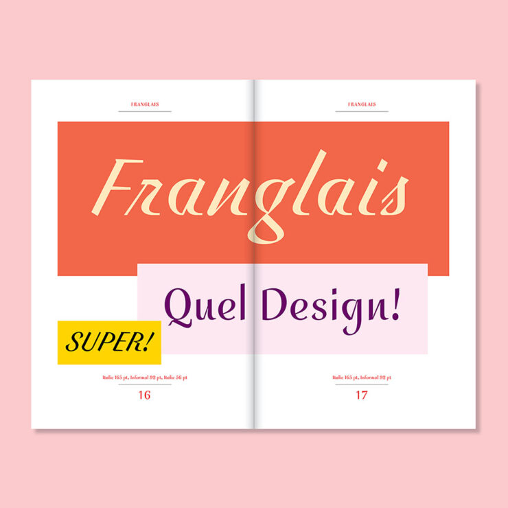
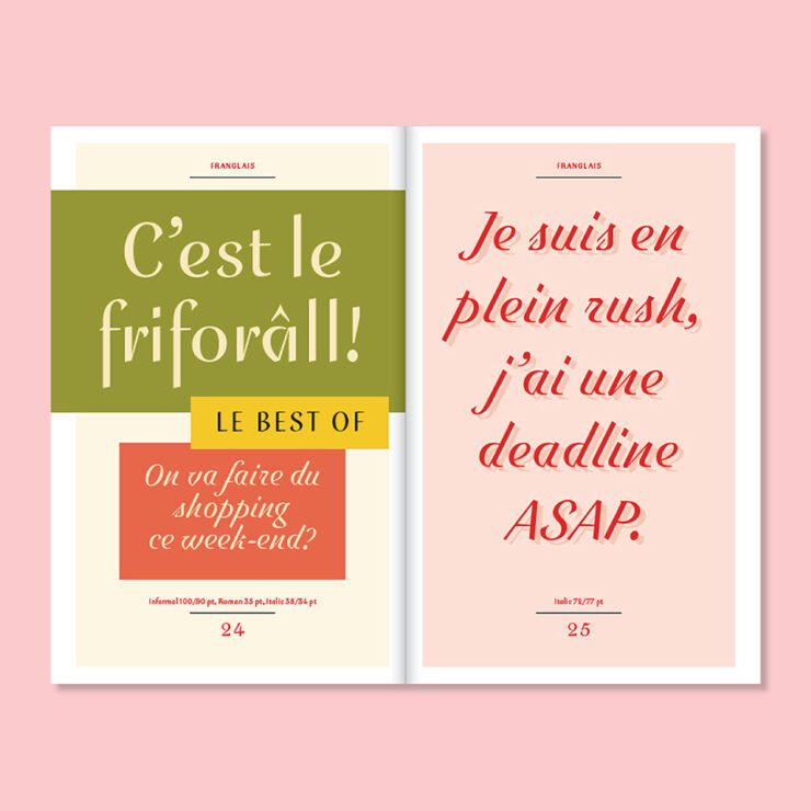
    Franglais, by Emigre
    Franglais, by Emigre.

    ”Franglais was designed by John Downer in sporadic bursts of inspiration dating back to 2000,” Emigre writes on their blog. “It was originally conceived as a standalone italic, and expanded to include two upright companions, Roman and Informal, developed in collaboration with Zuzana Licko.

    Pretty much everything Emigre puts out is beautiful, but Franglais is just gorgeous.

    “Reflecting on the origins of Franglais, Downer describes it as lettering devised for imaginary signage inspired by a hybrid of postwar metal type and vernacular chalk-written menu boards. Elements of ‘ruler writing’ — in which a ruler is used to keep the baseline straight across repeated lines — are evident throughout.”

    Special bonus #4: “ShieldFont, as designers Isaque Seneda and Gabriel Abrucio write in a recent white paper, was made to offer web publishers ‘a practical opt-out from unauthorized AI training and [to] disrupt what is collected when that choice is ignored.’” Read about it at Ars Technica.

    Not sure I’m on board with this approach.
    SE Micro, by Gallery Type
    SE Micro, by Gallery Type.

    “Se Micro is the small-size companion to Se Macro, released by Gallery Type earlier this year,” CreativeBoom writes in this month’s recommendations. “They share the same basic skeleton, but Se Micro works well in small or difficult settings, like tiny text or low-quality printing, perhaps even on screens.

    “There’s a nice twist, too. When you blow this typeface up to larger sizes, those practical features become a visual style in their own right. It looks distinctive and quirky rather than just doing its thing of being legible, especially in bolder weights.”

    Ink traps may be on-trend, but I still like their treatment in this typeface.

    “This is an option for branding work across fashion, culture and design-led products. It comes with 10 weights and three widths. And it’s part of a growing family: Se Macro is also out, as I’ve mentioned, but hold onto your hats for Se Mono and Se Rounded, due out later this year or early 2027.”

    Resan, by The Designer’s Foundry
    Resan, by The Designer’s Foundry.

    “Daniel McQueen from The Designers Foundry has been in touch,” CreativeBoom writes. ”He’s just released Resan, a super family inspired by the transitional types of the 17th and 18th centuries. It’s got warmth. It’s got timeless elegance. But it’s also precise.

    “It has a sharp rhythm with generous proportions, giving it decent impact at display sizes. It also lets you change the terminal shapes, shifting the type’s entire feel and mood.”

    I especially like Resan’s alternative terminals.

    ”It’s currently offered in 10 distinct display styles, and if you like what you’ve seen so far, a series of optical weights is in the works.”

    Special bonus #5: “Typographic tourism, or the art of hunting for beautiful signs all over the world,” from Wallpaper*. Never mind searching for the hashtag, read the article then just do it for fun!

    Architecture and typography in one photograph. Hmmm….
    RTFM: Resurgence of The Effing Manual

    Okay, sure, that’s not actually what the acronym stands for. But I don’t care. The United States and its cadre of point-one-percenters have chosen to lead the world in an important new area: preserving the true manual transmission.

    To be clear, they’re also demanding bans on internal combustion go away, so it’s not all good news. They’re apparently unconvinced by Ferrari’s approach, outlined last month and which still uses combustion engines but with increased efficiency, or Hyundai’s approach, which uses electric motors and simulated shifts (the latter of which is being adopted by BMW, among others).

    Two small manufacturers, McLaren and Gordon Murray Automotive (GMA), have both chosen this year’s Monterey/Quail festival of the uber-rich to introduce new cars. Both feature manuals. Porsche was on hand trying to play catch-up.

    McLaren’s first manual since the F1
    The McLaren McL 6GT.

    The original and perhaps most iconic modern hypercar — arguably, the car that launched the term — was the McLaren F1. This month, McLaren introduced something that’s . . . not at all like an F1. It’s a fresh take on 1969’s M6 GT.

    It is both retro and modern, hypercar and hyper-cool — an insta-buy if I could afford it. (Doesn’t matter: already sold out.)

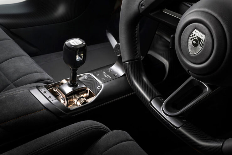
    References to the [original] M6 GT abound, from the vertical headlights and Kamm tail to the position and shape of every duct, rendered with a simplicity that we used to see in supercars of the ’90s and 2000s but see less today. And inside, McLaren has transformed the shifter into an art piece itself, its metallic linkages attracting natural light from every angle in a sea of black and carbon fiber. They’re clearly proud of it, and they suitably want it to be the focal point in here.

    — Adam Ismail, The Drive
    Just look at that — nothing less than a celebration.

    “McLaren bills this as a ‘new type’ of supercar ‘beyond the core portfolio,’” the article continues. “Based on that, it sounds like manual transmissions aren’t about to become a standard feature of the brand; that, beyond the delineation of ‘Sports, Super, and Ultimate’ models of the past, McLaren is diversifying into more exclusive offerings that, at least in this particular case, pursue a more analog experience counter to the regular lineup.”

    Yeah. Do want. But there’s a wrinkle.

    GMA’s new . . . McLaren F1

    The McLaren F1 was designed by an automotive racing legend named Gordon Murray. He subsequently started GMA, and brought out the amazing T.50, among others. Last year, his Special Vehicles department issued a track-only reimagining of the F1 — and has followed up with a road version, called the S1:

    Since it’s less of a concept than the McLaren, some details are available. It features a 4.2-liter, naturally-aspirated Cosworth V12 making 680 horsepower with a rev limit of 12,100 RPM. It exclusively sports a six-speed manual transmission. It is multi-millions of dollars. And it, too, is sold out. The Autopian has more.

    Special bonus #6: From the combining-cars-and-print-department (“not a stretch,” he insisted), Road & Track has a new ampersand:

    The before-and-after:

    Via the subscription-only Brand New.
    Porsche adds another 911 manual

    If you’ve not heard, one of the brands not doing too well at the moment is Porsche. They went hard into electrification, suffered hard from being part of parent company Volkswagen’s arrogantly inept approach,3Just one example: see Scout. It’s actually sad. and subsequently run afoul of social media’s society’s hard turn against EVs. It has cost them dearly.

    Despite insisting that they were going to do it all along, they’re scrambling to get back to what customers actually want. This month, they introduced a third variant of the venerable 911 available with a stick shift.

    It’s not purple, it’s aubergine. (Love the pinstripes.)

    Like the others, it features a wooden shift knob, a throwback to the Carrera GT V10 masterpiece from the heady days of the early naughties. Like the others, it puts the cupholder immediately behind the shifter, guaranteeing spills. (Or thirst.) Like the others, it costs twice what it did six years ago — although it’s still “only” a tenth of either of the above.

    Like the others, I’d be happy to receive one as a gift.

    Unlike the others, it’s US-only, and it’s available this fall. Details, if you’re interested, are available at The Drive or The Autopian.

    Special bonus #7: Jaguar has released the first image — a rendering, actually, but still — of the new Type 01’s interior:

    As it turns out, they’re not backing down from their vision for a completely-new Jaguar, and I respect them for it. The electric four-door also made its US debut at Monterey, albeit in disguise, and should be out sometime next year. More details and pics at Wallpaper*.

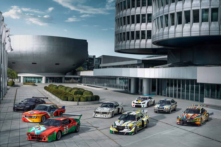
    Special bonus #8: To celebrate the 50th anniversary of BMW’s Art Cars, they’ve gathered them all together in Germany.

    A sampling of cars under the iconic four-cylinder BMW HQ.

    Lots of press has ensued, but in case you’re not familiar, they’re exactly what it sounds like they should be — but so very much more. Decorated by artists from Roy Lichtenstein to Andy Warhol, all twenty are unique, daring, and different. Some were even raced before becoming priceless.

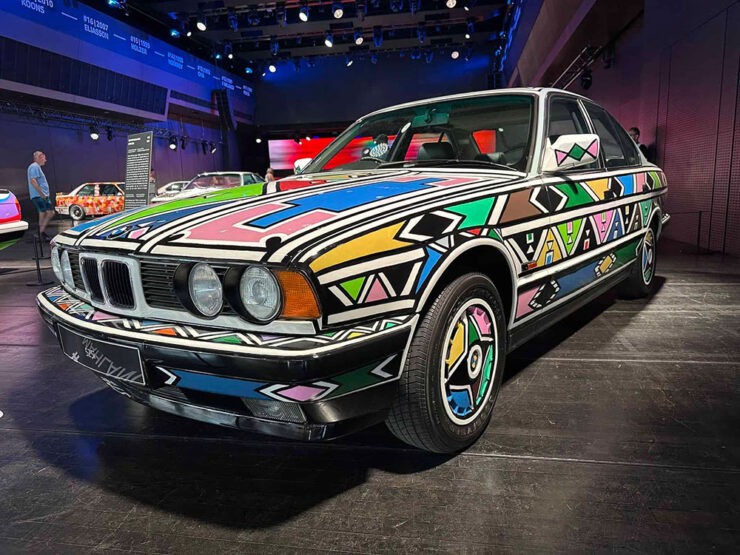
    #12, by Esther Mahlangu, on display at BMW Welt Munich.

    The above is a South African item, a country that, it turns out, has a special history for BMW. Meanwhile, get the history of all 20 cars at BMW Blog.

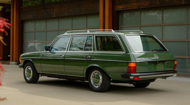
    Special bonus #9: From the not-a-joke department comes this beautiful — and beautifully green — 1979 Mercedes wagon with 6,088 miles. Long buried by an earthquake (!), has been unearthed and restored:

    The very definition of “classic.” The Autopian has the story.

    August’s photography round-up
    Sam Nicklin / Alessi

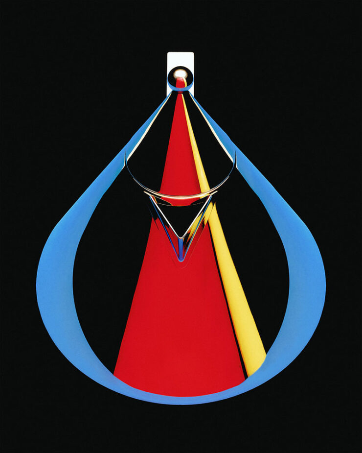
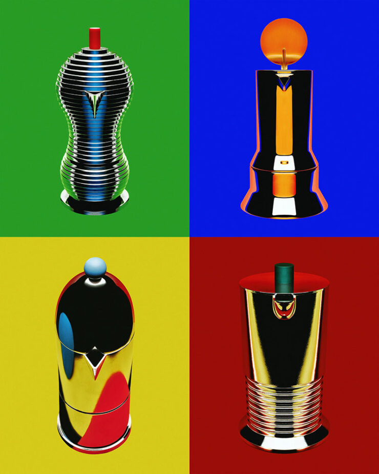
    Alessi, a “beacon of well-designed homeware,” is celebrated by photographer Sam Nicklin in a new series called Chrome & Colour:

    Photograph by Sam Nicklin.

    “My main goal was to define the silhouette of each object through colour in the reflections, using negative space and keeping highlights to a minimum to really make them pop,” he tells It’s Nice That. To give the images the feel of the 1970s and 80s, “Sam went truly analogue, using the time-consuming process of holding sheets of coloured paper cut to different shapes and moving them around the objects until the reflection was exactly as he envisaged.”

    Photographs by Sam Nicklin.

    See more, including behind-the-shots photographs.

    Pure Street Photography Awards 2026

    This is Colossal caught my attention with these.

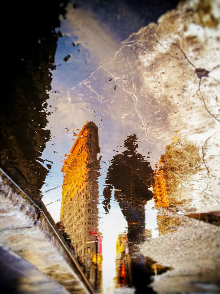
    Finalist, open category. Photograph by Pierra Hauser.

    A category that’s not usually at the Fore(word), but excellence won out.

    250 trailblazing women photographers

    In the introduction of a new book titled Great Women Photographers, Fiona Rogers writes, “If ‘greatness’ has long been defined by visibility and remembrance, then the continued documentation and celebration of women’s photographic practice is not only relevant but essential.”

    — Jackie Andres, This is Colossal
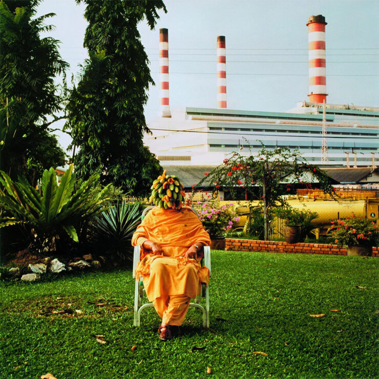
    Photograph by Simryn Gill.

    Phaidon’s stuff is always great. See more.

    Sixteen years of not-so-merry land

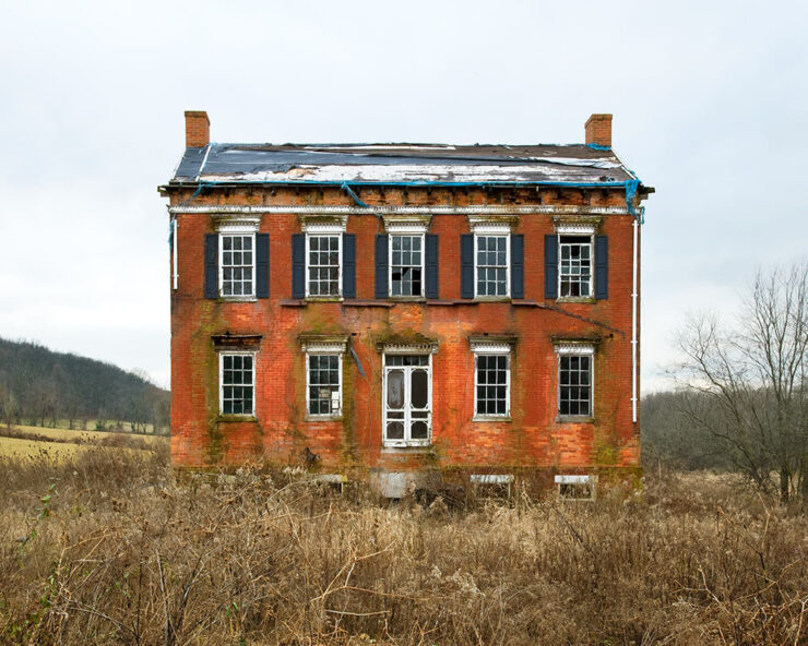
    From crumbling row houses in the inner city to abandoned houses on the Eastern Shore to temporary homeless camps, “greater” Baltimore demonstrates decay . . . and courage:

    Carroll County, Maryland. Photograph by Ben Marcin.

    Photographer Ben Marcin documents The Holdouts.

    One of 1.2 million

    “Astronaut Don Pettit takes photos so good that people have a hard time believing they are real,” PetaPixel writes. Case in point:

    Photograph by Don Petit, NASA.

    Internet skeptics tried to call him out. But he’d brought notes.

    Eclipse #1: 84 seconds

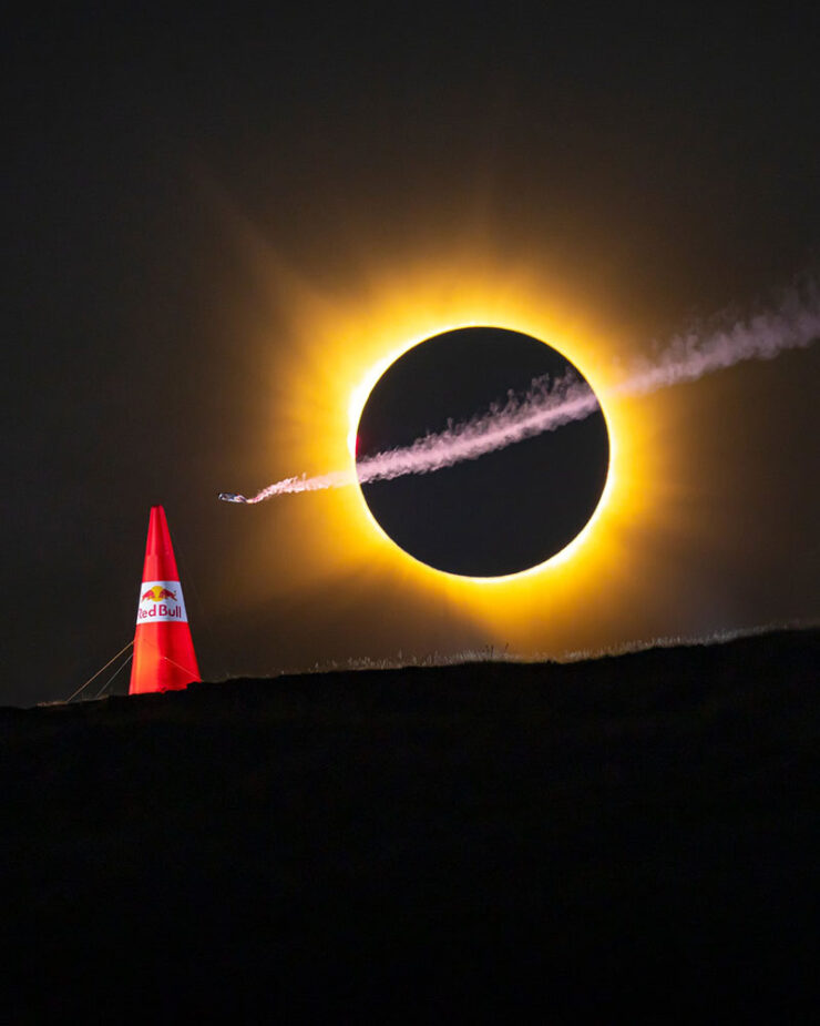
    A wingsuit and a total eclipse fly into a frame together:

    Photograph by Noah Wetzel for Red Bull.

    Genius marketing, nine months in the making. (Longer, arguably, in the case of the eclipse.)

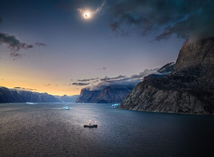
    Eclipse #2: the fijord
    Photograph by Marc Muench.

    Right place, right time — stunning results, part one.

    Eclipse #3: the sunset
    Photograph by Andrew McCarthy.

    Right place, right time — stunning results, part two.

    Photograph by Andrew McCarthy.

    Special bonus #10: Jason Kottke is moving house, and when he has a moment, posting en-masse. It’s an “old-school, stream-of-consciousness” sort of thing — which, to emphasize, is still awesome. Among the three dozen or so nuggets of greatness:

    “Half Dome, Apple Orchard, Yosemite,” trees with snow on branches, April 1933. Photograph by Ansel Adams.

    More than 200 Ansel Adams photos, mostly of National Parks, that are free to view & download. Via Open Culture, one of the gems of the open web.

    — Jason Kottke, “Empting out browser tabs“

    Anything but empty, I’d argue. Enjoy the rest of your summer, folks!

    • 1
      Soap box: getting a website, whose contents you own, is so painfully simple that I tend to discount those that rely on other platforms to publish what might otherwise be interesting material/thoughts/content. And in this case, the author is a Times journalist, who should definitely know better. ↩︎
    • 2
      It’s been pointed out that blogs are social media, too (the original social media, in fact) — something I don’t necessarily disagree with. From my perspective, writing that is owned, put out there due to belief, and read by folks who trust your opinion, is completely distinct from having your potentially-anonymous “take” promoted to strangers by an algorithmic mechanism that profits from conflict — or, at least, provocation. In my opinion, it’s the latter that defines “social media.” ↩︎
    • 3
      Just one example: see Scout. It’s actually sad. ↩︎
  • Beautifully Briefed 23.6: Welcome to Summer

    Beautifully Briefed 23.6: Welcome to Summer

    This time, several items related to books and bookstores; two more — possibly the last two — from the automotive logo category; and PRINT Magazine’s 2023 roundup of great design.

    Book Four-For
    AI book covers? Here, now.

    Creative Bloq, which I wasn’t familiar with, has a post up that’s only here because it’s the first I’ve seen of what is sure to be a trend: AI imagery on a book cover.

    Image: Bloomsbury UK (Also: Where’s the body to go with the head?)

    “Causing controversy,” they say, in that…:

    [F]or a while now, with concerns over copyright and ethics plaguing text-to-image generators. Perhaps the most existential worry of all is the idea that AI could put human artists out of work – and while many still find the idea fanciful, we’re already seeing examples of AI-generated art being used commercially.

    — Daniel Piper, Creative Bloq

    The article itself has a hint of click-bait about it, what with Twitter users spotting a NY Times bestseller but complaining about the UK version of the cover design . . . but the larger question of AI coming for the book designers everywhere is valid.

    Then again, AI imagery has the potential to reshape much of the creative landscape. Let’s hope — hope! — that it’s deployed ethically.

    B&N’s Market Repositioning
    Image: NYTimes (modified)

    BookRiot asks whether Barnes & Noble’s new presentation as “a local bookstore” — something that’s part of the community in a way that Amazon can never be —is genuine, let alone successful. (We have a B&N here in Macon, which I visit infrequently, and which doesn’t feel “local.”)

    Background: The BookRiot article (and the image) above ultimately stem, I believe, from a NY Times option piece from 2018.

    Temples of Books

    As regular readers know, I’m a huge fan of combining books and photography. Naturally, great photographs of great libraries strike just the right chord:

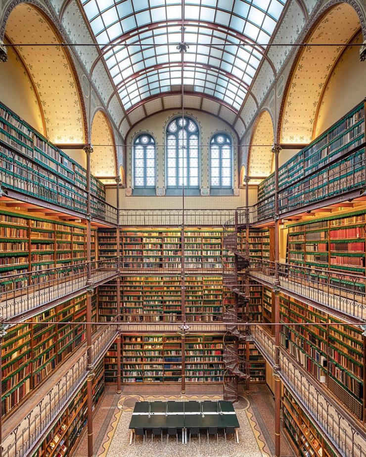
    Cuypersbibliotheek, Amsterdam, Netherlands

    As This is Colossal puts it, “Written by Marianne Julia Strauss, Temples of Books: Magnificent Libraries Around the World celebrates the stunning architecture and quietude associated with wandering the stacks.”

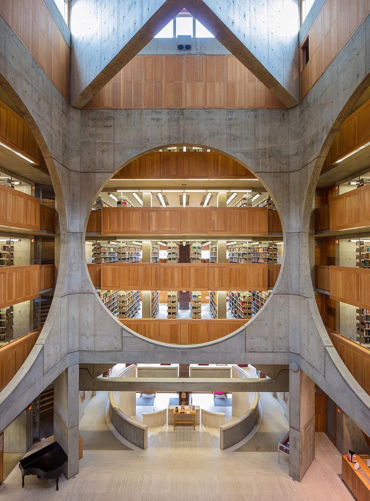
    Phillips Exeter Academy Library, Exeter, New Hampshire

    Positioning these spaces as intellectual havens, Temples of Books highlights their wide array of offerings, including botanic gardens, archival repositories, and of course, room to read. “As an institution that can curate knowledge, scrutinize the status quo, and encourage education, the library is more important today than ever,” a statement says. “This responsibility is only growing as the freedom to publish on all manner of channels increases.”

    — Grace Ebert, This is Colossal

    Instant wishlist item!

    Take Action for Libraries
    Image: everylibrary.org

    Simple brilliance: a handy step-by-step guide on what to do if you don’t like a book at your local library.

    Carmaker Logo Updates: Porsche and JLR
    Jaguar Land Rover > JLR
    No, that’s really it.

    Formerly Jaguar Land Rover, but generally known in the industry as JLR, the British company1Technically, it’s an Indian company, as JLR is a subsidiary of the TATA conglomerate. decided to have a FedEx moment and rebranded. Alas, Paul Rand was unavailable, so there’s no brilliance in the execution. (We’ll absolutely leave whether walking away from Land Rover as a brand is a smart move for another, longer discussion.) Motor1 has the details.

    Porsche > Almost all other mainstream car brands

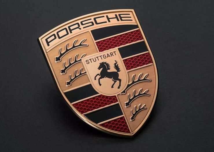
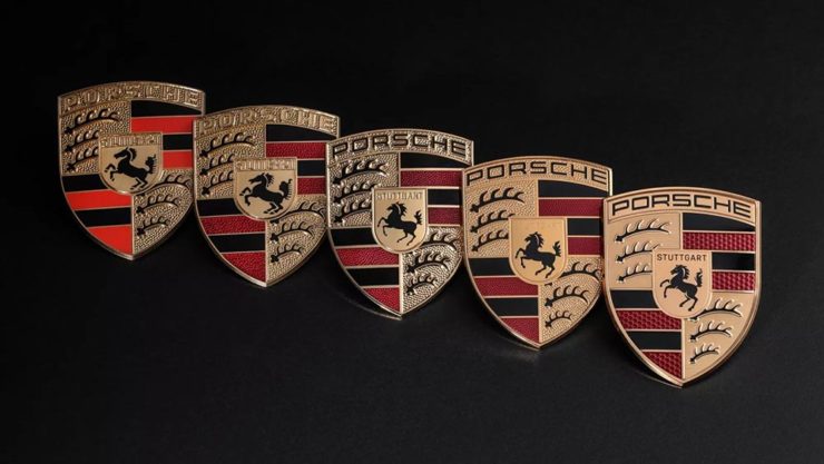
    There’s a new Porsche logo!

    The new 2023 version of the Porsche logo. (Image: Porsche)

    That’s right: it’s a very subtle change. But it’s a significant one, perhaps because it’s only the fifth in the company’s 75-year history:

    All five Porsche badges. (Image: Porsche)

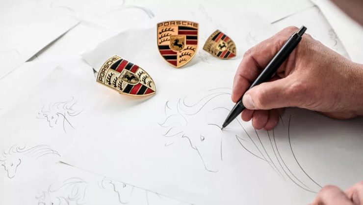
    The biggest changes are the backgrounds and the prancing horse in the middle, which is completely redrawn. (And, yes, has more than a passing — heh — resemblance to Ferrari’s.)

    Not-at-all-staged photograph by Porsche.

    Wallpaper* has the best coverage I’ve seen.

    Bonus: Motor1 has a roundup of every recent (2015+) automotive change in branding. Of course, I’ve covered most of ’em here, too.

    Update: Nissan, already on the updated list above, might be up to something.

    PRINT‘s Best of 2023

    PRINT reminds us that not everything is digital these days — so much of the work still goes on paper or packaging — in their 2023 roundup of great stuff:

    The 2023 PRINT Awards celebrated outstanding design in every shape and form, from the delicate texture and exquisite form of print to digital design that married technical skill with precise craftsmanship.

    — PRINT Magazine

    The best in show is a brilliant environmental design, the annual reports category is oddly satisfying (I didn’t know that Land O’ Lakes is a cooperative that owns Purina, for instance), the editorial category contains brilliance, and many, many more worthy of a design lover’s attention.

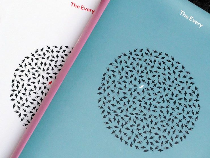
    Sadly, their book design category is a bust. I like “The Every,” but pretty much any of my Best of 2022 picks run circles around it (and the other two choices):

    The Every as photographed by PRINT.

    But there are gems. I really like Bakemono, for instance, a winner in the fonts category and the best monospaced font I’ve seen:

    Italian foundry Zetafonts brings us Bake Mono.

    It’s a long article (they call it a 74-minute read!), but when you have a moment, grab a drink and an iPad and enjoy — hopefully as much as I did.

    And that’s it! Settle into summer, and stay tuned for more soon.