Tag: photography

  • My Favorite Book Covers of 2023

    My Favorite Book Covers of 2023

    2023 seemed to go by with greater speed than normal, meaning the process of accumulating my favorite book covers occurred more hastily than I would have sometimes preferred — after all, perusing the best of the new releases is tremendously enjoyable. It’s just that, due to this year’s hefty undertakings, I was not able to make as much time as I’d have liked.

    So I was surprised when, in early January, the tally of candidates in the favorites folder was over two hundred items. A bounty of goodness.

    Narrowing those down to the list below was exceptionally difficult. I tried to get to last year’s limit of 70 titles, but failed; I managed to narrow it to 80, then 78, but just couldn’t winnow any further.

    Pull up a chair. This one’s gonna take a minute.

    Please remember that these are my favorites — others might say “best,” but I’ve been in this business long enough to know that there’s always another title you haven’t seen or read about, and I don’t want to disrespect any of the talented book designers not on this list. I’ve tried to include design credit where I could — special thanks to the folks who answered emails with that information — and wish to stress that any mistakes in the list below are mine.

    Note: If you’re on Foreword’s main page, please click on the post title, above, to view this list. You’ll get larger covers for your viewing pleasure.

    My Favorite Book Covers of 2023 (three-way tie)
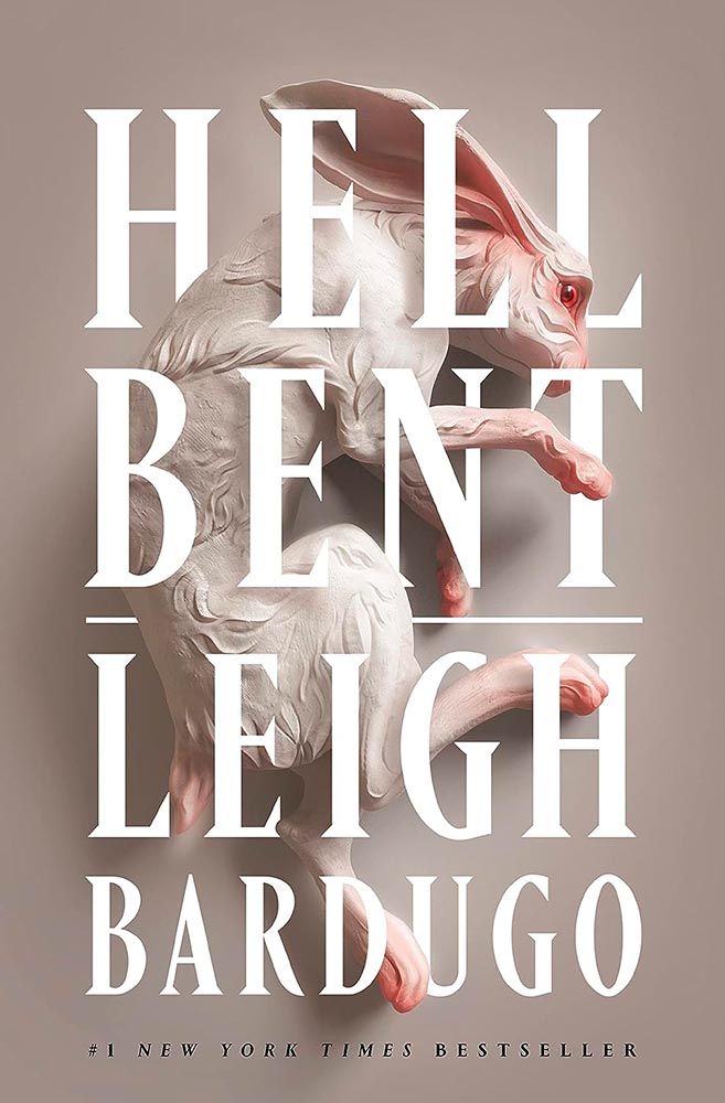
    Design by Keith Hayes with art by Sasha Vinogradova.

    “Find a gateway to the underworld. Steal a soul out of hell. A simple plan,” the Amazon description starts, and it’s a sequel of magic, secret societies, and whatever else.

    But never mind all that. This cover grabbed my attention in a way few do, with its combination of art, shadow, and type, all carved to perfection.
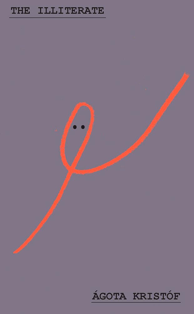
    Design by Oliver Munday.

    I dare say that only Oliver Munday could have done this expression of so much with so little. Enormously appropriate, then, for a memoir only 64 pages long.
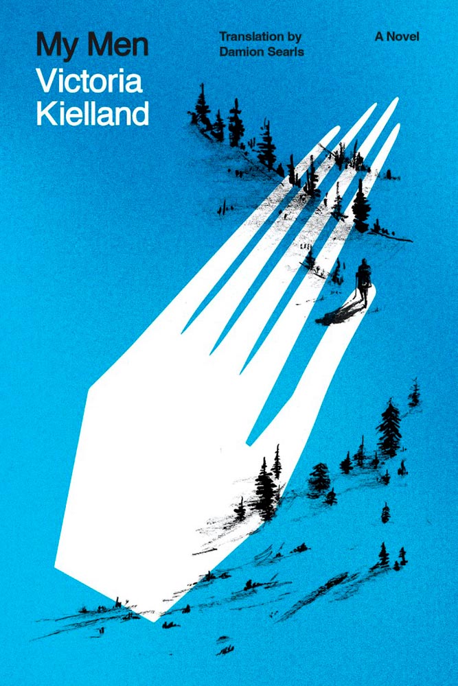
    Design by Adriana Tonello.

    From The Illiterate‘s Hungarian refugee in Switzerland we move to a Norwegian immigrant seeking freedom in America. Alas, she turns out to be our first (known) serial killer — giving this hand a quiet, eerie yet somehow classic quality that quietly compels like few others. Outstanding.

    Other 2023 Favorites, in alphabetical order:
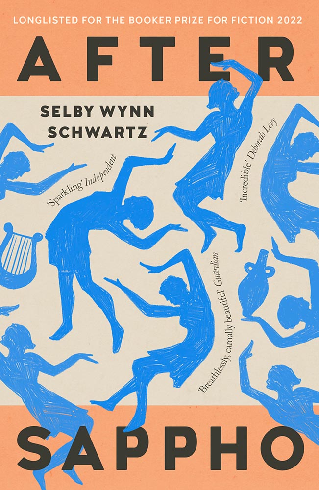
    Design by Holly Ovenden.

    Impressive sense of movement from these figures, whose interplay with the title type combines with quotes-on-a-path (something of a trend this year) and great color choices to provide something memorable.
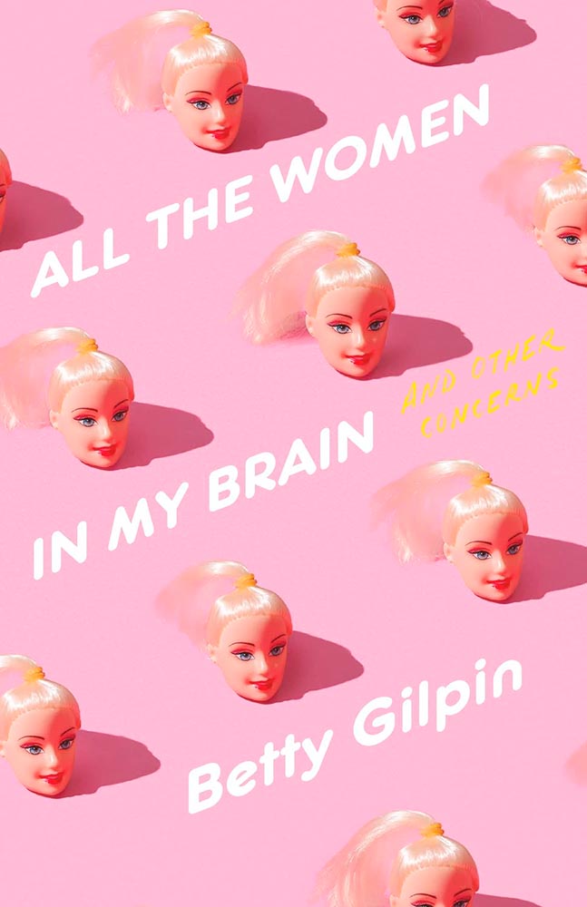
    Design by Keith Hayes.

    Such a simple concept. Such superlative results. No other concerns.
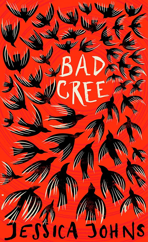
    Design by Holly Ovenden.

    There is another version of this on one of the “best of” lists, but I much prefer this one, with the circling birds and hand-done lettering. A two-color triumph.
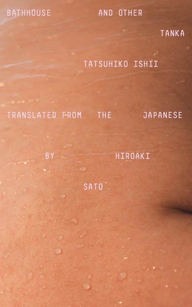
    Design by Oliver Munday.

    Oooollllliiiiivvvvvveerr!

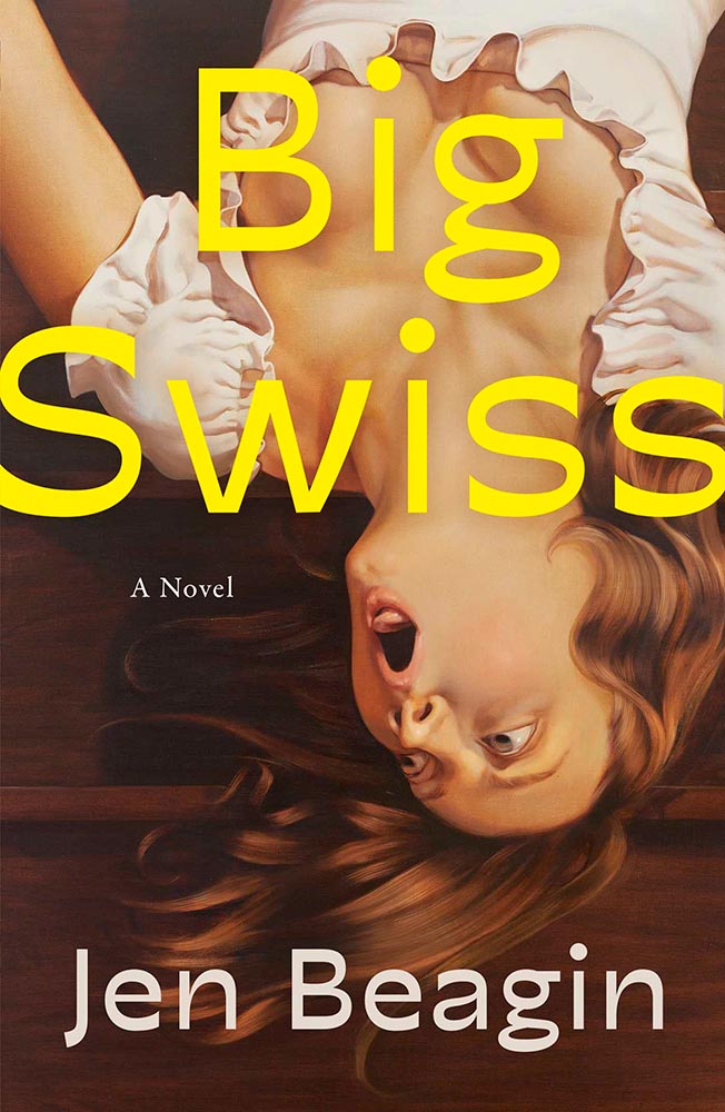
    Design for the US version by Anna Weyant.

    One of those examples where the art just shouts off the shelf, although the type treatment works exceptionally well, too. Better still, it’s one of the rare US versions that bests its UK treatment:
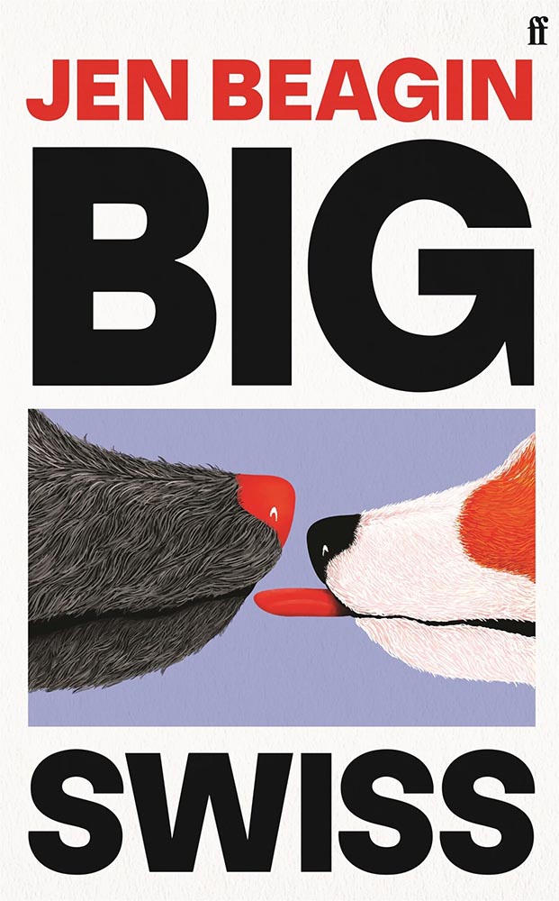
    Design for the UK version by Kishan Rajani.

    Not at all bad — in several “best of” lists, in fact. Just not mine.
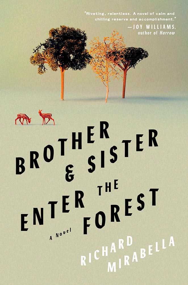
    Design by Sarah Wood.

    I’m not sure whether the items on the page are models, made (or found) objects, or some extremely well-done Photoshop work, but ultimately it’s combination of the simple graphics and brilliant typographic treatment that earned this title its spot. Fantastic.
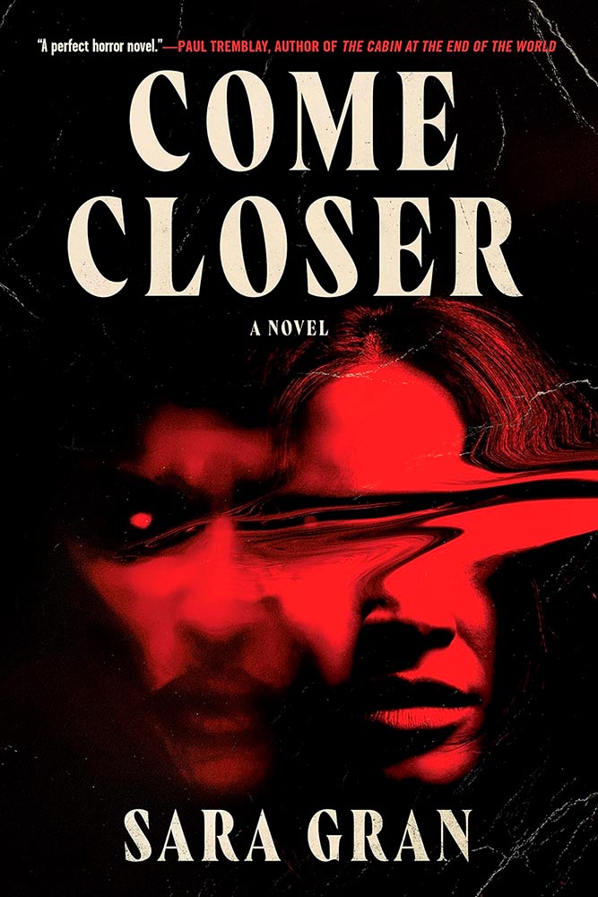
    Design by Caroline Johnson.

    The ’70s are hot right now, but this is 2023, aged to perfection. Very nearly made the “best of,” not just the “best of the rest.” Horrifically good.
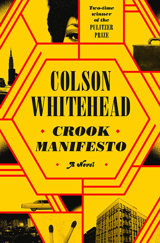
    Design by Oliver Munday.

    Type, color, pattern, brilliance. Must be a Munday.
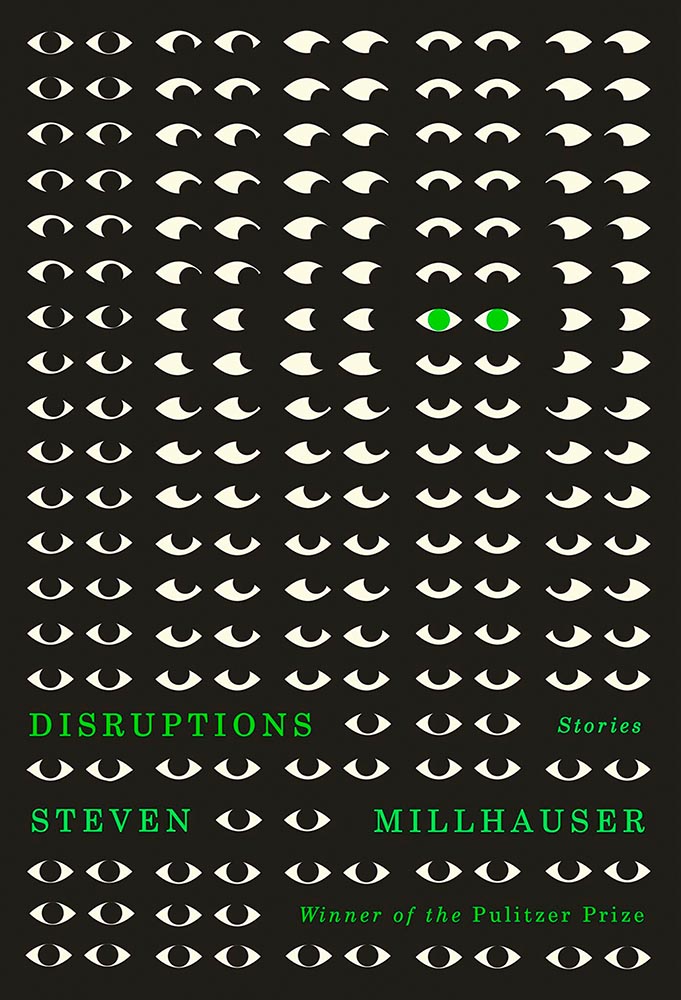
    Design by Dylan C. Lathrop.

    Eyes are a frequent guest on book covers. Rarely so many, though, and rarely in two-color. Winner of more than a Pulitzer.
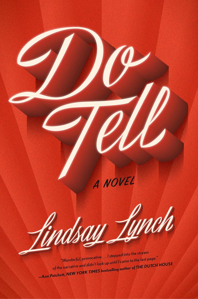
    Design by Emily Mahon, lettering by Martina Flor.

    Edie O’Dare does tell, it turns out. “Cinematic” might be a cliché, but….
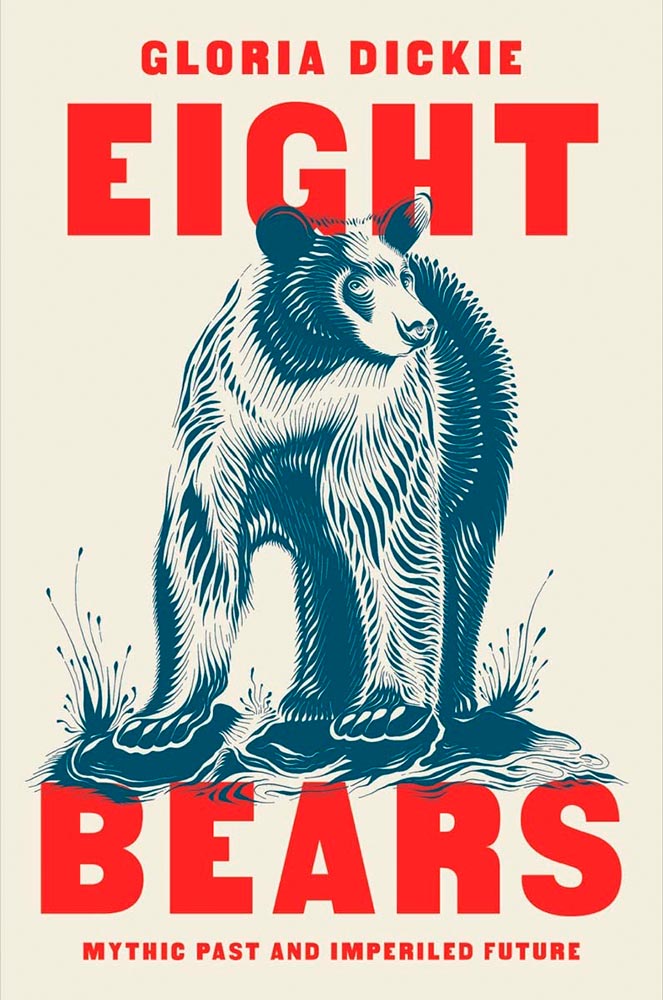
    Design by Pete Garceau.

    I’m a sucker for a great woodcut-style illustration. Great type treatment propels it into a standout book cover.
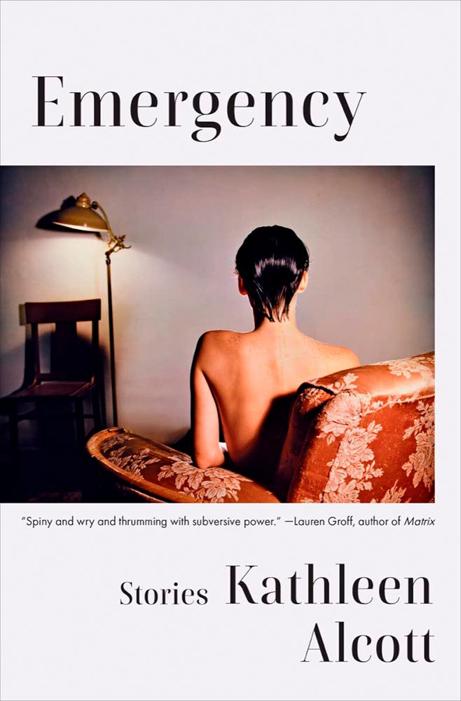
    Design by Ingsu Liu.

    There’s something decidedly non-emergency about this, yet once you understand, it works perfectly: simple, yet so very not.
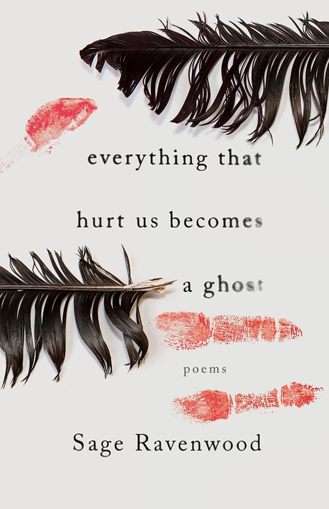
    Design by Eric C. Wilder.

    This book of Native poetry ranges from Missing and Murdered Indigenous Women (MMIW) to reverence to the natural world to “the machinations of colonialism,” a cover assignment that could border on impossible. Yet, here . . . absolutely brilliant. Expressive and so much more, including possibly my favorite type treatment of all on this list.

    Design by Arsh Raziuddin.

    Danger: UXB. (The pink is an inspired choice, too.)

    Design by Tom Etherington.

    Fear knows no bounds, only stylish hats. (On the LitHub list, someone said it has “serious 2024 vibes,” which I’m concerned may turn out to have some truth to it.)

    Screen print by Kate Gibb, lettering by Jodi Hunt, and photograph by Adaeze Okaro.

    Rarely have photo and type worked so well together. Fantastically well done, with plenty of room for the soon-to-be-added kudos, quotes, and awards.
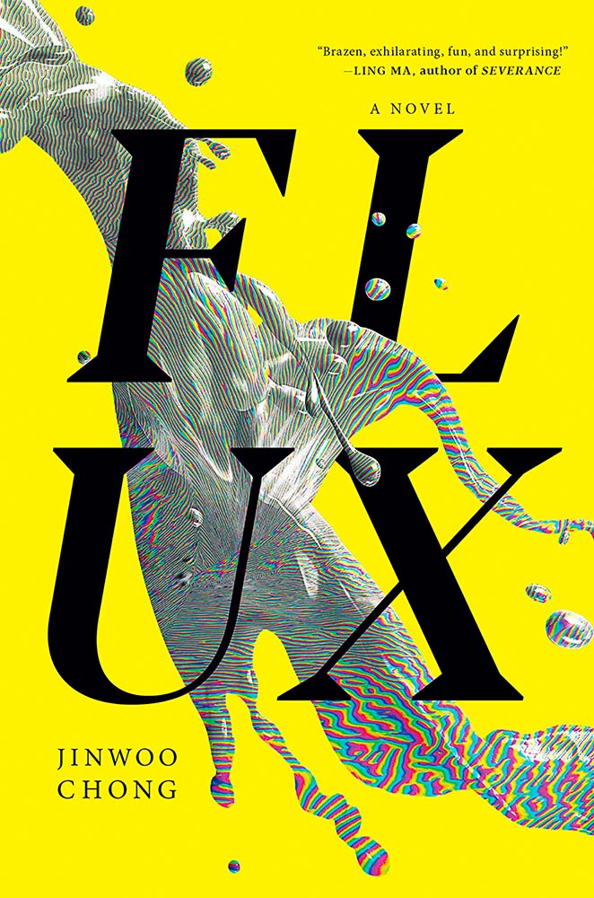
    Design by Beste Miray Doğan.

    Who splits a four-letter word onto two lines? Someone after great results, as it turns out — with bonus points for the pattern and color in the “splash.” Nice.
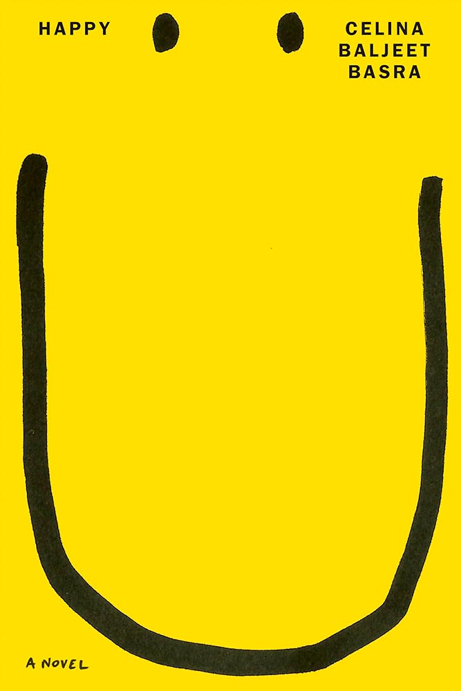
    Design by Alex Merto.

    Smile-inducing. Sometimes simple is best.
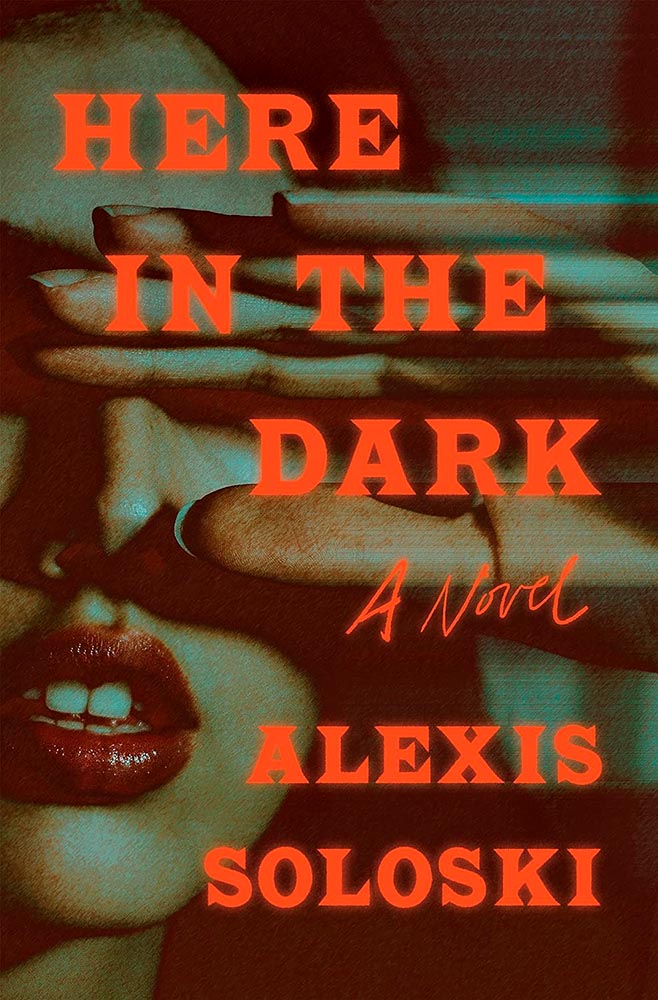
    Design by Sara Wood.

    Junior theatre critic gets senior designer’s knockout hit. The audience goes wild.
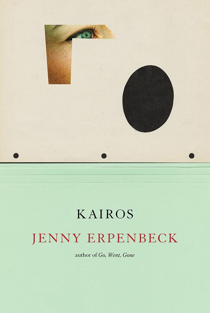
    Design by John Gall.

    I’m at a bit of a loss to describe why I like this so much, except that every time I look at it, I like it even more.
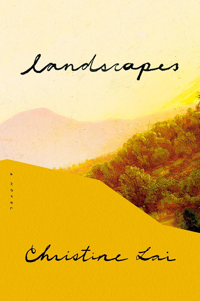
    Design by Kate Sinclair.

    Perfect execution of a simple concept, from colors to art to type.
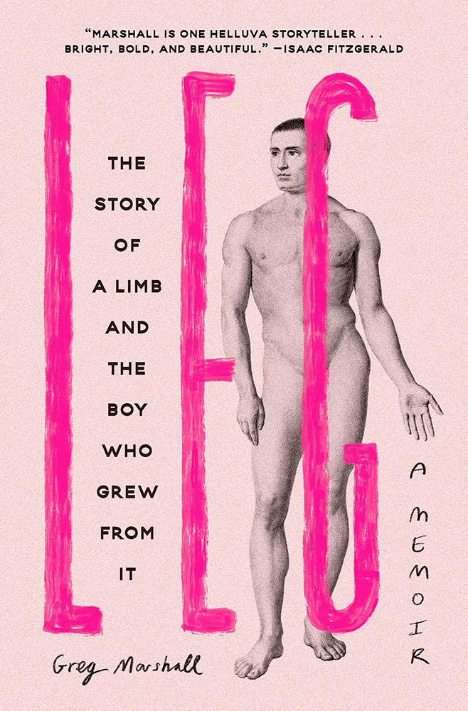
    Design by Devin Grosz.

    Wins the “best-placed title” award, among so many others.
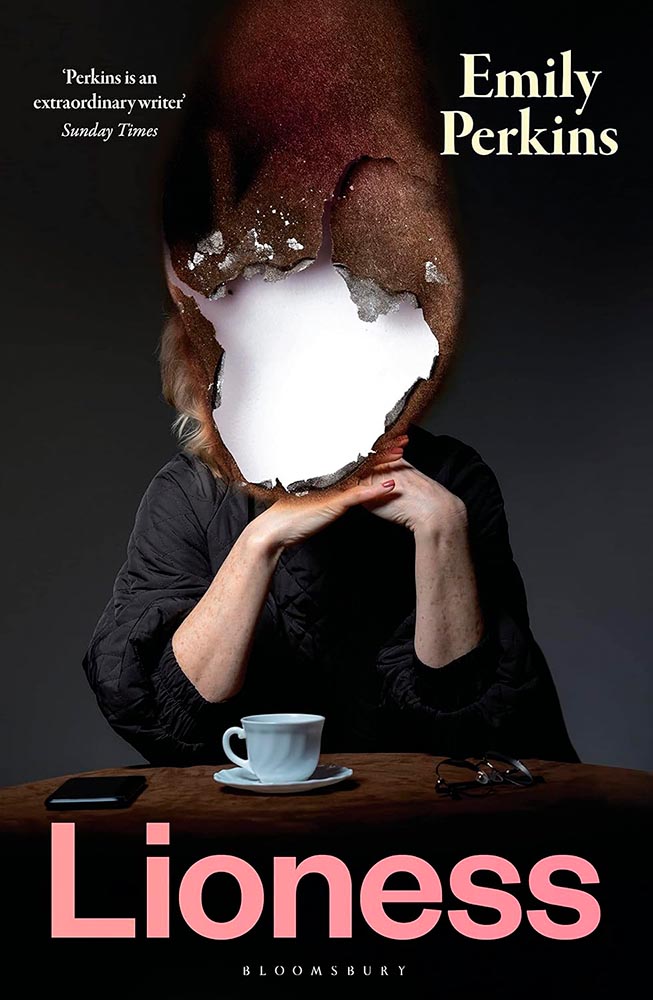
    Design by Greg Heinimann.

    A reminder that something done often can still be done with originality — and incredibly well.

    Design by Emily Mahon.

    The collage-as-book-cover is another (perhaps) overused item, but when in the hands of Emily Mahon, this one looks you in the eye and won’t let go.
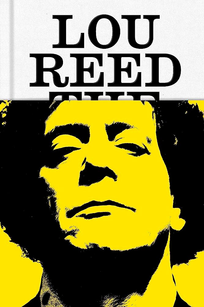
    Design by No Ideas.

    The jacket that covers The King of New York with . . . Lou Reed. “Well played” seems like an undersell.
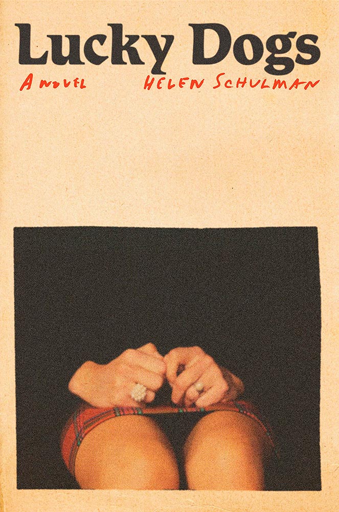
    Design by Janet Hansen.

    From the textured paper to the type choices, this cover’s great. But with that photo choice, it’s vaulted into “best” category.
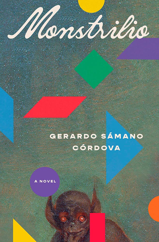
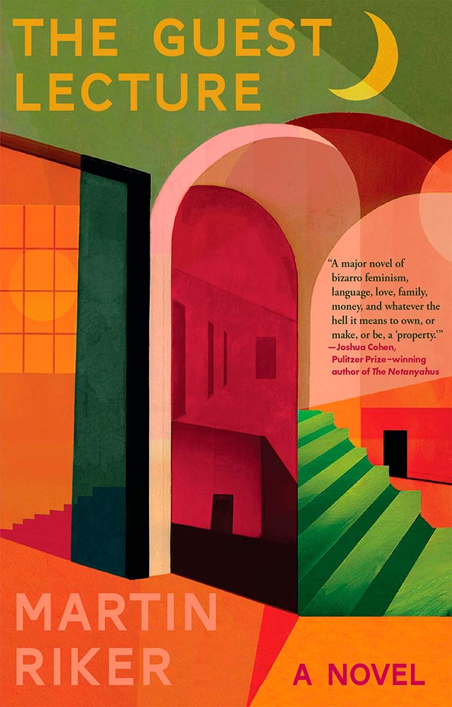
    Design by Alex Merto.

    The combination of geometric shapes and unexpected typography mean this little guy will never get painted into a corner.
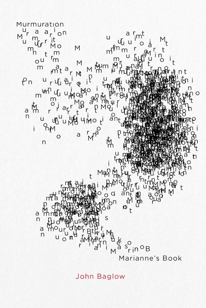
    Design by David Drummond.

    “Type here,” someone said.

    Design by Oliver Munday.

    Type-as-a-border is a trend — one I’m surprised to see on a Munday — that’s actually a great counter to the purposely irreverent illustration. I dig it.
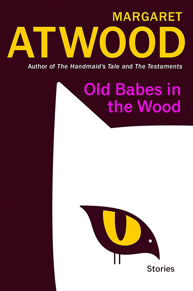
    Bird-as-cat’s-eye. On a Margaret Atwood. ’Nuff said.

    Design by Luke Bird.

    Brilliantly, uh, substantive: a lesson in how-to.
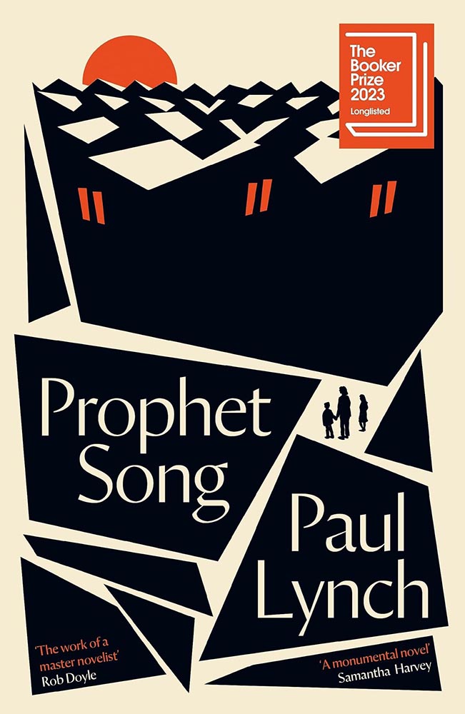
    Design by Jack Smyth.

    The rooftops alone make this, but avoiding the stereotypical Irish colors is a huge bonus, too. (This title went on to win the 2023 Booker Prize, by the way.)
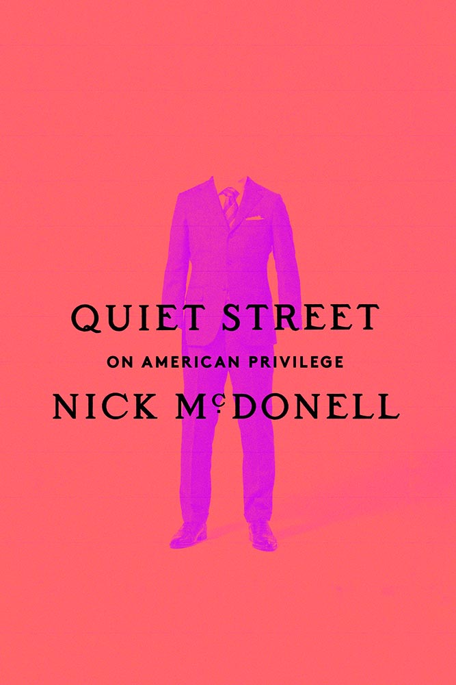
    Design by Janet Hansen.

    A triumph of the less-is-more approach, starring a headless human and superlative typography. Fantastic.
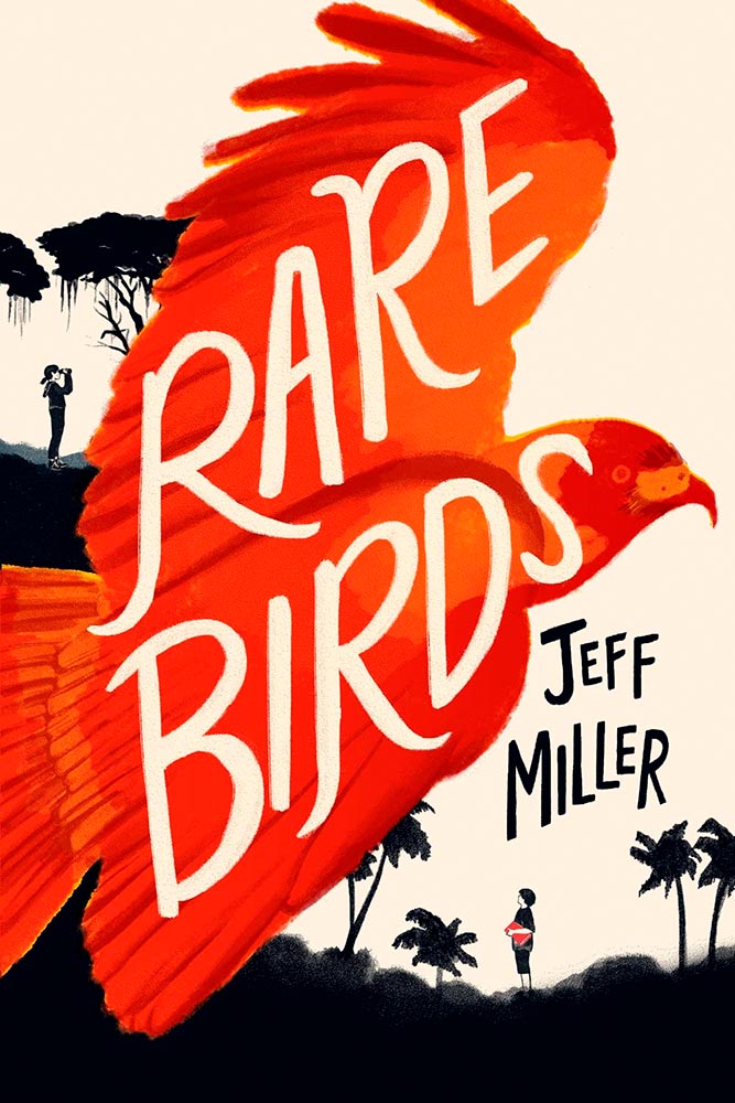
    Design by Kimberly Glyder.

    It’s rare to see children’s literature graced with such a great cover — this one literally flies off the shelf to grab your attention. A rare bird, indeed.
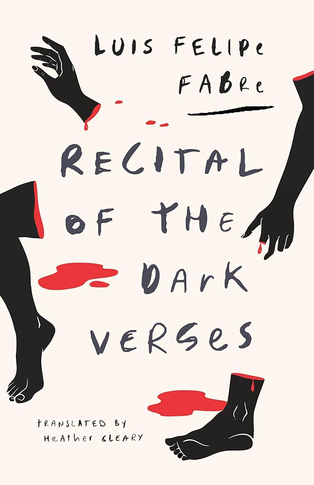
    Design by Alban Fischer.

    St. John called: this cover is fabulous, from evocative body parts to hand-lettering to die for. Awesome.
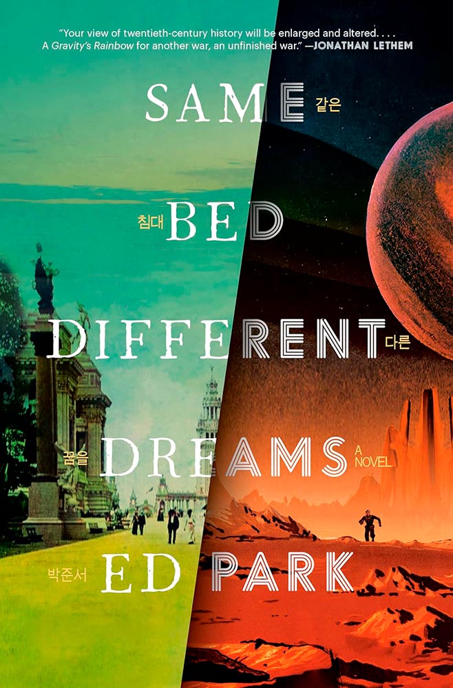
    Design by Will Staehle.

    A novel on the Korean Provisional Government — and so very much more. The split treatment, with both halves running at 11, get fantastic typography and the Korean characters (in gold, obvious in person) are a great touch.

    Bonus: Read the author’s reaction at LitHub.
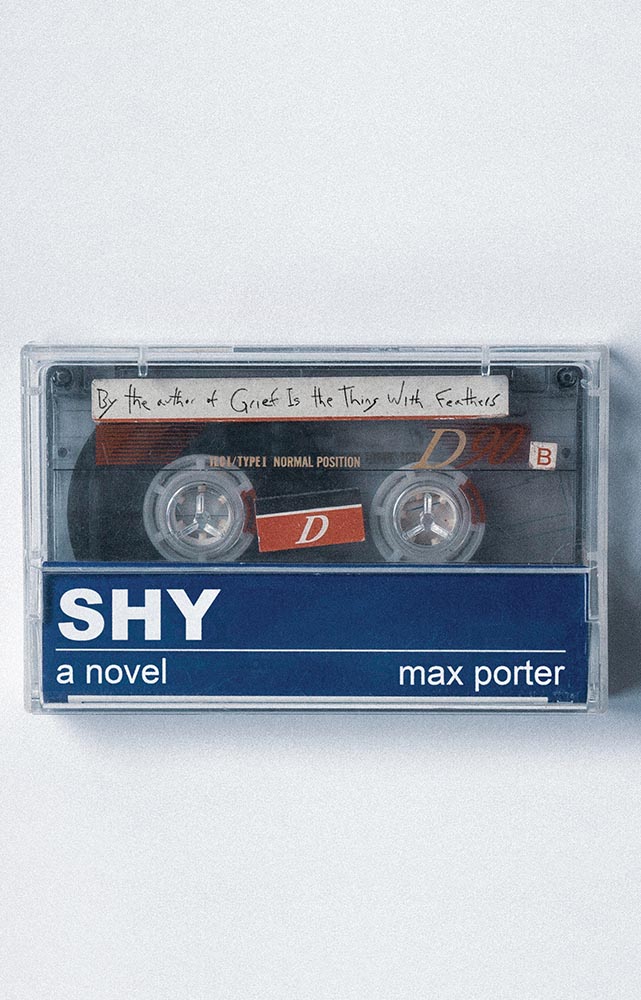
    Design of the US version by Carlos Esparza.

    Another where the US version shines, especially as cassettes are coming back into fashion. (Special points for the subtitle-as-label.) A B-side no longer.
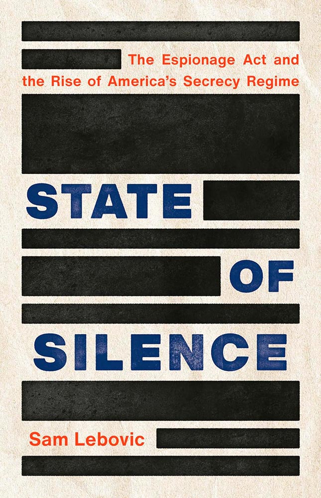
    Design by Emmily O’Connor.

    Brilliant comment redacted.

    Design by Will Staehle.

    Mallory Viridian is an amateur detective on an extraterrestrial (and sentient!) space station — perfectly sold with this line-art-only cover. Fantastic.
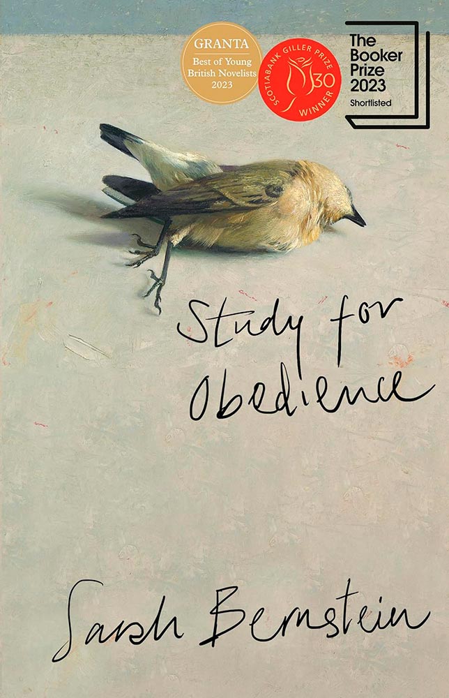
    Design by Anna Green.

    Dead birds wouldn’t ordinarily be my go-to for cover excellence. But this one, with its painterly quality and hand lettering, perfectly hints at the haunting, slightly bizarre adventure within. Perhaps I should study more; as many will testify, it’s certainly not an obedience thing. (Read the Booker Prize listing.)
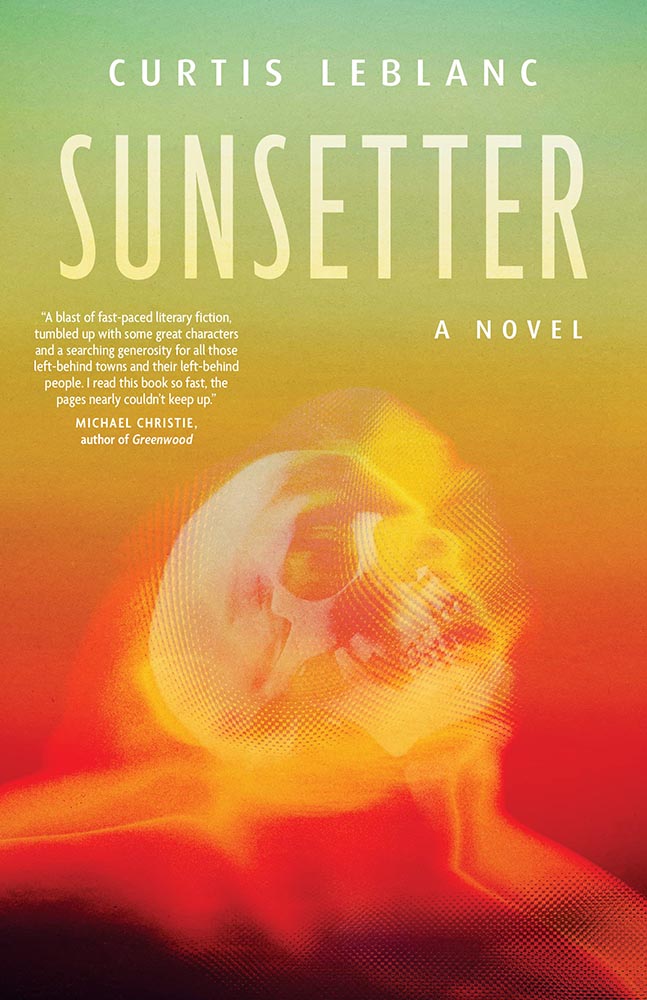
    Design by Caroline Suzuki.

    One of those instances where the graphic just sells the cover. Brilliant.
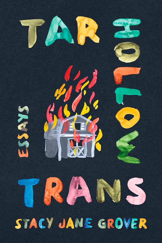
    Design by Jaya Miceli.

    The continuing stigmatization of the LGBTQ+ population in the United States is so perfectly summarized here. (I’m curious how this cover was done, too: white paint, then watercolored? Gouache? Either way, the colors serve the overall so very well.)
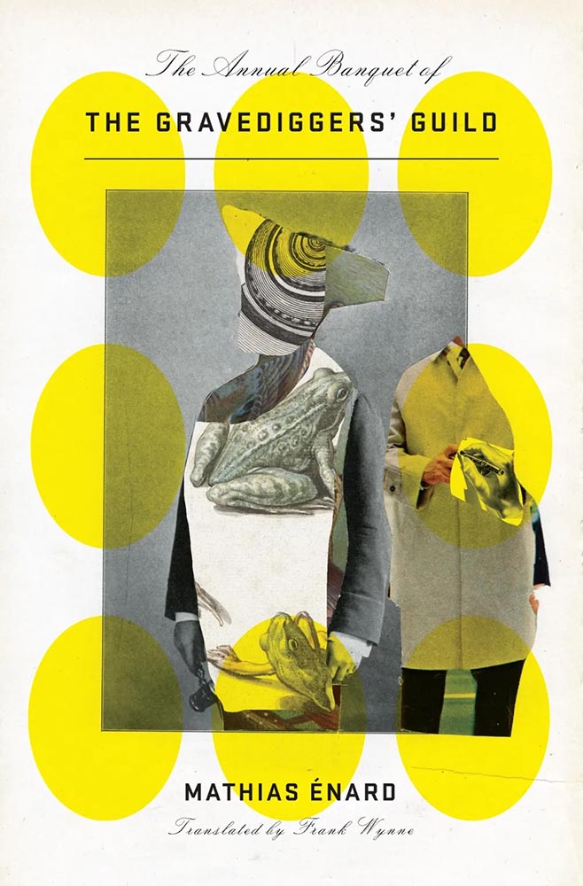
    Design by John Gall.

    This collage jumps through my psyche: sophisticated, off-kilter, and yet, somehow, completely right.
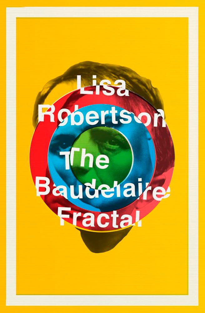
    Design by Jamie Keenan.

    I had to look up Charles Baudelaire, I have to admit — but didn’t need to know in order to get the disjointed, colorful appeal of this cover.
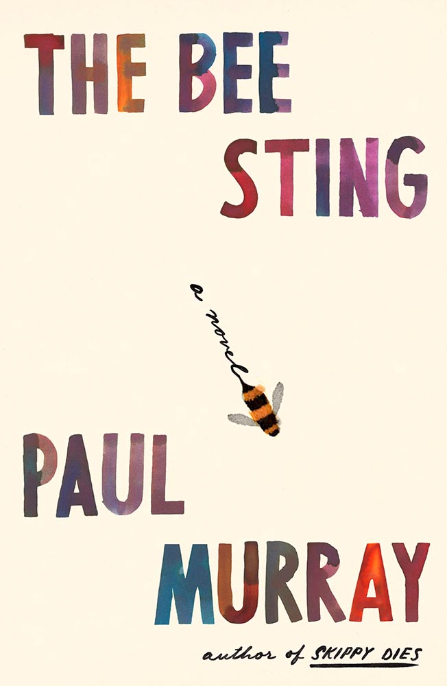
    Design by Na Kim.

    Leaving a trail, all right. (Also: the text colors.) This version is mercifully short of Booker notifications, too — sometimes, I wish all the callouts and clubs would just go away.
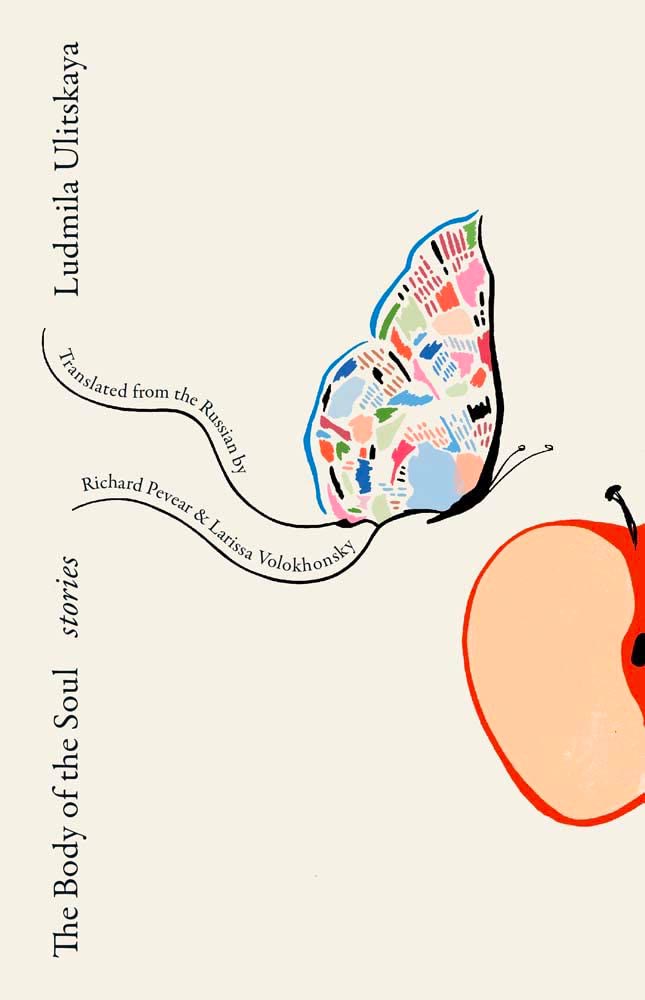
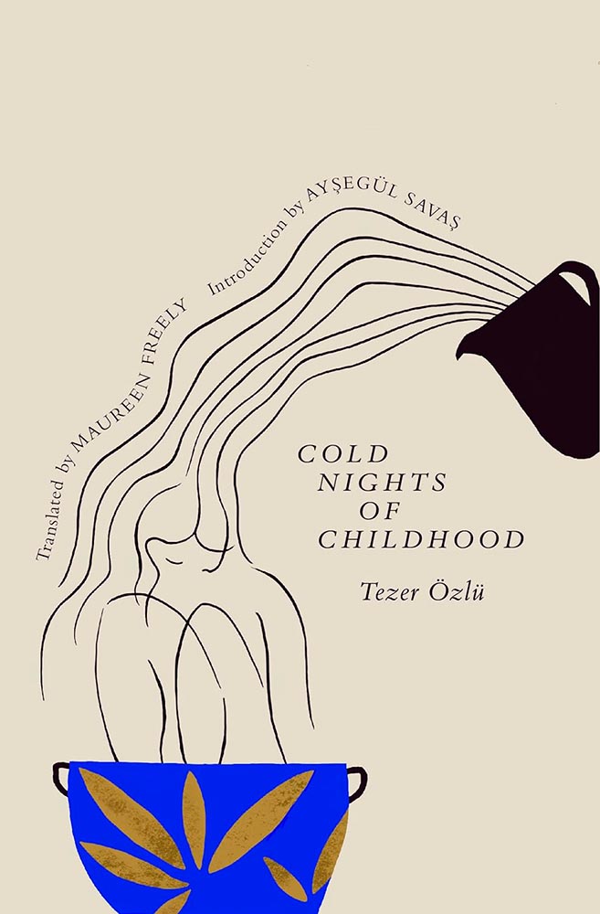
    Design (and illustration) by Sarah Schulte.

    Type on a path can be fraught, as can simple illustrations on off-white. Except when simple ideas are translated into compelling book design. Completely different from the above, yes, but just as accomplished.
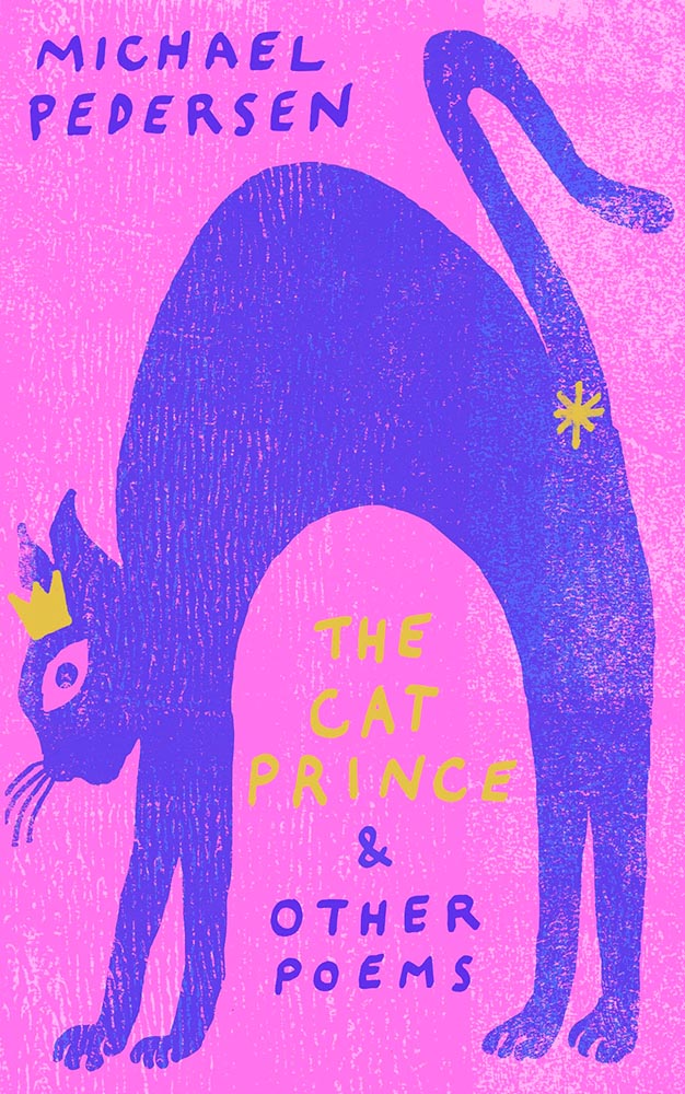
    Design by Gray318.

    Crown. Asterisk. Print!

    Design by Sarah Shulte.

    As the risk of repeating myself: “Type on a path can be fraught, as can simple illustrations on off-white. Except when simple ideas are translated into compelling book design. Completely different from the above, yes, but just as accomplished.”
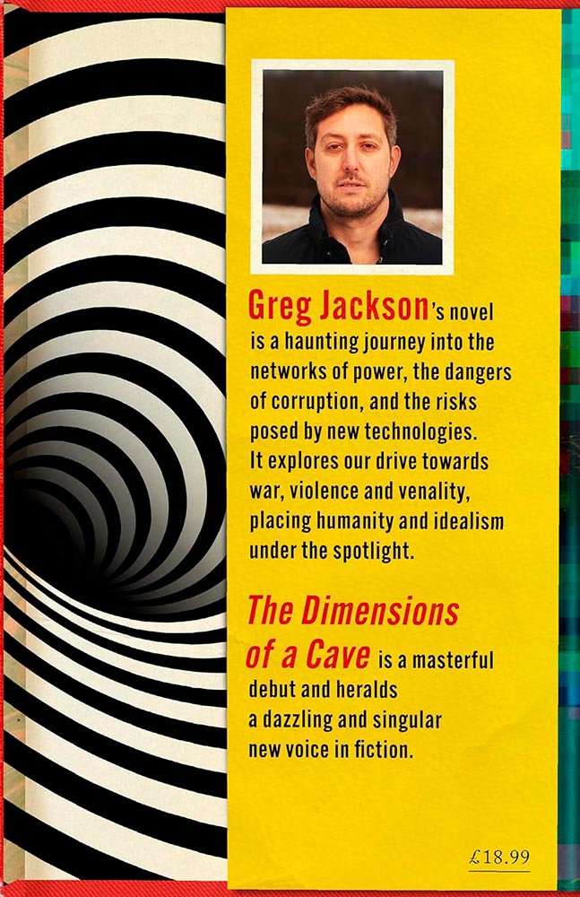
    Design by Jamie Keenan.

    This trick can only be pulled once, and book designers everywhere are envious downright jealous. Here’s the cover — uh, flap:
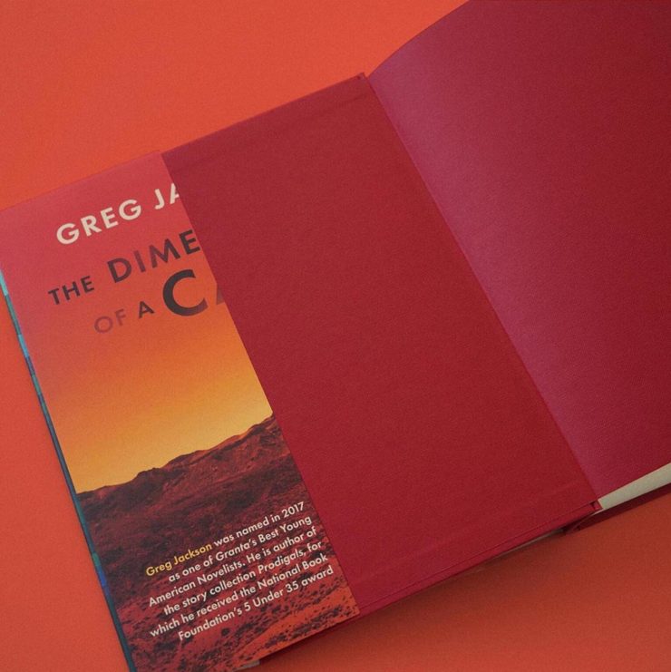
    “Continued on rear flap,” it doesn’t say.
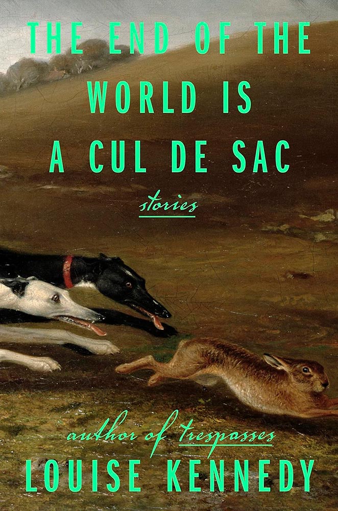
    Design by Lauren Peters-Callaer.

    Brilliance in titling aside, check the glint in the rabbit’s eye. Wonderful.
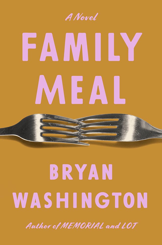
    Design by Grace Han.

    Interlocking forks, LOL. (Also, color choices.)
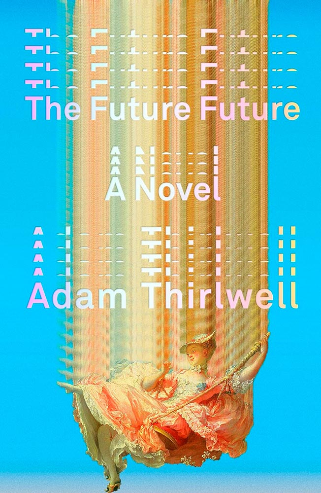
    Design by Alex Merto.

    This has gotten a bunch of well-deserved attention: from the embossed type to the gradually-increasing repetition of the artwork, Alex Merto scores and scores then repeats. Great stuff.
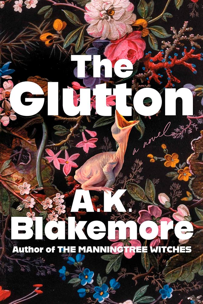
    Design for the US version by Alicia Tatone.

    Gluttonously hits a bunch of high notes, and keeps coming back for more — until:
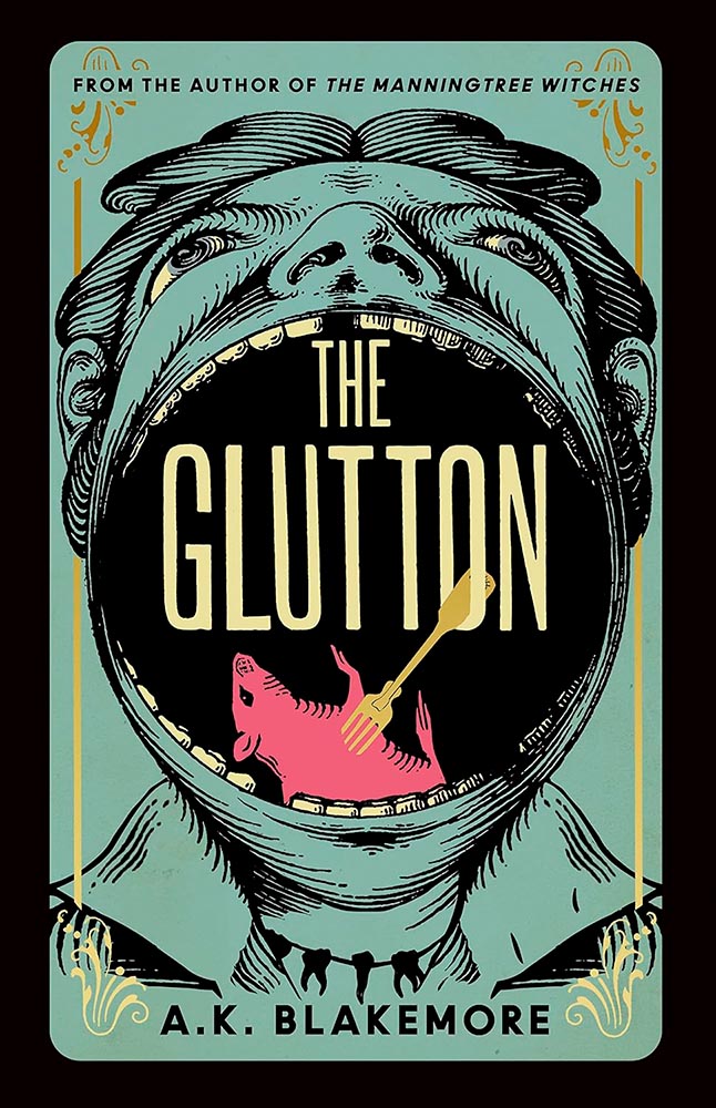
    Design for the UK version by Jo Walker.

    Yeah. Score one for the UK.

    Design by Kelly Winton.

    Is it possible for something Escher-esque to be soothing? Yes, it turns out.
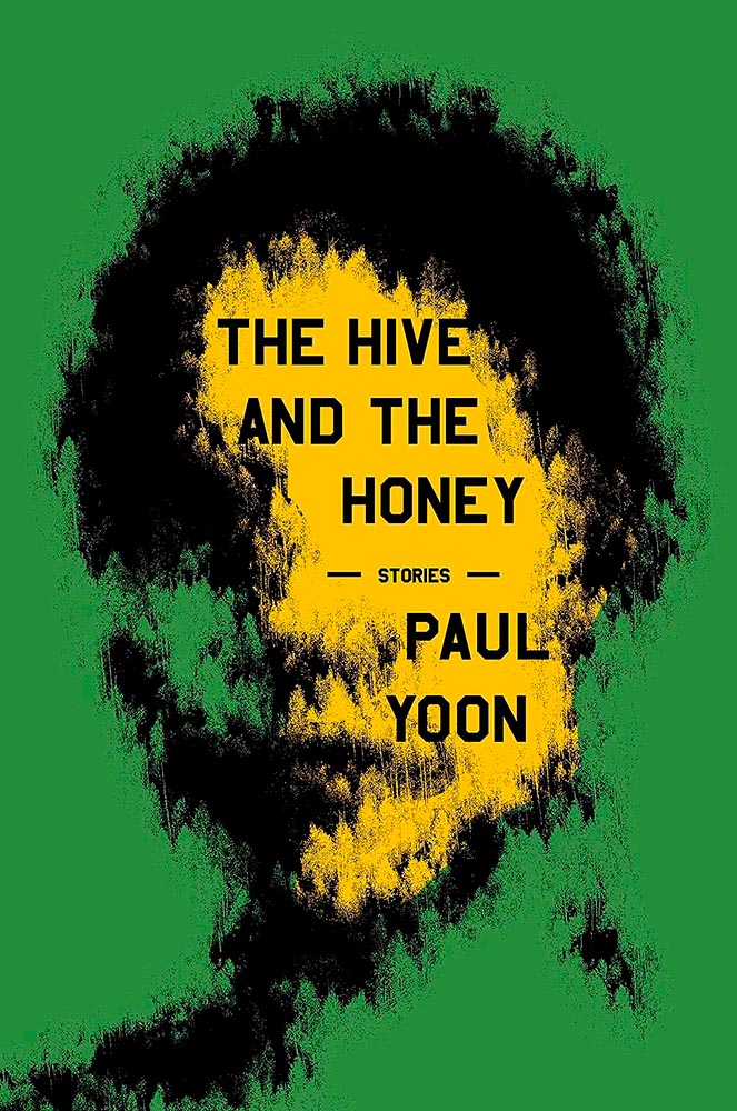
    Design by Oliver Munday.

    Perfectly abstract, brilliantly pulling together the remarkably disparate stories within.
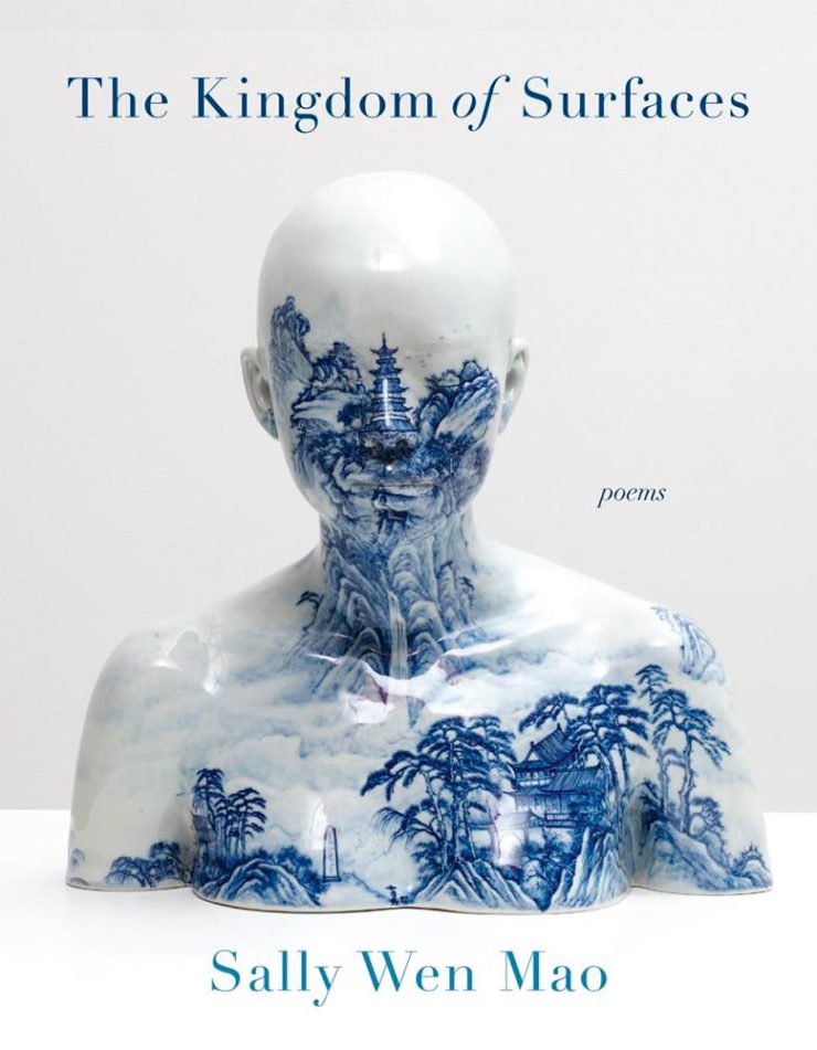
    Design by Kapo Ng.

    “Kingdom of surfaces,” so very indeed.
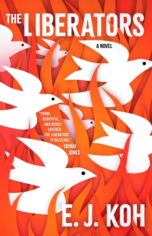
    Design by Beth Steidle.

    “Spare, beautiful, and richly layered, the [book’s cover] is dazzling.” —Foreword
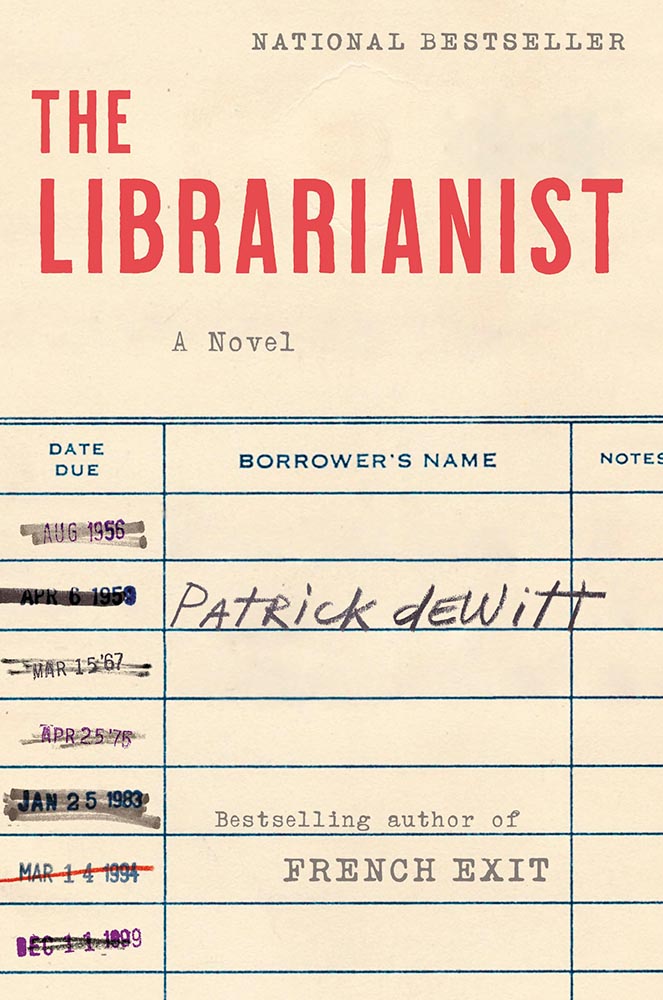
    Design by Allison Saltzman.

    Another of those too-simply concepts that checks out on every level. Awesome.
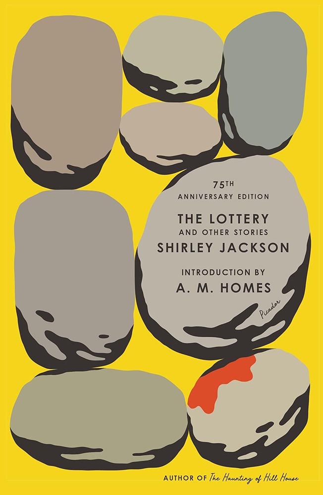
    Design by Alex Merto.

    Rarely does so much text take up so little space yet work so well — this 75th anniversary reprint stacks up. (Imagine inspiring a school-aged Stephen King, by the way. That’s “The Lottery.”)
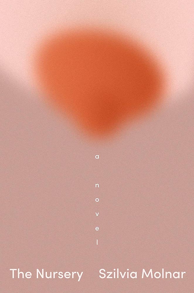
    Design by Linda Huang.

    “A novel” has never played so well.

    Design by Jaya Miceli.

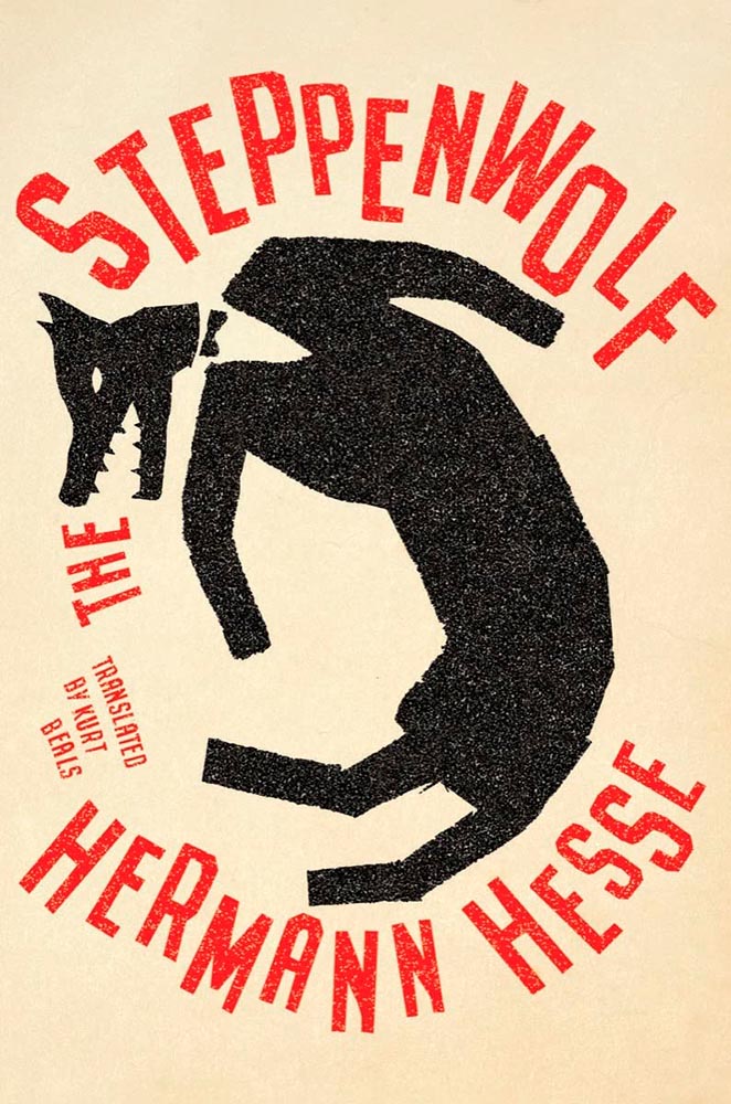
    Steppen-out: this new translation gets new meaning. (In the text, too, I understand.)
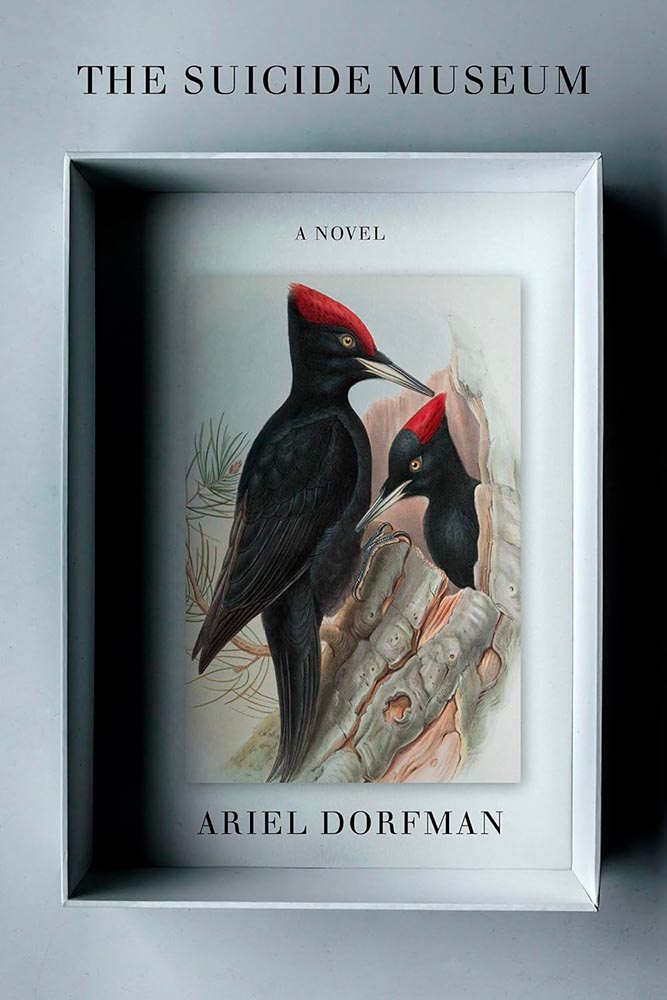
    Design by John Gall.

    Multi-layered shadowboxing. Nice.

    Design by Steve Attardo.

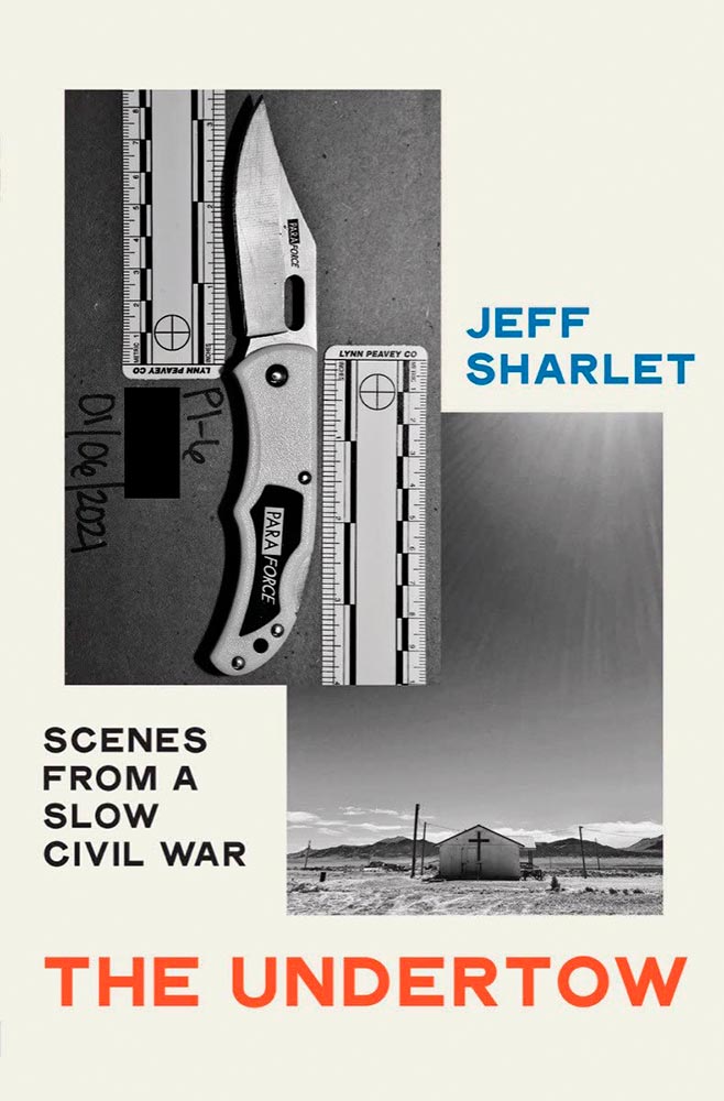
    A study in simple perfection. For a book examining heightening fascism, toning down the cover speaks volumes. Great choices on every level.
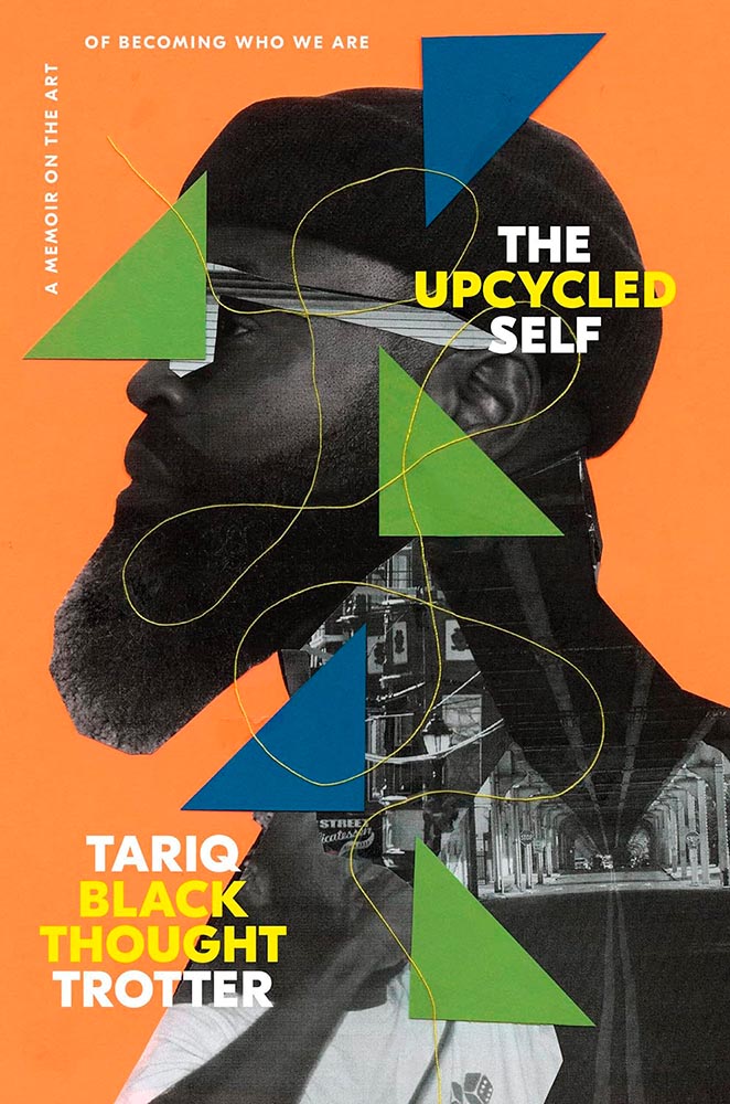
    Design by Greg Mollica.

    To collage in a way that the resulting product is of higher value than the original items: upcycling, indeed. (“The thread tying the cover together is a masterstroke,” he said.)
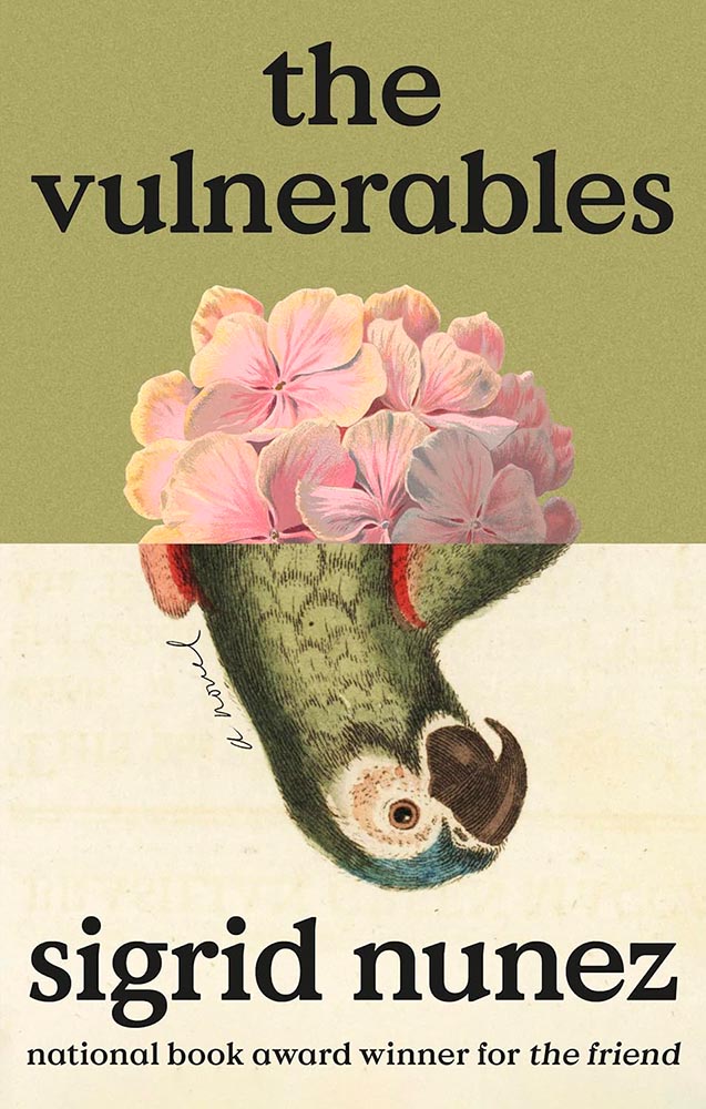
    Design by Lauren Peters-Callaer.

    “The humor of a great conversation,” one of the reviews said, and better words could not be found for the cover. Masterful.
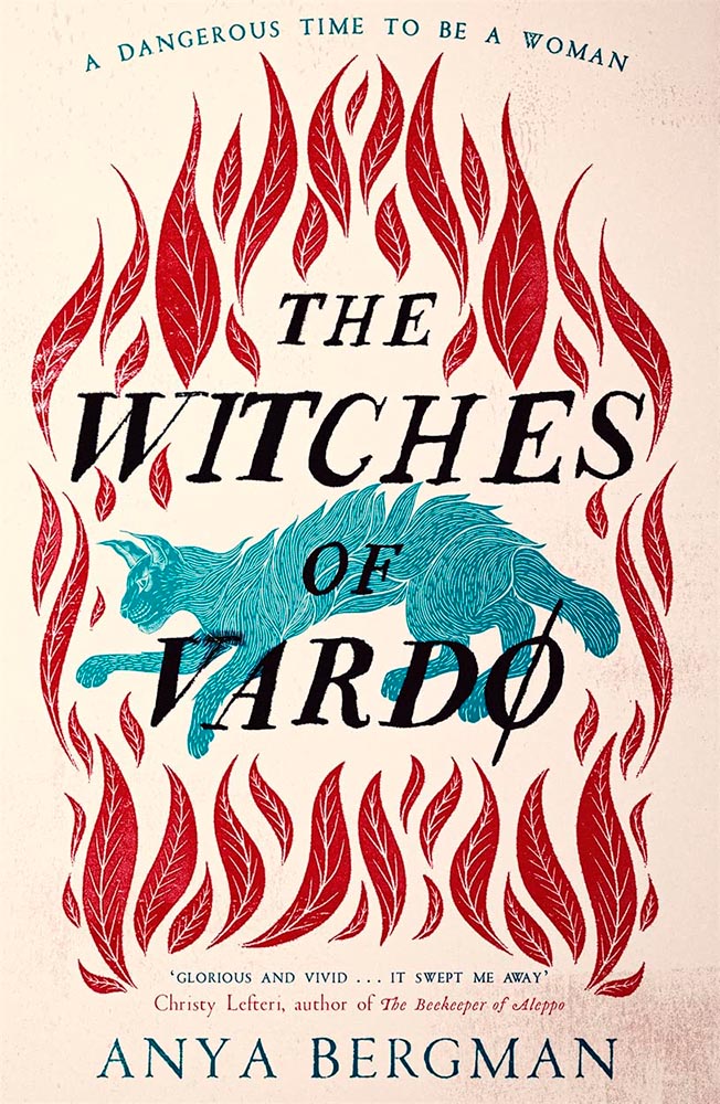
    Design by Andrew Davis.

    The woodcut-style illustration is back, in two-color and aged to perfection. (The paperback kept the illustration but changed out and dulled the colors, to a much less satisfying effect. Curses.)
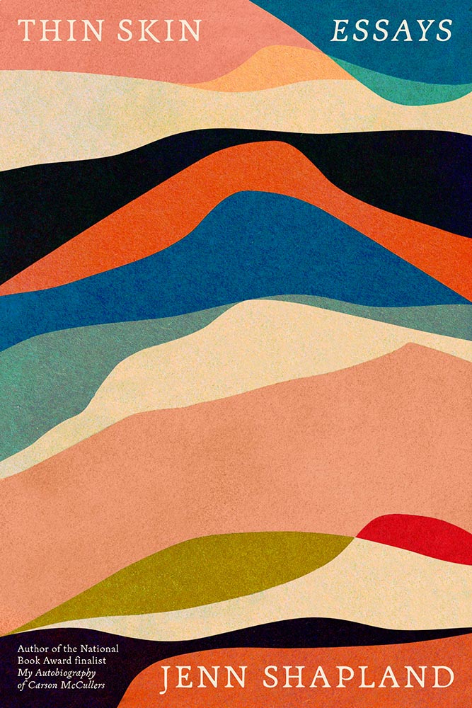
    Design by Tom Etherington.

    “Permeable boundaries,” illustrated brilliantly, with perfect texture and typography.
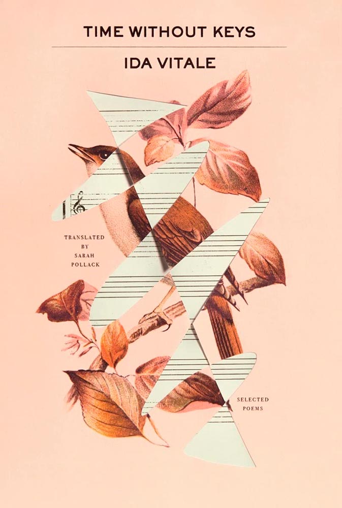
    Design by Tyler Comrie.

    “Sings,” someone said. “Seconded,” I said.
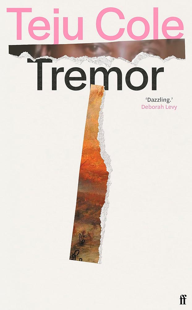
    Design by Jonathan Pelham.

    Stories told in a triumph of less is more. (The US version is good — another that’s one some others’ “best of” lists — but here’s another one where I think the UK slam dunks.)
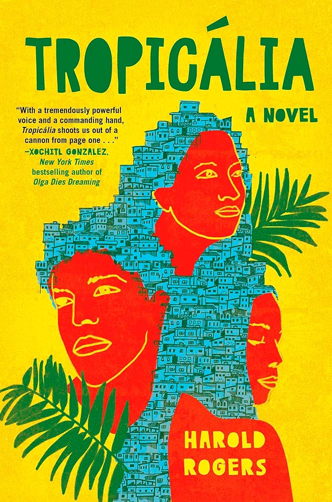
    Design by Laywan Kwan.

    This is one of those covers that keeps giving, a three-color triumph of telling the book’s story. (Also: typographically counter-riffic.)
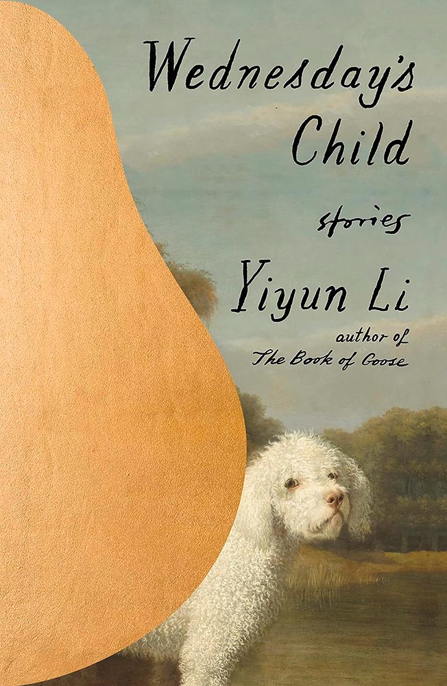
    Design by Na Kim.

    The Book of Goose was one of my top three covers last year, but high expectations are nothing when Na Kim is covering it. Storied, indeed.
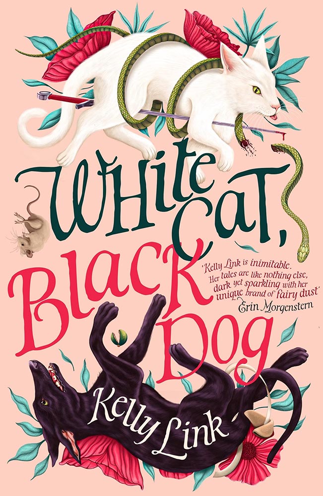
    UK version design by Andrew Davis.

    I was going to go on for a minute, again, about how the UK gets all the good covers — and this one earned a spot in this post — but…:

    US version design by Owen Gent.

    …the more I look at this US version, the more I like it. The hint of cat, the red shading, the paper’s tone and texture, and the type treatment stand in direct contrast with the fabulously literal interpretation of the UK version. Given both, I literally couldn’t choose.
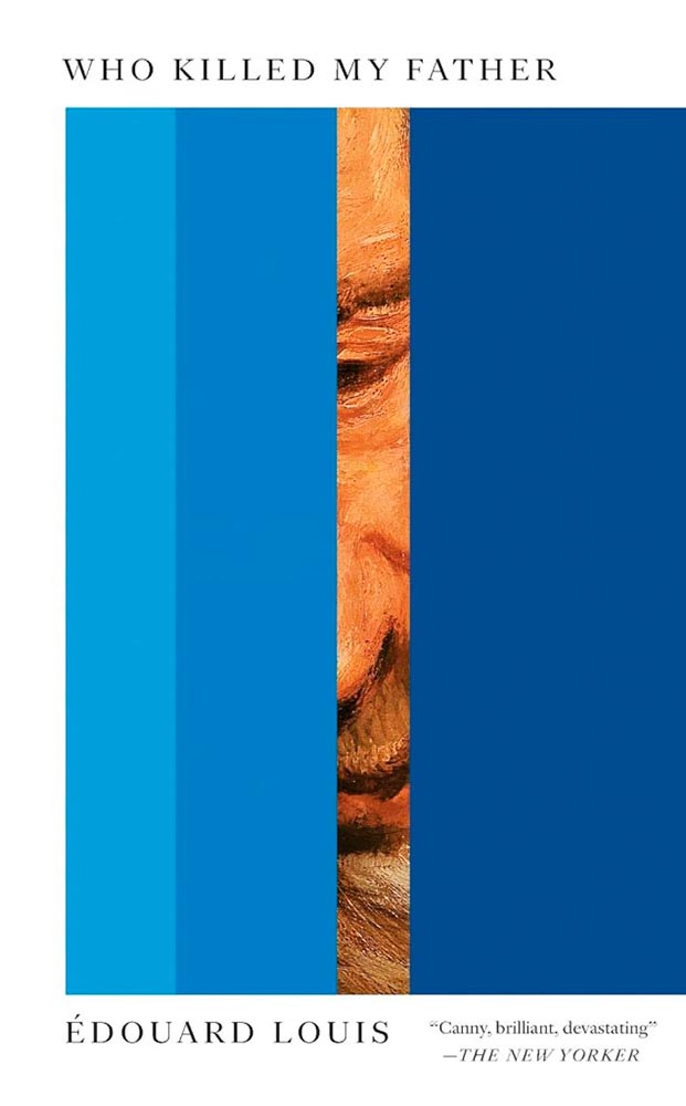
    Design by Matt Dorfman.

    “There’s a painting at the door,” in the most amazing state. (Political pun intended.)
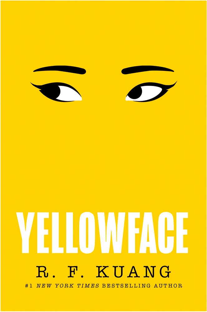
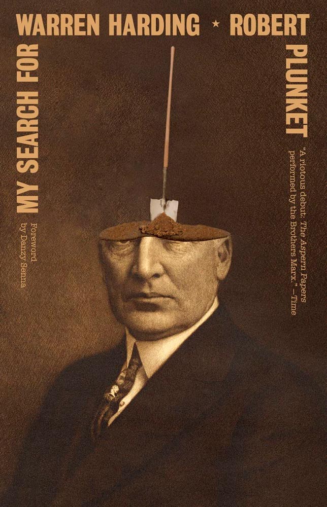
    William Morrow didn’t return a request for the cover design’s name, unfortunately.

    There are so many ways to get this design wrong — but wow: someone took a cliché and literally flew in the face of it, to brilliant, memorable effect. I wish I could give appropriate credit.

    • • •

    Dan Wagstaff over at The Casual Optimist comments that,

    [I]t’s like we’re stuck in a holding pattern, circling the same design ideas. Trends have stuck around. A lot of covers feel safe. Some of this was the books themselves. I’m not sure exactly how many celebrity memoirs is too many, but I’m pretty sure we reached that point and sailed right past it in 2023. No doubt some of it is sales and marketing departments sanding down all the edges and demanding the tried and true (see Zachary Petit’s alternative best of 2023 piece on killed covers for Fast Company). But I would not be surprised if it designers were just getting caught up in the churn — too many books, too many covers, and too much other stuff to worry about.

    — Dan Wagstaff, The Casual Optimist

    I think he’s right. Despite growing the number of selected covers this year over last, I feel that despite the outstanding items above, the majority of the book covers and jackets — almost certainly by publishers’ explicit direction — are playing it safe. After all, here in the Roaring Twenties, rocking the boat brings nothing short of vilification.

    Thankfully, the designers on this list have battled the committees bent on mediocrity and overcome with great talent, great design, and great perseverance. Power to them, and I wish them — indeed, all of us — continued success in 2024.

    ’Cause, y’know, it’s gonna be a great year.

    How this list was compiled

    My selections stem from books I’ve seen in person; the “best of” lists from NPR, The Guardian, and the BBC (among others); and the best book cover lists from Spine, The Casual Optimist, The Book Designer, Creative ReviewKottkePRINT, The New York Times (gift link), and LitHub. See how my list compares with those, and enjoy: a great many more outstanding examples of book cover creativity await.

    Please note: I somehow missed the 2023 University Press Design Show — usually linked here — so please stay tuned for that post soon (and then again in July for the ’24 Show). Apologies.
  • Beautifully Briefed 23.12: The Winning Winter

    Beautifully Briefed 23.12: The Winning Winter

    We round out 2023 — how’d that happen? — with some items pulled from the stockings: PRINT on a few favorite books and two different photography contests that impress. (Plus bonuses thrown in, just ’cause.)

    Books in PRINT

    Book designer Daniel Benneworth-Gray brings us some of his favorite books on design published in 2023:

    It’s that time of year when “stop asking for books, you have too many books, look at all these piles of bloody books” echoes around our house. My excuse for all this tsundokustacking: it’s professional research! After all, my job is just … book. Plus I have an untested but absolutely correct theory that books pay for themselves by acting as insulation and thus reducing your heating bill.

    — Daniel Benneworth-Gray, PRINT

    They act in that role here at my place, too. In any case, I agree with several of his choices enough to highlight them:

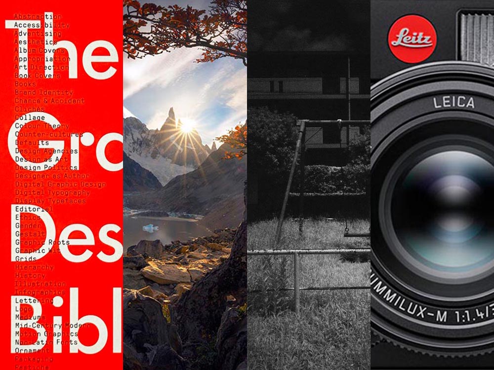
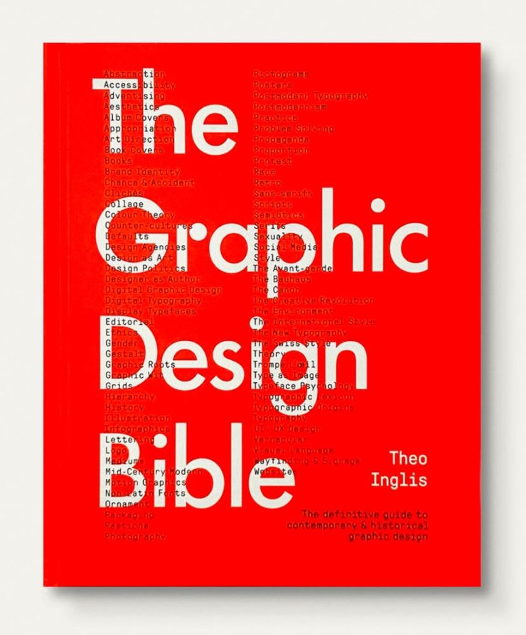
    The Graphic Design Bible has won numerous accolades this year, and reminds us that despite . . . well, the internet, a well-edited, well-curated examination of a subject as diverse as graphic design benefits from book form.

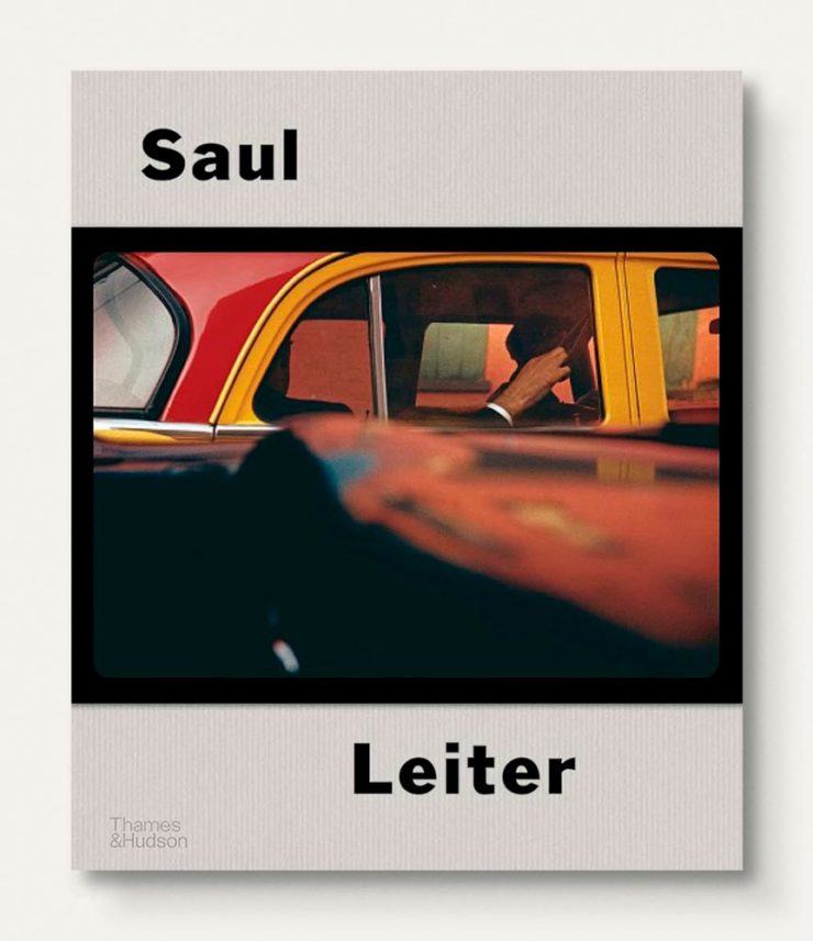
    Saul Leiter’s mid-century photographic genius earned him a long career, as proven by just glancing at the cover photograph on this latest tome:

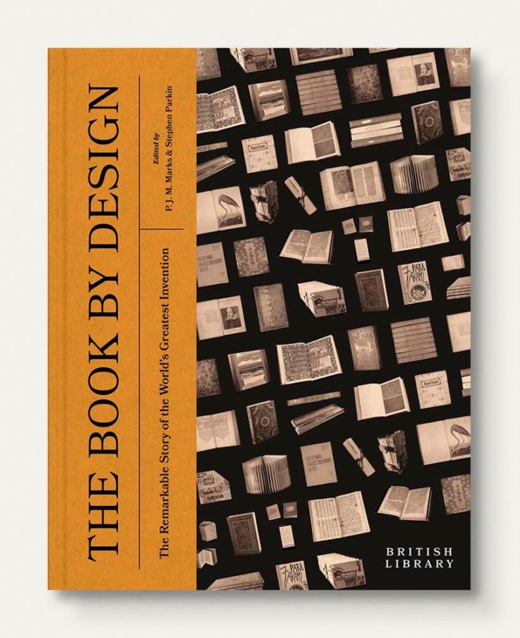
    Lastly, something I’ve added to my wish list:

    Note: UK cover shown, ’cause it’s better.

    It’s great that PRINT pulled this article from behind the unfortunate mess that is Substack and out into the light. Enjoy.

    Special bonus #1: NPR highlights public libraries’ most-borrowed books of 2023, along with their always-awesome “Books We Love,” 2023 Edition.

    Special bonus #2: The Guardian reminds us that, for younger readers especially, reading print improves comprehension far more than looking at digital text.

    Fantastic Landscape Photographs

    “2023 International Landscape Photographer of the Year Winners,” PetaPixel announces, and some of these are just wonderful:

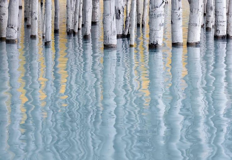
    International Landscape Photographer of the Year: photo by runner-up Andrew Mielzynski.

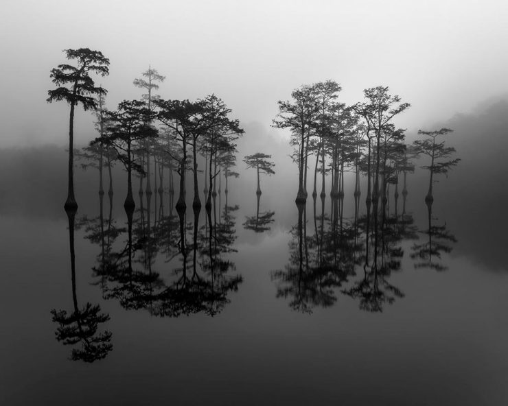
    Interestingly, this one reminds me a good deal of last month’s Natural Landscape winner from Adam Gibbs. (Maybe birches in water are a thing; I don’t do trends.) Also, kudos to this black-and-white taken right here in Georgia:

    Winner of the Aerial Award, a special category. Taken in George L Smith State Park, Georgia, by Jim Guerard.

    Again, like last month, here are two beautiful shots from the same photographer highlighted:

    International Landscape Photographer of the Year: third-place photo by Matt Meisenheimer.
    International Landscape Photographer of the Year: third-place photo also by Matt Meisenheimer.

    The International Landscape Photographer of the Year results are published in book form, which is great if you get the physical copy but slightly limiting in (their) website form. Nonetheless, check ’em out.

    Fantastic Black and White Photographs

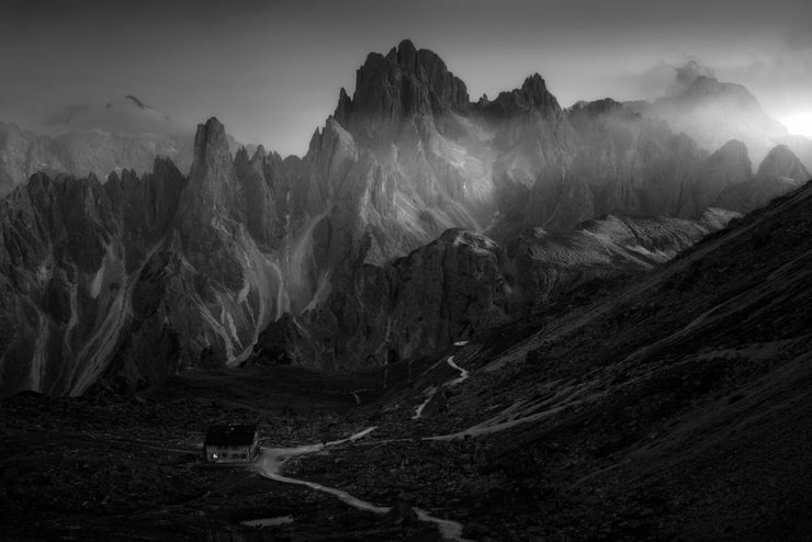
    “The incredible winning images,” PetaPixel announces of reFocus, a black-and-white-only photography competition, split into both professional and non-professional categories. (PetaPixel seems to have taken the flame that DPReview used to represent and run with it, thankfully.)
    Overall professional winner Bill Pack and a small Mercedes:

    reFocus Awards Black & White Photo Contest: “CarScape” by Bill Pack.

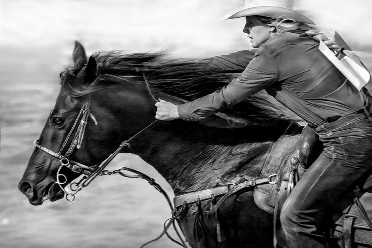
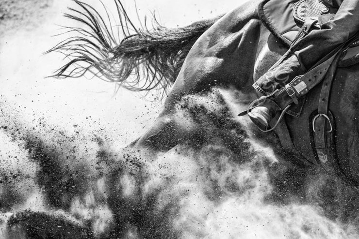
    “Sensual” might be an understatement there. Meanwhile, there seem to be some overlap between categories, but when you can capture action like these two, maybe they just wanted to make room for both:

    reFocus Awards Black & White Photo Contest: Oddly-filed Domestic Animals winning photo by David Zlotky.
    reFocus Awards Black & White Photo Contest: Event winner from Laura Thomson.

    Wow. Meanwhile, there are landscapes and architecture, too:

    reFocus Awards Black & White Photo Contest: Winner, landscape (non-professional) by Thomas de Franzoni.
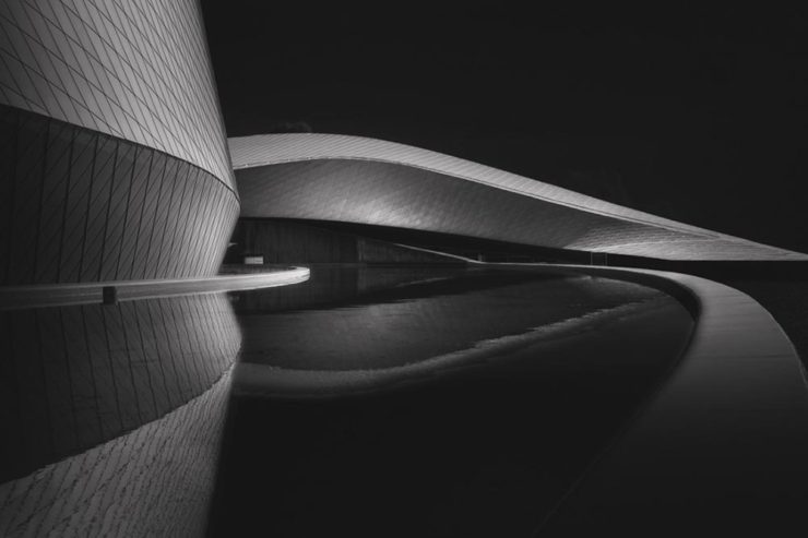
    reFocus Awards Black & White Photo Contest: Eyes of the Sea, winning architecture by Hilda Champion.

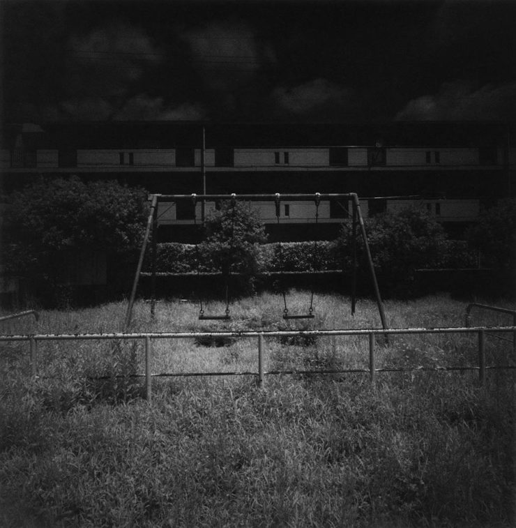
    We round out this list with something shot on film:

    reFocus Awards Black & White Photo Contest: Winner of the film/analog non-professional category by Shinya Ichikawa.

    Wonderful. See all the winners at the (thankfully well-presented) reFocus website.

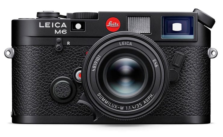
    Leica’s 2022 version of the M6 film camera, a bargain at $5695. (Lens not included.)

    Special Bonus #3: Speaking of film, Nick Heer reminds us why he’s a daily read: The Neverending Film Photography ‘Resurgence’. (The Leica is relevant, not just me taking an opportunity to post a photograph of their awesome gear.)

    Foreword . . . On Towards 2024

    The end of 2023 hasn’t seen as much posting as I’d like, something I’m hoping to change once the new year gets underway — starting with the annual list of my favorite book covers of the year mid-January. Meanwhile, wishing you and yours all the best in 2024 and beyond.

  • Beautifully Briefed 23.11: Considerations

    Beautifully Briefed 23.11: Considerations

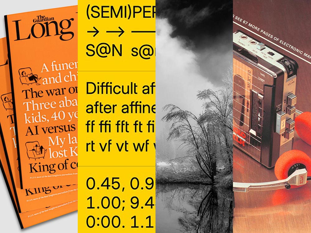
    A selection of diverse items for this entry in the series: a new publication from The Guardian, open source fonts for your 2023 goodness (along with more for ’24), and the Natural Landscape Photography Award winners. Also: DAK. Let’s get into it.

    The Long Read

    Regular readers will know that I’m a big fan of The Guardian, including its unusual-for-journalism payment model (that, frankly, some outlets in the US would be wise to copy). Now, they’re on newsstands with a “bookazine” called The Long Read.

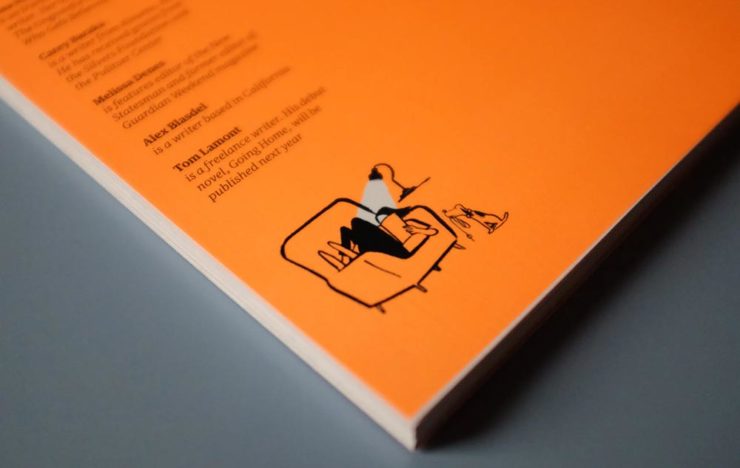
    The back cover. (See the front cover at the left in the header image.)

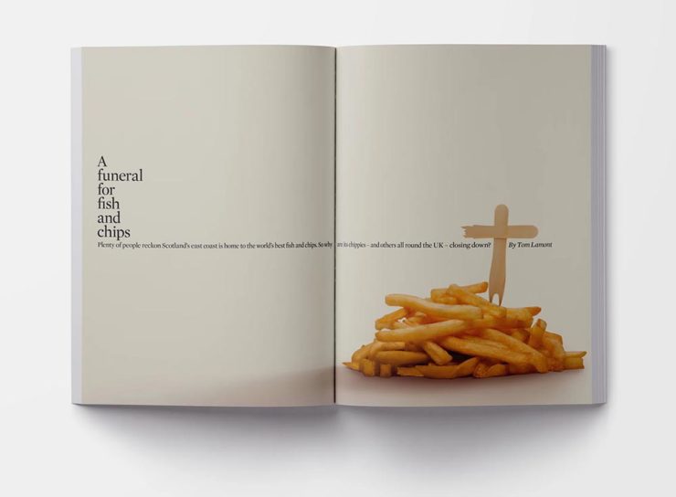
    “We know that for many people, myself included, when it comes to long, immersive pieces, reading in print […] is still the most satisfying reading experience, and one that should be cherished in a climate so saturated by disturbance,” quotes It’s Nice That. With most of these more evergreen stories taking months or even years to build, hardy print felt the best way for them to live. [A] ‘bookazine’, it balances all the things we love about magazines (“the drama, the pace, the energy”) with the considered typesetting of a book. A lot of attention was given to packaging its large volume of text – clocking in at 55,000 words – to make the reading experience as relaxing as possible, from body type size to column widths.

    Liz Gorny, It’s Nice That
    An article title page — indeed, the best of a newspaper magazine in book form.

    Read more at It’s Nice That, and give The Long Read a look at The Guardian bookstore or a newsstand near you.

    Three Open Source Fonts for 2023, and 50 for ’24

    As a self-confessed font junkie, I’m always interested when a new one comes across the bow — but there are so many these days, they’ve unfortunately become almost commodities. (That’s a huge shame, but also a discussion for another time.) So it’s interesting when I see ones that are not only good but also available for everyone, free and open source.
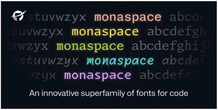
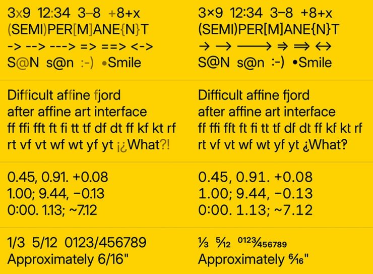
    Monaspace is the first of three I want to highlight, “a monospaced type superfamily with some modern tricks up its sleeve.” Designed for code — hence the monospace — it’s a successful answer to the question, “Letters on a grid is how we see our code. Why not make those letters better?”

    Get the full story or download from GitHub.

    B612 is designed for — get this — the screens on Airbus commercial planes. “[T]he challenge was to improve the display of information on the cockpit screens, in particular in terms of legibility and comfort of reading, and to optimize the overall homogeneity of the cockpit.” Read the back story here.
    B612 is available from Google or GitHub.

    Inter is described as, “The 21st century standard,” “a workhorse of a typeface carefully crafted & designed for a wide range of applications, from detailed user interfaces to marketing & signage.” One of the world’s most-used font families, it’s perfect when readability is at the fore.

    Inter is detailed and downloadable here.

    But there’s more!

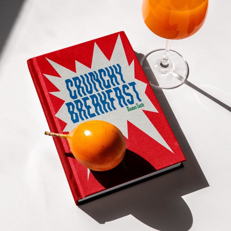
    Brinca by In-House International. (Image via CreativeBoom.)

    CreativeBoom has their annual compilation of 50 new fonts for the coming year up, “a comprehensive list of the best fonts that demand your attention in 2024. We’ve compiled this comprehensive list by asking the creative industry for their favourites, analysing work from the last 12 months, and taking on board the design trends emerging right now.”

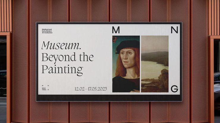
    National Museum in Gdańsk by Tofu Studio. Featuring Migra by Pangram Pangram. (Image via CreativeBoom.)

    Great stuff. Creative. Boom!

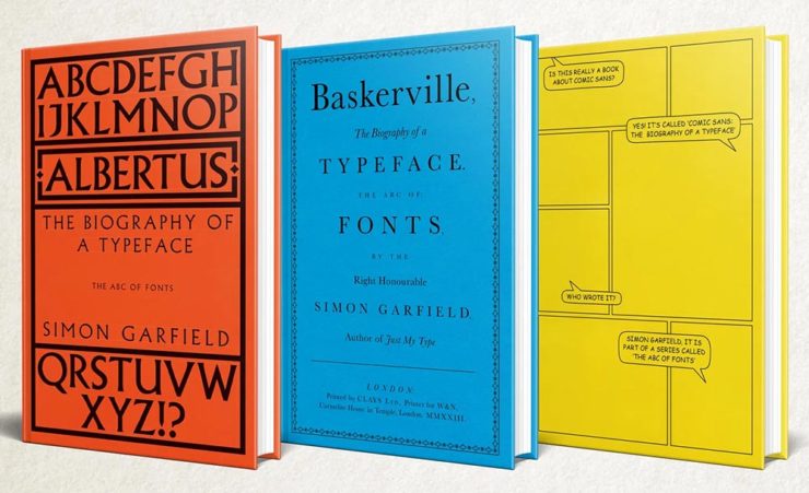
    Special Bonus: Simon Garfield publishes biographies on Albertus, Baskerville and Comic Sans. Seriously:

    The Natural Landscape Photography Awards

    For once: a contest that demands more — like the original RAW files. (Literally the raw image from the camera, before processing, for those who don’t know — think film negatives, rather than the resulting prints.) Okay, sure, it’s not perfect; there are entry fees and it doesn’t have a long track record, but the rules are solid with respect to image integrity.

    Of course, the quality of the subject chosen to photograph is, if you’ll pardon the expression, subjective. The overriding theme here seems to be the perfection of dramatic subtlety — not an easy thing to get right.

    Photo: Adam Gibbs
    Photo: Adam Gibbs

    The two photographs above are both by Adam Gibbs and reflect the judges’ desire to reward photographers who display a diverse portfolio of subjects.

    Photo: Alberto Rodriguez Garcia
    “Once Upon a Time.” Photo: Matt Redfern

    A winner from the “abstracts and details” category for the first and a great title for the second image that does indeed tell so many stories. Rounding it out, another beautiful black-and-white:

    Photo: Franka Gabler

    See the contest website for the complete selection of 2023 winners. (Via PetaPixel.)

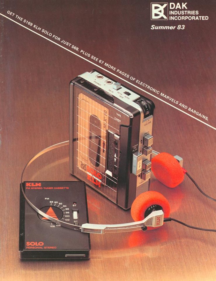
    Remember the DAK catalogs?

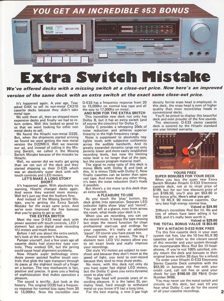
    If you’re a certain age — that is, were around in the ’80s — the DAK catalog was a regular. (Give me one, together with a JC Whitney catalog, and a weekend was gone.) A recent post by Cabel Sasser brought it all back:

    The catalog from Summer 1983.

    Oh, the products. The explanations. The fun.

    I’m not going to spoil the effort put into the story of Drew Alan Kaplan, a.k.a. DAK, Joseph Sugarman, Products That Think, or any of it: go enjoy for yourself.

  • Beautifully Briefed 23.10: Shifting, Branding, and Creating

    Beautifully Briefed 23.10: Shifting, Branding, and Creating

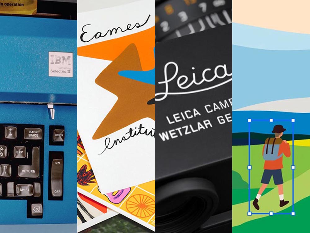
    A variety of interests addressed this time: a bit on Shift Happens, a great question on branding, and Leica’s new M camera — and its content credentials. (Plus, bonuses.) Happy October!

    Booking a Keyboard

    We talked about this title back in January, but it’s worth the reminder:

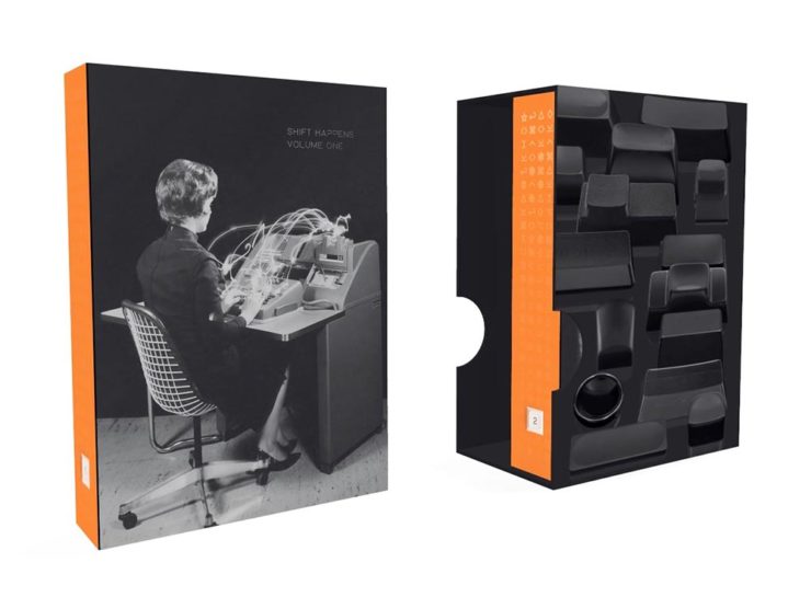
    A 3D rendering of Shift Happens.

    Marcin Wichary has long been interested in keyboards. In his words,

    Keyboards fascinated me for years. But it occurred to me that a good, comprehensive, and human story of keyboards — starting with typewriters and ending with modern computers and phones — has never been written. How did we get from then to now? What were the steps along the way? And how on earth does QWERTY still look the same now as it did 150 years ago? I wanted a book like this for years. So I wrote it.

    Marcin Wichary, Shift Happens

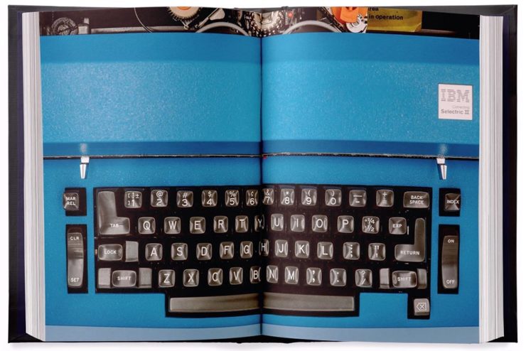
    This title fascinates me, partially because it’s an interesting subject — one we’ve all interacted with, often without thinking about — and partially because it’s a great, well-covered exercise in book design.

    A very cool photograph of an IBM Electric. Photo by Marcin Wichary.

    Further, Marcin has done a fantastic job in getting the word out. He’s designed a killer web site, written some great updates, and gotten some good press — including a recent interview with Ars Technica, in which he says:

    I am a web guy, and I used to think that the web (just like typewriters, once) took away a lot of hard-won typesetting nuance and tradition. But it turns out that the web also makes it much easier to do certain things. To have a word be surrounded by a rounded rectangle—a visual representation of a key—is a few lines of CSS or a few clicks in Figma. But for the book, I had to cut my own font and then write Python scripts to do typesetting inside the font-making software, which I’m pretty sure you are not supposed to do[.]

    Marcin Wichary, Shift Happens

    Really looking forward this title. Copies are, as of this writing, still available.

    Let’s Talk Branding.

    It’s Nice That asks a great question: “Are rebrands starting to look the same? The challenges facing commercial design,” in which author Elizabeth Goodspeed discusses whether “shortened turnarounds and economic tensions” are taking a toll on originality.

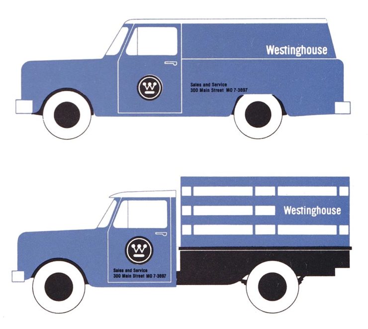
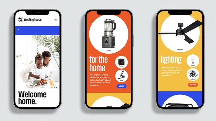
    Westinghouse branding guidelines from the ’60s.

    The answer might seem to be, “Well, duh,” but it’s nonetheless a thoughtful and insightful article that asks the correct question: “how does one define originality in an age saturated with visual stimuli?”

    [T]he digital applications more often associated with modern rebrands, while comparatively easy to update, may counter-intuitively promote less care and attention towards their making. [A]nother possible issue contributing to rebrand redundancy: lack of rollout support beyond rebrand launch. Even a unique identity may lose its spark when its primary consumer touchpoint is what a social media manager produces on Canva after skimming the brand guidelines once. Further still, many clients no longer approach design studios to harness their expertise but, instead, with preconceived notions of the result they expect; design studios may want to create original work, but sometimes clients are willing to pay more for a rebrand that mirrors their own preconceived ideas of what the work should look like.

    — Elizabeth Goodspeed, It’s Nice That
    The logo’s the same, but the applications vastly different.

    The whole article is great (and richly illustrated) — give it a few minutes of your time.

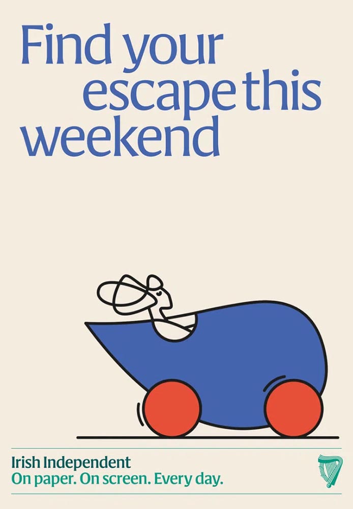
    Special Bonuses #1 & 2: Let’s look at a couple of places where branding has been in the news recently (pun intended). Also from It’s Nice That, an article on The Irish Independent rebrand. Here, as is often the case recently, it’s the custom illustrations that carry the day:

    Andy Goodman is the illustrator responsible for the lively work found throughout, which toe the line between measured and playful,” It’s Nice That writes. Agreed 100%.

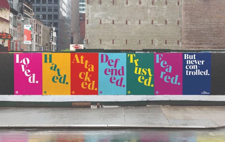
    Less successful is England’s The Guardian, whose ongoing campaign to raise money — they don’t have a paywall, relying instead on reader contributions — perhaps could have used more work:

    These ads don’t really have me on the fence: The Guardian deserves better.

    Meh. (And this from a huge fan of The Guardian.) Creative Boom is more positive.

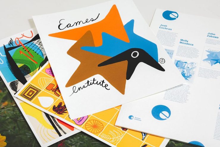
    Special Bonus #3: From the wildly successful, original branding department comes, of course, the brilliantly-named Eames Institute of Infinite Curiosity. They’ve been covered here twice before, but are back in the news with a new branding Manual. See why that’s capitalized at Dezeen.

    The Eames Institute branding oozes positivity, class, and — you guessed it — infinite curiosity. Nice.
    Leica, Adobe, and Content Authenticity

    One would assume that Leica users are the epitome of content authenticity — there’s nothing like the world’s best lenses (IMHO), attached to some incredible cameras, to provide photographers with all that’s needed to make the best possible images.

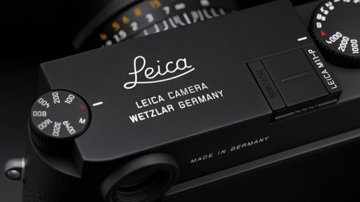
    Leica’s new M11-P, however, packs a world first: hardware encryption that supports a system called the “Content Authenticity Initiative (CAI).” In CAI corporate-speak, it’s “the future of photojournalism […] usher[ing] in a powerful new way for photojournalists and creatives to combat misinformation and bring authenticity to their work and consumers, while pioneering widespread adoption of Content Credentials.”

    Leica’s new M11-P. A bargain at $9,195. (Lenses extra, of course.)

    B&H puts it another way:

    The Content Authenticity Initiative (CAI) is a collaborative effort initiated by Adobe in partnership with various other organizations, including The New York Times and Leica, among others. Announced in late 2019, its primary goal is to develop a standard for digital content attribution. The rise in manipulated digital content, deep fakes, and misinformation has underlined the need for a more transparent system of content attribution, which the CAI seeks to address.

    The interesting thing here is Adobe’s initiative. What’s their goal?

    Adobe has been suffering a few hits recently. They’ve just raised prices — on the heels of record profits — and “monopoly” is not in any way a stretch. Photoshop? Entered the lexicon. InDesign? No credible alternatives. Illustrator? Professional standard across multiple industries. In other words, we’re stuck with ’em, and they know it.

    This line of thinking is expanded at CreativeBoom: “Is Adobe Becoming the Frenemy of Creatives? But that’s not all.

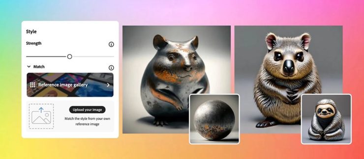
    Ignore’s Adobe’s unfailingly cute examples: AI + texture = exactly what some “creative director” needed. Seriously uncute.

    They’re pushing hard into AI, too, and surprisingly up-front about it changing creative work in ways potentially less creative:

    Firefly 2 was unveiled yesterday at the 2023 Adobe Max conference with the artificial intelligence (AI)-powered tool incorporated into Lightroom’s new lens blur feature that simulates depth of field along with a host of other tools. However, it was the new “Generative Match” tool that will allow users to upload a reference image to guide the AI image generator to a specific style that prompted Adobe to comment that the new tools could mean less work for photographers. 

    Adobe is appealing to companies who want a “consistent look across assets.” It is offering brands the chance to generate hundreds, if not thousands, of similar images for different uses such as websites, social media, and print advertisements.

    — Matt Growcoot, PetaPixel

    Or how about this example: An agency or freelancer working on a vector image in Illustrator, and need to add something that they either don’t have the time or talent to do myself. Previously, they could find either a stock item — made by a human (who is paid, by the way) — or hire it out (again, to a human, and again, one who is paid for their work). Now? Just tell the computer what you need.

    Get more from Ars Technica’s Unlimited Barbarians Dept.

    All of which ties nicely back to the previous section on whether branding is beginning to homogenize. Is AI going to accelerate that process? You betcha.

    Value human creativity, folks. Artists, teachers, writers, thinkers: all the people pushing at the edges of the envelope will now have to push even harder, in an era when envelope-pushing is increasingly demonized.

    Special Bonus #4: Ars Technica argues that the U.S. Copyright Office’s blanket ban on the copyright-ability of AI-generated images isn’t going to age well, using photography as an argument.

    Special Bonus #5 (Updated 31 Oct): Via Nick Heer’s excellent Pixel Envy, we have a great explainer from Tim Bray regarding The Coalition for Content Provenance and Authenticity (C2PA), the actual implementation of CAI. Better than my brief description by a country mile.

    Special Bonus #6: To round out this post, from the department of envelope-pushing: PRINT Magazine put together the book covers of the 11 most-banned books in America. Dangerous, indeed!

  • Gallery Update: Helen, Georgia

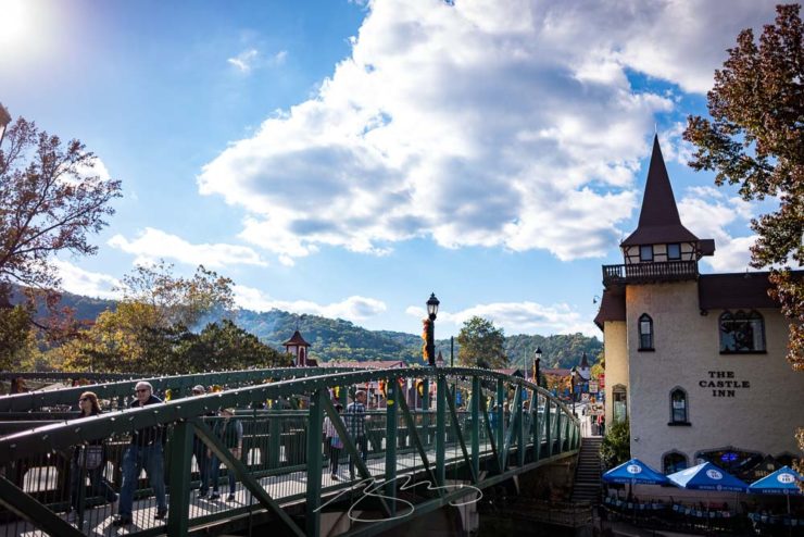
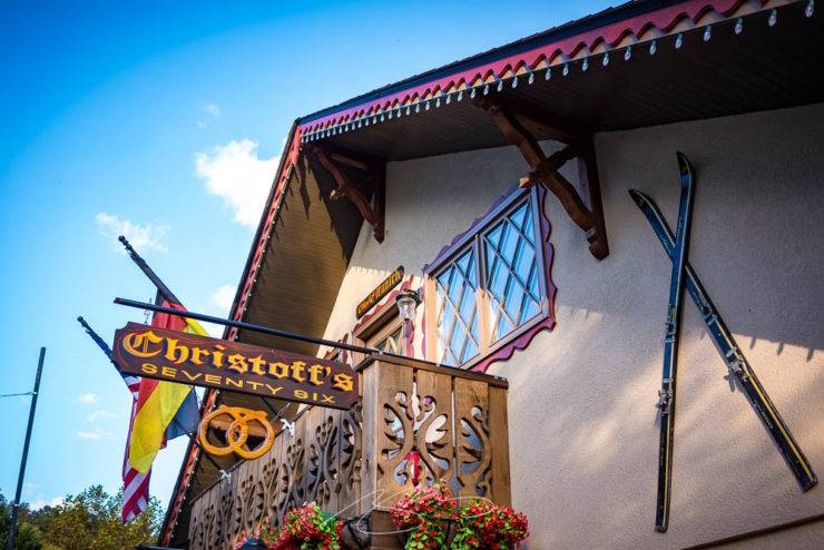
    This is my second try at a fall photostroll in Helen, a German-themed town in the Georgia mountains north of Athens, and I’ve got to tell you: Helen and I are not getting along.

    Technically, it’s my fault. But I feel the relationship may have soured; I just might neglect to make a third attempt.

    Unicoi Bridge into Helen, Georgia

    In late October, 2019, I was there with an unfamiliar lens and although I took a stack of photographs, the vast majority of them were junk. I got eight — eight! — worth putting up. Again, my fault. But not at all the results I’d wanted.

    This week, I was back. I had two beautiful fall days to make up the deficit.

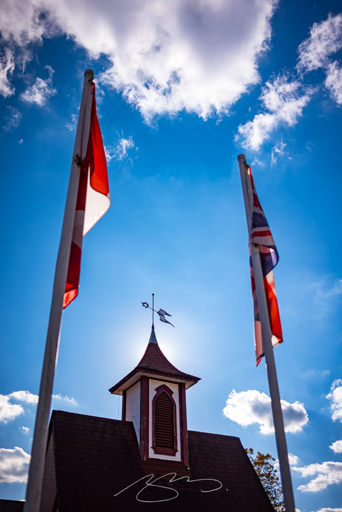
    Flags and (Brew) Decor
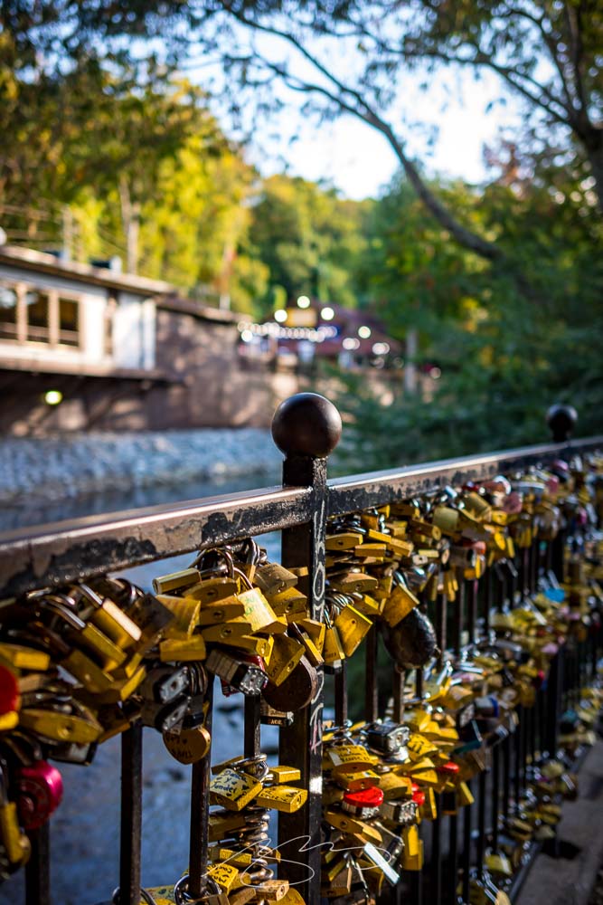
    Love Lock Bridge (Railing #1)

    Day one saw 68 photographs taken with my favorite 35mm, but I could tell almost immediately that it wasn’t going the way I wanted. It was flooded with tourists — expected and okay, frankly, but not built for wider shots. “No problem,” I said to myself. I’ll enjoy some schnitzel, have a good night’s sleep, and clean up with the detail shots in the morning.

    Bling Bling Blink Tourist Blind
    Christoff’s 76, Munich St.

    Alas, not only did I get out of the wrong side of the bed, my back somehow got out of the other side — I wasn’t walking anywhere. Crap.

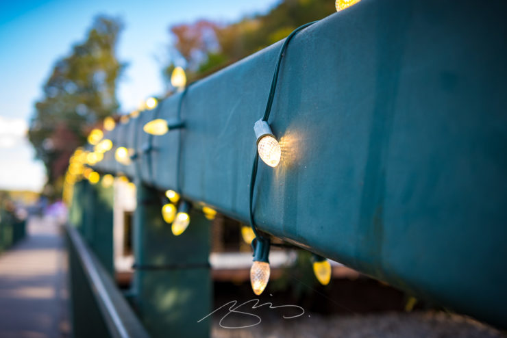
    Bridge Lights, Main St.
    River Overlook, Eidelweiss St.

    Worse, upon examination back in front of the big computer, I wound up with less than superlative results: only 30 of those 68 got posted.

    Have a look at the Helen gallery when you have a moment, with my wishes that your fall attempts at leafing don’t leave you behind.

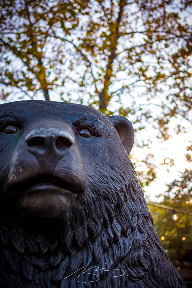
    Willie, The Friendly German Black Bear
  • New Gallery Bonus: Deepstep, Georgia. (Also, a New Georgia Gallery Setup.)

    New Gallery Bonus: Deepstep, Georgia. (Also, a New Georgia Gallery Setup.)

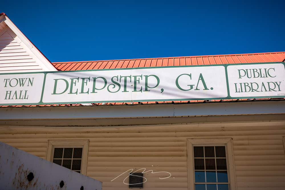
    A while back, on the road from Milledgeville to Sandersville, I spied a sign:

    Giles Cross Roads, 11917 Deepstep Rd.

    That little town — more a hamlet, really — is called Deepstep, and I’ve marked it for a stop since. On the way home from Augusta (part 1, part 2), I finally had the opportunity.

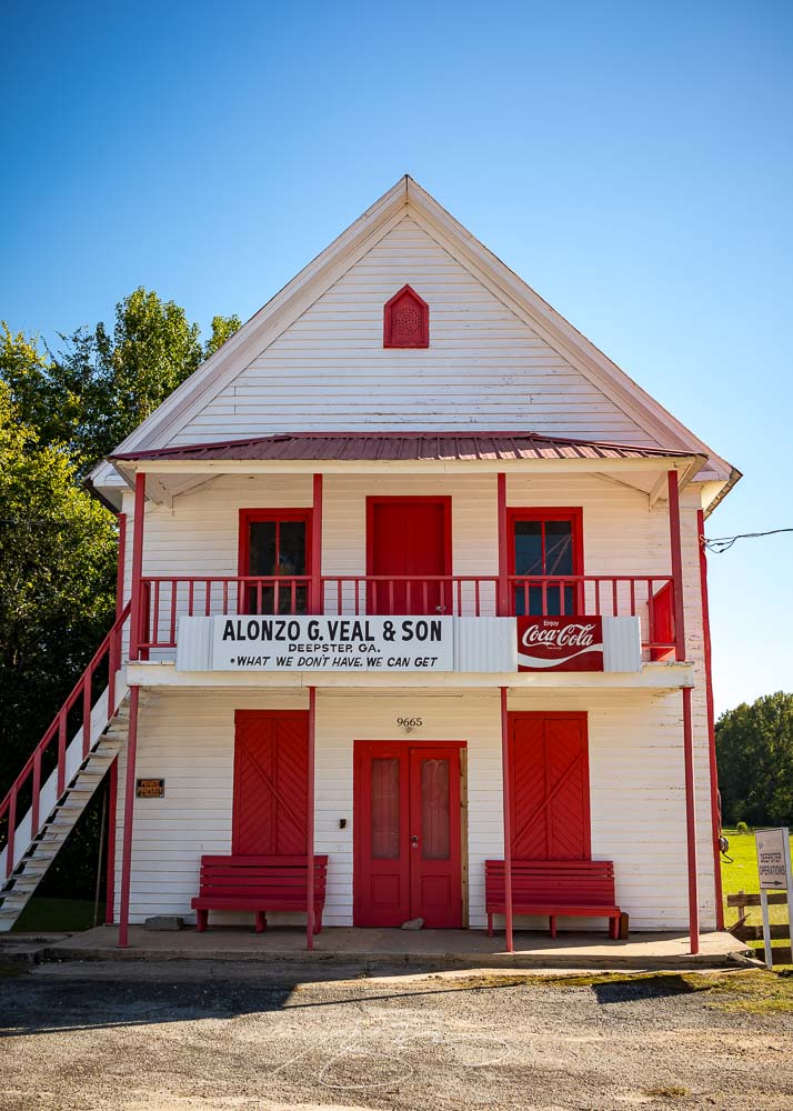
    Alonzo G. Veal & Son (What We Don’t Have, We Can Get), 9665 Deepstep Rd.
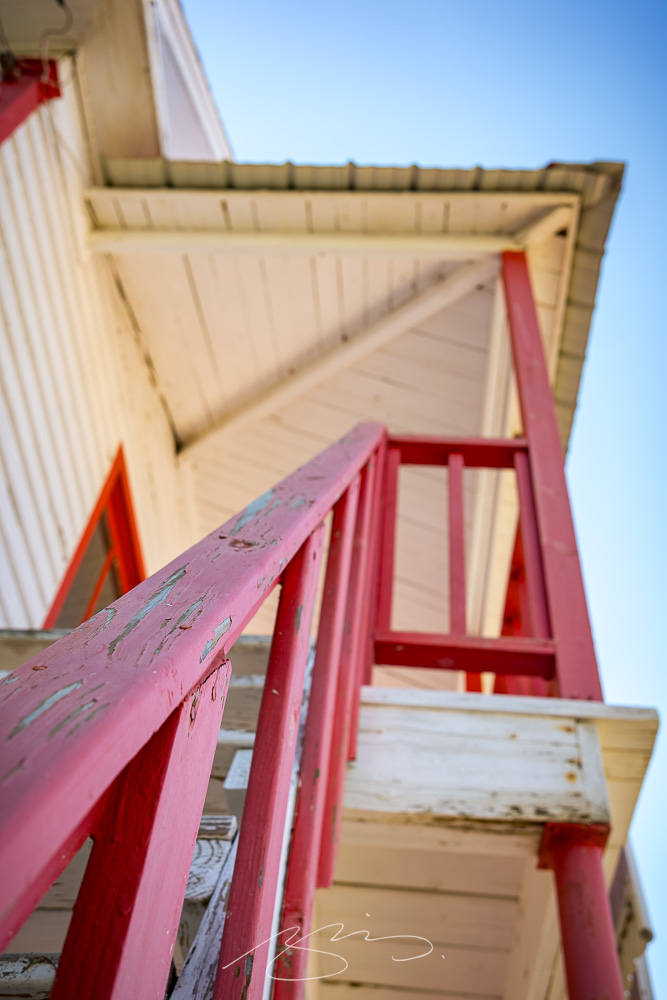
    Veal & Son Building Detail #1, 9665 Deepstep Rd.

    What a great little spot.

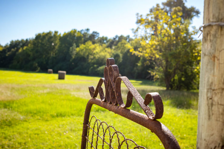
    Gate and Field, 9665 Deepstep Rd.
    Outbuilding and Pine, 9731 Deepstep Rd.

    The gallery’s only eighteen photographs, but absolutely a worthy addition to the newly revised Middle Georgia group. Those galleries cover everything from Pine Mountain in the west to Sandersville in the east, Madison in the north to Dublin in the south.

    Indeed, I’ve rearranged pretty much all of the Georgia galleries:

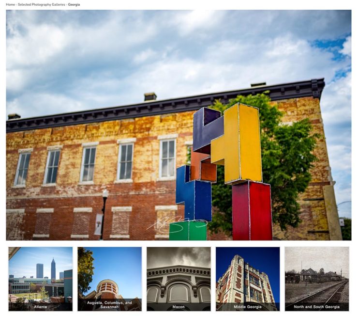
    The new Georgia gallery group: five items instead of three, all featuring rearranged contents.

    Atlanta gets its own (to be expanded soon, I hope); the cities of Augusta, Columbus and Savannah another; Macon, my home base, a third; the aforementioned Middle Georgia, a fourth; and finally North and South Georgia (Helen, St. Simon’s, etc.).

    As always, thanks for taking the time to stop by.

  • New Gallery: Augusta, Georgia (Part Two)

    New Gallery: Augusta, Georgia (Part Two)

    As mentioned yesterday, I’ve been meaning to get to downtown Augusta with a camera for years. Actually, that not correct: I’ve been meaning to get to downtown Augusta . . . period. I’d never been there, despite living 130 miles away for almost two decades, despite having been nearby, despite — well, you get the idea.

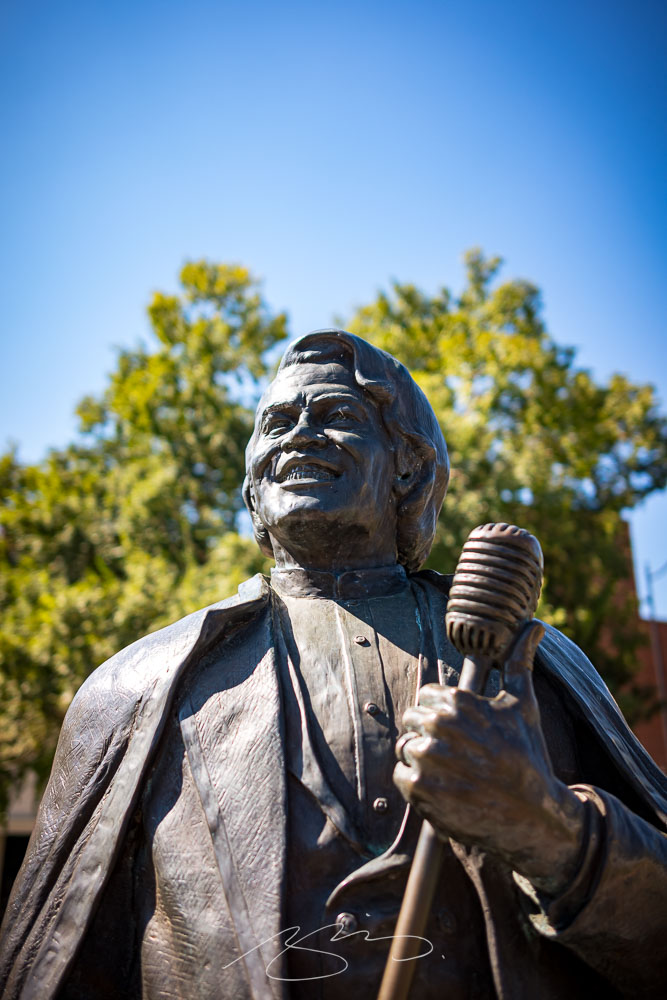
    Statue at James Brown Plaza, Broad St. and Augusta Common

    So it was a pleasure to get to the home of Woodrow Wilson, James Brown, Jessye Norman, and countless others — and see a city a lot like so many others in the American South, a city that’s struggling with identity, history, vacancy, gentrification, and so many other issues prevalent in the 2020s.

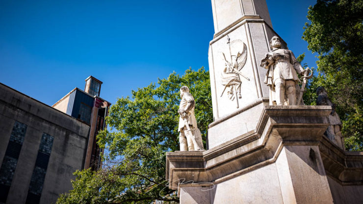
    The Confederates and the Albion, Broad St.

    One of them is the continued presence of a huge Confederate memorial, a shame in a majority-Black city — and just in front of the Lamar Building, soon to be luxury apartments. What message are Augusta, and its new luxury residents, sending?

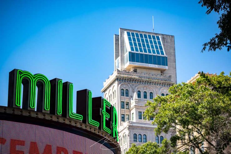
    Miller and Lamar, Broad St.

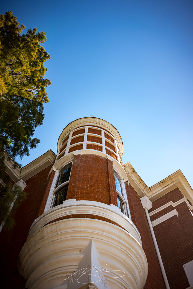
    Nonetheless, the day’s efforts resulted in some satisfying images, from architecture to neat details:

    Augusta Cotton Exchange Building #1, 32 8th St.
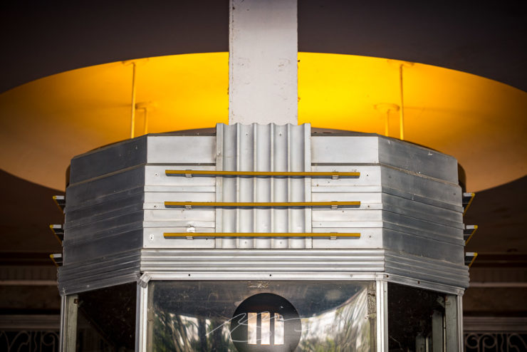
    Miller Theater (Entry Detail), 708 Broad St.
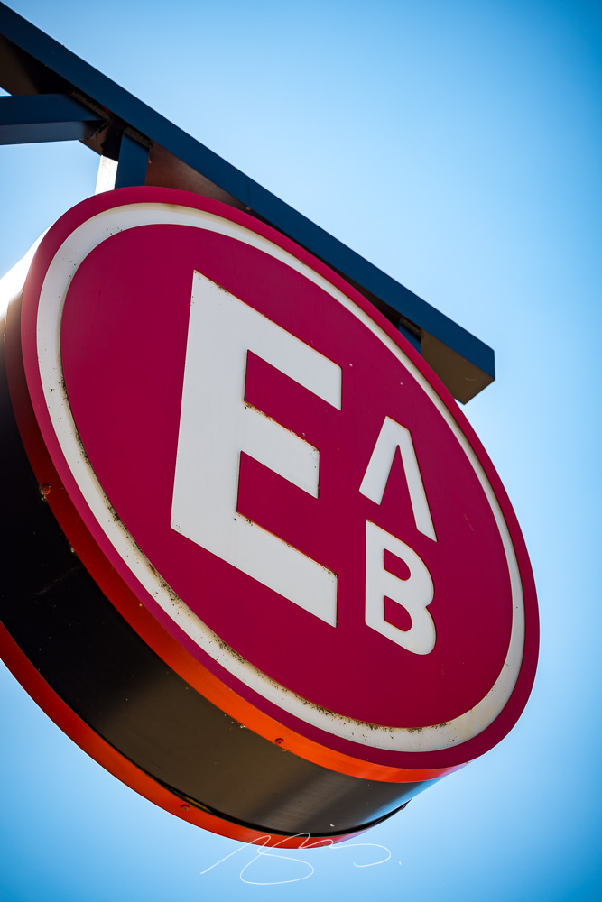
    Edgar’s Above Broad (Logo) Sign, 699 Broad St.

    Augusta is a riverfront city I’m looking forward to returning to. In the meantime, please enjoy a total of 128 photographs in the newly-posted gallery.

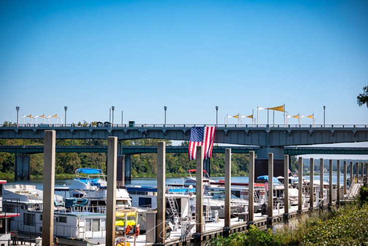
    Augusta Riverwalk Marina (with Freedom Bridge)
  • New Gallery: Augusta, Georgia (Part One)

    New Gallery: Augusta, Georgia (Part One)

    Together with Columbus and Macon, Augusta is one of Georgia’s “Fall Line” cities, and is home to more than 200,000 people. Located on the eastern edge of the state on the Savannah River, it was founded by James Oglethorpe in 1736 on the site of a Native American river crossing.

    Augusta has long been on the to-photograph list, but it’s just far enough away from Macon to make a quick, unplanned trip difficult — so this past weekend, when another trip was cancelled, I took advantage of the available time and made it happen.

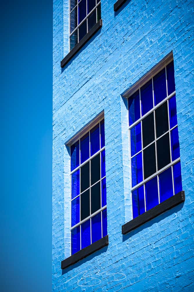
    Blue Against Blue Against Blue, 943 Ellis St.

    Of course, rather than a quiet Sunday downtown, I ran headlong — no pun intended — into the Augusta Ironman marathon. There were crowded street corners, intersections closed aplenty, and a combination of competitors and supporters everywhere.

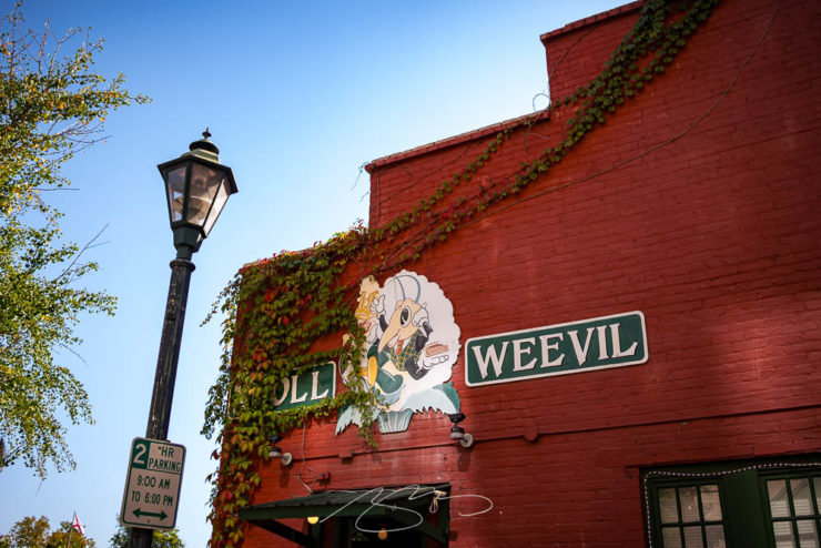
    Boll Weevil Cafe and Sweetery, 10 James Brown Blvd.

    Nonetheless, it was a beautiful early-fall day in Georgia, and over the course of several hours, I really enjoyed photography in downtown Augusta — as usual, without people in the shots.

    Decorative Facade, 103 Macartan St.

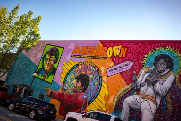
    Excepting, of course, The Godfather of Soul:

    Spirit of Funk Mural, 190 James Brown Blvd.

    The photostroll also included the Riverwalk, a stretch both at water level and atop the levee — doing my best to stay out of the runners’ way, moving around to the chants of “water!” and “ice!”

    Fountain at Riverwalk Enterance (#1), James Brown Blvd.
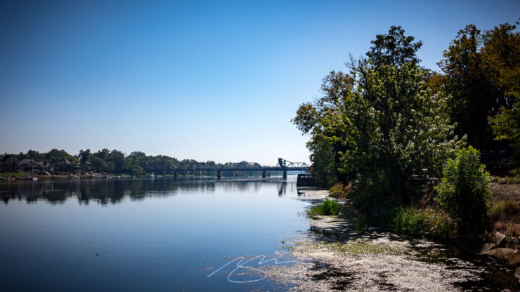
    Savannah River at Augusta, Georgia

    The first 64 photographs — part one of two — have been posted to the new Augusta gallery. Stay tuned for the second part, along with a bonus gallery and some housekeeping news, tomorrow.

    Slice of Primary Colors, 1102 Broad St.