Tag: joan westenberg

  • Beautifully Briefed 26.7: The Long Heat

    Beautifully Briefed 26.7: The Long Heat

    It’s July, and it’s hot. Bring a beverage. Umbrella optional.

    Spine!
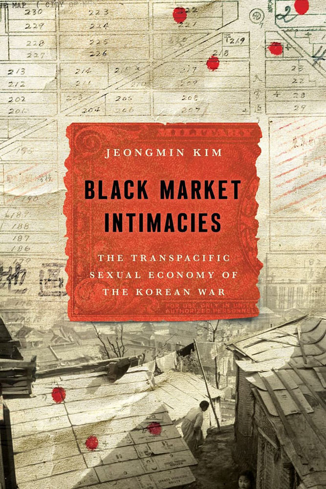
    Stanford University Press. Cover design by Lindy Kasler; art director, Michele Wetherbee. Cover art: Map of Kunitachi, Japan, National Archives and Records Administration; photograph of refugee dwellings in Busan, Korea, United Nations Archives; US military payment certificates note, US Army Finance Corps.

    “The cover asks questions,” I wrote in this month’s column for Spine. “Illustrations and scripts combine in myriad ways; maps plot; and blood drops. Rather than telling you what the title is about, it suggests that it’s not easily summarized — in all the right ways.”

    Read!
    The End of Reading is Here
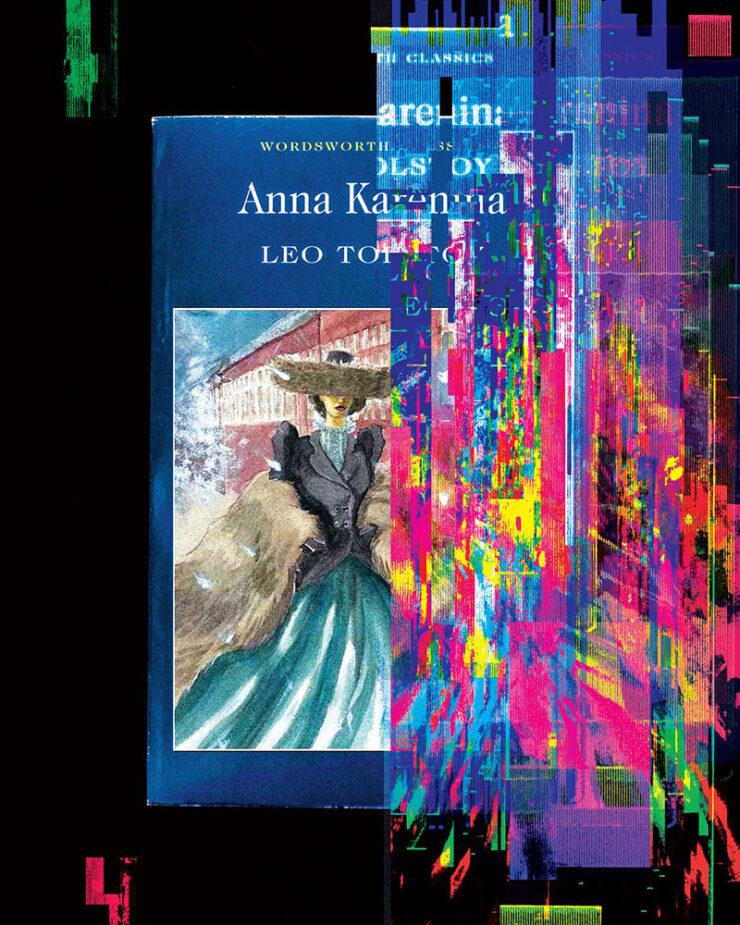
    Cool header graphic from The Atlantic article.

    “Optimists once believed that universal literacy was inevitable. Now it seems that the age of reading might be a short anomaly in human history,” The Atlantic writes. “The decline of reading will bring about changes of the same magnitude. It will affect our innermost thoughts, our society’s politics and culture, and how we tell the history of our civilization.”

    Reading requires imagination; consumption, whether social media, television, or gaming, really doesn’t. It’s no surprise that the lowering of the common denominator is the result.

    But what if the premise is, in fact, true? I can’t imagine a life without reading — and you’re reading this, so you probably can’t either. Will humanity reach to a point where ingestion of knowledge doesn’t involve the written word? Should it?

    Read the article here. (Gift link via Kottke.)

    Update, 31 July (after publishing): The gift link has expired, darn it — apologies. (One of the downsides of gathering items throughout the month, I guess; this is from the 8th of July.)

    “Read More. Read Often. Read Every Day.”
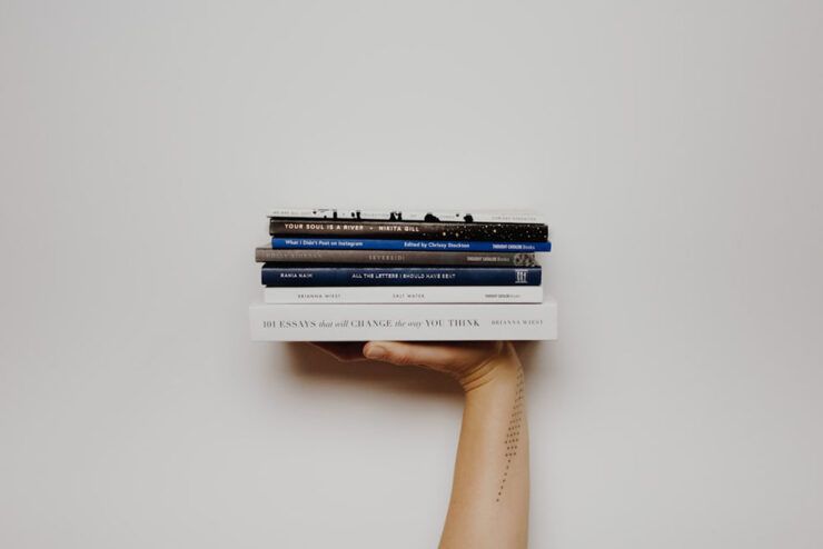
    We keep searching for lifehacks, productivity tips, and bullshit, but the answer is right there. If you want to be better, grow more, understand your life, understand your purpose, learn something, or just find somewhere to stay a while when life gets overwhelming — pick up a damn book.

    — Joan Westenberg

    She calls it the 80/20 rule: “I believe that spending 20% of your time buried in a book, buried in something that will inspire you, excite you, and make you want to jump out of your seat is going to give you the fuel, the ideas, and the power to create 80% of your output.”

    It’s worrying to think that The Atlantic might be right. This, In its brevity and forthrightness, is a strong counter-argument.

    Special bonus #1: Uncovered is a site for judging books by their first pages. “No cover. No bestseller sticker, no celebrity book club, no BookTok trend. You read the opening of a real book, blind, and answer the only question that matters: would you keep reading?”
    Great address, by the way — I didn’t know .ink was a thing. (Also via Kottke.)

    250 for 250
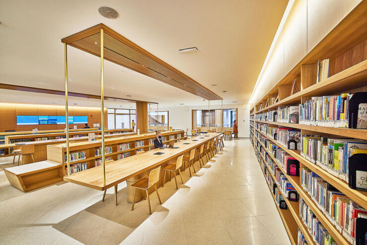
    Photograph of the Brooklyn Library’s main branch by the Municipal Art Society of New York.

    Brooklyn Public Library is celebrating our country’s 250th anniversary the best way we know how: with a thoughtful, surprising, irresistible booklist. Organized by genre and category of interest, this all-ages list is a deep dive on the stories, voices and moments that shaped America. Selected by our expert librarians — with help from a few notable New Yorkers! — here are the 250 most influential books in United States history.

    — Brooklyn Library’s 250 for 250 Booklist Intro

    Whether it’s actually the most influential 250 titles in the country’s history is probably intentionally debatable, but it’s still a great list. From The Hunger Games to The Snowy Day, The Warmth of Other Suns to Where the Sidewalk Ends, the choices are sometimes surprising, sometimes great memories, and sometimes inspirational.

    If you’re looking for the next title to read — or the next gift to give — start here. (Also available in a handy PDF if you’d like to send to someone.)

    Special bonus #2: Bookmobile, my favorite short-run printer, has been sold — but remains privately-owned, non-corporate, and dedicated to craft. Founder Don Leeper is retiring after 44 years; Michael Shoemaker is the new owner.

    “Mike is the perfect buyer for Bookmobile, with the passion, skills and resources to continue and improve our services to publishers. From the beginning of our discussions he displayed an aptitude for grasping the complexities of book publishing in the 21st century and bringing to bear his deep experience in technology, ecommerce, and business in general. Last but not least, he has an understanding and appreciation for the importance of book culture. I am damned lucky we connected.”

    — Don Leeper, Bookmobile

    “No major changes are planned,” the press release says. “Under its new ownership, Bookmobile will continue to invest in the growth of the business and the success of its publisher customers.”

    (Via Publisher’s Weekly.)

    Type!

    This month has seen a wealth of new typefaces introduced. A few that caught my eye are below, but it’s start with a question.

    “What is Queer Typography?”

    “Looking for queer anything often feels lonely,” Paul Soulellis writes. “The word queer resists definition, sometimes aligned with ideas about rejection, refusal, deviating from the expected, away from the normative. It’s certainly a political word, one that’s taken on expansive qualities throughout its history, qualities that aren’t necessarily confined to gender and sexuality.”
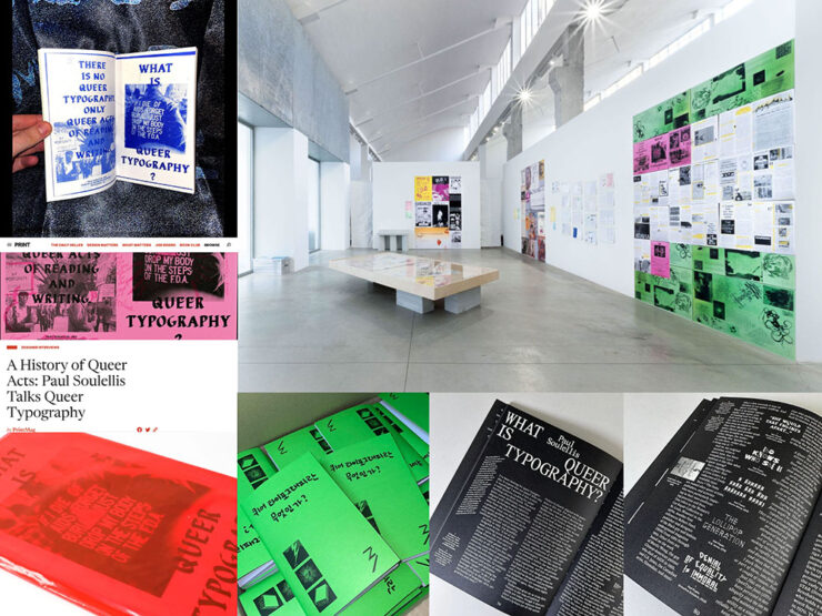
    Image via soulellis.com.

    An interesting text, certainly, with many possible answers to the question and accompanying designs and images. “[W]e need to stay with queer as an action, actively engaging with the past and the future as a verb.”

    Read more. (This is from 2024, but was recently linked at Kottke — and was new to me, so forgive the late notice/attention.)

    Emigre’s Modulator now at Adobe Type

    Adobe prices are a regular gripe amongst many, but one of their strongest offerings is the type catalog — and it just got better:
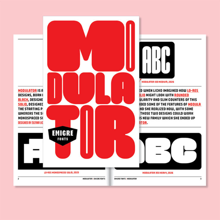
    “Modulator was conceived as a dialogue between two designs separated by nearly three decades: Modula Round Black (1995) and Lo-Res Monospaced Solid (2023),” Emigre writes. The results are Modulator and its companion Modulator Text Variable, “optimized for smaller sizes by expanding the stem and counter dimensions to improve legibility.”

    Pretty much everything Emigre is awesome, and this is a welcome addition.

    Data as type
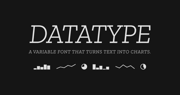
    “Datatype is an OpenType variable font that turns simple text expressions into inline charts. No JavaScript, no images, no rendering library — just type the syntax and Datatype’s ligature substitution does the rest.”
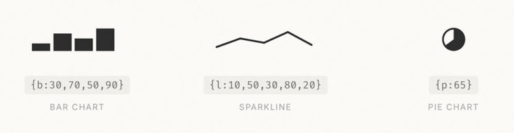
    Very cool — and very open source, thus very free. Available on GitHub or Google Fonts.

    Special bonus #3: I don’t actually know how much AI is driving new typeface design; honestly, it seems like an art form requiring human decision-making. Dutch foundry Mass-Driver is one that will always design fonts by hand:

    AI tools perceive reality as a finite set of data, up-to-date as of about 2021: the shadows on the wall of Plato’s Cave. Right now they are very good at making shadow puppets, but they cannot see the world outside.

    If we allow these tools to dictate our visual culture, we must accept that it will be vitrified by machines which consider a few billion webpages equivalent to the sum total of human existence. I don’t accept that. How dare we abandon so many countless traditions and people and ideas and nuances, simply because they are under­represented in the training data?

    — Rutherford Craze & Co., known as Mass-Driver
    CreativeBoom’s July Fonts

    Fourteen in all this time — last month’s suggestion of a summer lull was wrong, apparently — with some strong selections. I wanted to show several, but narrowed it down to three that deserve highlighting:
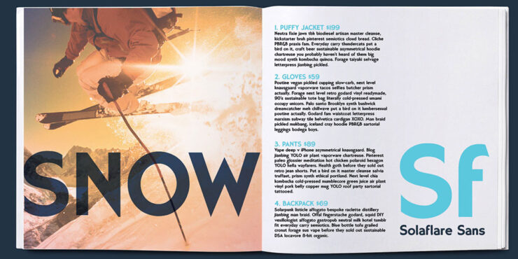

    Solaflare Sans, by John Reshell of Swell Type.
    Solaflare Flare.

    “Solaflare’s mood is both unmistakable and timely, evoking warm evenings, hand-painted shop signs, and the particular quality of light in a California coastal town. John Roshell of Swell Type was inspired by the hand-painted signage of Santa Barbara, but rather than simply reviving that aesthetic, he built a variable font around it; one that lets designers slide between three distinct typographic personalities within a single file.”
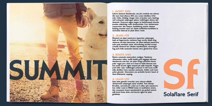
    Solaflare Serif.

    That’s right: a variable flare — meaning sans on one end, flare in the middle, serif on the other. Check it out.

    Oratorio, by Alex Chavot of Apex Type Foundry.

    “Alex Chavot’s latest release for Apex Type Foundry — launched alongside a comprehensively rebuilt foundry website — takes Halbfette Cantate, a display face released around 1910 by H. Berthold AG and designed by Johann Graf, as its starting point, then runs it through the filter of Ed Benguiat’s flamboyant 1970s classics. The result is sweeping swashes, lyrical terminals, high contrast, and an unapologetically theatrical personality that Chavot describes, accurately, as ornamental excess meeting typographic swagger, with just enough restraint to keep it printable.”
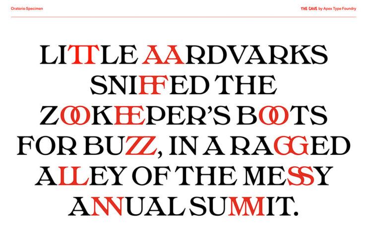
    Oratorio.

    Single-weight fonts are rare these days — but oh, what a weight it is. Expressive, serious, almost lavish. Check it out.
    Milgram, by Max Phillips of Signal Type Foundry.

    “Max Phillips of Signal Type Foundry has a gift for describing typefaces, and his account of Milgram is direct. They’d always wanted to add a humanist sans to the library, and always wanted to add a rounded sans. So they decided to save time by making them the same typeface and seeing what happened. What happened was a wave of nostalgia for Frankfurter, VAG Rundschrift, and an all-caps dry-transfer face called Formula One that nobody else seems to remember.”
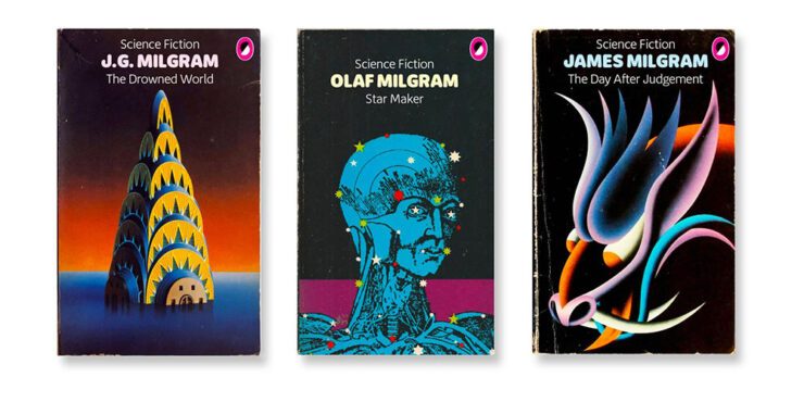
    Milgram.

    ’Course, anybody who mocks up book covers with their new font … instaclick! Check it out.

    Vote!
    Archinect’s Spring ’26 lecture posters

    Twice a year, Archinect holds a contest for their readers to decide which of the season’s lecture posters from architecture schools around the country are their favorites.
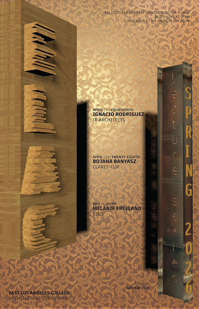
    East Los Angeles College.

    Alas, the contest usually ends just before this column gets posted, so sometimes y’all are able to vote, sometimes not. This time, we only get to compare my favorites with the results.
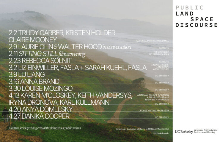
    University of California at Berkley.

    Along with these three, I’d also give honorable mentions to Yale, Sci-Arc, and the University of Tennessee at Knoxville.
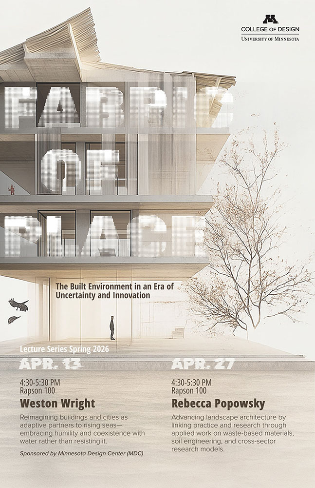
    University of Minnesota.

    ELEC won the contest, too. As for the rest, we’ll just have to agree that they’re all winners in one way or another. See the readers’ and editors’ choices.

    “Choose Euro’n Adventure”

    Brand New‘s penchant for punny-yet-perfect post titles scores another with this one — another one that voting might be just out of reach for, depending on where you’re reading this from.
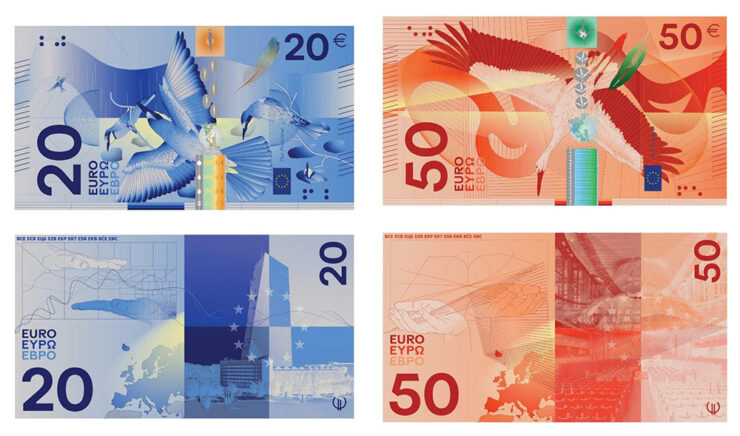
    Design submission by Rudy Guedj and François Girard-Meunier.

    That’s right: it’s time to redesign the Euro! Finalists have been chosen.

    “A panel of jurors selected the designs, which follow one of two themes: European places and ideas or birds and rivers, the latter of which is meant to symbolize freedom and unity,” This is Colossal writes.
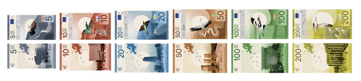
    Design submission by Isabelle Daëron.

    Interestingly, the notes get bigger with denomination — the 5 is the smallest, then 10, then 20; the 50, 100, and 200 are all the same size. (Not the boring uniformity we get here in the States.)
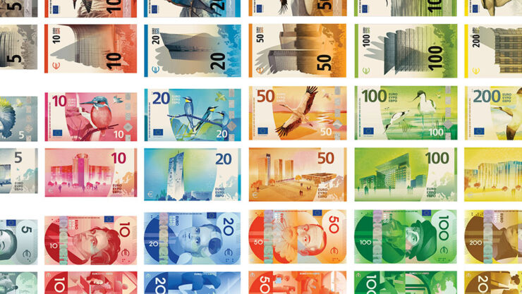
    Same colors, same denominations, vastly differing details. (Overview via Brand New.)

    “While basic elements are the same — all collections devoted to culture feature the same six figures, for example — individual approaches appear in the layout, aesthetic, and composition,” Colossal continues.
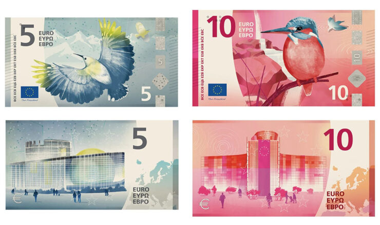
    Design submission by Atelier Goppel-Toperngpong.

    I’m unsurprisingly partial to the birds & places, but no matter which theme or which specific design, these are all excellent. See all the available options at the European Central Bank website — and, if you’re in the EU, take the survey!

    Special bonus #4: It’s not the Europeans, it’s the English we have to thank: Getty has abandoned its takeover/merger with/of Shutterstock. Hooray!

    Amuse!
    Lil’ Finder Guy
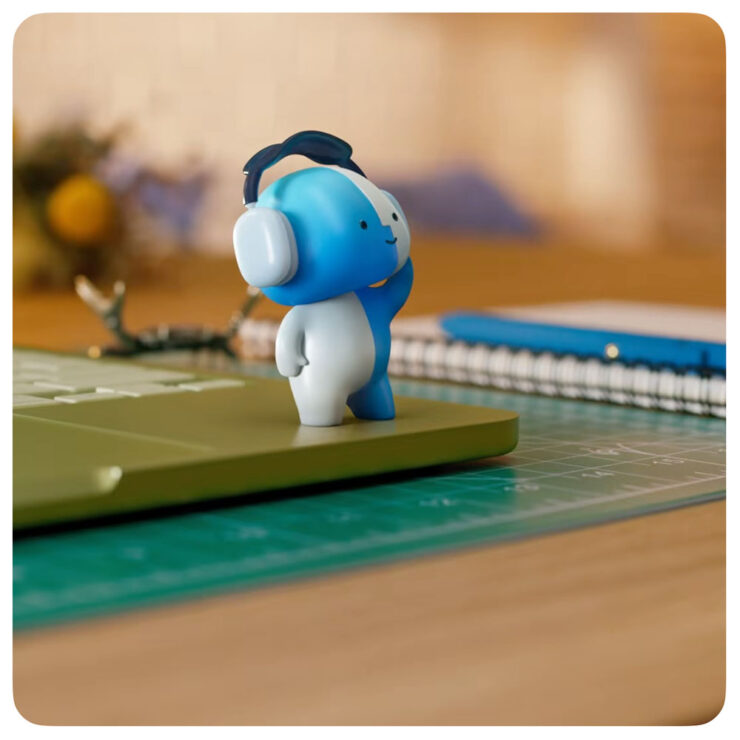
    It may be a social media campaign, but darn it’s cute.

    Basic Apple Guy, who introduced me to Apple’s social media campaign1As you probably know, I don’t participate in social media. I have to rely on others to bring Apple’s media efforts to my attention — folks covering the coverage, as it were. for the MacBook Neo, has an update with all things regarding this unofficial mascot.
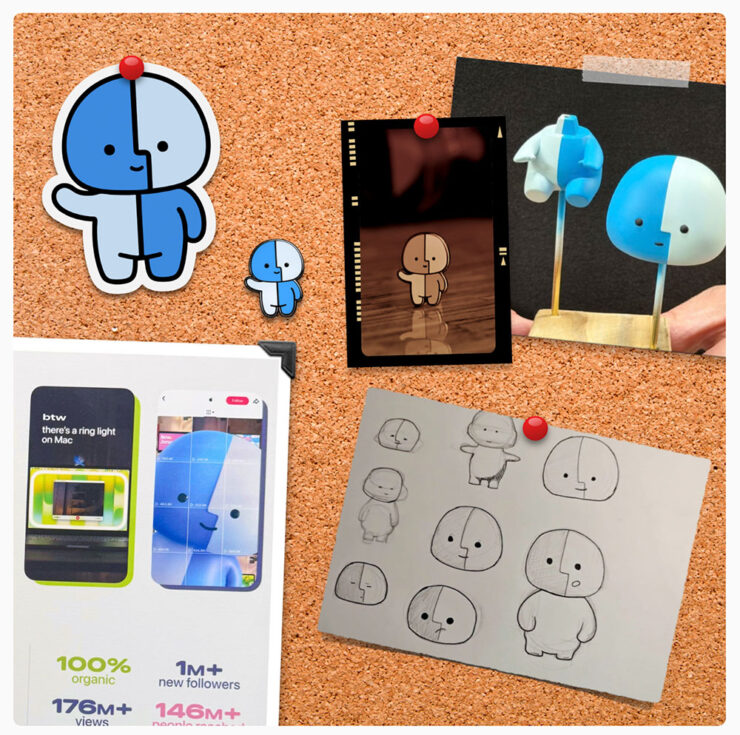
    Details, stickers, and more.

    It’s the Internet, of course, so even items that have been posted briefly then deleted are fodder for careful investigation — and some of the details he’s dug up are neat. (He’s also done a bunch of generated varieties of the character, which make occasional — and often delightful — appearances in his articles.)

    Save the manuals

    No, not of the RTFM variety. It’s actually a non sequitur.
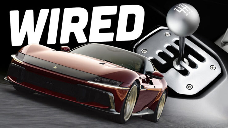
    Image via The Autopian.

    Ferrari went and did something interesting, again: having introduced the world of high-performance motoring to the automated manual (the F1, in 1997),2Ferrari’s F1 wasn’t actually the first automated or even semi-automated manual gearbox/transmission, by a long shot. It is, however, the one that brought it to sports cars, followed almost immediately by BMW’s SMG. Wiki has a history, if you’re interested. it’s now introducing … the manualized automatic.3Technically, Koenigsegg got there first with its CC850. However, a) you have to be a car geek to know Koenigsegg, and b) that shift-by-wire unit doesn’t use traditional selector forks, or synchronizers. Instead, it uses seven wet clutches, six to select forward ratios and one for reverse, all with their own pressure sensors and mechatronic actuators. “Changing up is as simple as engaging the right clutches,” The Autopian says. Ferrari’s is a gated dual-clutch automatic, although to call that an oversimplification is an undersell.
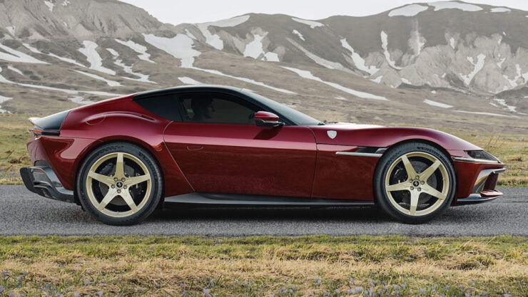
    Photograph via Ferrari’s press department.

    First of all, let’s all please agree that the 12 Cilindri, their 819-horsepower, half-million-Euro, two-seater Grand Touring masterpiece, is a beautiful thing — retro, but in a modern way. Especially in this merlot-and-gold combo.
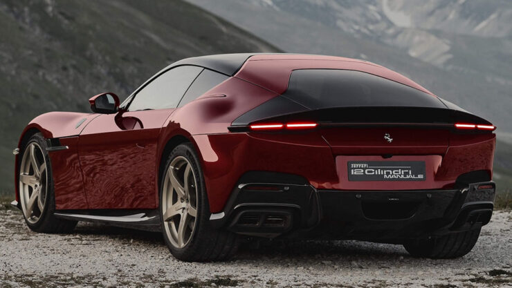
    Photograph via Ferrari’s press department.

    In the new Manuale model, the transmission is the story: a gated dual-clutch automatic, or DCT, with a twist. It’s got buttons for drive, reverse, etc., as usual — but a clutch and a shift lever instead of paddles.

    By doing so, offers a road map for other automakers (cough *BMW*) whose customers are demanding the engagement of a manual but whose governments are demanding reduced emissions and increased mileage — plus all those safety mandates like automatic braking and conveniences like adaptive cruise control.
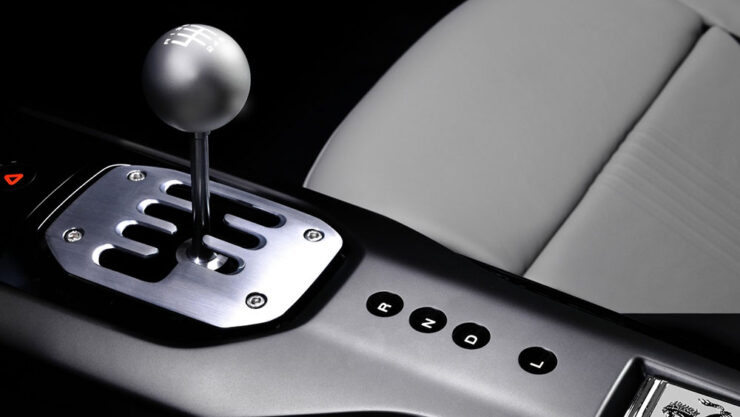
    Photograph via Ferrari’s press department.

    I’m convinced this is the future of the manual transmission. It’s unconventional, unexpected, and is going to take a minute to trickle down. But … fingers crossed.

    Get details at The Autopian or The Drive.

    Special bonus #5: Driving stick can help prevent dementia. Okay, sure, it’s not the most scientific post extant, but it makes sense.

    Gaze!
    Astronomy Photographer of the Year finalists 2026

    “Now in its 18th year, the ZWO Astronomy Photographer of the Year contest is among the premier photo competitions that celebrate the art of astrophotography and astronomy,” PetaPixel writes.
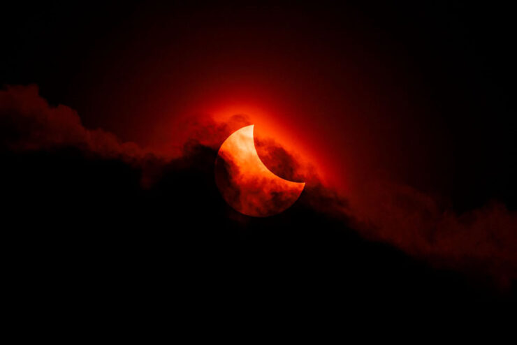
    Moody Partial Solar Eclipse. “Our Sun” category. Photograph by James McBeath, UK.

    “The competition features nine categories, a pair of special prizes, and the expert panel of judges selects a single overall winner, all of which will be showcased in an exhibition at the National Maritime Museum in England starting on September 18.”

    Te Hoho Rock Moonrise. “Skyscapes” category. Photograph by Evan McKay, New Zealand.

    Astrophotography is fascinating — a reminder that we’re merely a blip — and requires patience, skill, and specialized gear. But the results … wow.

    See all 29 finalists.

    25 Amazing JWST photographs

    While we’re on the subject of space photography, the imagery from space-based cameras amaze no less. The James Webb Space Telescope just celebrated its fourth birthday, and PetaPixel has gathered 25 of its most spectacular and insightful images.
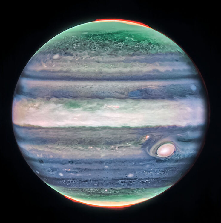
    Jupiter. Photograph credits: NASA, ESA, CSA, STScI, R. Hueso (UPV), I. de Pater (UC Berkeley), T. Fouchet (Observatory of Paris), L. Fletcher (University of Leicester), M.H. Wong (UC Berkeley), J. DePasquale (STScI).

    Cloud details, aurora, the eye — and all on a planet we’re “familiar” with.

    Rho Ophiuchi cloud complex. Photograph credits: NASA, ESA, CSA, STScI, K. Pontoppidan (STScI), A. Pagan (STScI).

    The Rho Ophiuchi cloud complex is the closest star-forming region to Earth, and demonstrates both the beauty and power of the Universe.

    “The $10 billion NASA/ESA/CSA JWST has produced a great deal of exceptional scientific work in its first four years of operation, much of which is utterly groundbreaking,” PetaPixel writes. “However, that alone is not enough to warrant a photo’s inclusion. While scientific value is important, a Webb image featured here must also be beautiful.”

    See also: PetaPixel‘s selections from JWST’s second birthday two years ago.

    Illumination

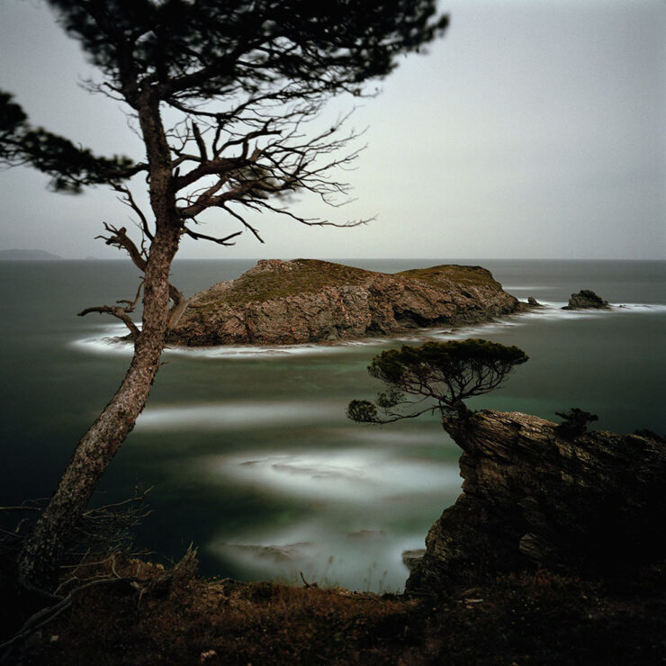
    What do these two photographs have in common?
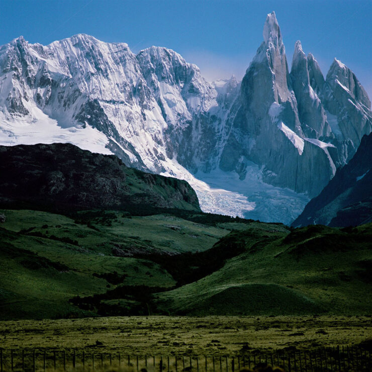
    Cerro Torre. Photograph by Darren Almond.
    Porquerolles. Photograph by Darren Almond.

    Both were taken by the light of the full moon!

    In his new book, aptly named Darren Almond. Fullmoon, “the light of the Moon is eerily enhanced, infusing the landscape with haunting ideas of nature and time,” PetaPixel (dramatically) writes.

    iPhone Photographer of the Year 2026

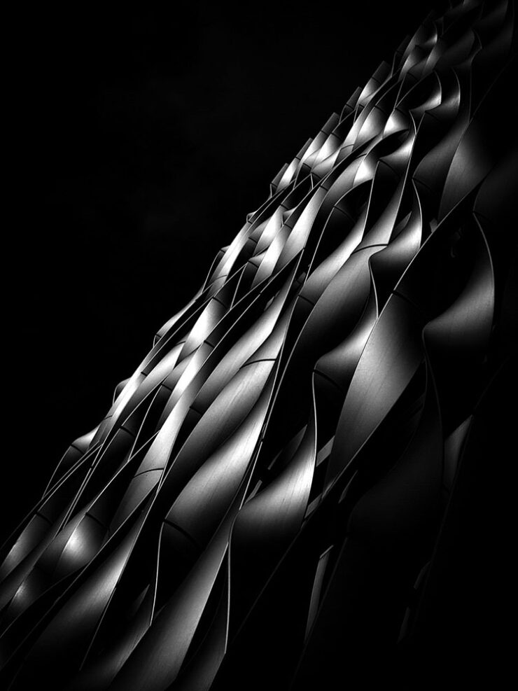
    It’s that time of year again: the iPhone Photography Awards, now in its 20th season, has announced its annual competition winners.
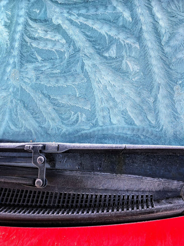
    Winner, Abstract category. Photograph by Barry Mayes, UK.

    Entrants from more than 140 countries “showed just how powerful an iPhone can be in the right hands and how great photos don’t always require high-end, dedicated camera equipment,” PetaPixel writes.
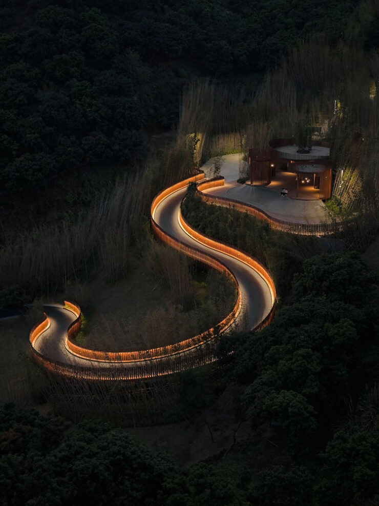
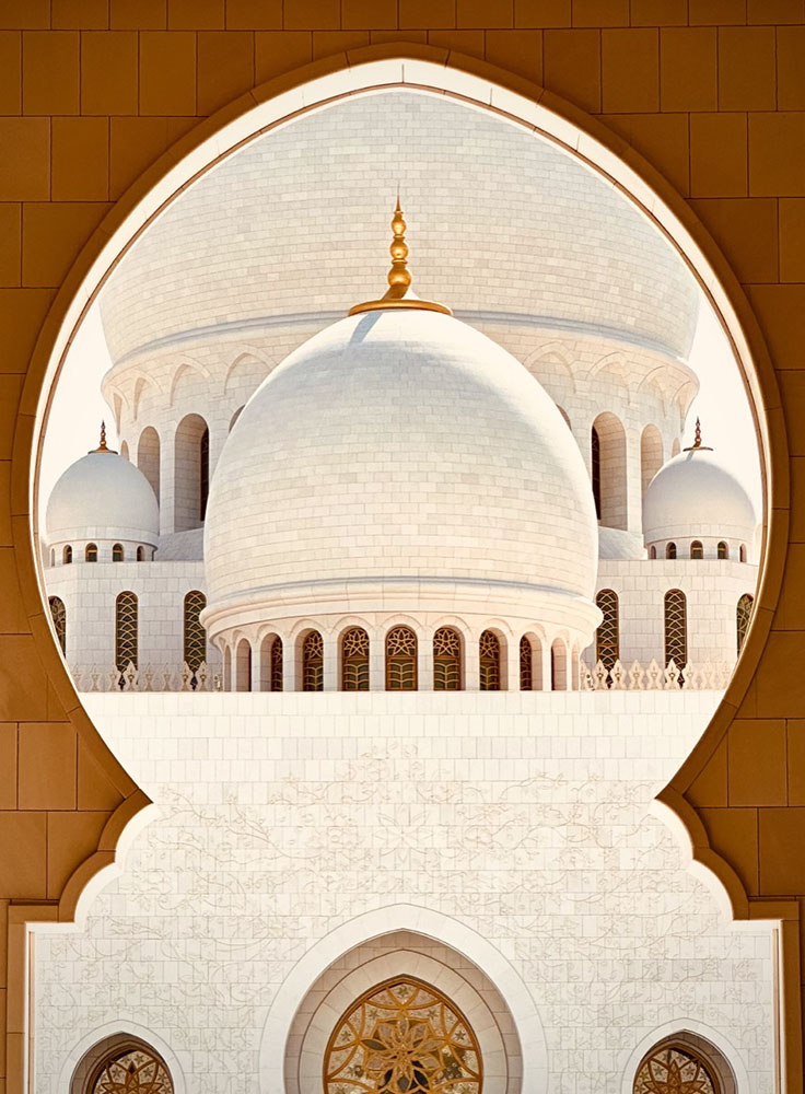
    Winner, Architecture category. Photograph by Ziwen Chen, China.
    3rd Place, Architecture category. Photograph by Preethy Ganesan, US.
    Honorable Mention, Architecture category. Photograph by Adrian Beasley, UK.

    Of course, these four barely scratch the surface of the fantastic selection from a variety of categories; see all the winners, runners-up, and more at the official website.

    The Architecture of Connection

    A left turn, so to speak:
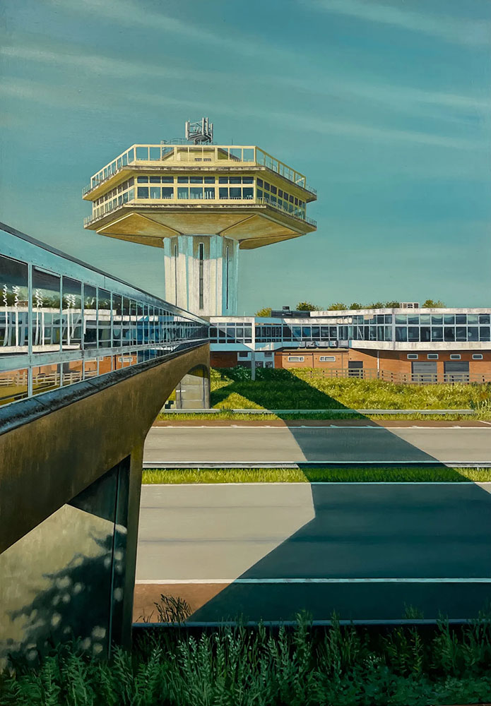
    The Last Landmark. Image by Jen Orpin.

    The Modernist Society takes a detour from its usual publishing habits with a new monograph, The Architecture of Connection,” Wallpaper* writes, “featuring the work of painter Jen Orpin.”
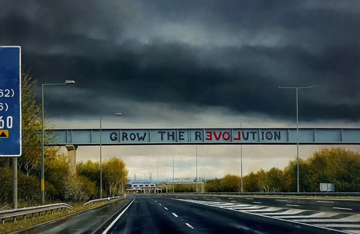
    Let Love Grow. Image by Jen Orpin.

    That’s right: paintings. We’re “in the realm of unseen and overlooked infrastructure, with Orpin’s eye – and careful framing – capturing over 200 images of the bridges that span Britain’s motorways. […] The Architecture of Connection brings the entire series together in a monograph for the first time, together with some of the artist’s writings about the work.”

    Without traffic, but with something bordering tranquility, it’s of course right up my street. I sometimes wish I could stop and photograph every interesting bridge — or even roadside attraction — while out in the world, but don’t, of course; few of us do. Orpin did. With an easel, no less.

    2026 International Pet Photography finalists

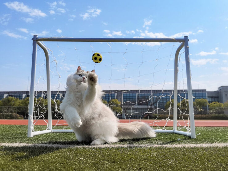
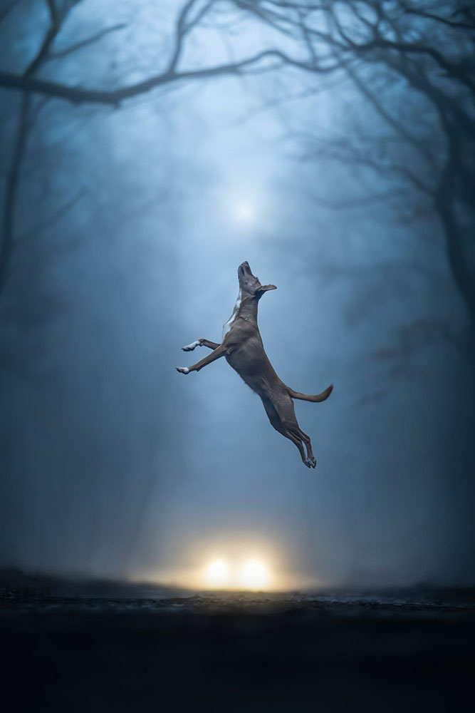
    Finally, something to send you into August with a smile on your face: humanity’s best friends.
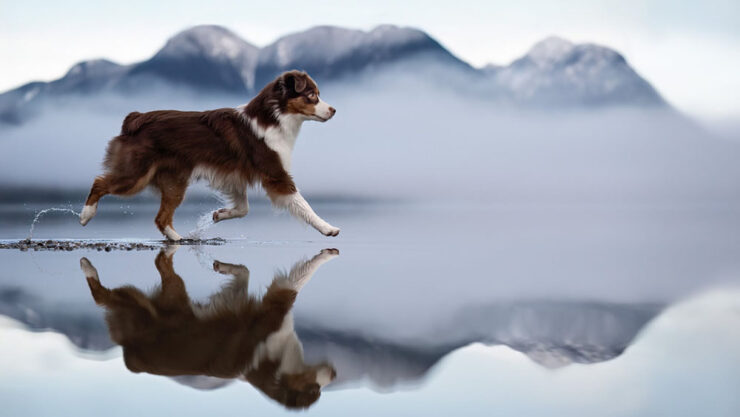
    Untitled, Action category. Photograph by Shandess Griffin.
    ‘Cat Goalkeeper,’ Phone category. Photograph by He Huapei.
    “Weightless,” Action category. Photograph by Linda Glomb.

    The winners will be announced tomorrow, August 1st.

    Happy summer, everyone!

    • 1
      As you probably know, I don’t participate in social media. I have to rely on others to bring Apple’s media efforts to my attention — folks covering the coverage, as it were. ↩︎
    • 2
      Ferrari’s F1 wasn’t actually the first automated or even semi-automated manual gearbox/transmission, by a long shot. It is, however, the one that brought it to sports cars, followed almost immediately by BMW’s SMG. Wiki has a history, if you’re interested. ↩︎
    • 3
      Technically, Koenigsegg got there first with its CC850. However, a) you have to be a car geek to know Koenigsegg, and b) that shift-by-wire unit doesn’t use traditional selector forks, or synchronizers. Instead, it uses seven wet clutches, six to select forward ratios and one for reverse, all with their own pressure sensors and mechatronic actuators. “Changing up is as simple as engaging the right clutches,” The Autopian says. Ferrari’s is a gated dual-clutch automatic, although to call that an oversimplification is an undersell. ↩︎
  • Beautifully Briefed 26.3: The Ides of Equal Madness

    Beautifully Briefed 26.3: The Ides of Equal Madness

    This month, some optimism, some interesting books, some creative fonts, and some fantastic photos, and somepositivity — plus a smidgen of pessimism — in the form of Adobe.

    On the whole, it’s mostly optimism, promise. And there’s butter. And a sleeping fox. And duck.

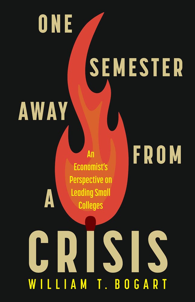
    This month’s Spine
    Rutgers University Press. Cover design by Ashley Muehlbauer; production editor, Vincent Nordhaus.

    “Our initial direction for [the designer] was to create a clean, simple text design that conveyed crisis, dread, or the element of threat,” this title’s production editor said in response to my request for information.

    “To say that someone lit a fire under those directions is an understatement,” I wrote in this title’s commentary. “In today’s American academic reality, where every day could indeed be … shall we say, fraught, this cover takes the brief and runs straight onto the dean’s list.”

    See the rest of this month’s University Press Coverage at Spine.

    Why she’s an optimist 

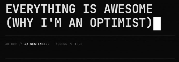
    Joan Westenberg (previously) has another great essay up about the AI doom loop — why it’s easy to believe that the downward spiral is tightening, to roughly paraphrase — and why she believes it just isn’t true:

    In 1810, 81% of the American workforce was employed in agriculture. Two hundred years later, it’s about 1%. If you had shown someone in 1810 a chart of agricultural employment decline and asked them to model the economic consequences, the only rational projection would have been apocalypse. Where would 80% of the population find work? What would they do? How would anyone eat if the farmers were all displaced by machines?

    The answer, of course, is that entirely new categories of work were created that no one in 1810 could have conceived of, and these new jobs paid dramatically more than subsistence farming. Factory work, office work, services, knowledge work, the entire apparatus of modernity: none of it was visible from the vantage point of the pre-industrial economy.

    — Joan Westenberg, “Everything is Awesome”

    “The transition was brutal and uneven. [People] suffered,” she writes. “But the trajectory was real, and the people projecting permanent immiseration […] were, in the fullest sense, catastrophically wrong.”

    The essay isn’t perfect; it’s too long, and the editor failed to catch a few typos (he said, hypocritically). But … it scales. Zoomed out, it applies to more than AI.

    “The doomers may have the best stories. I believe the optimists have the best evidence,” she concludes. I agree. Or, at least, I’d like to. 

    Go read it and see whether you do.

    Great web moments, x2
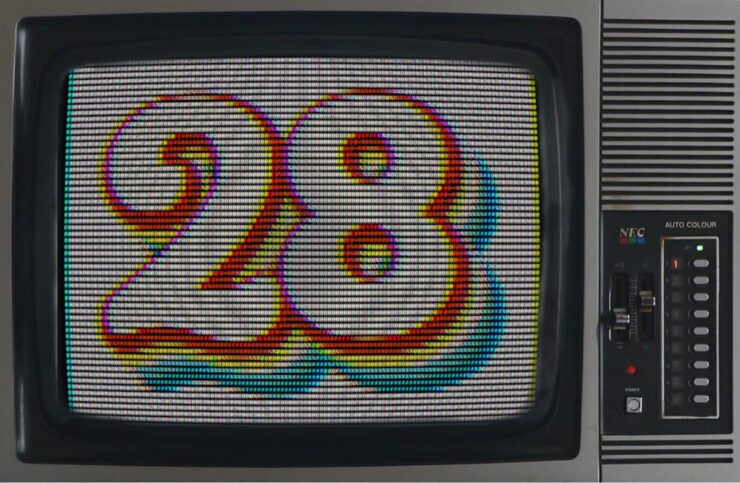
    Kottke.org 

    Kottke Turns 28. There are few websites I nod along with as often as this gem from the late ’90s, still going strong.

    Kottke.org: 47,300 posts and counting.
    Scripting.com

    Dave Winer shoots for the stars:

    We’re going to try to reboot the web.
    Doing what the social networks do, but only using the web.
    Every part replaceable. 

    — Dave Winer, scripting.com, “Mission Statement”

    Scripting News has been around since ’94 and if you’re even a little interested in a free web, his site is a fine place to start learning how you can contribute to keeping it free.

    Note: scripting.com is, famously, still non-https — which means that if you click on either of the above links you’re likely to get a warning that the site isn’t secure. It’s very much a safe link.

    Book notes, x3
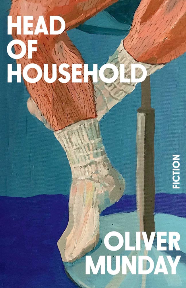
    Oliver Munday, Head of Household
    Somehow, I expected someone older. (Courtesy of Debutful.)

    Nearly every one of his book cover designs could be called an instant favorite. He has a wry, brief expression that often delights.

    So, when he wrote a book, did he do the cover? Well … no, as it turns out — and he preferred it that way.

    Cover design by Chris Brand.

    Munday’s collection of stories has an interesting cover by industry veteran Chris Brand, and I like it — although some of the alternatives seem to me like better fits for Munday’s take on life. 

    But, of course, that’s the point: it’s not about him, it’s about his book.

    See the other book cover design drafts Brand designed for Head of Household at LitHub. (And a short Q&A.) Enjoy also this interview with the author/designer at Debutful.

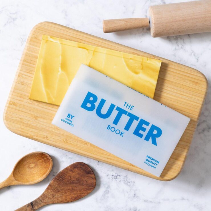
    The Butter Book
    Book design by Lizzie Vaughan.

    No, it doesn’t soften when left out — or spread any larger meaning. It’s just a great book cover (and jacket).

    Chronicle gets a kick out of “things that look like other things.” We made a notepad called Pad of Butter that has been selling steadily since 2015. So, imaginations did not need to stretch when a butter-focused cookbook with a vellum jacket was proposed. It’s our “bread and butter,” so to speak.

    — Q&A with author Anna Stockwell and designer Lizzie Vaughan, PRINT

    “It’s important to find joy wherever you can these days and it’s hard to hate on butter,” the article says. Read the rest at PRINT.

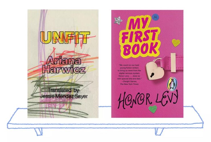
    “Naïve” design
    Image courtesy of the LA Times.

    The LA Times examines the latest book design trend: naïve design. (Yes, I pretentiously style that like the New Yorker does. The LA Times does not.) It’s where serious subjects wear … nostalgic cover designs, to use a phrase. Find out why.

    Parenthetically, of the covers mentioned in that article, only one — by design legend Na Kim — has found its way into my 2026 Favorite Covers folder. It’ll be a minute, but stay tuned to find out which.

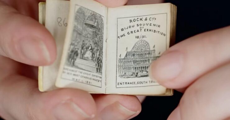
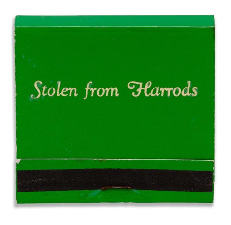
    Special bonus #1: “You’ll need a magnifying glass to read these,” says This is Colossal:

    Courtesy of the V&A Museum.

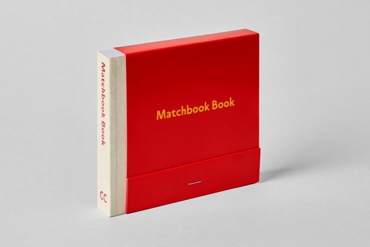
    Special bonus #2: A favorite collectible (and slight tangent), these books “keep a lost design legacy alight,” says It’s Nice That:

    A sample from The Matchbook Book by CentreCentre. 

    Update, 1 April: CreativeBoom has a nice feature on this title as well, with additional images. Check the slipcover:

    Awesomeness courtesy of CreativeBoom.
    Fonts March Foreword
    CreativeBoom’s March faves

    CreativeBoom‘s regular feature contains sixteen choices this month — awesome! — but I’d like to just highlight my three favorites: 

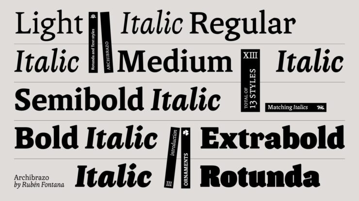
    Archibrazo by Rubén Fontana.

    “Rubén Fontana is one of the most respected figures in Latin American type design, and Archibrazo, released through TypeTogether earlier this year, represents a characteristically considered piece of work. The typeface brings together two traditions that might seem at odds: the fluidity of calligraphic practice and the hardness of sculptural form. The result is a serif family that wears its sources with confidence, without collapsing into historicism or affectation.”

    See more at TypeTogether.

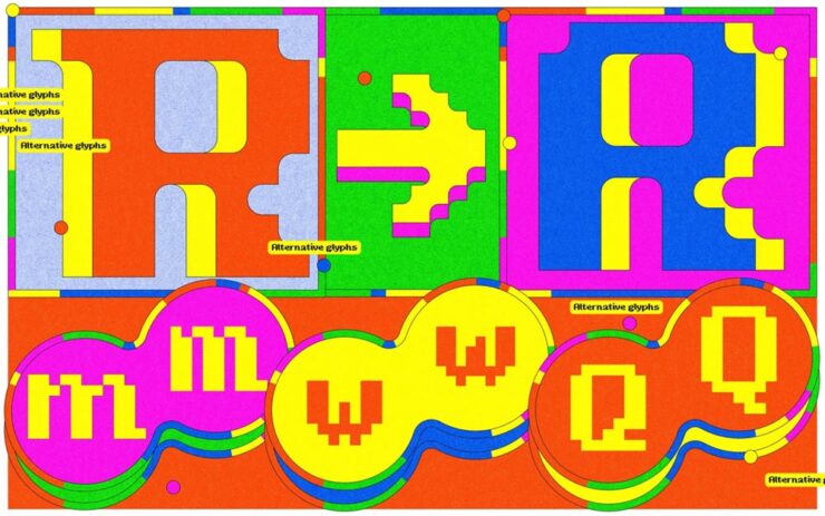
    Djaggety by Alessia Mazzaarella.

    “Djaggety began in a classroom. Alessia Mazzarella of Typeland, who teaches type design to BA Graphic Design students, uses an 8×8 grid exercise as a standard introduction to letterform construction. The constraint, she explains, strips away the paralysis of infinite choice and forces students to focus on what makes a character recognisable within a tightly defined system. During one iteration of the exercise, she found herself drawn into the process rather than simply demonstrating it. […] Overall, it’s a good lesson in how constraint can generate, rather than foreclose, creative possibilities.”

    See more at Typeland.

    Musikal by Fred’s Fonts.

    “After three years in development on Future Fonts, Fred Wiltshire’s Musikal has reached v1.0: a significant milestone for a typeface that began with a conscious act of divergence. Herman Ihlenburg’s Obelisk (1880s) served as the starting point: a high-contrast, ornamental display face of considerable geometric rigour and decorative confidence. Rather than reviving Obelisk directly, Wiltshire took its ‘playful nature’ as a conceptual springboard and built something clearly of the present.”

    See more at Future Fonts.

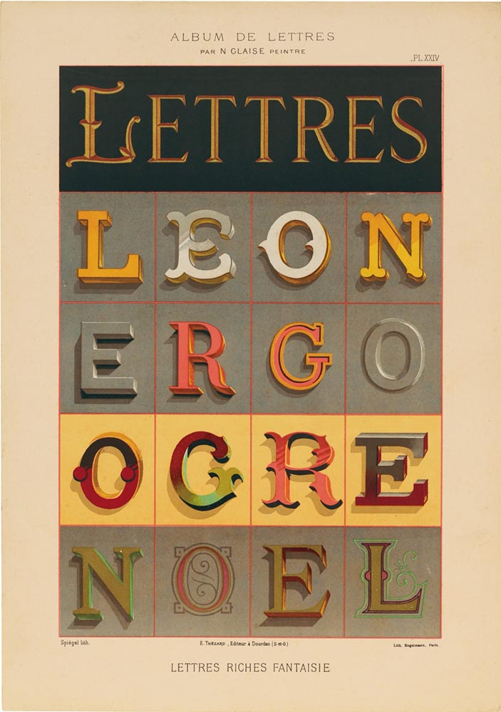
    Letterform Archives’ new celebration of hand-painted type
    One example — I mean, who can argue with “Lettres Riches Fantaisie“?

    “A new book published by Letterform ArchiveLettres Décoratives: A Century of French Sign Painters’ Alphabets, celebrates the vivacity and timelessness of French sign painting from the 19th and early 20th centuriesCompiled from lithograph portfolios, which range from 1875 to around 1932, the volume includes more than 150 full-color reproductions of these bold lettering samples. These portfolios once served as catalogue-like albums, providing inspiration for styles and motifs that could be translated onto large billboards and small signage alike.”

    Read more about this great new book at This is Colossal or PRINT.

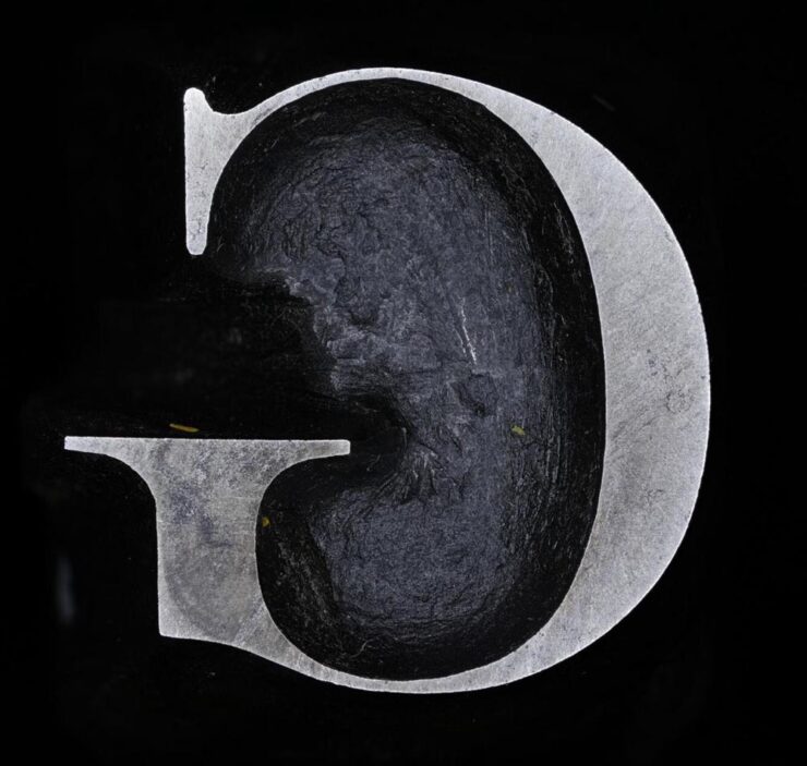
    Cambridge’s old Baskerville ounches

    Heavy metal for the type crowd:

    Image courtesy of Cambridge University.

    “John Baskerville was an influential 18th-century printer and type designer; you’ve probably used (or at least heard of) the Baskerville typeface. Cambridge University has the original punches used to create his signature typeface and has made high-res digital photos of them available online,” Kottke writes. “[S]eeing close-ups of the actual cut & shaped metal from 1757 is something else.”

    In case you’re not familiar:

    The typographic punch is the initial design for the letterform and one of the first of three stages in the manufacturing of metal type: short lengths of steel onto which his letters were cut in reverse and in relief. The punch was ‘tempered’ to increase its toughness and enable its use as a tool. Secondly, the punch was struck into the surface of a softer piece of metal (copper), leaving an impression of the ‘right-reading’ character to be cast. This was called the matrix. Finally, type was manufactured when the matrix was passed to the type-caster and inserted into a mould, into which molten lead-alloy was poured. This produced a cast of the type in relief and in reverse which were then arranged to create a text block and once inked, paper could be pressed against it.

    Not just hi-res photos of punches for various sizes of type, either: some have 3D versions. Very cool.

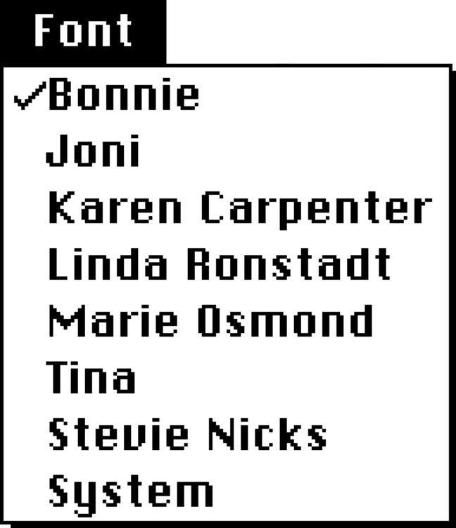
    Special bonus #3: The menu that never was:

    World Class Female Singers.

    Okay, okay, that’s not actually an unused menu from before Apple’s Macintosh was released in 1984, but how it came about isn’t something I’m going to quote. Instead, I’m just going to ask you to read it in full — it’s fantastic.

    Courtesy of Unsung, Marcin Wichary’s awesome blog. (Yes, he of Shift Happens fame.)

    Great graphic items, x2
    The Tenth Muse
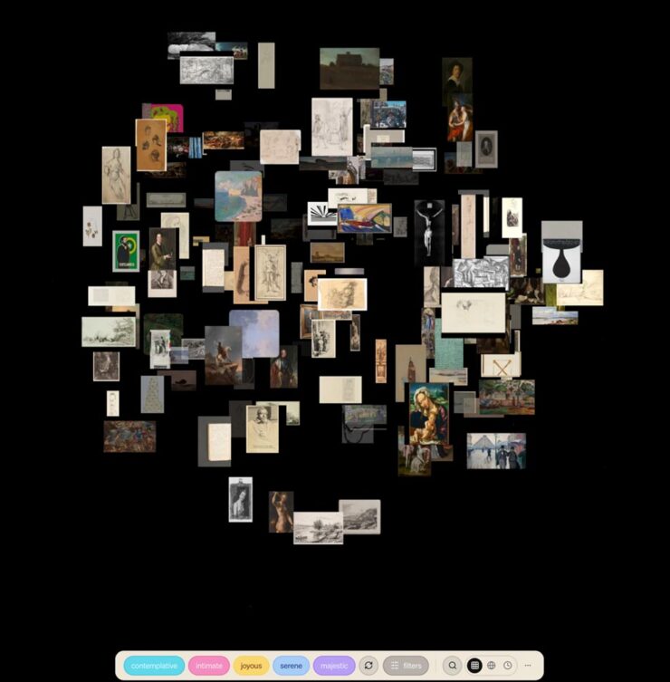
    Screenshot of the Tenth Muse home page.

    The Tenth Muse is an art discovery engine. Over 120,000 artworks from museums and institutions — searchable by feeling, mood, atmosphere, era, and medium.”

    (Via Kottke.)

    AIGA NY: 50 years of posters
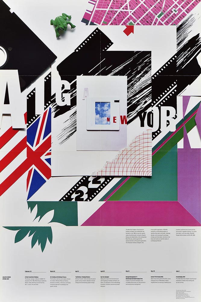
    Just one example of the many posters now available for your persual.

    “A 50-year goldmine of design: AIGA New York unveils its poster archive to the public,” It’s Nice That reports. “A newly opened window into its design archive, this unique visual library provides the public with an inside view of the design, art and activism that’s emerged from the city’s recent history. AIGA NY has ambitions for the collection to become physically accessible with an accompanying book that will showcase the posters in more depth.”

    Adobe, yet again
    DNG now standard

    Let’s start with the positive:

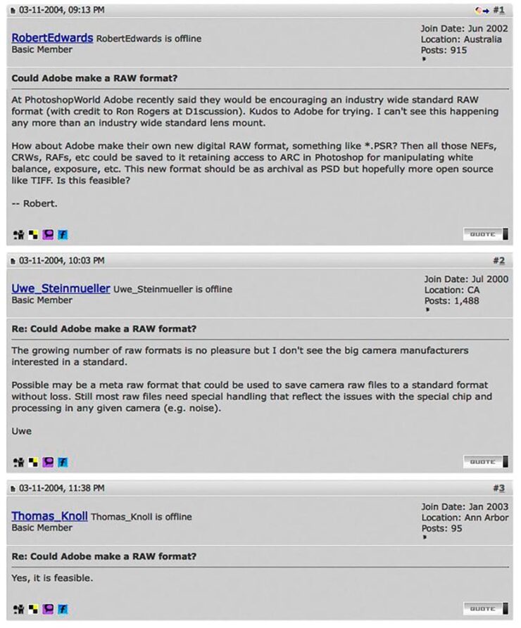
    “In March 2004, Australian photographer Robert Edwards asked a simple but meaningful question on Rob Galbraith’s now-defunct photography forums: ‘Could Adobe make a RAW format?’ The answer was very much ‘yes,’ and Adobe announced the DNG format, or Digital Negative, later that same year. Now, more than two decades later, DNG is now the official standard under the International Organization for Standardization (ISO),” PetaPixel writes.

    From back in the day.

    I remember lurking on Rob Galbraith site. Such were the importance of his forums — and, for that matter, the overall size and condition of the ’net in the early Aughties — that Thomas Knoll himself, one of the creators of Photoshop, would post there.

    In case you’re not familiar, a camera’s RAW file is what the sensor sees at the moment of exposure, stored in a format for later editing. It’s completely different from a JPG file, which has all the camera’s choices baked in to the final image. Sports or journalism photographers usually shoot JPG, due to the need to post immediately; social media photography is, of course, its own animal.

    Most fine photographers — that is, folks who shoot for art or pleasure, including your author — only shoot RAW, because it gives you maximum flexibility in “look.”

    I’m honestly not sure how much of a difference this will make, but it’s nice to see DNG accepted as a standard — and it’s an example of Adobe meaningfully contributing to the bigger picture. 

    Train Adobe’s AI on your style

    From the “mixed” department:

    It’s not tin foil.

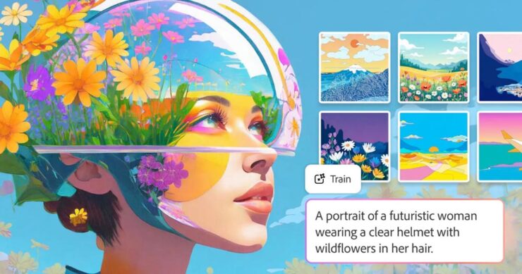
    Adobe has launched Firefly Custom Models, “allowing artists to generate image variations that ‘more consistently reflect’ their own style, subject, or characters. 

    Adobe’s Deepa Subramaniam says, “Today, we’re expanding access to Firefly custom models, which let you turn your creative style into a reusable model trained on your own images. In this public beta release, custom models are optimized for ideation in character, illustration and photographic style.” 

    The goal of Custom Models, according to PetaPixel, is to “allow artists to train Adobe’s Firefly AI specifically to unique workflows so that when it generates content, it is more aligned with their specific style.”

    Hmmm. How ’bout practical effects? Seriously, this might turn out to be useful. Time will tell. Helmet of tin flowers and all.

    CEO retires. Stock … down?

    Here’s where the attitude sneaks in: most of us, present company included, are sick of Adobe’s attitude towards its customers.

    “Adobe’s longtime CEO, Shantanu Narayen, announced this week that he is stepping down after 18 years as CEO and nearly 30 years at the company. If you ask shareholders, Narayen was, for a long time, among the very best in the biz. If you ask Adobe’s core customers, the artists who were once indispensable to the company’s success, it’s a different story,” writes Jeremy Gray in an opinion piece for PetaPixel.

    Adobe made more than $7 billion in net profit last year, a clear win for shareholders. This is due to their choice to treat creatives as a profit center. But their stock is down because their AI efforts have fallen flat — Firefly is way behind Midjourney or Gemini — and the planned additional profit center has failed to materialize. 

    And by “down,” I mean significantly. During Narayen’s tenure, Adobe’s share price increased from around $40 in late 2007 when he took over to an all-time high of $688.37 in 2021. But as of this writing, it’s $243. “Although Adobe and Narayen are painting his departure as entirely the outgoing CEO’s decision,” Gray continues, “it’s easy to wonder whether tumbling share prices had something to do with the transition, or at least sped up existing plans.

    “I respect the sheer scale of what he achieved. I admire that he grew Adobe so that it could hire more great workers to build better software. But for me, Narayen’s legacy is ultimately one of treating [creatives] like an afterthought […] using our passion and love for art to boost his brand.”

    I understand that Adobe has become one the Internet’s favorite punching bags of late, and I try to distance myself from that sport (no matter the subject). But I can’t help but agree with many of the things expressed in that piece.

    Let’s hope that the future bring change, one way or another. For many professionals, Adobe essentially holds a monopoly. 

    But then, so did Microsoft.

    Special bonus #4: Unsung asks, “Why wouldn’t everyone deserve the gift of focus?” He’s talking about the tragically-short-lived focus mode in Photoshop, wherein the user isn’t automatically shown pop-ups or blaring (bleating?) buttons regarding new features.

    I mention this because I just uninstalled Acrobat, Adobe’s PDF management program, because I couldn’t turn off the pop-ups, sharing invitations, or requests to add comments. All I wanted was to proof documents, but what I was gifted with was frustration — even anger, on days where a deadline was involved. 

    Special bonus #5: “A slap on the wrist” is understatement writ large:

    “Canceling a software subscription is supposed to be easy — that’s what US law dictates. Adobe, however, has played fast and loose with its Creative Cloud subscriptions in the past. The company was sued by the Department of Justice in 2024 due to its practice of hiding hefty termination fees when customers signed up. The case has now been settled, with Adobe agreeing to a $75 million fine and matching free services to users of its products,” Ars Technica writes.

    The company doesn’t admit to violating the law. “While we disagree ⁠with the government’s claims and deny any wrongdoing, we are pleased to resolve this matter,” Adobe said in a statement.

    March photo round-up

    Okay, let’s switch gear and end with inspiration — even happiness.

    International Garden Photographer of the Year 2026

    Yes, you read that right: there’s an international contest for the best garden photograph. (If you want hard-hitting stuff, see Sony’s awards. There’s enough “news” in the world, so….)

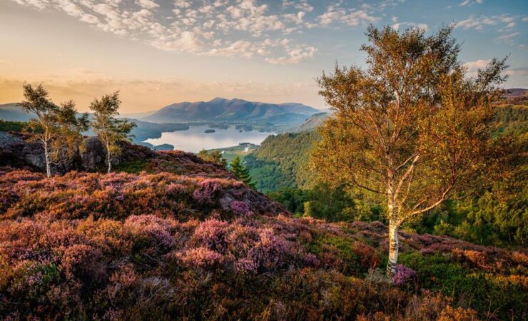
    Grange Fell Last Light. Overall Winner. Photograph by Mark Hetherington.

    Soothing. The image also earned first place in the Breathing Spaces — more soothing —category, and was captured in Borrowdale in England’s Lake District; the “photograph shows heather, silver birch trees, and the warm light of sunset viewed from Grange Fell,” PetaPixel writes.

    See all the winning photographs at the contest website.

    British wildlife
    Asleep at the Wheel. Winner, Urban Wildlife. Photograph by Simon Withyman.

    It’s a shame these are still photographs. Hearing a red fox bark in a British accent would be a hoot.

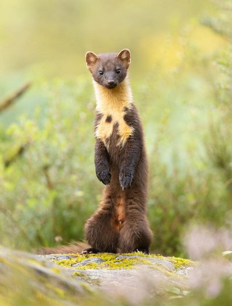
    Standing Tall. Winner, Animal Portrait. Photograph by Alastair Marsh.

    Proof that excellence in photography extends to all parts of the realm. See all twenty-one winners at This is Colossal or PetaPixel.

    London Camera Exchange Photographer of the Year 2026

    Last of the items originating in the UK this month, although the excellent photographs within aren’t limited to just those countries. Some examples:

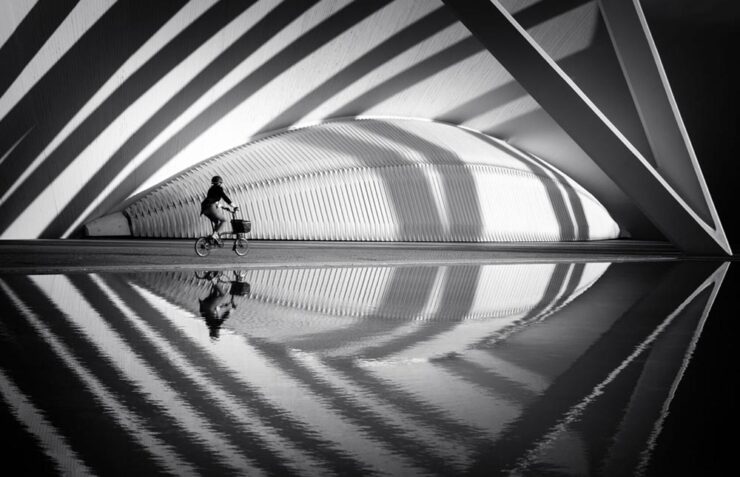
    Crossing the Curves. Winner, Street. Photograph by Helen Trust.

    “A lone cyclist moves through sweeping arcs of light and shadow at the City of Arts and Sciences. Reflections echo the architecture’s rhythm, momentarily aligning human motion with structure, symmetry, and space.”

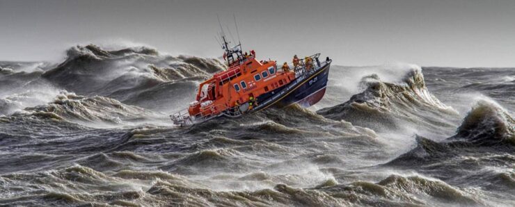
    Saving Lives at Sea. Winner, Action. Photograph by David Lyon.

    “Captured from the shore, during a regular Newhaven training exercise.”

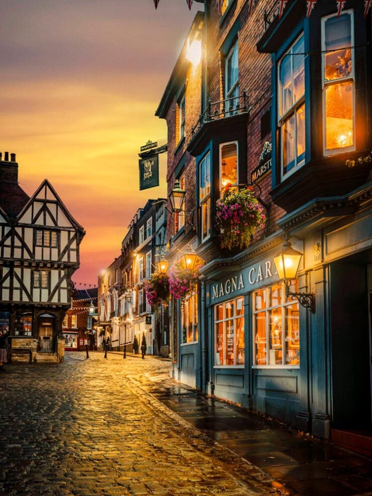
    Magical Uphill Lincoln. Winner, People’s Choice. Photograph by Andrew Scott.

    “This image was taken during golden hour in Lincoln. The image captures the historic streets and architecture of Lincoln as a golden sunset sets in. […] The golden glow of the sky, cobbles and light from the window add that extra dimension in terms of how the overall image works as a result.” (The description somehow missed “soothing.”)

    See all the winners at the London Camera Exchange website. Via Macfilos.

    Andrew Moore: Theater

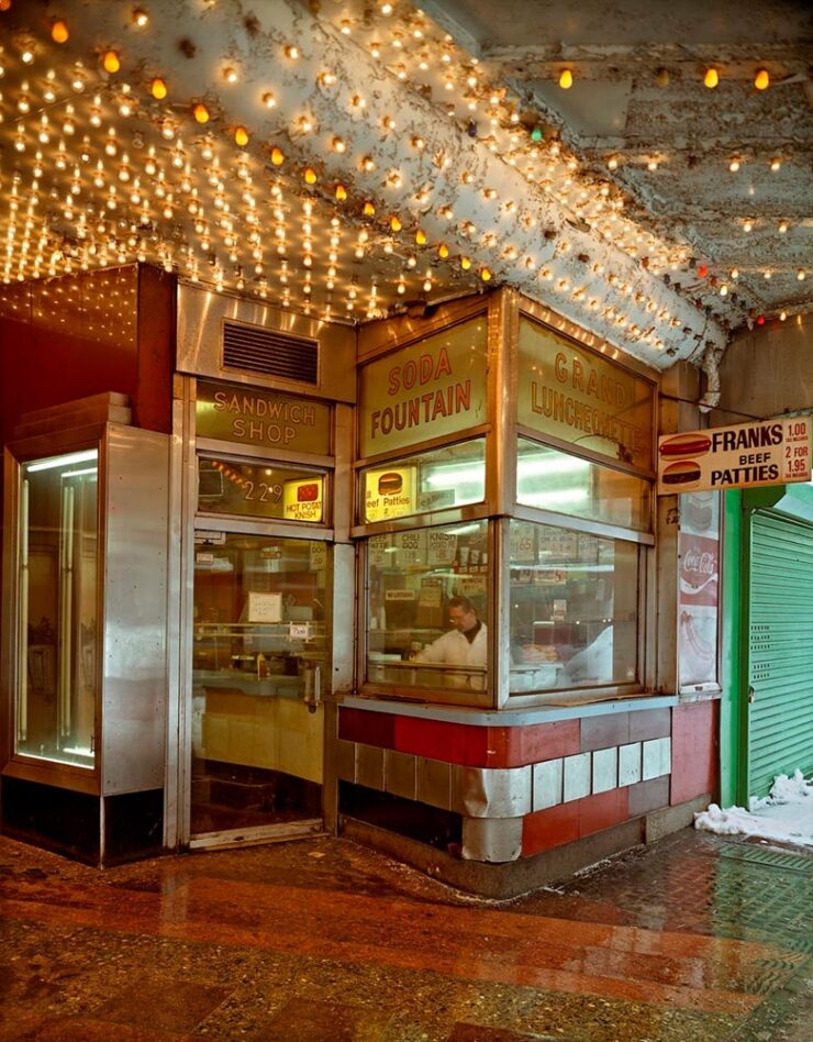
    “Known for his atmospheric photographs of landscapes, interiors, and urban centers that feel mysteriously locked in a not-so-distant past, Andrew Moore’s enigmatic images invite us into a slippage of time,” This is Colossal writes.

    Grand Luncheonette, New York, 1996. Photograph by Andrew Moore.

    Not only great, but currently on display: Moore has a solo show running at Atlanta’s Jackson Fine Art. (Update: The show ended March 21st, darned it. I’d have gone if I’d read that properly.)

    Cinematic plastic

    No, not current events — something better:

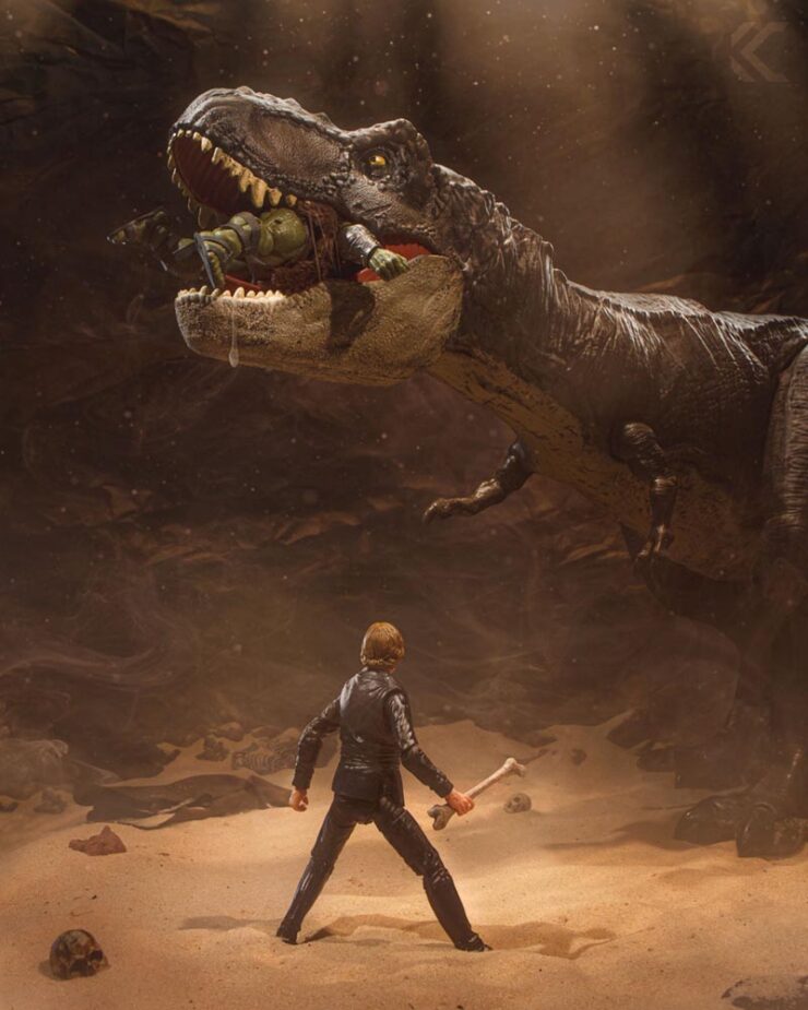
    Jurassic Pit. Photograph by Chuck Eiler.

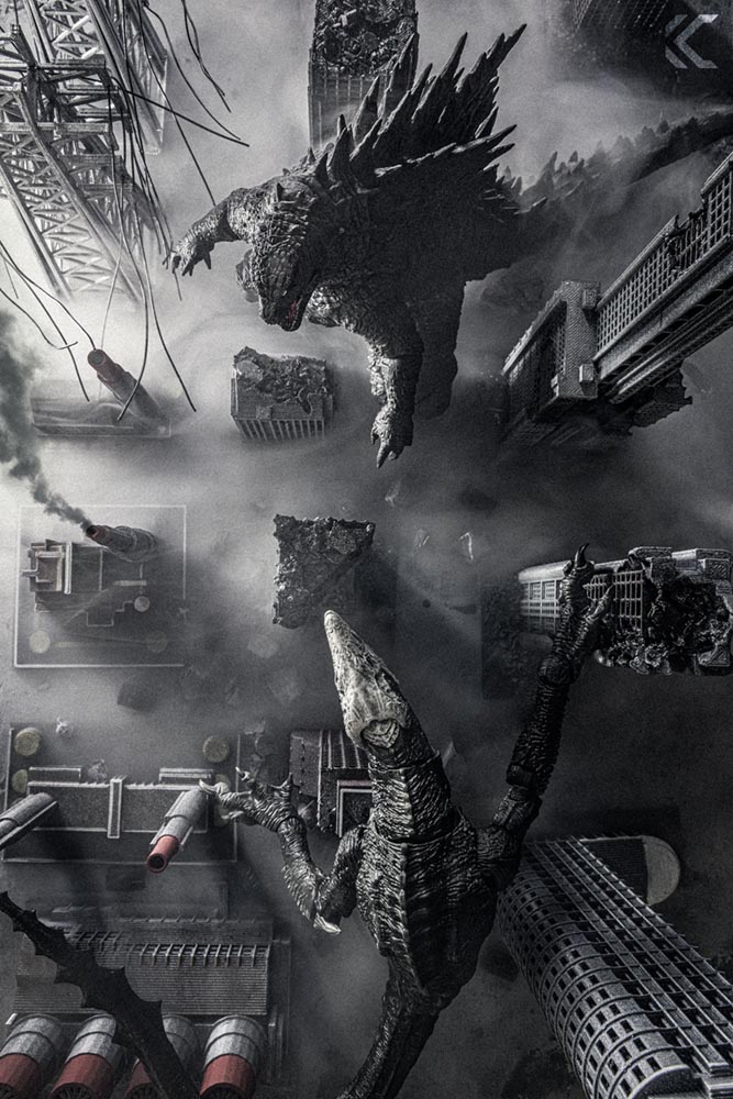
    “Chicago-based photographer Chuck Eiler transforms action figures into cinematic, story-driven miniature worlds that blur the line between toy photography and film. Through meticulously crafted sets, practical effects, and careful lighting, he creates immersive scenes that bring nostalgia and storytelling to life,” PetaPixel writes.

    Apex Predators. Photograph by Chuck Eiler.

    Awesome. (And available as prints, in case you want for your sandbox walls.)

    Finally: duck this

    Last month saw the incredible fresh pasta camera. Well, in case you think I only recommend a vegetarian lifestyle, there’s…:

    Four Minutes in London.

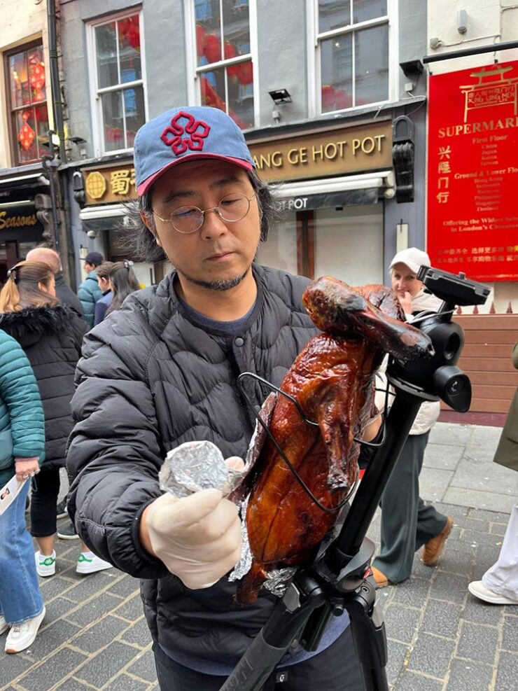
    Martin Cheung’s Chinese roast duckcam

    Presumably, he throws a fresh camera into the oven every time he needs one: “I will continue making Duckcam while I travel, so next time when you see a person with a roasted duck on a tripod, please say hello to me.”

    Enjoy your spring, everyone!

  • Beautifully Briefed 26.1: Finding What’s Needed

    Beautifully Briefed 26.1: Finding What’s Needed

    We’re setting into our third snow of the season here in Georgia, an extraordinary event even in a world where “normal” doesn’t seem to happen all that often any more. Thankfully, there are still gems, waiting to be discovered. Hopefully you’ll find several in the links below.

    Note: The site was offline for several hours mid-month due entirely to my mismanaging an update; the backups took a minute and didn’t restore the plug-ins, so it wound up being rough around the edges for a couple of days. If you visited — or tried to — during that time, apologies.

    Favorite book covers of 2025, and more

    If you’ve not seen, set aside a few minutes to enjoy:

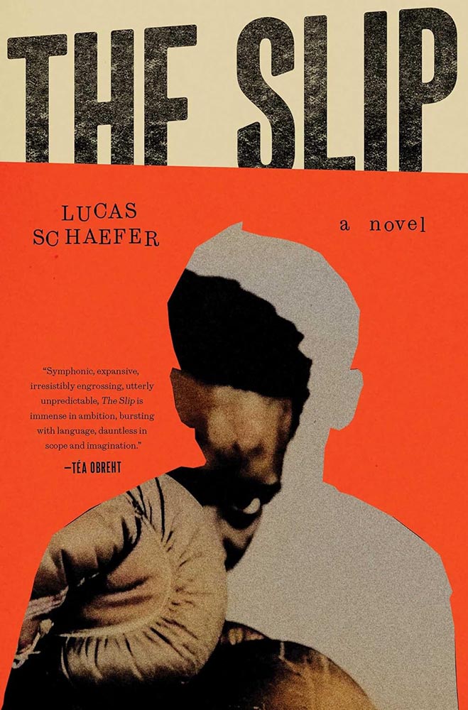
    This image has an empty alt attribute; its file name is 25fave_slip-the_jack-smyth.jpg
    Cover design by Jack Smyth.

    More than a hundred examples of book design greatness, with commentary, for the fifth year in a row. Bring a beverage.

    But wait, there’s more:

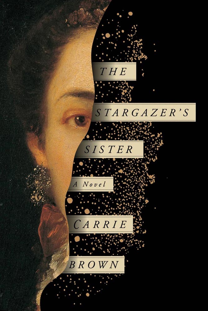
    This image has an empty alt attribute; its file name is books_the-stargazers-sister_2016_oliver-munday_lithub.jpg
    Cover design by Oliver Munday.

    LitHub has posted a summary of the last decade of their favorites, too. Whew!

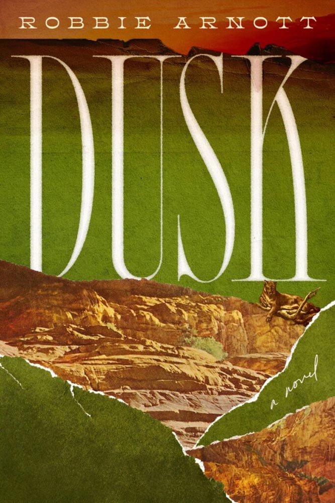
    This image has an empty alt attribute; its file name is books_dusk_alica-tatone_ourculturemag.jpg
    Cover design by Alicia Tatone.

    Special bonus #1: Our Culture has a feature on seven book designers to watch in 2026. None will be a surprise to regular readers, although Alicia Tatone hasn’t been highlighted here as much as she deserves (she had three cover designs, including Dusk, in the runners-up folder for my ’25 favorites, but didn’t appear in the final list).

    This month’s Spine

    Meanwhile, over at Spine, my monthly column on University Press goodness has been posted, including this:

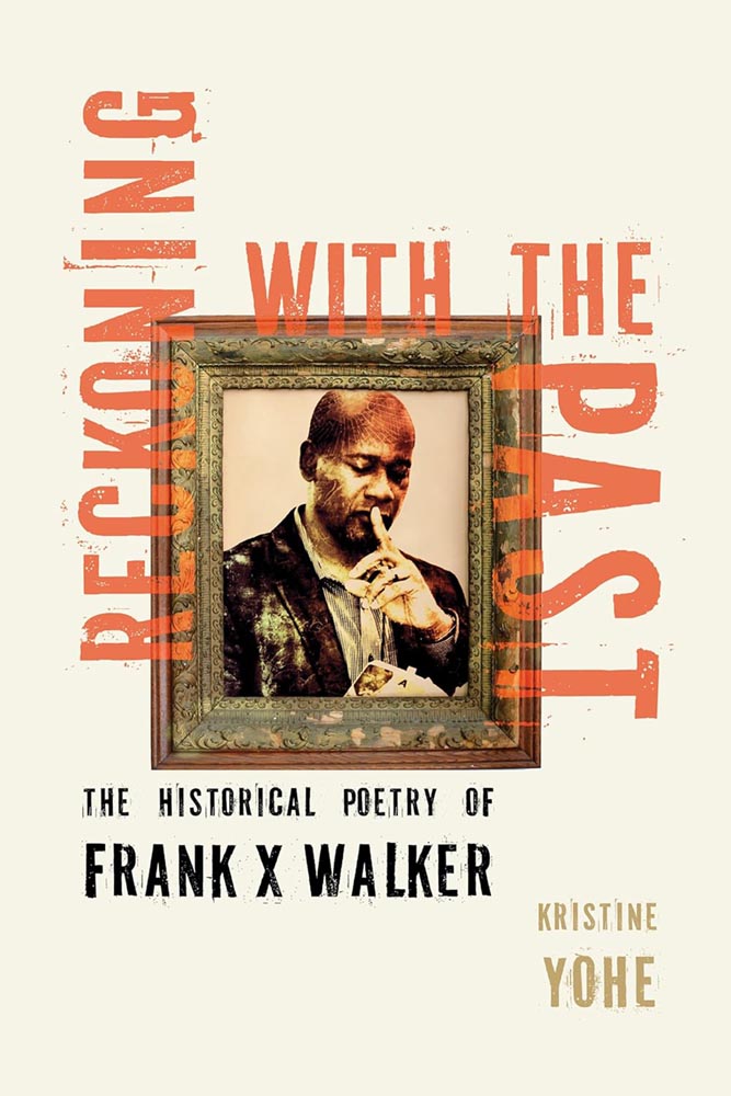
    This image has an empty alt attribute; its file name is spine_kentucky_reckoning-with-the-past_jan26_kat-lynch.jpg
    Cover design by Kat Lynch for the University Press of Kentucky.

    Walker, FYI, was the first Black person to be named Kentucky Poet Laureate and coined the term, “Affrilachia.”

    More from the design department
    Heller on Roy Kuhlman

    Steven Heller’s column in PRINT is always fantastic, but some introduce designers more of us should know by name — this time, Roy Kuhlman:

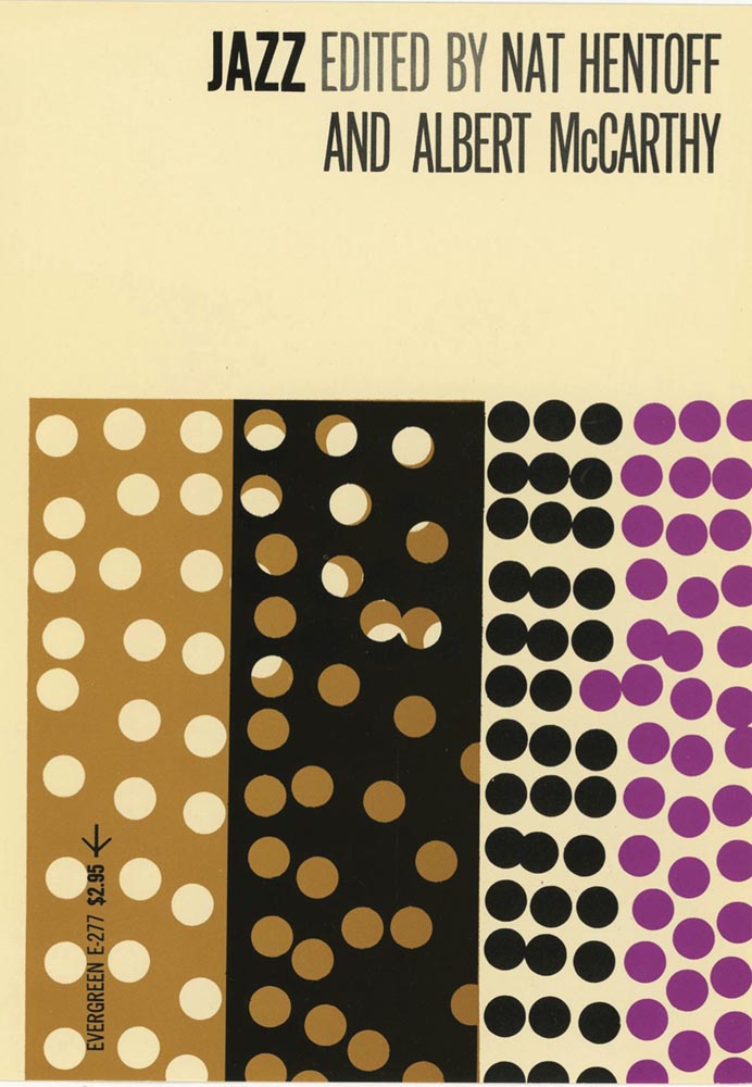
    This image has an empty alt attribute; its file name is books_jazz_roy-kuhlman_print.jpg
    Cover design by Roy Kulhman.

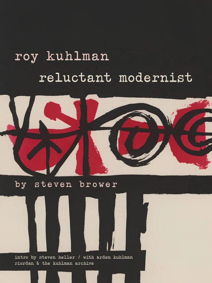
    “He designed almost exclusively for the edgy indie Grove Press, defining its list of literary, critical, philosophical and politically radical nonfiction titles,” Heller writes, discussing a new retrospective (that he wrote the introduction for):

    This image has an empty alt attribute; its file name is books_roy-kulman-reluctant-modernist_print-740x988.jpg

    Many of his abstractions tested the reader’s perception. His lexicon of kinetic, morphing shapes was usually rendered in flat colors with painterly and collage randomness. They could stand on their own. But usually, to make them functional, he used simple sans serif or elegant classic serif typefaces; fitting the abstract nature of his manner, he’d frequently draw or paint hand-scrawled titles and subsidiary texts. Much of his work employed two or three colors, as opposed to four-color process — and he was more than adept with limitations.

    — Steven Heller, PRINT

    Very cool. See the rest.

    January typeface favorites

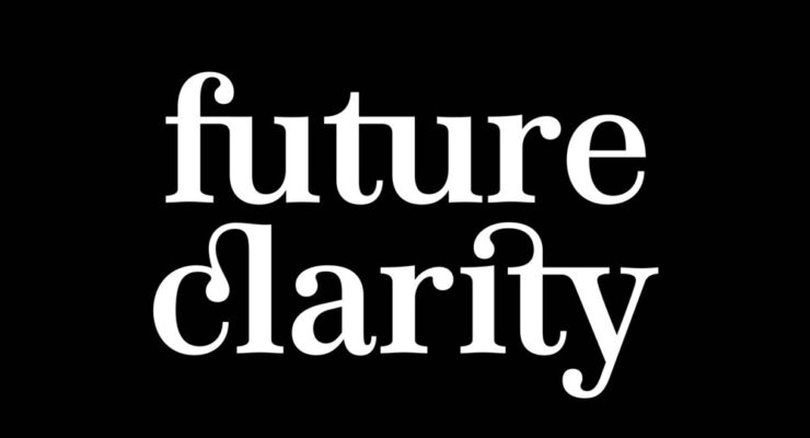
    Speaking of CreativeBoom, their regular feature on new typefaces has several that I like. Let’s start with the elegant Appeal, by new foundry We Type:

    This image has an empty alt attribute; its file name is fonts_appeal_creativeboom-740x400.jpg

    Next up, the old-style, almost-evokes-needlepoint Bárur, by MNDT Type:

    This image has an empty alt attribute; its file name is fonts_barur_creativeboom.jpg

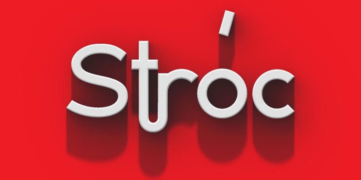
    Another new foundry, Designomatt, brings us the neat and “unpretentiously functional” Stróc:

    This image has an empty alt attribute; its file name is fonts_stroc_creativeboom-740x370.jpg

    The last to highlight is probably my favorite of the bunch, this cool and well-executed script called Pennline, from The Northern Block. It’s a “meticulous resurrection of Bulletin — a script first cast in 1899 by Philadelphia’s Keystone Type Foundry — demonstrat[ing] how historical preservation and contemporary utility can coexist when approached with respect and imagination.”

    This image has an empty alt attribute; its file name is fonts_pennline_creativeboom-740x494.jpg

    See ’em all — type joke intended — at CreativeBoom.

    Faber Editions: just my type

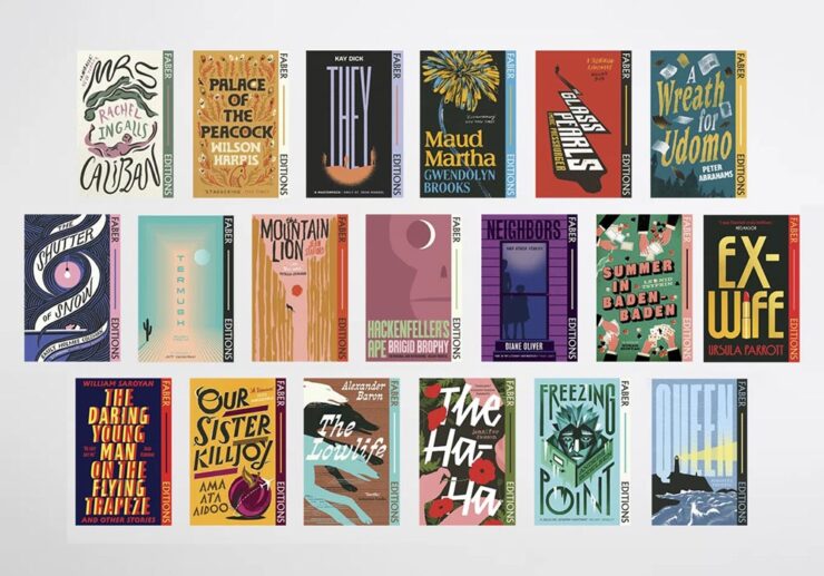
    It’s Nice That has a great feature on the new — actually, newly-revisited — Faber Edition titles, with their primarily type-driven cover designs:

    This image has an empty alt attribute; its file name is books_collected-faber-editions_various_its-nice-that-740x517.jpg

    “In an industry that can often be focused on newness, Faber Editions is a great reminder of the groundbreaking literature that’s come before us, and a clear indicator of the importance of the artwork the words sit within,” writes Olivia Hingley.

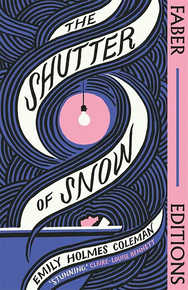
    This image has an empty alt attribute; its file name is books_the-shutter-of-snow_bill-bragg_its-nice-that.jpg
    Cover design by Bill Bragg.

    Faber is a UK publisher, so while these covers could be excellent because they’re British — see several examples of the US vs. UK titles in the favorites post — I’m just going to call the style interesting, the “look” of the complete series compelling, and the resulting work excellent. Read on.

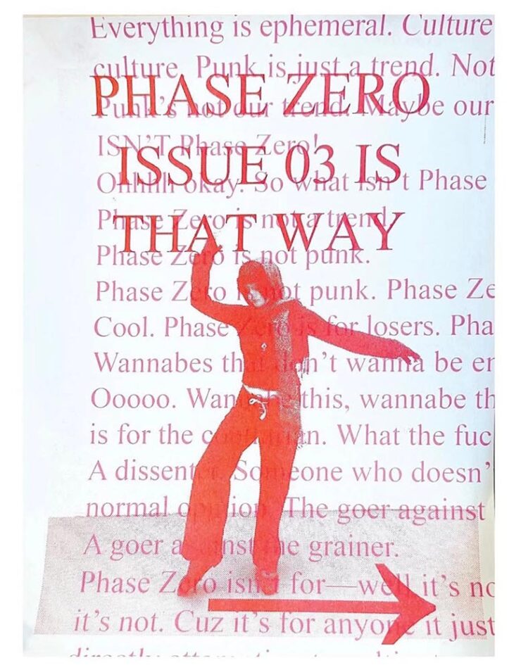
    Special bonus #2: “The graphic trends you’ll want to bookmark for 2026,” also from It’s Nice That. In short: lo-fi, anti-trends continue:

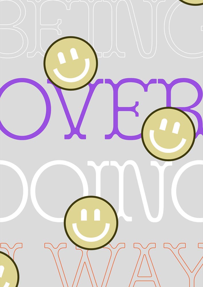
    This image has an empty alt attribute; its file name is design_phase-zero-flyer_its-nice-that-740x952.jpg
    © Maya Valencia & Sydney Maggin, Phase Zero NYC, via It’s Nice That.

    In other words, if AI struggles with it — if it’s authentic — it could be a winner. See the specifics.

    Special bonus #3: “AI isn’t the enemy. Our lack of nuance is,” Liz Seabrook writes at CreativeBoom. “The most powerful response is being more human.”

    Life in ’26: DDOS? Or Just Velocity?
    This image has an empty alt attribute; its file name is discussion_discourse-is-a-ddos_westernberg-740x288.jpg

    A few days apart, two new essays caught my attention and wound up feeling relevant enough — significant enough — that I wanted to share. They’re new takes on where we’re at, or, the specifics of “how.”

    The first is from new-to-me author Joan Westenberg, discussing a computer term called the Distributed Denial of Service (DDOS) attack:

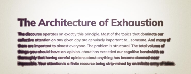
    [The] attack works by exhausting resources. It doesn’t need to be clever. It just needs to be overwhelming. The target’s defenses are simply overrun. The server can’t distinguish between legitimate requests and attack traffic because, in a sense, all the traffic is legitimate. The attack succeeds when the system has spent so much energy processing requests that it can no longer serve its actual function.

    — Joan Westenberg, “The Discourse is a DDOS”

    Does that sound like it might apply to life in the ’Twenties? Yeah.

    The old media ecosystem had gatekeepers, and those gatekeepers were often stupid or corrupt, but at least the stupidity and corruption were bounded. There were only so many column inches in the New York Times, only so many minutes of evening news. A finite supply of attention-worthy items existed, and someone had to decide which ones made the cut. That selection process was biased and imperfect, but it performed an important function: it told you, implicitly, that you didn’t have to have an opinion about everything. Most things that happened in the world weren’t important enough to make it into your awareness at all. Local political disputes in New South Wales? Nobody in Washington DC gave a [crap], and vice-versa. This was as close to optimal as we’ve ever got.

    But the gatekeeping function has now been distributed across millions of individual users, each of whom can boost any piece of content into viral prominence if it happens to resonate with the right combination of tribal anxieties and engagement incentives. The feed is infinite, and every slot in the feed is optimized to make you feel something strongly enough that you’ll engage with it. Outrage works, and so does fear. Disgust works, and righteousness
    really[…] works. Nuance and careful reasoning don’t work at all, because by the time you’ve finished a thought that begins with “Well, it’s complicated…” someone else has already posted a much simpler take that makes people feel validated, and the algorithm has moved on.

    — Joan Westenberg, “The Discourse is a DDOS”

    Om Malik, long-time in-the-trenches tech nerd (and fellow Leica enthusiast), completely agrees:

    Authority used to be the organizing principle of information, and thus the media. You earned attention by being right, by being first in discovery, or by being big enough to be the default. That world is gone. The new and current organizing principle of information is velocity.

    What matters now is how fast something moves through the network: how quickly it is clicked, shared, quoted, replied to, remixed, and replaced. In a system tuned for speed, authority is ornamental. The network rewards motion first and judgment later, if ever. Perhaps that’s why you feel you can’t discern between truths, half-truths, and lies.

    — Om Malik, “Velocity Is the New Authority. Here’s Why.”

    Westenberg has a suggestion I wholeheartedly recommend:

    What I do know is that the feeling of being overwhelmed, of never being able to keep up, of having strong opinions about everything and confident understanding of nothing, is not a personal failing. It’s a predictable response to an impossible situation. Your brain is being DDoS’d, and the fact that you’re struggling to think clearly under that onslaught is evidence that your brain is working normally. The servers aren’t broken. They’re overloaded. And until we figure out how to reduce the load or increase the bandwidth, the best any of us can do is recognize what’s happening and try, when possible, to step away from the flood long enough to do some actual thinking.— Joan Westenberg, “The Discourse is a DDOS”

    “Find one topic,” she says, and start there. Get with experts, get evidence, get uncomfortable, actually get into it … but just get into that one.

    And stay true to the idea that it shouldn’t — can’t — get away from you.

    I get some feedback for my lack of participation in social media. I don’t hate social media; if anything, the past few weeks of mayhem organized resistance in Minneapolis proves it has a place. But I long ago heeded advice to narrow my focus. Instead of burying my head in the sand — tempting though it may be at times — I choose to concentrate on those things that a) really hold interest and b) things I actually want to be part of my life.

    Both of these essays summarize the situation well, and both offer insights on how we got here. Westenberg’s offers good advice. When you have a spare few minutes, read both.

    (DDOS article via Doc Searls, whom I don’t link to often enough. Oms article via Daring Fireball.)

    Wikipedia turns 25

    Let’s please turn to something that the Internet does right.

    Whenever I worry about where the Internet is headed, I remember that this example of the collective generosity and goodness of people still exists. There are so many folks just working away, every day, to make something good and valuable for strangers out there, simply from the goodness of their hearts. They have no way of ever knowing who they’ve helped. But they believe in the simple power of doing a little bit of good using some of the most basic technologies of the internet.

    — Anil Dash, “Wikipedia At 25: What The Web Can Be”

    “When Wikipedia launched 25 years ago today, I heard about it almost immediately, because the Internet was small back then, and I thought ‘Well… good luck to those guys,’” Dash writes.1I, too, remember those days of a small Internet — not a young person anymore. While I miss the community it felt like, the resources available today, of which Wiki might be at the fore, are without parallel. But it’s grown into something something amazing: the encyclopedia that’s free in every sense of the word.

    This image has an empty alt attribute; its file name is wiki25_youtube-740x861.jpg
    One of the YouTube shorts published by Wikimedia Foundation.

    Like countless others, I value being a contributor, in an incredibly small way, to the collective effort that is Wikipedia. Indeed, editors “span continents, professions and motivations,” a CreativeBoom article writes. “Together, their stories underline that, even in an age of AI, knowledge is still human and it still needs humans.”

    “The site is still amongst the most popular sites on the web,” Dash agrees. “[B]igger than almost every commercial website or app that has ever existed. There’s never been a single ad promoting it. It has unlocked trillions of dollars in value for the business world, and unmeasurable educational value for multiple generations of children.”

    Of course, all is not perfect. Like Universities, DEI, and whatever else, Wikipedia has become a target; Grokipedia, for instance, exists specifically to undermine Wiki’s centrality and success. (And, it’s important to note, Groki used Wiki as a basis … because it’s open and freely available. No hypocrisy.)

    In fact, so many rely on Wikipedia that access has become a thing. Luckily, some large enterprise users of the site have recognized that the trillions they’ve earned as a result of having access to Wiki’s collective knowledge is worth paying for:

    [T]he Wikimedia Foundation announced API access deals with Microsoft, Meta, Amazon, Perplexity, and Mistral AI, expanding its effort to get major tech companies to pay for high-volume API access to Wikipedia content, which these companies use to train AI models like Microsoft Copilot and ChatGPT. […] In April 2025, the foundation reported that bandwidth used for downloading multimedia content had grown 50 percent since January 2024, with bots accounting for 65 percent of the most expensive requests to core infrastructure despite making up just 35 percent of total pageviews.

    — Benj Edwards, Ars Technica (15 Jan 2026)

    Anil Dash best finishes up: “Twenty-five years later, all of the evidence has shown that they really have changed the world.” I couldn’t agree more.

    Happy 25 to Wikipedia. May there be countless more.

    Special bonus #4: In an excellent article, Ars calls 2025 “the year AI came back down to Earth.” And while we’re on the subject of excellence, Cory Doctorow’s essay for The Guardian applies.

    This image has an empty alt attribute; its file name is ai_ai-companies-will-fail_guardian-740x360.jpg
    Cory Doctorow in The Guardian.
    Follow-up: BMW Alpina and Honda formalize logos

    Alpina, for formerly-independent tuner — re-manufacturer, really — of BMW cars (and SUVs), has, as of the first of this year, officially become a division of BMW, akin to MINI or Rolls-Royce. With it comes a new logo.

    Well, at least, this:

    This image has an empty alt attribute; its file name is cars_new-bmw-alpina-logo_dezeen-740x416.jpg
    Conservative, cool, collected. Definitely part of a bigger corporation now.

    That’s slightly different that what I covered back in June of 2023; the “A” is less dramatic, probably for the better. BMW calls the new logo “calm and confident,” saying the upcoming models will “master performance and comfort.”

    [Alpina] recently entered into an agreement to be purchased by BMW itself, not unlike AMG becoming part of Mercedes-Benz; starting in 2026, they are scheduled to represent the middle ground between BMW and Rolls-Royce — hopefully continuing the comfort, power, and style. It seems that the new ground will be the upmarket models only (that is, no 3-series-based items, and possibly even no 5-series), so think of items $200,000 and up.

    — Beautifully Briefed, June 2023

    Here’s the old logo, for reference:

    This image has an empty alt attribute; its file name is alpina-1962-20220-logo-740x524.png
    Alpina’s now-old logo: exhaust and crankshaft, sir. Nuthin’ like it.

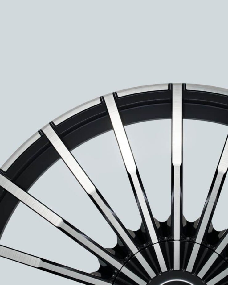
    And: they’re going to update the wheels!

    This image has an empty alt attribute; its file name is cars_new-20-spoke-alpina_bmwblog-1-740x924.jpg
    Photo via BMW Blog.

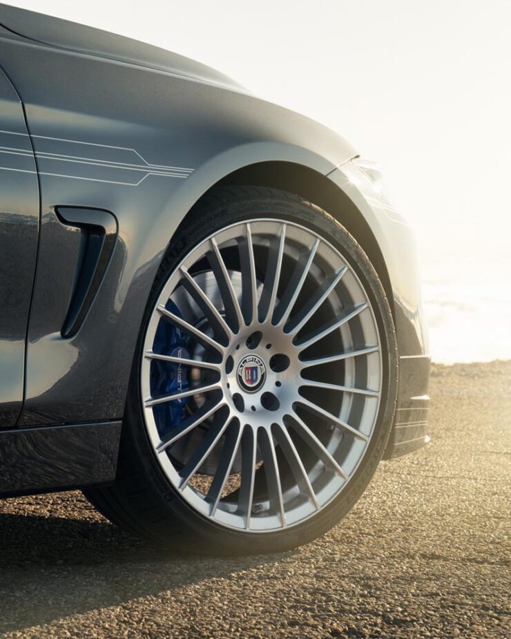
    As someone who’s become much more familiar with Alpina in the ten years I’ve owned BMWs, these wheels are iconic. Here’s the existing version, on one of my favorite pieces of unobtainium:

    This image has an empty alt attribute; its file name is cars_old-20-spoke-alpina_bmwblog-740x925.jpg
    Photo via BMW Blog.

    That’s a 2016 Aplina B4 BiTurbo Coupé, by the way. Not quite my favorite B3 Touring, but in either case, “drool” doesn’t quite cover it. (Neither were available in the States.)

    Curious to see whether this is successful. Expectations are high.

    This image has an empty alt attribute; its file name is cars_honda600-badge_autopian-740x740.jpg
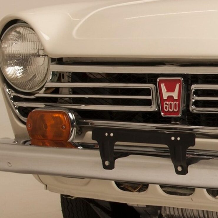
    The “old” H logo, shown on a 1971 600. (See wiki for more info.)

    Meanwhile, Honda initially said — and I reported, two years ago — that their new, slightly-retro “H” logo would be limited to electric cars. Of course, electric as a strategy has changed; they decided this month to make it official for all their cars.

    This image has an empty alt attribute; its file name is cars_honda-new-logo_the-drive-740x523.jpg

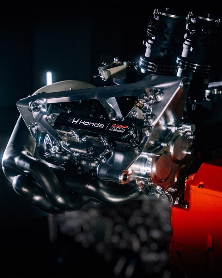
    Motorsports, too. Here’s their F1 engine with the new logo:

    This image has an empty alt attribute; its file name is cars_honda-logo-f1_the-drive-740x925.jpg
    Photo via The Drive.

    I love that both Honda and BMW are, at their heart, engineering companies.

    Get the full story on BMW Alpina at Dezeen or BMW Blog (logo, wheels). Honda’s details are available at The Drive (logo, F1) or The Autopian, where you can enjoy some sharp commentary on Honda’s press release.

    January photography round-up
    2025 Architecture Master Prize
    This image has an empty alt attribute; its file name is photo_arch-arbour-by-younes-bounhar_archinect.jpg
    “Arbour House.” Photograph by Younes Bounhar (Interior Architecture).

    I suppose it’s no surprise that an architectural photography selection tops this round-up, but the annual Architecture Photography MasterPrize highlights “compelling perspectives on buildings, cities, landscapes, and interior spaces, revealing the rich visual language of the built environment.”

    In other words, “catnip.”

    This image has an empty alt attribute; its file name is photo_arch-details-by-guanhong-chen_petapixel.jpg
    “Details (Series).” Photograph by Guanhong Chen (Other Architecture).
    This image has an empty alt attribute; its file name is photo_arch-details2-by-guanhong-chen_petapixel.jpg
    “Details (Series).” Photograph by Guanhong Chen (Other Architecture).

    There’s a huge variety of winning photographs, from professionals, amateurs, and students alike — all excellent. (They have awards for designs, firms, and products, as well.)

    This image has an empty alt attribute; its file name is photo_arch-sardinia-by-barbara-corsico_archinect.jpg
    “Mustras,” Sardinia. Photograph by Barbara Corsico (Exterior Architecture).

    I can’t possibly cover them all, but can provide links: photography winners, honorable mentions, student winners, and winners by country. Both Archinect and PetaPixel have stories. Enjoy!

    Two photographers, highlighted
    This image has an empty alt attribute; its file name is photo_greenland-lehtonen-by-dennis-lehtonen_colossal-740x494.jpg
    Photography by Dennis Lehtonen.

    Neither drone images nor folks who primarily post to social media usually get featured here, but these images of Greenland are both timely and excellent. This is Colossal has a great selection of items from photographer Dennis Lehtonen.

    This image has an empty alt attribute; its file name is photo_alps-to-andromeda_tom-rae_petapixel-740x437.jpg
    “From Alps to Andromeda.” Photograph by Tom Rae.

    “My photography style is rooted in landscape and night photography, with an emphasis on atmosphere, scale, and a strong sense of place. I’m drawn to environments that feel raw, remote, and otherworldly,” Tom Rae relates to PetaPixel. Otherworldly feels just right: good stuff.

    Society of Photographers’ Photographer of the Year 2025
    This image has an empty alt attribute; its file name is photo_soc-of-photographers_documentary-by-terry-donnelly_petapixel-740x493.jpg
    Photograph by Terry Donnelly.

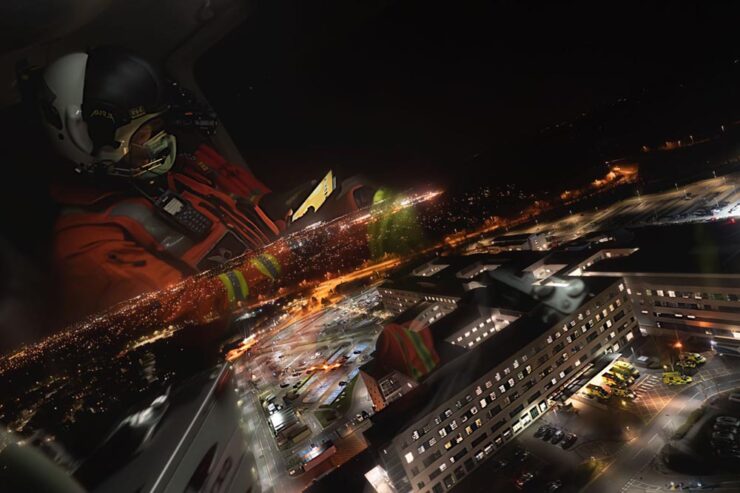
    I also usually don’t cover documentary-style photography — see narrow focus, discussed above — but there were several documentary-style photographs in this set of award winners that were excellent, including this Medivac flight from the UK.

    However — thankfully — there were more categories:

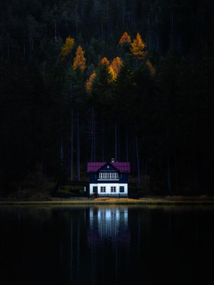
    This image has an empty alt attribute; its file name is photo_soc-of-photographers_travel-by-mark-scicluna_petapixel-740x985.jpg
    Photograph by Mark Scicluna.

    It’s the winner in the “travel” category, because apparently they don’t have one called “dramatically soothing.” No matter the labelling, see the rest of the winners at PetaPixel or head over to the Society’s website for more.

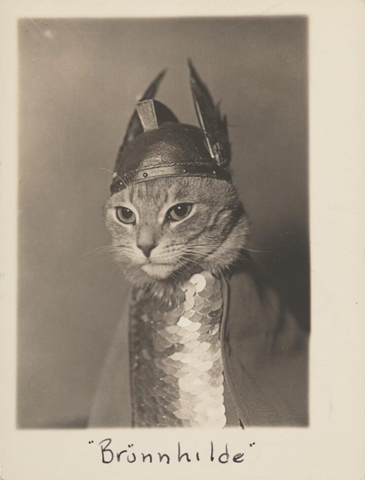
    Finally: some cats

    Speaking of catnip, let’s close out with something that purrs — in soprano:

    This image has an empty alt attribute; its file name is photo_phaidon-cat2_colossal-740x972.jpg

    Let’s not go ’round and ’round: that deserves framing. Or at least publication. Thankfully, Phiadon has you covered:

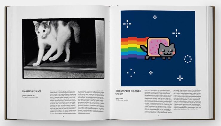
    This image has an empty alt attribute; its file name is photo_phaidon-cat_colossal-740x423.jpg

    A “whimsical visual survey of the house cat in art and popular culture, exploring humanity’s enduring connection to one of our most loved animal companions.” Awesome. (Via This is Colossal.)

    Have a great February, everyone!

    • 1
      I, too, remember those days of a small Internet — not a young person anymore. While I miss the community it felt like, the resources available today, of which Wiki might be at the fore, are without parallel. ↩︎