This month, the usual fontastic newness and photographic excellence. and I veer into nostalgia — maybe, perhaps, soapboxing — for the web’s “old days.” Also, for those in the U.S., I hope you had a wonderful Thanksgiving holiday. Pack up your leftovers and settle in.
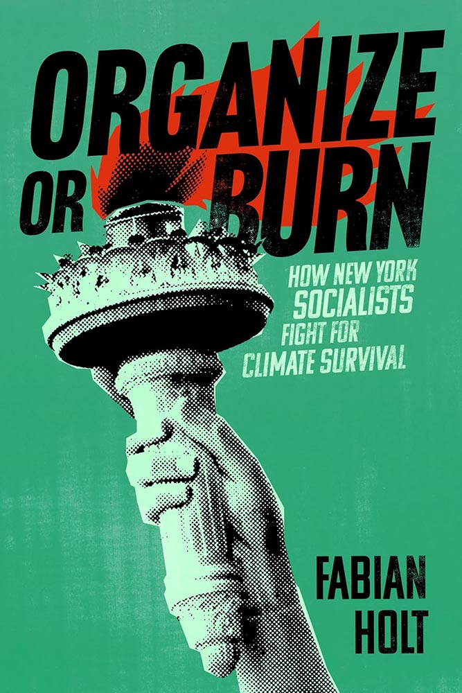
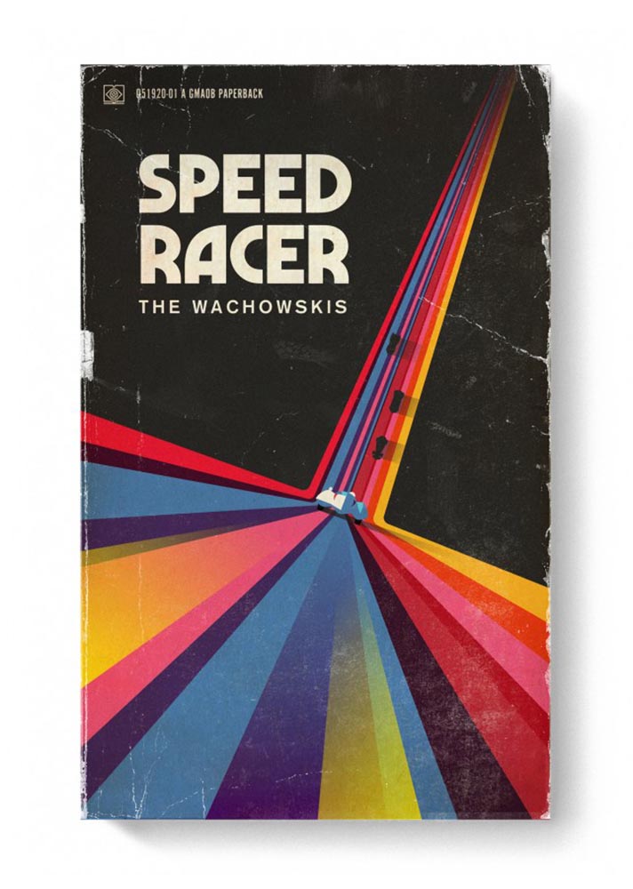
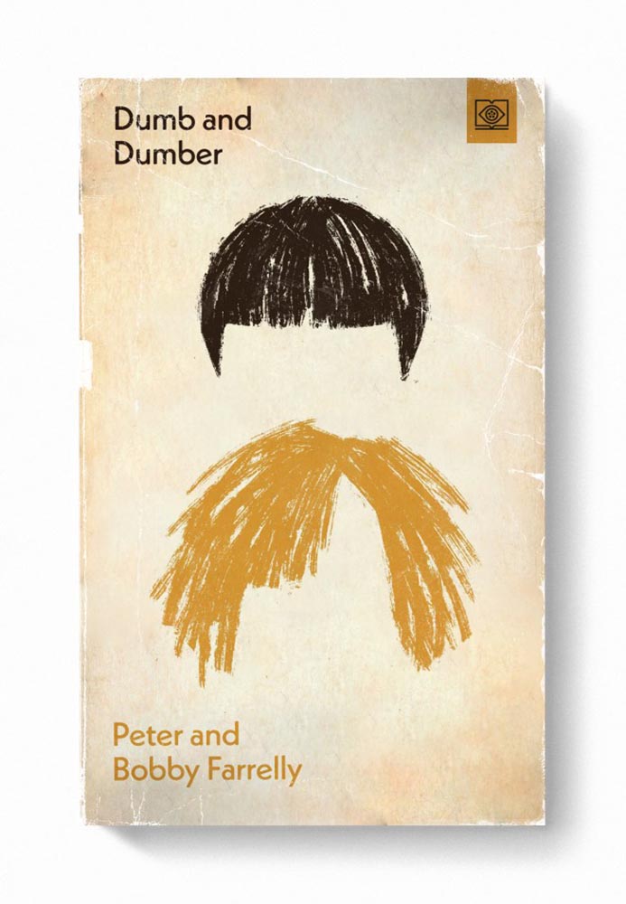
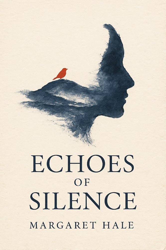
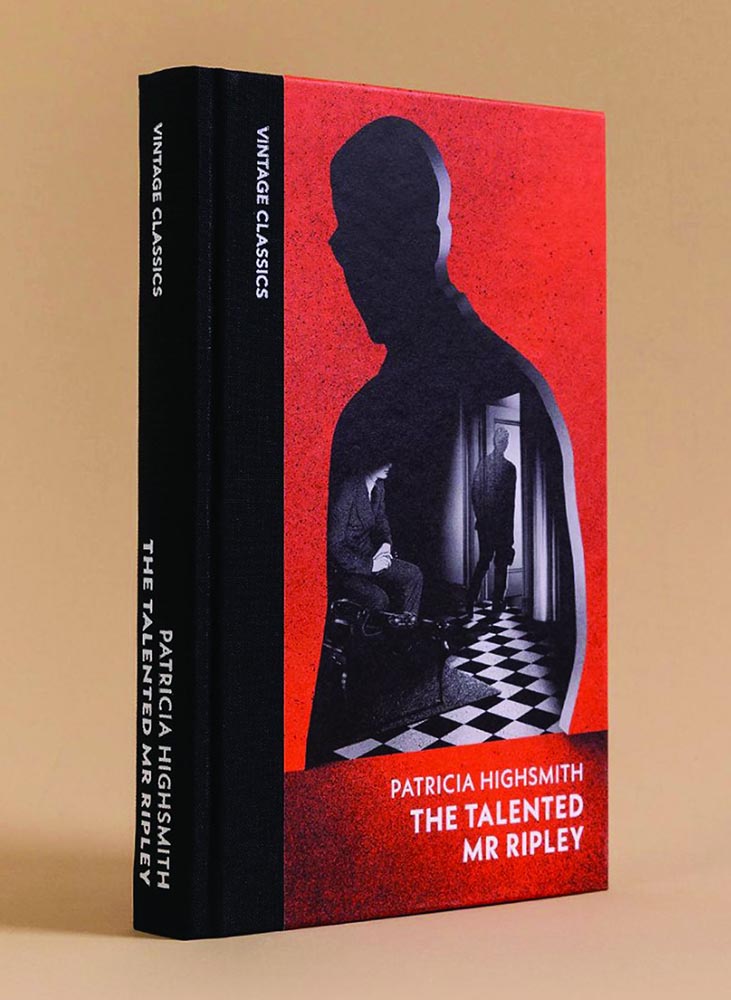
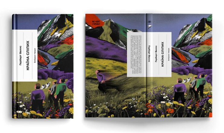
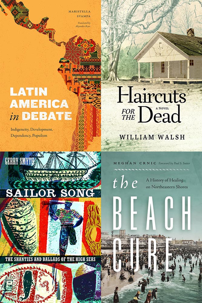
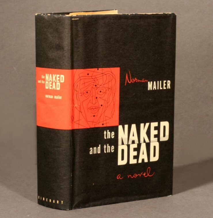
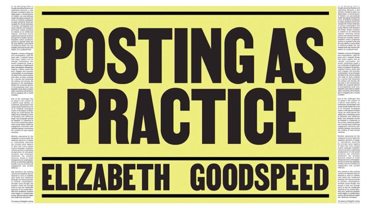
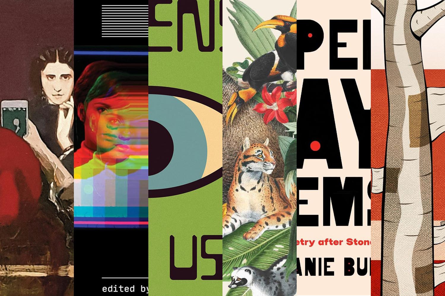
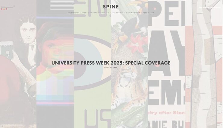
University Press Coverage on Spine
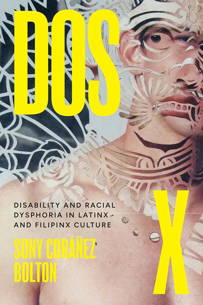
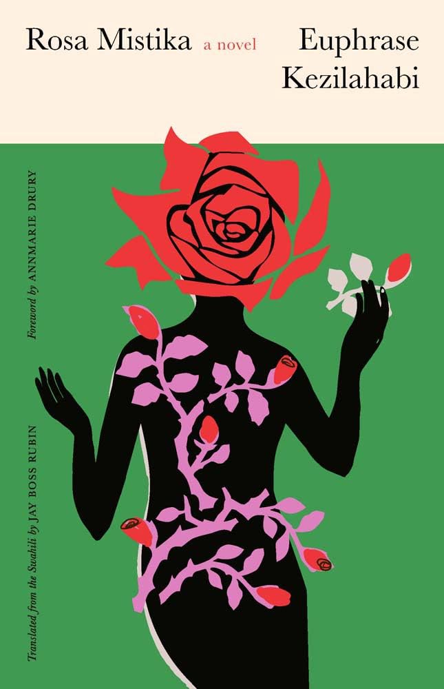
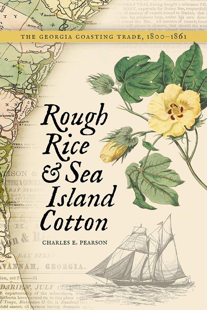
This month’s column has some good stuff — On Gaslighting has been a favorite for a minute, and Post-Weird is pretty much guaranteed to make an appearance in January — but I thought I’d give the first of two shout-outs to the University of Georgia:
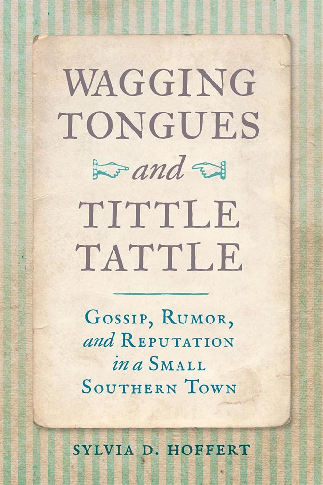
Check out my regular column at Spine. Meanwhile, keep an eye out for the other UGA mention below.
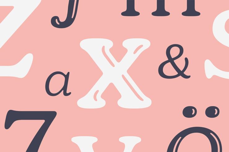
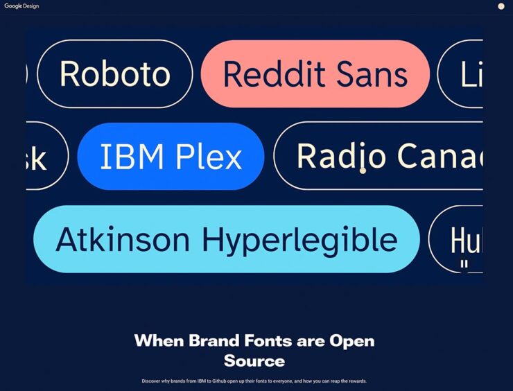
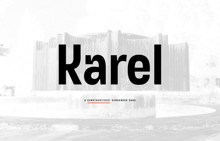
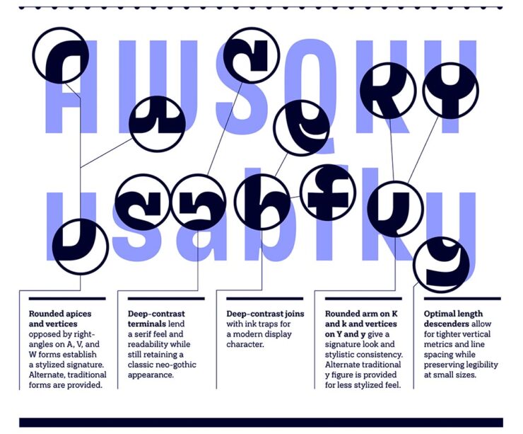
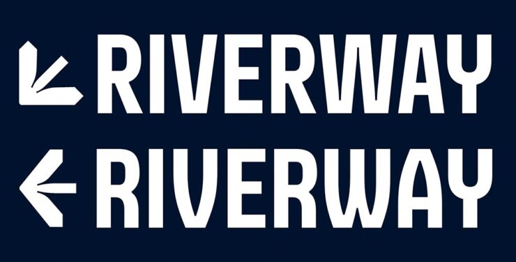
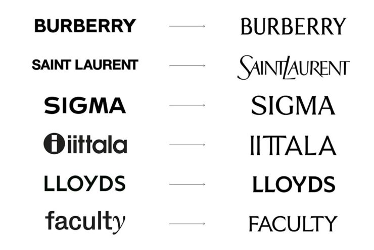
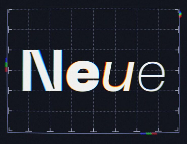
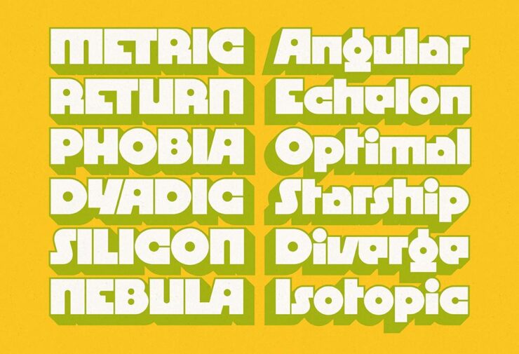
50, Mega: It’s all auld Neue
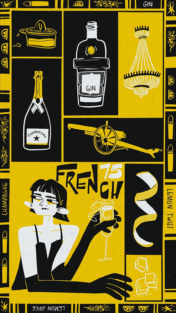
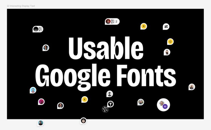
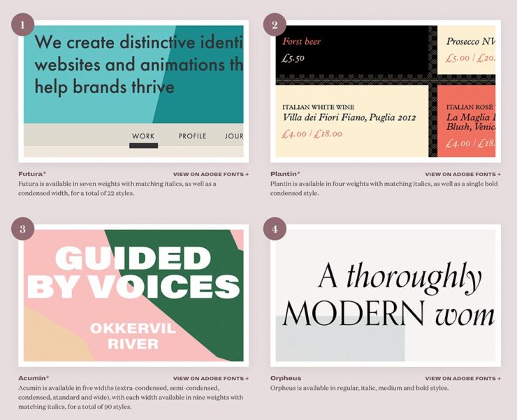
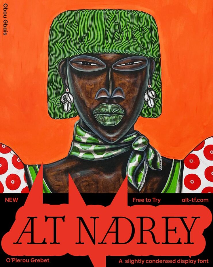
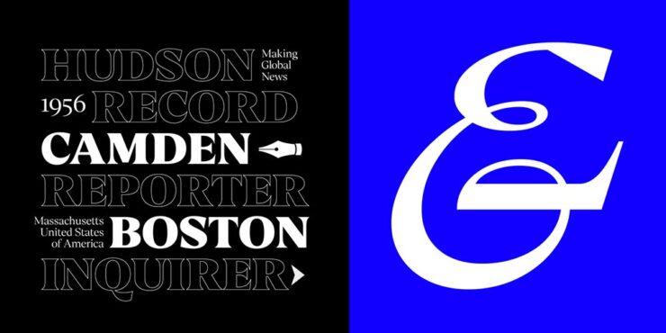
CreativeBoom: 50 Fonts for 2025
In their annual feature (previously), CreativeBoom lists fifty fonts that “will be popular with designers in 2025.” Most are paid, a few are free, and several are awesome.
It’s sometimes hard to see — yes, a new website is on the radar — but there are links in the captions if you’re interested. (Just to the website; I don’t do affiliate links, full stop.)
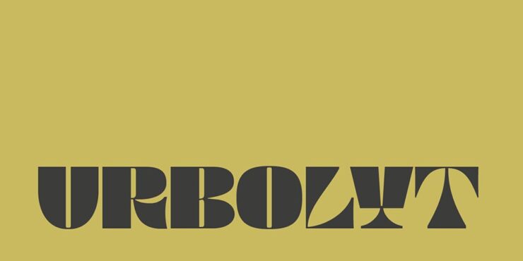
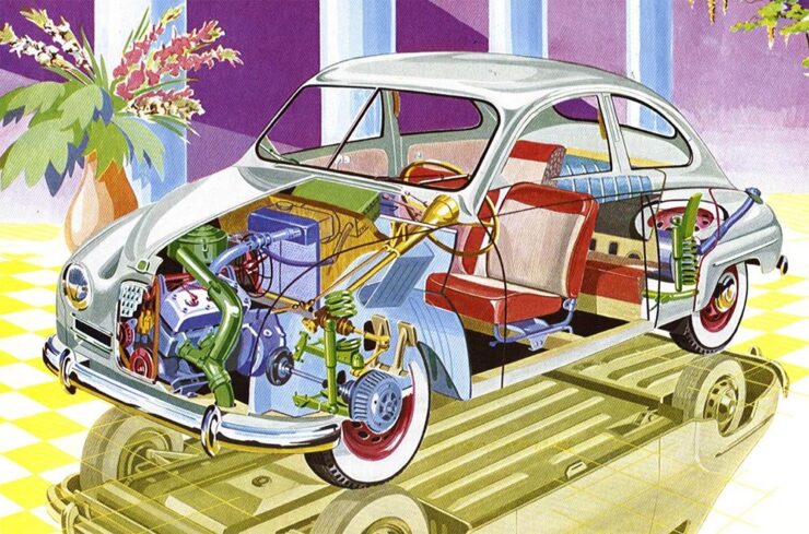
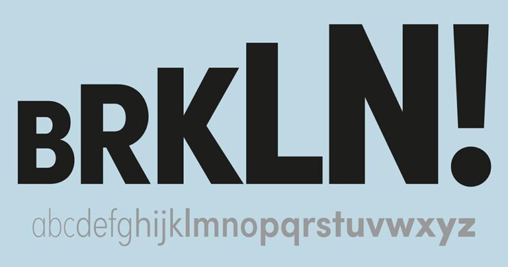
Megazoid
Described by Kottke as having “Radio Shack vibes,” David Jonathan Ross — DJR — brings us this retro-futuristic fantastic-ness, to coin a term.
Auld English
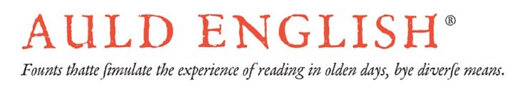
In addition to the “Mock Tutor” long-s character (optional), it’ll even (temporarily) change your spelling to proper English, none of this American stuff. Oh, and it looks properly auld school. Free for personal use, with licensing for professional use.
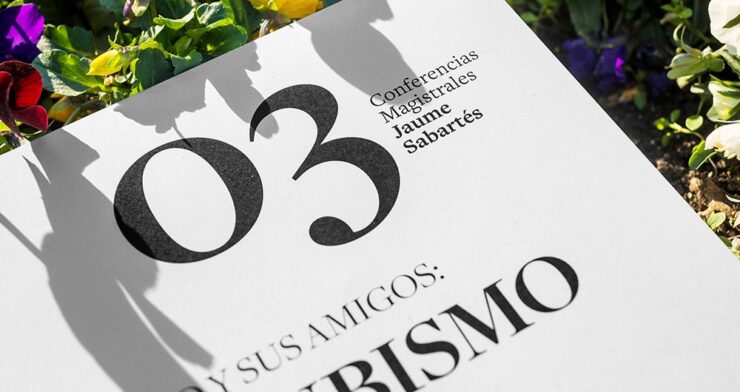
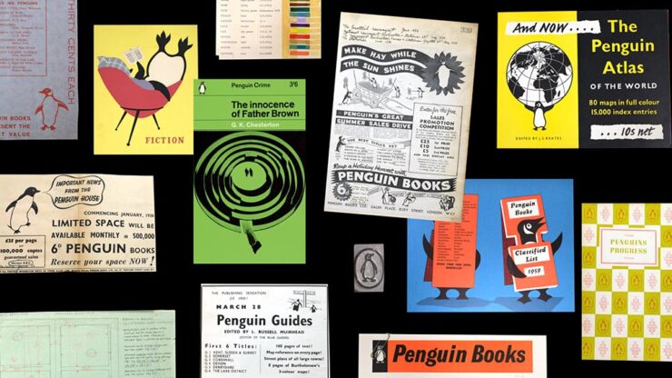
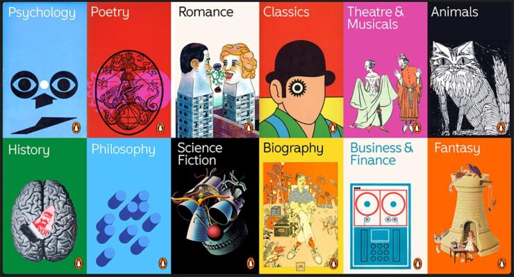
Special Bonus #1: 90 years of Penguin type, brought to you by CreativeBoom.
I must be getting old, part one: griping
Needy software
The Onion is the world’s leading news publication, offering highly acclaimed, universally revered coverage of breaking national, international, and local news events. Rising from its humble beginnings as a print newspaper in 1756, The Onion now enjoys a daily readership of 4.3 trillion and has grown into the single most powerful and influential organization in human history.
— About Us page, theonion.com
“It is an incredibly competitive market for Creative Software. Adobe knows the best way to stay relevant in a space with so many options is to provide their customers with incremental adjustments and AI-powered conveniences to improve their birthday invitations on a monthly basis, all at a fluctuating yearly price point,” The Onion tells PetaPixel in an email. “This is the kind of ingenuity and integrity we are proud to advertise in America’s Finest News Source.”
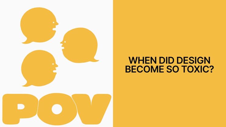
Meanwhile, Pixel Envy points us to a post by Nakita Prokopov — no, I’ve never heard of him either — with an incredibly salient point: that software has gone from something we need … to something that needs us.
The company needs to announce a new feature and makes a popup window about it. Read this again: The company. Needs. It’s not even about the user. Never has been.
Both of those are worth a read — but it’s the notation after the quote that makes the Pixel Envy post special: mention of Photoshop’s “Quiet Mode.”
Wait. What?
That’s right: Adobe actually recognizes that it’s gone so overboard with it’s notifications, blue dots, pop-ups, and helpful “feature introductions” that it’s invented a preference setting to reduce — not eliminate, ’cause — interruptions to your workflow.
Now all they need to do is bring it to InDesign, Lightroom, Illustrator, ….
Cracker Barrel: falsehoods, cheesy falsehoods, and statistics
CreativeBoom usually works for me: more content than not, if you know what I mean. (The article on typography and Penguin linked above, for instance.) Alas, their recent article on Cracker Barrel — “The Cracker Barrel rebrand: a $100M masterclass in brand value” — so widely missed the mark that it’s shameful.
All because the author is speaking to a fixed narrative instead of the facts.
“When Cracker Barrel’s shiny new look caused its stock to drop by almost $200 million, the internet laughed. But buried in the chaos was a golden lesson: what happens when you forget that brand isn’t just visuals—it’s value, emotion, and culture, all rolled into one,” writes Cat How, a founder and executive creative director of How&How branding agency and, apparently, her real name. (“A former journalist and design critic, she leads climate and mentorship initiatives including GetSet and GetEven, and […] an Ambassador for UN Women,” her bio reads.)
The thing is: her journalism is at issue here. But what gives me, basically a nobody, the right to say that? Well, thank Brand New.
That website is subscription, so I’ll have to summarize their brief post. No, to heck with that, I’ll quote it in its entirety:
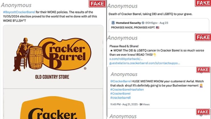
Cyabra, which offers an AI platform that shields companies and governments by uncovering fake profiles, harmful narratives, GenAI content, deepfakes, and other digital misinformation, analyzed the Cracker Barrel backlash and found that 21% of profiles discussing its logo change were fake accounts orchestrating a coordinated disinformation campaign that, in turn, triggered thousands of direct engagements from real profiles, which is when things start to snowball. This, apparently, is a full-fledged business known as Rage Farms, deploying bots to purposely harm brands.
— Armin Vit, Brand New
Those twenty-one percent of profiles discussing Cracker Barrel’s logo change were identified “as fake accounts orchestrating a coordinated disinformation campaign, whose […] content reached over 4.4 million potential views and thousands of authentic profiles’ engagements, [and that] manufactured outrage correlated with a 10.5% stock price drop,” and, viola, $100M in market value, Cyabra writes.
“Disinformation-as-a-Service” has become a profitable, global criminal enterprise: low-cost, high-impact bot networks hired to attack and destroy businesses and individuals … like you. And the social media platforms that could stop them won’t, because chaos is profitable. Propelled by AI, these strikes are targeting brands big and small. And the financial consequences are real — sliding stock prices, damaged brand equity, ruined careers.
— Mark Schaefer, businessgrow.com
That second quote, a follow-up to Cyabra’s post, is worth reading.
Now, to be clear: without complete information, Cat How’s post at CreativeBoom seems legit. But with that information, published almost a week before, it’s exactly what those fake profiles were after: justifying something when it shouldn’t be — and damaging reputations, including Cat How’s.
“One wonders how often this occurs,” he said … without a trace of snark.
Special Bonus #2: Investigating a Possible Scammer in Journalism’s AI Era. “This is likely not the first story you have read about a freelancer managing to land bylines in prestigious publications thanks to dependency on A.I. tools,” Pixel Envy‘s Nick Heer writes, “but it is one told very well.”
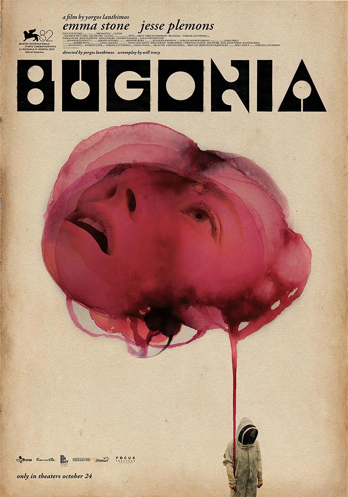
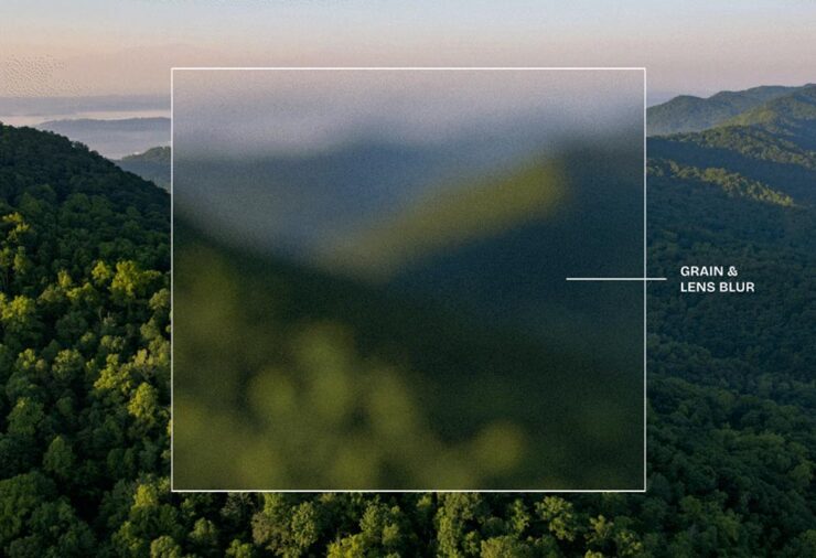
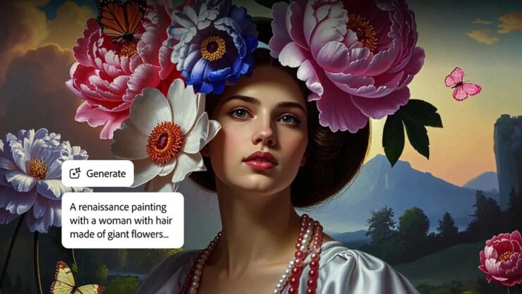
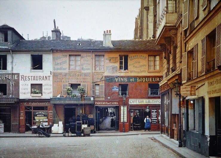
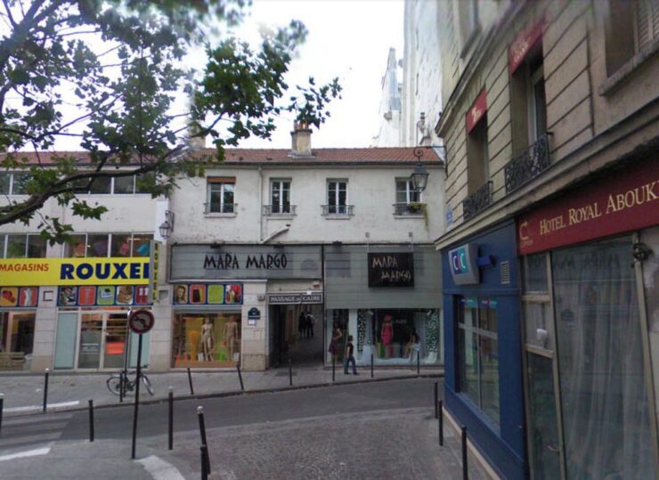
Special Bonus #3: Things do not necessarily need to be an outright fake to contribute to the problem. Many of you might have seen this image:
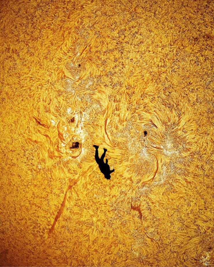
PetaPixel speaks glowingly of the process, the coordination, and laps up the marketing. But: it’s a composite. Interesting parts made with a good deal of effort — but made into something implied to be awesome when, in fact, it’s Photoshop.
I must be getting old, part two: those were the days
Elizabeth Spiers, “Requiem for Early Blogging”:
The growth of social media in particular has wiped out a particular kind of blogging that I sometimes miss: a text-based dialogue between bloggers that required more thought and care than dashing off 180 or 240 characters and calling it a day. In order to participate in the dialogue, you had to invest some effort in what media professionals now call “building an audience” and you couldn’t do that simply by shitposting or responding in facile ways to real arguments.
There’s a part of me that hopes that the most toxic social media platforms will quietly implode because they’re not conducive to it, but that is wishcasting; as long as there are capitalist incentives behind them, they probably won’t. I still look for people with early blogger energy, though — people willing to make an effort to understand the world and engage in a way that isn’t a performance, or trolling, or outright grifting. Enough of them, collectively, can be agents of change.
— Elizabeth Spiers
A progressive columnist, Spiers makes the argument that it is possible to work against the rage that so dominates at the moment; if you’ve not heard of her, she says, “Whether I like it or not, the first line of my obituary will probably be that I was the founding editor of Gawker.com.”
As a reminder, I don’t participate in social media. What I have to say is said here, on the record, under my own name, with all the consequences that entails. (Especially this month.) I’m old school enough — I’ve been blogging since the ’90s — to expect want any responses to be posted in a similar venue: a conversation between people rather than a fight between usernames.
Special Bonus #4: Doc Searls, old school emeritus, suggests that it is, in fact, appropriate to capitalize: Internet and Web, even if there’s a “the” involved. On the other hand, Dave Winer, arguably the most emeritus of the old school, doesn’t. Section 7.85 of the Chicago Manual of Style says no — but Doc’s argument is a strong one.
While we’re on the subject of social media…
Short-form video platforms such as TikTok, Instagram Reels, and YouTube Shorts are now a major part of daily life for many people. Our synthesis of 71 studies revealed that greater engagement with these platforms is associated with poorer cognitive and mental health in both youths and adults.
One fix? Art. According to The Guardian:
The research clearly shows the stress-reducing properties of viewing original art and its ability to simultaneously excite, engage and arouse us. Stress hormones and inflammatory markers […] are linked to a wide range of health problems, from heart disease and diabetes to anxiety and depression. The fact that viewing original art lowered these markers suggests that cultural experiences may play a real role in protecting both mind and body.
— Dr Tony Woods, researcher, King’s College London
“It’s always a good time to look at art,” Kottke writes, pointing to Korean artist Lee Hyun-Joung’s work, Poetic Texture:
We all need museum breaks — make time whenever you can. Even if it’s from home.
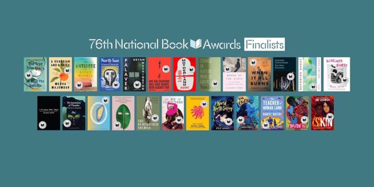
Special Bonus #5: I would argue that the average reader of this blog would suggest books, too; check out LitHub‘s interviews with National Book Awards Finalists for some worthwhile titles.
November’s photography round-up
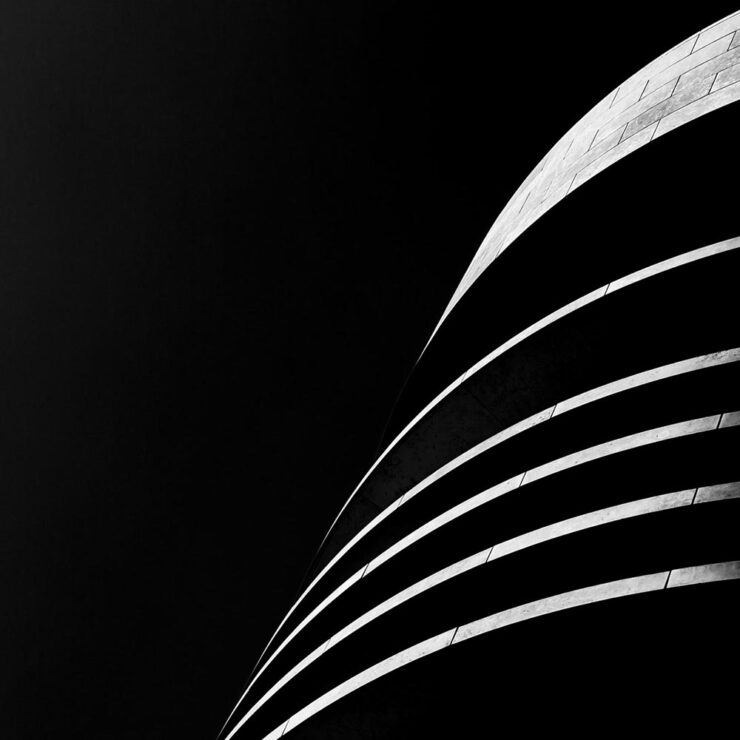
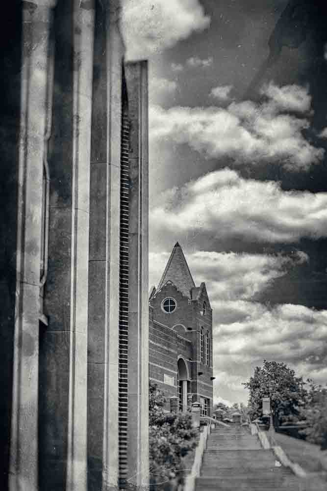
UGA: Historic Rural Churches
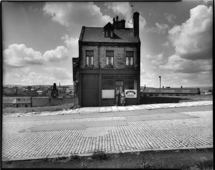
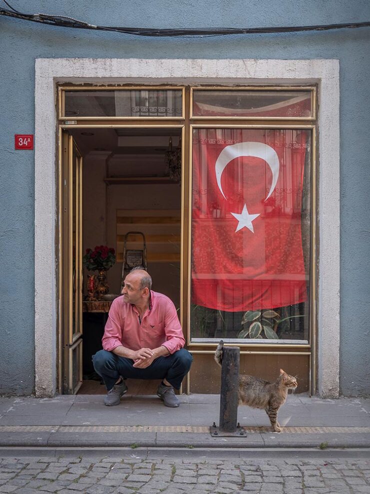
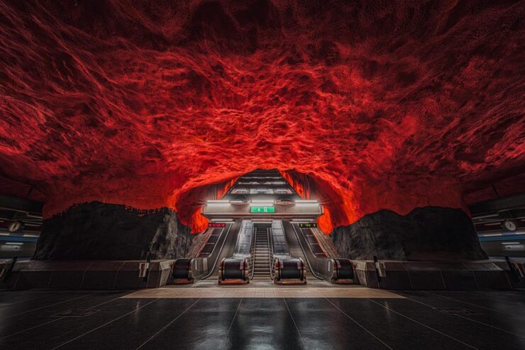
For a while, I had it on my list to do a photographic tour of rural and abandoned churches across Georgia. There are a ton, and some of them are quite photogenic.
This one in Talbotton,1I took the opportunity to remaster these photographs to both correct an unnoticed error and for better consistency between the photographs taken in 2022 and those in 2025. for instance:
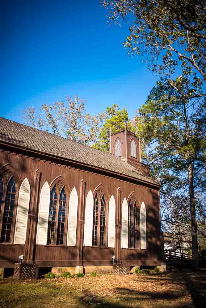

Alas, that project faded in importance, partially because I learned of the first volume of … you guessed it, Historic Rural Churches of Georgia, from UGA Press.
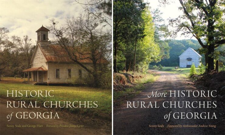
Now there’s a second volume — and a bundle — available. Check ’em out.
Oregon’s Trail of Tears, photographed
While we’re on the subject of interesting photography projects, this one is worth notice: retracing one of America’s (all-too-many) Trail of Tears:
By any measure, photographer Nolan Streitberger has built a practice that bridges art, history, and the profoundly personal. His work, particularly his acclaimed project Oregon’s Trail of Tears, transforms beautiful photography into both historical document and dialogue, a means of reclaiming memory and giving voice to stories long overlooked.
— Kate Garibaldi, PetaPixel
Done manually, using a wet-plate, Eastman No. 33A large-format camera from 1935, he’s done something extraordinary. Take a moment and explore this great work.
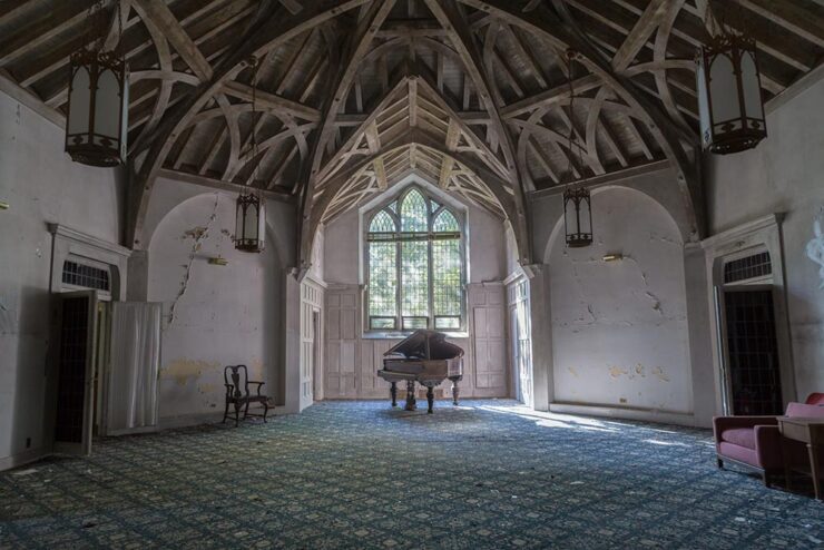
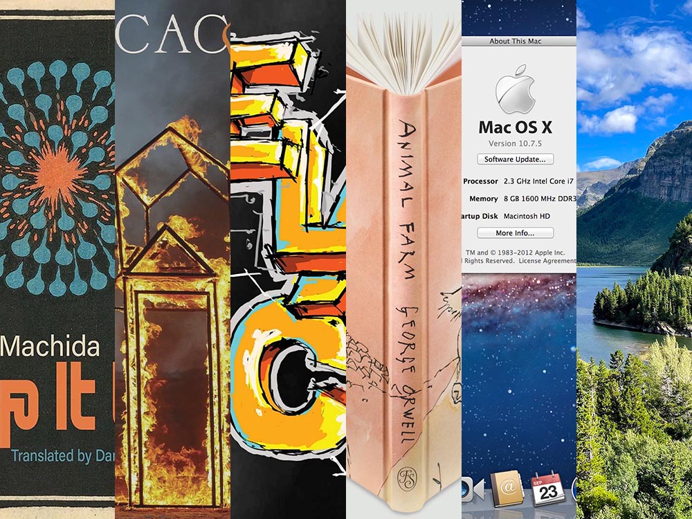
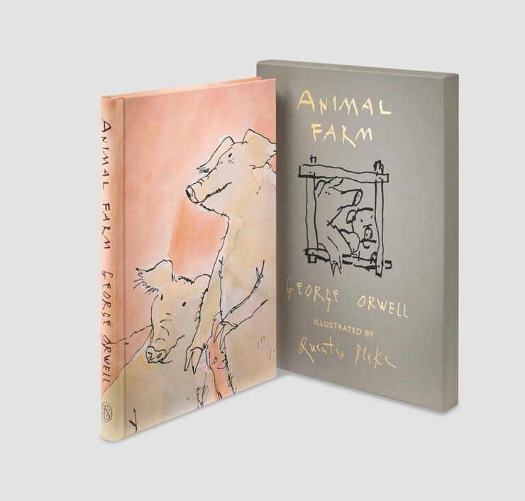
Where George Orwell wrote 1984
Another large-format discovery:
“Easton’s interior photographs of household items perfectly capture the simplicity of Orwell’s life[.] Collectively, they create an atmospheric vision of Orwell’s time on the island and the mood, desire and hope he experienced,” PetaPixel writes.
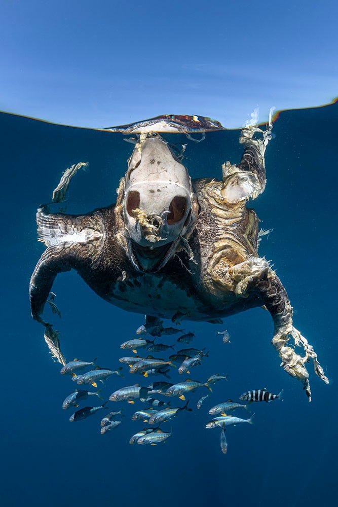
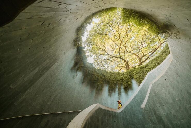
Close-Up Photographer of the Year shortlist, 2025
Some great stuff to peruse — admittedly, most long-list than shortlist — in multiple categories of natural subjects at the website. The winners will be announced in January.
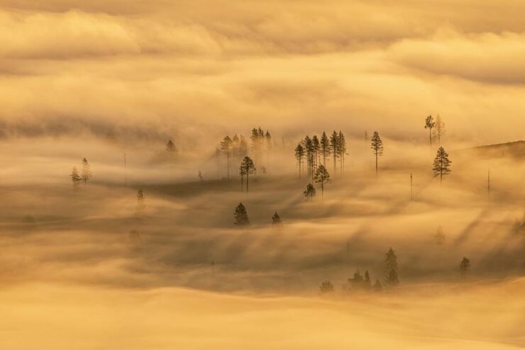
Nature Photographer of the Year, 2025
Another in the “annual treat” category, this European contest features some incredibly accomplished work.
See a round-up at PetaPixel or visit the contest’s website.
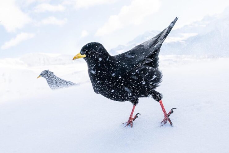
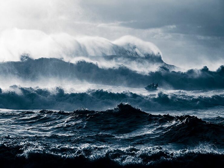
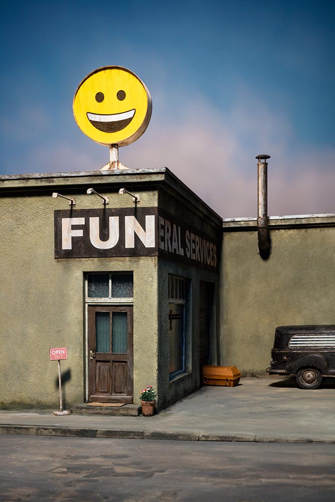
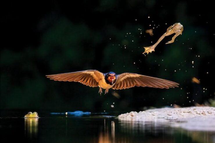
British Photography Awards, 2025
Standard photography contest, perhaps, but I swear there’s a bit of that uniquely British humor showing.
If you’ve ever been close up to a pelican, you’ll know that they’re neither small nor particularly friendly; this great shot ably demonstrates both.
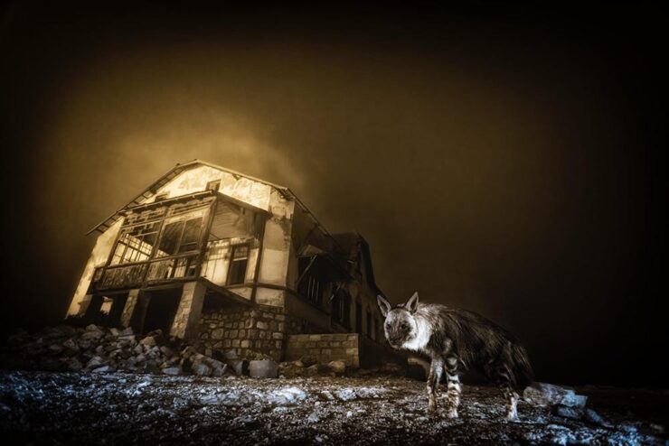
While we’re on the subject of neither small nor particulately (sic) friendly:
Imagine living there. No, don’t: go enjoy the other winners instead. (Via PetaPixel.)
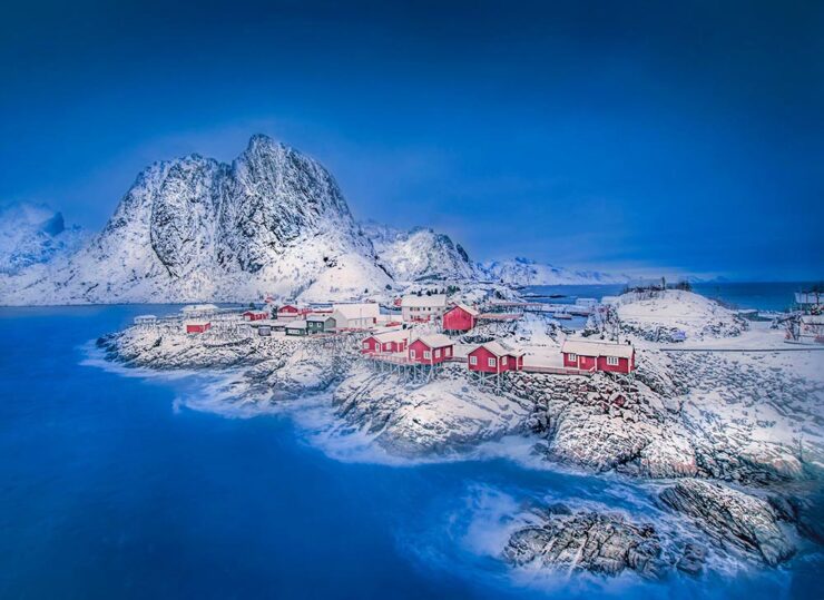
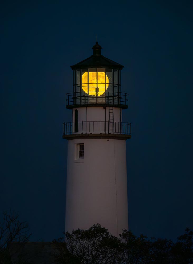
Royal Photographic Society Awards, 2025
The Royal Photographic Society Awards began 147 years ago — the world’s oldest — celebrating photography as an art form.
This shot, for instance, taken without a camera:
The RPS notes that Derges’ photographic work explores humanity’s relationship to the natural world, often by bringing natural phenomena to life in the photographic medium in new and exciting ways. For example, Derges has exposed the physical movement of rivers and oceans onto photosensitive materials at night using moonlight, carefully composing plants and other natural matter in front of photosensitive paper, and then exposing it to light, and exposing photosensitive materials to sound waves, letting the frequencies create the final prints.
— Jeremy Gray, PetaPixel
Plenty of other deserving artists, as well, but they use cameras:
See the website for all the honorees. (Via PetaPixel.)
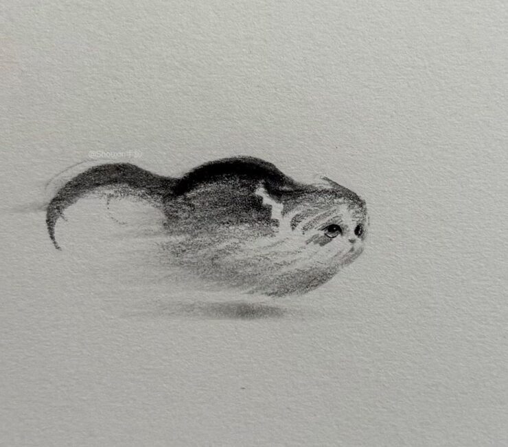
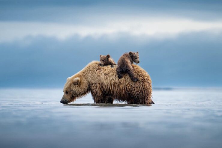
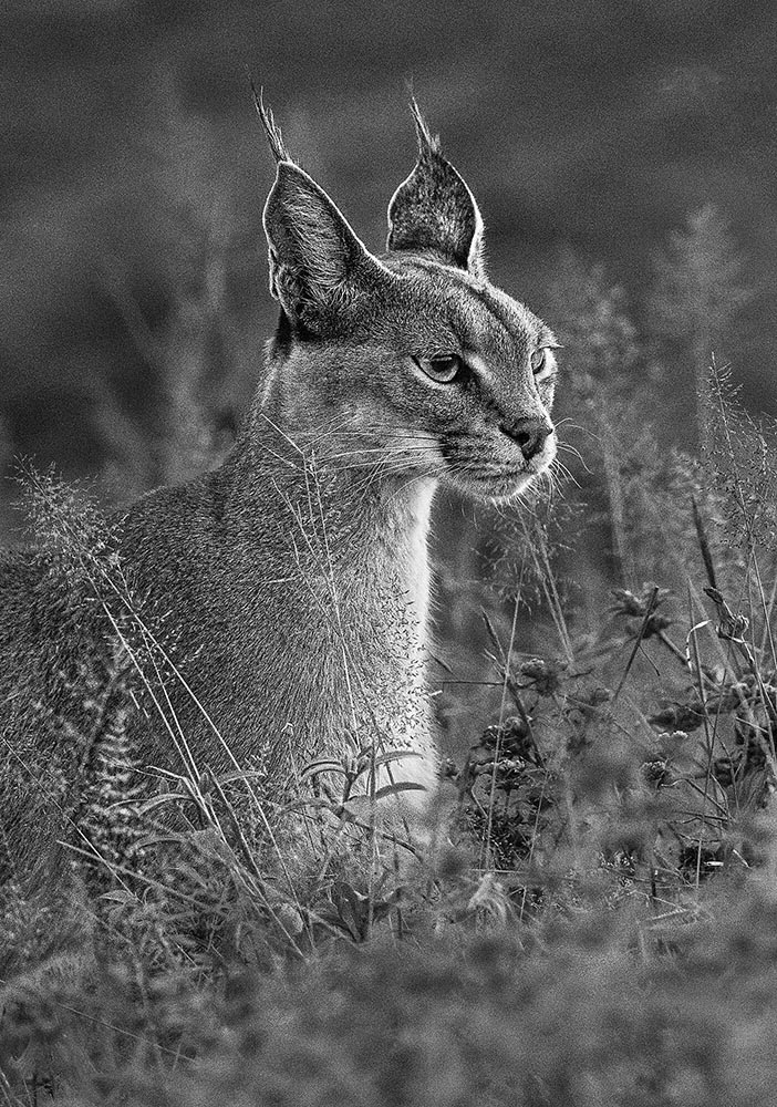
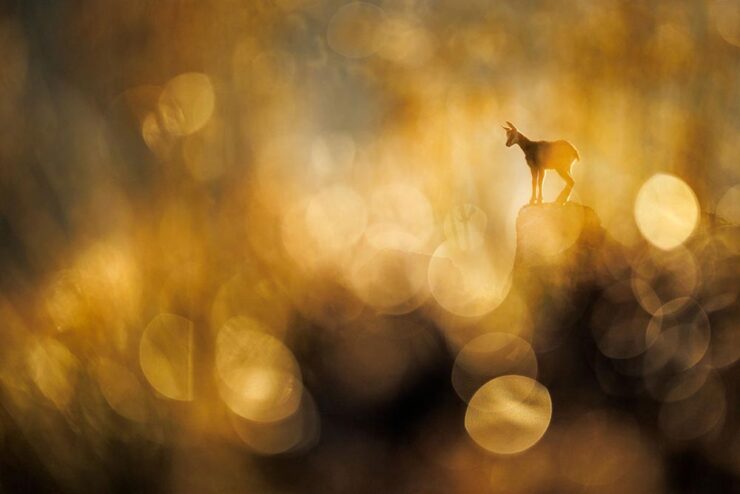
Best nature photography, 2026 showcase
No, you read that right: the first winners of next year, from the North American Nature Photography Association:
Most of these contain detail best seen at larger sizes. (See the website.) Well, okay, except maybe this one, which is cute at any size:
Thank you for visiting
That’s it from here for November. I still owe you coverage of AIGA’s 50 Books | 50 Covers (update: posted); weather permitting, there will be a new photography gallery mid-month; there will, of course, another Beautifully Briefed at the turn of 2026; and, don’t forget my annual Favorite Book Covers post mid-January. Please have a happy and healthy holiday season.
- 1I took the opportunity to remaster these photographs to both correct an unnoticed error and for better consistency between the photographs taken in 2022 and those in 2025.
![Beautifully Briefed 25.10: [Blank] of the Century](https://www.gileshoover.com/wp-content/uploads/2025/10/bb-hdr-2510.jpg)