Tag: book design

  • Beautifully Briefed, Early February 2022: A Car, a Photo, and a Book

    Beautifully Briefed, Early February 2022: A Car, a Photo, and a Book

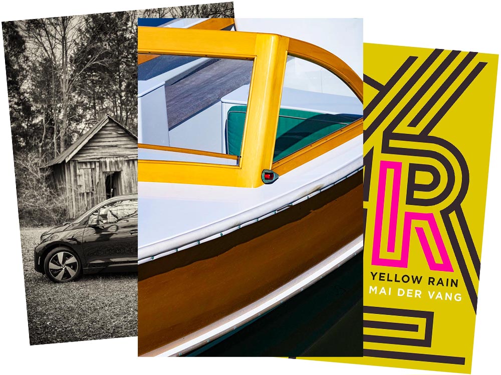
    BMW i3 Discontinued

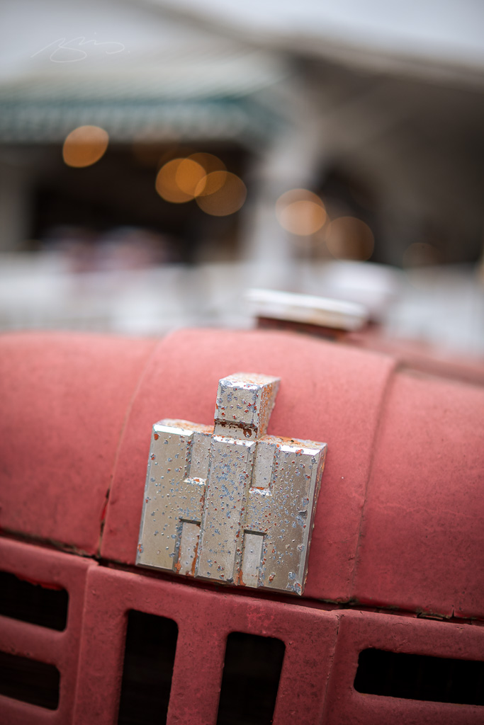
    As some of you know, for getting around town, I zip about in an electric BMW i3. The range isn’t great — 120 miles, give or take, meaning I’d have to recharge there if I went to Atlanta — but for Macon and pretty much all of Middle Georgia, it’s perfect. Grocery store? No problem. Park, for a walk? No warmup, no emissions. Enough range for an ice cream in Musella or lunch in Milledgeville? Easy.

    In fact, it’s not an understatement to say that I rave about my i3. Simply put, I love it.

    Electric Toolbox, Wooden Shed

    When introduced in 2014, it was hugely ahead of its time. Built on a bespoke platform with a carbon-fiber body and an eye-catching style (that somehow just looks electric), it was a huge change of pace for the “Ultimate Driving Machine” folks. And it’s done well for them, too: a quarter-million since.

    Alas, it’s just been discontinued: people want SUVs instead. Bah.

    From cars to boats

    Leica has announced their photograph of the year for 2021:

    Over the past ten years, Leica Camera AG has honoured twelve renowned photographers for their life’s work, by inducting them into the Leica Hall of Fame. A Leica Picture of the Year has now been designated for the first time, with the aim of sharing this success with all Leica enthusiasts. 

    Leica’s 2021 Photograph of the Year

    One of the things that makes photography so glorious is how many different ways the person behind the camera could approach a subject. So, I ask myself: would I have taken that photograph? Almost certainly not. That said, would I hang it on my wall? Yes. For $2000? Maybe another lens instead!

    LeicaRumors has more. Meanwhile, I’ll keep improving. Someday….

    Update: The official Leica page: Ralph Gibson and the M11.

    2021 Cover of the Year addition

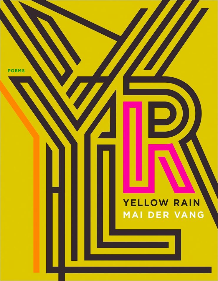
    Lastly, the New Yorker’s Briefly Noted book reviews (from 6 December — I get them second-hand, and subsequently, am a little behind) reveals a collection of poetry — a reinvestigation of chemical weapons dropped on Vietnam — whose cover is sublime:

    Yellow Rain, 7 x 9″ paperback, Graywolf Press, cover by Jeenee Lee Design

    Noted, indeed — I wish I’d seen this in time for my favorite covers of 2021. Belated Honorable Mention! (Thanks, Youa.)

  • My 50 Favorite Book Covers of 2021

    My 50 Favorite Book Covers of 2021

    This post is late, because I had trouble narrowing my long list down . . . and then, when even the short list was too long, said, “heck, 21 is too few for a year with such superlative design.” So, instead of 21 for ’21, y’all get 50. Grab a delicious beverage, settle in, and enjoy.

    My selections stem from books I’ve seen; the “best of” lists from NPR, The New Yorker, Kottke, and the BBC; and the best book cover lists from Spine, the Casual Optimist, Kottke, AIGA Eye on Design, Creative Review, LitHub, and PRINT magazine. When you’re done here, see how my list compares with theirs — a great many more outstanding covers await.

    Please remember that these are my favorites — others might say “best,” but I’ve been in this business long enough to know that there’s always another great title you haven’t seen or read about, and I don’t want to disrespect any of the great book designers not on this list. I’ve tried to include design credit where I could (thank you to the folks who answered emails with that information), and I wish to stress that any mistakes (incorrect attribution, link not working, etc.) in the list below are mine.

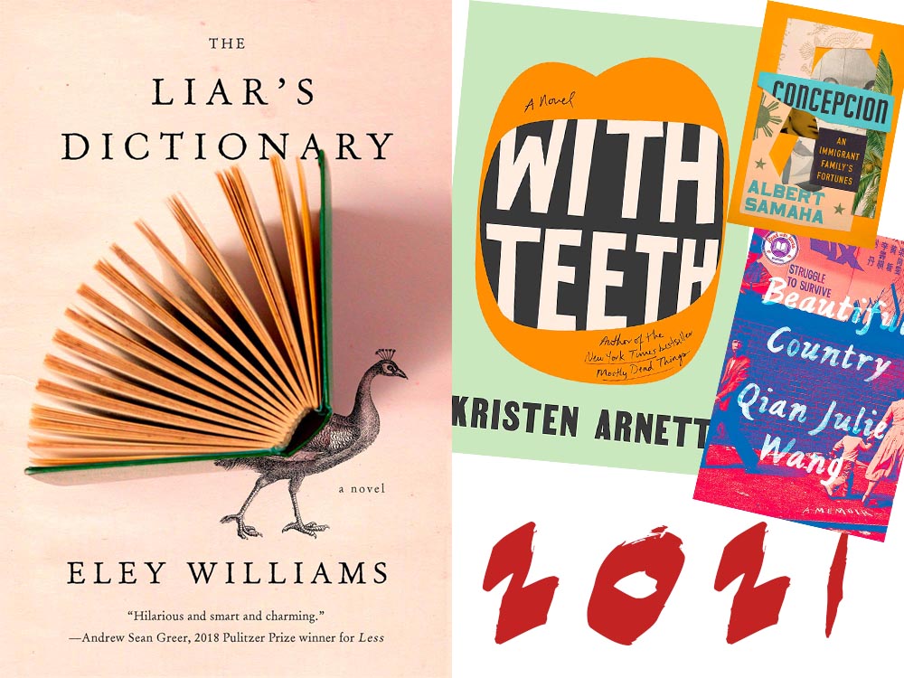
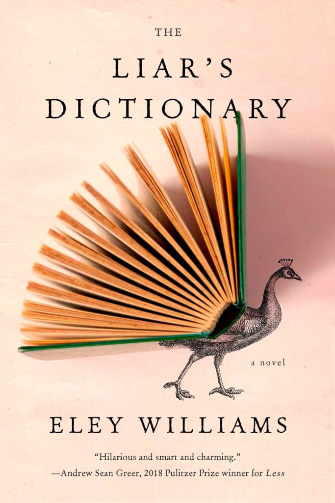
    My cover of the year is one of those combinations of photography and printed word that works on multiple levels. Okay, sure, it’s called Liar’s Dictionary, so I may totally be pulling your leg here, but:

    2021 Cover of the Year: Liar's Dictionary

    “We all peacock with our words,” one reviewer said: exactly right. I’m wondering about the direction of the shadow — some Monday morning quarterbacking, for certain — but otherwise, I’d be incredibly pleased to have this cover in my portfolio. It speaks to what I aspire to, which is the best photography and best graphics working in beautiful concert. Design by Emily Mahon. (Bonus: See a Spine write-up on Emily from 2017.)

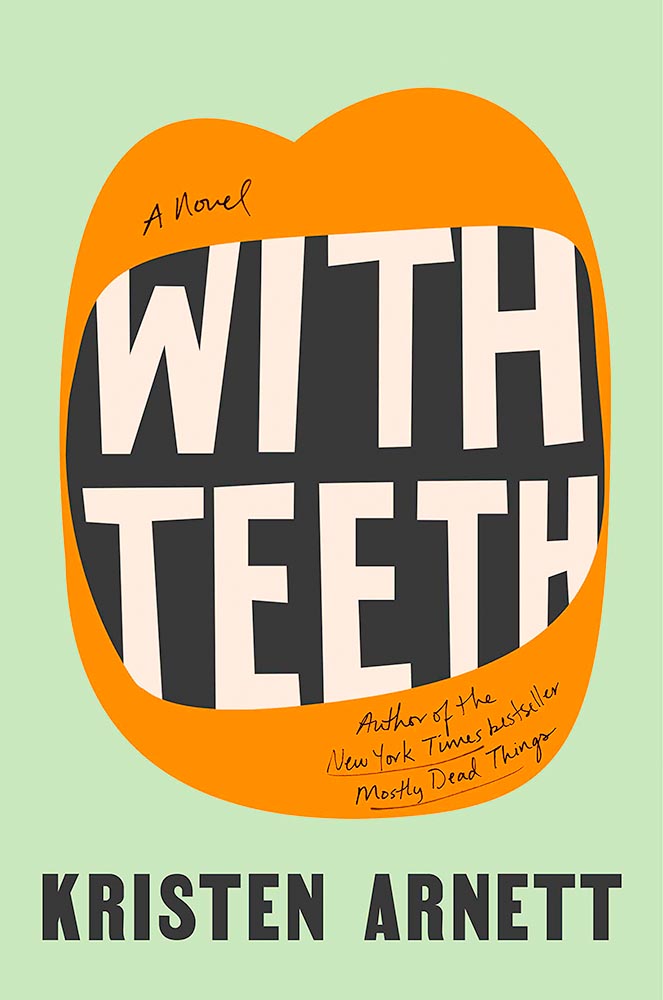
    With Teeth book cover

    My runner-up for favorite cover of the year, this novel of a queer mother is immeasurably strengthened by this extraordinary cover. Great color, great type . . . just great. Design by Lauren Peters-Collaer.

    The rest, in alphabetical order:

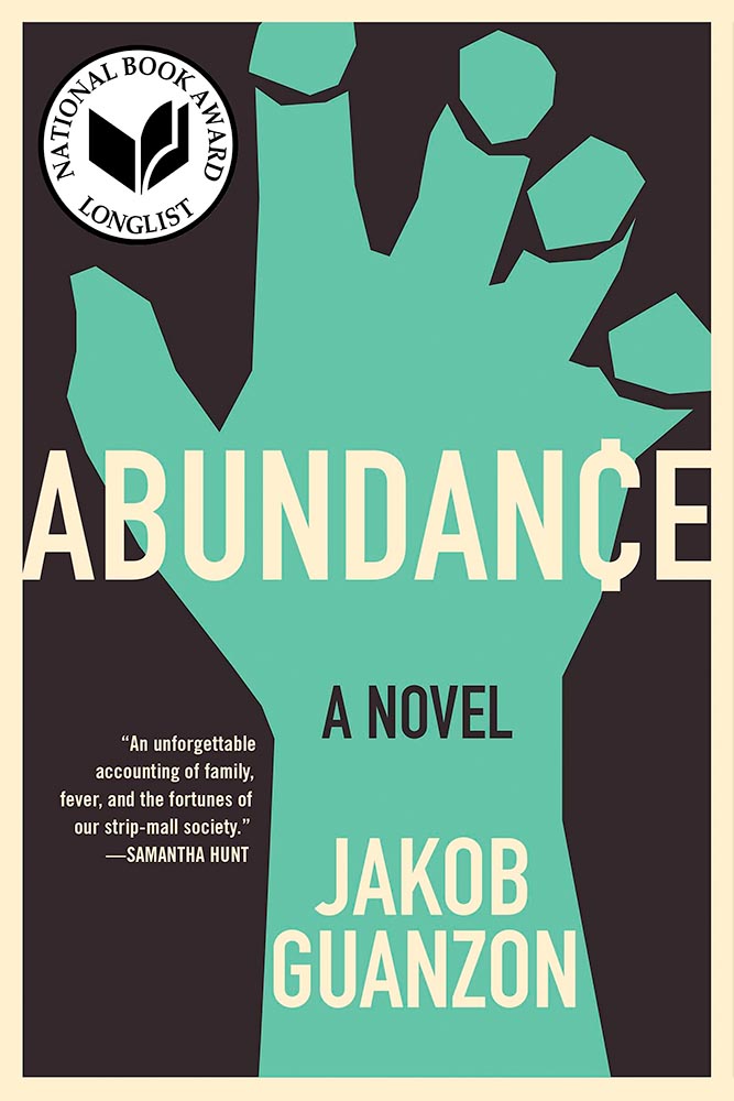
    Abundance

    The ability of this cover to catch your eye on a crowded bookshelf is undeniable, but it’s the amount communicated with seeming simplicity that makes it a winner. Design by Kapo Ng.

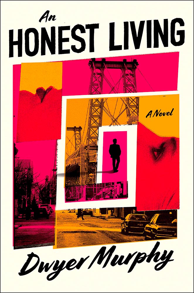
    An Honest Living book cover

    The progression of graphics here win on several levels, but the icing on this “exquisite ransom note” (thanks, Lithub) is the shadow from the silhouette in the middle. The use of so few colors is a huge bonus. Design by David Pearson. (He doesn’t seem to have a website, but here’s a It’s Nice That article.)

    Awake book design

    The combination of background image — the eyebrows are perfect — with the elements making up the overlays is wonderful. The wraparound text adds to the whimsy. Brilliant results. Design by Joan Wong.

    Beautiful Country book design

    This is just great: “struggle to survive” so prominently displayed, the fence and wall, what looks like a cop in the upper left, the guy staring straight at camera in the lower left, the “hurry up” notion of the mother and child, the colors of the collage, everything. Wow. Design by Linda Huang.

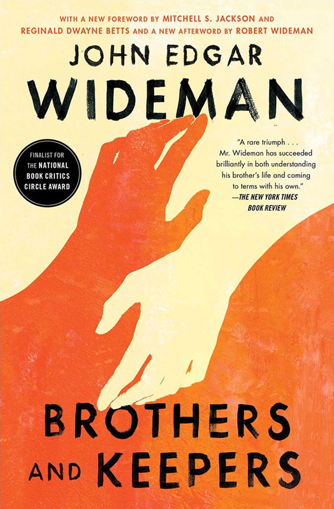
    Brothers and Keepers book cover

    This is another from the “simple is better” category. Great colors, yes, but little details, like the type and the subtle overlay of the graphs over some of that type take it over the finish line with style.

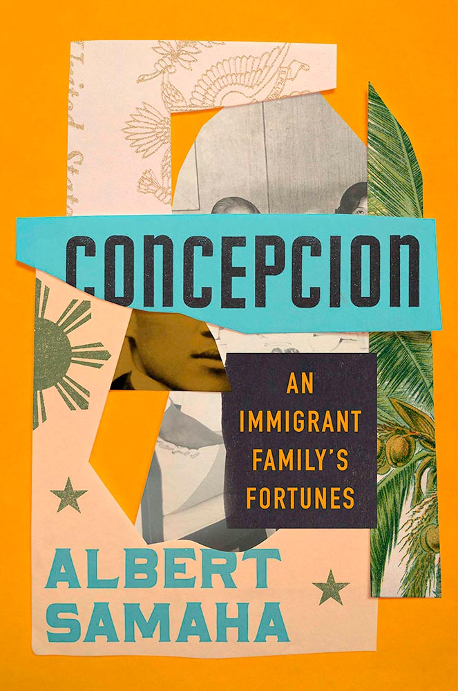
    Concepcion book cover

    Collage and type, yellow and green, all done beautifully well. Bonus points for the hints — just hints — at faces. Design by Lauren Peters-Collaer.

    Curb book cover

    Another with simple colors, but the strengths here are not only in the eye-catching type, but the repeating line drawings with their own curb . . . and that single lit window for the win.

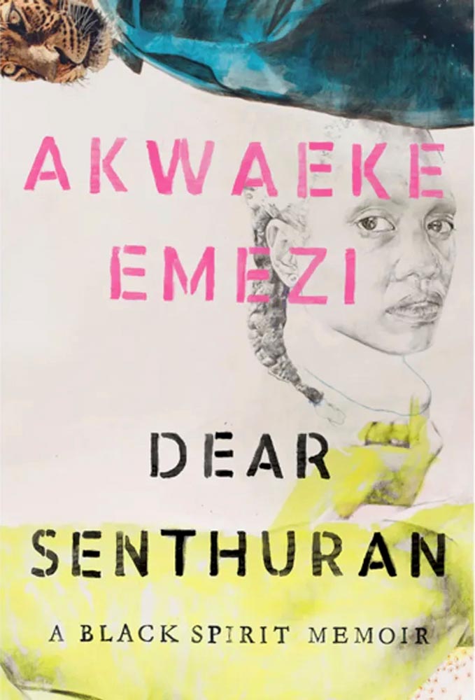
    Dear Senthuran book cover

    Leopard! Wonderful pencil sketch! From the simple-at-first-glance category we have anything but.

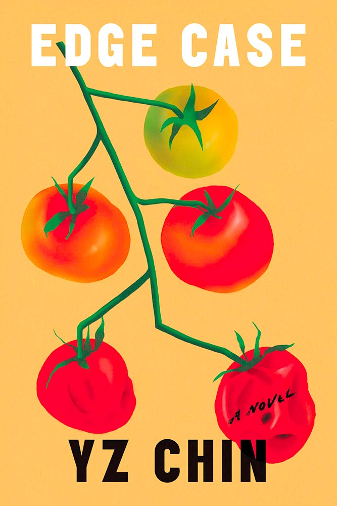
    Edge Case book cover

    At the risk of repeating myself, this one seems simple. Until you realize that the tomatoes age . . . and spoil. (The vine’s awesome, too.) Edgy design by Na Kim. (Bonus AIGA Eye on Design article on her.)

    Foucault in Warsaw book cover

    “Memorable” doesn’t begin to describe this one; the upside-down painting is only the beginning. Design by Daniel Benneworth-Gray.

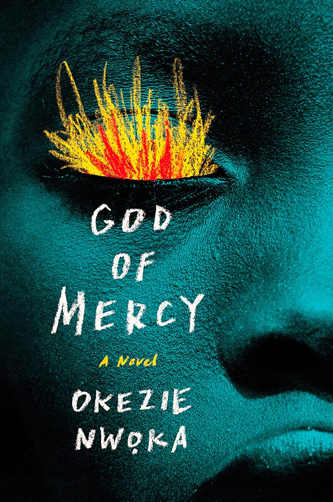
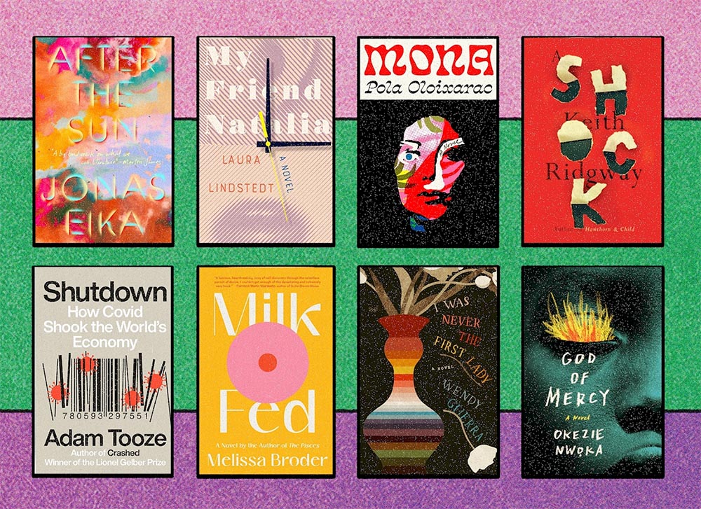
    God of Mercy book cover

    I’m going to go with chalk rather than brush to describe the type and especially flames, but either way, when combined with this extreme close-up, its perfectly-chosen duotone, and fantastic skin texture of this beautiful model, we get something close to amazing. Design by Sara Wood.

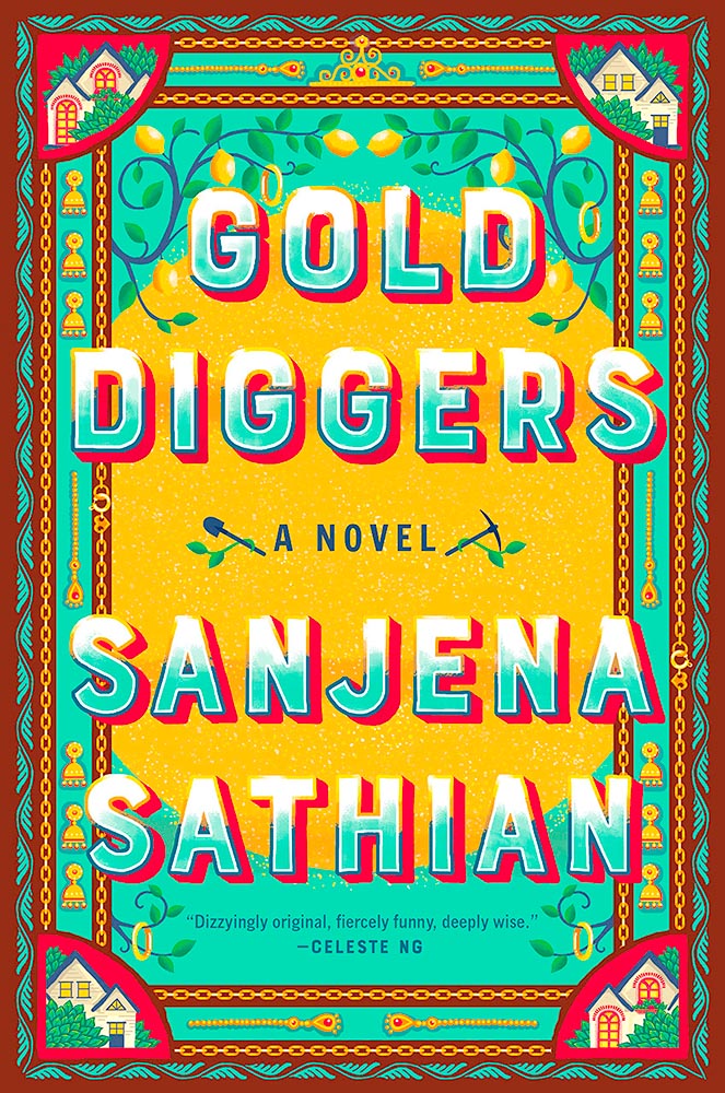
    Gold Diggers book cover

    In contrast to some, this one is not simple at all: deeply detailed and strikingly colored, this cover says “all-American” in a way only an immigrant can. Design by Stephanie Ross.

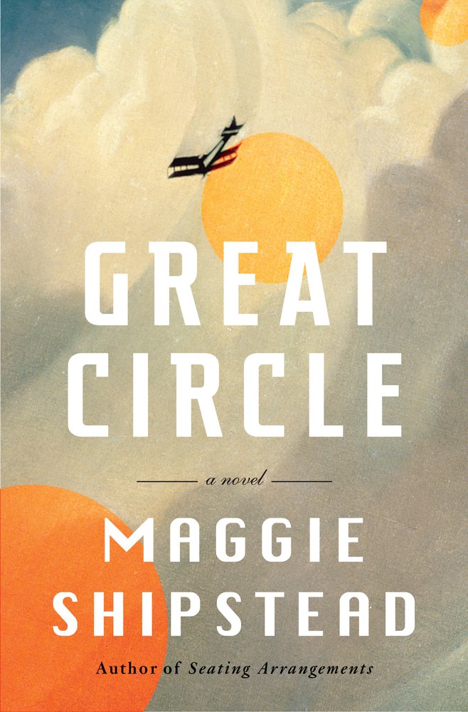
    Great Circle book cover

    Mentioned earlier this year, this title circles back because the artwork demands it. Cool white-type title, too. Design by Kelly Blair.

    Hard Like Water book cover

    The smile — and the shoes! — speak more loudly than the revolutionary themes so typical of Maoist-era settings. The perfect parody cover. Brilliant. Cover design by Matthew Broughton, based on art by Biao Zhong.

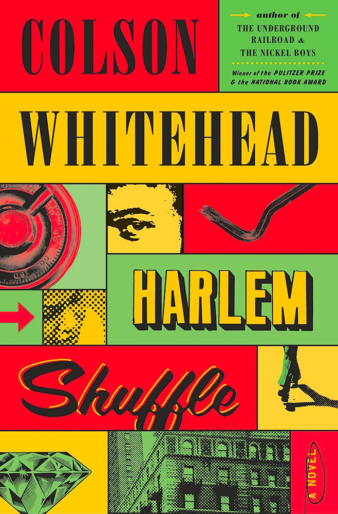
    Harlem Shuffle book cover

    Color, type, objects, the arrow, “a novel,” circled, the people and places . . . all add up to so much more than just the sum of the parts. Awesome.

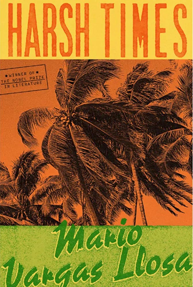
    Harsh Times book cover

    Nobel prize, blah, blah. It’s the cover, darn it! Design by Alex Merto.

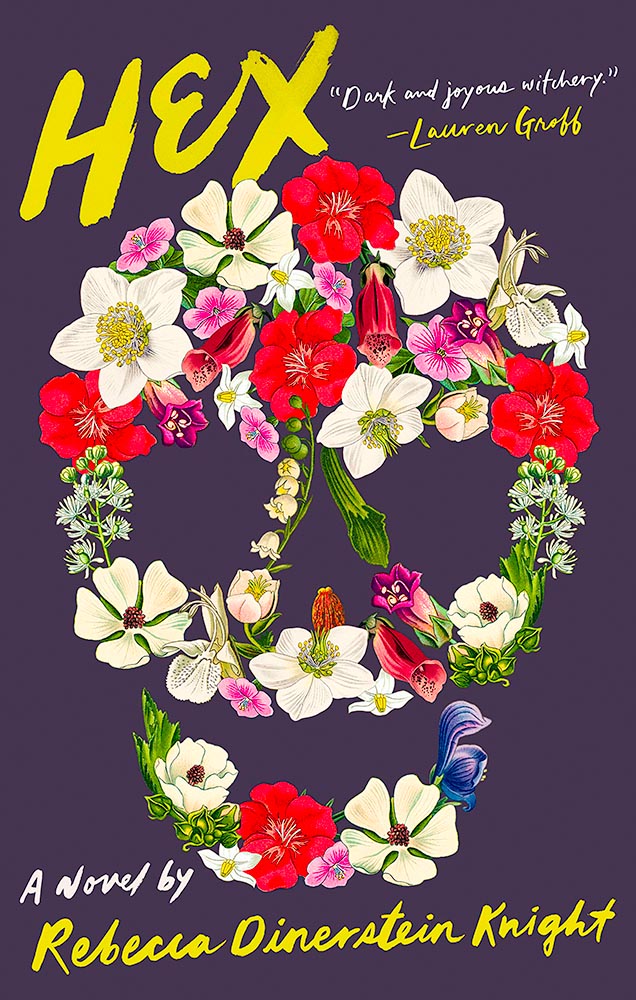
    Hex book cover

    The first of two skulls on this year’s list, this one made up of perhaps the least-hexed thing imaginable.

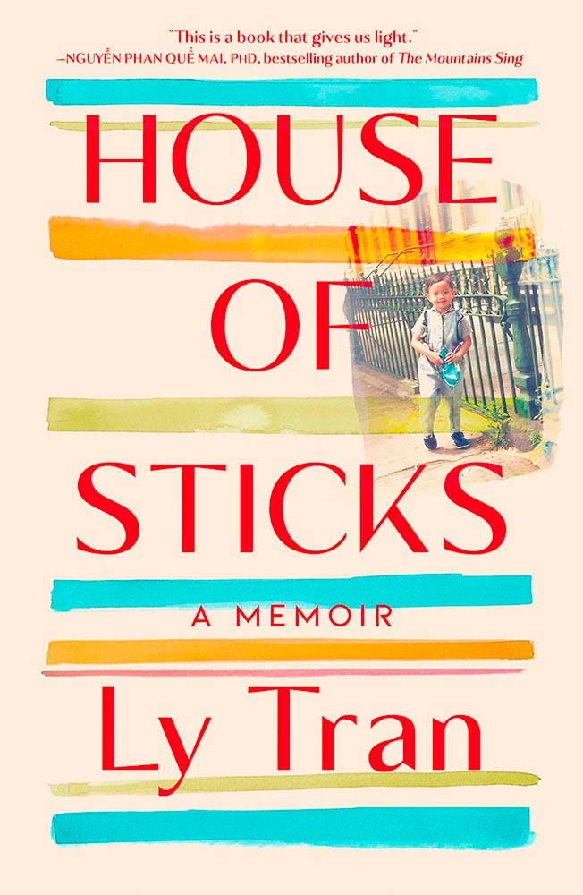
    House of Sticks book cover

    This one’s on this list for its subtle brilliance: the watercolor lines, the great typography choice, and integration of the photograph. Nicely done.

    How the One-Armed Sister Sweeps Her House book cover

    One the one hand, a simple photograph-and-title book cover. On the other, it’s beautifully cropped, the reader/viewer catches the “look,” and it’s complimented with great color choices. Long title served oh-so-well.

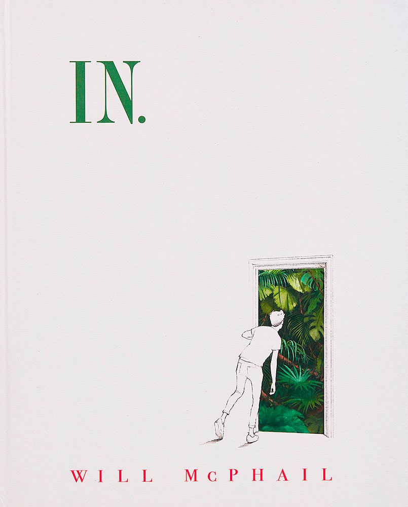
    In book cover

    You don’t see almost-blank covers every day, and this one, especially, makes you want in. (Sorry.) Brilliant.

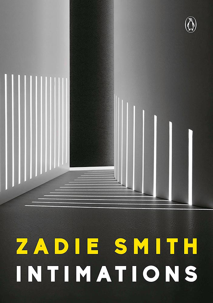
    Intimations book cover

    I. Want. To. Have. Taken. This. Photograph. (And then done this cover.)

    Kennedy's Avenger book cover

    This type of cover is actually very difficult to accomplish well, and here, it’s . . . well, accomplished.

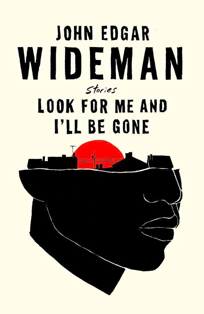
    Look For Me and I'll Be Gone book cover

    Brilliant on so many levels. Design by David Litman.

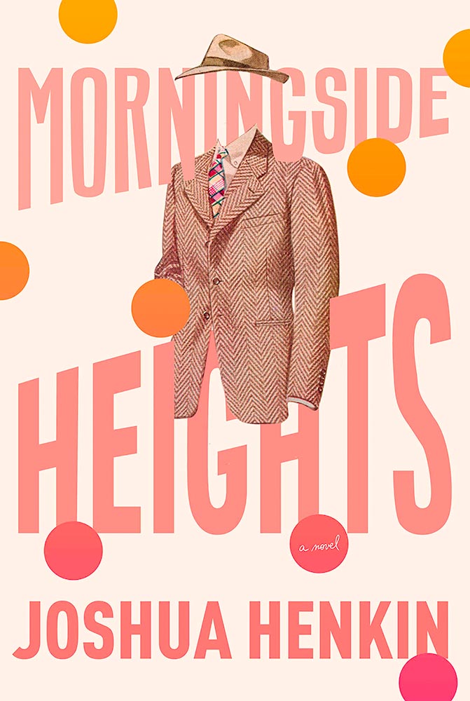
    Morningside Heights book cover

    Color and type compliment the awesome choice of suit and hat here. One of those covers that demands the reader/viewer pick it up off the shelf and explore. Design by Kelly Blair.

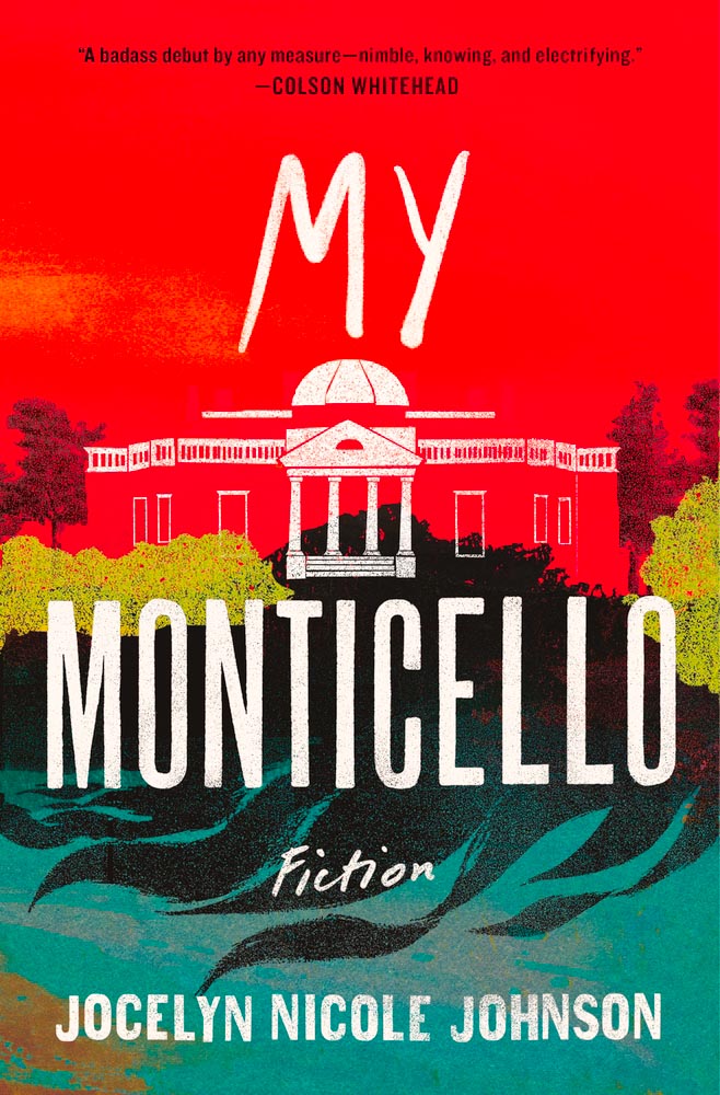
    My Monticello book cover

    The painterly elements here lead the reader/viewer to the correct question: “what is this about?” and, guaranteed: it’s not what you think.

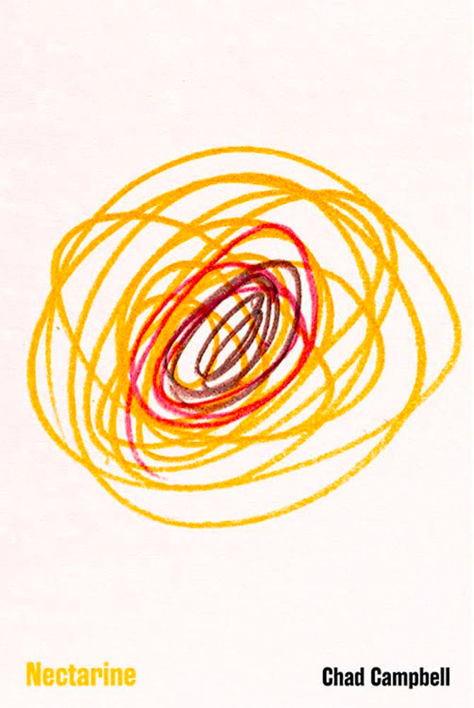
    Nectarine book cover

    This made a bunch of best-of lists this year, and I gotta say: it’s one accomplished scribble. Brilliant. Design by Dave Drummond. (Bonus: Dave Drummond has a write-up from PRINT.)

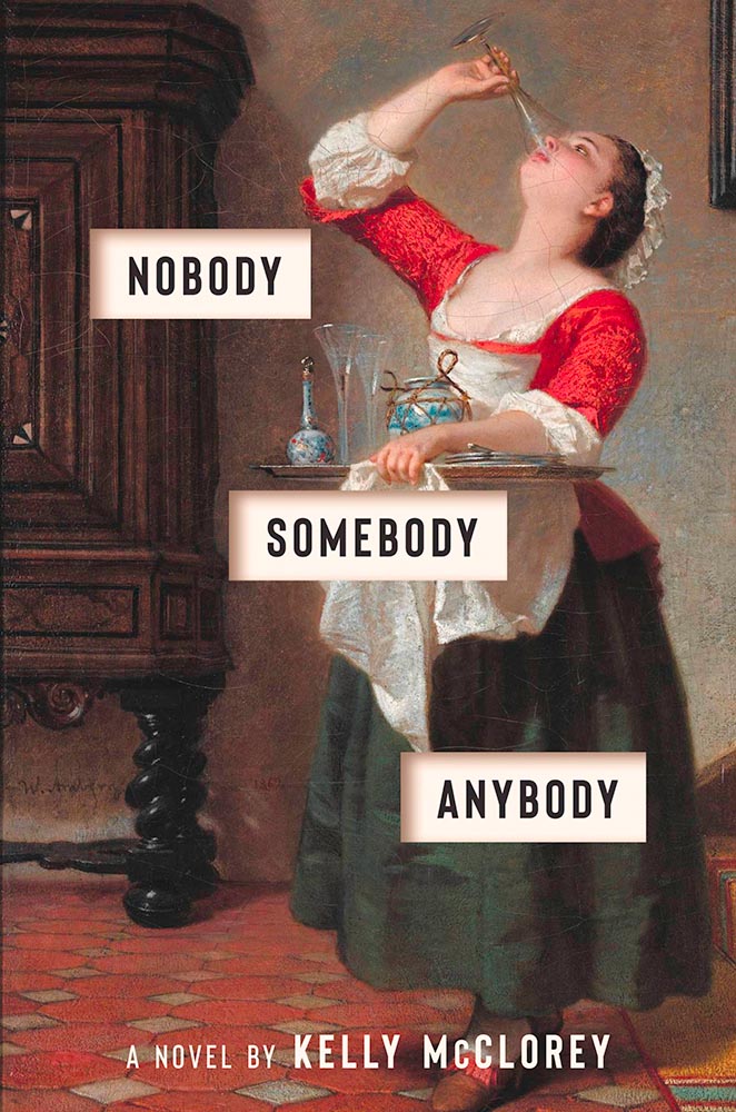
    Nobody Somebody Anybody book cover

    The best riff on “upstairs, downstairs” seen in a long, long time.

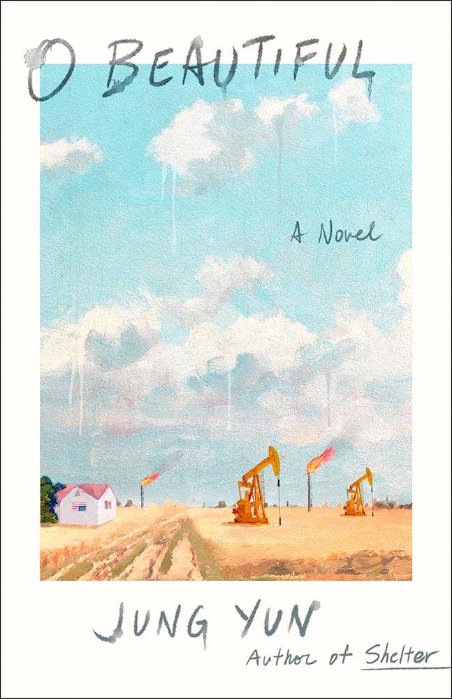
    O Beautiful book cover

    Watercolor, in every sense of the word. (Cloudy drips, too.) O-so-beautiful. Design by Young Jin Lim.

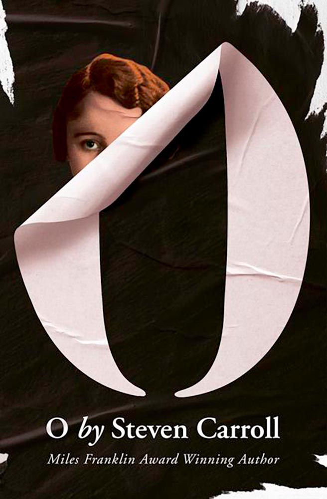
    O book cover

    Oh — wait a minute. Stick-on that isn’t, quite, combined with peeling and what seems like staring add up to a favorite. Design by Gray318.

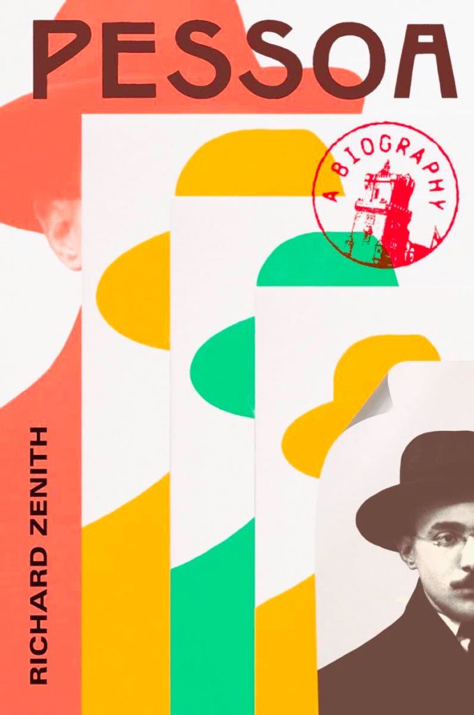
    Pessoa book cover

    From the simple-but-not dept., we have another brilliant entry, with great color choices, type placement, and the best — some might say, “Iconic” — “a biography” stamp ever. Love that the smallest photo is peeling, too. I’m actually envious of the talent displayed here! Design by Yang Kim.

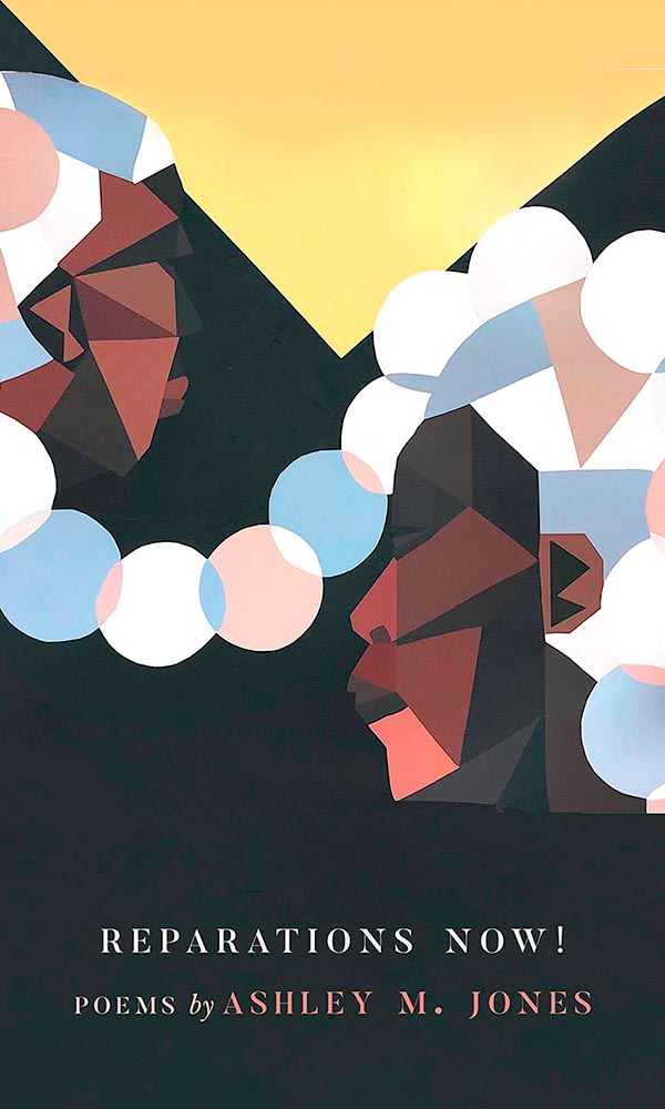
    Reparations Now book cover

    I hope it comes out in the relatively small photograph, but this is actually paper cut. Great choices, great colors.

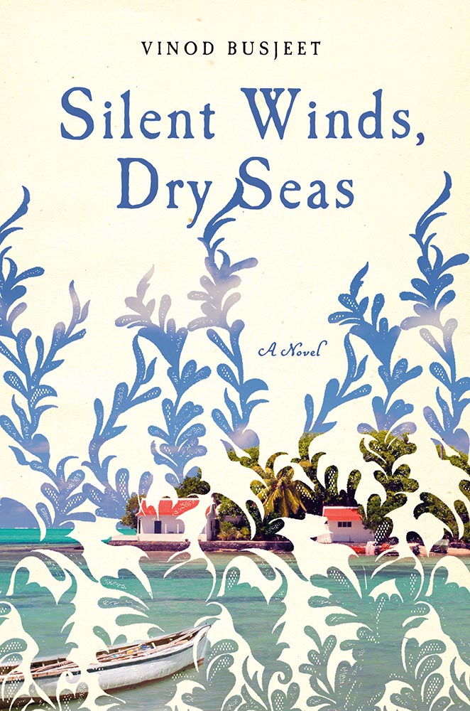
    Silent Winds Dry Seas book cover

    Like a dreamily lace curtain, the overlay on this painted shore brings what could be nice to the level of sublime. Having a cool title helps, too. Winner.

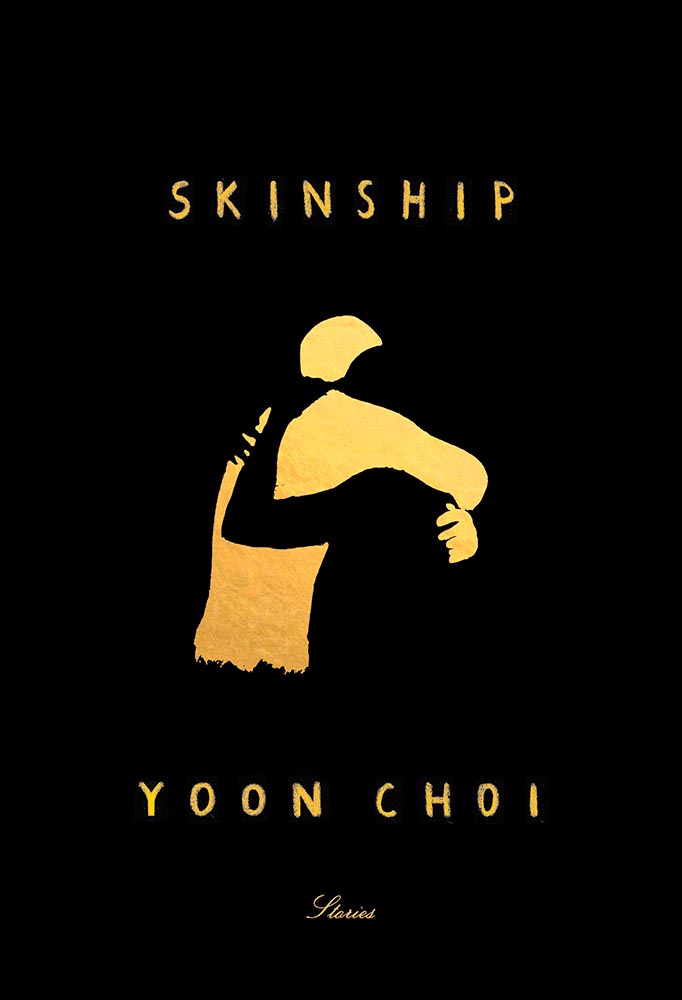
    Skinship book cover

    Wow. This cover violates so many supposed rules, yet succeeds on so many levels — absolutely brilliant. Design by Janet Hansen.

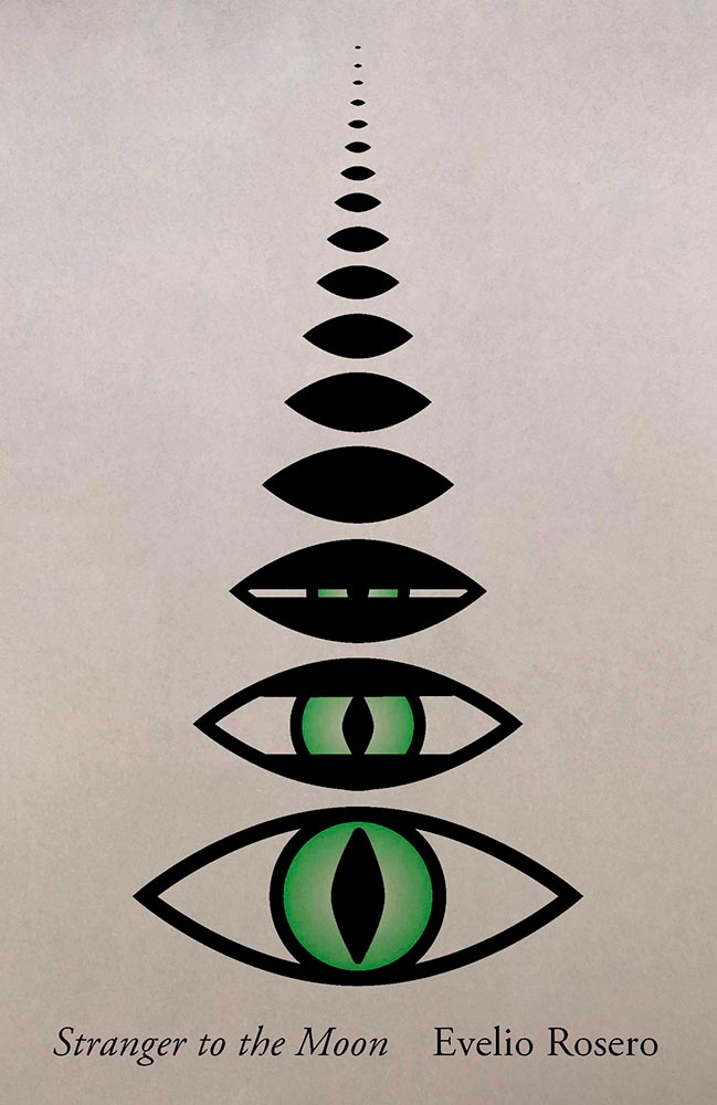
    Stranger to the Moon book cover

    The simple-yet-not cup floweth over with this one; its scant 96 pages encompass dystopian political fiction that wins national awards and deserves something this strong. Design by Janet Hansen.

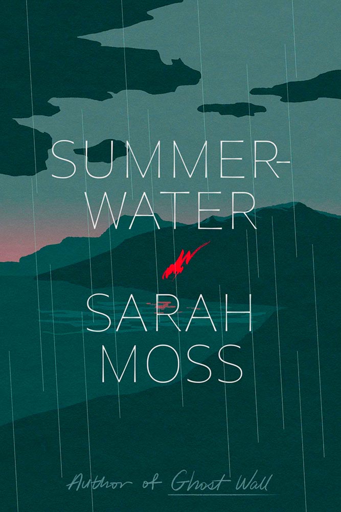
    Summer Water book cover

    Illustration rules, in a foreboding style that suggests anything other than a Scottish summer. Lovely slim type is complimented perfectly by the script at the bottom. The title is actually Summerwater, by the way — I missed the hyphen at first — but ultimately I’m not sure it matters. Design by June Park.

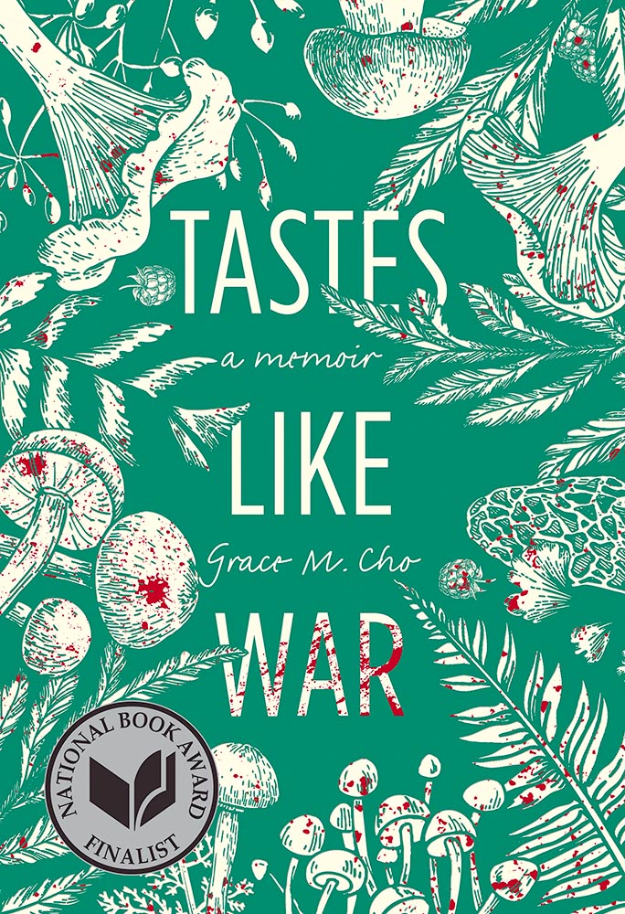
    Tastes Like War book cover

    The ingredients on this cover, together with splattered red, suggest more than food, racism, and a parent’s problems, yet this is a title I’d definitely pick and and spend time examining — all thanks to great design.

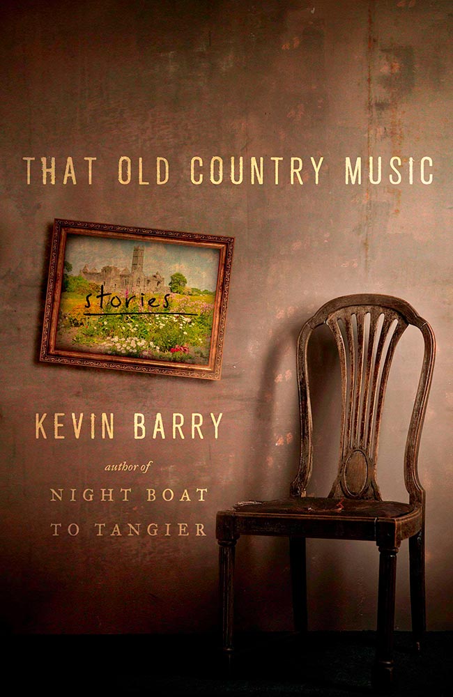
    That Old Country Music book cover

    An absolutely perfect photograph highlights a stack of great choices.

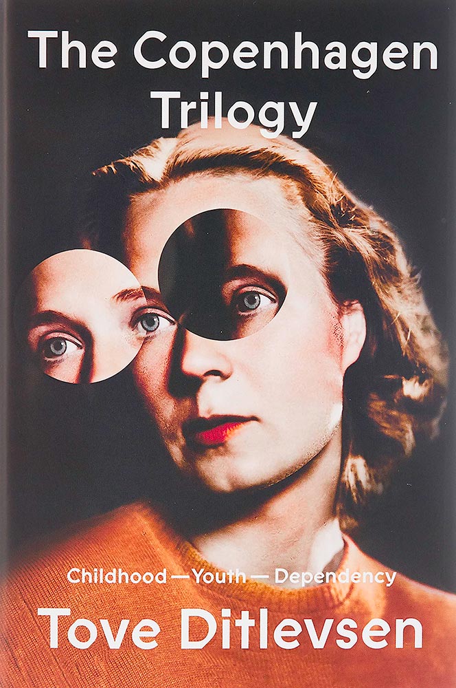
    The Copenhagen Trilogy book cover

    The old-time portrait it taken to the next three levels. Fantastic. Bonus points for an unusual type choice (type name, according to site name). Great, great design by Na Kim. (See also the PRINT write-up on this title.)

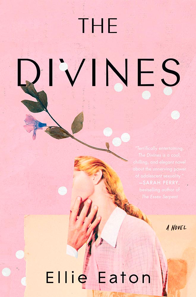
    The Divines book cover

    The photograph cropping alone brings this title to the table, but when combined with the aged background, the white dots perhaps suggesting a past shot through with problems, and the desiccated flower suggest something so much more. Design by Mumtaz Mustafa.

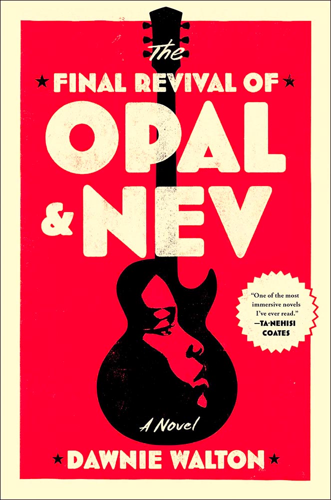
    Open and Nev book cover

    Sure, impressing Ta-Nehisi Coates and Barak Obama means impressive fiction — but it deserves a cover with star power, and this design by — absolutely delivers. Great stuff.

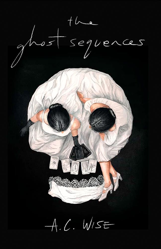
    The Ghost Sequences book cover

    The second skull on the list, this “house built by memory in-between your skin and bones” requires a second look, then a third. Deal me in. Design by Vince Haigh.

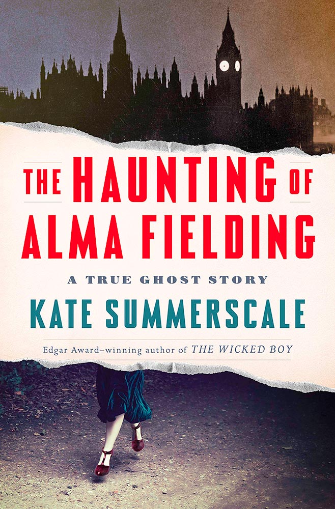
    The Haunting of Alma Fielding book cover

    Great type complimenting great illustration choices, sure, but those feet . . . .

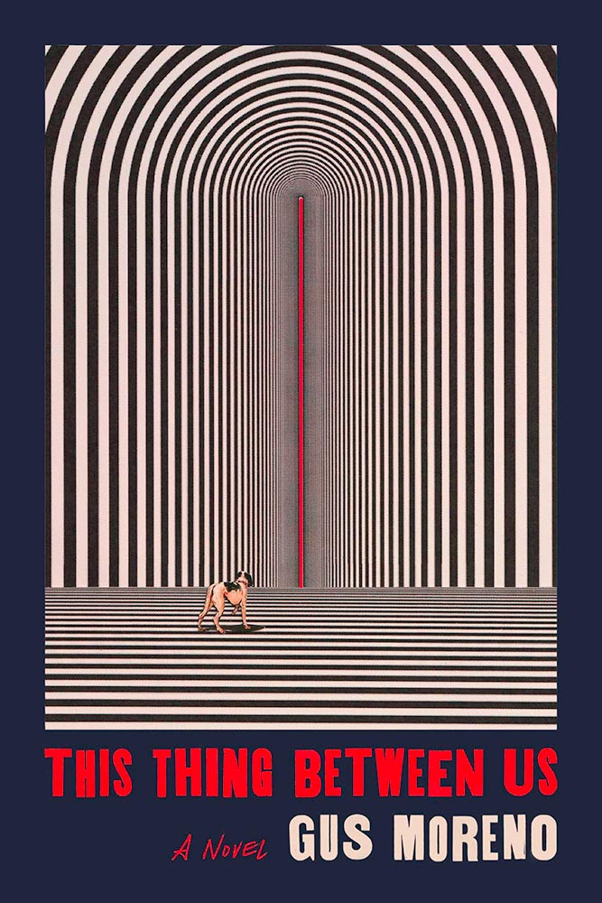
    This Thing Between Us book cover

    Surreal smart speaker — no kidding. How does one design a cover for that, exactly? This way. Design by Sara Wood.

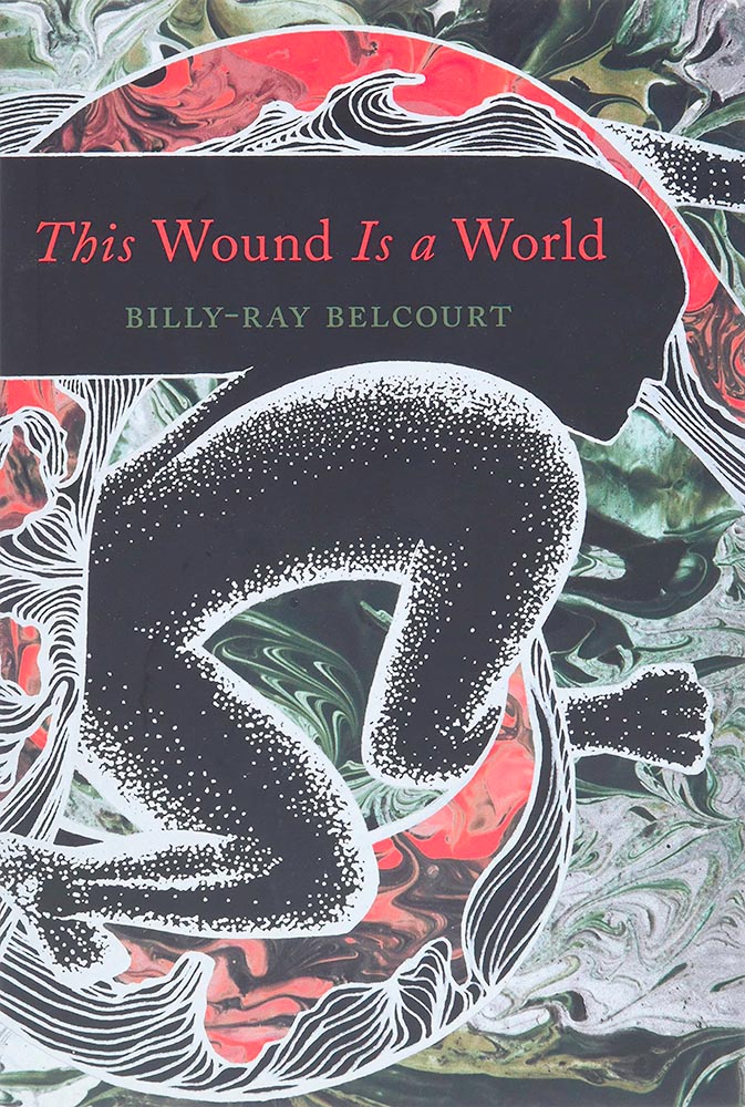
    This Wound is a World book cover

    “[C]ut a hole in the sky / to world inside,” this volume of Native American poetry suggests. The cover does just that.

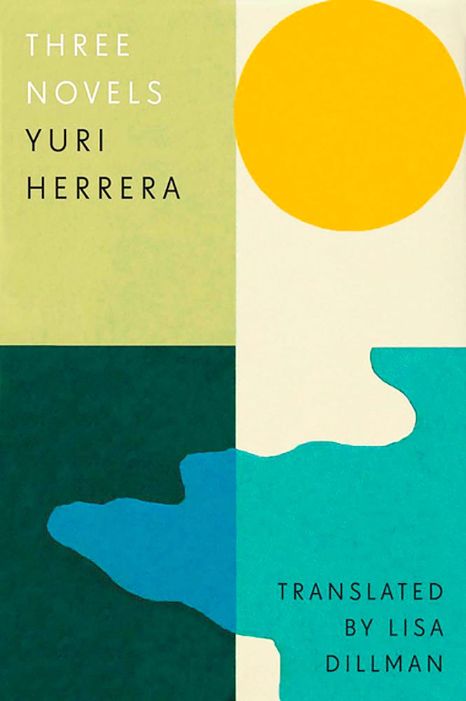
    Three Novels book cover

    “Another few cuts of paper,” he said with such casualness. Ha! Design by Tom Etherington.

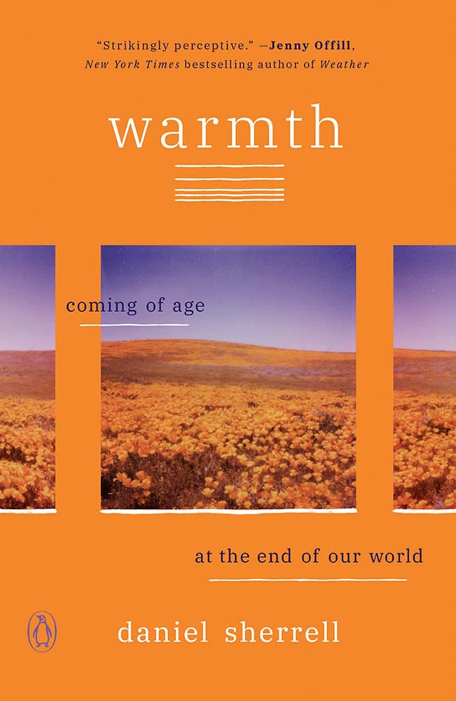
    Warmth book cover

    “Beautifully rendered and bracingly honest,” one of the reviews says. The cover, as well. (Plus, lines.)

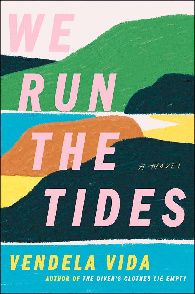
    We Run the Tides book cover

    The color choices here, combined with the illustration, suggest something soothing, yet catch the eye in a way that demands attention. The mystery within does, too, from practically the first sentence. Here because I know I wouldn’t have done it so well.

    Zorrie book cover

    Climbing that ladder’s going to take a minute. But then, that’s what it’s all about . . . .

    On to 2022, everyone! Thanks for surviving 2020, 2021, and continuing to read — here, and behind your favorite book cover.

  • Washington Post’s Best Book Covers 2021

    Washington Post’s Best Book Covers 2021

    The Washington Post has an article from book designer Kimberly Glyder with her favorite book covers of 2021. Her bio:

    Kimberly Glyder’s studio specializes in book design, illustration and lettering. Her work has been featured in the AIGA 50 Books/50 Covers show, the Type Director’s Club Annual Exhibition, Print magazine, American Illustration, the American University Presses Book Jacket and Journal Show, and the New York Book Show.

    Check her “best of” at the WP, and stay tuned for more 2021 lists next month.

  • The Most Iconic Book Covers (Again)

    The Most Iconic Book Covers (Again)

    LitHub has posted an article about what the author terms, “The 25 Most Iconic Book Covers in History.” (See the BBC’s article, previously.) Hard to disagree with LitHub’s choices, either:

    Some were less familiar to me —wherein I’m familiar with the work if not the cover — but awesome nonetheless:

    2001-29- Matt Flynn 039

    And then there are the covers that spawned movie posters, like this one:

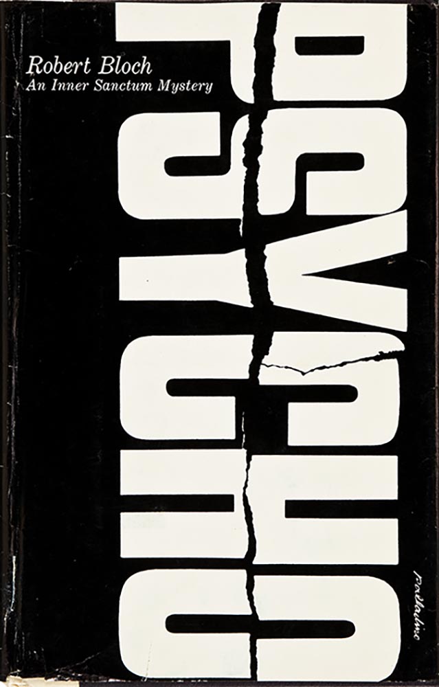
    My personal favorite, which also falls into the movie category, is a Chip Kidd masterpiece:

    Please enjoy the whole article, including both the bonus items at the end and some excellent suggestions in the comments. (Via Kottke.)

  • Climate: Little Books, Big Ideas, Great Design

    Climate: Little Books, Big Ideas, Great Design

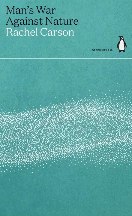
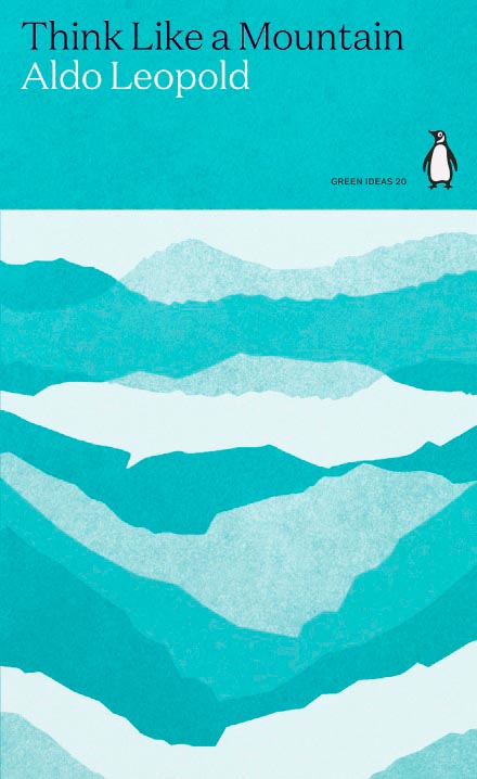
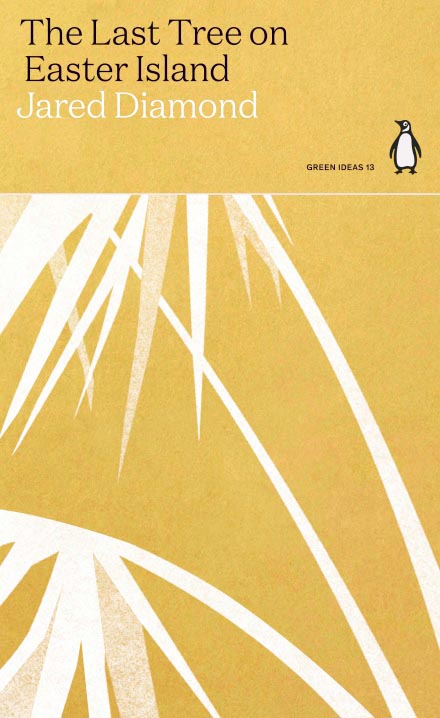
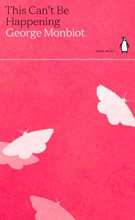
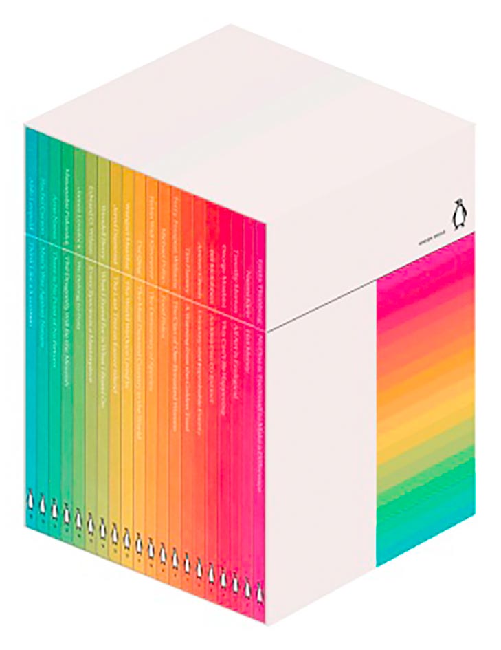
    Penguin has introduced — and reissued — a number of small titles regarding climate change, and done so with some great design:

    Green (Mountains)
    Palm (Island)
    Is (Happening)

    They’re even available as a boxed set:

    Green Ideas (Set)

    More at Penguin (UK). Via It’s Nice That, which has a nice writeup — check it out.

  • Beautifully Briefed: September, 2021

    Beautifully Briefed: September, 2021

    Let’s get the shock news out of the way first:

    Hoefler and Monotype

    It’s been thirty-two years, four months, and fourteen days since I hung out a shingle to announce that The Hoefler Type Foundry was open for business. What started as a sole proprietorship grew into the Hoefler&Co of today, a diversified design and technology practice with an international reach, still dedicated to the invention of original, thoughtful, and hard-working typefaces.

    Meanwhile, “nothing will change,” Jonathan Hoefler (previously) says, except that he’ll be stepping down. That’s kind of a big change, IMHO — but after using typography to “help elect a president,” where do you go from there? Read more here.

    In happier news, the much-delayed new Bond movie, No Time to Die, is finally in theaters next week.

    The 007 logo

    Ever wonder who was responsible for the above (slightly brilliant) graphic? Read Stephen Heller’s The Daily Heller: The Most Prolific Designer You’ve Never Known. Informative and great. Bang!

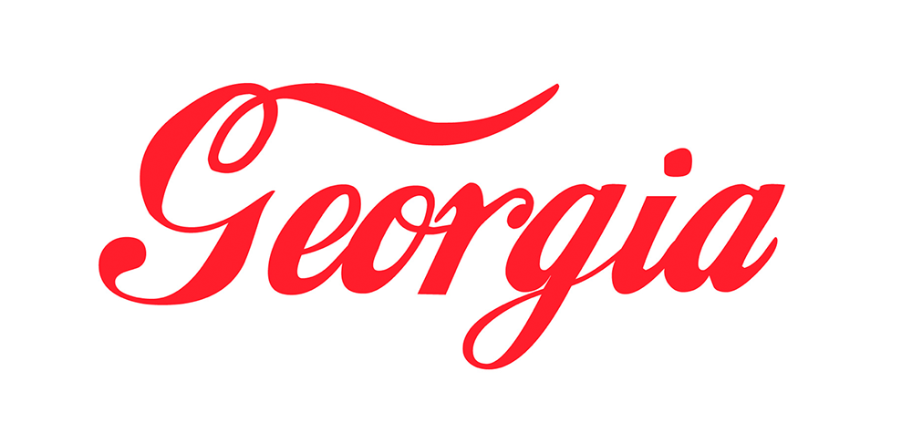
    Corp State of America: GA

    Keith Fleck has gotten a good deal of press for his Corporate States of America, but in case you haven’t seen it, it’s absolutely worth a look. Maine’s L.L. Bean, Florida’s Publix, and, of course, Georgia’s Coca-Cola are all winners. 51 bonus points!

    Lastly for this month, some book design:

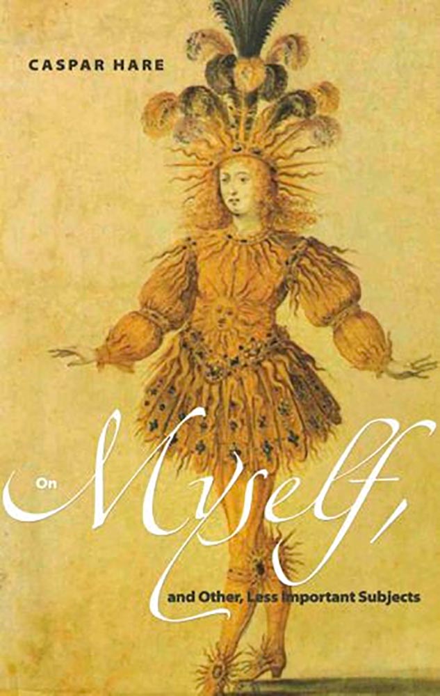
    On Myself

    Daily Nous asks their readers to nominate the best philosophy book covers — Judging Philosophy Books By Their Covers — and there are some winners, some absolute losers, and a few funny moments, too:

    Black Sabbath, except not

    “This always reminded me of a rejected Black Sabbath album cover or something,” says the poster. Nice. (And only 185 cents!)
  • Beautifully Briefed, July/August 2021

    Beautifully Briefed, July/August 2021

    It’s been a busy summer here in Middle Georgia; after regular updates to Foreword for several months, things have slowed down a little. Thus, some good items have piled up.

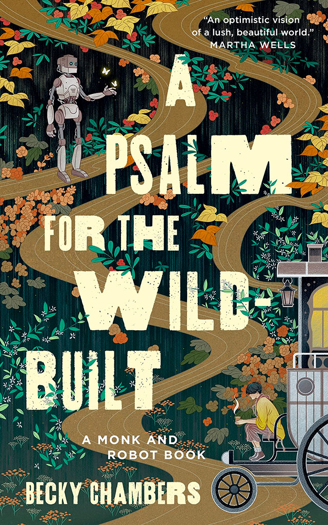
    Starting with a book design I really like:

    NPR describes it as, “A Monk And A Robot Meet In A Forest … And Talk Philosophy.” Interesting description, interesting design. I’d pick it up off a shelf.

    Speaking of bookshelves, a notable quote from Andy Hunter, of Bookshop.org:

    Take a look at this graph. The blue is Amazon’s share of book sales in the past six years. The orange is where we are headed if their average growth rate (8%) continues. If nothing slows their momentum, Amazon will control nearly 80% of the consumer book market by the end of 2025. Every single book lover should worry. After we’re done worrying, we must change the way we buy books.

    The graph:

    I’m not a fan of Medium — Andy, please choose a better place to post your very valid point — but it’s worth reading. Then change your book-buying habits if possible!

    Also from the book category, check out Skidmore, Owings, and Merrill’s latest book of built work 2009-2019. Tons of great work here, but one example might tower over the others:

    Great photography, too. designboom has more, in their famous all-lower-case style.

    While we’re talking about great photographs of New York City, check this out — complete with 1WTC in the background:

    A winner from the recent 2021 iPhone Photography Awards, which I enjoyed … until I found out it’s just another contest, complete with entry fee. (Hey, at least they don’t reassign copyright.)

    While we’re at the intersection of photography and architecture, these shots of modern churches across Europe are stunningly beautiful:

    From the nearby intersection of photography and illustration:

    The whole series is great, great stuff, and has very deservingly been used by the likes of Apple, The New Yorker, and more. Read on.

    Last and almost certainly least, I’ve updated the Musella gallery:

    Check that gallery out, look at the Middle Georgia collection, or peruse all my Georgia photographs on the road to purchasing a print or getting in touch to let me know you’d like to use something in a book or design project. Thank you.

    On to September!

  • University Press Design Show 2021

    University Press Design Show 2021

    From AUPresses:

    “Since 1965, the Association of University Presses (AUPresses) Book, Jacket, and Journal Show has fulfilled its mission to “honor and instruct”: honoring the design and production teams whose work furthers a long tradition of excellence in book design […]. The Book, Jacket, and Journal Show recognizes meritorious achievement in design, production, and manufacture of books, jackets, covers, and journals by members of the university press community. It also provides an evaluation of their work and serves as a focus of discussion and a source of ideas for intelligent, creative, and resourceful bookmaking.”

    Credit where credit is due: Spine, in their excellent way, has already covered this. Head on over there, knowing that I largely agree with their post in its entirety. However, there are a number of covers I like that they didn’t talk about — and they didn’t talk about interior design at all.

    So, without further ado, let’s start with the covers and jackets. Interiors follow, then items that are in both categories.

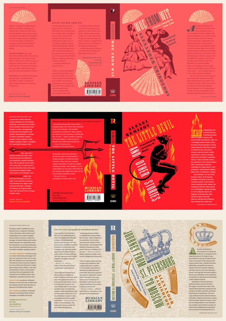
    Columbia University Press with a series (in order, top to bottom): Woe from Wit, The Little Devil and Other Stories, and Journey from St. Petersburg to Moscow. Each is great on their own, but put ’em together and the series stands tall. Excellent design by Roberto de Vicq de Cumptich.

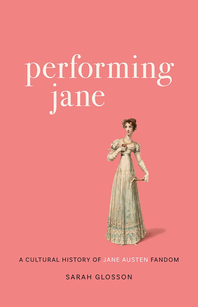
    Performing Jane

    Louisiana State University brings us Performing Jane, with design by Barbara Neely Bourgoyne. Simplicity wins.

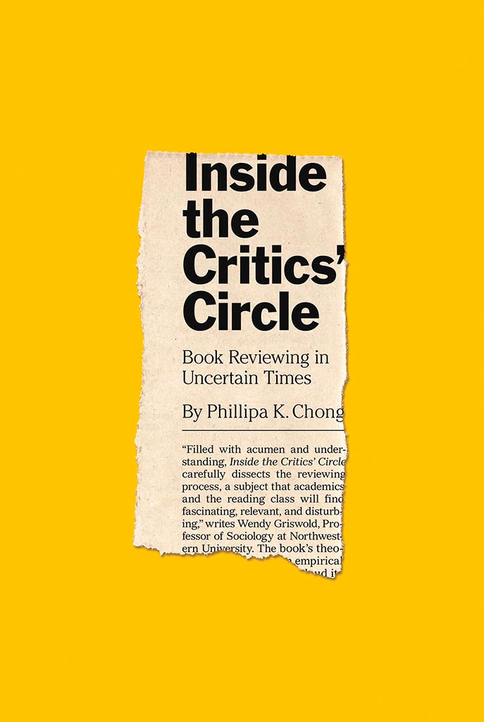
    Inside the Critic's Circle

    On the subject of simplicity, Inside the Critic’s Circle brings a seemingly-casual-yet-carefully-designed newspaper clipping onto a yellow background. Together, they’re attention-getting and just right. Nice. Design by Chris Ferrante for Princeton University Press.

    Vénus Noire is about as far from a bust as can be — except not really:

    Venus Noire

    Another example of simpler-is-better, yet something so much more. Design by Kaelin Chappell Broaddus.

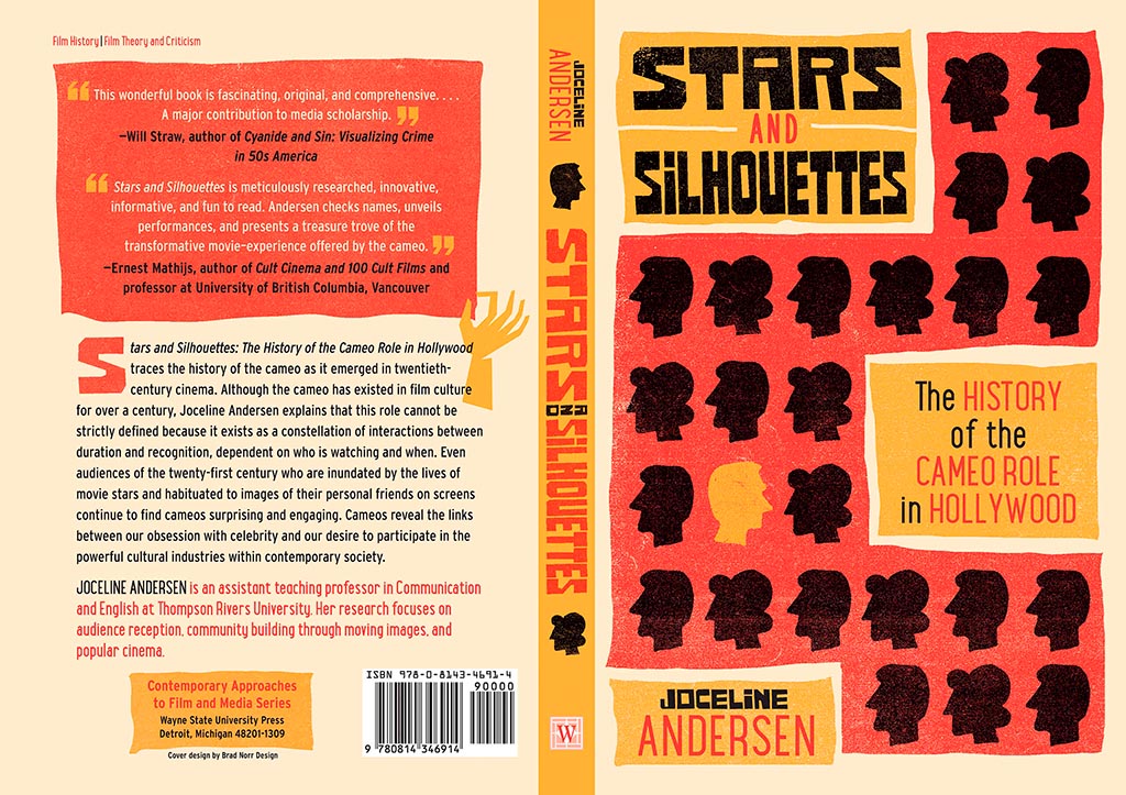
    Stars and Silhouettes

    Wayne State University Press brings us Stars and Silhouettes, in all its hand-drawn glory. Love the design by Brad Norr.
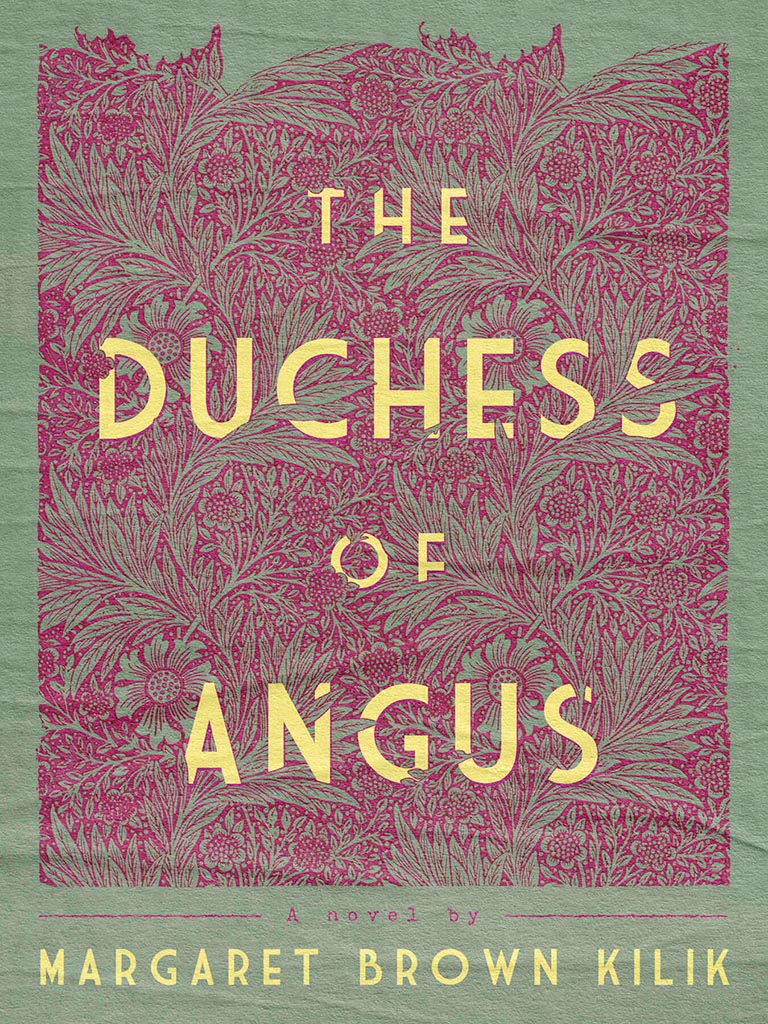
    My favorite of the stand-alone cover designs, however, contains a wrinkle or two:

    The Duchess of Angus

    Lovely. The illustration and paper photograph combine into something really special. Design by Derek Thornton — whose website, by the way, has a bunch of other great stuff. Nice!
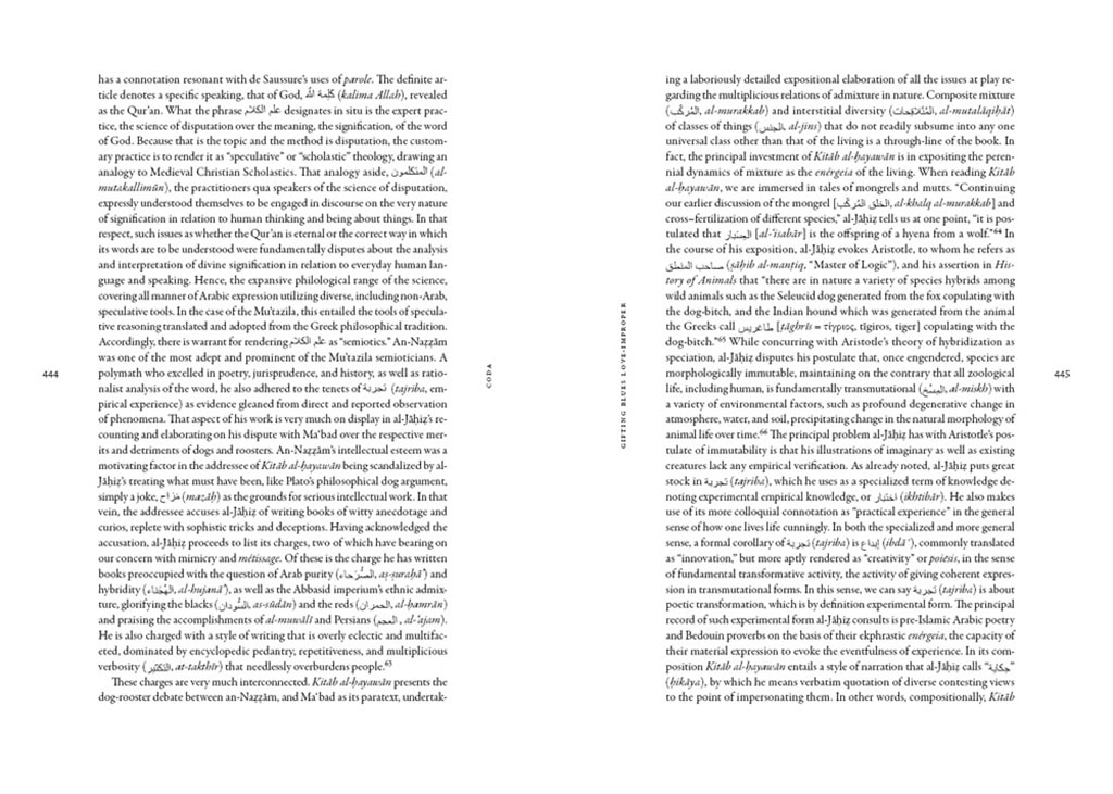
    On to some interior design, with Pinceton’s Dante:

    Dante's Interior

    Puts “boring academic title [page]” to rest. Design by Chris Ferrante.

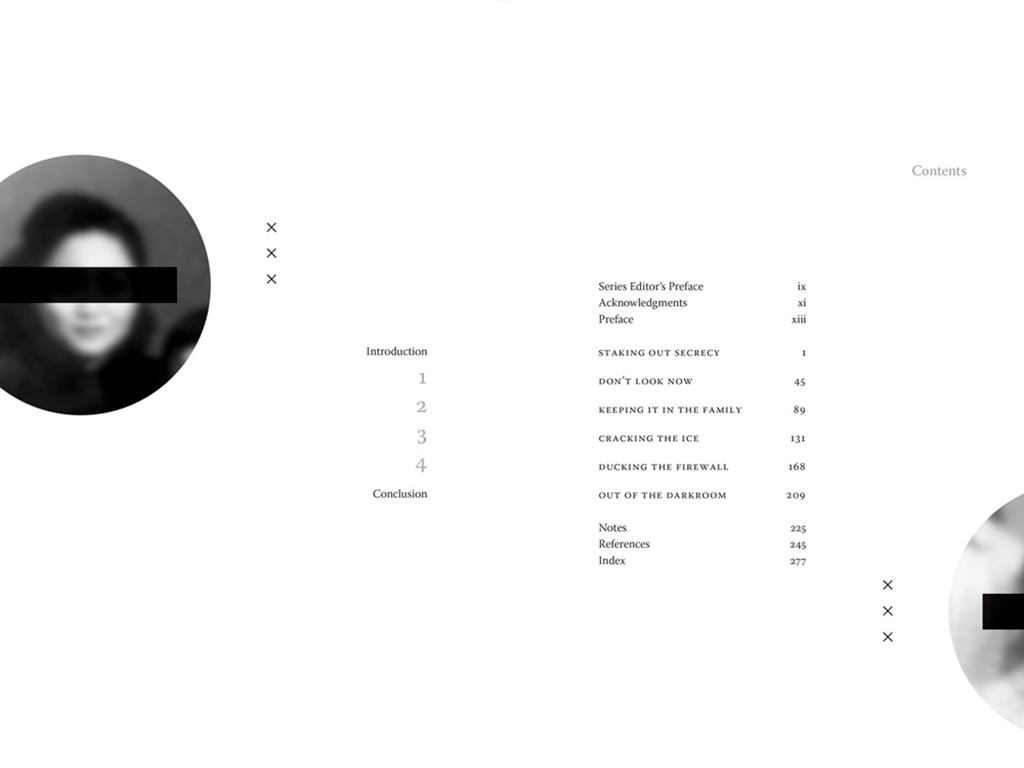
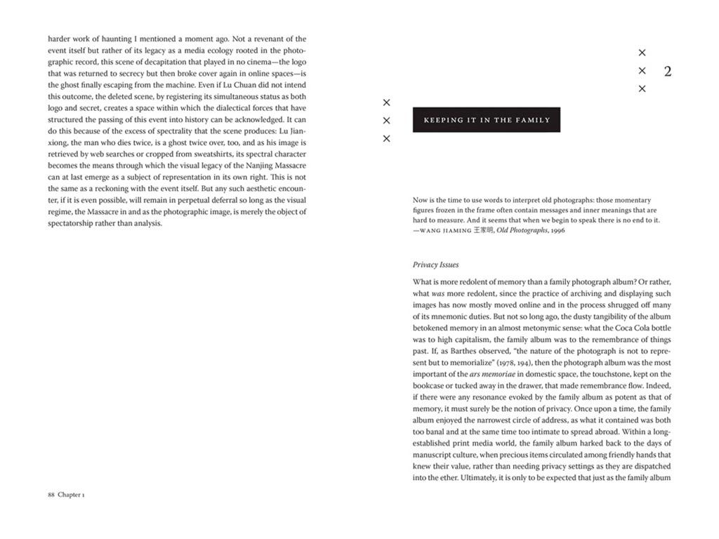
    Next, a title on “knowing what not to know in contemporary China”, called Negative Spaces:

    Negative Spaces 1
    Negative Spaces 2

    Design by Courtney Leigh Richardson for Duke University Press.

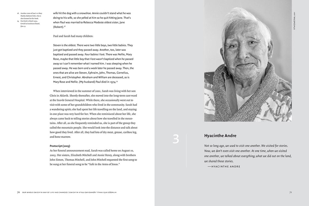
    Next, stories from “the people of the land”:

    Gwitchin 1
    Gwitchin 2

    Our Whole Gwich’in Way of Life Has Changed / Gwich’in K’yuu Gwiidandài’ Tthak Ejuk Gòonlih, with design by Alan Brownoff for the University of Alberta Press.

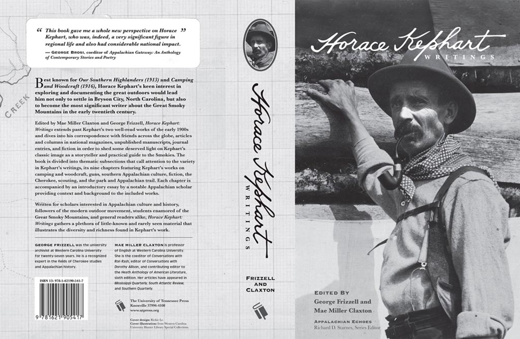
    Next, a couple where both the cover and interior excel, starting with Horace Kephart from the University of Tennessee Press:

    Horace 1

    UTenn Press has a cool logo, too.

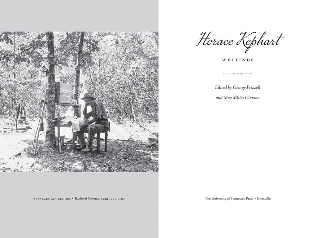
    Horace 2
    Horace 3

    Lovely detailing in this design by Mindy Basinger Hill. Only one question here: Why doesn’t the script on the cover match that used inside? Both are nice — I prefer the one used on the cover — but either way, pick one!

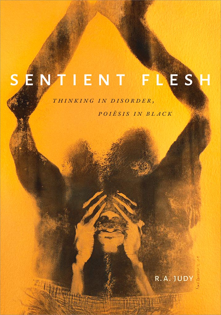
    Last but certainly not least, perhaps the best designed of all the projects in the AUPresses 2021 Show, Duke’s Sentient Flesh:

    Sentient 1

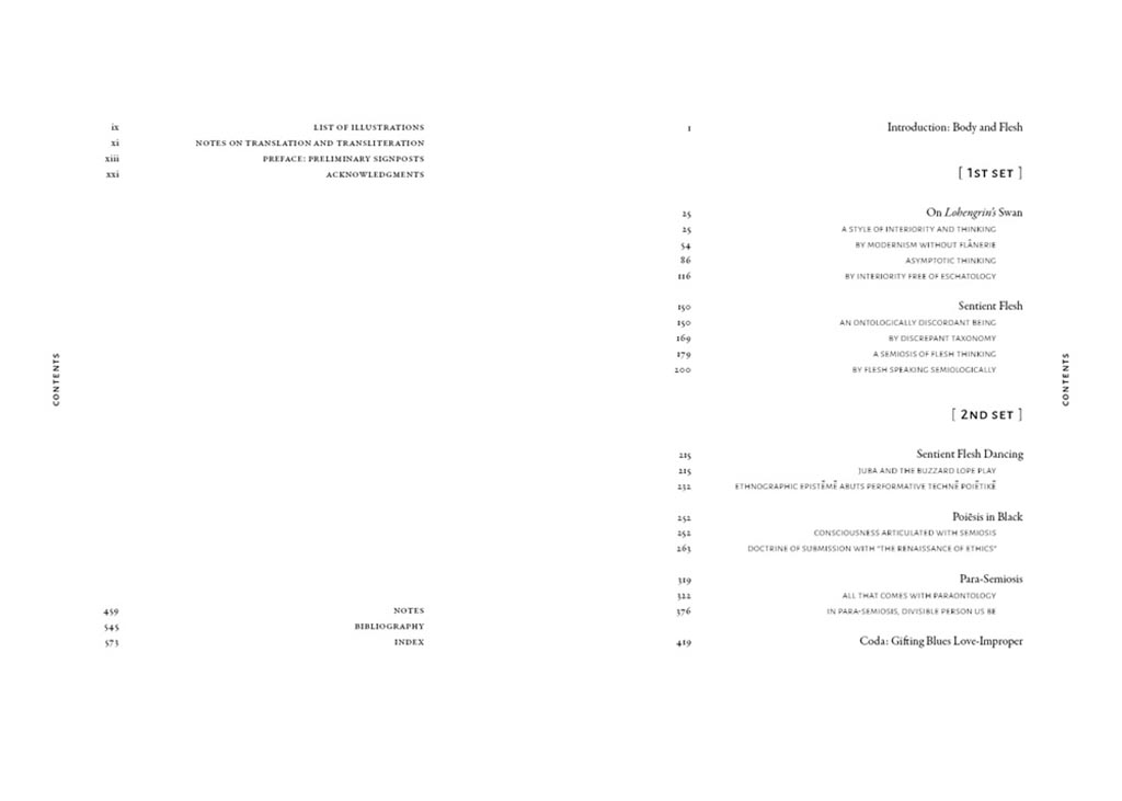
    Fantastic. And check the interior:

    Sentient 2
    Sentient 3

    Kudos to designer Matthew Tauch for a “best in show,” at least as far as I’m concerned!