Tag: book covers

  • Beautifully Briefed, Early July 2022: The Autopian, The Ford Heritage Vault, and an Eames Follow-Up

    Beautifully Briefed, Early July 2022: The Autopian, The Ford Heritage Vault, and an Eames Follow-Up

    Car site The Autopian scores with book design, Ford posts old marketing material gold mine, and more on the Eames Institute of Infinite Curiosity in this edition of Beautifully Briefed.

    Autopian suggests book design

    The Autopian, founded by a couple of former Jalopnik writers, is a new automotive gem: in these days of more-of-the-sameism sites trying to make money of others’ ideas, the Autopian has a retro style and interesting, original content.

    Including this short post from their Cold Start column:

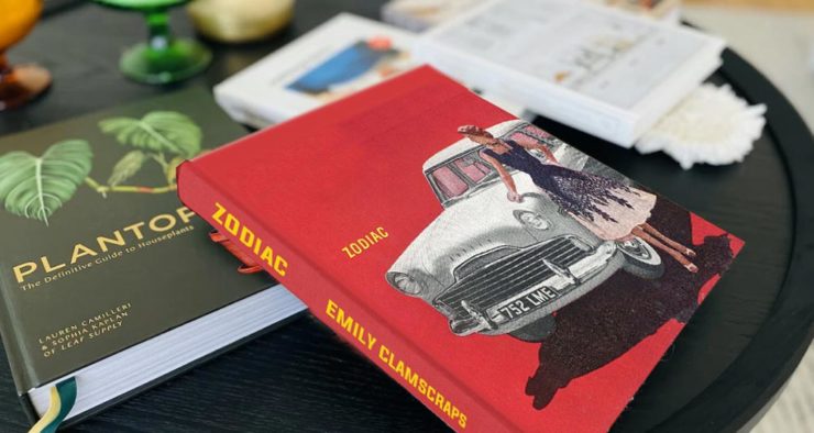
    Sometimes you may encounter an old car ad and realize that the design of it could lend itself very well to something completely different. In this case, this 1958 Ford Zodiac ad, with its rich, saturated colors, striking dress on the model, and evocative name with understated typography just feel like something you’d see on modern book cover design.

    Jason Torchinsky, Autopian Founder

    The ad:
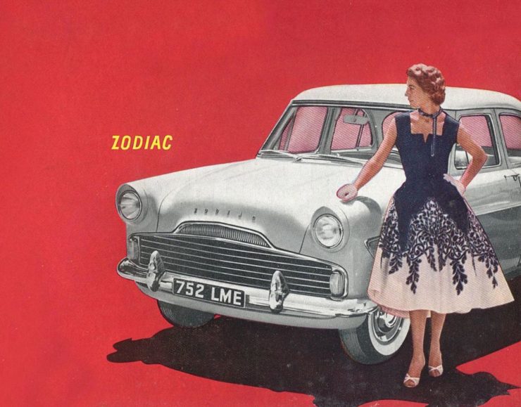
    A 1958 Ford Zodiac (European)

    His book design idea “realized”:

    Jason’s book cover mock-up. Love the author name.

    Nice.

    The Ford Heritage Vault

    Ford has taken the unusual step of posting a good chunk of their old — 1903 to 2003, their first 100 years — marketing materials online: “promotional materials, photographs, and all kinds of other historical goodies,” according to CarScoops.

    “Our archives were established 70 years ago, and for the first time, we’re opening the vault for the public to see. This is just a first step for all that will come in the future,” says Ted Ryan, Ford archive and heritage brand manager.

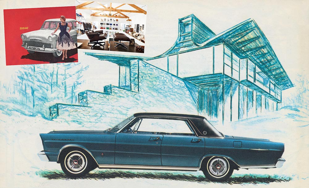
    Here’s a personal favorite: the 1965 full line brochure, showing the cars set in architectural drawings — presumably, matching the car to the house:

    The 1965 Ford Family of Cars brochure

    Fancy a drive down memory lane?

    More from the Eames Institute

    We discussed the Eames Institute of Infinite Curiosity back in April, but Metropolis magazine has published an extensive article covering a visit to the Institute.

    Modernism has largely been diluted from a series of ideas rooted in social change to one of just style—Instagram moments, if you will. The Eameses insisted that they did not have a style or even an “ism.” […] Modernism was an idea, not a style. With the establishment of the Eames Institute, I hope Charles and Ray will be remembered most of all for their ideas and processes.

    Kenneth Caldwell, Metropolis
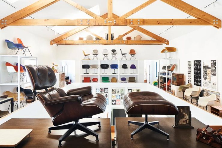
    An exhibit at the Eames Institute of Infinite Curiosity.

    With our ongoing struggle to use materials more efficiently, many of the Eameses’ ideas and ideals need to be taken for the solutions that they are: style with incredible substance.
    Read the whole article at Metropolis. (Via ArchDaily.)

  • Beautifully Briefed [Updated]: Book Six-Fer, June ’22

    Beautifully Briefed [Updated]: Book Six-Fer, June ’22

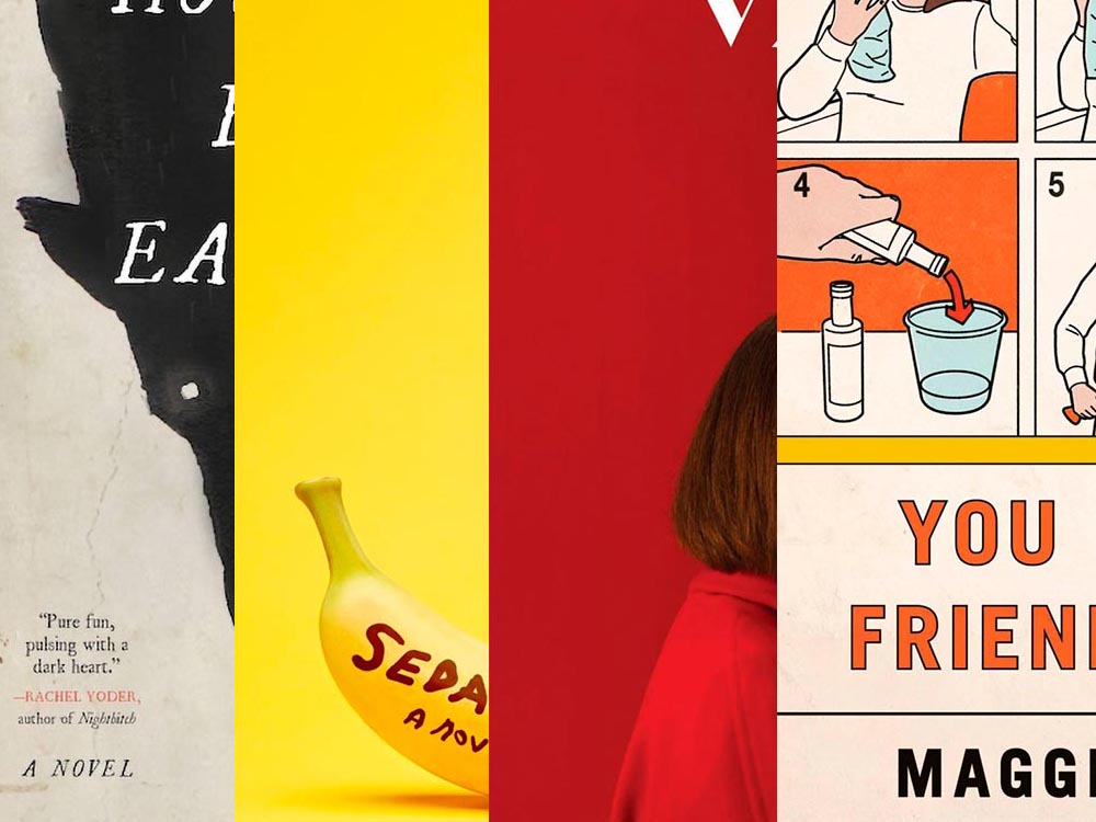
    A book design treat for your Monday morning: four of my favorite new book covers from last month’s debuts.

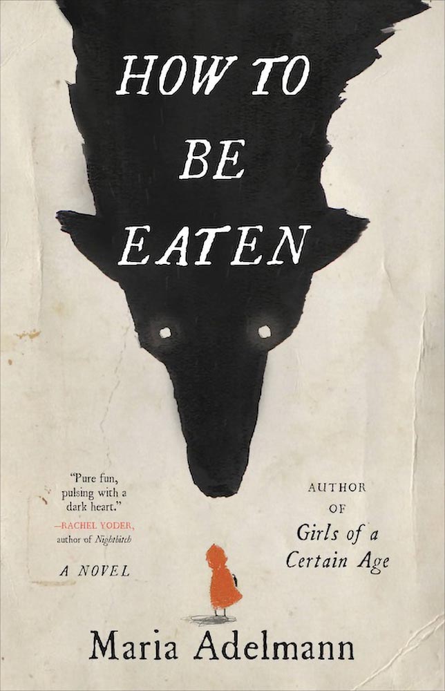
    How To Be Eaten. Design by Julianna Lee.

    Aged, distressed paper is a great look when done well, and this one hits all the right notes. The size relationship between the characters, the glow around the eyes, the two color choices, the type, all of it — great stuff.

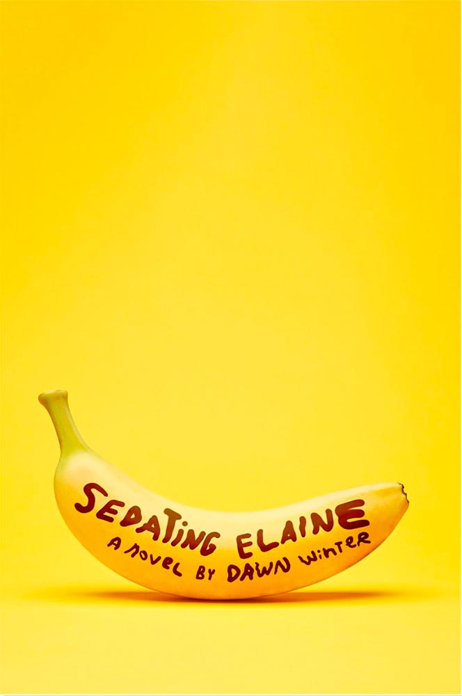
    Sedating Elaine. Design by Janet Hansen.

    A veritable how-to on less-is-more. Brilliant.

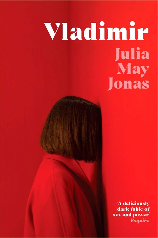
    Vladimir. Design by Katie Tooke.

    Another solid-color triumph. Great font choice here, too. Awesome.

    I’ve saved the best for last:

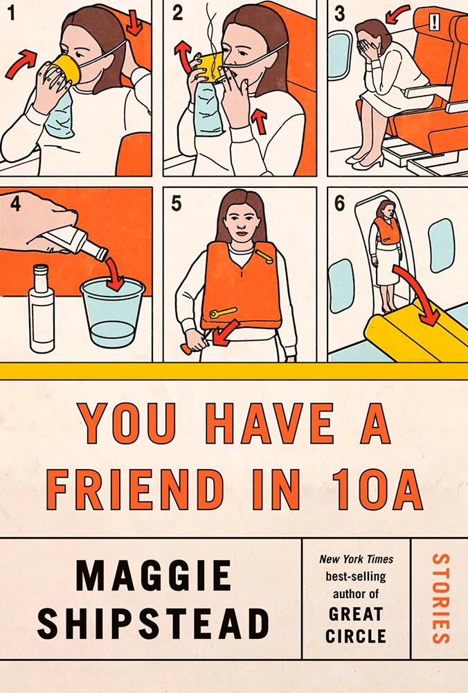
    You Have a Friend in 10A. Design by Kelly Blair.

    Great Circle has featured before, and this follow-up takes us inside the plane and into the safety brochure in the best possible way. Great, brilliant, and awesome wrapped into one.

    Via LitHub and Spine, as usual. Have a good week!

    Update, June 20th: WABE, Atlanta’s NPR station, has a summer reading list out, highlighting Georgia books and authors — and I’d like to include two of the covers here:

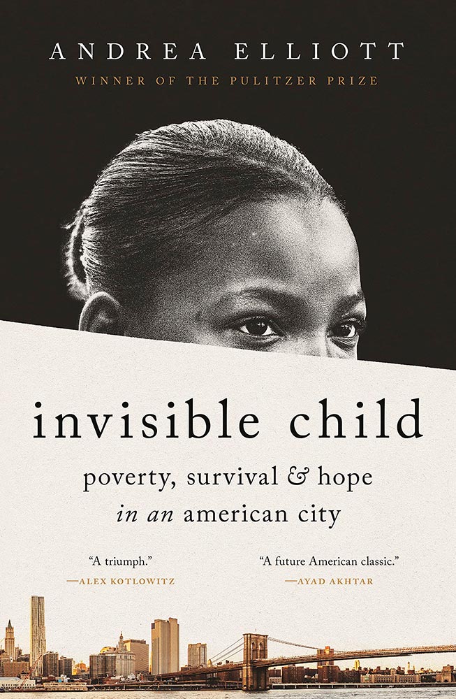
    Invisible Child.

    The grainy photograph, the wonderfully placed city skyline, and classic typography, combined with the diagonal cutline, elevate this title from mundane to eye-catching.

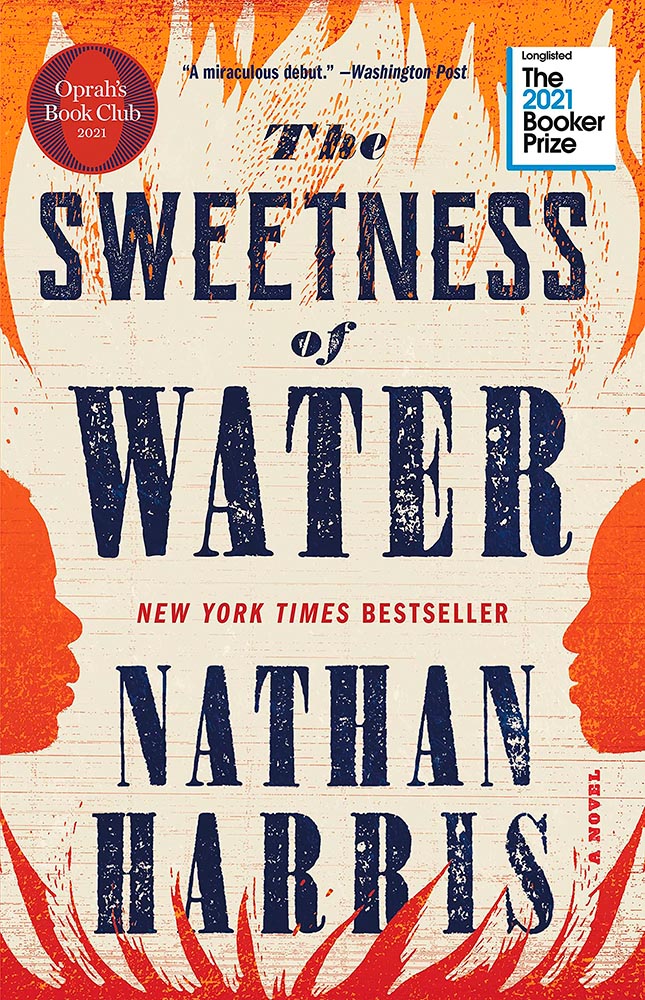
    The Sweetness of Water.

    Excellently distressed doesn’t begin to describe this, on many levels. Side note: it’s a terrible shame that the Oprah and Booker call-outs have been elevated to logo status in what can politely be described as a distraction (from a book designer’s point of view, at least).

  • Spring Book Design Coverage

    Spring Book Design Coverage

    For your May Day, please take a closer look at twelve great book covers — and a bonus thirteenth! — spotted during the first four months of 2022.

    In alphabetical order:

    Book design: David Drummond

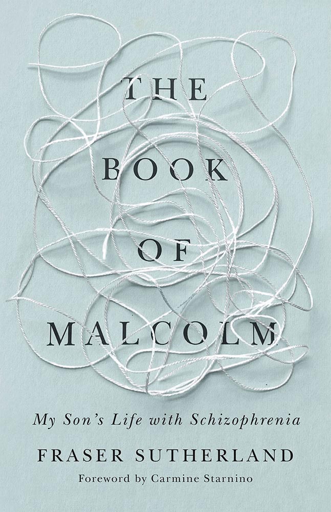
    Brilliant: actual text, printed (on a great color paper, too), with actual string, photographed on said print. Not only is it exactly right for the subject matter, it’s simply and beautifully done.

    Cover design: Brianna Harden

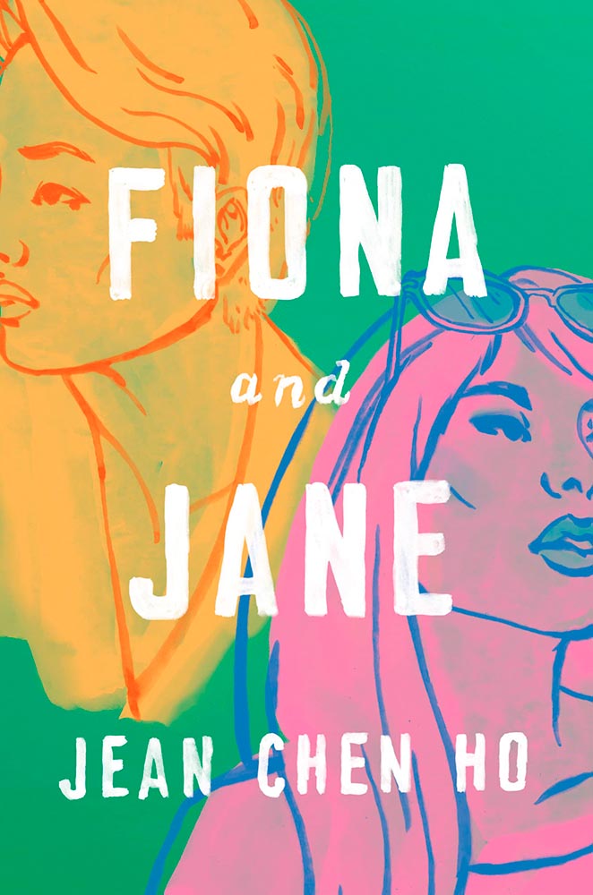
    Another great background color choice, this time highlighting the awesome colors chosen for Fiona and Jane’s illustrations. The hand-painted text is perfectly done.

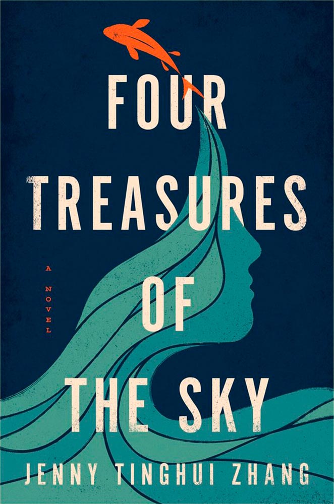
    Cover design: Vi-An Nguyen

    Woodcut or just aged? Doesn’t matter, as “brilliant” falls short when describing this title.

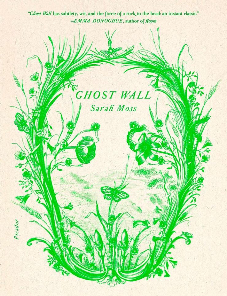
    Cover design: Alex Merto

    From It’s Nice That, we have a nice feature on Alex Merto — whose Ghost Wall cover is a great example of plant life adding so much more: “the force of a river to the head,” to paraphrase Emma Donoghue’s quote.

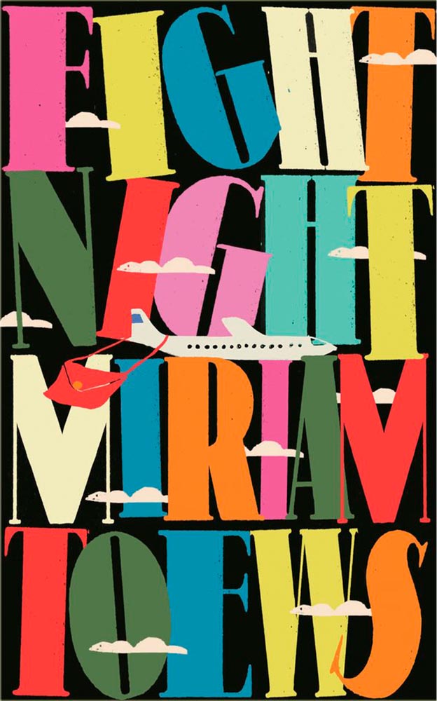
    Cover design: Anna Morrison

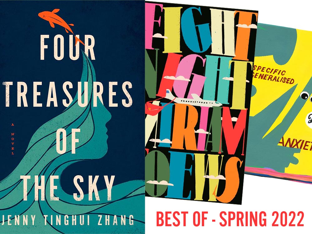
    The typography, awesome little plane — the purse(r)! — the clouds, all of it: sky-high levels of good.

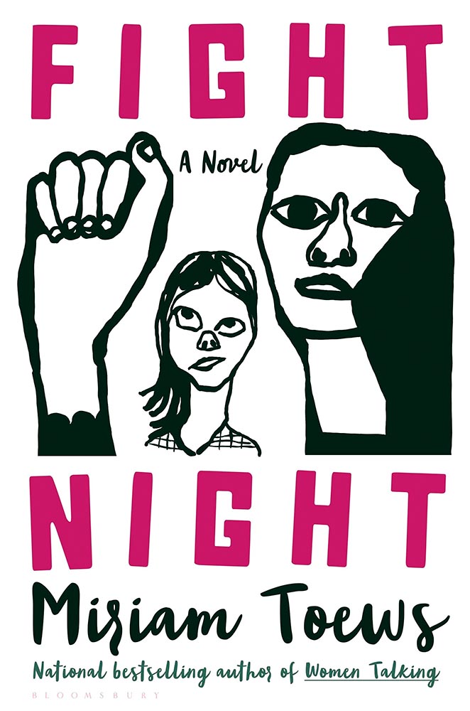
    Interestingly, Fight Night‘s cover has gotten notice before:

    Cover design: Patti Ratchford, illustration: Christina Zimpel

    I can’t begin to imagine what caused the redesign, or why it wound up being so radically — 180 degree! — different. The old design wound up on some “best covers” lists (here’s LitHub’s October 2021 post, for instance); the new one has wound up on mine.

    Cover design: Christopher Sergio

    LitHub says this one has a very high “hang on the wall” factor. I can’t think of a better description — great stuff.

    Cover design: Na Kim

    Na Kim just can’t help but design the best covers: a wonderful, antique background complimented by brilliance. (Great typography, too.)

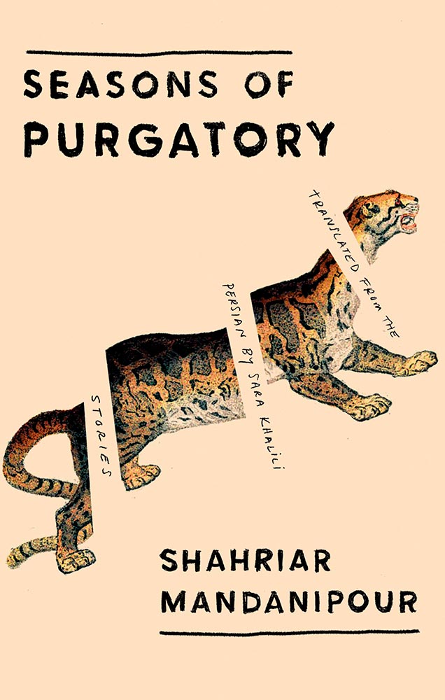
    Cover design: Emily Mahon

    It’s nigh-on impossibly to look at this cover and not flip it around to read the text trisecting the leopard. Take something simple, add the elusive more, get this. Yeah.

    Cover design: Jim Tierney

    Another fantastic example of plants adding more than the sum of their parts. The mottled green background and watercolor-style falloff is perfectly complimentary. Great stuff. (Except: This is one of those times when an editor or publicist somewhere says, “Hey, we need to add this quote at the top. Let’s do it without consulting the cover designer.”)

    Cover designer … unknown. Credit where credit is due — when I can.

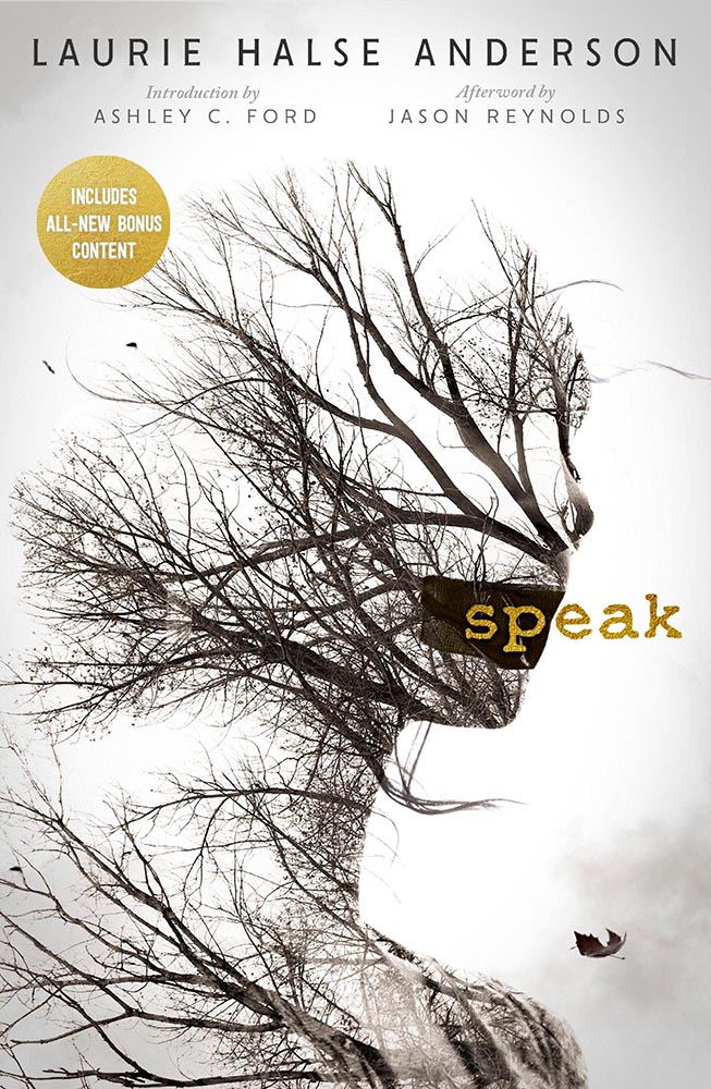
    From the Banned Books Department, we have the 20th Anniversary edition of this difficult title rendered in a photo-based collage that’s nothing short of brilliant. Highest praise. Kudos, too, to Open Culture: The New York Public Library Provides Free Online Access to Banned Books: Catcher in the Rye, Stamped & More.

    Cover design: Jack Smyth

    Never mind the great brushed color blocks or boat-rowing-the-ocean above the title. This is here for the overlap between color and island. Shortlisted for the prize for intersection-of-the-year.

    Cover design: Leanne Shapton

    This illustration being in grayscale is, at first, a little off. But, of course, that’s exactly the point. I overuse “brilliant,” but it’s the best description. (See a note from the designer at LitHub‘s cover reveal.)

    So, the bonus. No, it’s not the extra Fight Night, above, it’s a fictitious cover. That’s right:

    Cover design: Anna Hoyle

    In another It’s Nice That post, we have Anna Hoyle: “Judge her fake books by their comical covers.” Okay!

    More book design updates soon — ’cause, here in Georgia, USA, we’re done with spring. Summer starts . . . now.

    Additional sources: Spine, “Book Covers We Love” for January, February, March, and April, and LitHub, “Best Book Covers of the Month.”

  • I Swear, This Title….

    I Swear, This Title….

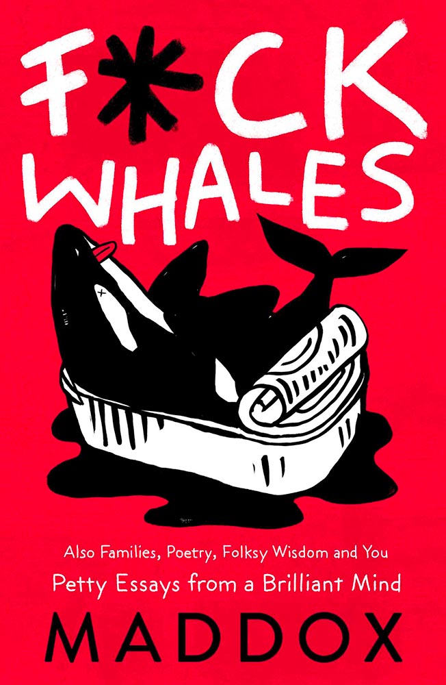
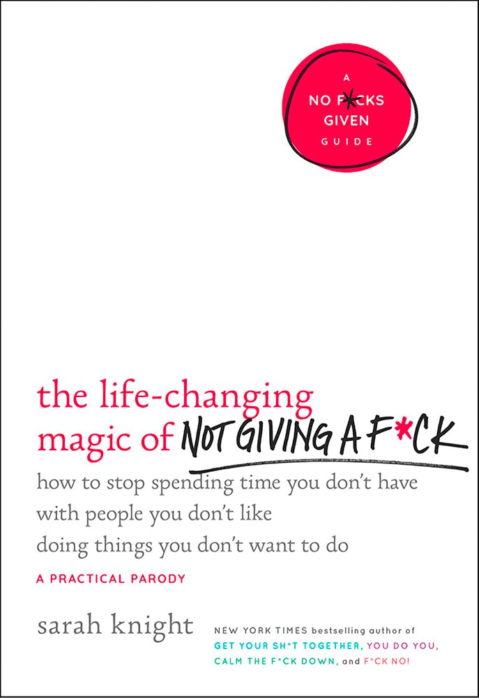
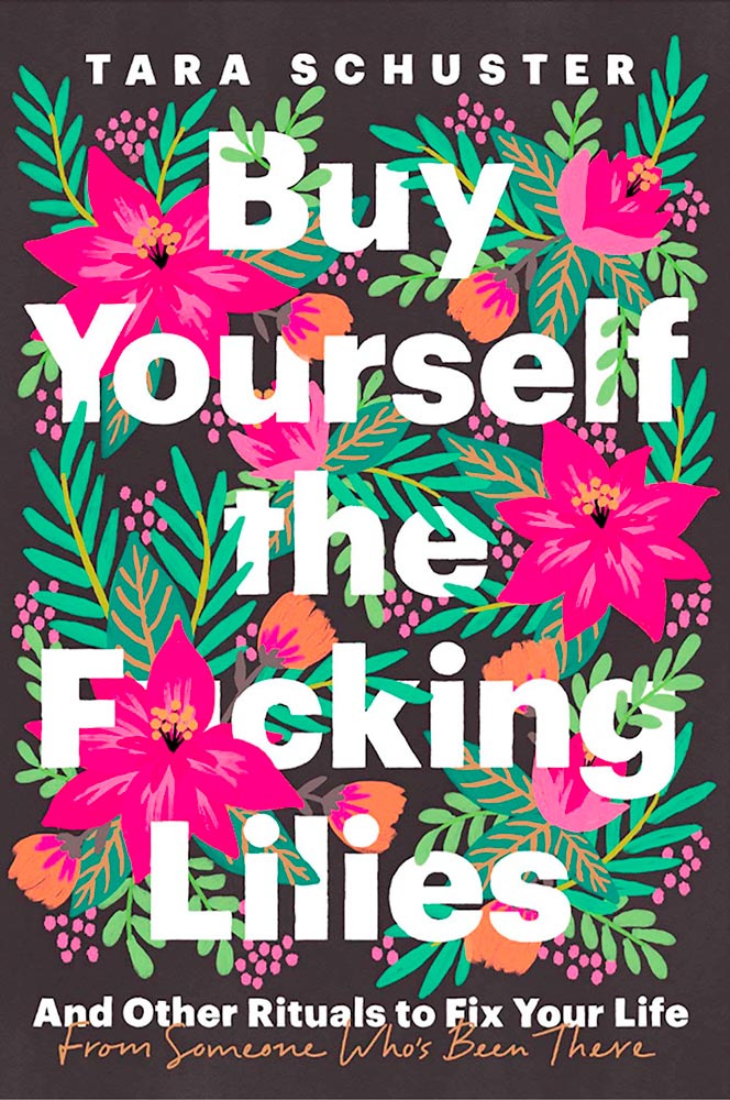
    Kottke recently revisited a theme that’s been running for a few years now: titles with a swear — f*ck, in this case — in the title. According to Slate, the practice stems from the 2011 parenting title Go the F*ck to Sleep, and has accelerated over the years.

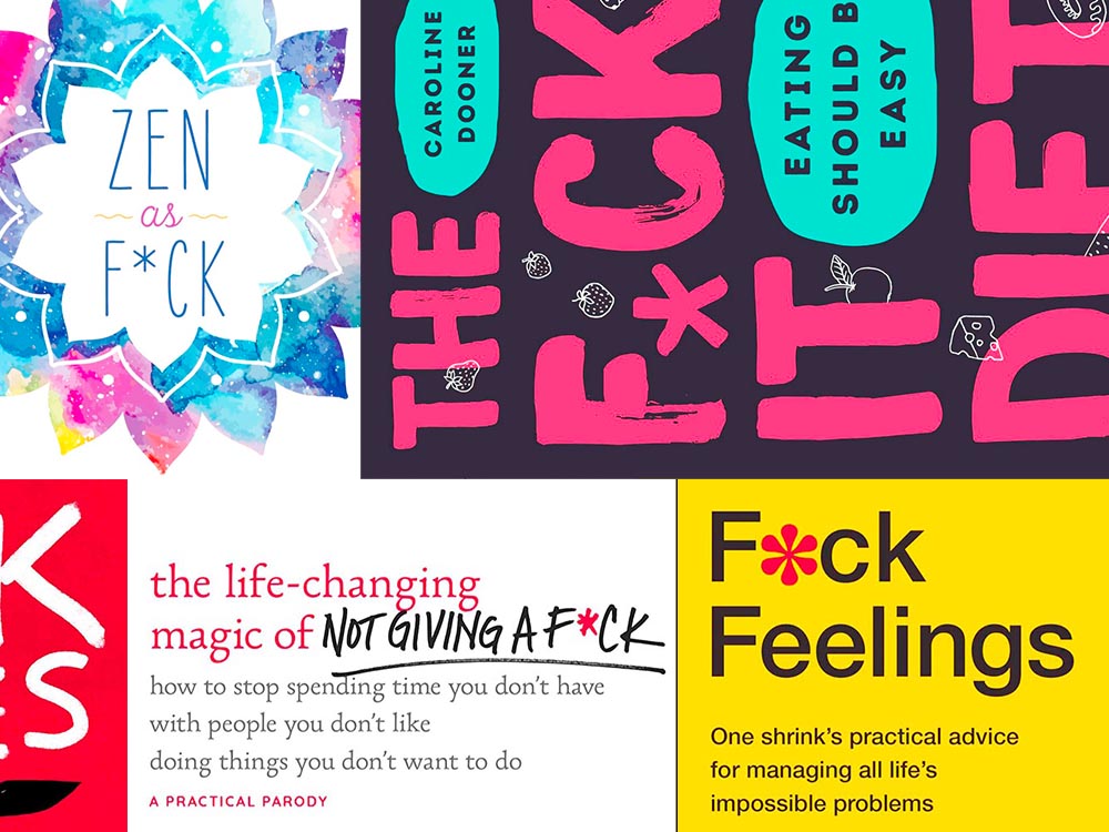
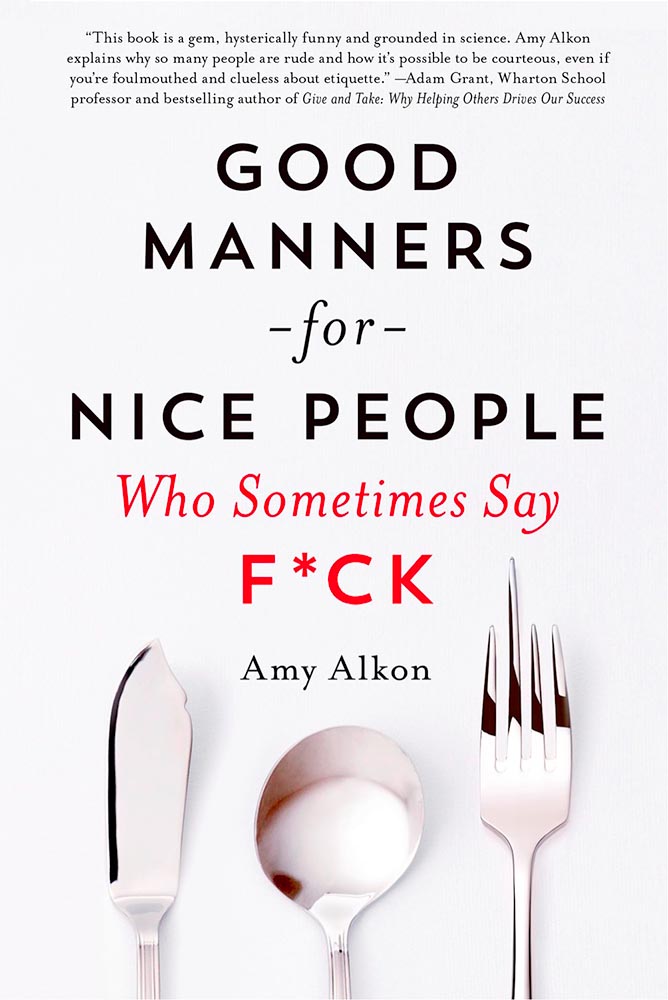
    I’m more interested in the design of such a title. Bookstores, advertisers, and publicists demand that the swear never be completely spelled out, but that doesn’t restrict great design ideas. Here are a few of my favorites:

    Love the fork. (So to speak.)
    The less-is-more approach.
    Whales as sardines.
    Interesting choice with the capitals, or lack thereof.

    Note the over-arching theme: no, not that — the lack of photography. The vast majority of these titles are text based, supposedly because something competing with the swear would detract from the shock value. There’s a primary color thing going, too, probably for the same reason.

    Most of the time:

    Self-help, with style.

    Something different for your day!

  • New Website. Finally.

    New Website. Finally.

    Housekeeping news: I went back to having an actual website in June, 2019; for a few years, I’d just used a photography hosting service, as photography was the vast majority of what I did. However, when book design again became an important-enough part of my work, I wanted to have a space to talk about it. I bought a WordPress template, added photographs, and posted it.

    …But I never really liked it. From the beginning, I felt y’all deserved more: better typography, better photography, better everything. Like so many, however, one’s own stuff is always at the bottom of the to-do list. No longer.

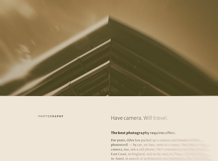
    I’d like to introduce the new version:

    The new gileshoover.com, January, 2022

    There were a few bumps getting here (naturally, I broke everything along the way; to say I don’t code is an understatement!), but with some tweaking notwithstanding, the new gileshoover.com is live. It’s got all-original photography, matched sans and serif font superfamily (Merriweather by Sorkin Type, a Google Font), much faster response time, open-source foundations, and so on.

    Note that entries on Foreword are best seen individually, as you’ll see bigger photographs (or illustrations, graphics, etc.). Click on entry titles to get there.

    Please explore.

  • University Press Design Show 2021

    University Press Design Show 2021

    From AUPresses:

    “Since 1965, the Association of University Presses (AUPresses) Book, Jacket, and Journal Show has fulfilled its mission to “honor and instruct”: honoring the design and production teams whose work furthers a long tradition of excellence in book design […]. The Book, Jacket, and Journal Show recognizes meritorious achievement in design, production, and manufacture of books, jackets, covers, and journals by members of the university press community. It also provides an evaluation of their work and serves as a focus of discussion and a source of ideas for intelligent, creative, and resourceful bookmaking.”

    Credit where credit is due: Spine, in their excellent way, has already covered this. Head on over there, knowing that I largely agree with their post in its entirety. However, there are a number of covers I like that they didn’t talk about — and they didn’t talk about interior design at all.

    So, without further ado, let’s start with the covers and jackets. Interiors follow, then items that are in both categories.

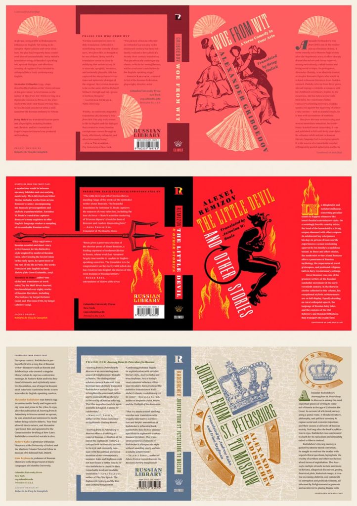
    Columbia University Press with a series (in order, top to bottom): Woe from Wit, The Little Devil and Other Stories, and Journey from St. Petersburg to Moscow. Each is great on their own, but put ’em together and the series stands tall. Excellent design by Roberto de Vicq de Cumptich.

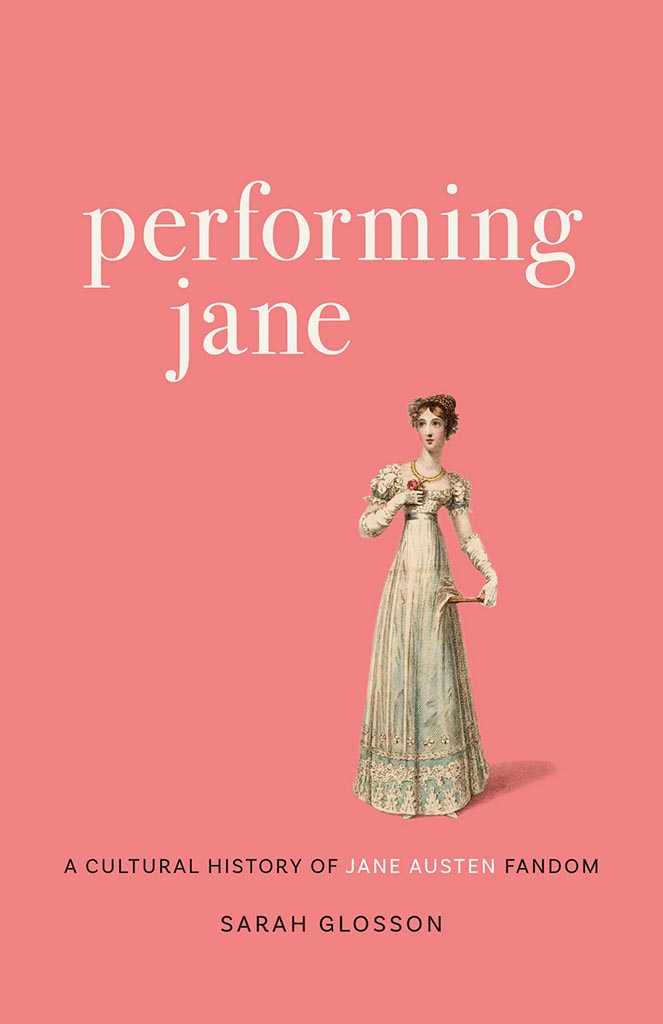
    Performing Jane

    Louisiana State University brings us Performing Jane, with design by Barbara Neely Bourgoyne. Simplicity wins.

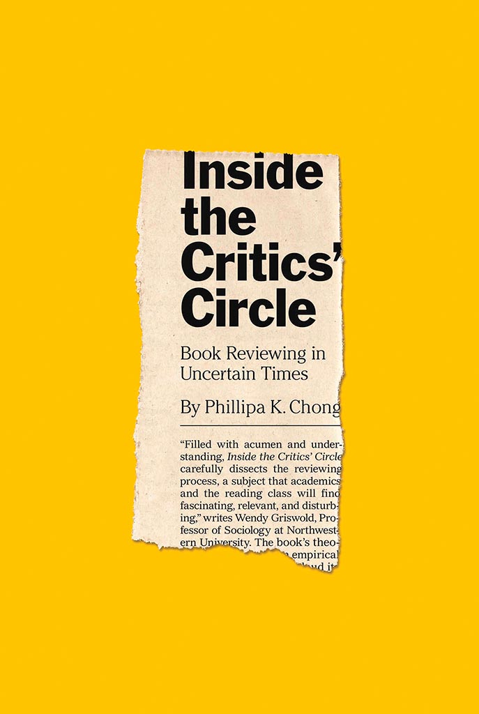
    Inside the Critic's Circle

    On the subject of simplicity, Inside the Critic’s Circle brings a seemingly-casual-yet-carefully-designed newspaper clipping onto a yellow background. Together, they’re attention-getting and just right. Nice. Design by Chris Ferrante for Princeton University Press.
    Vénus Noire is about as far from a bust as can be — except not really:

    Venus Noire

    Another example of simpler-is-better, yet something so much more. Design by Kaelin Chappell Broaddus.
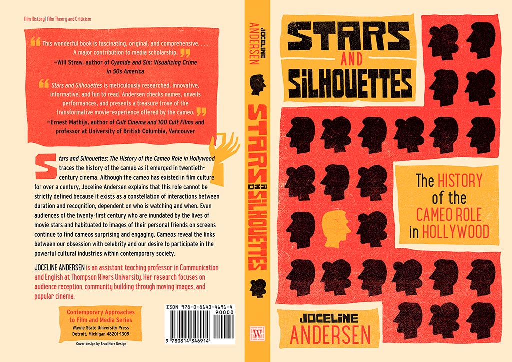
    Stars and Silhouettes

    Wayne State University Press brings us Stars and Silhouettes, in all its hand-drawn glory. Love the design by Brad Norr.

    My favorite of the stand-alone cover designs, however, contains a wrinkle or two:

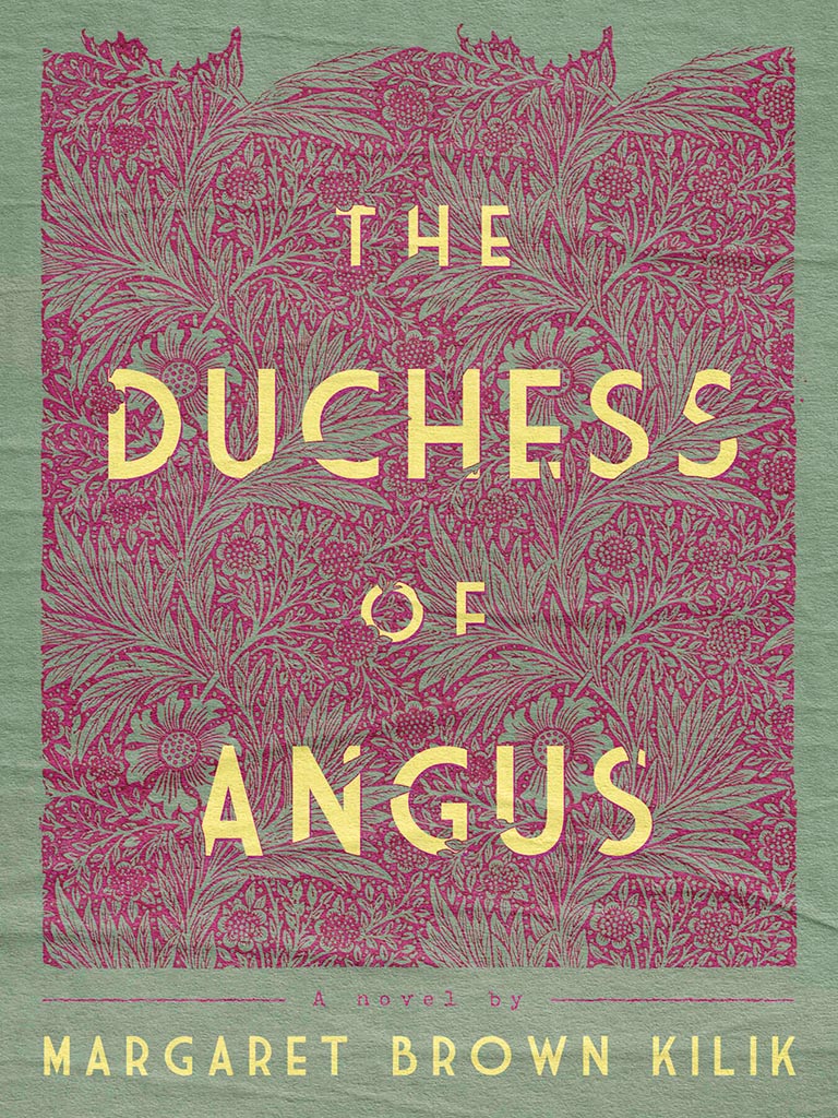
    The Duchess of Angus

    Lovely. The illustration and paper photograph combine into something really special. Design by Derek Thornton — whose website, by the way, has a bunch of other great stuff. Nice!

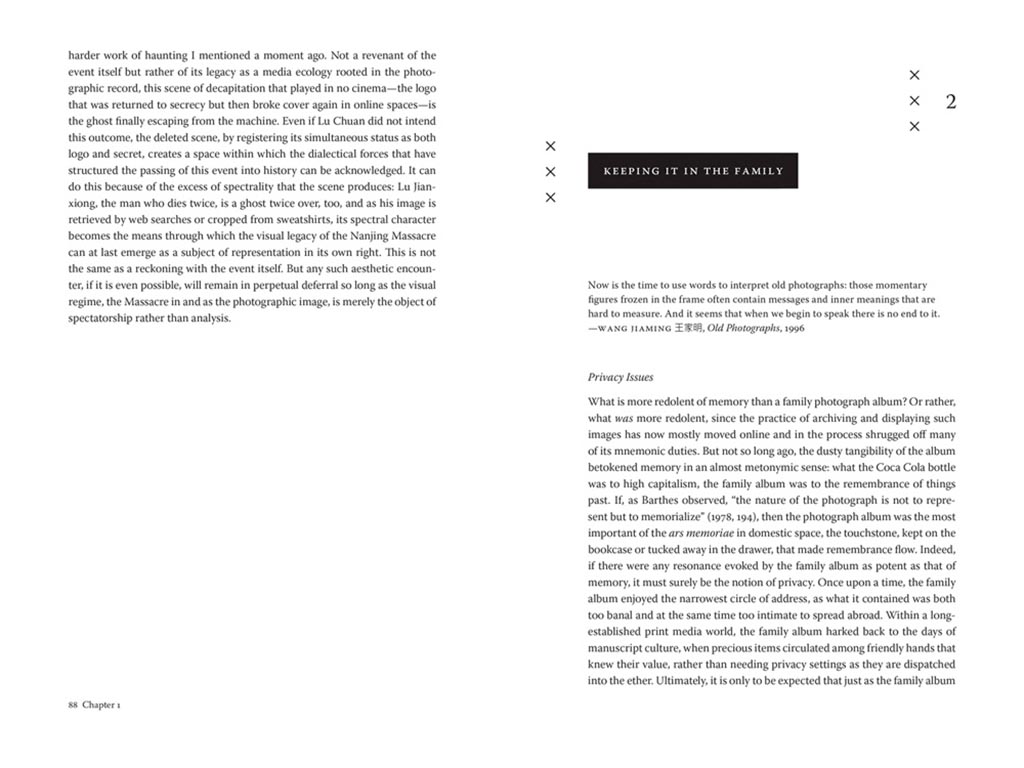
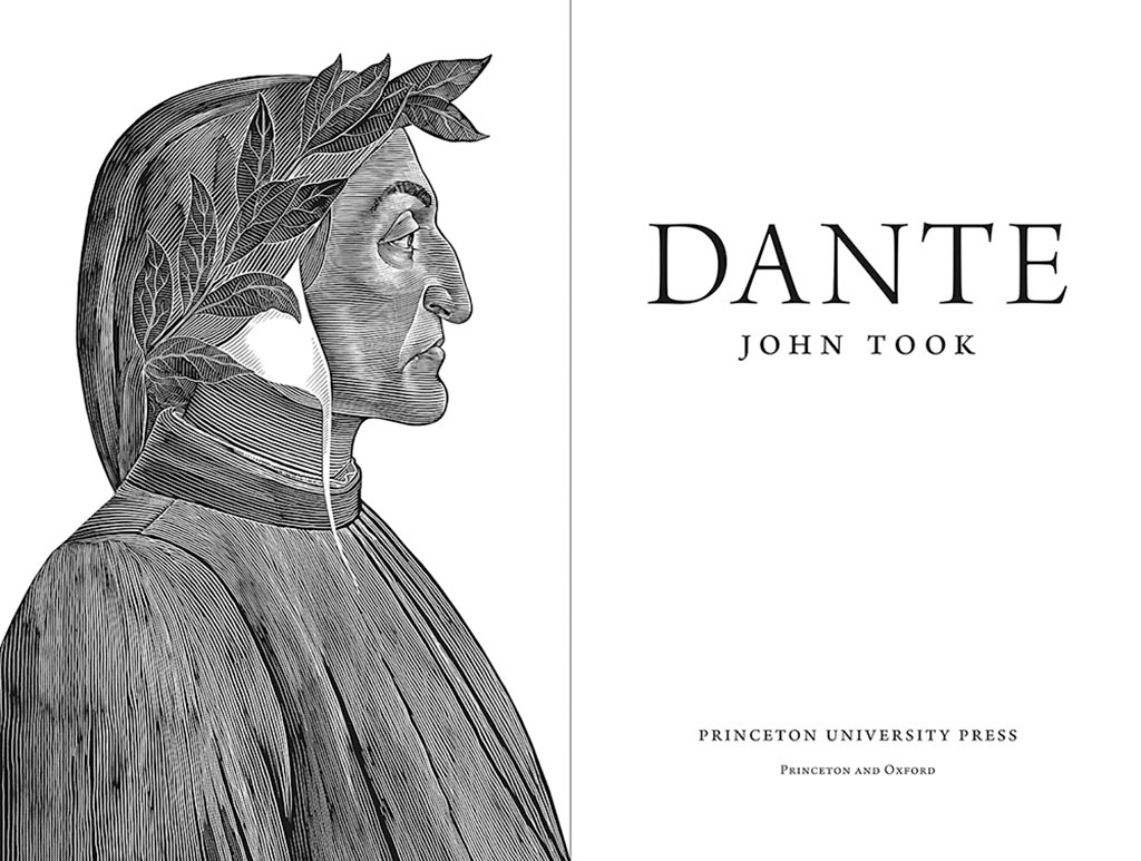
    On to some interior design, with Pinceton’s Dante:

    Dante's Interior

    Puts “boring academic title [page]” to rest. Design by Chris Ferrante.

    Next, a title on “knowing what not to know in contemporary China”, called Negative Spaces:

    Negative Spaces 1
    Negative Spaces 2

    Design by Courtney Leigh Richardson for Duke University Press.

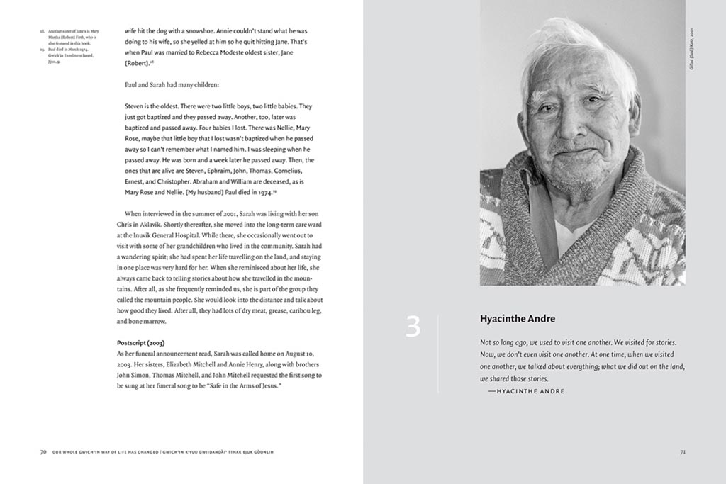
    Next, stories from “the people of the land”:

    Gwitchin 1
    Gwitchin 2

    Our Whole Gwich’in Way of Life Has Changed / Gwich’in K’yuu Gwiidandài’ Tthak Ejuk Gòonlih, with design by Alan Brownoff for the University of Alberta Press.

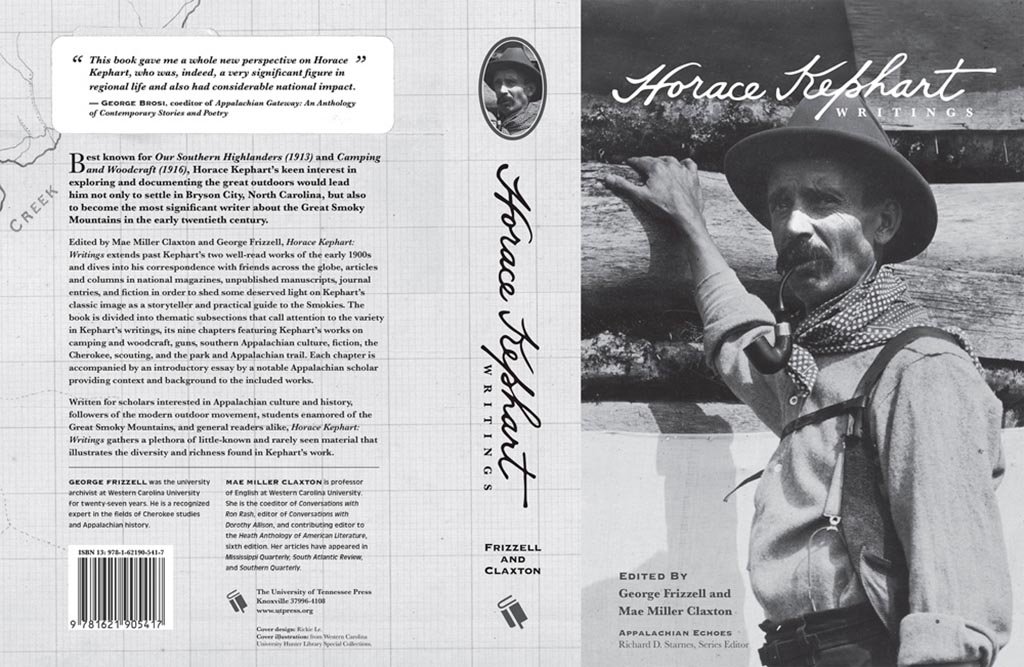
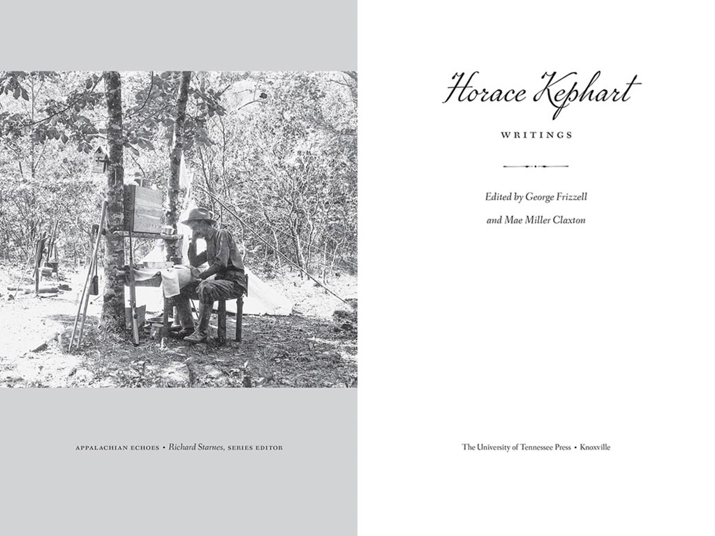
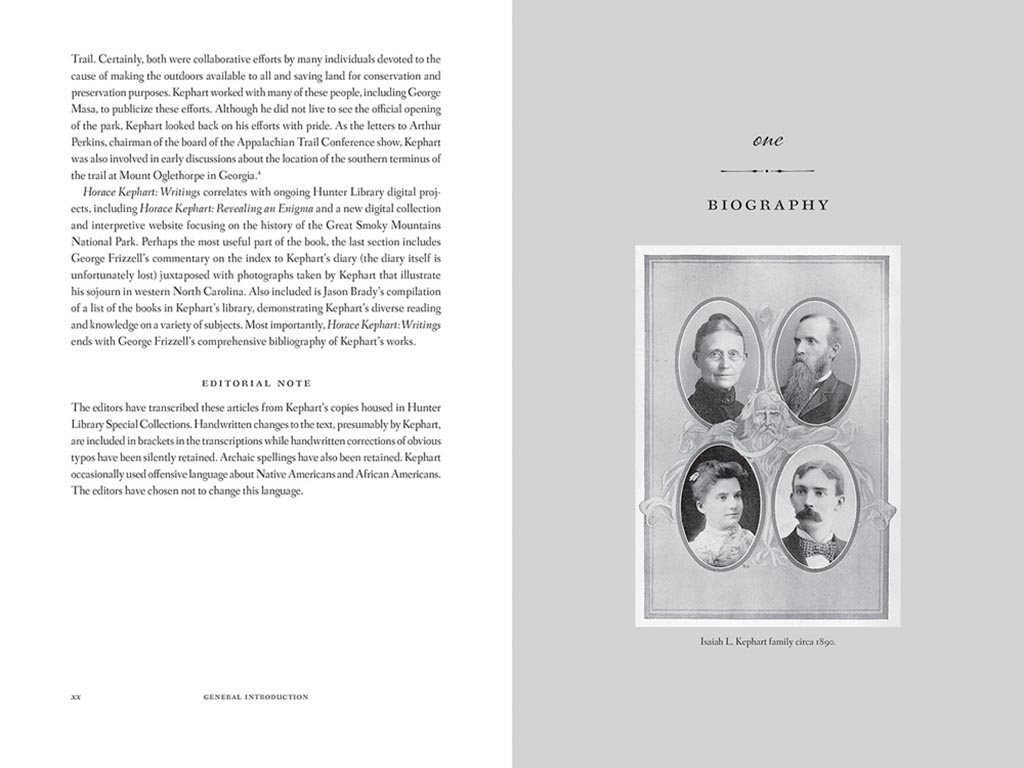
    Next, a couple where both the cover and interior excel, starting with Horace Kephart from the University of Tennessee Press:

    Horace 1

    UTenn Press has a cool logo, too.

    Horace 2
    Horace 3

    Lovely detailing in this design by Mindy Basinger Hill. Only one question here: Why doesn’t the script on the cover match that used inside? Both are nice — I prefer the one used on the cover — but either way, pick one!

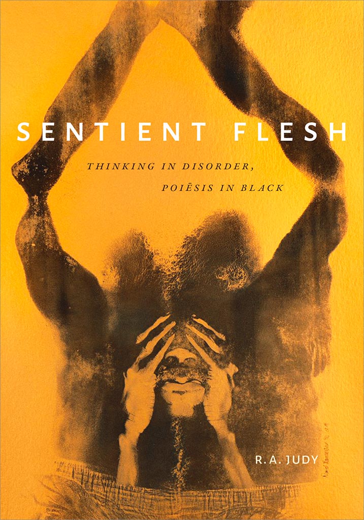
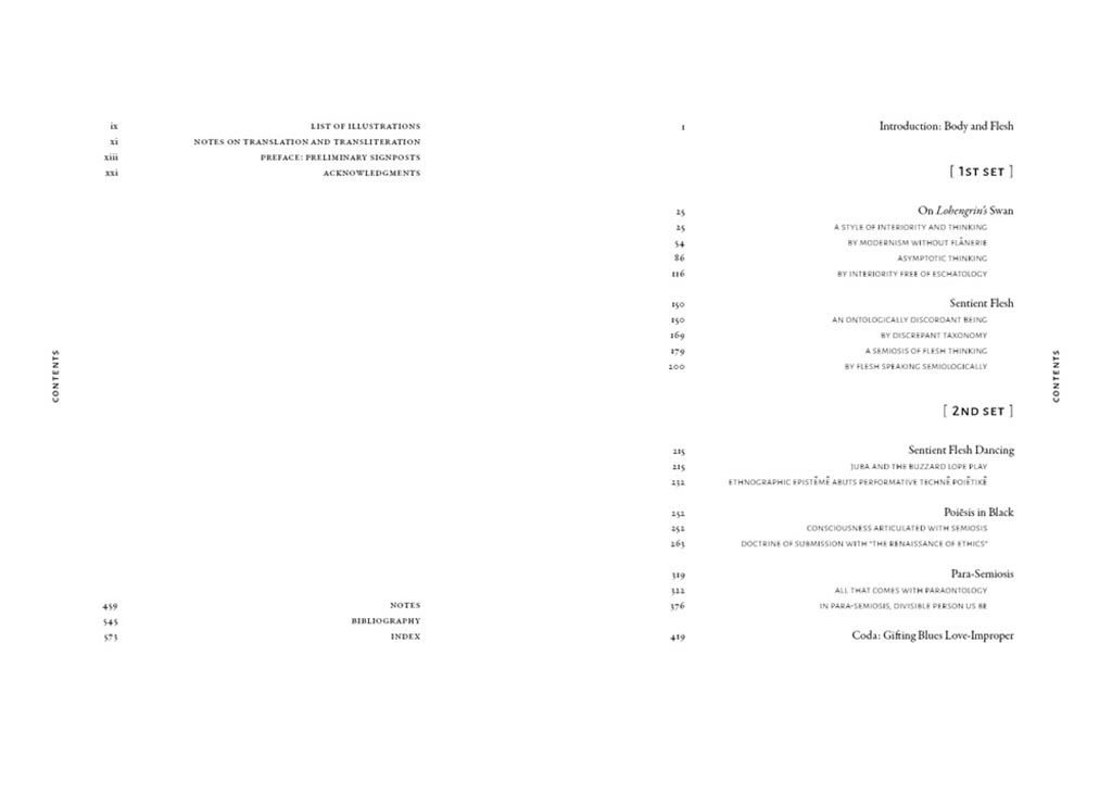
    Last but certainly not least, perhaps the best designed of all the projects in the AUPresses 2021 Show, Duke’s Sentient Flesh:

    Sentient 1

    Fantastic. And check the interior:

    Sentient 2
    Sentient 3

    Kudos to designer Matthew Tauch for a “best in show,” at least as far as I’m concerned!

  • 50 Books, 50 Covers

    50 Books, 50 Covers

    It’s time once again for AIGA’s 50 Books, 50 Covers:

    This time-honored competition aims to identify the 50 best-designed books and book covers. With 696 entries from 36 countries, the juror-selections from this year’s 50 Books | 50 Covers of 2020 competition exemplify the best current work from a year marked by unparalleled change.

    Picking favorites from this list is always fun, and often includes books and/or covers that I haven’t seen before — especially 2020, when seeing things in person was often … difficult. So without further ado (in no particular order):

    Accidentally Wes Anderson

    The unique destinations of Accidentally Wes Anderson. This 50 Books item catches the eye with the cover and the photographs carry you inside and to places heretofore unknown. Great stuff. Design by Mia Johnson.

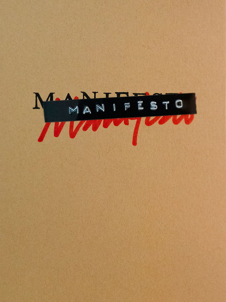
    Manifesto - Cover

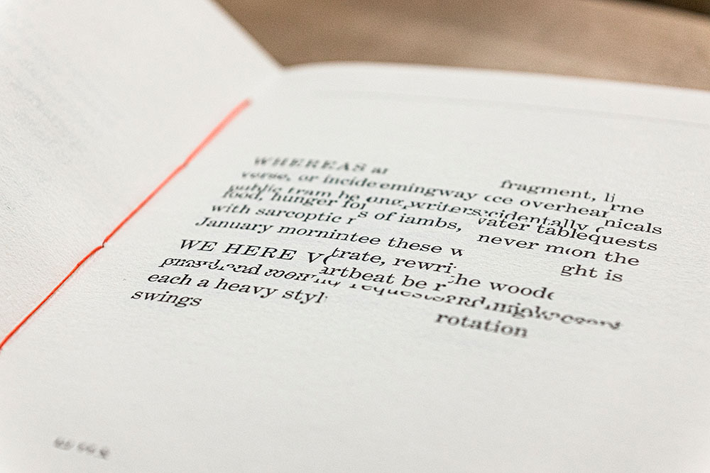
    Manifesto is more than meets the eye, even though the cover does an excellent job leading you in. It’s easier to quote the existing description than write one, so: “The opening pages contain an original text employing the sort of bombastic rhetoric traditionally associated with the manifesto genre. The typeset text is then cut up and reassembled, repeating throughout the book, each iteration becoming source material for subsequent cut-ups. The project takes a critical approach to book arts to explore authorship, readership, and the materiality of language.” Yeah:

    Manifesto - interior

    It’s tiny, too: 4.125 by 6. The design, by Victor Mingovits, is anything but. Well done!

    DR. ME

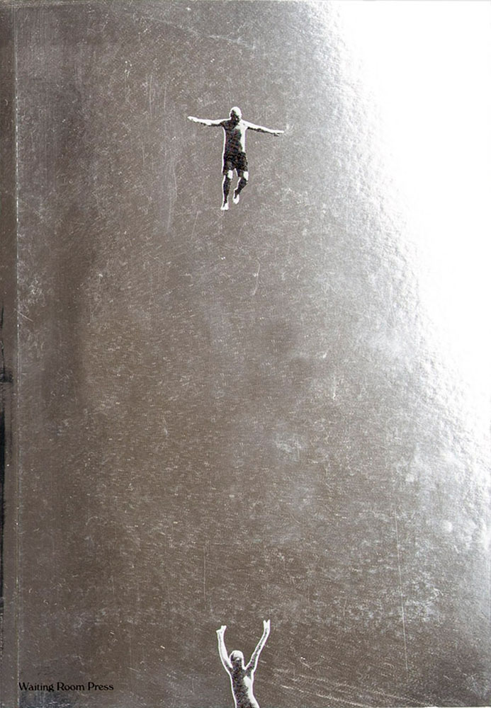
    Not Dead of Famous Enough, Yet compiles 10 years of work from a design firm into one place, with this surprisingly modest cover. DR. ME, as the duo of Ryan Doyle & Mark Edwards became known, not only do quality work, they know how to stitch together a quality book — to a point where they picked up a prestigious award. See more.

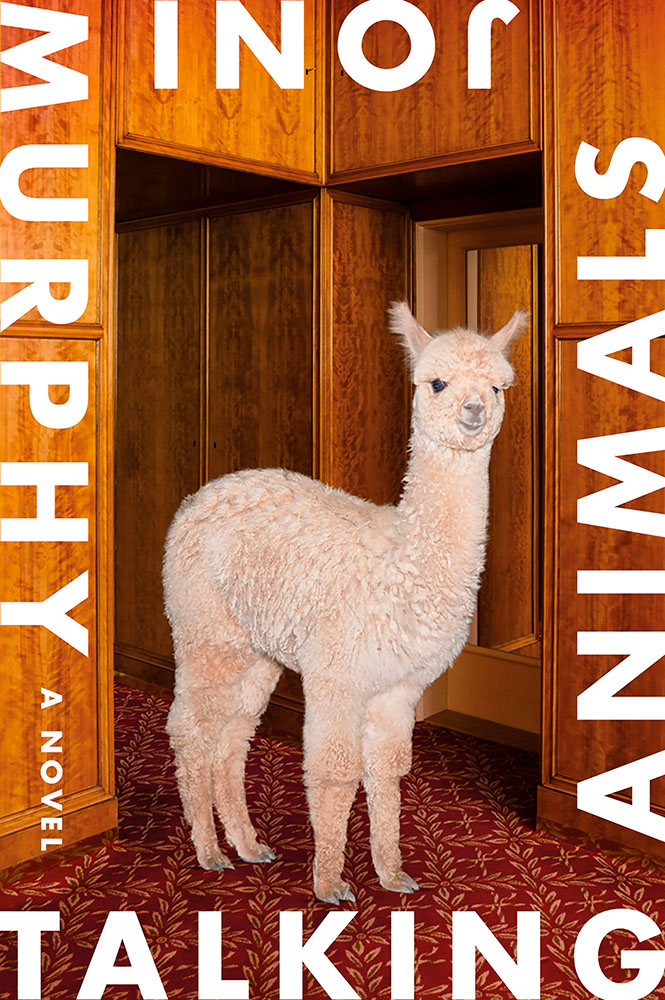
    Talking Animals

    Talking Animals violates one of my usual cover-design rules: it’s not immediately apparent which title word is first. Nonetheless, it’s eye-catching enough to warrant an exception — and a 50 Covers award. Design by Na Kim.

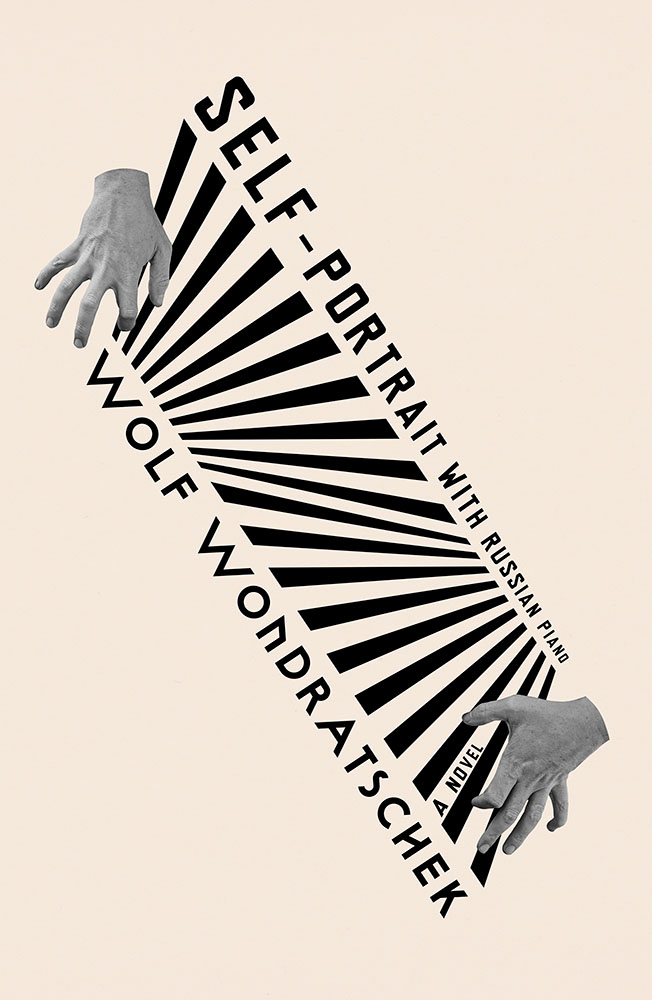
    Self Portrait with Russian Piano

    Na Kim makes another appearance with Self Portrait with Russian Piano. Kudos for something that’s equally eye-catching yet about as completely different as humanely possible — talent, defined.

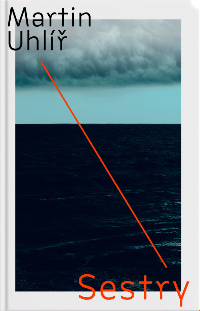
    Sestry

    “Eye-catching and mysterious,” says the entry for Sestry. “Oppressive and mysterious,” says the description. Both work — it’s certainly mysterious enough to catch your attention, grab it off the shelf, and investigate further. Design by Jan Šabach.

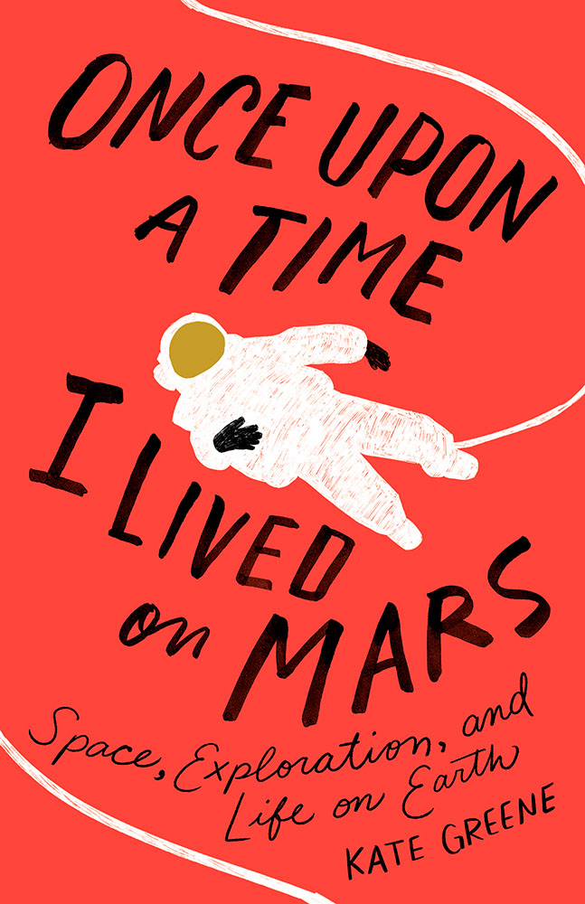
    I Lived on Mars

    Once Upon a Time, I Lived on Mars: Space Exploration, and Life on Earth is a loooooong title/subtitle combination. It’s something that, as a cover designer, you dread — but Johnathan Bush knocked it out of the park with this hand-lettered illustrated piece that’s 180 degrees from where you’d expect.

    The Turn of the Screw is probably my favorite of the whole collection:

    Turn of the Screw

    Almost simplistic … until you really look at it; the kind that makes you think, “I wish I’d done that.” Fantastic work by Kaitlin Kall.

    Lastly, two covers previously mentioned here:

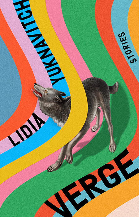
    Verge

    Verge, where unexpected choices lead to great new places here, especially with the yellow band overlaying the wolf. So, so good. Design by Rachel Willey. And:

    Zo

    Zo, which uses illustrations to huge effect — but this time with a huge typography effect to go along with it, and lo, it works. Great design choices by Janet Hansen.

    Again, see the whole list at AIGA: 50 Books, 50 Covers. Props to Hyperallergic for the heads up.