It’s fontastic, illustrative, and full of imagery: your beginning-of-fall design round-up here on Foreword. (And A.I., because it’s everywhere.) Enjoy.
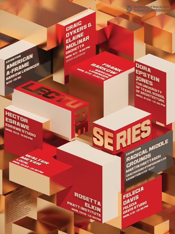
This month on Spine
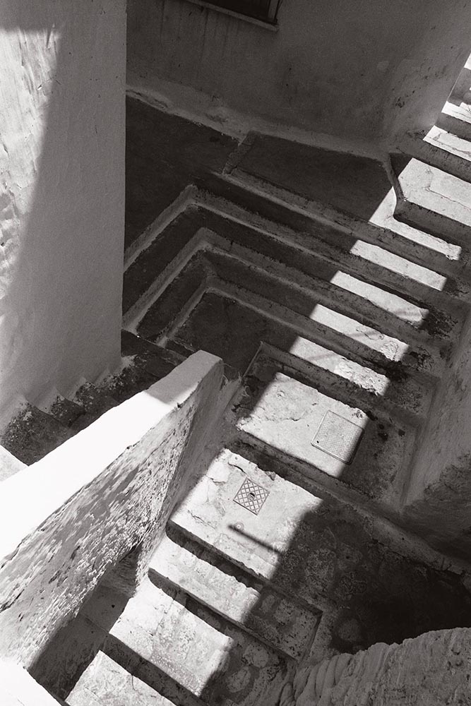
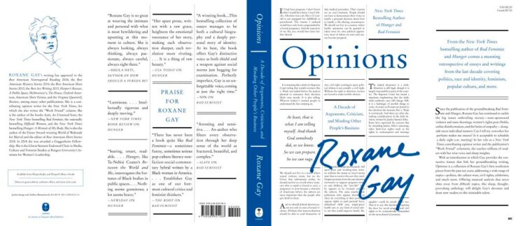
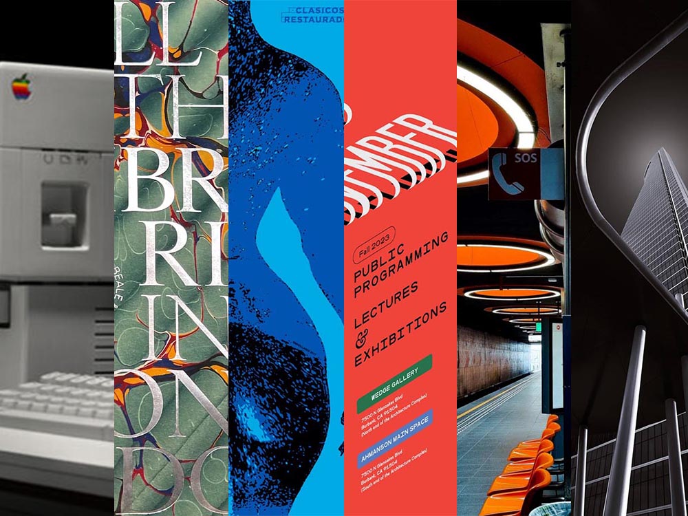
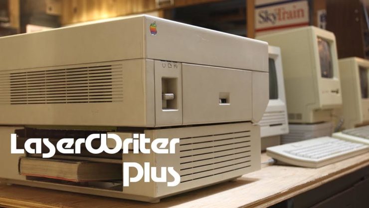
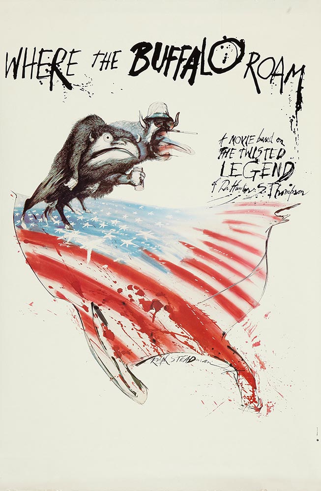
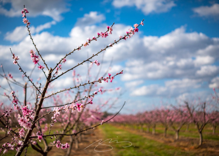
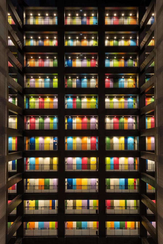
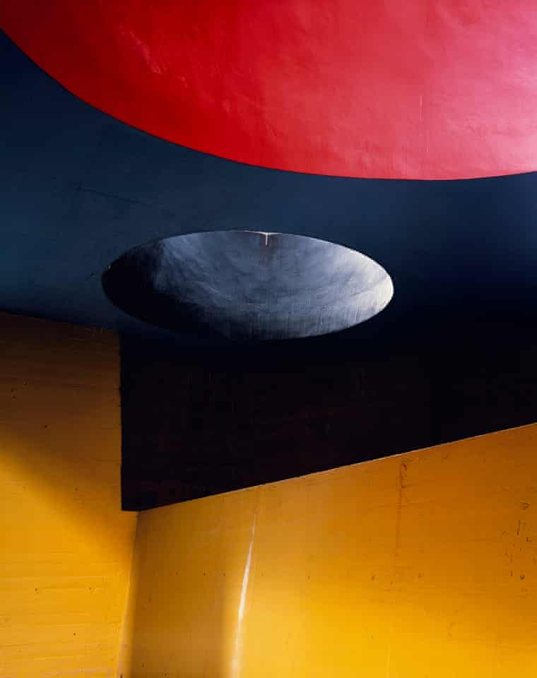
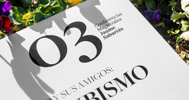
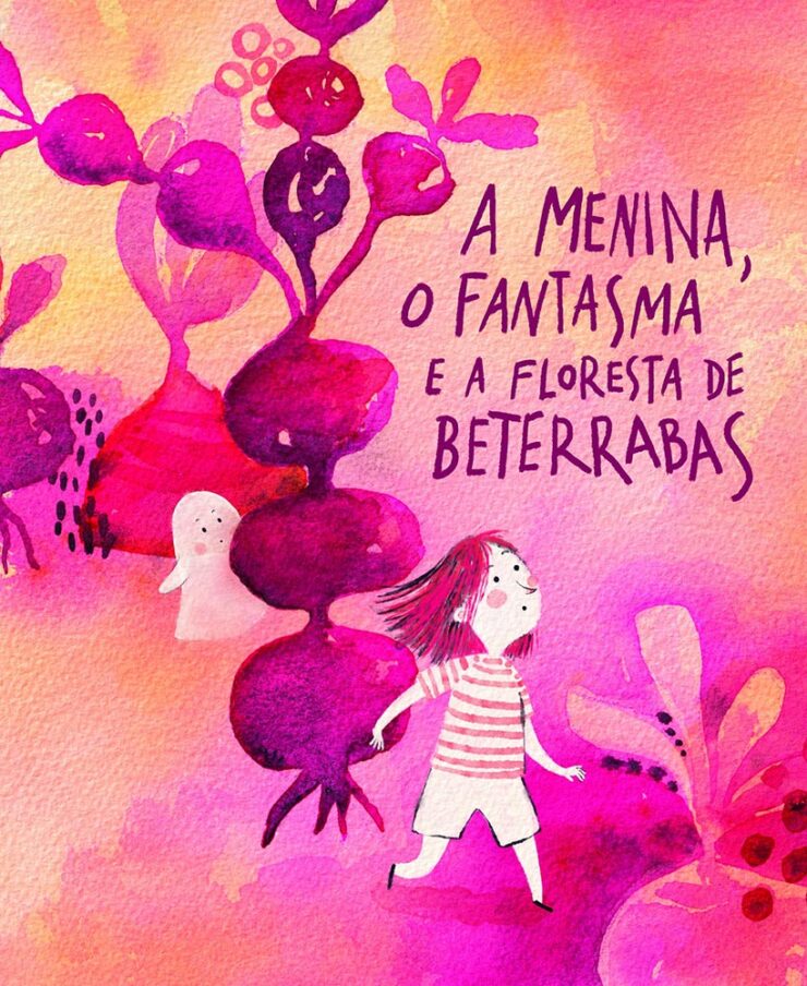
A fun and interesting University Press Coverage post on Spine when you have a moment, including this title from the University of Nebraska:
That was not a simple photograph to set up. Awesome.
Generative Book Cover Design
How 2 Shout Media presents a how-to: 20 cover design prompts for ChatGPT. “Creating the perfect book cover starts with the right vision — and that’s where ChatGPT transforms from a writing assistant into your creative design partner.” (Emphasis theirs.)
There are, for instance, specifics on “the anatomy of an effective prompt” and how to customize the provided templates; they even provide bonus templates to save and reuse, including one to quickly iterate on previous output.
The article contains some good advice, honestly, but the most relevant suggestion — to “[t]hink of ChatGPT as [a] creative director who provides vision and direction rather than final artwork” — is buried at the bottom of a fairly long page. I’m willing to get there are more than a few (especially in the self-publishing space) who read this as the definitive how-to . . . possibly without judging the output versus what a professional can create.
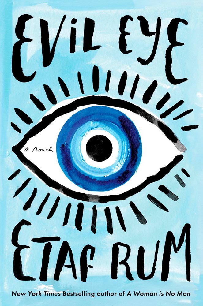
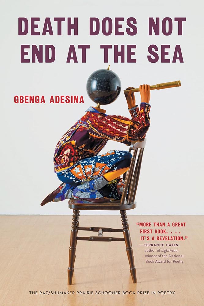
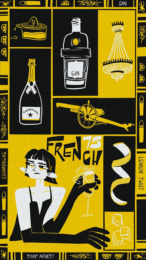
This cover sample is far and away the best of the eight illustrated options:
The prompt: “Design a literary fiction cover for ‘[Title]’ using a single continuous brushstroke that forms both an abstract landscape and a human profile when viewed differently—an optical illusion revealing loneliness and connection. Executed in indigo ink wash on cream paper texture. The brushstroke starts thick and confident, becoming increasingly fragmented and uncertain. Minimal color palette: indigo, cream, with one tiny spot of cadmium red as a focal point (perhaps a bird or flower). Title integrated into the negative space using a classic Garamond variant, appearing to be part of the original artwork. Author name in small, understated caps at bottom. Overall feeling: wistful, sophisticated, gallery-worthy.”
Take a moment to compare the output with the prompt, and you’ll see the generated output ignores several of the items, but overall, is kinda — sorta — close.
The other examples not so much. But I’m not going to spoil the whole thing: Go and see for yourself.
For now, I’d suggest that book design professionals — those that make a living from the art and science that is publishing excellence — are safe. Other professionals in the industry recognize what talent is and how valuable it is, and the designers themselves can take advantage of the power that some of these models offer to help brainstorm.
That said, today’s A.I. models are gaining quality at a rapid rate. In 5–10 years, at most, publishers (and authors self-publishing) that might not recognize that they’re best served by professionals — or those who don’t have the budget, despite the recognition — will have access to what might very well be “good enough.”
From Your Intelligence to Artificial Intelligence
So, where do the A.I. engines get their training material? From you and yours, of course; to quote a source we’ll get to in a moment, “[i]n writing this […] I am acutely aware it will become part of a training data set.” Some sites, such as Wikipedia and the Internet Archive, have seen an exponential upswing in traffic — all from the so-called “bots,” programs sweeping internet content into the never-satisfied regurgitation chamber that is today’s ChatGPT, Claude, and others.1One of the reasons my photography, as presented both here on Foreword and in the galleries, is both relatively lo-res and watermarked is to preserve a sense of ownership; likewise, one of the (many) reasons I no longer participate in social media is due to posts specifically being used to train A.I. — Instagram/Meta, for instance.
Ars Technica and Pixel Envy both highlight a new program, modeled on Really Simple Syndication (RSS), designed to “block bots that don’t fairly compensate creators for content.”
To quote Doug Leeds, the founder, “A.I. companies know that they need a constant stream of fresh content to keep their tools relevant and to continually innovate.” The “Really Simple Licensing” (RSL) standard evolves robots.txt instructions by adding an automated licensing layer that’s designed to block bots that don’t fairly compensate creators for content.
Free for any publisher to use starting today, the RSL standard is an open, decentralized protocol that makes clear to AI crawlers and agents the terms for licensing, usage, and compensation of any content used to train A.I[.]
— RSL Press Release
The new standard supports “a range of licensing, usage, and royalty models, including free, attribution, subscription, pay-per-crawl (publishers get compensated every time an AI application crawls their content), and pay-per-inference (publishers get compensated every time an AI application uses their content to generate a response).”
But — and it’s a big “but” — RSL is only one response to the problem. Another is to wall content off entirely, breaking one of the most valuable qualities of the internet itself: its openness.
We’re watching the construction of a fundamentally different internet, one where access is controlled by gatekeepers and paywalls rather than governed by open protocols and user choice. And we’re doing it in the name of stopping AI companies, even though the real result will be to concentrate even more power in the hands of those same large tech companies while making the internet less useful for everyone else.
— Mike Mesnick, TechDirt
Here’s where Pixel Envy agrees:
A.I. organizations have not created a bottom-up rebellious exploration of the limits of intellectual property law. They are big businesses with deep pockets exploiting decades of news, blogging, photography, video, and art. Nobody, as near as makes no difference, expected something they published online would one day feed the machines that now produce personalized Facebook slop.
— Nick Heer, Pixel Envy
“One thing that might help, not suggested by Masnick, is improving the controls available to publishers,” Heer writes, going on to discuss the new RSL standard proposal and what it might do to help. But, in the end, he’s not optimistic:
I simply do not know how much control I reclaim now will be relevant in the future, and I am sure the same is true of any real media organization. I write here for you, not for the benefit of building the machines producing a firehose of spam, scams, and slop. The artificial intelligence companies have already violated the expectations of even a public web. Regardless of the benefits they have created — and I do believe there are benefits to these technologies — they have behaved unethically. Defensive action is the only control a publisher can assume right now.
— Nick Heer, Pixel Envy
Yeah.
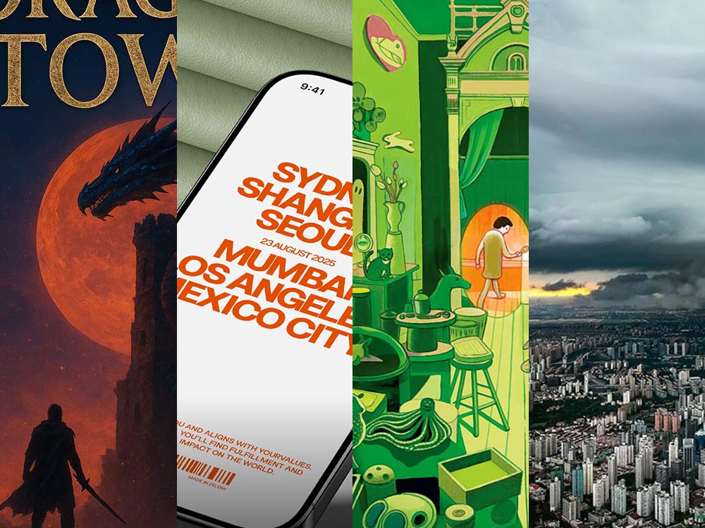
Special bonus #1: From the you’ve-trained-it-so-enjoy-A.I.-for-fun department,Kottke introduces us to generativ.design. “I wore out the “randomize” button on each of these,” he writes. (Via the new-to-me sidebar.)
Prefab Design
Meet fabricá, a new hair care company, whose identity ticks all the boxes: it’s trendy, eco-friendly, and well put-together:
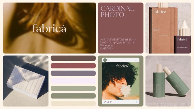
But there’s a catch: fabricá doesn’t exist — at least not yet. It’s a fully-formed identity, available now at Brands Like These, a new prefab identity outfit from Lyon&Lyon.
Now I’ll admit: at first, this seemed like a Dewey, Cheetham, and Howe thing,2Yes, I grew up listening to Car Talk. something that we all had a chuckle over before allowing it to shuffle into the background, readily available for use as a pithy line whenever we needed it: “Ha, we got Lyin’ and Lyin’ selling your precious startup canned … stuff.”
Unfortunately, it’s not a joke.
When Elizabeth Goodspeed, of It’s Nice That, got thinking about it, she had lots to say. “In a good design engagement, the back-and-forth between company and designer pushes the company itself to sharpen what it is; the ‘friction’ people complain about is also the juice that makes the work exciting.” (I find this true in editorial and publishing work, certainly.) But there’s a warning, too:
If this cart-before-horse approach takes hold, it won’t just change how companies buy branding, but how designers make it. The skills a designer needs shift from listening and refining to cranking out polished shells that could plausibly fit anything. […] Even if sites like BLT only sell a brand once, the more ambiguous the design, the more it risks echoing a dozen others (and collapsing under trend fatigue).
— Elizabeth Goodspeed, It’s Nice That
These models also threaten to hollow out the middle of the industry. We’ve seen this pattern before: bookstores went from indie shops and regional chains to Amazon or your local holdout; music from affordable CDs to either $50 LPs or all-you-can-stream. Branding may be headed for the same split – prefab kits at the low end, ultra-expensive bespoke at the high end, and little in between. And if prefab becomes the norm, it’s hard not to imagine the next step: why should these kits even be designed by humans? Once clients are trained to buy a look off the shelf, there’s little stopping A.I. from flooding the market with pre-packaged “brands” generated at scale.
This feels like an accurate prediction. Read the rest. (See also: her item on copyright, covered in February.)
Okay, we’ve dealt with the heavy stuff. Let’s enjoy the rest.
The New Type in Town
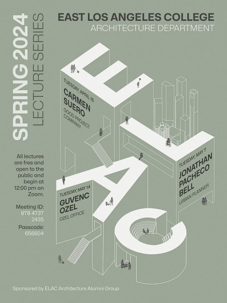
Several articles to point to if you’re interested in expanding your font collection — including 50 predictions for what’ll be popular 2026. Nice.
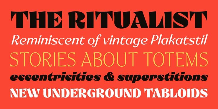
Steven Heller’s Font of the Month
Over at I Love Typography, industry veteran and designer extraordinaire Steven Heller’s monthly column exalts Ritualist.
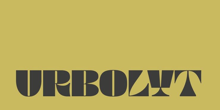
CreativeBoom’s Best o’ September
They have several, but my favorite is not dissimilar to the above, a new face called Urbolyt, a variable “that represents a clash between geometric rigor and organic forms.”
Zelow Studio’s Nature
Pixel Surplus brings us a new — and free! — variable grotesk typeface called Nature, available in a variety of styles.
CreativeBoom’s 50 for 2026
The vast majority of these are, basically, Helvetica; like Nature, the simple sans serifs are what’s in right now. (Sigh.) However, there are some gems on the list, and I’d like to take a moment to highlight an absolute favorite: Freight.
Freight is a collection of integrated typefaces ready to add unique style to any design project. What Joshua Darden started as a serif family inspired by the warmth and pragmatism found in 18th-century Dutch typefaces became The Freight Collection and now ranges across multiple weights, widths, and optical sizes — from Big to Display, Text, Micro, Macro, Sans, Neo, and Round — all of which include companion italics. That’s 192 fonts that have the ability to be bold and daring just as easily as they can be quiet and unassuming.
— freightcollection.com
I’ve used Freight in a variety of book projects and the breadth of options available always satisfies. It’s referred to as a superfamily: from the standard Text and beyond-excellent Neo (a sans with style), there’s an option for going Big and even two — Micro and Macro — best used at small sizes (readable footnotes!).
I cannot recommend more highly. Indeed, I could only take one font family with me to a desert island, I’d take Freight.
Illustrations Open Doors
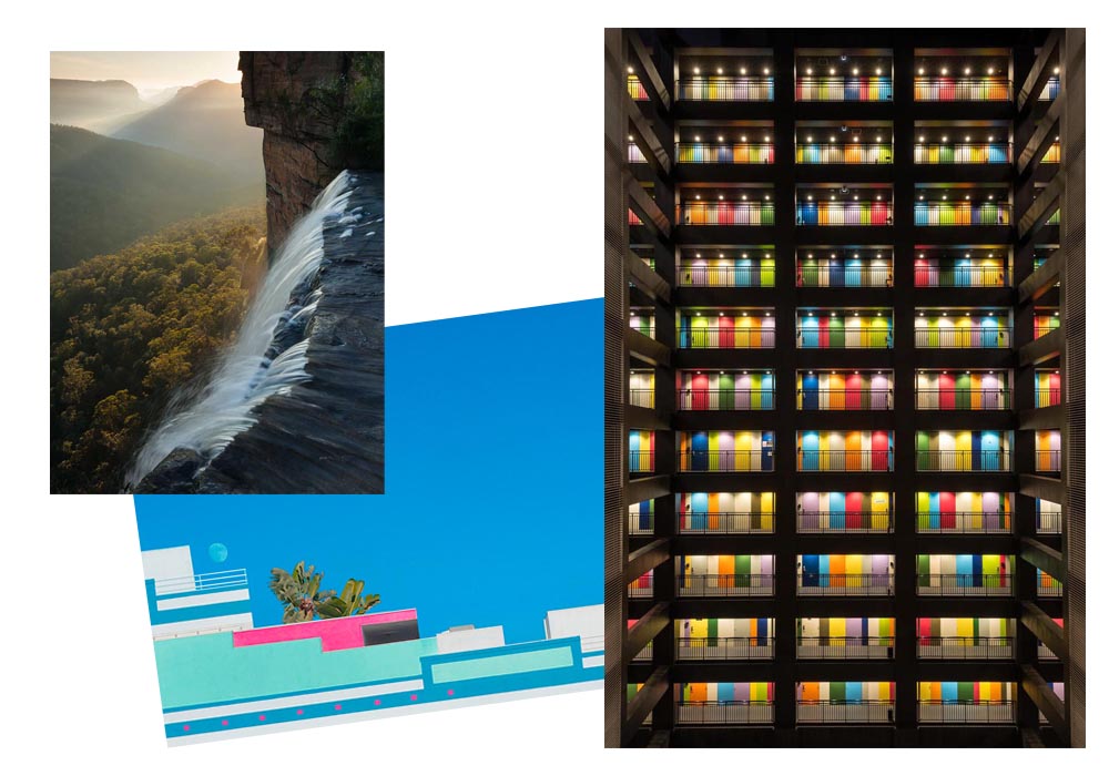
Illustration Awards 2025
CreativeBoom: “From playful packaging to poignant explorations of identity, the World Illustration Awards 2025 showcase the breadth of contemporary illustration. With over 4,700 entries from 85 countries, this year’s winners reveal how artists are shaping how we see, think and connect.”
One of the overall winners is this great poster:
Book covers (adult and children’s):
Site Specific:
The awards underline “how illustration continues to thrive as a medium of both beauty and urgency”: from packaging that delights to books that challenge taboos, the winning works reveal the versatility of illustrators working today.
See the whole list of winners and commended artists at the WIA 2025 Online Showcase, including interviews and insights into their creative process.
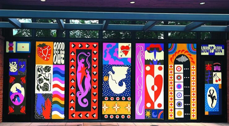
Illustration for Branding
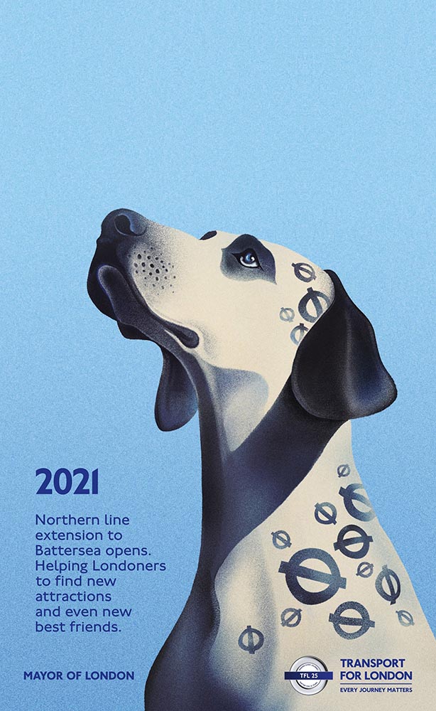
Another CreativeBoom article suggests that, “[f]rom murals to motion, illustration is starting to reassert itself in advertising,” because “illustration still offers unique advantages. Distinctiveness is the obvious one because, in a sea of photography-led campaigns, an illustrated execution can […] cut through precisely because they are unexpected.”
As this great TfL poster exemplifies:
“A Riot of Color and Joy”
Yet another example of illustration done well, this time from — wait for it — 1956:
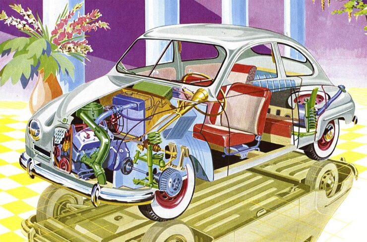
I still miss Saab. See more at The Autopian.
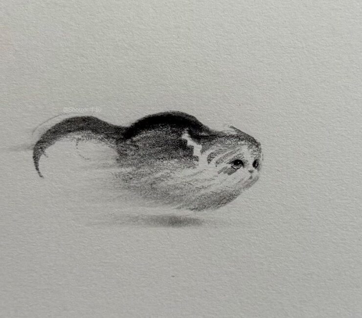
Special Bonus #2: These minimalist cat illustrations define brilliant:
September’s Photography Highlights
International Pet Photography Awards
While we’re on the subject of cats — and dogs, whose entries far outstripped those for cats (and horses, rabbits, pigs, and all the other things folks keep for pets) — this year’s pet photography contest has some pretty spectacular results:
Getting my dog to stand still long enough for a photograph is nigh-on impossible; some of the accomplishments shown in these winning photographs are fantastic. Kudos.
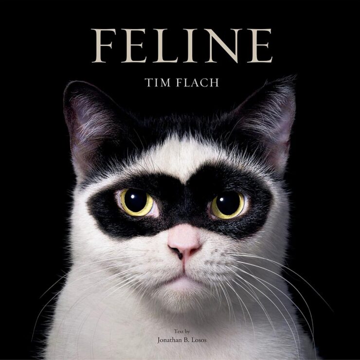
Special bonus #3: Cats, book matched.
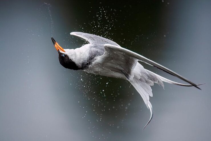
Audubon Photography Awards
The 15 winning entries for 2025 have been announced, including this one:
See more at PetaPixel or This is Colossal; explore galleries of this year’s winners and honorable mentions, or grab a copy of the Fall 2025 Audubon Magazine.
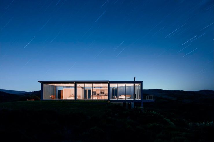
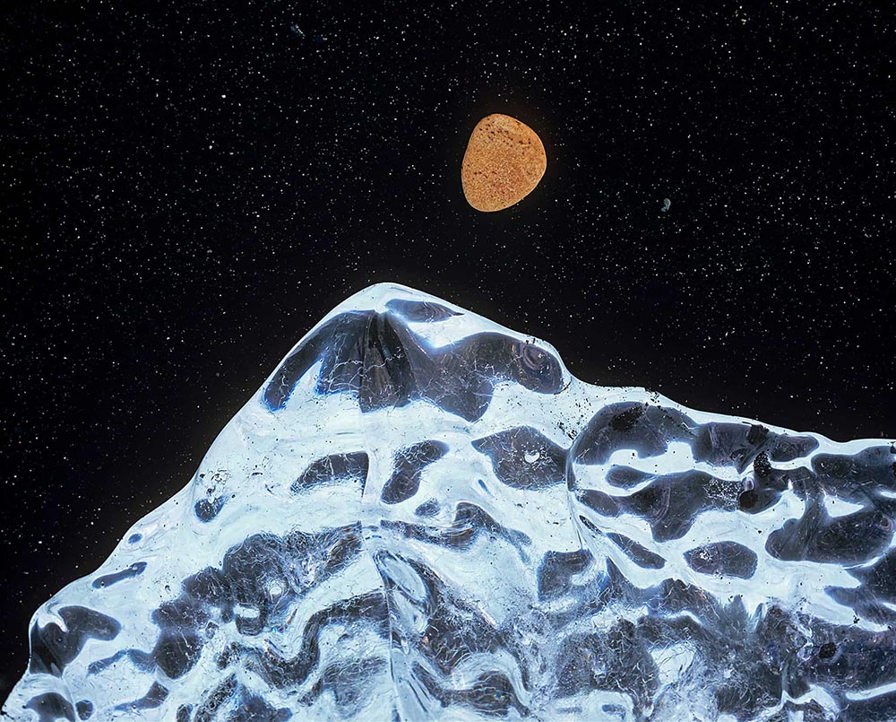
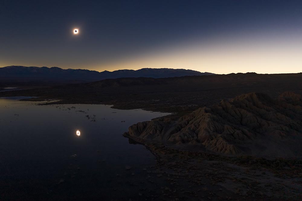
Astronomy Photographer of the Year
This is Colossal: “The universe’s workings may always remain a mystery. So it’s no surprise that when peering up at the night sky, whether it’s homing in on distant stellar clusters or simply watching the moon rise, photography helps us appreciate its enigmatic beauty.”
I didn’t realize until after I’d selected them that these were both from the same photographer, but unlike some that are just (amazing) night sky, these have an almost-science-fiction quality.
’Course, that’s only the tip of the iceberg: “The Royal Observatory Greenwich’s ZWO Astronomy Photographer of the Year 17 contest showcases the best astronomical and night sky images of the year, captured by exceptional photographers worldwide,” writes PetaPixel.
Two more that aren’t quite what you expect:
See the more winners, from here and beyond, at PetaPixel or This is Colossal.
Special bonus #4: While we’re on the subject of Earth and sky, PetaPixel profiles Italian photographer Gianluca Rubinacci:
Special bonus #5: The UK’s Weather Photographer of the Year 2025 Competition list of finalists has been announced, including this one:
See all of ’em — and vote (until October 16th) — here.
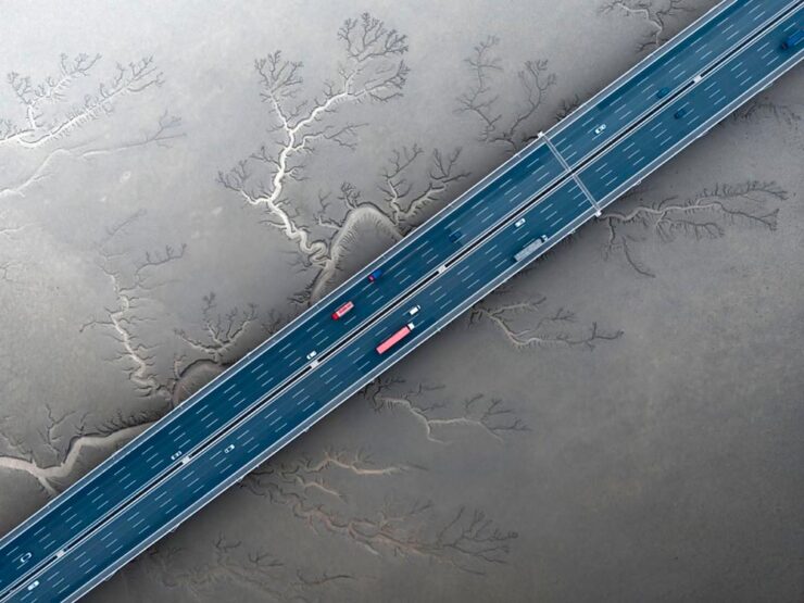
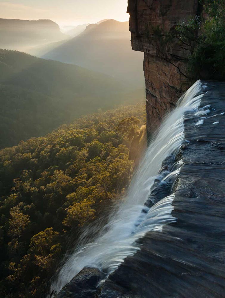
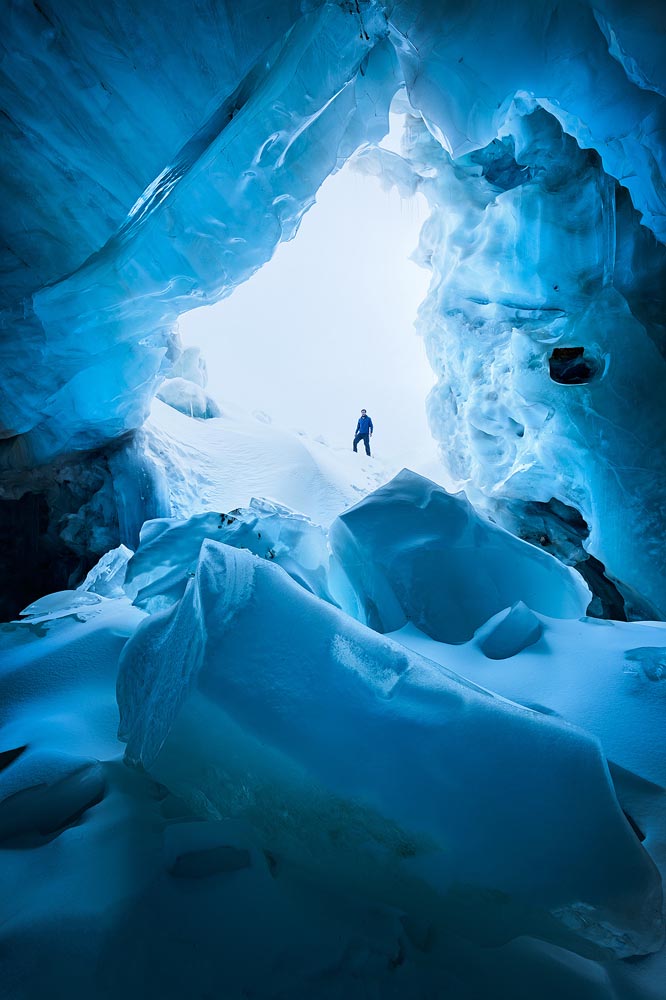
Natural Landscape Photography Awards
This one’s a little different, in that there can be no generative AI, no compositing of different photographs, and RAW files are checked by judges to ensure authenticity. (Refreshing, honestly.) “The competition is designed to promote photographers looking to work within the constraints of the natural landscape and traditional bounds of photography.”
See more at Petapixel, or to see all of the contestants head to the Natural Landscape Photography Awards website.
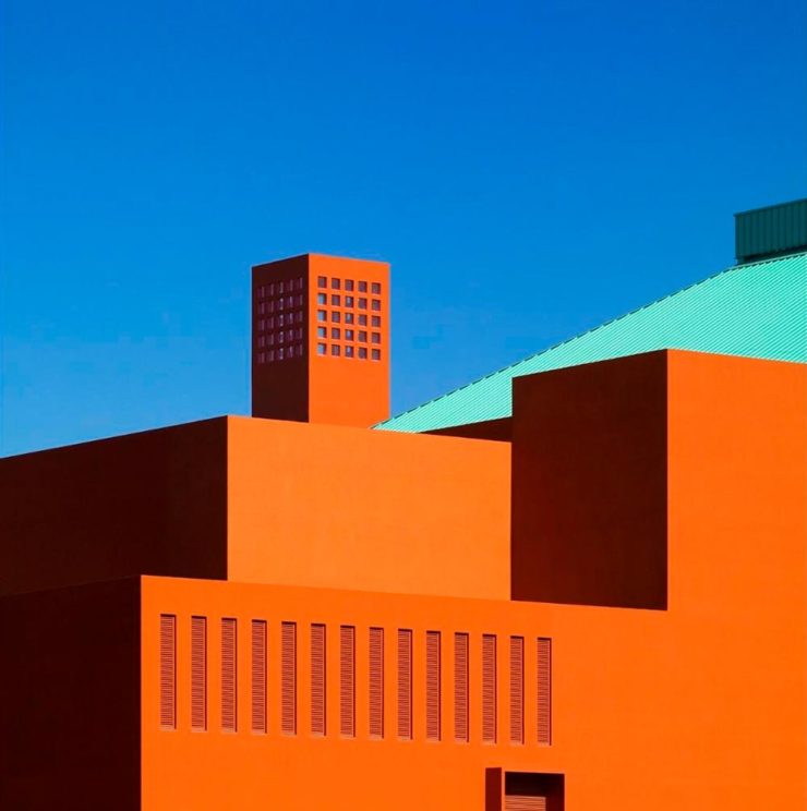
“Cyberpunk” and “Gotham” vs. “Otherworldly” and “Forgotten”
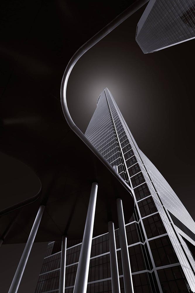
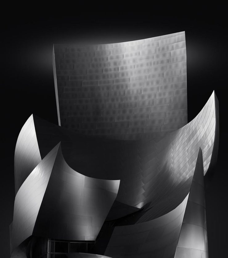
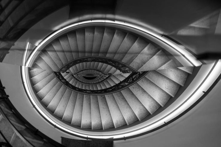
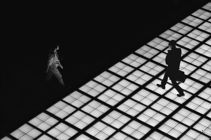
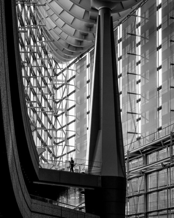
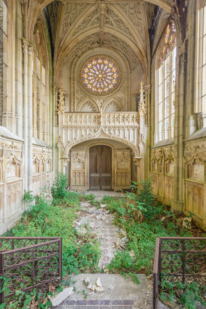
To close out this month, I’d like to mention a couple more book projects. Let’s start with Ben Moore, whose new photo book is titled Above & Across London. As the name suggests, he found high-up vantage spots: “I’ve always loved the look of a cool, urban, cyber-futuristic world, and at times I catch glimpses of that in London,” he writes.
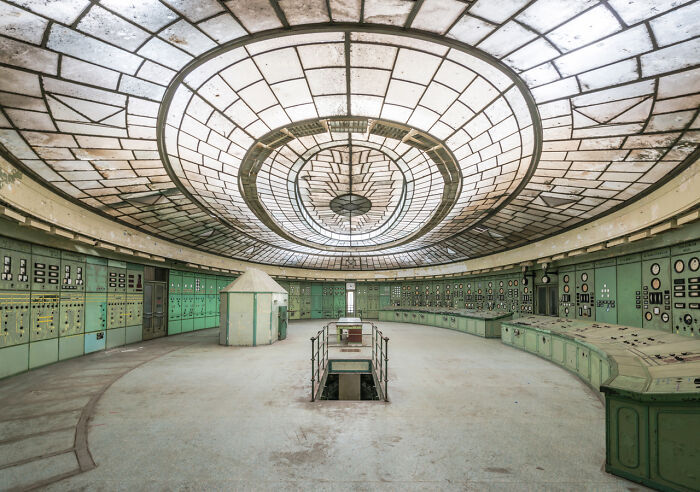
Meanwhile, photographer Bryan Sansivero feels a strong pull to document and explore forgotten dwellings; his new book, America the Abandoned, explores deserted homes around the country in 200 striking images — including this one:

Have a great October, everyone.
- 1One of the reasons my photography, as presented both here on Foreword and in the galleries, is both relatively lo-res and watermarked is to preserve a sense of ownership; likewise, one of the (many) reasons I no longer participate in social media is due to posts specifically being used to train A.I. — Instagram/Meta, for instance.
- 2Yes, I grew up listening to Car Talk.