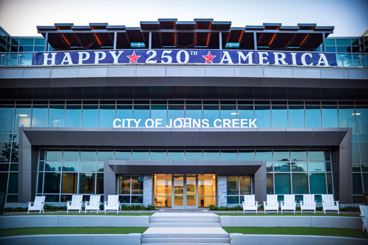
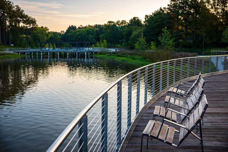
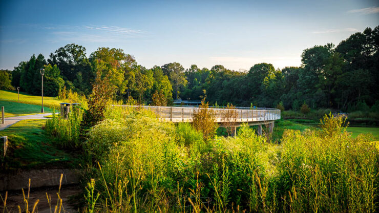
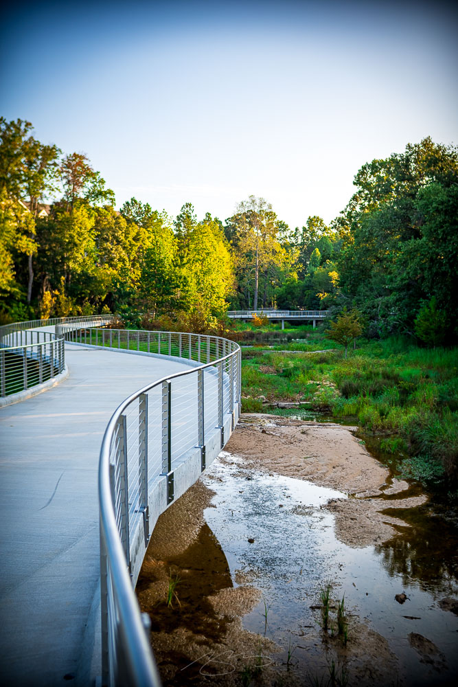
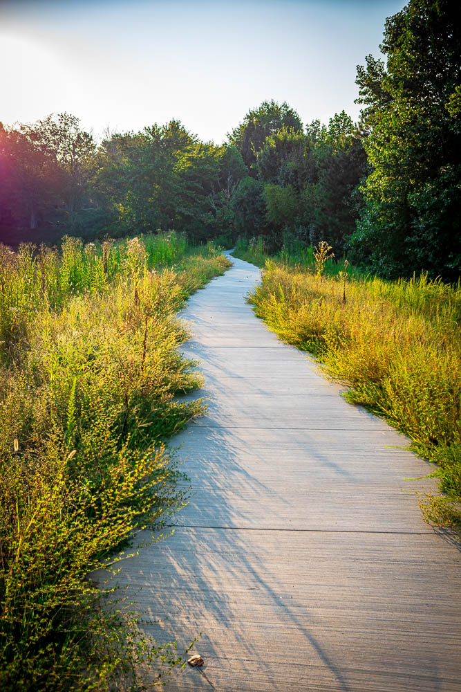
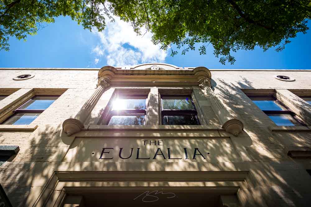
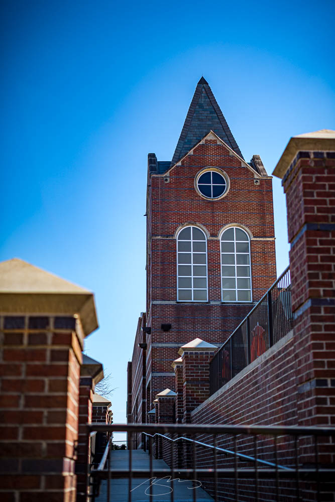
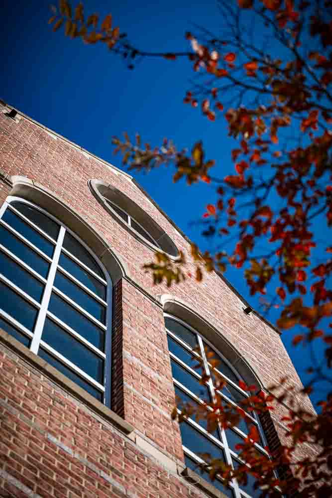
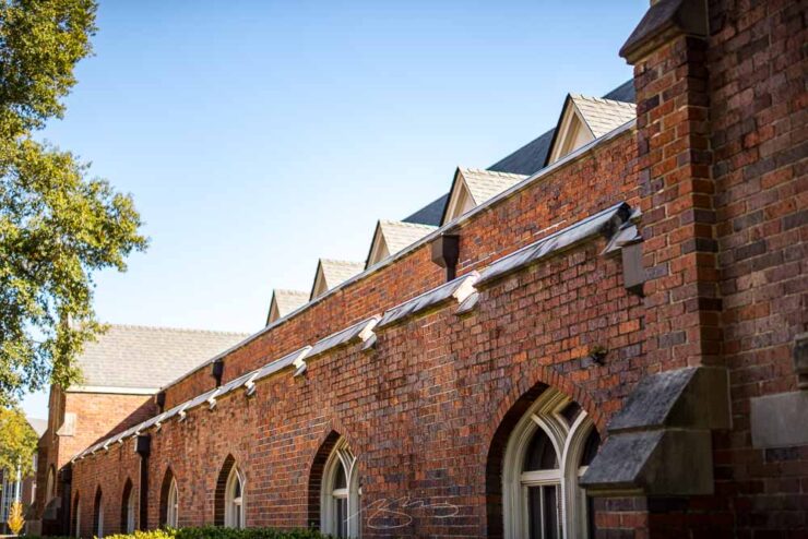
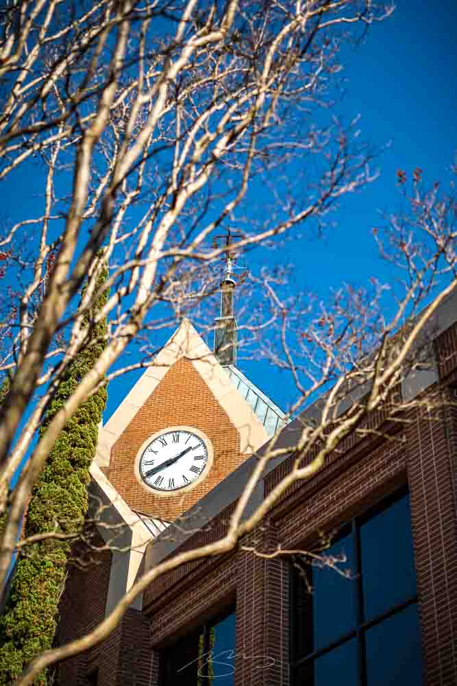
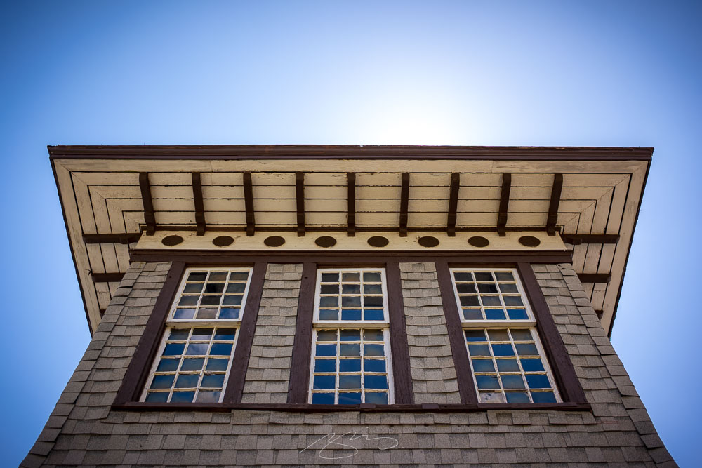
The City of Johns Creek, a suburb of Atlanta, recently opened The Boardwalk at Town Center, a 20-acre park and walking area centered around City Hall. The upgrade turned a scenic view for those that worked nearby into a vibrant park and performance venue for all. The transformation also included re-wilding a section of Johns Creek — the waterway, that is — from a man-made lake to something much more pleasant, much more natural, and something that locals and visitors alike can use and enjoy year-round.
Johns Creek City Hall #2, 11360 Lakefield Dr.
I was there at dawn and, as Georgia late-summer mornings go, I couldn’t have asked for a nicer time to wander.
Lakeside Relaxation (at Dawn), 11360 Lakefield Dr.
As part of the park’s construction, they’ve added a performance venue in front of City Hall, along with extensive landscaping and opportunities to sit lakeside.
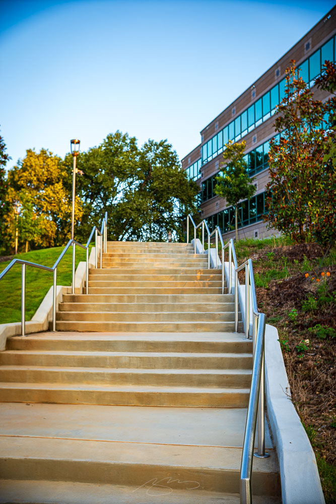
Boardwalk Stairs, 6455 E. Johns Crossing(Walk to) 11330 Lakefield Dr. #1
The surrounding office park and shopping areas have added access to the park, as well, aiding the public’s ability to access the improved areas.
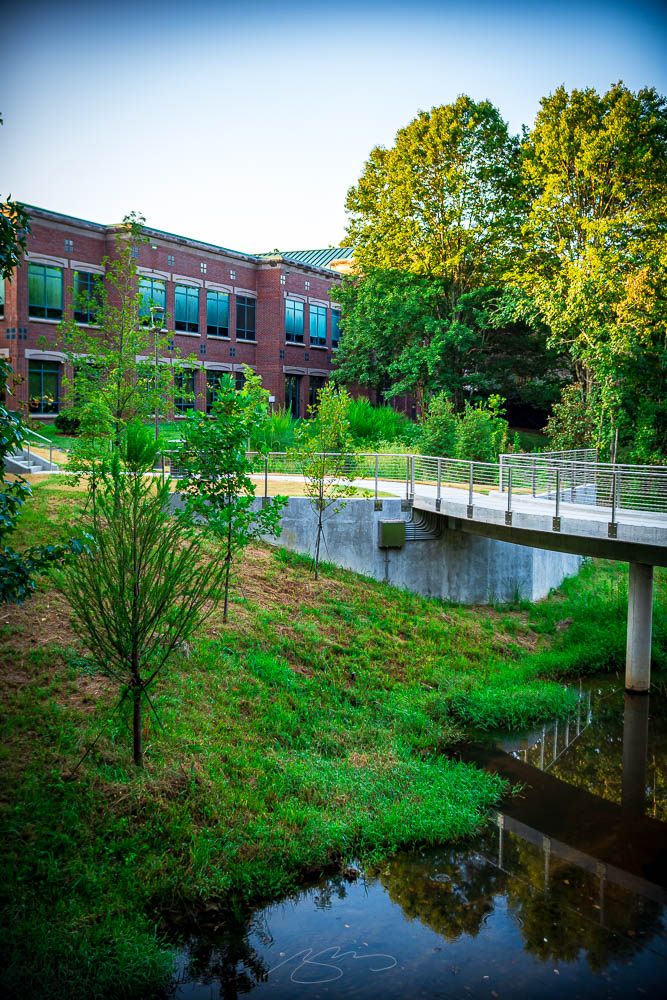
Former Lake Basin #3, 11362 Lakefield Dr.Former Lake Basin #5, 11362 Lakefield Dr.
The best area, however, is the former artificial lake basin at the southwestern end; between the raised walks and return of the waterway to nature, it’s become an valuable addition to this suburb populated mostly with busy roads, retail and planned living.
July photography in Georgia — even on a day that was “only” hot, as opposed to “scorching” or “overwhelmingly humid” — is a challenge. But yesterday’s photostroll was completely worth the effort.
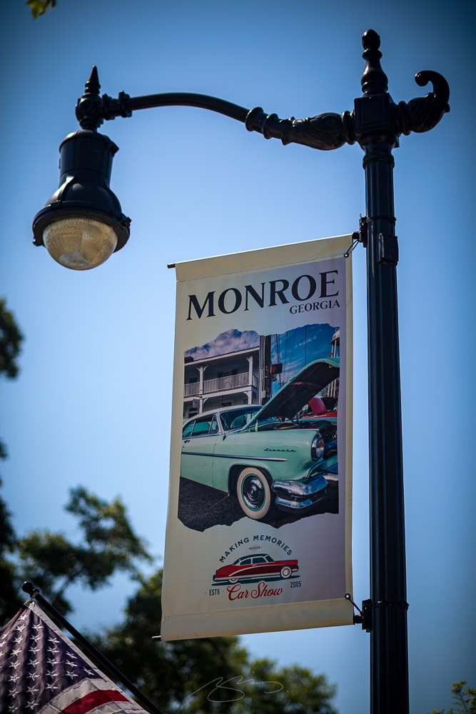
Monroe Light Sign, S. Broad St.
Named after James Monroe, this north-central town is about an hour east of Atlanta; close enough to the city to be called an exurb, it has an excellent selection of amenities to choose from.
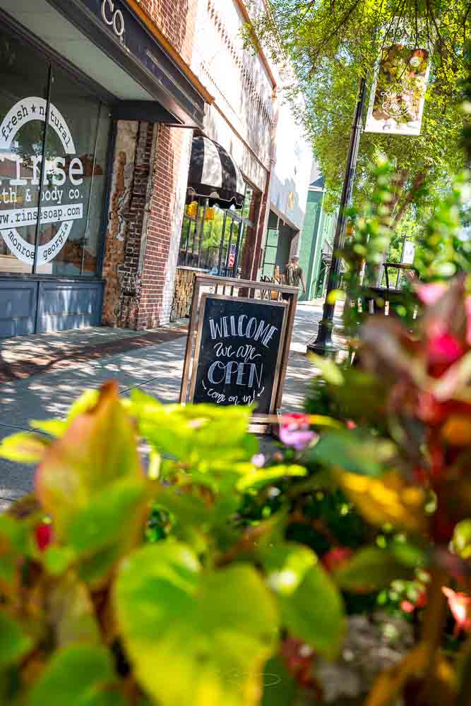
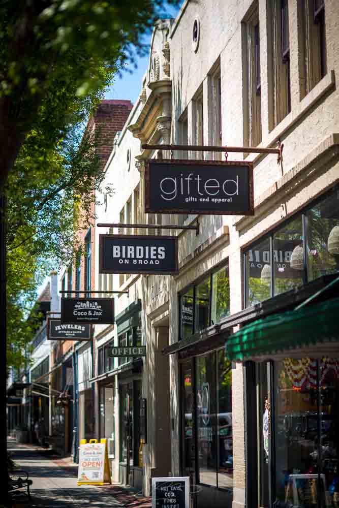
Sign to Rinse, 106 S. Broad St.Street frontages, N. Broad St.
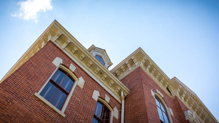
Typical of towns of the era, it has an old-fashioned town square and 19th-century architecture everywhere you turn.
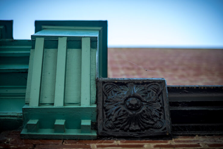
Old Monroe City Hall (Roofline Detail), 101 S. Broad St.Classic and Cast (Building Details), 124 N. Broad St.
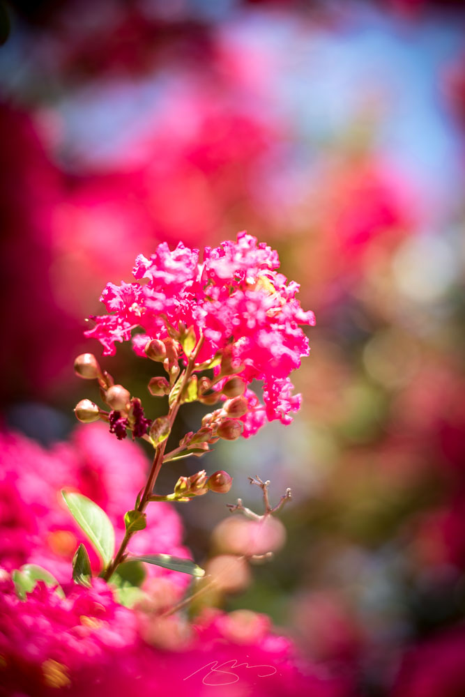
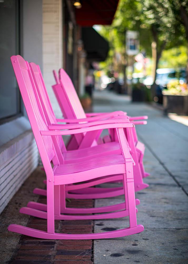
The downtown area was well-tended — somebody did an excellent job with the flowers — and not only has chairs to savor the ice cream, but a center to appreciate the arts, as well.
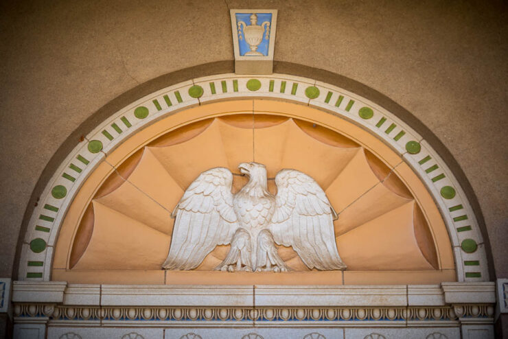
Crepes A’wash, W. Washington St.Scoop a Spell, 140 N. Broad St.Monroe – Walton Center for the Arts (Building Detail), 205 S. Broad St.Monroe – Walton Center for the Arts (Garden #3), 205 S. Broad St.
I took the long way on a trip to “The A-T-L,” and enjoyed the visit very much. I hope you’ll enjoy the results.
“Welcome to the new,” he said, pointing to the old, now dressed in a new suit. You’re reading this because the words and ideas resonated — and it’s why only the style is newly tailored.
Sometimes, though, a new look can be enormously satisfying. Enjoy.
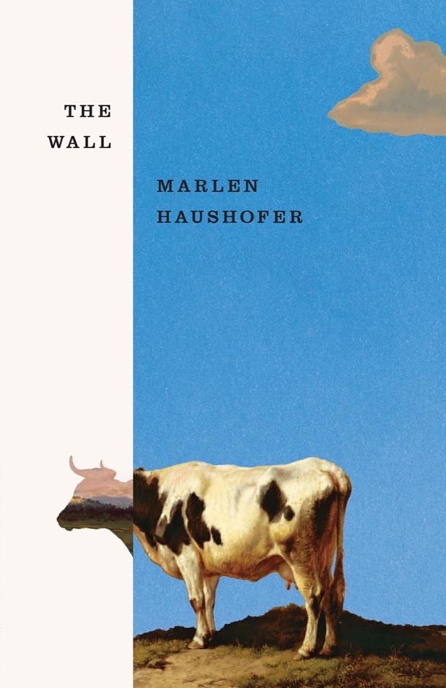
This month’s Spine
Beacon Press.
“Paperwork. Nice,” I said, while potentially allowing a smidgen of political speak through the door. (Not sorry.) Read the column here.
Design and type
Matt Dorfman’s many hats
Matt Dorfman’s book covers are a regular item here on Foreword, including several of my Favorite Book Covers of the Year posts. So it was a delight to see a new interview with It’s Nice That.
[B]usy days and late nights begin with, as Matt puts it, “churning out a generous amount of trash”. Much to his frustration he will be “working through what often feels like a landfill-sized hill of boring ideas”. Despite taking up quite a bit of time, it’s a necessity, as among this trash will be a shred of an idea worth expanding upon. “Usually it’s a minor detail from an earlier comp made in haste and far afield from anything that book is actually about,” he says, “but it typically has a quality of brokenness or something unfinished that just looks interesting.”
— Harry Bennett, It’s Nice That
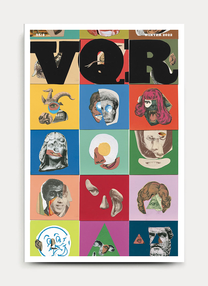
“Do anything except what’s right in front of you,” he tells them, while mentioning that he often favors collage. “Collage has become one of my shorthands for pairing themes and ideas together that aren’t so readily represented in nature or culture.” As in:
VQR. Book design by Matt Dorfman. Image via It’s Nice That.
Did I mention that he’s also the art director The New York Times Book Review? Yeah:
One of Matt Dorfman’s covers for the NYT Book Review. Image via It’s Nice That.
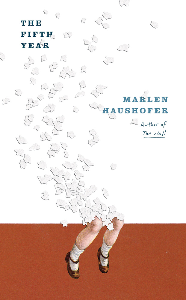
And a quick preview of next year’s Favorites list, with this gem:
Cover design by Matt Dorfman.
If it looks familiar, that’s because…:
Cover design by Matt Dorfman.Cover design by Matt Dorfman.
Both previous Favorites here on Foreword. Awesome.
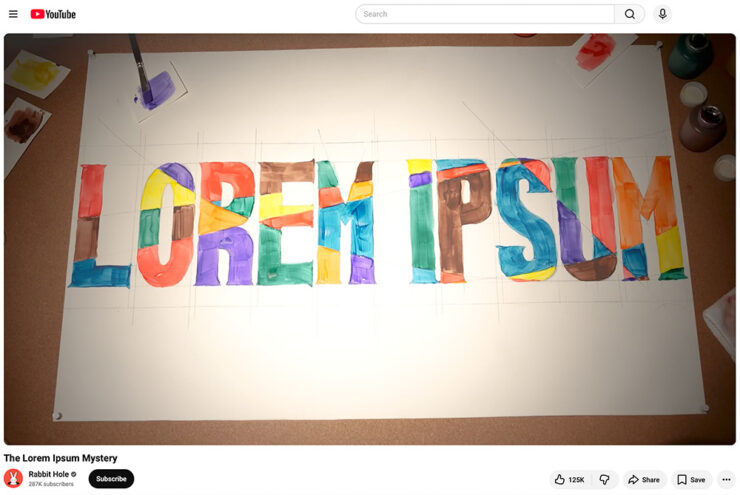
Glenn Fleishman, writing at Six Colors, points us at a YouTube documentary on the history of Lorem Ipsum:
A screenshot of the YouTube video.
“I found it riveting and hilarious, and exactly the kind of Rabbit Hole (her channel name) that I fall down with printing and type history myself,” he writes. “[H]er dogged research has largely filled in the missing pieces of the story of where the run of seemingly Latin text used by designers to act as placeholder (or ‘Greeked’) text in mock-ups since the late 1960s came from.”
I agree: it’s well put-together and, more importantly, answers a question you might not have actually had — but now can’t resist. Enjoy.
Side note: Privacy where possible: I’ve switched to screenshots of YouTube videos rather than embedding them. That way folks who choose not follow the link aren’t stuck with the trackers embedding foists upon all.
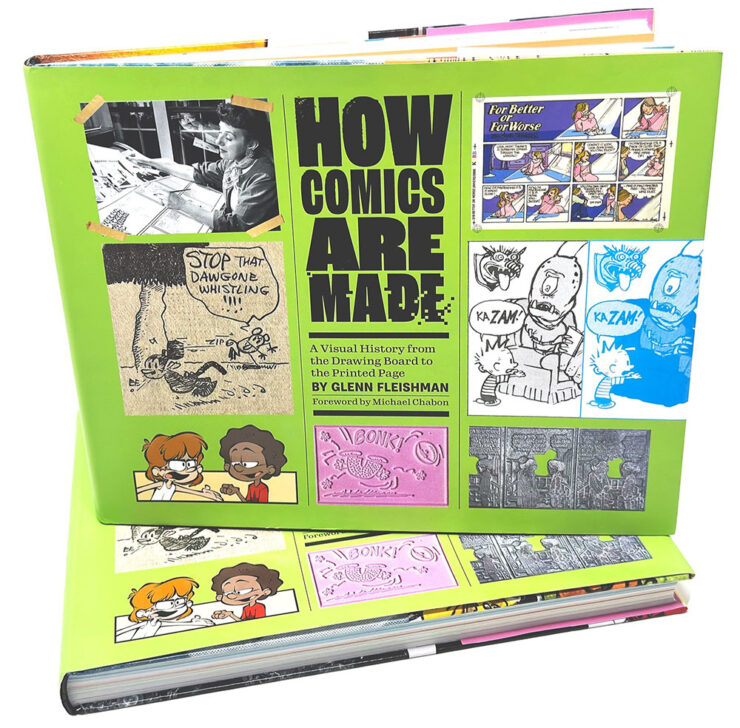
Special bonus #1: Glenn is one of those people who wears many hats — 2019’s awesomeTiny Type Museum project is his, for instance — but it’s the comics connection that might be most appreciated. He’s got a book out about it, now in its second edition, which has just been nominated for Will Eisner Comic Industry Awards — the Eisners. Read more.
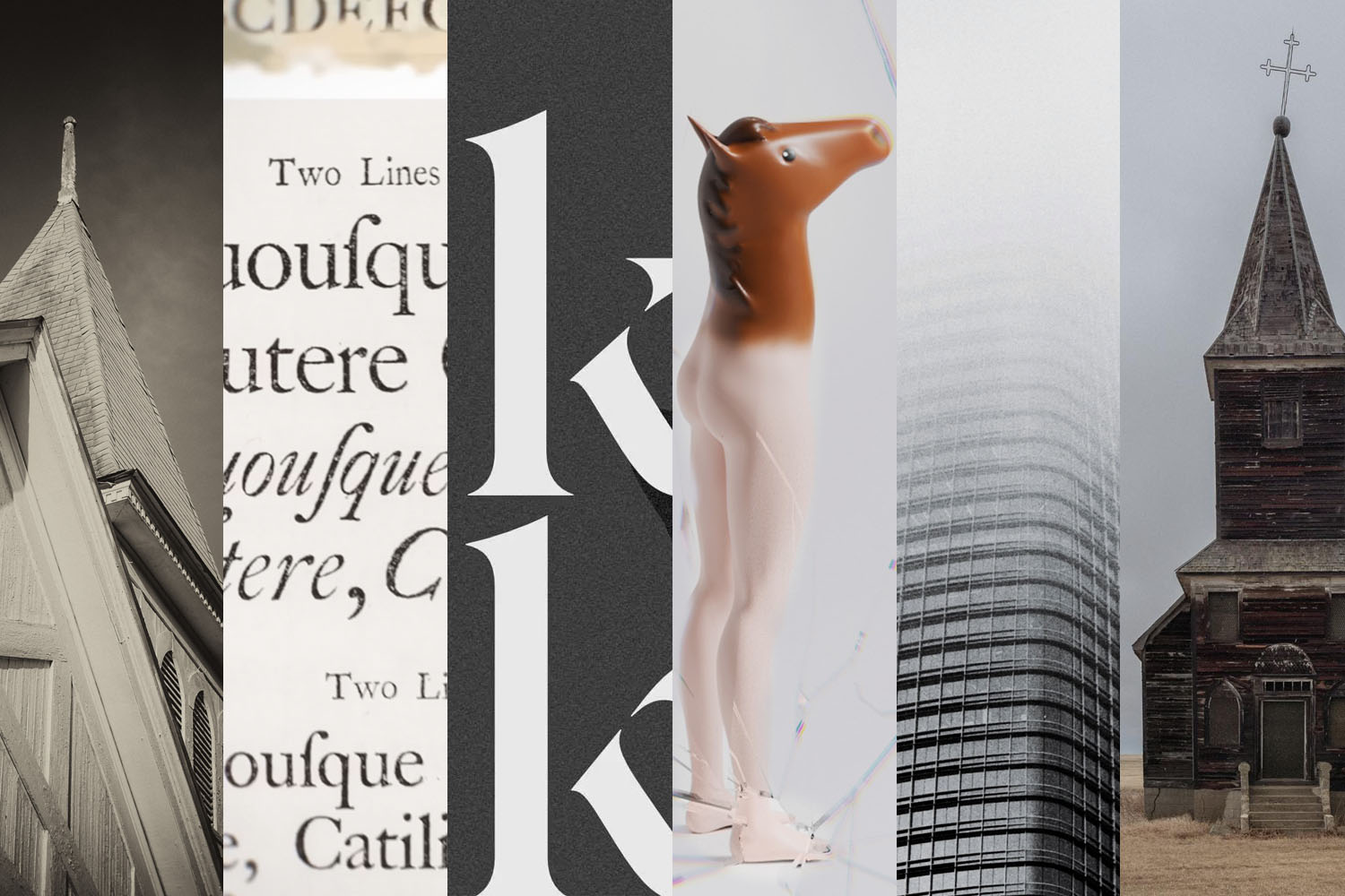
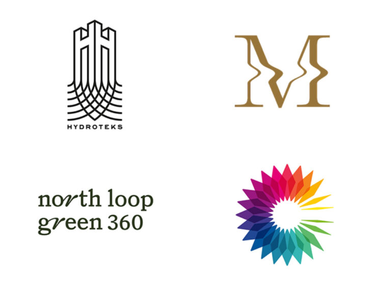
2026 logo trends
The Logo Lounge has posted its 2026 Report.
The quality of the Logo Trend Report has slipped over the past couple of years — there are suggestions that parts of it are generated rather of written — but I think the zoom-out is still useful for those of us in design.
If, for no other reason, to make sure our work is ahead of the curve.
Via Brand New, one of the only subscription sites I’ll link to. (Because it gives me an excuse to encourage you to subscribe, too: at $20/year, it’s sensibly priced and very much earns its keep.)
Best new fonts: a one-off
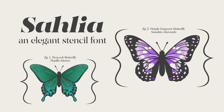
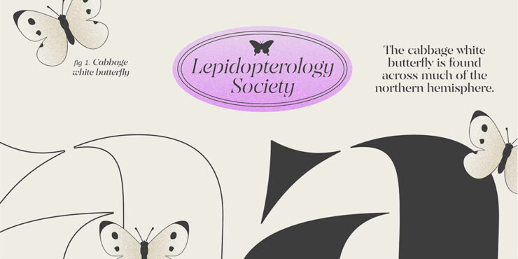
This month’s CreativeBoom post on new fonts was shorter than some — it’s summer! — with only one I’d like to highlight:
Sahlia, by Arcane Type Foundry.
But what a one it is. How often are we given an excuse get excited about stencil-style?
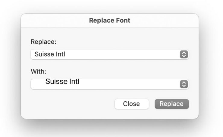
Marcin Wichary, whose brilliant Unsung continues to impress, has a neat item that we’ve all seen at this point: font menus that preview the font name in the style of the typeface, sometimes poorly.
Turns out, that’s not at all easy.
Oopsie. Screenshot courtesy of Unsung.
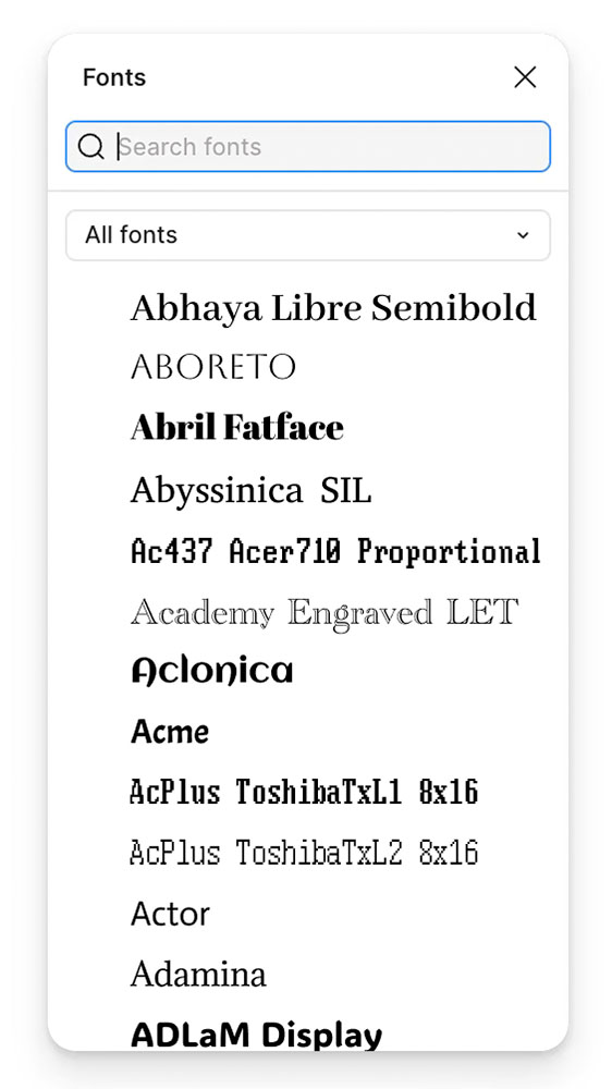
“Font previews are fascinating because they are the perfect showcase of how tricky fonts can be at scale,” he writes. The question is: why?
It’s actually impossible to left align or center text. Ever. Not just because each font does whatever it wants – font size is a number that doesn’t really give you anything to hang a hat on, and the font can place itself in its box however it desires, too – and not just because fonts often lie (via bad metrics) about what they store inside, but also because aligning and centering are really in the eye of the license holder, and have more than one definition.
So, every time you align text to anything, in whatever way, it’s only an approximation. Most of the time that’s good enough. Here it is not.
— Marcin Wichary, Unsung
It takes a surprising amount of work to get this right. Screenshot courtesy of Unsung.
“There are icon fonts, color fonts, and non-Western fonts so rich in variety and tradition that this category itself is basically a fractal,” he says. “There’s a craft to getting it right.”
Special bonus #2: Wichary also built something called Fontificator. “I thought it’d be fun to share this internal tool I made over a decade ago to aid with exploring options for Medium’s typographical redesign,” he says.
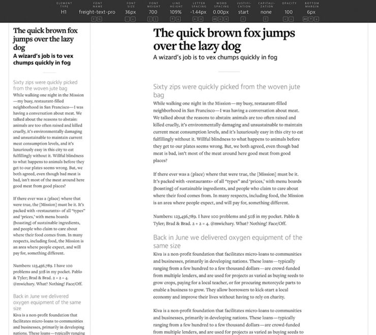
Fontificator. Screenshot courtesy of Unsung.
“The motivation for building Fontificator came from two observations:
font previews on type foundry sites were generally too limited to get a real sense of how a certain typeface feels, and it was best to see a font in situ,
often an extremely tiny nuance — like adding some letter spacing, or messing with line height — was what separated something that was promising from something that seemed very far from working.”
I know, I know, more Abode stuff. I’ll keep it quick(ish).
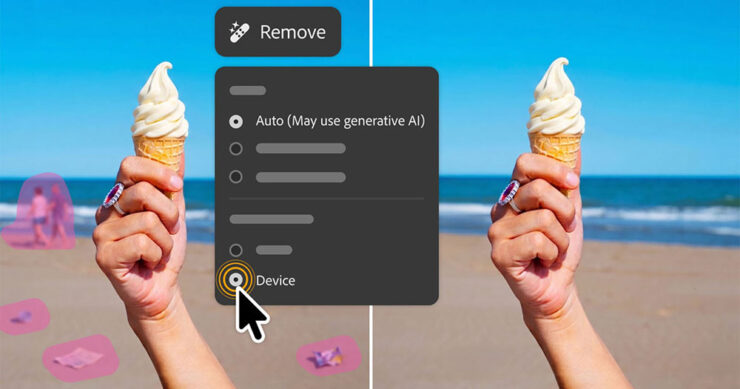
PetaPixel reminds us that, “the vast majority of working photographers are using AI to help save them time, handling tedious tasks that aren’t necessarily all that creative.” Adobe’s latest updates address that:
AI removal tools now have flavors, including on-device if needed.
Lightroom’s AI Sharpen tool can now use Topaz Labs’ Noise-Aware Sharpen model directly in the app. This promises to recover fine details more effectively, per Adobe. (More on Topaz below.) 👍
Lightroom’s Assisted Culling automatically stacks similar images into groups and automatically suggests the “strongest one.” 👎
Lightroom has a new Photo to Video feature that uses Firefly and Google Veo to turn a still photo into “polished b-roll or reels with AI-generated motion.” 👎
Photoshop’s reflection removals are now isolated on a separate layer, “giving users control over opacity for more natural-looking results,” according to PetaPixel. 👍
Photoshop’s Remove Tool, which uses generative AI to erase a selected object and replace it with realistic-looking pixels, can now be used offline using an on-device AI model. 👍
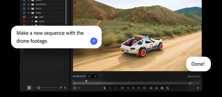
The agentic AI “assistant” might — or might not — be good. (Subscribers pay $$ for it, so….)
Meanwhile, Adobe’s promised “creative agent” — ’cause agentic AI — has “fully arrived” in Creative Cloud, PetaPixel writes. “Inside Premiere, Photoshop, Illustrator, InDesign, and Frame.io, users can tell Adobe’s Firefly-powered AI Assistant how to edit photos, videos, and other graphics.” It runs in a panel, like having Chat GPT or Claude right in the app.
“As a creative, you remain in control, choosing what to hand off, what to refine and how to apply your taste, expertise and judgment to shape every editable outcome. These tools are built for how you’ve told us you actually work,” Adobe explains.
I’m going to have to try this one. Maybe. Someday.
Several days after the above items were debuted, Adobe purchased Topaz outright. It’ll “fully integrate Topaz’s [AI scaling] models across apps like Photoshop, Lightroom, and its AI image generator Firefly” — which should be a good thing.
Special bonus #3: In case AI-all-the-things is getting to you, there’s this:
“A ‘centaur’ describes a human augmented with a technology, like machine learning, or even just driving a car or using autocomplete,” ArsTechnica writes as part of an interview with Doctorow. “A reverse centaur ‘is a machine head on a human body, a person who is serving as a squishy meat appendage for an uncaring machine.’”
“Being a centaur is generally viewed as a positive thing; few people relish being a reverse centaur. And yet the AI industry….” Read the rest.
People
Jason Snell
Amongst the tech names I’ve know for what seems forever, Jason Snell’s is up there. He was first at MacUser, then Macworld, then hung out his own banner at Six Colors.
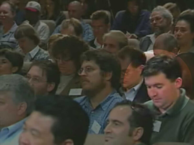
From Macworld: Jason Snell (highlighted) at the introduction of the iPod, 2001.
My first day on the job at Macworld, Apple was perilously close to going out of business. It was the fall of 1997, and Steve Jobs had returned to Apple and engineered the ejection of Gil Amelio as CEO, but there was no iMac yet, no visible turnaround in terms of products at all. Beyond the release of the iconic “Think Different” ad campaign, there was nothing.
Apple’s survival hung by a thread. Steve Jobs asked everyone to trust him. At Macworld Expo, he had enlisted Bill Gates — Bill Gates, of all people! — to help him instill belief in the world that Apple would find a way to survive.
The world was skeptical, to say the least. My family asked what job I thought I’d get once Apple went out of business.
—Jason Snell
Ah, the good old days. (I jest.) Hard to believe, but that was almost 30 years ago. Sheesh.
So long, in fact, that another milestone has passed: Jason’s left Macworld. Read the column. I’m glad he’ll be continuing with Six Colors, and am looking forward to his new podcast on Apple’s history, Designed in California.
David Hockney
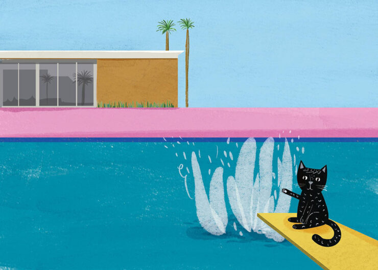
I was familiar more than a fan, but it’s undeniable that the world has lost a character — something very ably underscored by the tribute illustrations posted at CreativeBoom:
Illustration by Nia Gould.
“From Bradford to Beverly Hills, Hockney’s bold colours and irrepressible joy for living inspired a generation. Here’s what they created in response to his passing,” they write. See the rest.
Om Malik
Early this month, Om released an essay for the times — and the ages:
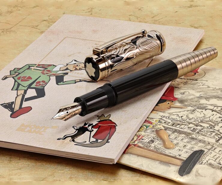
Most people remember Pinocchio as a story about lying. The nose grows. You get caught. Lesson learned. But that reading misses almost everything Collodi was actually doing. The book is a close study of a society where deception has gone ambient, woven into every institution, every transaction. Courts punish victims. Authority figures perform competence without exercising it. Experts are decorative. Society holds together through spectacle and habit rather than accountability. Into this environment, a naive creature is released, constitutionally unable to resist a good story about easy reward.
The nose is the least interesting lie in the book. The interesting lies are the ones that work.
Okay, sure, it was social commentary cleverly disguised as an essay about a pen. This Mont Blanc, in fact:
The point is, it was as insightful as ever. (See also the previously-cited “Velocity is the New Authority.”) It was immediately deposited in the to-be-posted folder. Before I could could get to that, however, heart disease snatched him away. He was 59.
I first heard via Pixel Envy, which linked to Om’s excellent photographs posted to Glass (social media),1Forgive the repetition, but just in case: I don’t participate in social media. While I’d heard of Glass, I didn’t know of Om’s posts there — and wouldn’t have followed in any case. Perusing those photos, and posting that link, are a one-off celebrating Om’s talent. and, later, appreciated John Gruber’s thoughtful piece at Daring Fireball.
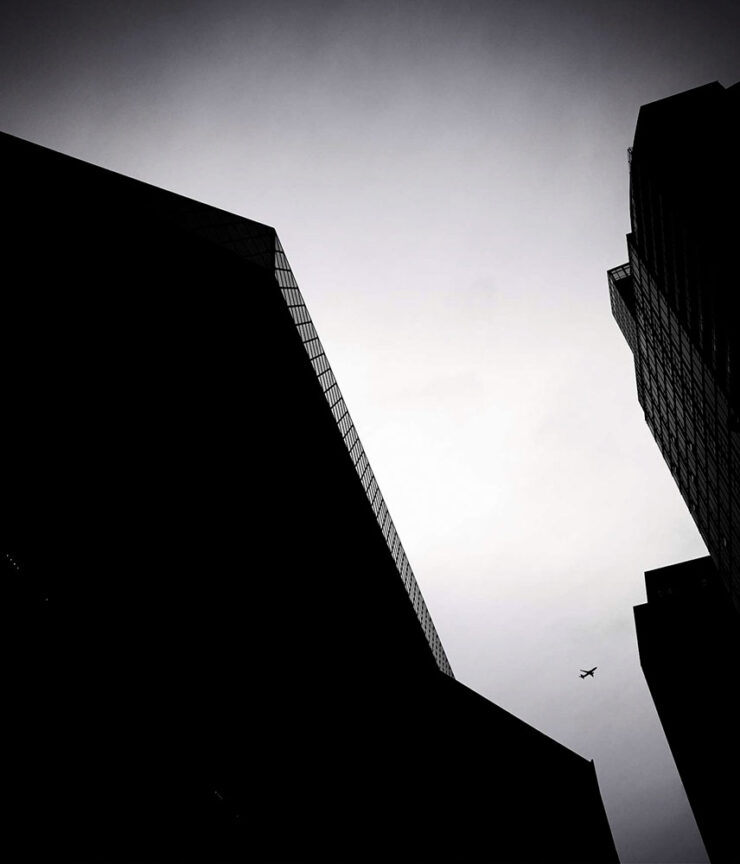
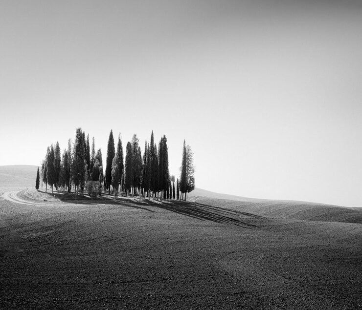
Both reminded me of Om’s love of Leica and preference for black-and-white:
“Sleepy in Seattle.” Photograph by Om Malik.“Does This Qualify as Flora?” Photograph by Om Malik.
Special bonus #4: The day after Om’s Pinocchio essay, above, Daring Fireball posted on Jason Zweig’ on’s three ways to get paid. I won’t spoil it — just go read.
Photography
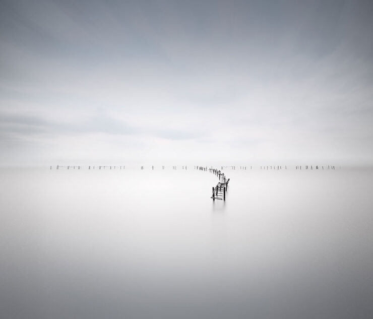
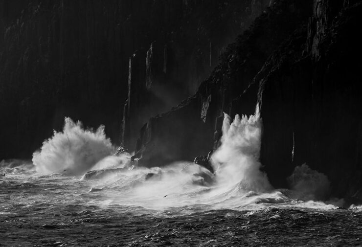
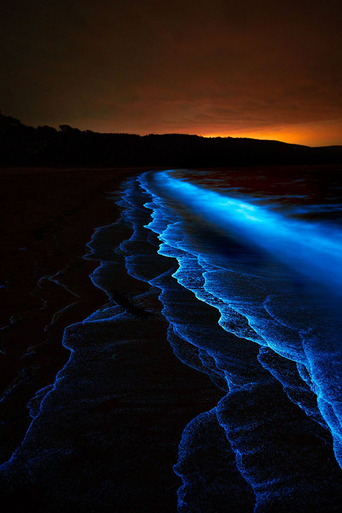
2026 Beaker Street Science Photography finalists
“This is the 10th anniversary of the Australian Beaker Street Festival. Each year, the competition celebrates fantastic photos of rare and unusual scientific phenomena, endangered species, conservation missions, and much more,” PetaPixel writes.
Some of these are awesome:
“Southern Ocean Energy.” Photograph by Nick Green.“Just Another Bioluminescent Tantrum.” Photograph by Deni Cupit.
26 finalists in all. See the rest (and, if you’d like, vote at the link).
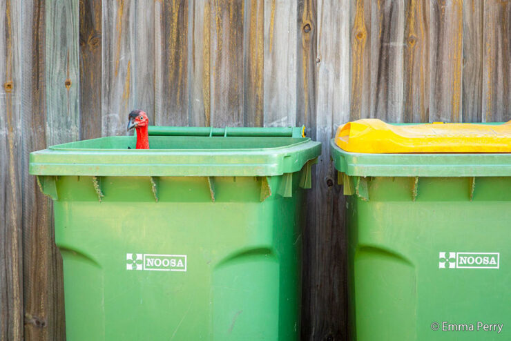
2026 Australian Geographic Nature Photographer of the Year shortlist
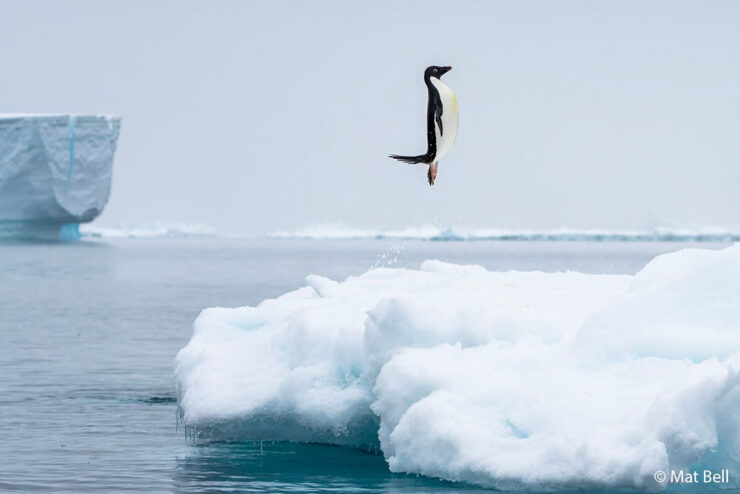
This contest takes entries from the majestic Australasian Realm, including the ANZANG bioregion consisting of Australia, New Zealand, Antarctica, and New Guinea, and to quote PetaPixel, “there are some real bangers on there.”
“Bin Turkey.” Photograph by Emma Perry.“Penguin Poe.” Photograph by Matt Bell.
Nature in all its marvelously diverse glory. See the rest.
Burton’s America
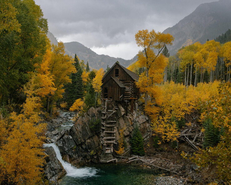
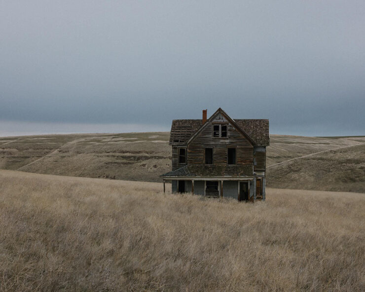
I’m surprised I haven’t linked to Brendon Burton’s work before, ’cause it’s right up my alley:
Traces #10. Photograph by Brendon Burton.Traces #6. Photograph by Brendon Burton.
His second book, Epitaph, “is a series that attempts to unravel the knot of mystery that exists within the dark corners of North America, shedding light on unseen histories and buried past lives.”
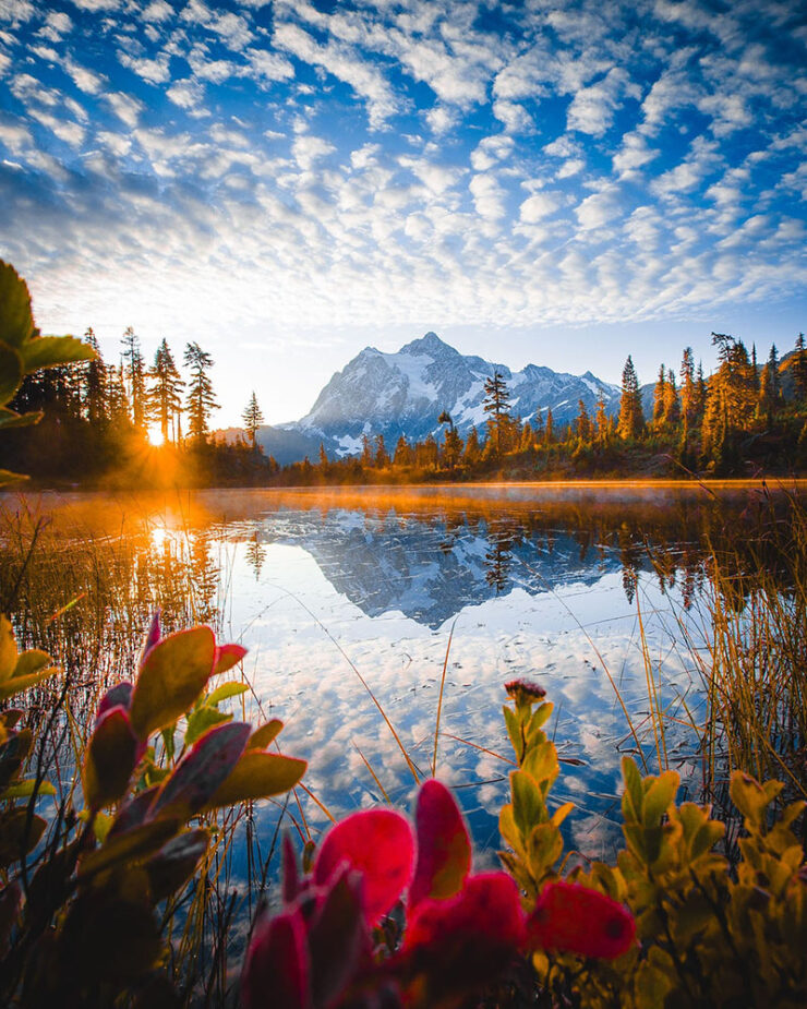
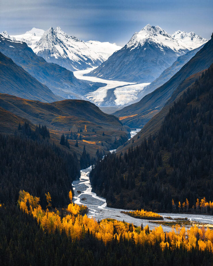
• Travel and nature photographer Jake Guzman has spent the past two years creating Otherworldly America, his new 256-page photography book:
“Picture Lake Washington.” Photograph by Jake Guzman.“Richardson Highway, Alaska.” Photograph by Jake Guzman.
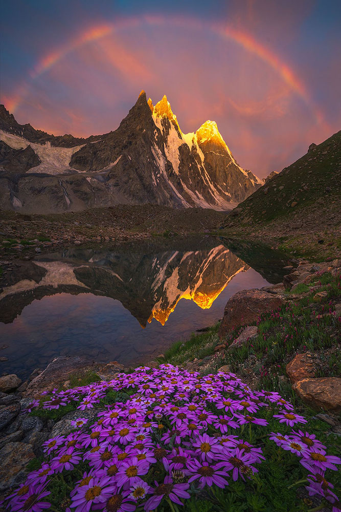
• Arpan Das has fallen in love with the Kishtwar Himalaya in the Jammu and Kashmir region, part of the Indian Himalayas:
“Barnaj Rainbow.” Photograph by Arpan Das.
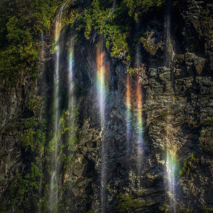
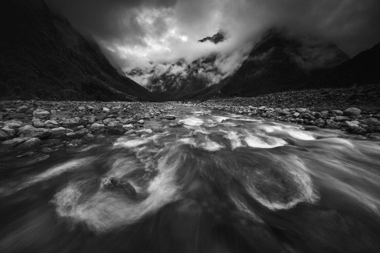
• Michael Shainblum photographs the volatile, weather-driven landscapes of New Zealand with “a body of work shaped less by fixed composition and more by responsiveness to constant change”:
“New Zealand #19.” Photograph by Michael Shainblum.“New Zealand #40.” Photograph by Michael Shainblum.
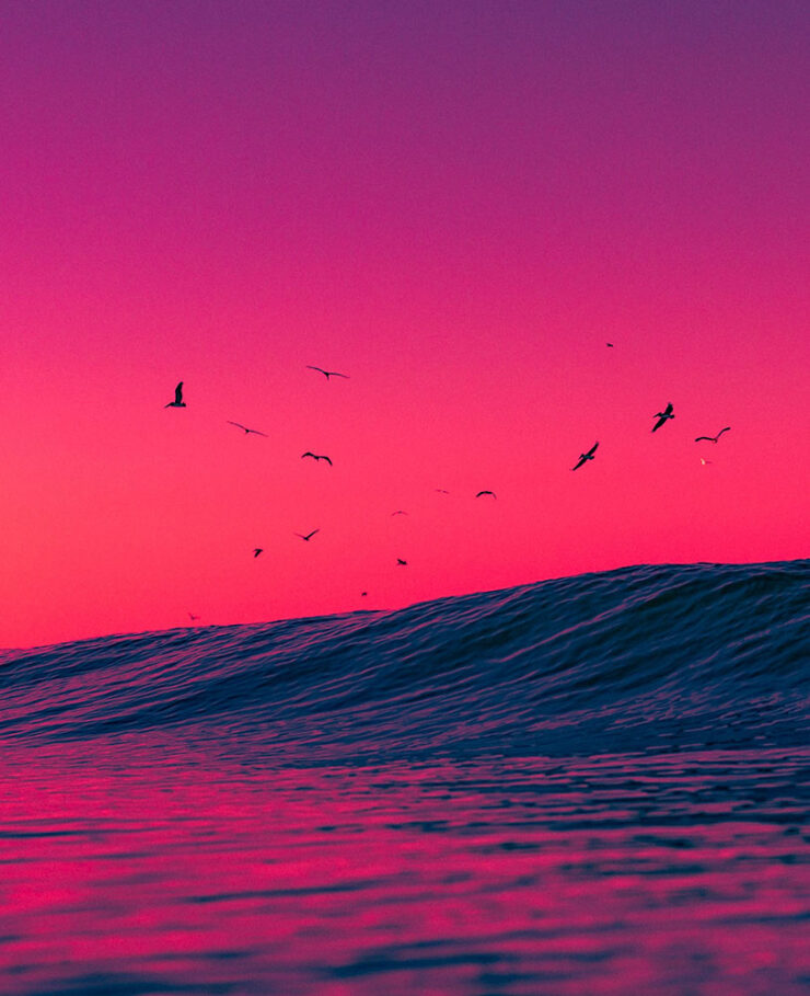
“Venice Beach: Dreamy #3.” Photograph by Craig Hubbard.
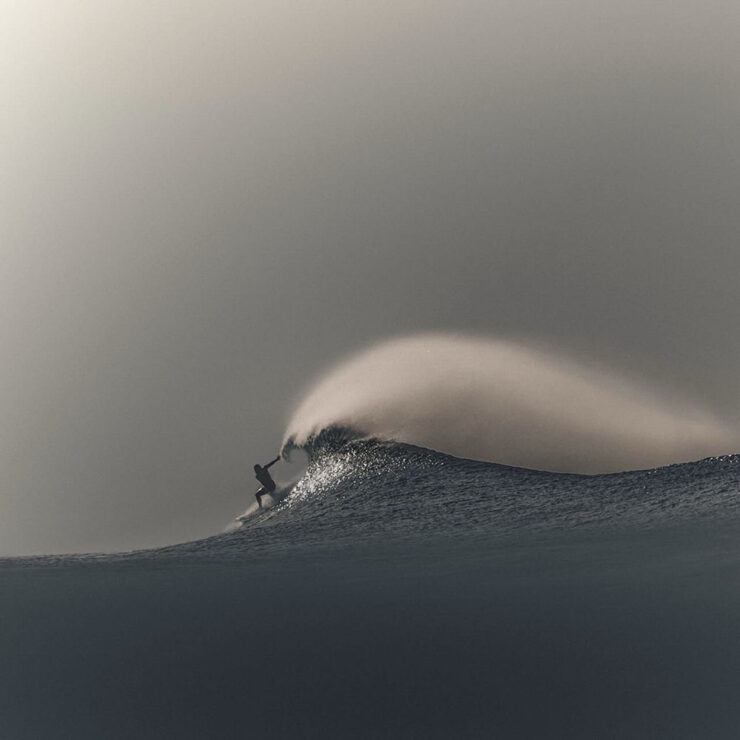
Hubbard’s photos are ethereal and cinematic, with surfers and wave crests illuminated by the early morning sun or backdropped by the marine layer. Sometimes the intense spray, curl, shoulder, or lip become the sole subjects of the portraits. “The water is the muse and artist,” Hubbard recently told an interviewer. “I’m just a biased translator and documentarian. Lastly, my ego relaxes in the ocean; the need to peacock recedes. This is where my best work comes from — or favorite, I should say.”
— Kate Mothes, This is Colossal
“Venice Beach: Dreamy #9.” Photograph by Craig Hubbard.
That’s it for this month. As always, thanks for visiting.
For folks in the US, have a safe and enjoyable holiday weekend as America turns 250. Let’s hope that we can make it a better place.
Also: Please don’t forget to let me know of any problems or concerns with the new site. I’ve got a list of items — going to work on them now — but always welcome feedback. Thanks.
1
Forgive the repetition, but just in case: I don’t participate in social media. While I’d heard of Glass, I didn’t know of Om’s posts there — and wouldn’t have followed in any case. Perusing those photos, and posting that link, are a one-off celebrating Om’s talent. ↩︎
Update 2, 30 June: I forgot to mention that I’ve reformatted all of the posts for 2026 to match the new style. Posts from 2025 and earlier will have mismatched pullquotes, among other minor items — but the content is unchanged.
Update, 30 June: Fingers crossed, things seem to be working. Please don’t hesitate to let me know if you run across anything. Thanks.
Update, 29 June:I broke something yesterday. The images on some posts from 2026 have been disconnected, and I’m not sure why. Posts from 2025 and earlier, and a couple from 2026, are displaying correctly. Working on it. Fixed.
Update, 28 June:The search results return mostly non-clickable results. Hmph. Will fix as soon as I have a moment. Fixed.
Original Post: It’s one of those things: something needs work, but since it’s yours — and not a clients’ — it doesn’t get done.
After a while, it starts to annoy. Still … other priorities take precedent.
But then something happens. In my case, it was the installation of WordPress 7, which caused several problems on the site. Old is one thing, but broken is another. It was time.
The itch finally got the scratch.
The New Foreword, June 2026
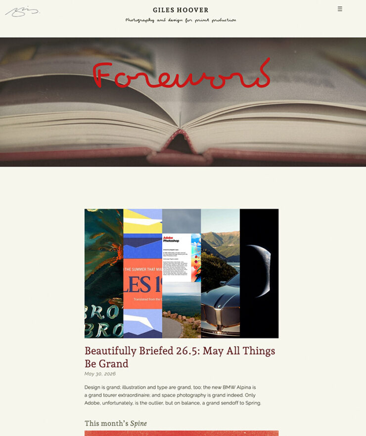
The site’s undergone a major reorganization, and as a result, it’s more focused. While there are static pages, visitors are directed to where the updates are posted: my blog, Foreword.
The site features completely new style sheets, which means a more flexible layout, dynamic fonts, and more. As a result, it has better compatibility with tablets and mobile devices — even if it’s still best viewed on a big screen.
The kicker: it’s based on modern code. That means it’s both faster and more private, stripping out third-party services (and their trackers), including search. The site continues to not have cookies, and does not save visitor information.1With one exception: if you use the contact form, a duplicate message is temporarily saved in case of an email hiccup.
Vetrans Super(fortress), Georgia Vetrans State Park, Cordele, Georgia, 2018
The photography sections got a bump, too. They’re now broken down into categories:
Regional Imagery, photography from selected cityscapes, rural scenes, landscapes, and architectural photographs from ten US states (plus several additional locations in the UK)
College Street, photography from colleges and universities, and
Maine Revisited, covering a ten-year span — 2008–2018 — of photography from the great State of Maine, “the way life should be.” While the book has sold out, there are hundreds of additional items to enjoy in the galleries.
And debuting this fall: Frequency Shift, which is macro, detail, and abstract photography from the world of hi-end audio.
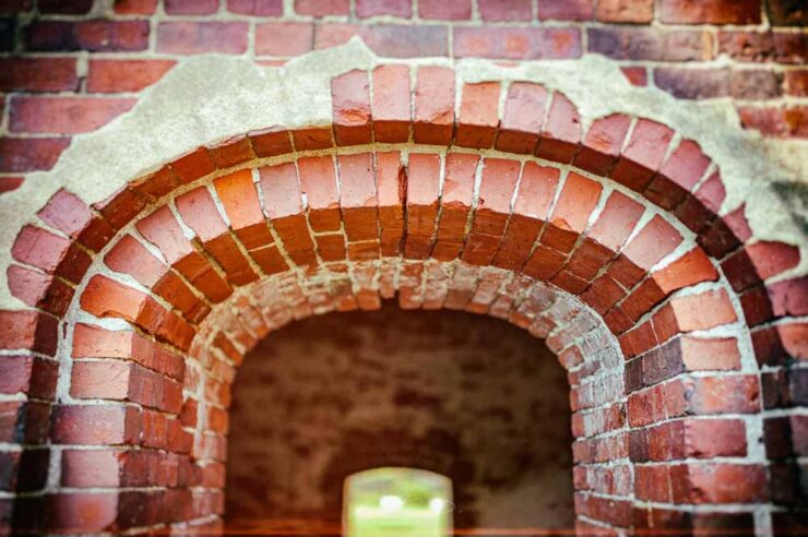
Brick Arches, Fort McClary, Kittery Point, Maine, 2014
As often happens with a ground-up rewrite, it’s still a work in progress — there are wrinkles that’ll hopefully be smoothed out in the next few weeks, most likely including things I don’t yet know about.
Kindly let me know of anything that doesn’t work for you.
However, it’s the end of the month, and I have the dozens of saved pages, notes, and photos set aside for this month’s Beautifully Briefed that I must attend to. (That’ll be posted Tuesday.)
As always, thank you for visiting!
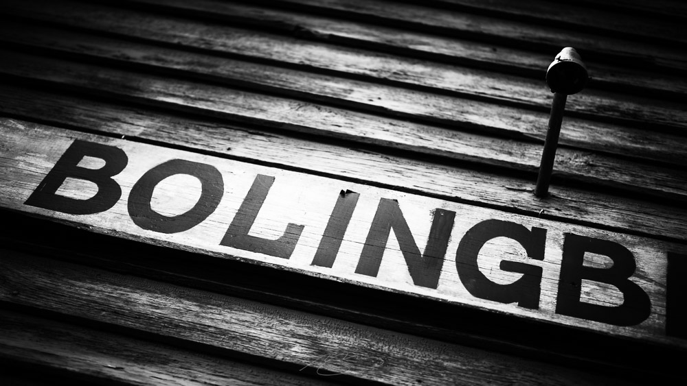
Top image: (Signs of) Bolingbroke, Georgia, 2018
1
With one exception: if you use the contact form, a duplicate message is temporarily saved in case of an email hiccup. ↩︎
Note: Title updated with the reorganized sorting system.
The first photostroll downtown this year involved some new gear, an extremely sharp and astonishingly compact wide-angle zoom from Sigma. I’ve wanted something wider that the 35mm-equivalent that is my daily driver for a minute now, and this absolutely fits the bill.
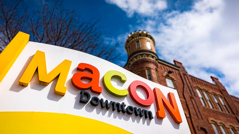
It also gave me an excuse to see a couple of new and updated spots in Macon:
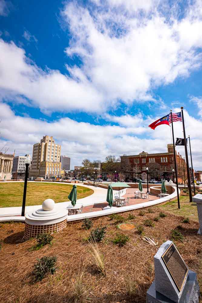
Rosa Parks Square (Memorials and Seating), Poplar and First Sts.
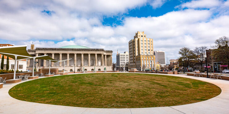
First up is the refreshed completely redone Rosa Parks Square, now with extensive hardscaping, seating and more — a much needed change to one of the most important areas in the city, right next to the City Auditorium and downtown’s Hotel 45:
Rosa Parks Square (Circle), Poplar and First Sts.
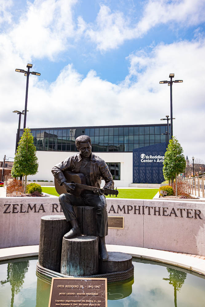
Also completely new is the Otis Redding Center for the Arts, a refreshingly contemporary building with its own new landscaping and gardens:
Zelma Redding Amphitheater (with Statue), Cherry St. and First St. Ln.
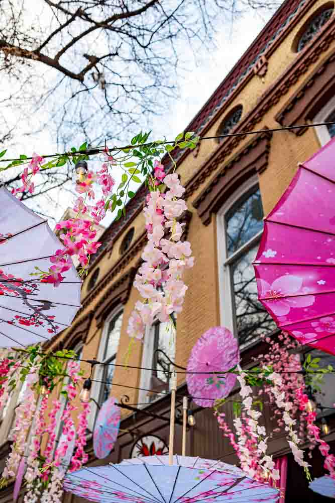
It’s a pleasure to be able to get a huge amount of detail, landscape, and space into a single photograph; the wide-angle itch is well and truly sated. Better still, when asked to focus on details, it shines very brightly indeed:
Cherry Blossom Festival Decor (#1), Parish Seafood, 580 Cherry St.
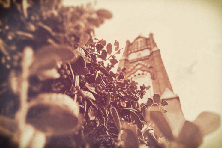
It does retro well, too:
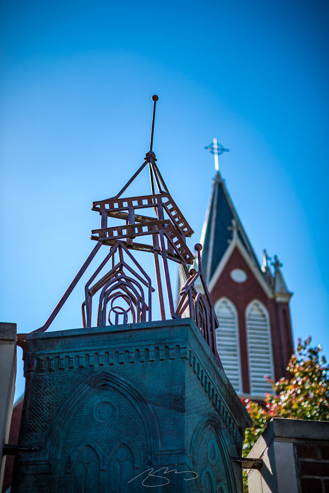
St. Joseph’s Catholic Church (Spire), 830 Poplar St.
So, ask me how I feel about this upgrade. Well, how ’bout this:
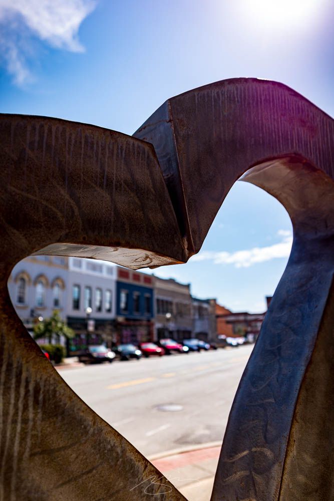
I Heart Downtown (Sculpture), Second St.
Sigma got this lens just right. Including the seven posted here, a total of 30 new photographs have been added to the Downtown Macon (2022-2026) gallery.
Note: Once you’re in the photo gallery, the new items are near the middle of the stack — look for the retro photo from this post and it’s the photos that follow. Remember that you can click on any photo to enlarge to a single photo with locations/titles and next/back controls (or run a slideshow). If you’re in a downtown Macon mood, don’t forget the 2008–2018 and 2020–2021 galleries as well. Thank you!
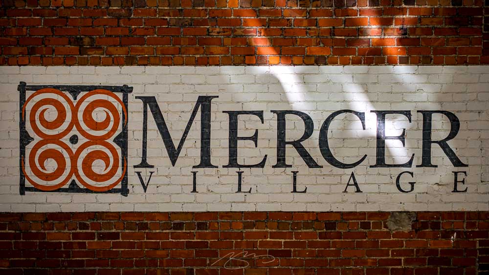
According to Google, at the corner of Coleman Avenue and Adams Street, in Macon, is home to Newton Hall — and more specifically, Mercer University Press.1Google is wrong: Mercer University Press isn’t actually on campus — they’re in a separate building nearer downtown. See this University Press Week blog tour post for more.
Mercer University (Newton Entrance), 1400 Coleman Ave.
Mercer one of more than 160 members of the Association of University Presses. I mention this because, a while back, I said regarding taking some photographs around the campus of Mercer University, “stay tuned.” In honor of AUP’s University Press Week, November 10–14, I’ve done just that.
Taken during a number of visits over fifteen years, a total of 100 photographs now populate the Mercer University gallery. Enjoy.
1
Google is wrong: Mercer University Press isn’t actually on campus — they’re in a separate building nearer downtown. See this University Press Week blog tour post for more. ↩︎
Most of the stuff I do daily is, frankly, mundane. That’s not a complaint: I have a roof over my head and food on the table. But exciting design isn’t a constant on my desktop.1It might be one of the reasons I love taking photographs so much — how creative those are is up to me. Now to find the time to take more….
I try to make up for it by looking for — and blogging about — others‘ great book design, graphic design, and photography. But it’s satisfying to get a great-looking result I can share publicly once in a while.
One such item:
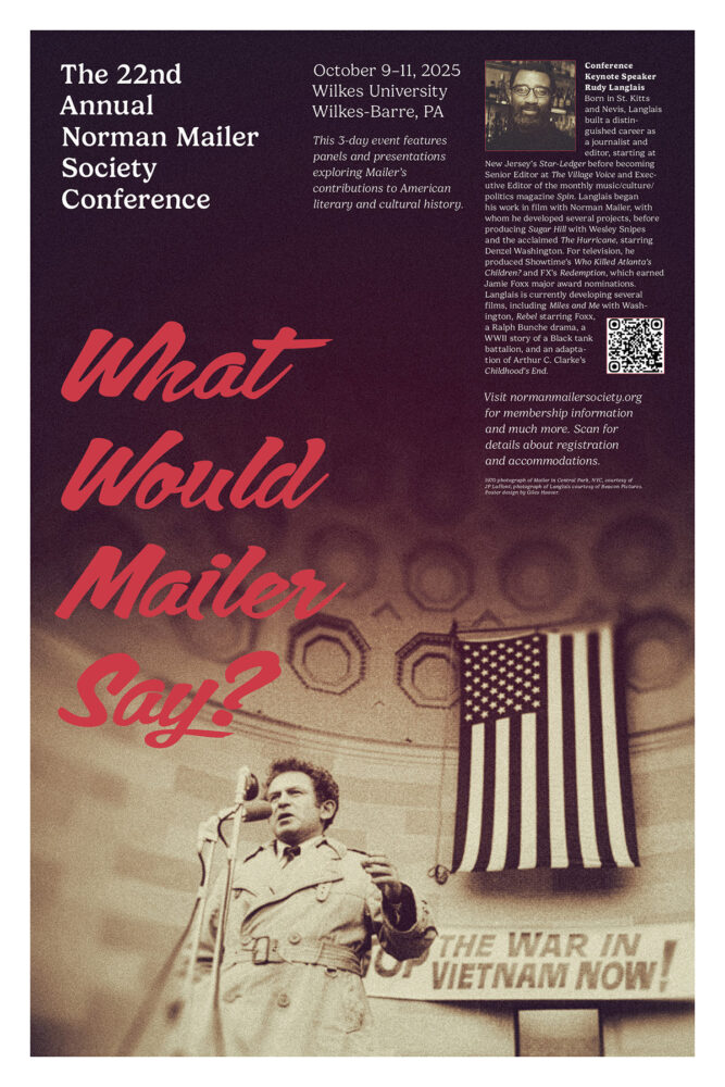
Click for larger.
The poster for the Norman Mailer Society’s 2025 Conference. Good stuff. Thanks to them for the continued work together on interesting projects.
1
It might be one of the reasons I love taking photographs so much — how creative those are is up to me. Now to find the time to take more…. ↩︎
It’s been a while — too long, in fact — but with a completely new storage and editing system in place, it’s time to get back to taking, editing, and posting photographs from Middle Georgia and beyond.
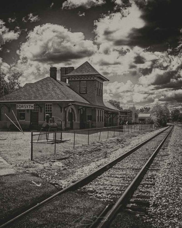
This time, it’s the nearby city of Forsyth, specifically its historic train depot. Interestingly, Forsyth was the first city in Georgia to get passenger train service, in 1838, and the lovely station wears its years well.
Tracks and Train Depot, E. Johnston St. and Railroad Ave., Forsyth
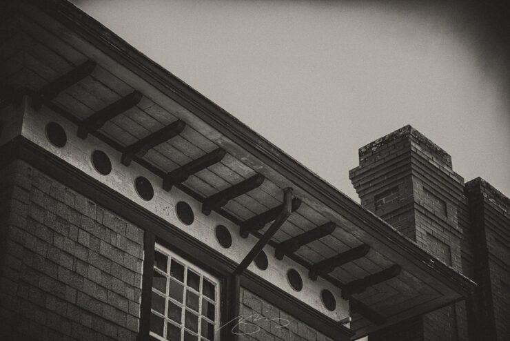
Both the depot and its features are examined, in general and in detail:
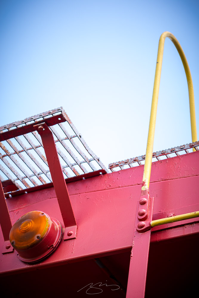
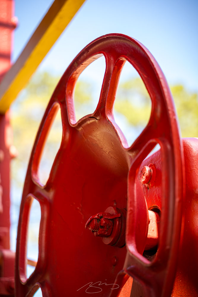
Forsyth Train Depot (Roof and Chimneys), 104-114 E. Adams St., ForsythForsyth Train Depot (Train Car Detail #3), 104-114 E. Adams St., ForsythForsyth Train Depot (Train Car Detail #5), 104-114 E. Adams St., ForsythAntique Fire Truck (Detail #7), 104-114 E. Adams St., Forsyth
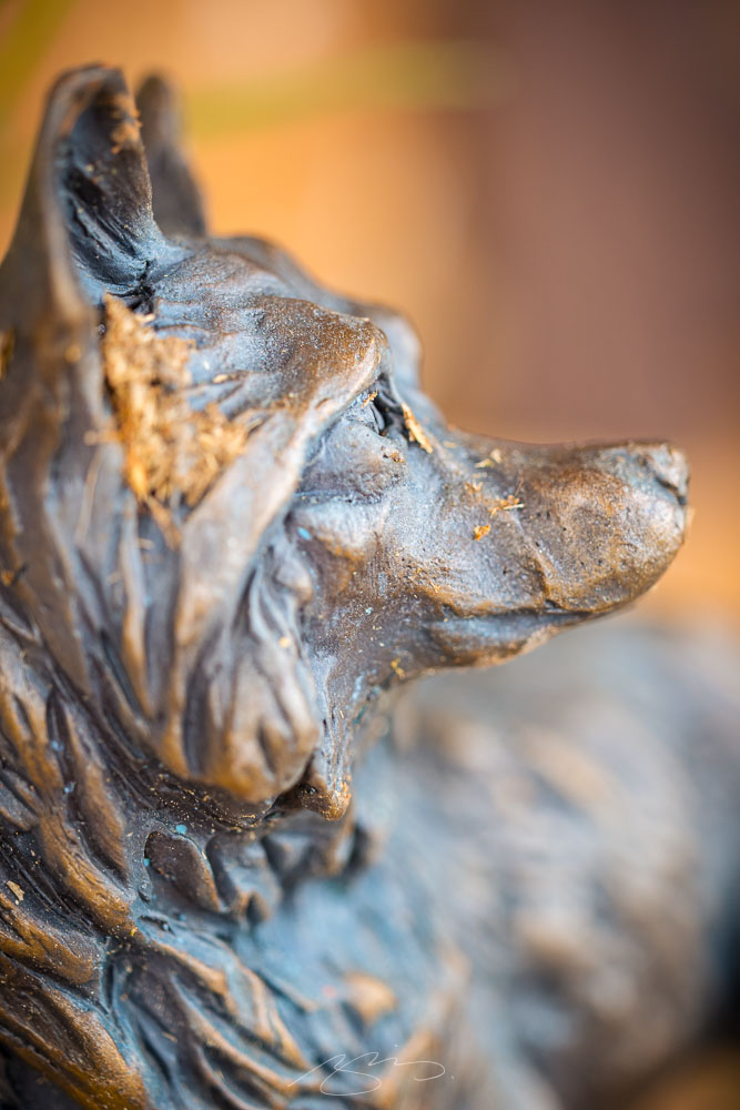
And, ever watchful:
Forsyth Train Depot (Bronze Dog Sculpture), 104-114 E. Adams St., Forsyth