
After reviewing hundreds of entries every year, the jury for AAM’s annual Museum Publications Design Competition awards only one publication with the Frances Smyth-Ravenel Prize for Excellence in Publication Design, recognizing it as the best submission overall. This year, the winner is David Levinthal: War, Myth, Desire, a publication of the George Eastman Museum in Rochester, New York, designed by Design Monsters studio. We recently talked to the book’s designer, George Corsillo,to learn more about the concept behind his prizeworthy design: a four-volume retrospective of the artist David Levinthal’s photographs which took two years to complete.
Category: Design
Design in general; that is, things, objects, and/or ideas that are designed but that aren’t book design, photography, etc. Generally considered distinct from art.
-

American Alliance of Museums: Q&A with Book Designer
-
Inside Hook on Peter Mendelsund and book design
In fact, for all his acclaim in the field of book design, Mendelsund himself isn’t particularly fond of book covers, generally seeing them as an impediment that inevitably colors a reader’s perception of a book. “As much as I love book covers — I love making them, it’s fun — I don’t love the fact that there’s somebody between me and the text.”
These days, actually, the renowned book designer who never wanted to be a book designer tends to simply rip the covers off his books altogether. “If it’s a paperback, I’ll rip the cover off,” he says. “The books that are most important to me in my life don’t have covers on them.”
I didn’t know Peter Mendelsund’s name off the top of my head [Memory not what it used to be? —Ed.], but we’re sure familiar with his work, such as The Girl with the Dragon Tattoo and the Atlantic’s recent redesign. And what an interesting relationship with book design he has. Read more
-
The Guardian: Graphic artist Art Spiegelman on Maus, politics and ‘drawing badly’
Forty years on from ‘the first masterpiece in comic-book history’, the Pulitzer-winning cartoonist talks fame, switching styles and why he doesn’t want to draw Trump
Maus on over to the Guardian. (Sorry.)
-
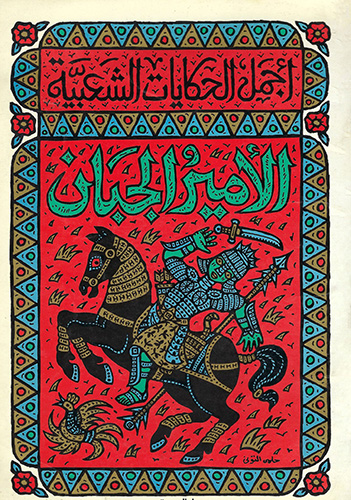
It’s Nice That: We dive into a new archive of over 1,000 book covers from the Arab world
Egyptian designer Moe Elhossieny talks us through why he launched his Design Repository and what he’s already learned about Arabic book design from the collection.
-
Jazz Musician Lettering
The history of the album cover and show poster begins with jazz.
-

Typeset in the Future on Star Trek: The Motion Picture
Lots and lots covered here, including things this huge fan of the movie never knew — including specifics on the fonts, type, and more. When you have a few minutes, grab a beverage and enjoy!
-

Martin Glaser dies (3 updates)
Martin Glaser, of I [Heart] NY fame — among many others — died yesterday at 91. Dylan covers forevermore! Here’s the Guardian with the news.
Update: Dezeen has a few items in their story, too.
Update, July 1: Dezeen has a great list of some of Graser’s more notable works (vodka excepted…;). See here.
Update, July 10: The Guardian‘s obit.
-
Columbia Journalism Review on capitalizing “Black”
“At the Columbia Journalism Review, we capitalize Black, and not white, when referring to groups in racial, ethnic, or cultural terms. For many people, Blackreflects a shared sense of identity and community. White carries a different set of meanings; capitalizing the word in this context risks following the lead of white supremacists.”
Read more of this timely and appropriate article (from a great and authoritative source.)