A long and diverse list this time, with a few thoughtful things and a ton of photography. Set aside a few minutes to get lost in links — and enjoy!
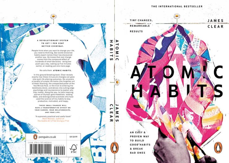
Books and Values
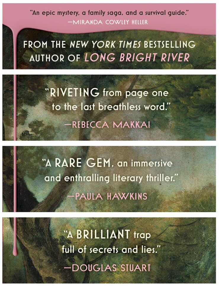
This article from the New Yorker is highlighted a little behind schedule — it’s from August (although, in my defense, I get my NYers second-hand) — but worth the read for the phrase “practitioners of bibliotherapy” alone.
Before we get into the meat of it, though, a primer on the growth of available titles in the United States:
- 1939: 10,640 (est.)
- 1970: 36,000
- 2020: 1,000,000 (est., including ebooks)
The New Yorker article lists this last figure as three million, but various internet sources dispute this; either way, it’s a huge number that no store could ever hope to stock. But … on to the important stuff.
The central question:
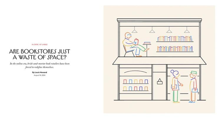
Amazon offers something like thirty million different print titles. The company has deals with purveyors of used and remaindered books, who are linked to on the site. It owns AbeBooks, the leading site for rare and out-of-print books. And there are many other places online where you can buy books, including barnesandnoble.com. So why does the world need bookstores?
— Louis Menand, New Yorker, August 29, 2024 issue
The New Yorker is kind enough to let you read a few articles a month without crashing into a paywall, so go find out the answer, appropriately enough, in their book review of Evan Friss’ The Bookshop: A History of the American Bookstore.
Meanwhile, Nick Heer of the always-excellent Pixel Envy cites another New Yorker article on pricing for non-physical books — “The Surprisingly Big Business of eBooks” — and comes up with a few spending figures of note regarding the New York Public Library and Barack Obama’s title, A Promised Land:
- $29,450, for 310 perpetual audiobook licenses at ninety-five dollars each;
- $22,512, for 639 one- and two-year licenses for the e-book; and,
- $5,300, for 226 copies of the hardcover edition.
If you want to know why publishers so aggressively fought the Internet Archive on its model of lending out scanned copies of physical books, this is the reason. Publishers have created a model which fundamentally upsets a library’s ability to function. There is no scarcity in bytes, so publishers have created a way to charge more for something limitless, weightless, with nearly no storage costs.
— Nick Heer, Pixel Envy
You know what you can’t do with an ebook license? Put it on a shelf for re-reading in ten years’ time. Or resell it. In other words: control what happens to it. “[I]t is hard not to see publishers as the real villains in this mess. They are consolidating power and charging even legitimate libraries unreasonable amounts of money for electronic copies of books which the publishers and their intermediaries ultimately still control,” Heer writes.
Exactly.
Special Bonus #1: Nick Heer gets something else right, too, by noting the sharply divergent goals of social media platforms and his own wishes — indeed, those of what we would idealize as “normal people.” “Guided by Vices” is excellent. Check it out.
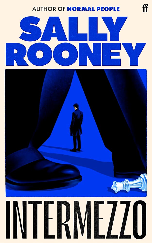
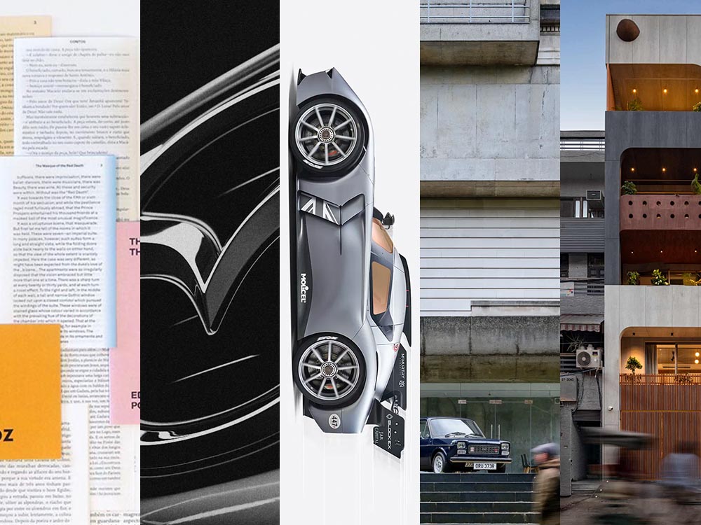
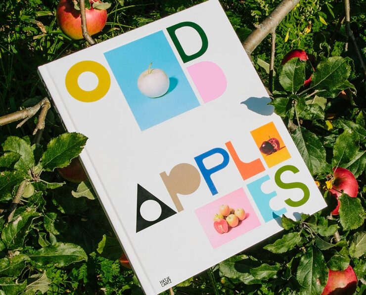
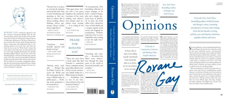
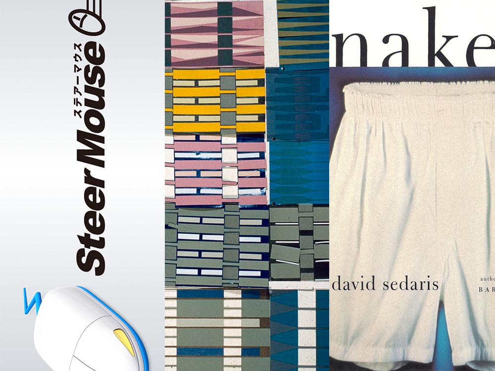
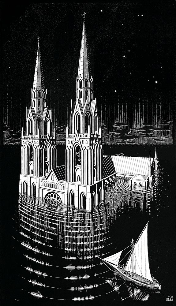
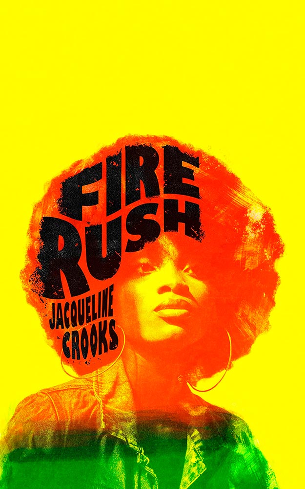
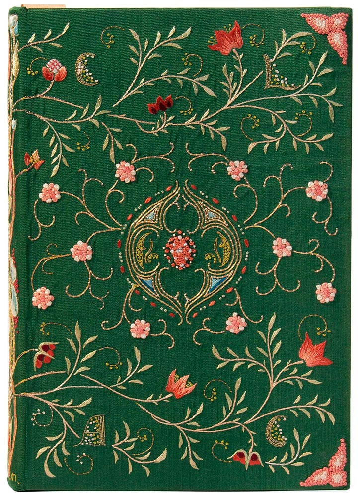
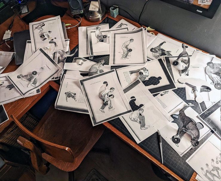
Book Design: Kafka
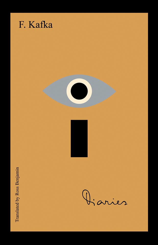
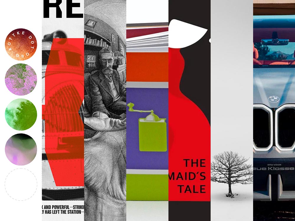
Few subjects could more appropriately follow the above, so it is with a certain sense of joy that I highlight these fantastic new covers Frank Kafka’s works, brought to us by the incredibly talented Peter Mendelsund1“Get inside the mind of Peter Mendelsund, the pianist who went from Tchaikovsky to Tolstoy and became one of the best book cover designers working today, with editor Zac Petit’s interview in PRINT’s 75th Anniversary Issue,” with the link at the source article. via an interview with Steven Heller at PRINT:
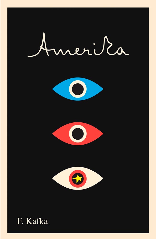
The whole article, and especially, the whole series of title designs, are exactly why I treasure book design. Read on.
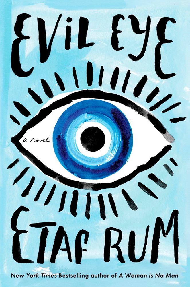
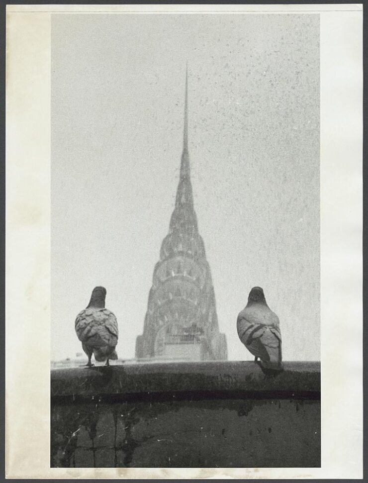
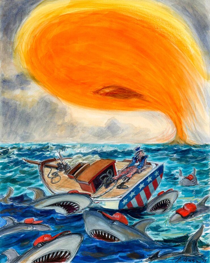
Special Bonus #2: From Rolling Stone, an image reposted without comment (and absolutely not related to Kafka):
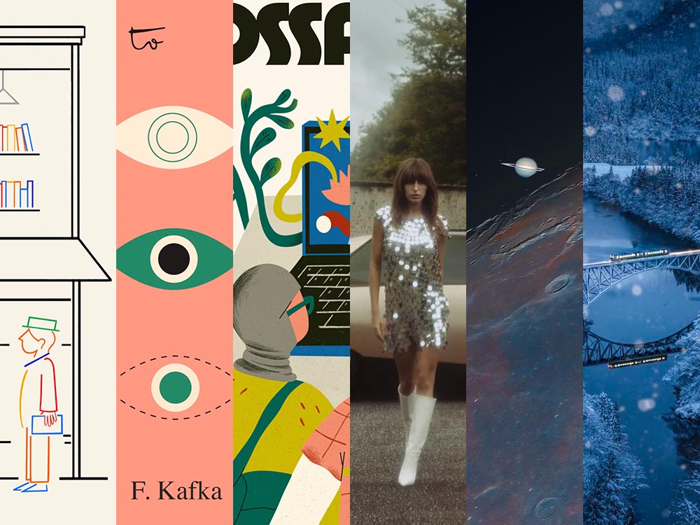
Colossally New
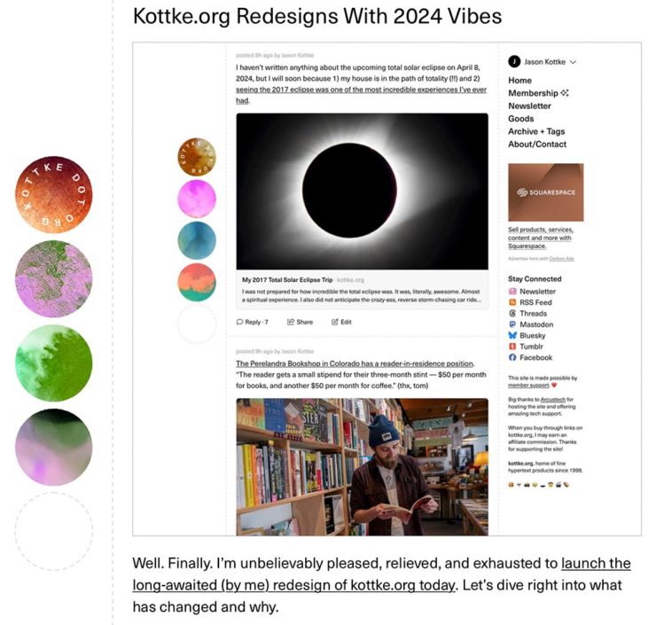
This is Colossal, one of the very few sites elevated to “check daily” status and a frequent contributor to posts here on Foreword, has a new look:
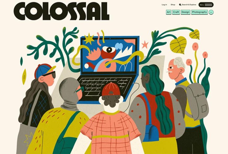
The last site, more than seven years old and designed by the great Armin Vit — he of Brand New fame — needed a refresh, mostly for technical reasons.
Check it out. (And, separately, read the details.)
Update, 4 Oct: More details from Firebelly. Great to see the progression of ideas.
Update, 18 Oct: Part 3, “Crafting Colossal’s Whimsical Web.”
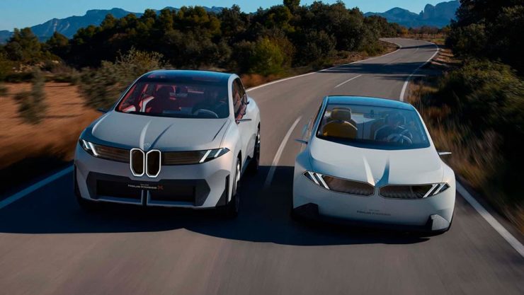
SM[all] Majesté

I had to lead with an image there — even as concept cars go, wow. “DS’ tribute to the bewitching Citroën SM is the cure for concept car burnout,” The Autopian says, and I completely agree.
The lights bleeding into the skirted rear wheels is, perhaps, perfection:


Okay, it’s not even a Citroen, and the 1970’s are hot right now, but still, it’s an out-of-the-park home run from the staggering — perhaps even stumbling — juggernaut that is Stallantis. Read about it at Motor1 or Wallpaper*, or see one of these two YouTube videos from DS or YouCar.
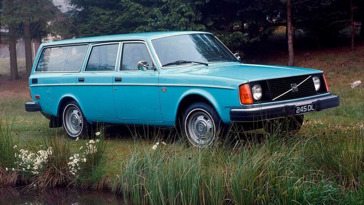
Special Bonus #3: Another design icon, the Volvo 240 series, celebrates its 50th birthday this year. (I learned how to drive on a 145, the immediate predecessor, and was surrounded by 240s in my teens. I remember them fondly.)
Photography Turns 200
According to an article in French photography publication Réponses Photo, quoted on PetaPixel, photography turned 200 on September 16. While that’s surely a conclusion rather than documented fact, it’s worth remembering and considering the journey photography has taken over the past two hundred years.
Indeed, one need only glance at the “phone” we all carry around to realize how democratized photography has become; those of us who carry bigger, more professional gear have become the exception — and our reasons for doing do more varied. (More on that soon.)
Meanwhile, let’s celebrate with some of the latest and greatest photography from September, 2024.
Tahiti Waves
Via Kottke and This is Colossal, a great series of ocean photographs from Tim McKenna:

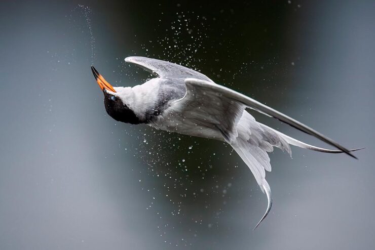
2024 Wildlife Photographer of the Year
Via This is Colossal, something quite, uh, jaw-dropping:

“The 2024 Wildlife Photographer of the Year competition broke its 60-year record with a whopping 59,228 entries from 117 countries and territories,” and is connected with the Natural History Museum in London. (See also the 2024 Bird Photographer of the Year, via the BBC.)
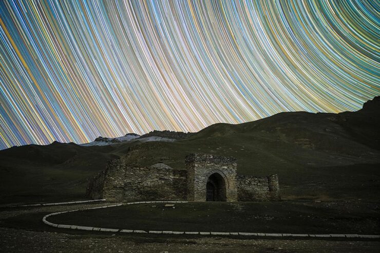
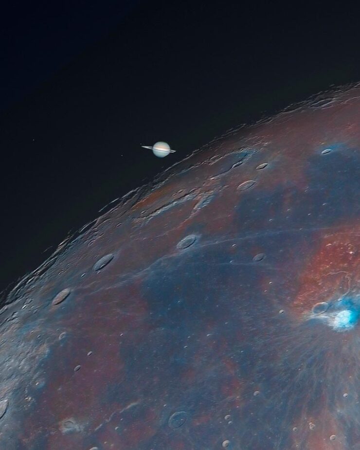
2024 Astronomy Photographer of the Year
“The Royal Observatory Greenwich, in partnership with BBC Sky at Night Magazine, announced the beautiful winners of its 16th annual Astronomy Photographer of the Year competition. The images show some of the most incredible cosmic objects and events in the Universe,” PetaPixel writes. (Also noted via This is Colossal, just ’cause.)

See all the winners at Royal Museums Greenwich.
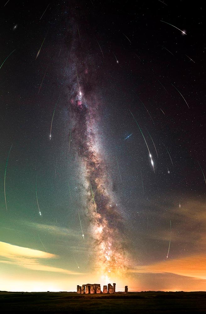
Not included in that — taken too late to be entered, I understand — is this stunning photograph:
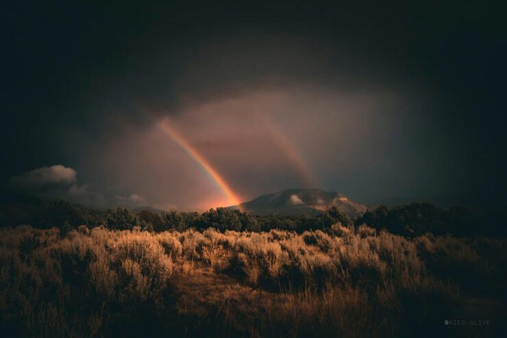
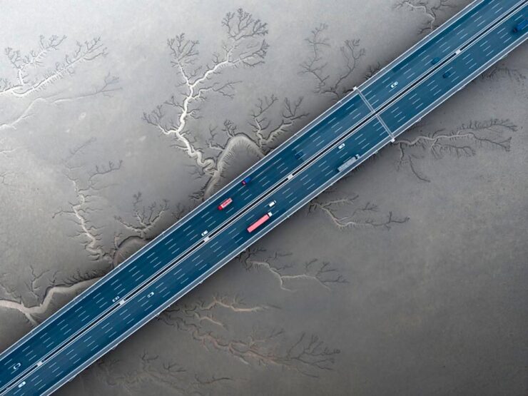
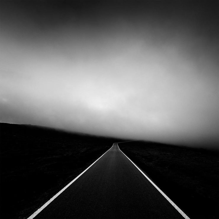
2024 Natural Landscape Photography Awards
Last but not least, some fantastic photography in this newish contest, now in its fourth year, set up to “promote the best landscape and nature photography by digital and film photographers who value realism and authenticity in their work.”
Some of my favorites:


Via PetaPixel.
Special Bonus #4: Phil Edwards brings us a history of one the most iconic photographs ever:
- 1“Get inside the mind of Peter Mendelsund, the pianist who went from Tchaikovsky to Tolstoy and became one of the best book cover designers working today, with editor Zac Petit’s interview in PRINT’s 75th Anniversary Issue,” with the link at the source article.