As summer turns to fall, let’s take a look at Type 1 fonts, a library index, revolutionary posters, posters for “get lectured,” and two different photography contests. Let’s get right into it.
Adobe discontinues a standard: The Type 1 font
Back in the early days of desktop publishing — up to about the turn of the century, give or take — everything typographic used PostScript, a programming language by Adobe. (Other stuff, too, like Adobe’s vector program, Illustrator.) PostScript fonts were the so-called “Type 1” variety, made up of a bitmapped “suitcase” that housed the standard display sizes and an outline file used by the output device to print clean, what-you-see-is-what-you-get beauty.
Companies from Apple to Microsoft didn’t want Adobe to hold a monopoly on output tech, so later fonts evolved into TrueType and then OpenType, the latter of which is the standard today.
So much so that Adobe has now discontinued Type 1, and they, along with Microsoft, have stopped being supported. Which is understandable and yet a shame: some of us still have hundreds of them.
Ars Technica has the best roundup.
Meanwhile, I’m going to investigate a conversion utility. Will report back.
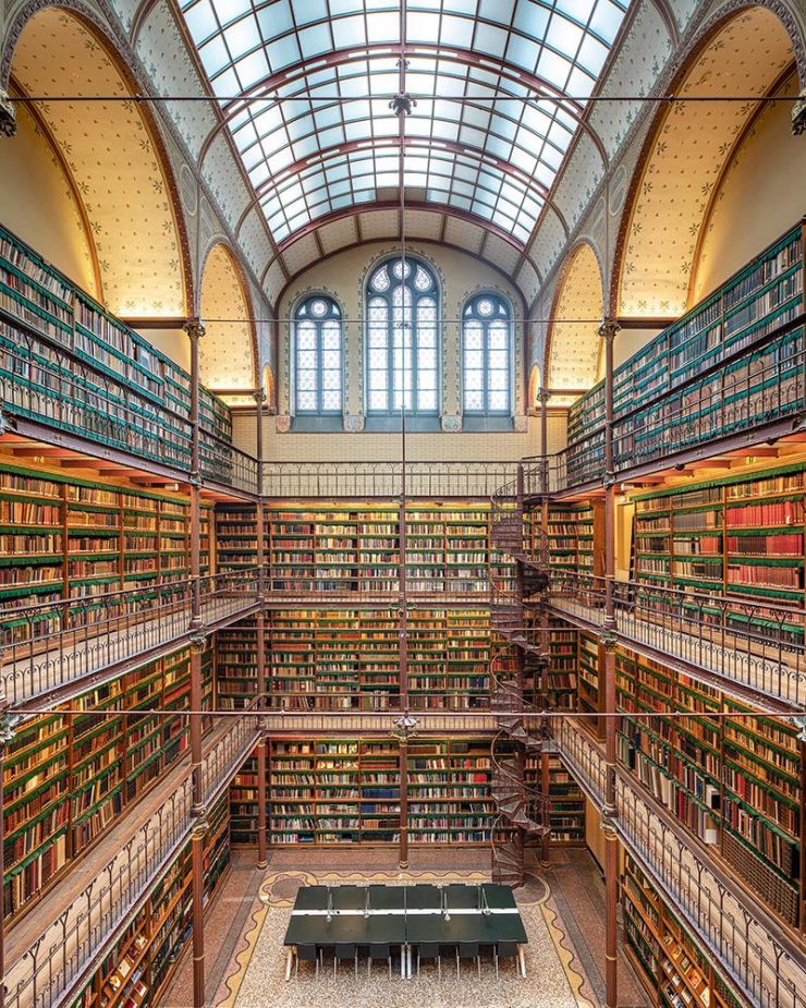
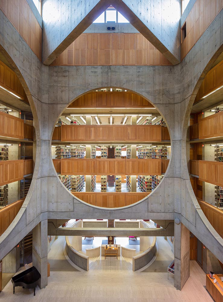
All the Libraries in London
It’s Nice That has a post that reminds us of a library’s central purpose: to leave knowing more than you did when you entered. “The library, in our shared public imagination, is a special place,” the author argues — reminding us of what libraries were established to do, often distinctly different from the modern reality (especially in the United States).
In the library you begin to be convinced that language matters, that words have the power to clarify, to rouse, to make us feel something, to help us understand the political and cultural features of historical and contemporary moments.
Lola Olufemi, It’s Nice That
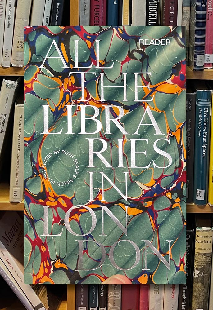
All the Libraries in London does something artistic with a simple listing, elevating it, reminding us how compelling the ideal that libraries represent really is:
This is a political and artistic listing, one that invites the reader to rediscover their own memories of their local library as a site of discovery. The book’s authors invite us to reflect on our personal relationship to libraries as well as the necessity of collectively securing their future existence.
Lola Olufemi, It’s Nice That
We need more of this everywhere, but especially here in the States. Meanwhile, check out this great item at It’s Nice That.
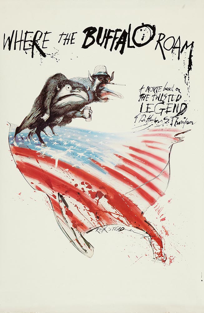
Special Bonus #1: Another British treasure, via the very British Antiques Roadshow (a British original, natch): this incredible poster by Ralph Steadman.
Special Bonus #2: British book designer Steve Leard has launched a new book design podcast, Cover Meeting, featuring interviews between Leard and fellow book designers on the work, the industry, and more. The Bookseller has more.
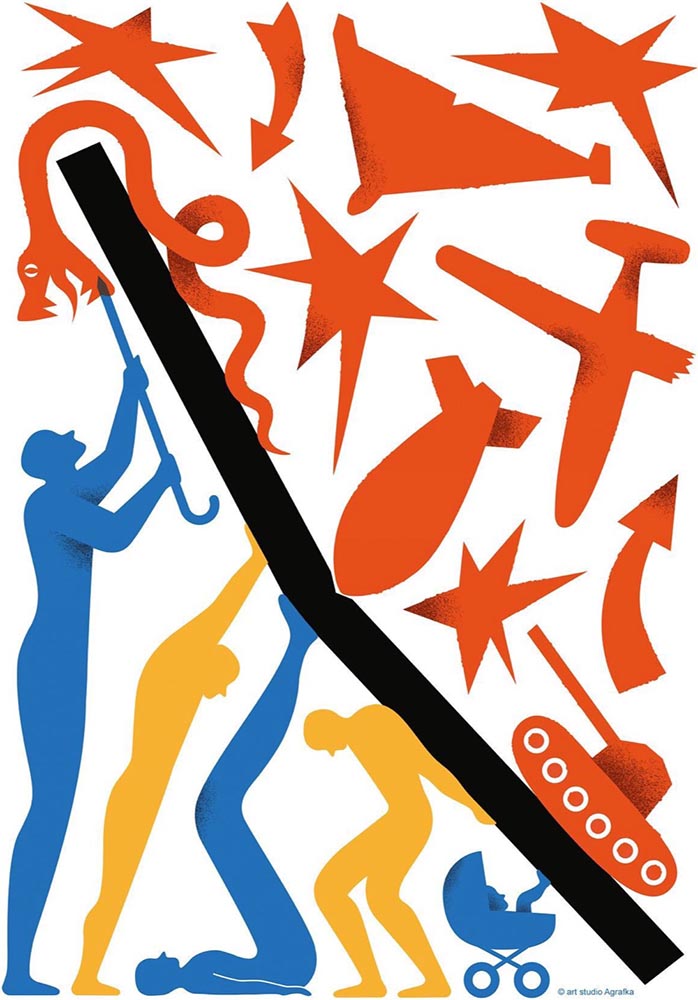
Cuban Movie Posters. No, Really.
While we’re on the subject of great posters — and It’s Nice That — let’s talk about how Cuba’s revolution-era political posters transformed their poster design for films. Appropriately enough, a new film, El Cartel Cubano, highlights these amazing (and, likely, never seen before) items.
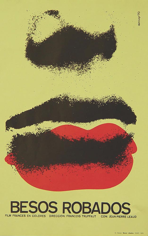
“How come our posters in the US aren’t this beautiful? What did this say about the priorities of the revolution? What did the medium or choices in the scarcity of materials used say about the economic situation in Cuba?” It’s these questions which form the bedrock of El Cartel Cubano, a fascinating and tender tribute to the artists on the island.
Adrienne Hall, co-director, El Cartel Cubano
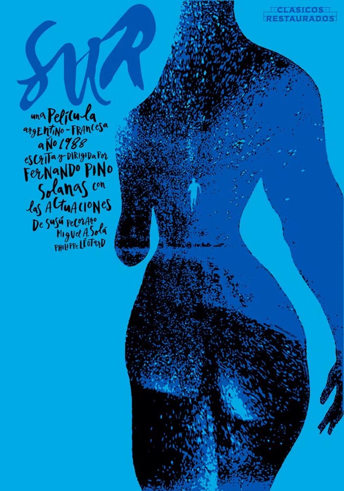
I have to admit: this isn’t a subject I would have leapt at, but It’s Nice That sold it. Awesome.
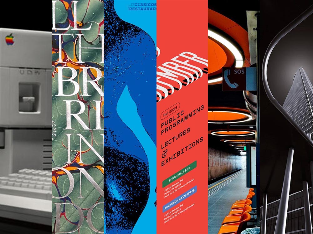
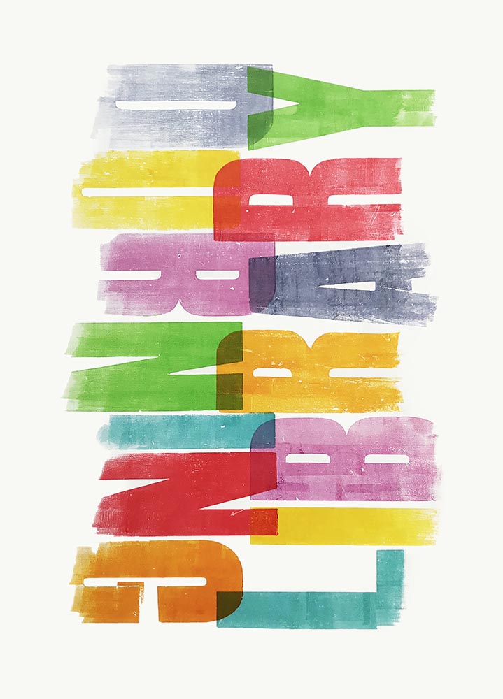
Get Lectured (on Architecture)
Closing out our trifecta of great posters, Archinect‘s Get Lectured series brings us these fantastic items from their Fall 2023 series:
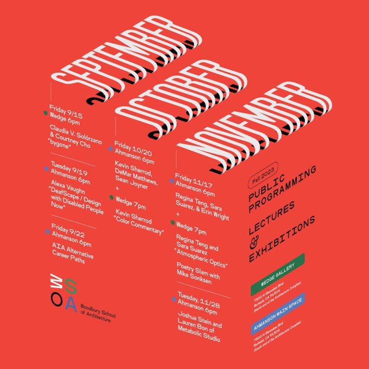
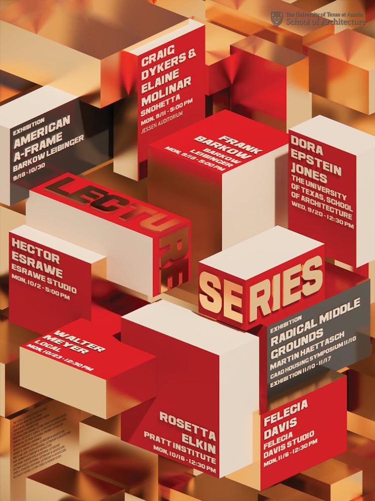
Some real gems: see more.
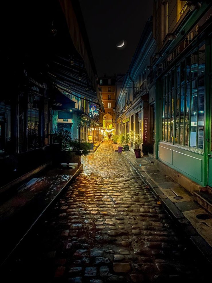
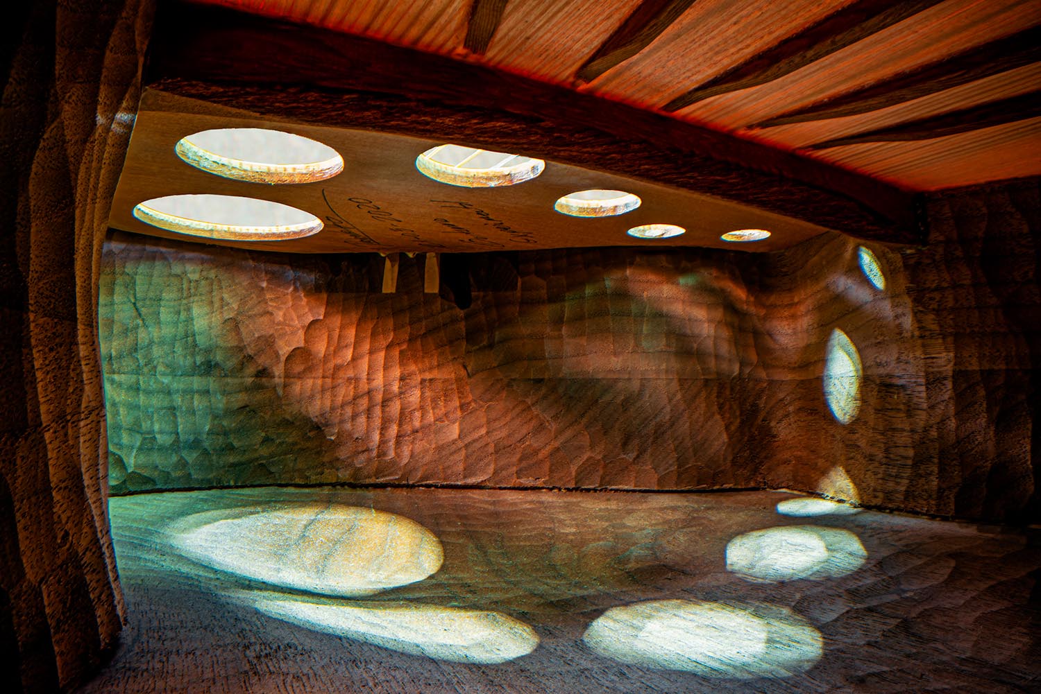
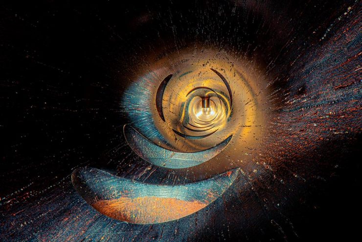
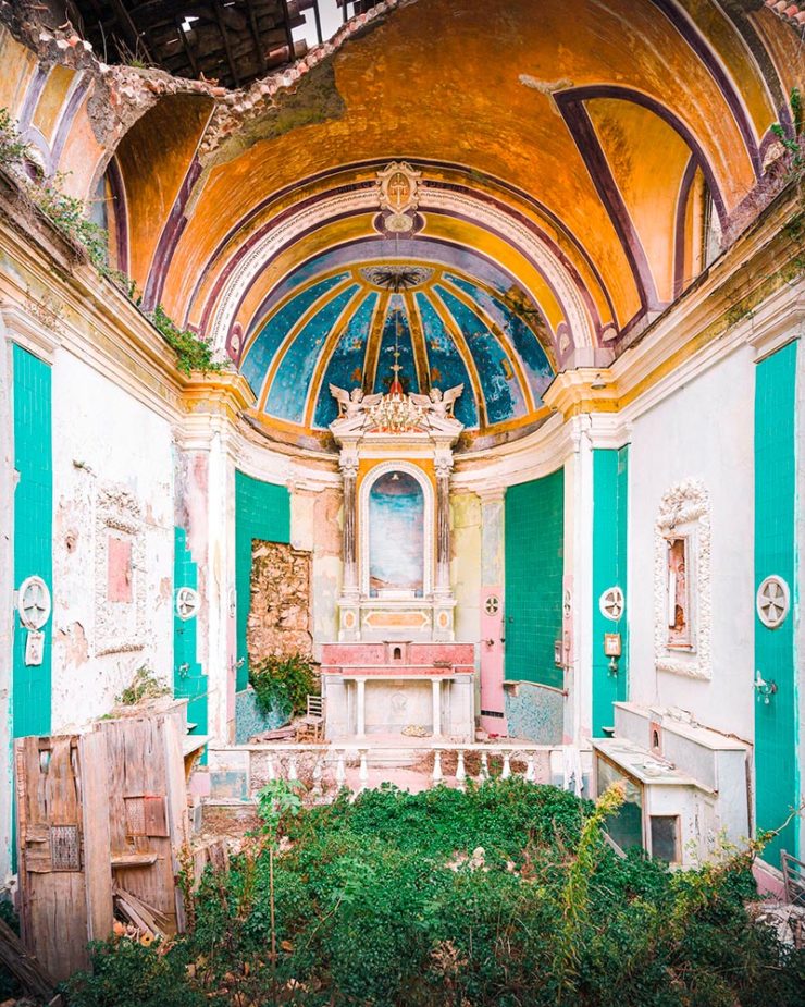
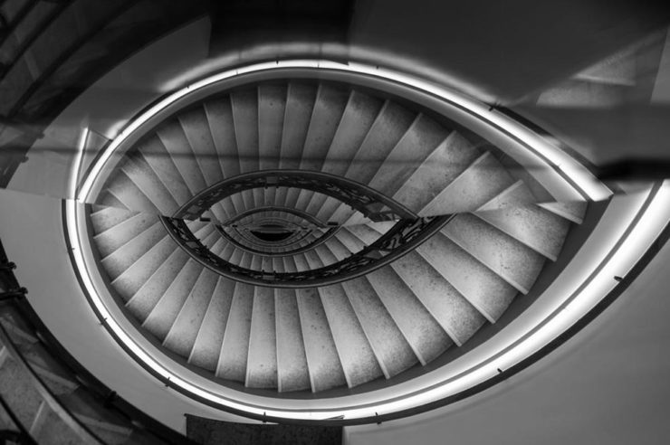
Finalists of the 2023 Urban Photography Awards
Going to soapbox a little here: pay-to-enter photo contests aren’t usually something I want to spread the word about. So ArchDaily‘s basically-a-press-release, “URBAN Photo Awards 2023 has announced its list of Finalist Photographers, marking the penultimate stage of the international contest,” was guaranteed a pass.
But there’s a problem: some of the photographs are really compelling.
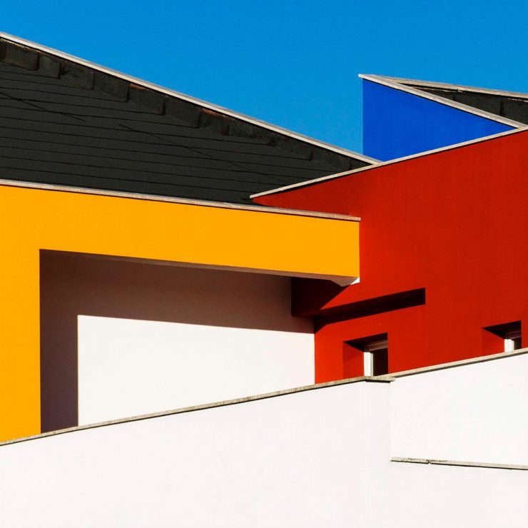
This one’s my fave:
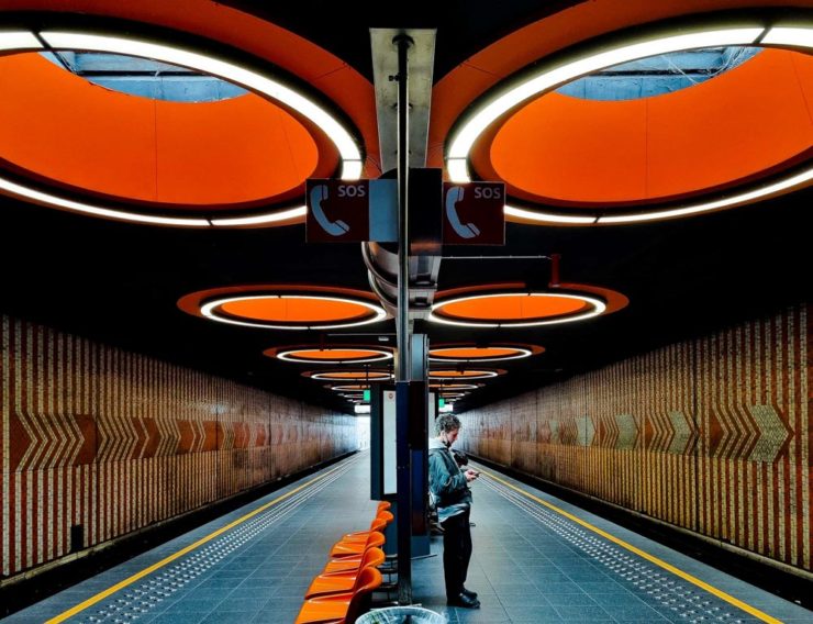
See the contest website, or ArchDaily‘s post.
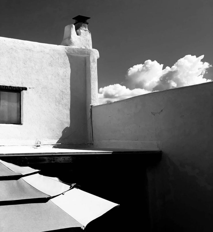
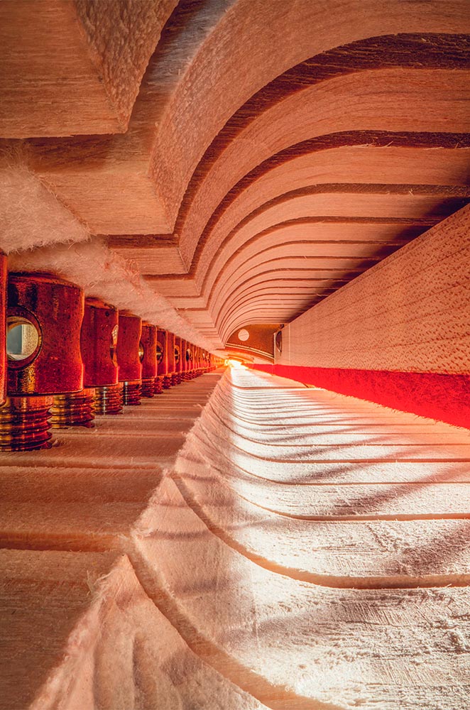
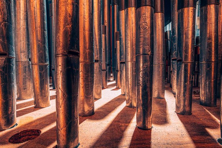
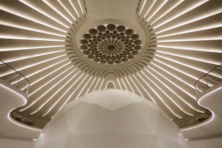
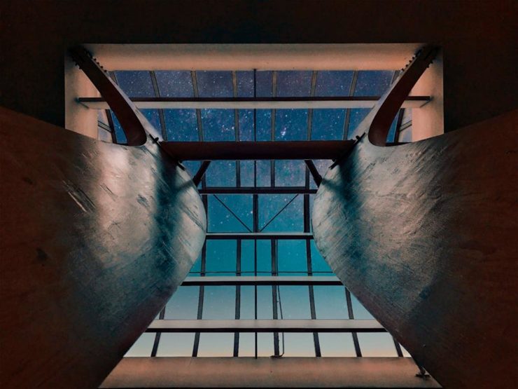
Winners of the 2023 Black and White Photography Awards
Another contest, yes. They’re everywhere. But … wow.
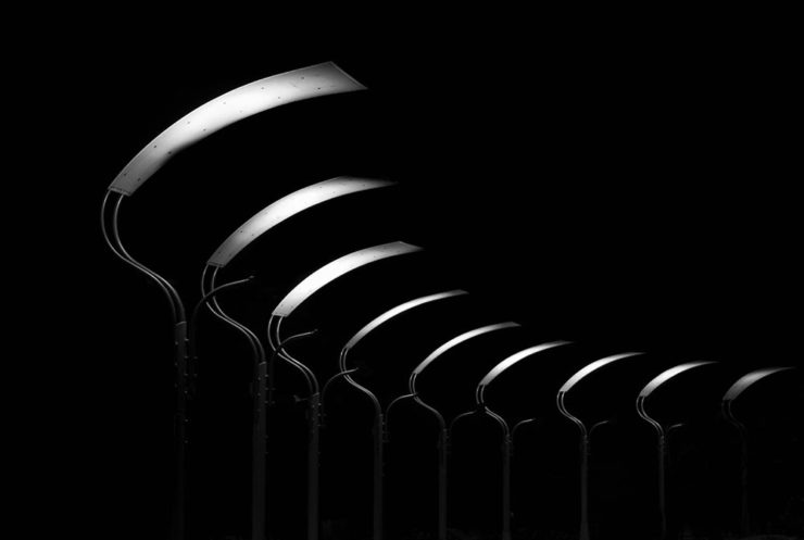
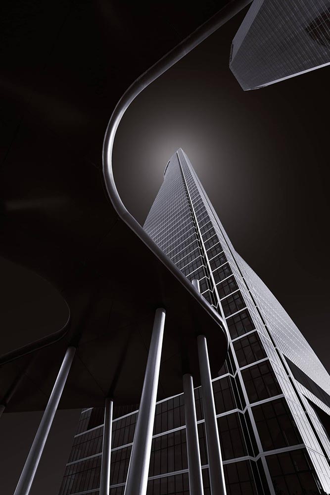
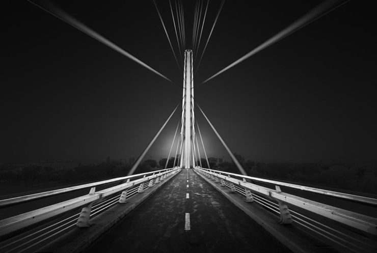
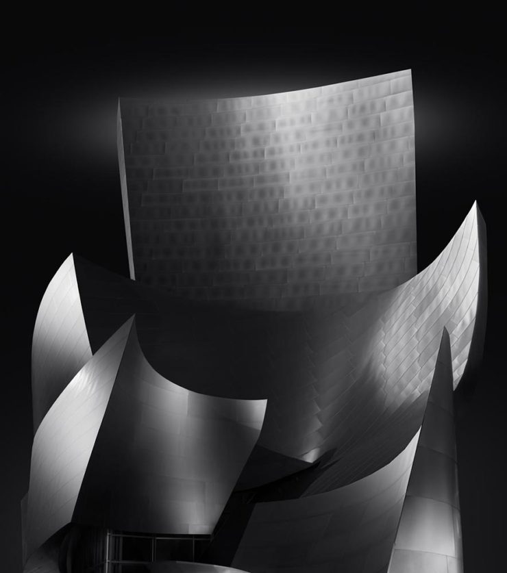
And that’s just the buildings/architecture — there are portraits, street photography, landscapes, and more. A reminder to aspire, every day, with every image.