Latest in Regular Sport: New Orwell Covers

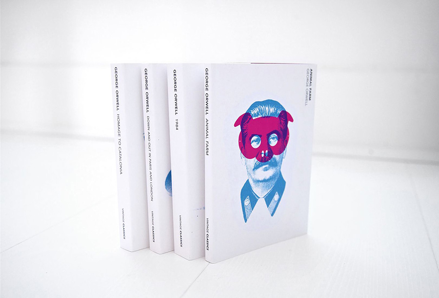
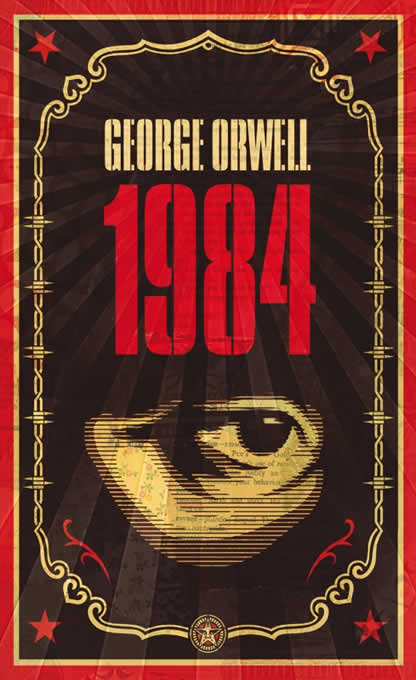
Creativeboom points out that Heath Kane, not a citizen but in fact a subject of the Crown, has designed new covers for George Orwell’s classics Animal Farm, 1984, and more.

Two interesting things about this: they call it the “final printed edition,” without further explanation. I somehow doubt there won’t be more editions in print — high schoolers everywhere would mourn, professors cry, and surveillance societies everywhere smile. Okay, overdramatic, but still.

And, I really preferred this one:

More from Penguin on Orwells through the ages.

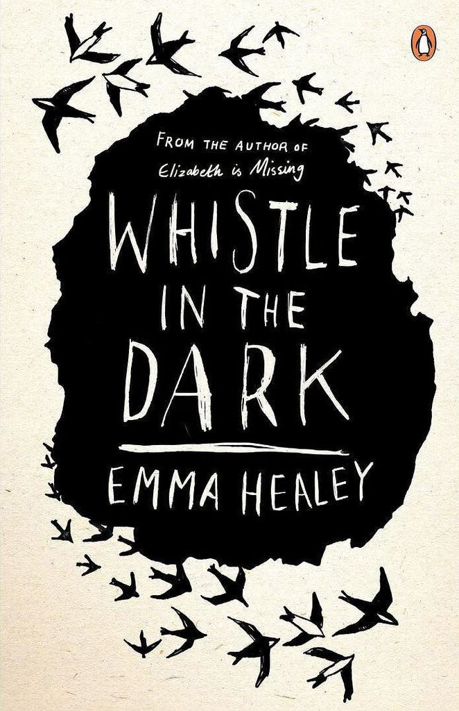
The Joy of Monochrome, from Spine

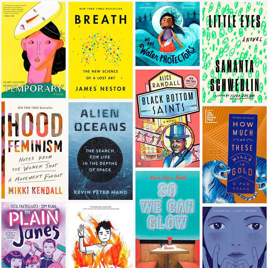
“A technicoloured cover can draw me to it like the proverbial moth to a flame. But as covers get more vivid, the buyers’ senses can become overwhelmed. They can’t see the books for the rainbow.”

Spine’s Vyki Hendy argues that monochrome — by which she means black-and-white-or-shades-thereof — is powerful. I’d argue that single-color items should belong in this category, too, but her piece stands on its own. Take a look.

I Love Typography’s 2020 Favorites

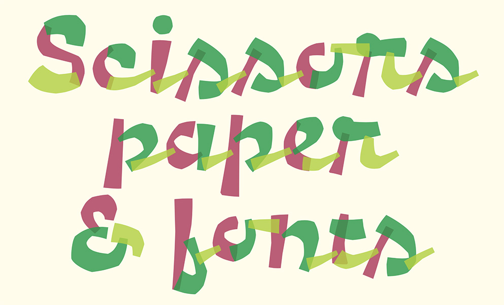
“It’s hard to believe that a decade has passed since I published one of these annual Favorite Fonts lists. A lot has happened in the interim: I now have less hair, more grey hairs, sometimes complain about my back, and now live in another country! Anyway, that’s quite enough about me. Here are, then, in no particular order, my favorite typefaces of 2020…”

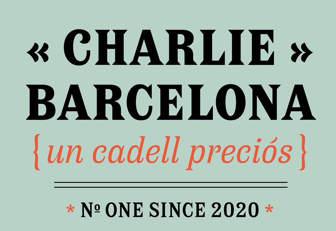
Some great choices here, especially:

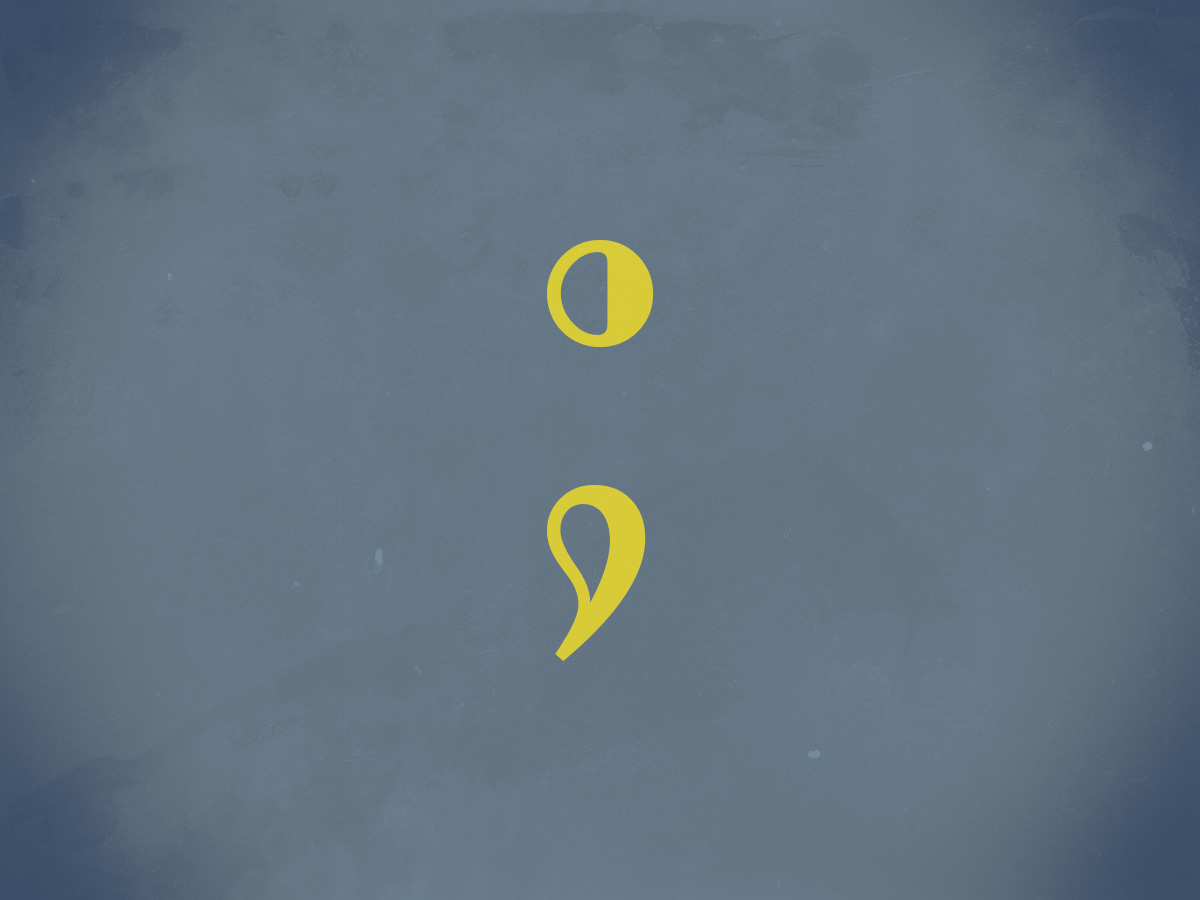
A layer font — something described as “fashionable for a while” — this one deserves to be on a book cover.

Special mention: ILT’s web design. This blog and this entry both are easy to look at, well put-together, and something that makes me a little envious.

Read all of the 2020 favorites, or ILT’s main page.

Downtown Gallery Updated (and… Updated)

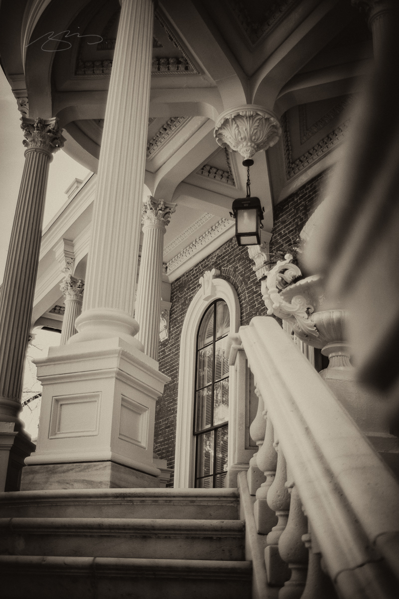
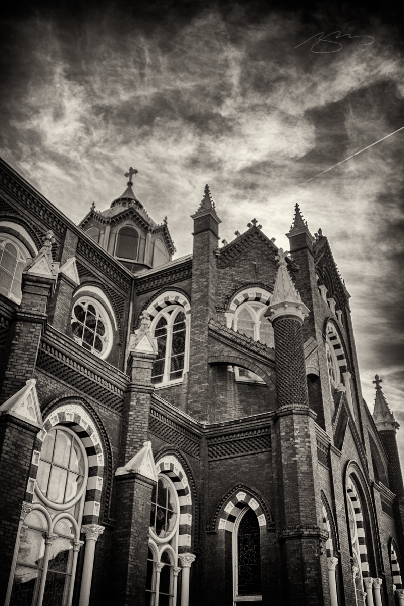
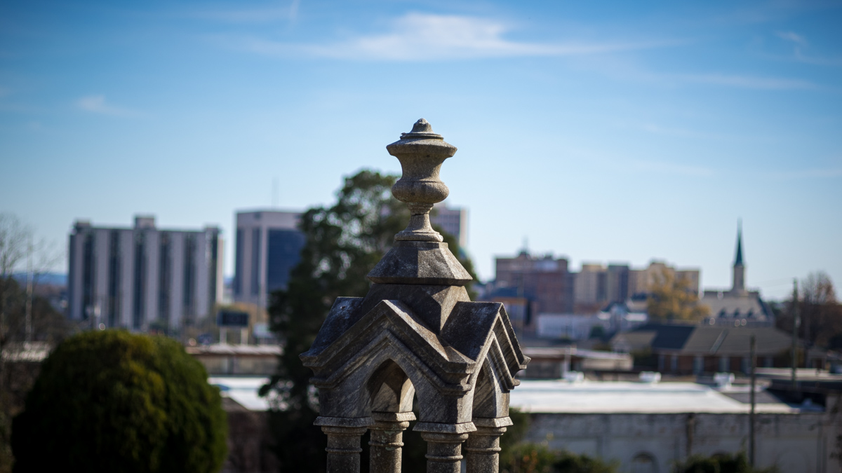
As mentioned yesterday, Gerald purchased a Voigtlander Ultron 21mm f1.8 — a very nice, German-owned (Japanese-made), manual-focus lens — last month, and he was kind enough to loan it to me for a couple of days.

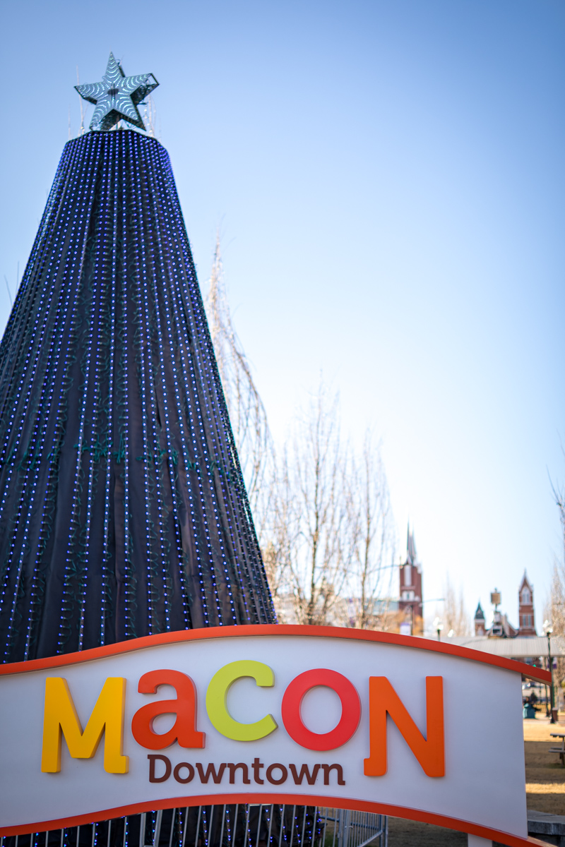
We — that is, the lens and I — went for a short photostroll in downtown Macon this afternoon. Check the results in the updated gallery.

Edit, 6 March, 2021: I’ve rejigged the Macon galleries, and the featured photograph from this post is now in the Macon – Miscellaneous gallery (as the Catholic church is up the hill from downtown).

Rose Hill Gallery Updated (Again)

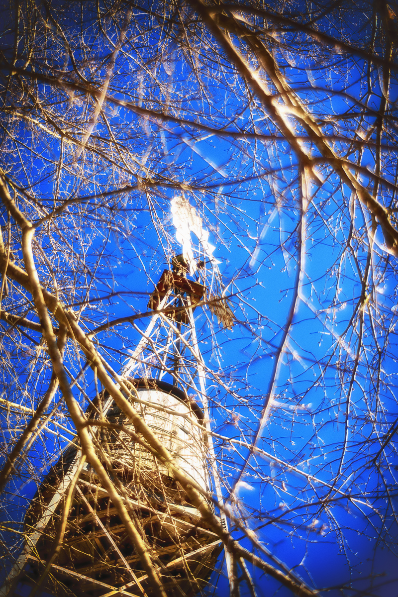
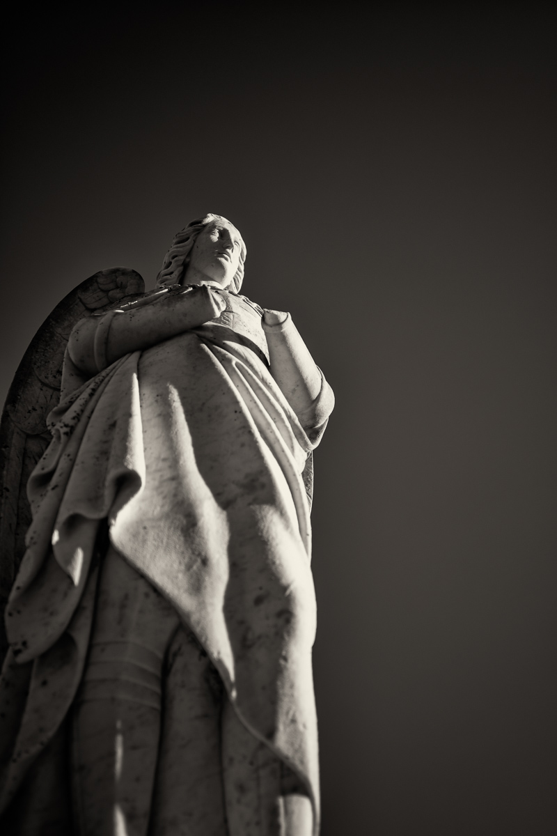
My good friend Prof. Gerald Lucas has been collecting lenses again, and since we both shoot with Leica L-mount cameras, we’re able to share — and he was kind enough to do precisely that. (Thank you, sir!). He’s added classics like the Asahi Super-Takumar 50mm f/1.8, Olympus Zuiko 28mm f/2.8, and Юпитер-8 (Jupiter-8) 2/50. (He’s added a brand-new Voightlander Ultron 21mm f1.8, as well — nice.)

Rose Hill and Riverside serve as familiar ground for us, meaning that when new photographic tools are available, we go there to see how well we work together; the gallery is twelve years old. See the update here. Enjoy.

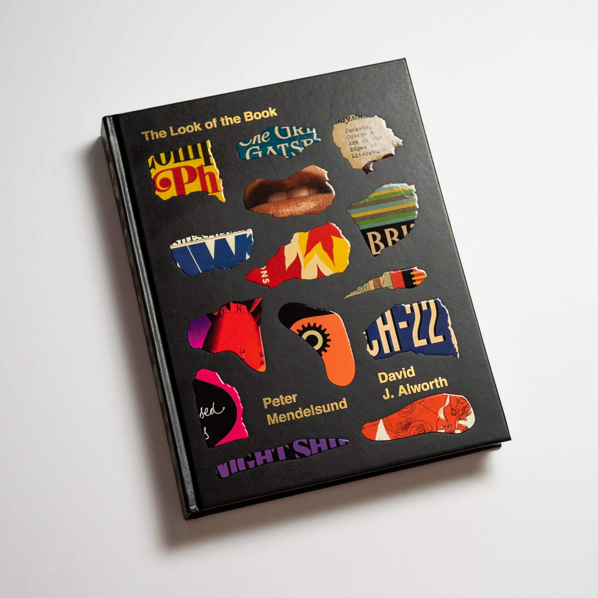
Peter Mendelsund’s The Look of the Book

From Bookshop.org’s description: “Why do some book covers instantly grab your attention, while others never get a second glance? Fusing word and image, as well as design thinking and literary criticism, this captivating investigation goes behind the scenes of the cover design process to answer this question and more.”

“As the outward face of the text, the book cover makes an all-important first impression. The Look of the Book examines art at the edges of literature through notable covers and the stories behind them, galleries of the many different jackets of bestselling books, an overview of book cover trends throughout history, and insights from dozens of literary and design luminaries.”

Looks like great stuff (if you’ll pardon the expression). Get it from Amazon Smile or Bookshop.org. (Via Kottke, unsurprisingly.)