
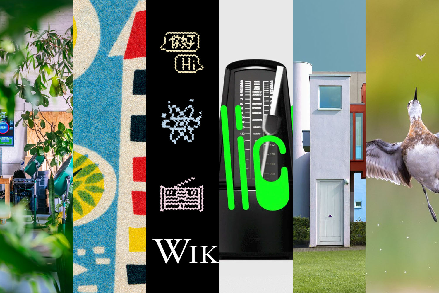
As I sit down to write this post, Middle Georgia’s first taste of Fall has come by to say hello — that delightful moment when the summer heat breaks and we have the start of open-window weather. Welcome.
September: highlights
This month’s Spine

Great group of covers this month in my regular column on Spine. It’s fall catalog season, so lots of University titles to choose from. The cover above is not only great, the story of how it came to be is appreciated, too.
Zoe Norvelll, by the way, is the founder of INeedABookCover.com.
Also posted this month
In addition to being posted early, Beautifully Briefed is a little shorter than usual — but you’re not left wanting for goodness: in case you’ve not already had the chance, check out some photographs from a visit to Johns Creek, Georgia; two separate galleries for Duluth, Georgia; and my annual take on AIGA’s 50 Books | 50 Covers. Enjoy!
Celebrate: Unsung
Marcin Wichary’s blog quickly earned a spot on my regular-checks routine; after the fabulous publicity for the amazing Shift Happens, finding out that he was going to post regularly was a gift — and regular readers will know that he’s become a oft-cited link destination in the Briefed series.
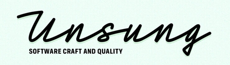
So it’s no surprise that his redesign of Unsung is brilliant.
I dreaded even attempting the redesign, but as I was adding full-text search to the blog, I realized the previous simple frame couldn’t accommodate it — no matter what I did, the search felt bolted on. I suppressed my PM side, decided to scope creep, and the 500th postiversary provided a good arbitrary deadline. (This is post №492, so hopefully I’m not jinxing it.)
— Marcin Wichary, Unsung
His work is filled with delightful details, like the angled change in color between posts (that’s different on desktop and mobile) and so much more . . . that he’s thoughtfully documented:

If you have a moment, and you’re into his interface and design work as much as I am, complete #3 (or 4) on that list.
One interesting strategy on the redesign: decamping to a friend’s coworking space for a motivation — and a new perspective:
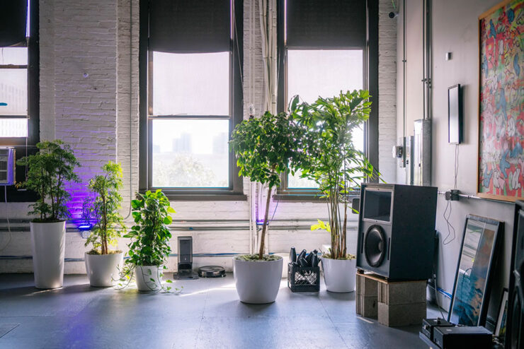
I’m frankly jealous of his results here. I struggled with the tech end of the rework here — stubbornly, perhaps, refusing to ask an “agent” for help — results that, for him, come so naturally . . . yet with all of the necessary design chops.1Parenthetically, I’m not 100% satisfied with how my redesign is working out. The body font, especially, is good at first — and second — glance, but some of the minutiae, like the minuscule quote marks and the collision/confusion between a capital I or L and a bracket (something I use often) is causing problems. I hope folks won’t mind if I do a point-one update sometime this fall or winter.
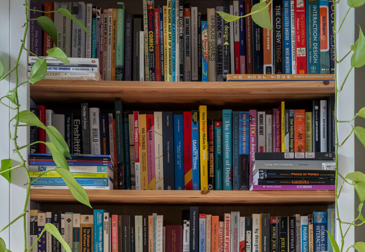
Special Bonus #1: Marcin’s design bookshelves, now a mini-site (!). Hover over each book for more information. Favorites are highlighted, and each includes a look at the cover — and a link to OpenLibrary.
Design: matchbooks and Wikis
Eastern Bloc matchbook covers, 1950–1980
A bit o’ fabulousness from Kottke:
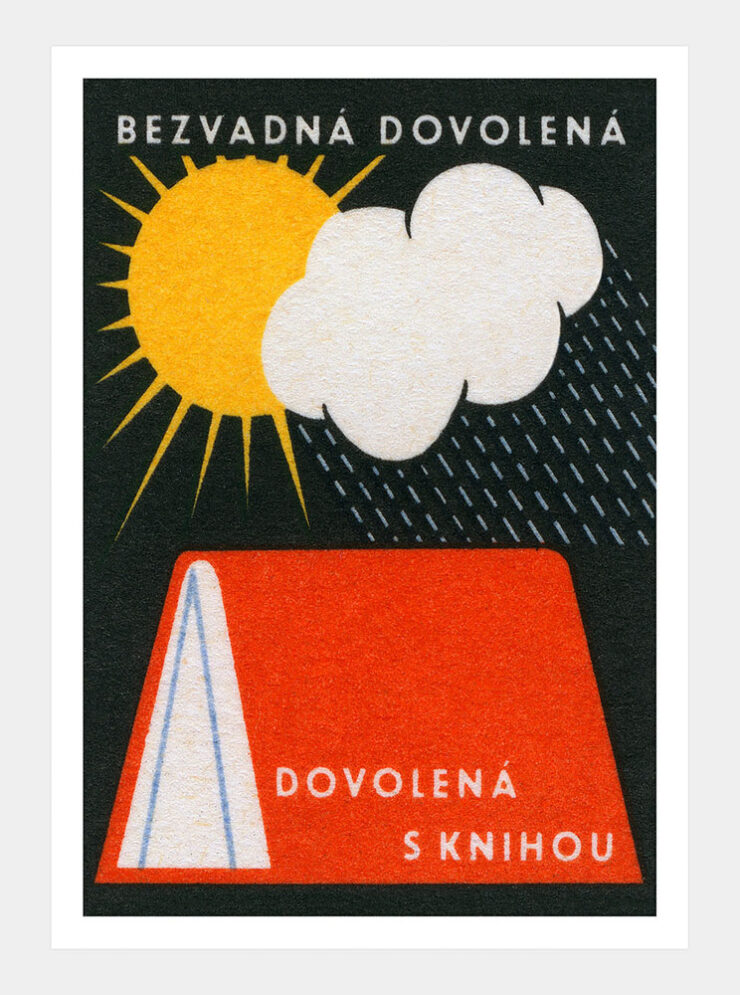
Over on Flickr, Jane McDevitt maintains a huge collection of 20th century matchbox label art from Eastern Europe, over 4000 photos in all. Some of the labels are available as prints. They did a book too, but it’s sold out. It was really difficult to narrow these down to some of my favorites, but I managed.
— Jason Kottke, Kottke.org
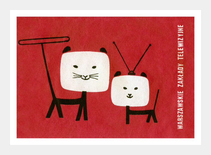
Jason adds, “P.S. I wrote this whole post and then discovered that I’d written about this collection before. But I picked different labels so it’s all good.”
I picked different items as well, so between his two posts and the ones I chose, your appetite should be well and truly whetted.
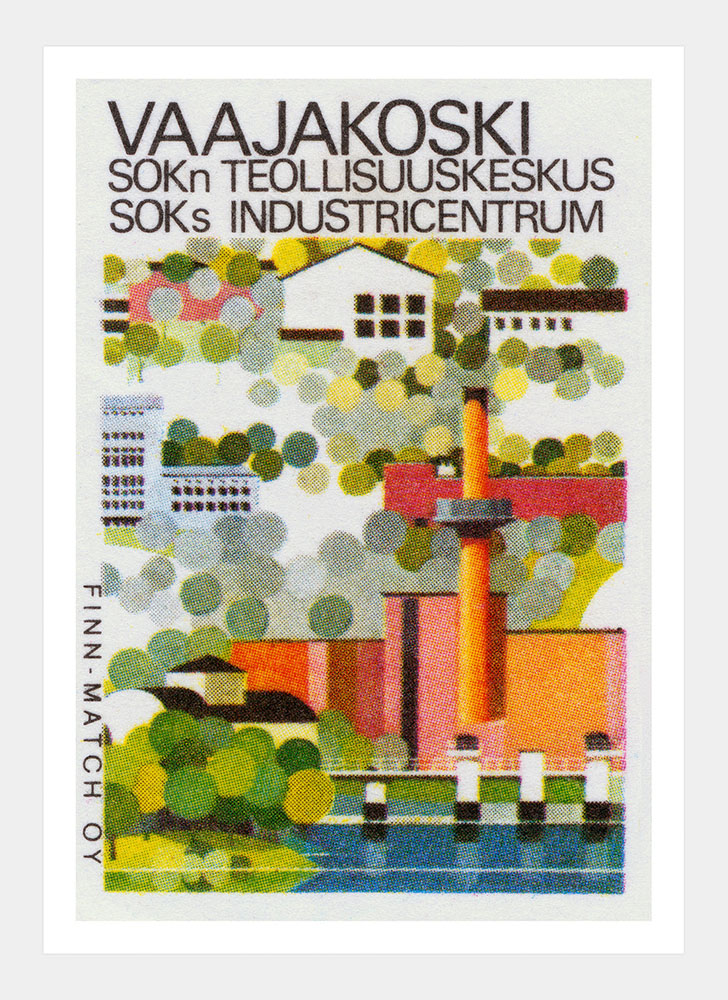
Man, if I had some extra wall space . . . .
The design of Wikipedia
It’s Nice That has posted a really interesting look at the “mascots, design and visual history of Wikipedia, the encyclopedia that puts functionality above aesthetics.”
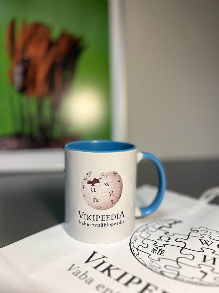
Wikipedia is the most classic idea of the internet you could possibly imagine: function over aesthetics, a treasure trove of knowledge rooted in homage to The Library of Alexandria, a website that you can really explore (you know, like how the internet is for exploring… an idea that has long been abandoned by most!). My friend calls it a relaxation medium — it’s serene, a place where you can effortlessly glide from learning about the moon landing to all of a sudden: exploding trousers. “Wikipedia pre-dates the attention economy,” says Justin Scherer, UX designer at the Wikimedia Foundation, the non-profit that supports Wikipedia and its visual design system. There are no infinite doomscrolls, only enriching rabbit holes that avoid those all-too-common psychic blasts of negative energy you get from Instagram reels.
— Paul Moore, It’s Nice That
But those aesthetics aren’t ignored. The article “speaks to the creatives behind, in-front and all around the greatest internet database, the site where every single human is the target audience.”

It goes into the design evolution of the site, from the early days through its 25th anniversary, celebrated in January of this year — where, as part of the goings-on, they introduced their first mascot, Baby Globe:
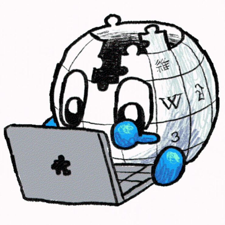
“Wikipedia is more than just a database, it’s an entire world — and in its orbit is a ring of fascinating design history, volunteer-led artworks and community that goes a little unsung,” It’s Nice That concludes. Enjoy some great details!
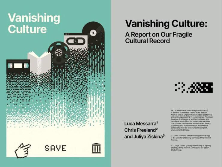
Special bonus #2: From the Internet Archive: Vanishing Culture: A Report on Our Fragile Cultural Record. “When digital materials are vulnerable to sudden removal . . . our collective memory is compromised, and the public’s ability to access its own history is at risk.” (Via Kottke.)
September: my type
Diverse group of new typefaces this month!
Clippy, by Kanon Foundry
Not the Clippy I bet you’re thinking of — something better:
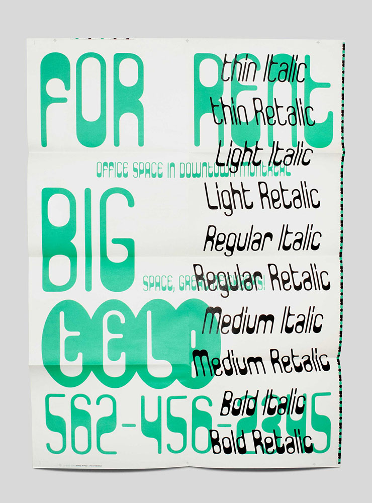
“When Tor Weibull, a type designer who co-founded Kanon Foundry with Alexander Örn in 2019, came across Paperclip Contour on the record sleeve for Kissin’ in the Back Row of the Movies by The Drifters, he was enamoured with its modular expression, but felt that the contour style and absence of uppercase letters made it limited in use. Naturally, as a type designer, he felt moved towards reinventing the idiosyncratic typeface, filling in the letters and developing uppercase letters alongside the lowercase forms. After all, work at Kanon Foundry is rooted in research, historical references and a hands-on approach, so taking a typeface from the 70s and bringing it into 2026 makes total sense for the independent designers.”

“The variable font technology allows Clippy to move between Retalic, Roman and Italic with fifteen styles that cover a range of weights – it’s quite the range for one system, all tied together with a similar, playful character and the freedom to find out what works best for the intended use. Besides Paperclip Contour, Tor took inspiration from modular lettering such as Herbert Bayer’s work, and as new weights and associations emerged during the creation of Clippy, Tor saw similarities to E13B-like mid-weights and CNC engraving, a manufacturing process that utilises computer-controlled machines to carve and etch lettering into materials.”
Like the Wikipedia article above, Paul Moore once again takes fingers to keyboard over at It’s Nice That. Get more details, or go straight to the source.
Arpeggio, by Paulo Goode
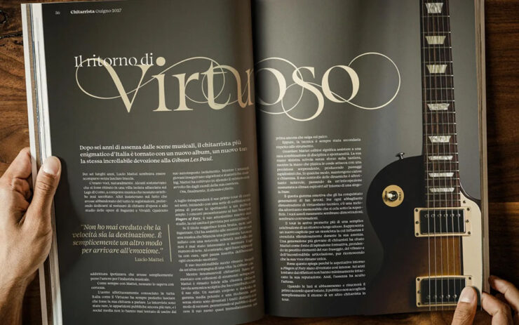
Arpeggio is described as a “transitional serif,” something “warm, readable and disciplined,” CreativeBoom says in this month’s new typefaces post. “It could serve as a workable alternative to Baskerville; not to mention Caslon, Mrs Eaves, Georgia, Perpetua and Bookman.”
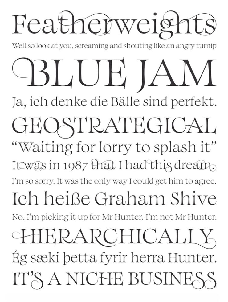
“Described by Paulo as ‘an original text typeface that balances disciplined rhythm with expressive character,’ it oozes clarity and confidence in the text weights whilst the Display collection amplifies the characterful nuances with sharpened forms, graceful swashes and exuberant flourishes. A strong choice for books, magazine design or a luxury brand identity.”
Incredibly well-named, too. Nice.
FYI, CreativeBoom‘s post had fifteen new faces, but Arpeggio was the only one that I immediately wanted to use. Your needs may vary: check ’em all out.
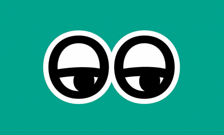
Special bonus #3: CreativeBoom has updated their “mascot”: the eyes have it. “Keep an eye on them because they’ll now offer lots more entertainment depending on seasons, events, and whether it’s night or day.”
Gimme, by Future Fonts
“This is bonkers,” Kottke writes, ”letters made from Battleship pieces, Connect Four boards, playing cards, wooden railroad tracks, etc.”
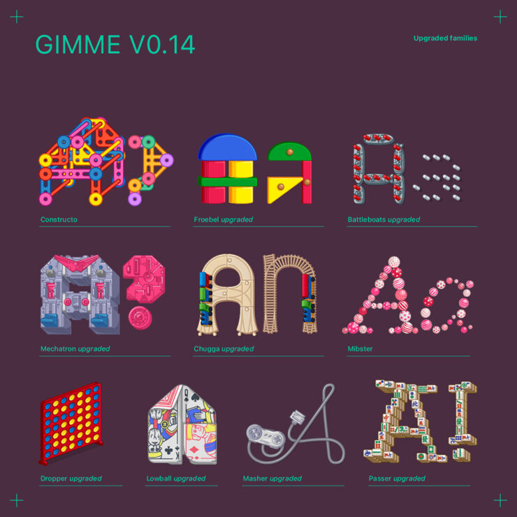
“Gimme is the kid in class who has everything, from the latest toy as seen on TV to a tricked out BMX bike. It’s the only person you knew with the complete Playmobil Mansion or USS Flagg. This time however, it can be you!”
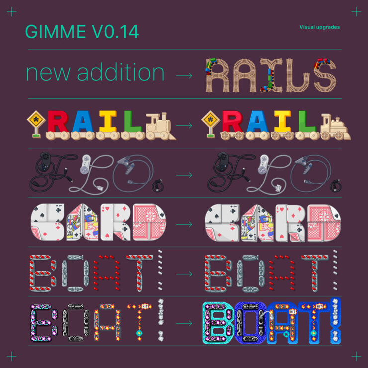
“Gimme is a dazzling ever-growing type family of multi-chromatic and variable display typefaces which will leave you saying: gimme more! And you are in luck, because updates will deliver on that!
“Inspired by a box full of toys, more type families will be added as we go along, expanding them further and adding new features. And the more allowance, the more it will grow!”
Special bonus #4: Kottke’s also responsible for bringing Walking Men Worldwide to my attention. These are awesome: Beijing is oddly reflective of London, Warsaw invited aliens, Chicago leans into the winter wind, and Istanbul dances. See many more (and other projects) — public art at its design best.

Special bonus #5, and the last Kottke mention for this post: Jason has answered the call to wander and relocated to Japan (!). He’s been checking out bookstores.
September: photography round-up
The power of simplicity
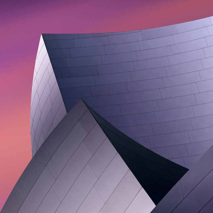
The 2026 Minimalist Photography Awards are out . . . and no, it isn’t at all catnip. Not even a little. I can’t imagine what made you think that.
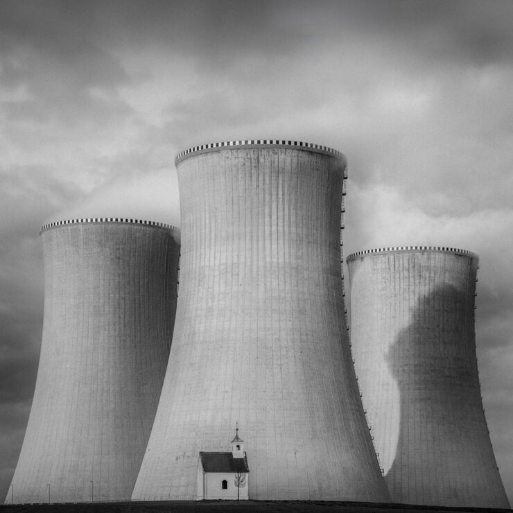
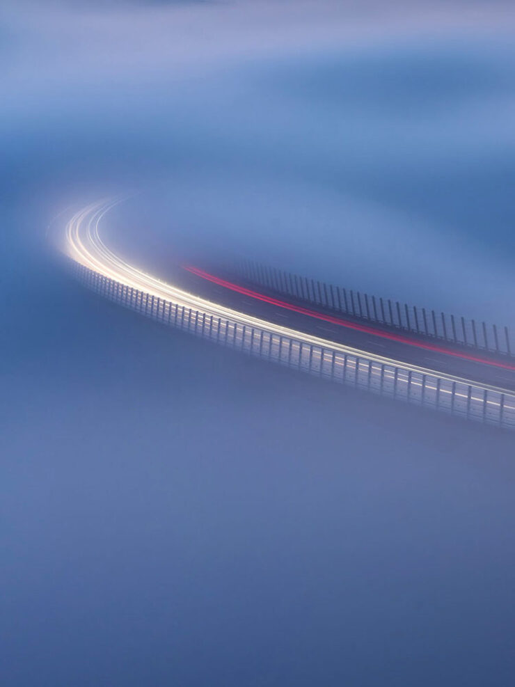
Appropriately, the awards site quotes Henry David Thoreau: ”It’s not what you look at that matters, it’s what you see.” See the winners’ gallery. (Via PetaPixel.)
The solitude and beauty of modern life
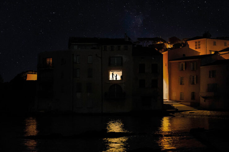
Nicolas Rachline’s “cinematic, Edward Hopper-esque photographs capture the solitude of contemporary life as well as its fragile beauty,” PetaPixel writes. His images “capture fleeting moments with a film noir-style intensity. His dreamlike scenes of cities such as Paris, Los Angeles, and New York are both familiar and slightly unsettling, in ways that can be difficult to explain.”

Rachline’s new book, Elsebound: Photographs from the Quiet Hours, is out now (from Rizzoli).
“The Way We Never Were”
This series is not only fascinating, it features more than a couple of photographs from Sarasota/Bradenton Florida, a familiar stomping ground.
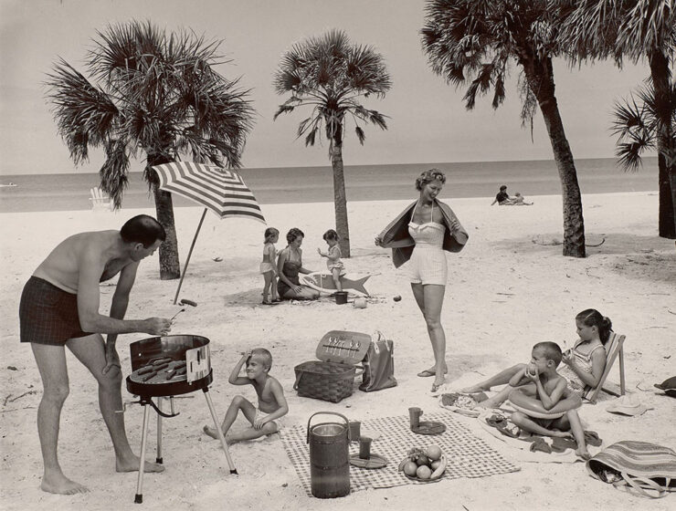
“Harvard Art Museums has delved into its extensive photographic collection,” PetaPixel writes, “to put on a thought-provoking exhibition titled The Way We Never Were that questions the postwar narrative in the United States.”
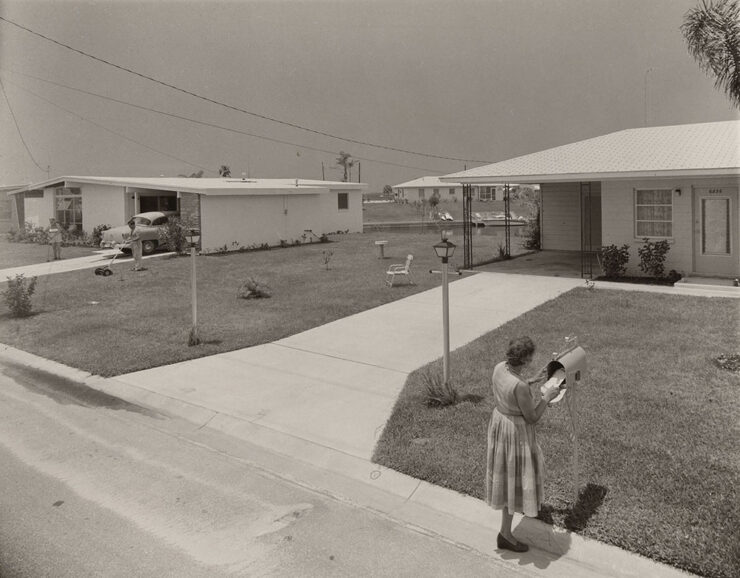
“American life after World War II is often portrayed as a rosy world of sock hops, malt shops, manicured lawns, and renewed optimism. This image was heavily shaped by commercial photographers, who worked on commission for private clients, corporations, and government agencies. Their carefully staged portraits and promotional imagery, constructed using polished visual conventions and framing devices, helped define many of the era’s most familiar scenes.”
Not that different from social media’s idealized influencers, in many ways, yet nostalgic and somehow endearing. (Longboat’s beach — which did still look like that when I first visited in 1978 — was reclaimed by the Gulf of Mexico a long while ago, and to say that Bayshore Gardens no longer looks like that the definition of understatement.)
Anyway, the photographs are not just Florida, and are both varied and engrossing. The Way We Never Were: The American Professional Photographers Collection is at the University Research Gallery at Harvard Art Museums in Cambridge, Massachusetts, until May 9, 2027. (Via PetaPixel.)
Special bonus #6: “I found a famous photographer’s early print in an antique store for just $5.” Another classic Florida tale.
Stargazing

“I never tire of seeing the new entries into the ZWO Astronomy Photographer of the Year competition,” Dr. Greg Brown, Royal Observatory Greenwich Astronomer and competition judge, tells PetaPixel. “For a sky that, at least in some ways, is remarkably unchanging from year to year, the skill and innovation of the entrants, coupled with improvements in technology, means that there is always a wealth of new sights to be seen even in targets that have been observed many times over.”

“The images from this, the 18th year of the competition, continue to show the growth of a community whose passion to capture the stunning variety of our Universe knows as few bounds as the subjects of their images.”
Birding, part one: Audubon 2026

“The National Audubon Society has unveiled the winners of the 2026 Audubon Photography Awards, a competition that captures the beauty of birds and the challenges they face,” PetaPixel reports.

“In addition to $5,000, grand prize winners each received a voyage to Antarctica with HX Expeditions.” Now that’s a prize. Check out all the winning photographs, grand or otherwise..
Birding, part two: BPOY 2026
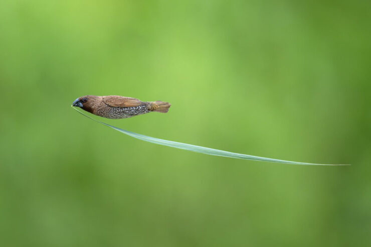
“It’s all things avian at Bird Photographer of the Year, the world’s largest contest dedicated to images of feathered creatures planet-wide,” This is Colossal writes. “Highlighting birds of all kinds, the competition emphasizes the diverse appearances and behaviors of the animals and also raises awareness of the challenges they face due human-triggered habitat loss, poaching, pollution, and other factors.”

“In a world where AI-generated imagery is becoming increasingly common, this year’s winners are a powerful reminder of the value of authenticity,” Will Nicholls, Director of Bird Photographer of the Year, said to PetaPixel.

“Every image in the competition represents a real moment in the wild, earned through patience, dedication and a genuine connection with nature. People will always value real stories told by real people, and this year’s extraordinary photographs celebrate the beauty, wonder and authenticity of our natural world.”
Part of the contest proceeds go to Birds on the Brink.
Finally: the world has a new cat!
This got a lot of press, but just in case:
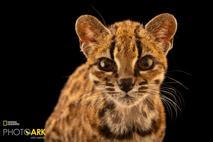
“10 years ago, National Geographic Explorer and biologist Paola Nogales-Ascarrunz was working in Bolivia when she got a call from a local wildlife sanctuary that had received “a weird cat.” Today, that “weird cat” has been officially identified as a new species, Leopardus tilcayo. This is the first time in over a century that scientists have formally named and described a new living cat species.” Awesome.
- 1Parenthetically, I’m not 100% satisfied with how my redesign is working out. The body font, especially, is good at first — and second — glance, but some of the minutiae, like the minuscule quote marks and the collision/confusion between a capital I or L and a bracket (something I use often) is causing problems. I hope folks won’t mind if I do a point-one update sometime this fall or winter. ↩︎