Tag: spine

  • University Press Design Show 2021

    University Press Design Show 2021

    From AUPresses:

    “Since 1965, the Association of University Presses (AUPresses) Book, Jacket, and Journal Show has fulfilled its mission to “honor and instruct”: honoring the design and production teams whose work furthers a long tradition of excellence in book design […]. The Book, Jacket, and Journal Show recognizes meritorious achievement in design, production, and manufacture of books, jackets, covers, and journals by members of the university press community. It also provides an evaluation of their work and serves as a focus of discussion and a source of ideas for intelligent, creative, and resourceful bookmaking.”

    Credit where credit is due: Spine, in their excellent way, has already covered this. Head on over there, knowing that I largely agree with their post in its entirety. However, there are a number of covers I like that they didn’t talk about — and they didn’t talk about interior design at all.

    So, without further ado, let’s start with the covers and jackets. Interiors follow, then items that are in both categories.
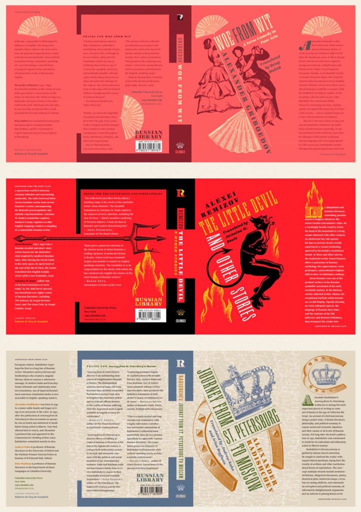
    Columbia University Press with a series (in order, top to bottom): Woe from Wit, The Little Devil and Other Stories, and Journey from St. Petersburg to Moscow. Each is great on their own, but put ’em together and the series stands tall. Excellent design by Roberto de Vicq de Cumptich.

    Performing Jane

    Louisiana State University brings us Performing Jane, with design by Barbara Neely Bourgoyne. Simplicity wins.
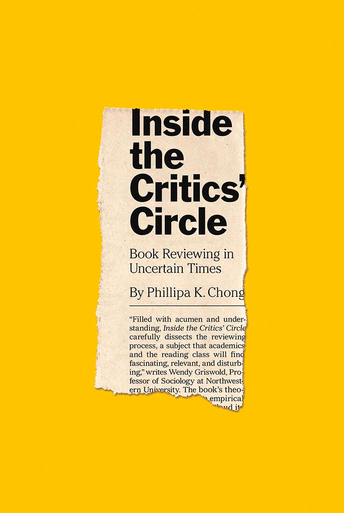
    Inside the Critic's Circle

    On the subject of simplicity, Inside the Critic’s Circle brings a seemingly-casual-yet-carefully-designed newspaper clipping onto a yellow background. Together, they’re attention-getting and just right. Nice. Design by Chris Ferrante for Princeton University Press.

    Vénus Noire is about as far from a bust as can be — except not really:

    Venus Noire

    Another example of simpler-is-better, yet something so much more. Design by Kaelin Chappell Broaddus.
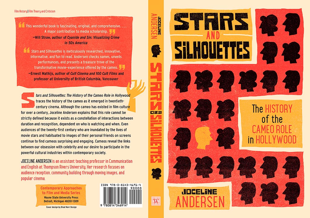
    Stars and Silhouettes

    Wayne State University Press brings us Stars and Silhouettes, in all its hand-drawn glory. Love the design by Brad Norr.

    My favorite of the stand-alone cover designs, however, contains a wrinkle or two:

    The Duchess of Angus

    Lovely. The illustration and paper photograph combine into something really special. Design by Derek Thornton — whose website, by the way, has a bunch of other great stuff. Nice!

    On to some interior design, with Pinceton’s Dante:

    Dante's Interior

    Puts “boring academic title [page]” to rest. Design by Chris Ferrante.

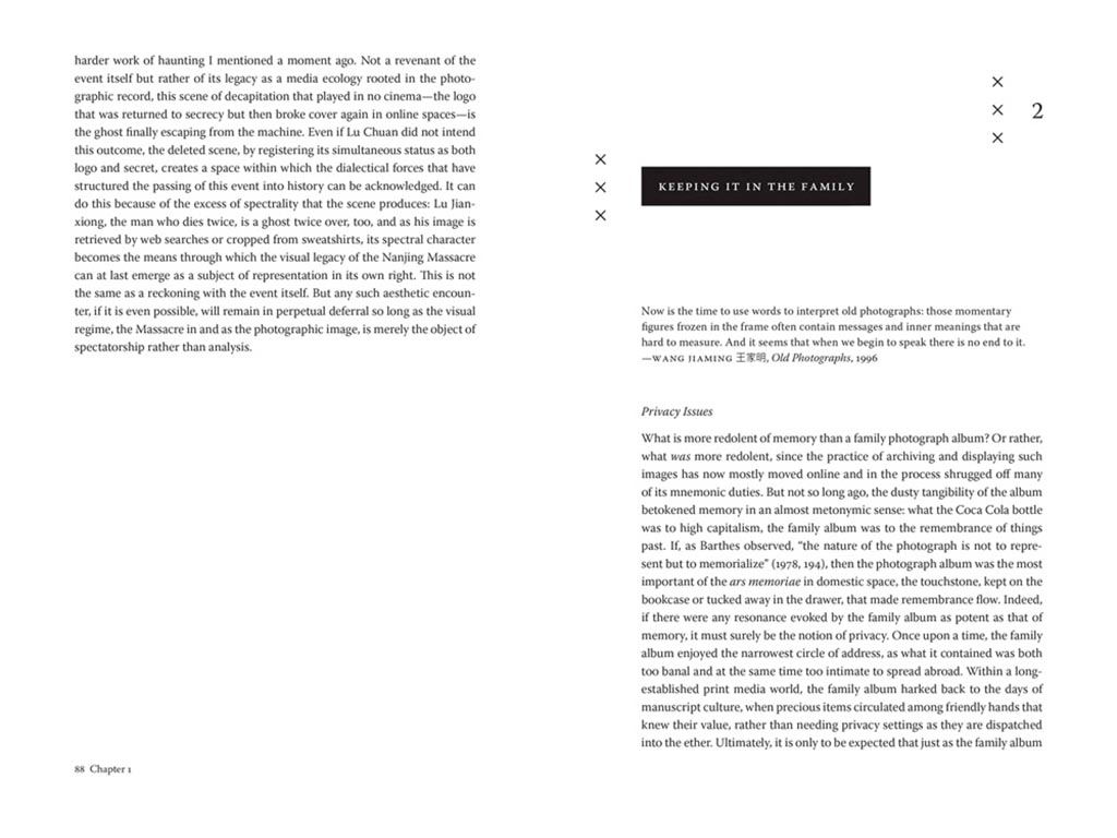
    Next, a title on “knowing what not to know in contemporary China”, called Negative Spaces:
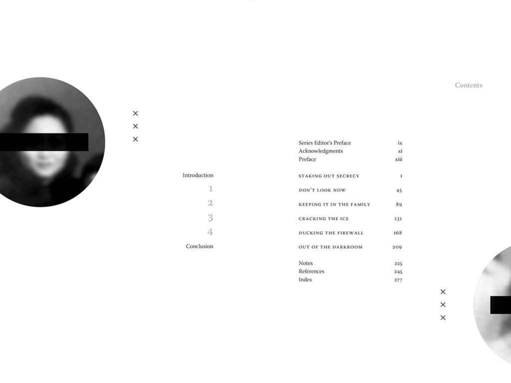
    Negative Spaces 1
    Negative Spaces 2

    Design by Courtney Leigh Richardson for Duke University Press.

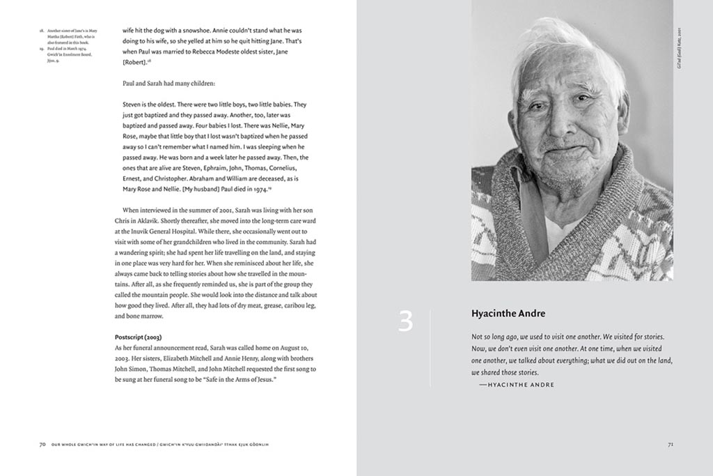
    Next, stories from “the people of the land”:

    Gwitchin 1
    Gwitchin 2

    Our Whole Gwich’in Way of Life Has Changed / Gwich’in K’yuu Gwiidandài’ Tthak Ejuk Gòonlih, with design by Alan Brownoff for the University of Alberta Press.

    Next, a couple where both the cover and interior excel, starting with Horace Kephart from the University of Tennessee Press:

    Horace 1

    UTenn Press has a cool logo, too.

    Horace 2
    Horace 3

    Lovely detailing in this design by Mindy Basinger Hill. Only one question here: Why doesn’t the script on the cover match that used inside? Both are nice — I prefer the one used on the cover — but either way, pick one!

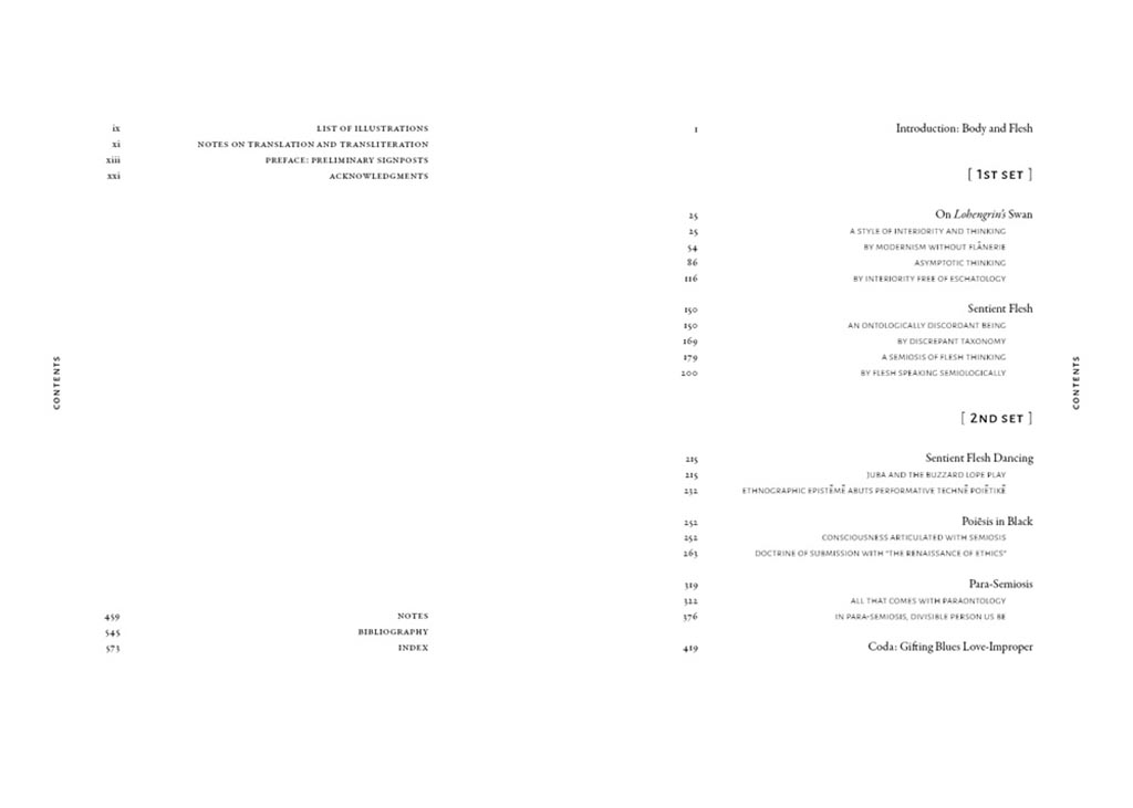
    Last but certainly not least, perhaps the best designed of all the projects in the AUPresses 2021 Show, Duke’s Sentient Flesh:

    Sentient 1

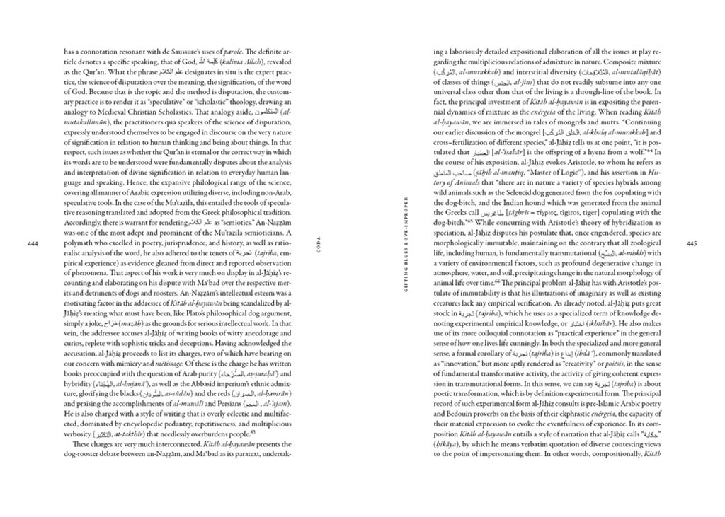
    Fantastic. And check the interior:

    Sentient 2
    Sentient 3

    Kudos to designer Matthew Tauch for a “best in show,” at least as far as I’m concerned!
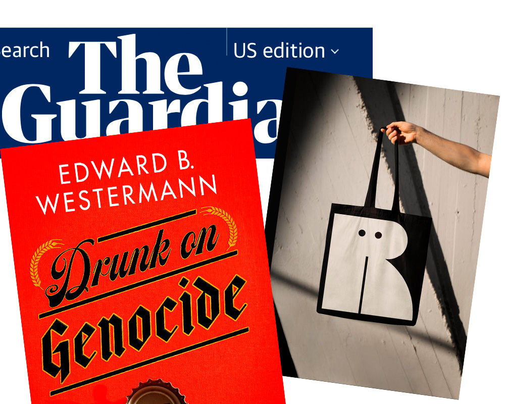
  • The Joy of Monochrome, from Spine

    The Joy of Monochrome, from Spine

    “A technicoloured cover can draw me to it like the proverbial moth to a flame. But as covers get more vivid, the buyers’ senses can become overwhelmed. They can’t see the books for the rainbow.”

    Spine’s Vyki Hendy argues that monochrome — by which she means black-and-white-or-shades-thereof — is powerful. I’d argue that single-color items should belong in this category, too, but her piece stands on its own. Take a look.

  • My 20 Favorite Book Covers of 2020

    My 20 Favorite Book Covers of 2020

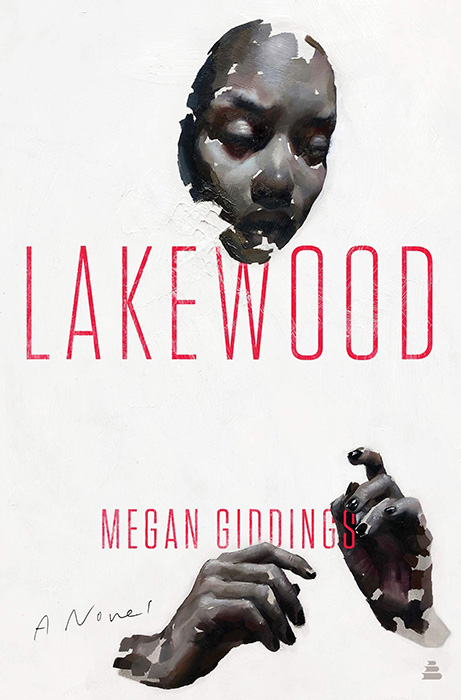
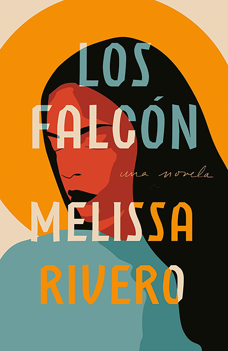
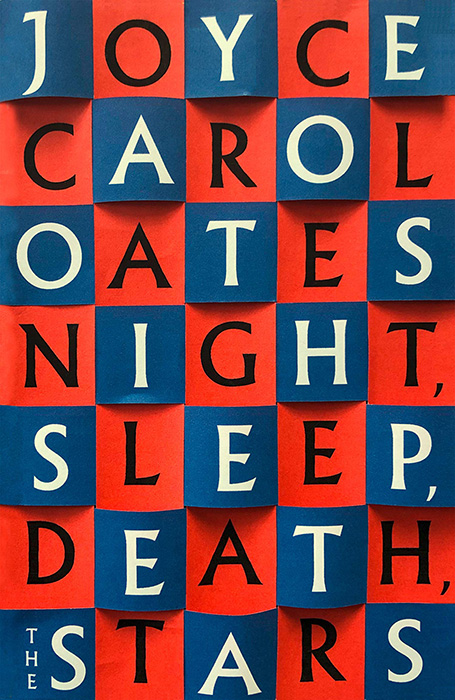
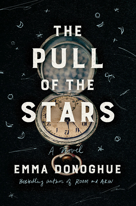
    This list is simple and straightforward: these aren’t necessarily all of the best book covers of 2020, only my favorites — gathered from the combined lists of LitHub, Creative Review, NPR’s 2020 Book Concierge, and the Casual Optimist, along with sightings in the New York Times Book Review, BookRiot, and Spine Magazine. Interestingly, despite the year many of us would rather forget, the best book covers are, as usual, memorable.

    My favorite, by quite a lot:

    There’s no other way to put this: it’s brilliant. The Party Upstairs by Lee Conell; design by Stephanie Ross. Read about how it was put together, along with initial ideas and drafts, at Spine Magazine. Great, great stuff!

    The rest, in alphabetical order:

    On the one hand, exactly what you’d expect — except a) it’s a novel, and b) it’s not really what you’d expect. Nice. Design by David High.

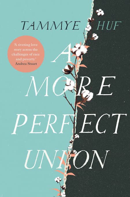
    The left and right halves here are a perfect union, and I’m a sucker for hand lettering. Design by Anna Morrison.

    I can’t remember the last time I saw a two-color cover I liked so much — major kudos here. Design by Emile Mahon.

    Blue tigers. Red eyes. Crooked title block. Yet somehow rich beyond easy description. (The author calls it “haunted by place.”) Design by Grace Han.

    Can’t. Unsee. The. Rat. Home run of horror. Design by Wil Staehle.

    Simple type that’s well executed meets brilliant original painting. Proof that less can be more, if you’ll pardon the cliché. Design by Stephen Brayda.

    One of this year’s best uses of color, along with another great illustration. Design by Adalis Martinez.

    This design has gotten a good deal of attention — and deservedly so. Eye-catching by fives. Design by Jamie Keenan.

    Explosive. (Sorry.) Actually, I’m personally jealous of this one: it feels like one I would have done, given the sudden (and unlikely) moment of creative greatness. Design by Christine Foltzer.

    The hand work on this one — both illustration and lettering — just make it. A universe of goodness. Design by Sara Wood.

    Scary good. Well, just scary, really, especially for a resident of the South. Excellent design by Henry Sene Yee.

    Retro style and simple typography combine to make something excellent. Suppose a cover, with design by Katy Homans.

    When has one color print been more compelling? This book would stand out on any bookshelf. Imagination by Jack Smyth.

    The original artwork (by Kai McCall) really grabs your attention … and then hangs on, staring straight at you. Wonderful. Design by Stephen Brayda.

    Here, the simple background illustration is enormously enhanced by the choice of colors, the “heart” cutout, and typography choices. A case of 10 + 10 + 10 = 1000. Design by Lauren Peters-Collaer.

    Deceptive at first glance, the colors here keep adding up (to build on a theme). Another excellent example of hand-lettering adding so much, too. Another great design by Lauren Peters-Collaer.

    Unexpected choices lead to great new places here, especially with the yellow band overlaying the wolf. So, so good. Design by Rachel Willey.

    No speculation here: this one takes me by storm. (Sorry.) “We are not ready nor worthy” applies to the cover, as well! Design by John Gall.

    Like Weather, Zo uses illustrations to huge effect — but this time with a huge typography effect to go along with it, and lo, it works. Great design choices by Janet Hansen.

    Now, let’s all survive 2021 so we can do this again!

  • Spine: University Press Cover Round-Up

    Spine, my favorite book design site, has “a new feature in which notable book cover designer Jordan Wannemacher periodically highlights a selection of recent university press cover designs. Please enjoy this celebration of amazing work.”

  • Spine: How books are put together

    My new favorite book design site. Well done!