Tag: space

  • Beautifully Briefed 26.8: The Anti-Drought

    Beautifully Briefed 26.8: The Anti-Drought

    It’s finally dried out here in Georgia, after a summer best described as “WTF” — where the “F” stands for flood, because you know it does. (As opposed to England, for instance, which is WTF in the other direction.)

    So: some design, typography, and imagery to inform and cheer. And ten special bonuses. You deserve no less.

    This Month’s Spine
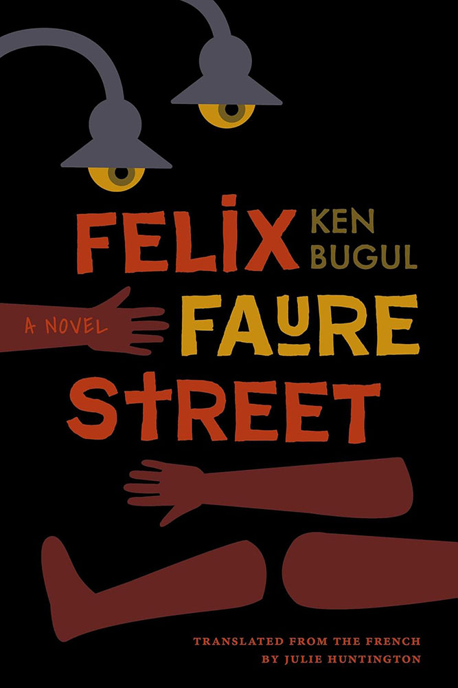
    Vanderbilt University Press. Cover design and art direction by Alissa Faden.

    It was my pleasure to feature some titles from Vanderbilt University, the University of South Carolina, and the University of Louisiana — because Stanford and NYU don’t have a lock on my attention. (’Sides, it’s fall catalog season, so there’s lots to choose from.)

    Enjoy fourteen great covers from University Press titles in my regular column for Spine Magazine.

    Reading reports that its death is greatly exaggerated

    As you’ll recall — or not, depending on whether you were able to read the article — The Atlantic worried out loud that reading is in such decline that we may have to think in terms of living in a “post-literate” world. (Because “post-truth” isn’t enough.)

    Turns out that there’s a back story to that take; it originated on a Substack titled, “The dawn of the post-literate society, and the end of civilisation,” by someone whose profile I can’t see because I refuse to create an account.1Soap box: getting a website, whose contents you own, is so painfully simple that I tend to discount those that rely on other platforms to publish what might otherwise be interesting material/thoughts/content. And in this case, the author is a Times journalist, who should definitely know better.

    So, I owe you an apology: this “moral panic,” as it’s been termed, originates in . . . what amounts to social media.2It’s been pointed out that blogs are social media, too (the original social media, in fact) — something I don’t necessarily disagree with. From my perspective, writing that is owned, put out there due to belief, and read by folks who trust your opinion, is completely distinct from having your potentially-anonymous “take” promoted to strangers by an algorithmic mechanism that profits from conflict — or, at least, provocation. In my opinion, it’s the latter that defines “social media.” I’m disappointed in The Atlantic for taking that bait, and in myself for trusting them and then making something of it here.

    Time for a reality check.

    Which comes courtesy of an article that’s part of It’s Nice That‘s POV series:

    It’s Nice That discusses Stack Reading Habits Report.

    . . . whose author puts forth just the right perspective, one that folks here can relate to:

    “The death of reading sounds uncannily similar to the death of print, which is another issue that’s prone to over-simplification.”

    — Steven Watson, It’s Nice That

    I still work in print. Many of us do. While it’s become a more specialized area of expertise, it’s still very much viable; whether it’s reached the stage of the horse post-motorcar or the manual transmission post-electric is something else entirely. (More on that latter item below, by the way.)

    The author quotes another response to the piece, which I almost completely agree with:

    All these pieces — from The Atlantic and elsewhere — about “the end” make this seem like a problem because of how they’re framing it, and who they’re framing it for. Maybe kids aren’t reading the classics, but look at the romantasy moral panic stewing in the background of social media. It’s a whole bunch of mostly men — who, demographically, do not read or buy books at all — declaring it the death of literature even though women and queer people are reading a ton of it. [. . .] It seems as though Americans have decided that the amount and kind of reading they personally do is normal and someone else doing it any more or less or differently than them is a social emergency. We may be seeing the end of certain kinds of reading [. . .] or certain kinds of culture, but that also means that something is replacing it. And good God do we need to replace a lot of it. If only to break up the corporations that dictate how it all currently works.

    — Ryan Broderick, Garbage Day

    To summarize, I fell for the “intellectual tragedy” represented by “the end of reading as we know it” and said something without thinking it through. I’ll try to do better.

    Rare books > AI. Unless…

    If you can truly appreciate an old book — and maybe even marvel at how its fragile, yellowing pages contain some of the earliest ways that people tried to make sense of the world around them — then headlines about tech companies that are destroying books to train AI likely torture a tender part of your soul.

    — Ashley Belanger, Ars Technica

    This article, dated August 12th, reminds us that, “Google patented a non-destructive book-scanning technology in 2009 that AI firms could use to efficiently scan books — if they were willing to slow down and invest in the process.”

    It continues, “The biggest fear for people who want to see books preserved through the training process is that AI firms will callously pulp rare books that can never be replaced.” Rare book dealers, it turns out, have started to flag suspicious bulk orders to safeguard the irreplaceable.
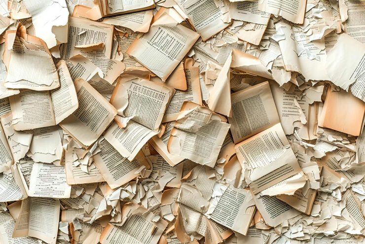
    Not Google’s patented process . . . but you can probably guess where this is going.

    Five days later, the same author reported:

    On Monday, 404 Media revealed that it had connected with a bookseller who agreed to plant an [Apple] Airtag in a rare book that was part of a bulk order. That Airtag was then tracked to an Amazon AI training facility in Las Vegas that housed a team focused on tearing books from their spines and scanning pages, 404 Media reported. Apparently tone-deaf to the escalating backlash over destructive book scanning, a logo on the door of that team’s warehouse, VGT3, showed a Tyrannosaurus rex preparing to devour a book, 404 Media documented.

    “Amazon declined to comment on 404 Media’s findings,” the article continues, “only providing Ars with the same statement it gave to 404 Media, which does not mention AI training specifically: ‘Amazon purchases books through commercial channels to help develop and improve the products and services our customers use.‘“

    The Internet, in its wisdom, has suggested that it’s all for profit — to “hide history behind a paywall.” How likely is that? After all, we know that Amazon, Anthropic, and Meta are altruistic.

    And now, courtesy of the ’Net’s most-trusted source, we have insider details: “when I see a one-of-a-kind, three-hundred-year-old tome taking up six whole inches of shelf space, I immediately start thinking about scale and efficiency.”

    Profit, efficiency, whatever — chewing up rare books for AI training is the very definition of “facepalm.”

    Special bonus #1: McSweeney’s new book, Obey in Advance, How to Survive and Thrive under Authoritarianism, is available this fall. An early review:

    “Democracy is priceless, but fascism sure seems to pay well. If you’re morally bankrupt and looking to sell your soul, Obey in Advance has everything you need for a profitable life of lickspittlery.”

    — Kevin Kruse, Professor of History, Princeton University

    Naturally, the book arrives at your door pre-scanned by AI.

    Special bonus #2: Remembering the pre-Google web, when search was an experiment. ”It was an era when the term ‘discovery’ carried actual weight, when you could authentically be one of the first people viewing a piece of content, regardless of its quality or how long it may have existed — an era of equal parts wonder and frustration.”
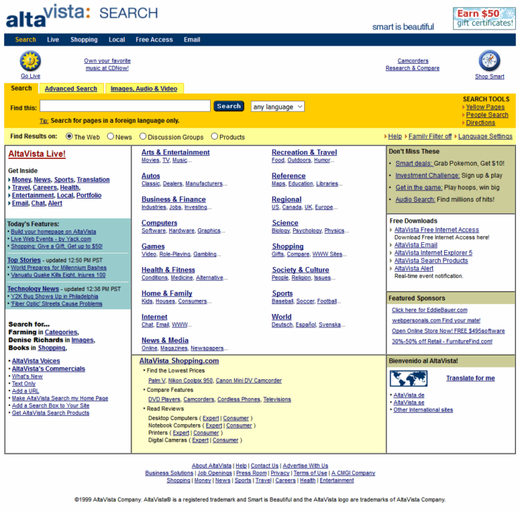
    Four scores and twenty-seven years ago . . . .
    The story behind Present & Correct
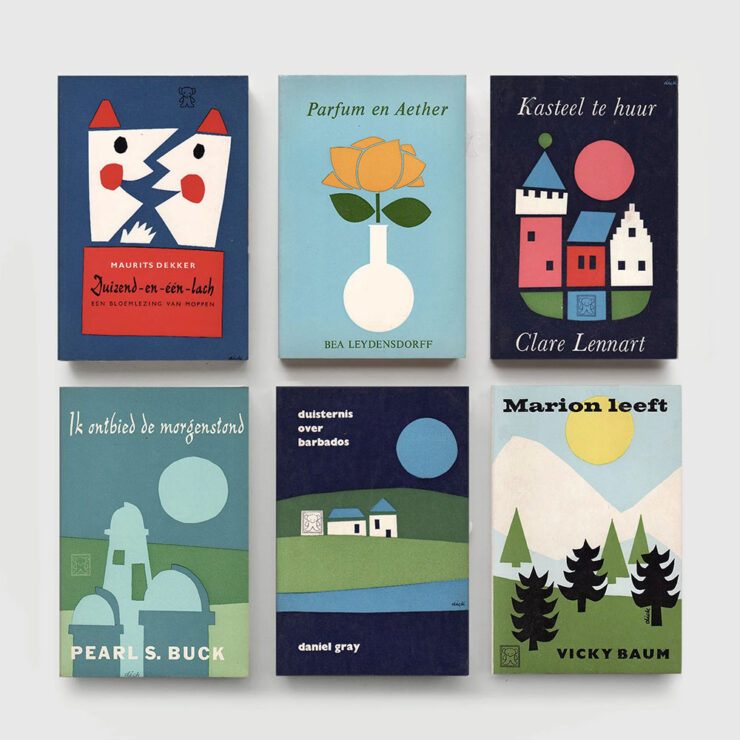
    Dick Bruna book covers, 1970s, from the Zwarte Beertjes publishing house. Image by Present & Correct.

    “The perfectly curated stationery shop that’s every graphic designer’s dream” has a new gig: publishing. But first, the origin story, thanks to a Q&A with It’s Nice That.
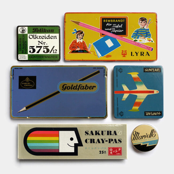
    Tins and boxes for crayons and pencils, mixed eras. Germany, USA & Japan. Image by Present & Correct.

    To talk more about this publishing journey and the designers’ joint practice, we spoke to [the owners] about the story of Present & Correct to date, tracing habits of collecting and archiving all the way back to a childhood spent carefully putting away scrapbooks of sugar sachets, napkins, postcards and coasters, a final major project at art school (a paper concept store called . . . Present & Correct), to their joint travels across the world today, foraging for original vintage stationery to curate the shop’s stocks from over 18 different countries.

    — Ellis Tree, It’s Nice That

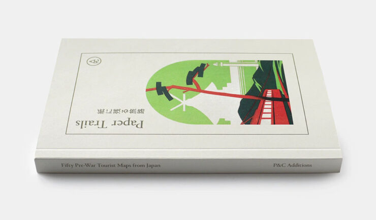
    ”This habit of archiving and collecting vintage ephemera,” the article continues, ”has informed your first self-published book at P&C Paper Trails: Pre-war tourist maps from Japan featuring fifty incredibly illustrated maps for various attractions around Japan.”

    Paper Trails, the first title published by P&C Additions.

    “We named it P&C Additions because we hope to make editions of varying sizes (might be a single sheet, might be a book) and they are additional to what we generally do (a stationery shop!). And yes, we want to make more as and when we can. No pressure, just a natural offshoot which will manifest as a published item when we feel the content is strong enough,” the owners report.

    The interview is awesome. Give it a moment of your time.

    Special bonus #3: The Last Museum’s curators: ““We currently have around five million artworks indexed, and strive to eventually index all museum art in the world.” Not sure about the name, but definitely bookmarked under useful resources. (Via This is Colossal.)

    “A Dutch Courtyard” by Pieter de Hooch, via The Last Museum. Chosen because the original absolutely does not hang in my living room, a joke one or two of you will actually get.
    August’s new typefaves

    Yes, I’ve coined a new word just there — and will continue to deny that it was, in any way, a typo involving the word “typefaces.”

    Franglais, by Emigre
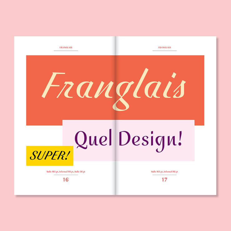
    Franglais, by Emigre.

    ”Franglais was designed by John Downer in sporadic bursts of inspiration dating back to 2000,” Emigre writes on their blog. “It was originally conceived as a standalone italic, and expanded to include two upright companions, Roman and Informal, developed in collaboration with Zuzana Licko.
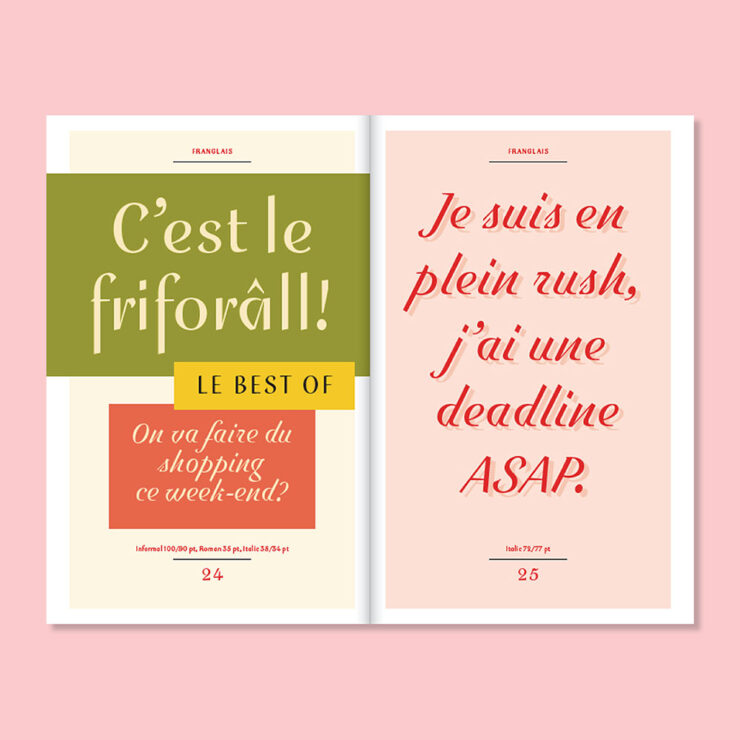
    Pretty much everything Emigre puts out is beautiful, but Franglais is just gorgeous.

    “Reflecting on the origins of Franglais, Downer describes it as lettering devised for imaginary signage inspired by a hybrid of postwar metal type and vernacular chalk-written menu boards. Elements of ‘ruler writing’ — in which a ruler is used to keep the baseline straight across repeated lines — are evident throughout.”

    Special bonus #4: “ShieldFont, as designers Isaque Seneda and Gabriel Abrucio write in a recent white paper, was made to offer web publishers ‘a practical opt-out from unauthorized AI training and [to] disrupt what is collected when that choice is ignored.’” Read about it at Ars Technica.

    Not sure I’m on board with this approach.
    SE Micro, by Gallery Type
    SE Micro, by Gallery Type.

    “Se Micro is the small-size companion to Se Macro, released by Gallery Type earlier this year,” CreativeBoom writes in this month’s recommendations. “They share the same basic skeleton, but Se Micro works well in small or difficult settings, like tiny text or low-quality printing, perhaps even on screens.

    “There’s a nice twist, too. When you blow this typeface up to larger sizes, those practical features become a visual style in their own right. It looks distinctive and quirky rather than just doing its thing of being legible, especially in bolder weights.”

    Ink traps may be on-trend, but I still like their treatment in this typeface.

    “This is an option for branding work across fashion, culture and design-led products. It comes with 10 weights and three widths. And it’s part of a growing family: Se Macro is also out, as I’ve mentioned, but hold onto your hats for Se Mono and Se Rounded, due out later this year or early 2027.”

    Resan, by The Designer’s Foundry
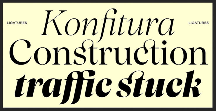
    Resan, by The Designer’s Foundry.

    “Daniel McQueen from The Designers Foundry has been in touch,” CreativeBoom writes. ”He’s just released Resan, a super family inspired by the transitional types of the 17th and 18th centuries. It’s got warmth. It’s got timeless elegance. But it’s also precise.

    “It has a sharp rhythm with generous proportions, giving it decent impact at display sizes. It also lets you change the terminal shapes, shifting the type’s entire feel and mood.”

    I especially like Resan’s alternative terminals.

    ”It’s currently offered in 10 distinct display styles, and if you like what you’ve seen so far, a series of optical weights is in the works.”

    Special bonus #5: “Typographic tourism, or the art of hunting for beautiful signs all over the world,” from Wallpaper*. Never mind searching for the hashtag, read the article then just do it for fun!

    Architecture and typography in one photograph. Hmmm….
    RTFM: Resurgence of The Effing Manual

    Okay, sure, that’s not actually what the acronym stands for. But I don’t care. The United States and its cadre of point-one-percenters have chosen to lead the world in an important new area: preserving the true manual transmission.

    To be clear, they’re also demanding bans on internal combustion go away, so it’s not all good news. They’re apparently unconvinced by Ferrari’s approach, outlined last month and which still uses combustion engines but with increased efficiency, or Hyundai’s approach, which uses electric motors and simulated shifts (the latter of which is being adopted by BMW, among others).

    Two small manufacturers, McLaren and Gordon Murray Automotive (GMA), have both chosen this year’s Monterey/Quail festival of the uber-rich to introduce new cars. Both feature manuals. Porsche was on hand trying to play catch-up.

    McLaren’s first manual since the F1

    The McLaren McL 6GT.

    The original and perhaps most iconic modern hypercar — arguably, the car that launched the term — was the McLaren F1. This month, McLaren introduced something that’s . . . not at all like an F1. It’s a fresh take on 1969’s M6 GT.

    It is both retro and modern, hypercar and hyper-cool — an insta-buy if I could afford it. (Doesn’t matter: already sold out.)

    References to the [original] M6 GT abound, from the vertical headlights and Kamm tail to the position and shape of every duct, rendered with a simplicity that we used to see in supercars of the ’90s and 2000s but see less today. And inside, McLaren has transformed the shifter into an art piece itself, its metallic linkages attracting natural light from every angle in a sea of black and carbon fiber. They’re clearly proud of it, and they suitably want it to be the focal point in here.

    — Adam Ismail, The Drive
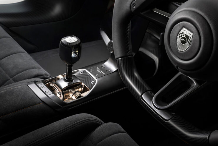
    Just look at that — nothing less than a celebration.

    “McLaren bills this as a ‘new type’ of supercar ‘beyond the core portfolio,’” the article continues. “Based on that, it sounds like manual transmissions aren’t about to become a standard feature of the brand; that, beyond the delineation of ‘Sports, Super, and Ultimate’ models of the past, McLaren is diversifying into more exclusive offerings that, at least in this particular case, pursue a more analog experience counter to the regular lineup.”

    Yeah. Do want. But there’s a wrinkle.

    GMA’s new . . . McLaren F1

    The McLaren F1 was designed by an automotive racing legend named Gordon Murray. He subsequently started GMA, and brought out the amazing T.50, among others. Last year, his Special Vehicles department issued a track-only reimagining of the F1 — and has followed up with a road version, called the S1:

    Since it’s less of a concept than the McLaren, some details are available. It features a 4.2-liter, naturally-aspirated Cosworth V12 making 680 horsepower with a rev limit of 12,100 RPM. It exclusively sports a six-speed manual transmission. It is multi-millions of dollars. And it, too, is sold out. The Autopian has more.

    Special bonus #6: From the combining-cars-and-print-department (“not a stretch,” he insisted), Road & Track has a new ampersand:

    The before-and-after:

    Via the subscription-only Brand New.
    Porsche adds another 911 manual

    If you’ve not heard, one of the brands not doing too well at the moment is Porsche. They went hard into electrification, suffered hard from being part of parent company Volkswagen’s arrogantly inept approach,3Just one example: see Scout. It’s actually sad. and subsequently run afoul of social media’s society’s hard turn against EVs. It has cost them dearly.

    Despite insisting that they were going to do it all along, they’re scrambling to get back to what customers actually want. This month, they introduced a third variant of the venerable 911 available with a stick shift.

    It’s not purple, it’s aubergine. (Love the pinstripes.)

    Like the others, it features a wooden shift knob, a throwback to the Carrera GT V10 masterpiece from the heady days of the early naughties. Like the others, it puts the cupholder immediately behind the shifter, guaranteeing spills. (Or thirst.) Like the others, it costs twice what it did six years ago — although it’s still “only” a tenth of either of the above.

    Like the others, I’d be happy to receive one as a gift.

    Unlike the others, it’s US-only, and it’s available this fall. Details, if you’re interested, are available at The Drive or The Autopian.

    Special bonus #7: Jaguar has released the first image — a rendering, actually, but still — of the new Type 01’s interior:

    As it turns out, they’re not backing down from their vision for a completely-new Jaguar, and I respect them for it. The electric four-door also made its US debut at Monterey, albeit in disguise, and should be out sometime next year. More details and pics at Wallpaper*.

    Special bonus #8: To celebrate the 50th anniversary of BMW’s Art Cars, they’ve gathered them all together in Germany.
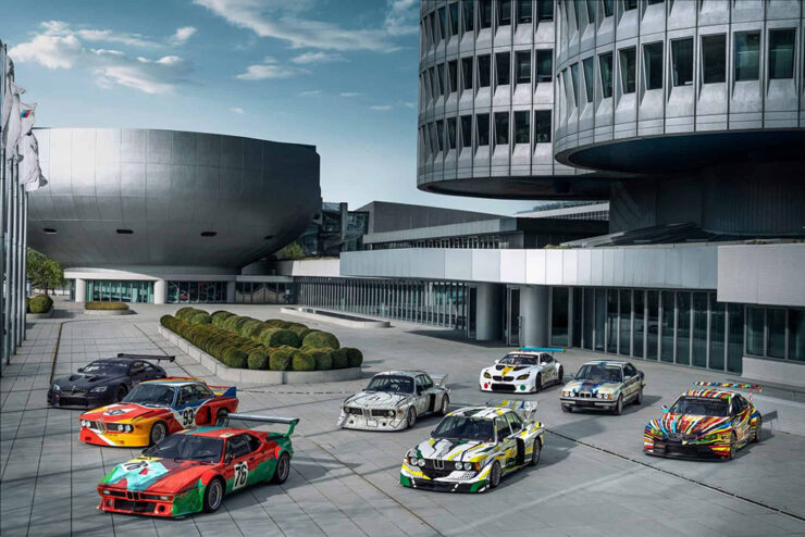
    A sampling of cars under the iconic four-cylinder BMW HQ.

    Lots of press has ensued, but in case you’re not familiar, they’re exactly what it sounds like they should be — but so very much more. Decorated by artists from Roy Lichtenstein to Andy Warhol, all twenty are unique, daring, and different. Some were even raced before becoming priceless.
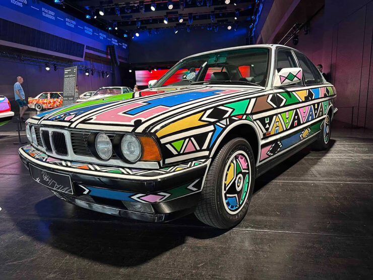
    #12, by Esther Mahlangu, on display at BMW Welt Munich.

    The above is a South African item, a country that, it turns out, has a special history for BMW. Meanwhile, get the history of all 20 cars at BMW Blog.

    Special bonus #9: From the not-a-joke department comes this beautiful — and beautifully green — 1979 Mercedes wagon with 6,088 miles. Long buried by an earthquake (!), has been unearthed and restored:
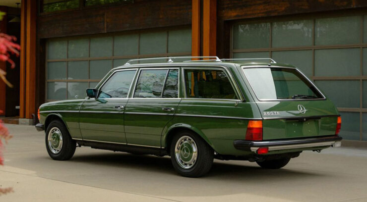
    The very definition of “classic.” The Autopian has the story.

    August’s photography round-up
    Sam Nicklin / Alessi

    Alessi, a “beacon of well-designed homeware,” is celebrated by photographer Sam Nicklin in a new series called Chrome & Colour:
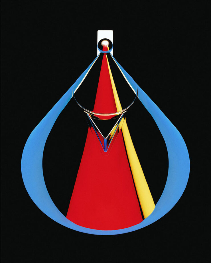
    Photograph by Sam Nicklin.

    “My main goal was to define the silhouette of each object through colour in the reflections, using negative space and keeping highlights to a minimum to really make them pop,” he tells It’s Nice That. To give the images the feel of the 1970s and 80s, “Sam went truly analogue, using the time-consuming process of holding sheets of coloured paper cut to different shapes and moving them around the objects until the reflection was exactly as he envisaged.”
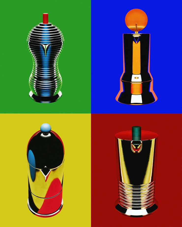
    Photographs by Sam Nicklin.

    See more, including behind-the-shots photographs.

    Pure Street Photography Awards 2026

    This is Colossal caught my attention with these.
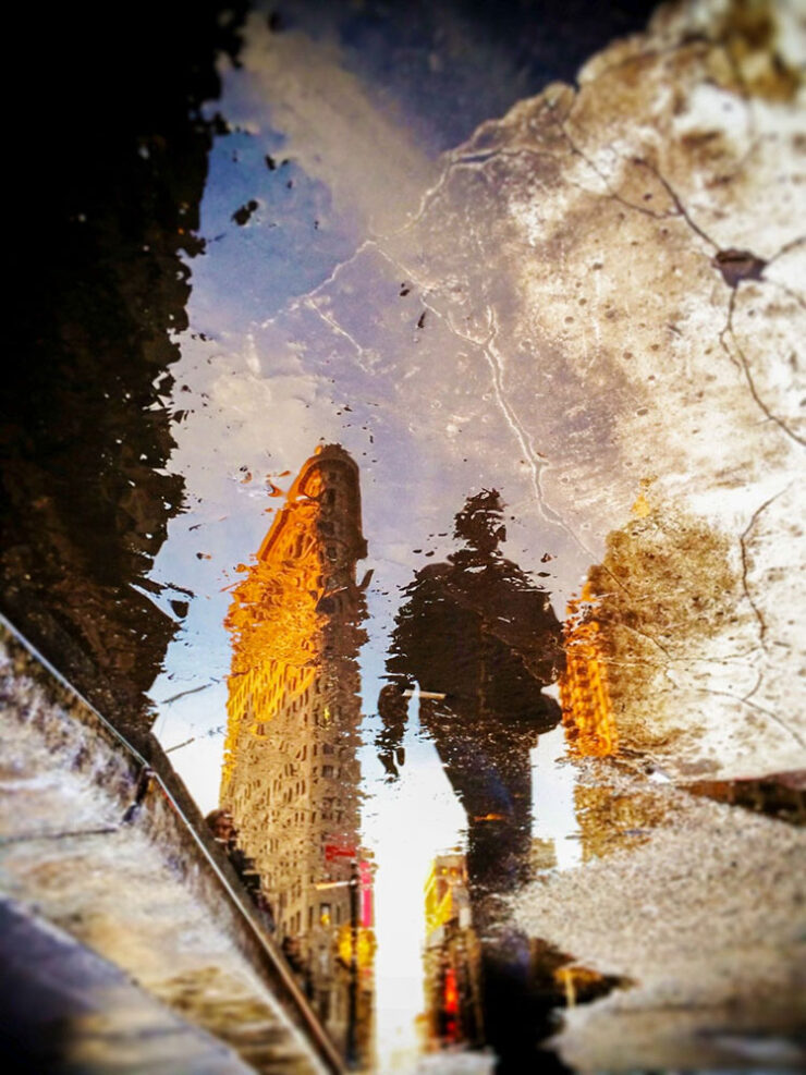
    Finalist, open category. Photograph by Pierra Hauser.

    A category that’s not usually at the Fore(word), but excellence won out.

    250 trailblazing women photographers

    In the introduction of a new book titled Great Women Photographers, Fiona Rogers writes, “If ‘greatness’ has long been defined by visibility and remembrance, then the continued documentation and celebration of women’s photographic practice is not only relevant but essential.”

    — Jackie Andres, This is Colossal
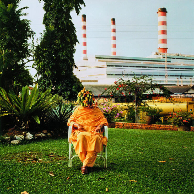
    Photograph by Simryn Gill.

    Phaidon’s stuff is always great. See more.

    Sixteen years of not-so-merry land

    From crumbling row houses in the inner city to abandoned houses on the Eastern Shore to temporary homeless camps, “greater” Baltimore demonstrates decay . . . and courage:
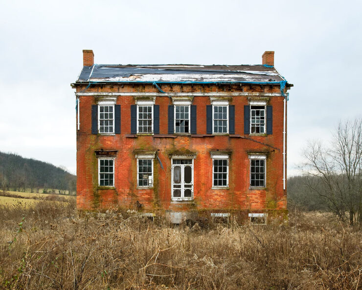
    Carroll County, Maryland. Photograph by Ben Marcin.

    Photographer Ben Marcin documents The Holdouts.

    One of 1.2 million

    “Astronaut Don Pettit takes photos so good that people have a hard time believing they are real,” PetaPixel writes. Case in point:
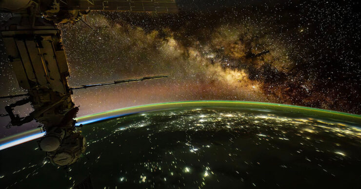
    Photograph by Don Petit, NASA.

    Internet skeptics tried to call him out. But he’d brought notes.

    Eclipse #1: 84 seconds

    A wingsuit and a total eclipse fly into a frame together:
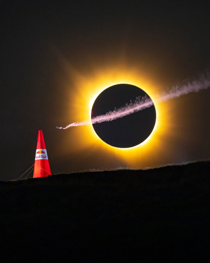
    Photograph by Noah Wetzel for Red Bull.

    Genius marketing, nine months in the making. (Longer, arguably, in the case of the eclipse.)

    Eclipse #2: the fijord

    Photograph by Marc Muench.

    Right place, right time — stunning results, part one.

    Eclipse #3: the sunset
    Photograph by Andrew McCarthy.

    Right place, right time — stunning results, part two.
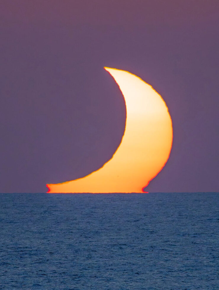
    Photograph by Andrew McCarthy.

    Special bonus #10: Jason Kottke is moving house, and when he has a moment, posting en-masse. It’s an “old-school, stream-of-consciousness” sort of thing — which, to emphasize, is still awesome. Among the three dozen or so nuggets of greatness:

    “Half Dome, Apple Orchard, Yosemite,” trees with snow on branches, April 1933. Photograph by Ansel Adams.

    More than 200 Ansel Adams photos, mostly of National Parks, that are free to view & download. Via Open Culture, one of the gems of the open web.

    — Jason Kottke, “Empting out browser tabs“

    Anything but empty, I’d argue. Enjoy the rest of your summer, folks!

    • 1
      Soap box: getting a website, whose contents you own, is so painfully simple that I tend to discount those that rely on other platforms to publish what might otherwise be interesting material/thoughts/content. And in this case, the author is a Times journalist, who should definitely know better. ↩︎
    • 2
      It’s been pointed out that blogs are social media, too (the original social media, in fact) — something I don’t necessarily disagree with. From my perspective, writing that is owned, put out there due to belief, and read by folks who trust your opinion, is completely distinct from having your potentially-anonymous “take” promoted to strangers by an algorithmic mechanism that profits from conflict — or, at least, provocation. In my opinion, it’s the latter that defines “social media.” ↩︎
    • 3
      Just one example: see Scout. It’s actually sad. ↩︎
  • Beautifully Briefed 26.5: May All Things Be Grand

    Beautifully Briefed 26.5: May All Things Be Grand

    Design is grand; illustration and type are grand, too; the new BMW Alpina is a grand tourer extraordinaire; and space photography is grand indeed. Only Adobe, unfortunately, is the outlier, but on balance, a grand sendoff to Spring.

    This month’s Spine
    University of Chicago Press.
    University of Chicago Press.

    I inked as many jokes as I could — penishment, one could say — but the University Presses column is still worth a read when you have a moment.

    Painting book covers

    Hyperallergic comments, “In a market flooded with design templates and AI-generated imagery, the painted cover stands out as distinctly human.” Which, they suppose, is why when you “[w]alk into any bookstore in the United States lately, […] the shelves and new-release tables resemble group exhibitions.”

    Cover design by Rodrigo Corral Studio. (A 2025 Favorite Book Cover here on Foreword, too.)

    The recent shift from color fields and geometric abstraction to gestural figuration on book covers may reflect a broader craving for embodiment and physical presence — proof, in other words, of the artist’s hand and subjectivity in the era of the internet. Just as painting implies time, so does the novel, demanding sustained attention to both write and to read. It’s a tension that undermines the forces driving creation and consumption in the service of ever-increasing profit margins, both in the art market and the publishing industry.

    — Tara Anne Dalbow, Hyperallergic

    Cover design by Jaya Miceli.

    Regular readers will know this isn’t a new thing, but I think the post — whose author is much more likely to be familiar with social media and bigger-picture trends than I am — is correct in the notion that, “the painted cover seemingly aligns the book with an art-historical lineage rather than the curation of an algorithmic feed.”

    Aside from misspelling Jaya Miceli’s name, there’s lots of good stuff in the article. Take a look.

    Note: I somehow hadn’t seen I Am You before, and am disappointed to have missed this great cover … that would absolutely have been in running for the 2025 Favorite Book Covers. Apologies.

    Speaking of great book design: Jenny Volvovski

    In 2012, Jenny Volvovski “really wanted to design book covers but didn’t have any book cover work. So I hired myself to redesign my personal library.” An interesting approach, to be sure:

    A small selection of items from Volvovski’s unsolicited covers collection.

    That, as it turns out, has worked very well for her — she’s now amongst the elite:

    Cover design by Jenny Volvovski. Was a finalist — but not selected — for my 2025 Favorite Book Covers.

    “Yeah,” I hear you say, “but that’s only a runner-up.” Okay:

    Cover design by Jenny Volvovski. One of my 2025 Favorite Book Covers.

    In addition to the above, Beethoven, The Novel and the Blank, and The Master of Contradictions are among several that fall into the outstanding category; see many more in the “published” section of her website.

    Enjoy! (Prompted by Kottke.)

    Fantastic early 20th-century movie posters (and more)

    Eric Rohman wasn’t a name I was familiar with — he’s Swedish, so I suppose there’s an excuse — but the great design transcends not only the language barrier but the years, as well:

    Poster design by Eric Rohman, 1918.

    “Eric Rohman (1891–1949) was born in Nyköping and grew up in Helsingborg. He was one of the very few people in Sweden who could make a living by only producing posters. He produced about 7,000 works, according to his own estimate. 

    “Rohman’s brother was the manager of one of the big cinema chains and the need for posters was great. Rohman usually worked with few colors and did not spend much time on details, he had a great ability to quickly pick out the essentials.”

    Poster design by Eric Rohman, 1917.

    From Laurel and Hardy and Charlie Chaplin to Ingrid Bergman and Greta Garbo, this online archive is both inspirational and sure to bring a smile to your face.

    When you’re done, the site, Artvee, has countless more from artists worldwide, in hi-res where possible, all in the public domain. A fantastic resource.

    (Another via Kottke.)

    Special bonus #1: Quentin Blake, at 93, continues to advocate “for a discipline that’s lacked attention and prestige for far too long,” CreativeBoom writes. 

    Photograph courtesy of CreativeBoom.

    The master illustrator of Roald Dahl’s Matilda, The BFG, and around 500 more instantly-recognizable titles has been working on a singular goal for more than three decades; the fruit of his labor, The Quentin Blake Centre for Illustration, “the world’s largest permanent public space dedicated to illustration,” opens its doors in Clerkenwell, London, this summer.

    One of the famous cockatoos gifted to the world by Quentin Blake.

    Update, 6 June 2026: Dezeen has a great article on both the Center and its facility: “The site, known as New River Head, was once the end of an artificial river created in the early 1600s to channel drinking water into London,” they write. 

    Facility by Tim Ronalds Architects. Photograph courtesy of Dezeen.

    “Many of the structures on the site were created as part of the endeavour to pump this water to people’s houses. The oldest of these was the base of a windmill dating back to 1707, which stands at the entrance to the museum’s site and has been converted into a gallery space for temporary exhibitions.” Check it out.

    This month’s new fonts

    CreativeBoom‘s monthly feature has twelve choices, a couple of which I’d love to have the opportunity to use.

    Ardent, by Typofounderie
    Ardent, by Typofonderie.

    “Jean François Porchez began designing Ardent in January 2021, starting from his earlier Le Monde Journal and asking what that typeface would need to become to serve modern screen reading. The answer involved drawing wider letterforms and more open counterforms, following the research of Ladislas Mandel and Matthew Carter on legibility and apparent size. Serifs in the italics (an unusual, but actually sensible choice) serve readability on screen, rather than print conventions. […]

    Ardent’s ”angular counters,” as they call them, do stand out.

    “More broadly, the font draws on a rich historical lineage: Elzevirs, Albertus, Vendôme, Meridien, even Verdana. Angular and triangular shapes sit alongside round terminals and both bracketed and unbracketed serifs, creating what Jean describes as a typeface that reveals subtle contrasts invisible at small sizes but gives graphic projects a distinct identity at large ones.”

    Have to emphasize: unlike my usual selections, this is aimed at screens, not the printed page. Still, good stuff.

    Tareco, by Dalton Maag
    Tareco, by Dalton Maag.

    “Deiverson Ribeiro’s pulled off something a bit special here. Developed at Dalton Maag, Tareco takes the beloved sweet treat of the same name as its starting point. This is not a polite, restrained script, but one with a loud, confident personality. Thick, confident strokes and precise details give these letterforms a jazz-like syncopation: a sense of forward propulsion and playful energy that helps to bring designs to life on the page.”

    And seriously: who doesn’t love a biscuit?

    Software woes, rants and hopes
    Part One: Adobe

    I’ve not had much good to say about Adobe recently, I’ll admit. I’m also not thrilled to be back, bemoaning something else. It’s a shame they’ve given me another reason to.

    Recently, I’ve noticed that in Photoshop, the “canvas size” dialog (among others) has looked … well, off. Windows-like, even, which is most assuredly not a compliment. But on a more fundamental level, it’s broken — it has, to use the parlance, lost its focus sequence: the standard workflow of open dialog, type value, tab, type, enter (no mousing required) is just gone. Each value has to be manually selected and entered, a much more arduous process — it’s additional movement, clicks, and time unnecessarily added.

    The old interface is on the left, “new” on the right. Screenshot courtesy of Unsung.

    You can bet I’m not the only one to have noticed.

    Marcin Wichary, at the excellent Unsung:

    I generally avoid such harsh labels on this blog, but: this is awful work. 

    I’m angry. (Clearly.) We should all be angry in the face of stuff like this. This is how people get fed up with software – because it feels unstable and deteriorates on its own without needing to. 

    I know I brought up that an existing power user base can be a huge pain in the ass, and I am a decades-old Photoshop power user. But this is different than other examples where the product needs or at least wants to evolve past its core audience or toward a different market. For Photoshop here, nothing I see indicates any change in course or clientele – and yet all of these good moments in UI that used to help me out no longer exist.

    Plus, all those transgressions are solved problems. Those issues are not buried in pages of heavily litigated patents, or in seven collective brains of world-class interface designers whose driveways are presently occupied by cash-filled trucks sent over by frontier companies. This isn’t some long lost art that requires archaeologists to decipher. This feels like carelessness and laziness in face of basic UI engineering; in a likely internally-motivated effort to refresh the interface, the team threw an entire nursery worth of babies [out] with the bathwater.

    — Marcin Wichary, Unsung

    “It’s not just about disservice to craft. It’s not even about disrespect for change management, trivialization of institutional memory, and disinvestment in quality assurance. This isn’t only […] sloppy coding,“ he continues. “This is a failure of imagination.”

    Jason Snell, at Six Colors:

    I have been using Photoshop since John Sculley was the CEO of Apple. Longtime users can be brutally resistant to change, but I would like to think that I remain open-minded. One can’t have used Photoshop for more than three decades without having adapted to change and found utility in the new features Adobe has added over the years. I’ve used generative fill. I’ve used AI-enhanced edge detection. I’m hip and with it.

    But, as Wichary detected, what Adobe is doing with the Modern User Interface is not to make a new, improved, modern interface. Adobe’s own description gives it away: It’s a hammering of all of Adobe’s user interfaces so they look alike, across Creative Cloud. It’s a “multi-platform design system,” which means in addition to Adobe being committed to “modernizing” Photoshop by making it look like Premiere, it’s also going to make it look the same on the Mac as Windows.

    Already, Photoshop desperately wants to run in single-window mode, with multiple documents opening in a single uberwindow—in other words, the stink of Windows. Fortunately, you can turn that feature off, and I have. […]

    That all said, of course, this decision could benefit Photoshop users, because Adobe could put in the work to make the app better while also fulfilling its own corporate goals of homogeneity.

    Ha ha ha. Sorry. I tried to write that with a straight face.

    — Jason Snell, Six Colors

    It gets worse. Nick Heer, he of PixelEnvy, noted:

    If you do a little poking around in Adobe’s application bundles, a key reason for the jankiness of these user interfaces becomes apparent: it is because they are little webpages. These dialog boxes are HTML files that reference a chunky CSS file and oodles of JavaScript […].

    This is loathsome.

    There are people out there who will insist it is unfair to blame the tools and that bad user interfaces can be built in entirely native languages, too, which is true. Also, Adobe’s interface has always been unique and not quite at home on either MacOS or Windows. Maybe it really is possible to build a web app that feels platform native. But I have never used one — not once — and for this mess to be increasingly used in the industry-standard professional suite of creative tools is maddening.

    — Nick Heer, Pixel Envy

    John Gruber, on Daring Fireball, notes that, “The before-and-after screenshots look like examples from a lecture on user interface design  —  if you swap them around make the new ones ‘before’ and the old ones ‘after’. Better balance, better focus behavior, appropriate platform-native typography.”

    Michael Tsai has a post on the whole “conversation” if you’d like to get a sense of just how many people are upset; for what it’s worth, it includes a comment from Adobe’s “Lead Scientist” for user interface: “These sharp edges are acknowledged, and we are working on them.” I’m sure I’m not the only one who doesn’t entirely trust their reassurances.

    Wichary did provide a solution, however temporary: turn off the interface “improvements.” There’s an option buried in the settings:

    Uncheck the box, then note the last line.
    Part Two: Folklore

    The hope part: Gruber followed up with a thought-provoking piece called, “Software as the Product of Obsession Times Voice.” He reminds us of a famous quote from Walt Disney — “We don’t make movies to make money; we make money to make more movies” — and that it applies to software development, especially for independents. To wit:

    It feels like the world of software is bifurcating quality-wise. This whole thing about Adobe’s new craptacular “modern” UI language (a.k.a. “Spectrum”) exemplifies one side of that bifurcation — the bad-and-getting-worse side. Software that is the product not just of an ignorance of long-established principles of interaction design, but of a willful disdain for those principles. What Adobe is now shipping is just inexplicably bad UI, ignoring literally decades of great work and long-mastered concepts — a lot of which work was pioneered by Adobe itself!

    — John Gruber, Daring Fireball

    He goes on to discuss that what’s expected from Apple is “insanely great,” and that Adobe is failing so hard precisely because they’re Adobe and know better. He also mentions a concept known as software brain — read the post to get that — but, in a nutshell, it’s not about the quality of the software. It’s about the quality of the profits. Quelle surprise.

    However, “[t]he other side of the software fork is not deserted. It’s just populated, more than ever, by the products of small independent developers who obsess, first and foremost, over quality and artistic vision.”

    Which leads us to Folklore. Mentioned on Upgrade’s Apple 50th anniversary podcast episode, Folklore is a list of 123 great stories from Apple’s early days, from when Apple was that company obsessing, first and foremost, over quality and artistic vision.

    Great stuff. Wander through the list at your leisure — and revel in the glory days.

    Never doubt that a small group of thoughtful, committed people can change the world. Indeed, it’s the only thing that ever has.

    — Margaret Mead

    Special bonus #2: Taken, a single webpage that shows just how much information you share by … visiting a webpage. Sigh.

    Special bonus #3: Boring, an interactive essay arguing that some of the items mentioned above have, in fact, gone too far — and that forces are at work to redress. Speaking of hope: let’s do that.

    BMW Alpina

    So, it’s finally happened: after what seems like forever — including several mentions here on Foreword — we’ve now seen where BMW is going to take the Alpina brand.

    I’m both relieved and excited: it could be very cool.

    Image courtesy of BMW.

    Unlike BMW M, which is focused on sport, BMW Alpina will be focused on speed. Mile-munching, cross-continent stuff. (If you’re a Mercedes fan, think closer to Maybach than AMG — or maybe an amalgamation of both.) “[T]he understated character of ALPINA fits the way wealthy buyers are spending now,” writes BMW Blog. “That is the market BMW is aiming at — not M buyers, not 7 Series buyers, but the segment above both.”

    “An ALPINA is for connoisseurs, meaning people that love driving, they like driving fast, but they don’t want to communicate to the outside world that they bought a race car,” said BMW Group Chief Designer Adrian van Hooydonk. “That would be an M customer. And therefore we thought that is the position, that is the opportunity for ALPINA.”

    Image courtesy of BMW.

    Which makes sense. It’s what Alpina always stood for: faster than standard models, more luxurious than M models. Exclusive and expensive.

    Four images above courtesy of BMW Blog.

    There’s nothing about this I don’t like. It’s a great design in a great color with a fantastic interior. Indeed, it’s a great presentation, and looks like a great place to park yourself for hours on end while scenery rips by.

    Of course, not all is perfect: it’s only a “vision.” BMW’s concept cars tend to get watered down fairly extensively, and this one’s no exception; the first model isn’t even going to be a coupé but rather a modified 7-series sedan. They’ll be both gas — ahem, petrol — and electric, and will cost Bentley money.

    The concept on stage at the 2026 Concorso d’Eleganza Villa d’Este. Image courtesy of BMW Blog.

    Alpina has always been the car for people who found M too loud and Rolls-Royce too theatrical. The buyer who knew what a it was and didn’t need anyone else to. I’m excited that Alpina is going to, thankfully, continue to represent that — and seemingly, successfully transition to a new era under direct BMW control. 

    Read more at BMW Blog (1, 2, 3, 4, 5, 6, 7, 8, 9) or The Autopian.

    This month’s photography round-up
    Space #1: More from Artemis II

    “NASA has released a tranche of 12,000 photos taken during the historic voyage that were shot on a combination of the Nikon D5 SLR, Nikon Z9 mirrorless, and iPhone 17 cameras that the Artemis crew took with them,” PetaPixelnotes in a post showing some of their favorites. (This is Colossal has a post of their favorites, as well.)

    Hank Green — of the Sci Show YouTube channel, among many others — has put together the very cool Artemis II Photo Timeline, as noted long-time Mac guy (and co-founder of the Relay network of podcasts) Stephen Hackett.

    The timeline is an interactive way to scroll through photos from the mission — but pinned to NASA’s official schedule. Green also explains something I was wondering, which is why there are no credits on the photos: “the four astronauts together agreed that they did not want credit for any photos taken on the mission. I’m somewhat conflicted about this because this project is about giving as much context as possible, but of course there is also something very beautiful about not wanting to take individual credit for something that was the result of so much collaboration.”

    Hat tipped to all of that. A month later, and the excitement is still palpable.

    Space #2: The Milky Way
    “Night at the Remarkables.” Photograph by Tom Rae.

    The 2026 Milky Way Photographer of the Year winning images have been announced, and they’re stunning. “Every year, this collection reminds us that photographing the Milky Way is not only about technique or planning. It is about curiosity, patience, and the desire to experience the night sky in places where it still feels wild,” says Dan Zafra, editor of Capture the Atlas.

    “Perseid Meteors Over Durdle Door.” Photograph by Josh Dury.

    See all of the winning images at This is Colossal, PetaPixel, or the contest website.

    Space #3: Triple Arch
    The Matterhorn, the summer arch (left), the Gegenschein (center), and the winter arm of the Milky Way (right). Photograph by Angel Fux.

    From high up in the Alps, a stacked image of events that took place in one night, taken from one location by one photographer, with no AI involved: a celestial phenomenon that has never been captured in this exact way before. Awesome. PetaPixel has the details.

    And Finally: Lightning Bugs, Indeed
    “Presence,” Australia. Photograph by JJ.

    PetaPixel brings us the story of JJ, who went on a mission to capture lightning sprites, an elusive-yet-beautiful item — and got something else, too.

    “Those little fireflies reminded me of why I do this in the first place. It reminded me that it wasn’t about getting something better; it was about fully appreciating things there in the moment. And this is why I named the image ‘Presence.’” 

    Special bonus #4: Engagement with the arts slows aging!

    “[R]esearchers believe that a significant part of why engaging with the arts slows biological aging is the diverse range of visual, sensory, and physical stimuli associated with art, as well as the social interactions that often accompany it,” PetaPixel notes. 

    “The new findings go much farther than that, though: they also found evidence that artistic engagement can have roughly the same health benefits as physical exercise. This is a huge deal, especially for those in middle- and late-age groups who may find strenuous physical exercise too difficult.”

    So, be glad: taking the time to read Foreword today may have had benefits beyond entertainment. Thanks for visiting.