It’s July, and it’s hot. Bring a beverage. Umbrella optional.
Spine!
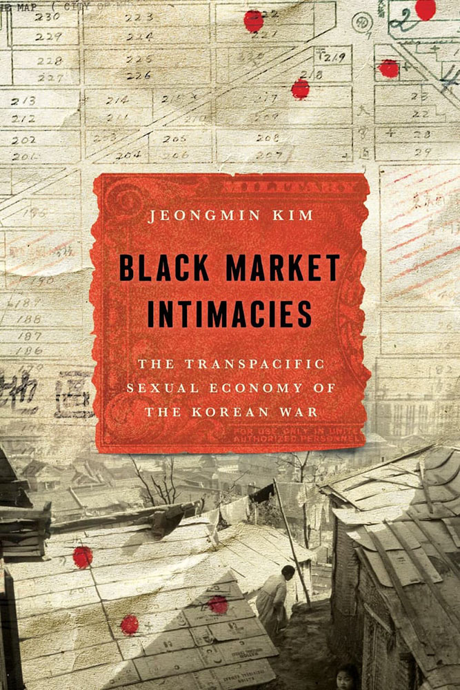
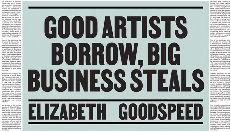
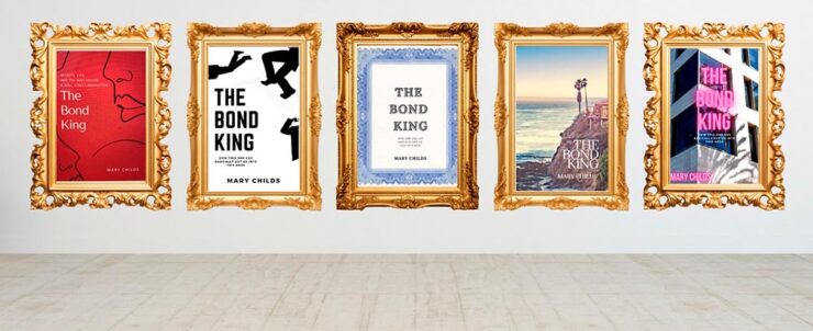
“The cover asks questions,” I wrote in this month’s column for Spine. “Illustrations and scripts combine in myriad ways; maps plot; and blood drops. Rather than telling you what the title is about, it suggests that it’s not easily summarized — in all the right ways.”
Read!
The End of Reading is Here
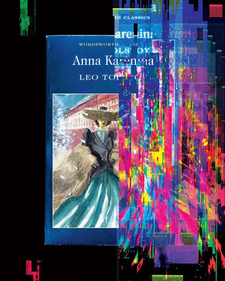
“Optimists once believed that universal literacy was inevitable. Now it seems that the age of reading might be a short anomaly in human history,” The Atlantic writes. “The decline of reading will bring about changes of the same magnitude. It will affect our innermost thoughts, our society’s politics and culture, and how we tell the history of our civilization.”
Reading requires imagination; consumption, whether social media, television, or gaming, really doesn’t. It’s no surprise that the lowering of the common denominator is the result.
But what if the premise is, in fact, true? I can’t imagine a life without reading — and you’re reading this, so you probably can’t either. Will humanity reach to a point where ingestion of knowledge doesn’t involve the written word? Should it?
Read the article here. (Gift link via Kottke.)
Update, 31 July (after publishing): The gift link has expired, darn it — apologies. (One of the downsides of gathering items throughout the month, I guess; this is from the 8th of July.)
“Read More. Read Often. Read Every Day.”
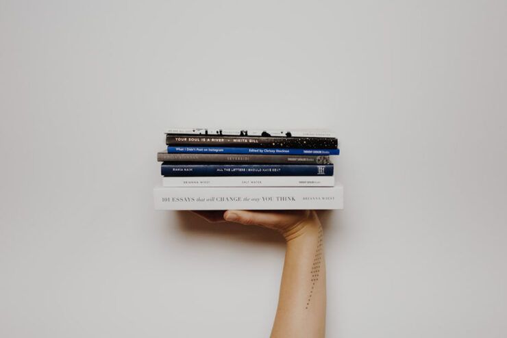
We keep searching for lifehacks, productivity tips, and bullshit, but the answer is right there. If you want to be better, grow more, understand your life, understand your purpose, learn something, or just find somewhere to stay a while when life gets overwhelming — pick up a damn book.
— Joan Westenberg
She calls it the 80/20 rule: “I believe that spending 20% of your time buried in a book, buried in something that will inspire you, excite you, and make you want to jump out of your seat is going to give you the fuel, the ideas, and the power to create 80% of your output.”
It’s worrying to think that The Atlantic might be right. This, In its brevity and forthrightness, is a strong counter-argument.
Special bonus #1: Uncovered is a site for judging books by their first pages. “No cover. No bestseller sticker, no celebrity book club, no BookTok trend. You read the opening of a real book, blind, and answer the only question that matters: would you keep reading?”
Great address, by the way — I didn’t know .ink was a thing. (Also via Kottke.)
250 for 250

Brooklyn Public Library is celebrating our country’s 250th anniversary the best way we know how: with a thoughtful, surprising, irresistible booklist. Organized by genre and category of interest, this all-ages list is a deep dive on the stories, voices and moments that shaped America. Selected by our expert librarians — with help from a few notable New Yorkers! — here are the 250 most influential books in United States history.
— Brooklyn Library’s 250 for 250 Booklist Intro
Whether it’s actually the most influential 250 titles in the country’s history is probably intentionally debatable, but it’s still a great list. From The Hunger Games to The Snowy Day, The Warmth of Other Suns to Where the Sidewalk Ends, the choices are sometimes surprising, sometimes great memories, and sometimes inspirational.
If you’re looking for the next title to read — or the next gift to give — start here. (Also available in a handy PDF if you’d like to send to someone.)
Special bonus #2: Bookmobile, my favorite short-run printer, has been sold — but remains privately-owned, non-corporate, and dedicated to craft. Founder Don Leeper is retiring after 44 years; Michael Shoemaker is the new owner.
“Mike is the perfect buyer for Bookmobile, with the passion, skills and resources to continue and improve our services to publishers. From the beginning of our discussions he displayed an aptitude for grasping the complexities of book publishing in the 21st century and bringing to bear his deep experience in technology, ecommerce, and business in general. Last but not least, he has an understanding and appreciation for the importance of book culture. I am damned lucky we connected.”
— Don Leeper, Bookmobile
“No major changes are planned,” the press release says. “Under its new ownership, Bookmobile will continue to invest in the growth of the business and the success of its publisher customers.”
Type!
This month has seen a wealth of new typefaces introduced. A few that caught my eye are below, but it’s start with a question.
“What is Queer Typography?”
“Looking for queer anything often feels lonely,” Paul Soulellis writes. “The word queer resists definition, sometimes aligned with ideas about rejection, refusal, deviating from the expected, away from the normative. It’s certainly a political word, one that’s taken on expansive qualities throughout its history, qualities that aren’t necessarily confined to gender and sexuality.”
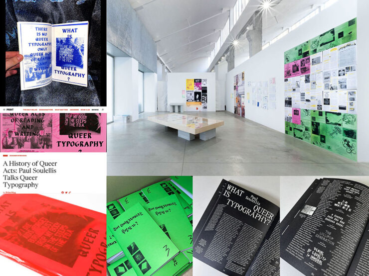
An interesting text, certainly, with many possible answers to the question and accompanying designs and images. “[W]e need to stay with queer as an action, actively engaging with the past and the future as a verb.”
Read more. (This is from 2024, but was recently linked at Kottke — and was new to me, so forgive the late notice/attention.)
Emigre’s Modulator now at Adobe Type
Adobe prices are a regular gripe amongst many, but one of their strongest offerings is the type catalog — and it just got better:
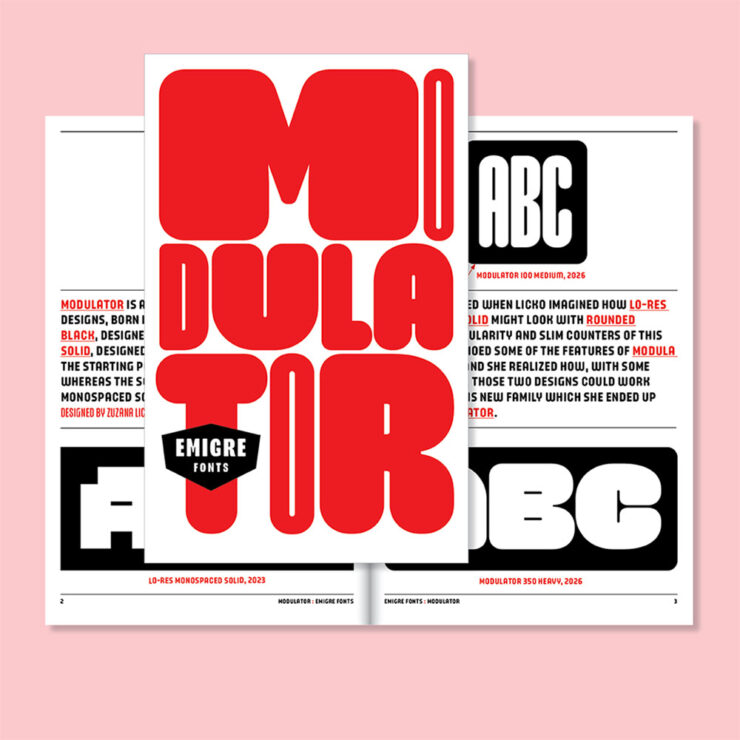
“Modulator was conceived as a dialogue between two designs separated by nearly three decades: Modula Round Black (1995) and Lo-Res Monospaced Solid (2023),” Emigre writes. The results are Modulator and its companion Modulator Text Variable, “optimized for smaller sizes by expanding the stem and counter dimensions to improve legibility.”
Pretty much everything Emigre is awesome, and this is a welcome addition.
Data as type
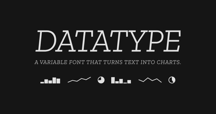
“Datatype is an OpenType variable font that turns simple text expressions into inline charts. No JavaScript, no images, no rendering library — just type the syntax and Datatype’s ligature substitution does the rest.”
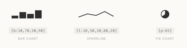
Very cool — and very open source, thus very free. Available on GitHub or Google Fonts.
Special bonus #3: I don’t actually know how much AI is driving new typeface design; honestly, it seems like an art form requiring human decision-making. Dutch foundry Mass-Driver is one that will always design fonts by hand:
AI tools perceive reality as a finite set of data, up-to-date as of about 2021: the shadows on the wall of Plato’s Cave. Right now they are very good at making shadow puppets, but they cannot see the world outside.
— Rutherford Craze & Co., known as Mass-Driver
If we allow these tools to dictate our visual culture, we must accept that it will be vitrified by machines which consider a few billion webpages equivalent to the sum total of human existence. I don’t accept that. How dare we abandon so many countless traditions and people and ideas and nuances, simply because they are underrepresented in the training data?
CreativeBoom’s July Fonts
Fourteen in all this time — last month’s suggestion of a summer lull was wrong, apparently — with some strong selections. I wanted to show several, but narrowed it down to three that deserve highlighting:
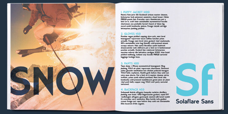

“Solaflare’s mood is both unmistakable and timely, evoking warm evenings, hand-painted shop signs, and the particular quality of light in a California coastal town. John Roshell of Swell Type was inspired by the hand-painted signage of Santa Barbara, but rather than simply reviving that aesthetic, he built a variable font around it; one that lets designers slide between three distinct typographic personalities within a single file.”
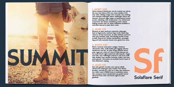
That’s right: a variable flare — meaning sans on one end, flare in the middle, serif on the other. Check it out.

“Alex Chavot’s latest release for Apex Type Foundry — launched alongside a comprehensively rebuilt foundry website — takes Halbfette Cantate, a display face released around 1910 by H. Berthold AG and designed by Johann Graf, as its starting point, then runs it through the filter of Ed Benguiat’s flamboyant 1970s classics. The result is sweeping swashes, lyrical terminals, high contrast, and an unapologetically theatrical personality that Chavot describes, accurately, as ornamental excess meeting typographic swagger, with just enough restraint to keep it printable.”
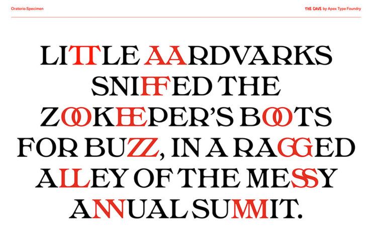
Single-weight fonts are rare these days — but oh, what a weight it is. Expressive, serious, almost lavish. Check it out.
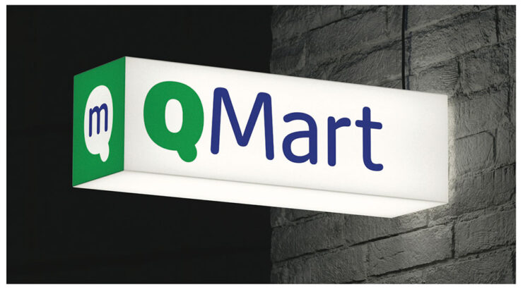
“Max Phillips of Signal Type Foundry has a gift for describing typefaces, and his account of Milgram is direct. They’d always wanted to add a humanist sans to the library, and always wanted to add a rounded sans. So they decided to save time by making them the same typeface and seeing what happened. What happened was a wave of nostalgia for Frankfurter, VAG Rundschrift, and an all-caps dry-transfer face called Formula One that nobody else seems to remember.”
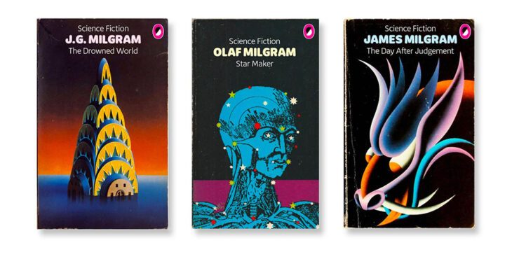
’Course, anybody who mocks up book covers with their new font … instaclick! Check it out.
Vote!
Archinect’s Spring ’26 lecture posters
Twice a year, Archinect holds a contest for their readers to decide which of the season’s lecture posters from architecture schools around the country are their favorites.
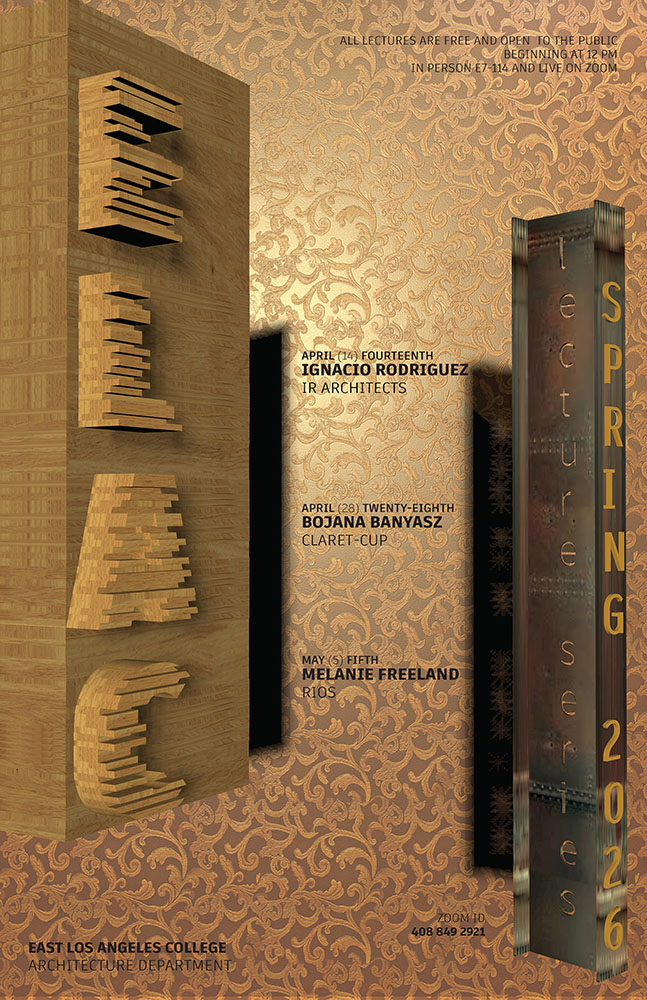
Alas, the contest usually ends just before this column gets posted, so sometimes y’all are able to vote, sometimes not. This time, we only get to compare my favorites with the results.
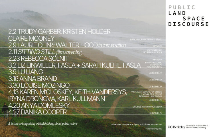
Along with these three, I’d also give honorable mentions to Yale, Sci-Arc, and the University of Tennessee at Knoxville.
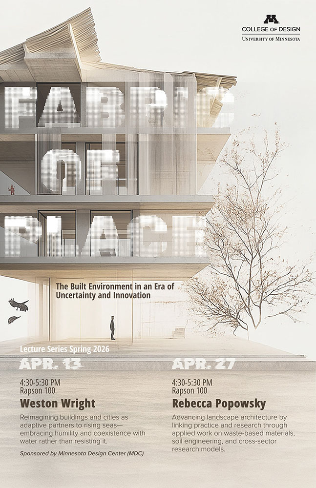
ELEC won the contest, too. As for the rest, we’ll just have to agree that they’re all winners in one way or another. See the readers’ and editors’ choices.
“Choose Euro’n Adventure”
Brand New‘s penchant for punny-yet-perfect post titles scores another with this one — another one that voting might be just out of reach for, depending on where you’re reading this from.
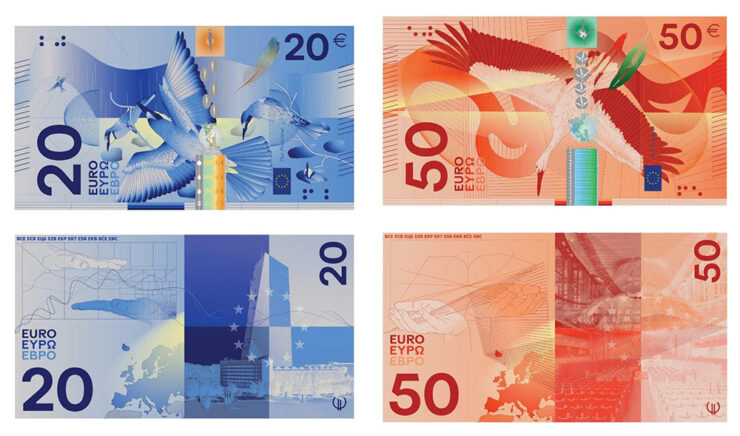
That’s right: it’s time to redesign the Euro! Finalists have been chosen.
“A panel of jurors selected the designs, which follow one of two themes: European places and ideas or birds and rivers, the latter of which is meant to symbolize freedom and unity,” This is Colossal writes.
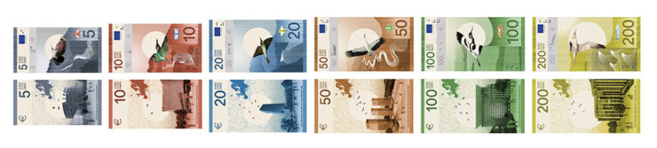
Interestingly, the notes get bigger with denomination — the 5 is the smallest, then 10, then 20; the 50, 100, and 200 are all the same size. (Not the boring uniformity we get here in the States.)
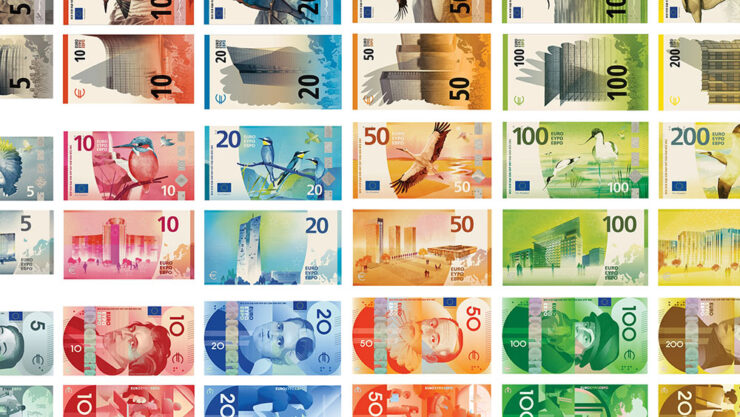
“While basic elements are the same — all collections devoted to culture feature the same six figures, for example — individual approaches appear in the layout, aesthetic, and composition,” Colossal continues.
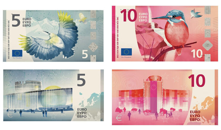
I’m unsurprisingly partial to the birds & places, but no matter which theme or which specific design, these are all excellent. See all the available options at the European Central Bank website — and, if you’re in the EU, take the survey!
Special bonus #4: It’s not the Europeans, it’s the English we have to thank: Getty has abandoned its takeover/merger with/of Shutterstock. Hooray!
Amuse!
Lil’ Finder Guy
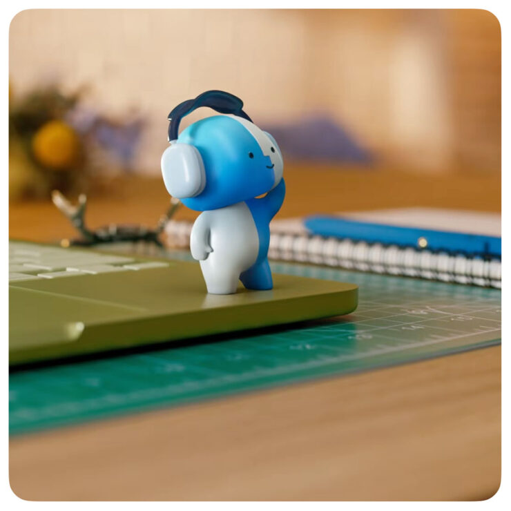
Basic Apple Guy, who introduced me to Apple’s social media campaign1As you probably know, I don’t participate in social media. I have to rely on others to bring Apple’s media efforts to my attention — folks covering the coverage, as it were. for the MacBook Neo, has an update with all things regarding this unofficial mascot.
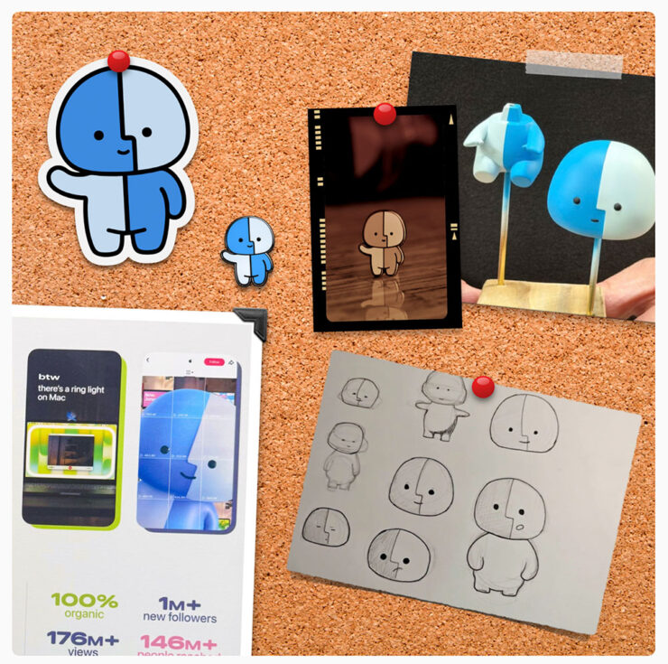
It’s the Internet, of course, so even items that have been posted briefly then deleted are fodder for careful investigation — and some of the details he’s dug up are neat. (He’s also done a bunch of generated varieties of the character, which make occasional — and often delightful — appearances in his articles.)
Save the manuals
No, not of the RTFM variety. It’s actually a non sequitur.
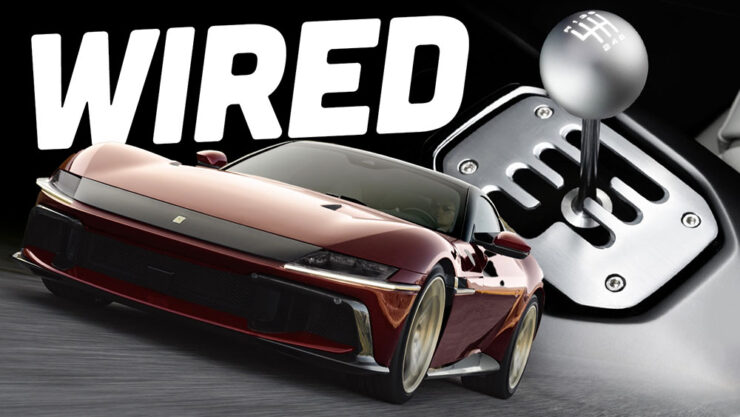
Ferrari went and did something interesting, again: having introduced the world of high-performance motoring to the automated manual (the F1, in 1997),2Ferrari’s F1 wasn’t actually the first automated or even semi-automated manual gearbox/transmission, by a long shot. It is, however, the one that brought it to sports cars, followed almost immediately by BMW’s SMG. Wiki has a history, if you’re interested. it’s now introducing … the manualized automatic.3Technically, Koenigsegg got there first with its CC850. However, a) you have to be a car geek to know Koenigsegg, and b) that shift-by-wire unit doesn’t use traditional selector forks, or synchronizers. Instead, it uses seven wet clutches, six to select forward ratios and one for reverse, all with their own pressure sensors and mechatronic actuators. “Changing up is as simple as engaging the right clutches,” The Autopian says. Ferrari’s is a gated dual-clutch automatic, although to call that an oversimplification is an undersell.
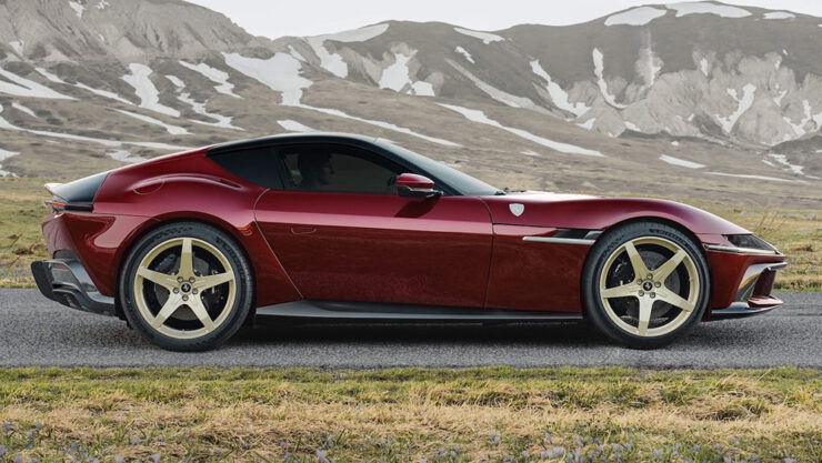
First of all, let’s all please agree that the 12 Cilindri, their 819-horsepower, half-million-Euro, two-seater Grand Touring masterpiece, is a beautiful thing — retro, but in a modern way. Especially in this merlot-and-gold combo.
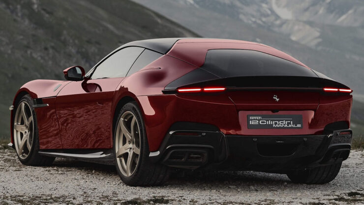
In the new Manuale model, the transmission is the story: a gated dual-clutch automatic, or DCT, with a twist. It’s got buttons for drive, reverse, etc., as usual — but a clutch and a shift lever instead of paddles.
By doing so, offers a road map for other automakers (cough *BMW*) whose customers are demanding the engagement of a manual but whose governments are demanding reduced emissions and increased mileage — plus all those safety mandates like automatic braking and conveniences like adaptive cruise control.
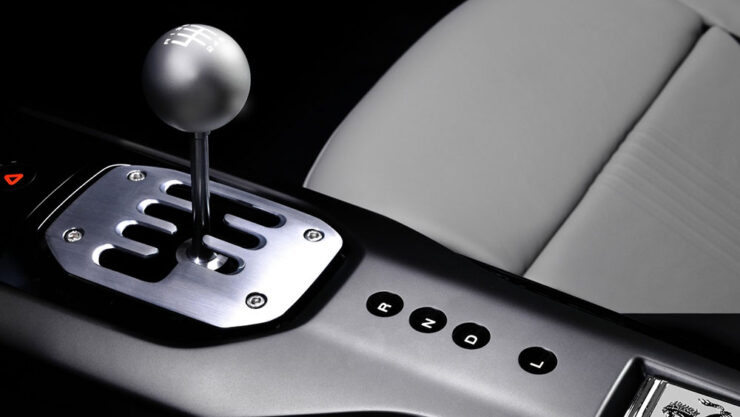
I’m convinced this is the future of the manual transmission. It’s unconventional, unexpected, and is going to take a minute to trickle down. But … fingers crossed.
Get details at The Autopian or The Drive.
Special bonus #5: Driving stick can help prevent dementia. Okay, sure, it’s not the most scientific post extant, but it makes sense.
Gaze!
Astronomy Photographer of the Year finalists 2026
“Now in its 18th year, the ZWO Astronomy Photographer of the Year contest is among the premier photo competitions that celebrate the art of astrophotography and astronomy,” PetaPixel writes.
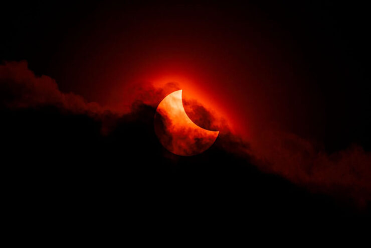
“The competition features nine categories, a pair of special prizes, and the expert panel of judges selects a single overall winner, all of which will be showcased in an exhibition at the National Maritime Museum in England starting on September 18.”

Astrophotography is fascinating — a reminder that we’re merely a blip — and requires patience, skill, and specialized gear. But the results … wow.
25 Amazing JWST photographs
While we’re on the subject of space photography, the imagery from space-based cameras amaze no less. The James Webb Space Telescope just celebrated its fourth birthday, and PetaPixel has gathered 25 of its most spectacular and insightful images.
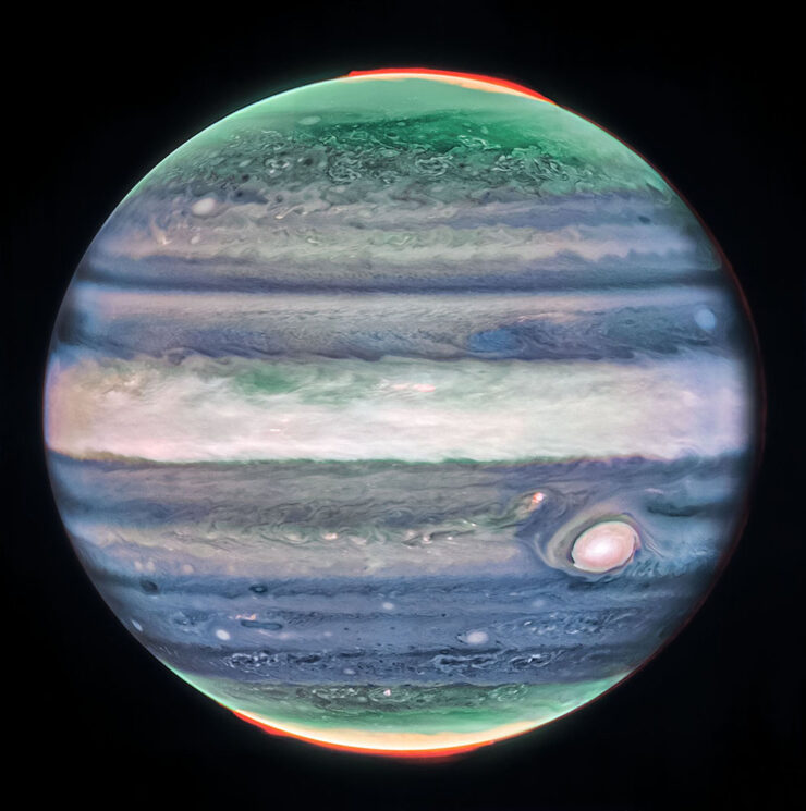
Cloud details, aurora, the eye — and all on a planet we’re “familiar” with.
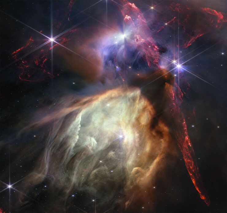
The Rho Ophiuchi cloud complex is the closest star-forming region to Earth, and demonstrates both the beauty and power of the Universe.
“The $10 billion NASA/ESA/CSA JWST has produced a great deal of exceptional scientific work in its first four years of operation, much of which is utterly groundbreaking,” PetaPixel writes. “However, that alone is not enough to warrant a photo’s inclusion. While scientific value is important, a Webb image featured here must also be beautiful.”
See also: PetaPixel‘s selections from JWST’s second birthday two years ago.
Illumination
What do these two photographs have in common?


Both were taken by the light of the full moon!
In his new book, aptly named Darren Almond. Fullmoon, “the light of the Moon is eerily enhanced, infusing the landscape with haunting ideas of nature and time,” PetaPixel (dramatically) writes.
iPhone Photographer of the Year 2026
It’s that time of year again: the iPhone Photography Awards, now in its 20th season, has announced its annual competition winners.

Entrants from more than 140 countries “showed just how powerful an iPhone can be in the right hands and how great photos don’t always require high-end, dedicated camera equipment,” PetaPixel writes.
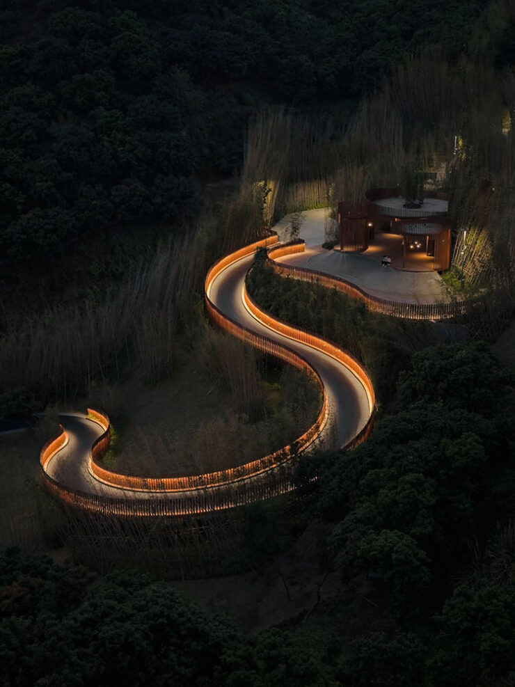
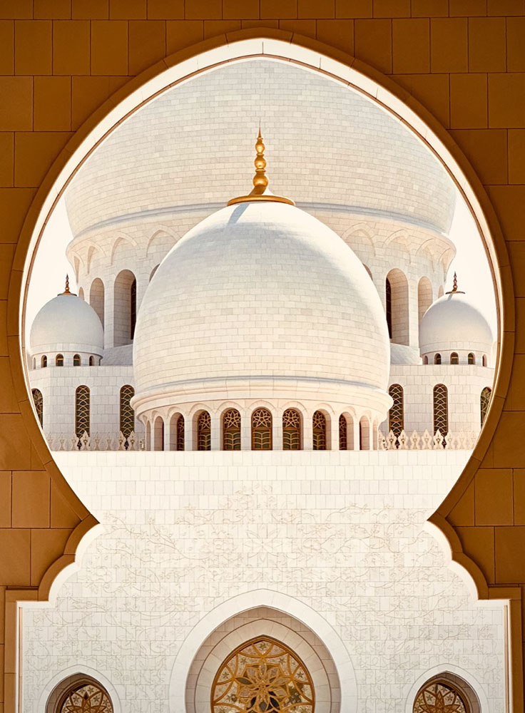
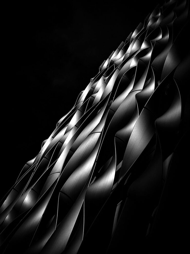
Of course, these four barely scratch the surface of the fantastic selection from a variety of categories; see all the winners, runners-up, and more at the official website.
The Architecture of Connection
A left turn, so to speak:
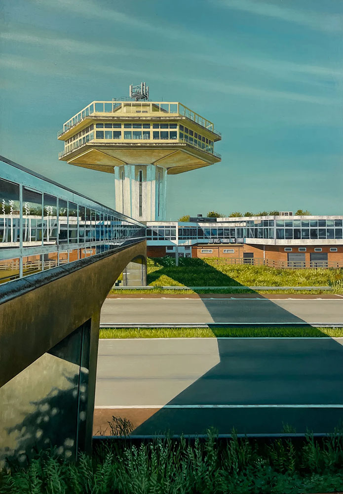
“The Modernist Society takes a detour from its usual publishing habits with a new monograph, The Architecture of Connection,” Wallpaper* writes, “featuring the work of painter Jen Orpin.”
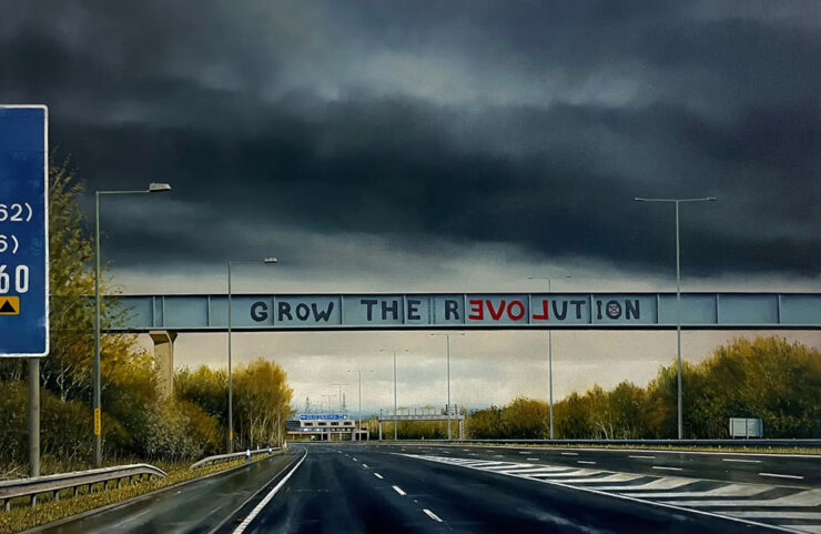
That’s right: paintings. We’re “in the realm of unseen and overlooked infrastructure, with Orpin’s eye – and careful framing – capturing over 200 images of the bridges that span Britain’s motorways. […] The Architecture of Connection brings the entire series together in a monograph for the first time, together with some of the artist’s writings about the work.”
Without traffic, but with something bordering tranquility, it’s of course right up my street. I sometimes wish I could stop and photograph every interesting bridge — or even roadside attraction — while out in the world, but don’t, of course; few of us do. Orpin did. With an easel, no less.
2026 International Pet Photography finalists
Finally, something to send you into August with a smile on your face: humanity’s best friends.


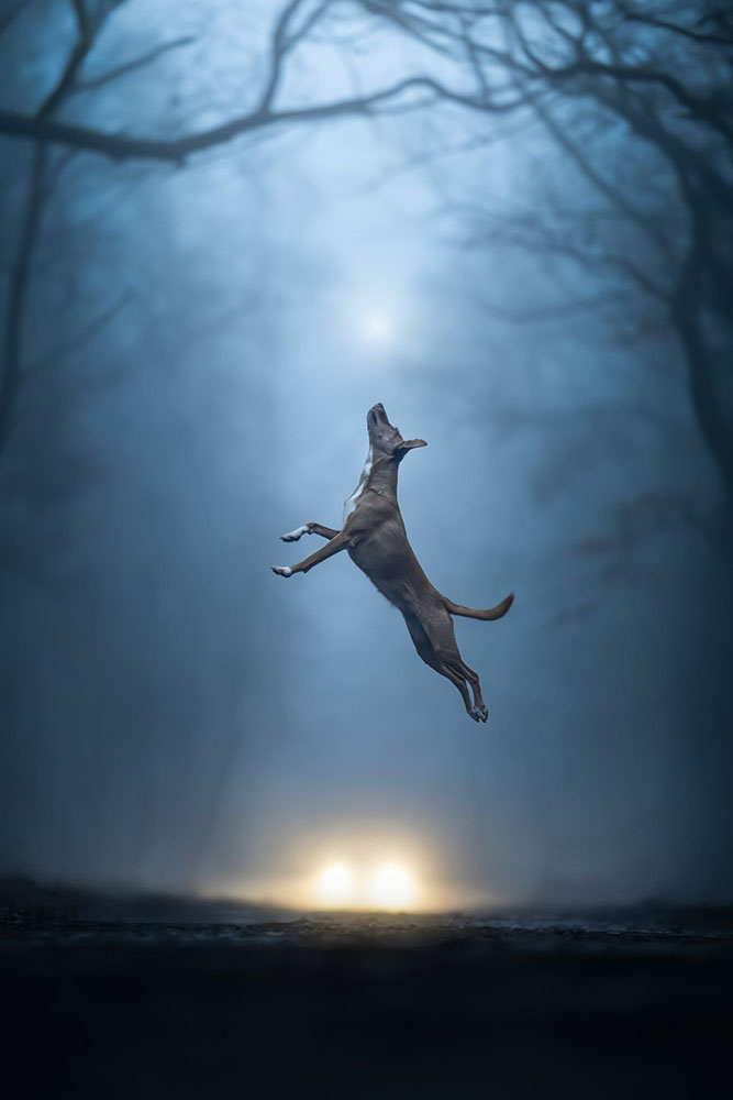
The winners will be announced tomorrow, August 1st.
Happy summer, everyone!
- 1As you probably know, I don’t participate in social media. I have to rely on others to bring Apple’s media efforts to my attention — folks covering the coverage, as it were. ↩︎
- 2Ferrari’s F1 wasn’t actually the first automated or even semi-automated manual gearbox/transmission, by a long shot. It is, however, the one that brought it to sports cars, followed almost immediately by BMW’s SMG. Wiki has a history, if you’re interested. ↩︎
- 3Technically, Koenigsegg got there first with its CC850. However, a) you have to be a car geek to know Koenigsegg, and b) that shift-by-wire unit doesn’t use traditional selector forks, or synchronizers. Instead, it uses seven wet clutches, six to select forward ratios and one for reverse, all with their own pressure sensors and mechatronic actuators. “Changing up is as simple as engaging the right clutches,” The Autopian says. Ferrari’s is a gated dual-clutch automatic, although to call that an oversimplification is an undersell. ↩︎