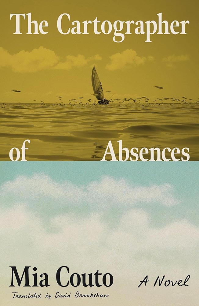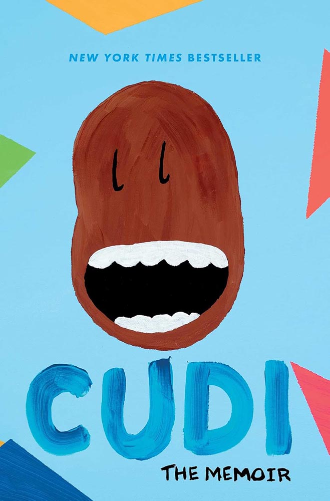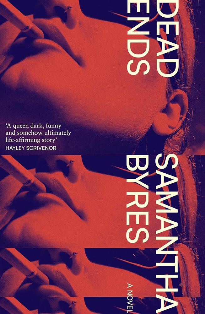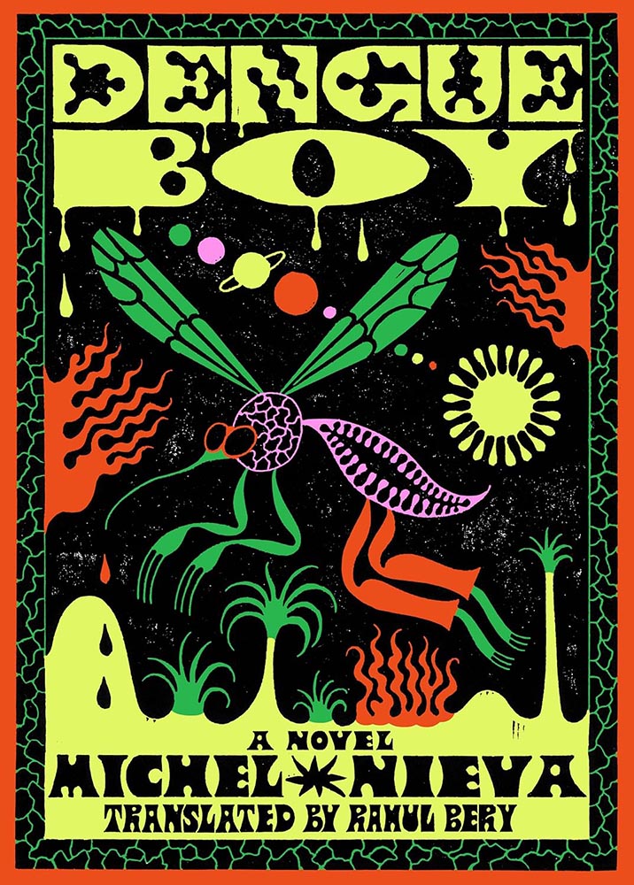
Tag: new york times

  • Beautifully Briefed 26.6: New is Good. Old is Good.

    Beautifully Briefed 26.6: New is Good. Old is Good.

    “Welcome to the new,” he said, pointing to the old, now dressed in a new suit. You’re reading this because the words and ideas resonated — and it’s why only the style is newly tailored.

    Sometimes, though, a new look can be enormously satisfying. Enjoy.

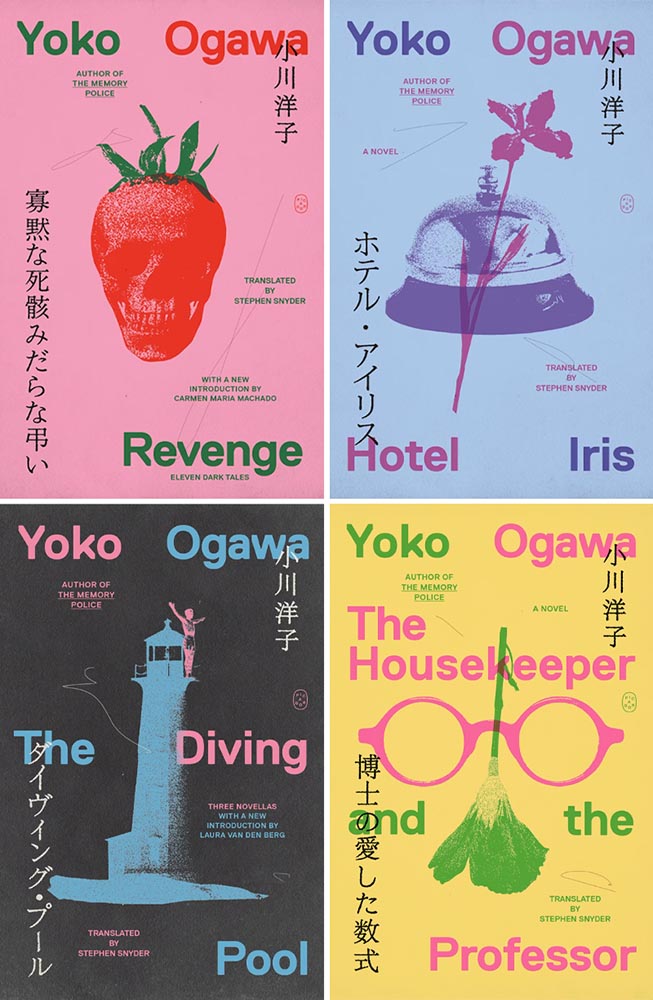
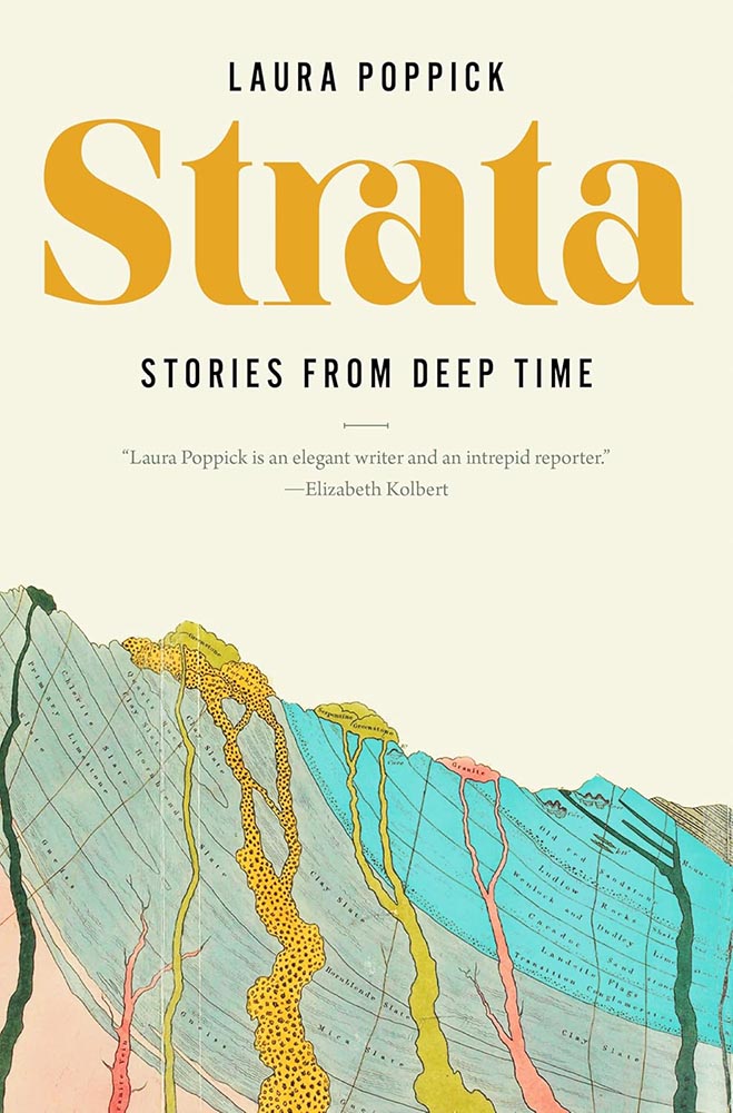
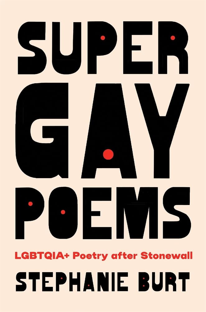
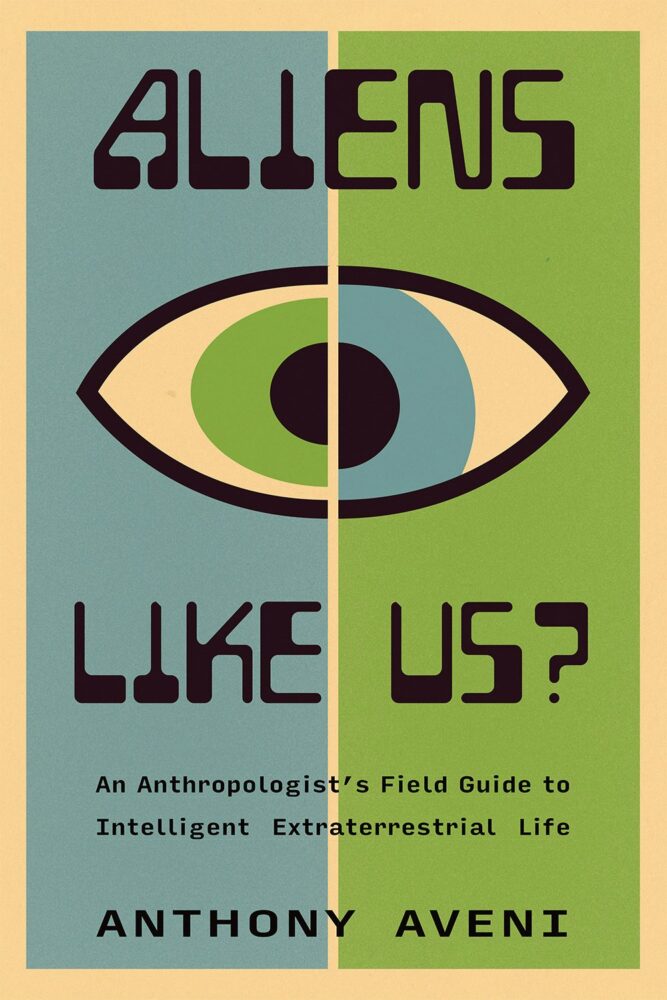
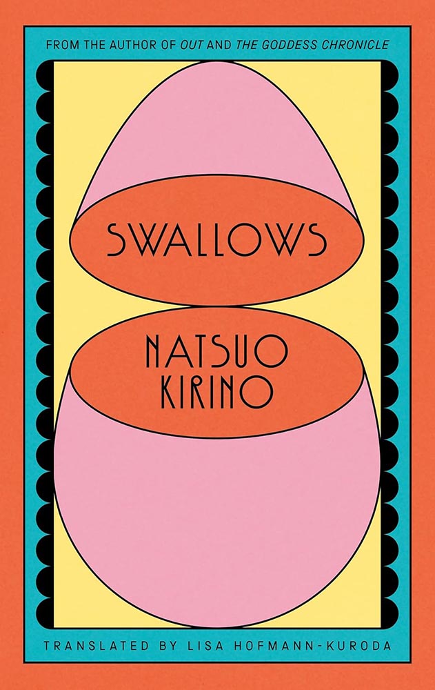
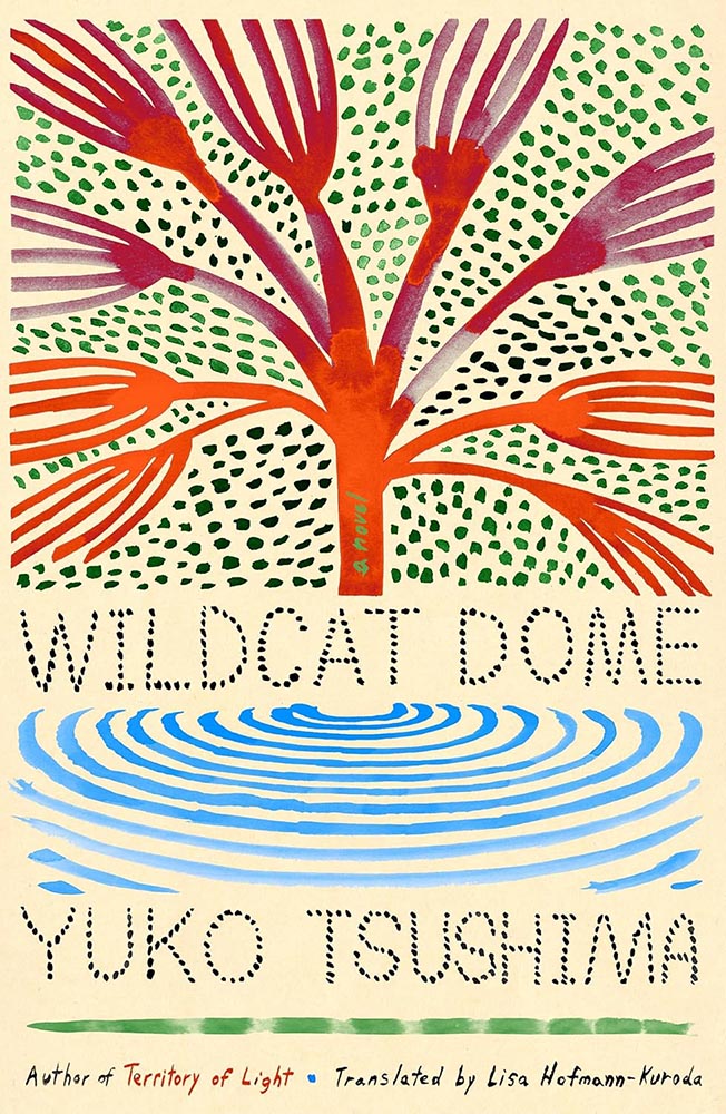
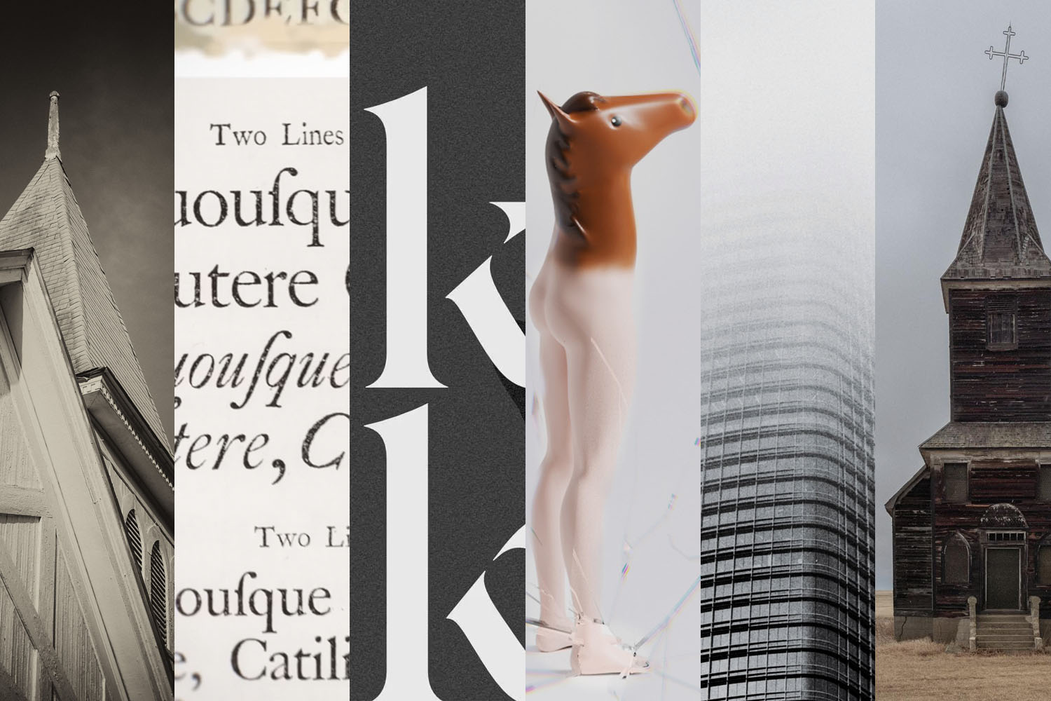
    This month’s Spine

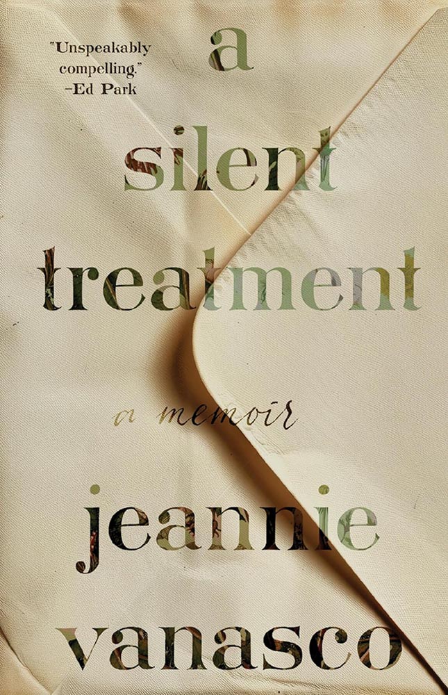
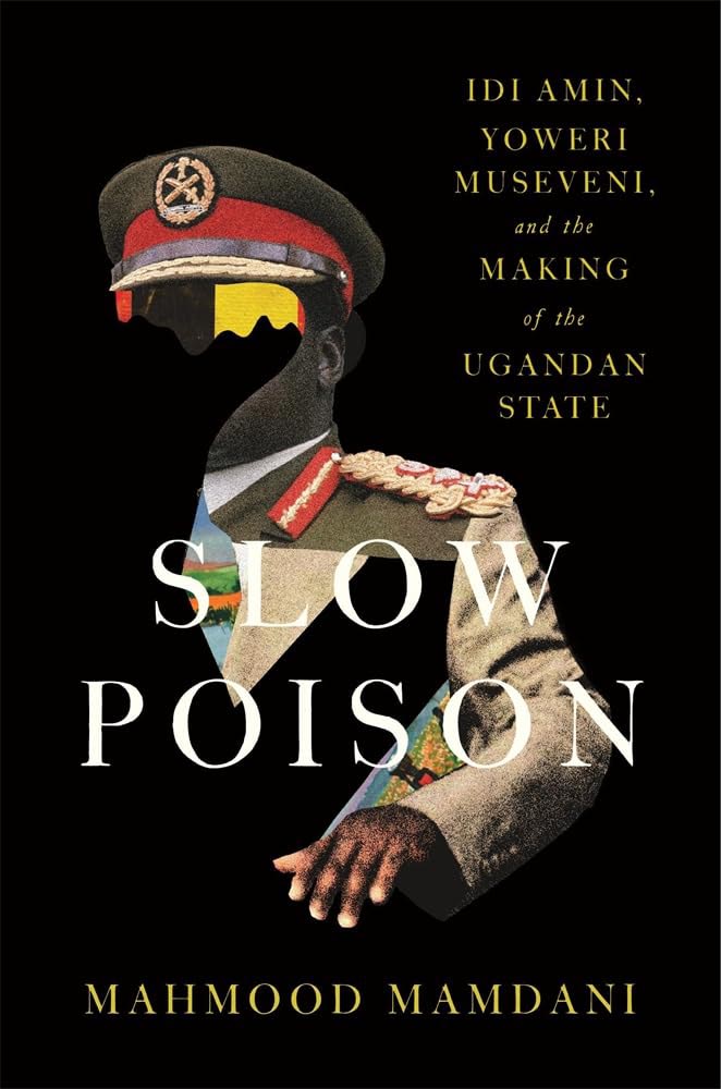
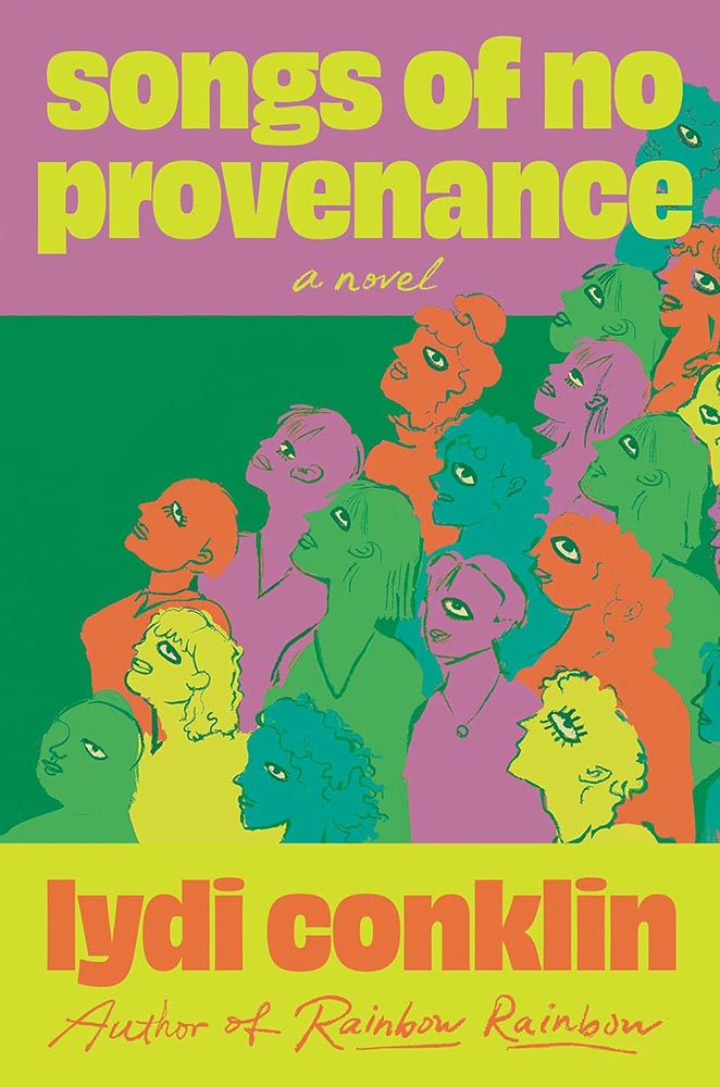
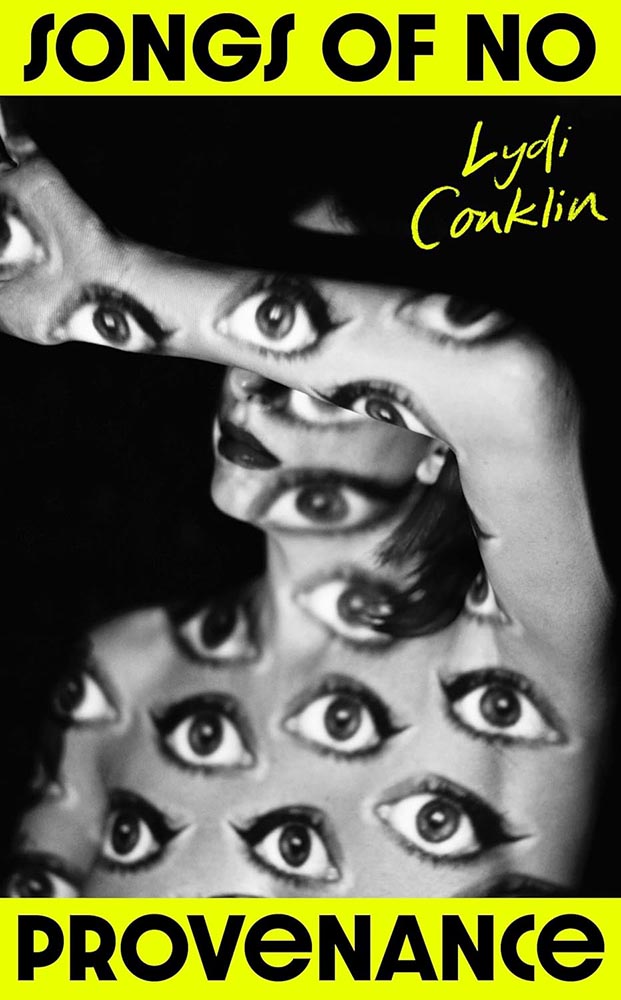
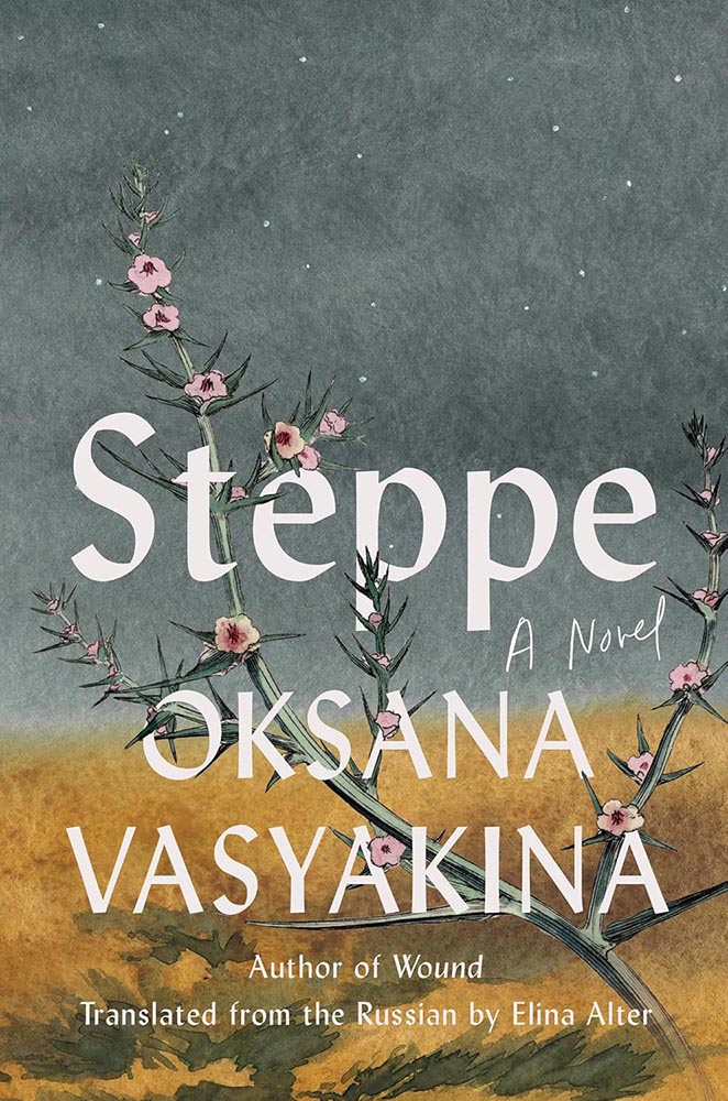
    Beacon Press.

    “Paperwork. Nice,” I said, while potentially allowing a smidgen of political speak through the door. (Not sorry.) Read the column here.

    Design and type
    Matt Dorfman’s many hats

    Matt Dorfman’s book covers are a regular item here on Foreword, including several of my Favorite Book Covers of the Year posts. So it was a delight to see a new interview with It’s Nice That.

    [B]usy days and late nights begin with, as Matt puts it, “churning out a generous amount of trash”. Much to his frustration he will be “working through what often feels like a landfill-sized hill of boring ideas”. Despite taking up quite a bit of time, it’s a necessity, as among this trash will be a shred of an idea worth expanding upon. “Usually it’s a minor detail from an earlier comp made in haste and far afield from anything that book is actually about,” he says, “but it typically has a quality of brokenness or something unfinished that just looks interesting.”

    — Harry Bennett, It’s Nice That

    “Do anything except what’s right in front of you,” he tells them, while mentioning that he often favors collage. “Collage has become one of my shorthands for pairing themes and ideas together that aren’t so readily represented in nature or culture.” As in:
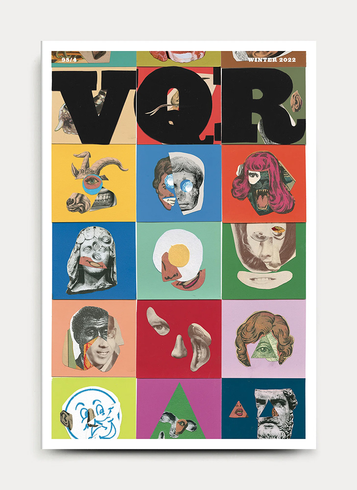
    VQR. Book design by Matt Dorfman. Image via It’s Nice That.

    Did I mention that he’s also the art director The New York Times Book Review? Yeah:
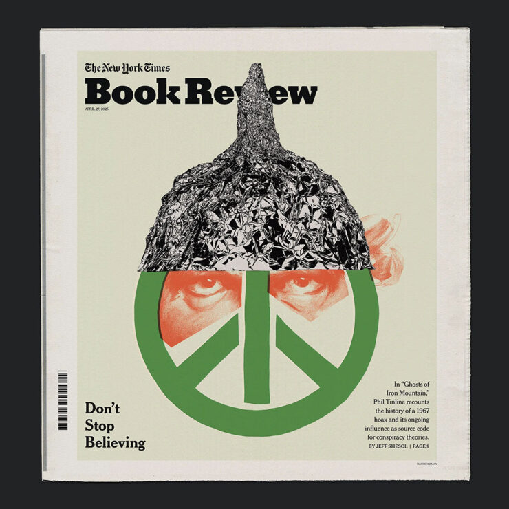
    One of Matt Dorfman’s covers for the NYT Book Review. Image via It’s Nice That.

    And a quick preview of next year’s Favorites list, with this gem:
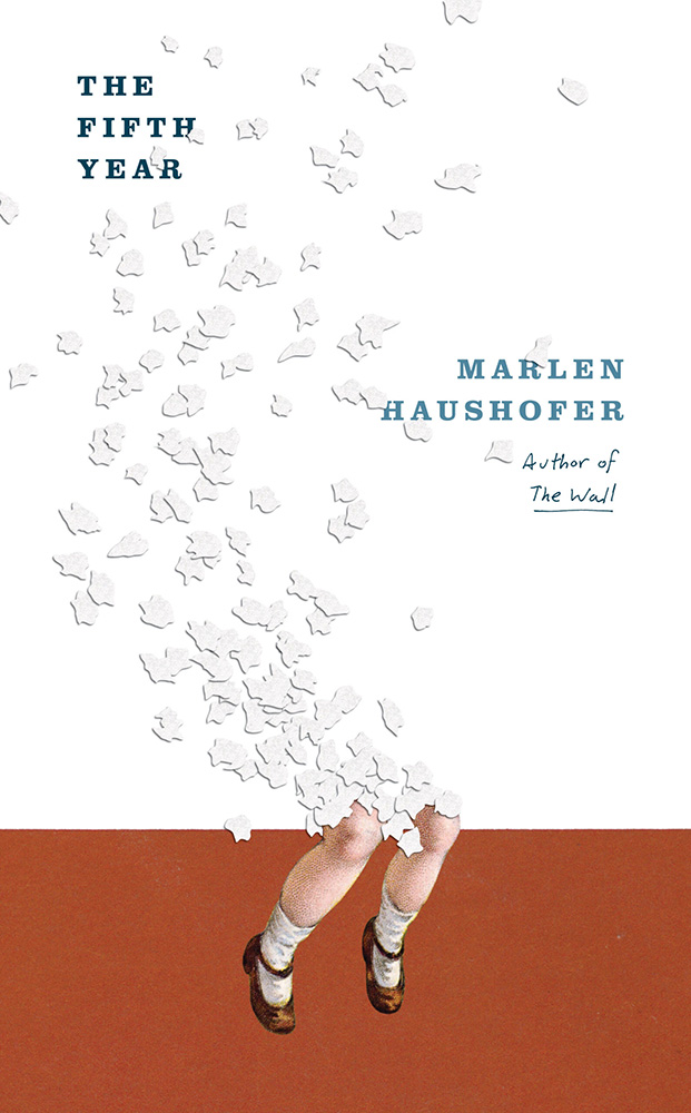
    Cover design by Matt Dorfman.

    If it looks familiar, that’s because…:
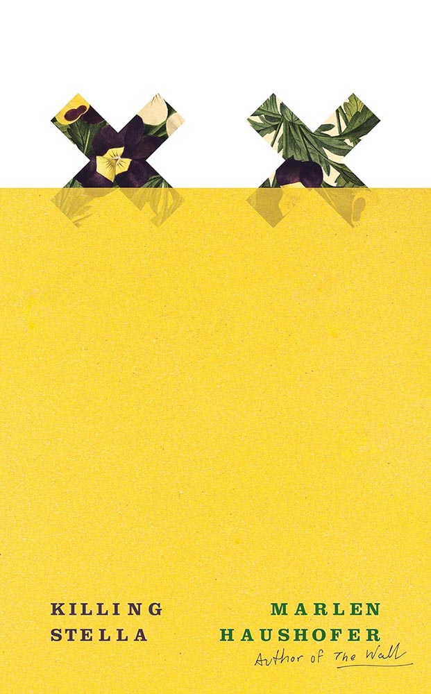
    Cover design by Matt Dorfman.
    Cover design by Matt Dorfman.

    Both previous Favorites here on Foreword. Awesome.

    Read the whole interview at It’s Nice That.

    “It’s All Greeked to Me”

    Glenn Fleishman, writing at Six Colors, points us at a YouTube documentary on the history of Lorem Ipsum:
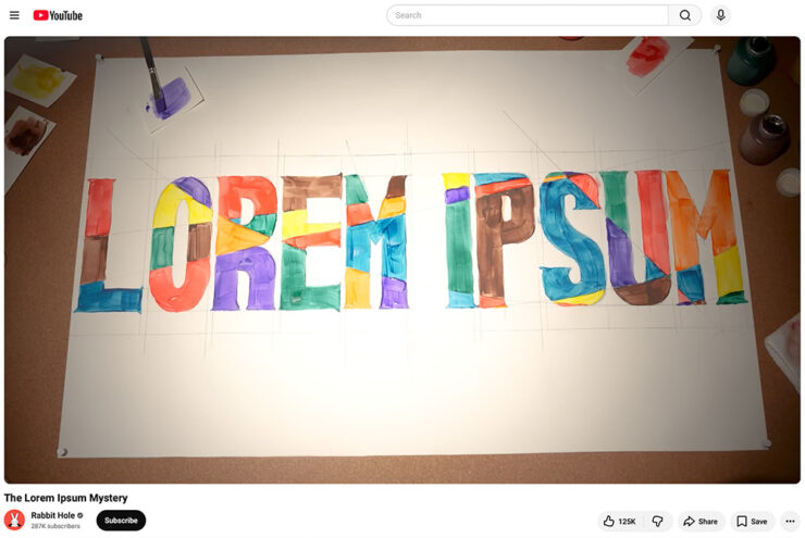
    A screenshot of the YouTube video.

    “I found it riveting and hilarious, and exactly the kind of Rabbit Hole (her channel name) that I fall down with printing and type history myself,” he writes. “[H]er dogged research has largely filled in the missing pieces of the story of where the run of seemingly Latin text used by designers to act as placeholder (or ‘Greeked’) text in mock-ups since the late 1960s came from.”

    I agree: it’s well put-together and, more importantly, answers a question you might not have actually had — but now can’t resist. Enjoy.

    Side note: Privacy where possible: I’ve switched to screenshots of YouTube videos rather than embedding them. That way folks who choose not follow the link aren’t stuck with the trackers embedding foists upon all.
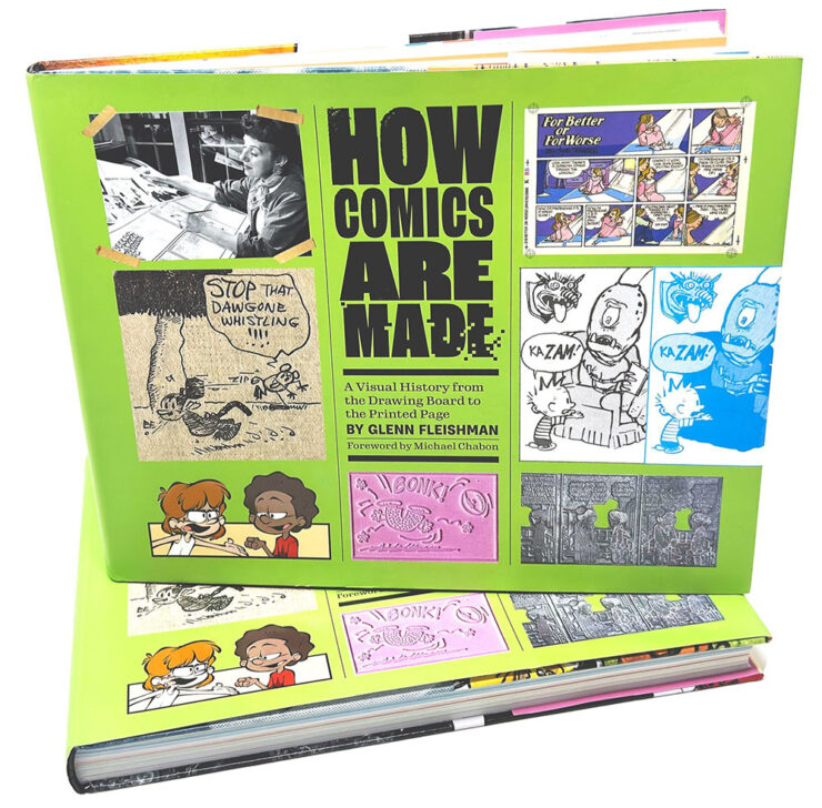
    Special bonus #1: Glenn is one of those people who wears many hats — 2019’s awesome Tiny Type Museum project is his, for instance — but it’s the comics connection that might be most appreciated. He’s got a book out about it, now in its second edition, which has just been nominated for Will Eisner Comic Industry Awards — the Eisners. Read more.

    2026 logo trends
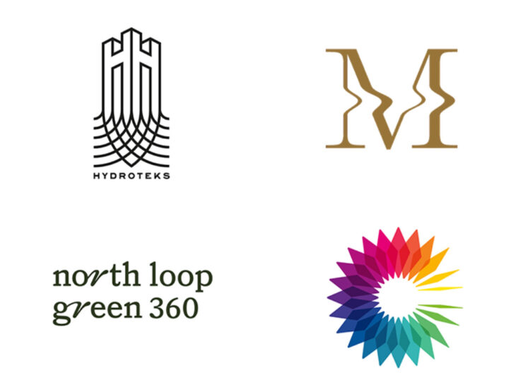
    The Logo Lounge has posted its 2026 Report.

    The quality of the Logo Trend Report has slipped over the past couple of years — there are suggestions that parts of it are generated rather of written — but I think the zoom-out is still useful for those of us in design.

    If, for no other reason, to make sure our work is ahead of the curve.

    Via Brand New, one of the only subscription sites I’ll link to. (Because it gives me an excuse to encourage you to subscribe, too: at $20/year, it’s sensibly priced and very much earns its keep.)

    Best new fonts: a one-off

    This month’s CreativeBoom post on new fonts was shorter than some — it’s summer! — with only one I’d like to highlight:
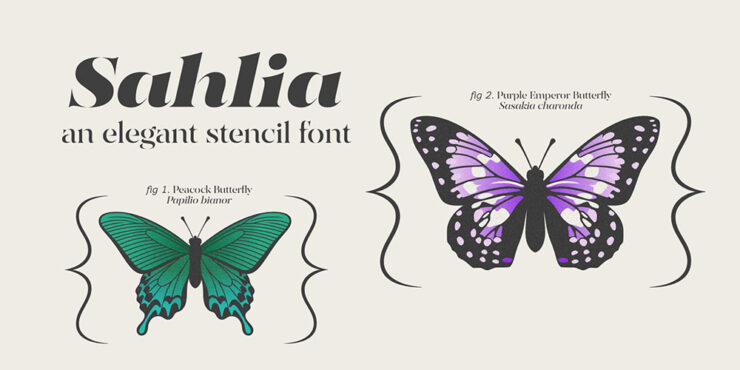
    Sahlia, by Arcane Type Foundry.

    But what a one it is. How often are we given an excuse get excited about stencil-style?
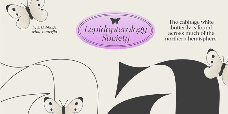
    Close-up details (and more butterflies).

    Sahlia is available from Arcane Type Foundry.

    Font previews: not simple

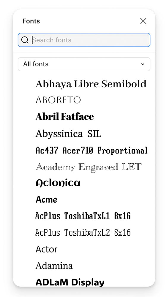
    Marcin Wichary, whose brilliant Unsung continues to impress, has a neat item that we’ve all seen at this point: font menus that preview the font name in the style of the typeface, sometimes poorly.

    Turns out, that’s not at all easy.
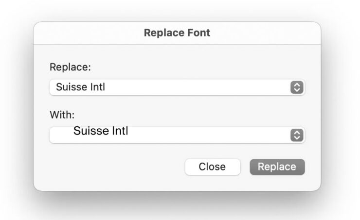
    Oopsie. Screenshot courtesy of Unsung.

    “Font previews are fascinating because they are the perfect showcase of how tricky fonts can be at scale,” he writes. The question is: why?

    It’s actually impossible to left align or center text. Ever. Not just because each font does whatever it wants – font size is a number that doesn’t really give you anything to hang a hat on, and the font can place itself in its box however it desires, too – and not just because fonts often lie (via bad metrics) about what they store inside, but also because aligning and centering are really in the eye of the license holder, and have more than one definition.

    So, every time you align text to anything, in whatever way, it’s only an approximation. Most of the time that’s good enough. Here it is not.
    — Marcin Wichary, Unsung
    It takes a surprising amount of work to get this right. Screenshot courtesy of Unsung.

    “There are icon fonts, color fonts, and non-Western fonts so rich in variety and tradition that this category itself is basically a fractal,” he says. “There’s a craft to getting it right.”

    Read the rest.

    Special bonus #2: Wichary also built something called Fontificator. “I thought it’d be fun to share this internal tool I made over a decade ago to aid with exploring options for Medium’s typographical redesign,” he says.
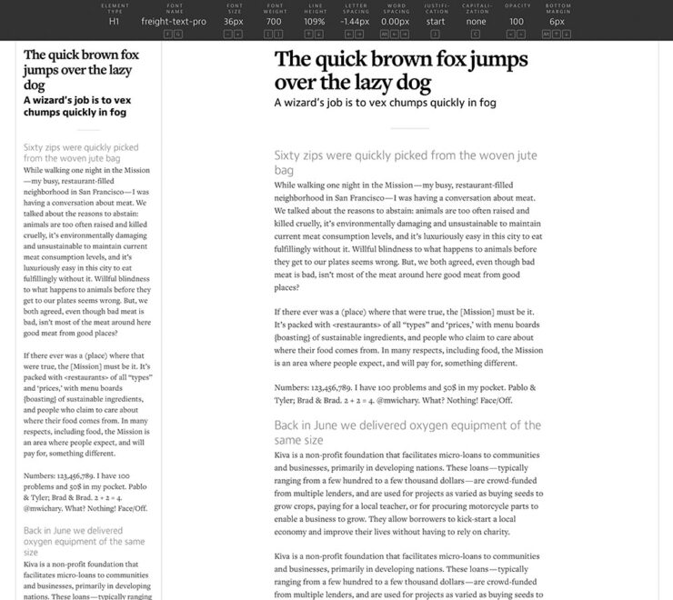
    Fontificator. Screenshot courtesy of Unsung.

    “The motivation for building Fontificator came from two observations:

    • font previews on type foundry sites were generally too limited to get a real sense of how a certain typeface feels, and it was best to see a font in situ,
    • often an extremely tiny nuance — like adding some letter spacing, or messing with line height — was what separated something that was promising from something that seemed very far from working.”

    It’s both brilliant and fun. Check it out.

    Adobe does AI

    I know, I know, more Abode stuff. I’ll keep it quick(ish).

    PetaPixel reminds us that, “the vast majority of working photographers are using AI to help save them time, handling tedious tasks that aren’t necessarily all that creative.” Adobe’s latest updates address that:

    AI removal tools now have flavors, including on-device if needed.
    • Lightroom’s AI Sharpen tool can now use Topaz Labs’ Noise-Aware Sharpen model directly in the app. This promises to recover fine details more effectively, per Adobe. (More on Topaz below.) 👍
    • Lightroom’s Assisted Culling automatically stacks similar images into groups and automatically suggests the “strongest one.” 👎
    • Lightroom has a new Photo to Video feature that uses Firefly and Google Veo to turn a still photo into “polished b-roll or reels with AI-generated motion.” 👎
    • Photoshop’s reflection removals are now isolated on a separate layer, “giving users control over opacity for more natural-looking results,” according to PetaPixel. 👍
    • Photoshop’s Remove Tool, which uses generative AI to erase a selected object and replace it with realistic-looking pixels, can now be used offline using an on-device AI model. 👍

    Get the full story at PetaPixel.
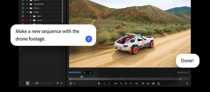
    The agentic AI “assistant” might — or might not — be good. (Subscribers pay $$ for it, so….)

    Meanwhile, Adobe’s promised “creative agent” — ’cause agentic AI — has “fully arrived” in Creative Cloud, PetaPixel writes. “Inside Premiere, Photoshop, Illustrator, InDesign, and Frame.io, users can tell Adobe’s Firefly-powered AI Assistant how to edit photos, videos, and other graphics.” It runs in a panel, like having Chat GPT or Claude right in the app.

    “As a creative, you remain in control, choosing what to hand off, what to refine and how to apply your taste, expertise and judgment to shape every editable outcome. These tools are built for how you’ve told us you actually work,” Adobe explains.

    I’m going to have to try this one. Maybe. Someday.

    Several days after the above items were debuted, Adobe purchased Topaz outright. It’ll “fully integrate Topaz’s [AI scaling] models across apps like Photoshop, Lightroom, and its AI image generator Firefly” — which should be a good thing.

    Special bonus #3: In case AI-all-the-things is getting to you, there’s this:

    “A ‘centaur’ describes a human augmented with a technology, like machine learning, or even just driving a car or using autocomplete,” ArsTechnica writes as part of an interview with Doctorow. “A reverse centaur ‘is a machine head on a human body, a person who is serving as a squishy meat appendage for an uncaring machine.’”

    “Being a centaur is generally viewed as a positive thing; few people relish being a reverse centaur. And yet the AI industry….” Read the rest.

    People
    Jason Snell

    Amongst the tech names I’ve know for what seems forever, Jason Snell’s is up there. He was first at MacUser, then Macworld, then hung out his own banner at Six Colors.
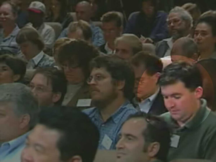
    From Macworld: Jason Snell (highlighted) at the introduction of the iPod, 2001.

    My first day on the job at Macworld, Apple was perilously close to going out of business. It was the fall of 1997, and Steve Jobs had returned to Apple and engineered the ejection of Gil Amelio as CEO, but there was no iMac yet, no visible turnaround in terms of products at all. Beyond the release of the iconic “Think Different” ad campaign, there was nothing.

    Apple’s survival hung by a thread. Steve Jobs asked everyone to trust him. At Macworld Expo, he had enlisted Bill Gates — Bill Gates, of all people! — to help him instill belief in the world that Apple would find a way to survive.

    The world was skeptical, to say the least. My family asked what job I thought I’d get once Apple went out of business.

    —Jason Snell

    Ah, the good old days. (I jest.) Hard to believe, but that was almost 30 years ago. Sheesh.

    So long, in fact, that another milestone has passed: Jason’s left Macworld. Read the column. I’m glad he’ll be continuing with Six Colors, and am looking forward to his new podcast on Apple’s history, Designed in California.

    David Hockney

    I was familiar more than a fan, but it’s undeniable that the world has lost a character — something very ably underscored by the tribute illustrations posted at CreativeBoom:
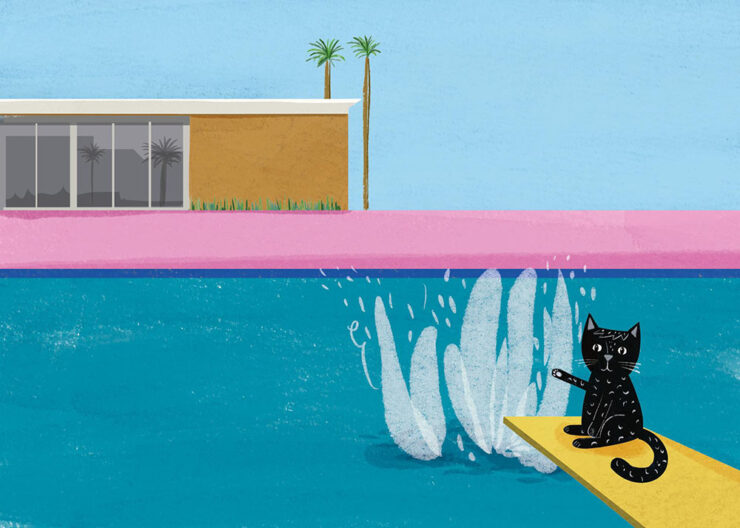
    Illustration by Nia Gould.

    “From Bradford to Beverly Hills, Hockney’s bold colours and irrepressible joy for living inspired a generation. Here’s what they created in response to his passing,” they write. See the rest.

    Om Malik

    Early this month, Om released an essay for the times — and the ages:

    Most people remember Pinocchio as a story about lying. The nose grows. You get caught. Lesson learned. But that reading misses almost everything Collodi was actually doing. The book is a close study of a society where deception has gone ambient, woven into every institution, every transaction. Courts punish victims. Authority figures perform competence without exercising it. Experts are decorative. Society holds together through spectacle and habit rather than accountability. Into this environment, a naive creature is released, constitutionally unable to resist a good story about easy reward.

    The nose is the least interesting lie in the book. The interesting lies are the ones that work.

    Om Malik, om.co (Via Daring FIreball.)

    Okay, sure, it was social commentary cleverly disguised as an essay about a pen. This Mont Blanc, in fact:
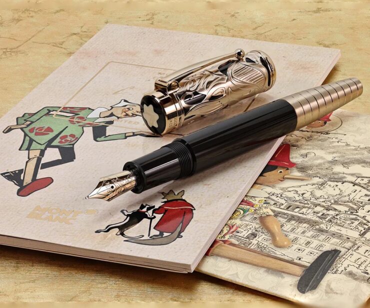
    The point is, it was as insightful as ever. (See also the previously-cited “Velocity is the New Authority.”) It was immediately deposited in the to-be-posted folder. Before I could could get to that, however, heart disease snatched him away. He was 59.

    I first heard via Pixel Envy, which linked to Om’s excellent photographs posted to Glass (social media),1Forgive the repetition, but just in case: I don’t participate in social media. While I’d heard of Glass, I didn’t know of Om’s posts there — and wouldn’t have followed in any case. Perusing those photos, and posting that link, are a one-off celebrating Om’s talent. and, later, appreciated John Gruber’s thoughtful piece at Daring Fireball.

    Both reminded me of Om’s love of Leica and preference for black-and-white:

    “Sleepy in Seattle.” Photograph by Om Malik.
    “Does This Qualify as Flora?” Photograph by Om Malik.

    Or almost-black-and-white:

    Untitled. Photograph by Om Malik.

    See a few more, called “Selects,” at Om’s personal photography site.

    Special bonus #4: The day after Om’s Pinocchio essay, above, Daring Fireball posted on Jason Zweig’ on’s three ways to get paid. I won’t spoil it — just go read.

    Photography
    2026 Beaker Street Science Photography finalists

    “This is the 10th anniversary of the Australian Beaker Street Festival. Each year, the competition celebrates fantastic photos of rare and unusual scientific phenomena, endangered species, conservation missions, and much more,” PetaPixel writes.

    Some of these are awesome:

    “Southern Ocean Energy.” Photograph by Nick Green.
    “Just Another Bioluminescent Tantrum.” Photograph by Deni Cupit.

    26 finalists in all. See the rest (and, if you’d like, vote at the link).

    2026 Australian Geographic Nature Photographer of the Year shortlist

    This contest takes entries from the majestic Australasian Realm, including the ANZANG bioregion consisting of Australia, New Zealand, Antarctica, and New Guinea, and to quote PetaPixel, “there are some real bangers on there.”
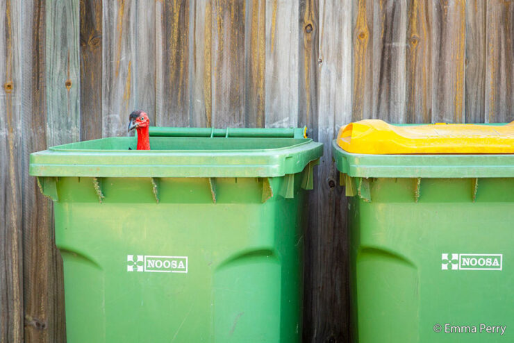

    “Bin Turkey.” Photograph by Emma Perry.
    “Penguin Poe.” Photograph by Matt Bell.

    Nature in all its marvelously diverse glory. See the rest.

    Burton’s America

    I’m surprised I haven’t linked to Brendon Burton’s work before, ’cause it’s right up my alley:

    Traces #10. Photograph by Brendon Burton.
    Traces #6. Photograph by Brendon Burton.

    His second book, Epitaph, “is a series that attempts to unravel the knot of mystery that exists within the dark corners of North America, shedding light on unseen histories and buried past lives.”

    See more. (Via This is Colossal.)

    Landscapes three-fer

    • Travel and nature photographer Jake Guzman has spent the past two years creating Otherworldly America, his new 256-page photography book:

    “Picture Lake Washington.” Photograph by Jake Guzman.
    “Richardson Highway, Alaska.” Photograph by Jake Guzman.

    Arpan Das has fallen in love with the Kishtwar Himalaya in the Jammu and Kashmir region, part of the Indian Himalayas:

    “Barnaj Rainbow.” Photograph by Arpan Das.

    •  Michael Shainblum photographs the volatile, weather-driven landscapes of New Zealand with “a body of work shaped less by fixed composition and more by responsiveness to constant change”:

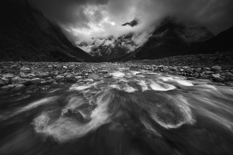
    “New Zealand #19.” Photograph by Michael Shainblum.
    “New Zealand #40.” Photograph by Michael Shainblum.

    All three are via PetaPixel: Jake Guzman, Apran Das, and a longer feature on Michael Shainblum.

    Finally: soothing surf

    “Venice Beach: Dreamy #3.” Photograph by Craig Hubbard.

    Hubbard’s photos are ethereal and cinematic, with surfers and wave crests illuminated by the early morning sun or backdropped by the marine layer. Sometimes the intense spray, curl, shoulder, or lip become the sole subjects of the portraits. “The water is the muse and artist,” Hubbard recently told an interviewer. “I’m just a biased translator and documentarian. Lastly, my ego relaxes in the ocean; the need to peacock recedes. This is where my best work comes from — or favorite, I should say.”

    — Kate Mothes, This is Colossal

    “Venice Beach: Dreamy #9.” Photograph by Craig Hubbard.

    See more at This is Colossal.

    That’s it for this month. As always, thanks for visiting.

    For folks in the US, have a safe and enjoyable holiday weekend as America turns 250. Let’s hope that we can make it a better place.

    Also: Please don’t forget to let me know of any problems or concerns with the new site. I’ve got a list of items — going to work on them now — but always welcome feedback. Thanks.

    • 1
      Forgive the repetition, but just in case: I don’t participate in social media. While I’d heard of Glass, I didn’t know of Om’s posts there — and wouldn’t have followed in any case. Perusing those photos, and posting that link, are a one-off celebrating Om’s talent. ↩︎
  • My Favorite Book Covers of 2025

    My Favorite Book Covers of 2025

    When it comes to describing 2025, “tumultuous” is probably an understatement.

    So it’s probably not a surprise that, when looking at the hundred covers that make up this list, there’s a definite direction: favoring quality over quantity. Which is to say, consciously or not, I’ve tended to prefer designs where more is said with less.

    Perhaps I’m striving for calm in a world that just … isn’t. Perhaps it’s my choice not to participate in social media and its race for likes, loves, and “latests.”1Publishers need to remember that not all of their customers select what to read based on influencers, what they see on Facebook, or by doomscrolling Instagram. Some of us are lifelong learners, have hundred or thousands of books, and discover by … reading. Real articles, by real people, on websites with those people’s real names on them. (Or even, occasionally, this thing called paper.) Perhaps it’s my advancing age — closing in on 60 now — and thus “old-fashioned” standards.

    In fact, it could be said that I value not keeping up: I don’t want to highlight the trendy. I want to celebrate great talent, design that’s standout in its day but will still be great as time passes.

    However, it’s appropriate to emphasize that these are my favorites. Others might say “best,” but I’ve been in this business long enough to know that there’s always another title you haven’t seen or read about, and I don’t want to disrespect any of the talented book designers whose work I didn’t see, and consequently didn’t feature. I’ve tried to include design credit where I could — many thanks to the folks who answered requests for that information — and wish to stress that any mistakes in the list below are mine.

    Note: By request, titles starting with “The” are alphabetized correctly. Also, if you’re on Foreword’s main page, please click on the post title, above, to read this list. You’ll get larger covers for your viewing pleasure.

    • • •
    My favorite book cover of 2025
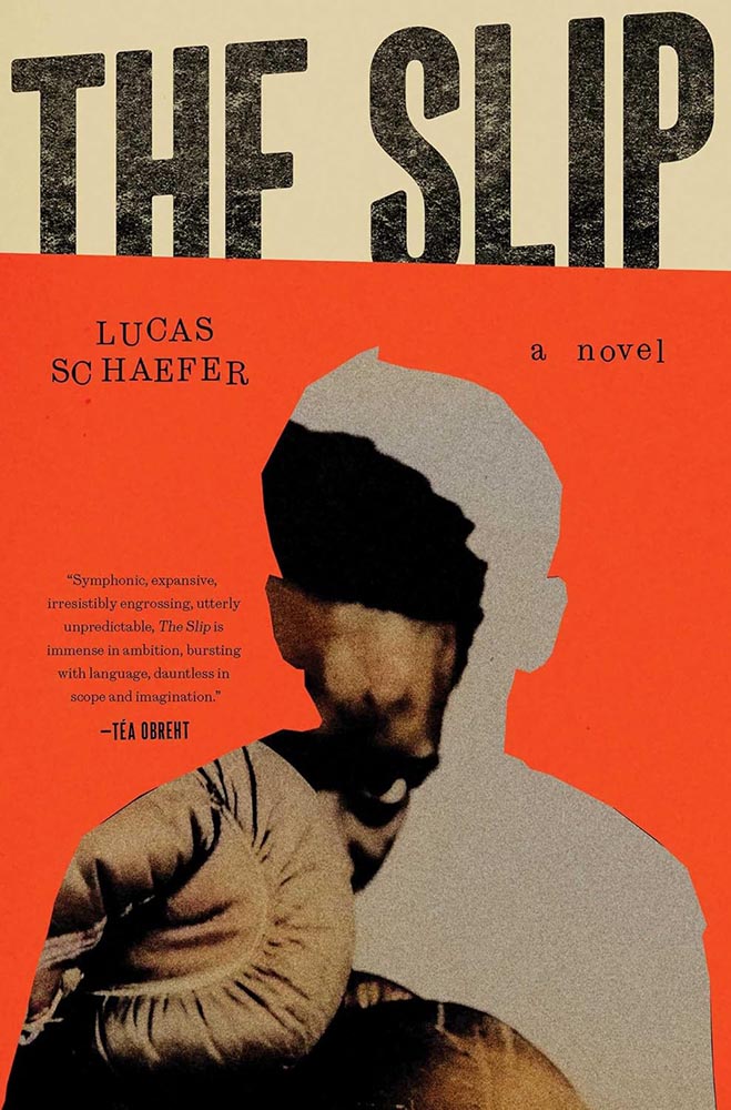
    Cover design by Jack Smyth.

    There was no question which of these hundred titles would take the title: this heavyweight, brought to us by Dublin-based Jack Smyth. Fellow cover designer Jaya Nicely, in LitHub‘s 2025 list, called it “tactile,” but it’s more than that — it’s downright visceral.

    In fact, and indeed in direct contradiction to what I said in the intro, I’m celebrating something trendy: silhouettes are “in” — even overused — but I love this cover because I don’t recall ever seeing one more effectively implemented. Simultaneously hiding around the edge and using it to an advantage, our boxer (presumably the book’s subject, Nathaniel) looks poised to strike.

    When combined with type and lines slightly off kilter, use of a fantastic orange, and aging and grain that ice the cake, this cover has it down.

    2025 runners-up
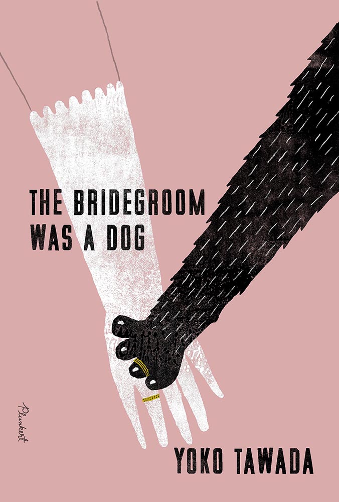
    Cover design by Paul Sahre, with illustration by David Plunkert.

    A triumph of less-is-more illustration, with color and a title treatment that knows how compliment. The pressed or sprayed, aged-but-not, white and black are magnificent, while the rings stand out as the only use of “gold.” I love that the arm above the glove is just an outline.

    Cover design by Kris Potter; photography by Laurent Tixador.

    Photography seems almost passé these days, so its use requires something extra — here served up in spades. On the one hand, I want the boats on the horizon to have been removed, but on the other, it highlights the fraud within in a subtle, realize-after-the-fact way that’s awesome.

    I have to say, too: this is about fifteen light years beyond the woman-folded-into-the-chair edition, one of those trends that needs to just stop.

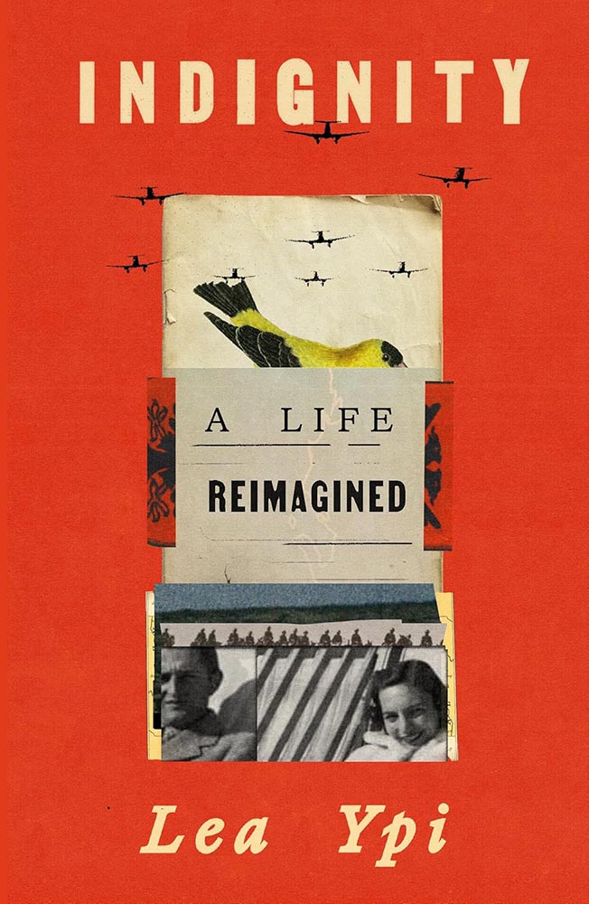
    Cover design by Arsh Raziuddin.

    While it compliments Free, from 2022’s list, it’s more: more sophisticated, more of a story, and leaves you with more questions — and more likely that you’ll pick it up to get those answers.

    Bonus points for the folded papers, the Albanian coat of arms, and planes “outside” the collage.

    • • •
    Other 2025 favorites, in alphabetical order
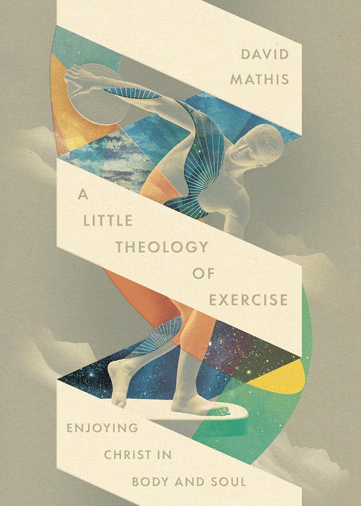
    Cover design by David Fassett.

    Christian titles so often reach for stereotype — something easily pigeonholed, almost like romance (for instance, unless of course I’m the one stereotyping). It’s often to the detriment of the subject: prematurely dooming the worthy, as it were.

    This one very much rises above: the mountain/clouds, the spiral, the mixed and colored illustrations, and titles stacked at an angle (with slight em- or debossing?) are all exceptionally well done.

    Riverhead/Penguin didn’t return a request for cover design info. Apologies.

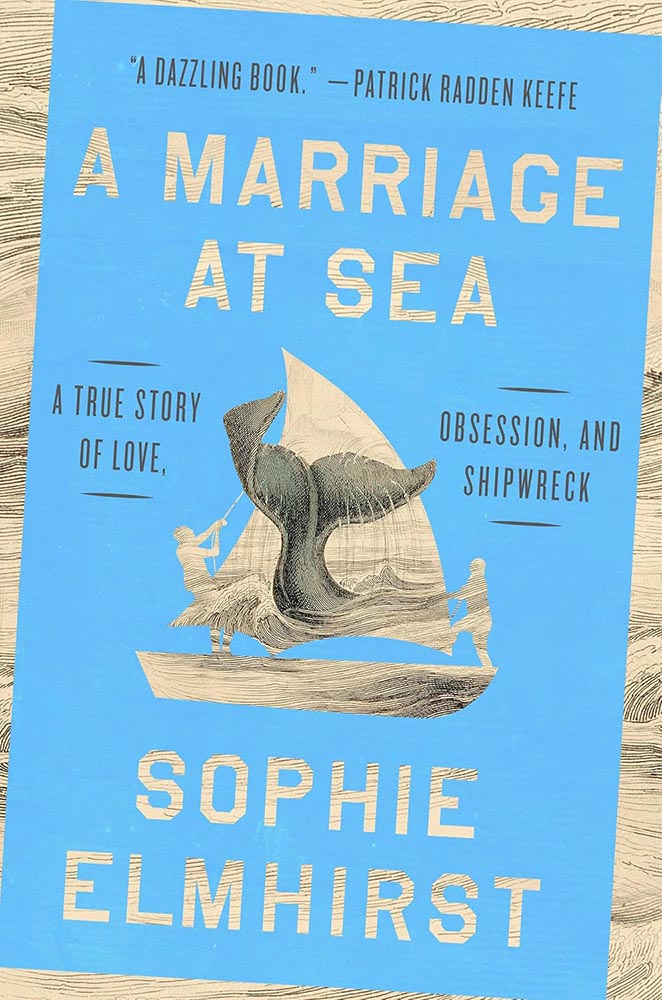
    The opposite of sinking beneath the waves: a beautiful pen-and-ink illustration, a color block of sea — or sky — heeling over at just the right angle, with the wonderful knock outs. Then there’s the hint-of-blue tail, the design equivalent of a spinnaker, standing out at the fore of a crowded race. Unmistakably awesome.

    Cover design by Beth Steidle.

    Simple without being simplistic, quiet while not quite, this one deserves that satisfying “thunk” that goes with a stamp of approval. (No cancellations allowed.)

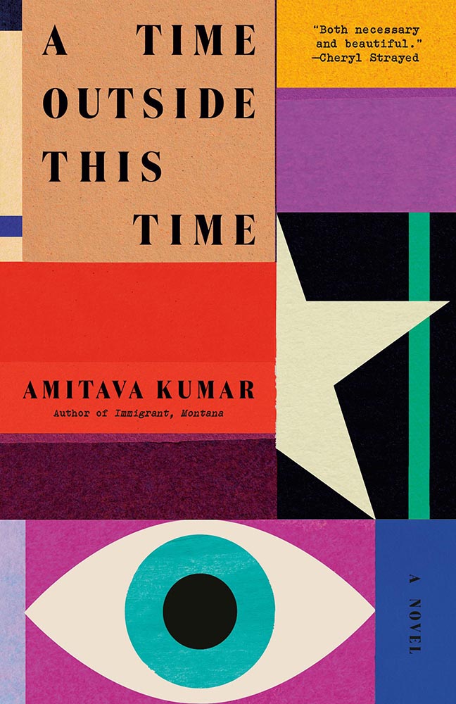
    Cover design by Tom Etherington.

    Eye-catching is a cliché too far — but it’s definitely more than just a collection of shapes artfully arranged. Bonus points for the edge between red and star, the color choices, and title spacing.

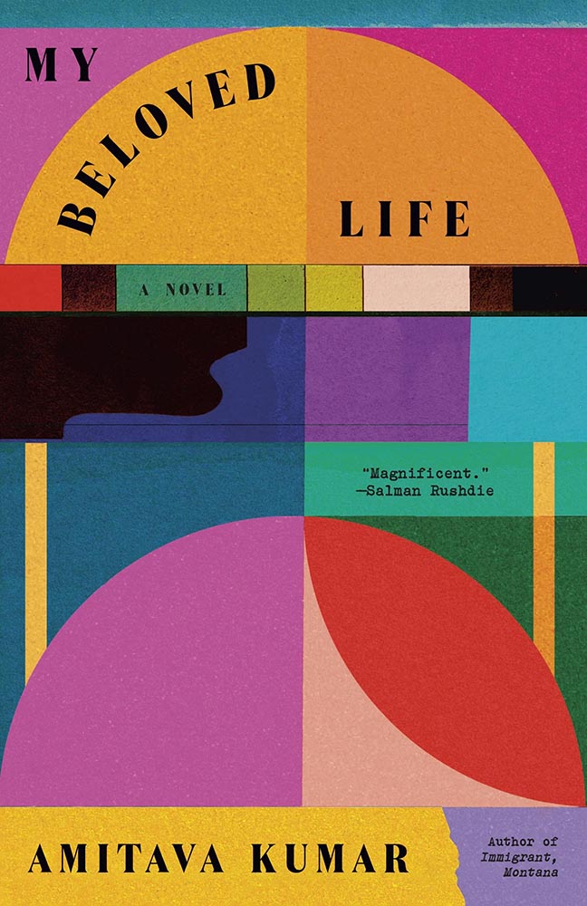
    Special bonus — continues the family look:

    Cover design by Tom Etherington.

    Fantastic.

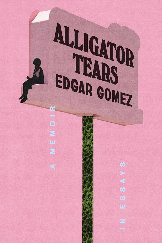
    Cover design by Arsh Raziuddin.

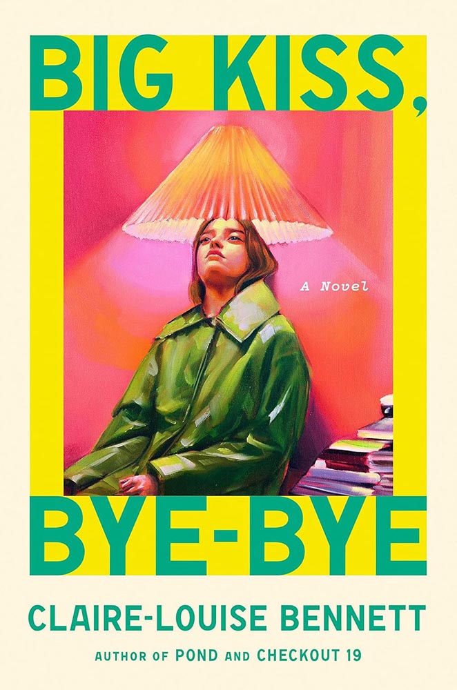
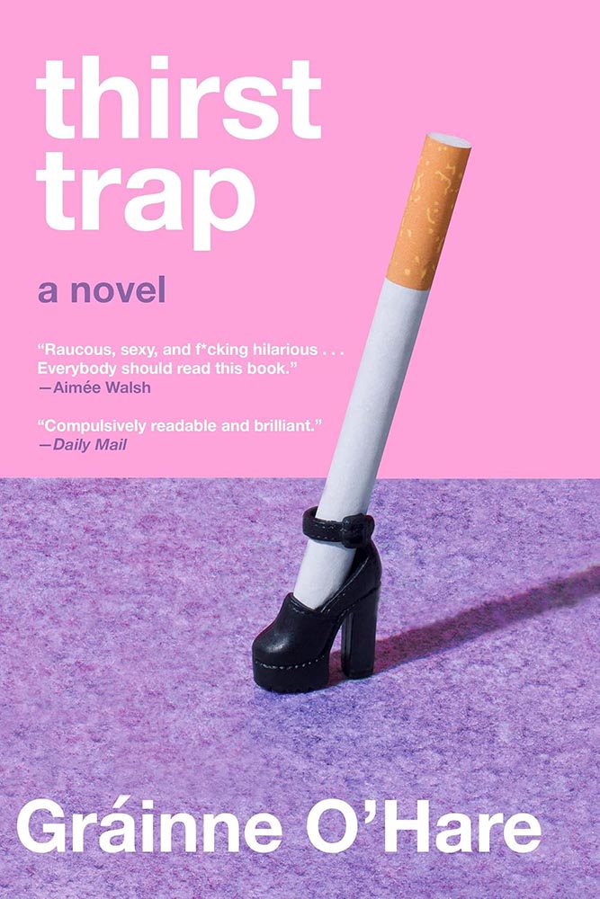
    Neither a zig nor zag: the combo of pink, alligator skin, and “tears” is nigh-on perfect.

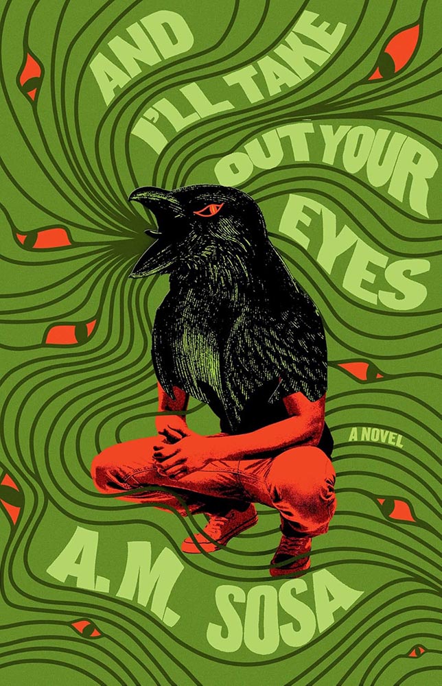
    Algonquin Books didn’t return an inquiry for the cover design info — sorry. (If you know….)

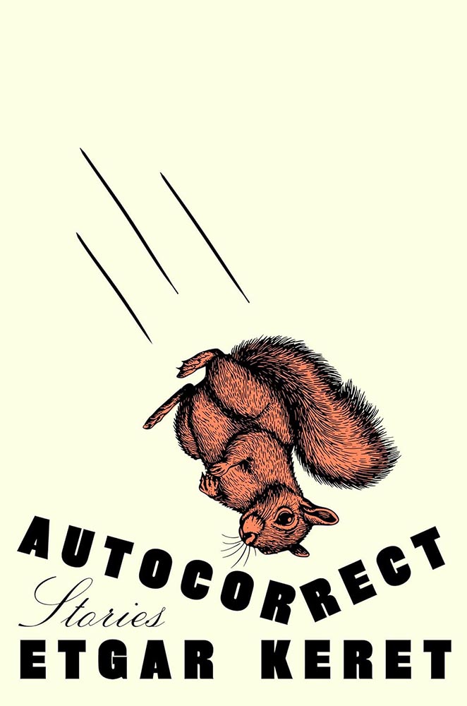
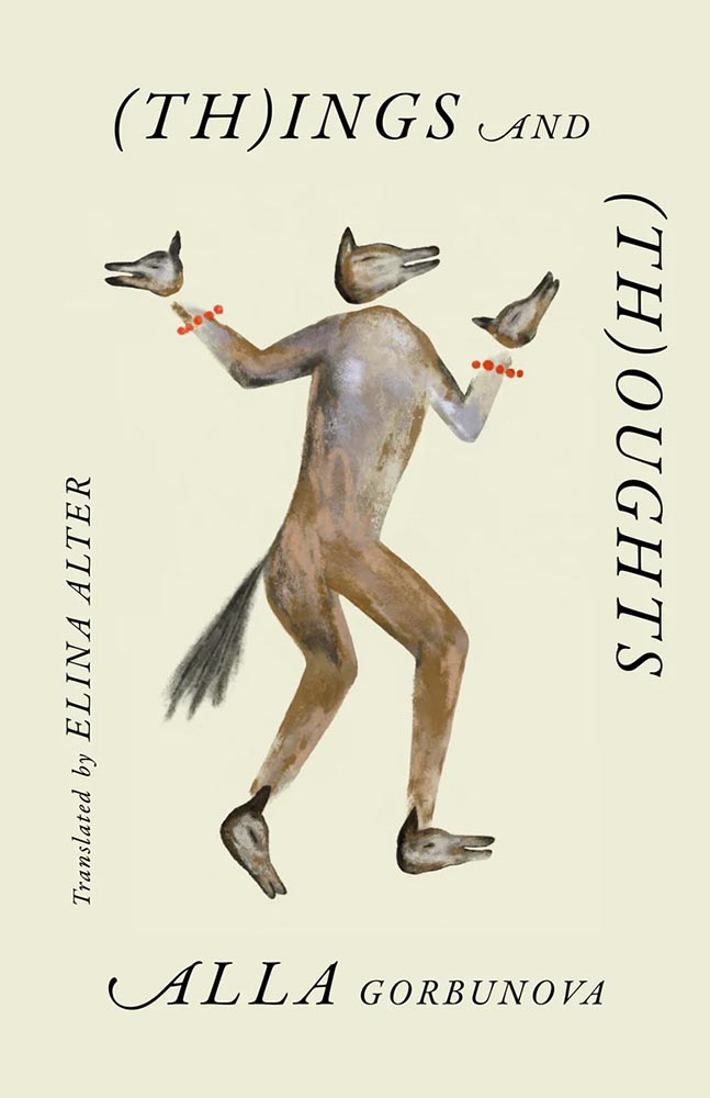
    The part-human-part-animal design tool is another of those overused items — except when it’s handled as well as it is here. The eyes are brilliant, the title treatment fun, and the colors standout. The subject, superficially, is not dissimilar to Alligator Tears, above, but the details, the design — and most certainly the text within — celebrate being different.

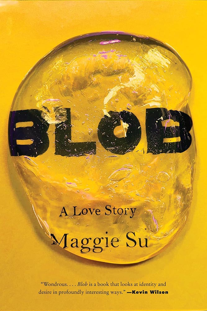
    Cover design by Beth Steidle.

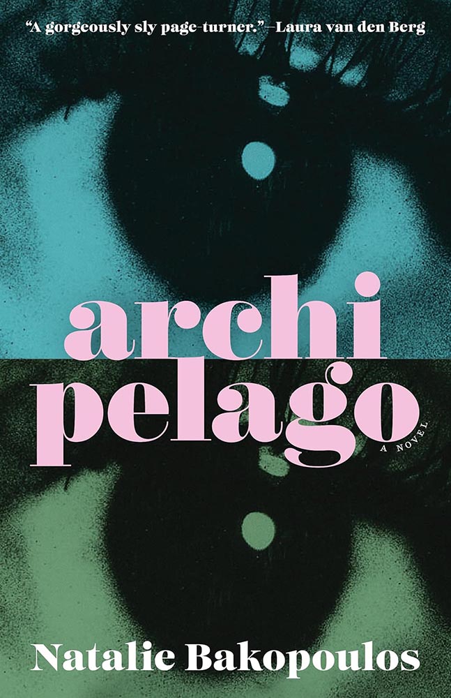
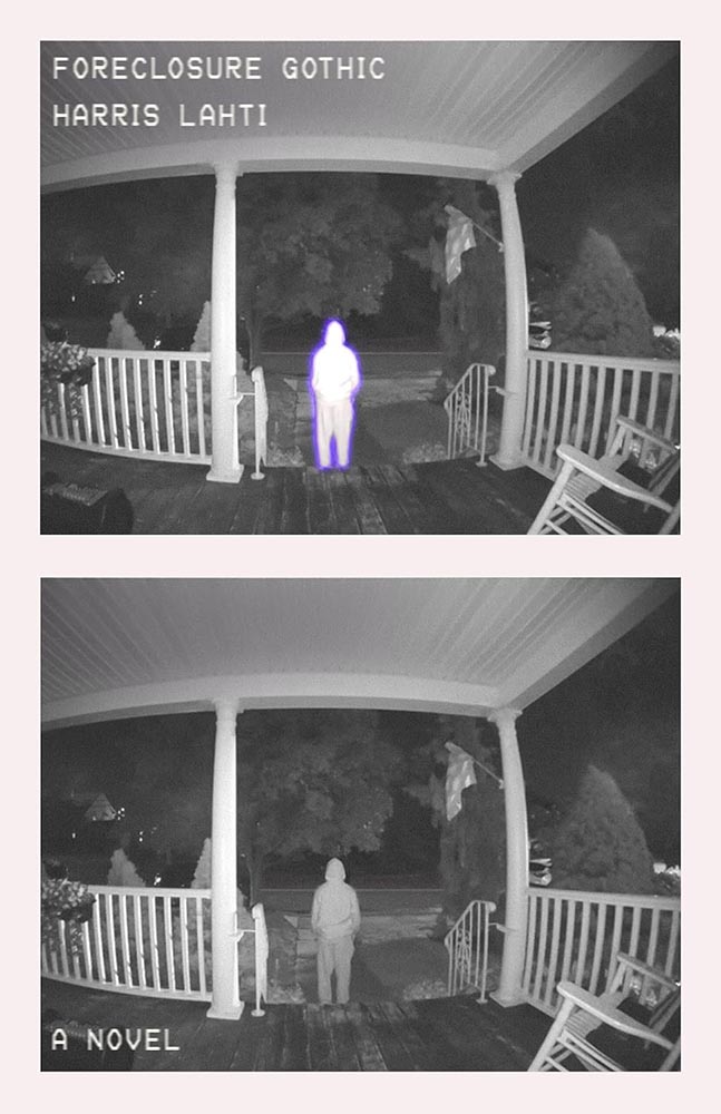
    The cover-in-two-parts is another of those items potentially overused, but the repetition and title treatment — the r-l tie-up is fab — take this one to the next level. Bonus points for “a novel,” both less and so much more.

    Cover design by Elena Giavaldi.

    Another where the pressed/stamped ink works well — but the black on top of the almost-overstyled photo is the winner here, a photo that doesn’t say “South Dakota” in all the right ways.

    Cover design and illustration by Elizabeth Story.

    Never mind the awesome type, layout, and color — that illustration, or perhaps just the expression, does everything. A winner at first sight.

    Cover design by Lauren Peters-Collaer.

    Sometimes, it’s possible to be knocked askew awed by a simple idea.

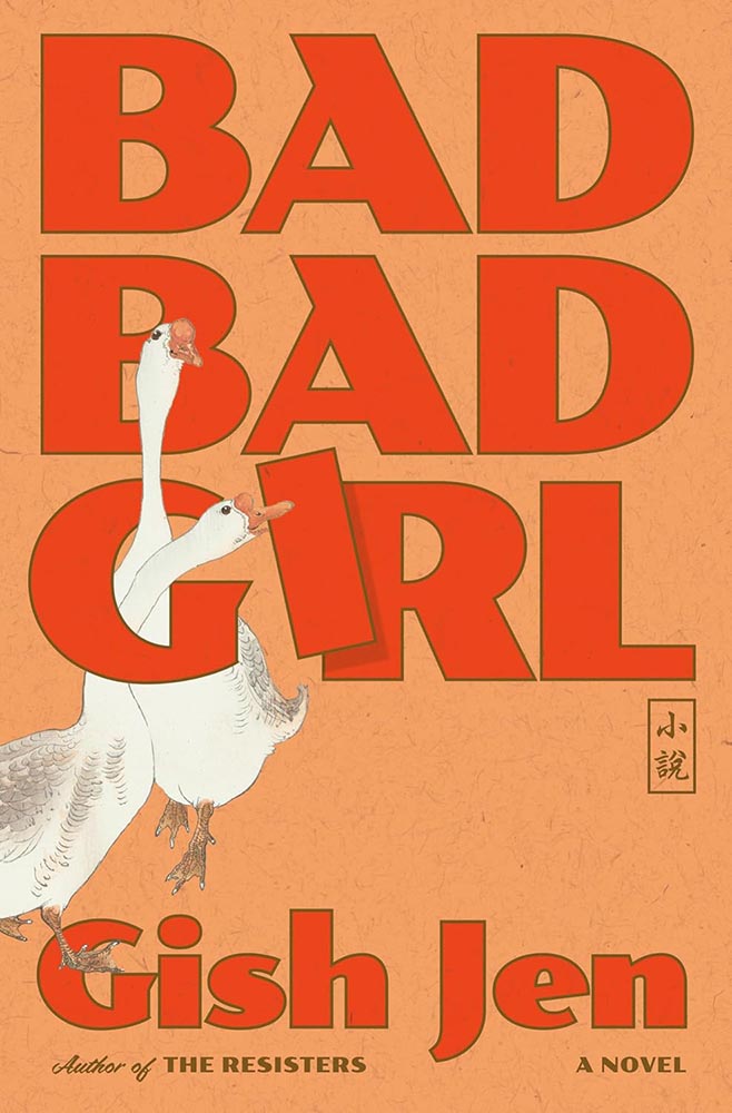
    Cover design by Linda Huang.

    “My aye!”

    (Yeah, yeah, the paper pattern and color, aged red and great brown outlines, type choices, and inclusion of Asian name seal, not to mention the geese, are all awesome too.)

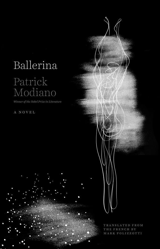
    Cover design by Monograph.

    One is more — one-color, that is, with a perfect combination of blur and line, “shadow” and light, simplicity and complexity.

    Not the only one-color item on this list, I’m happy to see.

    Cover design by Luisa Dias.

    From texture to type, photo to illustration, this is a cover that keeps giving the more the viewer keeps looking.

    Cover design by Stephanie Ross, with art by Maria Guimaraes.

    Cool illustration, cool idea — but it’s the use of color that earns this cover a spot here. The bright pink and various greens delight, as does the unusual-but-perfect background box for the title.

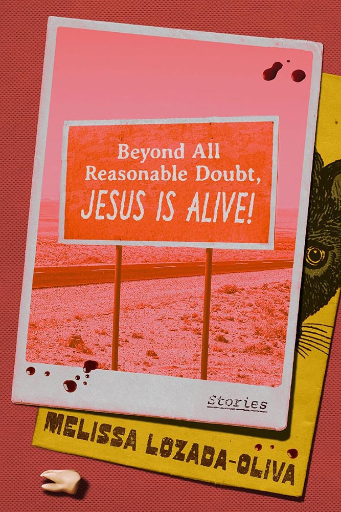
    Cover design by Robin Bilardello.

    “Guaranteed to augment your … life,” Vi thought.

    Cover design by Rodrigo Corral Studio.

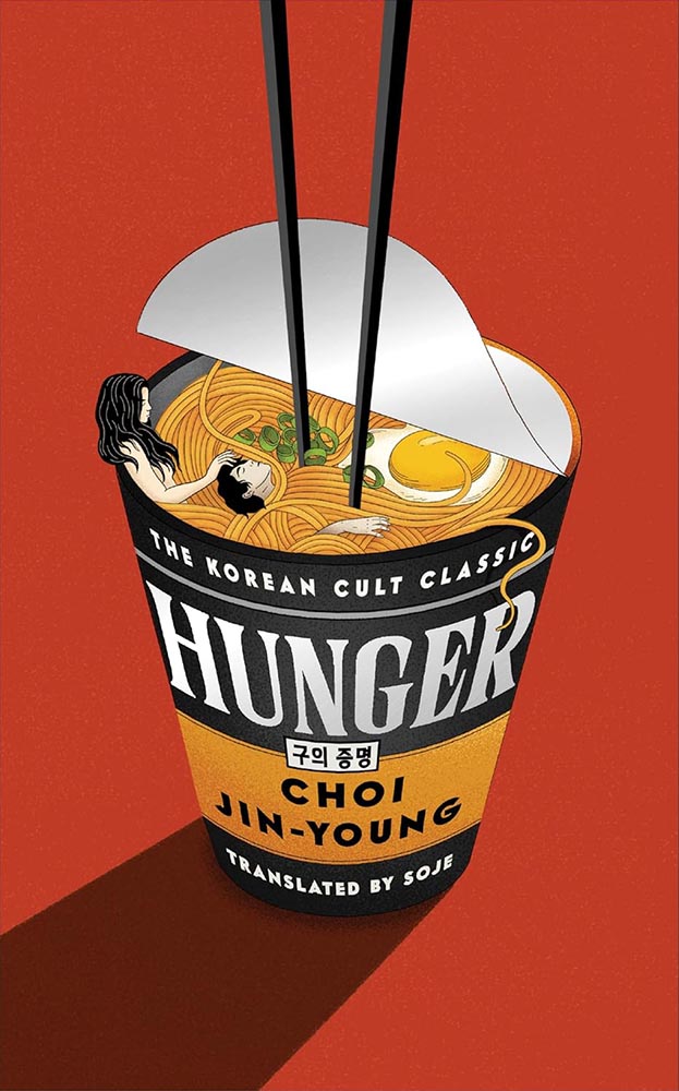
    This is based on the Korean edition; the art came with the title. That said, this version uses that ah-ha moment that is title’s holding area, combined with infinitely better type — and gets serious compliments as a result.

    Bonus points to the original designer for a painting that’s anything but postmodern.

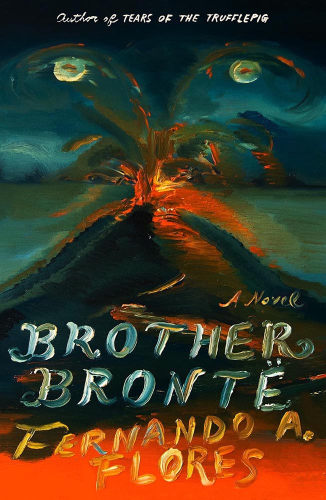
    Cover design and art by Na Kim.

    Speaking of paintings, Na Kim’s often take center stage in her cover designs. Here, however, it’s everything. Fantastic!

    Cover design by Thoman Colligan.

    The two-pane cover gets overdone, no question, but like others on this list that rise above a trend, this cover triumphs in complimentary colors, type treatments, and spacing. Somehow soothing and attention-getting — an accomplishment.

    Cover art by Scott Mescudi.

    Every time one zoomed out to look at the collected — every single time — this persevered. Survived. Stayed. And then became incredibly successful.

    (The cover, too.)

    Cover design by Josh Durham.

    Pictures running in time, complimented by the vertical title. (Rare and attention-demanding use of duotone here, too — nice.) Bonus points for the title and other text being subtly different colors.

    Cover design by Adriana Tonello and Frances Digiovanni, Rodrigo Corral Studio. Illustration by Sophy Hollington.

    Letterpress or inkblot? When it’s as much eye candy as this, do you care?

    Cover design by Na Kim.

    The contrast to Na’s Brother Brontë cover, above, couldn’t be more stark — yet this one, in its … well, stark simplicity, is no less accomplished.

    Work that stands out, from one of the standouts.

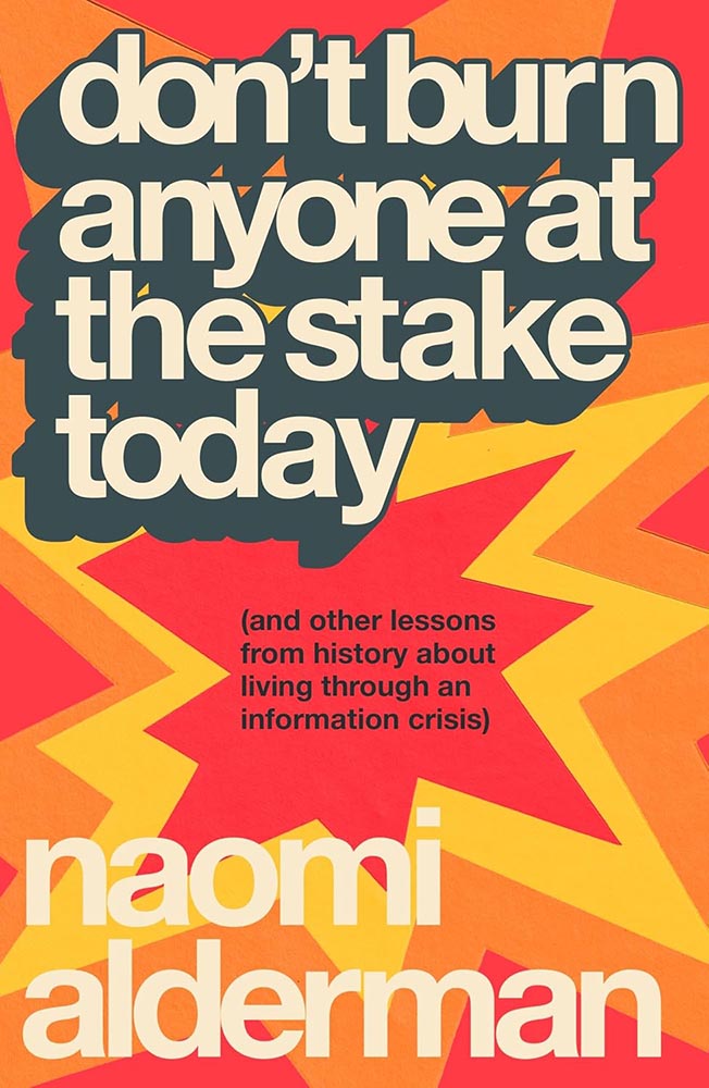
    Cover design by Chris Bentham.

    Retro-tastic burst of style that takes something ostensibly text-only to another level.

    Parenthetically, the author argues that we’re in the third “information crisis,” the first being invention of writing and the second the invention of the printing press. We survived those, maybe we can survive this…. A UK title I wish were readily available in the States. (The Brit Amazon wants you to buy it together with Cory Doctorow’s Enshittification, by the way. There‘s an afternoon’s reading.)

    Cover design by Matt Dorfman.

    Old-fashioned illustration, type arranged in a way that’s anything but old-fashioned, and great color choices: successful in a way that suggests simple in one of those “effortless ease” ways. (“Yo-Yo Ma just saws on a big fiddle” kind of thing.)

    Cover design by Eli Mock.

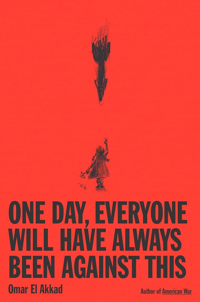
    “Missile Command meets The New York Times,” you say, in an effort to describe this design to someone who hasn’t seen it — something guaranteed to get a laugh. But here it is, in all its glory.

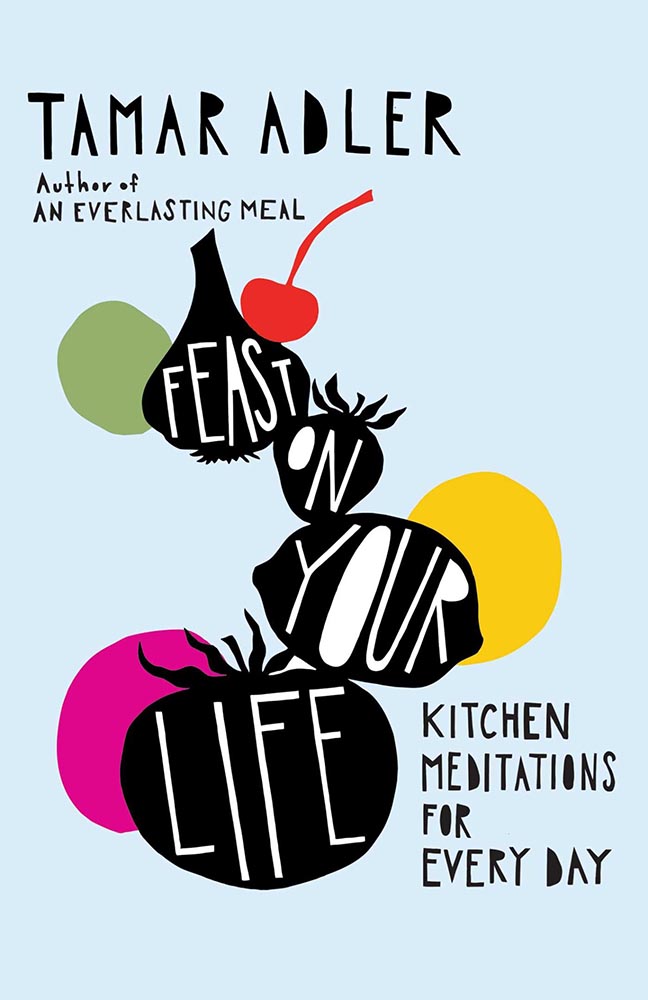
    Cover design by Jaya Miceli, with art by Anna Brones.

    Cookbooks are such a well-trod genre that it’s nearly impossible to break out of the pack and generate something not only truly original but truly excellent: a feast indeed.

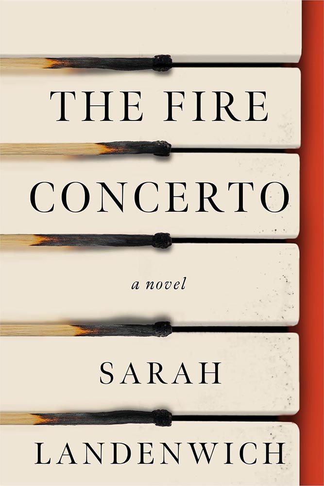
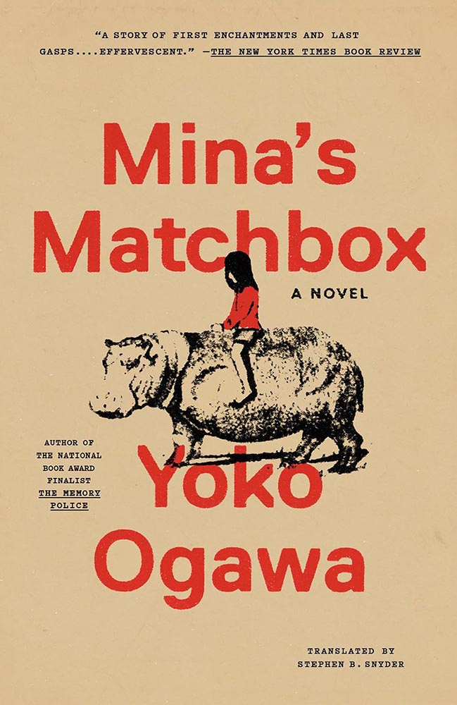
    Cover design by Jared Oriel.

    Burnt matches have never made such sweet music.

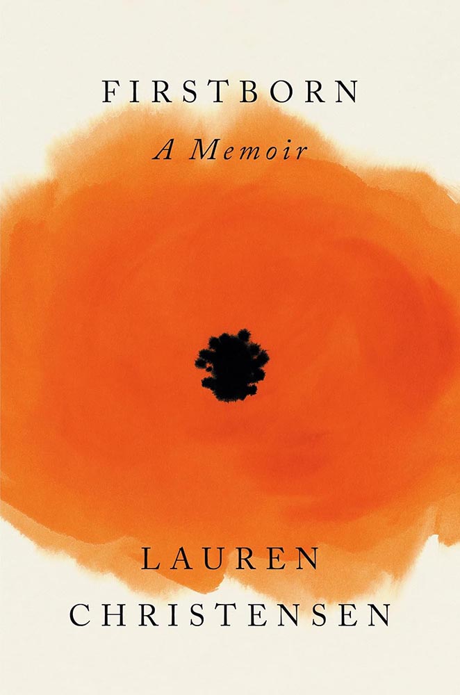
    Cover design by Darren Haggar; illustration by Cecilia Caristedt.

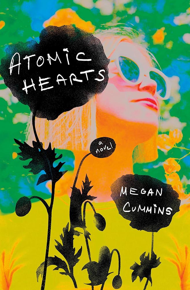
    Poppy? Or a view into something deeper?

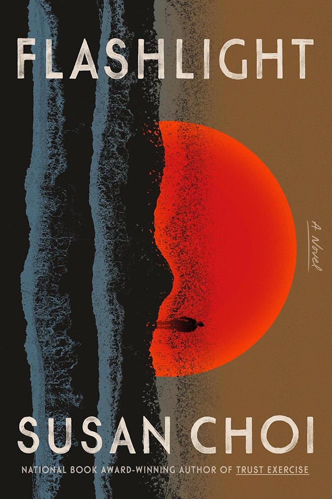
    Cover design by June Park.

    “What happens when your world goes sideways?” this cover — and book — ask. From illustration to style, basically … perfect.

    Cover design by Janet Hansen.

    Simple, practical, awesome. (“Chef’s kiss” is probably tacky, so I’ll avoid saying that.)

    The author’s previous title, Lucky Dogs, was in my 2023 Favorites.

    Cover design by Rodrigo Corral and Adriana Tonello.

    At first glance, something we see all the time, from image to typestyle.

    But then it goes on to ring the bell.

    Cover design by Frances Digiovanni, Rodrigo Corral Studios.

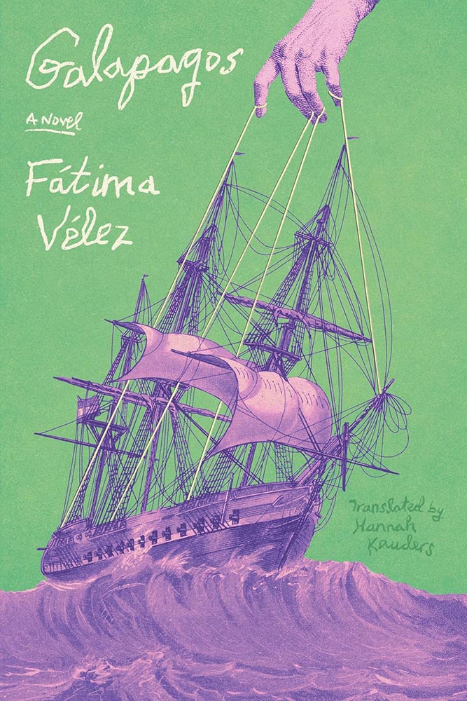
    The case where something like “a two-color triumph” feels not only cliché but a genuine undersell. The illustration, the color choices, the exquisitely shaky hand lettering — all beyond perfect, and that’s before we start talking about those strings. And the power that’s pulling on them.

    Cover design by Jared Bartman.

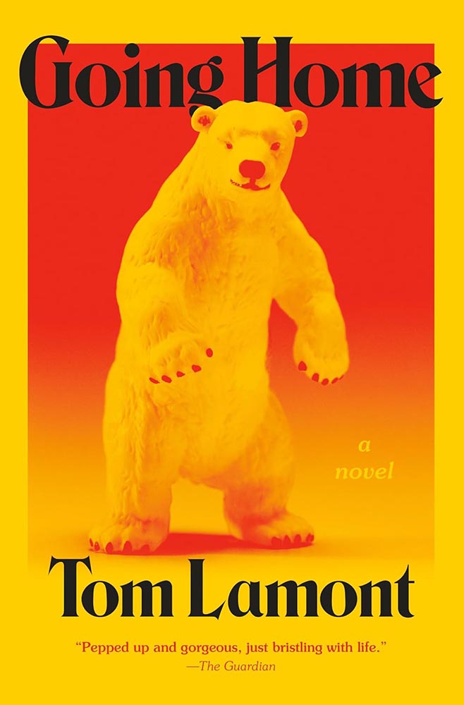
    The bear feels like something generated by bad AI, or even a suit; as it turns out, we don’t care. Bright, funny, and fun in just the right way. (I do wish they’d kept the single quotes proper English uses.)

    Cover design by Adriana Tonello.

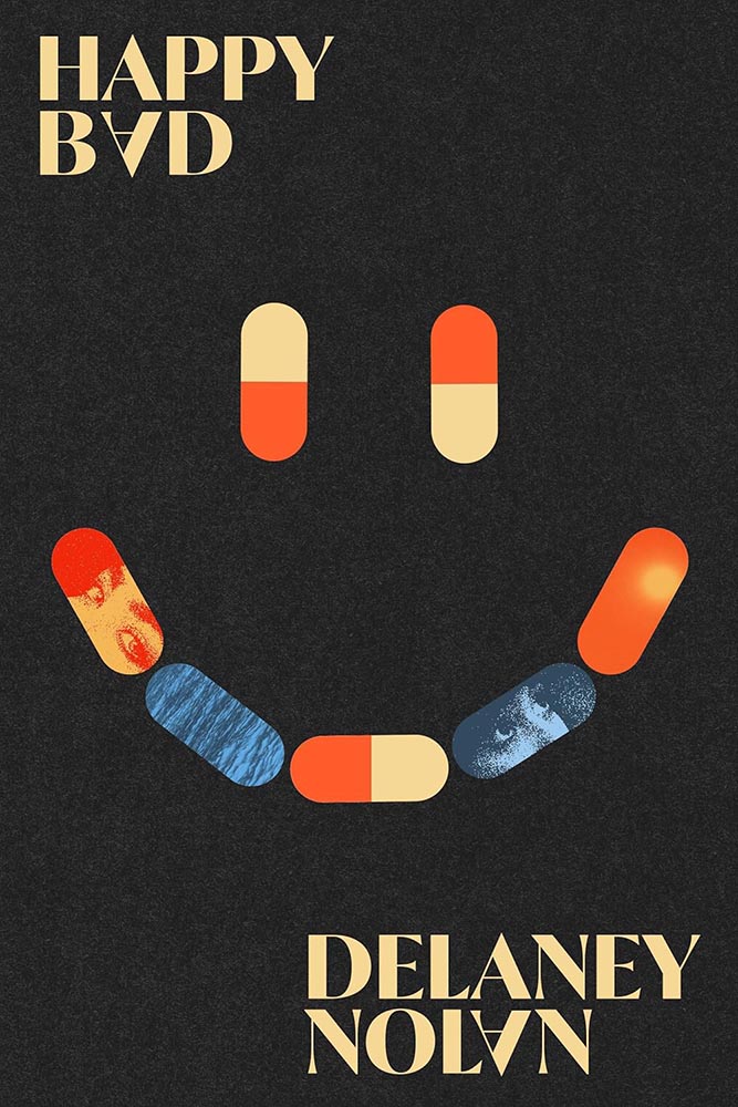
    On the one hand, the opposite of “bright, funny and fun” — and yet, one the other, somehow, not.

    Cover design by Maddy Angstreich.

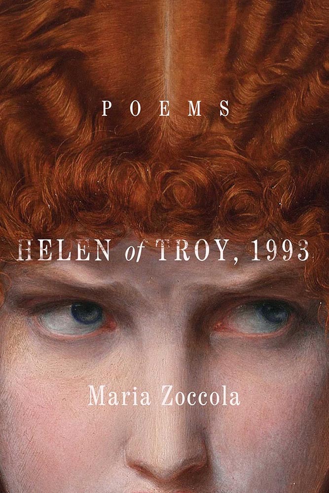
    I swore, possibly in public, that cropped classical paintings is something we should move on from in book design.

    Clearly, I was wrong.

    Cover design and illustration by Micaela Alcaino.

    One of the few times in recent memory that something so original was so funny, so satisfying, and such a standout design … on any shelf.

    (One of those covers that would work well as a print, I think.)

    Cover design by Anna Morrison.

    The triumph of the simple.

    Cover design by Keith Kayes, with art by Jose David Morales.

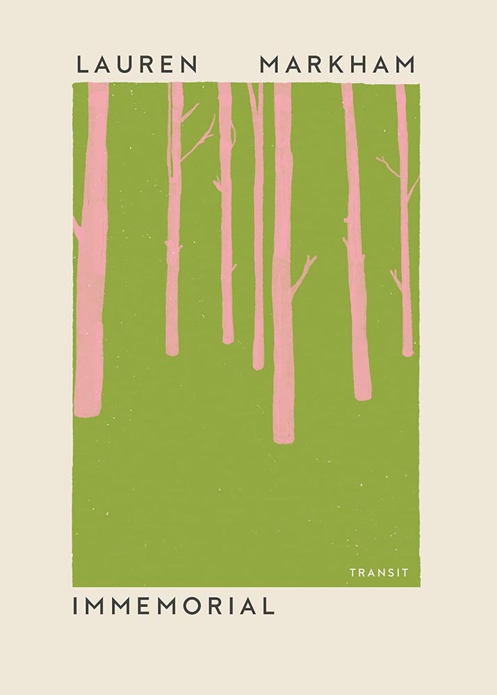
    “Sometimes a new author will sidle up and whisper in your ear, and sometimes she’ll grab you by the neck,” one of this book’s blurbs reads. The design of Immemorial, above, is the former. This design is very much the latter — completely and delightfully.

    Ballantine’s contact page is a 404 error — I kid you not — so the designer remains anonymous.

    Power, grace, and color — and, of course, the title treatment. A cover that was never in danger of losing its groove. (Bonus points for the pink “earring.”)

    Cover design by Matt Dorfman.

    Simplicity can mask death depth.

    Special bonus — related brilliance, from 2022:

    Cover design by Matt Dorfman.
    Cover design by Nick Misani.

    Illustration and lettering triumph for this classic title, slightly reminiscent of the Farmer’s Almanac I remember from my youth (in the most complimentary way), with appropriately-English “characters” for the UK edition.

    Cover design by Katy Homans.

    I mentioned above that for photographs to work today, they have to have that something that grabs and won’t let go. This one does.

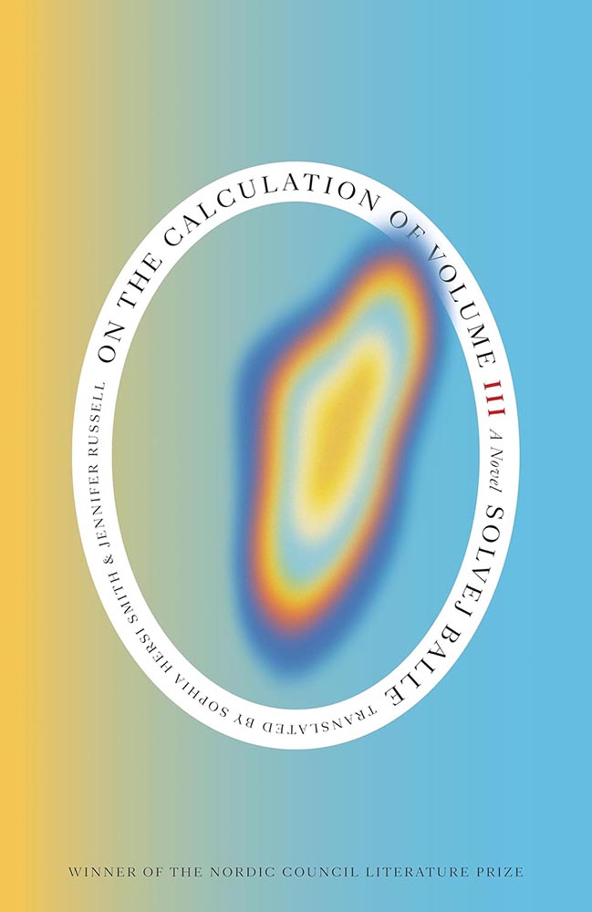
    Cover design by Arsh Raziuddin.

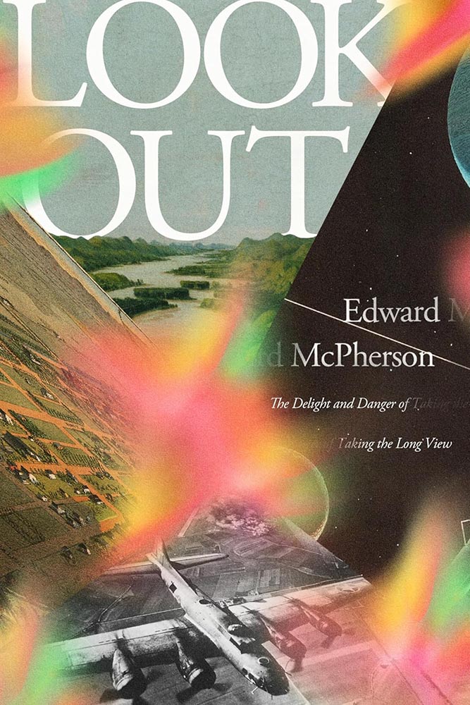
    Next-level collection of long views both together with and simultaneously separated by brilliant use color. Bonus points for the repetition in author and subtitle.

    Cover design by La Boca.

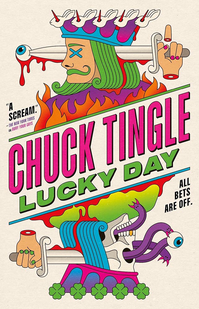
    Gets the award for “most zany,” in the best possible way: “a scream,” indeed.

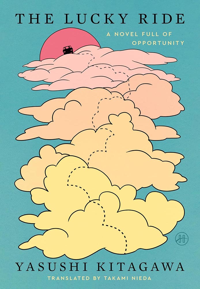
    Cover design by Stephen Brayda.

    Speaking of awards, let’s have one for “soothing.” The dotted path is brilliant and colors awesome. (And while it’s not part of the design, it’s impossible not to appreciate that subtitle.)

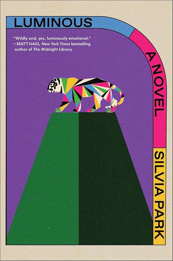
    Cover design and art by Alex Merto.

    Colorful, original, retro-yet-not — with that tiger. I want to make jokes about how this cover so very well illuminates, but really, I just want to go read it. Awesome.

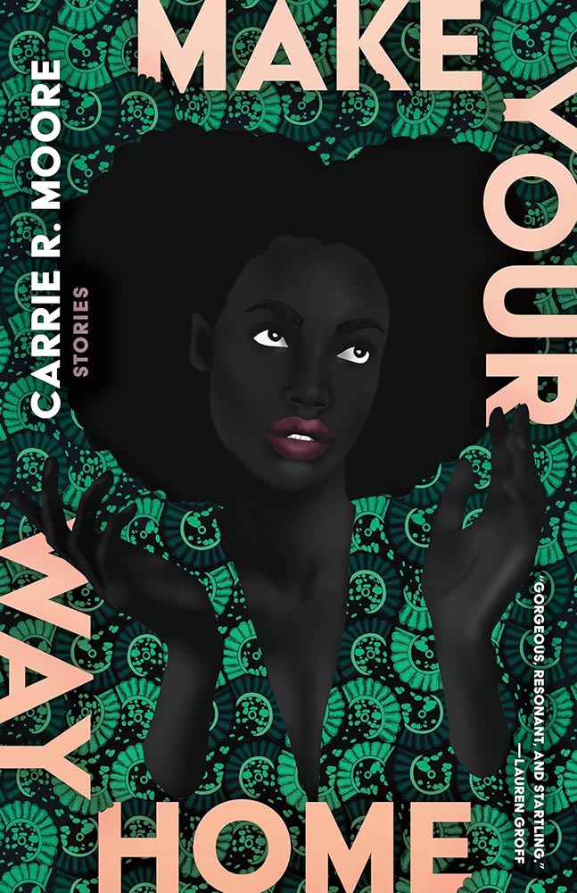
    Cover design by Beth Steidle, with art by Uzo Njoku.

    I’m not a fan of the text-around-the-edge trend — I get it, it’s a framing device, but, suddenly it was everywhere, too much, all at once.

    Once in a while, however, it’s done so well that greatness must be acknowledged. Weaving the title text into the pattern helps, as does, of course, the fantastic art.

    Cover design by Tyler Comrie.

    I had the UK version of this in last year’s list — but the paperback, out this year, gives me an excuse to not only highlight the US version, but the associated redesigned back titles:

    Cover designs by Tyler Comrie.

    I do not believe “brilliant” is resorting to cliché.

    Cover design by Grace Han.

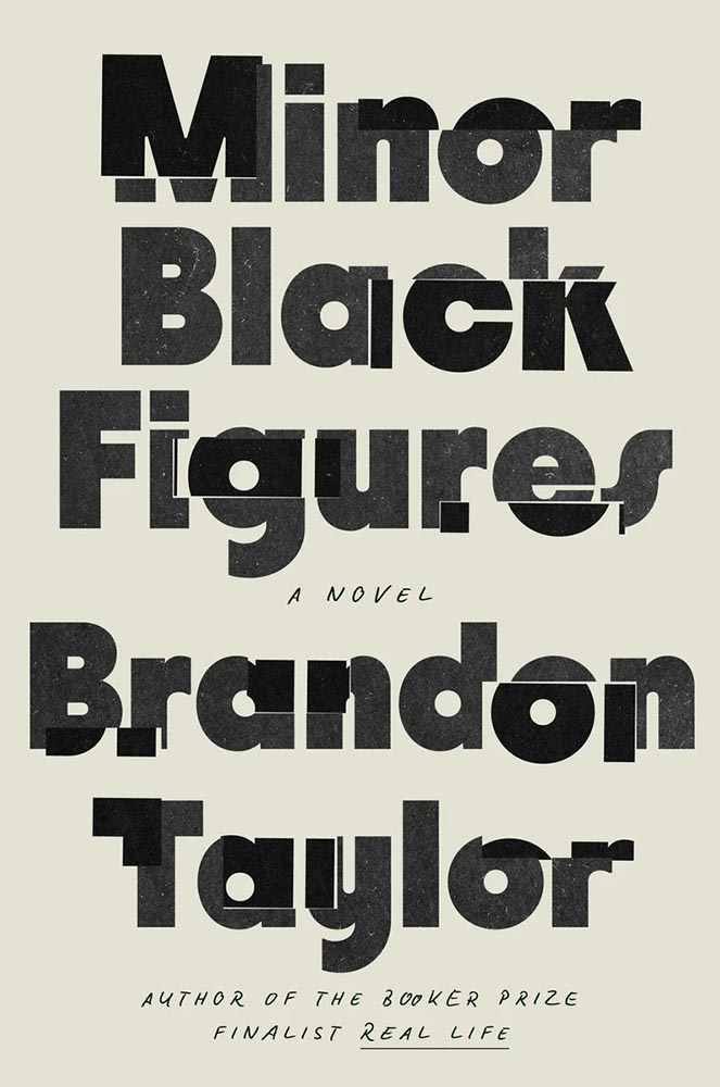
    The second one-color cover on this list, whose simplicity belies the story within. (Lauren Peters-Collaer, on LitHub‘s “best of” list, describes it as “fractured,” which I love — along with the “minor Black artist” being named Wyeth.)

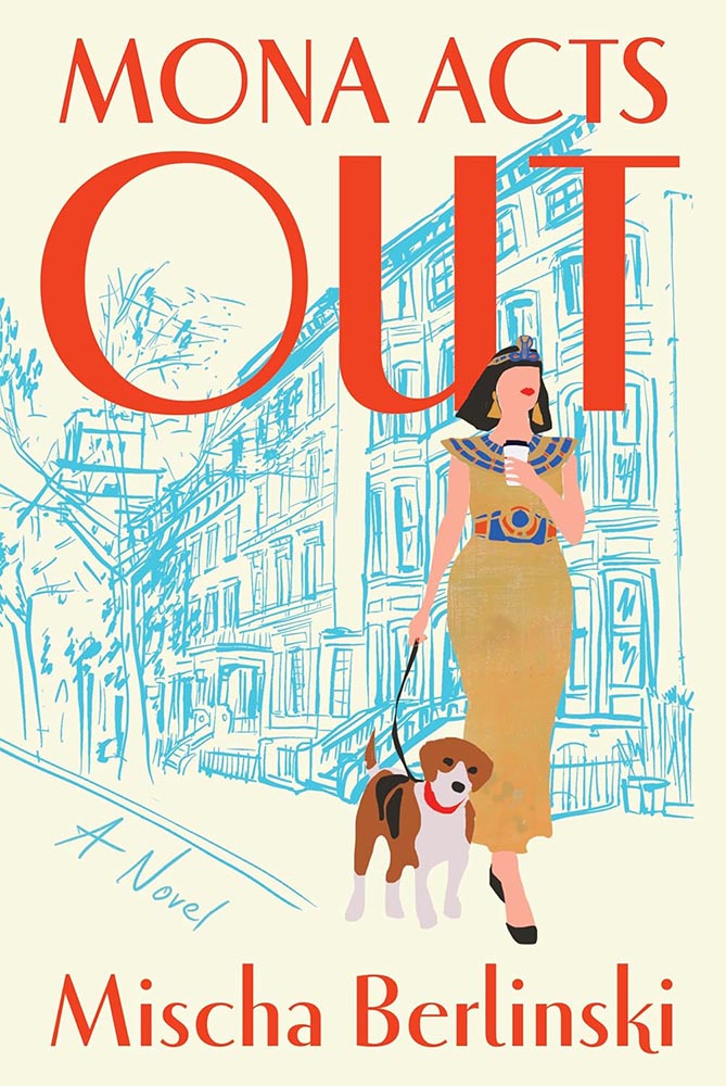
    Cover design by Jaya Miceli.

    “I forgot the blueprints parsley!”

    Awesome stuff: the lips being the only thing on her face, the dog’s expression, the rough sketch style, the way the title stands out, um … okay, everything.

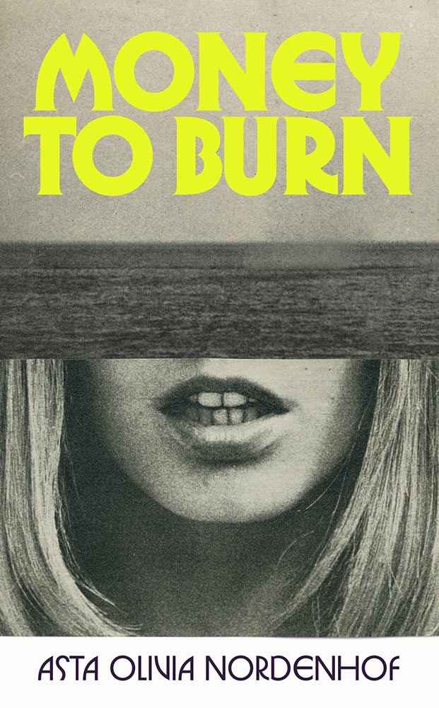
    Cover design by Matt Broughton, with art by Katrien de Blauwer.

    As mentioned, the two-pane cover has become a thing; this one breaks out not only with the black-and-white photos (possibly a subtle duotone) and a bright title in a great typeface (Herbus, by OTT) but cropping on the bottom photo that causes a double-take, and that hint — just a hint — of just-sank in the top photo. Good stuff.

    Much stronger without the quotes fouling the water, by the way. The tug-of-war between design and marketing sometimes gets makes ugly.

    Cover design by Jenny Volvovski.

    Brilliantly simple stand-out: nest and enjoy.

    Cover design by Arsh Raziuddin.

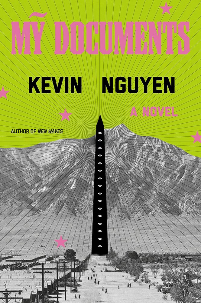
    A fantastic example of a photograph plus — that illustration, those lines, that green, those stars. (And, of course, the eyes.)

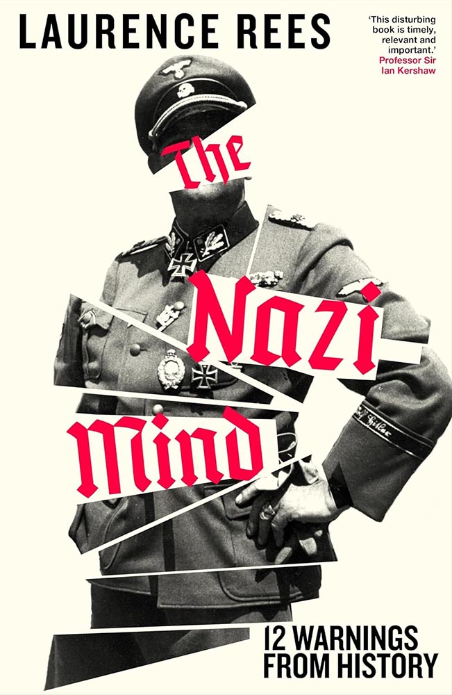
    Cover design by Chris Bentham.

    This UK cover expresses the arrogance — the cockiness — while bringing forth all of the disjointedness and even kleptocracy. Timely and compelling.

    Cover design by Matt Dorfman.

    I like the design of this series — the title holding area (literally) is unusual enough to catch attention on today’s shelves socials — but the colors and treatment on this title, specifically, are the most pleasing.

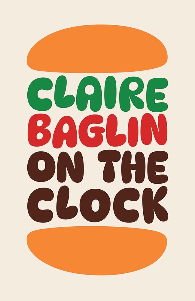
    Cover design by Erik Carter.

    A brilliant idea, perfectly fulfilling the idea of communicating everything needed with one simple concept. (Alas, since putting this aside — the candidates for this list are gathered throughout the year — it’s gained splashy “ketchup” and what can only be described as “cheese.” Boo.)

    Special bonus — the UK version:

    Cover design by Jack Smyth.

    No less brilliant — yet, as covers from the “right” side of the pond often are, more sophisticated.

    Cover design by Janet Hansen, with art by Ahmad Sabbagh.

    Okay, let’s revisit the text describing the previous title.

    To quote Jason Kottke: “The US cover, like many American things, is somewhat less subtle & elegant.” In this specific instance, however, I have to disagree: sometimes, more is more.

    Here, the US version brings a power to the table that US versions often struggle with; a “a few strokes of the pen” can wield enormous strength — often too much — and thought, talent, and consideration are appreciated. This is all of those.

    Cover design by Claire Sullivan, with art by Alex Eckman Lawn.

    “Not for the faint of heart,” one of the blurbs for this title reads — and applies equally well to the cover, which communicates “lovely” and “grotesque” in equal measure. (The UK version trendily plays up the lighter approach.)

    Cover design by Jaya Nicely, with art by Rokas Aleliunas.

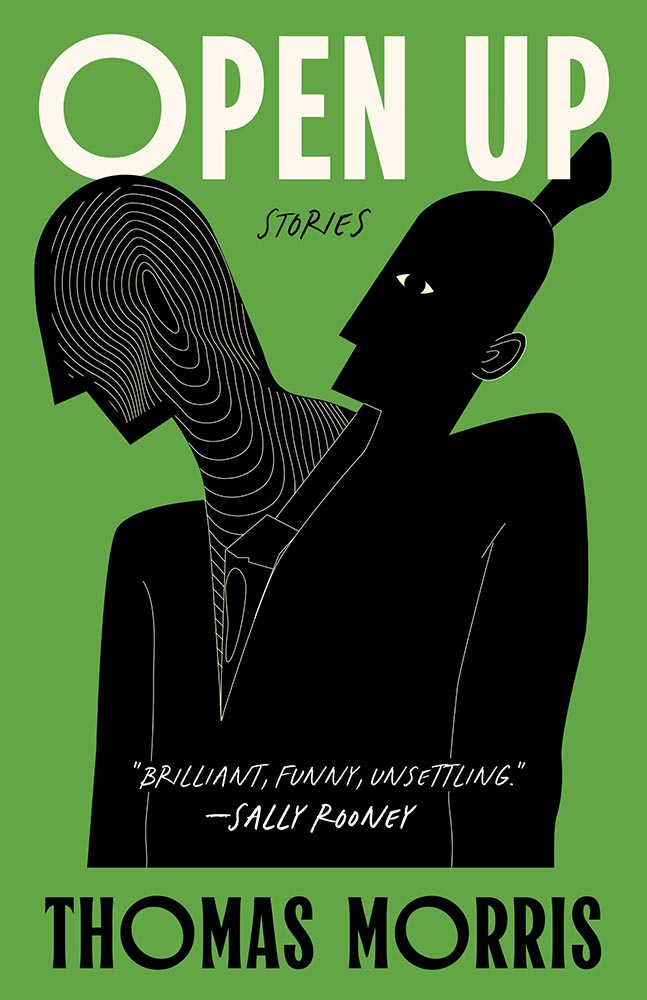
    A “brilliant, funny, unsettling” illustration, too. (Love the green, by the way.)

    Cover design by Devon Manney.

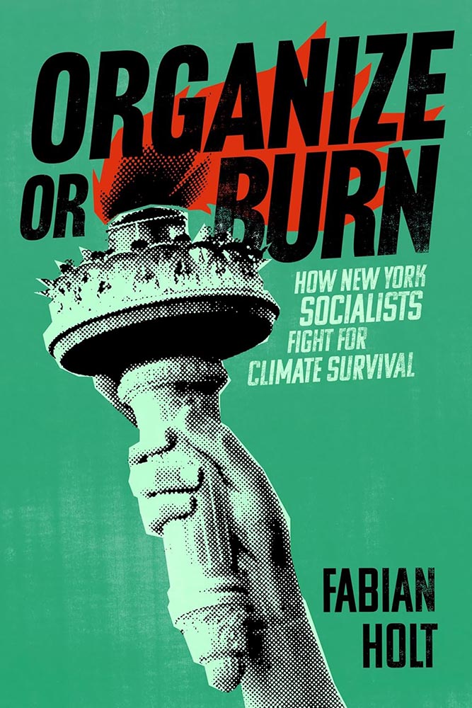
    “From screening to aging, suggestion to content, color to style, this one, put simply, gets everything right,” I said on Spine in October’s University Press Coverage column — but when it was highlighted in October’s Beautifully Briefed, here on Foreword, I added, “One could argue that this cover — and title — could work well even if the word “climate” was removed.”

    Cover design by David Eckersall.

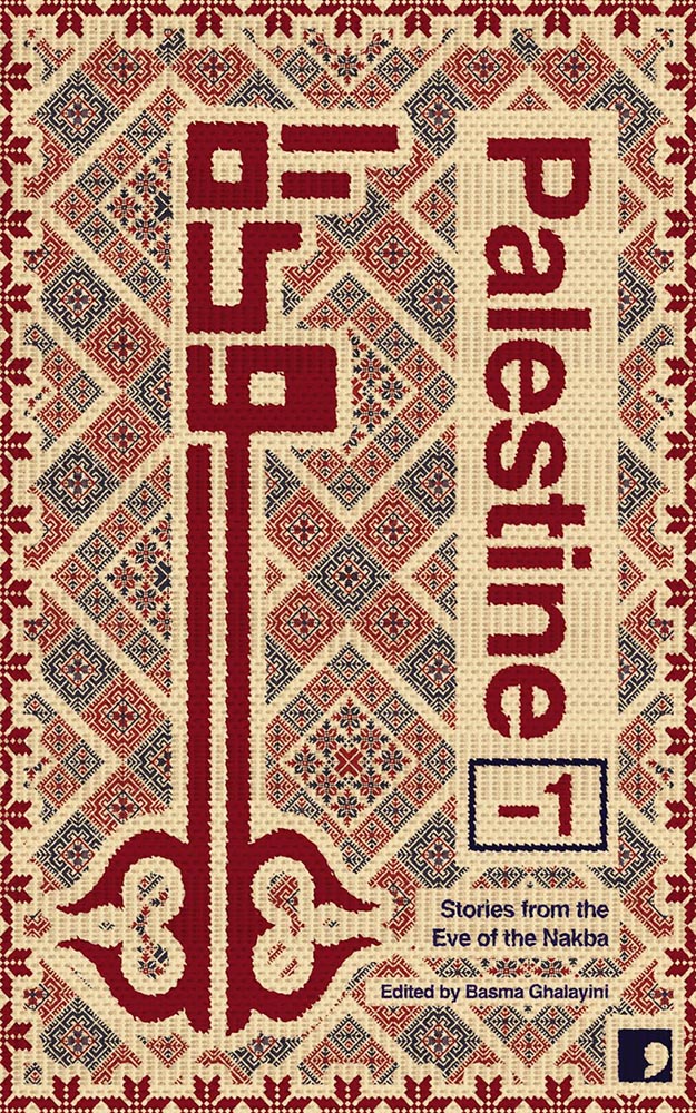
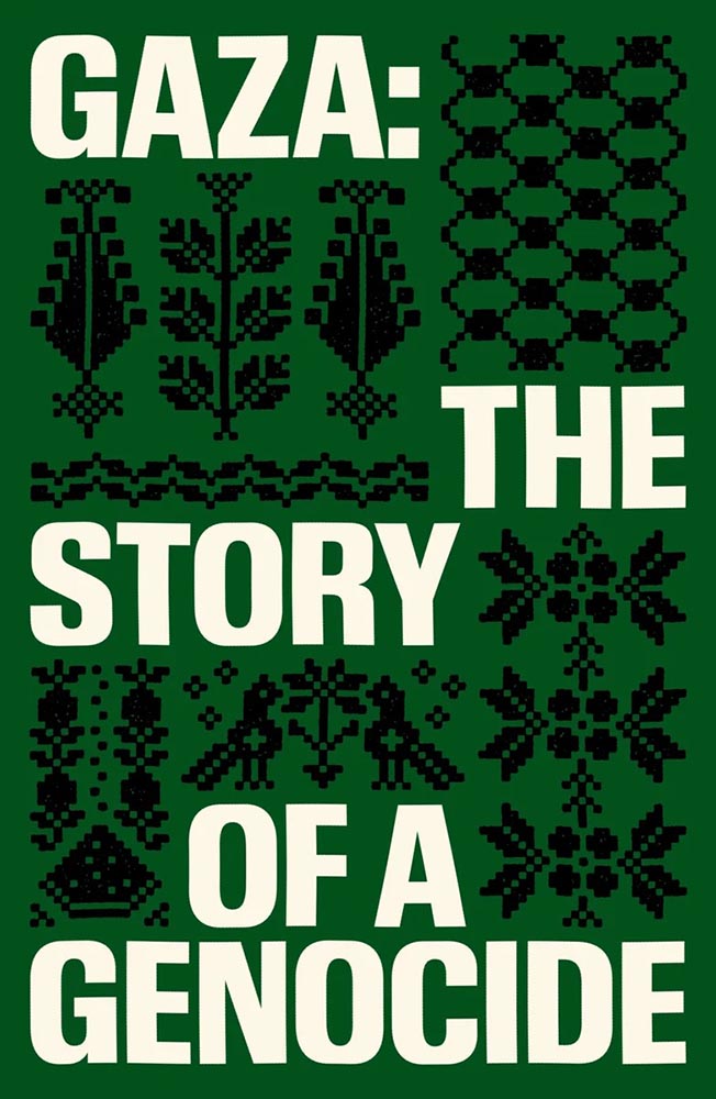
    “Tatreez, meaning ‘embroidery’ in Arabic, is used to refer to the traditional style of embroidery practiced in Palestine and Palestinian diaspora communities. The contemporary form of tatreez is often dated back to the 19th century. The style of cross-stitch embroidery called fallaḥi has been practiced amongst Arab communities in the Mediterranean for centuries,” Wikipedia notes. (NY’s Met Museum has more.)

    Beautifully applied.

    Special bonus — see also:

    Cover design by Chantal Jahchan.

    Yeah.

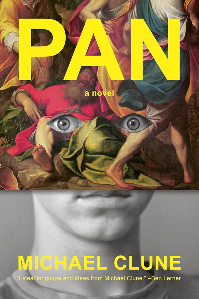
    Cover design by Janet Hansen.

    Pan, panic, or just surprise? No matter the expression, a delightful way to break all of the rules. (Bonus points for the knee to the nose.)

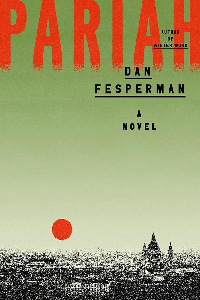
    With apologies, I don’t know the designer for this cover.

    A disgraced comedian-turned-politician is recruited by the CIA — a grainy prospect that you wouldn’t expect to look like this.

    Um, yes.

    (“This title is absolutely about Bolrovia,” he added.)

    Cover design by Emily Mahon.

    Less chess and more Cold War, another where a powerful, simple idea triumphs. The orange and the hand-lettering deserve special praise, as well.

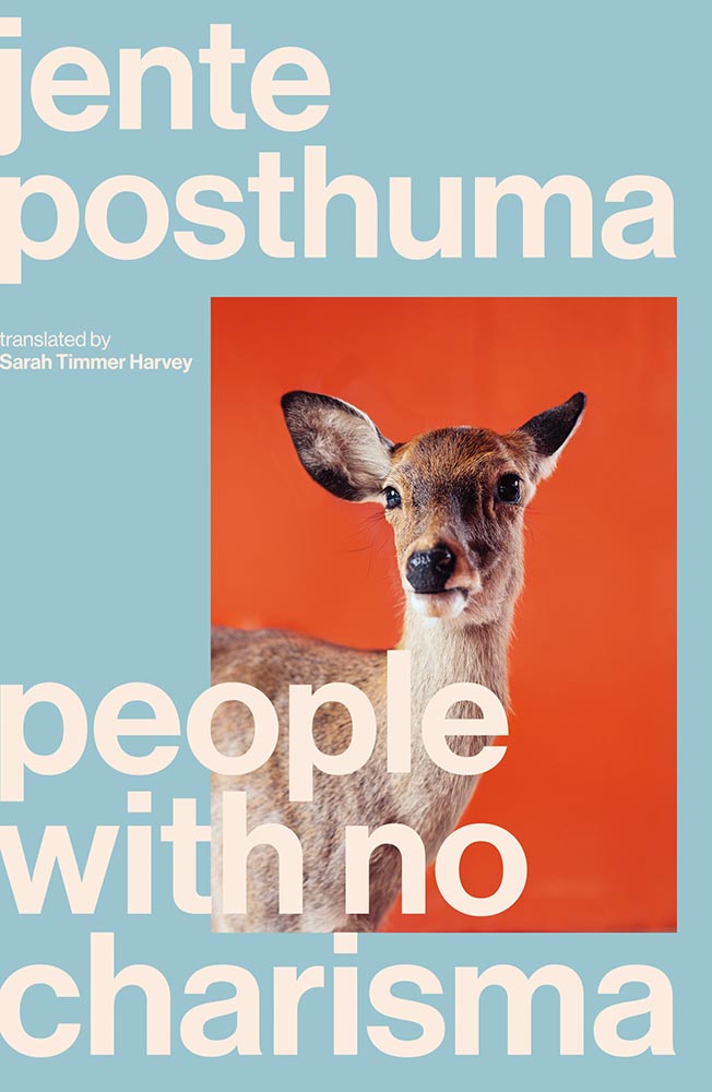
    Cover design by Luke Bird.

    From expression to ears, brings new delight to deer-in-the … highlights.

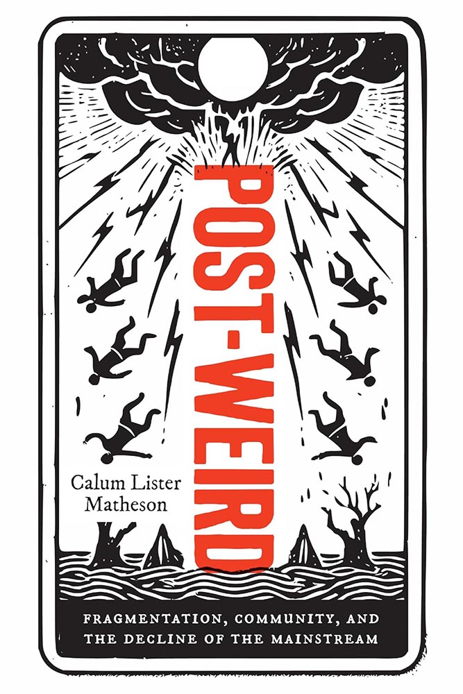
    Rutgers University Press did not return a request for cover design information.

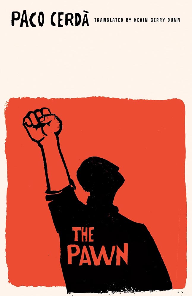
    “From the woodcut hall of fame, we have this,” I wrote in Spine‘s November column.

    (I’m sad Rutgers never returns emails, because this artist deserves named credit. If you know….)

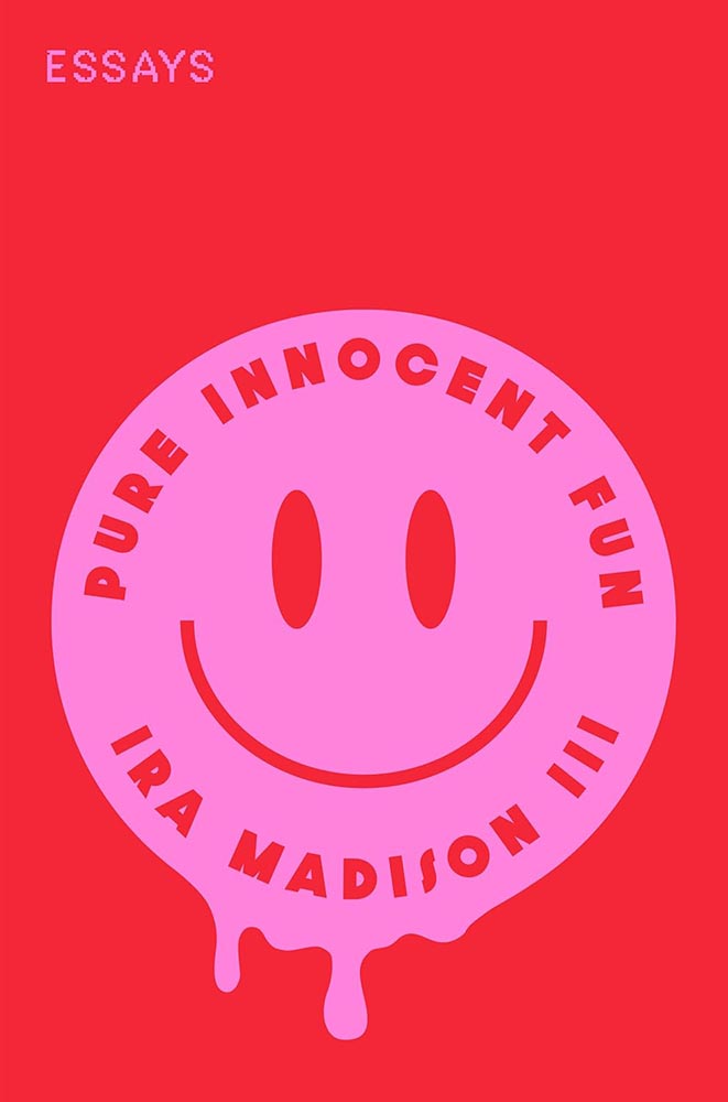
    Cover design by Ella Laytham.

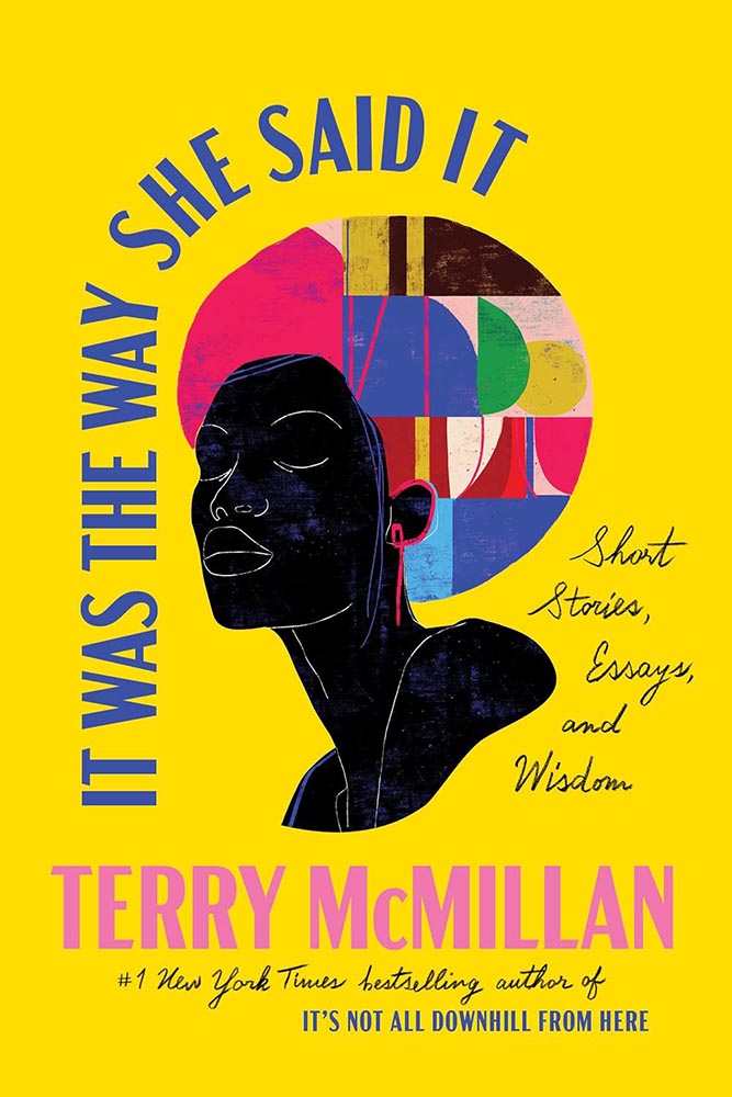
    That “Essays” is printed in little tiny pink stamps is merely the kicker: awesomeness, defined.

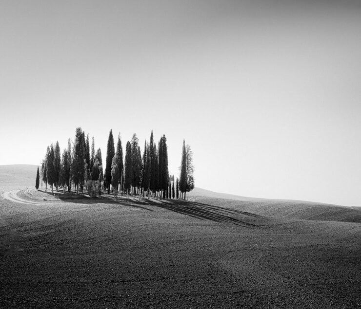
    Cover design by Lauren Peters-Collaer.

    Might I have mentioned that silhouettes are overused, even trendy? And that photographs are passé? Not here.

    Like The Slip, this title goes out of its way to do something different, something appreciated, with the cutout. Combined with a great photo and grainy sky, it steps out of line and requires your attention.

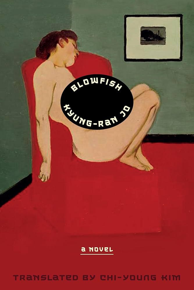
    Cover design by Lauren Peters-Collaer.

    “Deadpan wit” could be used to describe more than the contents: simultaneously simple and simply brilliant.

    A cheat here: the green version is the hardcover from 2024; the paperback, from November ’25, is orange with a pink chair — and not quite as good.

    Cover design by Sarah Schulte.

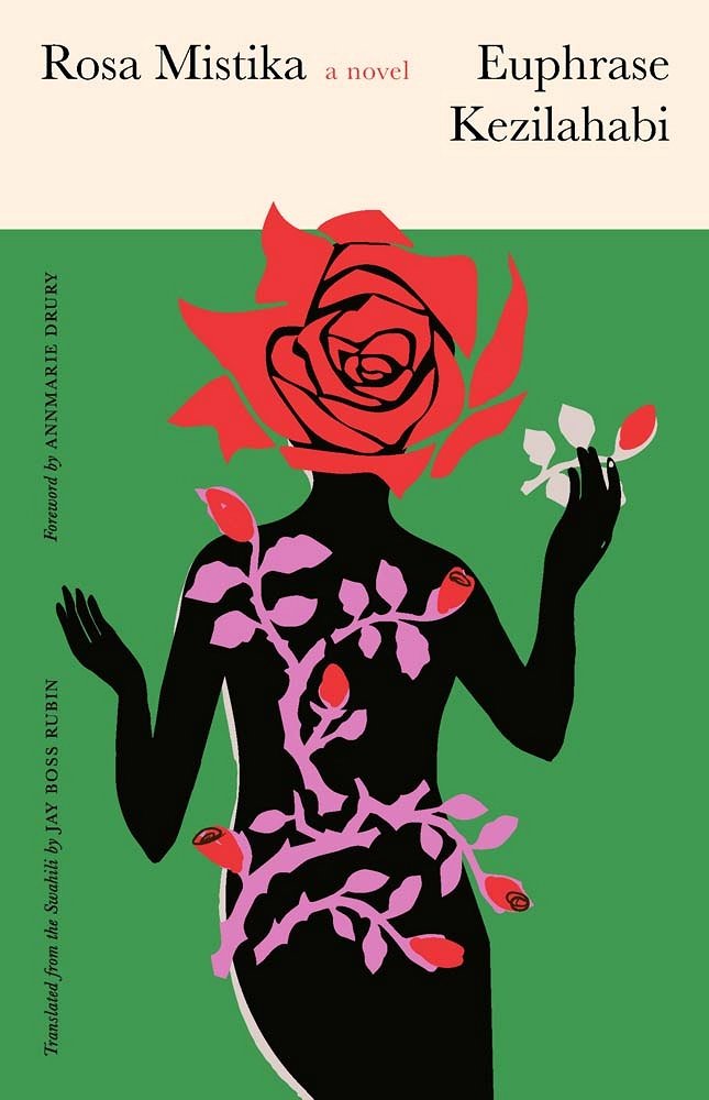
    “A controversial Swahili classic — banned on publication — translated into English, published by Yale, and represented with a cover best described as a gift. A design that belongs in every ‘best of’ list,” I said in the inaugural column for Spine.

    So added.

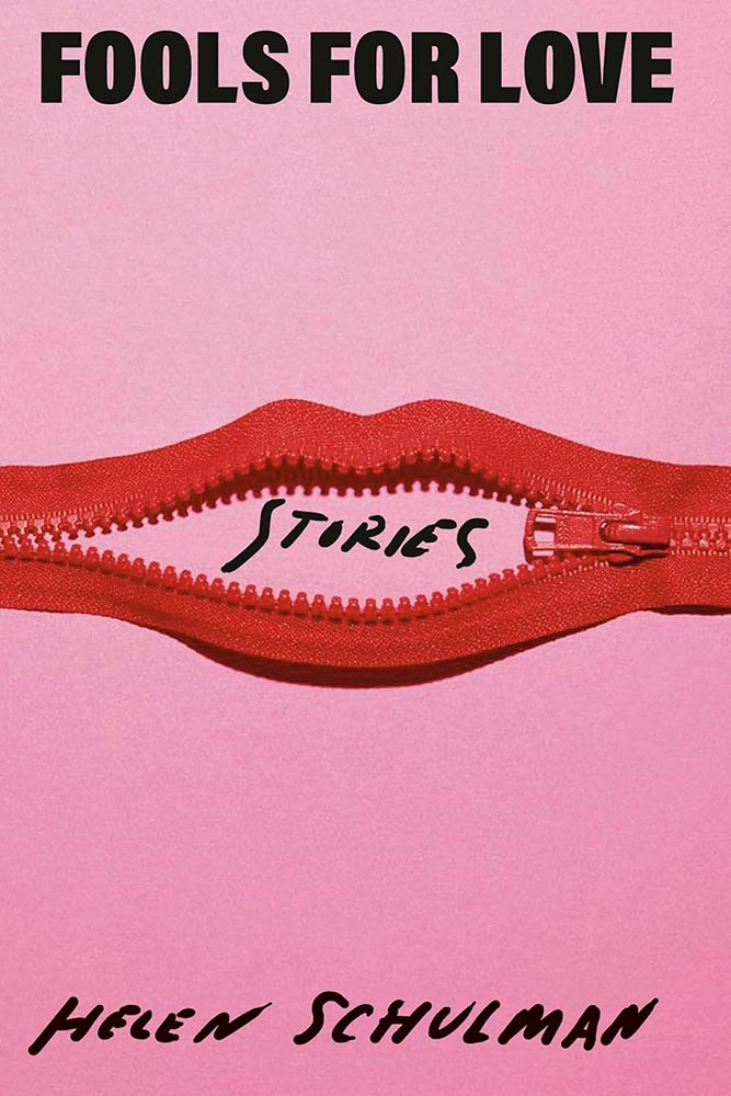
    Cover design by Josh Durham.

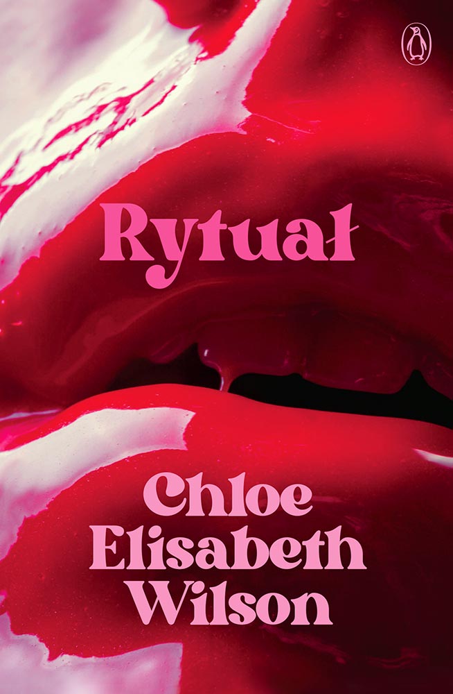
    Close-ups of women’s lips is another trend I’ve been avoiding — except when it positively drips with photographic brilliance: millennial pink, taken to the next level. (Once again, a cover measurably better without the detritus rytuałły added by the publicity department.)

    Cover design by Beth Steidle.

    I don’t know whether Beth did the art for this — presumably — but that art, together with the title treatment, add up to one of those “wow” covers instantly added to the list of year’s best.

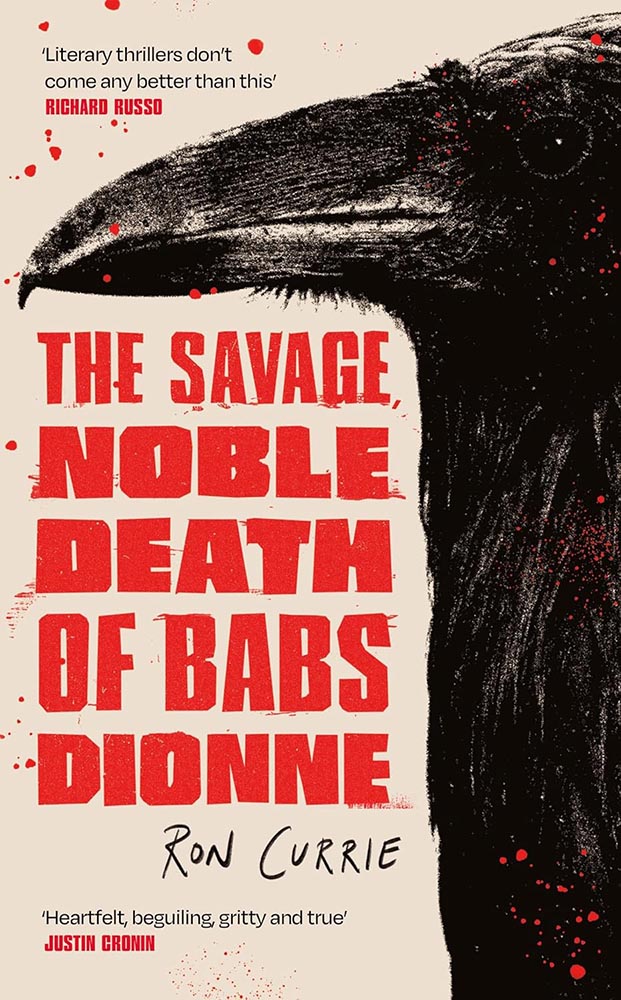
    Cover design by Holly Battle.

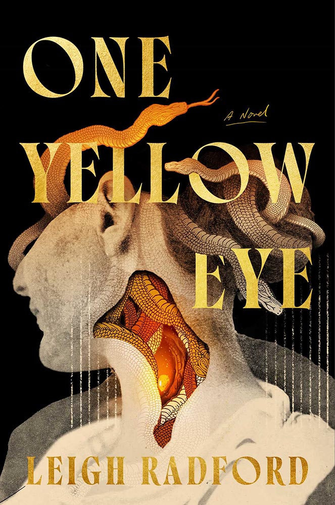
    A “doting grandmother and vicious crime matriarch”: raven mad. This UK cover gets points for illustration style, type style, and, of course, just the right dose of splatter.

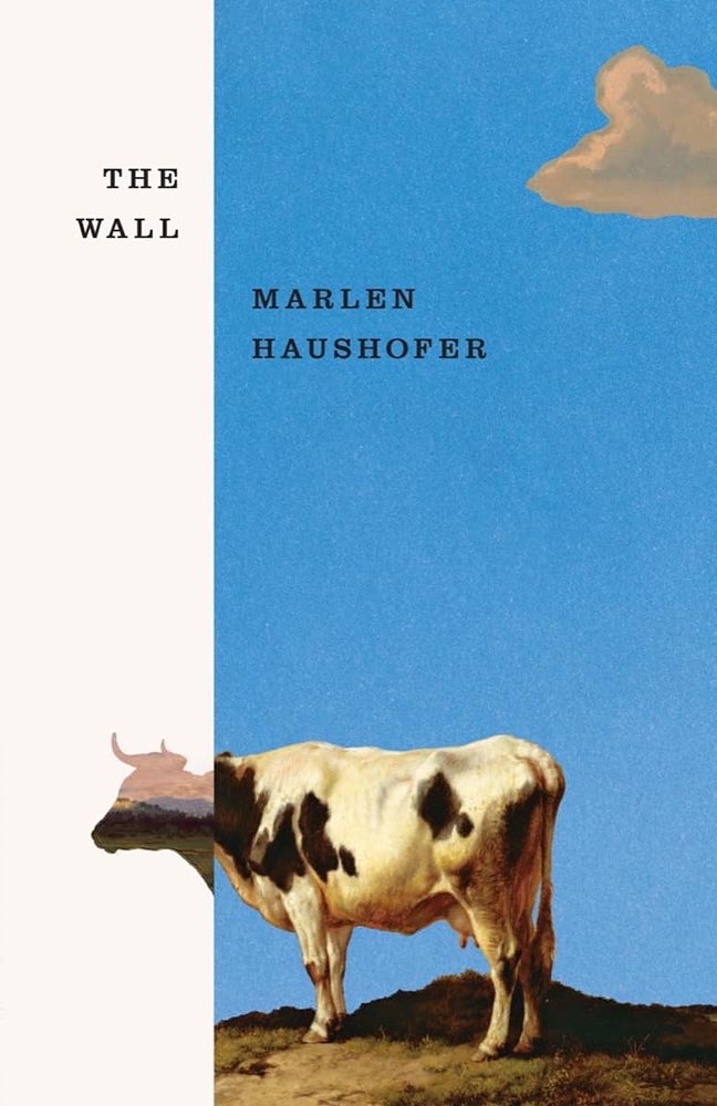
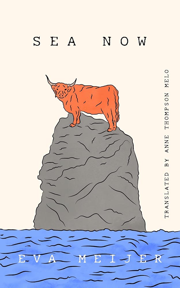
    Cover design by Jared Bartman.

    “The bull’s expression,” he said.

    “The no bulls*** expression of nature,” she retorted.

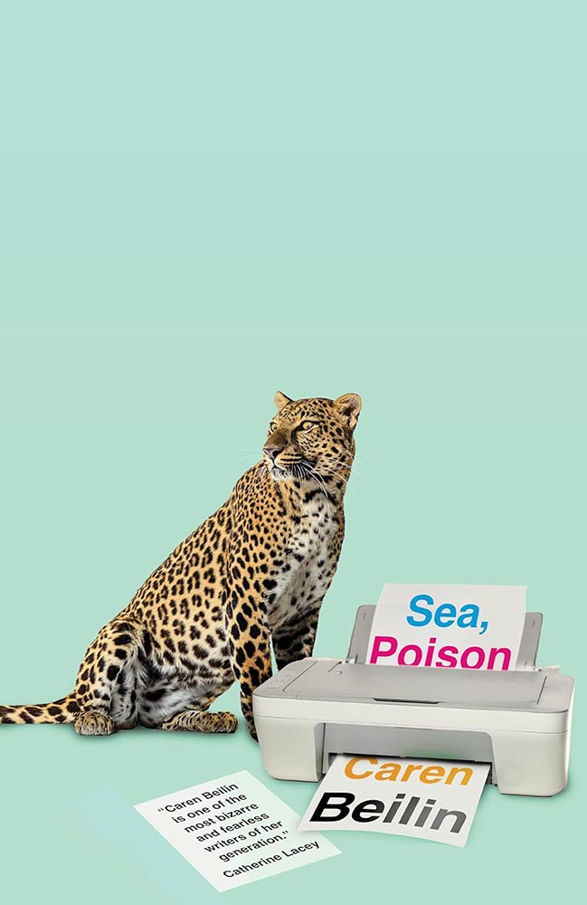
    Cover design by Jamie Keener.

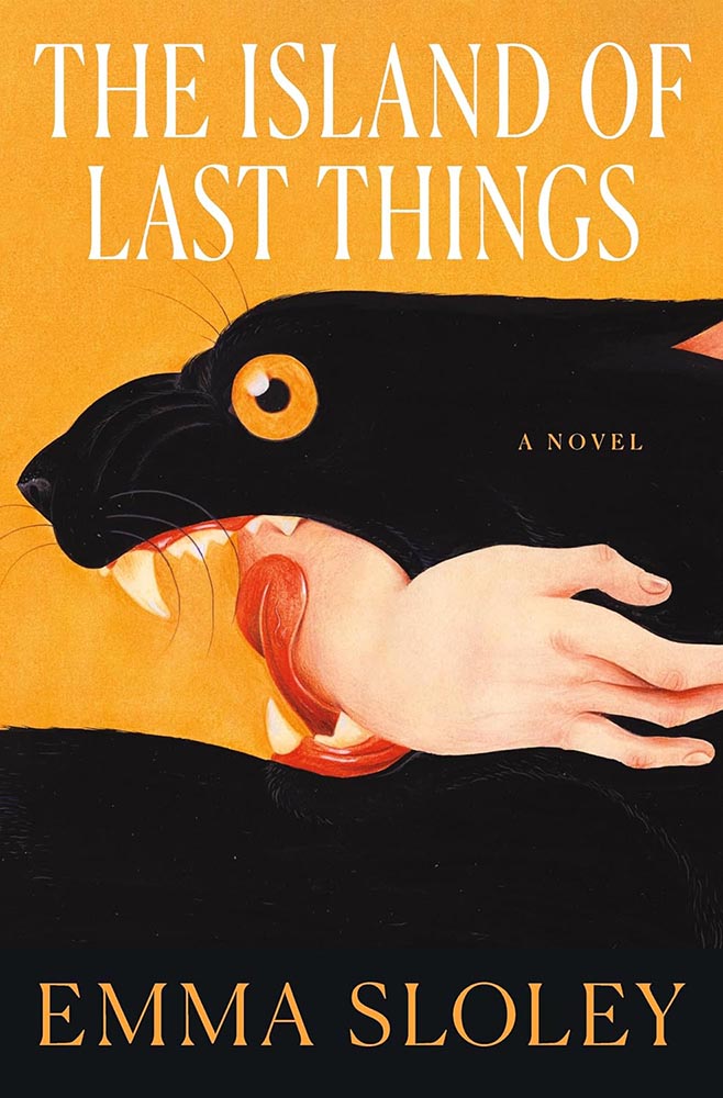
    Never mind the huge negative space: it’s the eyes. (Okay, it’s also the unlikely collection — collision? — of leopard and printer. Plus the loose page/quote. Plus the background color. But still.)

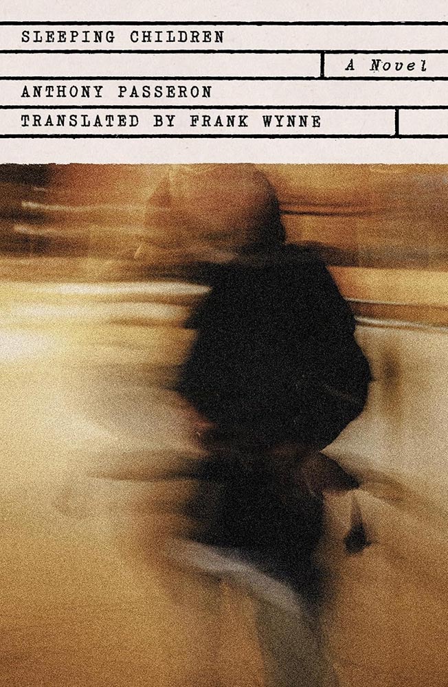
    Cover design by Rodrigo Corral.

    Heroin addiction, AIDS, French doctors, family drama: how do you weave that together into a compelling cover? Well, this.

    Cover design by Gabriele Wilson; collage by Arsh Raziuddin.

    “Fragmented colonialism in Africa, illustrated incredibly well,” I said in October’s Spine column — then went on to do both designers a disservice by failing to include the appropriate credit. Sheesh. (Apologies.)

    Cover design by Farina Yasmin.

    The US vs. UK “style” has been mentioned, well, possibly too much. Sorry.

    But.

    Here’s a great example of two great covers — both where all eyes are very much on the performer’s … uh, performance — yet in remarkably different ways.

    Cover design by Julia Connolly; photograph by Sandra Casado.

    Even though this kicks serious a**, in this case (and to continue the back-and-forth), I don’t think the US version is any less sophisticated.

    Cover design by Nicole Caputo.

    Beautiful illustration, beautiful type treatment; it’s something that could almost be described as “soothing.”

    (With the possible exception of the text within.)

    Cover design by Steve Attardo.

    An awesome illustration against one of the year’s creamiest backgrounds, yes, but absolutely one of the year’s best title type treatments.

    Cover design by Jaya Miceli.

    From Spine‘s University Press Week special coverage, November 10–14, brought to you in honor of the event help by the Association of University Presses:

    “‘Ebullient’ is used in the description of this title, and quite frankly I can’t think of a better word to describe this text-only treatment: superlative work.

    “(In Miceli’s library, this would be shelved with Milk Fed and Joy of Consent instead of Big Swiss and Victorian Psycho — but it’s telling that she’s great at both styles.)”

    Special bonus — another from that post:

    Cover design by Issac Morris.

    “The ayes have it,” I quipped. “Also, both the title type and color choices are out of this world. (Not sorry.)”

    Cover design by Jack Smyth.

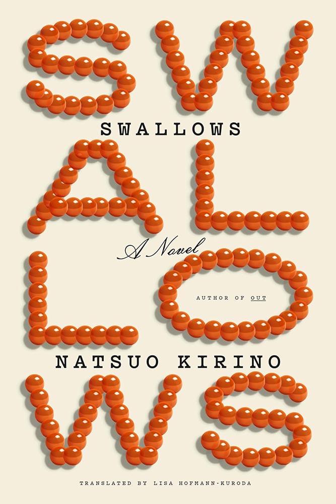
    The word “acerbic” is used several times to describe this tile, but the UK cover just isn’t — the type and treatment are wonderful, and the surrogate egg is perfect.

    Special bonus — the US version, which received a good deal of praise:

    Cover design by Tyler Comrie.
    Cover design by Dana Li.

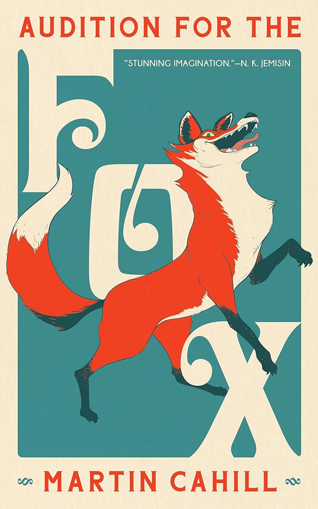
    As mentioned on And I’ll Take Out Your Eyes, the part-human, part animal thing could possibly be described as “overdone.”

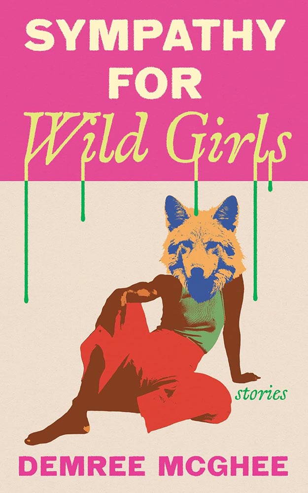
    Here, though, it’s a home run wrapped in a night out: from colors to drips, pose to poise. Awesome.

    Cover design by Michel Vrana.

    A “decades-long earthquake,” indeed: layered, hopeful, wonderful.

    Cover design by Sarah Schulte.

    Another text-in-a-square exception to the rule: framing rarely works so well. (Besides, there’s that illustration.)

    Cover design by Daisy Bates; photograph by Vanessa McKeown.

    Cover photograph of the year, foot hands down.

    Cover design and illustration by Kimberly Glyder.

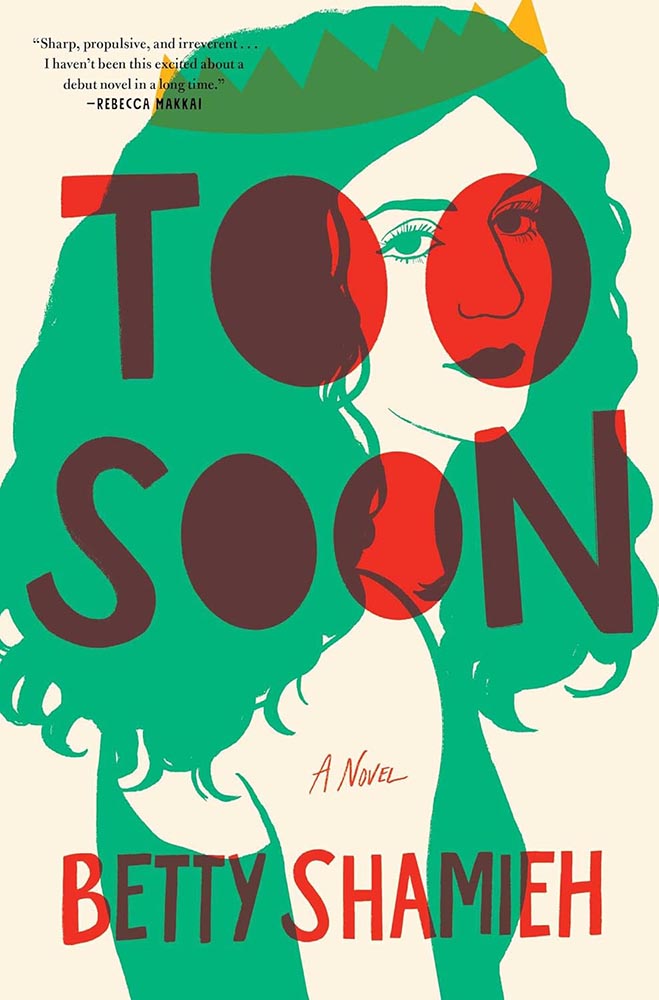
    “A risqué cross-dressing interpretation of a Shakespeare classic”: I can’t decide if it’s a crown, horns, or teeth. (“Yes,” someone said.)

    But it’s the red overprint that steals the show. Fantastic.

    Parenthetically, the author is “a founding artistic director of The Semitic Root, a collective that supports innovative theatre co-created by Arab and Jewish Americans.” How awesome is that?

    Cover design by Kelly Hill.

    “Canadian text soothes,” some belligerent American said.

    (Another one of those illustrations I’d happily hang on my office wall, by the way.)

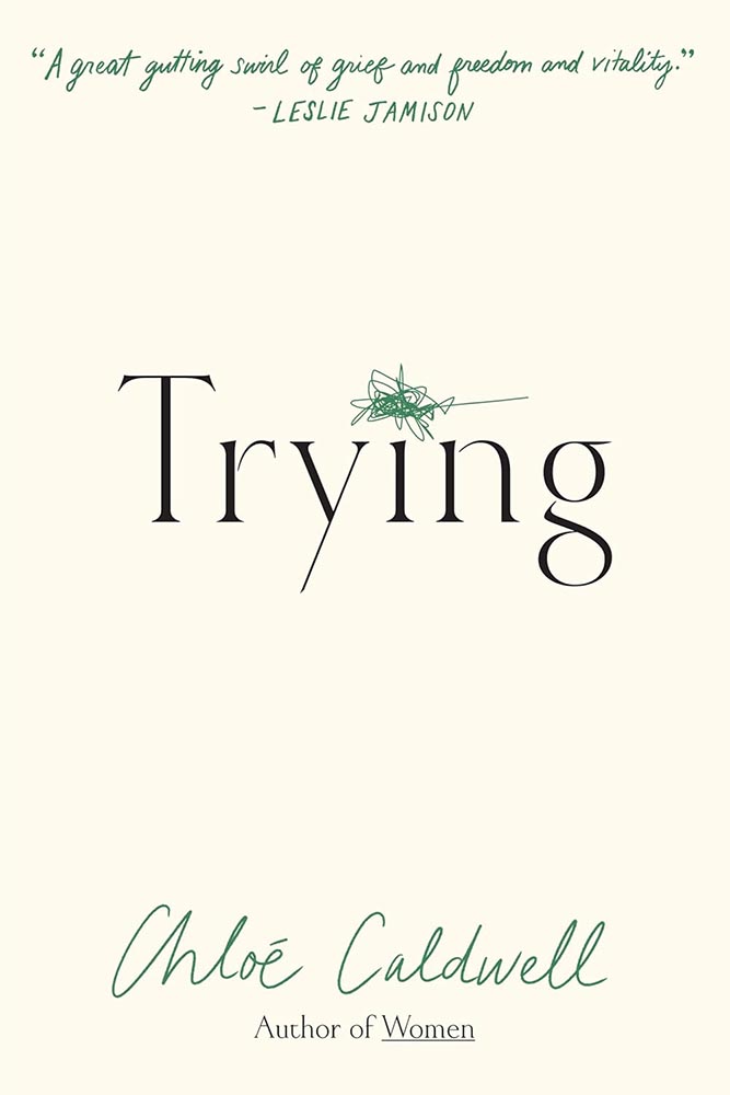
    Cover design by Kimberly Glyder.

    Never mind anything else: it’s the scribble. (The title font’s beautiful, too, honestly.)

    I try to reserve “perfect” for occasions that warrant it — this does.

    Cover design by Luke Bird.

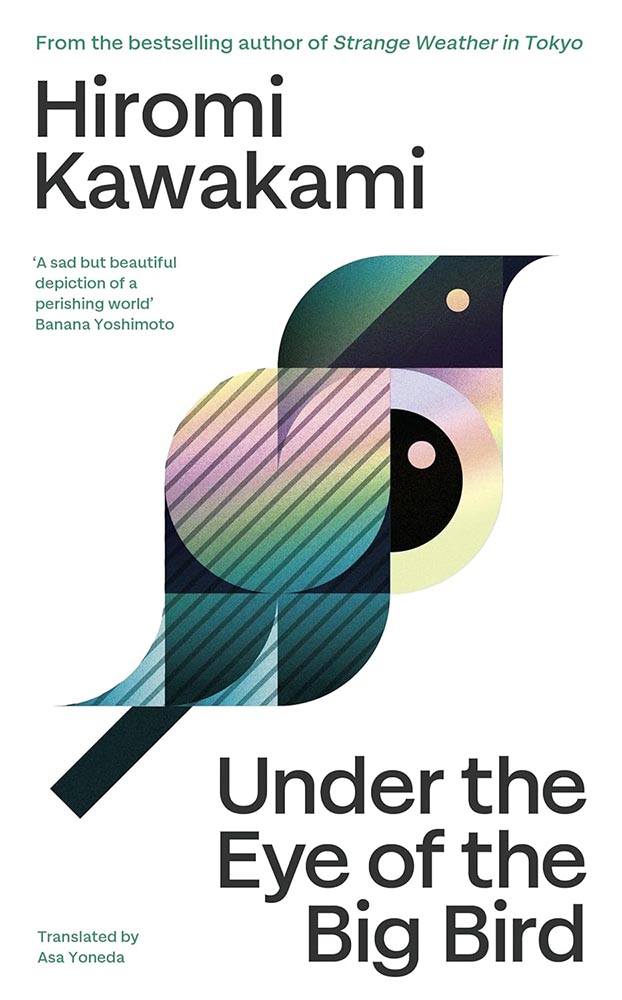
    A geometric, simple triumph of illustration: I suppose if anyone can do a bird well….

    (Sorry.)

    As an aside, this title is not to be confused with Under the Eye of Big Bird, which is in a whole ’nuther category.

    Cover design by Jamie Keenan.

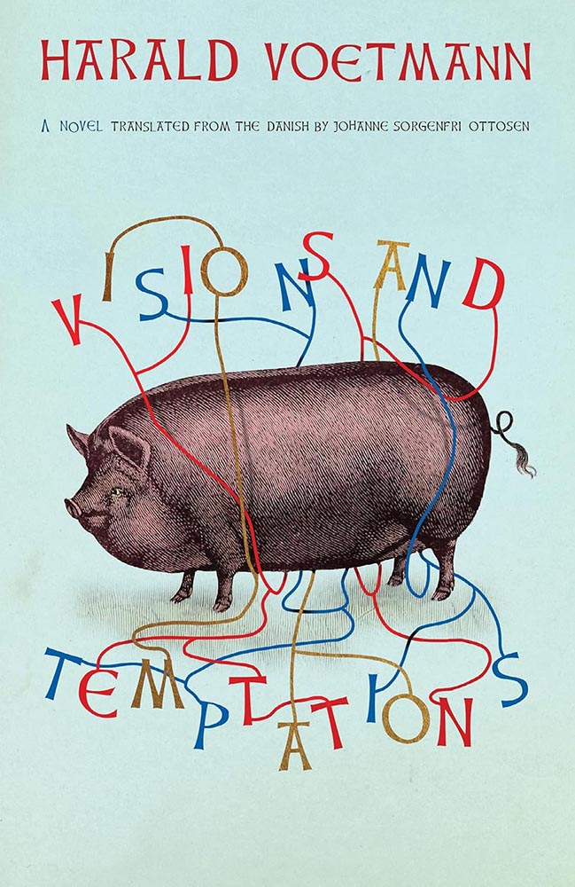
    Entangled in wonder. (Also, the background color is super, and the font — Celtic Hand by Dieter Steffmann — is proof that freebies sometimes work beautifully.)

    2023’s Sublunar was a interesting design, too.

    Cover design by Grace Han.

    Open the window to yeokmasal: awesomeness awaits.

    Cover design by Thomas Colligan.

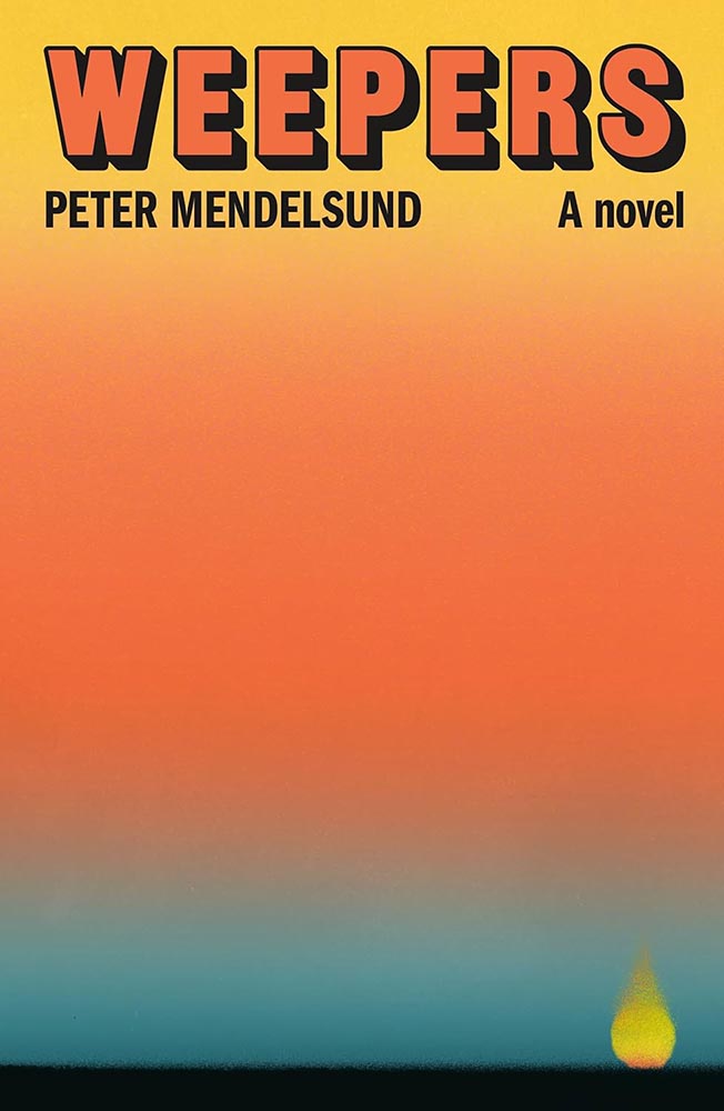
    A book about a professional weeper, [whose] “services are sorely needed these days, as the town, the region, the country as a whole has become more or less numb.”

    Ummmm….

    (The cover’s fantastic, too.)

    Cover design by Maddy Angstreich; photograph by Bobby Doherty.

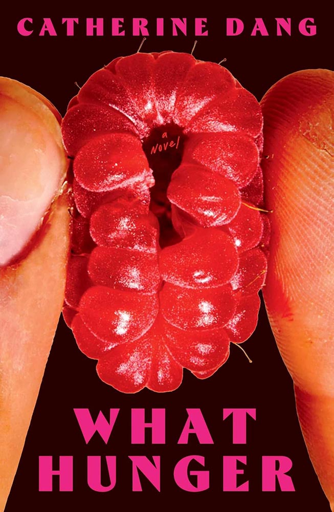
    Dang, that’s not raw meat being squeezed there. (Nor a fruit, for that matter.)

    Cover design by Pablo Delcan.

    From June’s Spine column: “19th-century hair styles: the absolutely fantastic world of university press cover design briefs … absolutely nailed here, with pen-and-ink illustrations and aged type handled perfectly. (Great title, too.)”

    Cover design by Na Kim.

    To close out, another painting by Na Kim, as visually arresting as Brother Brontë, above, but 180 degrees in the other direction. (Bonus points for the pointillist lettering.)

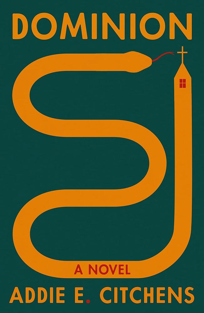
    Come to think of it, it’s 180 degrees from Dominion, too. Is it possible to have a 540-degree compass? Na apparently does — awesome.

    • • •

    2025’s favorites folder contained more than four hundred examples by the end of the year — a hundred more than 2024 — and represented a huge variety of titles, publishers, and design styles. (Significantly different from last year, too — interesting.)

    It was a huge task to whittle the selections down; 400 to 300 was relatively easy, 300 to 200 more difficult, and those last hundred involved making hard choices between covers I really liked.

    One thing helped: as mentioned in the intro, I worried less this year about highlighting every style, every designer, in every category — given the drama that was 2025, there was, in fact, a smidgen of comfort food involved.

    But oh, that comfort food. Michelin starred.

    Another help: my column at Spine.2Vyki Hendy, Spine‘s publisher, deserves a special thank you for that opportunity. It’s reminded me of the gems that exist in an area that doesn’t get enough attention — outstanding, often great, book covers I’m more than happy to find the time to celebrate. While I enjoyed casually perusing University Press designs in the past, they didn’t live under the same microscope that they did starting last June (and will continue to). Adding more University titles is an ongoing bonus, and several of those titles made it into this list; perhaps egotistically, I’d like to think that the exposure those titles received allowed them to make others’ lists, as well, a benefit for all. Nice.

    Thank you for taking the time to spend a few minutes here today. I wish you a wonderful, successful, and above all, peaceful 2026. See you soon.

    How this list was compiled

    There were fewer sources for titles in 2025 than in years past; the BBC disappeared behind a paywall, the quality of mainstream publishers continues to decline, and those articles I did read seemed to stress trends and “what’s hot” rather than actual quality. Thankfully, there’s still PRINT, Spine, LitHub, The Casual Optimist, and NPR’s Books We Love. There’s also The Guardian, which does pretty well with books; the New Yorker‘s book reviews are outstanding (although rarely centered on their design); and, of course, there’s the New York Times Book Review (likewise, although Matt Dorfman’s best designs article deserves note). If you haven’t already, when you have a moment, please enjoy some of those links— a great many more outstanding examples of book cover creativity await.

    • 1
      Publishers need to remember that not all of their customers select what to read based on influencers, what they see on Facebook, or by doomscrolling Instagram. Some of us are lifelong learners, have hundred or thousands of books, and discover by … reading. Real articles, by real people, on websites with those people’s real names on them. (Or even, occasionally, this thing called paper.) ↩︎
    • 2
      Vyki Hendy, Spine‘s publisher, deserves a special thank you for that opportunity. It’s reminded me of the gems that exist in an area that doesn’t get enough attention — outstanding, often great, book covers I’m more than happy to find the time to celebrate. ↩︎