Tag: manual

  • Beautifully Briefed 26.8: The Anti-Drought

    Beautifully Briefed 26.8: The Anti-Drought

    It’s finally dried out here in Georgia, after a summer best described as “WTF” — where the “F” stands for flood, because you know it does. (As opposed to England, for instance, which is WTF in the other direction.)

    So: some design, typography, and imagery to inform and cheer. And ten special bonuses. You deserve no less.

    This Month’s Spine
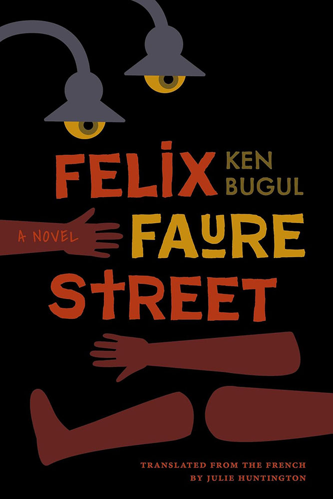
    Vanderbilt University Press. Cover design and art direction by Alissa Faden.

    It was my pleasure to feature some titles from Vanderbilt University, the University of South Carolina, and the University of Louisiana — because Stanford and NYU don’t have a lock on my attention. (’Sides, it’s fall catalog season, so there’s lots to choose from.)

    Enjoy fourteen great covers from University Press titles in my regular column for Spine Magazine.

    Reading reports that its death is greatly exaggerated

    As you’ll recall — or not, depending on whether you were able to read the article — The Atlantic worried out loud that reading is in such decline that we may have to think in terms of living in a “post-literate” world. (Because “post-truth” isn’t enough.)

    Turns out that there’s a back story to that take; it originated on a Substack titled, “The dawn of the post-literate society, and the end of civilisation,” by someone whose profile I can’t see because I refuse to create an account.1Soap box: getting a website, whose contents you own, is so painfully simple that I tend to discount those that rely on other platforms to publish what might otherwise be interesting material/thoughts/content. And in this case, the author is a Times journalist, who should definitely know better.

    So, I owe you an apology: this “moral panic,” as it’s been termed, originates in . . . what amounts to social media.2It’s been pointed out that blogs are social media, too (the original social media, in fact) — something I don’t necessarily disagree with. From my perspective, writing that is owned, put out there due to belief, and read by folks who trust your opinion, is completely distinct from having your potentially-anonymous “take” promoted to strangers by an algorithmic mechanism that profits from conflict — or, at least, provocation. In my opinion, it’s the latter that defines “social media.” I’m disappointed in The Atlantic for taking that bait, and in myself for trusting them and then making something of it here.

    Time for a reality check.

    Which comes courtesy of an article that’s part of It’s Nice That‘s POV series:

    It’s Nice That discusses Stack Reading Habits Report.

    . . . whose author puts forth just the right perspective, one that folks here can relate to:

    “The death of reading sounds uncannily similar to the death of print, which is another issue that’s prone to over-simplification.”

    — Steven Watson, It’s Nice That

    I still work in print. Many of us do. While it’s become a more specialized area of expertise, it’s still very much viable; whether it’s reached the stage of the horse post-motorcar or the manual transmission post-electric is something else entirely. (More on that latter item below, by the way.)

    The author quotes another response to the piece, which I almost completely agree with:

    All these pieces — from The Atlantic and elsewhere — about “the end” make this seem like a problem because of how they’re framing it, and who they’re framing it for. Maybe kids aren’t reading the classics, but look at the romantasy moral panic stewing in the background of social media. It’s a whole bunch of mostly men — who, demographically, do not read or buy books at all — declaring it the death of literature even though women and queer people are reading a ton of it. [. . .] It seems as though Americans have decided that the amount and kind of reading they personally do is normal and someone else doing it any more or less or differently than them is a social emergency. We may be seeing the end of certain kinds of reading [. . .] or certain kinds of culture, but that also means that something is replacing it. And good God do we need to replace a lot of it. If only to break up the corporations that dictate how it all currently works.

    — Ryan Broderick, Garbage Day

    To summarize, I fell for the “intellectual tragedy” represented by “the end of reading as we know it” and said something without thinking it through. I’ll try to do better.

    Rare books > AI. Unless…

    If you can truly appreciate an old book — and maybe even marvel at how its fragile, yellowing pages contain some of the earliest ways that people tried to make sense of the world around them — then headlines about tech companies that are destroying books to train AI likely torture a tender part of your soul.

    — Ashley Belanger, Ars Technica

    This article, dated August 12th, reminds us that, “Google patented a non-destructive book-scanning technology in 2009 that AI firms could use to efficiently scan books — if they were willing to slow down and invest in the process.”

    It continues, “The biggest fear for people who want to see books preserved through the training process is that AI firms will callously pulp rare books that can never be replaced.” Rare book dealers, it turns out, have started to flag suspicious bulk orders to safeguard the irreplaceable.
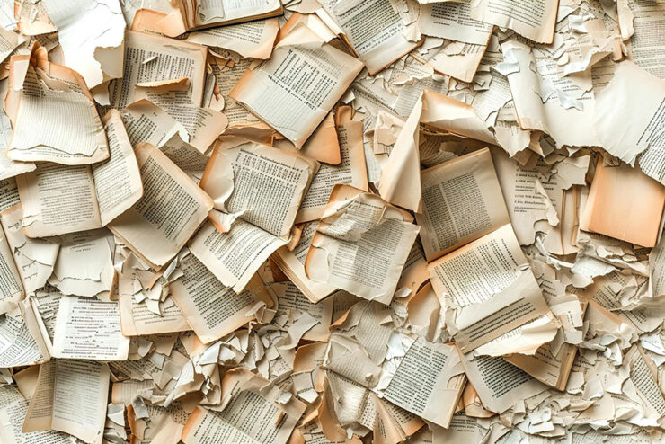
    Not Google’s patented process . . . but you can probably guess where this is going.

    Five days later, the same author reported:

    On Monday, 404 Media revealed that it had connected with a bookseller who agreed to plant an [Apple] Airtag in a rare book that was part of a bulk order. That Airtag was then tracked to an Amazon AI training facility in Las Vegas that housed a team focused on tearing books from their spines and scanning pages, 404 Media reported. Apparently tone-deaf to the escalating backlash over destructive book scanning, a logo on the door of that team’s warehouse, VGT3, showed a Tyrannosaurus rex preparing to devour a book, 404 Media documented.

    “Amazon declined to comment on 404 Media’s findings,” the article continues, “only providing Ars with the same statement it gave to 404 Media, which does not mention AI training specifically: ‘Amazon purchases books through commercial channels to help develop and improve the products and services our customers use.‘“

    The Internet, in its wisdom, has suggested that it’s all for profit — to “hide history behind a paywall.” How likely is that? After all, we know that Amazon, Anthropic, and Meta are altruistic.

    And now, courtesy of the ’Net’s most-trusted source, we have insider details: “when I see a one-of-a-kind, three-hundred-year-old tome taking up six whole inches of shelf space, I immediately start thinking about scale and efficiency.”

    Profit, efficiency, whatever — chewing up rare books for AI training is the very definition of “facepalm.”

    Special bonus #1: McSweeney’s new book, Obey in Advance, How to Survive and Thrive under Authoritarianism, is available this fall. An early review:

    “Democracy is priceless, but fascism sure seems to pay well. If you’re morally bankrupt and looking to sell your soul, Obey in Advance has everything you need for a profitable life of lickspittlery.”

    — Kevin Kruse, Professor of History, Princeton University

    Naturally, the book arrives at your door pre-scanned by AI.

    Special bonus #2: Remembering the pre-Google web, when search was an experiment. ”It was an era when the term ‘discovery’ carried actual weight, when you could authentically be one of the first people viewing a piece of content, regardless of its quality or how long it may have existed — an era of equal parts wonder and frustration.”
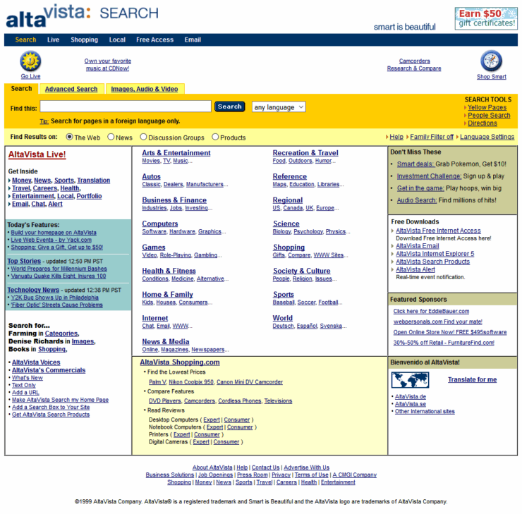
    Four scores and twenty-seven years ago . . . .
    The story behind Present & Correct
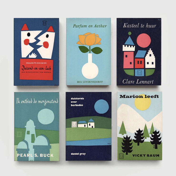
    Dick Bruna book covers, 1970s, from the Zwarte Beertjes publishing house. Image by Present & Correct.

    “The perfectly curated stationery shop that’s every graphic designer’s dream” has a new gig: publishing. But first, the origin story, thanks to a Q&A with It’s Nice That.
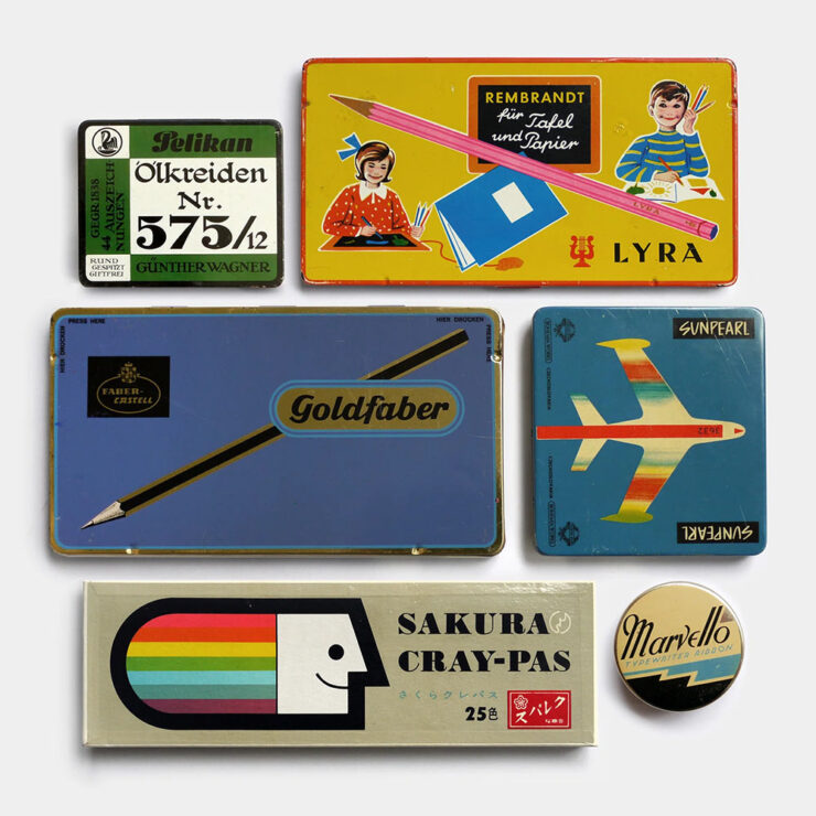
    Tins and boxes for crayons and pencils, mixed eras. Germany, USA & Japan. Image by Present & Correct.

    To talk more about this publishing journey and the designers’ joint practice, we spoke to [the owners] about the story of Present & Correct to date, tracing habits of collecting and archiving all the way back to a childhood spent carefully putting away scrapbooks of sugar sachets, napkins, postcards and coasters, a final major project at art school (a paper concept store called . . . Present & Correct), to their joint travels across the world today, foraging for original vintage stationery to curate the shop’s stocks from over 18 different countries.

    — Ellis Tree, It’s Nice That

    ”This habit of archiving and collecting vintage ephemera,” the article continues, ”has informed your first self-published book at P&C Paper Trails: Pre-war tourist maps from Japan featuring fifty incredibly illustrated maps for various attractions around Japan.”

    Paper Trails, the first title published by P&C Additions.

    “We named it P&C Additions because we hope to make editions of varying sizes (might be a single sheet, might be a book) and they are additional to what we generally do (a stationery shop!). And yes, we want to make more as and when we can. No pressure, just a natural offshoot which will manifest as a published item when we feel the content is strong enough,” the owners report.

    The interview is awesome. Give it a moment of your time.

    Special bonus #3: The Last Museum’s curators: ““We currently have around five million artworks indexed, and strive to eventually index all museum art in the world.” Not sure about the name, but definitely bookmarked under useful resources. (Via This is Colossal.)

    “A Dutch Courtyard” by Pieter de Hooch, via The Last Museum. Chosen because the original absolutely does not hang in my living room, a joke one or two of you will actually get.
    August’s new typefaves

    Yes, I’ve coined a new word just there — and will continue to deny that it was, in any way, a typo involving the word “typefaces.”

    Franglais, by Emigre
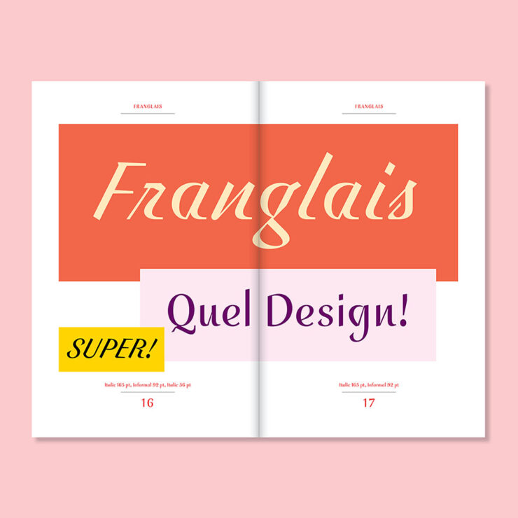
    Franglais, by Emigre.

    ”Franglais was designed by John Downer in sporadic bursts of inspiration dating back to 2000,” Emigre writes on their blog. “It was originally conceived as a standalone italic, and expanded to include two upright companions, Roman and Informal, developed in collaboration with Zuzana Licko.
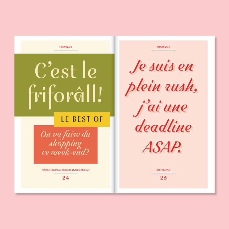
    Pretty much everything Emigre puts out is beautiful, but Franglais is just gorgeous.

    “Reflecting on the origins of Franglais, Downer describes it as lettering devised for imaginary signage inspired by a hybrid of postwar metal type and vernacular chalk-written menu boards. Elements of ‘ruler writing’ — in which a ruler is used to keep the baseline straight across repeated lines — are evident throughout.”

    Special bonus #4: “ShieldFont, as designers Isaque Seneda and Gabriel Abrucio write in a recent white paper, was made to offer web publishers ‘a practical opt-out from unauthorized AI training and [to] disrupt what is collected when that choice is ignored.’” Read about it at Ars Technica.

    Not sure I’m on board with this approach.
    SE Micro, by Gallery Type
    SE Micro, by Gallery Type.

    “Se Micro is the small-size companion to Se Macro, released by Gallery Type earlier this year,” CreativeBoom writes in this month’s recommendations. “They share the same basic skeleton, but Se Micro works well in small or difficult settings, like tiny text or low-quality printing, perhaps even on screens.

    “There’s a nice twist, too. When you blow this typeface up to larger sizes, those practical features become a visual style in their own right. It looks distinctive and quirky rather than just doing its thing of being legible, especially in bolder weights.”

    Ink traps may be on-trend, but I still like their treatment in this typeface.

    “This is an option for branding work across fashion, culture and design-led products. It comes with 10 weights and three widths. And it’s part of a growing family: Se Macro is also out, as I’ve mentioned, but hold onto your hats for Se Mono and Se Rounded, due out later this year or early 2027.”

    Resan, by The Designer’s Foundry
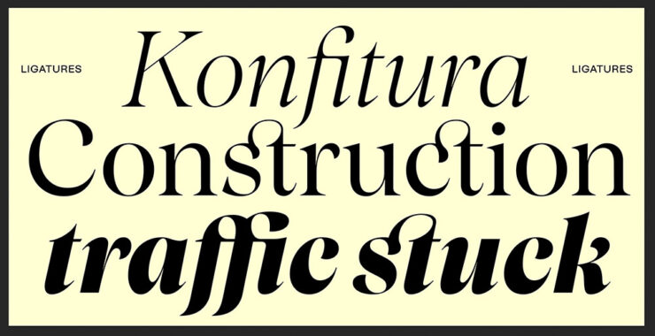
    Resan, by The Designer’s Foundry.

    “Daniel McQueen from The Designers Foundry has been in touch,” CreativeBoom writes. ”He’s just released Resan, a super family inspired by the transitional types of the 17th and 18th centuries. It’s got warmth. It’s got timeless elegance. But it’s also precise.

    “It has a sharp rhythm with generous proportions, giving it decent impact at display sizes. It also lets you change the terminal shapes, shifting the type’s entire feel and mood.”

    I especially like Resan’s alternative terminals.

    ”It’s currently offered in 10 distinct display styles, and if you like what you’ve seen so far, a series of optical weights is in the works.”

    Special bonus #5: “Typographic tourism, or the art of hunting for beautiful signs all over the world,” from Wallpaper*. Never mind searching for the hashtag, read the article then just do it for fun!

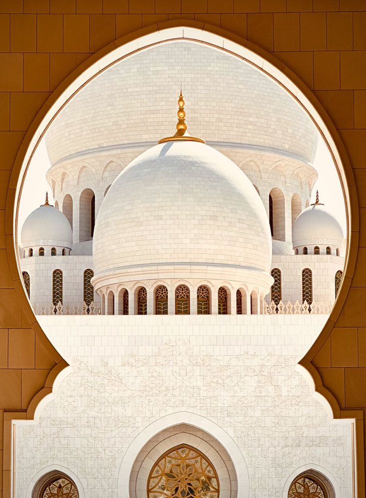
    Architecture and typography in one photograph. Hmmm….
    RTFM: Resurgence of The Effing Manual

    Okay, sure, that’s not actually what the acronym stands for. But I don’t care. The United States and its cadre of point-one-percenters have chosen to lead the world in an important new area: preserving the true manual transmission.

    To be clear, they’re also demanding bans on internal combustion go away, so it’s not all good news. They’re apparently unconvinced by Ferrari’s approach, outlined last month and which still uses combustion engines but with increased efficiency, or Hyundai’s approach, which uses electric motors and simulated shifts (the latter of which is being adopted by BMW, among others).

    Two small manufacturers, McLaren and Gordon Murray Automotive (GMA), have both chosen this year’s Monterey/Quail festival of the uber-rich to introduce new cars. Both feature manuals. Porsche was on hand trying to play catch-up.

    McLaren’s first manual since the F1

    The McLaren McL 6GT.

    The original and perhaps most iconic modern hypercar — arguably, the car that launched the term — was the McLaren F1. This month, McLaren introduced something that’s . . . not at all like an F1. It’s a fresh take on 1969’s M6 GT.

    It is both retro and modern, hypercar and hyper-cool — an insta-buy if I could afford it. (Doesn’t matter: already sold out.)

    References to the [original] M6 GT abound, from the vertical headlights and Kamm tail to the position and shape of every duct, rendered with a simplicity that we used to see in supercars of the ’90s and 2000s but see less today. And inside, McLaren has transformed the shifter into an art piece itself, its metallic linkages attracting natural light from every angle in a sea of black and carbon fiber. They’re clearly proud of it, and they suitably want it to be the focal point in here.

    — Adam Ismail, The Drive
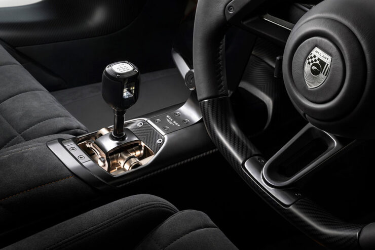
    Just look at that — nothing less than a celebration.

    “McLaren bills this as a ‘new type’ of supercar ‘beyond the core portfolio,’” the article continues. “Based on that, it sounds like manual transmissions aren’t about to become a standard feature of the brand; that, beyond the delineation of ‘Sports, Super, and Ultimate’ models of the past, McLaren is diversifying into more exclusive offerings that, at least in this particular case, pursue a more analog experience counter to the regular lineup.”

    Yeah. Do want. But there’s a wrinkle.

    GMA’s new . . . McLaren F1

    The McLaren F1 was designed by an automotive racing legend named Gordon Murray. He subsequently started GMA, and brought out the amazing T.50, among others. Last year, his Special Vehicles department issued a track-only reimagining of the F1 — and has followed up with a road version, called the S1:

    Since it’s less of a concept than the McLaren, some details are available. It features a 4.2-liter, naturally-aspirated Cosworth V12 making 680 horsepower with a rev limit of 12,100 RPM. It exclusively sports a six-speed manual transmission. It is multi-millions of dollars. And it, too, is sold out. The Autopian has more.

    Special bonus #6: From the combining-cars-and-print-department (“not a stretch,” he insisted), Road & Track has a new ampersand:

    The before-and-after:

    Via the subscription-only Brand New.
    Porsche adds another 911 manual

    If you’ve not heard, one of the brands not doing too well at the moment is Porsche. They went hard into electrification, suffered hard from being part of parent company Volkswagen’s arrogantly inept approach,3Just one example: see Scout. It’s actually sad. and subsequently run afoul of social media’s society’s hard turn against EVs. It has cost them dearly.

    Despite insisting that they were going to do it all along, they’re scrambling to get back to what customers actually want. This month, they introduced a third variant of the venerable 911 available with a stick shift.

    It’s not purple, it’s aubergine. (Love the pinstripes.)

    Like the others, it features a wooden shift knob, a throwback to the Carrera GT V10 masterpiece from the heady days of the early naughties. Like the others, it puts the cupholder immediately behind the shifter, guaranteeing spills. (Or thirst.) Like the others, it costs twice what it did six years ago — although it’s still “only” a tenth of either of the above.

    Like the others, I’d be happy to receive one as a gift.

    Unlike the others, it’s US-only, and it’s available this fall. Details, if you’re interested, are available at The Drive or The Autopian.

    Special bonus #7: Jaguar has released the first image — a rendering, actually, but still — of the new Type 01’s interior:

    As it turns out, they’re not backing down from their vision for a completely-new Jaguar, and I respect them for it. The electric four-door also made its US debut at Monterey, albeit in disguise, and should be out sometime next year. More details and pics at Wallpaper*.

    Special bonus #8: To celebrate the 50th anniversary of BMW’s Art Cars, they’ve gathered them all together in Germany.
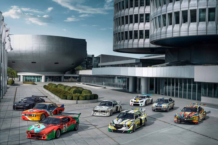
    A sampling of cars under the iconic four-cylinder BMW HQ.

    Lots of press has ensued, but in case you’re not familiar, they’re exactly what it sounds like they should be — but so very much more. Decorated by artists from Roy Lichtenstein to Andy Warhol, all twenty are unique, daring, and different. Some were even raced before becoming priceless.
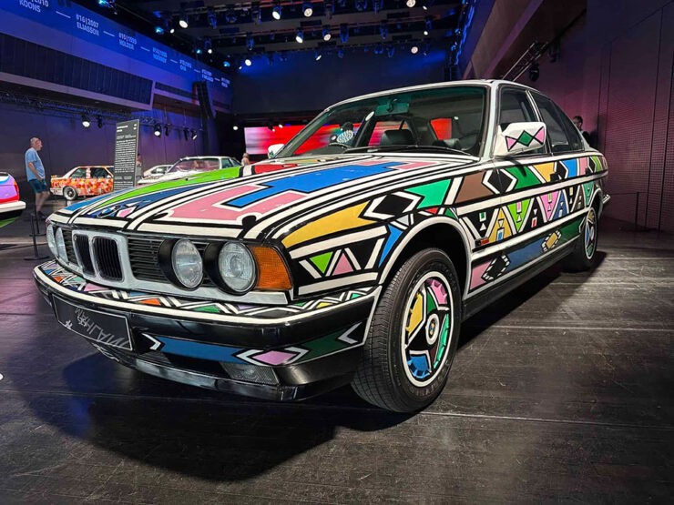
    #12, by Esther Mahlangu, on display at BMW Welt Munich.

    The above is a South African item, a country that, it turns out, has a special history for BMW. Meanwhile, get the history of all 20 cars at BMW Blog.

    Special bonus #9: From the not-a-joke department comes this beautiful — and beautifully green — 1979 Mercedes wagon with 6,088 miles. Long buried by an earthquake (!), has been unearthed and restored:
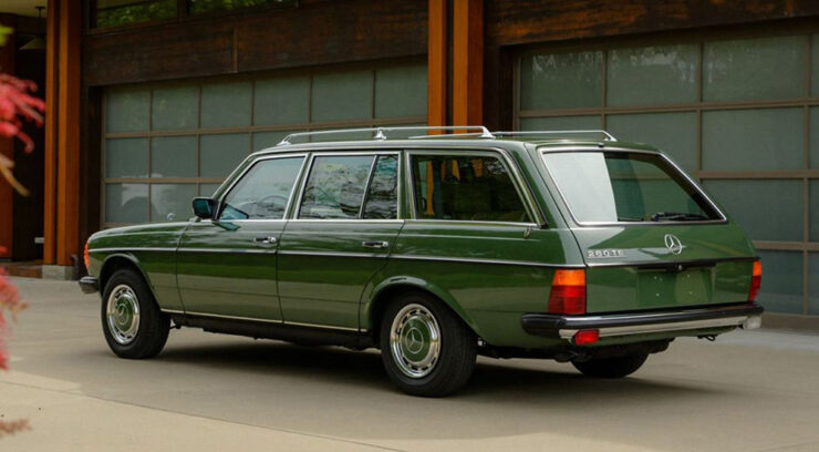
    The very definition of “classic.” The Autopian has the story.

    August’s photography round-up
    Sam Nicklin / Alessi

    Alessi, a “beacon of well-designed homeware,” is celebrated by photographer Sam Nicklin in a new series called Chrome & Colour:
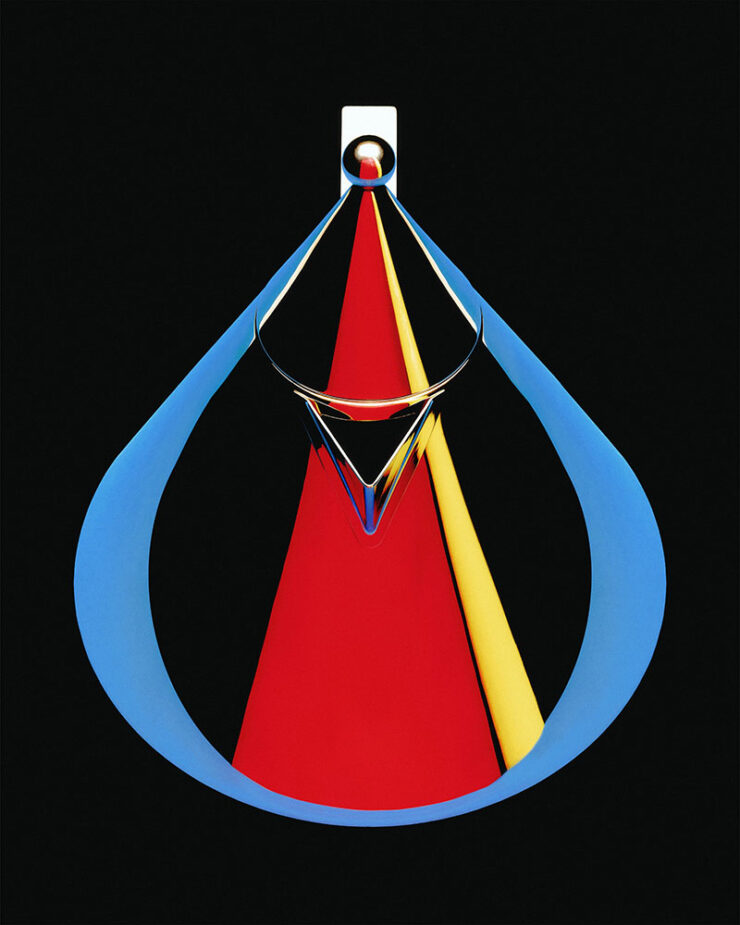
    Photograph by Sam Nicklin.

    “My main goal was to define the silhouette of each object through colour in the reflections, using negative space and keeping highlights to a minimum to really make them pop,” he tells It’s Nice That. To give the images the feel of the 1970s and 80s, “Sam went truly analogue, using the time-consuming process of holding sheets of coloured paper cut to different shapes and moving them around the objects until the reflection was exactly as he envisaged.”
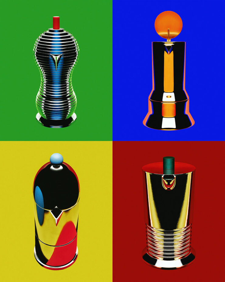
    Photographs by Sam Nicklin.

    See more, including behind-the-shots photographs.

    Pure Street Photography Awards 2026

    This is Colossal caught my attention with these.
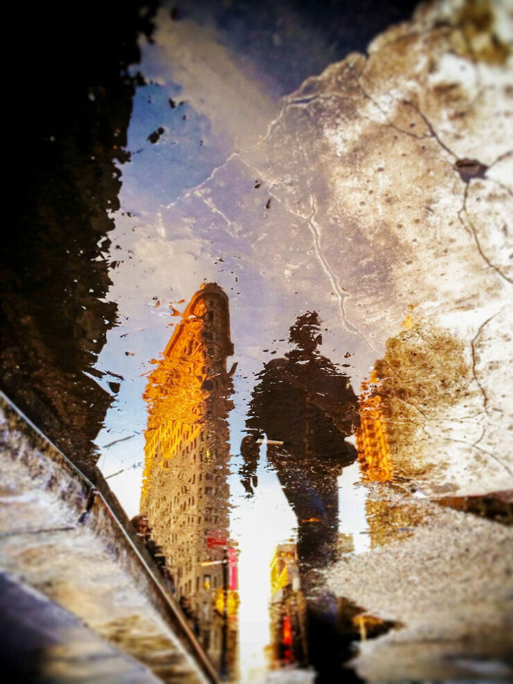
    Finalist, open category. Photograph by Pierra Hauser.

    A category that’s not usually at the Fore(word), but excellence won out.

    250 trailblazing women photographers

    In the introduction of a new book titled Great Women Photographers, Fiona Rogers writes, “If ‘greatness’ has long been defined by visibility and remembrance, then the continued documentation and celebration of women’s photographic practice is not only relevant but essential.”

    — Jackie Andres, This is Colossal
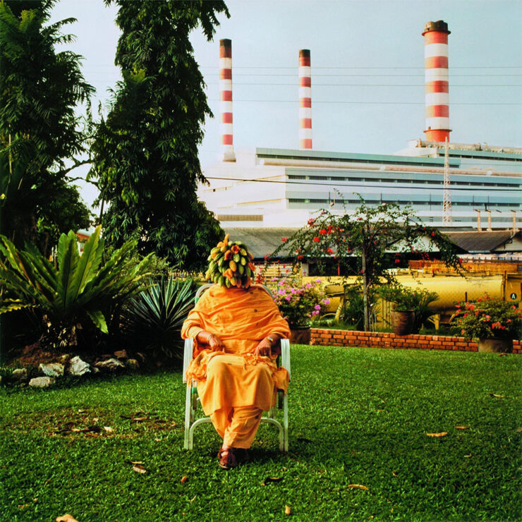
    Photograph by Simryn Gill.

    Phaidon’s stuff is always great. See more.

    Sixteen years of not-so-merry land

    From crumbling row houses in the inner city to abandoned houses on the Eastern Shore to temporary homeless camps, “greater” Baltimore demonstrates decay . . . and courage:
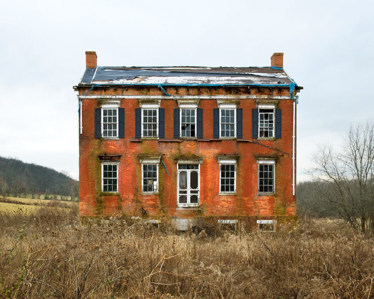
    Carroll County, Maryland. Photograph by Ben Marcin.

    Photographer Ben Marcin documents The Holdouts.

    One of 1.2 million

    “Astronaut Don Pettit takes photos so good that people have a hard time believing they are real,” PetaPixel writes. Case in point:
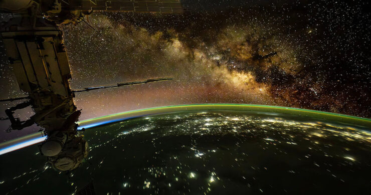
    Photograph by Don Petit, NASA.

    Internet skeptics tried to call him out. But he’d brought notes.

    Eclipse #1: 84 seconds

    A wingsuit and a total eclipse fly into a frame together:
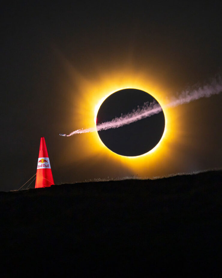
    Photograph by Noah Wetzel for Red Bull.

    Genius marketing, nine months in the making. (Longer, arguably, in the case of the eclipse.)

    Eclipse #2: the fijord

    Photograph by Marc Muench.

    Right place, right time — stunning results, part one.

    Eclipse #3: the sunset
    Photograph by Andrew McCarthy.

    Right place, right time — stunning results, part two.
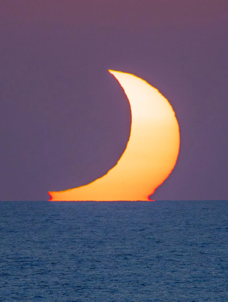
    Photograph by Andrew McCarthy.

    Special bonus #10: Jason Kottke is moving house, and when he has a moment, posting en-masse. It’s an “old-school, stream-of-consciousness” sort of thing — which, to emphasize, is still awesome. Among the three dozen or so nuggets of greatness:

    “Half Dome, Apple Orchard, Yosemite,” trees with snow on branches, April 1933. Photograph by Ansel Adams.

    More than 200 Ansel Adams photos, mostly of National Parks, that are free to view & download. Via Open Culture, one of the gems of the open web.

    — Jason Kottke, “Empting out browser tabs“

    Anything but empty, I’d argue. Enjoy the rest of your summer, folks!

    • 1
      Soap box: getting a website, whose contents you own, is so painfully simple that I tend to discount those that rely on other platforms to publish what might otherwise be interesting material/thoughts/content. And in this case, the author is a Times journalist, who should definitely know better. ↩︎
    • 2
      It’s been pointed out that blogs are social media, too (the original social media, in fact) — something I don’t necessarily disagree with. From my perspective, writing that is owned, put out there due to belief, and read by folks who trust your opinion, is completely distinct from having your potentially-anonymous “take” promoted to strangers by an algorithmic mechanism that profits from conflict — or, at least, provocation. In my opinion, it’s the latter that defines “social media.” ↩︎
    • 3
      Just one example: see Scout. It’s actually sad. ↩︎
  • Beautifully Briefed 26.7: The Long Heat

    Beautifully Briefed 26.7: The Long Heat

    It’s July, and it’s hot. Bring a beverage. Umbrella optional.

    Spine!
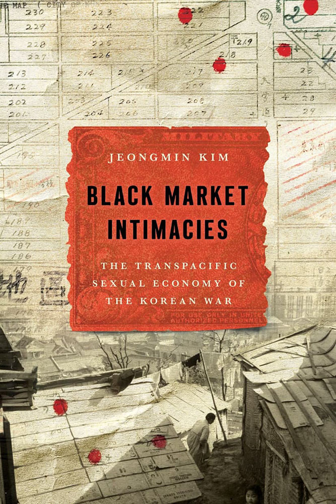
    Stanford University Press. Cover design by Lindy Kasler; art director, Michele Wetherbee. Cover art: Map of Kunitachi, Japan, National Archives and Records Administration; photograph of refugee dwellings in Busan, Korea, United Nations Archives; US military payment certificates note, US Army Finance Corps.

    “The cover asks questions,” I wrote in this month’s column for Spine. “Illustrations and scripts combine in myriad ways; maps plot; and blood drops. Rather than telling you what the title is about, it suggests that it’s not easily summarized — in all the right ways.”

    Read!
    The End of Reading is Here
    Cool header graphic from The Atlantic article.

    “Optimists once believed that universal literacy was inevitable. Now it seems that the age of reading might be a short anomaly in human history,” The Atlantic writes. “The decline of reading will bring about changes of the same magnitude. It will affect our innermost thoughts, our society’s politics and culture, and how we tell the history of our civilization.”

    Reading requires imagination; consumption, whether social media, television, or gaming, really doesn’t. It’s no surprise that the lowering of the common denominator is the result.

    But what if the premise is, in fact, true? I can’t imagine a life without reading — and you’re reading this, so you probably can’t either. Will humanity reach to a point where ingestion of knowledge doesn’t involve the written word? Should it?

    Read the article here. (Gift link via Kottke.)

    Update, 31 July (after publishing): The gift link has expired, darn it — apologies. (One of the downsides of gathering items throughout the month, I guess; this is from the 8th of July.)

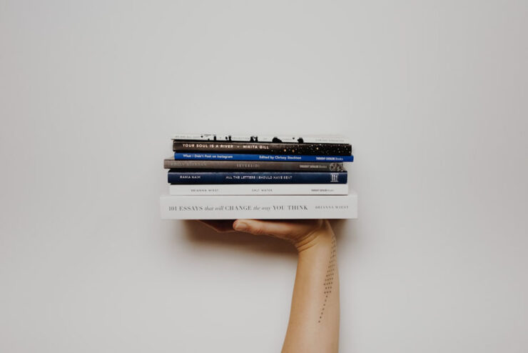
    “Read More. Read Often. Read Every Day.”

    We keep searching for lifehacks, productivity tips, and bullshit, but the answer is right there. If you want to be better, grow more, understand your life, understand your purpose, learn something, or just find somewhere to stay a while when life gets overwhelming — pick up a damn book.

    — Joan Westenberg

    She calls it the 80/20 rule: “I believe that spending 20% of your time buried in a book, buried in something that will inspire you, excite you, and make you want to jump out of your seat is going to give you the fuel, the ideas, and the power to create 80% of your output.”

    It’s worrying to think that The Atlantic might be right. This, In its brevity and forthrightness, is a strong counter-argument.

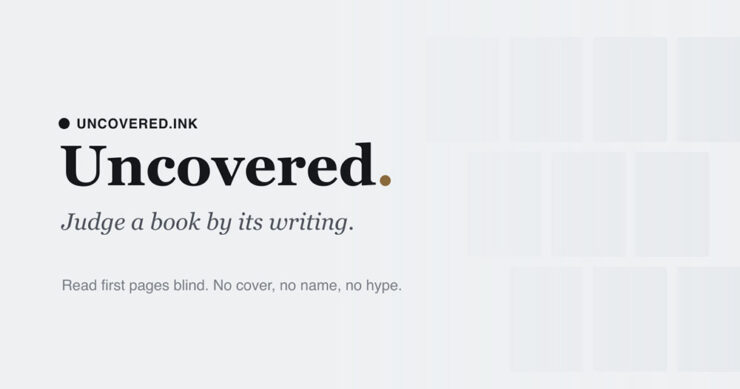
    Special bonus #1: Uncovered is a site for judging books by their first pages. “No cover. No bestseller sticker, no celebrity book club, no BookTok trend. You read the opening of a real book, blind, and answer the only question that matters: would you keep reading?”

    Great address, by the way — I didn’t know .ink was a thing. (Also via Kottke.)

    250 for 250
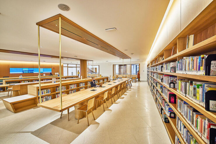
    Photograph of the Brooklyn Library’s main branch by the Municipal Art Society of New York.

    Brooklyn Public Library is celebrating our country’s 250th anniversary the best way we know how: with a thoughtful, surprising, irresistible booklist. Organized by genre and category of interest, this all-ages list is a deep dive on the stories, voices and moments that shaped America. Selected by our expert librarians — with help from a few notable New Yorkers! — here are the 250 most influential books in United States history.

    — Brooklyn Library’s 250 for 250 Booklist Intro

    Whether it’s actually the most influential 250 titles in the country’s history is probably intentionally debatable, but it’s still a great list. From The Hunger Games to The Snowy Day, The Warmth of Other Suns to Where the Sidewalk Ends, the choices are sometimes surprising, sometimes great memories, and sometimes inspirational.

    If you’re looking for the next title to read — or the next gift to give — start here. (Also available in a handy PDF if you’d like to send to someone.)

    Special bonus #2: Bookmobile, my favorite short-run printer, has been sold — but remains privately-owned, non-corporate, and dedicated to craft. Founder Don Leeper is retiring after 44 years; Michael Shoemaker is the new owner.

    “Mike is the perfect buyer for Bookmobile, with the passion, skills and resources to continue and improve our services to publishers. From the beginning of our discussions he displayed an aptitude for grasping the complexities of book publishing in the 21st century and bringing to bear his deep experience in technology, ecommerce, and business in general. Last but not least, he has an understanding and appreciation for the importance of book culture. I am damned lucky we connected.”

    — Don Leeper, Bookmobile

    “No major changes are planned,” the press release says. “Under its new ownership, Bookmobile will continue to invest in the growth of the business and the success of its publisher customers.”

    (Via Publisher’s Weekly.)

    Type!

    This month has seen a wealth of new typefaces introduced. A few that caught my eye are below, but it’s start with a question.

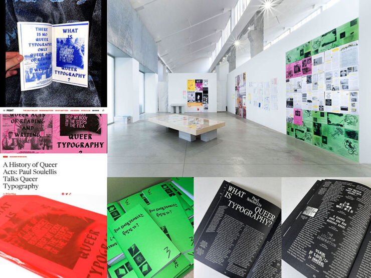
    “What is Queer Typography?”

    “Looking for queer anything often feels lonely,” Paul Soulellis writes. “The word queer resists definition, sometimes aligned with ideas about rejection, refusal, deviating from the expected, away from the normative. It’s certainly a political word, one that’s taken on expansive qualities throughout its history, qualities that aren’t necessarily confined to gender and sexuality.”

    Image via soulellis.com.

    An interesting text, certainly, with many possible answers to the question and accompanying designs and images. “[W]e need to stay with queer as an action, actively engaging with the past and the future as a verb.”

    Read more. (This is from 2024, but was recently linked at Kottke — and was new to me, so forgive the late notice/attention.)

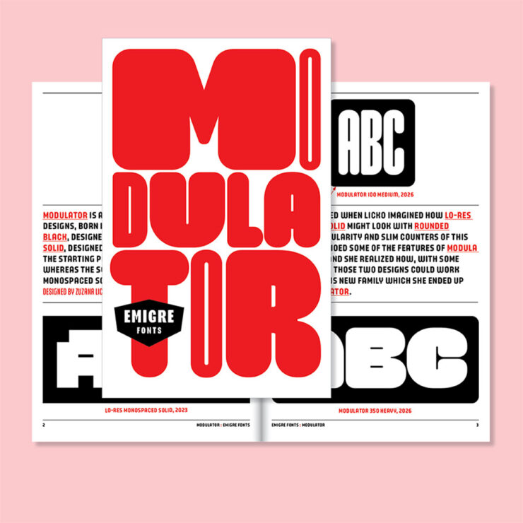
    Emigre’s Modulator now at Adobe Type

    Adobe prices are a regular gripe amongst many, but one of their strongest offerings is the type catalog — and it just got better:

    “Modulator was conceived as a dialogue between two designs separated by nearly three decades: Modula Round Black (1995) and Lo-Res Monospaced Solid (2023),” Emigre writes. The results are Modulator and its companion Modulator Text Variable, “optimized for smaller sizes by expanding the stem and counter dimensions to improve legibility.”

    Pretty much everything Emigre is awesome, and this is a welcome addition.

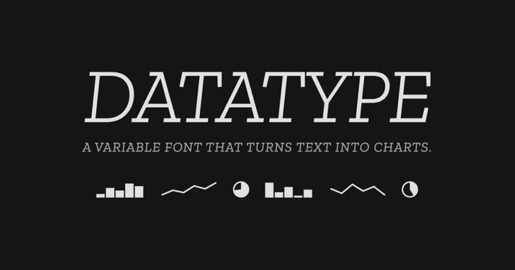
    Data as type

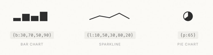
    “Datatype is an OpenType variable font that turns simple text expressions into inline charts. No JavaScript, no images, no rendering library — just type the syntax and Datatype’s ligature substitution does the rest.”

    Very cool — and very open source, thus very free. Available on GitHub or Google Fonts.

    Special bonus #3: I don’t actually know how much AI is driving new typeface design; honestly, it seems like an art form requiring human decision-making. Dutch foundry Mass-Driver is one that will always design fonts by hand:

    AI tools perceive reality as a finite set of data, up-to-date as of about 2021: the shadows on the wall of Plato’s Cave. Right now they are very good at making shadow puppets, but they cannot see the world outside.

    If we allow these tools to dictate our visual culture, we must accept that it will be vitrified by machines which consider a few billion webpages equivalent to the sum total of human existence. I don’t accept that. How dare we abandon so many countless traditions and people and ideas and nuances, simply because they are under­represented in the training data?

    — Rutherford Craze & Co., known as Mass-Driver
    CreativeBoom’s July Fonts

    Fourteen in all this time — last month’s suggestion of a summer lull was wrong, apparently — with some strong selections. I wanted to show several, but narrowed it down to three that deserve highlighting:

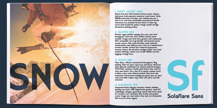
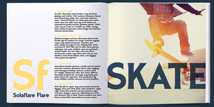
    Solaflare Sans, by John Reshell of Swell Type.
    Solaflare Flare.

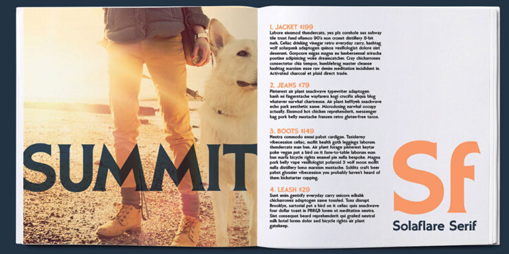
    “Solaflare’s mood is both unmistakable and timely, evoking warm evenings, hand-painted shop signs, and the particular quality of light in a California coastal town. John Roshell of Swell Type was inspired by the hand-painted signage of Santa Barbara, but rather than simply reviving that aesthetic, he built a variable font around it; one that lets designers slide between three distinct typographic personalities within a single file.”

    Solaflare Serif.

    That’s right: a variable flare — meaning sans on one end, flare in the middle, serif on the other. Check it out.

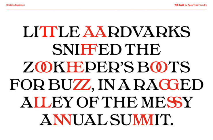
    Oratorio, by Alex Chavot of Apex Type Foundry.

    “Alex Chavot’s latest release for Apex Type Foundry — launched alongside a comprehensively rebuilt foundry website — takes Halbfette Cantate, a display face released around 1910 by H. Berthold AG and designed by Johann Graf, as its starting point, then runs it through the filter of Ed Benguiat’s flamboyant 1970s classics. The result is sweeping swashes, lyrical terminals, high contrast, and an unapologetically theatrical personality that Chavot describes, accurately, as ornamental excess meeting typographic swagger, with just enough restraint to keep it printable.”

    Oratorio.

    Single-weight fonts are rare these days — but oh, what a weight it is. Expressive, serious, almost lavish. Check it out.

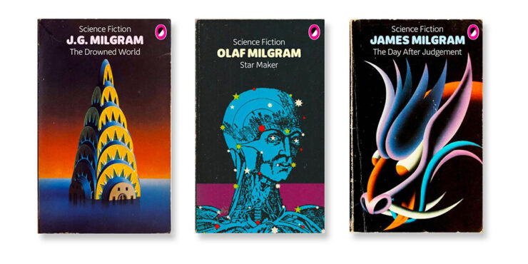
    Milgram, by Max Phillips of Signal Type Foundry.

    “Max Phillips of Signal Type Foundry has a gift for describing typefaces, and his account of Milgram is direct. They’d always wanted to add a humanist sans to the library, and always wanted to add a rounded sans. So they decided to save time by making them the same typeface and seeing what happened. What happened was a wave of nostalgia for Frankfurter, VAG Rundschrift, and an all-caps dry-transfer face called Formula One that nobody else seems to remember.”

    Milgram.

    ’Course, anybody who mocks up book covers with their new font … instaclick! Check it out.

    Vote!
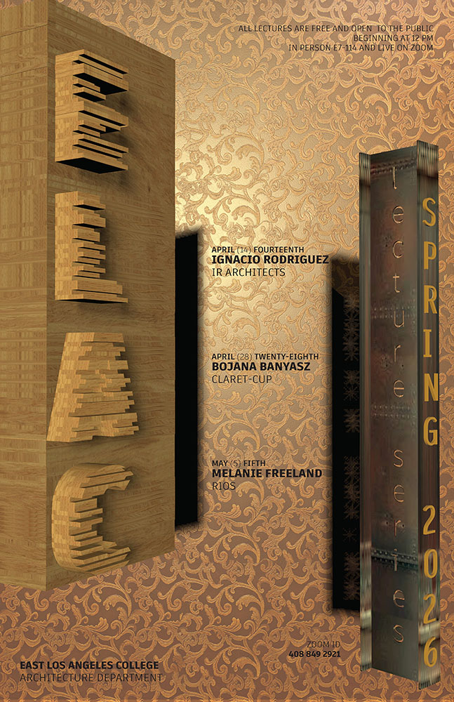
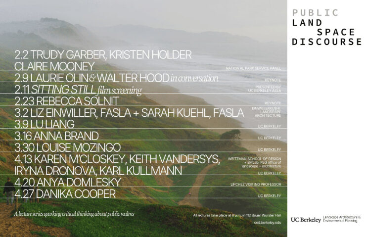
    Archinect’s Spring ’26 lecture posters

    Twice a year, Archinect holds a contest for their readers to decide which of the season’s lecture posters from architecture schools around the country are their favorites.

    East Los Angeles College.

    Alas, the contest usually ends just before this column gets posted, so sometimes y’all are able to vote, sometimes not. This time, we only get to compare my favorites with the results.

    University of California at Berkley.

    Along with these three, I’d also give honorable mentions to Yale, Sci-Arc, and the University of Tennessee at Knoxville.

    University of Minnesota.

    ELEC won the contest, too. As for the rest, we’ll just have to agree that they’re all winners in one way or another. See the readers’ and editors’ choices.

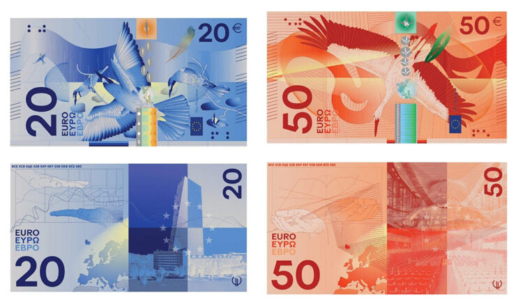
    “Choose Euro’n Adventure”

    Brand New‘s penchant for punny-yet-perfect post titles scores another with this one — another one that voting might be just out of reach for, depending on where you’re reading this from.

    Design submission by Rudy Guedj and François Girard-Meunier.

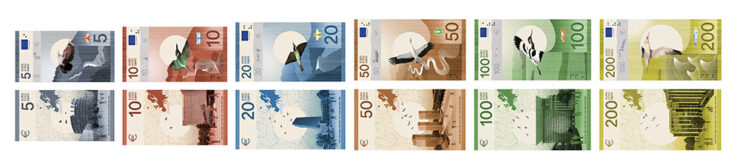
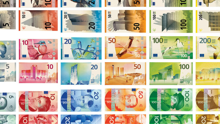
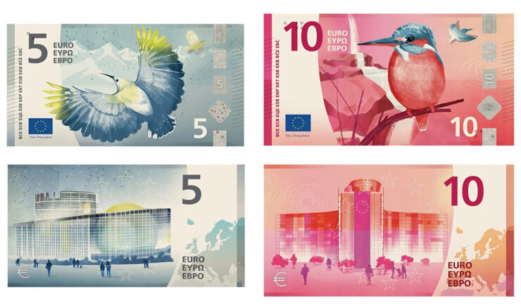
    That’s right: it’s time to redesign the Euro! Finalists have been chosen.

    “A panel of jurors selected the designs, which follow one of two themes: European places and ideas or birds and rivers, the latter of which is meant to symbolize freedom and unity,” This is Colossal writes.

    Design submission by Isabelle Daëron.

    Interestingly, the notes get bigger with denomination — the 5 is the smallest, then 10, then 20; the 50, 100, and 200 are all the same size. (Not the boring uniformity we get here in the States.)

    Same colors, same denominations, vastly differing details. (Overview via Brand New.)

    “While basic elements are the same — all collections devoted to culture feature the same six figures, for example — individual approaches appear in the layout, aesthetic, and composition,” Colossal continues.

    Design submission by Atelier Goppel-Toperngpong.

    I’m unsurprisingly partial to the birds & places, but no matter which theme or which specific design, these are all excellent. See all the available options at the European Central Bank website — and, if you’re in the EU, take the survey!

    Special bonus #4: It’s not the Europeans, it’s the English we have to thank: Getty has abandoned its takeover/merger with/of Shutterstock. Hooray!

    Amuse!
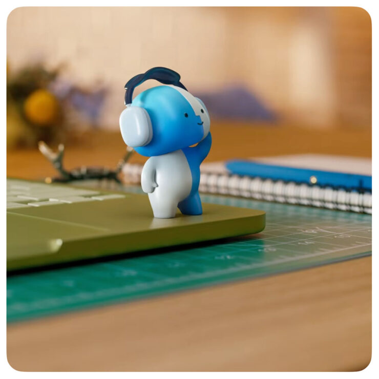
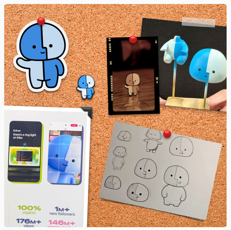
    Lil’ Finder Guy
    It may be a social media campaign, but darn it’s cute.

    Basic Apple Guy, who introduced me to Apple’s social media campaign1As you probably know, I don’t participate in social media. I have to rely on others to bring Apple’s media efforts to my attention — folks covering the coverage, as it were. for the MacBook Neo, has an update with all things regarding this unofficial mascot.

    Details, stickers, and more.

    It’s the Internet, of course, so even items that have been posted briefly then deleted are fodder for careful investigation — and some of the details he’s dug up are neat. (He’s also done a bunch of generated varieties of the character, which make occasional — and often delightful — appearances in his articles.)

    Save the manuals

    No, not of the RTFM variety. It’s actually a non sequitur.

    Image via The Autopian.

    Ferrari went and did something interesting, again: having introduced the world of high-performance motoring to the automated manual (the F1, in 1997),2Ferrari’s F1 wasn’t actually the first automated or even semi-automated manual gearbox/transmission, by a long shot. It is, however, the one that brought it to sports cars, followed almost immediately by BMW’s SMG. Wiki has a history, if you’re interested. it’s now introducing … the manualized automatic.3Technically, Koenigsegg got there first with its CC850. However, a) you have to be a car geek to know Koenigsegg, and b) that shift-by-wire unit doesn’t use traditional selector forks, or synchronizers. Instead, it uses seven wet clutches, six to select forward ratios and one for reverse, all with their own pressure sensors and mechatronic actuators. “Changing up is as simple as engaging the right clutches,” The Autopian says. Ferrari’s is a gated dual-clutch automatic, although to call that an oversimplification is an undersell.

    Photograph via Ferrari’s press department.

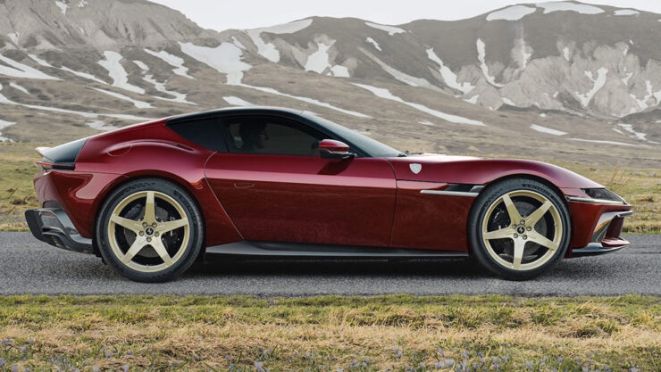
    First of all, let’s all please agree that the 12 Cilindri, their 819-horsepower, half-million-Euro, two-seater Grand Touring masterpiece, is a beautiful thing — retro, but in a modern way. Especially in this merlot-and-gold combo.

    Photograph via Ferrari’s press department.

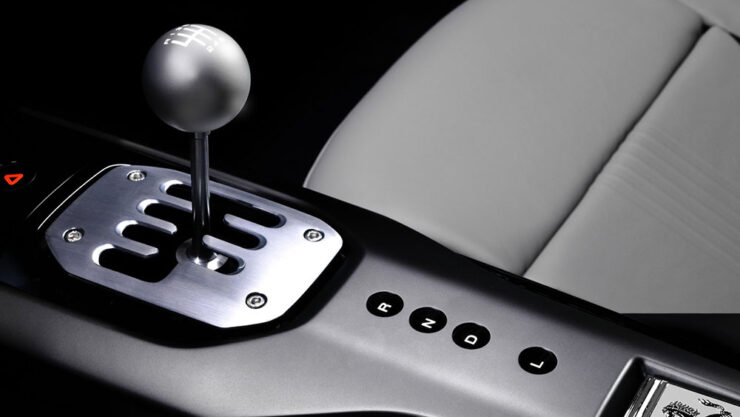
    In the new Manuale model, the transmission is the story: a gated dual-clutch automatic, or DCT, with a twist. It’s got buttons for drive, reverse, etc., as usual — but a clutch and a shift lever instead of paddles.

    By doing so, offers a road map for other automakers (cough *BMW*) whose customers are demanding the engagement of a manual but whose governments are demanding reduced emissions and increased mileage — plus all those safety mandates like automatic braking and conveniences like adaptive cruise control.

    Photograph via Ferrari’s press department.

    I’m convinced this is the future of the manual transmission. It’s unconventional, unexpected, and is going to take a minute to trickle down. But … fingers crossed.

    Get details at The Autopian or The Drive.

    Special bonus #5: Driving stick can help prevent dementia. Okay, sure, it’s not the most scientific post extant, but it makes sense.

    Gaze!
    Astronomy Photographer of the Year finalists 2026

    “Now in its 18th year, the ZWO Astronomy Photographer of the Year contest is among the premier photo competitions that celebrate the art of astrophotography and astronomy,” PetaPixel writes.

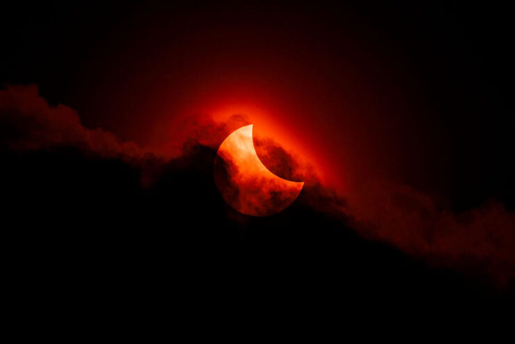
    Moody Partial Solar Eclipse. “Our Sun” category. Photograph by James McBeath, UK.

    “The competition features nine categories, a pair of special prizes, and the expert panel of judges selects a single overall winner, all of which will be showcased in an exhibition at the National Maritime Museum in England starting on September 18.”

    Te Hoho Rock Moonrise. “Skyscapes” category. Photograph by Evan McKay, New Zealand.

    Astrophotography is fascinating — a reminder that we’re merely a blip — and requires patience, skill, and specialized gear. But the results … wow.

    See all 29 finalists.

    25 Amazing JWST photographs

    While we’re on the subject of space photography, the imagery from space-based cameras amaze no less. The James Webb Space Telescope just celebrated its fourth birthday, and PetaPixel has gathered 25 of its most spectacular and insightful images.

    Jupiter. Photograph credits: NASA, ESA, CSA, STScI, R. Hueso (UPV), I. de Pater (UC Berkeley), T. Fouchet (Observatory of Paris), L. Fletcher (University of Leicester), M.H. Wong (UC Berkeley), J. DePasquale (STScI).

    Cloud details, aurora, the eye — and all on a planet we’re “familiar” with.

    Rho Ophiuchi cloud complex. Photograph credits: NASA, ESA, CSA, STScI, K. Pontoppidan (STScI), A. Pagan (STScI).

    The Rho Ophiuchi cloud complex is the closest star-forming region to Earth, and demonstrates both the beauty and power of the Universe.

    “The $10 billion NASA/ESA/CSA JWST has produced a great deal of exceptional scientific work in its first four years of operation, much of which is utterly groundbreaking,” PetaPixel writes. “However, that alone is not enough to warrant a photo’s inclusion. While scientific value is important, a Webb image featured here must also be beautiful.”

    See also: PetaPixel‘s selections from JWST’s second birthday two years ago.

    Illumination

    What do these two photographs have in common?

    Cerro Torre. Photograph by Darren Almond.
    Porquerolles. Photograph by Darren Almond.

    Both were taken by the light of the full moon!

    In his new book, aptly named Darren Almond. Fullmoon, “the light of the Moon is eerily enhanced, infusing the landscape with haunting ideas of nature and time,” PetaPixel (dramatically) writes.

    iPhone Photographer of the Year 2026

    It’s that time of year again: the iPhone Photography Awards, now in its 20th season, has announced its annual competition winners.

    Winner, Abstract category. Photograph by Barry Mayes, UK.

    Entrants from more than 140 countries “showed just how powerful an iPhone can be in the right hands and how great photos don’t always require high-end, dedicated camera equipment,” PetaPixel writes.

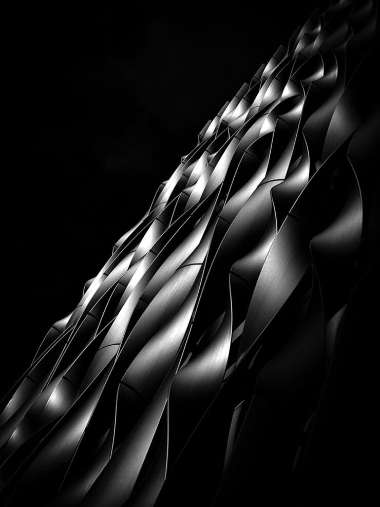
    Winner, Architecture category. Photograph by Ziwen Chen, China.
    3rd Place, Architecture category. Photograph by Preethy Ganesan, US.
    Honorable Mention, Architecture category. Photograph by Adrian Beasley, UK.

    Of course, these four barely scratch the surface of the fantastic selection from a variety of categories; see all the winners, runners-up, and more at the official website.

    The Architecture of Connection

    A left turn, so to speak:

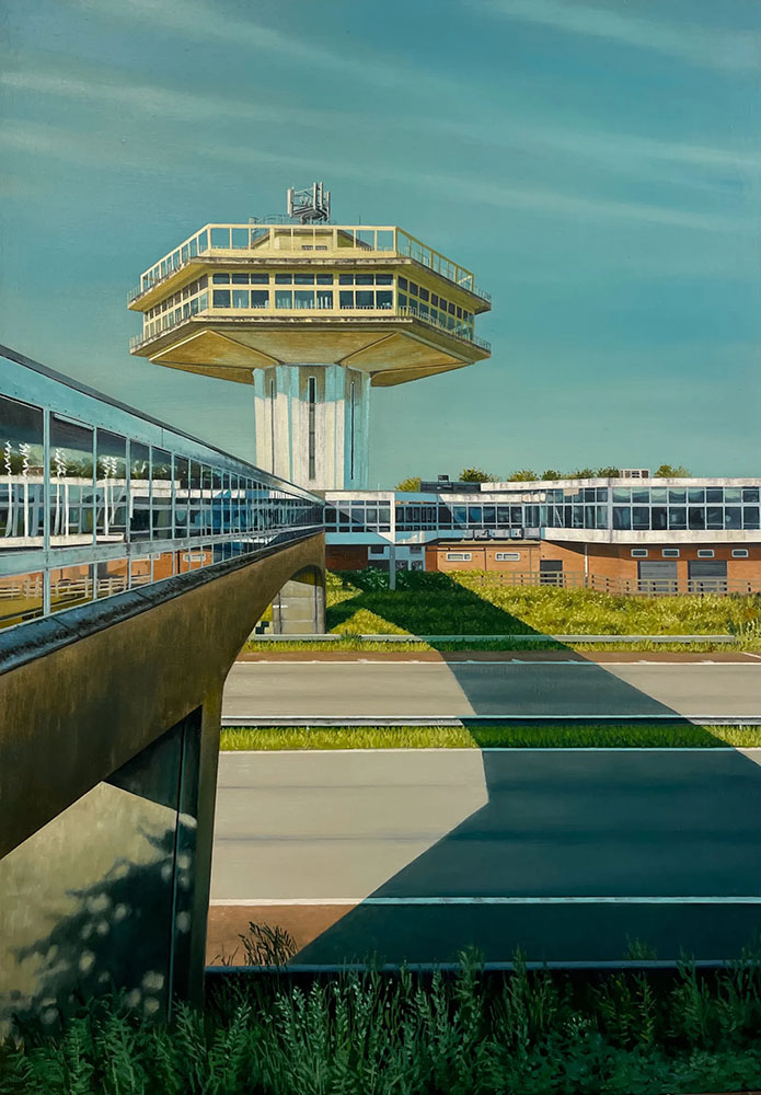
    The Last Landmark. Image by Jen Orpin.

    “The Modernist Society takes a detour from its usual publishing habits with a new monograph, The Architecture of Connection,” Wallpaper* writes, “featuring the work of painter Jen Orpin.”

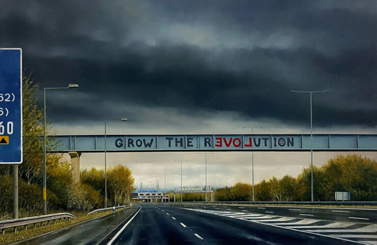
    Let Love Grow. Image by Jen Orpin.

    That’s right: paintings. We’re “in the realm of unseen and overlooked infrastructure, with Orpin’s eye – and careful framing – capturing over 200 images of the bridges that span Britain’s motorways. […] The Architecture of Connection brings the entire series together in a monograph for the first time, together with some of the artist’s writings about the work.”

    Without traffic, but with something bordering tranquility, it’s of course right up my street. I sometimes wish I could stop and photograph every interesting bridge — or even roadside attraction — while out in the world, but don’t, of course; few of us do. Orpin did. With an easel, no less.

    2026 International Pet Photography finalists

    Finally, something to send you into August with a smile on your face: humanity’s best friends.

    Untitled, Action category. Photograph by Shandess Griffin.
    ‘Cat Goalkeeper,’ Phone category. Photograph by He Huapei.
    “Weightless,” Action category. Photograph by Linda Glomb.

    The winners will be announced tomorrow, August 1st.

    Happy summer, everyone!

    • 1
      As you probably know, I don’t participate in social media. I have to rely on others to bring Apple’s media efforts to my attention — folks covering the coverage, as it were. ↩︎
    • 2
      Ferrari’s F1 wasn’t actually the first automated or even semi-automated manual gearbox/transmission, by a long shot. It is, however, the one that brought it to sports cars, followed almost immediately by BMW’s SMG. Wiki has a history, if you’re interested. ↩︎
    • 3
      Technically, Koenigsegg got there first with its CC850. However, a) you have to be a car geek to know Koenigsegg, and b) that shift-by-wire unit doesn’t use traditional selector forks, or synchronizers. Instead, it uses seven wet clutches, six to select forward ratios and one for reverse, all with their own pressure sensors and mechatronic actuators. “Changing up is as simple as engaging the right clutches,” The Autopian says. Ferrari’s is a gated dual-clutch automatic, although to call that an oversimplification is an undersell. ↩︎