Beautifully Briefed 23.7: Items of Independence (Day)

The mission for these posts is simple: independent, unrelated items which add up to something interesting. This time, it’s nifty type, aka NFTy.pe, photographic AI (or not), the 2023 Logo Trends Report, great London Review of Books illustrations, and a worthy art book list hijacked for a rant on stickers. Boom!

Better Than it Sounds: NFTy.pe

Typefaces have become, from this designer’s point of view, become commodities — perhaps even part of a broken system. Most clients don’t have a budget for unique type, there are too many spread across too many different sites, and, as Creative Boom puts it, “ownership has become poorly policed, if not non-existent.”

NFType really flips the script on all of that and attempts to reimagine the industry from creation to sale. In a nutshell, NFTy.pe uses a combination of modular type design and generative scripts to create fonts with unique visual attributes. The upshot is that no two character sets are exactly the same. And thanks to smart contracts and embedded metadata, ownership is quick and easy to verify.

— Craig Ward, NFTy.pe creator, via Creative Boom
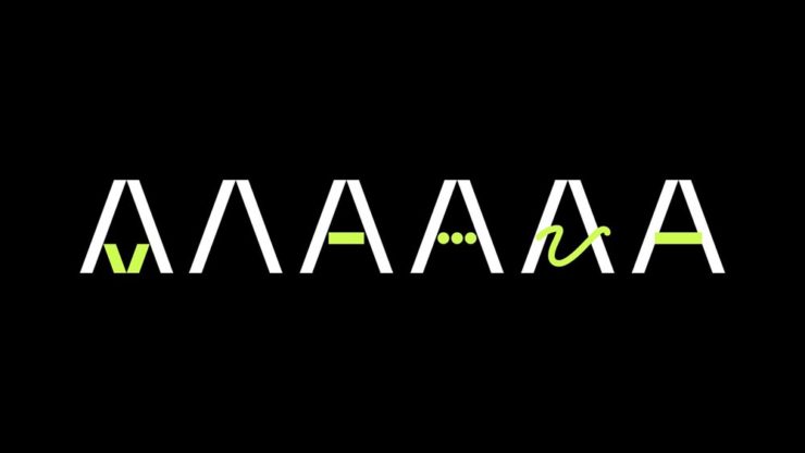
Create a unique typeface that rewards, in more ways than one.

As pointed out, it’s not just for type users:

There’s a lot of work to be done to put some distance between the dumpster fire that represents much of the NFT space and projects – like this one – with actual utility. I wouldn’t vouch for the worth of a lot of what I’ve seen out there, but the underlying tech – the smart contracts themselves – [is] actually genius and will be a game changer for any industry where provenance is a key factor – agriculture, property, fashion etc.

— Craig Ward

The whole article is worth a read, or go straight to the source.

Photographic AI

This year has been centered around AI, it seems — and, as illustrations go, some of the results are indeed a new form of art. Take this one posted by Dezeen as part of their AItopia competition:

Created by Midjourney for Daniel Riopel.

Fantastic. Its creator, a production technician in the prefabricated housing industry, deserves major kudos for describing something to the Midjourney engine that’s intricate and, if I dare use the term with AI, creative. (Several of the images there are excellent — check ’em out.)

That said, I’m not a fan of articles like PetaPixel‘s recently-posted “Photographers May Have to Embrace AI, Whether They Want To or Not.” Simply put: no. I don’t have to embrace it, because nothing has changed — either I can get the photograph I want using the cameras and lenses I have or I can’t. I’m not going to “generate the fill,” pure and simple. (I don’t control the computational photography my phone produces, but Apple isn’t prone to creating what isn’t there.)

I’ve been trying to write on this subject for a while, without success. Possibly because I don’t need a longer version of the above paragraph, possibly because it’s something else I haven’t been able to articulate yet — even to myself.

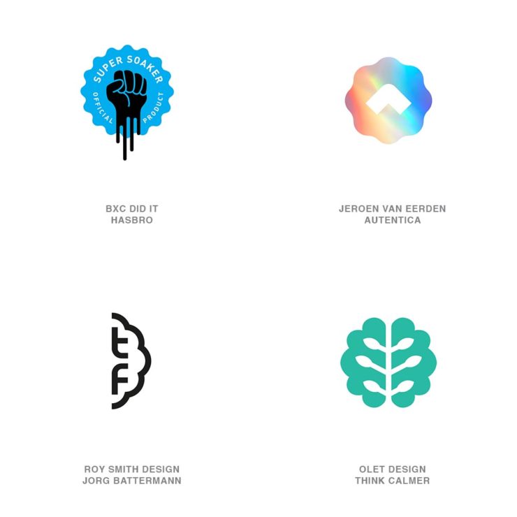
The 2023 Logo Trends Report

It’s back! BrandNew points us to the latest in styles and, as advertised on the tin, trends:
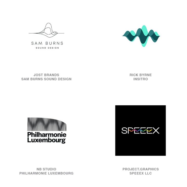
“Sonics,” part of the 2023 Logo Trends Report.
“Ritz,” as in the cracker, part of the 2023 Logo Trends Report.

Always an interesting read, including this fantastic tidbit directly related to the previous section:

“Don’t worry about AI stealing your job. To replace graphic designers with AI, clients will need to accurately describe what they want. We’re safe.”

— Bill Gardner, LogoLounge

Read the full report, “a whirlwind of ideas, symbols, and AI, evolving how creators like us create,” at LogoLounge.

Illustrations at the London Review of Books

Because we cover books here often (pun intended), an article on Jon McNaught’s awesome illustrations for the London Review of Books absolutely caught my eye. “A collaborative relationship,” it’s called — and the results produced not only illustrate a huge variety of subjects in a consistent style, but do so in a way that delights:
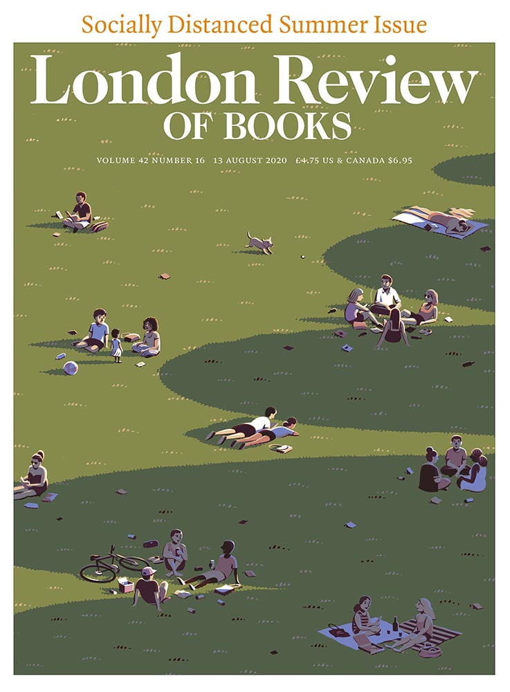
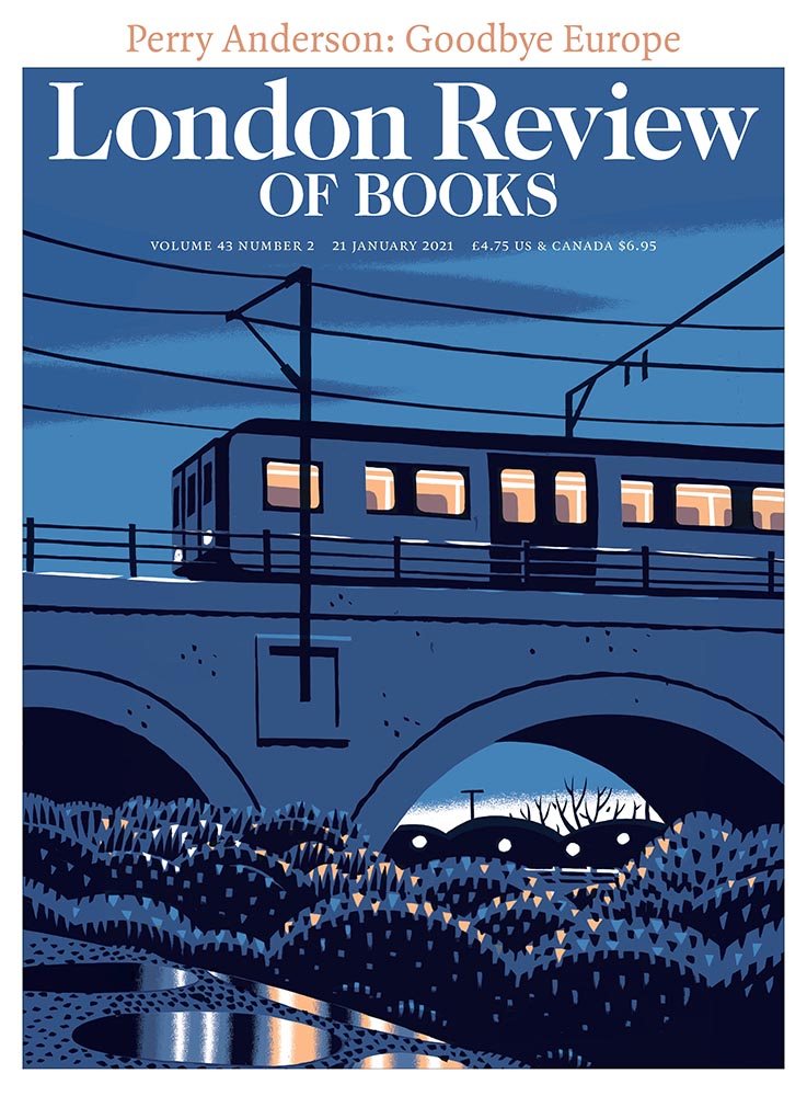
A great illustration by Jon McNaught.
Of the examples posted, there’s not a single one I don’t like. Copyright Jon McNaught.

Since 2011, Jon has been collaborating with the renowned literary journal, creating works that have a quietly mesmerising quality. His scenes breed comfort with their universality, but also their ability to evoke specific memories and feelings in the individual viewer. Through his covers, Jon artfully captures the essence of everyday life by representing the vastly contrasting nature of British weather, plus the uniqueness of London’s architecture, green spaces and public transport.

— Olivia Hingley, It’s Nice That

See many more illustration examples and read the article at It’s Nice That.

Hyperallergic‘s Art Books to Read this summer

Hyperallergic‘s coverage of art, despite the annoying pop-ups, is worth its bookmark — illustrated by this list of 11 Art Books to Add to Your Reading List This Summer. Some, like the Philip Guston I recently saw highlighted on Perspective, are as relevant as ever. It’s a great list.

As usual, whenever I see something like this, I’m going to do something else at the same time: mine it for potentially great book design. Which, if you’ll indulge, leads to this short rant: I hate good covers marred by stickers.
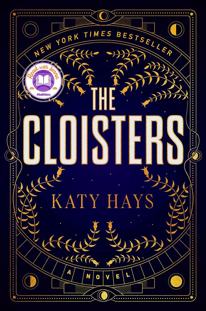
“Read with Jenna?” Seriously?

Solid cover. Soooo, who’s Jenna? Is she important enough to mar the cover with? (I DuckDuckGo’d the answer: maybe … if you watch television. Not sure that’s the audience publishers should want to cater to.)
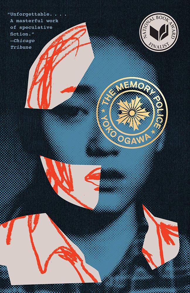
This time, the “sticker” is National Book Award Finalist. Better, but still.

Another solid cover — perhaps even really good, something that’s appropriate for a title up for the National Book Award. Real shame, then, that the sticker gets in the way, winding up completely distracting from the very nice circular title treatment (I’m sorry I don’t know either book designer to list here.)

I understand that it’s a little like trying to hold back the tide with a shovel, but it’s something I needed to express. [/rant]

Bonus #1 (awful): From the disturbing trends department: TikTok may start publishing books. Barf.

Bonus #2 (amazing): Via Kottke, a fantastic poster and perhaps better question:
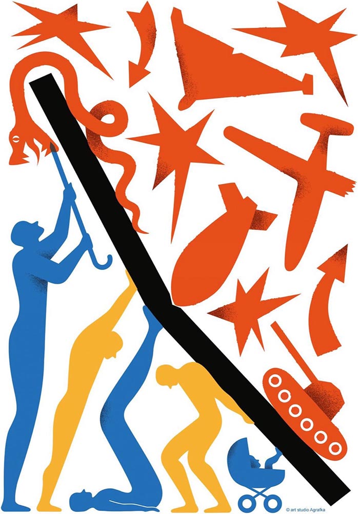
Poster for the 2023 International Book Arsenal Festival, by Art Studio Agrafka

A book festival. During a war. In a city under martial law. While schools and legislatures here in the US ban books about Black and LGBTQ+ experiences based on bad faith complaints of tiny fundamentalist parent groups. Tell me, who’s doing democracy better right now?

— Jason Kottke, Kottke.org

That’s all for early July, folks. Go forth and make your summer a better place.

Beautifully Briefed, Thanksgiving Edition (November 2022): Book Sculpture, Architectural Arcades, and Artists Sunday

This time, art from old encyclopedias, architectural art, and an appeal to add art to your post-holiday shopping and giving plans.

Books as Art — In a Different Way

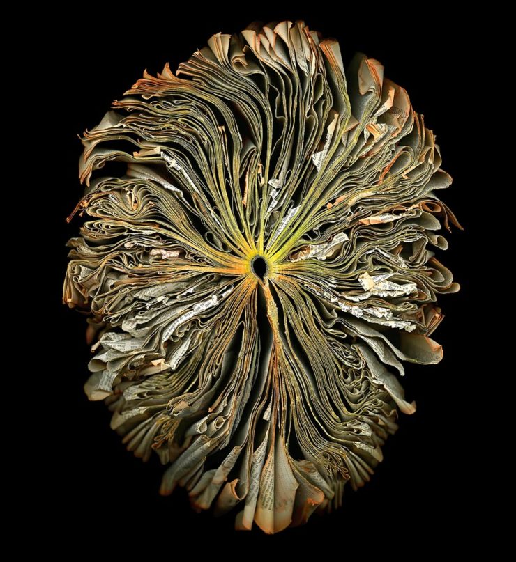
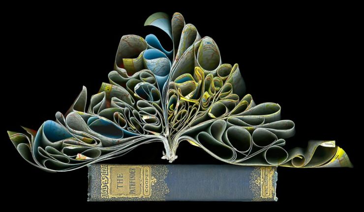
Cara Barer says, “Books, physical objects and repositories of information, are being displaced by zeros and ones in a digital universe with no physicality.  Through my art, I document this and raise questions about the fragile and ephemeral nature of books and their future.”

It’s more than that, though:

As This is Colossal puts it: “With cracked spins and crinkled pages, the manipulated objects reference the relationship between the natural and human-made as they evoke flowers at peak bloom.”

As a book designer, I’m glad that the titles used aren’t something a designers labored over but rather mostly instruction manuals and old encyclopedias. Either way, they’re a beautiful way to make commentary.

See more at her website.

“Photographic escapades in arcades and colonnades”
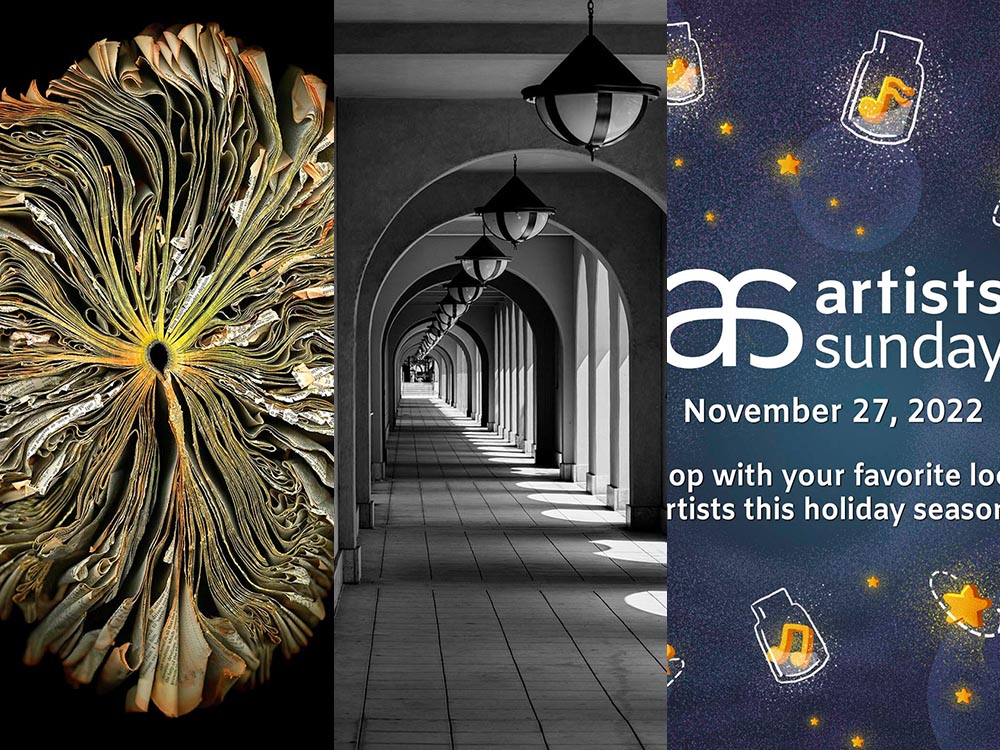
Liberty Station, San Diego by Keith James

Few scenes set my photographic heart aflutter as does the view down a long covered walkway towards a distant, barely visible vanishing point. As a self-confessed symmetry addict drawn to architectural images in black and white, photographing these vistas scratches a deep creative itch.

Keith James, MacFolios

His article is well-illustrated, informative, and speaks to my heart: I love a good arcade — although, in some cases, I feel like an entry or exit makes the point:

Vassar College Chapel Arcade, September 2021

This is not the first time I’ve admired Keith’s work. His “Architecture Meets Sculpture in Black and White: the Interplay of Light and Form” was great work. Both articles are highly recommended.

Artist Sunday

For those of you in the United States, this weekend is the Thanksgiving holiday. It’s also that most American of traditions: a shopping weekend. I have spent recent years boycotting Black Friday and Cyber Monday, and am encouraged by the emergence of Giving Tuesday. Here’s something to add to that list:

Photographer Chris Sherman developed the concept of “Artists Sunday” in 2019, after noticing a bump in sales on that day in November. “The idea struck,” Sherman told Hyperallergic. “What a great time to patronize artists — during the busiest shopping weekend of the year.” 

In 2020, Sherman launched the project alongside Cynthia Freese, a fellow artist who has also spent extensive time on the boards of arts nonprofits. On a dedicated website, Sherman and Freese provide artists and arts organizations with free marketing materials to promote the event. Now in its third year, over 4,000 artists and more than 600 towns and cities across the country have signed onto the initiative, which takes advantage of special events and partnerships (with nonprofits, individual artists, and businesses) to spread the message.

Happy Thanksgiving.

50 Books, 50 Covers

50 Books 50 Covers

It’s time once again for AIGA’s 50 Books, 50 Covers:

This time-honored competition aims to identify the 50 best-designed books and book covers. With 696 entries from 36 countries, the juror-selections from this year’s 50 Books | 50 Covers of 2020 competition exemplify the best current work from a year marked by unparalleled change.

Picking favorites from this list is always fun, and often includes books and/or covers that I haven’t seen before — especially 2020, when seeing things in person was often … difficult. So without further ado (in no particular order):

Accidentally Wes Anderson

The unique destinations of Accidentally Wes Anderson. This 50 Books item catches the eye with the cover and the photographs carry you inside and to places heretofore unknown. Great stuff. Design by Mia Johnson.

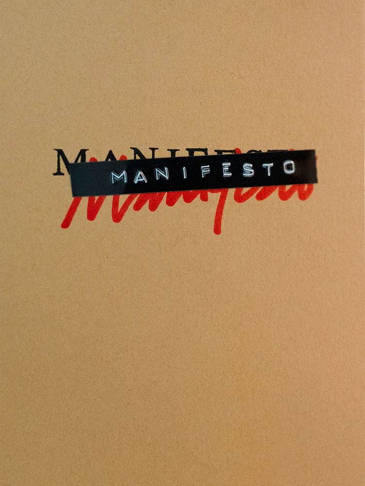
Manifesto - Cover

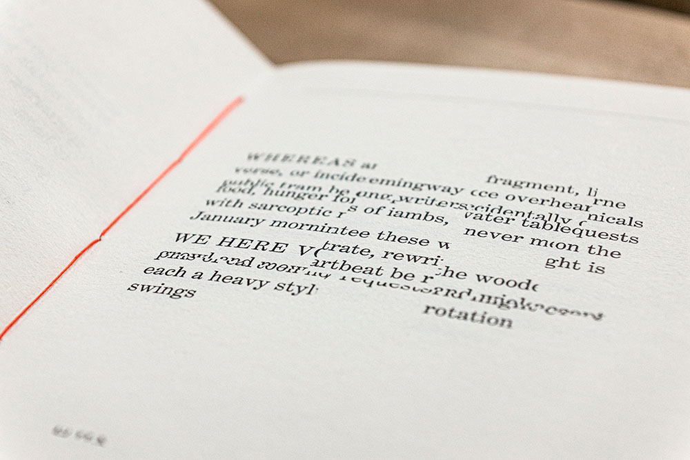
Manifesto is more than meets the eye, even though the cover does an excellent job leading you in. It’s easier to quote the existing description than write one, so: “The opening pages contain an original text employing the sort of bombastic rhetoric traditionally associated with the manifesto genre. The typeset text is then cut up and reassembled, repeating throughout the book, each iteration becoming source material for subsequent cut-ups. The project takes a critical approach to book arts to explore authorship, readership, and the materiality of language.” Yeah:

Manifesto - interior

It’s tiny, too: 4.125 by 6. The design, by Victor Mingovits, is anything but. Well done!

DR. ME

Not Dead of Famous Enough, Yet compiles 10 years of work from a design firm into one place, with this surprisingly modest cover. DR. ME, as the duo of Ryan Doyle & Mark Edwards became known, not only do quality work, they know how to stitch together a quality book — to a point where they picked up a prestigious award. See more.

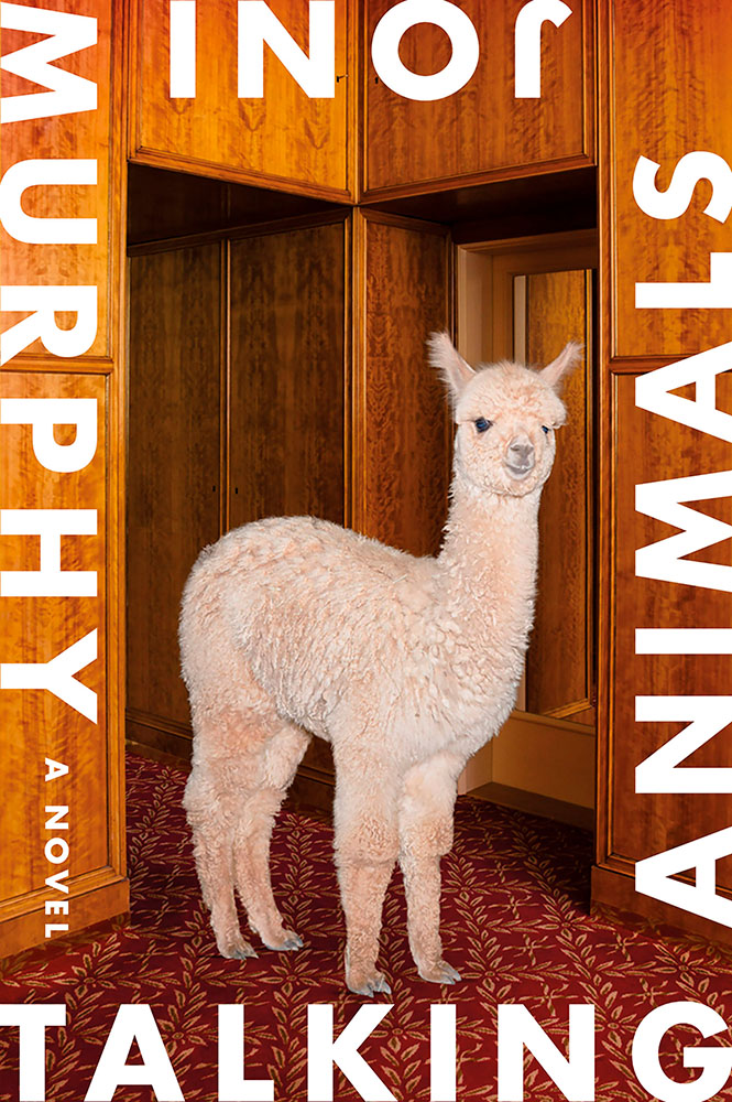
Talking Animals

Talking Animals violates one of my usual cover-design rules: it’s not immediately apparent which title word is first. Nonetheless, it’s eye-catching enough to warrant an exception — and a 50 Covers award. Design by Na Kim.

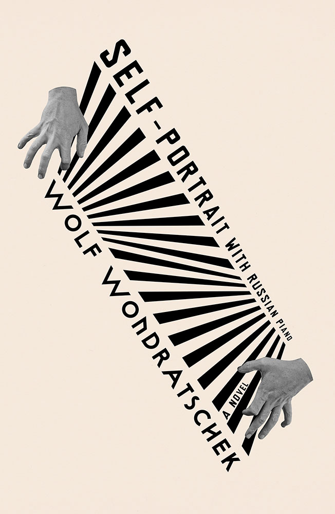
Self Portrait with Russian Piano

Na Kim makes another appearance with Self Portrait with Russian Piano. Kudos for something that’s equally eye-catching yet about as completely different as humanely possible — talent, defined.

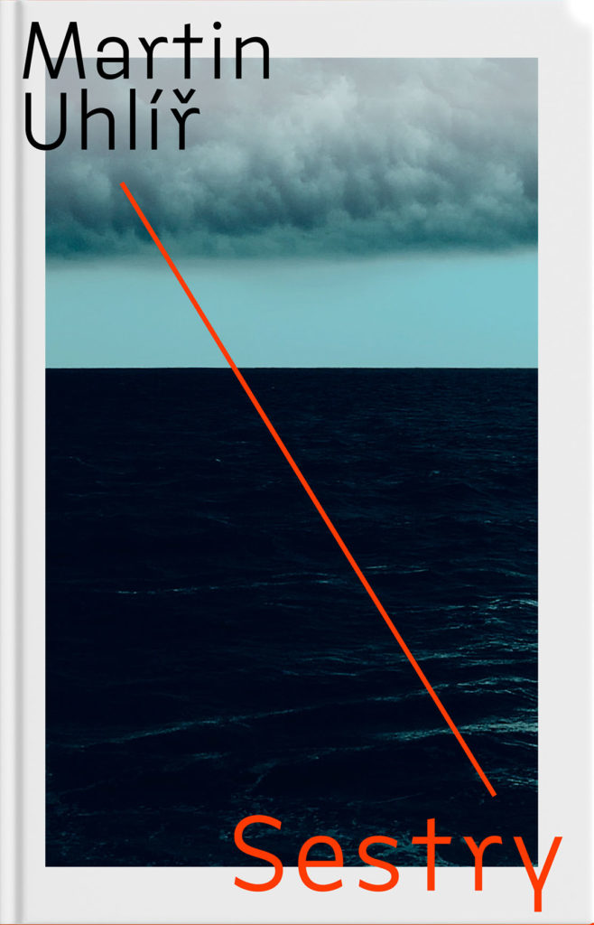
Sestry

“Eye-catching and mysterious,” says the entry for Sestry. “Oppressive and mysterious,” says the description. Both work — it’s certainly mysterious enough to catch your attention, grab it off the shelf, and investigate further. Design by Jan Šabach.

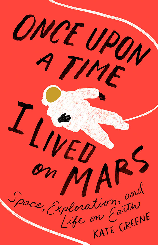
I Lived on Mars

Once Upon a Time, I Lived on Mars: Space Exploration, and Life on Earth is a loooooong title/subtitle combination. It’s something that, as a cover designer, you dread — but Johnathan Bush knocked it out of the park with this hand-lettered illustrated piece that’s 180 degrees from where you’d expect.

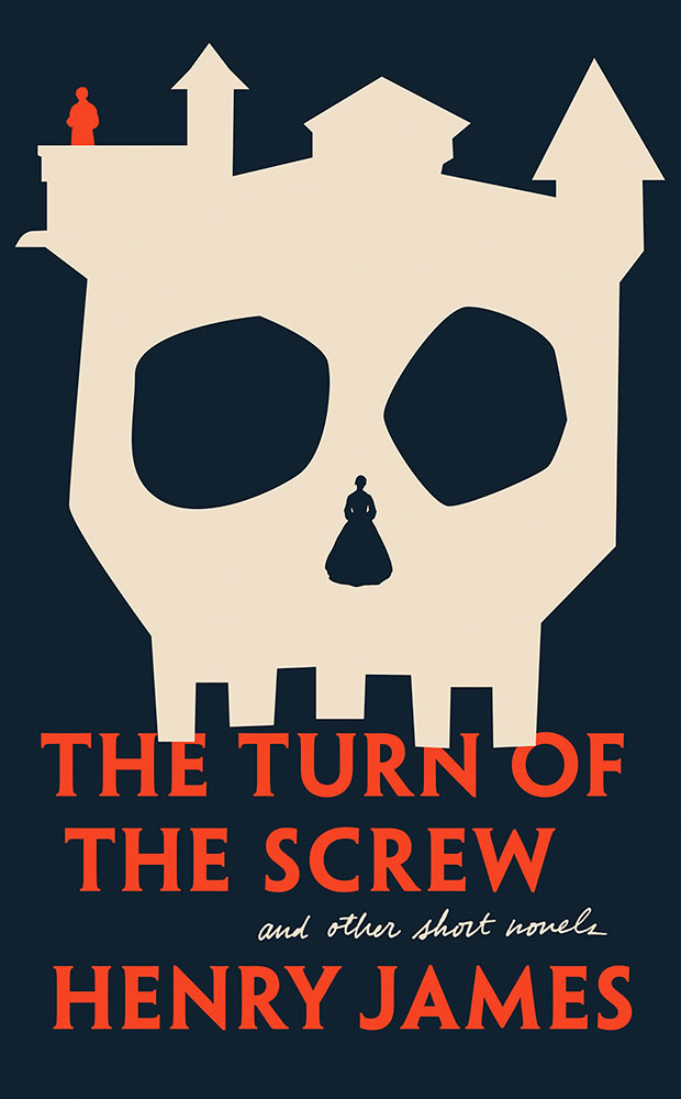
The Turn of the Screw is probably my favorite of the whole collection:

Turn of the Screw

Almost simplistic … until you really look at it; the kind that makes you think, “I wish I’d done that.” Fantastic work by Kaitlin Kall.

Lastly, two covers previously mentioned here:

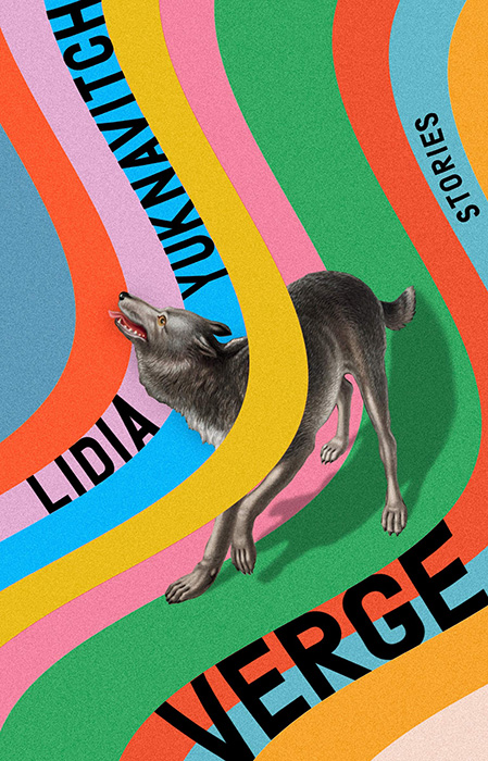
Verge

Verge, where unexpected choices lead to great new places here, especially with the yellow band overlaying the wolf. So, so good. Design by Rachel Willey. And:

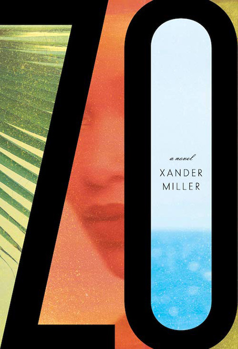
Zo

Zo, which uses illustrations to huge effect — but this time with a huge typography effect to go along with it, and lo, it works. Great design choices by Janet Hansen.

Again, see the whole list at AIGA: 50 Books, 50 Covers. Props to Hyperallergic for the heads up.