Beautifully Briefed 23.1: Winter Potpourri

From book design and minimalist photography to … well, book design and what absolutely isn’t minimalist photography, plus some street signs and another warning about Adobe. Let’s dig in.

Book Design #1: People Really Do Judge a Book by its Cover

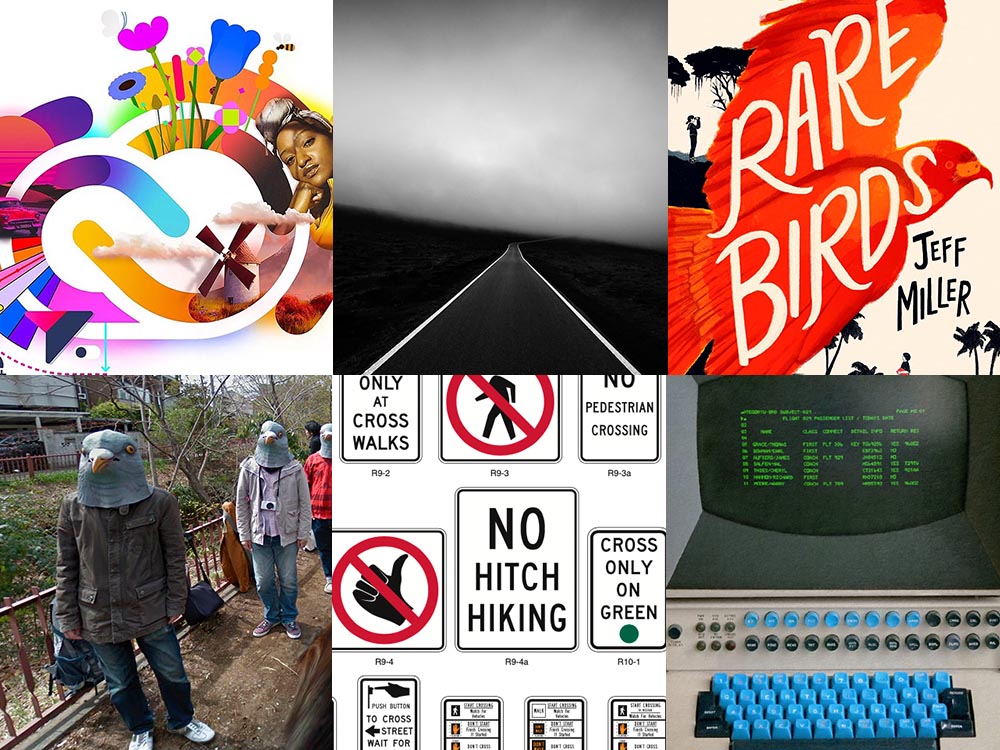
From University College Cork — that’s Ireland, folks — we have something that, on the surface, seems obvious: a book cover “is the most likely factor to convince a person to read a book if they are unfamiliar with the work or its author.” Maria Butler, a PhD candidate in the School of English and Digital Humanities at UCC, reminds us why.

Design by Kimberly Glyder.

You’re reading Foreword, so you likely agree — and shown above is one of those worth-a-thousand-words images: the first of the 2023 titles I’ve set aside for my favorites of the year, and absolutely something good enough to make me pluck it off the shelf without knowing anything about either the title or author.

Bonus: See 70 (!) more of my Favorite Book Covers of 2022.

Book Design #2: Shift Happens

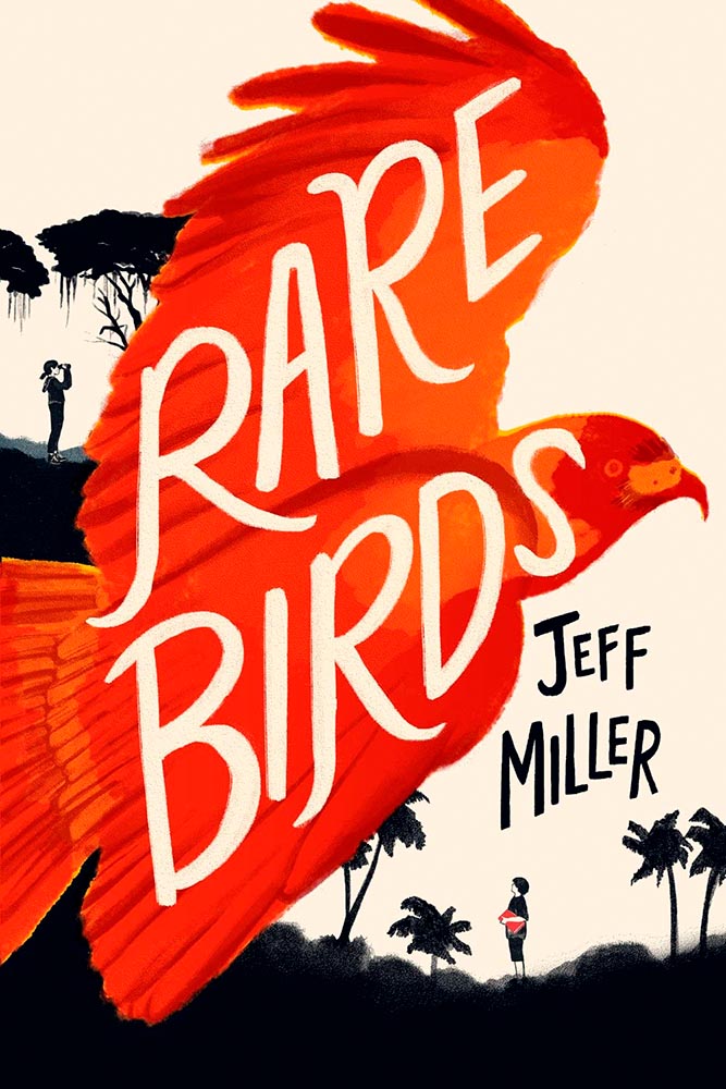
A fantastic website has clicked our way: Shift Happens, for a book about keyboards.

A screenshot from the Shift Happens website. Great stuff.

This project not only scores with great web design — check the interactive version of the book, pictured above — but what also seems like great book design. It’s a Kickstarter project (or will be, next month), so the usual cautions apply, but I might just go ahead and take the leap.

Couple of interesting book design items, by the way: the TOC is at the back, the endpapers are awesome, and the macro photography is tops. The book design reminds me of The Playmakers, still my favorite book design project ever.

Bonus: Tim Walsh, author of The Playmakers, is still going strong. Nice.

Photography #1: Minimalism

The winners of the Minimalist Photography of 2022 awards are in, some are fantastic. Here are a couple of favorites, from the architecture category:

“Prince Claus Bridge in the Netherlands,” by Arthur van Orden
“Blue Window,” by Andrea Richey

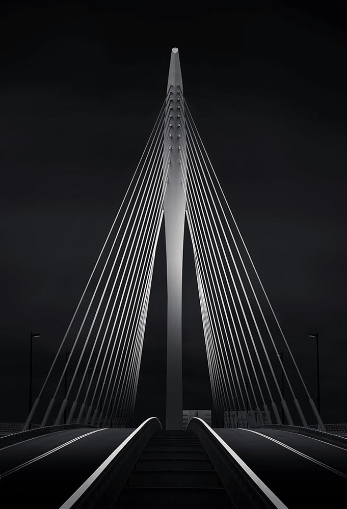
The Minimalist Photography Award is the only foundation that deals extensively and professionally with minimalist photography as a branch of photography in which the photographic artistic vision takes the lead.

Milad Safabakhsh, President of Minimalist Photography Awards
Photography #2: Wonders of Street View

This is Colossal brings us another gem from Neal.Fun: the Wonders of Street View.

“Wall Driver,” indeed.

Direct quote, just because: “A man with three legs, a vintage car scaling a building, and an unsettling formation of people donning bird masks are a few of the scenarios highlighted in the terrifically bizarre Wonders of Street View.”

I didn’t know it was a thing to dress up and pose for the Google cameras. Perfect.

Street Sign Style Guide

Speaking of street views, did you know there’s a style guide for highway signs? Would you believe that I’m a fan?

Interestingly, there is an I-42/I-17 interchange in Phoenix, but this ain’t it: these signs are representational.

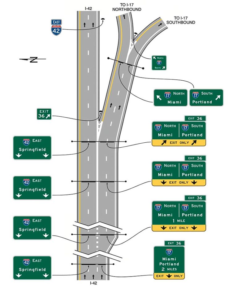
As with most things government, there’s confusion, too many regulations, and yet it’s based around good ideas. Beautiful Public Data has a guide to the guide.

Adobe Steps in it, Again

From DPReview: “If you’re an Adobe Creative Cloud subscriber, you might want to go and turn off a new setting immediately. It’s been discovered that Adobe has automatically opted users into a ‘Content analysis’ program that allows Adobe to analyze your media files […] for use in its machine learning training programs.”

It’s important to note that Adobe only uses the files saved in the “Creative Cloud,” something I don’t do as a matter of course, but even still, this is yet another example of Adobe using its monopoly position in the creative field to take advantage of its paying customers.

Adobe, unsurprisingly, didn’t return DPReview’s request for a comment/clarification.

Beautifully Briefed, May 2022: Two on Type, Two on Photography, and Kottke

This month’s favorites cover a delightful new extension of the typeface DaVinci, Google’s updated mega-font, Noto, photographs of a desert aircraft boneyard from above, and mega-photographs of the Milky Way.

Before we get there, however, I wanted to wish Jason Kottke — whose 24 years of web sleuthing has been a source for items here on Foreword dating back to its original iteration in the ’90s — good luck on his sabbatical:

“I need some space to think and live and have generative conversations and do things, and then I’ll make something, but I can’t tell you what it is just yet.”1Alexandra Bell, NYT That’s the sort of energy I need to tap into for a few months.

Hear, hear.

The Beautiful DaVinci Italic

It’s Nice That points us to a new, extended version of the font DaVinci, done for Sydney’s Biennale:

“When you do this sort of type exercise — based on printed letters — it gives a very organic shape and form, in opposition to the very metallic sharp shape from type materials.” Furthering this organic look by pushing the fluidity curse at its maximum, Virgile ended with a design “which is very historical, yet with a contemporary twist.” 

Just look at those glyphs!

Makes you want to find an excuse to use it. But that’s not all: Flores is an incredibly diverse artist whose work both challenges and inspires. See more.

Google’s Noto

Called “A Typeface for the World,” Google’s Noto defines “megaproject.”

Noto is a collection of high-quality fonts with multiple weights and widths in sans, serif, mono, and other styles. The Noto fonts are perfect for harmonious, aesthetic, and typographically correct global communication, in more than 1,000 languages and over 150 writing systems. 

Google’s Noto font collection.

According to Google,

“Noto” means “I write, I mark, I note” in Latin. The name is also short for “no tofu”, as the project aims to eliminate ‘tofu’: blank rectangles shown when no font is available for your text.

While the font itself has been around for a few years — 2013 seems like yesterday in so many ways! — it’s updated regularly, cover 150 out of the 154 scripts defined in Unicode, and deserves attention from every web designer and type nut. Read more at Google or Wikipedia. (Via Kottke.)

Aircraft Boneyard, From an Aircraft

This is Colossal introduces us to Davis-Monthan Air Force Base in Tucson, Arizona, whose desert conditions are ideal for storing — and scrapping — aircraft:

What happens when the military’s aircraft are end-of-lifed

The photographs are by Bernhard Lang — whom Colossal has highlighted before — and who has an incredible talent for finding patterns from above. See many more at his website.

Milky Way Photography

We don’t get many opportunities here in Middle Georgia, but in other, less populous (read: less light-polluted) places in the world, the Milky Way shines forth from the heavens:

Mountain, redefined.

The Guardian points us to the 2022 Milky Way Photographer of the Year, and many just wow:

Take cover . . . in awe!

Check ’em all out, be inspired to take one of your own, or simply be reminded just how big this system we’re a part of is. Enjoy.