Tag: daring fireball

  • Beautifully Briefed 26.6: New is Good. Old is Good.

    Beautifully Briefed 26.6: New is Good. Old is Good.

    “Welcome to the new,” he said, pointing to the old, now dressed in a new suit. You’re reading this because the words and ideas resonated — and it’s why only the style is newly tailored.

    Sometimes, though, a new look can be enormously satisfying. Enjoy.

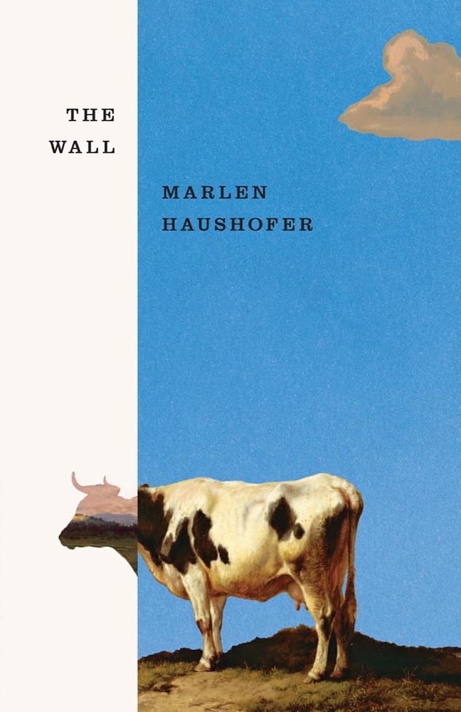
    This month’s Spine

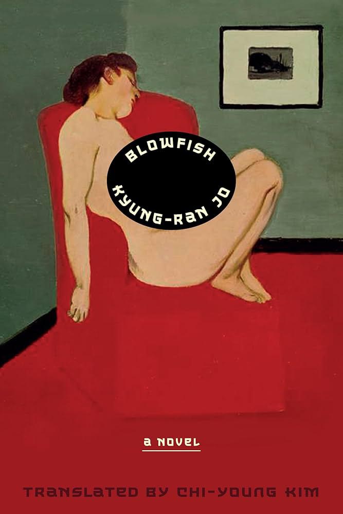
    Beacon Press.

    “Paperwork. Nice,” I said, while potentially allowing a smidgen of political speak through the door. (Not sorry.) Read the column here.

    Design and type
    Matt Dorfman’s many hats

    Matt Dorfman’s book covers are a regular item here on Foreword, including several of my Favorite Book Covers of the Year posts. So it was a delight to see a new interview with It’s Nice That.

    [B]usy days and late nights begin with, as Matt puts it, “churning out a generous amount of trash”. Much to his frustration he will be “working through what often feels like a landfill-sized hill of boring ideas”. Despite taking up quite a bit of time, it’s a necessity, as among this trash will be a shred of an idea worth expanding upon. “Usually it’s a minor detail from an earlier comp made in haste and far afield from anything that book is actually about,” he says, “but it typically has a quality of brokenness or something unfinished that just looks interesting.”

    — Harry Bennett, It’s Nice That

    “Do anything except what’s right in front of you,” he tells them, while mentioning that he often favors collage. “Collage has become one of my shorthands for pairing themes and ideas together that aren’t so readily represented in nature or culture.” As in:
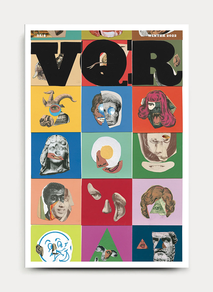
    VQR. Book design by Matt Dorfman. Image via It’s Nice That.

    Did I mention that he’s also the art director The New York Times Book Review? Yeah:
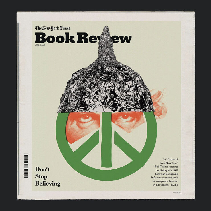
    One of Matt Dorfman’s covers for the NYT Book Review. Image via It’s Nice That.

    And a quick preview of next year’s Favorites list, with this gem:
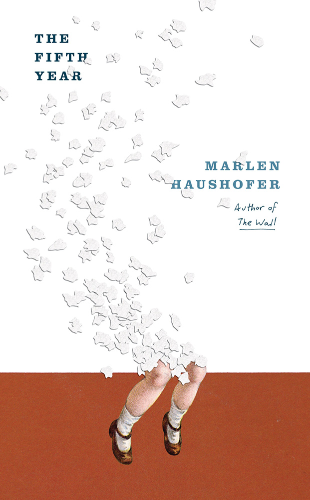
    Cover design by Matt Dorfman.

    If it looks familiar, that’s because…:
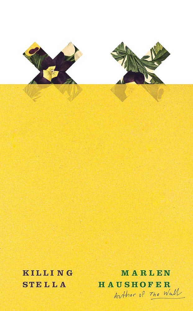
    Cover design by Matt Dorfman.
    Cover design by Matt Dorfman.

    Both previous Favorites here on Foreword. Awesome.

    Read the whole interview at It’s Nice That.

    “It’s All Greeked to Me”

    Glenn Fleishman, writing at Six Colors, points us at a YouTube documentary on the history of Lorem Ipsum:
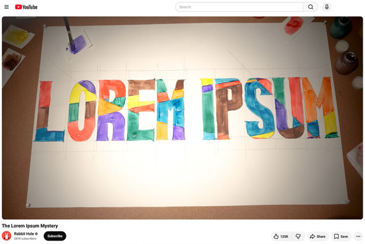
    A screenshot of the YouTube video.

    “I found it riveting and hilarious, and exactly the kind of Rabbit Hole (her channel name) that I fall down with printing and type history myself,” he writes. “[H]er dogged research has largely filled in the missing pieces of the story of where the run of seemingly Latin text used by designers to act as placeholder (or ‘Greeked’) text in mock-ups since the late 1960s came from.”

    I agree: it’s well put-together and, more importantly, answers a question you might not have actually had — but now can’t resist. Enjoy.

    Side note: Privacy where possible: I’ve switched to screenshots of YouTube videos rather than embedding them. That way folks who choose not follow the link aren’t stuck with the trackers embedding foists upon all.
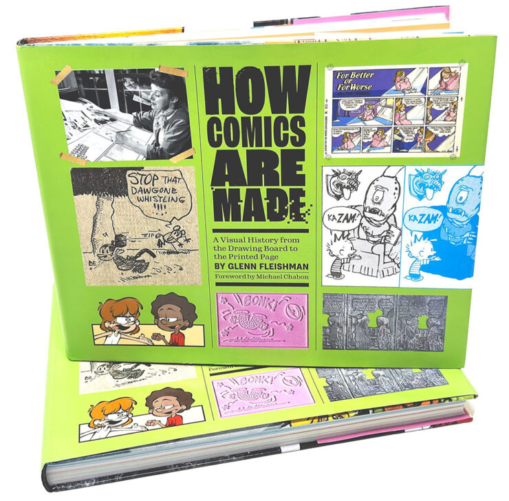
    Special bonus #1: Glenn is one of those people who wears many hats — 2019’s awesome Tiny Type Museum project is his, for instance — but it’s the comics connection that might be most appreciated. He’s got a book out about it, now in its second edition, which has just been nominated for Will Eisner Comic Industry Awards — the Eisners. Read more.

    2026 logo trends
    The Logo Lounge has posted its 2026 Report.

    The quality of the Logo Trend Report has slipped over the past couple of years — there are suggestions that parts of it are generated rather of written — but I think the zoom-out is still useful for those of us in design.

    If, for no other reason, to make sure our work is ahead of the curve.

    Via Brand New, one of the only subscription sites I’ll link to. (Because it gives me an excuse to encourage you to subscribe, too: at $20/year, it’s sensibly priced and very much earns its keep.)

    Best new fonts: a one-off

    This month’s CreativeBoom post on new fonts was shorter than some — it’s summer! — with only one I’d like to highlight:
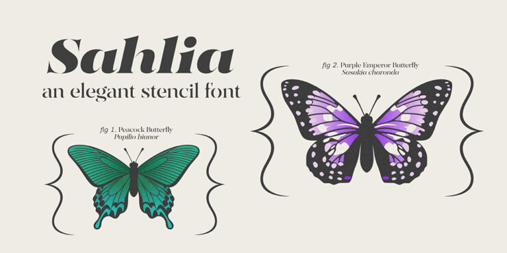
    Sahlia, by Arcane Type Foundry.

    But what a one it is. How often are we given an excuse get excited about stencil-style?
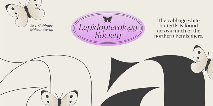
    Close-up details (and more butterflies).

    Sahlia is available from Arcane Type Foundry.

    Font previews: not simple

    Marcin Wichary, whose brilliant Unsung continues to impress, has a neat item that we’ve all seen at this point: font menus that preview the font name in the style of the typeface, sometimes poorly.

    Turns out, that’s not at all easy.
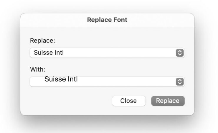
    Oopsie. Screenshot courtesy of Unsung.

    “Font previews are fascinating because they are the perfect showcase of how tricky fonts can be at scale,” he writes. The question is: why?

    It’s actually impossible to left align or center text. Ever. Not just because each font does whatever it wants – font size is a number that doesn’t really give you anything to hang a hat on, and the font can place itself in its box however it desires, too – and not just because fonts often lie (via bad metrics) about what they store inside, but also because aligning and centering are really in the eye of the license holder, and have more than one definition.

    So, every time you align text to anything, in whatever way, it’s only an approximation. Most of the time that’s good enough. Here it is not.
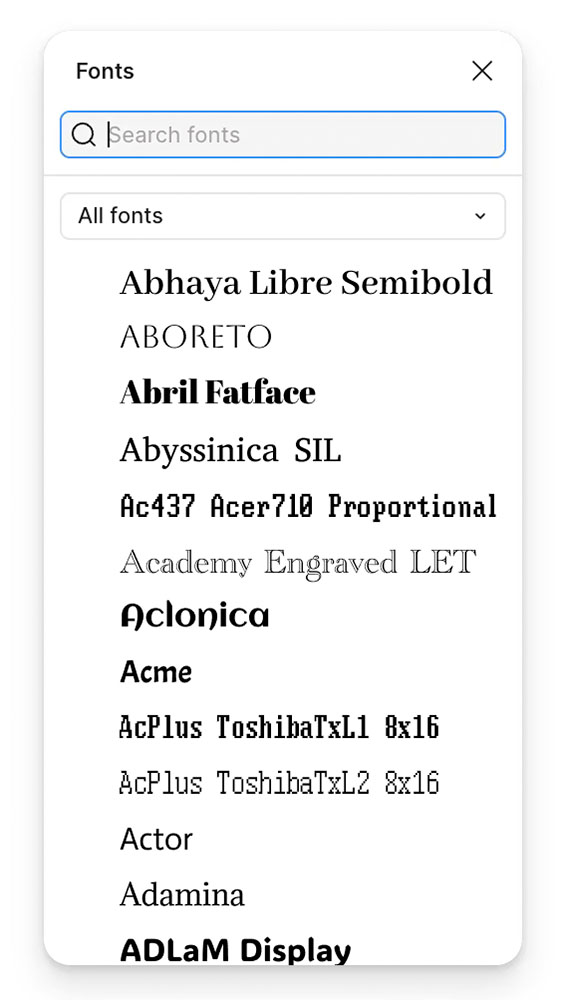
    — Marcin Wichary, Unsung
    It takes a surprising amount of work to get this right. Screenshot courtesy of Unsung.

    “There are icon fonts, color fonts, and non-Western fonts so rich in variety and tradition that this category itself is basically a fractal,” he says. “There’s a craft to getting it right.”

    Read the rest.

    Special bonus #2: Wichary also built something called Fontificator. “I thought it’d be fun to share this internal tool I made over a decade ago to aid with exploring options for Medium’s typographical redesign,” he says.
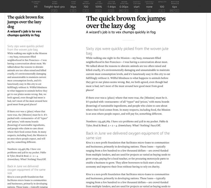
    Fontificator. Screenshot courtesy of Unsung.

    “The motivation for building Fontificator came from two observations:

    • font previews on type foundry sites were generally too limited to get a real sense of how a certain typeface feels, and it was best to see a font in situ,
    • often an extremely tiny nuance — like adding some letter spacing, or messing with line height — was what separated something that was promising from something that seemed very far from working.”

    It’s both brilliant and fun. Check it out.

    Adobe does AI

    I know, I know, more Abode stuff. I’ll keep it quick(ish).

    PetaPixel reminds us that, “the vast majority of working photographers are using AI to help save them time, handling tedious tasks that aren’t necessarily all that creative.” Adobe’s latest updates address that:
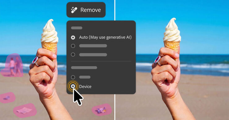
    AI removal tools now have flavors, including on-device if needed.
    • Lightroom’s AI Sharpen tool can now use Topaz Labs’ Noise-Aware Sharpen model directly in the app. This promises to recover fine details more effectively, per Adobe. (More on Topaz below.) 👍
    • Lightroom’s Assisted Culling automatically stacks similar images into groups and automatically suggests the “strongest one.” 👎
    • Lightroom has a new Photo to Video feature that uses Firefly and Google Veo to turn a still photo into “polished b-roll or reels with AI-generated motion.” 👎
    • Photoshop’s reflection removals are now isolated on a separate layer, “giving users control over opacity for more natural-looking results,” according to PetaPixel. 👍
    • Photoshop’s Remove Tool, which uses generative AI to erase a selected object and replace it with realistic-looking pixels, can now be used offline using an on-device AI model. 👍

    Get the full story at PetaPixel.
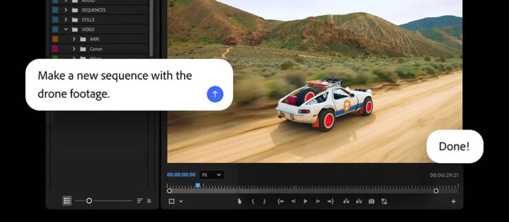
    The agentic AI “assistant” might — or might not — be good. (Subscribers pay $$ for it, so….)

    Meanwhile, Adobe’s promised “creative agent” — ’cause agentic AI — has “fully arrived” in Creative Cloud, PetaPixel writes. “Inside Premiere, Photoshop, Illustrator, InDesign, and Frame.io, users can tell Adobe’s Firefly-powered AI Assistant how to edit photos, videos, and other graphics.” It runs in a panel, like having Chat GPT or Claude right in the app.

    “As a creative, you remain in control, choosing what to hand off, what to refine and how to apply your taste, expertise and judgment to shape every editable outcome. These tools are built for how you’ve told us you actually work,” Adobe explains.

    I’m going to have to try this one. Maybe. Someday.

    Several days after the above items were debuted, Adobe purchased Topaz outright. It’ll “fully integrate Topaz’s [AI scaling] models across apps like Photoshop, Lightroom, and its AI image generator Firefly” — which should be a good thing.

    Special bonus #3: In case AI-all-the-things is getting to you, there’s this:
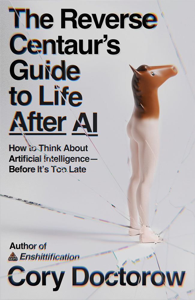
    “A ‘centaur’ describes a human augmented with a technology, like machine learning, or even just driving a car or using autocomplete,” ArsTechnica writes as part of an interview with Doctorow. “A reverse centaur ‘is a machine head on a human body, a person who is serving as a squishy meat appendage for an uncaring machine.’”

    “Being a centaur is generally viewed as a positive thing; few people relish being a reverse centaur. And yet the AI industry….” Read the rest.

    People
    Jason Snell

    Amongst the tech names I’ve know for what seems forever, Jason Snell’s is up there. He was first at MacUser, then Macworld, then hung out his own banner at Six Colors.
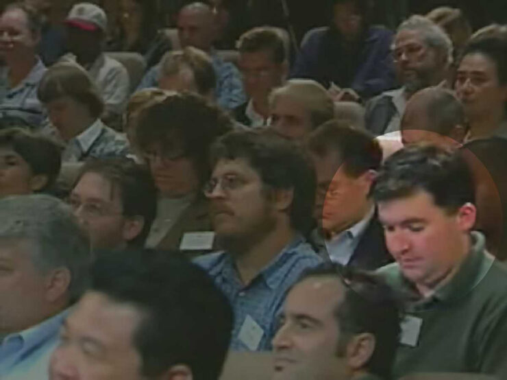
    From Macworld: Jason Snell (highlighted) at the introduction of the iPod, 2001.

    My first day on the job at Macworld, Apple was perilously close to going out of business. It was the fall of 1997, and Steve Jobs had returned to Apple and engineered the ejection of Gil Amelio as CEO, but there was no iMac yet, no visible turnaround in terms of products at all. Beyond the release of the iconic “Think Different” ad campaign, there was nothing.

    Apple’s survival hung by a thread. Steve Jobs asked everyone to trust him. At Macworld Expo, he had enlisted Bill Gates — Bill Gates, of all people! — to help him instill belief in the world that Apple would find a way to survive.

    The world was skeptical, to say the least. My family asked what job I thought I’d get once Apple went out of business.

    —Jason Snell

    Ah, the good old days. (I jest.) Hard to believe, but that was almost 30 years ago. Sheesh.

    So long, in fact, that another milestone has passed: Jason’s left Macworld. Read the column. I’m glad he’ll be continuing with Six Colors, and am looking forward to his new podcast on Apple’s history, Designed in California.

    David Hockney

    I was familiar more than a fan, but it’s undeniable that the world has lost a character — something very ably underscored by the tribute illustrations posted at CreativeBoom:
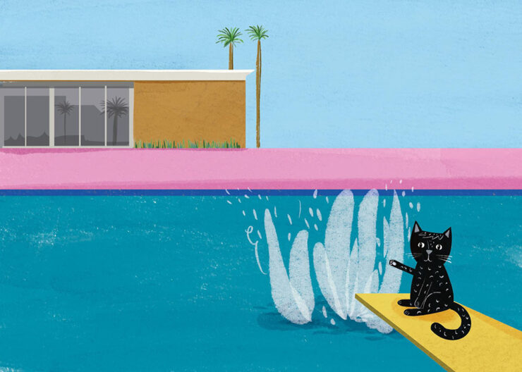
    Illustration by Nia Gould.

    “From Bradford to Beverly Hills, Hockney’s bold colours and irrepressible joy for living inspired a generation. Here’s what they created in response to his passing,” they write. See the rest.

    Om Malik

    Early this month, Om released an essay for the times — and the ages:

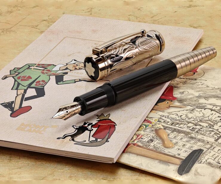
    Most people remember Pinocchio as a story about lying. The nose grows. You get caught. Lesson learned. But that reading misses almost everything Collodi was actually doing. The book is a close study of a society where deception has gone ambient, woven into every institution, every transaction. Courts punish victims. Authority figures perform competence without exercising it. Experts are decorative. Society holds together through spectacle and habit rather than accountability. Into this environment, a naive creature is released, constitutionally unable to resist a good story about easy reward.

    The nose is the least interesting lie in the book. The interesting lies are the ones that work.

    — Om Malik, om.co (Via Daring FIreball.)

    Okay, sure, it was social commentary cleverly disguised as an essay about a pen. This Mont Blanc, in fact:
    The point is, it was as insightful as ever. (See also the previously-cited “Velocity is the New Authority.”) It was immediately deposited in the to-be-posted folder. Before I could could get to that, however, heart disease snatched him away. He was 59.

    I first heard via Pixel Envy, which linked to Om’s excellent photographs posted to Glass (social media),1Forgive the repetition, but just in case: I don’t participate in social media. While I’d heard of Glass, I didn’t know of Om’s posts there — and wouldn’t have followed in any case. Perusing those photos, and posting that link, are a one-off celebrating Om’s talent. and, later, appreciated John Gruber’s thoughtful piece at Daring Fireball.

    Both reminded me of Om’s love of Leica and preference for black-and-white:
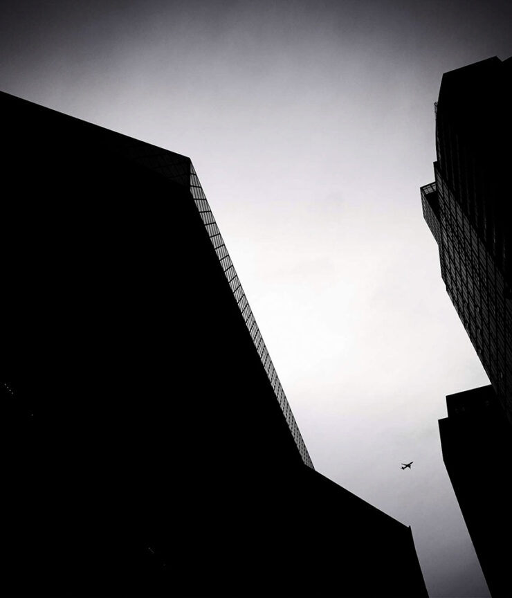
    “Sleepy in Seattle.” Photograph by Om Malik.
    “Does This Qualify as Flora?” Photograph by Om Malik.

    Or almost-black-and-white:

    Untitled. Photograph by Om Malik.

    See a few more, called “Selects,” at Om’s personal photography site.

    Special bonus #4: The day after Om’s Pinocchio essay, above, Daring Fireball posted on Jason Zweig’ on’s three ways to get paid. I won’t spoil it — just go read.

    Photography
    2026 Beaker Street Science Photography finalists

    “This is the 10th anniversary of the Australian Beaker Street Festival. Each year, the competition celebrates fantastic photos of rare and unusual scientific phenomena, endangered species, conservation missions, and much more,” PetaPixel writes.

    Some of these are awesome:
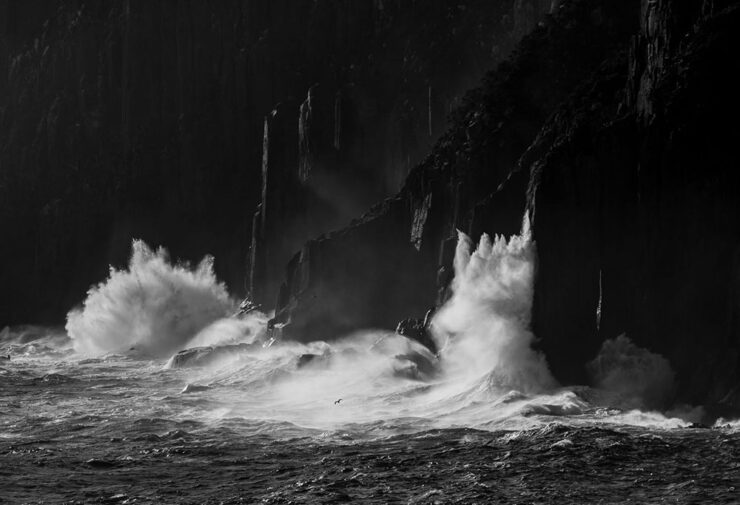
    “Southern Ocean Energy.” Photograph by Nick Green.
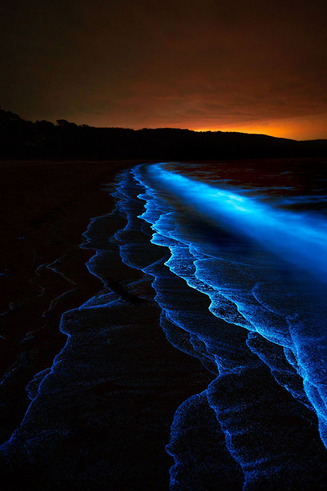
    “Just Another Bioluminescent Tantrum.” Photograph by Deni Cupit.

    26 finalists in all. See the rest (and, if you’d like, vote at the link).

    2026 Australian Geographic Nature Photographer of the Year shortlist

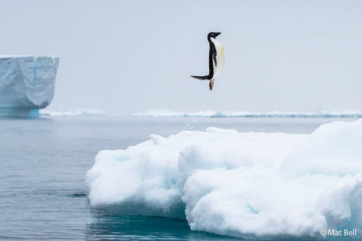
    This contest takes entries from the majestic Australasian Realm, including the ANZANG bioregion consisting of Australia, New Zealand, Antarctica, and New Guinea, and to quote PetaPixel, “there are some real bangers on there.”
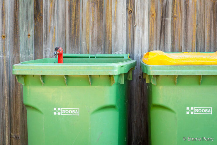
    “Bin Turkey.” Photograph by Emma Perry.
    “Penguin Poe.” Photograph by Matt Bell.

    Nature in all its marvelously diverse glory. See the rest.

    Burton’s America

    I’m surprised I haven’t linked to Brendon Burton’s work before, ’cause it’s right up my alley:

    Traces #10. Photograph by Brendon Burton.
    Traces #6. Photograph by Brendon Burton.

    His second book, Epitaph, “is a series that attempts to unravel the knot of mystery that exists within the dark corners of North America, shedding light on unseen histories and buried past lives.”

    See more. (Via This is Colossal.)

    Landscapes three-fer

    • Travel and nature photographer Jake Guzman has spent the past two years creating Otherworldly America, his new 256-page photography book:

    “Picture Lake Washington.” Photograph by Jake Guzman.
    “Richardson Highway, Alaska.” Photograph by Jake Guzman.

    • Arpan Das has fallen in love with the Kishtwar Himalaya in the Jammu and Kashmir region, part of the Indian Himalayas:
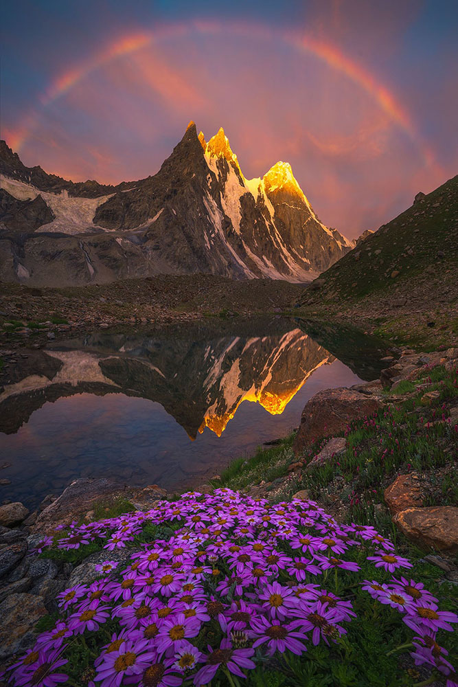
    “Barnaj Rainbow.” Photograph by Arpan Das.

    •  Michael Shainblum photographs the volatile, weather-driven landscapes of New Zealand with “a body of work shaped less by fixed composition and more by responsiveness to constant change”:
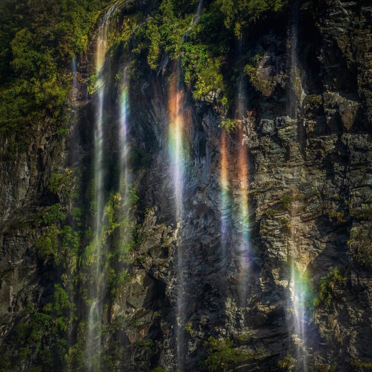
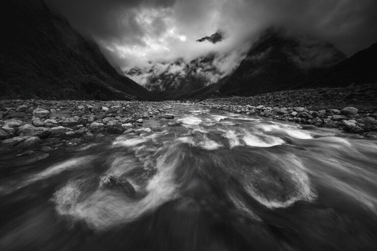
    “New Zealand #19.” Photograph by Michael Shainblum.
    “New Zealand #40.” Photograph by Michael Shainblum.

    All three are via PetaPixel: Jake Guzman, Apran Das, and a longer feature on Michael Shainblum.

    Finally: soothing surf
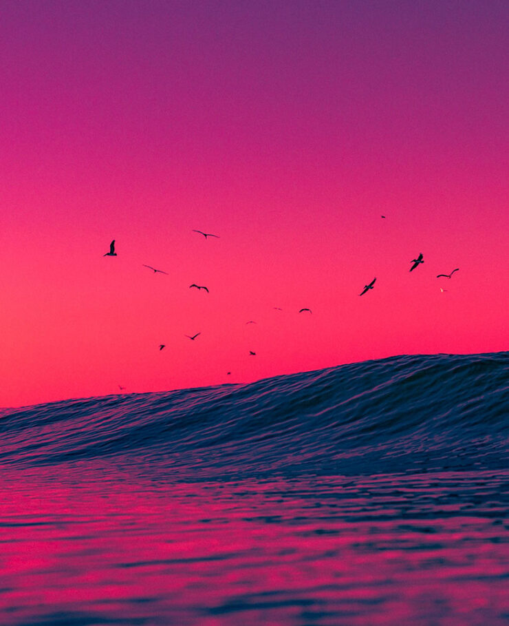
    “Venice Beach: Dreamy #3.” Photograph by Craig Hubbard.

    Hubbard’s photos are ethereal and cinematic, with surfers and wave crests illuminated by the early morning sun or backdropped by the marine layer. Sometimes the intense spray, curl, shoulder, or lip become the sole subjects of the portraits. “The water is the muse and artist,” Hubbard recently told an interviewer. “I’m just a biased translator and documentarian. Lastly, my ego relaxes in the ocean; the need to peacock recedes. This is where my best work comes from — or favorite, I should say.”

    — Kate Mothes, This is Colossal
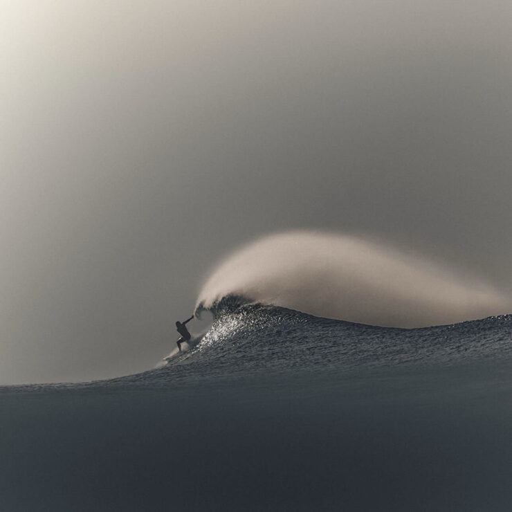
    “Venice Beach: Dreamy #9.” Photograph by Craig Hubbard.

    See more at This is Colossal.

    That’s it for this month. As always, thanks for visiting.

    For folks in the US, have a safe and enjoyable holiday weekend as America turns 250. Let’s hope that we can make it a better place.

    Also: Please don’t forget to let me know of any problems or concerns with the new site. I’ve got a list of items — going to work on them now — but always welcome feedback. Thanks.

    • 1
      Forgive the repetition, but just in case: I don’t participate in social media. While I’d heard of Glass, I didn’t know of Om’s posts there — and wouldn’t have followed in any case. Perusing those photos, and posting that link, are a one-off celebrating Om’s talent. ↩︎
  • Beautifully Briefed 26.5: May All Things Be Grand

    Beautifully Briefed 26.5: May All Things Be Grand

    Design is grand; illustration and type are grand, too; the new BMW Alpina is a grand tourer extraordinaire; and space photography is grand indeed. Only Adobe, unfortunately, is the outlier, but on balance, a grand sendoff to Spring.

    This month’s Spine
    University of Chicago Press.
    University of Chicago Press.

    I inked as many jokes as I could — penishment, one could say — but the University Presses column is still worth a read when you have a moment.

    Painting book covers

    Hyperallergic comments, “In a market flooded with design templates and AI-generated imagery, the painted cover stands out as distinctly human.” Which, they suppose, is why when you “[w]alk into any bookstore in the United States lately, […] the shelves and new-release tables resemble group exhibitions.”

    Cover design by Rodrigo Corral Studio. (A 2025 Favorite Book Cover here on Foreword, too.)
    The recent shift from color fields and geometric abstraction to gestural figuration on book covers may reflect a broader craving for embodiment and physical presence — proof, in other words, of the artist’s hand and subjectivity in the era of the internet. Just as painting implies time, so does the novel, demanding sustained attention to both write and to read. It’s a tension that undermines the forces driving creation and consumption in the service of ever-increasing profit margins, both in the art market and the publishing industry.

    — Tara Anne Dalbow, Hyperallergic

    Cover design by Jaya Miceli.

    Regular readers will know this isn’t a new thing, but I think the post — whose author is much more likely to be familiar with social media and bigger-picture trends than I am — is correct in the notion that, “the painted cover seemingly aligns the book with an art-historical lineage rather than the curation of an algorithmic feed.”

    Aside from misspelling Jaya Miceli’s name, there’s lots of good stuff in the article. Take a look.

    Note: I somehow hadn’t seen I Am You before, and am disappointed to have missed this great cover … that would absolutely have been in running for the 2025 Favorite Book Covers. Apologies.

    Speaking of great book design: Jenny Volvovski

    In 2012, Jenny Volvovski “really wanted to design book covers but didn’t have any book cover work. So I hired myself to redesign my personal library.” An interesting approach, to be sure:

    A small selection of items from Volvovski’s unsolicited covers collection.

    That, as it turns out, has worked very well for her — she’s now amongst the elite:

    Cover design by Jenny Volvovski. Was a finalist — but not selected — for my 2025 Favorite Book Covers.

    “Yeah,” I hear you say, “but that’s only a runner-up.” Okay:

    Cover design by Jenny Volvovski. One of my 2025 Favorite Book Covers.

    In addition to the above, Beethoven, The Novel and the Blank, and The Master of Contradictions are among several that fall into the outstanding category; see many more in the “published” section of her website.

    Enjoy! (Prompted by Kottke.)

    Fantastic early 20th-century movie posters (and more)

    Eric Rohman wasn’t a name I was familiar with — he’s Swedish, so I suppose there’s an excuse — but the great design transcends not only the language barrier but the years, as well:

    Poster design by Eric Rohman, 1918.

    “Eric Rohman (1891–1949) was born in Nyköping and grew up in Helsingborg. He was one of the very few people in Sweden who could make a living by only producing posters. He produced about 7,000 works, according to his own estimate. 

    “Rohman’s brother was the manager of one of the big cinema chains and the need for posters was great. Rohman usually worked with few colors and did not spend much time on details, he had a great ability to quickly pick out the essentials.”

    Poster design by Eric Rohman, 1917.

    From Laurel and Hardy and Charlie Chaplin to Ingrid Bergman and Greta Garbo, this online archive is both inspirational and sure to bring a smile to your face.

    When you’re done, the site, Artvee, has countless more from artists worldwide, in hi-res where possible, all in the public domain. A fantastic resource.

    (Another via Kottke.)

    Special bonus #1: Quentin Blake, at 93, continues to advocate “for a discipline that’s lacked attention and prestige for far too long,” CreativeBoom writes. 

    Photograph courtesy of CreativeBoom.

    The master illustrator of Roald Dahl’s Matilda, The BFG, and around 500 more instantly-recognizable titles has been working on a singular goal for more than three decades; the fruit of his labor, The Quentin Blake Centre for Illustration, “the world’s largest permanent public space dedicated to illustration,” opens its doors in Clerkenwell, London, this summer.

    One of the famous cockatoos gifted to the world by Quentin Blake.

    Update, 6 June 2026: Dezeen has a great article on both the Center and its facility: “The site, known as New River Head, was once the end of an artificial river created in the early 1600s to channel drinking water into London,” they write. 

    Facility by Tim Ronalds Architects. Photograph courtesy of Dezeen.

    “Many of the structures on the site were created as part of the endeavour to pump this water to people’s houses. The oldest of these was the base of a windmill dating back to 1707, which stands at the entrance to the museum’s site and has been converted into a gallery space for temporary exhibitions.” Check it out.

    This month’s new fonts

    CreativeBoom‘s monthly feature has twelve choices, a couple of which I’d love to have the opportunity to use.

    Ardent, by Typofounderie
    Ardent, by Typofonderie.

    “Jean François Porchez began designing Ardent in January 2021, starting from his earlier Le Monde Journal and asking what that typeface would need to become to serve modern screen reading. The answer involved drawing wider letterforms and more open counterforms, following the research of Ladislas Mandel and Matthew Carter on legibility and apparent size. Serifs in the italics (an unusual, but actually sensible choice) serve readability on screen, rather than print conventions. […]

    Ardent’s ”angular counters,” as they call them, do stand out.

    “More broadly, the font draws on a rich historical lineage: Elzevirs, Albertus, Vendôme, Meridien, even Verdana. Angular and triangular shapes sit alongside round terminals and both bracketed and unbracketed serifs, creating what Jean describes as a typeface that reveals subtle contrasts invisible at small sizes but gives graphic projects a distinct identity at large ones.”

    Have to emphasize: unlike my usual selections, this is aimed at screens, not the printed page. Still, good stuff.

    Tareco, by Dalton Maag
    Tareco, by Dalton Maag.

    “Deiverson Ribeiro’s pulled off something a bit special here. Developed at Dalton Maag, Tareco takes the beloved sweet treat of the same name as its starting point. This is not a polite, restrained script, but one with a loud, confident personality. Thick, confident strokes and precise details give these letterforms a jazz-like syncopation: a sense of forward propulsion and playful energy that helps to bring designs to life on the page.”

    And seriously: who doesn’t love a biscuit?

    Software woes, rants and hopes
    Part One: Adobe

    I’ve not had much good to say about Adobe recently, I’ll admit. I’m also not thrilled to be back, bemoaning something else. It’s a shame they’ve given me another reason to.

    Recently, I’ve noticed that in Photoshop, the “canvas size” dialog (among others) has looked … well, off. Windows-like, even, which is most assuredly not a compliment. But on a more fundamental level, it’s broken — it has, to use the parlance, lost its focus sequence: the standard workflow of open dialog, type value, tab, type, enter (no mousing required) is just gone. Each value has to be manually selected and entered, a much more arduous process — it’s additional movement, clicks, and time unnecessarily added.

    The old interface is on the left, “new” on the right. Screenshot courtesy of Unsung.

    You can bet I’m not the only one to have noticed.

    Marcin Wichary, at the excellent Unsung:

    I generally avoid such harsh labels on this blog, but: this is awful work. 

    I’m angry. (Clearly.) We should all be angry in the face of stuff like this. This is how people get fed up with software – because it feels unstable and deteriorates on its own without needing to. 

    I know I brought up that an existing power user base can be a huge pain in the ass, and I am a decades-old Photoshop power user. But this is different than other examples where the product needs or at least wants to evolve past its core audience or toward a different market. For Photoshop here, nothing I see indicates any change in course or clientele – and yet all of these good moments in UI that used to help me out no longer exist.

    Plus, all those transgressions are solved problems. Those issues are not buried in pages of heavily litigated patents, or in seven collective brains of world-class interface designers whose driveways are presently occupied by cash-filled trucks sent over by frontier companies. This isn’t some long lost art that requires archaeologists to decipher. This feels like carelessness and laziness in face of basic UI engineering; in a likely internally-motivated effort to refresh the interface, the team threw an entire nursery worth of babies [out] with the bathwater.

    — Marcin Wichary, Unsung

    “It’s not just about disservice to craft. It’s not even about disrespect for change management, trivialization of institutional memory, and disinvestment in quality assurance. This isn’t only […] sloppy coding,“ he continues. “This is a failure of imagination.”

    Jason Snell, at Six Colors:

    I have been using Photoshop since John Sculley was the CEO of Apple. Longtime users can be brutally resistant to change, but I would like to think that I remain open-minded. One can’t have used Photoshop for more than three decades without having adapted to change and found utility in the new features Adobe has added over the years. I’ve used generative fill. I’ve used AI-enhanced edge detection. I’m hip and with it.

    But, as Wichary detected, what Adobe is doing with the Modern User Interface is not to make a new, improved, modern interface. Adobe’s own description gives it away: It’s a hammering of all of Adobe’s user interfaces so they look alike, across Creative Cloud. It’s a “multi-platform design system,” which means in addition to Adobe being committed to “modernizing” Photoshop by making it look like Premiere, it’s also going to make it look the same on the Mac as Windows.

    Already, Photoshop desperately wants to run in single-window mode, with multiple documents opening in a single uberwindow—in other words, the stink of Windows. Fortunately, you can turn that feature off, and I have. […]

    That all said, of course, this decision could benefit Photoshop users, because Adobe could put in the work to make the app better while also fulfilling its own corporate goals of homogeneity.

    Ha ha ha. Sorry. I tried to write that with a straight face.

    — Jason Snell, Six Colors

    It gets worse. Nick Heer, he of PixelEnvy, noted:

    If you do a little poking around in Adobe’s application bundles, a key reason for the jankiness of these user interfaces becomes apparent: it is because they are little webpages. These dialog boxes are HTML files that reference a chunky CSS file and oodles of JavaScript […].

    This is loathsome.

    There are people out there who will insist it is unfair to blame the tools and that bad user interfaces can be built in entirely native languages, too, which is true. Also, Adobe’s interface has always been unique and not quite at home on either MacOS or Windows. Maybe it really is possible to build a web app that feels platform native. But I have never used one — not once — and for this mess to be increasingly used in the industry-standard professional suite of creative tools is maddening.

    — Nick Heer, Pixel Envy

    John Gruber, on Daring Fireball, notes that, “The before-and-after screenshots look like examples from a lecture on user interface design  —  if you swap them around make the new ones ‘before’ and the old ones ‘after’. Better balance, better focus behavior, appropriate platform-native typography.”

    Michael Tsai has a post on the whole “conversation” if you’d like to get a sense of just how many people are upset; for what it’s worth, it includes a comment from Adobe’s “Lead Scientist” for user interface: “These sharp edges are acknowledged, and we are working on them.” I’m sure I’m not the only one who doesn’t entirely trust their reassurances.

    Wichary did provide a solution, however temporary: turn off the interface “improvements.” There’s an option buried in the settings:

    Uncheck the box, then note the last line.
    Part Two: Folklore

    The hope part: Gruber followed up with a thought-provoking piece called, “Software as the Product of Obsession Times Voice.” He reminds us of a famous quote from Walt Disney — “We don’t make movies to make money; we make money to make more movies” — and that it applies to software development, especially for independents. To wit:

    It feels like the world of software is bifurcating quality-wise. This whole thing about Adobe’s new craptacular “modern” UI language (a.k.a. “Spectrum”) exemplifies one side of that bifurcation — the bad-and-getting-worse side. Software that is the product not just of an ignorance of long-established principles of interaction design, but of a willful disdain for those principles. What Adobe is now shipping is just inexplicably bad UI, ignoring literally decades of great work and long-mastered concepts — a lot of which work was pioneered by Adobe itself!

    — John Gruber, Daring Fireball

    He goes on to discuss that what’s expected from Apple is “insanely great,” and that Adobe is failing so hard precisely because they’re Adobe and know better. He also mentions a concept known as software brain — read the post to get that — but, in a nutshell, it’s not about the quality of the software. It’s about the quality of the profits. Quelle surprise.

    However, “[t]he other side of the software fork is not deserted. It’s just populated, more than ever, by the products of small independent developers who obsess, first and foremost, over quality and artistic vision.”

    Which leads us to Folklore. Mentioned on Upgrade’s Apple 50th anniversary podcast episode, Folklore is a list of 123 great stories from Apple’s early days, from when Apple was that company obsessing, first and foremost, over quality and artistic vision.

    Great stuff. Wander through the list at your leisure — and revel in the glory days.

    Never doubt that a small group of thoughtful, committed people can change the world. Indeed, it’s the only thing that ever has.

    — Margaret Mead

    Special bonus #2: Taken, a single webpage that shows just how much information you share by … visiting a webpage. Sigh.

    Special bonus #3: Boring, an interactive essay arguing that some of the items mentioned above have, in fact, gone too far — and that forces are at work to redress. Speaking of hope: let’s do that.

    BMW Alpina

    So, it’s finally happened: after what seems like forever — including several mentions here on Foreword — we’ve now seen where BMW is going to take the Alpina brand.

    I’m both relieved and excited: it could be very cool.

    Image courtesy of BMW.

    Unlike BMW M, which is focused on sport, BMW Alpina will be focused on speed. Mile-munching, cross-continent stuff. (If you’re a Mercedes fan, think closer to Maybach than AMG — or maybe an amalgamation of both.) “[T]he understated character of ALPINA fits the way wealthy buyers are spending now,” writes BMW Blog. “That is the market BMW is aiming at — not M buyers, not 7 Series buyers, but the segment above both.”

    “An ALPINA is for connoisseurs, meaning people that love driving, they like driving fast, but they don’t want to communicate to the outside world that they bought a race car,” said BMW Group Chief Designer Adrian van Hooydonk. “That would be an M customer. And therefore we thought that is the position, that is the opportunity for ALPINA.”

    Image courtesy of BMW.

    Which makes sense. It’s what Alpina always stood for: faster than standard models, more luxurious than M models. Exclusive and expensive.

    Four images above courtesy of BMW Blog.

    There’s nothing about this I don’t like. It’s a great design in a great color with a fantastic interior. Indeed, it’s a great presentation, and looks like a great place to park yourself for hours on end while scenery rips by.

    Of course, not all is perfect: it’s only a “vision.” BMW’s concept cars tend to get watered down fairly extensively, and this one’s no exception; the first model isn’t even going to be a coupé but rather a modified 7-series sedan. They’ll be both gas — ahem, petrol — and electric, and will cost Bentley money.

    The concept on stage at the 2026 Concorso d’Eleganza Villa d’Este. Image courtesy of BMW Blog.

    Alpina has always been the car for people who found M too loud and Rolls-Royce too theatrical. The buyer who knew what a it was and didn’t need anyone else to. I’m excited that Alpina is going to, thankfully, continue to represent that — and seemingly, successfully transition to a new era under direct BMW control. 

    Read more at BMW Blog (1, 2, 3, 4, 5, 6, 7, 8, 9) or The Autopian.

    This month’s photography round-up
    Space #1: More from Artemis II

    “NASA has released a tranche of 12,000 photos taken during the historic voyage that were shot on a combination of the Nikon D5 SLR, Nikon Z9 mirrorless, and iPhone 17 cameras that the Artemis crew took with them,” PetaPixelnotes in a post showing some of their favorites. (This is Colossal has a post of their favorites, as well.)

    Hank Green — of the Sci Show YouTube channel, among many others — has put together the very cool Artemis II Photo Timeline, as noted long-time Mac guy (and co-founder of the Relay network of podcasts) Stephen Hackett.

    The timeline is an interactive way to scroll through photos from the mission — but pinned to NASA’s official schedule. Green also explains something I was wondering, which is why there are no credits on the photos: “the four astronauts together agreed that they did not want credit for any photos taken on the mission. I’m somewhat conflicted about this because this project is about giving as much context as possible, but of course there is also something very beautiful about not wanting to take individual credit for something that was the result of so much collaboration.”

    Hat tipped to all of that. A month later, and the excitement is still palpable.

    Space #2: The Milky Way
    “Night at the Remarkables.” Photograph by Tom Rae.

    The 2026 Milky Way Photographer of the Year winning images have been announced, and they’re stunning. “Every year, this collection reminds us that photographing the Milky Way is not only about technique or planning. It is about curiosity, patience, and the desire to experience the night sky in places where it still feels wild,” says Dan Zafra, editor of Capture the Atlas.

    “Perseid Meteors Over Durdle Door.” Photograph by Josh Dury.

    See all of the winning images at This is Colossal, PetaPixel, or the contest website.

    Space #3: Triple Arch
    The Matterhorn, the summer arch (left), the Gegenschein (center), and the winter arm of the Milky Way (right). Photograph by Angel Fux.

    From high up in the Alps, a stacked image of events that took place in one night, taken from one location by one photographer, with no AI involved: a celestial phenomenon that has never been captured in this exact way before. Awesome. PetaPixel has the details.

    And Finally: Lightning Bugs, Indeed
    “Presence,” Australia. Photograph by JJ.

    PetaPixel brings us the story of JJ, who went on a mission to capture lightning sprites, an elusive-yet-beautiful item — and got something else, too.

    “Those little fireflies reminded me of why I do this in the first place. It reminded me that it wasn’t about getting something better; it was about fully appreciating things there in the moment. And this is why I named the image ‘Presence.’” 

    Special bonus #4: Engagement with the arts slows aging!

    “[R]esearchers believe that a significant part of why engaging with the arts slows biological aging is the diverse range of visual, sensory, and physical stimuli associated with art, as well as the social interactions that often accompany it,” PetaPixel notes. 

    “The new findings go much farther than that, though: they also found evidence that artistic engagement can have roughly the same health benefits as physical exercise. This is a huge deal, especially for those in middle- and late-age groups who may find strenuous physical exercise too difficult.”

    So, be glad: taking the time to read Foreword today may have had benefits beyond entertainment. Thanks for visiting.

  • Beautifully Briefed 26.4: Showered with… [Insert Here]

    Beautifully Briefed 26.4: Showered with… [Insert Here]

    This month, Apple turned 50. Plus, the usual dose of great design, fonts, and photographs. Let’s spring into it!

    This month’s Spine
    The University of Iowa Press.

    Genius placement of record label, great typography, and more — although the folks at the University of Iowa generally don’t respond to requests for information (hence the lack of designer credits), their production department deserves all the kudos. Great stuff.

    See the whole list of University Press Coverage at Spine.

    Apple turns 50

    I’m just enough older than Apple that it’s been pretty much a constant presence in my life. Early on, it was only in schools that I interacted with them; we couldn’t afford a Mac in 1984, and I was stuck, nose pressed up against the glass, until 1990.

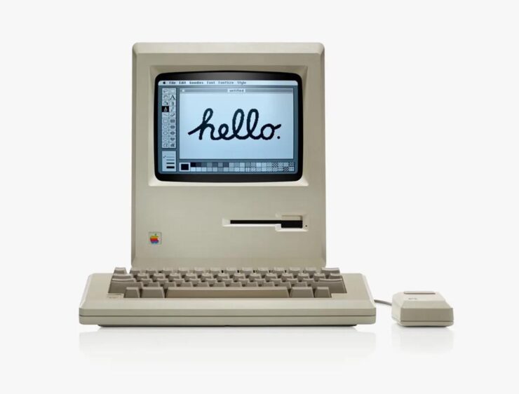
    The original Mac 128k. Photo courtesy of Apple.

    My first Mac was the same iconic beige, except it was a Mac Plus — which, together with a 20MB (!) Jasmine external hard drive and an ImageWriter — really allowed me to start down the path of making documents and publications lookgreat.

    Over the years, I’ve been through many Macs (more than I should probably try to count, honestly). I still use and love the platform today.

    Of course, I’ve added iPhones, iPads, and miscellaneous others, too. (Oddly, I was never an iPod person — I’ll take speakers over headphones if at all possible.)

    iPad wallpaper courtesy of Basic Apple Guy.

    There are too many great opinions on this anniversary, frankly, for mine to really matter — so I’m going to point to a few excellent items from others, in case you’ve not read them or would appreciate some additional perspectives:

    If you’d rather listen, this episode of the podcast Upgrade (Jason Snell and Myke Hurley) also covers the early — that is, really early — years:

    Whew. Enjoy.

    Meanwhile, I have to point at another article that will probably surprise … well, none of my regular readers: a great Architectural Record piece on the many Apple Stores and their fantastic, now-iconic look.

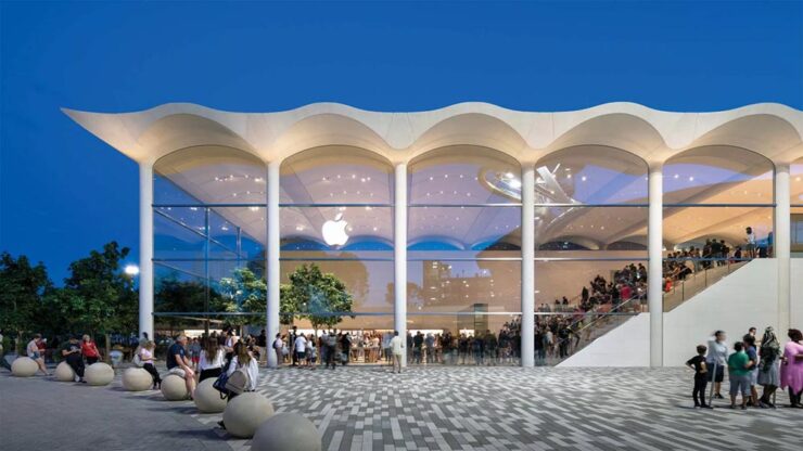
    Apple Aventura (Miami). Photograph courtesy of Architectural Record / Nigel Young, Foster + Partners.

    The possibility exists that I might have mocked Apple in 2001 for announcing that they’d be opening brick-and-mortar locations. (They had resellers, after all.) But, man, did I get that one wrong. Five hundred plus stores later, all over the world, Apple’s story is being told every day through great products — and great architecture.

    Apple Zorlu Center (Istanbul). Photograph courtesy of Architectural Record / Nigel Young, Foster + Partners.
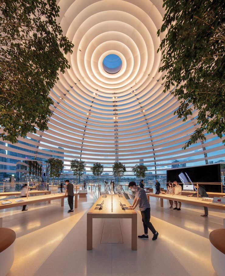
    Apple Marina Bay Sands (Singapore). Photograph courtesy of Architectural Record / Finbarr Fallon.

    Many thanks to Apple for making my daily life better. It sounds strange to thank a company with a nearly four trillion dollar market cap, but as someone who’s been there since the dark days of the ’90s — indeed, basically all of those 50 years — they’re more than just a company to me. May there be many more anniversaries to come.

    Late-breaking supplement: new Apple CEO

    As it turns out, Apple’s 50th also marks a turning point:

    Today we announced that I’m taking the next step in my journey at Apple. Over the coming months I will be transitioning into a new role, leaving the CEO job behind in September and becoming Apple’s executive chairman. A new person will be stepping into what I know in my heart is the best job in the world. That leader is John Ternus, a brilliant engineer and thinker who has spent the past 25 years building the Apple products our users love so much, obsessed with every detail, focused on every possible way we can make something better, bolder, more beautiful, and more meaningful. He is the perfect person for the job.

    John cares so much about who we are at Apple, what we do at Apple, who we reach at Apple, and he has the heart and character to lead with extraordinary integrity. I am so proud to call him Apple’s next CEO. 

    — Tim Cook, CEO, Apple

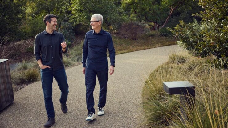
    John Ternus and Tim Cook. Photograph courtesy of Apple.

    Ternus’ long-time role at Apple has been as its head of hardware. Among the things Apple does extraordinarily well, hardware arguably tops that list. Every piece of hardware has an level of quality the rest of the industry just can’t match; from the early days of the iMac to today’s MacBook Neo, from the first iPhone to the orange powerhouse that is today’s iPhone 17 Pro, there’s a feel that Apple does like no one else.

    That also means, for all intents and purposes, that Apple recognizes that the next CEO isn’t going to — can’t — increase its net worth another thousand percent the way it did under Cook’s tenure. They’re going to concentrate on what they do best: products.

    I hope.

    For more on the CEO announcement, see also: 

    Special bonus #1: What happens when you put greed first. I’ve spent a minute slogging on Adobe — hopefully fairly — but Nick Heer of PixelEnvy summarizes better than I have.

    Design
    Penguin’s 2026 cover design award

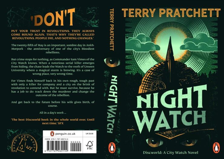
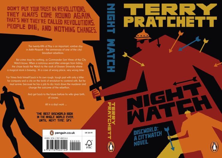
    This CreativeBoom article is framed as “Gen Z judges books by their covers” — breaking news, surely — but is really about what happens when you give some design novices1Entrants had to have no more than one year of paid creative experience, and 60% of those on this year’s shortlist were students. an assignment redesigning covers of two iconic titles. Here are a couple of winners:

    Night Watch design study for Penguin UK by Peter Goddard.
    Night Watch design study for Penguin UK by Sunny Tsang.

    Of course, there are a couple of age-related stats in the article worth mentioning: “40% of 18 to 24-year-olds like to display books at home, with nearly a third using them as interior design objects or art pieces. Among the over-55s, that figure drops to 8%.” (Raises hand on the latter.)

    The other title is the always-awesome A Wrinkle in Time. Take a look.

    Post of goodness

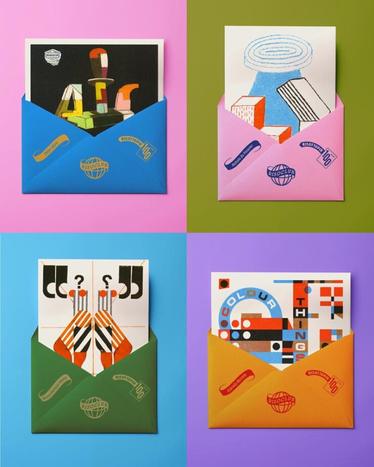
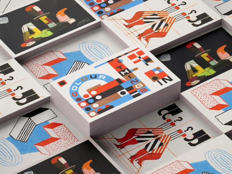
    While we’re on the subject of awesome: “Print and design studio Risotto is marking 100 months of artist postcards, all printed by hand and posted worldwide, with an exhibition that puts the beauty and breadth of Risograph on show,” It’s Nice That writes.

    A sample of Risotto postcards, oddly with envelopes.

    “For the Glasgow-based print and design studio Risotto, a connection to slower publishing in a fast world has been part of its fabric since its beginnings. Risotto’s Riso Club has been a constant print project running in the background at the press for the past decade: A monthly not-for-profit postcard subscription that directly supports independent artists by sending their colourful work to a community of print enthusiasts around the world,” the article continues.

    More of the fantastic artists’ postcards.

    “It’s a bit of an antidote to the speed of the doom scroll or just the amount of content that’s out there,” studio owner Gabriella Marcella says. I couldn’t agree more — in fact, if I had even a smidgen of display space available, I’d subscribe (and may anyway).

    Read more at It’s Nice That or CreativeBoom.

    That’s the ticket

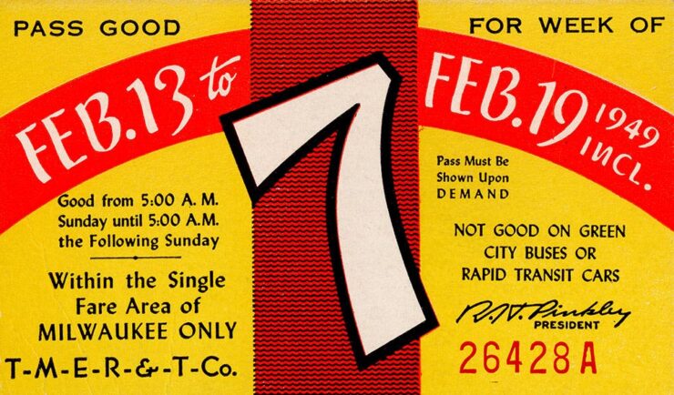
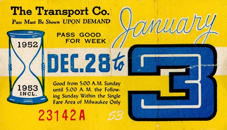
    Kottke, while bringing us a quick snippet with a brand designer’s “compendium of transit tickets” from around the world, also reached back into his archives to bring us these absolute gems:

    Golden Tickets, Milwaukee, week 7, 1949.

    A collection of weekly bus passes from Milwaukee, WI. Years covered are 1930-1979.

    Golden Tickets, Milwaukee, week “53,” 1952-3.

    Originally posted at the not-cited-enough Present & Correct.

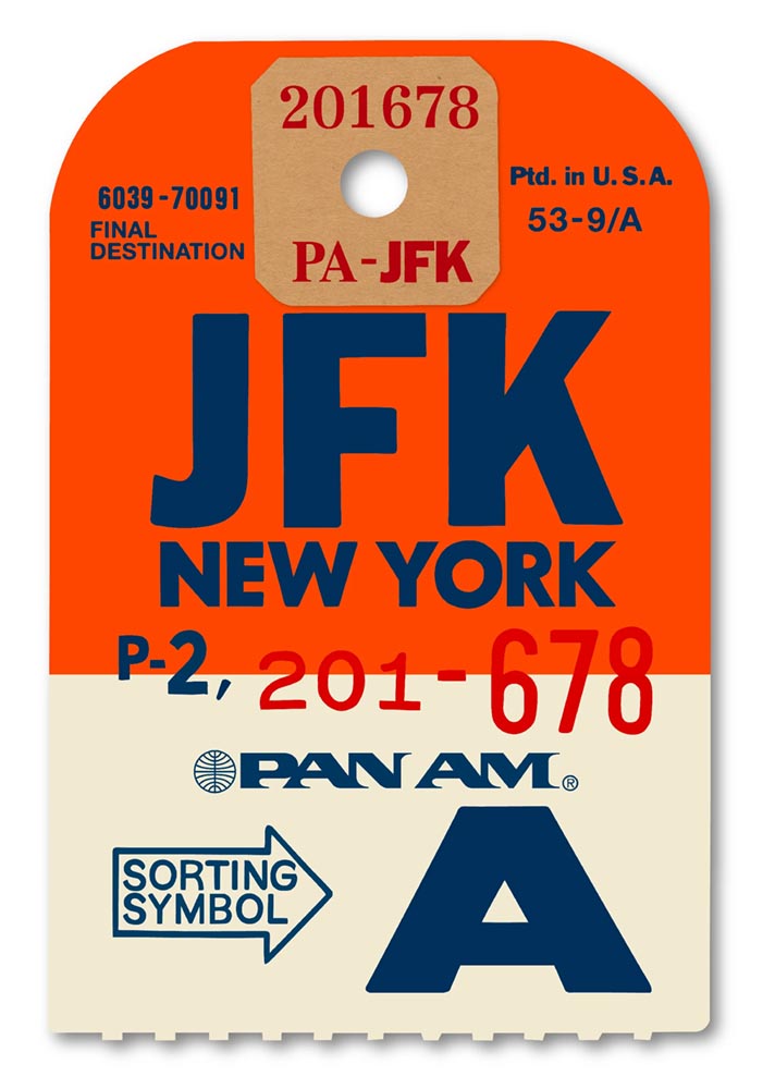
    Special bonus #2: Extra large Pan Am ticket recreations as art, framed, for your wall:

    Flight of fancy by Ella Freire. 

    These are perfect for an Air BNB or other travel/hospitality locale — as mentioned above, my walls are full — but no matter what, looking through the destinations is fun. Check it out. (Via Daring Fireball, citing another not-cited-enough item, SimpleBits by Dan Cederholm.)

    Special bonus #3: Speaking of travel and hospitality, “Letterform Archive has turned a century of vintage hotel luggage labels into 330 gorgeous stickers: a new sticker book from the San Francisco-based design archive revives the golden age of travel through the vibrant graphic art of hotel luggage labels.” Awesomeness at CreativeBoom.

    April’s typography greats
    Mark Simonson’s start in type

    …actually has a great story attached:

    Hand lettering for Mark Simonson’s 1975 yearbook.

    “Fifty years ago this month, March 1976, at 20 years old, is when my interest in type design began,” he writes. I’m not going to spoil it — just go read instead.

    CreativeBoom‘s April selections

    Nineteen in all, but as usual, I’m only going to mention a few faves:

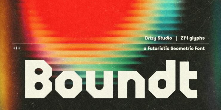
    Boundt (not cake), by Ahmadi Hasan.

    “Boundt arrives from Drizy Font with a clear visual proposition: bold, architectural geometry at display scale, informed by mechanical bolt-and-nut structures and the graphic language of vintage broadcast design. The mechanical metaphor gives the letterforms a coherence that purely decorative display faces often lack: a sense that the same underlying system generated them all.” See more.

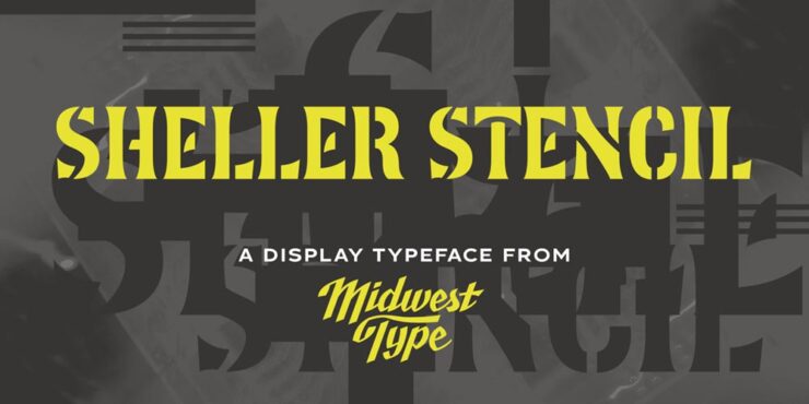
    MWT Sheller Stencil by Jesse R. Ewing. (Who was not shot for their efforts.)

    “Sheller Stencil originates in the stencilled lettering found on agricultural machinery from Tiffin, Ohio, in the late 19th century: anonymous commercial graphics that, on close examination, turn out to be genuinely inventive. Some characters split at right angles; others follow curvilinear breaks that track the Art Nouveau-inflected letterforms rather than cutting across them mechanically. The result reads as antique but carries enough formal authority for contemporary packaging, editorial work and heritage-positioned branding.” See more.

    Herald News by Kevin Foley.

    “The story behind Herald News is a personal one. Kevin Foley grew up with the Fall River Herald News (delivered it as a paperboy, absorbed its typography over years of handling), and later found himself scanning its pages to find his daughter’s name in the results after track meets. That very human relationship with a newspaper’s visual character is precisely the kind of deep familiarity from which good type design grows.”

    This is a serif family was built for editorial work — and I like so much, it’s been bookmarked for when the right project comes along. See more.

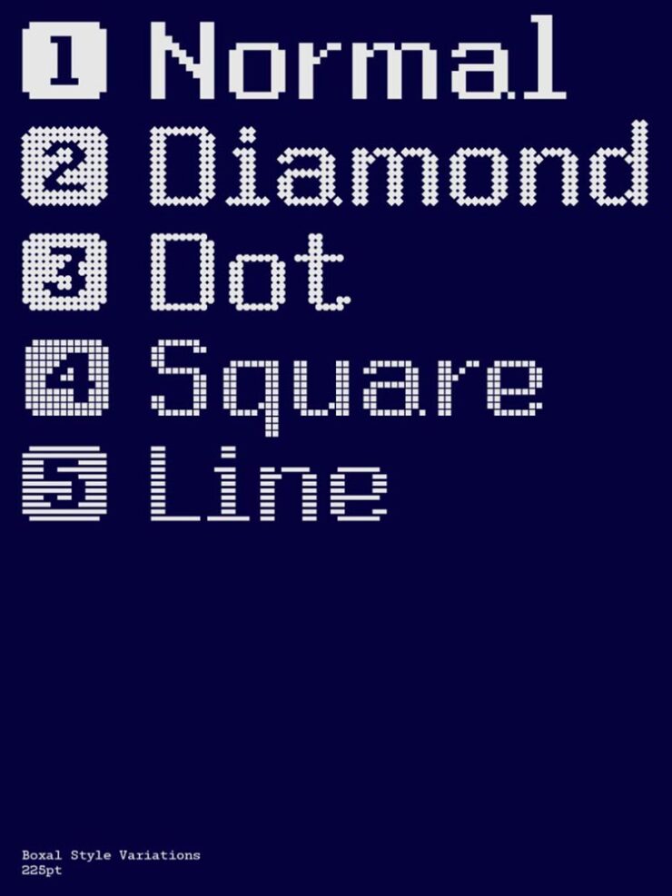
    Boxal by The Northern Block.

    “Boxal is The Northern Block’s newest typeface – a meticulously crafted, retro-inspired pixel font that captures the nostalgic charm of classic arcade gaming while delivering modern precision and versatility. With the personal design history of founder and type designer Jonathan Hill very much in mind, Boxal draws on the pixel artistry of iconic titles like Zelda, Shinobi, and Cops and Robbers, and represents a cultural homecoming for the studio.”

    Fantastically retro yet proportionally spaced, best at large sizes, preferably slowly scrolling up a screen. Awesome. See more.

    Zed, for when Z just isn’t enough
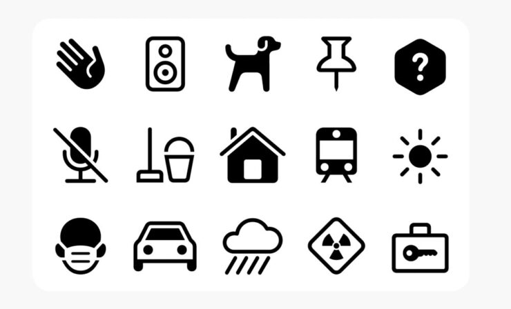
    Zed’s icon family by Typotheque.

    “Zed is extremely practical, both in terms of its extraordinarily broad language support and the stylistic variations available via its adjustable width, weight, roundness, and slant. It even offers Braille characters and an icon font. But Zed is also simply beautiful. It’s a font family and type system that exemplifies the belief that rich accessibility and pure aesthetic appeal are not at odds,” Daring Fireball writes. (In, admittedly, a sponsored spot — but his sponsors are so highly curated that I actually read the posts … and, occasionally, pass them along.)

    Zed used in a display at the V&A, London.

    See more.

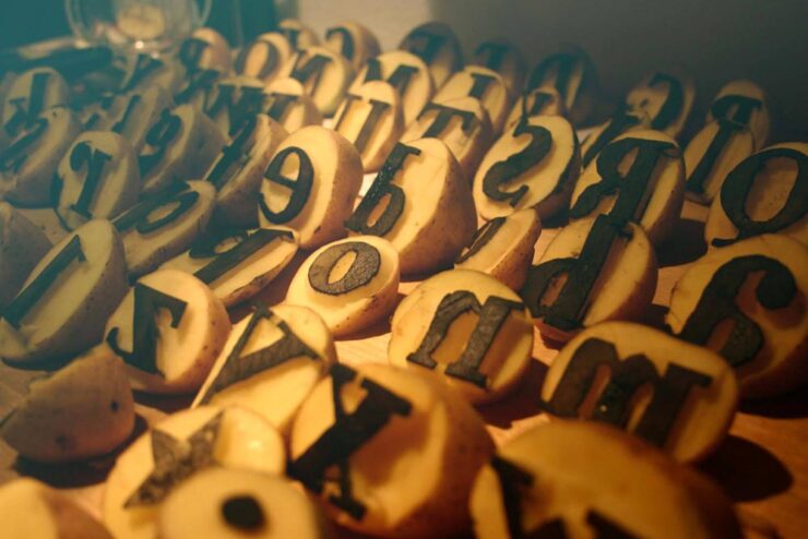
    HVD Bodedo
    Hand cut, not fried.

    No, your eyes are not deceiving you: those are potatoes, carefully carved in the service of Bodoni. Mostly. But it’s got tasty ink content — and is free. Check it out. (Via Kottke.)

    Special bonus #4: ChatGPT can now think … about type, traditionally one of AI’s weak points:

    Generated. (“Create everything at once,” Open AI claims.) We’re all going to be out of a job!
    April’s Photography Round-up
    Artemis II (#1)

    Only a few items this time — but that partially because, at least in my mind, one event more or less dominated photography during April: the Artemis mission.

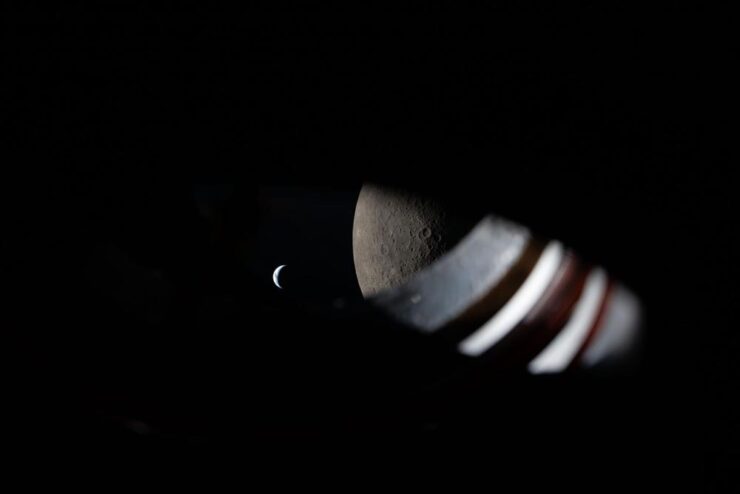
    “Room with a View.” A view from the window of the Orion spacecraft approximately 9 minutes before Earthset during the Artemis II lunar flyby on April 6, 2026. Photograph courtesy of NASA. (No specific astronaut credited.)

    “I like perspective. As much as I enjoy the wide, sweeping shots of our Moon and Earth set against each other (and I do very, very much enjoy those), my favorite photos remind me that there were people there,” Jason Schneider writes at PetaPixel. I couldn’t agree more: the shot above, for instance, is both spare and overwhelmingly expansive. Awesome.

    See also: NASA’s official photo page, the Planetary Society’s favorites, Scientific American‘s twelve favorites, and Space.com’s sweet sixteen.

    Artemis II (#2)
    Artemis II launch. Photograph by Steven Madow.

    How did that image get created — I mean, it’s practically right on the pad? “Photographer Steven Madow has been photographing rocket launches for over a decade, but arguably no rocket launch he has photographed has been as big of a deal. […] Madow set up 14 different Panasonic Lumix cameras to cover the monumental event, including seven remote cameras at the launch site. His outstanding photos are the result of years of practice and planning,” PetaPixelwrites.

    For Artemis II, Madow partnered with Space Explored, a website dedicated to sharing all the inspiring stories surrounding spaceflight and exploration. Read the whole story.

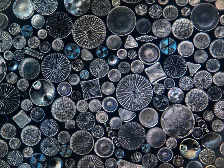
    Patterns: the book
    “Big Diatom Stack, Edit 2.” Photograph by Jon McCormack.

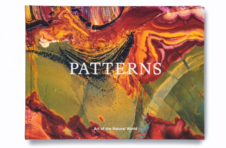
    “In the words of Georgia O’Keefe, to see takes time,” says photographer Jon McCormack. His new monograph, “Patterns: Art of the Natural World,” is a “beautiful visual love letter to nature and all its intricate patterns, from microscopic and rarely-seen to vast and majestic,” writes PetaPixel. 

    Patterns cover.

    McCormack’s photographic journey, which started with a hand-me-down film camera in the rugged, rural Australian Outback and has taken him all over the world to — get this — the iPhone camera software lead at Apple. (The man has a clue, ladies and gentlemen.)

    The book is something after my own heart. Read the entire piece. (You can also see the book at This is Colossal.)

    Hans Hansen’s explosions
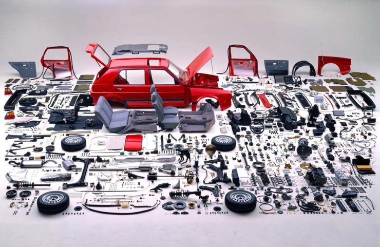
    1988 Volkswagen advertisement. Photograph by Hans Hansen.

    …aren’t quite what you might expect — but might be something you remember, like the above VW spot from the ’80s (which triggered a memory of the awe experience upon first seeing that collection of, well, parts).

    “Hans Hansen is not necessarily well known to anyone but the most studious of photographic historians. Throughout a long career, the self-taught German photographer has quietly carved a niche as a master of still life and commercial image-making. His work explores colour and composition, as well as drawing lessons from modern artistic movements, resulting in some of the most striking and memorable product images of the 1970s, 1980s and beyond,” Wallpaper*writes. 

    See more great examples.

    Finally: X-ray *this*
    X-Ray Microbus. (Don’t ask how.) Photograph by Nick Veasey.

    Over at The Autopian, Jason Torchinsky writes: “Seriously! Full-scale X-rays! Of cars! Using five X-ray machines and/or a massive German-sourced X-ray machine, in a studio that features 30-inch-thick walls, British artist Nick Veasey took X-ray images of so many cars, and they’re stunning.”

    Have a great rest of your Spring, everyone!

    • 1
      Entrants had to have no more than one year of paid creative experience, and 60% of those on this year’s shortlist were students. ↩︎
  • Beautifully Briefed 25.12: Old and New

    Beautifully Briefed 25.12: Old and New

    To close out 2025, a bunch of disparate items for your edification and enjoyment: the usual categories plus some stuff imported from left-field. Get caffeinated, get comfy, and let’s get to it.

    Please note that the photography trip planned for mid-December had to be cancelled at the last minute — circumstances beyond my control — and hasn’t yet been rescheduled. Apologies.

    December’s Spine
    Stanford University Press. Cover design by Jan Šabach; art director, Michele Wetherbee.

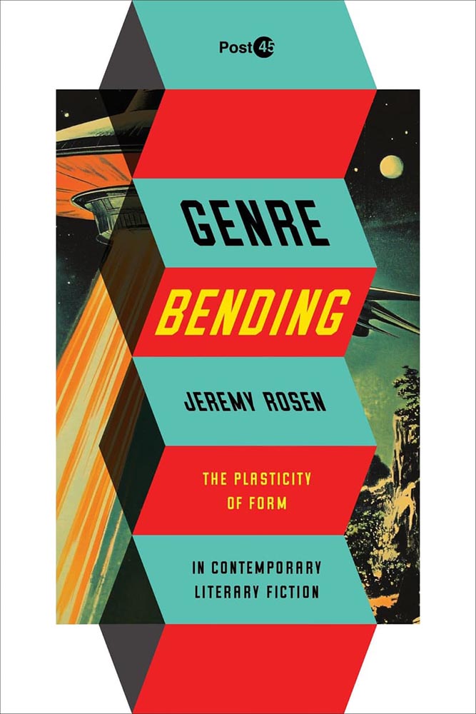
    Fourteen great University Press book covers in December’s column, including the genre-bending example above. Check it out.

    December 25th: designer holiday cards
    Charles and Ray Eames, 1940s. (Image credit: © 2025 Eames Office, LLC. All rights reserved. Via Wallpaper*.)

    “Long live the Christmas card — a ritual that feels increasingly endangered in our digital age. The simple act of putting pen to paper and sending wishes inked in black or blue is, in a word of instant messages, profoundly gratifying,” Wallpaper* writes. “In celebrating this venerable tradition, we found ourselves asking: what sort of Christmas card does an architect send?”

    January 1st: Public Domain Day
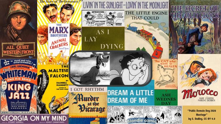
    Image courtesy of the Center for the Study of the Public Domain, Duke Law.

    On January 1, 2026, thousands of copyrighted works from 1930 enter the US public domain, along with sound recordings from 1925. They will be free for all to copy, share, and build upon. The literary highlights range from William Faulkner’s As I Lay Dying to Agatha Christie’s The Murder at the Vicarage and the first four Nancy Drew novels. From cartoons and comic strips, the characters Betty Boop, Pluto (originally named Rover), and Blondie and Dagwood made their first appearances. Films from the year featured Marlene Dietrich, Greta Garbo, the Marx Brothers, and John Wayne in his first leading role. Among the public domain compositions are I Got Rhythm, Georgia on My Mind, and Dream a Little Dream of Me. We are also celebrating paintings from Piet Mondrian and Paul Klee. [In this post] you can find lists of some of the most notable books, characters, comics, and cartoons, films, songs, sound recordings, and art entering the public domain. After each of them, we have provided an analysis of their significance.

    — Jennifer Jenkins and James Boyle, Duke Law

    The annual list is, in every manner of speaking, a gift to society. (Via Pluralistic.)

    Has judging a book by its cover gone too far?
    Cover design by David Pearson.

    Excellent question from It’s Nice That, discussed in a post with book designers Na Kim and David Pearson. Book covers these days are driven by trends that are all-too-fleeting — what does that mean for what’s contained within? Is “salability” all that matters?

    Perhaps the question should be, “Where are we as a society, and is this it, in microcosm?”

    Special Bonus #1: 100 Notable Small Press Books of 2025, from LitHub:

    A reminder that press size and cover quality do not necessarily correlate — as noted in the above item, small presses might be willing to bend the “rules” more readily than the big players.

    “Our guiding principles were ‘read a lot, recommend a few’ and ‘seek out a diverse array of authors and publishers,’” they write. “We were especially interested in BIPOC and LGBTQ authors and publishers, who have an even steeper climb to mainstream recognition.” Enjoy.

    Special Bonus #2: Bar codes as design objects:

    This short piece from type foundry Pangram Pangram includes several book covers.

    CreativeBoom: six surprising illustration trends for 2026
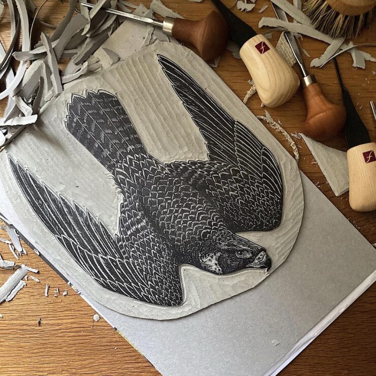
    A linocut by Emily Robertson.

    Contrary to popular belief, illustration — like photography — is not on its deathbed. Despite the temptation for some companies (or budgets) to reach for generative AI, the consensus is that in order to stand out, bringing something unique to the table will be worth the effort. CreativeBoom talked to seven illustration agencies to get an idea what will work in 2026.

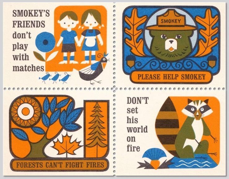
    Special Bonus #3: A repository of mid-20th-century illustration, for research or just enjoyment: “Illustrator Zara Picken has an incredible searchable archive of mid-century modern illustration from c.1950-1975. It’s a goldmine of graphic, type, color, and texture inspiration.”

    Smokey the Bear stamps from 1967.

    Zara’s illustrations are in a cut-paper style and awesome; link via SimpleBits Studio Notes #60. (The entire series of Notebook entries is cool when you have a few extra minutes.)

    Creative Review‘s movie posters of 2025
    Poster by Empire Design.

    Begonia was mentioned in October. A couple are by Empire Design, including the above — which is a master class in nested photographs. (“Claustrophobic,” CR says.) Great stuff.

    Typefaces, pt. 1: notes for December
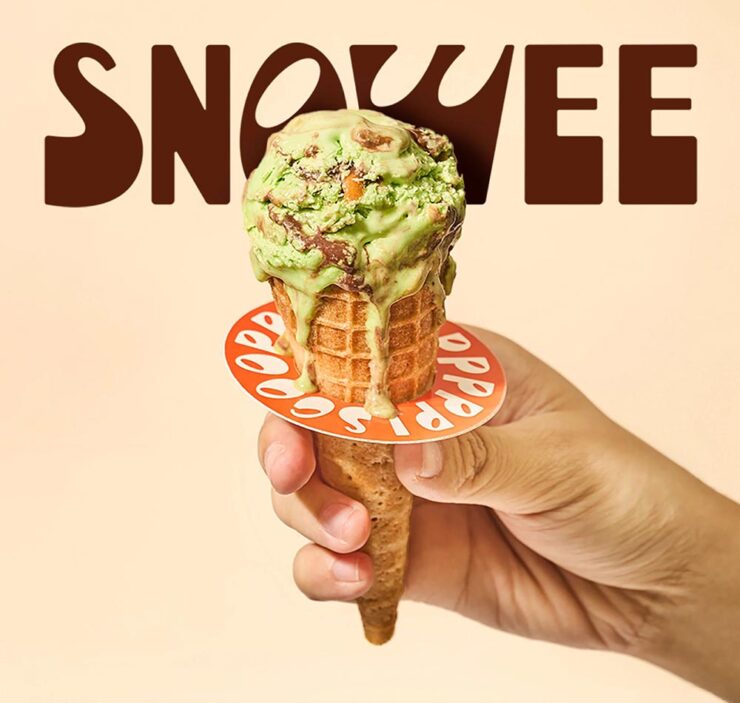
    Snowee

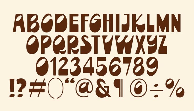
    CreativeBoom‘s new font post for December includes Snowee, which is far and away my favorite: interesting, characterful (heh), and just fun — something lacking amongst the sea of Helvetica wannabes.

    It’s caps-only and not great at small sizes, but given a headline or poster or … whatever, it could be a pleasant, different choice. (I love that the O looks like an olive.)

    LEGO’s letterforms

    Meanwhile, LEGO features in a new project called “A2Z,” an international effort to create letterforms highlighting strength found in limited systems:

    LEGO “offered an ideal blend of fixed constraints and room for playful exploration. Each brick’s scale and form could not be altered, but the grid’s size could be individually defined,” This is Colossal writes of this hand-printed awesomeness.

    Gotham

    From Tobias Frere-Jones, the story of how Gotham came to be:

    Tobias Frere-Jones‘ inspiration for Gotham.

    “In 2021, Monotype bought Hoefler & Co, and with it several families that I designed. As these families are now further removed from their origin, I want to ensure that their stories are accurately recorded,” Frere-Jones says. (Part of a series, in fact.)

    The Garamonds

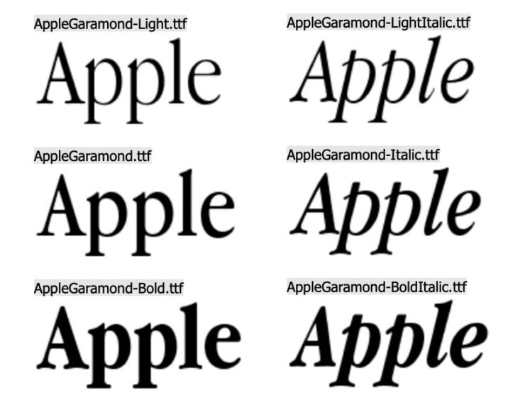
    Lastly (for now), John Gruber’s Daring Fireball is among many who point out that condensed serifs are back in vogue, including — naturally, given the source — Apple Garamond:

    It’s TrueType, but now open source.

    Gruber also reminds us that Apple’s gone through more processor types than typefaces.

    Special Bonus #4: Gruber also has a quick item linking to a brilliant essay arguing that not all Garamonds are created equal — ITC’s version, especially. (Which Apple Garamond was based on, interestingly.)

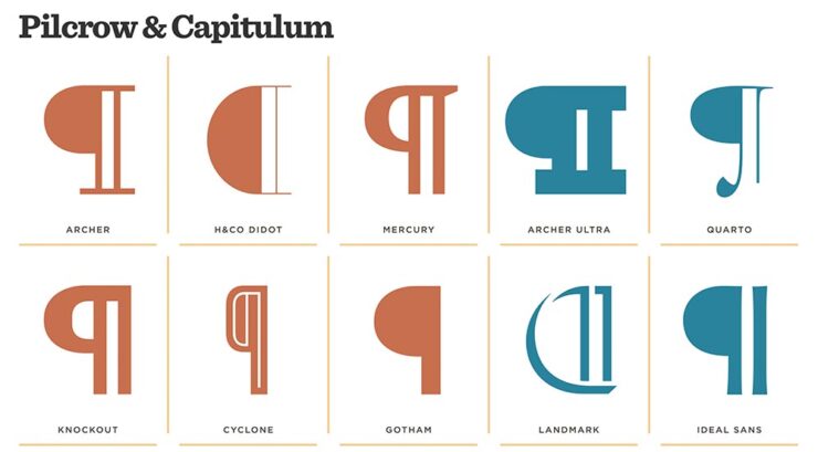
    Special Bonus #5: Who doesn’t love a Pilcrow?

    Hoefler & Co’s brief item is worth it for the varied examples alone.
    Fonts, pt. 2: the Calibri flame-out

    Let’s face it: type rarely generates headlines. But these aren’t “normal” times. Headlines were definitely made when the US State Department decided that its house style rules ditch Calibri, a font chosen to be more readable — more inclusive — and revert to Times New Roman. Because … tradition? Politics? Readability?

    Let’s stipulate for the moment that the memo’s drafters saw choices as limited to the defaults available in Microsoft Word. (Because … you saw that coming.)

    John Gruber was all over it, and argued thus:

    While neither is a good choice, between the two, Times New Roman is clearly better. […] I just think it’s stupid for an institution with the resources of the U.S. State Department to shrug its shoulders at the notion that they should license and install whatever fonts they want on all of their computers. Anyone making excuses that they “can’t” do that should be fired. […]

    Calibri does convey a sense of casualness — and more so, modernity — that is not appropriate for the U.S. State Department. And I do not buy the argument that Calibri is somehow more accessible for those with low vision or reading disabilities. People with actual accessibility needs should be catered to, but they need more than a sans serif typeface, and their needs should not primarily motivate the choice for the default typeface.

    — John Gruber, Daring Fireball

    But he didn’t stop there. He somehow got his hands on the complete memo written by Secretary of State Rubio, and it’s … surprisingly sober. Gruber comments:

    It drives me nuts when news sites in possession of a statement or original document do not make the full original text available, even if only in a link at the bottom, and choose only to quote short excerpts.

    With regard to today’s news regarding Marco Rubio’s directive re-establishing Times New Roman as the default font for U.S. State Department documents (rescinding the Biden administration’s 2023 change to Calibri), I very much wanted to read the original.
    The New York Times broke the news, stated that they had obtained the memo, and quoted phrases and words from it, but they did not provide a copy of the original. 

    The State Department has not made this document publicly available, and to my knowledge, no one else has published it. I have obtained a copy from a source, and have made it available here in plain text format. The only change I’ve made is to replace non-breaking spaces (U+00A0) with regular spaces.

    Please do read it yourself, and do so with an open mind.

    It seems clear to me that
    The New York Times did Rubio dirty in their characterization of the directive. The Times story, credited to reporters Michael Crowley and Hamed Aleaziz, ran under the headline “At State Dept., a Typeface Falls Victim in the War Against Woke.”

    — John Gruber, Daring Fireball

    Engagement sells?

    Wallpaper*, a UK publication I generally enjoy (and cite elsewhere in this post), is one of many examples where a chosen narrative framed the piece. However, they did one thing to help: they introduced us to Calibri’s designer:

    Lucas de Groot, font designer.

    His comments, directly quoted (from HackerNews — sorry — but also via DF):

    The decision to abandon Calibri on the grounds of it being a so-called “wasteful diversity font” is both amusing and regrettable. Calibri was specifically designed to enhance readability on modern computer screens and was selected by Microsoft in 2007 to replace Times New Roman as the default font in the Office suite. There were sound reasons for moving away from Times: Calibri performs exceptionally well at small sizes and on standard office monitors, whereas serif fonts like Times New Roman tend to appear more distorted. While serif fonts are well-suited to high-resolution displays, such as those found on modern smartphones, on typical office screens the serifs introduce unnecessary visual noise and can be particularly problematic for users with impaired vision, such as older adults.

    Professional typography can be achieved with both serif and sans-serif fonts. However, Times New Roman—a typeface older than the current president—presents unique challenges. Originally crafted in Great Britain for newspaper printing, Times was optimised for paper, with each letterform meticulously cut and tested for specific sizes. In the digital era, larger size drawings were repurposed as models, resulting in a typeface that appears too thin and sharp when printed at high quality.

    Serif fonts are often perceived as more traditional, but they are also more demanding to use effectively. While a skilled typographer can, in theory, produce excellent results with Times, using it in its default digital form is not considered professional practice.

    — Lucan de Groot, LucasFonts

    I don’t know whether there’s much needed beyond that takedown. Okay, maybe this:

    [Y]ou can still make good typography with system fonts. But choose wisely. And never choose Times New Roman or Arial, as those fonts are favored only by the apathetic and sloppy. Not by typographers. Not by you.

    — Matthew Butterick, “Typography in Ten Minutes”

    In case all you encountered were the headlines, now you know there was more to the story.

    See also: The Scourge of Arial, A Brief History of Times New Roman, and Typefaces for Dyslexia, all from Daring Fireball, and The Guardian‘s fun Calibri: Is this Really the World’s Wokest Font?

    While I’m at it: word of the year
    Getty stock image, made awesome with brown.

    Merriam-Webster announced that “slop” is its 2025 Word of the Year, reflecting how the term has become shorthand for the flood of low-quality AI-generated content that has spread across social media, search results, and the web at large. The dictionary defines slop as “digital content of low quality that is produced usually in quantity by means of artificial intelligence.”

    “It’s such an illustrative word,” Merriam-Webster President Greg Barlow told The Associated Press. “It’s part of a transformative technology, AI, and it’s something that people have found fascinating, annoying, and a little bit ridiculous.”

    To select its Word of the Year, Merriam-Webster’s editors review data on which words rose in search volume and usage, then reach consensus on which term best captures the year.

    — Benj Edwards, Ars Technica

    I’d like to suggest an alternative: “brown.”

    Brown is the color you don’t want to be in the U.S. right now, lest you face legalized discrimination, illegal arrest — or worse. Brown is the color of the FUD the “Health Department” employs to prevent use of lifesaving treatments and vaccines. Brown is the substance, or lack thereof, the United States exports worldwide in the place of aid, education, fairness, or leadership. Brown is the color of the ink the Supreme Court uses to write opinions stripping people of their rights. Brown is the color of the flag a supine Congress continues to wave, surrendering its authority. Brown is the color of everything that comes from the stool-sample spectacular otherwise known as the U.S. Executive. And, of course, brown is today’s engagement-driven social media, a fecosystem of algorithms and AI built to exploit people for profit.

    Red Scare? Been there, done that. Welcome to the new.

    The Brown Scare.

    [/soapbox]

    Briefly: Jaguar

    On multiple occasions, I predicted that JLR might actually succeed at making something interesting out of Jaguar — in the face of, well, the Internet. They’re still working on it:

    The actual new Jaguar previewed by the Type 00 concept.

    Alas, the world has changed around them; EVs are no longer what they were, and basing a new, ultra-high-end product line exclusively around an EV platform might not work out quite the way they’d hoped.

    “Are we seeing the back of Jaguar?” Wallpaper* asks.

    Frankly, the pullback from EVs is beyond stupid — ask anyone who owns one — but then, “stupid” is something to be proud of these days. (I know: soapbox. Sorry.)

    What’s important regarding Jaguar at this moment in time is, supposedly, the company has pulled so far back that it fired its chief designer, Gerry McGovern.

    Or not. There are questions.

    Professor Gerry McGovern, OBE, in 2021.

    “It’s long been rumoured that McGovern was personally liked by Ratan Tata, who ran JRL’s parent company,” The Drive quotes. “Mr. Tata passed away last year, leaving Autocar India to speculate that ‘key support’ for Mr. McGovern may have waned in the corporate titan’s absence.”

    That was on December 2nd. On the 15th, rumors started circulating that the news stories weren’t correct: Jaguar has reportedly stated it’s “untrue” that McGovern was “terminated.”

    Time will tell.

    Special Bonus #6: How ’bout a mash-up? Cars and type: Volvo has a new corporate font, Centum, designed “with safety in mind.” (Naturally.) Dezeen has the story.

    December’s photography round-up
    A royal competition
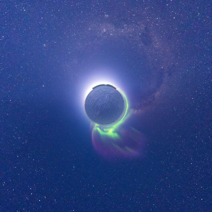
    Runner-up, “Between Auroras and Dawn — A South Pole Sunrise After the Longest Night on Earth.” Photograph by Aman Chokshi.

    See the winners of the Royal Society Publishing Photography Competition 2025, ten images that showcase “the best scientific photography worldwide across multiple categories, celebrating the overlap between compelling art and influential science.” (Via PetaPixel.)

    Nature’s best science photos of 2025
    “Rings of Fire,” lenticular clouds, Villarrica volcano, Chile. Photography by Francisco Negroni.

    Nature’s annual picks for favorite science photography reflect a diverse range that’s always worth checking out. While it includes the skydiving image covered briefly last month without appropriate comment, the others delight (especially the sloth). Props, too, for the excellent web design on show here.

    International Landscape Photographer of the Year 2025

    Three examples among the twenty winning — and astonishing and inspiring — images:

    “Morning in Dolomites,” Italy. Photography by Martin Morávek.
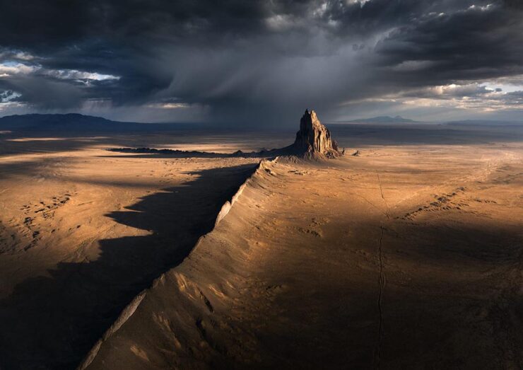
    “Shiprock,” New Mexico. Photograph by Karol Nienartowicz.
    “Starry Night.” Photograph by Joyce Bealer.

    The rules of the competition state that all images must be taken by the photographer and AI-generated images of any kind are prohibited. Photographers are required to edit the images themselves as the competition “consider[s] this part of the art of landscape photography.” Nice.

    The competition’s website is unfortunately offline as of this writing (Dec 31st), but see more at PetaPixel or This is Colossal.

    Northern Lights Photographer of the Year 2025
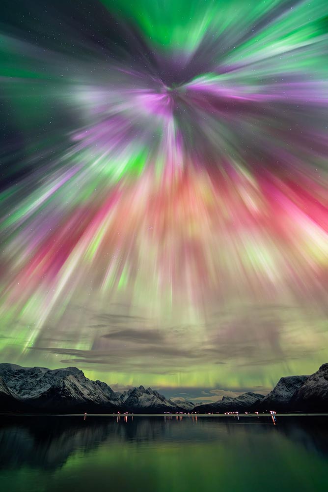
    “Arctic Rain,” Tromso, Norway. Photograph by Vincent Beudez.

    “Capture the Atlas has unveiled the winners of its eighth annual Northern Lights Photographer of the Year contest, and the 15 award-winning photos […] are as beautiful as they are inspiring,” PetaPixel writes.

    I remember lying on my back on the rocks by the Maine beach where I grew up, watching with wonder at the natural display. It’s a pleasure to revisit, however vicariously.

    Otherworldly forest photos
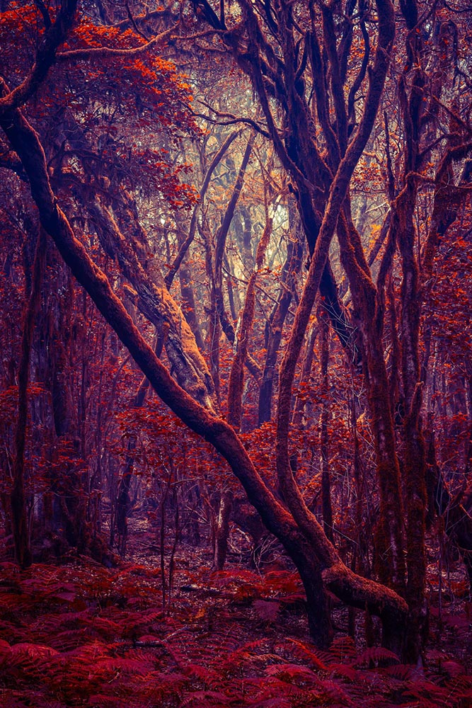
    Photograph by Michelle Blancke.
    Photograph by Michelle Blancke.

    “‘I’ve always been fascinated by the idea that our perceived reality is shaped by our minds and reflecting our inner world,’ says artist Michelle Blancke, whose ethereal photographs of trees, glens, and foliage invite us into a familiar yet uncanny world,” writes This is Colossal. Great stuff.

    Nikon Comedy Wildlife Awards 2025
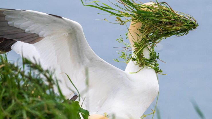
    “Now Which Direction Is My Nest,” United Kingdom. Photograph by Alison Tuck.

    Have yourself a smile.

    The “AI-inside” camera

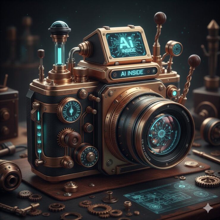
    At MacFilos, Andrew has a new piece of kit — an “unexpected trade deal benefit” — that’s capable of making all his images everything he’s ever dreamed of:

    AI image generated by Andrew Owen-Price.

    “May we all remain capable of laughing and smiling through these turbulent times,” he writes. Yes, please!

    Wishing you a safe and happy New Year.

  • Beautifully Briefed, Early March 2022: Monograph Impresses, Monotype Trends, and Media Waste

    Beautifully Briefed, Early March 2022: Monograph Impresses, Monotype Trends, and Media Waste

    Three diverse items in this round-up, from illustration to typography to whether or not ad-blockers are actually environmentally-friendly — along with a response that reminds us to look at the bigger picture.

    Malika Favre (Expanded Edition)

    CreativeBoom:

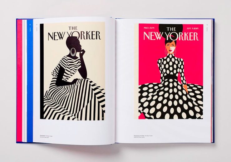
    French illustrator and graphic designer Malika Favre has been impressing audiences for years with her minimalist work for publications such as The New Yorker, Vogue, and Vanity Fair. Now over a decade’s worth of her work has been released in a new monograph from Counter-Print, which contains a suitably stripped-back aesthetic.

    Her style is distinctive; I’ve liked her New Yorker covers especially:

    Malika Favre (Expanded Edition) in English

    The book includes the illustrator’s own cover, and she had a big hand in designing the layout, too. CreativeBoom’s article is excellent — check it out.

    Monotype’s 2022 Trends

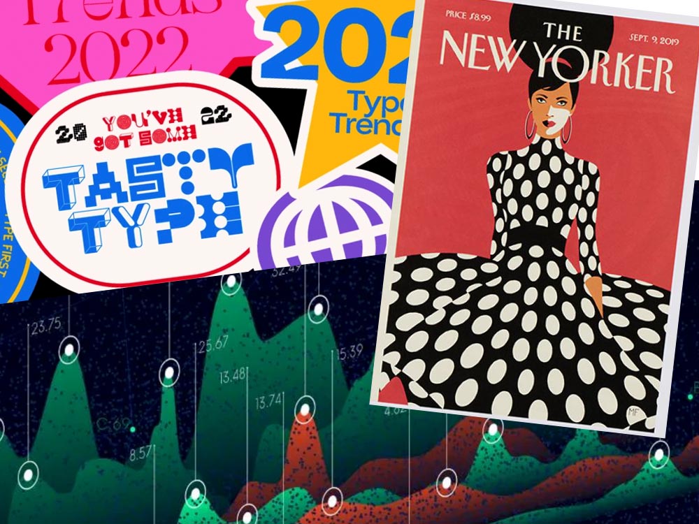
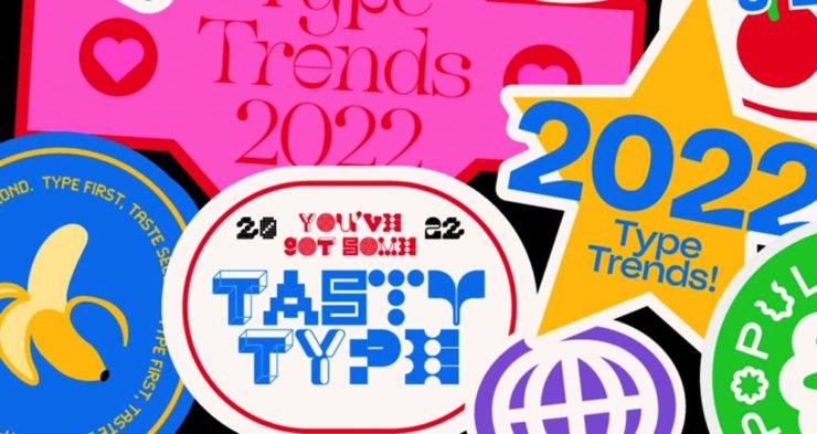
    It’s Nice That points us to the recently-released 2022 Type Trends Report from Monotype:

    Monotype’s 2022 Type Trends Report cover

    Throughout yet another “unprecedented year,” it’s safe to say that the macro trends influencing the type design community are nearly too long to list. Several socioeconomic, political, and cultural events continue to shape the way we approach creative work and how connect to each other online and offline.

    Biodiversity’s relationship to type, varying type styles in a single logo, and thin serifs — the one I’m likely to use somewhere — are in this year.

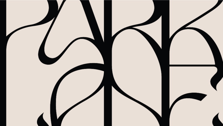
    New York’s Park Lane Hotel

    The above example, from New York’s Park Lane Hotel, is but one they cite (see that whole, very lovely project at Brand New). Check out the whole report, and get trendy.

    Perhaps we can convince Apple to go back to its also-lovely Garamond…?

    Media, Trackers, Blockers, and the Environment: There’s a Problem

    Did it ever occur that using an ad blocker in your browser is actually an environmentally-friendly move? No, I hadn’t put it together, either.1More from MIT on ecological impacts of cloud computing here.

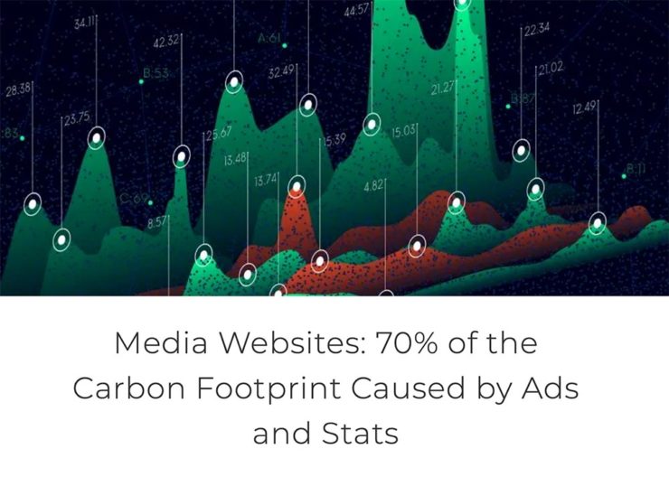
    70% junk. Surprise and shock (not really).

    [U]p to 70% of the electricity consumption (and therefore carbon emissions) caused by visiting a French media site is triggered by advertisements and stats. Therefore, using an ad blocker even becomes an ecological gesture. But we also suggest actions web editors could take to reduce this impact.

    An interesting study, certainly, with information that many of us already use and some suggestions for action in case we don’t. But…:

    Another of Monotype’s 2022 Type Trends, appropriated for use here

    Nick Heer:

    I have qualms with this. The idea of a “carbon footprint” was invented by British Petroleum to direct focus away from environmental policies that would impact its business, instead blaming individuals for not recycling correctly or biking to work more. A “carbon footprint” is also a simplistic view of how anything contributes to global warming, and that it seems to be used here as a synonym for bandwidth and CPU consumption.

    I’m not sure whether I’ve called out the excellent Pixel Envy2A sort-of Daring Fireball with Canadian roots, but this is an example of why I should.

    That is where I think this well-intentioned study falters. Even so, it is absurd that up to 70% of a media website’s CPU and bandwidth consumption is dedicated to web bullshit. Remember: the whole point of web bullshit is that it is not just the ads, it is about an entire network of self justifying privacy hostile infrastructure constructed around them.

  • Beautifully Briefed, Late February 2022: Photography, Font, and Furniture

    Beautifully Briefed, Late February 2022: Photography, Font, and Furniture

    A three-fer as we wind through this February: Peter Stewart, a really talented architecture photographer from Australia; VAG Rounded, Apple’s keyboard font and how it relates to Volkswagen; and a new site called The Apple Store Glossary leads to an interesting review of furniture in Apple Stores.

    Peter Stewart

    November’s Beautifully Briefed covered the 2021 Architecture Photography Awards shortlist, and one of the photographers is Peter Stewart, a self-taught Australian who wanders around Asia. Gotta say: he’s better than great.

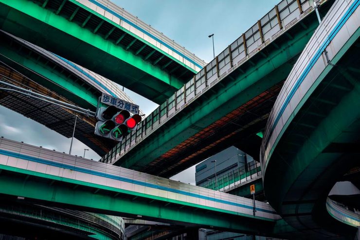
    “Hanshins Web” Osaka, Japan. 2019, by Peter Stewart

    His eye for pattern and color is spot-on:

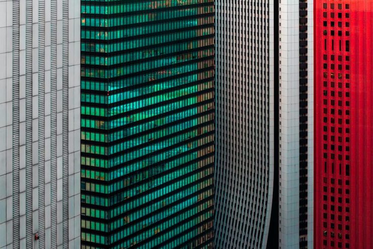
    “Four Columns” Tokyo, Japan. 2019, by Peter Stewart

    Archinect’s In Focus feature has a great 2019 interview that not only discusses the how and where, but also the why — including his thoughts on use of Photoshop and, perhaps most insightfully, how to thrive as a photographer in this crowded age:

    The hardest part of being a photographer today is finding a way to stand out among the crowd. In just the past few years Instagram has changed everything and given rise to a sizable number of highly talented new photographers. We are inherently influenced by the work we see from others, and as such has given rise to a lot of popular trends and styles of photography which has brought about a bit of a copycat culture. The point is, I think it’s important to find your own themes and ideas in order to progress, and not to simply emulate.

    Peter Stewart, Archinect Interview

    Check it out.

    VAG Rounded and Apple

    Daring Fireball is a daily stop for Apple geeks like me, but rarely does it cross into graphic design territory — except when it links to a Jalopnik article discussing how a Volkswagen font wound up on Apple’s keyboards.

    Good stuff. (Bonus ’80s Dasher brochure siting, too.) Enjoy.

    Apple Store’s Boardroom Furniture

    Some Apple Stores have additional, not-usually-open-to-the-public spaces called boardrooms. And, as you might imagine, they’re filled with interesting stuff.

    A new (to me, at least) site called The Apple Store Glossary has information and photographs of all aspects of Apple Stores, from the new Pickup area to the behind-the-scenes Boardrooms.

    The latter started out as something called Briefing Rooms, intended for business customers and special events. However, they’ve evolved: more casual, more comfortable. And more interesting:

    Apple Boardroom (Passeig de Gràcia store, Barcelona, Spain)

    9to5Mac has a great roundup of these rooms we don’t see, from the accessories (bonus Eames Bird sightings) to the books, and perhaps most interestingly, the furniture.

    Grab a seat, get comfortable, and get info.