It has been, and continues to be, a rough time for a nature photographer who makes a living shooting around the world. This kind of time period sometimes makes we artists think about our life missions and convictions, and delve deeper into our beliefs and the way we view our art and what makes it worthwhile. While some people don’t see photography as art, I definitely do, and for that reason I feel that a discussion is needed about what makes photography an art form rather than technical labor.
“Since 1965, the Association of University Presses (AUPresses) Book, Jacket, and Journal Show has fulfilled its mission to “honor and instruct”: honoring the design and production teams whose work furthers a long tradition of excellence in book design […]. The Book, Jacket, and Journal Show recognizes meritorious achievement in design, production, and manufacture of books, jackets, covers, and journals by members of the university press community. It also provides an evaluation of their work and serves as a focus of discussion and a source of ideas for intelligent, creative, and resourceful bookmaking.”
Credit where credit is due: Spine, in their excellent way, has already covered this. Head on over there, knowing that I largely agree with their post in its entirety. However, there are a number of covers I like that they didn’t talk about — and they didn’t talk about interior design at all.
So, without further ado, let’s start with the covers and jackets. Interiors follow, then items that are in both categories.
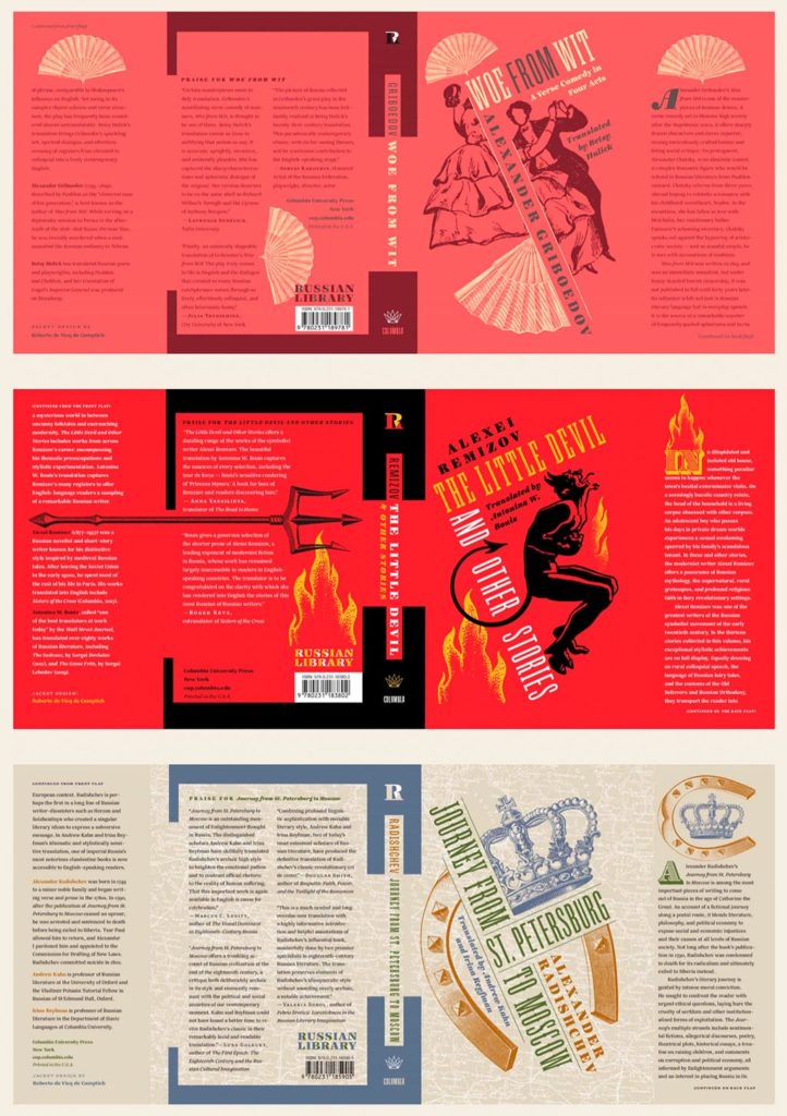
Columbia University Press with a series (in order, top to bottom): Woe from Wit, The Little Devil and Other Stories, and Journey from St. Petersburg to Moscow. Each is great on their own, but put ’em together and the series stands tall. Excellent design by Roberto de Vicq de Cumptich.
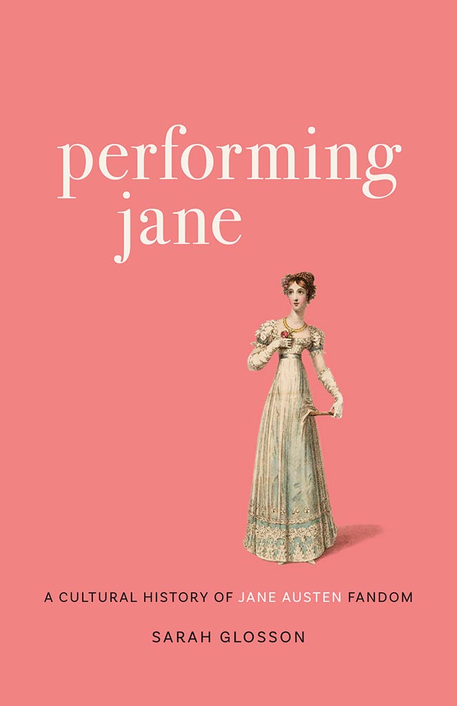
Louisiana State University brings us Performing Jane, with design by Barbara Neely Bourgoyne. Simplicity wins.
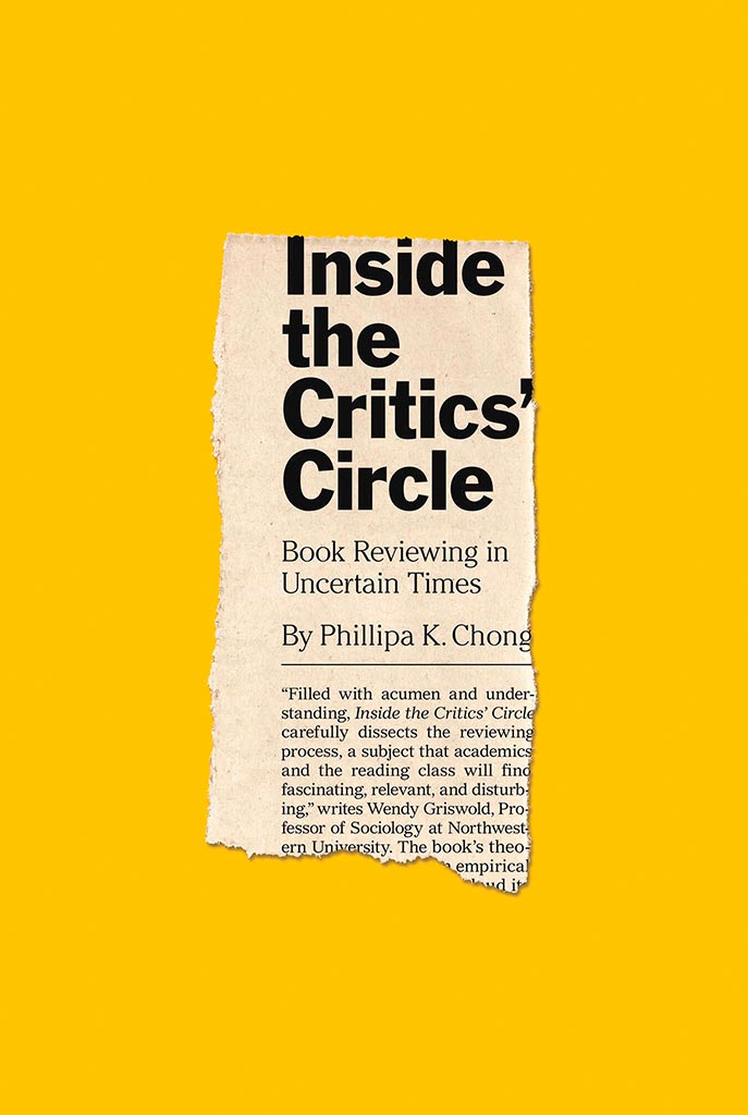
On the subject of simplicity, Inside the Critic’s Circle brings a seemingly-casual-yet-carefully-designed newspaper clipping onto a yellow background. Together, they’re attention-getting and just right. Nice. Design by Chris Ferrante for Princeton University Press.
Vénus Noire is about as far from a bust as can be — except not really:
Another example of simpler-is-better, yet something so much more. Design by Kaelin Chappell Broaddus.
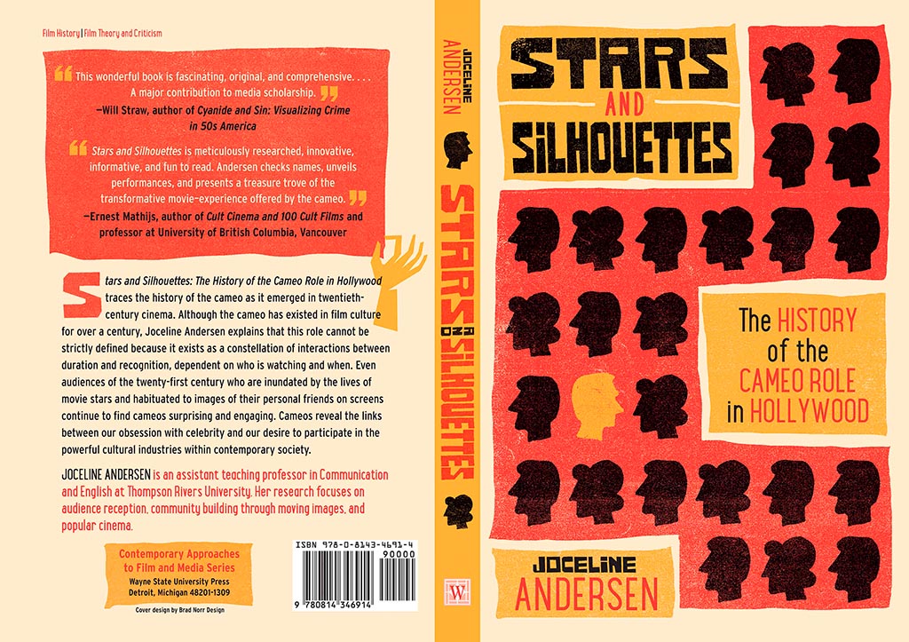
Wayne State University Press brings us Stars and Silhouettes, in all its hand-drawn glory. Love the design by Brad Norr.
My favorite of the stand-alone cover designs, however, contains a wrinkle or two:
Lovely. The illustration and paper photograph combine into something really special. Design by Derek Thornton — whose website, by the way, has a bunch of other great stuff. Nice!
On to some interior design, with Pinceton’s Dante:
Puts “boring academic title [page]” to rest. Design by Chris Ferrante.
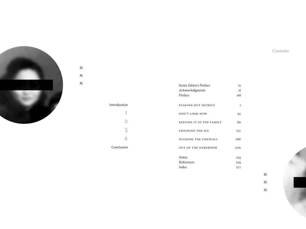
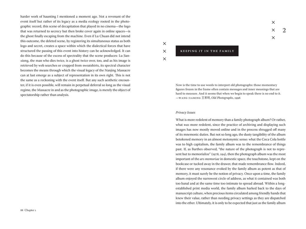
Next, a title on “knowing what not to know in contemporary China”, called Negative Spaces:
Design by Courtney Leigh Richardson for Duke University Press.
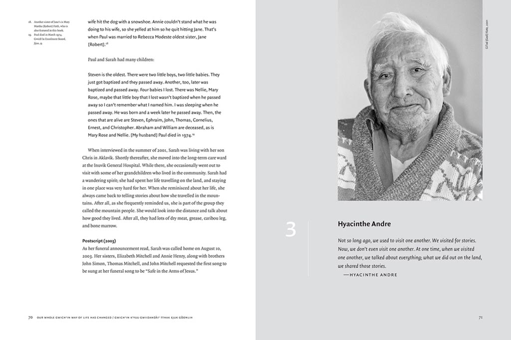
Next, stories from “the people of the land”:
Our Whole Gwich’in Way of Life Has Changed / Gwich’in K’yuu Gwiidandài’ Tthak Ejuk Gòonlih, with design by Alan Brownoff for the University of Alberta Press.
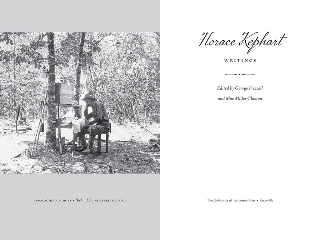
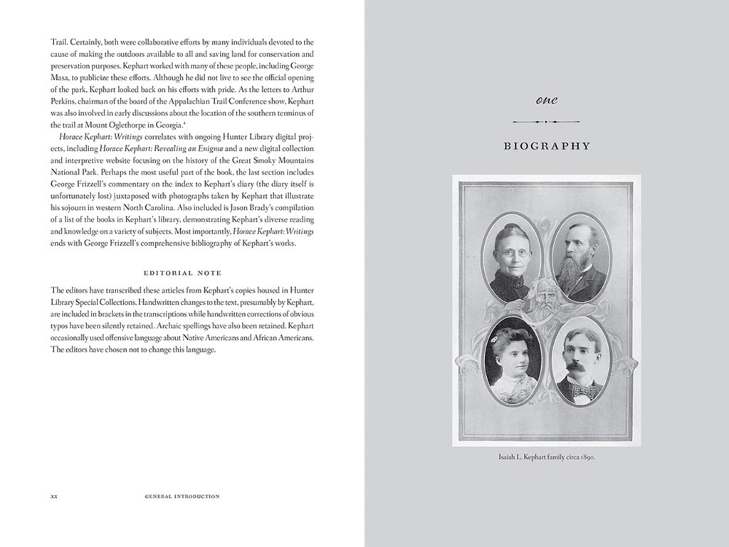
Next, a couple where both the cover and interior excel, starting with Horace Kephart from the University of Tennessee Press:
UTenn Press has a cool logo, too.
Lovely detailing in this design by Mindy Basinger Hill. Only one question here: Why doesn’t the script on the cover match that used inside? Both are nice — I prefer the one used on the cover — but either way, pick one!
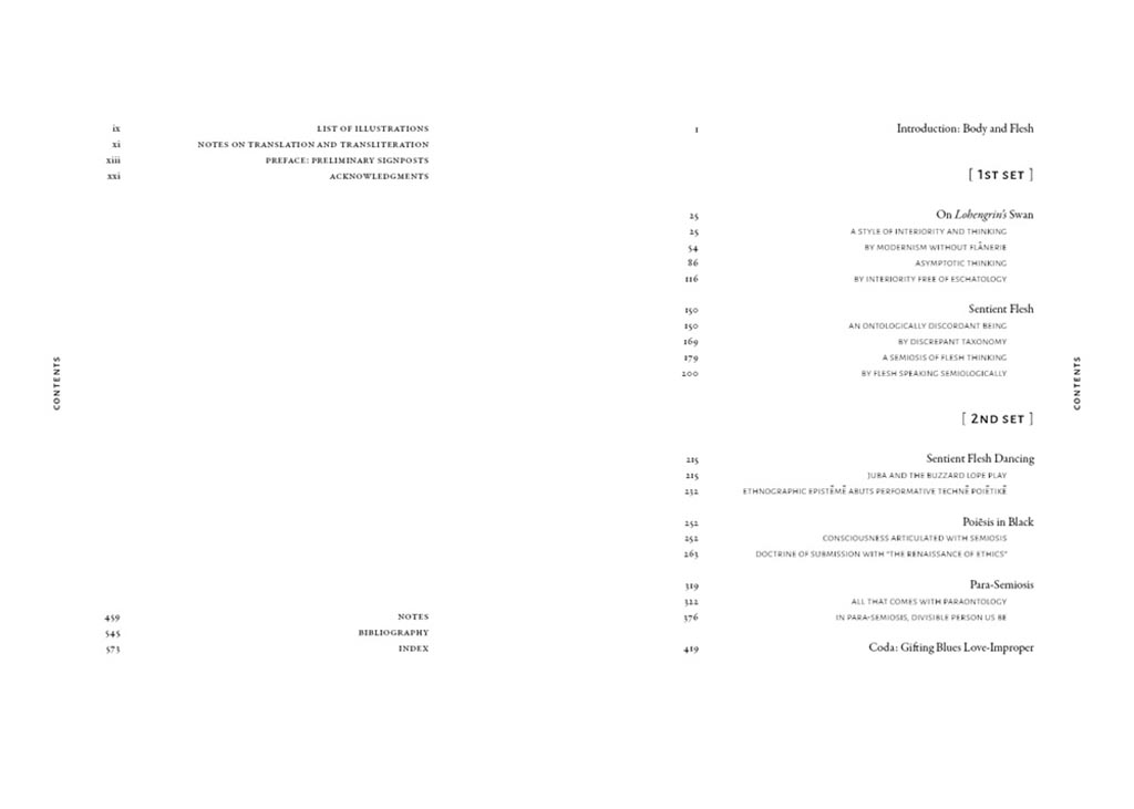
Last but certainly not least, perhaps the best designed of all the projects in the AUPresses 2021 Show, Duke’s Sentient Flesh:
Fantastic. And check the interior:
Kudos to designer Matthew Tauch for a “best in show,” at least as far as I’m concerned!
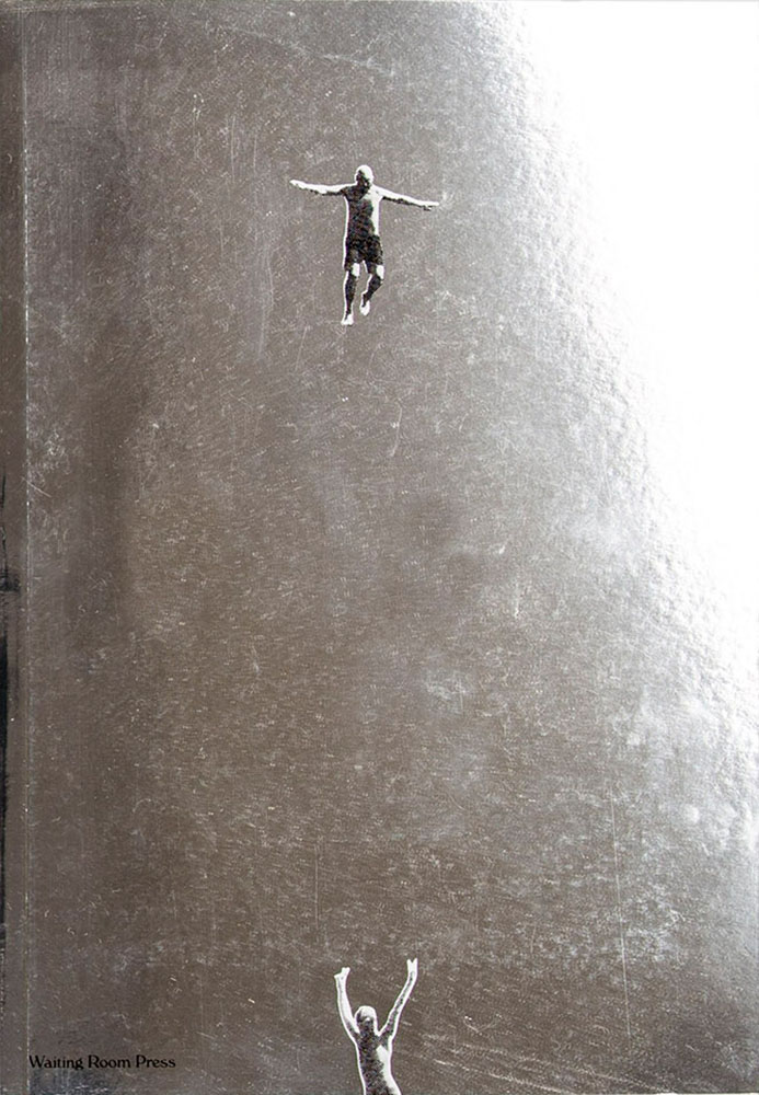
This time-honored competition aims to identify the 50 best-designed books and book covers. With 696 entries from 36 countries, the juror-selections from this year’s 50 Books | 50 Covers of 2020 competition exemplify the best current work from a year marked by unparalleled change.
Picking favorites from this list is always fun, and often includes books and/or covers that I haven’t seen before — especially 2020, when seeing things in person was often … difficult. So without further ado (in no particular order):
The unique destinations of Accidentally Wes Anderson. This 50 Books item catches the eye with the cover and the photographs carry you inside and to places heretofore unknown. Great stuff. Design by Mia Johnson.
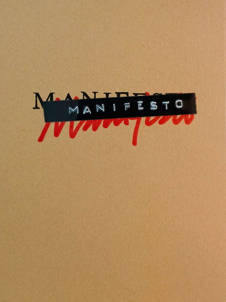
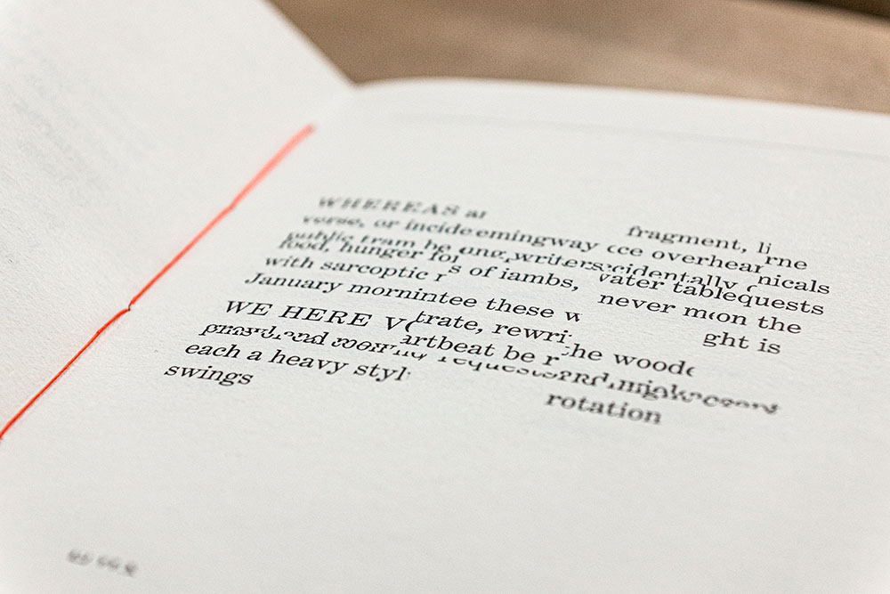
Manifesto is more than meets the eye, even though the cover does an excellent job leading you in. It’s easier to quote the existing description than write one, so: “The opening pages contain an original text employing the sort of bombastic rhetoric traditionally associated with the manifesto genre. The typeset text is then cut up and reassembled, repeating throughout the book, each iteration becoming source material for subsequent cut-ups. The project takes a critical approach to book arts to explore authorship, readership, and the materiality of language.” Yeah:
It’s tiny, too: 4.125 by 6. The design, by Victor Mingovits, is anything but. Well done!
Not Dead of Famous Enough, Yet compiles 10 years of work from a design firm into one place, with this surprisingly modest cover. DR. ME, as the duo of Ryan Doyle & Mark Edwards became known, not only do quality work, they know how to stitch together a quality book — to a point where they picked up a prestigious award. See more.
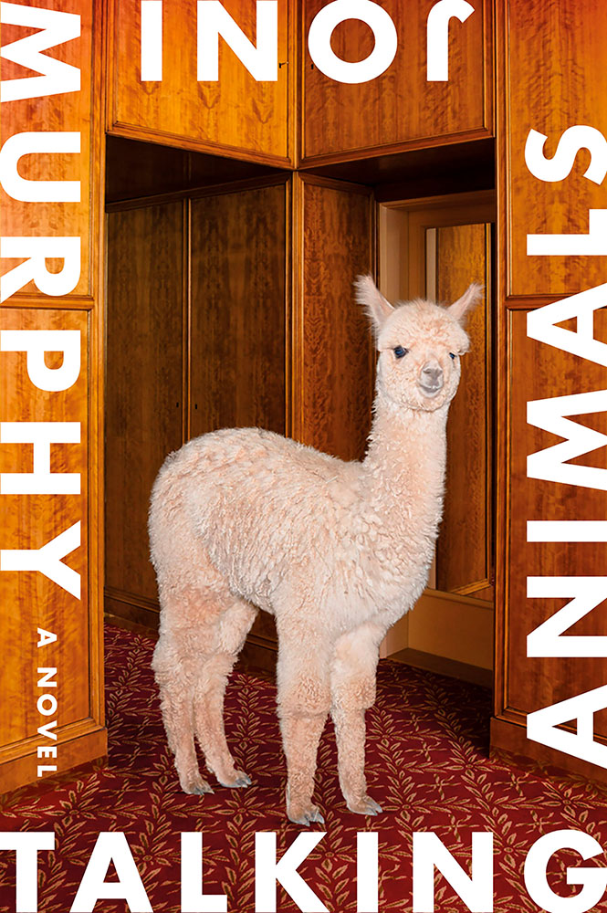
Talking Animals violates one of my usual cover-design rules: it’s not immediately apparent which title word is first. Nonetheless, it’s eye-catching enough to warrant an exception — and a 50 Covers award. Design by Na Kim.
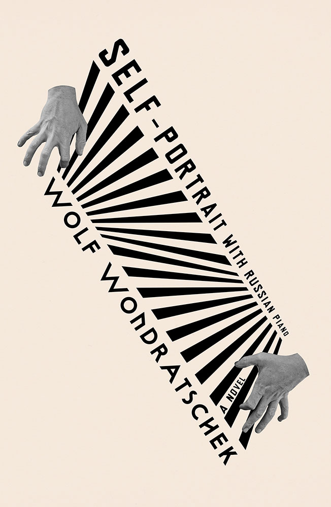
Na Kim makes another appearance with Self Portrait with Russian Piano. Kudos for something that’s equally eye-catching yet about as completely different as humanely possible — talent, defined.
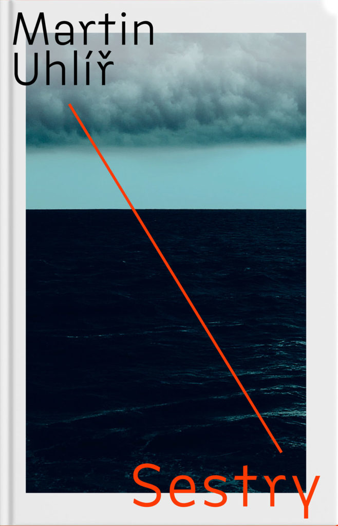
“Eye-catching and mysterious,” says the entry for Sestry. “Oppressive and mysterious,” says the description. Both work — it’s certainly mysterious enough to catch your attention, grab it off the shelf, and investigate further. Design by Jan Šabach.
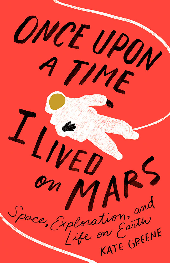
Once Upon a Time, I Lived on Mars: Space Exploration, and Life on Earth is a loooooong title/subtitle combination. It’s something that, as a cover designer, you dread — but Johnathan Bush knocked it out of the park with this hand-lettered illustrated piece that’s 180 degrees from where you’d expect.
The Turn of the Screw is probably my favorite of the whole collection:
Almost simplistic … until you really look at it; the kind that makes you think, “I wish I’d done that.” Fantastic work by Kaitlin Kall.
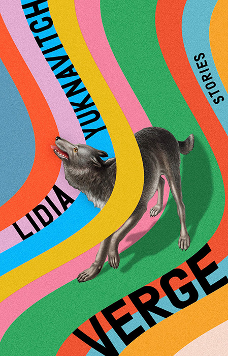
Verge, where unexpected choices lead to great new places here, especially with the yellow band overlaying the wolf. So, so good. Design by Rachel Willey. And:
Zo, which uses illustrations to huge effect — but this time with a huge typography effect to go along with it, and lo, it works. Great design choices by Janet Hansen.
Once again, it’s time for the annual 50 Books, 50 Covers awards!
My favorites: Blackness at MoMA, Specimen Days, 14 books by Gustavo Piqueira • 2012-2018), Jacob Lawrence: The American Struggle, and … not all of them, certainly. Interesting and challenging. Definitely worth checking out!