
Three interesting logo redesigns this month, plus a moment where venti has nothing to do with coffee. Oh, and a airy bonus.
Drobo Declares Bankruptcy
Generally speaking, I’m not one to engage in schadenfreude, aka “enjoying the pain or suffering of another.” (Wiki. Anyone surprised that the Germans have a word for this … but I digress.)

Back in 2011, I lost two Drobos in short order — and with them, the majority of my back files. Project I’d worked on, photographs I’d taken, personal documents, years worth of stuff, just gone.
Drobo, the company, did nothing to help, offering neither solutions nor apologies. I wasn’t alone; forums across the ’net suggested that I should have chosen more carefully.
It turns out they should have, too. Good.
Gloat Read more at DPReview or PopPhoto.
Rolling Stone’s New Logo
To call Rolling Stone‘s place in America culture iconic might be selling it short, and their logo plays a large role in that. In 2018, they flattened it — leading that trend, possibly — and it lost something.
However, this month, it’s back:
“The assignment was a paradox. How could we make the logo look like it did in the past, without making it feel dated? My hope is that loyal readers will believe the old logo is back, but on closer inspection will be surprised to notice how much it has been modernized.”
Jesse Ragan, XYZ Type
The “old logo” he’s referring to is the one that ran from 1981–2018, but there were others, too:
A great study in logo evolution: read more at the Type Network, and lettering specifics from XYZ Type. Awesome. (Hat tip to, as usual, Brand New.)
Aston Martin’s New Logo
On the subject of subtlety, Aston Martin usually isn’t the first thing that comes to mind. Their recent logo redesign, however, falls into that category:
The evolution of their logo emphasizes those small steps:
Not a great amount of information on this one, but the accompanying photographs of the logomark being made are fantastic. See more at The Drive, with more at Brand New.
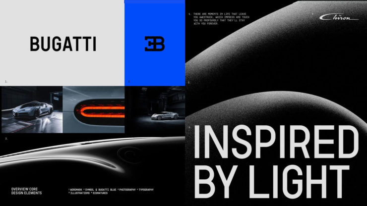
Bugatti’s New Logo
Subtlety and Bugatti rarely — if ever — fit in the same sentence. Aston is stratospheric as far as I’m concerned, so Bugatti would qualify as the antithesis of subtlety. But, but, but: there’s something about one.

They have a new logo and marketing campaign to go with:
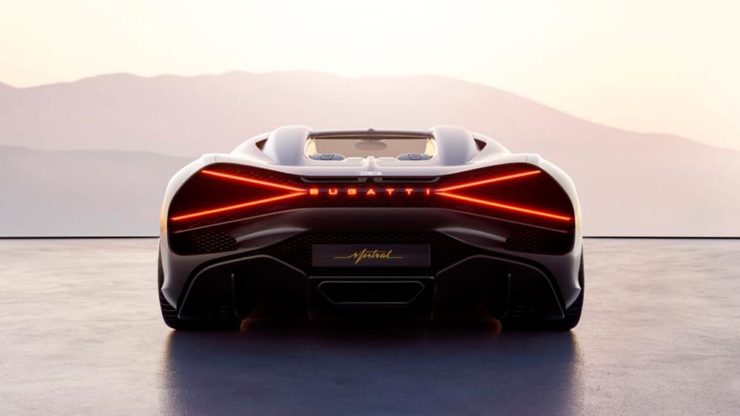
Read up at It’s Nice That. Car and Driver has more information on the Mistral.
Update, 20 Sept., 2022: Brand New weighs in on Bugatti’s updated logo.
Bonus: In the Skies
It’s been a busy August, including having to make a lightning trip through the usually-not-fun Atlanta airport. But there’s always a bright spot at the end of that tunnel: being the little boy again, awed by the simple act of flying.
Better still, the flight was on a 757, the sports car of big planes. Everybody around me had their window shades pulled and noses in their phones, but I was looking out the window:

See you in September!