We don’t get ’em like this in the United States. Oslo, Norway gets the win:

Even the ceilings are noteworthy (also seen below). Check the atrium:

More at ArchDaily.

Photography and design for print production
Book content — more than the book’s design, that is — is the main subject here.

We don’t get ’em like this in the United States. Oslo, Norway gets the win:
Even the ceilings are noteworthy (also seen below). Check the atrium:
More at ArchDaily.
It’s time once again for AIGA’s 50 Books, 50 Covers:
This time-honored competition aims to identify the 50 best-designed books and book covers. With 696 entries from 36 countries, the juror-selections from this year’s 50 Books | 50 Covers of 2020 competition exemplify the best current work from a year marked by unparalleled change.
Picking favorites from this list is always fun, and often includes books and/or covers that I haven’t seen before — especially 2020, when seeing things in person was often … difficult. So without further ado (in no particular order):

The unique destinations of Accidentally Wes Anderson. This 50 Books item catches the eye with the cover and the photographs carry you inside and to places heretofore unknown. Great stuff. Design by Mia Johnson.
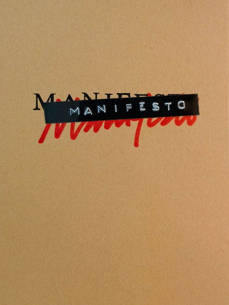
Manifesto is more than meets the eye, even though the cover does an excellent job leading you in. It’s easier to quote the existing description than write one, so: “The opening pages contain an original text employing the sort of bombastic rhetoric traditionally associated with the manifesto genre. The typeset text is then cut up and reassembled, repeating throughout the book, each iteration becoming source material for subsequent cut-ups. The project takes a critical approach to book arts to explore authorship, readership, and the materiality of language.” Yeah:
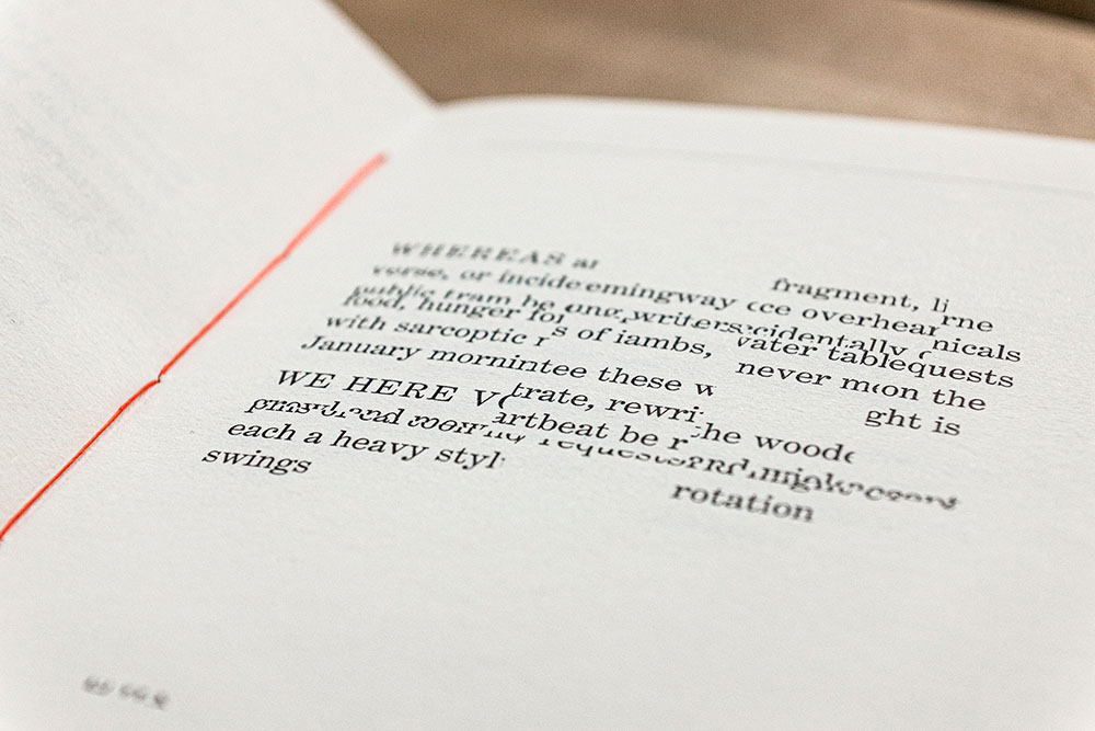
It’s tiny, too: 4.125 by 6. The design, by Victor Mingovits, is anything but. Well done!
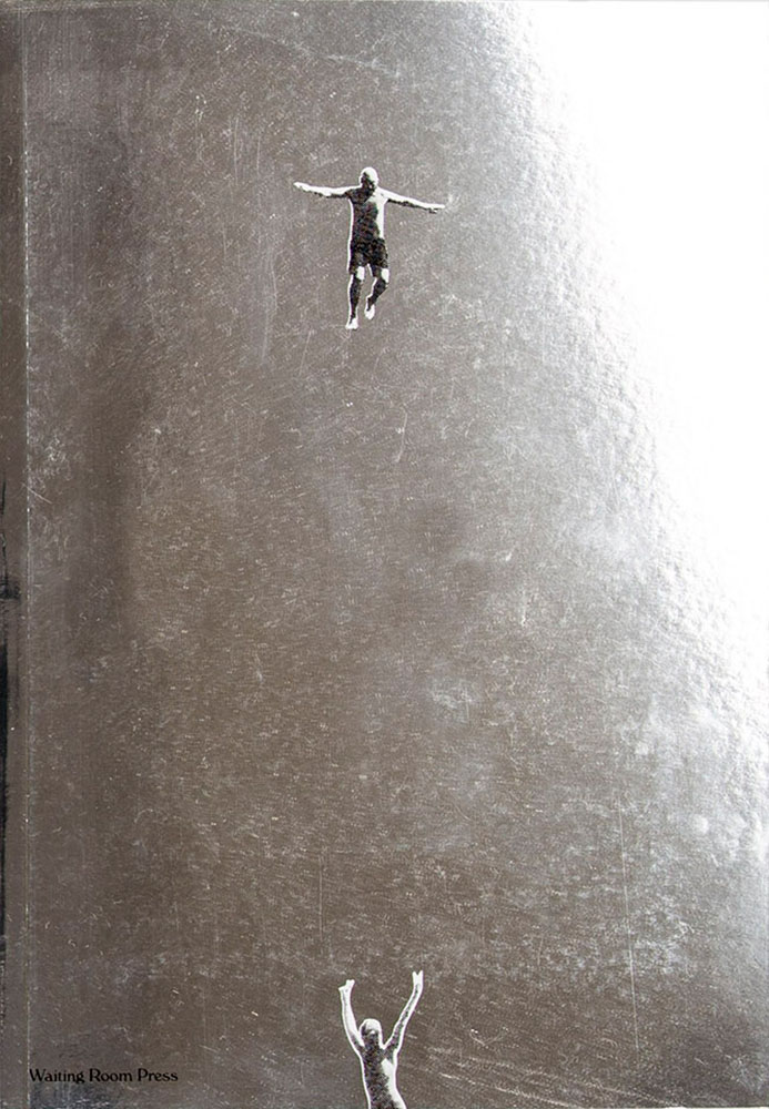
Not Dead of Famous Enough, Yet compiles 10 years of work from a design firm into one place, with this surprisingly modest cover. DR. ME, as the duo of Ryan Doyle & Mark Edwards became known, not only do quality work, they know how to stitch together a quality book — to a point where they picked up a prestigious award. See more.
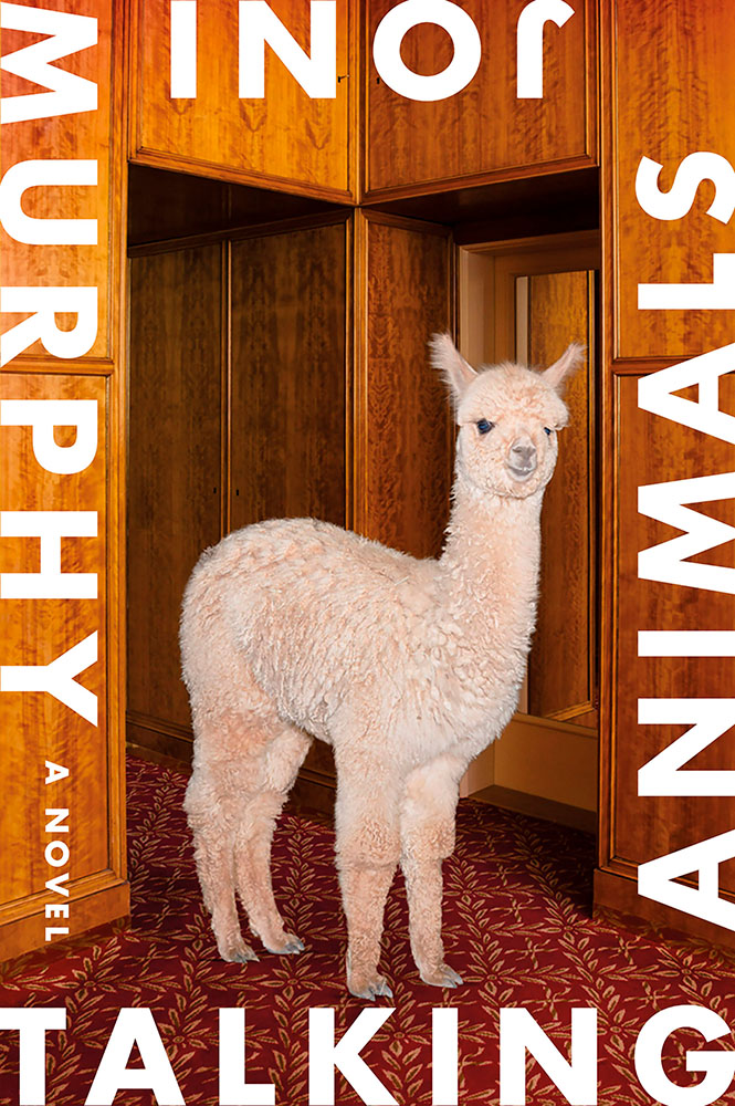
Talking Animals violates one of my usual cover-design rules: it’s not immediately apparent which title word is first. Nonetheless, it’s eye-catching enough to warrant an exception — and a 50 Covers award. Design by Na Kim.
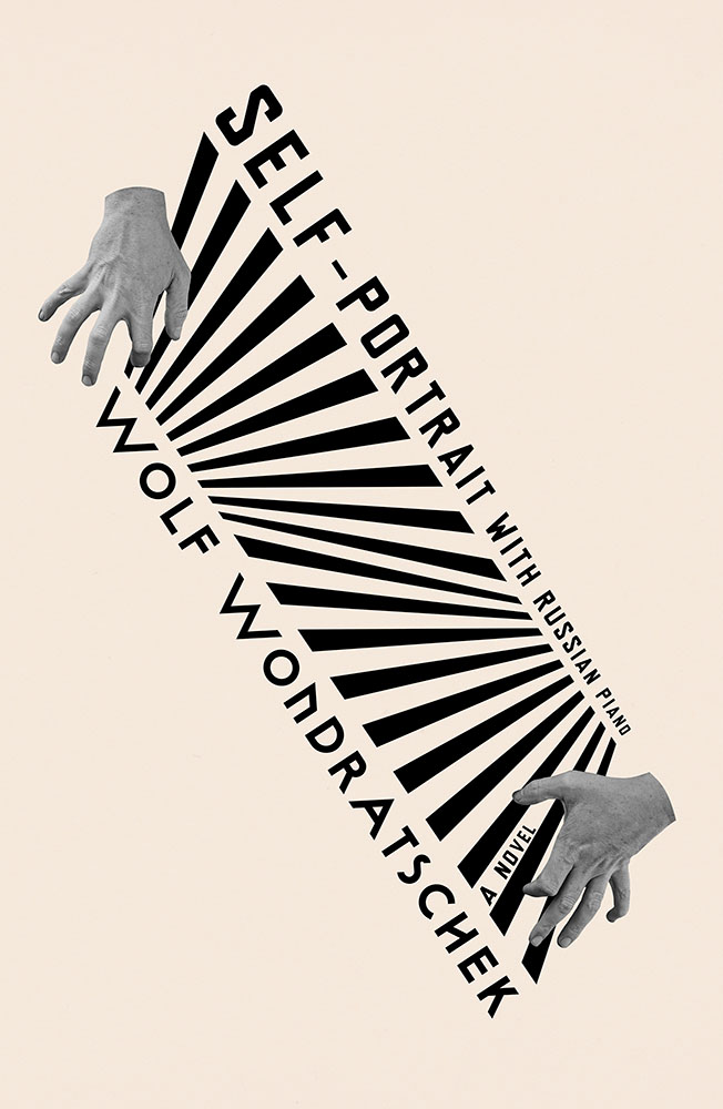
Na Kim makes another appearance with Self Portrait with Russian Piano. Kudos for something that’s equally eye-catching yet about as completely different as humanely possible — talent, defined.
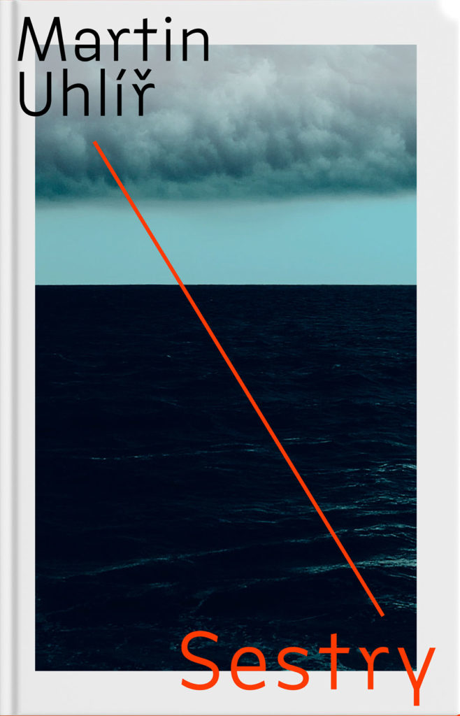
“Eye-catching and mysterious,” says the entry for Sestry. “Oppressive and mysterious,” says the description. Both work — it’s certainly mysterious enough to catch your attention, grab it off the shelf, and investigate further. Design by Jan Šabach.
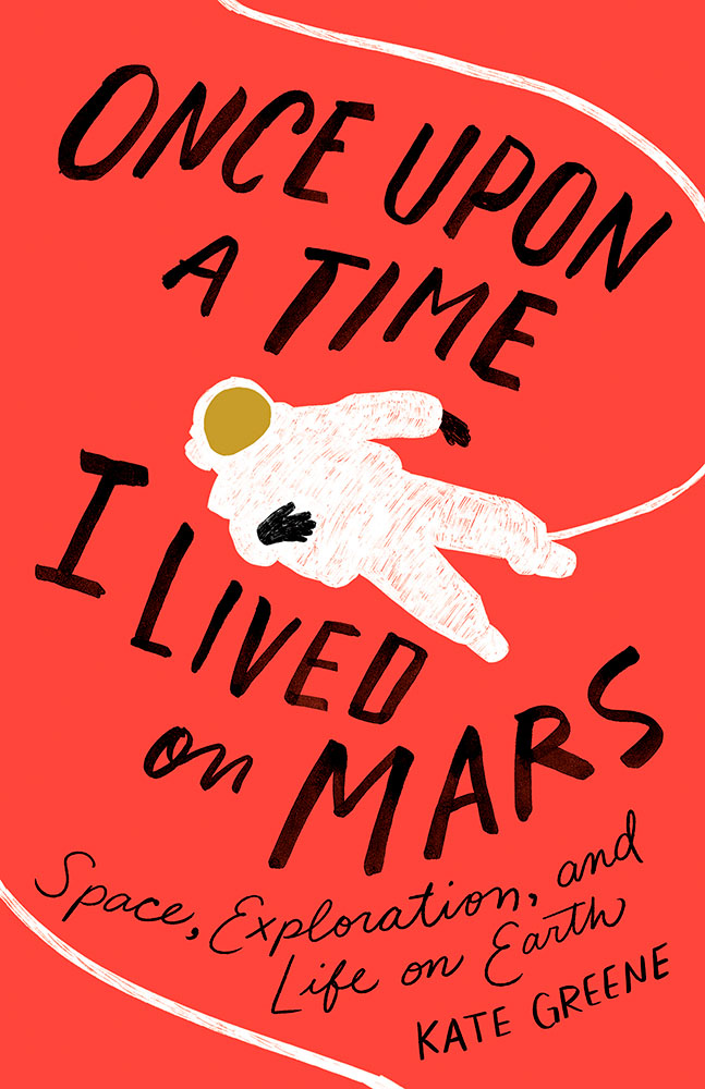
Once Upon a Time, I Lived on Mars: Space Exploration, and Life on Earth is a loooooong title/subtitle combination. It’s something that, as a cover designer, you dread — but Johnathan Bush knocked it out of the park with this hand-lettered illustrated piece that’s 180 degrees from where you’d expect.
The Turn of the Screw is probably my favorite of the whole collection:
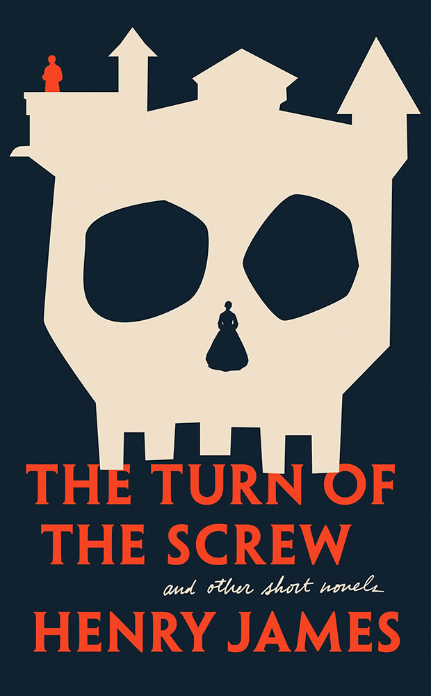
Almost simplistic … until you really look at it; the kind that makes you think, “I wish I’d done that.” Fantastic work by Kaitlin Kall.
Lastly, two covers previously mentioned here:
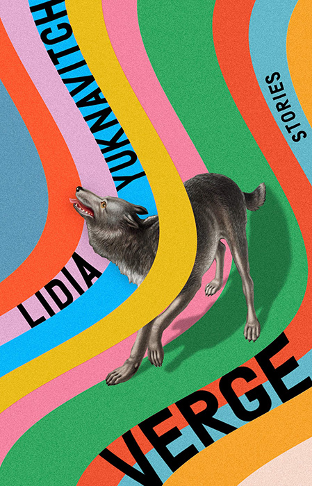
Verge, where unexpected choices lead to great new places here, especially with the yellow band overlaying the wolf. So, so good. Design by Rachel Willey. And:
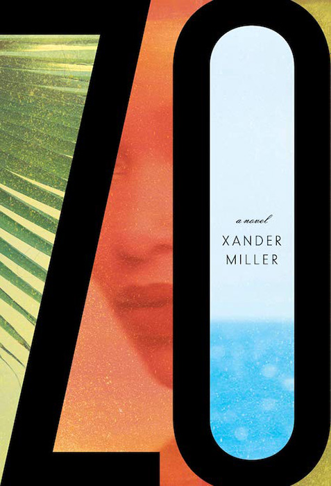
Zo, which uses illustrations to huge effect — but this time with a huge typography effect to go along with it, and lo, it works. Great design choices by Janet Hansen.
Again, see the whole list at AIGA: 50 Books, 50 Covers. Props to Hyperallergic for the heads up.
On David Hockney’s Piccadilly Circus logo:
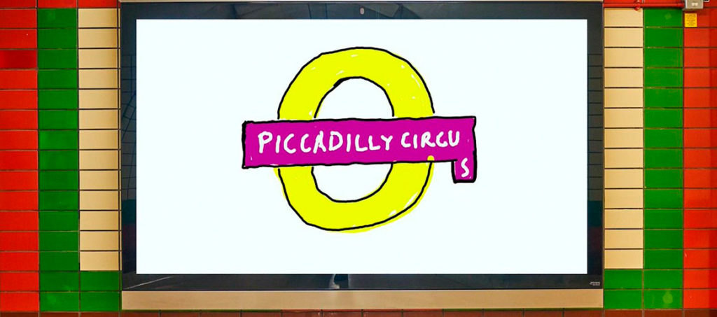
It’s been a minute since I’ve been in London — 2011, to be exact — and I’d love to go back. The food, the parks, the museums, the Thames, the short train rides to more interesting places (Hello, Cambridge?), and even the Tube. (We’ll leave the anti-Americanism aside for right now — we’re post-Trump and post-Covid, so traveling is at least an option!) Yet even the cultural masterpiece that is London is showing some cracks; from the New Statesman:
Hockney’s Piccadilly Circus has also drawn criticism for its simplistic approach. Over on the cesspit of arts criticism that is Twitter, anonymous accounts that decry all art made post-1920 as an abomination have ridiculed Hockney’s scrawl as indicative of the death of art. Other critics have rightly argued that the work feels like a red flag to a bull: fuelling culture-war debates about the legitimacy of public art, rather than encouraging the public to get onside.
I like it more every time I see it. Read more at It’s Nice That.
On the NYC subway map:
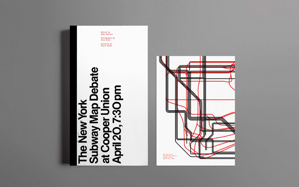
Speaking of It’s Nice That, an interesting new book from Gary Hustwit . . . on the debate over the New York City subway map. On the one side, the iconic Massimo Vignelli version, introduced in 1972, representing the less-is-more approach. On the other, the replacement version from John Tauranac, introduced in 1979, representing the more-accurate-is-more approach. (An updated version of the latter is still in use today.)
But back in 1978, the two got up on stage at Cooper Union’s Great Hall — home to debates of, among others, Abraham Lincoln — and pitched their case:
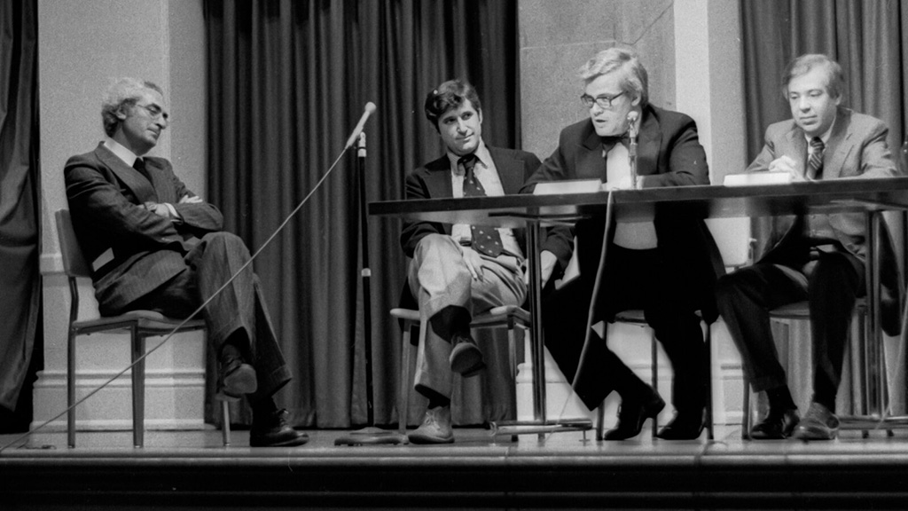
Newly discovered photographs and audio lead to this new, smartly-designed, book. Read more at It’s Nice That; Dezeen has an interview with the author. Pre-order the book and get a limited-edition letterpress print at Oh You Pretty Things.
On books and book design:
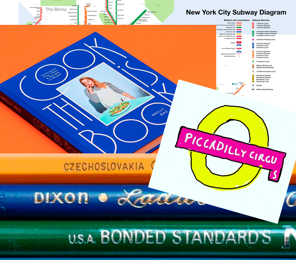
Nice new cookbook chock full o’ seventies-era design, “Violaine et Jérémy returns with a cookbook for Molly Baz, featuring three of the studio’s much-loved typefaces,” at — wait for it — It’s Nice That:
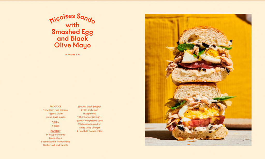
Sandwich Nicoice. Mmmmmmm.
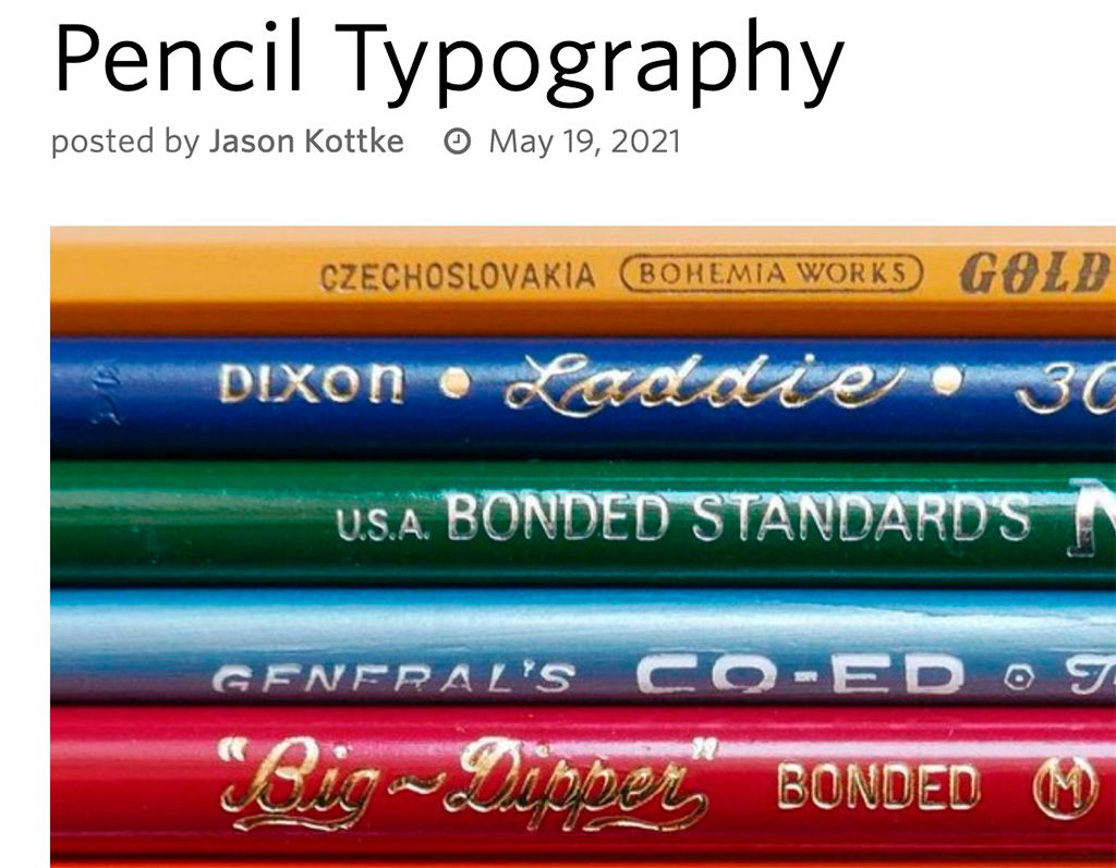
Lastly, just because, Kottke collects pencil photography to examine the typography. Nice.
Three items for your update this month, starting with one of the best logos I’ve seen in a long while: Realm. Check this out:
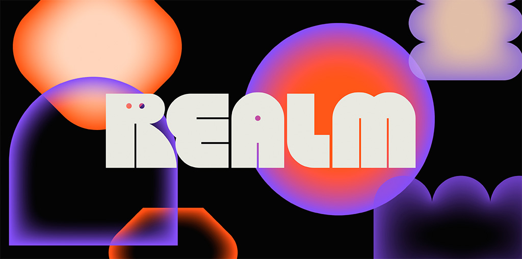
Just … wow. Colors aplenty in the supporting materials, but the logo itself in beautiful black and white — and that GIF. (Update: the GIF isn’t working here, which lessens its appeal. CRAP. See it at either link below, but either way, see it. So worth it!) Congrats to Mother Design on this triumph.
Read the story at It’s Nice That or visit the source at Realm.fm.
Update, May 4: Brand New says, “A Nightmare on Realm Street.” Frankly, I’m surprised:
The animations for both the full wordmark and monogram are a little clunky. Maybe it’s on purpose, maybe not, but something about them feels half-cooked. Some killer animations would have really taken this to the next level.
Hmph. Read the rest.
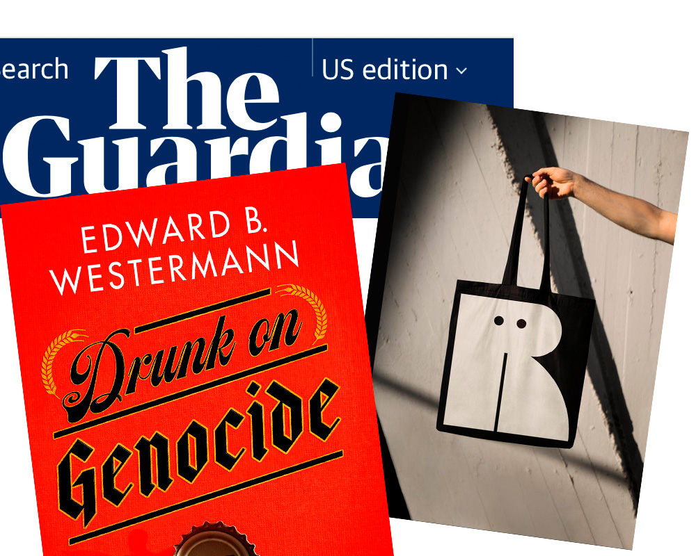
Next. a Guardian item on book covers — and how being “Instagrammable” is now, thanks to Covid and bookstores being less accessible, what’s expected:
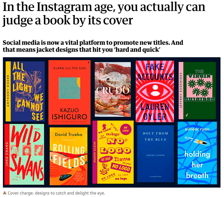
I’ve famously chosen to boycott social media, so it’s probably not a surprise that I’m not 100% in agreement with the sentiment that Instagram is necessary for successful cover design. Nonetheless, supporting quality design — and acknowledging that more than a few do, in fact, judge a book by its cover — is a good thing. Read the rest.
Last but not least, from Spine’s fantastic University Press Cover Round-Up, this:
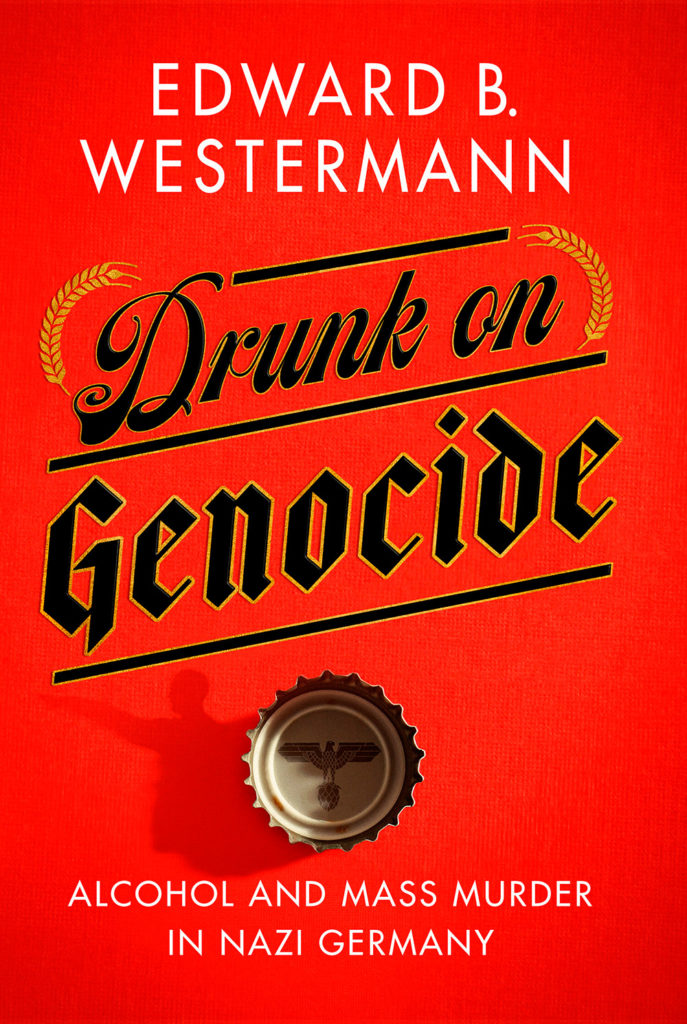
Check the shadow of the bottle cap. Now, go to Spine and check the texture in the background. Revel. Repeat.
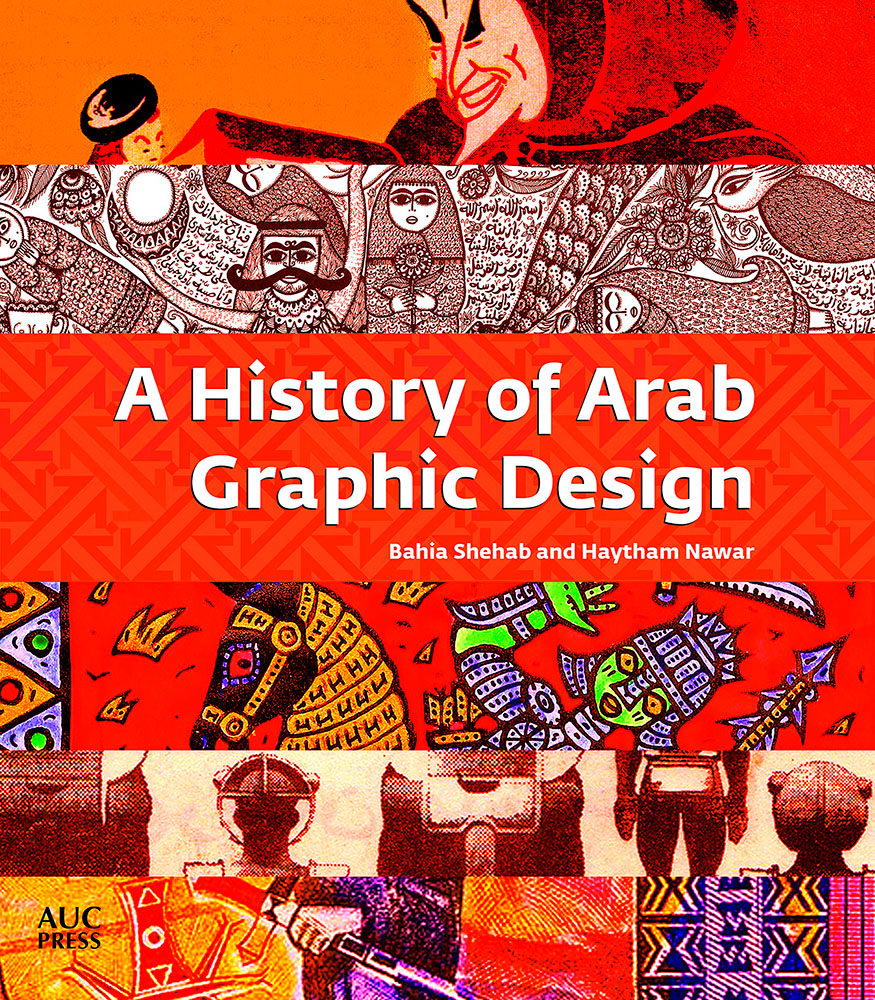
A History of Arab Graphic Design is easily the best introduction to the history of modern Arab visual culture on the market today. It lacks the jargon of exhibition catalogues, leans heavily on visual sources, and dismisses some previously held assumptions about Arab art[.]
Something for those of us in the West who sometimes suffer from Western-centricity. More at the Brooklyn Rail.
Great list — I agree with almost all of them, but wanted to call a few out especially:
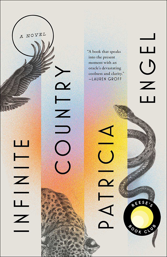
Infinite Country, mentioned here;
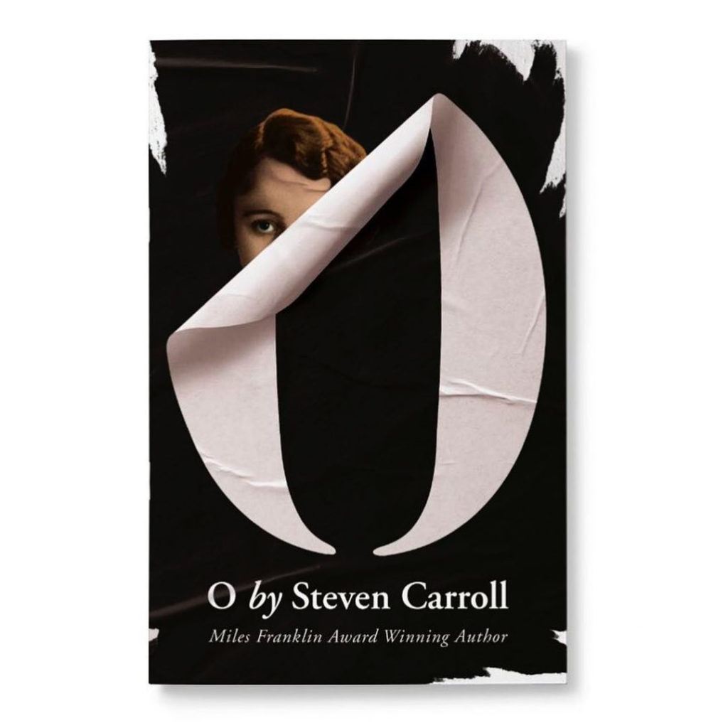
O, Steven Carroll, cover by John Gray;
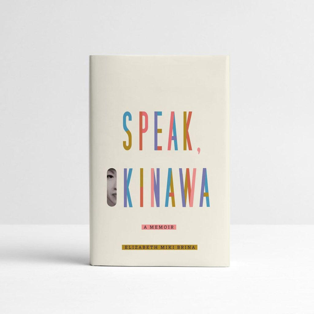
Speak, Okinawa, Elizabeth Miki Brina, cover by Janet Hansen; and
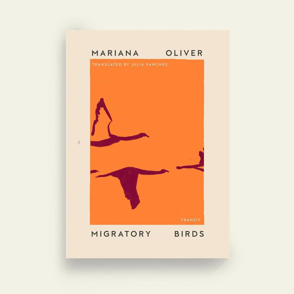
Migratory Birds, Mariana Oliver, cover by Anna Morrison.
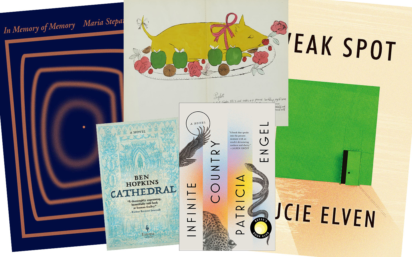
Five book design items that caught my attention recently.
First, from ArtNet News. Prior to basically everything, Andy Warhol did this:
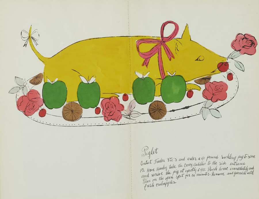
“The whimsical book was a collaboration with interior decorator Suzie Frankfurt, who wrote the ridiculous recipes, and the artist’s mother, Julia Warhola, who provided the calligraphy, replete with charming misspellings. [It] was the last of a number of books Warhol designed in the 1950s, before he shot to fame in 1962 with Pop art compositions featuring Campbell’s soup and Coca-Cola. Book design offered him a valuable creative outlet during the years he worked as a commercial illustrator.” See more.
The rest are from the New Yorker‘s “Briefly Noted” reviews — which, I’ll admit, inspired the title of this post. They pick four titles weekly, and while I’m sure many are great, actually great book design is rare. So to have four in two weeks … well, just had to say, “noted.” (The New Yorker is, of course, subscription — but there is a free account with limited options if you’d like to read their review.)
The first three are from the March 8th, 2021, issue, starting with In Memory of Memory:
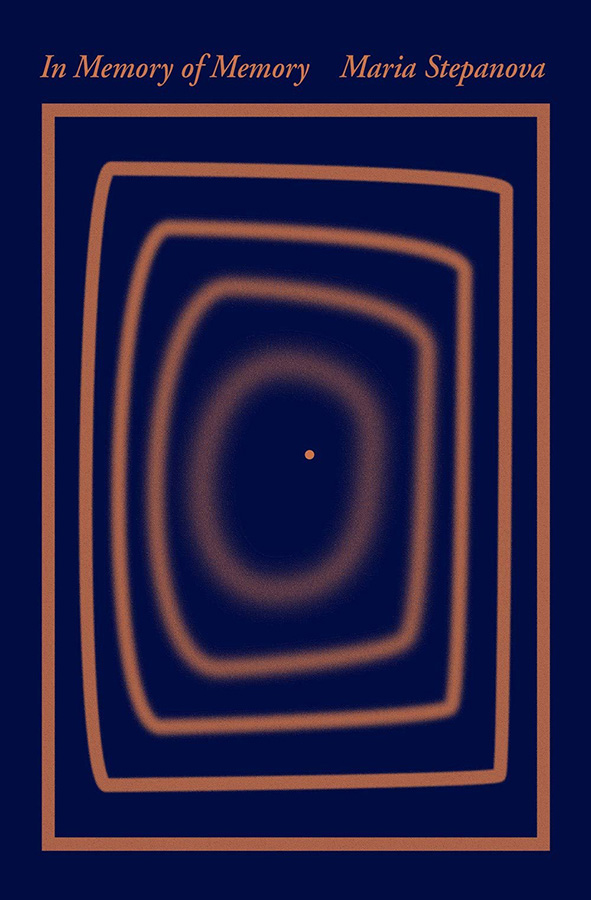
The simplicity of the concentric rectangles — and “destination” dot — is mesmerizing.
Next, Cathedral:
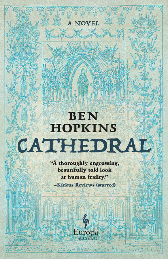
Not a simple illustration in this case, and still an attention-getter in the background. Nice.
Next, my favorite of this set, The Weak Spot:
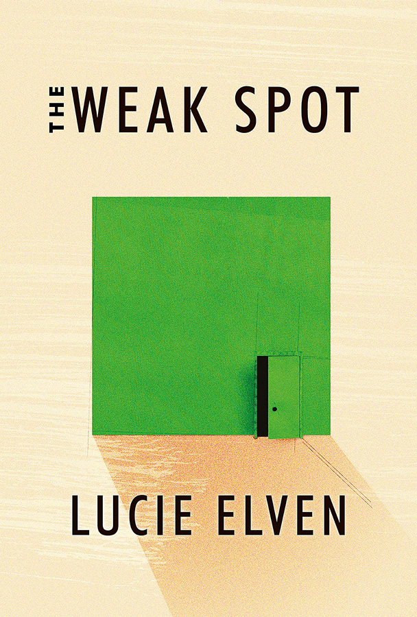
A very brief (176 page!) debut novel with hits-above-its-weight cover design. (Content, too, presumably…;)
Lastly, from the March 15th issue, Infinite Country:
Color and composition unite into something … infinitely good.
Enjoy.
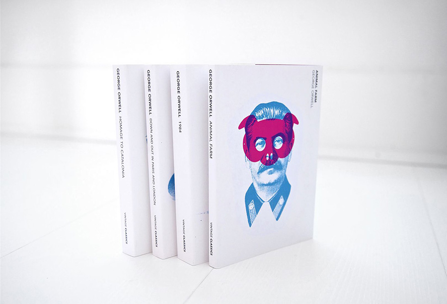
Creativeboom points out that Heath Kane, not a citizen but in fact a subject of the Crown, has designed new covers for George Orwell’s classics Animal Farm, 1984, and more.
Two interesting things about this: they call it the “final printed edition,” without further explanation. I somehow doubt there won’t be more editions in print — high schoolers everywhere would mourn, professors cry, and surveillance societies everywhere smile. Okay, overdramatic, but still.
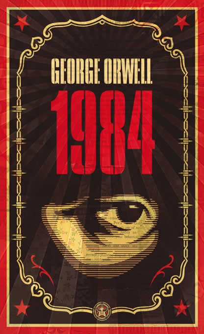
And, I really preferred this one: