I Love Typography’s 2020 Favorites

“It’s hard to believe that a decade has passed since I published one of these annual Favorite Fonts lists. A lot has happened in the interim: I now have less hair, more grey hairs, sometimes complain about my back, and now live in another country! Anyway, that’s quite enough about me. Here are, then, in no particular order, my favorite typefaces of 2020…”

Some great choices here, especially:

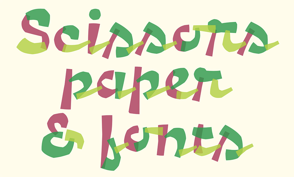
A layer font — something described as “fashionable for a while” — this one deserves to be on a book cover.

Special mention: ILT’s web design. This blog and this entry both are easy to look at, well put-together, and something that makes me a little envious.

Read all of the 2020 favorites, or ILT’s main page.

The United Kingdom, Revisited

In 2011, my good friend Gerald Lucas gave me an irresistible opportunity: almost a week in England. He was teaching there that summer, and there was University housing available — which meant a visit for the price of a plane ticket, food, and a rental car. One word: absolutely.

Needless to say, I went with camera in-hand — Nikon back then, specifically a D3 with 24-70 and 70-200 lenses — and made it into one large photostroll.

Today, thanks to migrating my Aperture libraries to Lightroom, I had the excuse to revisit some of these images, re-edit some, and repost — a new total of 357 photographs. Take a trip to London, Cambridge, Winchester, Salisbury, and Bath with me. Enjoy!