Spring Book Design Coverage

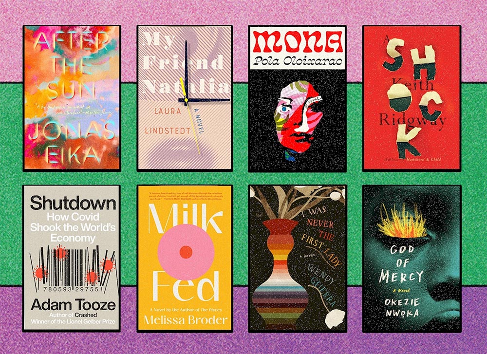
For your May Day, please take a closer look at twelve great book covers — and a bonus thirteenth! — spotted during the first four months of 2022.

In alphabetical order:

Book design: David Drummond

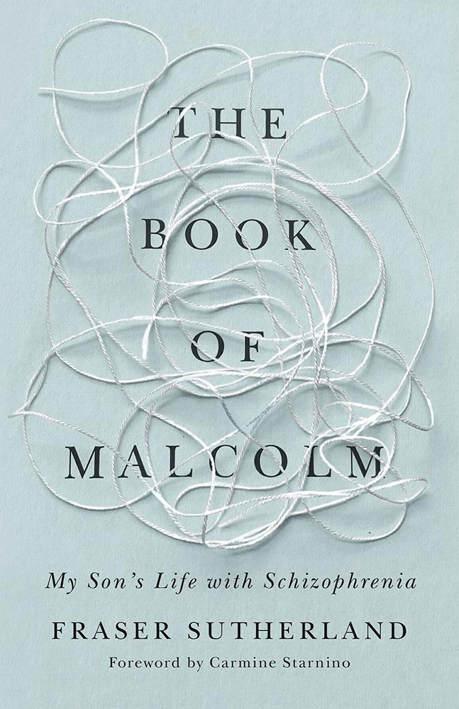
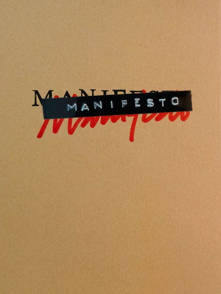
Brilliant: actual text, printed (on a great color paper, too), with actual string, photographed on said print. Not only is it exactly right for the subject matter, it’s simply and beautifully done.

Cover design: Brianna Harden

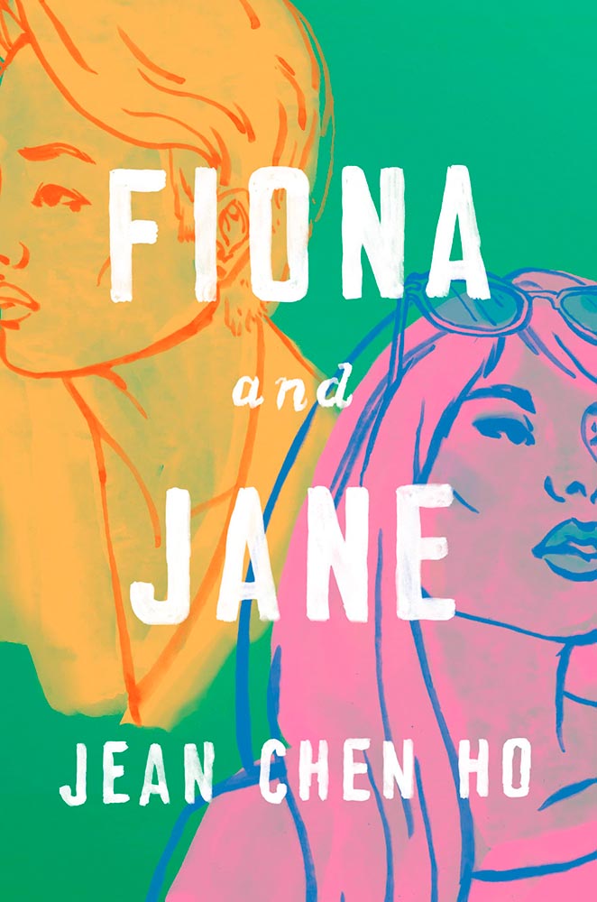
Another great background color choice, this time highlighting the awesome colors chosen for Fiona and Jane’s illustrations. The hand-painted text is perfectly done.

Cover design: Vi-An Nguyen

Woodcut or just aged? Doesn’t matter, as “brilliant” falls short when describing this title.

Cover design: Alex Merto

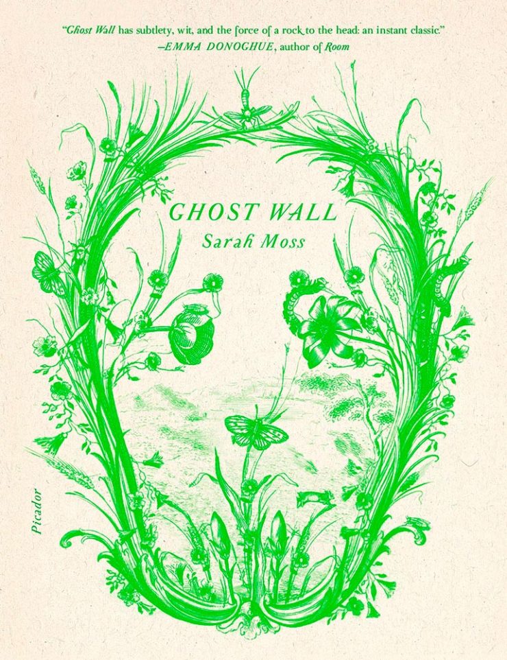
From It’s Nice That, we have a nice feature on Alex Merto — whose Ghost Wall cover is a great example of plant life adding so much more: “the force of a river to the head,” to paraphrase Emma Donoghue’s quote.

Cover design: Anna Morrison

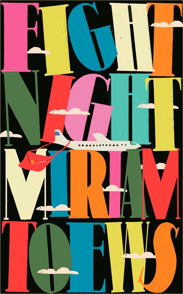
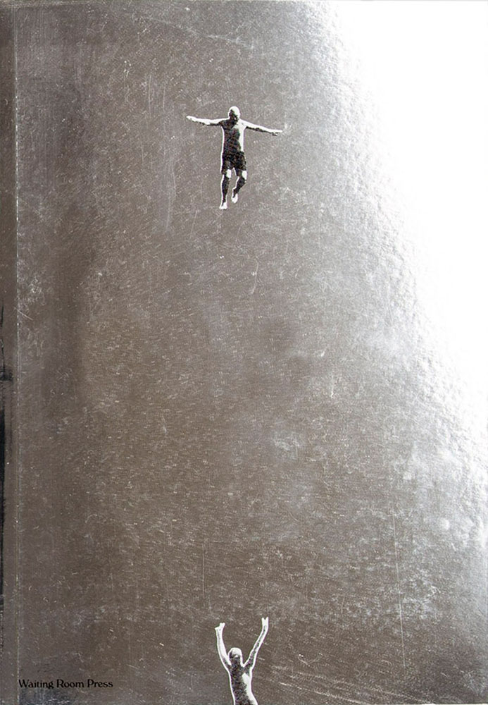
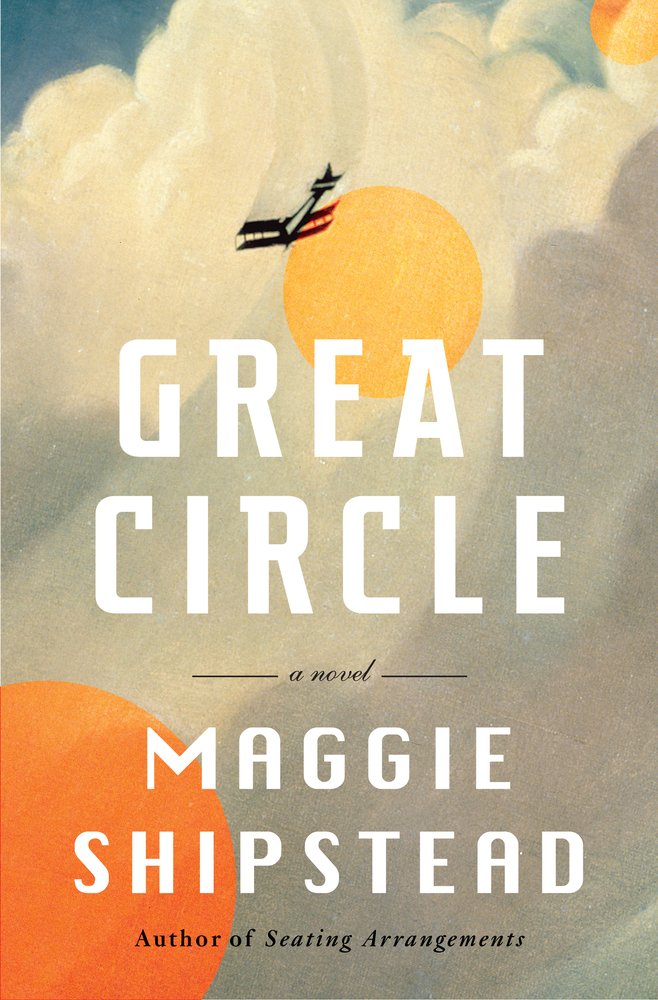
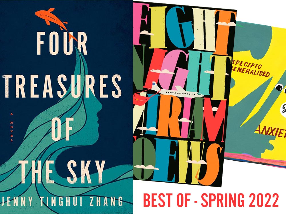
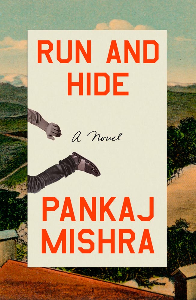
The typography, awesome little plane — the purse(r)! — the clouds, all of it: sky-high levels of good.

Interestingly, Fight Night‘s cover has gotten notice before:

Cover design: Patti Ratchford, illustration: Christina Zimpel

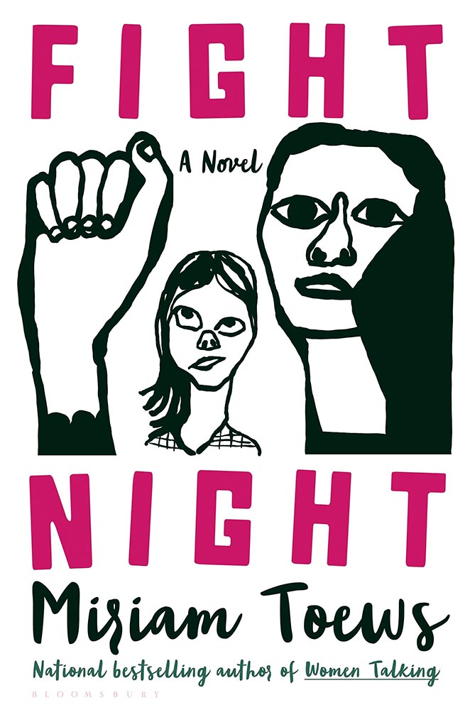
I can’t begin to imagine what caused the redesign, or why it wound up being so radically — 180 degree! — different. The old design wound up on some “best covers” lists (here’s LitHub’s October 2021 post, for instance); the new one has wound up on mine.

Cover design: Christopher Sergio

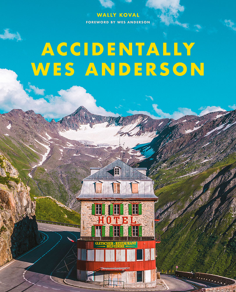
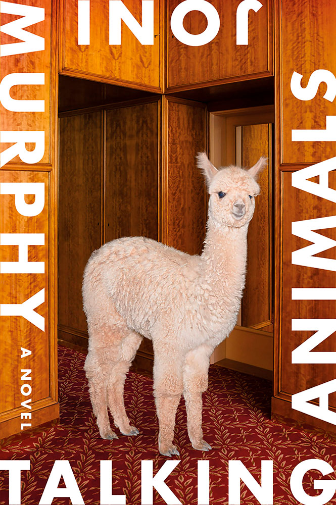
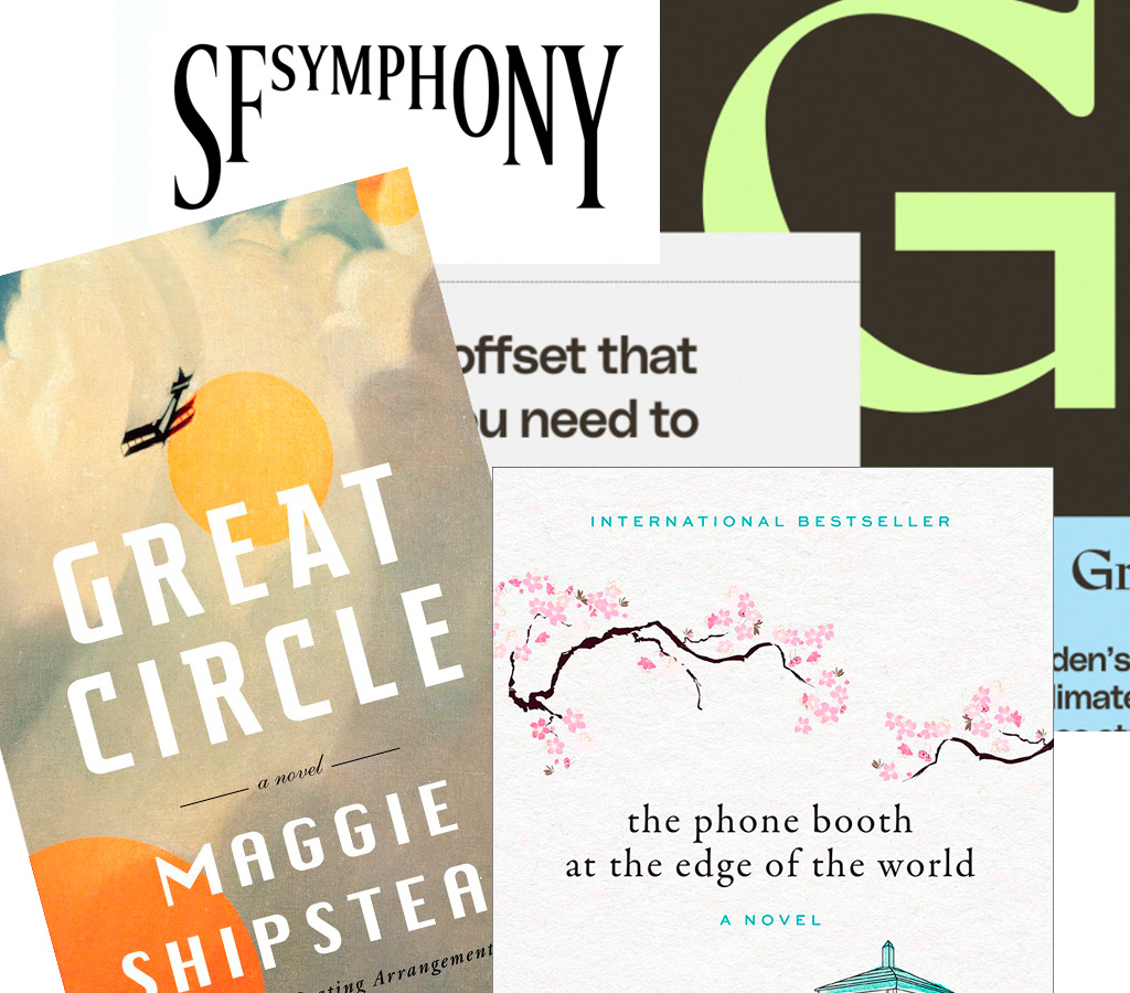
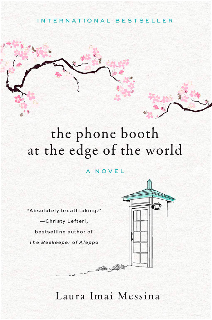
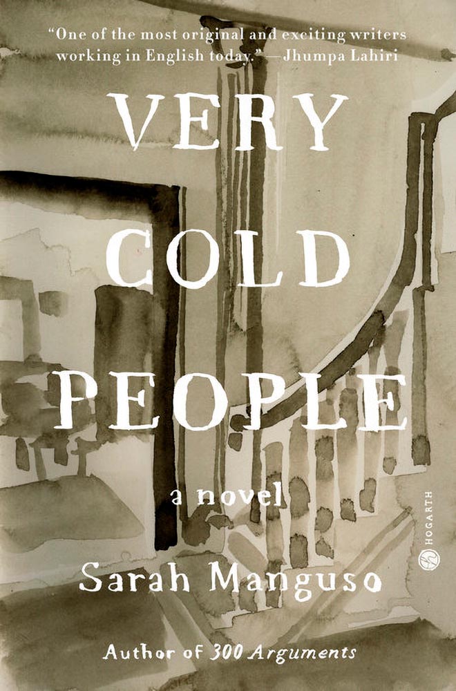
LitHub says this one has a very high “hang on the wall” factor. I can’t think of a better description — great stuff.

Cover design: Na Kim

Na Kim just can’t help but design the best covers: a wonderful, antique background complimented by brilliance. (Great typography, too.)

Cover design: Emily Mahon

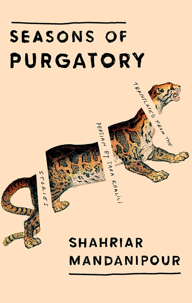
It’s nigh-on impossibly to look at this cover and not flip it around to read the text trisecting the leopard. Take something simple, add the elusive more, get this. Yeah.

Cover design: Jim Tierney

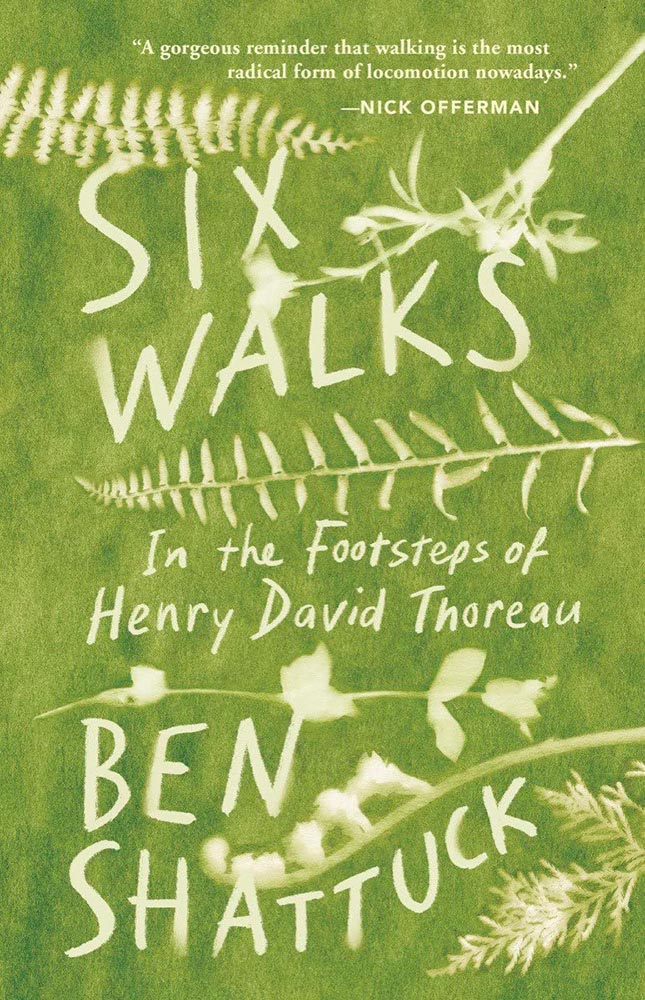
Another fantastic example of plants adding more than the sum of their parts. The mottled green background and watercolor-style falloff is perfectly complimentary. Great stuff. (Except: This is one of those times when an editor or publicist somewhere says, “Hey, we need to add this quote at the top. Let’s do it without consulting the cover designer.”)

Cover designer … unknown. Credit where credit is due — when I can.

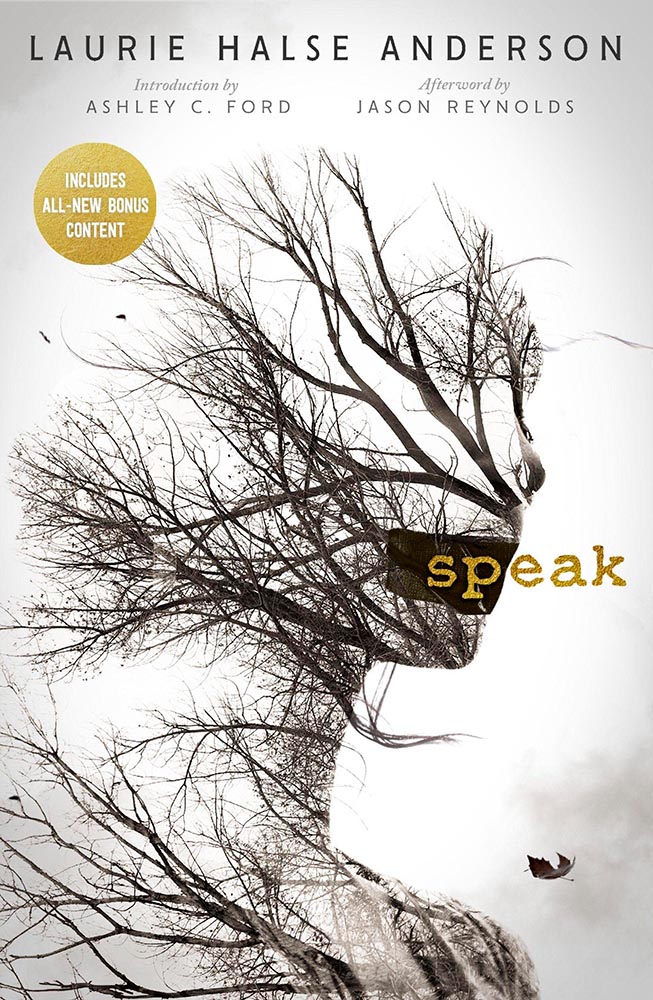
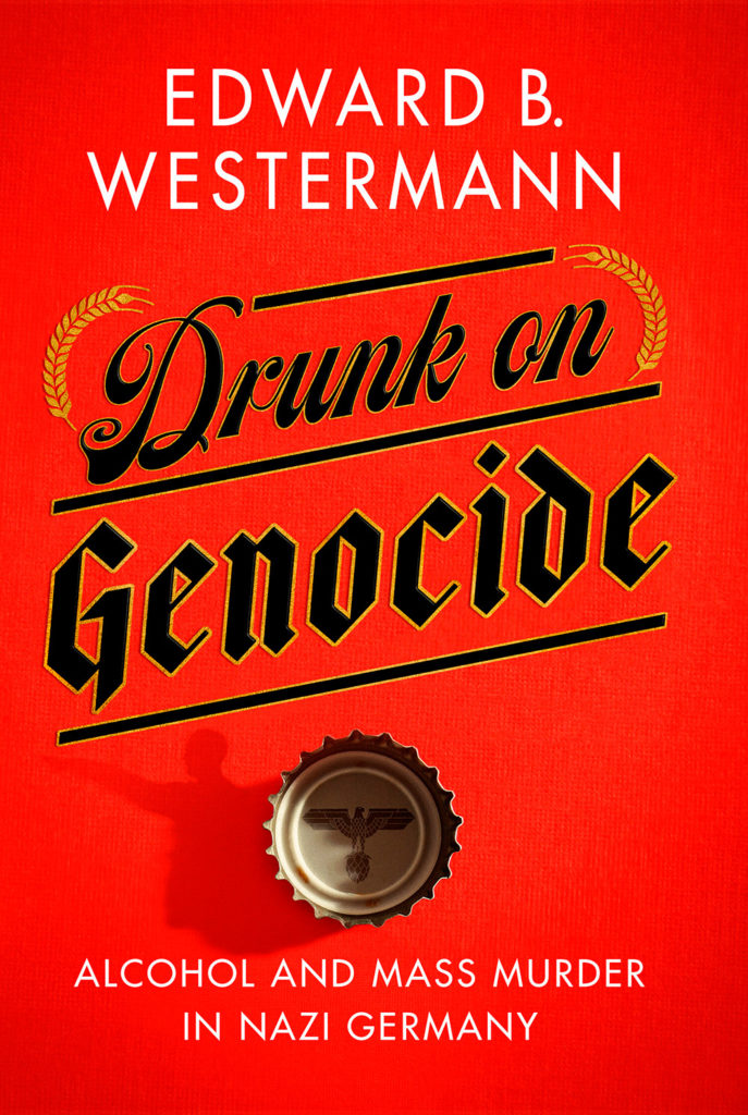
From the Banned Books Department, we have the 20th Anniversary edition of this difficult title rendered in a photo-based collage that’s nothing short of brilliant. Highest praise. Kudos, too, to Open Culture: The New York Public Library Provides Free Online Access to Banned Books: Catcher in the RyeStamped & More.

Cover design: Jack Smyth

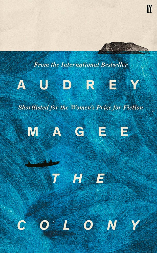
Never mind the great brushed color blocks or boat-rowing-the-ocean above the title. This is here for the overlap between color and island. Shortlisted for the prize for intersection-of-the-year.

Cover design: Leanne Shapton

This illustration being in grayscale is, at first, a little off. But, of course, that’s exactly the point. I overuse “brilliant,” but it’s the best description. (See a note from the designer at LitHub‘s cover reveal.)

So, the bonus. No, it’s not the extra Fight Night, above, it’s a fictitious cover. That’s right:

Cover design: Anna Hoyle

In another It’s Nice That post, we have Anna Hoyle: “Judge her fake books by their comical covers.” Okay!

More book design updates soon — ’cause, here in Georgia, USA, we’re done with spring. Summer starts . . . now.

Additional sources: Spine, “Book Covers We Love” for January, February, March, and April, and LitHub, “Best Book Covers of the Month.”

Beautifully Briefed, Late March 2022: Type Museum, Toshiko Mori, and … Buick?

Catching up with a few unrelated stories that I’ve been meaning to post — including one pretty significant failure on my part, one potentially significant failure, and because not everything should be about fail, an extremely interesting and thoughtful interview.

Tiny Type Museum Sold Out

I was cleaning up open Safari tabs on my phone the other day — the detritus that results from checking things on the fly when out and about, often or never closed — and noticed that I’d sort-of bookmarked something for action and … missed it. Crap!

The Tiny Type Museum & Time Capsule, with specimens and those beautiful drawer pulls.

The Tiny Type Museum & Time Capsule is a celebration by journalist and printing historian Glenn Fleishman of type and printing, and an effort at preserving history for future generations to re-discover. Each custom, handmade wood museum case holds several dozen genuine artifacts from the past and present, including a paper mold for casting newspaper ads in metal, individual pieces of wood and metal type, a phototype “font,” and a Linotype “slug” (set with a custom message), along with original commissioned art, a letterpress-printed book, and a few replicas of items found in printing shops.

The Tiny Type Museum. (Bottom drawer.)

The museum includes a letterpress-printed book written for the project, Six Centuries of Type & Printing, in which Fleishman traces the development of type and printing starting before Gutenberg printed his Bible around 1450 up through the present day. This book acts as “docent” for the museum, providing insight into the stages in technological and artistic development that took place, and explaining the importance and nature of the artifacts. It also slides out neatly as part of a sled from the top of the museum case, and provides the visible name.

The letterpress book is still available: get your copy, or subscribe to the podcast. But even if you don’t, take a moment to appreciate the work that went into this — well done, indeed.

Buick’s New Logo

This one … I dunno. The race to do car logos flat black-and-white has seemed like a race to the lowest common denominator. (See previous coverage of BMW, Volvo, Cadillac, and more.) Below, Buick’s old (left) and new (right) logos, courtesy of Motor1:

The trademark filing for Buick’s new logo.

Thankfully, there’s been a leak — Instagram, natch, so no link here — demonstrating that it’ll still be in color:

From Instagram (alas): The new Buick logo in living color.

Still, not sure. Will have to see the official announcement and package that goes with it; Motor Trend suggests that it might be part of an EV-only future. Stay tuned for Brand New’s take, I guess….

Toshiko Mori

The former chair of Harvard’s graduate architecture program has given a great and wide-ranging interview to New Reader:

I think innovation doesn’t come in one huge leap. It’s a series of small steps. Accumulations of small discoveries, followed by incremental implementation. And then it all adds up. Innovation is not a single idea—it’s incredibly incremental and additive. Even these small discoveries can change the way we think about things very quickly. So I think every step of the way—problematizing “what are the issues?” and “what are the solutions?” filtering issues of sustainability, supply chain, accessibility, will eliminate many solutions which are not possible. And then you end up with small nuggets of potential. In a way it’s very systematic, innovation, and so is experimentation. It’s the elimination of what’s not possible and focusing on goals.

Toshiko Mori. Image courtesy of New Reader.

You know, history is not about the past, really. History is about the story of an individual interpreting history. Historians cannot be unbiased narrators. Every history is a story, and then yes, there are facts—which are important, but the way you connect facts and then make diverse narratives is super interesting. 

As you can see, Fox News provides false narratives, and a lot of times they skew the facts, and that’s a problem. It can be used dangerously, but it can also be used productively. I think that’s what makes history rich. It’s not about the past, it’s about projecting into the future. So when I teach students, I ask them to make their own story based upon their research. But it’s a story—so that’s kind of their own reality. And based upon that reality, they can develop diverse narratives and then communicate the story to others. It’s not as if you have different opinions, but you have different stories to share. It’s not about controversial opinions, but about the way we each look at life very, very differently—and that enriches everybody.

The whole thing is definitely worth a read: Archinect News called it a “nuanced interview,” and if anything, that’s an undersell. Please go, reflect, and appreciate.

Side note: New Reader‘s notes throughout the interview deserve special mention (see the red Greek letters and separate, well, sidenotes). Nice.

I Swear, This Title….

Kottke recently revisited a theme that’s been running for a few years now: titles with a swear — f*ck, in this case — in the title. According to Slate, the practice stems from the 2011 parenting title Go the F*ck to Sleep, and has accelerated over the years.

I’m more interested in the design of such a title. Bookstores, advertisers, and publicists demand that the swear never be completely spelled out, but that doesn’t restrict great design ideas. Here are a few of my favorites:

Love the fork. (So to speak.)
The less-is-more approach.
Whales as sardines.
Interesting choice with the capitals, or lack thereof.

Note the over-arching theme: no, not that — the lack of photography. The vast majority of these titles are text based, supposedly because something competing with the swear would detract from the shock value. There’s a primary color thing going, too, probably for the same reason.

Most of the time:

Self-help, with style.

Something different for your day!

Beautifully Briefed, Early March 2022: Monograph Impresses, Monotype Trends, and Media Waste

Three diverse items in this round-up, from illustration to typography to whether or not ad-blockers are actually environmentally-friendly — along with a response that reminds us to look at the bigger picture.

Malika Favre (Expanded Edition)

CreativeBoom:

French illustrator and graphic designer Malika Favre has been impressing audiences for years with her minimalist work for publications such as The New Yorker, Vogue, and Vanity Fair. Now over a decade’s worth of her work has been released in a new monograph from Counter-Print, which contains a suitably stripped-back aesthetic.

Her style is distinctive; I’ve liked her New Yorker covers especially:

Malika Favre (Expanded Edition) in English

The book includes the illustrator’s own cover, and she had a big hand in designing the layout, too. CreativeBoom’s article is excellent — check it out.

Monotype’s 2022 Trends

It’s Nice That points us to the recently-released 2022 Type Trends Report from Monotype:

Monotype’s 2022 Type Trends Report cover

Throughout yet another “unprecedented year,” it’s safe to say that the macro trends influencing the type design community are nearly too long to list. Several socioeconomic, political, and cultural events continue to shape the way we approach creative work and how connect to each other online and offline.

Biodiversity’s relationship to type, varying type styles in a single logo, and thin serifs — the one I’m likely to use somewhere — are in this year.

New York’s Park Lane Hotel

The above example, from New York’s Park Lane Hotel, is but one they cite (see that whole, very lovely project at Brand New). Check out the whole report, and get trendy.

Perhaps we can convince Apple to go back to its also-lovely Garamond…?

Media, Trackers, Blockers, and the Environment: There’s a Problem

Did it ever occur that using an ad blocker in your browser is actually an environmentally-friendly move? No, I hadn’t put it together, either.1More from MIT on ecological impacts of cloud computing here.

70% junk. Surprise and shock (not really).

[U]p to 70% of the electricity consumption (and therefore carbon emissions) caused by visiting a French media site is triggered by advertisements and stats. Therefore, using an ad blocker even becomes an ecological gesture. But we also suggest actions web editors could take to reduce this impact.

An interesting study, certainly, with information that many of us already use and some suggestions for action in case we don’t. But…:

Another of Monotype’s 2022 Type Trends, appropriated for use here

Nick Heer:

I have qualms with this. The idea of a “carbon footprint” was invented by British Petroleum to direct focus away from environmental policies that would impact its business, instead blaming individuals for not recycling correctly or biking to work more. A “carbon footprint” is also a simplistic view of how anything contributes to global warming, and that it seems to be used here as a synonym for bandwidth and CPU consumption.

I’m not sure whether I’ve called out the excellent Pixel Envy2A sort-of Daring Fireball with Canadian roots, but this is an example of why I should.

That is where I think this well-intentioned study falters. Even so, it is absurd that up to 70% of a media website’s CPU and bandwidth consumption is dedicated to web bullshit. Remember: the whole point of web bullshit is that it is not just the ads, it is about an entire network of self justifying privacy hostile infrastructure constructed around them.

  • 1
    More from MIT on ecological impacts of cloud computing here.
  • 2
    A sort-of Daring Fireball with Canadian roots

Beautifully Briefed, Late February 2022: Photography, Font, and Furniture

A three-fer as we wind through this February: Peter Stewart, a really talented architecture photographer from Australia; VAG Rounded, Apple’s keyboard font and how it relates to Volkswagen; and a new site called The Apple Store Glossary leads to an interesting review of furniture in Apple Stores.

Peter Stewart

November’s Beautifully Briefed covered the 2021 Architecture Photography Awards shortlist, and one of the photographers is Peter Stewart, a self-taught Australian who wanders around Asia. Gotta say: he’s better than great.

“Hanshins Web” Osaka, Japan. 2019, by Peter Stewart

His eye for pattern and color is spot-on:

“Four Columns” Tokyo, Japan. 2019, by Peter Stewart

Archinect’s In Focus feature has a great 2019 interview that not only discusses the how and where, but also the why — including his thoughts on use of Photoshop and, perhaps most insightfully, how to thrive as a photographer in this crowded age:

The hardest part of being a photographer today is finding a way to stand out among the crowd. In just the past few years Instagram has changed everything and given rise to a sizable number of highly talented new photographers. We are inherently influenced by the work we see from others, and as such has given rise to a lot of popular trends and styles of photography which has brought about a bit of a copycat culture. The point is, I think it’s important to find your own themes and ideas in order to progress, and not to simply emulate.

Peter Stewart, Archinect Interview

Check it out.

VAG Rounded and Apple

Daring Fireball is a daily stop for Apple geeks like me, but rarely does it cross into graphic design territory — except when it links to a Jalopnik article discussing how a Volkswagen font wound up on Apple’s keyboards.

Good stuff. (Bonus ’80s Dasher brochure siting, too.) Enjoy.

Apple Store’s Boardroom Furniture

Some Apple Stores have additional, not-usually-open-to-the-public spaces called boardrooms. And, as you might imagine, they’re filled with interesting stuff.

A new (to me, at least) site called The Apple Store Glossary has information and photographs of all aspects of Apple Stores, from the new Pickup area to the behind-the-scenes Boardrooms.

The latter started out as something called Briefing Rooms, intended for business customers and special events. However, they’ve evolved: more casual, more comfortable. And more interesting:

Apple Boardroom (Passeig de Gràcia store, Barcelona, Spain)

9to5Mac has a great roundup of these rooms we don’t see, from the accessories (bonus Eames Bird sightings) to the books, and perhaps most interestingly, the furniture.

Grab a seat, get comfortable, and get info.

Beautifully Briefed, January 2022: Airplanes, Architecture, and Typography

BB Jan22 header image

Happy New Year! Stephen Colbert called it, “an unprecedented third year of 2020.” Let’s hope it turns out better than that.

To that end, here are some neat things to catch your eye.

Airliner Photography, to the nth degree
MG - no bogies here

I’ve been a plane junkie since, well, forever; to this day, I watch YouTube videos of things flying around, often the big ‘uns. I follow Airliners.net’s Civil Aviation forum, and can tell you at a glance whether something sitting at the gate is a Embraer 190 or Airbus 220. So this new title by photographer Maxime Guyon has my complete attention.

MG engine

Very much looking forward to getting my hands on. Beautifully done, sir. (Via a great article at It’s Nice That.)

ArchDaily’s New Branding

Meanwhile, another subject I follow:

ArchDaily 2022

Arch Daily has already teamed up with Architonic, a site for products, last year. For 2022, they’ve rebranded and both sites are now linked with DesignBoom, one of the web’s original sites for design and architecture (since 1999!). Dezeen has more.

The Year in Type

Last but certainly not least, I Love Typography has a great roundup of 2021: The Year in Type.

The Year in Type, 2021

Enjoy, indeed.

Beautifully Briefed, December 2021: Holiday Edition

Beautifully Briefed, December 2021

It’s the yearly wrap-up and the holiday season! Recap and Rejoice!

Hermès Does Windows

“Journey of a Lifetime” is this year’s window display for Hermès — yes, Hermès should have an accent, but I can’t seem to summon it today fixed! — so let’s go with a picture instead:

Hermes window display

All in paper. No, let me repeat that: it’s all paper. (Well, perhaps some glue.) From artists Zim and Zou. Here’s another, one of their earlier works:

Zim and Zou, previously

Read more at This is Colossal about the window and the church. Nice.

Yule Ogg

While we’re on the subject of the holidays, check this out:

Yule Ogg

That’s right, it’s one of those four-hour Yule log videos — but with a twist. Those are wooden type pieces going up the flame. Check it out, along with the backstory, at It’s Nice That.

Top Architectural Photography Projects

Closing out, we start the year’s “best of” round-ups, this one Dezeen’s top 10 architectural photography projects of 2021:

Soviet (Asia) Photography

Above, Soviet architecture, central Asia, by Roberto Conte and Stefano Perego. Below, Structure Photography by Nikola Olic:

"Poetic" Architecture Photography

The latter is called “poetic,” a description I’d completely agree with. The Mother Road, USA, by Hayley Eichenbaum (previously mentioned) is there, too. Enjoy.

That’s it until after the holiday. Around the first, stay tuned for my favorite book designs of 2021 and more. Take care!

Letterpress Typeface from Plymouth Press

Letterpress type, digitally

James Brocklehurst is leading a new kind of innovation method for typography, harking back to the good old days of the letterpress. The technology uses scanned letterpress prints for each letter, and through scripting, randomly cycl[ing] through a range of alternate letterforms whilst you type.

The font uses OpenType scripting to automatically cycle through a range of alternate glyphs for each character, giving a ‘random’ appearance as you type. (Alternates can also be chosen manually in supported applications.) Very nice, and if you jump through some hoops, some neat results:

Letterpress type, digitally

It’s display only — no numbers, limited punctuation — but absolutely worth the download. And did I mention it’s free? Go!

(Via It’s Nice That. Thank you.)

Washington Post’s Best Book Covers 2021

WP Best Book Design 2021

The Washington Post has an article from book designer Kimberly Glyder with her favorite book covers of 2021. Her bio:

Kimberly Glyder’s studio specializes in book design, illustration and lettering. Her work has been featured in the AIGA 50 Books/50 Covers show, the Type Director’s Club Annual Exhibition, Print magazine, American Illustration, the American University Presses Book Jacket and Journal Show, and the New York Book Show.

Check her “best of” at the WP, and stay tuned for more 2021 lists next month.

Beautifully Briefed: September, 2021

BB - Sept 21

Let’s get the shock news out of the way first:

Hoefler and Monotype

It’s been thirty-two years, four months, and fourteen days since I hung out a shingle to announce that The Hoefler Type Foundry was open for business. What started as a sole proprietorship grew into the Hoefler&Co of today, a diversified design and technology practice with an international reach, still dedicated to the invention of original, thoughtful, and hard-working typefaces.

Meanwhile, “nothing will change,” Jonathan Hoefler (previously) says, except that he’ll be stepping down. That’s kind of a big change, IMHO — but after using typography to “help elect a president,” where do you go from there? Read more here.

In happier news, the much-delayed new Bond movie, No Time to Die, is finally in theaters next week.

The 007 logo

Ever wonder who was responsible for the above (slightly brilliant) graphic? Read Stephen Heller’s The Daily Heller: The Most Prolific Designer You’ve Never Known. Informative and great. Bang!

Corp State of America: GA

Keith Fleck has gotten a good deal of press for his Corporate States of America, but in case you haven’t seen it, it’s absolutely worth a look. Maine’s L.L. Bean, Florida’s Publix, and, of course, Georgia’s Coca-Cola are all winners. 51 bonus points!

Lastly for this month, some book design:

On Myself

Daily Nous asks their readers to nominate the best philosophy book covers — Judging Philosophy Books By Their Covers — and there are some winners, some absolute losers, and a few funny moments, too:

Black Sabbath, except not

“This always reminded me of a rejected Black Sabbath album cover or something,” says the poster. Nice. (And only 185 cents!)

50 Books, 50 Covers

50 Books 50 Covers

It’s time once again for AIGA’s 50 Books, 50 Covers:

This time-honored competition aims to identify the 50 best-designed books and book covers. With 696 entries from 36 countries, the juror-selections from this year’s 50 Books | 50 Covers of 2020 competition exemplify the best current work from a year marked by unparalleled change.

Picking favorites from this list is always fun, and often includes books and/or covers that I haven’t seen before — especially 2020, when seeing things in person was often … difficult. So without further ado (in no particular order):

Accidentally Wes Anderson

The unique destinations of Accidentally Wes Anderson. This 50 Books item catches the eye with the cover and the photographs carry you inside and to places heretofore unknown. Great stuff. Design by Mia Johnson.

Manifesto - Cover

Manifesto is more than meets the eye, even though the cover does an excellent job leading you in. It’s easier to quote the existing description than write one, so: “The opening pages contain an original text employing the sort of bombastic rhetoric traditionally associated with the manifesto genre. The typeset text is then cut up and reassembled, repeating throughout the book, each iteration becoming source material for subsequent cut-ups. The project takes a critical approach to book arts to explore authorship, readership, and the materiality of language.” Yeah:

Manifesto - interior

It’s tiny, too: 4.125 by 6. The design, by Victor Mingovits, is anything but. Well done!

DR. ME

Not Dead of Famous Enough, Yet compiles 10 years of work from a design firm into one place, with this surprisingly modest cover. DR. ME, as the duo of Ryan Doyle & Mark Edwards became known, not only do quality work, they know how to stitch together a quality book — to a point where they picked up a prestigious award. See more.

Talking Animals

Talking Animals violates one of my usual cover-design rules: it’s not immediately apparent which title word is first. Nonetheless, it’s eye-catching enough to warrant an exception — and a 50 Covers award. Design by Na Kim.

Self Portrait with Russian Piano

Na Kim makes another appearance with Self Portrait with Russian Piano. Kudos for something that’s equally eye-catching yet about as completely different as humanely possible — talent, defined.

Sestry

“Eye-catching and mysterious,” says the entry for Sestry. “Oppressive and mysterious,” says the description. Both work — it’s certainly mysterious enough to catch your attention, grab it off the shelf, and investigate further. Design by Jan Šabach.

I Lived on Mars

Once Upon a Time, I Lived on Mars: Space Exploration, and Life on Earth is a loooooong title/subtitle combination. It’s something that, as a cover designer, you dread — but Johnathan Bush knocked it out of the park with this hand-lettered illustrated piece that’s 180 degrees from where you’d expect.

The Turn of the Screw is probably my favorite of the whole collection:

Turn of the Screw

Almost simplistic … until you really look at it; the kind that makes you think, “I wish I’d done that.” Fantastic work by Kaitlin Kall.

Lastly, two covers previously mentioned here:

Verge

Verge, where unexpected choices lead to great new places here, especially with the yellow band overlaying the wolf. So, so good. Design by Rachel Willey. And:

Zo

Zo, which uses illustrations to huge effect — but this time with a huge typography effect to go along with it, and lo, it works. Great design choices by Janet Hansen.

Again, see the whole list at AIGA: 50 Books, 50 Covers. Props to Hyperallergic for the heads up.

Beautifully Briefed: Icons and Typography, Mid-June, 2021

Three items for you here, starting off with the 2021 Logo Trend Report, from the Logo Lounge. From the Asterisk to Electric Tape, Quads, Chains, and more:

2021 Logo Trend Report

Bill Gardner discusses all fifteen different trends, with logos to back ’em up (naturally).

Next, “A Cabinet of Curiosities” from Hoefler & Co.

Printers once used the colorful term ‘nut fractions’ to denote vertically stacked numerators and denominators that fit into an en-space. (Compare the em-width ‘mutton fraction.’)

This is beautiful:

Dutch Curio, H&Co

A Dutch curio, representing the letters z-i-j.

Read all of the rest.

Lastly, these are amazing . . . and simple, the better form of “simply amazing.” Yeah:

111 Shadow

See the rest at This is Colossal.

Happy June!

(More) Beautifully Briefed, Books and Design, May 2021

BB_May-2021_More

On David Hockney’s Piccadilly Circus logo:

piccadilly-circus

It’s been a minute since I’ve been in London — 2011, to be exact — and I’d love to go back. The food, the parks, the museums, the Thames, the short train rides to more interesting places (Hello, Cambridge?), and even the Tube. (We’ll leave the anti-Americanism aside for right now — we’re post-Trump and post-Covid, so traveling is at least an option!) Yet even the cultural masterpiece that is London is showing some cracks; from the New Statesman:

Hockney’s Piccadilly Circus has also drawn criticism for its simplistic approach. Over on the cesspit of arts criticism that is Twitter, anonymous accounts that decry all art made post-1920 as an abomination have ridiculed Hockney’s scrawl as indicative of the death of art. Other critics have rightly argued that the work feels like a red flag to a bull: fuelling culture-war debates about the legitimacy of public art, rather than encouraging the public to get onside.

I like it more every time I see it. Read more at It’s Nice That.

On the NYC subway map:

Speaking of It’s Nice That, an interesting new book from Gary Hustwit . . . on the debate over the New York City subway map. On the one side, the iconic Massimo Vignelli version, introduced in 1972, representing the less-is-more approach. On the other, the replacement version from John Tauranac, introduced in 1979, representing the more-accurate-is-more approach. (An updated version of the latter is still in use today.)

But back in 1978, the two got up on stage at Cooper Union’s Great Hall — home to debates of, among others, Abraham Lincoln — and pitched their case:

They Look Happy! (Subway debate 1978)

Newly discovered photographs and audio lead to this new, smartly-designed, book. Read more at It’s Nice That; Dezeen has an interview with the author. Pre-order the book and get a limited-edition letterpress print at Oh You Pretty Things.

Subway Map Debate Book

On books and book design:

Nice new cookbook chock full o’ seventies-era design, “Violaine et Jérémy returns with a cookbook for Molly Baz, featuring three of the studio’s much-loved typefaces,” at — wait for it — It’s Nice That:

Nicoise Sandwich

Sandwich Nicoice. Mmmmmmm.

Lastly, just because, Kottke collects pencil photography to examine the typography. Nice.

Kottke on Pencil Photography